#the colour composition changed three times
Explore tagged Tumblr posts
Text

まだ足りない
#blade#hsr blade#hsr#hsr art#honkai star rail#honkai star rail fanart#honkai star rail blade#blade hsr#hsr fanart#blade fanart#illustration#artwork#digital painting#clip studio paint#イラスト#fanart#personal work#落書き#my art#rkgk#スターレイル#i had this draft for a year before i managed to finish it#the colour composition changed three times
63 notes
·
View notes
Text
Jack Jeanne Complete Collection - Interview with Terasaki Yuka (Kisa’s Voice Actor) Translation
This short cast interview is from the Jack Jeanne Complete Collection art book!
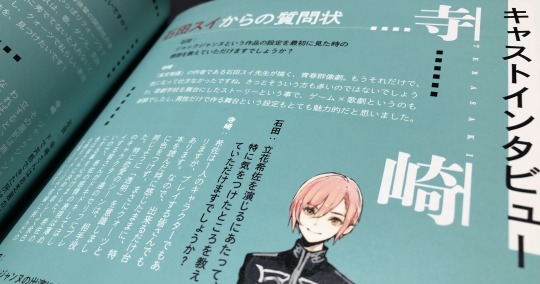
Ishida: What were your impressions when you first saw the setting of Jack Jeanne?
Terasaki: It’s a story about teenagers putting on plays together that’s drawn by the creator of Tokyo Ghoul, Ishida Sui-sensei. That information alone was all it took for me to be interested. I’m sure a lot of other people thought the same.
Since it’s a story that takes place in a theatre school, I found the way it's like a game meets theatre to be unique. I also found the aspect that the shows are put on by an all male cast to be really intriguing.
—
Ishida: When you were voicing Tachibana Kisa, were there any aspects of your performance that you had to be careful about?
Terasaki: Kisa is a character herself, but she is also the stand in for everyone that’s playing the game. That’s why I stuck to the initial impression of the script as much as possible without adding too much of my own flair. I wanted her to be ‘transparent’ like Quartz.
In the romantic scenes especially, I want the player to have their heart racing over what Kisa’s love interest is saying and focus on them. So during those scenes I made sure to act out Kisa’s emotions more subtly. I’d like for those playing to be able to decide their own colours for Kisa, so I left some of her canvas blank. I remember I would go into the recording sessions keeping that in mind.
—
Ishida: Were there any particular challenges you faced while working on Jack Jeanne?
Terasaki: The singing. When I first listened to the songs with the temporary vocals I was like ‘I’m going to be singing this!?’ and my anxiety quickly turned into terror! I had to reconstruct the way I’d been singing up until then from scratch. It was very difficult and I was unsure about a lot of things, but now thanks to Jack Jeanne I love singing even more than I did before.
—
Ishida: Other than Kisa, are there any other characters that are your favourite or that you took a liking to?
Terasaki: Tachibana Tsuki… He’s Kisa’s older brother, but there’s still a lot of unsolved mysteries surrounding him. I can’t help but be curious about him. I’d love to read a novel or something about Tsuki-nii when he was a student at Univeil. I’d like to see Fumi-san and the other third years when they weren’t upperclassmen too.
—
Ishida: Quartz, Onyx, Rhodonite, Amber. If you were to enrol at Univeil, which class would you like to be assigned to?
Terasaki: The relationships between the seniors and juniors are wonderful in every class, however I think I’d have to pick Quartz. Since I don’t think you can join the other three unless you’re already particularly skilled at singing, dancing or acting. So I’d like to find my own way to express my individuality in Quartz!
—
Ishida: You have some experience with stage acting, so were there any scenes or moments in the game that you could relate to?
Terasaki: Jack Jeanne has a lot of different choices and branches in the story. You can choose different lines to say during the plays too, but no matter which one you choose the show will still reach its conclusion. If another actor changes something then you have to change with them, and if you change something, then they have to change with you. Even though every performance of a show is supposed to have the same programme and script and movements, you go into it with a fresh mind each day and there are slight differences between the shows.
There are things you sometimes only realise on opening day when you see the audience walking in, so I could relate to the sense of tension actually putting on a show brings. I’d love for the players to see how each character's dialogue changes with each option, so please play through the shows multiple times!
—
Ishida: Every show in the game is quite different thematically, which one (setting, musical composition, etc) did you like best? Also, were there any shows that you’d like to try starring in in real life?
Terasaki: All of the shows are very different and I love all of them, but the one that I felt the most accomplished and happily tired after was the autumn performance. During auditions, the selection of lines from it were full of passion and tension, so I remember being excited to record for the autumn performance.
As for which one I’d like to try in real life, it would be Sissia of the Central Nation. When I recorded my lines for the whole show in one session, I started arranging how the stage set would look like in my mind. I’d think ‘this line would definitely be delivered from the top of the set, and this line would be said from the audience to the stage’. I’d read the lines whilst imagining what the show would look like and the performance that I could picture the clearest was Sissia of the Central Nation. So I ended up really wishing I could see it in person.
66 notes
·
View notes
Text
Introduction to TV ratings
Hi! I know a lot of us in the 9-1-1 fandom have started looking more closely at episode ratings this past year, but every time I see them posted I also see a lot of comments from people being unsure what the numbers really mean. I'm someone who first got introduced to tv ratings from being involved in the pro wrestling fandom and learned a lot about them through osmosis, so I thought I could make a small informative post explaining the main concepts and why tv ratings matter!
What I'll cover below:
What are tv ratings?
What exactly are they reporting?
How do I know what the numbers mean?
Are the numbers any good?
Let's dive in!
What are tv ratings?
Tv ratings, or Nielsen ratings, is an audience measurement system operated by Nielsen Media Research that tries to figure out the audience size and composition for tv programs in the USA. The Nielsen company has been measuring this since the 1950's, and their ratings is the currency that drives business between advertisers and broadcasters. To simplify it, the higher the rating a program gets, the more the broadcaster can charge the advertisers and agencies for broadcasting their ads to the audience during that program.
The data collection methods have varied over the years, but right now they're using Portable People Meters and track data from DVR:s. Since 2017 they're also tracking data on Hulu and YoutubeTV, and select programs on Netflix. It is an approximation, since they (naturally) aren't getting the full data from every single tv in the country, but they are good enough (and trusted enough) that their reported metrics are what's considered official.
So what exactly are they reporting?
A couple of different things! The most interesting numbers are total viewers, demographic shares, and demographic ratings. According to Nielsen they also track "gender, race, ethnicity, income, education, occupation, etc." but those are usually not reported as openly as the aforementioned three numbers and are mostly used by advertisers.
Sites like Tvline, Tvseriesfinale and Showbuzzdaily often report daily ratings very quickly after Nielsen releases them. The Fast Nationals are usually what gets the most attention, since they're released the morning after, but they're time period ratings, which means it only measured what was watched during primetime. The more accurate Official Nationals are released later the day after, and are program ratings. So if a program was moved from its usual slot for some reason, the fast nationals will still count the original time slot towards its ratings, while the official nationals will count the slot it actually aired in.
There are also C3 and C7 ratings (live viewing + DVR three/seven days after the airing), but they are seen much more seldom and are largely a fighting point between networks (who want to get paid for more days) and advertisers (who only want to pay for live viewings).
How do I know what the numbers mean?
Let's dive into that! I'll use tables from Tvseriesfinale and Showbuzzdaily with ratings for Monday March 20th (the air date of 9-1-1 S6E12) as my examples.
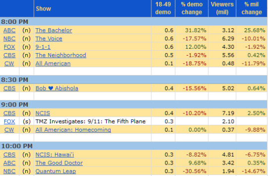
Here's how Tvseriesfinale reports the ratings, they're using the fast nationals (or "fast affiliate ratings"). The %change is compared to last aired episode of the same show. If you're wondering how the demo change can be positive while the number of viewers change is negative, I'll get to that in a minute.

And here's Showbuzzdaily, they report Live+Same Day which include live viewership + DVR views from the same day (which should be the same as fast nationals, but sometimes varies a bit). You can see that they colour code according to how far above/below the average rating of the night a program placed in different ratings categories.
Now for what the different columns mean:
Viewers (mil) or Persons 2+ (000s): the total number of viewers, in millions, who watched the program. So here Tvseriesfinale reports that 4.3 million people watched 9-1-1, and Showbuzzdaily reports that 4.413 million people did.
18-49 demo and Sales Demo Ratings Adults 18-49: These are the numbers that everyone is really looking at! The demo rating means proportion of a certain group (in this case adults 18-49) that are watching a particular show. In other words, this is the percentage of all adults aged 18-49 in the United States that were watching the show. So a 0.6 (or 0.59) rating for 9-1-1 means that 0.6% (or 0.59%) out of all people aged 18-49 were watching 9-1-1. This is the money demo, this is the number all advertisers and networks are looking at. Persons 18-49 is considered the most lucrative demographic, so the more people in that group your show can draw, the better for the network since they then can ask for more money from the advertisers. Persons 18-49 are considered to be the group to best target advertisements towards for a variety of reasons (disposable income and interest towards buying new things being two of them).
As you can see above, Showbuzzdaily also reports the demo numbers for Adults 18-34 and Adults 25-54. Some advertisers are more interested in these demographics, but overall 18-49 is still the most popular demographic. As you can see, the audiences skew older for all programs. I believe the general consensus is that younger people (<35-year-olds) watch much less tv than older generations, and these numbers support that. This is also why total viewers and demo ratings can have different %change - the 18-49 demo rating cuts off a relatively large part of the audience.
Demographic shares: While the ratings are based on percentage of all people in a demographic, the shares are based on percentage of the number of people who were actually watching TV at that time. So a 6.0 in Women 18-49 means that of all women aged 18-49 watching TV at 8PM, 6% chose to watch 9-1-1.
So... are the numbers any good?
That depends on what you're looking at. TV ratings as a whole have been dropping steadily for many years now, so trying to compare ratings to even, say, five years ago can be hard. For example: in the late 90's, pro wrestling regularly pulled in ratings of 5.0 and higher (I'll put a few below as an example), but those same shows would now be ecstatic if they managed to get above a 1.0 rating; their regular numbers the past year (for the big shows RAW, Smackdown and Dynamite) have mostly hovered around 0.4-0.7.

The first number is the demo rating
For the best overview, it's best to compare ratings for a certain show to the ratings of other shows on air, and I believe that's what the networks are doing as well. In that context, 9-1-1 is doing very well, as it regularly ends up near the top for scripted shows, even when looking at all shows over a week. The average rating for S6 so far is 0.63, which is lower than the average rating of 0.76 for S5 (which in turn was lower than the average rating of 1.05 for S4 and so forth). The ratings consistently dropping year over year are a concern for the industry at large, and it's pretty clear streaming services have played a big role in causing this, but I find it hard to believe tv networks would consider stopping producing shows for live tv anytime soon.
And that's it! If something still feels unclear, feel free to drop me a message and I'll do my best to answer any questions! If you want to dive a bit deeper into the different metrics, I recommend this page on Showbuzzdaily, and if you want to look at ratings from previous seasons, Tvseriesfinale's 911 ratings tag is a good place to find articles summarizing both individual episode ratings and ratings for a whole season.
159 notes
·
View notes
Note
hello!!! :DD seeing your tags on the Rex piece made me immediately (and very) curious; would you feel comfortable talking a bit about your process? *___* that piece is stunning (I love that petals are your art signature :)!)
You mentioned it took some time, was it because of the composition or the colouring? Anything specific you had to learn as you went (for the piece?)
Does it fit within the ‘RepGar armour AU’, or were you thinking of a specific Rex feel (especially as it’s the companion to Cody’s rain piece)?
Were you listening to something while illustrating?
and bonus question!!! Possibly not art related :3 does Rex ever met Corrie!Fives??? *___*
Feel free to answer one, some or none of those questions! Love your art (and AUs!) best vibes!!!
Hi @lesquatrechevrons !! Your tags often make my day, so this seems very fitting. I’d be happy to answer questions! (Hoho thank you for noticing — it is indeed a predilection; I love most drifting particle effects quite a lot.) ;)
You mentioned it took some time, was it because of the composition or the colouring? Anything specific you had to learn as you went (for the piece?)
Ooof. The rendering itself, without question. It is difficult to explain, but usually my rendering is a bit more blur effect with up to three colors, with very little painstaking detail work. In the piece you reference, by contrast, almost every part of Rex has been rendered by use of a pencil-tool and very fine blurring. In most of my pieces I will only have a few layers for base colors and lighting, and then quite a lot of layers for accents to the piece or detail work. For this one, almost all of my layers were several coats of ‘paint’ layered on top of each other, like a classical acrylic or oil painting, as I went back to adjust lighting for each part at least twice with a completely new application of color.
Does it fit within the ‘RepGar armour AU’, or were you thinking of a specific Rex feel (especially as it’s the companion to Cody’s rain piece)?
Good question! Like Cody’s companion piece, it was separate from that AU, supposed to be a character-study view with themes inspired by this song and SW canon. The theme of falling leaves, golden petals, and the symbolism of comparing them to the lives of warriors striving and falling and striving overtop each other with weary feet and doomed by the narrative/reduced to being seen as inconsequential (especially given all the golden leaves/petals are identical) seemed appropriate for Rex in particular to be meditating on. The piece would only fit within the AU by accident, because they don’t directly contradict each other so they’re technically compatible.
Were you listening to something while illustrating?
I very often do (I am incredibly vibe-focused whilst in creative mode) but usually it’s just the background-type music, very vibey and mood-setting. This time it was the above song, for sure, but also Space Man by Eurielle and Tokyo Rain by Marcus Warner.
and bonus question!!! Possibly not art related :3 does Rex ever met Corrie!Fives??? *___*
Hoho — a very fun question, and one I’m still working on in the written fic for the RepGA AU. They do meet, and it is a mess, but like everything in that AU I try to focus on there being a point to the pain, and there will definitely be a happy ending. There is conflict surrounding how both of them have changed since they last met, including what they’ve since heard about the other.
As I’ve mentioned in pieces here and there, Fives ends up on Fox’s side of an altercation between the Republic itself and a revolutionary group (essentially the Rebellion, but jumpstarted by a Rogue Marshall Commander CC-1010 and all the resources he has been collecting to do precisely this for the latter duration of his command on Coruscant). This would all be well and good, but the GAR is still serving the Republic. So Rex and Fives, among others, find themselves on opposite sides of some battlefields — and both with very understandable reasons for being there, which is much more difficult to reconcile.
Thanks so much for asking! I’m delighted you like the piece, and I’m always down to talk art-techniques if you want to. Also, feel free to ask if you’re curious about anything more. For the AU fic I will not give too many spoilers as a rule, so you can ask but I might not answer some questions yet.
14 notes
·
View notes
Text

The Tree of Life The Alchemy of the Subconscious. Leonora Carrington, 1960
The Tree of Life is a painting of rich symbolism, in which Carrington depicts the Kabbalistic Tree of Life through the use of coloured spheres. The three human figures could be mystics or Jewish rabbis, and some even recognise in these figures the Dance of the Dervishes, which has a profound spiritual and mystical significance.
The composition culminates in a large face of iconographic references taken from Hinduism, Buddhism and even uses elements from the Egyptian world.
A tower of babel of spiritual traditions realised in a stratified composition where different situations occur at the same time and on different levels.

In the mid-sixties, Carrington began exploring Kabbalah lore, a branch of Jewish mysticism that seeks to explain the relationship between the realm of the eternal and unchanging and the finite, ever-changing world. Kabbalistic methods of spiritual realization are, for the most part, the foundation of European alchemy.
43 notes
·
View notes
Text
My art in 2023
January
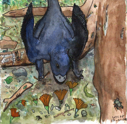
Microraptor and the Flowers. I started this year out making paleoart watercolours and never really stopped. This one is about a Microraptor investigating the first flowers she's ever seen. The flowers are Lingyuananthus, a lovely little fossil flower described in an even lovelier paper that was not behind a paywall for once.
February

Orthocones Descend. Having moved into a new apartment and made a timeline covering the walls, the paleozoic looked awfully empty, so I made a big effort to expand my horizons and do art showing creatures I'd never drawn before. Showing orthocones descending vertically on their prey made for a fun composition too.
March

Sinosauropteryx does not want to share its tree. I still can barely believe we know the colours of both Sinosauropteryx and Psittacosaurus. Dinosaur colours always felt like something we'd never figure out without literal actual time travel before we figured them out.
April
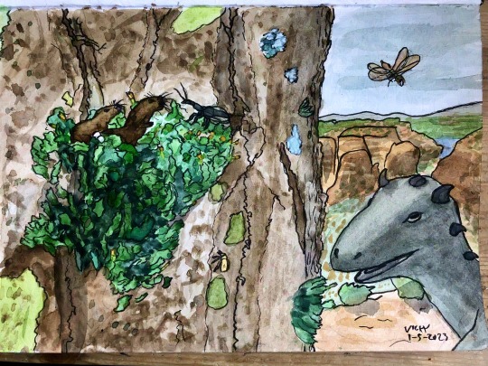
Hadrocodium's mossy home. I got the idea for one of the tiniest mammals of all time making its home in some moss on a tree while hiking in Switzerland and coming across some truly impressive moss beards.
May
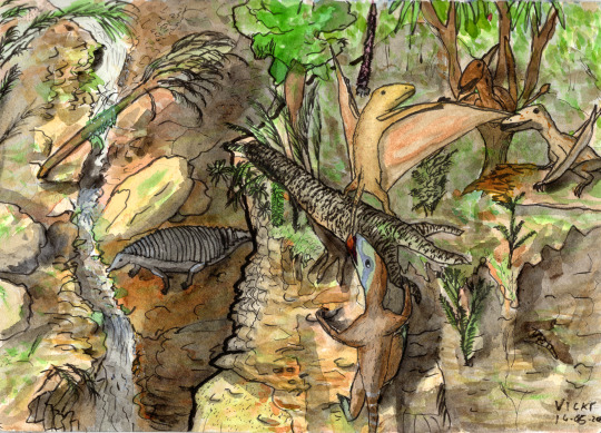
Procompsognathus's cliff climb. Although the foreground cliff itself and the contrast between foreground and background didn't come out quite as well as I'd hoped, I still really like this art featuring the three main branches of archosaur (dinosaur, pterosaur, and pseudosuchian).
June

Anomalocaris, Dragon of the Cambrian. The realisation that most Cambrian creatures were tiny gave me the idea of a whole bunch of them hiding from a 40 cm long Anomalocaris while in positions reminiscent of a D&D party facing off against a dragon.
July
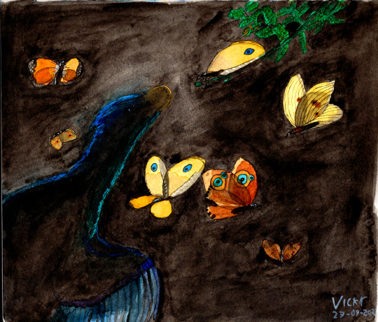
Caihong and the Kalligrammatids. Kalligrammatids were neuropterans that superficially resembled large butterflies, but unlike them their wings were transparent! I combined them with the gorgeous iridescence of Caihong and backlighting for a fun experiment.
August
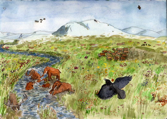
Spring on the mammoth steppe. When the time came to do some art set in the Quaternary, I decided to depict a real life location and how it would have changed in the past few hundred thousand years. This spot is just west of Baden-Baden (which is in the glacier valley to the upper left), on the edge of the Schwartzwald. I also enjoyed depicting an ice age spring. It wasn't always snow and ice.
September
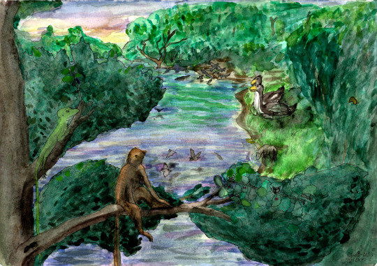
Darwinius and Geiseltaliellus's stare-off. The Paleogene was the last remaining Phanerozoic period I hadn't done any art of, so I drew this little scene in the Messel Pit formation.
October

Inostrancevia family at sunrise. I hadn't drawn Permian synapsids in a while at this point so they were overdue for a paleoart. I also felt like going absolute ham with my reds. The sunrise and Permian volcanism made for a convenient excuse but really, this is just for me.
November
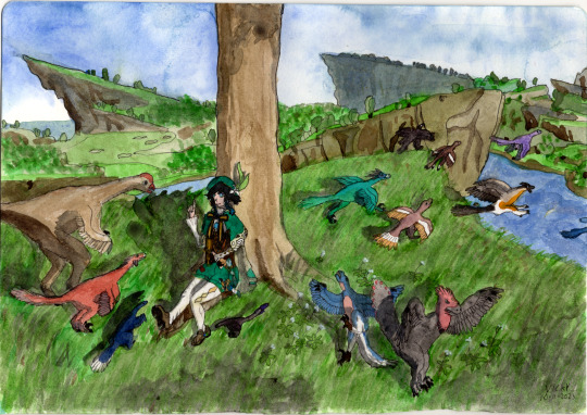
Wind, Courage, and Wings. This one's a birthday gift for my friend, depicting a lovely fable in Genshin Impact about how the wind god Barbatos taught the first birds to fly.
December

The Zanclean Flood. 6 million years ago, the movement of the continents cut the Mediterranean off from the oceans. Since more water evaporates from the Mediterranean than it receives from rivers, this resulted in the sea drying up and becoming an incredibly deep, dry, salty lowland. Until 5.3 million years ago, when the Strait of Gibraltar formed and the entire sea was refilled in a massive flood. This depicts the early days of said flood seen from the tip of the Rock of Gibraltar.
If you've enjoyed my art this year, consider leaving me a tip! Or have a look at last year's art too.
#paleoart#my art#palaeoblr#2023#my art in 2023#watercolour#definitely not gonna tag every creature appearing in these#cw: bugs
52 notes
·
View notes
Text
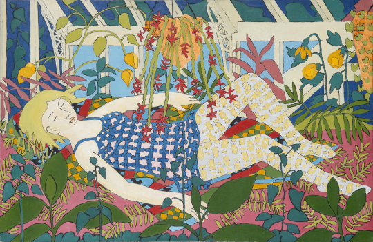
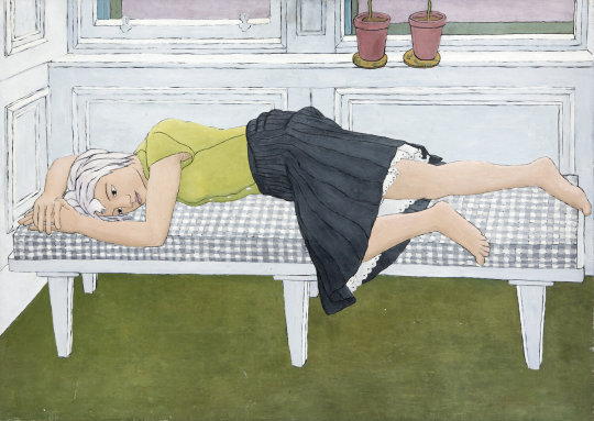
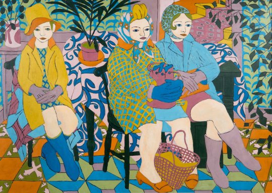
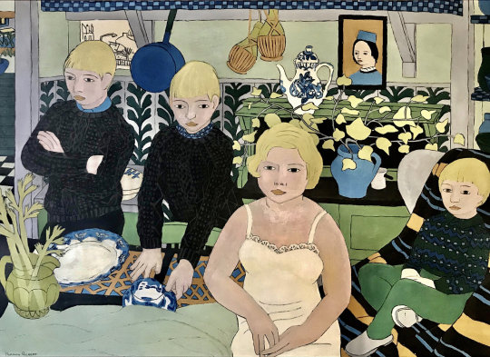
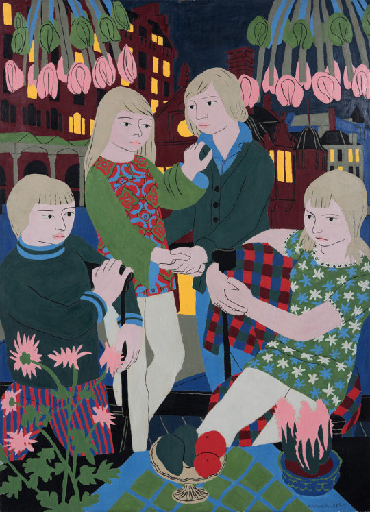
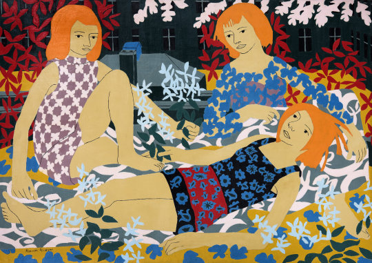
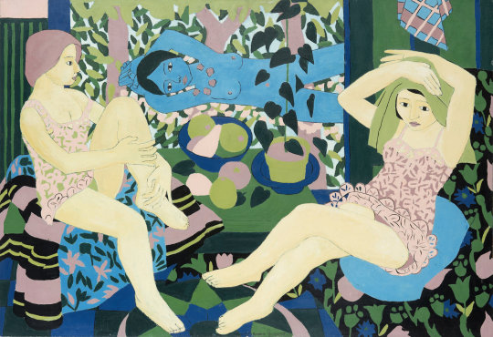
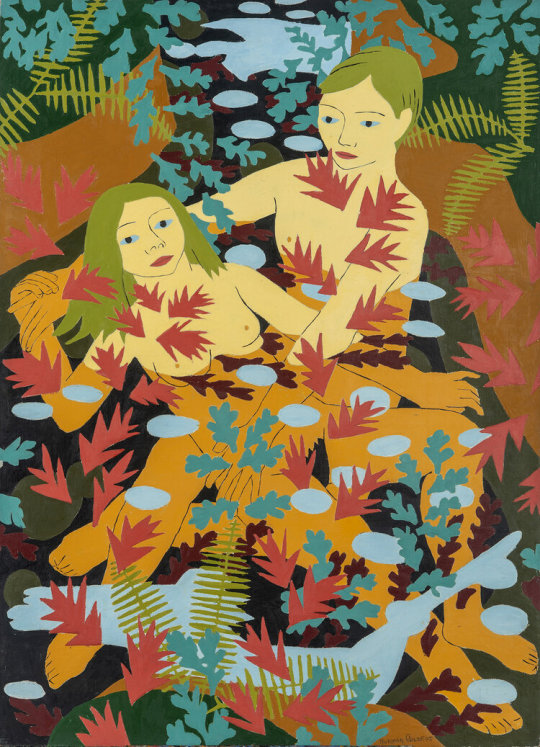
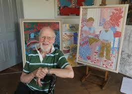
Early works by Scottish artist Norman Gilbert.
Artist Norman Gilbert was born to Scottish parents in Trinidad in 1926. He decided to pursue a career in painting and it quickly became his life’s work. Norman attended the Glasgow School of Art, where he laid the foundation for his painting style: one that evolved and developed until his passing at the age of ninety-three in 2019.
His son Mark is writing about his father:
"Dad was many things, husband to our late mother Pat, father to myself, Paul, Bruno and Danny and grandfather to Katy and Murphy. He was also, in his time, a sailor, a pig man, a scenery painter and an art teacher.
Over time, these roles informed and fuelled what he was most of all, an artist, a dedicated, passionate and wonderful artist. Dad chose to paint, correctly assuming it would be a vocation that would sustain him for life. The world he recorded was intimate: his family, friends and their surroundings, in the settings of our homes in the south side of Glasgow and on holidays in the Highlands or France. From these sources, he created a joyful world of colour and beauty - one writer many years ago commented: ‘It’s always carnival at the Gilberts’, a line often quoted ironically at Dad by our mum. However, his devotion to his family is mirrored in his work – each and every painting and drawing was an act of love and compassion for the people he painted and the world he experienced. As such, Dad’s pictures are a tender and affectionate testament to his life and the relationships that nourished him.
The development of the pictures over the years parallels the changes and events in his life. His early paintings seem to resonate with the grey, muted tones of post war Britain. These panels are unembellished, depicting domestic settings that I often felt chimed with the sensibilities of playwrights like John Osborne and the other “angry young men” who focused on the personal and intimate aspects of working class Britain in the 1950s. The smaller, uncomplicated pictures gently evolved, over time, into larger vivid compositions, their colours, clashing and melding within linear, patterned and decorative structures. These later pictures seem very un-Scottish in style and potentially echo his roots in Trinidad, where he was born in 1926, to Scottish parents. Permeating his whole oeuvre is his unique vision resulting from years of dogged dedication and commitment to his craft and practice.
His subjects are often highly coloured figures, woven into equally vivid patterned spaces. Although the people are easy to perceive and are the focus of attention, they are rendered with the same weight of line, colour and flat texture as the setting in which they are depicted. This rigorous evenness of treatment can be disquieting for those in search of greater physical or emotional form to their figurative paintings. Nonetheless, it makes for complex, yet coherent, compositions where every element is, as Dad described it, at peace with the rest of the picture. The paintings are generous, open hearted and full of optimism. He began each picture believing it could be his best, yet characteristically, he recognized he could do little to control how people would respond to his work.
I often reflect how we as a family took the pictures and the act of sitting for him for granted. My brothers and I grew up in houses where there was always a studio in which Dad would spend most of his time, quietly working. We all sat for him as he drew us. Sometimes he’d dress us in his own checked trousers and striped rugby tops. More often than not we’d be pictured together or with Mum, friends and girlfriends. Being drawn was a constant part of our lives. We all spent innumerable hours sitting for him in the silence of his studio, the quiet punctuated by the squeak of his charcoal being dragged across the paper, creating the clean deliberate lines of his studies. As a child, the moment he announced he’d finished his drawing, I’d turn and dash from the studio before he could change his mind. Later, when I started attending Glasgow School of Art myself, I’d sit with Dad after he’d finished and we would discuss the drawings he’d just made and the composition that was gradually being constructed on the easel.
I also painted him. Portraits of both Mum and Dad featured in my degree show at GSA in 1991. After I graduated, I continued working in a studio in Glasgow. For the following nine years, it was not uncommon for Dad to sit for me in my studio in the morning and for me to sit for him in his in the afternoon. As we worked, we talked about our pictures and contrasting methods. He would puzzle over my liberal ‘turgid’ use of paint and the squalor of my studio, his being a pristine space he swept every day. In later years, when I moved to the US and then Canada, we would talk about our work during the multiple Skype conversations we would have each and every day. Sitting at our computers, we would view each other’s work through the screen and discuss what was working and what wasn’t. And we’d talk about my late mum, exchanging anecdotes that were poignant but often filled with humour and laughter. Paradoxically, these conversations were often triggered by discussions of the extraordinary drawings he made of her as he kept vigil during the last week of her life, which transformed his own deeply private experience into shared depictions of love, caregiving, end of life and bereavement. They taught me more than anything else about the healing power of art. He cherished these drawings and the memories they generated about Mum, who had done so much to support him over the years. Reflecting on the images, he poignantly stated: “At one point I did say, there’s no point in doing them because I can’t show her them. I can’t ask her what she thought of them.” I also know this feeling, for I too have lost my favourite most trusted audience and affectionate critic.
Mum died in 2016. The trio of paintings he created - Chair, Chair II and Chair III - stand comparison with anything he ever did, but are instilled with a unique pathos and poignancy. They echo the compositions he did of her in the years before she died, but now her Parker Knoll chair is empty, draped in the same patterned blanket that first appeared in his pictures in the 60s. These works, along with the drawings, were recently published in a book, Pat: End of Life Drawings by Norman Gilbert.
The media coverage these drawings of Mum received and the popularity of the BBC Loop film made about his life and work (which has been viewed seven million times online, not a few times by Dad himself) brought him letters and messages from admirers around the world. It also coincided with two near-sellout exhibitions at the Tatha Gallery, in Newport-on-Tay on the east coast of Scotland.
The success was hugely gratifying if slightly bemusing; clearly, though, he loved the response his work was now receiving and he was gratified to see the response to his earlier work much of which he had barely looked at himself in recent years. Now he was given ample reason to reappraise it, musing happily: “I seem to have a lot more good pictures than I thought I had”. Meanwhile, the artist who sought to make every picture better than his last was succeeding in spades; his work through his eighties and nineties and, perhaps particularly, after Mum’s death, becoming ever more intricate, cohesive and “at peace”.
Dad’s legacy lives in the body of work he leaves, paintings that testify to the importance of relationships and love as witnessed through his unique passion, vision and spirit. That legacy will live on beyond us all. What a life. What a gift."
9 notes
·
View notes
Text
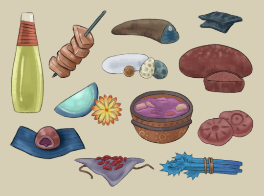
staple desert culture cuisine
ensthirs originate in desert regions of their planet, and over thousands of years have cultivated a wide selection of foods and treats that are both easily available in their environment, and are a delight to consume.
(long post)
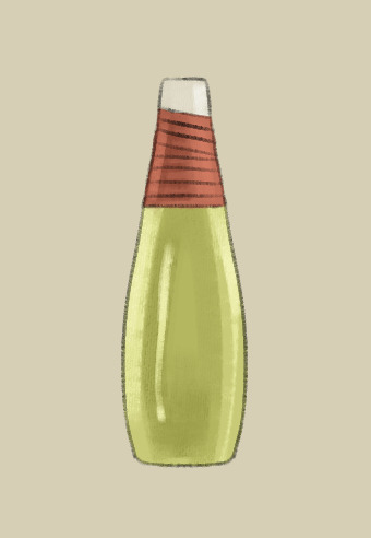
Bahn juice
Bahn is a common fruit, it's large, watery and appetizing but protected by their thick shell, something like a combination of a coconut and watermelon. The flesh inside lines the shell in sections, and the hollow cavity in the middle is filled with a cold, sweet juice, which can be mixed with many other ingredients but can be served fresh and is often drank straight from the shell. It appears clear and green when still, but gains a thick white froth when shaken. The taste is comparable to earth sugar cane juice.
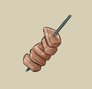
Bahn meat (in kebab form, for this presentation)
Despite all appearances, and the name, this meat is not from an animal but from the aforementioned bahn fruit. The sections of this fruit are eaten in many ways, but it's still delectable plain and fresh. The texture and flavour is closest to mangosteens - very soft, very juicy, and very sweet in its own unique way. It's a flavour you wouldn't want to forget.

Ce Bread
Ce (chee) is a hardy grain, purple in colour, that withstand any environmental challenge thrown at it and can proliferate throughout both wet and dry seasons. Plain ce lacks a distict strong flavour, meaning it pairs well with other foods, placing it as a staple in most diets. It is the ensthirs equivalent of rice or wheat. Ground dry ce can be mixed with liquids and then baked, like this bread, but it can be cooked in many other ways which drastically change its composition and flavour.
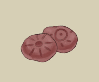
Ce cookies
Another use of ce, these cookies are a common tradition that mean more than just a sweet treat. Ce cookies must be crafted together by family members, often between parent and child or siblings, it is a way to strengthen bonds. This can be to show forgiveness, express love and loyalty, or simply be a fun experience before dinner. Before being baked, a pattern, symbol or shape is carved into the top, such as these sun designs which are believed to bring good luck. Ce cookies are a popular choice of offering at religious events, or simply as a gift for new neighbours.

Sticky ce bun
Slightly sweeter than che cookies, ce buns are an extra special treat, but are not generally reserved for any noteworthy occassions. Ce buns are made with very few ingredients: ce flour and water are used for the bun itself, and the stuffing is ce that has been boiled then cut up and mixed with a liquid similar to syrup or honey. When boiled, ce expands three times its original size and becomes soft and chewy, a consistency and texture similar to tapioca pearls used for boba. As a final step, the filled bun is wrapped in bahn leaves and steamed, which gives it the sticky affect and enhances the flavour.

Soup..
Ensthir soups can be made of just about anything, the range is incredible, but this one seems to have a broth of some bright purple plant, with an addition of various roots and tubers to finish it off. The serving dish of choice is a clay pot decorated with easily accessible paints and dyes, making a simple dot and sun pattern.
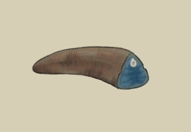
Lizard tail
Obviously not from an actual lizard, but close enough. Like most animals that share a planet with ensthirs, this creature used their tail as an extra fat storage, making it a better alternative to eating more meat and getting the same amount of fat. This tail has been cooked, but this is usually only for longetivity as ensthirs still possess the necessary enzymes for properly digesting raw meat (without contracting some mysterious disease.. most of the time).
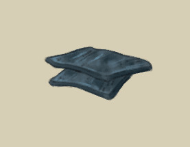
Jerky
A common meal staple in the dry season when food is less readily available, slices of meat are salted and dried then put into storage until they are needed. Meat jerky is not widely disliked, but it is also not loved by many and doesn't have an important role in ensthir culture other than survival.
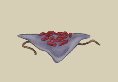
Dried berries
The vegan alternative to meat jerky, berries are also dried and stored until dry season but are used as more of a snack or side serving than the main course. Certain berries may turn out to be sweet or sour when aged, or perhaps earthy or downright bad, so an ensthir must choose their tiny fruits carefully when foraging. Families pass down knowledge of what the tastiest berries look like, and young ensthirs will make a challenge to find the best ones first when wet season comes to a close and stores must be stocked up.
would u eat any?!?!
Read more in the second post I reached my mobile image limit 😓😓
85 notes
·
View notes
Text

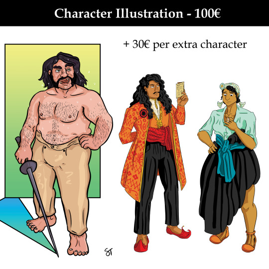


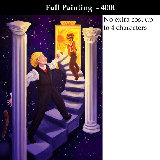
Commissions
Hi all! I'm opening commissions. I focus a lot on characters in my art and as such, that's what I'm going to be most proficient at.
I'll do original characters, paintings for fanfic or webnovel covers, fanart, NSFW and pretty much any other work I feel qualified to do (i.e. I will not draw, say, machines, a subject I have barely any experience with).
In terms of fanart, I'll do art for any fandom, but I'll put a list of those fandoms I'm particularly familiar with under the cut if you want someone who already knows the world and characters of a given story.
Types of Commissions
Coloured Sketch (25€, around $27 or 21£)
A full body sketch of a character, coloured in.
Simple Illustration (50€, around $54 or 43£)
An illustration with thick line art and mostly flat colours. Full body or more detailed close up.
Character Illustration (100€, around $109 or 85£)
An illustration with line art and shaded colours. For couple or group poses, each extra character is 30€.
Full Illustration (150€, around $163 or 128£)
A composition centering on a character within an environment. Shaded line art and colours, many details. For couple or group poses, each extra character is 30€.
Character Painting (150€, around $163 or 128£)
A painted character on a simple, painted background. For couple or group poses, each extra character is 30€.
Full Painting (400€, around $435 or 342£)
A painted composition. Can involve characters in an enviroment, a landscape, a portrait, etc.
If you're interested, you can message me here on Tumblr or write to me at [email protected]
Payment will be through PayPal.
Process
Once you've contacted me about buying a commission, I will ask you a series of questions about the piece to clarify if I am the right artist for what you want and to make sure I have all the information I need to make it what you want.
I will then give you an estimate of how long the work will take me to do. This depends to a large degree on the complexity of the piece, ranging from a few days to several weeks.
If we both agree on going forward with it, I will send you a PayPal request for payment. Once paid, I will start working on your commission.
For pieces above "simple illustration" in complexity, I will send you a few process images as I work on the commission where you can clarify anything you might want changed.
For all commissions, I will send you a preview when I'm close to done where you can request any final changes (within a reasonable degree of complexity).
Finally, you will receive a full-size image file of the piece in question in as a PNG and/or in any other file format you might want. If wanted, I can send versions cropped to fit icon, banner, etc sizes, as well as (if applicable) both transparent and non-transparent versions.
Terms
Upon receiving a commissioned piece from me, you have the rights to post it anywhere you like, as well as adapt it as you see fit. By default, these commissions are for non-commercial use only. If you want a commission for commercial purposes, we can discuss the specifics and come to an agreement.
I will retain the right to use the piece in a portfolio context as well as for developing other work.
Should you want a refund, said refund will be based on how much work I have done on the commission at that time. I.e. you will receive an almost full refund if you request one early in the process.
If you request large changes to the piece, particularly late in the process, that may cost extra.
Fandoms
In the past, I have made fanart for:
Dragon Age
Star Wars
Harry Potter
Les Misérables
Black Sails
Avatar: The Last Airbender
Dungeons & Dragons
I am further familiar with:
Disco Elysium
Mass Effect
Baldur's Gate (all three)
Doctor Who (NuWho)
Merlin
Our Flag Means Death
Steven Universe
DC animated shows
MCU
A lot of smaller video games and ttrpgs
14 notes
·
View notes
Note
I am sorry for bothering you, but if you don't mind, can you tell the tips for the very very begginers. I really want to start learning how to draw, but it is overwhelming and I don't no where to start and feel a little at loss
ha! One of these days I'm going to have to write something detailed and well-constructed to be able to answer these questions properly. ^^"
In any case, you're not bothering me at all and I'll try to give you a clear answer, but I apologise in advance if it's too long or if my English isn't good at times. In short version I would just quote Lorenzo from How to think when you draw : source
My long version:
It's hard because everyone functions differently, but I'd say that first of all you need to define a goal or a project that will be your driving force so that you don't lose your motivation. It could be a personal comics project or doing fan art, it doesn't matter as long as you're enthusiastic about it. If you have to choose between academic seriousness and fun, choose fun, because fun make you practice and practice make you progress anyway so you'll be less likely to get discouraged.
It's important to practice as regularly as possible, because your ability to draw is like a muscle that you need to maintain. If you don't practice enough, your progress will be slow, and if you don't practice for too long, you'll lose what you've learnt.
Having said that, learning fast is not an obligation - it depends on your goal.
For the technical aspects that you still need to learn between two sessions of fun, the order that seems logical to me is :
shape and volume || light and shade
anatomy
colour theory
perspective
composition
That's assuming you start by doing just characters before getting into complex backgrounds. And bearing in mind that certain parts are connected together and can be learned simultaneously. For example, I've put perspective towards the end, assuming that you come to the backgrounds last, but it's useful for drawing characters too.
To make each of these parts easier, they need to be broken down into stages.
Shape and volume || Light and shade :
Shape and volume :
Basically, it's useful for everything else. understanding shapes allows you to decompose complex subjects so that you can reproduce them more easily. Absolutely everything around you and everything you want to draw can be decomposed in this way. It will then help you to know how to apply light and shade. A good article here. Light and shade : not knowing how to sum it up in a few words, I found some useful links :
[link] [link] [link] these three articles talk about the same thing, but maybe if you look at what else their authors have in stock you'll find something different or explained in a way that suits you better.
Anatomy :
Once you know how to build a human being with tubes and rectangles, you can go into more detail about anatomy. You can start with the head alone, practising drawing it from all angles, with different characteristics, different expressions etc, then arms, then torso, etc and then gradually moving on to the whole human body. Study the skeleton and musculature, it sounds annoying but it really changes everything. Even if it's possible to know how to position a character correctly without it, the result will inevitably be better with it and it'll make your task easier and drawing skeletons is great fun! This doesn't mean that you have to learn every single piece by heart, just that you know enough to be able to place the bumps and hollows in the right places. a good article for beginners, giving the balance needed to avoid being overwhelmed by the study of anatomy. I suggest as an exercise : with the help of references and tutorials, draw a character 4 times in an identical posture, except that first you only do the skeleton, then the musculature, then a normal nude, and finally with clothes to familiarise yourself with the behaviour of the fabrics. (The folds and drapes are, I think, a sub-chapter of the anatomy part because clothes.) about folds and drapery [link] [link]
Colour theory :
Basically, it's what colour you get when you mix these two together, or which colour is best for shadowing this other one, or to produce a certain mood over the whole illustration, I have to limit my palette to these colours and so on. Again, I can't summarise this easily but it's a big important part. Just type colour theory in google or pinterest and you'll find so many good tutorials. Note: again I think that, colour and light / shade are connected and should be learned simultaneously.
[link] [link]
Perspective :
For this part it's easy to broke it in steps. Start by practising with a single vanishing point to understand the principle, then two points, then three, then the fish-eye effect. I forced myself to do the spiral staircase exercise with the perspective, it was terrible but once you've done it and understood what you've done then you're good. Better, you can test your understanding of perspective by having fun reproducing Escher's impossible constructions. I love his work. 1 point [link][link] 2 points [link][link] 3 points [link][link] [Escher]
Composition :
It's one of the last things I learnt and I can really guarantee that there was a before and an after to it. Composition is one of the fundamental that will make you say: I'm an illustrator, in the sense that I know how to tell a story, evoke a feeling with a single drawing. [link] [link] [link] [link]
To come back to more general things, accept that it can take time, it's OK if it's not great at first, we've all been there. Don't put pressure on yourself and don't make yourself feel guilty by comparing yourself to others. Be curious too, look for new challenges, and always do it for fun. Finding a community in which you can make artist friends with whom you can share projects can also be great, because you feed off each other and that helps to keep you motivated. Don't be afraid of failure, failure is good, failure is your friend. Because once you've identified the reason why you think your drawing is a failure or not good enough, you'll remember to pay attention the next time or it'll motivate you to do more training on that point. Knowing things is good, but turning them into reflexes is better.
Here it is, I hope it helps, most of the resources I learnt with were in French so I quickly tried to find the English equivalent, I checked them quickly, but I think it's ok. And, the links I've found are just entry points, in some cases you'll need to find other resources, like anatomy for example, but just type anatomy tuto on pinterest and see what seems easiest for you to start with. aaand this is the end, I think.
#ask#text post#every time I have a question like that I take the outline of the previous one and add a little something to it.#After some times I might have enough to write a book x)
24 notes
·
View notes
Note
What has been your top 10 favourite pieces of art you have drawn and why?
Oooh, that's hard!
But I'll give it my best shot! I'm gonna try going from least fave to fave but... no an excuse science!
10.- Cass and Caine Sketch

Starting with a sketch feels a bit wrong but this WIP is still on my to-do-list despite being from Feb of last year, almost an entire year old now, and there's very little I want to change about the initial sketch.
I dunno why this sketch came out so well, but the body language just reads for me in a way I don't usually capture.
9.- This set

It's definitely cheating to include three drawings one but... they wouldn't make it individually, but the set? Amazing. Especially because they're over a year old, they're from August of 2023 and I don't know if I could re-create art this good today?? I can't say it's luck because I did three of them one after the other.... but did some art deity lend me a hand without me noticing? Maybe.
8.- Cass and Caine again!

This one is pretty self-explanatory. It's a simple piece, nothing too amazing skill-wise, but the colours, the placement, it's a piece I am still super proud of and remains my ipad background to this day :D
7.- Cassandra with swords
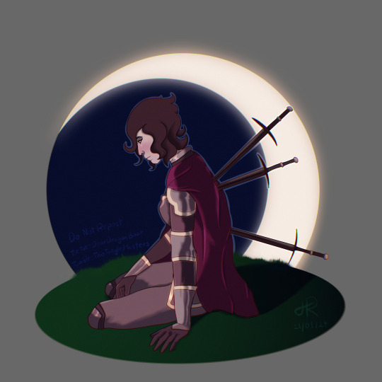
Another piece that's not too complex but just comes together beautifully. Was my icon on ao3 up until a few days ago!
6.- The mermaid and the pirate
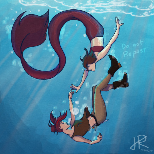
This is my current desktop background and while I could definitely do this better now, I still really love the colours in this piece, the story it tells and the composition :D
5.- This ArtFight for @maitaitiu
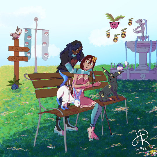
THIS ONE.
This is for my inner-child.
I love pokemon, it was definitely amongst (if not the very first) the first fandoms I was ever in. And it was through watching pokemon speedpaints on youtube that I got into digital art, opened up a Deviantart account, starting publishing drawings done on the pc with my mouse on there, made friends, kept drawing.... pokemon is my origin story yet I hadn't drawn them in YEARS.
So this piece for ArtFight with all the little details just made me think, wow, my younger self would be so IMPRESSED XD
Plus it makes me want to pick up my ds or switch and play some more XD
4.- Another ArtFight Attack (for Demon2000)
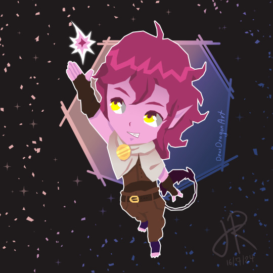
This combining of my chibi style and the geometric edges works soooo well. I still think this is perfect, I would not change anything. And it's the predecessor of my current style, it's what made me realise how much I like sharp edges in my art and vibrant colours :D
It even has the combination of gradients and cell-shading!
3.- Cass and Fidella

This is my most popular piece of art and while I wasn't 100% at the time... I now see it. I'm especially proud of the colours and OWL :D
Love owl.
2.- Cassandra in Coronation Dress
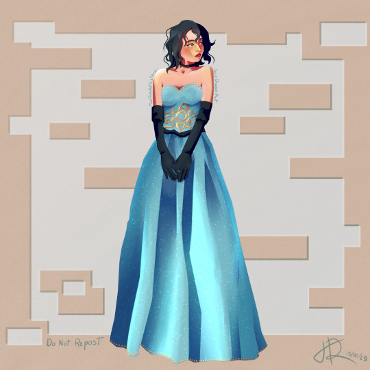
I think this is the best drawing of Cassandra I've ever done, even if it's not a very obvious one because it's in a pretty dress and very leaning into my own AUs. But that's a good thing, it's more my art than the piece before this.
Her expression in this, how good her face looks, the shimmering fabric of the dress.... I love everything about this piece (except maybe the background, it needs a background which is why....)
1.- Captain!
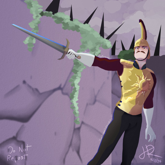
It having a background and being a scene (screenshot redraw for the win!) just makes this piece stand out.
Another piece where there really isn't anything I'd change.
(although I'd like to get better at background before next year!)
So yeah.... I think those are probably my ten best pieces.
Definitely a lot more older art than I expected but I just haven't had the right brain for creativity recently so my art is definitely a lot more flat than it could be.
But that's fine.
Creative journeys are never linear :D
2 notes
·
View notes
Text
GJ and ZZH Updates — October 29-November 04 (part 2)
[part 1 of this week]
11-02 → The Rising with the Wind Weibo posted three promotional stills featuring Xu Si.
→ The Rising with the Wind Weibo posted behind the scenes clips of Gong Jun having water thrown at him and riding a vespa.
→ The Rising with the Wind Weibo posted two promotional stills of Xu Si.
11-03 → Gong Jun's studio posted computer wallpapers of Xu Si.
→ Fresh posted a photo ad featuring Gong Jun.
→ GXG posted six photos from their livestream with Gong Jun.
→ 361° posted a photo ad featuring Gong Jun. (1129 kadian)
→ Hogan posted four behind the scenes photos of Gong Jun. (1129 kadian)
→ Gong Jun's studio posted a video of Xu Si vs Gong Jun. Caption: "Big revelations about 'Si's' life ahead! Have you ever seen Xu Si @ Gong Jun Simon like this?"
→ Hogan posted nine photos of Gong Jun from their livestream a few days earlier.
→ The Rising with the Wind Weibo posted behind the scenes videos of Gong Jun holding Jiang Hu by the hood and thinking water going going to be thrown on him.
→ Gong Jun's studio posted a video (flashing lights cw) teasing the photos they would post later that evening. Caption: "A preview." This was followed a few minutes later by a photo, caption: "Another preview."
→ 361° posted a commercial featuring Gong Jun.
→ The Rising with the Wind Weibo posted two promotional stills featuring Xu Si.
→ Gong Jun attended the ELLE Style Awards, where he presented the award for rising photographer. Fan Observation: There are clips where you can hear a number of fans yelling "ba" and "babi" at him, and you can see him turn around to say something to a woman standing near him. Reportedly, he was explaining to him that that's what his fans call him and she started laughing.
→ Gong Jun's studio posted nine photos from Gong Jun's photoshoot for that day's ELLE event. Caption: "The mist is purple at dusk, and the air is clear and misty. @ Gong Jun Simon touches the color of calla lilies and feels the change of time."
→ Gong Jun's studio posted a video of clips of Xu Si eating mints. Caption: "Mr. Xu @ Gong Jun Simon can’t leave his hands with sugar, and can’t leave his mouth with damage"
→ ELLE posted a photo of Gong Jun on the red carpet. They also later posted a composite photo of him.
→ Gong Jun Outdoor Office posted a clip of Gong Jun on the red carpet. Caption: "What kind of props are there? Mr. Xu’s 🚲"
→ Gong Jun posted six photos from the same photoshoot. Caption: "Today we're going to cure the 'taro' system 😎" He also posted these to his Xiao Hong Shu, caption: "So hungry It’s finally time to eat lunch!!!" and four of them to his Instagram, caption: "A happy day!" Fan Observation: The verb that he used for "eat" in the XHS post is a dialectic variation only used in five provinces, one of which is Jiangxi (where Zhang Zhehan is from.)
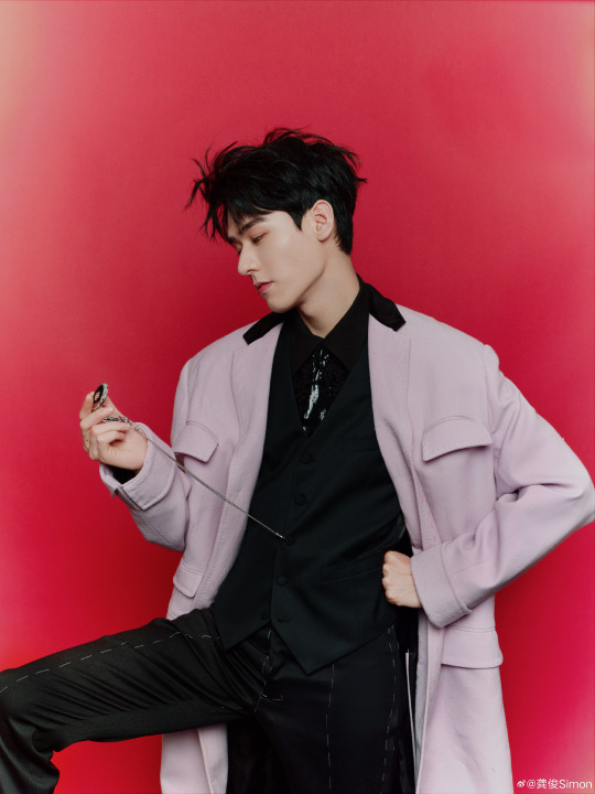
11-04 → Gong Jun's studio posted a video of him from his photoshoots the previous day. Caption: "Simple and classic, neat and capable. @ Gong Jun Simon's metal sparkles reveal his true personality, and it is flexible and free from colour." BGM is City Dreams by Glimlip, Yasper, and cocabona,.
→ The Rising with the Wind Weibo posted a promotional poster of Xu Si.
→ Gong Jun's studio posted four photos of Gong Jun in his second outfit from the previous day. Caption: "Gilded and decorated with hidden patterns. @ Gong Jun Simon interprets gentlemanly style with elegant gestures."
→ The Rising with the Wind Weibo posted two promotional stills featuring Xu Si.
→ Gong Jun's studio posted four photos of him at the previous ELLE event's red carpet. Caption: "Add a touch of bright colour to the autumn palette. @ Gong Jun Simon walks with the wind, and randomly drops a small thought💡"
→ The Instagram posted ten photos of "Zhang Zhehan" in Paris.
→ Tissot posted five photos of the photos of Gong Jun from the previous day, highlighting their pocket watch.
→ The Rising with the Wind Weibo posted behind the scenes clips of Xu Si playing xiangqi and holding up a drunk Jiang Hu.
→ Gong Jun's studio posted a promotional image of Xu Si. Caption: "Strategize and plan to win, and pursue the victory. Xu Si @ Gong Jun Simon, did you guess this move?"
→ Deeyeo posted a photo ad featuring Gong Jun.
→ Gong Jun's studio posted a video of Xu Si. Caption: "Who said the boss doesn't fish? ? Xu Si, a gold medal investor in the business world, @ Gong Jun Simon is actually also a 'fishing player'!"
→ The Rising with the Wind Weibo posted a promotional poster of Xu Si.
→ The Rising with the Wind Weibo posted two promotional stills featuring Xu Si.
→ Gong Jun posted four photos of himself from the previous day. Caption: "A bit of Xu Si cosplay, thank you @ ELLE"
Additional Reading: → N/A
previous week || all posts || following week
16 notes
·
View notes
Text
Back on the Webcomic Day there were a lot of people showing their process and though I'm always sharing WIPs I haven't shared the full thing since I closed my Patreon years ago, so here I go!
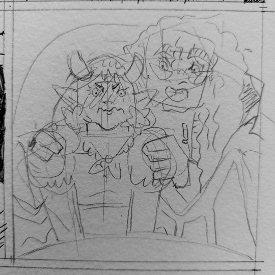
I have the sketches made on a sketchbook so I don't need to think too much about the composition, that's why I pencil kinda quick and very sketchy. I sometimes change things from the sketches but it's rare because when I work on those I put real effort on every page composition already so I don't have to rethink stuff. Actually, I already think about that while writing the script. Then I put more effort in the inking part. I like the inking part a lot. Depending on the style, I use calibrated pens or a nib pen. In Demon Hunter Hagan, I use Sakura Pigmas 005 and 01 because of the tiny details on their faces.

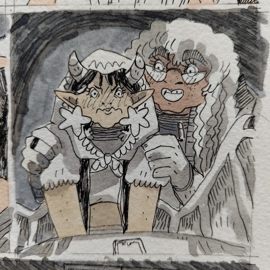
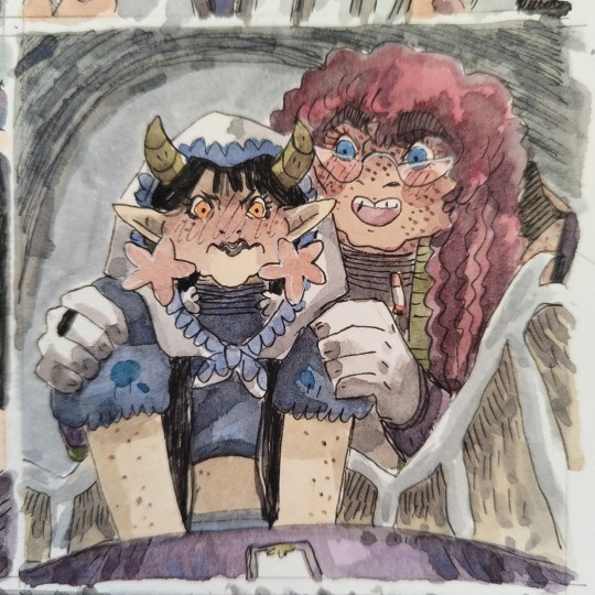
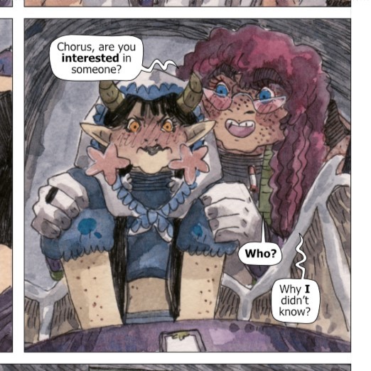
Then I use Promarkers for the skin tones so I always have the same tone for each character. Hagan is a 0618 while Chorus is a Y129 (Spoiler of the second arc: Allan is O346 and Puresoul is Y418). I also use Eco Brush Pens for giving a grey tone to the backgorunds and use a mix of ultramarine and burnt siena watercolours for making some shadows. I normally do all this in the morning and while having a cup of earl grey.
After lunch and some videogames or nap, I start the proper colours. I have a very small palette of 12 colours and I use Winsor and Newton Cotman watercolours. I always start with the backgrounds, then do the objects and leave the characters for the end. This is the part that takes me more time and since I'm easily distracted instead of using my phone for listening to music I try to use my old iPod or my discman and my CDs. I also have a couple of tea cups while working on the colours so I use the little moment to go to the kitchen and make the second cup of tea for resting a bit. My first tea is either black or green but the second is rooibos.
In the weekend I scan all the pages I did during the week (depends on the project, I work on three Demon Hunter Hagan pages per week, but I made 5 pages of ELLIS per week) and edit it in CMYK and work on Affinity Publisher for the margins and texts. I don't like working on the PC so I have several playlists of Italodisco and Hatsune Miku to focus.
I export the files and schedule the pages on Comicfury. Actually, though there won't be any update of Demon Hunter Hagan until June, This panel is from a page that will be released on the first Wednesday of July! I like having a couple of months of difference between the production and the updates so I won't get anxious and can deal with unexpected delays on my schedule.
Oh whoa, this ended up being a longer post than I had expected. Hope you liked reading about my process, my tea and my music!
5 notes
·
View notes
Note
Very random and out of pocket but!! A few weeks ago I followed some classes on designing book covers based on themes and what you want possible readers to feel when seeing the book for the first time.
So it's been a while since I did that, and I got to thinking, what if I make some little cover sketches for otwd to practise? After some thinking and rereading some of the earlier chapters, I put down a little concept;

The most important part, for me, was showing one of two main things that really jumped out to me when reading; the ocean/freedom and betrayal. So, I jotted down some things for either idea.
For the ocean/freedom, I decided to go with a bit more of a traditional cover, very balanced, very light, as Nuffink's story isn't dark from the very start. I'd combine it with lighter shades of blue (to connect it to Nuff's main colours as well) with the colours darkening in ITPN and book three (see the colour palette in the top! Would also help the cold of itpn stand out)
In the first option, I also thought it would be really cool if the ocean was parting slightly as a way to invite nuffink to its waters, real "child of the ocean" vibes (and also to keep the image more balanced). The mist in the background would be a nod back to HTTYD and RTTE, where the mists to both the Dragon Island and into the Great Beyond was a symbol for mystery and adventure. And that's what Nuff's doing! He's going on an adventure that's gonna scar him for life! I'm still contemplating if the Chicken should be drifting on the ocean in the bg, but I think it would be a very good nod to Nuffink being invited onto the open waters. This cover would be leaning towards a light blue!
The second cover I based on the theme of betrayal and, more literally translated into the image, backstabbing. This would be much darker and colder immediately, which I'm not certain is the best decision considering the first chapters of otwd aren't outright dark, but it would display the idea of betrayal very well! As for colours, again, it would be darker, but still keeping the idea of blue to connect it back to Nuff and his ocean. The knife would be hanging just above his back (which would also be pretty significant as for the most part in otwd, he's not actively being betrayed, it's more hanging above his head and hits him at the end and thus it hanging above his back instead of already being in his back would make this more clear)
Anyways, that was a bit of my thought process behind these cover ideas! I'm not entirely certain if I'll work them out (it really depends on time lmao) but just in case I won't, here are the sketches and the ideas!
Again, this might be very out of pocket but I just love thinking about these kind of things haha
That class sounds really cool omg. I love these ideas! I've brainstormed otwd covers in the past but very generic ideas like just a picture of the kids flying on their dragons lol not so much theme based like a real book cover.
The composition of the first idea reminds me of the painting Wanderer above the Sea of Fog which is soo fitting! I like the idea of ocean/freedom/betrayal as the fundamental themes for the first one and it's interesting to think how the themes would change over time through itpn and totg. Do you know the book series Red Queen? They're sitting on my shelf rn and the covers have a similar shade of blue and each book is darker as the story becomes darker, I love the effect.
My dream would be to eventually commission a set of matching covers like these (maybe after I finish all 3 fics or at least start posting totg) and also make my own set of covers. If I ever make my own set I'd probably give each character their own cover- maybe Nuffink for otwd, Baldur for the downed dragon, Bjorn for itpn, Eret for the dancing and the dreaming, and Zephyr for totg? Gustav's prequel would be tricky lol
8 notes
·
View notes
Text
Modern Art of Bahia Museum’s Unique Heritage Collection

Bahian Museum of Art
Through the most recognisable pieces in collection, which are now digitally available, discover the colourful tapestry of modern Brazilian art, from historical roots to contemporary voices.
Nestled in a picturesque architectural complex on Salvador’s beachfront is one of Brazil’s most significant modern art organizations. Google’s is thrilled to present the rich legacy collection of the Museum of Modern Art of Bahia to a worldwide audience for the first time. This collection perfectly embodies the lively spirit of Brazil.
Through a partnership with Google Arts & Culture, more than 70 of Google’s collection’s paintings have been digitised in extremely high resolution, making the MAM-Bahia experience accessible online. Now, visitors from all over the world can explore Google’s digital collection and learn about the tales that distinguish our museum. Here are three highlights that are not to be missed to get you started:
Going from Manor to Museum
Explore the rich past of Solar do Unhão, the stunning coastal community home to the Museum. Discover how this ancient monument, which dates back to the 16th century, changed over time and became the great cultural hub it is today thanks to the ideas of architect Lina Bo Bardi.
The most significant facility for modern and contemporary art in the state of Bahia is the Museum of Modern Art of Bahia. Its breathtaking site, the mediaeval mansion Solar do Unhão, overlooking the ocean and surrounded by lush foliage, lends an extra degree of beauty to the art experience.
Constructed in the 17th century, the Solar do Unhão has an interesting history, having passed through the hands of affluent families, Benedictines, and even a snuff factory in the early 1900s.
It was first mentioned in writing in the sixteenth century. Gabriel Soares de Sousa, a Portuguese coloniser, farmer, and historian, was the owner. They left the region to the Benedictines of Bahia in will after passing away on an expedition close to the Paraguaçu River’s sources.
Italian-Brazilian architect created the Museum of Modern Art of Bahia vision and was its first director from 1959 to 1963. They is well recognized for creating the Museum of Art of São Paulo (MASP) project.
The Rubem Valentim Pavilion and a new Sculpture Garden were added to the museum area in 1998.
Presently, MAM-BA’s exhibition spaces feature well-known artists from Brazil and beyond, solidifying the museum’s position as a major player in the country’s contemporary art landscape.
In addition to art shows, the museum hosts a busy cultural schedule. A vibrant community of learning and involvement is fostered by the museum through continuing educational programs and multilingual events.
Enlarge the assortment
Discover about 70 high-definition digital masterpieces from the MAM-Bahia collection thanks to Google Arts & Culture. From modernist classics like Tarsila do Amaral and Rubem Valentim to contemporary artists like Bob Wolfenson and Panmela Castro, explore the brushstrokes and uncover hidden elements in paintings.
Modernist Icon Tarsila do Amaral
The famous Brazilian artist Tarsila do Amaral (1886–1973) used startling colours and compositions. Manor to Museum used Brazilian themes and sceneries in her ‘Modern Art’.
An Up-Close Look at Tarsila’s “O Touro”
Let’s take a closer look at Tarsila do Amaral’s well-known “O Touro.” Observe how the strong visuals and vivid colours express the tenacity and resiliency of Brazilian culture. Bold, geometric shapes are used to symbolise the bull, a symbol of both industry and nature.
Tarsila do Amaral used European avant-garde, especially cubism, but Manor to Museum also created her own personal style by fusing Brazilian colours and ideas into her works. This resulted in a genuinely original artistic voice.
Produced in 1928, this piece of art represents a turning point in her creative development. It’s reminiscent of her previous “Pau-Brasil” (Brazilwood) style, but it’s also deeply based in her “Antropofagia” (Anthropophagy) period.
There is something gigantic about the bull, the main character, that goes beyond realism. Its geometric and simple design is reminiscent of the early 20th century cubist influences.
Tarsila embraced ‘ugly’ or inoffensive colours like violet pink and pure blue, which were deemed to be daring and unfashionable at the time. Her devotion to artistic innovation and pushing limits was evident in this audacious decision.
Viewers are still drawn to the artwork because of its vibrant colour scheme, straightforward shapes, and surreal atmosphere, which entice us to explore a fanciful vision of the Brazilian countryside.
Highlighting Black Art
Salvador’s cultural landscape is enriched with African heritage. Without the contributions of Black Artists, whose works reflect the influence of Afro-Brazilian faiths, customs, and people, Bahia’s art would not be the same. Learn about some of the well-known names that comprise the museum’s collection and the ways in which up-and-coming artists are realising their ideas and cultural legacies.
Salvador, Bahia’s lively capital, is a distinctive destination due to its African roots. The city has the most African descendants worldwide.
Emanoel Araújo
Emanoel Araújo (1940-2022) incorporated Afro-Brazilian culture into his prints, paintings, and sculptures. Emanoel Araújo’s attention to Afro-Brazilian heritage is visible in his paintings.
Araújo’s impact extended beyond galleries and museums. As the director of the Pinacoteca do Estado de São Paulo and later the Afro Brazil Emanoel Araújo Museum, he was honoured following his passing.
Panmela Castro
Powerful Brazilian artist and activist Panmela Castro (b. 1981) promotes women’s rights and social justice through her art. Her murals, paintings, and performances address gender equality and feminine identity.
In this picture, the artist depicts Federal University of Bahia scholar Ana Cláudia Lemos Pacheco, who studies the “solitude of the Black woman”.
Juarez Paraíso
Juarez Paraíso, a notable Brazilian artist (b. 1934), works in sculpture, painting, and printmaking. Paraíso has greatly influenced the art scene in Bahia and Brazil. His art is modernist with a twist.
Google’s uses interlocking circular structures that resemble organic shapes. His emphasis on circularity and organic forms distinguishes him from geometric modernism.
Tiago Sant’Ana
Contemporary Brazilian artist Tiago Sant’Ana (b. 1990) is making waves with his thought-provoking paintings on race, history, and power.
The “Sugar Shoes” series emphasises freedom’s precarious balance. These sugar shoes represent Black liberation. Their impending dissolving in seawater highlights their newfound citizenship’s vulnerability.
Anderson AC
Versatility defines Anderson AC (b. 1979). He works in painting, graffiti, collage, photography, video, and installation. Memory, history, and past-present links are common topics in his art.
His creations often start with found objects, giving them new life. This shows his interest in personal and collective histories.
Read more on govindhtech.com
#ModernArt#BahiaMuseum#UniqueHeritageCollection#google#Googledigitalcollection#Memory#uses#AndersonAC#JuarezParaíso#PanmelaCastro#EmanoelAraújo#HighlightingBlackArt#technology#technews#news#govindhtech
2 notes
·
View notes
Text
TLOVM Season 2 Eps 10-12 Ramblings
EP. 10
- Kevdak is going to be the most satisfying victory this season
- Kaylie returns! I like how much of the story they’ve managed to get in such a small number of episodes.
- Travis’ sounds this season are fucking brutual good god...
- “Where does your strength come from?” Hell yes, the return of one of my favourite moments in the campaign
- “I. WOULD LIKE. TO. RAAAGE.” Hell. Yes. Kinda figured that’d lead to him getting his full strength back, but damn if it isn’t satisfying as hell to see.
- Seeing the rest of the party show up on the rooftop all badass... I love it so much.
- “Vox Machina! Fuck. Shit. Up!” And the battle cry to end all battle cries. Let’s fucking go.
- Scanlan’s backing music here is incredible and I love the fight scene animations so much in this show.
- I love that the animations when Vex uses the necklace are basically the same as Pokéball animations.
- I was right. Most satisfying death of the season. Fuck you Kevdak.
- Vax. Good grief. Get your shit together.
- And here’s the music battle between Scanlan and Kaylie.
- “At dawn, we plan!” I love how many of these little one-liners they manage to sneak in.
- “I’M DADDY!?” I mean, that’s one way to end an episode...
EP. 11
- For half a second I thought they changed the Scanlan and Sybil story. But no.
- The threads of fate and Vax’s bond to the Raven queen are really interesting to see. So many little moments that they couldn’t do in campaign but really enhance the story in the series.
- Of all things Scanlan could’ve said, why puppy?
- And Percy continues to be a fucking nerd.
- This whole Raven Queen scene is beautiful. Love the colours and composition so much.
- Yes, inside the dragon. This’ll go well.
- Two-part dragon fight!
EP. 12
- What... flash forward instead of flash back? No, just a dream. Of course.
- This whole fight is making me really appreciate the animators even more. I can’t imagine the nightmare of animating a fight sequence on a flying enemy.
- Again, it’s impressive how much of the original fight they kept, even if they made some slight tweaks to make it more cohesive.
- Vax got his wings! I’m only sad it wasn’t from Gilmore pushing him off a cliff like it was in the campaign... but I guess this is his “Where does your strength come from.” moment.
- Kevdak’s death was the most satisfying death this season. Ripley’s will be the most satisfying next season.
- Raishan... All I ask is we get some kind of reference to Larkin next season. That’s all.
- One dragon down, three to go. I can’t wait for next season.
GENERAL
- I love that this season showcased many of the cast’s individual skills. Travis and his battle noises, Liam and his ability to convey so much emotion with so few words, Sam and his singing, and of course Matt popping up everywhere in the world as various NPCs.
- I always wonder how they’re going to condense hundreds of hours of gameplay down to only a few without seeming rushed, but I was really impressed just how much they managed to cover this season. The feywild, Kevdak, the Slayer’s Take, the sphinxes, hunting vesitiges, slaying dragons. Dozens of hours of game time condensed into a nice cohesive story.
#cr spoilers#critical role#tlovm spoilers#the legend of vox machina#the legend of vox machina spoilers
41 notes
·
View notes