#the color palette doesn’t go any darker
Explore tagged Tumblr posts
Visit Tumblr Blog
Explore Tumblr blogs with no restrictions, modern design and the best experience.
Last Seen Tumblr Blogs


Fun Fact
Tumblr is available in 18 languages.
Note
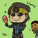
Do you think you’d be able to show how to recreate Lottie’s makeup look when she’s taking her medicine with orange juice at the dinner table in the pilot?
Sure, and I also used the plane scene as reference too.


I lost some of the nuance with the colors when scanning the photo but this is how I would recreate the makeup look:

Lips:
Whatever Lottie is wearing on her lips isn’t too matte but has a slight shine. It also doesn’t seem too dark and is a good color match on her. So, I think a tinted lip balm would be the best way to get a similar look.
Color wise look for a mauve pink or even a slightly berry color.
If the lip product you use has too much shine or pigment you can blot your lips with a tissue to dull down the sheen/color.
Blush:
Lottie looks to be wearing a pink blush on the apples of her cheeks though it’s a pretty subtle color.
If your blush is really pigmented I would avoid going on too heavy with it so it’d look more natural.


Eyeshadow:
A. Start with a dark pink shade (like #1 on the palette above) and put that all over your lid (inner, middle, and outer lids on the chart).
B. Use a a lighter pink shade like #2 in your “Above Crease” to blend out shade #1.
C. Depending on your hair color you might want a lighter or darker shade of brown but from what I can tell, Lottie wears a color similar to #3. Concentrate the color in the outer lower lash line but blend it lightly into the inner lower lash line as well.
If your under eye gets too smoky you can use a q tip and makeup remover to clean it up.
D. Take shade #3 and concentrate the color on your outer lid close to the top lash line. The darkest part being the very outer corner.
Hopefully this is helpful! If you have any other questions or need me to clarify anything feel free to ask!
23 notes
·
View notes
Text
One whole person asked about the Invincible suit design variants I did (a while ago, my bad fam) so FINALLY! WORD VOMIT ABOUT THE DESIGNS below!!! >:D


Coherency is for losers but for my own sanity, I’ll probably go suit by suit, which is going to be repetitive asf, since there’s recurring elements, purposefully so, but I will make my thoughts someone else’s problem istg, so before I begin I wanna clarify!
One! Mark and Nolan’s og designs are incredible and I won’t stand for any slander. Their suits work in such incredible contrast. The usage of primary colors for Mark, sans red, makes it so any red stands out against him, thereby suggesting how ill-fitting blood suits him, when it draws your eye so quickly! On the other hand, Nolan’s white (Viltrum color), and red suggest red, ergo blood, fits him, because when his hands are already covered in red, it’s hard to distinguish if the blood’s even there, because he already looks bloody, because violence suits him. Like the color usage + the line for the “O” to match Viltrum? Iconic. They ate this the fuck up.
Now, I’d rather watch paint dry than see Mark in his new blue-black suit a second longer, because it’s so horribly boring. And before you say a damn thing, I know the purpose of the suit, I’ve said it before, it is a visual representation of his darker era with literal darker color scheme, the removal of bright yellow (like his casual outfits s2 onward), represent the loss of joy, and this continues as he suffers, and his outlook on heroism is soured by Nolan’s actions, plus, he is literally beaten black and blue often. It’s a literal reversal of Nolan’s red-white, even. I KNOW. It’s still so boring because the COLOR works but the DESIGN doesn’t. So it just feels palette swapped. The only meaningful change is shorter boots, AND THAT’S IT? BLASPHEMY.
Hence the suits. First batch sports the yellow-black-blue, explorations to keep the color scheme, but to keep the message about ruined joy, the colors are dulled!


Now, first primarily focuses on incorporating elements from Conquest’s design, because his suit has a variation on the Viltrumite uniform. The double lined belt, the bit of pants cuffed by the low boots, are slapped onto Mark’s suit, here, while general, simplified shaped of Conquest’s robot arm (half circle, then straight line), are added to Mark’s gloves, as well as a chunky/puff cuff to the wrist to, again, give an attempt homage to Conquest’s arm. If you notice, Conquest’s robotic arm, when it meets his uniform, is half circle and straight line, but Mark has a bottom half circle, then line, because, again, homage. An extra emphasis on black because, y’know, darker era, with both the Viltrumite classic line cutting through Mark’s yellow, with black mask. Generally, I’m trying to keep the eye drifting up, but it’s an attempt while balancing the colors.
Second suit (is me fucking around lol), again, explorations by shifting the colors to minimize yellow as Mark’s joy shrinks but hasn’t died yet, with an emphasis on the black and blue. Double lines around the neck portion, Conquest has two lines around his upper arm instead of the standard one, and generally speaking, if you see double lines that’s what I’m trying to pull from. Plus, around the hip are stripes of blue with a shape vaguely mimicking the shapes around Viltrum/Nolan’s waist but vertically, not horizontally. And again, Conquest belt, but Viltrumite geometric shape, with a higher end at the slides, and a slightly lower end in the middle, line-wise. Like a really flattened U, if that makes sense. Boot size to mimic Nolan’s, rather than Conquest’s shorter boots.
Third of the yellow-black-blue batch follows similarly. Muted colors, double lines around the arm to mimic Conquest, but keeping the og suit’s higher boots without the knee brace, geometric lines rather than the smooth curve because sharp edges = scary, danger whatever, line language, idk, higher gloves to balance the colors, added blue to the upper leg to shake things up.


Beautiful mutual @/ talked about the fuck would you add red to the blue-black and I took it as a personal fucking challenge, and why the og post even exists, so this me figuring that color scheme and I DID IT. Hence, the second batch of three, blue-black-red. First of this batch has lines around the glove like Viltrum uniforms have a line around the lower arm, keeping the og suit’s fingerless look without actually being fingerless, big ol’ emphasis on red in particular while blue and black take second change. Same Conquest homage belt, og suit high boots, sharper shapes rather than smooth curve, with added dark blue around the upper arms as homage to Conquests’ lines around the upper arms.
Second of the second batch looks color to Nolan here with tiny adjustments; red is an inkling not the focus, while a soft baby blue takes center stage, ‘cause Mark is darker yeah, but he’s still soft, he’s still Mark. Forgot to mention all fingers in this batch are red because of Nolan, and the visual idea of them all have blood stained hands, much like how Nolan’s gloves are red! A little red on the boots to keep the color more of an accent, and a red line on the upper chest/neck as another Nolan homage!
Third of the second batch has way more red, an emphasis of violence, as the gloves are just as red and longer, being short of the elbow this time around. Pale blue-grey is the smallest color used now, but a sharper version of Mark’s og knee pads are included! Sharper, because it’s hard edges and not smooth, circular Mark wore initially. The red bleeding into Mark’s shoulder and a bit of the chest instead of switching to blue farther up, mimicked Mark’s original suit as well. That’s where Mark’s og suit had blue dipped in the shoulder of chest!
LAST one!!!! Entirely blue and black. Ran outta steam to finish anymore, and was itching to post, so the last batch has the only one suit. Only suit with a cape, which is black/dark on the side despite having blue on the outside, intentionally. Not only does he wear a cape like Nolan does, but the darker inside is supposed to emphasize a darker heart, like whatever the fuck that demon said at the end of s3. This suit keeps Mark’s canonical second suit (black, blue) glove but they’re not fingerless anymore but completely covered. The squarish shape to flat line that Nolan has around his waist (where red needs white there), is mimicked on a very minor scale around Mark’s own waist/blue around his chest, where it meets the darker grey.
And that’s all of them! :)
#real's rambles#invincible rotating in my mind#the brainrotsreal's art tag ✧˖°:*♡#invincible fanart#THANK YOU TO THE PERSONS ASKING ABOUT THEM I THOUGHT SO DEEPLY ABOUT THESE#used all my power... for invincible suits LMAO#but in all seriousness i seriously hate the design of the suit but love the colors#its so BORINGGGGGGGG DESIGN WISE LIKE WHYYY
19 notes
·
View notes
Text
Chapter 34: A Hidden Cave
The Sun, the Moon, and All Our Stars

Summary and Details…
Chapter Background and Summary: Sebastian and Kate are on an adventurous camping trip in the Scottish Highlands. Their first two days were leisurely, but now that their third day has begun, they're getting higher into the mountains and closer to the places they want to explore. In this chapter, the two lovers discover a cave hidden behind a large waterfall that does not appear on any map.
Pairing: 25-year-old, post-Azkaban Sebastian Sallow x Kate Mayflower (my OC)
Content warnings: In general, this story is rated 18+, so MNDI. For this particular chapter, there are no content warnings.
The full chapter is available below the cut; it can also be found on AO3 (link is posted below). Please leave some feedback. A comment, like, or Kudos would be quite motivational. 🥰
Chapter 34: A Hidden Cave
Sitting on a large rock, Sebastian unfolds his map. As she patiently waits, Kate observes her boyfriend silently studying the route.
Being dressed for action and adventure feels so foreign to her. She had to pay a visit to Augustus Hill at Gladrags prior to the trip to acquire outfits suited to hiking and exploration per Sebastian’s strong suggestion. She could still hear his words in her head: “Dresses are completely unsuitable for the trip.” Trousers are not Kate’s favorite clothing item by any means, but she had to admit, now that they were truly trekking up mountains over rocky terrain, that they are the most sensible. Accompanied by boots, a sweater with two additional layers, gloves, and a cape, Kate wears a darker color palette than usual - browns with varying degrees of gray.
Sebastian appears dashing and completely in his element, clad in a jacket and trousers in off-white, with a vest and cape in dark green, and boots, a necktie, and belt in shades of brown. His chocolate eyes are trained on the map, then glance at their current surroundings.
“We should still have a couple more hours until we reach the first cave,” he explains, perplexed. “There is nothing like this marked on the map. It’s strange.”
Kate, though surprised, can’t help but marvel at the gorgeous waterfall along their path. “Then it’s a lovely surprise, wouldn’t you say?”
Sebastian’s eyes narrow as he stands up, examining the waterfall. “It is rather pretty, but this map should account for almost everything we should see along the way. The thing is - we are going in the right direction… I just can’t make sense of it.”
Kate reaches out, smiling and putting her hands over his, forcing him to fold up the map. “Do we need an explanation for something so beautiful? Perhaps we should simply enjoy it as it is.”
Sebastian sighs, the tension visibly disappearing from his posture. “I suppose you’re right.”
He pockets the map, then puts an arm around Kate’s waist as they both admire the sight. She leans her head between his arm and chest, taking in every little detail.
A moment later, she gasps. “Sebastian… look! Look behind the waterfall! Do you see it?”
Sebastian focuses, staring. There is a tiny path leading towards the waterfall, which doesn’t seem all that interesting until he notices an opening - a cave entrance - behind it. “Was that there the entire time? I swear, I didn’t notice it until just now. How odd.”
“I don’t know,” Kate replies honestly. “Likewise. I only just saw it…”
They turn to look at each other, rather intrigued.
“Sebastian, if this was not on the map, it could mean that no one knows this is here,” she deduces.
“Yes, you’re right,” Sebastian agrees, intrigued. “Who knows what could be inside? Perhaps we are the first to find it in centuries…”
Kate raises her eyebrows. “There would only be one way to find out… Should we go inside?”
Sebastian pauses, running through hypothetical situations they might find themselves in. “Unmarked destinations can pose danger. If no one has been here for years and years, there could be a high reward if someone used it as a hiding place for treasure. But, I’ll admit - situations like this are high-risk.”
Kate nods. “I know nothing about this, but I trust your judgment, Bash.”
“High risk, high reward…” he muses, then puts his hands on Kate’s shoulders, making certain that she is listening to him carefully. “There could be traps. Curses. Spiders. I mean, truly, who knows.” He studies her face. “My love, I don’t want you to take this the wrong way, but I’m not sure you’re ready for something like this. This is only your first time exploring…”
She cuts him off. “But you said that the castle we’ll explore has been abandoned for centuries, too. Why is that any different?”
Sebastian considers her reasoning. “I… I understand what you’re thinking. It’s just that caves have a more… wild and untamed nature than something man-made like a castle. Anything could be waiting in the dark for us.”
Kate smiles, pulling out her wand. “Then let’s use Lumos.” She pokes him with the wand. “My moon, this is why we’re out here, isn’t it? To have an adventure together? Come on, let’s check it out. If you’re with me, I know I’m safe.”
The worry on his face begins to fade. “Yes, that’s true… Well, if you’re this enthusiastic, I suppose we could have a look around.” He takes her hand, kissing it, then speaks in a serious tone. “Just promise me… if I tell you to do something, you’ll do it.”
“You’re not the boss of me, Sebastian Sallow,” she playfully retorts, already beginning to wander onto the narrow path that leads to the cave.
“Kate - wait! You need to be more careful. It’ll be slippery,” he warns.
Just as he finishes speaking, she loses her footing with a little shriek. She almost topples over but catches herself in time. It all happens so quickly that Sebastian can do little more than reach out. She flattens herself against the rocky wall, her eyes wide as she stares at the steep drop leading to a pool of water far, far below. Her heartbeat drums in her ears.
“Are you okay?!” Sebastian asks, gingerly making his way towards her.
“Yes,” she responds breathlessly.
“This is exactly what I meant when I said you need to listen to me,” he continued, his own heart rate speeding. “Merlin, you scared me.”
“I’m sorry.” She observes him carefully. “I know you have more experience. I guess I was just excited to try something new.”
“It’s fine. It’s fine,” Sebastian repeats. “Come here.”
Kate shuffles back towards him, much more cautious now. Her boyfriend opens his arms and takes her into his embrace.
“I don’t want to have any chance of losing you,” he whispers, kissing the top of her head.
“You won’t. I promise - you won’t.”
“I’ll protect you as best I can,” he murmurs against her hair. “My sun.”
“And I’ll do the same,” Kate tells him. “I’ll protect you, too, my moon.”
Sebastian laughs heartily. “Oh, Kate, my love. I don’t think I’m in any need of that. Remember, I’m the experienced one here.”
She smiles. “Yes, you are. But even so…” Glancing back towards the cave, she asks, “Are you sure we should do this? I’m having some doubts now.”
“It will be fine,” he answers after a moment. “We will be fine.”
As the light slowly disappears behind them, Kate holds on to Sebastian’s arm. His eyes dart around, trying to get a sense of what the cave might be like. She can’t explain it, but she feels a sense of exhilaration along with a sense of dread. Every step forward, the sensation increases. Neither of them speak. The two listen intently for any sounds that might indicate danger, but it is eerily silent and has been since they entered the cave, despite the rushing waterfall outside.
Without warning, both of them fall over, tripping over something that feels like overgrown tree roots. Kate squeaks in surprise and then becomes more alarmed as she feels tendrils moving around her, wrapping around her legs and torso. She is separated from Sebastian, who is dragged in the opposite direction.
“Bash!” Kate shrieks, terrified as she is carried towards a wall, the tendrils growing tighter as she squirms.
“Lumos!” Sebastian bellows with his wand outstretched, bathing the area in light.
Kate gasps in realization the moment she sees the source. “Devil’s snare!”
“Lumos maxima!” he calls out.
The plant drops him immediately, shrinking away from the illumination. Sebastian stands up quickly, rushing over to Kate with his wand held out towards the Devil’s Snare. It relaxes its grip around her until she is able to stand on her own two feet.
She reaches out for him, trying to feel secure with a hug, but he shakes his head. “We need to move past this area - it’s not safe.”
Sebastian pulls her forward with haste, turning back to see the Devil’s Snare stretching back out across the cave floor as the light from his wand gets further and further away.
“I should have known it was Devil’s Snare,” Kate whispers, shaking her head in remorse. “My papa would have been so disappointed to see me scrambling like that. I… I didn’t have a clear head.”
“It’s alright. Just keep your wits about you,” Sebastian requests. “We may run into more surprises soon enough.”
After walking about ten more minutes, Sebastian affirms Kate’s feelings by sharing his own. “Something about this cave is strange. I don’t like it. I have half a mind to turn back. It just doesn’t feel right.”
“I have an odd feeling, too. It’s like I feel… thrilled… but also terrified.”
“Maybe we should leave-”
“Sebastian!” Kate shouts, cutting him off. “Wow! Do you see?!”
He squints and then his eyes land upon what his girlfriend has spotted. From right where they stand, the cave walls are suddenly growing with life - and glowing. Lined with green vines and leaves along with huge, exotic flowers, it seems like a little paradise within the darkness. The area is lit up by bioluminescent mushrooms. Common blue butterflies flit about, not at all afraid of the humans walking amongst them.
“I don’t understand… I didn’t think anything like this could grow without sunlight,” Kate muses, astonished. She reaches out to touch a yellow and pink hibiscus flower, her fingertips caressing the silky, soft petals. Her eyebrows raise when she realizes that all of the plant life feels as cold as ice, yet unfrozen. “My papa would be fascinated.”
“No, none of it could grow without light,” Sebastian replies. “This makes no sense.”
“But it is real, Bash,” Kate tells him, astonished. “Touch something. You’ll see. It isn’t an illusion…”
He reaches out to touch leaves on the vines, sharply inhaling when he feels how freezing cold they are. His eyes are wide as he contemplates how the cave could defy nature. He takes a moment to think.
“Something’s wrong here,” Sebastian finally concludes in a serious and urgent tone. “We need to leave. It isn’t right. It isn’t natural.”
A group of butterflies rushes in front of Kate. She gasps. “Sebastian, even more butterflies!”
They fly further into the cave with Kate eagerly following. Sebastian trails after her. “Kate…” he warns.
She completely ignores him, transfixed by the display. Deeper and deeper she travels, driven by the instinct to follow the butterflies to beautiful treasure, just like she had in the forest. As nervous as Sebastian feels, his feet move forward. Something within him is bidding him to continue on, to follow his lover…
The path within the cave eventually ends, circling around a lowered pit. The butterflies flutter down below, where Kate and Sebastian cannot follow.
From the corner of Kate’s eye, something dark flies, almost hovering up above. Not able to see much in the darkness, she ignores it, figuring it must be a bat. It certainly isn’t the butterflies; now at the bottom of the pit, they all fly in a wild circle, stuck in an endless loop, until they disappear into thin air.
The pit dimly lights up. They are no longer observing a dark and empty pit but a bookstore within the cave.
#hogwarts legacy fanfic#hogwarts legacy sebastian#sebastian sallow x oc#post azkaban sebastian#hufflepuff x slytherin#aged up sebastian sallow#hogwarts legacy oc#hl oc#hl sebastian#hogwarts legacy romance
18 notes
·
View notes
Text
Something to help understand/interpret my art, also lore dump (if you care):
Mae and Sage both are my sonas, Mae is my MAIN sona, she’s literally ME, and Sage represents an ASPECT of me.
Mae uses She/her pronouns and Sage uses He/him, they are both non-binary characters that represent different aspects of my gender experience. Mae represents the more physical gender experiences Ive had, and Sage represents more so what my gender is. (This is sort of hard to explain, Mae represents the experiences I’ve had in relation to my physical body that I was born with, and the experiences I’ve had in society and how society has interpreted me and my gender. She’s still accurate to my gender, but her design is more surface level and obvious. Sage on the other had, represents my gender experience at its CORE, and how I actually feel as an individual, despite my body. I feel like I am simply experiencing a feminine experience in some ways because of my body and how society sees me, but I don’t feel like who I am at my core can be put into any box, hence me being non-binary. I feel very much like I’m sort of playing a game and this is just the avatar I have, and that who I am is neither male nor female. I just happen to have more experiences in one regard because of how I was born. Sage is the aspect that cannot be boxed. He is both masculine and feminine, and also neither male or female. He’s just SAGE.) (this is also extremely personal to MY OWN gender experience so if you don’t relate to this don’t think to hard about it, this is literally how I interpret my own identity, it probably doesn’t make any sense to anyone else)
Back to Mae representing my more physical life experience, she carries a lot of my trauma and bad experiences. She represents every part of me that has ever been hurt.
Sage represents a part of me that is less in the earthly experience. If you know what a “higher self” is, that’s basically what Sage is in relation to Mae. He is an aspect of me, and therefore an aspect of Mae, they’re part of the same character. He acts as a sort of “guardian angel” who loves Mae more than anything and he would literally go any length for her. Representative of the innate love that I feel like everyone has for themself until society fucks us over and makes us hate ourselves.
Sage and Mae are NOT romantic towards each other (any art drawn of that is non-canon, sometimes I’m bored) , they are more like a queer-platonic relationship. I wouldn’t say they’re “just friends” because their lore and story and relationship is pretty complex and doesn’t fit that box for me.
Sage is an angel in canon, that takes a physical form which is the form I always draw, I’m working on drawing his true form for lore but I’m still designing it.
Sage is an angel of healing, which is why he’s so tender and gentle towards Mae and in general such a honey.
Sage is an angel of healing, and represents the higher self, but he also represents the shadow self (if you don’t know what that is, google is your friend). He carries the pain and trauma from Mae indirectly. This is why he has a darker color palette, since he represents Mae’s shadow (I actually am contemplating a few other alternate palettes for him , a crème color palette as well a blue one, as I work through the lore I’ll decide when those apply). He is NOT a dark angel or an evil angel. His character is multifaceted and complex, and his color palette just represents what I just explained. There are evil angels in my oc lore universe but their color palette doesn’t represent that bc I think that concept is overused, also I like being ironic. Sage having a darker palette is again, linked to his relation to Mae and the trauma he carries from her.
Even though Sage is small and sweet looking he is literally insanely powerful, like CRAZY strong
Sage being the shadow self, and also being so close and loving to Mae represents that our shadow self is not a part of us that is bad and needs to be pushed away, but actually a part of us that is just hurt and desperately needs love and healing.
I draw a lot of art of Mae and Sage embracing, either lovingly or during times of turmoil. I draw a lot of art of Mae being physically or mentally hurt and being comforted or embraced by Sage, Sage having different reactions situationally. A lot of the time, Mae is representing the physical effects of trauma, and Sage is the inner self mourning/crying/ suffering the trauma. Sort of like how you feel terrible for your child self for being mistreated, or how you feel bad for yourself because of the experiences you’ve had. It’s like a depiction of self pity, but also in a way, self love. It’s like holding yourself and crying for how the world has hurt you, and wishing better for yourself.
It’s symbolism✋
#I needed to write all this out and tell people because I need people to understand the deeper meaning of my art bc it’s my soul#my soul put on a canvas#but also I highkey think it’s interesting#like this is juicy stuff#but also I just want the world to know there’s a meaning behind alot of what I draw#I mean not all of it#some of it is just me goobin around#but some of it is LORE BRO#ANYWAYS#thanks for reading this if you did#hope you think I’m interesting#if not it’s whatever I’m just drawing dogs on the internet#mae rambles#oc lore#lore
25 notes
·
View notes
Text
Sega Mega Drive - Vectorman
Title: Vectorman / ベクターマン
Developer: Blue Sky Software
Publisher: Sega Europe
Release date: 30 November 1995
Catalogue No.: 1577-50
Genre: Platform Action

The first time I played Vectorman was through Sonic Gems Collection on the Game Cube. The reason I mention that is that I don't think this game saw a Japanese or Asian release physically.
The graphics are sharp and interesting, and the animation is fluid and detailed. Clearly inspired by the CG-produced graphics of Donkey Kong Country, as the game was made as an answer to that particular title, they nevertheless do a remarkable job of being a showpiece for the Mega Drive. Background animations are energetic and smooth, adding depth and a sense of life to the stages and environments. Due to the smaller color palette and more subdued colors of the Genesis, the game, thankfully, doesn’t look like a direct copy of Donkey Kong Country. The colors here are darker, more subdued—perhaps a tad melodramatic in direct opposition to the bright and cheery colors found in DKC. They may not be quite as attractive and pretty here, but at least they still look impressive and have their own feel.
Bosses are generally creative and visually impressive. The final boss and boss battle are especially impressive. And, the boss battles are somewhat less repetitive and overly predictable than those found in Donkey Kong Country.
There are a lot of creative stages that are often wildly different than the side-scrolling run-n-gun stages that permeate the bulk of the gameplay. Not that I’m against that run-n-gun gameplay, don’t assume that! I’m a huge fan of run-n-gun titles and games like Contra, Metal Slug, and Gunstar Heroes. As a matter of fact, the run-n-gun gameplay in Vectorman is extremely satisfying and a pure blast to go charging through. The creative stages involve things like bizarre pseudo-3-D overhead levels with Vectorman crawling across the ground to dodge giant fists, and another with Vectorman as a train-type vehicle trying to shoot down a giant robot hanging from beneath the tracks. The really cool part of that latter stage is that it takes place from a changing isometric overhead perspective. Several stages like this add a different flavor to the gameplay.
Control is sharp and responsive, as one would hope to find in such an action-packed title. Vectorman has a wide variety of interesting items at his disposal in the guise of transformation abilities—a gimmick no doubt related to his being made up of floating balls. He can transform into a kind of spinning top item with the ability to drill through certain floors, a type of car (or possibly motorcycle) to crash through walls, the ability to fly for a time, a swimming ability, and even an item that turns Vectorman into a bomb to open up new areas. There is also a huge variety of weaponry at your disposal including machine guns and contra-like spread guns. These are all acquired from the various TV monitors hanging all over every level.
Speaking of the monitors, there are a bunch of things in each stage to collect or destroy. There are glowing-spark type items to collect in every stage. Think of coins from Super Mario or just about any other platformer that wanted to copy Super Mario. It’s stuff to collect that adds to your score, and increasing score is one of the ways to earn extra guys, which, if you’re not using cheat codes, you’re going to need. On top of which, the game keeps track of how many monitors you destroy in each stage, which again, adds to the score at the end.
The game is loaded with action, which is of course, part of the run-n-gun formula. Platforming elements are fairly basic and not overt challenges, which is good. This keeps the focus on playing with speed and keeps the flow of the action fairly constant. The game is also rife with bombastic explosions—things that shake up the screen so much that even the information bar at the bottom seems to get in on the quaking. Despite the puny sound available in the Mega Drive thanks to this game using GEMS (the SNES/Super Famicom was the audio powerhouse of the generation - though some developers managed to make the Mega Drive sing with their custom drivers or while making use of the tried-and-tested SMPS driver), the game never-the-less features some minor voice work and some excellent blasts to accompany those screen-shattering explosions. The vibrancy of the action is such that I found myself wishing the Genesis controller had rumble abilities built into the thing.
Ample cheat codes are present buried within the title, if should you dare to use them. The cheat codes are great for those of us without the skill or time to hassle with the game’s overall hefty difficulty. However, the game is not without its reward for effort: Using cheat codes automatically prevents the gamer from reaching the “good” ending to the game.
On top of this, there are three difficulty levels, and some other stuff to play around with in the options menu, such as music and sound effects, and a controller setup.


youtube
2 notes
·
View notes
Note
Laura’s overall design is very well done. I enjoy the fact that she is on the wider set side because it relates back to her being a werewolf. The Hellsing estate is very reminiscent of the Victorian era so her dress seems like it would be something you’d see in the show. One thing I do wonder is since she is a werewolf, does she get bothered by tight clothing?
I do see the bonuses of the sleeves she has. It hides excess body hair which could be expensive to others and doesn’t look as awkward with her gloves.
Clothing that maids wore were also dependent on their status: what they did around the house, who they reported to, whether or not they appeared in front of guests.
Maid dresses don’t have any exact look for them. A lot of servants didn’t wear the exact black and white apron look unless they were facing guests. Which I doubt Laura would be doing because of her colourful personality. If she is, maybe lean more into decorating her apron with lace. Hellsing is a little more modern. In-home or maids in the city in the Victorian era had their own dresses with patterns. Darker or muted colours. Like any other woman in their class It might be nice to see Laura have some rotating outfits that show various aspects of her personality. Part of her character seems like it is learning to be gentle with others and herself. Another thing is vulnerability? It would be interesting for her to start to explore expressing herself through new ribbons in her hair, new hairstyles (maybe done by Walter like the cute father figure he is). She has had some run ins with being some ladies mysterious wolf mistresses. It might be funny and a little interesting if she wore any gifts she got from her girlfriends or even items she stole from the guys. Like how serial killers take trophies
Biggest thing I would want to see more if is her personality showing more through her design, unless you are more telling of a story of a werewolf that has a similar loyalty to the Hellsing family as Alucard does.
I like the idea of Integra complimenting Laura wearing her hair or having a certain colours on and so she continues to wear items of the same variety.
It depends on how modern or traditional you want to go. How you see your version of the Hellsing organization. My opinion on a design change isn’t towards the dress as much as it is to accessories.
I love Laura as she is tho so feel free to shoo this away.
By the gods are you aware how fucking helpful this ask is?? Not only the maid facts, but also all the things that could add onto and show her personality? Thank you so much. (Ranting below 👇)
I adore the idea of her keeping accessories from her previous mistresses and kills, that’s genius. Little hoarder goblin has a stash in her quarters full of random shit and trinkets she stole. Maybe wearing the suit of an unfaithful groom she ate (big talk coming from her after she fucked the bride) to wear on nice occasions.
Lace is a very interesting aspect! Especially since she is french, perhaps some traditional patterns from the 18th century. Lace is also delicate and ladylike, which adds onto her being a wolf in sheep’s clothing. And more english maid than french i’d suppose, since Integra is quite patriotic.
I also really like the detail of the loose clothing you pointed out! Laura is also claustrophobic, so that is definitely a plus on her design, as well as that reflecting her personality not being strict about rules or morality. Maybe some more rips and tears here and there to reflect her more wild nature. Colors might not be her thing… but a darker palette would be interesting.
And indeed, Laura isn’t allowed near the guests lest it’s for serving things if the staff is low. She’s already all glares and no smile, no need to spook the invitees any more than they already are by this strange grumbly woman pouring them tea.
As for her loyalty to Hellsing… it is at the same time complex and simple: dogs are loyal, and Laura likes Integra as a person and sees her as a prime example of the virtues of humanity, contributed also by the fact she’s fed and clothed while not having to hide her lycanthropy (to Hellsing at least). Normally she would despise someone like Integra, as she would see her as someone who’s as all bark and no bite; but seeing Integra be not only unafraid of her and Alucard but be commanding? That’s new.
Also, part of her character is absolutely learning to handle gentler things. She is muzzled, she can’t kill just anyone, she must stay docile, she can’t hurt herself or others. Integra has a tight eye on her, and Laura definitely isn’t used to actually being cared for, or having fellow monsters that actually understand her. That’s also why she’s loyal to Integra.
I also need to post about her backstory, it’s been months since i’ve been talking about it. But i tried to fit SO much psychology explaining in there, it’s difficult to make it compact (and i don’t want to make you guys read a whole novel).
Again, i will absolutely keep this ask in mind as i redesign her. Thank you so much for it.
#hellsing#fave#my oc#laura chastel#long post#oc posting#thank you SO much anon#this is extremely helpful#EXTREMELY helpful#i suspect you have an interest in maids anon#you are invited to rant about them in my inbox
30 notes
·
View notes
Text
How a Black Stainless Steel Sink Adds Luxury to Any Dallas Kitchen

In Dallas, kitchen design has evolved beyond function — it’s now a reflection of lifestyle, personality, and elevated taste. From upscale homes in Highland Park to sleek urban lofts in Downtown, Dallas homeowners are leaning into refined finishes, clean lines, and smart design. One feature that’s redefining modern luxury in kitchens? The black stainless steel sink.
Stylish, durable, and surprisingly versatile, the black stainless steel sink has become the go-to upgrade for Dallas homeowners who want a space that looks high-end while performing flawlessly. If you’re planning a kitchen remodel or just looking to elevate your current design, here’s why this unique sink finish is a small detail with a big impact.
The Luxury Appeal of Dark Finishes
Dark tones have long been associated with elegance, sophistication, and depth. From matte black faucets to charcoal-toned cabinets, homeowners in Dallas are embracing moody color palettes that feel modern yet timeless.
A black stainless steel sink instantly adds that luxurious aesthetic. Unlike traditional stainless steel or white porcelain, this darker finish draws the eye and adds a level of drama and contrast to the kitchen. When paired with light countertops like marble or quartz, it creates a stunning visual balance that feels custom and designer-approved.
Built to Perform — Not Just Look Good
Luxury isn’t just about appearance — it’s about experience. And the black stainless steel sink delivers. Made from heavy-duty stainless steel with an advanced black PVD coating, this sink is:
Resistant to scratches and stains
More durable than painted or powder-coated finishes
Easy to clean and maintain
Finger-print and smudge resistant
Dallas kitchens are known for heavy use — from entertaining guests to feeding large families — so choosing a sink that’s as hardworking as it is attractive is a must.
Complements High-End Appliances and Fixtures
The rise of black stainless appliances has been a game-changer in luxury kitchen design. A black stainless steel sink coordinates beautifully with black stainless refrigerators, ovens, and dishwashers — tying the whole space together with a seamless and intentional look.
Even if you’re mixing metals (another trending design move in Dallas), this sink still fits in. It works equally well alongside brushed gold, matte black, or even chrome hardware, offering flexibility and a unified aesthetic.
Elevates Any Kitchen Style
What makes a black stainless steel sink truly luxurious is its adaptability. It doesn’t matter if your Dallas kitchen leans toward:
Modern Minimalist with slab cabinets and quartz counters
Farmhouse Chic with natural wood accents and white tile
Industrial Urban with concrete finishes and steel fixtures
This sink fits right in. It offers just enough contrast to stand out, without overwhelming the design. That’s the hallmark of luxury — refinement without excess.
Easy Maintenance, Long-Term Beauty
One of the most luxurious features a kitchen can offer is simplicity — and that includes cleaning. A black stainless steel sink is incredibly easy to maintain. It doesn’t show water spots like traditional stainless steel and hides fingerprints, making it ideal for high-use areas.
Daily maintenance is minimal: a soft cloth and mild dish soap are typically all you need to keep it looking new. That means more time enjoying your kitchen, and less time maintaining it — a luxury in itself for busy Dallas homeowners.
Adds Resale Value and Buyer Appeal
Dallas’s real estate market is competitive, and high-end buyers notice details. A black stainless steel sink adds a premium touch that signals a modern, updated kitchen. It stands out in listing photos and open houses, especially when paired with matching appliances and designer finishes.
Even if you’re not planning to sell soon, this upgrade adds everyday value by enhancing both the look and functionality of your space.
Where to Find Luxury Black Stainless Steel Sinks in Dallas
At Splendor Sink, we offer a curated collection of black stainless steel sinks designed for performance and visual impact. Whether you’re doing a full kitchen remodel or looking for one standout upgrade, we’ll help you select a sink that reflects your personal style and meets your space’s demands.
With local expertise and high-end options in stock, we make it easy for Dallas homeowners to bring modern luxury into their kitchens.
Final Thoughts
A black stainless steel sink isn’t just a trend — it’s a smart investment that adds luxury, durability, and modern design to your kitchen. Whether you’re hosting a dinner party, prepping weekday meals, or just want a kitchen that makes a statement, this stylish fixture delivers in every way.
Ready to upgrade your kitchen? Explore the luxury collection at Splendor Sink and discover how the black stainless steel sink can transform your Dallas kitchen into something truly exceptional.
#black and stainless steel sink#black stainless sink#small undermount vanity sink#black stainless kitchen sink#ceramic lavatory sink Near You#granite composite sink in dallas#composite farm sink
0 notes
Text
Breaking Down the Style Code: The Office Wear Kurta Set
SECTION 1: WHY THE OFFICE WEAR KURTA SET MATTERS
Function meets fashion. That’s the driving force behind the rise of the office wear kurta set in modern professional wardrobes. While the global corporate world leans into suits, blouses, and business-casual hybrids, Indian workplaces have carved space for ethnic silhouettes that blend comfort with authority.
An office wear kurta set is not simply a piece of clothing—it’s a style strategy. It allows expression without compromising professionalism. It respects cultural roots without veering into overly traditional territory.
SECTION 2: THE CHARACTERISTICS OF AN OFFICE WEAR KURTA SET
Not all kurta sets qualify for boardrooms or business lunches. The office-appropriate versions come with certain unwritten rules:
Minimalistic Design: Subdued prints, subtle embroidery (if any), and restrained color palettes dominate the space.
Structured Silhouettes: Straight cuts, A-lines, or slight flares with defined tailoring make for clean lines.
Neutral or Muted Colors: Earth tones, soft pastels, or monochromes are preferred over flashy hues.
Comfortable Fabrics: Cotton, linen, rayon, and modal rank high for breathability, especially for long hours.
Dupatta Optionality: Often optional, a light dupatta may be included or replaced with scarves depending on the formality level of the office.
SECTION 3: WHO IT WORKS FOR
The office wear kurta set adapts well to a variety of professional roles:
Corporate Professionals: Ideal for HR executives, consultants, and team leads who need a balance of polish and ease.
Educators: Provides ease of movement while maintaining presentability.
Healthcare Administrators: Non-restrictive and clean silhouettes work well in both clinical and administrative settings.
Creative Professionals: Writers, designers, and marketers often favor its ease and opportunity for subtle self-expression.
Regardless of age, body type, or work culture, this style transcends categories and offers inclusivity.
SECTION 4: SEASONAL CONSIDERATIONS
An office wear kurta set can be thoughtfully rotated throughout the year by keeping fabric and layering in mind.
Summer:
Lightweight cotton or mulmul
Sleeveless or half-sleeved kurtas
Loose, breathable pants or palazzos
Monsoon:
Quick-dry rayon or blended cotton
Darker hues to avoid visible stains
Shorter kurtas to avoid mud splashes
Winter:
Layered sets with jackets or shrugs
Wool blends or thick cotton with lining
Dupattas that double as stoles or scarves
This level of adaptability is one of the understated strengths of the office wear kurta set.
SECTION 5: STYLE VARIANTS TO EXPLORE
Office-friendly doesn’t mean uniform. Here are structural and design variants to explore without compromising professionalism:
Mandarin Collar Kurtas: Clean, modern, and slightly androgynous, these offer a no-nonsense vibe.
High Slit Straight Kurtas: These pair well with cigarette pants for a sleek outline.
Panelled A-line Kurtas: Offer flow without looking casual; ideal for longer workdays.
Two-Tone or Blocked Sets: Create visual interest while staying within minimal design.
Kurta Sets with Pocket Details: Functionality meets fashion, perfect for carrying phones or ID cards on the go.
SECTION 6: WHAT TO PAIR WITH YOUR OFFICE WEAR KURTA SET
Pairing can enhance or mute the effect of the outfit. Here’s a breakdown of suitable additions:
Footwear: Closed-toe sandals, mojaris, or low-block heels.
Accessories: Delicate studs or thin hoops, analog watches, and minimal rings.
Bags: Medium-sized tote bags or structured handbags in neutrals.
Outerwear: Blazers for semi-formal meetings or lightweight shrugs for everyday use.
Over-accessorizing or adding overly ornate elements can quickly turn the look into something less workplace-friendly.
SECTION 7: BEYOND THE OFFICE—TRANSITIONAL POWER
One of the understated advantages of the office wear kurta set is its transitional nature. With minor tweaks, the same set can move from:
Desk to Dinner: Add bold earrings, a darker lipstick, and switch to heels.
Work to Weekend: Remove the dupatta or layer with denim for a relaxed look.
Client Meetings to Casual Fridays: Swap bottoms or add a lightweight jacket.
Its inherent flexibility eliminates the need to change outfits multiple times a day.
SECTION 8: SUSTAINABILITY AND LONGEVITY
Unlike fast fashion, a well-chosen office wear kurta set is durable and seasonless. It aligns with slow fashion principles through:
Reusability: Can be mixed and matched with other ethnic or even Western separates.
Timeless Cuts: Doesn’t rely on trends to stay relevant.
Eco-Friendly Fabrics: Organic cotton and handwoven fabrics are becoming popular in workwear collections.
Investing in a few versatile sets ensures not just wardrobe efficiency but also ethical buying choices.
SECTION 9: A BRIEF ON WHAT TO AVOID
For a professional setting, certain elements are better left out:
Heavy Embellishments: Sequins and mirror work don’t translate well under office lighting.
Bright Neons or Loud Prints: Distract from a composed presence.
Too Many Layers: Reduces comfort and may appear less polished.
Ill-Fitting Pieces: Even the most elegant fabric fails if tailoring is off.
A checklist approach can help streamline your outfit planning.
CLOSING THOUGHTS: A MODERN UNIFORM
The office wear kurta set is more than a garment—it’s a cultural reinterpretation of professional attire. It respects tradition while meeting modern needs. It’s inclusive, expressive, and adaptable to roles, seasons, and moods.
When worn thoughtfully, it projects both confidence and comfort—two essentials in any workplace. As the lines between traditional and contemporary continue to blur, this staple quietly holds its ground, proving that elegance has no dress code—but it certainly has a form.
0 notes
Text
Recolor Your Images Online with PhotoCut

Recoloring images gives life to your pictures, enhancing the beauty of images or completely transforming their appearance. If you need your photos to be vivid, you may change the color of elements or shift hues to set up a particular mood. All of this can easily be achieved through PhotoCut, which features a simple, AI-powered color changer.
It's suitable for beginners who want to test the color-changing effect in images, as well as professionals in artistic or commercial usage. Below is a guide on how to use PhotoCut’s AI color changer and how to re-color specific parts, along with other creative opportunities.
What is PhotoCut?
With PhotoCut, users can edit images in various ways using the online image editor. Its most interesting feature is the AI color changer, which lets you change the color of your images in no time by either choosing certain areas or making the entire image color changes. The features of PhotoCut, when compared to standard photo editing software, provide professional quality outcomes much quicker for work such as product photography, portraits, or creative photography. You can even create digital paintings using PhotoCut’s AI Painter.
How to Recolor Your Image with PhotoCut
Using PhotoCut’s color changer is incredibly easy and doesn’t require any advanced technical knowledge. Here’s how you can recolor your image using the platform:
Step 1: Upload Your Image
First, go to the PhotoCut website and use the image recolor tool. To upload your photo, click the "Open Image" option or just drag & drop it into the editing area. PhotoCut is compatible with all file types, including PNG, JPG, and JPEG. In seconds, your image will be prepared for modification.
Step 2: Select the Area to Recolor
You upload your picture and may decide to color the whole image or only some portions of it. PhotoCut gives you several tools for selections so that you precisely target particular areas. You may use a brush tool and paint over that portion of the image that you want to change or a lasso tool, which helps draw around objects requiring new color. The AI-powered tool allows for the automatic detection of edges and objects, so you can highlight which area you'd like to adjust.
Step 3: Choose the New Color
Choosing a new color is the next step after deciding the region you want to recolor. You may select any hue from the color palette in PhotoCut. It also offers Hue, Saturation, and Lightness options to change the color. For example, you could change the hue of an image so that it makes it appear more warm or more cold.
Step 4: Adjust the Color Settings
To have more control over the colors, PhotoCut allows you to play with the intensity of the color. You may adjust the saturation to make it brighter or less bright. Additionally, you may experiment with the color's brightness by making it look darker or lighter.
Step 5: Preview and Save Your Image
Once you're happy with the changes, preview your recolored image. If everything is good, then hit the "Download" button to save your image. PhotoCut provides an option to download the final image in any of the mentioned file formats, such as JPG or PNG, according to your requirements. Your newly recolored image is ready to go, whether it's content for social media, business, or personal projects. After downloading, you can make your photos glitchy using PhotoCut.
AI-Powered Features
PhotoCut’s AI technology makes recoloring even simpler by automating many aspects of the editing process. Some of the key AI-driven features that make recoloring easier include:
AI Color Replacer
One of the most useful applications of AI-powered PhotoCut is changing image colors rapidly. It automatically recolors on areas selected, based on your preference. This tool helps change images without much effort, especially when dealing with big or complex images. Adjusting each pixel isn't required; PhotoCut’s AI does that for you and you enjoy the professionally recolored image in seconds.
Hair Color Changer
Need to change the hair color of someone? With PhotoCut, you can use its Hair Color Changer tool for recoloring hair in portrait or group photography. So if you like the natural appearance or want something more funky such as purple or blue, the hair color changer does the task accurately. You can also get a virtual makeover using PhotoCut’s Bangs Filter.
Eye Color Changer
An important feature is the ability to have changeable eye colors, which almost all users admire, especially on fantasy or artistic portraits, where you switch eye colors as you want by any shade preferred within natural tones of the eyes toward more dramatic effects like bright green or violet.
Background Color Changer
Do you want to change the background of an image? Background Color Changer is an easy tool used to modify the backdrop of your pictures, making it appear that you've captured the photo in a different location. You may also use this tool for vibrant or moody backgrounds depending on your vision.
Why Use PhotoCut for Recoloring Your Images?
1. Easy and Fast
Recoloring with PhotoCut is incredibly quick and straightforward. The procedure takes only a few minutes, regardless of whether you want to alter a single feature or a whole image. Many of the processes are automated by AI-powered tools, allowing even novices to deliver excellent outcomes without a significant learning curve.
2. Professional Results
PhotoCut’s recoloring tools deliver professional results without the need for advanced software or complicated techniques. You have total control over the final result thanks to the fine-tuning tools and the AI's assurance that colors are applied smoothly. To create stunning images, you don't have to be a graphic designer.
3. Free to Use
PhotoCut offers free access to its recoloring features, making it an excellent option for anyone on a budget. While there are premium options for advanced features, the core recoloring functionality is available to everyone without any cost. This makes it accessible for personal projects, social media content, and small businesses alike.
4. No Software Download Required
PhotoCut's web-based functionality is one of its advantages. This implies that software installation and download are not required. Because it can be accessed from any internet-enabled device, it's ideal for mobile work.
Conclusion
PhotoCut makes it easy to recolor your images. One of the greatest tools for putting your creative ideas into practice is PhotoCut, whether you want to quickly edit your product photos, alter the color of a particular aspect, or experiment with other color schemes. Anyone wishing to recolor photos online should utilize PhotoCut because of its AI-driven features, quickness, and high-quality output.
You can even create unique emojis according to your needs using PhotoCut’s Emoji Maker.
FAQs
Q1. What is PhotoCut, and how does it help with recoloring images? Ans. PhotoCut is an online picture editing tool where users can recolor pictures very easily. This tool uses AI to automatically find areas in a picture that could be recolored, thereby saving time and effort. This platform offers some of the most powerful tools to recolor particular parts of a picture or even the whole picture, which enables you to produce professional results quite quickly.
Q2. Do I need to download any software to use PhotoCut for recoloring? Ans. No, PhotoCut is a web application. All that is required is to have access to the internet so that you may use the software and begin re-coloring the images.
Q3. Can I recolor just part of an image? Ans. You may select the areas of an image that you wish to recolor with PhotoCut, yes. You may quickly apply new colors and isolate regions you want to modify using a brush or lasso tool.
Q4. What file formats can I use with PhotoCut? Ans. JPG, JPEG, and PNG are among the common picture formats that PhotoCut supports. The most up-to-date details on the file formats that are supported may always be found on the website.
Q5. Is PhotoCut free? Ans. Yes, PhotoCut offers a free version with basic recoloring features. There may be premium features available for advanced editing or higher usage limits, but the core recoloring tools are free to use.
0 notes
Text
Top 5 Must-Have Makeup Palettes for Travel
Traveling light doesn’t mean compromising on your beauty routine. The right makeup palette can help you create multiple looks while saving space in your luggage. Whether you need a palette for eyes, face, or lips, choosing versatile, compact, and travel-friendly options will keep your makeup routine effortless and organized.
In this guide, we’ve curated the top 5 must-have makeup palettes for travel that offer high-quality pigments, long wear, and portability. Don’t forget to check out Nav Emporium for the best makeup products to keep you looking flawless on the go!

What to Look for in a Travel-Friendly Makeup Palette
Before we dive into our top picks, here are some key features to consider when choosing a makeup palette for travel:
✔ Compact & Lightweight – Avoid bulky palettes that take up space in your bag. ✔ Multi-Purpose – Opt for palettes that include eyeshadow, blush, highlighter, or contour for versatility. ✔ Durable Packaging – A sturdy case prevents makeup from breaking during transit. ✔ Long-Wearing Formula – Travel days can be long, so go for highly pigmented, long-lasting shades. ✔ Neutral & Versatile Colors – Perfect for both day and night looks without needing multiple palettes.
💡 Travel Tip: Choose a palette with a mirror for easy touch-ups on the go!
1. Urban Decay Naked3 Mini Palette
⭐ Best for Neutral Eye Looks
If you love soft, romantic tones, the Urban Decay Naked3 Mini is a perfect travel companion. This six-shade neutral palette features warm pinks and soft browns that suit all skin tones.
✔ Compact size – Fits easily in any makeup bag ✔ Highly pigmented with blendable matte & shimmer shades ✔ Long-wearing formula for all-day looks ✔ Travel-friendly packaging with a sturdy case & mirror
💡 Travel Hack: Use the darker shades as eyeliner to save space in your bag!
2. Tarte Tartelette In Bloom Eyeshadow Palette
⭐ Best for Day-to-Night Versatility
The Tartelette In Bloom Palette is a cult favorite for a reason. With 12 stunning shades, it offers a mix of matte and shimmer finishes that work for natural daytime looks or bold evening glam.
✔ Lightweight & sleek packaging ✔ Amazonian clay formula for long-lasting wear ✔ Versatile shades for multiple makeup looks ✔ Includes a mirror for easy application on the go
💡 Travel Hack: The matte brown shades double as eyebrow fillers, making this a multi-use essential!
3. Charlotte Tilbury Instant Look in a Palette
⭐ Best All-in-One Face Palette
If you’re looking for a palette that does it all, the Charlotte Tilbury Instant Look in a Palette is a must-have. This full-face palette includes eyeshadows, blush, bronzer, and highlighter, making it perfect for minimalist travelers.
✔ All-in-one face and eye makeup palette ✔ Silky, blendable powders for a natural glow ✔ Compact & travel-friendly design ✔ Universal shades suitable for all skin tones
💡 Travel Hack: Skip packing separate blush and highlighter—this palette has everything you need!
4. Natasha Denona Mini Nude Palette
⭐ Best for Minimalist Travelers
For those who prefer natural, everyday makeup, the Natasha Denona Mini Nude Palette is a perfect travel-friendly option. This five-shade palette includes warm neutrals and shimmering golds, perfect for a soft glam look.
✔ Super compact & lightweight ✔ Highly pigmented, creamy formula ✔ Perfect for simple, elegant eye makeup ✔ Long-lasting wear without creasing
💡 Travel Hack: Apply the shimmer shade as a face highlighter to maximize your makeup kit!
5. Huda Beauty Nude Obsessions Palette
⭐ Best for Bold & Versatile Looks
If you want a palette with variety and intensity, the Huda Beauty Nude Obsessions Palette is a great travel essential. Available in three different nude variations (Light, Medium, Dark), this palette offers rich, pigmented shades perfect for both soft daytime and sultry nighttime looks.
✔ Compact, travel-friendly size ✔ A mix of matte, shimmer, and metallic shades ✔ Highly blendable & long-wearing formula ✔ Versatile enough for different skin tones
💡 Travel Hack: Wet an angled brush and use the darkest shade as a smudge-proof eyeliner!
How to Pack Your Travel Makeup Kit Efficiently
Now that you’ve picked the best makeup palettes for travel, here are some extra tips to pack light while staying glam:
✔ Stick to Multi-Use Products – Choose palettes that include eyeshadow, blush, and bronzer to minimize packing. ✔ Use a Travel Makeup Bag – A compact, padded makeup bag helps protect your products from damage. ✔ Pack Mini Versions of Your Essentials – Opt for travel-size foundations, mascaras, and lip products. ✔ Avoid Glass Packaging – Glass can break easily; go for durable plastic or metal casing. ✔ Bring a Makeup Setting Spray – Helps your look last longer without needing frequent touch-ups.
💡 Pro Tip: If you’re flying, keep your liquid beauty products under 3.4 oz (100ml) to comply with TSA regulations.
Final Thoughts
The right makeup palette can save space, simplify your routine, and keep you looking flawless no matter where you go. Whether you prefer neutral tones, bold glam, or an all-in-one face palette, these top 5 travel-friendly makeup palettes will keep your beauty routine light and efficient.
For more high-quality beauty essentials, visit Nav Emporium and discover the best products to elevate your travel makeup game!
Which travel-friendly makeup palette is your favorite? Let us know in the comments!
0 notes
Text
How to Create a Cozy, Welcoming Entryway
Your entryway is the first thing people see when they enter your home, so it’s important to make it warm and inviting. Whether it’s a grand foyer or a small hallway, creating a cozy and welcoming entryway doesn’t have to be complicated. With a few simple tweaks, you can transform this often-overlooked space into a functional and beautiful part of your home.

1. Start with a Warm Color Palette
When designing a cozy entryway, the colors you choose can set the tone for the entire space. Soft, neutral hues like warm beige, light gray, or even a rich, deep blue can make your entry feel inviting. Don’t be afraid to incorporate darker shades, especially if you want a more intimate, cozy feel. A welcoming entryway doesn’t need to be overly bright, but should evoke a sense of calm as people enter your home.
2. Invest in Practical Entryway Furniture
Furniture in your entryway should serve both functional and aesthetic purposes. A bench can provide a comfy spot to sit and take off shoes, while adding a sense of coziness. If space allows, consider adding a small console table for keys, mail, or a decorative vase. If you have a larger entryway, a coat rack or even a storage chest can help keep the area tidy while also enhancing its charm.
3. Create a Welcoming First Impression with Lighting
Lighting plays a huge role in setting the mood for any room, and the entryway is no different. To create a cozy, welcoming atmosphere, consider using soft, ambient lighting. A stylish pendant light, wall sconces, or even a table lamp can add warmth and make the space feel more inviting. Avoid harsh overhead lights, as they can make the space feel sterile. Instead, go for options that cast a warm glow, making everyone feel right at home as soon as they walk through the door.

4. Add Personal Touches
A cozy, welcoming entryway isn’t complete without a few personal touches. Whether it’s family photos in frames, a unique piece of art, or a decorative item that reflects your personality, these elements will make the space feel more lived-in and welcoming. A colorful rug or a bowl for keys can also add both functionality and flair. These personal items will make your entry feel like an extension of the rest of your home.
5. Consider the Layout for Small Spaces
If your entryway is on the smaller side, you don’t have to sacrifice style for functionality. In a small space, it’s important to maximize your layout to ensure it feels spacious and organized. A slim console table can be a perfect addition to narrow entryways, and wall-mounted hooks or shelves help free up valuable floor space. By keeping your entryway organized and uncluttered, you can still make a great first impression without feeling cramped.
6. Use Mirrors to Create a Larger, Lighter Space
Mirrors are a fantastic tool for creating a sense of openness in a smaller entryway. A well-placed mirror can reflect light and visually expand the space. This trick is particularly effective for homes with smaller or darker entryways, where you might want to add both brightness and depth. Mirrors also add a touch of sophistication and elegance to your decor.
7. Bring in Natural Elements
Nothing says cozy like natural elements. Incorporating plants into your entryway design can bring life and freshness to the space. Whether it’s a small potted plant on a table or a tall leafy plant in the corner, greenery helps create a welcoming atmosphere. Additionally, consider materials like wood or woven baskets for extra texture and warmth. These simple touches can make your entryway feel more homely and inviting.
8. Make It Functional
Lastly, don’t forget that the entryway should be functional as well as cozy. It’s a place where you and your guests will frequently leave and enter, so it should be practical. Think about storage solutions for shoes, coats, bags, and other essentials. Baskets, hooks, or even a shoe rack can keep things organized and prevent clutter. A functional entryway ensures the space remains inviting, not just for guests but for your daily routines.

0 notes
Text
Reinvent Your Space: 5 Interior Design Hacks That Will Blow Your Mind
Interior design doesn’t have to be complicated or expensive to make a dramatic impact on your home. Sometimes, all it takes is a few clever tricks to completely transform your space and give it a fresh, exciting new vibe. Whether you’re looking to maximize space, add personality, or simply upgrade your environment, these five interior design hacks will leave you wondering why you didn’t try them sooner.
Let’s dive into the hacks that will reinvent your space in ways you never imagined.
Check this page: best interior design company in bangladesh
1. Use Mirrors to Expand Space (Without Breaking the Wall)
Mirrors are an interior designer’s secret weapon, and when used correctly, they can work magic on a room. By strategically placing mirrors, you can make a small room appear larger, reflect light to brighten dark spaces, and even create the illusion of a more open floor plan.
Consider using a large mirror as a focal point in the living room or dining area, or hang a series of smaller mirrors in a grid pattern on a feature wall. The reflective surfaces will create depth and a sense of spaciousness, making even the tiniest rooms feel airy and expansive. Bonus: mirrors add a touch of sophistication to any space.
Tip: Go big or go home—large, statement mirrors can have a much more dramatic effect than a bunch of tiny ones scattered around.
2. Rearrange Your Furniture for Instant New Energy
It might seem like a no-brainer, but the power of rearranging your furniture cannot be underestimated. Changing the layout of a room can completely alter the flow, open up new areas, and create fresh energy. Plus, it’s free!
Start by thinking about how you use the space. If you’re in a living room, for example, try moving the seating arrangement to face each other instead of just positioning everything around the TV. Create cozy conversation zones, or move larger furniture pieces away from walls to encourage a sense of intimacy and balance.
Tip: Don’t be afraid to get experimental. Try an unconventional arrangement—sometimes the best design breakthroughs happen when you break the "rules."
Checkout this page: interior design company in bangladesh
3. Go Vertical with Shelving and Storage
In many spaces, the vertical real estate often goes underutilized, but it can be a game-changer when it comes to storage and décor. Installing floating shelves or tall bookcases on your walls can free up valuable floor space while adding style and functionality.
Maximize storage in smaller rooms or apartments by using tall, narrow shelving units that don’t take up much space but offer plenty of room for books, plants, or decorative objects. You can even use these shelves to create visually dynamic, layered designs by mixing decorative pieces with everyday items.
Tip: Floating shelves aren’t just for books—they’re perfect for displaying art, photos, or plants, creating a gallery-like feel without crowding the room.
4. Play with Color Blocking to Define Zones
Color blocking isn’t just for fashion—it’s a powerful tool in interior design to create distinct areas within a room, especially in open-plan spaces. By painting different sections of a room in complementary colors, you can visually define spaces for specific purposes, such as a reading nook, a dining area, or a workspace.
For example, you could paint one wall a bold, deep color behind the sofa to anchor the living room, or use a two-tone approach where one half of the wall is painted in a lighter hue and the other in a darker tone. This adds energy to the room while subtly zoning different functions.
Tip: Choose a color palette that feels cohesive yet bold. Darker tones at the bottom and lighter ones at the top can create a grounded yet airy feel.
5. Swap Out Hardware for a Quick Update
Sometimes, the smallest changes can have the biggest impact. One of the easiest ways to reinvent a space without spending a fortune is to swap out old hardware. Whether it’s the cabinet knobs in the kitchen, the drawer pulls in the bedroom, or the light fixtures throughout the house, upgrading these often-overlooked elements can instantly refresh the look of your space.
Opt for stylish brass, matte black, or even colorful hardware to give your furniture and cabinetry a modern touch. You’d be surprised at how just changing your door handles or faucet fixtures can make your entire space feel more polished and updated.
Tip: Focus on high-traffic areas—kitchen cabinets and bathroom hardware can make a huge impact with minimal effort and cost.
Conclusion: Design Your Space with Bold Moves
You don’t need a complete overhaul to breathe new life into your home. With a few simple yet strategic hacks, you can reinvent your space and make it feel like a whole new place. From mirrors that expand the room to clever furniture arrangements, color blocking, and small hardware upgrades, these design tricks will blow your mind and leave your space feeling fresh, functional, and fabulous.
So, what are you waiting for? Start experimenting with these hacks and see how small changes can create huge transformations in your home!
Related Post: interior design company in dhaka
#design#interior#interiors#interior design#interior decorating#home decor#home interior#decor#decoration#plants#nature#conservatory#hippie#aesthetic#decor aesthetic#interiorstyling#interior design aesthetic#design aesthetic#home#home aesthetic#interior aesthetic#nature aesthetic#plant aesthetic#home decoartion#home decor aesthetic#space#veranda#porch#porches#sunrooms
0 notes
Text
How to Achieve a Classic Look with Modern Laminate Parquet Flooring?

Introduction
When it comes to home design, the flooring choice is crucial for setting the tone and character of the space. Many homeowners seek that perfect balance between the timeless elegance of classic designs and the convenience of modern materials. Fortunately, modern parquet flooring offers the ideal solution. By blending the traditional charm of parquet patterns with contemporary styles and advanced materials, you can achieve a classic look without compromising on modern benefits. Here's how.
1. Embrace Timeless Parquet Patterns
One of the hallmarks of classic design is the use of intricate, geometric patterns in flooring. Parquet flooring, with its herringbone, chevron, and basket-weave designs, has been a favorite in elegant homes for centuries. Today, modern parquet flooring captures the spirit of these traditional patterns while utilizing durable, easy-to-install laminate materials.
To create a classic look, opt for herringbone or chevron laminate parquet. These patterns add depth and sophistication to any room. The key to nailing the look is to choose a color palette that complements the vintage-inspired design—think warm, natural wood tones like oak, walnut, or chestnut.
2. Choose the Right Color Palette
Color plays a significant role in achieving a classic ambiance. Darker shades like espresso or mahogany laminate parquet can evoke a sense of luxury and history, reminiscent of old-world interiors. However, if you're going for a lighter, more open feel, soft tones like gray-washed oak or white ash can lend a classic, airy vibe without feeling outdated.
Mixing shades within the parquet pattern is another way to add a sense of timelessness. Two-tone designs that blend light and dark wood hues create visual interest and replicate the character of aged, hand-laid parquet floors.
3. Opt for High-Quality Laminate Finishes
One of the greatest advantages of modern parquet flooring is that it combines the look of traditional wood with the benefits of high-tech laminate materials. Today's laminate flooring options are incredibly realistic, offering wood grain textures that mimic the appearance of natural wood without the upkeep.
When aiming for a classic aesthetic, opt for high-quality finishes that replicate the look of polished or lightly distressed wood. Matte or satin finishes tend to work best for achieving a timeless look, as they evoke the natural beauty of wood without the high sheen of ultra-modern finishes.
4. Complement with Traditional Décor Elements
To fully realize the classic look, it’s important to coordinate your flooring with your overall interior design. Traditional furnishings such as tufted sofas, wooden coffee tables, and vintage-style lighting will harmonize beautifully with modern parquet flooring. Additionally, consider using rich textiles like velvet curtains, patterned area rugs, and antique-style mirrors to enhance the classic ambiance.
By integrating stylish flooring solutions with other timeless décor elements, your space will feel cohesive and intentionally designed.
5. Benefit from Modern Features
While your goal may be to create a classic look, you don’t have to compromise on the advantages that modern parquet flooring brings. Laminate parquet is not only more affordable than traditional hardwood, but it’s also easier to install and maintain. Many laminate options are scratch-resistant, moisture-resistant, and highly durable, making them a practical choice for busy households.
Moreover, laminate parquet flooring is easy to clean and doesn’t require the refinishing or sealing that traditional wood floors demand. This means you get the beauty of classic design with the ease of modern living.
Conclusion: Bringing Classic and Modern Together
Achieving a classic look in your home doesn’t mean giving up on modern comforts. Modern parquet flooring allows you to enjoy the best of both worlds—beautiful, stylish flooring solutions that echo the elegance of the past while embracing the practicality of the present. By choosing the right parquet patterns, colors, and finishes, and pairing them with complementary décor, you can create a space that is timeless, functional, and uniquely yours.
0 notes
Text
Wedding guest dressing dos and don’ts

These are the rules to follow this wedding season. Navigating what to wear to a wedding can be one of the trickiest parts of the occasion. There are countless rules about what you should and shouldn't wear to different occasions, which can leave us flustered. It is tough if you attend several weddings quickly, all with slightly different dress codes or themes. You can wear what you want to a wedding, but consider the couple's preferences and the theme. Don't wear white It's important to remember that wearing a white dress to a wedding, unless instructed otherwise, can attract unwanted attention. Avoid black While black always looks smart and put together, avoiding it for a wedding is generally best. Black clothes can have negative connotations that don't fit in with the mood of a wedding, so it's always safest to steer clear. Black and white color-palette themes are becoming increasingly popular at modern weddings, so there is a chance that you may attend a wedding that permits explicitly black. In that case, you can feel confident in opting for the darker hue. Don't wear anything too revealing. Any advice not to wear a revealing outfit can feel quite outdated, but it is advice to follow when it comes to a wedding. You never want to upstage the couple or cause the conversation to center around you as a guest for any reason. So, it's best to avoid any outfit that could cause controversy. Always follow the theme. If you have been given a color scheme or dress code, always follow it strictly. Nothing is worse than someone showing up to a wedding having ignored the couple's wishes for the day, and it can have a more significant impact than you might think. It doesn't matter if you have the perfect dress at home, but it's just the wrong color – don't wear it. If in doubt, overdress It's always better to be overdressed than underdressed, particularly for an occasion like a wedding. Dressing up as much as you feel comfortable can help you avoid feeling like you missed the memo. It also signals to the special couple that you genuinely care about their day. A casual ensemble can have the opposite effect. Don't shy away from prints and patterns. Reforma- Anaiis Silk Dress $398 Although it can be tempting to stick to something plain and sleek for formal occasions like weddings, they are a brilliant opportunity to experiment with your style and wear a more statement occasion outfit that you may not get the chance to wear otherwise. Florals will always fit in perfectly at summer weddings, and as Kate Middleton often proves, patterns like polka dots look endlessly sophisticated and chic when styled up. It may feel overwhelming to be faced with countless do's and don'ts about what to wear as a wedding guest, but it is straightforward to dress perfectly for all weddings. You won't go wrong if you wear something formal to the theme or dress code. Here are some Fool-proof wedding guest dresses to invest in Aqua -Tiered Sleeveless Maxi Dress $118 Milly -Pleated Midi Dress $475 Read the full article
0 notes
Text
“Oh, it definitely will. One of those books that you bought about parenting and children has an entire chapter dedicated to how crucial a healthy relationship between the mother and the father is to creating a safe and loving environment for the baby. There’s another one on how observant babies are how quickly they learn just from watching how people around them behave and treat each other,” she rambles on with a smile, trying to impress the other with her newly acquired knowledge. It’s something that she rarely gets to do because he’s so intelligent and curious that she feels like he already knows almost everything there is to know. “That’s awful, Axl.” Her good humor fades quickly and features crease subtly in sympathy upon hearing his story, the story that’s so well-known to her at this point as if it were her own and yet still never fails to break her heart. He deserved so much better. “Part of me always feels bad for your mother, but at the same time… Why did she never leave him? It baffles me. I know that it was the 60s and it probably wasn’t easy to get a divorce in Indiana back then, but she could have at least tried.” If not for herself then for her children and their future. Anything seems better than growing up in an abusive household. “We’re nothing like our parents,” the brunette says confidently, smiling once more when the other leans in and kisses her lips. Her eyes seem to be glowing with happiness. “Oh, yeah… Seems like a better option.” Giggling at her silly attempts to squeeze beside him, she curls one of her slender arms around his neck and perches down on his lap. “You okay?” She asks shyly, feeling like she’s already gained at least twenty pounds, which she has not, and wanting to make sure that she’s not causing her husband any discomfort. “Of course, I do. It’s my favorite. I only use these on special occasions because I want to make them last longer,” she admits with a faint laugh, reaching out to touch one of the lipsticks. Money is no longer an issue, they can afford fancy brands like Dior and Chanel, and she does own a few more expensive items in her makeup collection, but it’s the ones with the most sentimental value that she truly cherishes and loves. Besides, she doesn’t really see the point in spending thousands of dollars on makeup. “We always think alike, hm?” She coos, tucking his hair behind his ear and kissing his temple. Her slender arms coil tighter around his neck and she nuzzles into his cheek, basking in the warmth of his skin. “Well, there’s no right or wrong way to do this, but yeah, I usually start with lighter colors and apply them first. I think that makes it easier for you to blend the darker shade later,” she explains, letting go of his neck to pick up one of her favorite palettes, the one with slightly darker shades. She pries it open with her nails and points to the darkest shadow, thoughtfully labeled midnight. “See? I use this one last and just start with the lightest, that way when things start to look a bit too harsh I can catch it right away and blend it out before it messes up my whole eye look.”
“That’s what I hope for and aim to instill in our relationship that’ll reflect towards them.” Axl sincerely responds, nodding and taking that as something he’s very serious on. “Neither did mine. My mother acted like she was walkin’ on eggshells most of the time around him, which made things really weird. My stepfather was always talking down to my mother. Then they’d erupt into arguments, be screaming in the kitchen and a few times it could get physical even. So yeah…that wasn’t anything nice to see between them ever.” As a young impressionable boy, absorbing and taking things in. Learning from it. “That’s weird to me too, how my parents never kissed and hugged either. And if they did go out on dates it was just so my dad could get my mom alone and take advantage of her. Cause she let it. Yeah, all of that is really strange. Especially from how we’re different and wanna kiss.” A smile curls on his lips, leaning in to kiss the corner of her lips. Then he sees her puckering her lips and leans down to kiss those too. “Well, here. Just sit here on my lap.” Looking down at her once she sits, since there’s not much room and they can be more comfortable this way. “You still have this?” he chuckles, finding it cute she keeps everything of his. “Yeah, I was thinking red looks great with black eyeshadow. And when you put a little on it always makes your eyes look very pretty. So I’ll do the full thing…but I’m just questioning if I mix a few shades with it? I should apply the grey first?” he questions, becoming genuinely confused with this part but a little guidance and he can figure it out.
#rcsechild#main verse: 1990.#erin is squealing rn on the inside :') getting to talk makeup with her tough husband :') goals
231 notes
·
View notes
Text
How to choose the perfect color for your walls.
Post has been published on becoration
How to choose the perfect color for your walls.
Before diving into the color palette for your walls, take a moment to understand your space and your goals. What kind of atmosphere do you want to create? What room are you working with? What natural lighting is available?
If you have a small room that you want to appear larger, you may want to opt for light and soft colors. If you’re looking for a cozy ambiance in your living room, warm colors might be the perfect choice. But let’s dive deeper into how to choose the perfect color for your walls.
The orientation of the room
The orientation of your room can affect the perception of color. Rooms that receive a lot of natural light throughout the day can handle darker colors.
On the other hand, rooms with limited lighting can benefit from lighter and brighter colors. Observe how light affects your space at different times of the day to make an informed decision.
Define your style
The color of your walls should reflect your personal style and complement the existing decor. Are you someone who loves modern and minimalist? Neutral tones and soft colors could be ideal. If you’re more daring and creative, consider vibrant colors or bold combinations. Your color choice should make you feel comfortable and in tune with the space.
Once you have an idea of your preferences and the room’s orientation, start creating a color palette. Gather paint samples, online palettes, or inspiring images that you like. Play with different options and see how they feel together. This will help you visualize how the color will look in your space.
Try paint samples
Paint samples are your best friends when it comes to choosing the perfect color. Most paint stores offer color samples that you can try on your walls before making a final decision. Paint a small area on the wall and observe how its appearance changes with natural and artificial light throughout the day. This will give you a clear idea if the color is right.
Consider the psychology of color
Every color has emotional and psychological associations. For example, blue is often associated with calmness and serenity, while red can evoke excitement and passion. Consider how you want your walls to make you feel. If you’re choosing the color for a workspace, choose a color that encourages concentration and productivity.
Coordinate with furniture and decor
The color of your walls should coordinate with your existing furniture and decor. Consider the color scheme of your furniture, curtains, and accessories. Make sure the new wall color harmonizes with the furniture and doesn’t clash with it. Coordination creates a balanced and harmonious environment.
Try neutral colors
If you’re unsure of what color to choose or prefer a more versatile color palette, neutrals are an excellent option. Neutral colors such as white, beige, gray, and earth tones are timeless and adapt to almost any style of decor. You can add pops of color with accessories and decorations.
If you feel inspired and want to make a bold statement, don’t be afraid to go for unusual or intense colors. Vibrant colors can be striking and create a unique atmosphere. Make sure to balance them with softer or neutral tones to avoid the room feeling overwhelming.
Try temporary colors
If you’re still undecided, consider temporary options such as removable wallpaper or washable paint. This will allow you to experiment with color without the long-term commitment. If you’re not satisfied with the result, you can easily change it.
At the end of the day, color choice is a personal decision. Listen to your intuition and choose the color that makes you feel most comfortable and happy in your space. After all, you’re the one who will spend most of the time there.
Source: MiMub in Spanish
0 notes