#the background is just a collage of some drawings i made recently
Explore tagged Tumblr posts
Text

#character design#outfit#fae#fairy#oc#i mean she's original right??#star#Clémentine#constellation#the background is just a collage of some drawings i made recently#mixed media#collage#watercolor#ink#ootd#fashion#aesthetic#fairy grunge#fairycore#power dressing#girlboss
18 notes
·
View notes
Text
Actually I thought I'd talk about my podfic covers, just a little bit. Because I can't draw for shit -- what I do is digital collage, sliding resources around on the screen until they look good -- but they're not un-adjacent to art either and I liked how some recent design choices worked out.
Sometimes it really is easy. I find a nice shot on Pixabay or some other digital commons, slap a title on it, and go. Sometimes I just need to trim a little, or run something through a funky filter:

[ID Cover of "Precious Jade", featuring Xiaoge's head and torso but in black and white, and reversed, so he looks like crystal against a black background. End ID]
Or fill in some blank space because the pic doesn't match the frame of an album cover:

[ID Cover of "I Have Seen Troy", featuring the painting “Hélène sur les remparts de Troie” by Gustave Moreau. A paler column on the left, where the title runs vertically, was made from an enlarged detail of the painting. End ID]
Sometimes I'm trying to turn This

into This:

[ID Two photos, one of the actor Bai Yu in a blue jacket next to a screenshot of him playing a long-haired Zhao Yunlan, followed by the cover of "Likeness", with a 'painting' of the god Kunlun, his turquoise robes and long hair tumbling about him. End ID]
Sometimes it's... kinda both?
For "Ghost at the Threshold" I got so super lucky with Pixabay searching. The fic involves two people in a kind of protective dreamscape of camping while trapped behind the heavy Bronze Doors of canon. I lucked into a camping scene -- with a guy in a black hoodie, no less! -- and a stock image of a gate with the centre helpfully cleaned in about five minutes.


[ID Two images, one of the ornamental arch of a stone door with a blank in the centre, the other a photo of two people under a tent-awning, chatting comfortably as smoke from a campfire rises between them. End ID]
“People Camping Tent” by 철민 박 – https://pixabay.com/photos/people-camping-tent-lifestyle-4817872/ (Pixabay Licence) “Doorway Palace Architecture” – https://pixabay.com/illustrations/doorway-palace-architecture-gate-1420437/ (Pixabay Licence)
A bit of tinkering and sliding around, and I got a lovely shot of that brightly coloured scene shining out from its dark frame:

[ID The camping scene shown above, slightly stylised, bright in the frame of the stone arch. End ID]
Only problem is, I needed to put a title on that and every time I tried I lost that gorgeous inky black and distracted from that vibrant wilderness scene. The wilderness was supposed to be the focus!!
So I experimented a bit with repeating the gate element to make a corridor to draw the eye up to the upper right quadrant even in a busier image. And since I was doing that anyway, an option presented itself for dealing with the text:

[ID Similar image to above, but the door element now looks like a corridor and the title "Ghost at the Threshold" trails from upper right to lower left, following the line of corridor. End ID]
I still get a lot of that inky black and I got the text to marry with the corridor, suggesting steps going downward.
Design was perpetrated.
I'm feeling very proud.
16 notes
·
View notes
Text
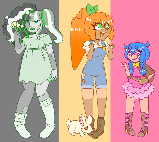
Y'know, i kinda have to write the final chapter of my story mundane believers but i've also had the ideas for these OCs in my head for a while now and i can't focus on anything other than them so i just decided to draw designs for them so that i can get 'em out of my head. (EXPLANATIONS OF THESE CHARACTERS + SOME OTHER STUFF UNDER THE CUT)
The frankenstein girl is named "alive" (any pronouns, she doesn't care about gender). She's mixed between 5 different races and doesn't talk much, she's also vewy scawwy but is also very misunderstood. I haven't really developed her much yet lol (also her color palette was, of course, inspired by old black and white horror movies as well as frankie stein from monster high, specifically how they appear in the "reel drama" collector's line)
The girl in overalls is named carrie, she's quite literally a carrot that decided to be human one day and she's desperately trying to fit in with the other humans. Also i imagine she doesn't really now what a name is and didn't actually have one until someone asked and she just said whatever sounded like a human name (kinda like that one headcanon people have about shrek) oh yeah and she has a pet bunny named rabby who's constantly trying to eat her but she doesn't realize it....btw carrie is also an intersex demigirl
Lastly, the girl with blue hair is named makeighlyn. She is a parody of those really weird flash games aimed at girls and i got the idea for her when i watched the youtuber li speaks' video about avata star sue. Basically the gist of what makeighlyn is about is she's basically an exorcist/demon slayer who's generally really sweet most of the time but is pretty much doomguy levels of sadistic when it comes to her job, she ABSOLUTELY HATES demons and wants nothing more than to see them suffer! Oh yeah and also she's pretty fucking two-faced and i consider her theme song to be scary world by night club
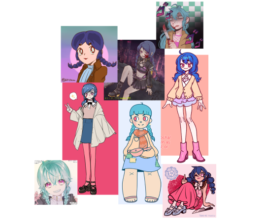
Some other inspirations for makeighlyn are mikan tsumiki from danganronpa, the 3 mascots of GirlsGoGames, the artist SleepyCore's OC mew, the artist jo_sipu's OC balvenie and the youtuber caitlyn reilly's "the girl who bullied you in high school" skits (this one's more obvious considering makeighlyn was named after the title character's daughter)
Oh yeah and quick warning: jo_sipu is a GORE artist and quite a few of her animations deal with stuff such as toxic relationships and drug use so if you want to check her out, please do so with caution ⚠️
Btw here's a collage of different pictures of makeighlyn that i made in picrew (just recently got into picrew and they're fun as hell lol)
Links to the original picrews
The sailor moon one
The cyberpunk one
The one with jojo symbols
The one on the bottom left
The one with the bright pink background
The super cartoony one
The one with the coral background
The one where makeighlyn is flipping off the camera
#can you tell makeighlyn is my favorite out of the three?#oc: alive#oc: carrie#oc: makeighlyn#artists on tumblr#digital art#art#digital illustration#oc#ocs#oc art#character design#horror#horror oc#frankenstein#frankenstein's monster#carrots#food#food themed#mid 2000s#mid 2000s aesthetic#religious themes#exorcist oc#black and white#green#orange#pink#this post took way too long to format#picrew
9 notes
·
View notes
Note
how did you get so good at crowded perspective pieces?
hey lol. forgive me for the wait, i tried to answer this (twice) on the day u sent this and both times my app crashed after me typing out a whole thing so i just needed to. take a breath before trying again. im on vacation rn so i dont have all of my files/sketches so im gonna try and make do with what i have.
the real answer is that i only really started doing it recently! i really made the resolution to make my work more involved and resolved instead of just doodling a character on a random background.. i’m very inspired by cartoonists and comicmaking and so i want my illustrations to be fully resolved scenes that tell stories and communicate ideas. right now im focusing a lot on trans bodies in close proximity, small spaces and domestic t4t relationships. I started off with a few studies. I did sketches of some artists who drew enviroments i enjoyed and tried my best to grasp an understanding of spatial relationships. taking some life drawing classes also really helped ^_^
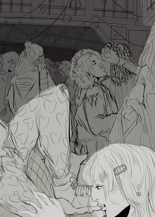
im gonna talk about my house party series bc its relevant but i used different methods to sketch each one!
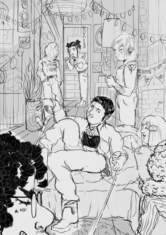
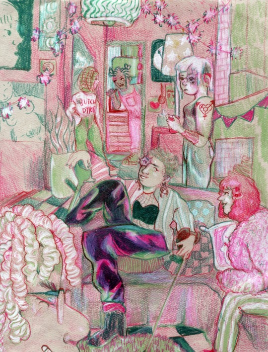
i used the csp perspective tool to create a linear grid to work off of, it’s very helpful, i knew i wanted a more centered composition for this one so i drew my center character first and figured out how to layer others around them from there!


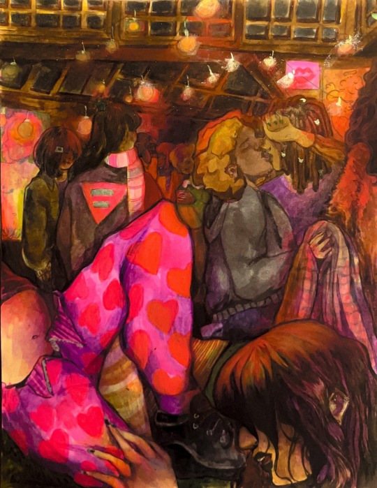
this one was a little more complex. i made a photo collage (i wish i had used my own refs but. we all make mistakes) and then went over it with a lasso tool blocking out chunks of color. then i turned off the collage layer and drew over the chunks until i was happy with my layout! for this composition, i wanted your eye to travel pretty nonstop around the peice so i chose to make it cluttered and vertical to overwhelm the viewer!
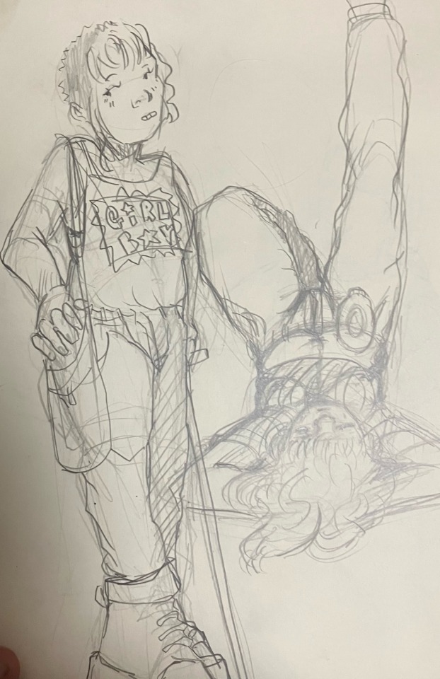
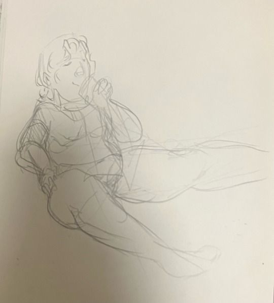
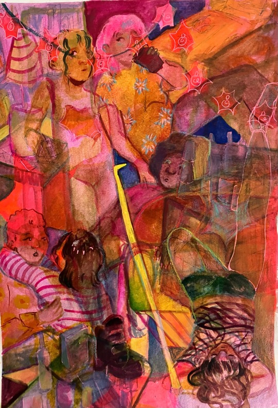
this one was actually not sketched digitally!! i drew the characters in my sketchbook since i knew i wanted to go for a more layered and abstracted vibe, then used my lightboard to trace them on top of eachother.
I think creating crowd scenes is a lot about juggling space, figuring out how to make things look cramped but not have things blend into one blob. it’s difficult, but with patience you can learn to balance the elements effectivly.
10 notes
·
View notes
Text
10 Types of Aesthetics If You Want to Switch up Your Wardrobe ~Vibes~
1. E-girl
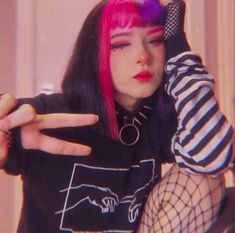
Borrowing its looks from anime, "e-girls" typically have dyed hair (mostly concentrated to the two front sections like Dua Lipa here) and hyper-stylized makeup that exaggerates their eyes and cheeks. Many even draw on tiny hearts or freckles on their faces and pile on the blush to give their cheeks an extra-rosy hue, although there are also those who opt for no or minimal makeup. Hair clips, mesh clothing, choker necklaces, and silver jewelry are some key items to pull off the extremely online vibe, and while gaming culture is part of it, you don't necessarily have to be on World of Warcraft to partake.
2. AngelCore
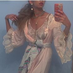
Angelcore is a contemporary aesthetic inspired by imagery and depictions of angels, and is adjacent to devilcore. The aesthetic is designed to emulate the same unearthly beauty that European angels are described and depicted with, though it can also include non-European angel aesthetics.
3. Soft Girls
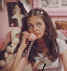
It fully leans into bright hair barrettes and pastel colors. The outfits look ultra-romantic and often include pinks and purples, pleated skirts, florals, sweater vests, and cardigans. Some iterations, however, also incorporate edgy contrasting items like chunky boots, black baguette bags, or statement sunglasses, but it can still be "soft" because it's about the overall ~aura~ you're giving off. Click for some soft girl outfit ideas for even more examples.
4. Grunge
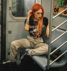
Think back to the late '80s and early '90s when bands like Nirvana and Pearl Jam reigned and flannels were *the* fashion staple. Marc Jacobs also released a now-iconic grunge collection for Perry Ellis in 1992 that was inspired by the burgeoning music scene coming out of the Pacific Northwest. The fashion result of the aesthetic is loads of mesh, plaid, mixed prints, combat boots, and layered choker necklaces. A guitar or two in the background of a photo doesn't hurt either, like singer beabadoobee here.
5. Cottagecore
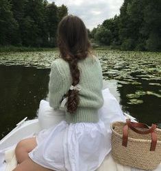
Imagine wearing a prairie dress or a breezy nightgown and living in a cute tiny cottage surrounded by a garden you tend to everyday. Sounds like pure bliss, right? The cottage and garden might be a stretch, but at least you can attain the illusion that you own both by wearing a floral or eyelet number reminiscent of The Little House on the Prairie. Brands like Christy Dawn, DÔEN, and Hill House Home (with its viral "Nap Dress") can help you in this department.
6. Art Hoe
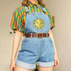
This movement originated on Tumblr with the Black and LGBTQ+ community expressing themselves through art and collages.
While the term "hoe" can be controversial, the gender-fluid co-creator of the aesthetic, Mars, explained to The Guardian: “‘Art hoe’ or ‘art ho’ is a term used by me and my co-founder Jam to empower and uplift participants of color in this movement... it's normally a derogatory way to refer to women–especially Black women–as being promiscuous, within the male gaze. Using the term in an arbitrary way diminishes its harmful origin in light of something better.”
The color yellow is often affiliated with this aesthetic as is a vintage-looking outfit that channels nature or art, like this adorable House of Sunny cardigan above.
7. Baddie
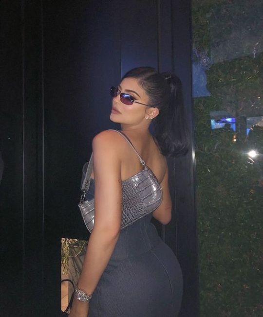
This is that look that is made for the IG grid. A tight-fitting dress, full makeup, and designer pieces are giveaways for this aesthetic. Beauty bloggers and the Kardashian/Jenner clan are pros at channeling the vibe, as well as Lori Harvey here with her full Dior ensemble. Like, WOW.
8. Dark Academia
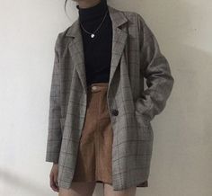
Tweed blazers, sweater vests, and anything that reminds you of prep school or a fancy (and much-too-expensive) East Coast university are staples for this aesthetic. The "dark" wording though simply means the tones of your outfit skew on the darker side and typically include browns and blacks.
9. Light Academia
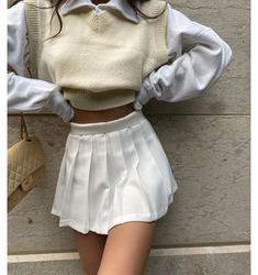
The same but lighter colors! A very simple explanation, I know. Whites, creams, and beiges are the tones you should wear to get in on this vibe.
10. Fairycore
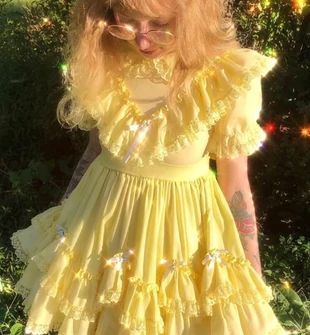
The beauty of fairycore is that there is no recipe: Each item looks individually crafted because the aesthetic embraces the uniqueness of the wearer, even if there are staple pieces to complete the fairy look. For example, elements of fairycore can be traced back to recent history, long before it hit the internet mainstream (and our social media feeds) in 2021. From young women wearing flower crowns at music festivals to even little girls wearing tutus to school, the spirit of fairycore has always been within us. It’s just seeing a massive resurgence now, especially with fairy-adjacent media like Winx Club.
#aestheitcs#aesthetic#dark aesthetic#dark acadamia aesthetic#dark academia#light academia#light acadamia aesthetic#fairytalecore#fairycore#cottagecore#angelcore#art ho aesthetic#art hoe#bombshell#egirlvibes#egirl aesthetic#grungy style#grungy aesthetic#grunge#soft girl
57 notes
·
View notes
Text
Happy Indigenous Peoples’ Day!
10/12/20:
So. If you’ve been here a year or more, you might know that I have this little journal from back in 2018 that I try to update every year with works from local indigenous artists / created in collaboration with indigenous folks.
It was once hosted on another site, but that one’s since gone to hell! So, I’m shuffling it over here and giving it a little TLC : -) Enjoy!
◆
10/8/18:
You can probably glean from my work that I owe intensely to the people of the Sonoran Desert and surrounding communities. Since it’s Indigenous Peoples’ Day, I’m going to share a few works from (mostly southwestern) native artists that have really impressed on me. If you enjoy anything that I do, I think you’ll enjoy their work even more!
Tyler Bighorse and Suite 104
I was introduced to the work of Tyler Bighorse in downtown Flagstaff, where he runs a gallery called Suite 104.
If you're ever in the area I really recommend dropping by! He sells prints and originals of his works there, as well as other local artists' work. (snagged this sick Legend of Zelda spread for my bro while I was up there.)

Mulaka, by Lienzo
youtube
Synopsis, from their website:
Dive into northern Mexico’s breathtaking landscapes with Mulaka, a 3D action-adventure game based on the rich indigenous culture of the Tarahumara. Renowned for their impressive running abilities, embark on the journey of a Sukurúame - a Tarahumara shaman - as you fight back the foulness corrupting the land, while drawing upon the powers of demigods.
Mulaka was developed by the Chihuahua-based game company Lienzo in conjunction with Rarámuri leaders and anthropologists. Lienzo also aims to keep their game dev local to Chihuahua, which I think is extremely badass.
And the music just. rules. ( Town of Paquimé / Nini Areware Ne Chunume )
Quantum Tangle (Grey Gritt and Tiffany Ayalik)
Quantum Tangle is really really good. Like, really really good. Blurb from their old bandcamp:
Fusing of old-world sounds and new-world flair, the Juno Award-winning group Quantum Tangle is embracing their blended background. Combining their talents of throat singing, haunting melodies and traditional legends, Grey Gritt and Tiffany Ayalik are excited to present pieces that look back through history to challenge, educate and encourage the next generation to be socially aware.
The unfortunate news is that their website went down earlier in the year : -( But the good news is their work is still floating around the internet. I believe you can find them on Spotify and other streaming services as well. Here is a favorite, a love ode of sorts called Igluvut:
youtube
My other favourites for first-time listeners are Love is Love pt. 2 and Tiny Hands : -)
Oral History of the Yavapai, by Mike Harrison and John Williams
Three tribes of Yavapai got together at Bloody Basin. Kewevkepaya, Wipukpa and Yavepe. Three of them. They get together and cook mescal, cook deer. Get together and eat, dance and have a good time. But the soldiers met them there and killed them. Then the White people called the place Bloody Basin. Called it after our blood.
- Oral History of the Yavapai I originally stumbled across this book (in reality a word-for-word chronicle of oral history told by Mike Harrison and John Williams, two Yavapai elders) through one of the sources cited in this blog post: The True Victims of “Bloody Basin” Were the Yavapai.
It really struck me, because to that point all major publications that I'd read had unquestioningly ran the old U.S. Army account of how Bloody Basin got its name (Check out the Verde Independent’s article here, and AZcentral’s take here.) It frames the massacre not only as a “punitive expedition,” but also incorrectly names the victims as Tonto-Apache-- The Dilzhe’e are a distinct people, though the Yavapai people were often conflated with them. It’s much harder to get folks into books, but if you have any interest in the history of the Salt River Valley or surrounding areas at all, this was an invaluable read to me. Be aware that it is vibrant and devastating in equal measures-- but if you can handle it, I highly recommend it.
◆
10/14/19 Additions
The writing of Darcie Little Badger
The Whalebone Parrot and Owl Vs. The Neighborhood Watch were my introductions to Darcie's work and they are so, so full of wit, character, and ghoulish suspense... the kind of stories you would read to family and friends as Halloween closes in, this time of year. I am only familiar with her mystery and horror-adjacent short stories at the moment, but I hope to become better acquainted with her body of work in the near future. You can find a list here, many of which you can read online for free!
Anyway. Let me leave you with the Inherent Horror of Birds (from The Whalebone Parrot,) which I don't think I've seen any other writer capture so artfully:
I wonder if all parrots have dancing eyes. The pupils are in a state of constant flux, contracting and expanding. Big, small, big, small.
“What song is that?” I asked. Her pupils danced: large, small, large. She possessed parrot eyes and parrot songs.
10/12/20 Update: Darcie Little Badger recently published her first book, Elatsoe! Check it here : -)

Imagine an America very similar to our own. It’s got homework, best friends, and pistachio ice cream. There are some differences. This America has been shaped dramatically by the magic, monsters, knowledge, and legends of its peoples, those Indigenous and those not. Some of these forces are charmingly everyday, like the ability to make an orb of light appear or travel across the world through rings of fungi. But other forces are less charming and should never see the light of day.
Seventeen-year-old Elatsoe (“Ellie” for short) lives in this slightly stranger America. She can raise the ghosts of dead animals, a skill passed down through generations of her Lipan Apache family. Her beloved cousin has just been murdered, in a town that wants no prying eyes. But she is going to do more than pry. The picture-perfect façade of Willowbee masks gruesome secrets, and she will rely on her wits, skills, and friends to tear off the mask and protect her family.
The pottery of Nathan Youngblood
youtube
I learned of Nathan Youngblood's work scarcely a week ago, during a visit to the Heard Museum, and it very nearly made me start hooting and hollering in the middle of the museum. It is, without exaggeration, unlike any kind of craft I've ever seen before. His work is something of a marriage between the Santa Clara pottery tradition with Asian ceramics and other traditions world-wide, and it's a coupling that is at once startlingly familiar and yet completely unique.
The art, writing, and games of Elizabeth LaPensée
Elizabeth is perhaps best known for creating Thunderbird Strike!
vimeo
(synopsis from its website: )
In the 2D sidescroller Thunderbird Strike, fly from the Tar Sands to the Great Lakes as a thunderbird protecting Turtle Island with searing lightning against the snake that threatens to swallow the lands and waters whole.
But she has a very wide and rich body of work, and among my personal favourites are her visual art. She employs digital collage to create these sort of iconographic pieces, and to me there's a certain joy in the way her work employs silhouette and contour, tracing the shape of a body, the environment within that body, and its place in its environment. It's not something that I can really do justice by describing, so here's a favourite from her ("Thunderbird Circles") that I have on my wall:

44 notes
·
View notes
Text
Dust, Volume 7, Number 7

What are Grandbrothers doing to that piano?
Greetings from under the heat dome, where shipments of vinyl are melting mid-journey and even the coolest of cool jazz sounds a little wilted by the time it reaches your ear. We are sitting in the shade. We are drinking lemonade and iced tea. We are looking for the window fans and lugging old air condition units up from the basement. We are, perhaps, headed to the community pool for the first time since our kids were young, though also, perhaps not. In any case, we are still getting through piles of recorded music, even in this heat, and finding some gems. Here are dispatches from the furthest reaches of Japanese psych, European free jazz, self-released indie folk, Irish lockdown angst, Moroccan raging punk and lots of other stuff. Contributors included Mason Jones, Jennifer Kelly, Bill Meyer, Tim Clarke, Bryon Hayes, Jonathan Shaw, Arthur Krumins and Chris Liberato. Stay cool.
Yuko Araki — End of Trilogy (Room40)
End Of Trilogy by Yuko Araki
These 16 tracks whoosh past in just 35 minutes, with most of them clocking in around two minutes in length. Many don't reach a conclusion: they simply end abruptly, and the next one starts. Araki manipulates electronics to create whirling, sizzling atmospheres of confusion, sometimes fast-moving burbles of percussion and synths, at other moments pushing distorted hissing and confrontational tones to the front. The aptly-named "Dazed" begins with a cinematic feel, then its galactic drones give way to static and metallic scrapes. "Positron in Bloom" is like a chorus of machine voices shouting angry curses into space, and "Dreaming Insects" sounds as if the titular creatures are being pulled downstream in fast-moving rapids. Oscillating between menacing and humorous, End of Trilogy's bite-sized pieces of surrealist electronics are never boring.
Mason Jones
Alexander Biggs — Hit or Miss (Native Tongue Music Publishing)
Hit or Miss by Alexander Biggs
Alexander Biggs blunts sharp, stinging lyrics in the sweetest sort of strummy indie-pop, working very much in the Elliott Smith style of sincerity edged with lacerating irony. “All I Can Do Is Hate You” finds a queasy intersection between soft pop and tamped down rage, Biggs murmuring phrases like “I want you to fuck me til I can’t say your name,” but melodically, over cascades of acoustic guitar. “Madeline” is the pick of the litter here, a dawdling jangle of guitar framing knife-sharp lyrics about romantic disillusionment. “Miserable,” sports a bit of lap steel for emotional resonance, demonstrating once more, if you had any doubt, that very sad songs can make you feel better somehow. Biggs is good at both the softness and the sting, and for guy-with-a-guitar albums, that’s what you need.
Jennifer Kelly
Christer Bothén 3 — Omen (Bocian)
Omen by Christer Bothén 3
Dusted’s collective consciousness has spent a lot of time considering Blank Forms’ recent publication, Organic Music Societies, which considers Don and Moki Cherry’s convergence of artistic and familial efforts during the 1960s and 1970s, as well as the two archival recordings by Don and associates, which shed light upon his Scandinavian musical activities. All three are worth your attention, but their liveliness is shaded by the awareness that almost every hopeful soul involved is no longer with us. But Christer Bothén, who introduced Don to the donso ngoni and subsequently played in his bands for many years, is not only among the living, he’s got breath to spare. This trio recording doesn’t delve into the African sounds that bonded Bothén and Don. Rather, the Swede’s bass clarinet draws bold and emphatically punctuated melodic lines, driven by a steaming rhythm section that takes its cues from Ornette Coleman’s mid-1960s trio recordings. This music may not sound new, but it’s full of lived-in knowledge and vigor.
Bill Meyer
Briars of North America — Supermoon (Brassland)
Supermoon by Briars of North America
New York-based trio Briars of North America take patient, painterly, occasionally cosmic approach to folk music. With “Sala,” Supermoon sounds like a backwoods Sigur Ros. A falsetto voice intoning a made-up language arcs elegantly over sustained waves of electric piano. Soon after, the album touches down into more grounded guitar-and-cello territory on pieces such as “Island” and “Chirping Birds,” which bring to mind Nick Drake, albeit less contrary or withdrawn. At the album’s midway point, the listener is carried into the aether with the eerie sustained brass and wordless vocals of the eight-minute “The Albatross of Infinite Regress.” A similar space is explored at the album’s end with the 12-minute “Sleepy Not Sleepy,” as strings and warbling synthesizer tones intermingle with the return of the made-up language. Though the band’s more conventional vocal-led songs, such as “Spring Moon,” are decent enough, Briars of North America touch upon something expansive and ineffable when they explore their more experimental side.
Tim Clarke
Bryan Away — Canyons to Sawdust (self-released)
youtube
Chicago-based actor, composer and multi-instrumentalist Elliot Korte releases music under the moniker Bryan Away. His new album, Canyons to Sawdust, begins with what feels like two introductions. “Well Alright Then” is a Grizzly Bear-style scene-setter for wordless voices, strings and woodwinds, while “Within Reach” sounds like a tentative cover of Radiohead’s “Pyramid Song” that runs out of steam before it had the chance to build momentum. The first full song, single “The Lake,” gets the album up and running in earnest with its melancholy piano and string arrangement spiked with pizzicato plucks and bright acoustic guitar figures. Half Waif lends her vocal talents to “Dreams and Circumstance,” another highlight featuring some lovely interplay between guitar arpeggios and drum machine. One pitfall of exploring romantic musical territory is the risk of sounding a tad saccharine, and the weakest links in the album, companion tracks “Scenes From a Marriage” and “Scenes From a Wedding,” have the kind of performative tone you’d expect to find on the soundtrack of a mainstream romantic comedy. Elsewhere, though, Korte’s judgment is sound, and there’s plenty of elegant music to be found. Fans of Sufjan Stevens will no doubt find a lot to like, and it’ll be interesting to see where Bryan Away ventures next.
Tim Clarke
Jonas Cambien Trio — Nature Hath Painted Painted The Body (Clean Feed)
Nature Hath Painted the Body by Jonas Cambien Trio
On its third album, the Jonas Cambien Trio has attained such confidence that it’s willing to mess with its signature sound. The Oslo-based combo’s fundamental approach is to stuff the expressive energy and textural adventure of free jazz into compositions that are by turns intricate and rhythmically insistent but always pithy. This time, the Belgian-born pianist Cambien also plays soprano sax and organ. The former, stirred into André Roligheten’s bundle of reed instruments, brings airy respite from the music’s tight structures; the latter, dubbed into locked formation with the piano and jostled by Andreas Wildhagen’s restlessly perambulating percussion, expands the music’s tonal colors. The tunes themselves have grown more catchy, so much so that their twists and turns only become apparent with time and repeat listening.
Bill Meyer
Ferran Fages / Lluïsa Espigolé — From Grey To Blue (Inexhaustible Editions)
From Grey To Blue by Ferran Fages
When discussion turns to a pianist’s touch, it’s tempting to think mainly of what they do with their fingers. But it must be said that Lluïsa Espigolé exhibits some next-level footwork on this realization of Ferran Fages’ From Grey To Blue. Fages is a multi-instrumentalist who functions equally persuasively within the realms of electroacoustic improvisation and heavy jazz-rock, but for this piece, which was devised specifically for Espigolé, he uses written music and an instrument he doesn’t play, the piano, to engage with resonance and melody. The three-part composition advances with extreme deliberation, often one note at a time, turning the tune into a ghostly presence and foregrounding the details of the decay of each sound. This music is so sparse that the shift to chords in the third section feels dramatically dense after a half hour of single sounds and corresponding silences. The elements of this music have been sculpted with such exquisite control that one wonders if Catalonia has looked into insuring Espigolé’s feet; her way with the piano’s pedals is a cultural resource.
Bill Meyer
Grandbrothers — All the Unknown (City Slang)
All the Unknown by Grandbrothers
The duo known as Grandbrothers hooks a grand piano up to an array of electronic interfaces, deriving not just the clear, gorgeous notes you expect, but also a variety of percussive and sustained sounds from the classic keyboard. In this third album from the two—that’s pianist Erol Sarp and electronic engineer Lukas Vogel—construct intricate, joyful collages, working clarion melodies into sharp, pointillist backgrounds. The obvious reference is Hauscka, who also works with prepared piano and electronics, but rather than his moody beauties, these compositions pulse with rave-y, trance-y exhilaration. If you ever wondered what it would sound like if the Fuck Buttons decided to cover Steve Reich, well, maybe like this, precise and complex and shimmering, but also huge and triumphant. Good stuff.
Jennifer Kelly
id m theft able — Well I Fell in Love with the Eye at the Bottom of the Well (Pogus Productions)
Well I Fell in Love With the Eye at the Bottom of the Well by id m theft able
Al Margolis’ Pogus Productions imprint has cast its gaze toward the strange happenings in Maine, netting a mutant form of electroacoustic wizardry in the process. Scott Spear is the one-man maelstrom known as id m theft able, an incredibly prolific and confounding presence in the American northeast. He draws influence from musique concrète and sound poetry, but adds a whimsical spirit, a tinker’s ingenuity and the comedic timing of a master prankster to his compositions. Sometimes this leads to the bemusement of his audience, but he tempers any surface madness with an endless curiosity and a playful sense of the meaning of the word music. Well I Fell in Love with the Eye at the Bottom of the Well ostensibly came to be via Spear’s desire to create a doo-wop tune. Only Spear himself knows whether this is fact or fiction, because it is clear from the opening moments of “Shun, Unshun and Shun” that this disc is full of sonic non-sequiturs, amplified clatter and delightful mouth happenings that are as far removed from doo-wop as possible. The madness is frequently tempered with beautiful moments: a broken music box serenades a flock of chirping birds in the middle of a mall, Spear hypnotically chants at a landscape of crickets, flutes pipe along to the patter of rain on a window. As one gets deeper into the record, the sound poetry aspects become more and more pronounced, such as on “The Curve of the Earth” and the closing piece, “Purple Rain.” Those seeking a humor-filled gateway drug into that somewhat perilous corner of the sonic spectrum would be wise to pop an ear in the direction of this frenetic assemblage of sound.
Bryon Hayes
Mia Joy — Spirit Tamer (Fire Talk)
Spirit Tamer by Mia Joy
Mia Joy turns the temperature way down on gauzy Spirit Tamer, constructing translucent castles in the air out of musical elements that you can see and hear right through. The artist, known in real life as Mia Rocha, opens with a brief statement of intent in a one-minute title track that wraps wisps of vocal melody with indistinct but lovely sustained tones. The whole track feels like looking at clouds. Other cuts are more substantial, with muted rock band instruments like acoustic and electric guitars and drum machines, but even indie-leaning “Freak” and "Ye Old Man,” are quiet epiphanies. Rocha sounds like she is singing to herself softly, inwardly, without any thought of an audience, but also so close that it tickles the hair in your ears. Rocha closes with a cover of Arthur Russell’s “Our Last Night Together,” letting rich swells of piano stand in for cello, but tracing the subtle, undulating lines of his melody in an airy register, an octave or two higher. Like Russell, Rocha sets up an interesting interplay between deep introversion and presentation for the public eye; she’s not doing it for us, but we’re listening anyway.
Jennifer Kelly
Know//Suffer — The Great Dying (Silent Pendulum Records)
The Great Dying by KNOW//SUFFER
It’s not inaccurate to describe The Great Dying as a hardcore record. You’ll hear all the burly breakdowns; buzzing, overdriven guitars; and grimly declaimed vocals that characterize the genre, which since the mid-1990s has moved ever closer to metal. But Know//Suffer have consistently infused their music with sonic elements associated with other genres of heavy music. Most of the El Paso band’s 2019 EP bashed and crashed along with grindcore’s psychotic, sprinting energy. The Great Dying is a longer record, and it slows down the proceedings considerably. There are flirtations with sludge, and even with noise rock’s ambivalent gestures toward melody: imagine Tad throwing down with a mostly-sober version of Eyehategod, and you’re more than halfway there. As ever, Toast Williams emotes forcefully, giving word to a very contemporary version existential dread. But there’s frequently a political edge to the lyrics on this new record. On “Thumbnail,” he sings, “I swallow what must be hidden / Hoping assimilation makes me whole / The whole that everyone thinks I am / Smiling under this mask knowing / I’m not hiding my face in public.” “Assimilation” is a loaded word, especially on the Southern Border, and it’s no joke walking around in public as a proud black man anywhere in Texas. Wearing a mask as you walk into Target? P.O.C. stand a chance of getting shot. Know//Suffer still sound really pissed off, but the objects of their anger seem increasing outside of their tortured psyches, located in the lifeworld’s social planes of struggle. That gives their grim music an even harder charge, and makes Williams’s performances of rage even more powerful.
Jonathan Shaw
Heimito Künst — Heimito Künst (Dissipatio)
HEIMITO KÜNST by Heimito Künst
The debut album from Italian experimental instrumentalist Heimito Künst, recorded over several years in his home studio, uses an array of electronic and primitive instrumentation to create an overall woozy, dark atmosphere. From groaning, atonal slabs of organ, like a detuned church service, to murmuring field recordings and scrapings, these seven tracks are less like songs and more like unsettling journeys through sound. Pieces like "Talking to Ulises" blend quiet Farfisa tones and a wordlessly singing voice in the distance. Ironically, although the final track is titled "Smoldering Life", it's unexpectedly brighter, with major-key synth notes over the cloudy sound of a drum being bashed to pieces before ending with an almost gentle, summertime feel.
Mason Jones
Jeanne Lee — Conspiracy (moved-by-sound)
Conspiracy by JEANNE LEE
Lots of 1960s and 1970s jazz reissues offer beautiful music, but few redefine how liberating improvised music can be. Conspiracy, originally recorded in 1974 by Lee on vocals with an ensemble that includes Sam Rivers and Gunter Hampel, falls into the latter category without feeling forced. It combines sound poetry, the conversation of spontaneity, and grooves that don’t stay on repetition but still get ingrained into your brain somehow. Best digested in a contemplative sitting, the album demands you give your whole attention to the direction of the music and words mixed with extended vocal techniques. The sound shifts from a full-on medley of flutes, drums, bass and horns with voice, to more minimal experiments. The recording is clean and uncluttered, even at its busiest. A lushly enjoyable listen.
Arthur Krumins
Sarah Neufeld — Detritus (Paper Bag)
Detritus by Sarah Neufeld
Sarah Neufeld’s third solo album grew out of a collaboration with the Toronto choreographer Peggy Baker, begun before the pandemic but dealing anyway with loss, intimacy and grief. The violinist and composer works, as a consequence with a strong sense of movement, underlining rhythms with repeated, slashing motifs in her own instrument and pounding drums (that’s Jeremy Gara, who, like Neufeld, plays in Arcade Fire). You can imagine movement to nearly all these songs. “With Love and Blindness” rushes forward in a wild swirl of strings, given weight by the buzz of low-toned synthesizer and airiness in the layer of denatured vocals; you see whirling, bending, graceful gestures. “The Top” proceeds in quicker, more playful patterns; agile kicks and jumps and shimmies are implied in its contours. “Tumble Down the Undecided” has a raw, passionate undertow, its play of octave-separated notes frantic and agitated and the drumming, when it comes, fairly gallops. This latter track is perhaps the most enveloping, the notes caroming wildly in all directions, in the thick of the struggle but full of joy.
Jennifer Kelly
Aaron Novik — Grounded (Astral Editions)
Grounded by Aaron Novik
Aaron Novik is a clarinetist with an extensive background in jazz, klezmer, rock and in-between stuff, but you wouldn’t know any of that from listening to this tape. Its ten numbered instrumentals sound more derived from the sound worlds of 1970s PBS documentaries, Residents records of similar vintage, and Pop Corn’s fluke hit, “Pop Corn.” Recorded during the spring of 2020, when Novik’s new neighborhood, Queens, became NYC’s COVID central, it manifests coping strategy that many people learned well last year; when the outside world is fucked and scary, retreat to a room and then head down a rabbit hole. In this case, that meant sampling Novik’s clarinets and arranging them into perky, bobbing instrumentals. The sounds themselves aren’t processed, but it turns out that when recontextualized, long, blown tones and keypad clatter sound a lot like synths and mechanized beats. There’s a hint of subconscious longing in this music. While it was made in a time and place when many people didn’t leave the house, it sounds like just the thing for outdoor constitutionals with a Walkman.
Bill Meyer
Off Peak Arson — S-T (Self-released)
Self Titled by Off Peak Arson
Presumably named after the Truman's Water song — a fairly obscure name check, indeed — Off Peak Arson hail from Memphis, TN. Their debut EP's five songs are less reminiscent of their namesakes than of heavier, noisier bands like Zedek-era Live Skull, Dustdevils and Sonic Youth. Which is not a bad thing at all. The four-piece leverage the dual guitars to nicely intense effect, and with all four members contributing vocals there's a lot going on, at times blending an interesting sing-song pop feel with the twisty-noisy guitar. The band have a way of finding memorable hooks amidst sufficient cacophony to keep things challenging while also somehow catchy. Keep your ears open for more from this quartet.
Mason Jones
Barre Phillips / John Butcher / Ståle Liavik Solberg — We Met – And Then (Relative Pitch)
We met - and then by Phillips, Butcher, Solberg
In 2018, ECM Records issued End To End, a CD by double bassist Barre Phillips which capped a half-century of solo recording. You might expect this act to signal the winding down of the California-born, France-based improviser’s career; after all, he was born in 1934. And yet, in 2018 he played the first, but not the last, concert by this remarkable trio, which is completed by British soprano/tenor saxophonist John Butcher and Norwegian percussionist Ståle Liavik Solberg. Recorded in Germany and Norway during 2018 and 2019, this CD presents an ensemble whose members are strong in their individual concepts, but are also committed to making music that is completed by acts of collective imagination. The music is in constant flux, but purposeful. This intentionality is expressed not only through action, but through the conscious yielding of space, as though each player knows what openings will be best occupied by one of their comrades.
Bill Meyer
Round Eye — Culture Shock Treatment (Paper +Plastick)
“Culture Shock Treatment,” the lead-off track from this unhinged and ecletic album, swings like 1950s rock and roll, a sax frolicking in the spaces between sing-along choruses. And yet, the gleeful skronk goes a little past freewheeling, spinning off into chaos and wheeling back in again. Picture Mark Sultan trying to ride out the existential disorder of early Pere Ubu, add a horn line and step way back, because this is extremely unruly stuff. Round Eye, a band of expatriates now living in Shanghai, slings American heartlands oddball post-punk into unlikely corners. Frantic jackhammer hardcore beats (think Black Flag) assault free-from experimental calls and responses (maybe Curlew?) in “5000 Miles, “ and as a kicker, it’s a commentary on ethno-nationalist repression (“Thank…the country. Thank…the culture”). “I Am the Foreigner” hums and buzzes with exuberance, like a hard-edged B-52s, but it’s about the alienation that these Westerners most likely experience, every day in the Middle Kingdom. This is one busy album, exhausting really, a whac-a-mole entertainment where things keep popping out of holes and getting hammered back, but it is never, ever dull.
Jennifer Kelly
So Cow — Bisignis (Dandy Boy)
Bisignis by So Cow
This new So Cow record is a mood. Specifically, that mood during the third and “least fun” of Ireland’s lockdowns, when you head to your shed and bash out an album about everything that’s been lodged in your craw during a year of isolation — including, of all things, the crowd at a Martha Wainwright show (on “Requests”). And while sole Cow member Brian Kelly might have dubbed the record Bisignis, the Old English word for anxiety, it’s his discontent that takes center stage. “Talking politics with friends/Jesus Christ it never ends” Kelly sings on early highlight “Leave Group” before employing a guitar solo that could pass for some seriously fried bagpipes to help clear the room. This album takes the opposite approach of The Long Con, the project’s 2014 Goner Records one-off where So Cow made more complex moves towards XTC and Futureheads territory but obscured its greatest weapon: Kelly’s deadpan wit. And while a couple of these songs overstay their welcome with their sheer garage punk simplicity, others like “Somewhere Fast” work in the opposite way and win your ears over with repeat listens. “You are the reason I’m getting out of my own way,” Kelly sings, and in doing so has produced the project’s best full-length in a decade. So what? So Cow!
Chris Liberato
Taqbir — Victory Belongs to Those Who Fight for a Right Cause (La Vida Es Un Mus)
Victory Belongs To Those Who Fight For A Right Cause by Taqbir
In our super-saturated musical environment, another eight-minute, 7” record of scorching punk burners isn’t much of an event. But the appearance of Taqbir’s Victory Belongs to Those Who Fight for a Right Cause (the title is almost longer than the record itself) is at the very least a significant occurrence. The band comes from Morocco and features a woman out front, declaiming any number of contemporary socio-political ills. So there’s little wonder that the Internet isn’t bursting with info about Taqbir; you can find a Maximumrocknroll interview, some chatter about the record here and there, and not much else. It must take enormous courage to make music like this in Morocco, and even more to be a woman making music like this. The long reign of King Mohammed IV has edged the country toward marginal increments of cultural openness — if not thoroughgoing political reform — but conservative Islam and economic struggle are still dominant forces, combining to keep women relegated to submissive social roles. And the band is not fucking around: their name is a Moroccan battle cry, synonymous with “Alu Akbar!” Their repurposing of that slogan in support of their anti-traditionalist, anti-religious, anti-capitalist positions likely makes life in a place like Tangier or Casablanca pretty hard. The songs? They’re really good. Check out “Aisha Qandisha” (named for a folkloric phantasm that ambiguously mobilizes the feminine as murderous and rapacious monster): the music slashes and burns with just the right dash of melody, the vocals go from a simmer to a full-on rolling boil. Taqbir! y’all. Stay safe, stay strong and make some more records.
Jonathan Shaw
TOMÁ — Atom (Self-Release)
Atom by TOMÁ
Tomá Ivanov operates in interstices between smooth jazz and soul-infused electronics, splicing bits of torchy world traditions in through the addition of singers. You could certainly draw connections to the funk-leaning IDM of artists like Flying Lotus and Dam-Funk, where pristine instrumental sounds—strings, piano, percussion—meet the pop and glitch of cyber-soul. Guest artists flavor about half the tracks, pushing the music slightly off its center towards rap (“A Different You featuring I Am Tim”), quiet storm soul (“Outsight featuring Vivian Toebich”), falsetto’d art pop (“Catharsis featuring Lou Asril”) or dreaming soul-jazz experiments (“Blind War featuring Ben LaMar Gay”). Thoughout, the Bulgarian composer and guitarist paces expansive ambiences with shuffling, staggering beats, roughing up slick surfaces with just enough friction to keep things interesting.
Jennifer Kelly
The Tubs — Names EP (Trouble In Mind)
Names EP by The Tubs
“I don’t know how it works” declared The Tubs on their debut single, but they’re diving right in anyways on its follow-up, Names, with four songs that explore the self and self-other relationship. Their cover of Felt’s “Crystal Ball” tightens the musical tension of the original in places but still allows enough slack for singer Owen Williams to stretch the lyrical refrain — about the ability of another to see us better than we see ourselves — into a more melancholy shape than Lawrence. Of the EP’s three originals, Felt’s influence is most obvious in George Nicholls’ guitar work on “Illusion,” especially when the change comes and his lead spirals off Deebank-style behind Williams while he questions his connection to his own reflection. “Is it just an illusion staring back at me?” “The Name Song” is the longest one here at over three minutes, and in a similar way to The Feelies, it feels like it could go on forever, which might prove useful if Williams adds more names to his don’t-care-about list. “Two Person Love” is the best track of the bunch, though, with its classic sounding riff that swoops in and out allowing room for the chiming and chugging rhythm section to do the hard work. The relationship in the song might have been “pissed up the wall,” as Williams in his Richard Thompson-esque drawl puts it, but The Tubs certainly seem to have figured out how this music thing works.
Chris Liberato
Venus Furs — S-T (Silk Screaming)
Venus Furs by Venus Furs
Venus Furs sounds like band, but in fact, it’s one guy, Paul Krasner, somehow amassing the squalling roar of psychedelic guitar rock a la Brian Jonestown Massacre or Royal Baths all by himself. These songs have a large-scale swagger and layers and layers of effected guitars, as on the careening “Friendly Fire,” or hailstorm assault of “Paranoia.” A ponderous, swaying bass riff girds “Living in Constant.” Its nodding repetition grounds radiating sprays of surf guitar. You have to wonder how all this would play out in concert, with Krasner running from front mic to bass amp to drum kit as the songs unfold, but on record it sounds pretty good. Long live self-sufficiency.
Jennifer Kelly
Witch Vomit — Abhorrent Rapture (20 Buck Spin)
Abhorrent Rapture by Witch Vomit
Witch Vomit has one of the best names in contemporary death metal (along with Casket Huffer, Wharflurch and Snorlax — perversely inspired handles, all), and the Portland-based band has been earning increasing accolades for its records, as well. They are deserved. Witch Vomit plays fast, dense and dissonant songs, bearing the impress of Incantation’s groundbreaking (gravedigging?) records. Does that mean it’s “old school”? Song titles from the band’s previous LP Buried Deep in a Bottomless Grave (2019) certainly played to traditionalists’ tastes: “From Rotten Guts,” “Dripping Tombs,” “Fumes of Dying Bodies.” And so on. This new EP doesn’t indicate any significant changes in trajectory or tone, but the songwriting makes the occasional move toward melody. See especially the second half of “Necrometamorphosis,” which has a riff or two that one could almost call “pleasant.” If that seems paradoxical, check out the EP’s title. Is that an event, a gruesome skewing of Christianity’s big prize for the faithful? Or is it an affective state, in which abject disgust somehow builds to ecstatic transport? Who knows. For the band’s part, Witch Vomit keeps chugging, thumping and squelching along, doling out doleful songs like “Purulent Burial Mound.” Yuck. Sounds about right, dudes.
Jonathan Shaw
yes/and — s-t (Driftless Recordings)
yes/and by yes/and
This collaboration between guitarist Meg Duffy (Hand Habits) and producer Joel Ford (Oneohtrix Point Never) is an elusive collection of shape-shifting instrumentals. Each piece is built around Duffy’s guitar, yet the timbre and mood tends to switch dramatically between tracks. The album’s run-time is fairly evenly split between dark, atmospheric pieces, such as “More Than Love” and “Making A Monument,” and hopeful, glimmering miniatures, such as “Centered Shell” and the wonderfully titled “In My Heaven All Faucets Are Fountains.” “Learning About Who You Are” looms large at the album’s heart, as nearly eight minutes of hazy, wind-tunnel drone pulses and reverberates across the stereo space. Despite the variation in tone, each track stakes out its own territory in the tracklist, and it’s only “Tumble” that comes across as an unrealized idea. While it’s only half an hour, yes/and feels longer, its circuitous routes opening up all kinds of possibilities.
Tim Clarke
#dust#dusted magazine#yuko araki#mason jones#alexander biggs#jennifer kelly#Christer Bothén 3#bill meyer#briars of north america#tim clarke#bryan away#jonas cambien trio#Ferran Fages#Lluïsa Espigolé#grandbrothers#id m theft able#bryon hayes#mia joy#Know//Suffer#jonathan shaw#Heimito Künst#jeanne lee#arthur krumins#sarah neufeld#matthew liam nicholson#aaron novik#off peak arson#barre phillips#john butcher#Ståle Liavik Solberg
4 notes
·
View notes
Text
FMP Evaluation
For my final major project I chose underground/overground as my flipside theme. I thought that this would give me a good opportunity to explore light with overground and dark with underground. This stark contrast would make an eye catching piece of work. I chose war as the topic within this flipside theme. This enabled me to explore wartime underground bunkers which led me to look into the cold war with the nuclear explosions and the effects of nuclear war. This has a personal resonance as my dad’s godfather, my great grandfathers cousin (Uncle Ken) was the pilot of the plane that dropped Britain’s first h bomb.

Out of all of the artists I researched during this project, there were three that impacted and inspired me the most. I researched Kathe Kollwitz who was a German artist during the war who did wood block prints studying people who have been affected by war. From this artist I have taken the stark black and white effect from her work. I think it is very effective and fits with the flipside theme. I also admire the way she managed to convey the strong emotion and the horrors of war in such an apparently simple way. This influenced my final three pieces. Shown above is one of her works. Secondly the artists Iri and Toshi Maruki who lived in Japan throughout the world wars and cold war who were both personally effected by the Hiroshima explosion. This husband and wife artist duo created ‘The Hiroshima Panels’ which are a series of fifteen painted folding panels which they completed over a span of thirty two years. I admire the intensity and emotion that their works convey. Their work is mainly black and white images with the blurry coloured background of the flames which I have done something similar for my final outcomes with the black drawings and the background coloured. Shown below is part of their work ‘The Hiroshima Panels’.


The artist Henry Moore also inspired me with his series of wartime drawings which are displayed at the Tate, more specifically his piece ‘Tube Shelter Perspective’ which shows lots of people almost looking lifeless all lined up sleeping in an underground tunnel. This inspired me for one of my final outcomes where it has a tree and underneath it is people sheltering in the London underground. The people in this are hard to make out a bit like his work.

I was really excited to look further into ‘Operation Grapple’ for my wider world research. This was the operation for testing Britain’s first H-bomb, it was interesting to explore the sense of pride that a member of my family was involved in a recent part of this country’s history with the flipside of being horrified that a relative was involved in the creation of a weapon of mass destruction. For research I read the book ‘Operation Grapple’ which was written by Uncle Ken (Group Captain Kenneth Hubbard). It was amazing to learn some of the behind the scenes of the RAF and their operations and I can personally relate to some of the things he is talking about with flying these planes as I just started having flying lessons myself last September. Below is a picture of uncle ken’s plane during the operation, as well as picture of the mushroom cloud from the H-bomb.


In researching wartime bunkers, I was interested to find out just how many were created and could be lying undiscovered under the countryside. A man discovered one in his garden under what he thought was a drain cover, which was left forgotten. This is what inspired my image of the bunker underneath the tree. It is also interesting that many bunkers are used for displaying artworks/turned into galleries. There was one German bunker in the Channel Islands that was excavated a couple of years ago after being filled in in the 1960’s and they uncovered some purple painted flowers on the wall done by one of the soldiers. Shown below is the picture of the flowers in the German bunker as well as the hidden bunker under the Middlesbrough back garden.


In this project I have experimented with new techniques, processes and materials. For example Line drawings/pen scribble drawings, layered tracing paper images, making boxes/3d work, woodblock prints, mandala designs, 2 handed symmetrical drawings, using the layout app to mirror images, collage, images with light – using photographic paper, taking photos and learning how to use photoshop more. As I chose to do layered tracing paper images for my final outcomes, I have been using tracing paper a lot. I really like this style because it allows you to try out the images in lots of different ways because each image is on a separate layer. Also in doing this technique I have become more confident in experimenting with colour, as for the backgrounds of my outcomes I used neon pastels which worked really well for the explosions.
For the FMP, because I work in black and white a lot, I have learnt to use it in many different and interesting ways to convey thoughts and feelings. But also adding hints of colour to give depth and feeling. Looking back now at all of the work I have done, the ones that I feel were the most successful are the pen scribble drawings. I like the freedom of the marks in contrast to my final outcomes that were made with more careful and defined lines. Most of my work is done very precisely and with clear lines, this was my favourite workshop in college as I wasn’t worried about messing up (which I do too much with my work).
My initial outcome idea came from a drawing that I did in my sketchbook having brought ideas together from different workshops for example Hannah’s layered tracing paper workshop with the idea of a floating world. My first outcome, building on from my ideas from the sketchbook, developed into an image of Birmingham cathedral in ruins following a bomb attack. I am fairly happy with the overall image, I like how the mountain being upside down can form a floating world, but I feel like the flames were dulled down too much as just a block colour from being scanned in. I went onto develop two other pieces with a similar idea, I think that the one with the mushroom cloud worked well but again the colour of the explosion was dulled down, so the image lost some of the detail. The third outcome I don’t like as much, I like the images but I think that it is too plain in the background. I also developed these outcomes further by taking sections of them showing more of the detail up close and changing the hues/saturation of them in photoshop.
1. Thoughts, experiment, man-made

2. Destruction, historic, devastation

3. Inferno, senseless, ruin

4. rumble, beauty, rock

In this project, I have learnt new techniques like the photographic workshop outcomes and also the pen scribble drawings. From this project I feel more confident with starting my pieces and making bolder marks. I am now more open minded with trying new styles, techniques and thinking of new ways to look at art and what it is. In my proposal I said that I wanted to do layered tracing paper images for my final outcomes as I thought that they make strong, bold images and I think that I was quite successful in doing this. I succeeded in producing larger scale images, my final outcomes were produced in A3. This project has taught me a lot of new things both creative and technical skills, which I will definitely take further and I am looking forward to what new things I will learn next year.
2 notes
·
View notes
Photo
Polar Visions Amplitude reviewing -
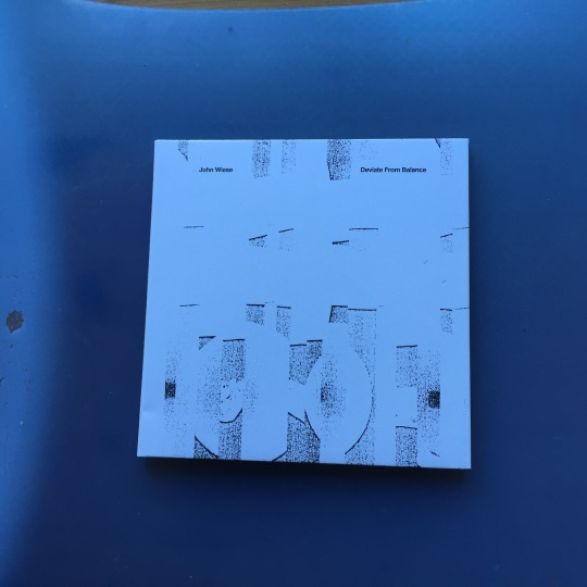
John Wiese - Deviate From Balance
Released on 15 June 2015 by Gilgongo Records
Reviewed format: CD album
Connected listening - there are various ways to order a selection of John Wiese’s further discography. The Helicopter mail-order stocks various John Wiese releases as well as Sissy Spacek releases and releases by by John Wiese in collaboration with associates, you can find it here: https://helicopter.storenvy.com/collections/924921-john-wiese
Several solo releases by John Wiese are also available on physical and digital format from his Bandcamp page here: https://johnwiese.bandcamp.com
Many releases on Gilgongo Records are available on physical format through their mail-order store here: https://gilgongorecords.storenvy.com
After looking at one of Sissy Spacek’s recent new albums Featureless Thermal Equilibrium in the previous Polar Visions Amplitude it’s time today for the first of two follow-up reviews in which in this case we’re focussing first on one of John Wiese’s past solo albums, Deviate From Balance. Released back in 2015 on both a 2 LP vinyl package as well as a CD version on James Fella’s label Gilgongo Records our look is on the CD version which features the packed 79 minute album in full and what a collection of pieces it is. While the Sissy Spacek album showcases John Wiese’s talent in mixing Grindcore aggression with monolithic Noise screeches as well as maxing out the energy throughout, Deviate From Balance showcases John’s more restrained side in a collection of 10 tracks encompassing mostly live recorded compositions and improvisations that are leaning more towards intense choppy sound collages and noisy electro-acoustic interplay of acoustic and electric instrumentation with John’s electronics with a more conceptual edge to them. However while some of the titles of the 10 pieces suggest a somewhat philosophical or technical meaning behind these pieces, listening to these reveals a much more playful and raw sense of composition and performances from John and all musicians and artists involved in this album. Whilst John’s sound can be related to Free Improvisation, his rapid-fire editing and manipulation of sonic material on this album is much more complex and dazzling than many other artists and carries John’s signature knack for surprise, high frequency distortion crunches as well as shifting and abusing lo-fi sound recording equipment and electronics in as many ways as possible, almost as if they turn into crumbling fragile rocks. Disintegrating broken sound and dadaist absurdist humour is a recurring theme in John’s sound, making for an album that is much more enjoyable than overly academic contemporary Tape Music can be at times. Besides John’s sonics the involved musicians on this album are definitely an important element that adds many rich colours to the 10 pieces, featuring musicians like guitar virtuoso Oren Ambarchi, violin artist Jon Rose, sampling expert David Shea and drum machine musician Ikue Mori as well as many others. Before we’re diving deep into the 10 tracks on Deviate From Balance, let’s have a look at the packaging design of the CD version. The CD comes in a neat glossy oversized gatefold sleeve showcasing John Wiese’s minimalist design, artwork as well as a very colourful artist photo of John by Martin Escalante on the back. In terms of artwork I do like the photo-collages and art pieces on the inside of the gatefold a bit more than the cover this time as while the cover does highlight the general collaged, choppy nature of the album well in a visual manner, its subdued grayscale grainy images aren’t as striking as John Wiese’s other album covers but still, it’s a decent cover and the typography is quite stylish and repeats on the spine in a similar manner. The aforementioned imagery on the inside of the gatefold showcases both grayscale abstract art in the form of archaeological artefact style fragments on the left panel as well as a film roll like photo collage of a rather disturbed looking lady blowing up a balloon. The abstract images are a bit similar to the album cover though with darker and more distinct contrast but the photo collage also adds another good visual reference to the packaging regarding the tracks themselves in that balloon like squealing and screeching can be heard on some of the pieces and it also seems to refer to the album’s quite off the wall type of abstract humour. The left panel additionally features all album credits neatly laid out so you can find out all about the involved artists and recording locations plus sources. The CD itself comes in a convenient little black envelope with plastic protection and features a more LP like label design featuring simply the artist name, album title and Gilgongo label logo, somewhat similar to a Japanese mini-LP replica package. Now that we’ve looked at the package, let’s pop in the CD and dig in.
Deviate From Balance starts with Wind Changed Direction which is one of the most atmospheric pieces on the album. The piece blends organ like drone, chopped up distorted recordings of what sounds like children’s voices, machinery as well as other Industrial noises together to form a quite surreal mysterious soundscape. Quite like the title suggests the music sounds quite like you’re floating through the clouds right after the wind has changed direction. The drone feels both calming but also a notch ominous whilst the auto-panned chops of sound are both vaguely abstract and at times recognisable with John varying between distorted and resonant shards of crunchy sound and cleaner metallic elements. The voice samples hint somewhat at sonified memories, they sound like fragments from the past, conversations or event you might remember from childhood though the actual words are unrecognizable. This first piece is definitely one of the most straight-forward compositions on here in terms of structure with the drone both introducing and rounding off the piece as in both cases it eventually fades into the background. A quite lush start of the album. Following piece 356 S. Mission Rd continues the soundscape like approach but in a more ominous manner sounding quite like a cross of dark sounding orchestral music samples with strange hollow metallic resonances and washy shifting noises. The metallic resonances bring plenty of subdued Industrial shine to the piece but the aforementioned orchestral samples are what draws me into this piece the most as the screechy dissonant strings combined with ever so slightly differently timed horn crescendo suggest an ever apparent danger which is getting closer but just like in an abstract nightmare is stuck in a loop with the danger never reaching further than a certain indiscernible point. The shifting noise elements add some rawness to the piece which suggests some kind of turntable manipulations going on in the piece, a lovely brooding collage piece this is. Segmenting Process For Language, the next piece, is where things start to get more chaotic and free-wheeling though still very much controlled. The track featuring a live performance recorded at East Brunswick Club in Melbourne, Australia consists of wild and inspired mixtures of saxophone, (junk) objects, percussion, drums, guitar and noise as the musicians move into always differing “segments” made up of shards of sound, wildly swirling melodies, chords and tones. This does make for quite some literal clashes of sound but rather than being one of the more random sounding Free Improv performances the sections of interplay follow a much more recognisable structure in that certain droning tones as well as feedback lays somewhat of a base underneath the bursts of sonic mayhem. Whilst there are a whole lot of things happening in this recording I would like to name a few particularly enjoyable bits. These include the short bursts of squelchy synth swirls, resonant ground vibrating feedback laden noise, the hilarious goofy but still playful wordless vocalisations spat out by the musicians but also the at times disturbing dissonant chords which are formed and culminate in an absurdly, almost 50’s Horror film soundtrack like waves of organ droning at the ending of the piece after which we can hear the only applause that could be fit in on the tightly edited CD. An inventive juxtaposition of out of the blue musical absurdism with the more dadaist lightning strike like approach of collage based Harsh Noise carrying John’s seal of quality. The next track Superstitious does match its title rather well in terms of the sounds within and it’s the most Noise focussed piece on Deviate From Balance though still more along the lines of a layered soundscape. After the instrumental interplay of Segmenting Process For Language we’re back to a more noticeably composed piece which moves through various phases emitting a definite ambience of superstition through somewhat disturbing concrete sounds, noise and tones. Its beginning featuring chopped and quite heavily scrambled recordings of a scared woman wailing as well as various other waves of distorted sound and tone overtime moves to the climax of the piece which is an extended section of the aforementioned noise from by a nicely low end grounded stream of screechy sound featuring especially piercing high frequency sound manipulations quite like some kind of dystopian alien machinery, though your interpretation might definitely be much different. Regardless of how you interpret it, the piercing noise does give off quite an intense feeling of dread and fear and while the sounds used in the piece are sometimes somewhat recognisable, like dirt like crumbling sounds, coffee cups, car related sounds etc., again they’re manipulated and structured in such shifting and distorted manners that they feel like sudden waves of mind imagery than things you can really grab onto. The finale of the piece in which John frequency manipulates a continuous tone is quite gripping too and Superstitious as a whole sounds quite like both a physical and mind gripping piece. Cafe OTO is the track that follows and it’s obviously a live recording that was made at Cafe OTO. Moving back to the more improvisation based style of collaborative group performances that John Wiese has done together with other musicians this piece has a more continuous flow of sonic events and instrumental interplay and a generally might lighter edge to it than some of the other pieces. Especially the percussion blended with effect manipulations and saxophone performances are particularly good on here with percussion clattering, clinking, jumping around the room in quite hilarious surprising manners moving from crystal like tinkling to shells and wooden percussion whilst the saxes wildly swirling melody lines and screeches form sweet tonal abstraction that are wild but not going overboard and staying well in tune with the other elements of the performances. The “spat” out vocalisations are quite matching with the saxophone performance and whilst somewhat more subtle for most of the recording, there’s also some tasty, albeit less abrasive crashes of objects near the end of the recording. Again, John Wiese’s talent in highly abstract but always varied and uncompromising electronics and instrumental performances combined with the excellent inspired energy of all musicians that appears in his group performances shines through with the fun and details in the layers created making this suitable for many repeat listens. The following track Battery Instruments (Stereo) does work quite like an extension of the sounds from the Cafe OTO recording, though in a bit more minimalistic fashion being made up of mostly small, clicky and quite sounds. A collage of instrument, objects, electronics as well as short vocal bursts the piece puts the freely moving aspect of John Wiese’s group pieces into more of microscopic lowercase territory. It’s the shortest piece of the album at 2:12 minutes and works as kind of transition from Cafe OTO to the quite abrasive walkman Noise collage piece Memaloose Walkman, showcasing various crackling, scraping, spiky sonic details, a mysterious subdued drone as well as some quite tasteful bass string scratchings all panned quite widely (as this was originally a multi-channel piece). A sweet short piece this one. The aforementioned piece Memaloose Walkman then follows and it’s quite straight-forward in nature consisting of a mono tape collage of various recordings of gunshots. Besides splices and perhaps a bit of pitch adjustment there’s not much manipulation added to this but as a Noise piece it’s quite effective letting you hear the different swishing phased textures of shots from various guns as well as some bits of talk and music in between with a layer of crunchy saturation on top of everything. Simple but effective. Afterwards Dramatic Accessories continues within the Noise territory as a piece of quite a lot of instrument / object and especially turntable abuse featuring quite a lot of bassy and wild distorted screeches mixed with chopped recordings all presented through some crazy panning. One that will especially please harsh heads, within Dramatic Accessories there are various sections in which John and the other artists involved use all kinds of methods to create a variety of sounds ranging from the shifting kind of turntable warble, clicks, grating washes of distortion, chunks of feedback, amp hiss and metallic ringing. However whilst there are a lot of distorted sonic events happening within this piece, there is some sense of dynamics within however, created by the wild panning as well as shifting the phase and using some of the room acoustics and feedback of equipment to create some loud / softer / loud sections leaving some headroom for the sounds to not fully max out and become a bit overblown. The garbled object and instrument chops are clattering around often but strange distorted disturbing recordings of voices are also thrown in the mix making for an at times frightening but thrilling ride of unpredictable sounds. One element that is recurring throughout the wildly fluttering barrages of different sounds are certain grounded tones that bring forth some kind go base for all sounds to lean on as they continue changing in at times rapid manners. All in all Dramatic Accessories is another enjoyable sonic ride on Deviate From Balance in which rich and uncompromising textures are brought out in memorable ways through some fine inspired performances from all people involved. Solitaire follows, which is one of the two longest and final pieces on Deviate From Balance, at 11:15 minutes. In terms of approach the piece is somewhat similar to Dramatic Accessories but with the difference that rather than using vinyl, tape is being used here as one of the elements that create the various sounds within the piece. Solitaire follows a more continuous structure than other pieces on Deviate From Balance in that it’s mostly based on a set of repeating patterns within it's structure acting a bit like the compositional and performance equivalent of mechanical processes. Whereas Dramatic Accessories featured experiments with both clean and distorted sounds, Solitaire moves more into a quite crunchy rough direction featuring shards of chopped up instrument and music recordings, junk objects, voices as well a various especially percussive and resonant concrete sounds that ever continue to change in form. These repetitive patterns do give some kind of rhythmic drive to the piece but change often enough to not become sampler like and are more akin warbled broken tapes as the recordings are mercilessly abused through speed manipulations and ever increasing distortion. This is combined with a constant shift of stereo phase, through which on headphones you get the idea that the shards of sound are flying over your head and are forming 3D shapes in between your ears. A great listening experience which even works as the distortion gets quite murky and harsh nearing the end of the piece. Whilst the pattern style, on the fly pitch warbles and crunching noises carries on throughout, it’s great how some depth is slowly forming near the end of the piece, in which soft ticking percussive bits are being scattered between out ears and rimshot like ticking sounds are added for nice clean percussive accents. A very fluid piece in terms of progression and sound work which shows that whilst John Wiese’s solo and band works might at times sound very free-flowing and chaotic, he’s always got quite some noticeable control and focus within every piece, inspired and always different. Final piece Segmenting Process (Oregon) is indeed somewhat related to the earlier Segmenting Process For Language although in the case of this recording the segmenting of the several parts of the piece is even more clear. Being the longest piece on Deviate From Balance at 21:45 minutes the piece is also one of the most introspective and “organized” sounding tracks on the album as in here we can find the by now familiar mixture of acoustic, electric instrumentation with both electronic sounds and manipulations but also a more restrained approach to the Noise elements John Wiese has explored in various ways in most tracks before this one. Rather than almost overtaking the non-electronic instrumentation either through loudness or sharp (harsh) frequencies, the Noise is more in tune with the instrumentation as being a part of a blend of various sonic elements. This is also helped by the fact that with the larger group setting featuring brass, percussions, drums and more the piece required a larger venue to be performed which gives the piece some welcome acoustic space, adding some room ambience and keeps the piece nicely dynamic. Sounding most similar in approach to Electroacoustic Improvisation the pieces segments blending vibrant instrumental performances which vary from fluttering percussive tones, noises as well as more drone focussed falling and rising tones with crackling, noisy, humming, distorted, sample based and glitchy electronics sound quite like the piece is based on a mixture of dreams. Like a sonic interpretation of a dream world the piece moves from segment to segment with all of them featuring somewhat recognisable sounds like the instruments themselves or voices mixed with shaped abstract noises but everything carries some kind of mystery within it, which is especially caused by the somewhat unnerving textures created by the brass instruments within the performance. The absurdist humour element is still apparent within the piece however with at times goofy squeaky noises, drum kit hits, tinkling bells and other pointy bits of abstract sound keeping things nicely playful and light but still powerful as always. The flow of the piece also helps to keep things captivating and interesting throughout as its length might take some listeners a bit to get into it but with so many different events happening throughout there’s never any idleness in here. And with this last piece I’m getting into the conclusion of this review of John Wiese’s Deviate From Balance. I award this album a Polar Visions Amplitude of 85 dB, recommending you to definitely check out this album. Deviate From Balance showcases both John Wiese’s compositional and performance talents through a varied selection of recordings in which you can hear John’s approach in various settings ranging from surreal sound collages, Noise infused instrumental improvisations to rough tape manipulation and Electroacoustic Improvisation. Never resorting to mere academic musical studies John Wiese’s pieces on Deviate From Balance keep hitting the ears and mind in excellent and inspiring manners and will be a great discovery for fans of free spirited contemporary music, both analog and digital based sound collage works, (Harsh) Noise fans as well as anyone into inspired improvised music and will be a great addition to the collection of fans of John Wiese and Sissy Spacek.
Deviate From Balance is available on CD from Gligongo Records mail-order store here: https://gilgongorecords.storenvy.com/products/20648396-john-wiese-deviate-from-balance-cd-gggr-077
#polar visions amplitude#album review#john wiese#deviate from balance#15 june#2015#gilgongo records#cd album#sound collage#musique concrete#noise#free improvisation#electroacoustic improvisation#unsettling#disturbing#playful#absurdist#humorous#introspective#PVA
2 notes
·
View notes
Text
Geometry Club
©Dave Mullan
©Adrian flickr
“Embrace nature’s brutal perfection” Boyd Rice
Research the Narrative
The research required for this brief is simply to gather inspirational images from other practitioners. Add this to your blog/workbook with clear information as to where the images were sourced and who the copyright belongs to.
Tell the Story
Shape and form in environmental photography underpins the overall aesthetic, considering the underlaying composition of an image allows the photographer to explore the subject in new and exciting ways and help you see the photograph as a unique representation of the subject you choose.
Simple geometry can be found everywhere, the shapes formed by the play of light, structures intertwining, objects passing each other… training your eye to look out for strong shape to compose your subject is an important part of constructing strong, bold photographs. Waiting for the correct moment to press the shutter release is a skill in finding the right moment.
Look around your environment to find strong geometric images. Shoot 100 photographs with the main focus being on strong geometric shape, within an outdoor environment.
Edit and refine: Complete worksheet
Make a contact sheet of the best images.
Study and ‘mark-up’ the contact sheet, making aesthetic decisions on your final selection.
Optimise your best TEN images Describe your decision-making process.
Submit: Series of TEN images on ONE A3 canvas 300ppi. Upload to my city.
Geometry Club Research
What Makes a Great Fine Art Architectural Photograph?
JUNE 22, 2018 · SHARON TENENBAUM
Every person you ask might have a different answer to the question, what makes a great fine art architectural photograph? However, in my experience, there are a few key factors that are necessary for transforming a good image into a great one.
Great architectural images often follow these 3 features:
· Composition. In architectural photography, you need to use the language of geometric lines and shapes. These elements must create a harmonious balance within your frame. Without this component, not much can be done to salvage an image.
· Simplicity. Once the shot is made, ask yourself: “What elements in the image are not adding to the story?” In other words, try to simplify your scene by eliminating unnecessary details.
· Post-processing. Once the two factors above are covered, the work on post-processing begins. If you are familiar with my work, you might be aware that I’m a strong advocate of ‘creating’ an image and not ‘capturing’ one. This means accentuating and exaggerating the compositional elements mentioned above, and creating depth, volume, and balance through selective lighting.
Image 1 – BEFORE: cluttered, unprocessed and without a person in the frame. Even though the compositional foundation is present, there is still much work to be done on decluttering and gradient lighting.

Image 2 – AFTER: ‘cleaning’ the image of unnecessary details and implementing gradient lighting.

Until recently, this is where my creative process stopped. I don’t want to elaborate too much on the features listed above; instead, I want to talk about an element in architectural photography which I’ve only lately begun exploring.
Creative Shift
As architectural fine art photography is my passion, it’s been the subject of my images for over a decade now. My path of creating this body of work was a path of self-discovery. Even though some of my earlier architectural images are stellar and I would not have done anything different with them today, in my newer work, I am embarking on a creative shift. This shift is taking my architectural images in a different direction, so now, they are not just about celebrating form, but also about human interaction with the architectural environment.
Architectural structures, by their nature, are designed to serve a purpose for people. By eliminating people out of the composition, the photographer is celebrating the art of geometry and engineering above anything else. As magnificent as the design might be, by including a human element in the composition, the image takes on a new (and different) life form. The benefits are three-fold:
First, it adds a sense of life and warmth to an otherwise cool scene. An architectural image is naturally cold, comprised of concrete, steel and/or wood. By including even a single person in the image, we are warming up the scene and crossing the boundaries from the inanimate to the animate.
Second, it gives a structure a sense of scale and comes closer to the architect’s original intent in design, which is serving people for a specific purpose. For instance, Middle Age Gothic churches were designed to dwarf the scale of a human in comparison to the House of God they were entering. A church was designed to be of an enormous scale to give the parishioners an ‘otherworldly’ experience. If you walked into a Middle Age church and did not get that feeling, then the architect did not do his job right. This was done with the intention of making one feel small in the presence of the Almighty God. Likewise, an image of a church that depicts the sense of scale by including a human reference would convey that concept whereas the image without one would not.
Lastly, by adding a single person, we are giving the viewer’s eye a resting point. The psychological reason for this I can’t say, but it’s a fact. We tend to first spot the person in the image and use the rest as a background. That makes the image more intriguing on a few levels. First, as the photographer/artist, you now have the power to direct the attention of your viewers. You are saying to them: “Start here.” Second, it helps to simplify a scene that otherwise can be too busy with lines and shapes (as in the image below). Third, and maybe most important, it adds asymmetry or shifts the ‘center of gravity’ of an image to create a more intriguing composition.
Looking at the image below, we can see all the points I stated above exemplified, as the image without the cyclist is lacking warmth, a sense of scale and a resting point.
Image 1: With Cyclist
Image 2: Without Cyclist

Sharon Tenenbaum teaches Fine Art Architectural Photography Workshops around the world. To learn more about Sharon’s work and details about her upcoming workshops, please visit: SharonTenenbaum.com
Source: https://www.thephotoargus.com/what-makes-a-great-fine-art-architectural-photograph/
Matthias Heiderich
A self-taught photographer, Matthias Heiderich (b. 1982) explores urban environments, finding surprising angles and colours within cityscapes. His shots are framed in a distinct way, focusing on corners, sides and small sections of buildings. Consequently, he does not just record what he sees; rather he transforms the ordinary into dream-like spaces that suggest a futuristic universe. The minimalist images bring attention to symmetry, lines and patterns prevalent in the urban landscape. Primarily working in the realm of fine art, his pieces have also appeared in architecture and travel publications, such as Wallpaper* and Cereal. Since 2011, Heiderich’s images have been exhibited at galleries in Berlin, Barcelona, San Francisco, St Petersburg and Zürich. In 2014 Spektrum Berlin was published with the Parisian publisher Editions Intervalles. The images selected are an overview, illustrating how exploring lines, structures and space rejects the banality of city scenes, reforming them into an awe-inspiring collage of geometric shapes. www.matthias-heiderich.de.






Source: https://aestheticamagazine.com/geometric-architecture/
Architecture photography corner – in pictures
In 2014, Sheffield-based photographer and graphic designer Dave Mullen Jr started Geometry Club, a collaborative Instagram project in which people submit images of buildings forming carefully composed triangle shapes. Mullen is now creating an app to simplify the meticulous formatting process, and says the project is “a test of building an audience based on curating the same thing”. The account has attracted more than 25,000 followers and welcomes contributions by professional and amateur photographers. “I quite like the fact that sometimes you look at the photos and it’s not obvious that it’s architecture straight away,” says Mullen.
Photograph by @grg_mlll (US).

Photograph by @ferrypasschier (Netherlands).

Photograph by @mismaria (England).

Photograph by @davemullenjnr (England).

Photograph by @jagamac266 (Singapore).
Photograph by @marcclish (Scotland).
Source: https://www.theguardian.com/artanddesign/gallery/2017/jan/28/architecture-photography-corner-in-pictures
7 Tips to Spice up Your Photography Using Geometry
MARCO DE GROOT
October 9, 2017
Finding yourself in a photographic rut? Add value to your images by keeping these geometric principles in mind.
SYMMETRY
Symmetry lies at the heart of the laws of nature. It’s calming and pleasant to the eye when an image features a symmetrical composition. But a photo doesn’t necessarily need to be split directly down the middle to successfully incorporate symmetry. When an image feels balanced, you can achieve the same (and sometimes more interesting) result.
Look around on your next trip; you can find symmetry everywhere.


SHAPES
Using shapes is another way to creatively frame the subjects in your photos.
Squares and rectangles suggest conformity and order. Keep an eye out for these shapes and use them to enhance that feeling.
On the other hand, the circle represents unity, completion, and perfection. When used in an image, circular shapes can help draw the eye inward and keep the viewer’s attention on the subject.


Finally, triangles are a good way to focus attention toward a certain point. And, depending on the way a triangle is angled, it can evoke a calm or energetic feeling for the viewer.

CONVERGING LINES
Converging lines can be used to add depth and guide the viewer’s attention in a specific direction. These lines don’t need to be physical, per se, but can be created using a pattern that directs the gaze forward.


PARALLEL LINES
The use of parallel lines evokes order and rhythm in photography. Parallel vertical lines give the illusion of growth, while horizontal lines give the impression of calmness or tranquility.


INTERSECTING LINES
Diagonal or angled leading lines can make an image seem more dynamic. By highlighting these lines, photos become more active. Depending on your angle, intersecting leading lines can also help connect more than one subject or add depth to a photo.


PATTERNS
Patterns are a useful tool for both framing and composition in photography. When a frame is filled with shapes it can add to a photo’s drama or, when aligned, its order.
You can find patterns in window arrangements in buildings, shapes of tiles, pebbles on a beach, bricks on a wall etc.. When you know what to look for, you can find them all around you.


PERSPECTIVE
Sometimes, even a perfectly-composed shot can end up looking a bit boring. If that’s the case, try changing the perspective by flipping or rotating the image to find the view that makes it most intriguing.

Source: https://passionpassport.com/spice-up-your-photography-with-geometry/
Shoot 1 Contact Sheets

Contact sheets marked up with images chosen for optimisation
I feel the above selected images could work well when optimised as they contain strong and repeating geometric patterns. The images are high contrast and colourful, while the ones chosen from the contact sheet below contain intricate patterns in the shadows created by the strong sunlight.
Most successful optimised images from shoot


Marked up contact sheet from 2nd shoot

Most successful optimised images from shoot



1 note
·
View note
Text
Cookies & kisses💋
.BTS Jungkook.
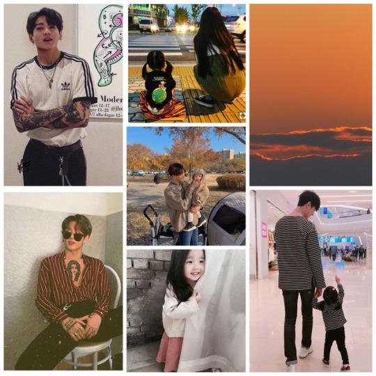
Summary- Jeon Jungkook is a broke college student who’s just trying to get his degree and find his place in the world but things aren’t always that easy. Especially when you’re only 21 years old and have a 4 year old daughter.
Warnings- Mentions of underage sex, brief mentions of past drug & alchol abuse. Mentions of past depression, self harm and suicidal thoughts. Quite a bit of swearing but nothing too harsh, don’t read if you’re sensitive to anything mentioned above.
Word count- 2.4k
-
A trail of ‘sorry’s and ‘excuse me’s left Jungkooks mouth as he pushed his way through the overcrowded hallway of tired and depressed collage students. His afternoon class had ran over and he had to get to the daycare a little under a mile away in under 5 minutes if he wanted to pick his daughter up in peace without all the judgemental moms rolling their eyes at him for not being on time. It’s happened more times then he’d like to admit and Jungkook would be lying if he said the fellow parents stares weren’t intimidating. Now the young dad knew that being a single father in collage would get him a bad reputation, the tattoos covering his muscular body doesn’t help with anything either but he’s learnt to ignore the disapproving glares from strangers and to just focus on himself and his precious little girl.
He ran as fast as he could to the nursery, considering himself victorious when he arrived at 3:31pm, only a minute late and the class hadn’t even came out yet. He smiled slightly to himself before looking around awkwardly to see only a few stares from both Teacher’s and parents which made him huff and cross his arms over his chest, emphasising the tattoos covering his toned arms in a way to tell them he isn’t interested in what they have to say. Who do they think they are, looking down at him and his daughter like they’re some specks of dirt on their shoe. It honestly angered him more than anything, everyone thinking he can’t raise his own daughter well because of his age, everyone thinking he’s a bad father because of how he looks and the bad things he did in the past. He had moved on from those times and he liked to think he’s even grown as a person which is something only a few people seemed to believe.
His thoughts are interrupted by the sound of a door opening and a crowd of excited children running towards him like a mini stampede and a smile is instantly spread across his face when he sees his beautiful little girl skipping towards him. “Daddy!” Eunha squealed as she jumped into her fathers arms, obviously happy to see him after a long day of being apart. “Hey baby how are you?” He said whilst picking the small girl up, kissing her cheek before making his way out of the now crowded playground. “It was so fun daddy! We did painting and drawing all day and look I made you something!” Jungkook stopped a moment, looking down happily at his daughter who’s hands were carrying a rather large card that had “Merry Christmas Daddy!” Written on the front in various different colours and a picture of the two of them with a Christmas tree full of presents in the background.
“Baby this is beautiful, thank you princess.” Jungkook said emotionally. He was so happy to have someone so precious in his fucked up life that brought him happiness and peace, something the father didn’t think he deserved.
The two made it home after about 15 minutes of walking, they lived in a big apartment just outside of campus with three of Jungkooks best friends. He originally wanted a small house for just the two of them but after talking with they boys he realised moving in with them would be cheaper and it meant he had someone to help take care of Eunha if needed. Some people would question if living with 4 men was a good thing for the young girl but Jungkook would always shut down the comments, insisting that he’d known the three for years and Taehyung, Seokjin and Hoseok adored Eunha and would do anything to help.
“We’re back” The raven haired boy shouted, putting Eunha down so she could run off into the lounge to play. “In here” Taehyung shouted back from his position presumingly in the kitchen. His suspicion was met when he walked in and saw his hyung raiding the cookie draw. “Hyung, Jin literally brought those this morning and you know how he gets when you open food straight away” the younger laughed as Taehyung rolled his eyes at the comment. “That’s not my problem, if he would let me then I’d do the food shopping but he doesn’t so he’s just gonna have to deal with it” Jungkook just laughed at his friends rant, grabbing his phone and scrolling through his most recent notifications.
“Tae oppa!” Eunha grinned, her curly long brown hair bounced as she ran towards her favourite (don’t tell jin) uncle. Jungkook and tae had been best friends since elementary school and when the younger told him he was gonna be a dad he didn’t judge him like everyone else did. Don’t get him wrong he was shocked of course; and a little sympathetic for the inexperienced teenager,but he stuck by him and helped him through everything. So it was kinda natural that his daughter had the best bond with him considering he was practically Eunha’s second dad. “Princess” he laughed as he picked the youngster up, twirling her around in circles resulting in the cutest giggles squeaking out of her mouth. Jungkook gazed lovingly at the sight before him, the sweet sound of his daughters laugh never failed to make him smile.
“Dad said that you’re looking after me a bit today” she informed him looking up into Taes eyes, grabbing a strand of his hair and playing with it between her small fingers. The elder looked at the father with a raised eyebrow as the younger mouthed ‘please hyung’ with pouty lips that Taehyung could never say no to. “Of course I am sweetie and we’re gonna have lots of fun, why don’t you go into your room and find something for us to play with” he smiled, carefully putting her down with a kiss on the cheek before she giggled and skipped out of the room. “I’m sorry Tae I got a call earlier from my professor and he said he needed to talk to me and I know it’s late notice and I should have asked you first but-”
“Jungkook it’s fine, don’t worry about it just call me when you’re on your way home” Taehyung smiled and patted him on the back. “Thanks hyung, I shouldn’t be too long.” He quickly turned and made his way out of the room, grabbing his phone and keys from the side before kissing Eunha on the forehead and making his way back out of the door.
The young dad sighed to himself as he strolled through the fairly busy park, it was mid May so the summer heat had just hit Seoul like a truck and Jungkook wasn’t particularly ready for it. A black and red checkered hoodie, thick black jeans and boots covered his muscular frame and he was starting to hate himself for his choice of clothing. A thin layer of sweat covered his forehead making his raven black hair stick slightly and Jungkook hated how it made his body itch but didn’t bother wiping it as he knew it would only make things worse, choosing to walk under the shade that the oak trees decorating the park provided.
Lighting up a cigarette the young male looked around the crowded park, the new weather brought about hundreds of different people; from students to families with small children of similar ages to Eunha, the sight of a couple and their daughter playing happily and laughing made him feel somewhat guilty. A feeling he felt quite often these days. It’s not that Jungkook regretted become a father at the young age of 17, of course he would have preferred to be a bit older before he had children but he wouldn’t change it for the world. It was more the fact Eunha didn’t have a mother figure in her life and he could tell that it’s effecting her more ways then she would admit. Seeing all the other kids at her nursery being picked up by their moms and all the little girls having pretty braided hair in fancy clips and scrunchies that Jungkook just couldnt figure out how to master no matter how hard he tried. Obviously Mother’s Day was the hardest, especially now that she went to school where everyone else was making ‘best mom ever!’ cards for their beloved parent, however she drew her dad a picture, a colourful sketch of herself, Jungkook and her 3 uncles instead and as much as he knew his daughter loved him with all her heart, she would love to have a mother figure too.
So lost in his thoughts Jungkook didn’t realise he had arrived at his professors office. He threw the cigarette on the floor and stomped it into the ground before taking a deep breath and gently knocking on the door. A small ‘Come in’ echoed throughout the room and Jungkook slowly made his way into the overheated room. “Ah Jungkook, nice to see you! Take a seat.” His professor, Dr Thomas said way to enthusiastically for a Monday afternoon. Upon taking his seat Jungkook quickly became overwhelmed by the amount of papers that were placed in front of him. “Do I even know what all of these papers are?” The student asked eyeing up the never ending pile of papers of all colours. Chuckling at Jungkooks reluctantly “Don’t worry, they’re not all as bad as it seems.” The teacher joked rummaging through the pile to pull out a rather bright booklet that stated ‘Grease The musical!’ on the front cover in big bold letters and handing it to the confused student.
“Erm sir.. I’m not a musical theatre major, why are you giving me this?” Jungkook questioned looking down at the script in his tattooed hands. It made no sense to him as to why his professor was giving him this, he’d never been interested in acting or even going to see a theatre production so this was completely random to him. “Now Jungkook that’s what I needed to speak to you about” he paused, “I’m pretty sure you’re aware of this but you’re failing my class and well it’s my job to not let that happen” The middle aged man smiled keenly. “Now this big ol’ pile of rubbish is all of the projects you can do for extra credit and I spoke to your friend Hoseok Jung and asked him about your interests and he said performing arts is one of them!” He said gesturing to the never ending stack of scripts and god knows what else.
Grunting quietly Jungkook slowly flicked through the pages of the script in front of him “So what do I have to do? Just pick one of these and help out backstage or something? Cause I’m not really an actor, more of a dancer” He asked looking up at the man in front of him. “Now, Hoseok said that might be the case so I asked the head of Musical theatre if you could help out somehow with the choreography and you’re in luck! Their main choreographer had to drop out so all you have to do is go and tell Professor Richards that you’re up for the job, perform a piece of your own choreography in an audition and boom extra credit sorted!” Dr Thomas exclaimed, clapping excitedly for his student.
Smiling slightly at the mans excitement Jungkook nodded “Thanks for sorting all this out sir I really appreciate it.” He said standing up, wiping his sweaty palms onto his thighs before offering his hand for the teacher to shake. “No worries, oh how’s Eunha by the way? You haven’t brought her into class recently .” Dr Thomas asked curiously letting go of Jungkooks hand.
The student had been taking his daughter into his lectures since he started the university. It was extremely hard for him back then considering he was a single, 19 year old father with nothing but hopes and dreams of graduating with a degree in engineering science. He didn’t have anyone to take care of Eunha during his classes due to his friends being tied up in their own schedules and his parents were always busy at work so bringing her into class with him had been his only option. Mr Thomas had been extremely supportive of Jungkook and his situation, so much that he even made a small children section in the corner of the class that had a few books and toys to keep Eunha occupied whilst her father was listening to the lecture. The young student was beyond thankful for everything he had done for him. If it wasn’t for him Jungkook doesn’t think he would have coped.
A proud smile came over his face as his daughter was mentioned. He loved to talk about his pride and joy and he jumped at every chance he could to brag about her brilliance. “She’s doing really well sir, she just started nursery so I don’t have to bring her In anymore.” He explained happily. “That’s fantastic Jungkook! You’ll have to bring her in to see me one of these days, anyway I’ll let you go. See you soon son.” Jungkook smiled once again and waved before stepping out of the office, the fluorescent pink script looking out of place in his inked hands.
The student paused as soon as he made it out of the office, a sigh making its way out of his mouth. How the hell is he gonna be able to fit this into his schedule? Jungkook was a busy man, he had a 4 year old daughter for God’s sake! How is he meant to choreograph for all 10 songs, teach the choreography, study and look after his child and himself all at once? Shaking his head he carried on walking, pulling out another cigarette to calm himself down. He knew he shouldn’t smoke as much as he does but it was an old habit he just couldn’t get rid of no matter what he tried. The youngster carried on walking home, a million different thoughts swerving round in his head. He didn’t know what he was going to do for this audition. Didn’t know if he should just turn back around and tell his professor to forget it and let him fail. He wanted the latter but he knew he couldn’t do that. He had to pass this class. He needed to make his daughter proud.
#bts#bts reactions#bts scenarios#kpop#kpop scenarios#fanfic#bts jungkook#bts fluff#jeon jungkook#jungkook scenarios#bts jhope#bts jimin#bts taehyung#bts suga#bts jin#bts namjoon#bangtan#bts fanfic
333 notes
·
View notes
Photo


VIRTUAL SKETCHBOOK 1
Pictures are in order of assignment.
1. WRITING AND RESEARCH -
A fact about me is that I love to play Dungeons & Dragons. I play a little gnome on some days and a big half-orc on others.
The art work assigned to me was The Great Wave Off Kanagawa by Japanese artist Hokusai.
1. This piece of art, sometimes known simply as The Wave, is part of a 36-piece series that all feature Mount Fuji under different weather conditions.
2. The Wave is not a painting, which I always assumed it was. It is actually a woodblock print.
3. Hokusai began creating art when he was only six years old, when he learned to paint, and branched off to different mediums from there.
4. The boats in these paintings are depictions of the boats that had been used to transport fish between land masses. In each boat, there are eight people manning them. It is implied that they had been heading back home with fish before the formation of the large wave in question.
5. Hokusai changed his pen name 30 different times throughout his career. With each name change, he allowed a student of his to assume his former name.
Researching this art did change the way I looked at it. Before, I never really took notice of the boats, and I never realized there were people inside the boats. Before realizing this, looking at The Wave always gave me a sense of peace; I love the ocean, and the color blue always makes me feel calm. While I still feel this way, I do also feel a new sense of urgency and impending danger with this new information, and I now see the fear from the rowers clinging to their oars.
2. ART AND WRITING – Pictured above is a drawing that a friend of mine drew of one of my Dungeons & Dragons characters. It was made using pencil and paper, and it currently hangs on my wall over my desk. It’s important to me, because I recently (last week) moved very far away from all of my close friends. Looking at this drawing reminds me of all of the fun times we had playing D&D together and going out for midnight breakfast afterwards. It helps me feel better when I get homesick, and it reminds me that even though I’m far away from my friends now, I still have them as friends and I will get to see them again in the future. I wouldn’t say that the drawing itself is innately beautiful, since it’s a really simple sketch, but I do see beauty in the memories that it holds. The fact that something so simple can hold so much significance is really astounding to me.
3. WRITING A SELF-PORTRAIT – I am 21 years old, I’m white, and I’m nonbinary. I’m from Sarasota, Florida- born and raised. This recent move is the first time I’ve ever lived anywhere else! In my free time, aside from my all-consuming love for tabletop games, I like to weight lift, swim, hike, sew, draw, and sing. My tabletop groups are currently the only organized groups that I am a part of, but I hope to join more soon so I can meet new people. I’m between jobs right now, but I want to pursue a job as a pharmacy tech or a barista at a local coffee shop. Many things make me uniquely me, but I think what stands out the most is that I am very opinionated, I’m a bit of an organizational freak, and I have a unique sense of humor.
4. ART PROJECT (SELF-PORTRAIT) – I have elected to make a collage for my self portrait. The background includes two pride flags and a floral design, things that I feel embody some of the foundations of my identity. The collage also includes sharks, which are my favorite animal and a symbol of misrepresented “ugly” animals whose conservation are just as important as “cuter” animals who get more representation. I’ve also included bats, because they share a similar “ugly animal” plight and I also really love Halloween. The cats, while silly, perfectly embody both my sense of humor and my connection to my emotions. I am a highly emotional person and even my negative feelings (anger, sadness, pride, etc.) I have learned to embrace as a part of myself, and I do often choose to express those emotions through humor. Lastly, of course, D&D is in the center of my collage because of how important it is to me. It gives me a medium to express creativity and explore more of my personality, and I have met many of my best friends through playing. The symmetry of the collage symbolizes my need for organization.
1 note
·
View note
Link
Friday, March 01, 2019
by Breckan Erdman, NRCDV Program Specialist
When I was in college, I co-facilitated a weekly creative writing workshop at a local domestic violence shelter. “Writing workshop” was a loose term for our group, which gathered informally each week with residents who were available and interested to read and write poetry, play word games, talk about art, and listen to music. No one was required to attend; residents came because they wanted to. In a domestic violence program where the rest of the day was often highly structured and centered around managing crises, our weekly gatherings created a space for flexibility, creativity, and self-care.
Although some folks in the group knew themselves to be great poets and artists, many of us did not. Our gatherings were more about taking time to connect and create than about writing a perfect poem or short story. We often abandoned our set agendas to make space for storytelling. As we worked together to find meaning in poetry and shared our vulnerabilities when reading our own writings aloud, we built community.
Even if we don’t consider ourselves to be particularly “artistic,” most of us like to create in one way or another, whether this means writing poetry, performing in an improv group, gardening, or cooking food that brings us comfort. Because using the arts for self-expression can be incredibly empowering and can promote healing for survivors, making space to create and play can serve an important role in domestic violence organizations.
Art for Healing
“I found I could say things with color and shapes that I couldn’t say any other way – things I had no words for.” – Georgia O’Keefe
Different creative outlets, from music therapy to body art are known to promote healing for survivors of trauma. This can take a more structured form, such as art therapy, which is when a licensed mental health professional works with clients to “use art media, the creative process, and the resulting artwork to explore their feelings, reconcile emotional conflicts, foster self-awareness, manage behavior and addictions, develop social skills, improve reality orientation, reduce anxiety, and increase self-esteem” (American Art Therapy Association). Because it has the flexibility to “be molded and designed around each and every individual patient and issue, addressing not only the physical and mental aspects, but reaching deeper into the emotional and spiritual,” art therapy is particularly helpful for survivors of trauma. Researcher Sarah Riley writes that art therapy can be “an effective tool for expression, personal growth, and recovery from traumatic events and emotional weight” (Positive Effects of Art Therapy for Women and Children from Backgrounds of Domestic Violence).
Even outside of the context of formal art therapy, it is easy to see the emotional benefits of engaging in expressive arts: working through frustrations while kneading clay, attaching words to lived experiences through poetry, navigating the world with someone else’s eyes through drama. And because art is inextricably intertwined with culture and identity, engaging in culturally significant forms of art can be an especially meaningful way for survivors to process and heal. Making space for creative expression can be an important part of providing empowering, culturally relevant services to survivors. INCITE! writes that art “helps us manifest our power and our vision into something real; it inspires and connects us to each other… Through culture we bring our vision alive, reclaim our histories and identities, and draw on the strength of our ancestors.”
“For women, then, poetry is not a luxury. It is a vital necessity for our existence. It forms the quality of light from which we predicate our hopes and dreams toward survival and change, first into language, then into idea, then into more tangible action.” – Audre Lorde
And because it can help us to process feelings, express ourselves, and heal, creating art can be an empowering tool for self-care for advocates as we work to mitigate the effects of exposure to vicarious trauma and promote resilience in our work and personal lives. Even if you don’t consider yourself to be particularly artistic, doodling, journaling about your feelings, or simply manipulating a piece of clay with your hands can help you to soothe and center yourself. Or if you prefer more structure, you could engage in art therapy activities, such as assembling a motivational collage or creating a mind map, to help you process emotions, relax, and examine your sense of self.
Keep in mind that, although it’s wonderful to be able to create a breathtaking painting or to write a song that resonates with people, this is more about the process than the final product. The most important thing is to make space for self-expression, reflection and healing. Some ideas for incorporating the arts into domestic violence programs include:
Add paint, clay, and other art supplies to your organization’s donation needs list. Keep these supplies in a place that is accessible for people to use when they feel inspired.
Is there a blank wall in your building? Invite advocates and survivors in your organization to work together to create a mural.
Offer incoming survivors a notebook and pen. This was a critical component of our weekly writing workshops – we tried to always have extra notebooks and pens available to give away, so that anyone interested in writing on their own time throughout the week had the supplies they needed.
Gardening can be a great way to get in touch with nature and to create something beautiful at the same time, and has been shown to promote psychological and social well-being. Work with survivors in your program to start a garden or reach out to a local community garden.
Reach out to your local community theatre or dance studio about opportunities to collaborate.
If possible, connect with an art therapist in your area so you know who you can refer survivors to for art therapy.
Ask the survivors and advocates in your organization what they like to do to express themselves creatively and try to find a way to build programming that is responsive to their artistic interests!
“I feel the gardening program has made my children become more gentle with plants and flowers, also they have learned all things grow with care and love.” – Survivor, Project GROW
For more information on the connections between, art, culture, and healing, as well as resources for service providers and a gallery of survivor artwork, visit Arte Sana’s website. Arte Sana is a national Latina-led nonprofit committed to ending sexual violence and other forms of gender-based aggressions and engage marginalized communities as agents of change through bilingual professional training, community education, and the arts.
Art for Social Change
“Political art is critical because it sparks critical reflection and consciousness for mass groups of peoples. It helps us manifest our power and our vision into something real.” – INCITE!
In addition to its capacity to help us process our feelings and heal from trauma, art has the power to bring people together and foster social change. Because of its intrinsic ability to connect with people’s emotions and bring visibility to the lived experiences of marginalized communities, the arts have played a key role in virtually every social justice movement throughout history, from the freedom songs of the Civil Rights movement to Vietnam protest posters to the riot grrrl zines of the 1990s. Within the movement to end gender-based violence, survivors and activists have used the arts to raise awareness and move people to action through Clothesline Projects, Silent Witness Displays, the Bandana Project, and more. In recent years, efforts to support marginalized survivors who have been unjustly criminalized, such as the Free Marissa and Free Bresha campaigns, have harnessed the power of visual and literary arts through poster making, zines, and poetry to educate and create change.
So how can your program use the arts to inspire social change? The Domestic Violence Awareness Project offers ideas for traditional Domestic Violence Awareness Month campaign events that incorporate visual arts, such as purple ribbon campaigns, silent witness displays and brides marches. You could also consider engaging with your community through a story circle, working with youth in your community to design educational posters, or even staging a local production of the Vagina Monologues to raise awareness about gender-based violence. These are just a starting point – the possibilities are truly endless!
For more information:
Arte Sana
Transformative Storytelling for Social Change
DO YOU: Building Youth Resilience Through Creative Expression
How can I incorporate experiential or alternative activities into summer programming with domestic violence survivors? by Patty Branco, NRCDV
Art for Action by the Northwest Network
Using Story Circles to Capture Local Community Responses to Gender-Based Violence by NRCDV
Artwork:
My Soul Has Survived (Andrea Wellnetz, Arte Sana)
Free Bresha protest art
2 notes
·
View notes
Text
Kara Walker
Nyja Holland
Alysia Kaplan
DSGN-100-F42
10/8/22
Kara Walker, An Eye-Opening Artist
"The work is difficult because the history is hard. But don't you want to see it?" (Walker and Haldemann Kara Walker: A Black Hole is everything a star longs to be: Drawings 1992-2020)
Kara Walker was born in 1969 in Stockton, California, and studied in Atlanta and Rhode Island. She earned a Bachelor of Fine Arts at Rhode Island School of Design, a Master's in Fine Arts at Atlanta College of Art, and awarded a MacArthur Fellowship when she was 28. She is primarily known for her unique take on silhouette cutouts; however, she is a truly diverse artist. She is not only a creator of silhouettes but of sculptures, paintings, books, essays, and films. One of her biggest influences was her father, Larry Walker, whose artistic style was visual art, more specifically collages. It is from him that she obtained her passion and skillset for collages as well.
One of her most famous and controversial artworks is titled "A Subtlety," which was exhibited from May 10th to July 6th of, 2014. It was a 70 ft long and 35 ft high "mammy sphinx" (Walker and Haldemann Kara Walker: A Black Hole is everything a star longs to be: Drawings 1992-2020). It was housed in an old Domino sugar refinery in Brooklyn. This exhibit was the last use of the refinery after it was torn down. The exhibit was in direct contrast to its title as it had no subtlety, instead, it was lurid, riveting, and attracted massive crowds. It was made of polystyrene foam that was coated in pure white cane sugar. Only wearing a handkerchief around her head, the mammy sphinx had highly exaggerated breasts and buttocks, with exposed genitalia, and was surrounded by 13 blackamoors (a name with an origin also rooted in racism and slavery used for art pieces depicting black people usually as slaves or servants). The blackamoors were made of molasses-covered resin, with some carrying baskets for collecting sugar cane. Kara wanted to convey that the very lucrative sugar cane industry was established by the gruesome exploitation of black slave labor. They were unpaid and overworked Black men, women, and children who toiled away to be able to provide the white population with sugar at their tables. This art piece really gives a gut-wrenching feeling, imagining what it was like and how recent it was. It really is a powerful piece and one of my favorite pieces by Kara Walker.
The most common art style Kara Walker does is her version of Silhouettes. They are wall-sized, black in color and usually placed on a white background. They can have anywhere from 1 to over 20 figures creating a scene. The black silhouettes really speak to me, "The "blackness" is only visible in and against the "whiteness" of its containing ground" (Walker and Berry Kara Walker: Narratives of a negress). I was so used to seeing silhouettes used for simple outlines of a person (usually white) that I did not even connect the fact that her art was considered the same type of silhouette used for these human portraits. They are so vastly different and yet brilliantly detailed that to call them silhouettes is too simplistic.
Kara Walker is an artist that is not like any I have seen. She is a complex and a deeply controversial artist, whose works have multiple layers of meaning to them; she is diverse in her art as well, using different mediums and styles to convey varying messages. These messages all lead back to one thing: The African American experience and struggle. She focuses more on slavery than modern struggle, which is just as important. She is exceptionally raw and refuses to sugarcoat things; she wants you to be uncomfortable because you should be, especially about the silenced history of America’s journey to global economic success. This, of course, can be perceived as highly controversial, but I feel you will always be considered controversial when speaking against racism. Some pills are just hard to swallow.
Works Cited
Brophy. "The Stickiness of Instagram: Digital Labor and Post slavery Legacies in Kara Walker's 'a Subtlety.'" Cultural Critique, vol. 105, 2019, p. 1., https://doi.org/10.5749/culturalcritique.105.2019.0001.
Haldemann, Anita, et al. Kara Walker: A Black Hole is Everything a Star Longs to be : Drawings 1992-2020. JRP Editions, Geneva, 2020.
Walker, Kara E., et al. Kara Walker: Narratives of a Negress. Frances Young Tang Teaching Museum and Art Gallery at Skidmore College, Saratoga Springs, NY;Cambridge, Mass;, 2003.
Walker, Kara E., Friedhelm Hütte, and Deutsche Bank (1957- ). Kara Walker. Deutsche Bank AG, Frankfurt am Main, 2002.
Walker, Kara E., et al. The Ecstasy of St. Kara. Cleveland Museum of Art, Cleveland, OH, 2016.
0 notes
Text
Issue 1: Tass
How long have you had your store: I started officially selling clothes after I finished college in 2013 and moved back home to the suburban midwest, so I guess 5 years now! I was working at the local newspaper at the time but was looking for an extra way to kill time, not necessarily even to make money. I started with Poshmark and loved connecting with other people who liked similar clothes, which was actually kind of rare for where I lived. I loved being able to see people showcase their own style in the form of their own closets and let people “shop their closet”. I also became really interested in clothes trading, which I like doing with my irl friends, so the fact a lot of people were willing to trade items was also really cool to me and something I hadn’t seen before.
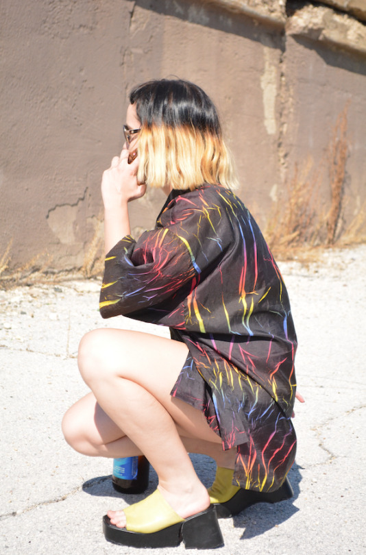
How would you describe your shop? I think the clothes I sell are kind of more one-off like something that would be worn as a funny statement piece - I love a bright color and bold pattern, power clashing, and anything rainbow, glittery or that can incorporate faux fur in a tasteful way. It’s pretty reflective of my midwestern lifestyle and probably the clothes I consistently have the most of are windbreakers and winter coats, the main way we can express ourselves here for half of the year or more… There are a few sticker art projects I have in my store that I started doing around 2012 out of boredom when I was still in school, the most prominent one probably being the 6 foot tall Britney Spears poster that’s completely covered in (vintage) Lisa Frank stickers but never intended to actually finish or take seriously. Over the years I used sticker collaging as a way to keep my mind off things and have it be a means to add color and vibrancy to otherwise more plain posters/art.
When I first opened my shop in 2013, I made a holographic wall out of posterboards to hang my clothes on and that was my first store display on Poshmark and Etsy and always tried to have unique ways to show my clothes ever since, and to change the look of my store at least once a year. I’ve wavered between thinking having consistent “branding” is best and thinking it’s best to change as my ideas change, and have ended up going with the latter at whatever expense that has had, resulting in my store bio now being “Hi I’m Crazy Branding” lmao. The last time I re-did my store I got a mannequin from the city off Craigslist that I painted hot pink and move around my yard or put against different backdrops/bright colored walls to model the clothes. At one point I put velcro on the back of all my stuffed animals plushies and trolls and stuck them to a white wall in my apartment I was living to use as the background. I used to love to bring around solo holographic poster boards to my friends’ houses before we went out so that we could all take pictures behind them as the backdrop, portable aesthetic is essential.
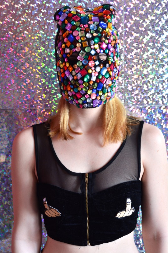
What era or year is your favorite in fashion? My favorite looks are early 90s minimalistic grunge but not too minimal - Black jeans, velvet dresses, and plain tees, all of that, but then on the flip side I love the super excessive part of those eras of fashion too, like rainbow everything and floating glitter inside plastic holographic accessories. My favorite outfit of all time is something my aunt gave me from her 80s closet, it’s a long elastic teal leopard mermaid-style skirt with a matching teal leopard flowy button down shirt, all cotton and polyester. I love outfits that are completely matching like that and have been seeing that lately in brands that I follow, so I hope that sticks.

What item of clothing in the world are you lusting after or saving up for?
One of those new robot dresses that react to your moods or whatever lmao but if I’m being more realistic there is a designer who I really love that I found on Instagram who knits beaded sweaters using like thousands of different colored beads and completely covers them. They’re works of art and I would love to have one some day and be able to support an artist too! I’m definitely always lusting after new pairs of plain black pleather platform (but not too high anymore) shoes. I love the brand Hot Lava and I guess if I'm saving up for one thing it would be their "Barbed" rainbow matching bralette/pants combo.
Favorite clothing brand/brands and why? Since I usually only buy thrift for myself these days, my favorite brands are probably just based on design only but I love Discount Universe and other sequins-covered clothes or otherwise outlandish/tacky patterns, especially if they’re owned/designed/produced by women - Wacky Wacko, I have the Tabloid Dress they made a few years ago and it’s one of my favorite of all time even though I never wear it I also LOVE everything from Big Bud Press and YardSale666 in general.
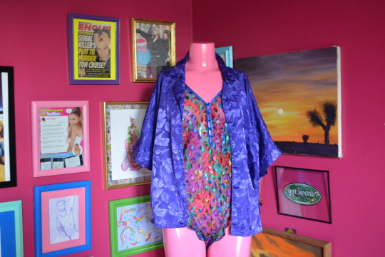
What music do you like, does it play a role in your personal style? The music I listen to most now is probably "experimental pop" and growing up I loved pop punk. Both of those have affected my style and stayed with me to this day, I still wear skinny jeans and slip on Van-style shoes most often no matter what else I’ve layered on top of it. I used to like to purposely wear edgy clothes and do my hair to provoke a reaction out of people when I was younger - my brother would pass down band shirts to me that said things like “What the F*** are you looking at?” (lol) and I would cut them off into a crop top and wear it with a super long high-waisted thrifted pink and purple plaid skirt. That was definitely my go-to outfit for like an entire summer straight. I’ve always liked clothes that makes a statement even if it’s in a literal way with words, clothes with a lot of text on them, and I really like the new wave of DIY embroidery, especially on thrifted or up cycled clothes. Band tee shirts were also just like a huge part of growing up for me, buying them at shows and collecting them and wearing them all the time. Also in my shop I have a guitar that I completely stickered/bejeweled which was one of my longest running projects that I really want to make more of. It was one of my brother's old acoustic guitars that he let me completely deck out and it perfectly combines the femme pop elements I love with an actual instrument. Music and fashion are so intertwined all the time I think, and clothes/accessories are something that always stuck out to me about singers and bands too! I love how fashion plays a role in music today too and can make or break an entire aesthetic or era.
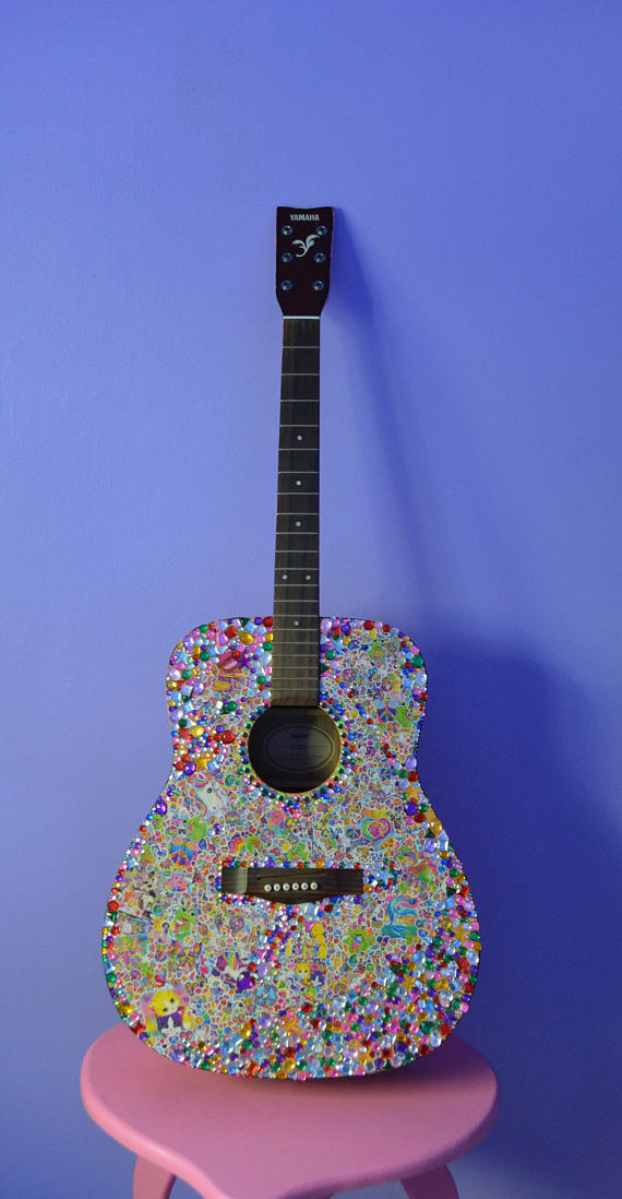
Does living in your city/state inspire you? Where are you most creative? Yes lmao living in rural suburban Illinois actually inspires me a lot and I’m probably the most happily creative here. When I lived in the city, things were a lot more stressful so it made me work on a lot of projects to distract myself, but I eventually burned out from that pretty bad. I get inspired by midwestern people but mostly in a way that most people find cringey, I mocked it more when I was younger but now try to tastefully incorporate it into my looks. State Fair Chic is inspiring to me. My mom has a lot of handpainted and iron-on sweatshirts for different holidays that are staples of my closet. Living in the midwest and being bored definitely made me thrift more and imo makes the thrifting better, it made me always be working on craft projects, and always changing my hair and style.
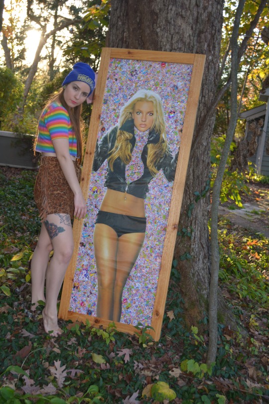
What things do you love to create? I think my favorite things to create are entire rooms and looks, I like to make different aesthetics through combining colors, furniture and fabrics that all feel familiar even if it’s a little chaotic. My long term project with my bedroom was turning my walls of thrifted art (with 20-30 framed pictures) into matching colored frames that fit the whole look of the room, so I guess just really getting at the details of design. I think I’m pretty tacky so I like to stick to things that embody that and will always love stickering huge projects, painting everything plain into bright colors and incorporating anything I find thrifting or in the garbage into larger art aesthetics. My favorite thing to do is thrift and upcycle clothes, furniture, wall art, lamps, etc. anything that I see “potential” in lol.
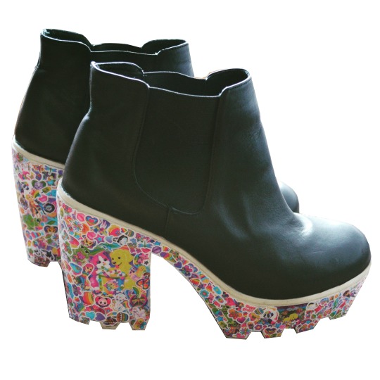
Who are some of your favorite artists?: There are a ton of artists I follow that inspire me every day, definitely just “regular” people or like more lowkey artists. People who thrift or collect and refurbish toys are amazing to me and I love the doll community on IG. Witches or people I’ve met through astrology who are creating more spiritual art inspire me every day with their words and presentations. I also love comedians and movies, I love John Early and Kate Berlant and recently saw they collaborated with Peggy Noland and Seth Bogart of Wacky Wacko so that was iconic to me.
I collaborate a lot with my brother who has done a lot of graphic design stuff for me over the years. He makes resin toys of his own and designs t-shirts. He’s great at painting and drawing, two skills I never was good at that I really appreciate in him that he is always willing to lend a hand to me. He is two years older than me and went to school for advertising so exchanging ideas and doing projects with him is something I like to do too. He also has more of a background in music production so we recently started trying to make music together. We both love combining fashion and music!

What album do you recommend to pick up ASAP? Hayley Kiyoko - Expectations, hands down the vibe for summer
Follow Tass on Depop!
Depop.com/trashbitch
1 note
·
View note
Text
Aesthetic Research
At the beginning of this project, I was heavily inspired by the first two artists and wanted to base my zine around them. As I've progress with research, my style plan has changed slightly which is why there is two versions of this post. This is the original aesthetic I wished to use.
Originally, I wanted to have majority of my work made digitally as this was my strong point however, as I began to research other artists, combining some of this work with physical art would help my zine feel nostalgic and personal to the reader. This zine will be playful and humorous to remind the viewer not to take things to seriously. I will also be adding personal imagery alongside these inspirational work techniques. At first, I was fairly worried as I knew I wanted to cover a lot of different subjects within and I felt as though I had to keep the overall aesthetic layout similar on every page but a tutor advised me to do as I please as the more different each page would look the more engaging it would be to read. Below are some inspiring artists who may spark some of my layout ideas.
Florence Given- Women don't owe you pretty
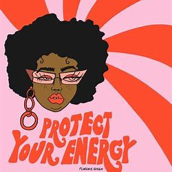
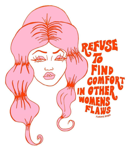
I had read Florence Givens book last year, ‘Women don't owe you pretty’ which actually sparked this idea and learning more about feminism in the first place. She not only wrote this book but she also created all the visual identity behind her work. I love her aesthetic which reminds me a lot of the 70s because of her common curved typography. I enjoy her colour palette also as of course there is pink within her book but she also uses orange, red and yellow to add a fiery and informal side to her art. I've previously talked about colour phycology in our group project and I love the combination of pink and red in visual art. The light pink symbolises the generic stereotypes behind a woman and is very feminine just like we are told to be. The red conveys the opposite despite being close on the colour wheel. The primary colour symbolises the fiery presence and confidence that should be the representation for women. I am most definitely will be using this combination throughout this zine as I think the red alongside doesn’t make it look as girly and soft as the light pink alone will be. When creating a zine around this matter, it is hard not use the stereotypical colours that everyone would know and is associated with a women. Although this would catch attention quicker, feminism doesn't like this attachment which is why I will be aiming to use a lot more colours along side pink to wash out this opinion. I think I will use pinks, red and oranges like Florence but also add blues, greens and purples to add as much euphoria as I can.
Natasha Ahmed- Illustrated Wardrobe


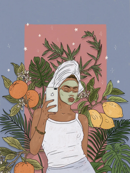
Natasha Ahmed is a social influencer and illustrator. She has recently collaborated with a clothing brand with her motivating art which is what inspired me prior to researching more artists. All of her work is drawn digitally which is was sparked my inspiration originally. As I progress, I think I will use digital illustrations to an extent with typography but I have decided to rely on my collaging ideas to provide the main aesthetic for the zine. I will add digital art over the top of existing work to add personality and a ‘diary like’ feel. For example adding pieces like Natasha's or drawing over a image. Nevertheless, I love Natasha's work as it highlights normal life. A lot of her work consists of trendy objects or pictures of her room. She has made a magazine full of illustrations of famous musicians which I was drawn to. The first image above is what inspired me the most as I like the idea of the cluttered objects placed behind a patterned background. This ignited my idea of making it more personal by adding certain objects and imagery that could make the zine look as though it has been placed on a table without any thought. What I mean by this is imagery within the page such as tea-stains, nail polish, eyelashes, jewellery etc.
Below is some artists I began to research after I knew I wanted to add some collaging techniques into my zine. I was given this book by a tutor. The book is called Cute and Paste.
Julian Pacauld- escapism

I had always liked this persons art as I had found them on Pinterest a few projects ago however, the book helped be find the artists name and look further into his work. I always love the abnormality behind collage work like this and wanted to include it into my work some way. Originally, when you look at Julian's work it feels humorous as he places certain images in particular ways that aren't common .He plays around with size and proportions which is where this personality of art comes from. His pieces remind me a lot about escapism and the functions behind a persons mind. It requires a lot of imagination and playfulness to form this which is why I love it so much. I didn't know how I could tie this sort of technique into my work however, the more I thought about my original message behind the zine, I think Julian work fits in quite well. I’d like readers to feel eased when reading the zine as a lot of my content would involve the importance of living present and not overthinking certain life situations. I will use this technique when I try to explain the small severity behind a persons problem. For example; I have recently stressed about silly problems and I have made a conscious effort to remind myself how amazing life is as a tiny human on a floating rock in space. I could portray this message with abnormal collaging imagery as this could help get my message across better than heavy amounts of confusing text.
James Dawe- adding new stories into existing imagery to help portray messages


I believe James has used collaging digitally as this work seems fairly flat. I am unsure yet whether it would be easier to create my collage this way or to print pictures off. Nevertheless James is another piece of art which has inspired me greatly. What I enjoy so much is the layers within the pieces. I believe he only uses one or two pieces of art but multiple copies of them so he is able to get different outcomes with different cut outs. This is a interesting technique to add a new narrative within a image. I hope to do this slightly to some of my images. I may do this with my own personal images to again add a sense of playful into my work or combine two contrasting images together to create a different aesthetic. I am excited to start this process and see what outcomes I could create with James inspiration.
Craig Atkinson- personal touches

This was the final artist which I liked from the book Cut and Paste. Although Craig's background work is fairly simplistic, what adds character is the additional pen lines and mixed media. This is exactly the aesthetic I am going for. Just like Craig, I hope to create the a narrative that makes the reader feel as though they are snooping through someone's diary yet becoming educated at the same time. Using this sort of technique will make a big impact on particular pages and help portray my fun message for a female's life. I am unsure yet how to execute this process perfectly as I've previously tried this technique with the trend lookbook however, there is a difference between physical lines and digital lines. It would be easier to do this digitally on top of pre-existing collaging work however I don't want it to look too clean and pristine and I think digital sketches give off that look.
To conclude, all of these artist have inspired my visual idea. Despite changing my original aesthetic idea, all of these artists has contributed to my new visual layout of my zine and I will make an conscious effort to keep referring to these artists pieces for inspiration when I finally begin to speak these ideas into creative existence.
0 notes