#the 1st pic was supposed to be just a sketch but I had too much fun playing around with those brushes
Explore tagged Tumblr posts
Text
1ST COLLEGE ART ASSIGNMENT!!!!

It's an individual assessment so we could draw just about anything as long as we used graphite or charcoal. (sorry if the pic looks a bit weird. I changed the contrast and whatnot so the shades wouldn't all blend together)
The idea actually originated from the surrealism project we did in art my Junior (?) year.
The teacher put on music that was supposed to encourage surrealist thinking and we roughly sketched doodles of whatever came into our heads in our sketchbooks. Most of my sketches ended up being inspired by steampunk and Alice in Wonderland, but if it was more run down and decrepit.
This dude was one of the doodles that I didn't choose for that assignment
I don't hate how he turned out but I'll probably draw him again someday. Mostly because I think the smoke blends in too much with the background. It didn't occur to me to make it light instead of dark to avoid it melting into the background until I had already sealed it 🥲

(the original doodle)
#art#artists on tumblr#my art#sketches#pencil and paper#graphite#sketchbook#art assignment#skeleton#teacup#surrealism art#cigarette#smoking#traditional art#image description in alt#college art assignment#individual assessment#river#weeping willow#skeleton art#fwuitfwog
11 notes
·
View notes
Photo
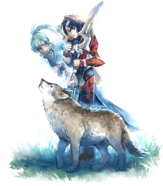

Wanted to doodle Alcryst with his wolf friend but also want to doodle him with Lyn...
Solution:
do both at same time
#fire emblem#fire emblem engage#FE alcryst#FE lyn#shi's art#FE diamant#FE hector#the 1st pic was supposed to be just a sketch but I had too much fun playing around with those brushes
662 notes
·
View notes
Text
#ShowYourProcess
From planning to posting, share your process for making creative content!
To continue supporting content makers, this tag game is meant to show the entire process of making creative content: this can be for any creation.
RULES — When your work is tagged, show the process of its creation from planning to posting, then tag 5 people with a specific link to one of their creative works you’d like to see the process of. Use the tag #showyourprocess so we can find yours!
I was tagged by @milkcrates, who showed her process of making this gorgeous piece with Wei Wuxian and little A-Yuan!! It was awesome to see how it came to life - and thank you for tagging me! ✨
So I got tagged to show how this Yunmeng brothers + golden core art happened! I already included the digital sketch for it in my sketch vs final compilation, but I guess I can show some more!
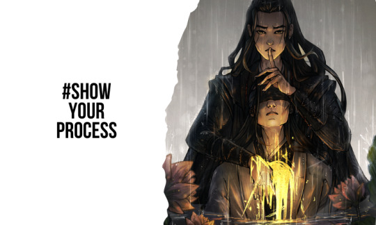
This is gonna be long because I like talking a lot, so putting the rest under a cut!
1. Planning
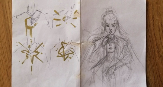
SO. A golden core pic was on my to-draw list as soon as I finished watching the show. I had a WIP of a different pic for that waiting, but actually I noticed that a very similar thing has already been drawn, so that was kinda dropped. But I’m glad I waited until the idea for this one slapped me! It was pretty much a moment of “w a i t a second” and I had to grab a random piece of paper to sketch it while I still had it in my head.
This is the sketch - as you can see from the coffee stains, it has been through some stuff. On the left I actually tried out some different ideas for the golden core - the 1st one was the winner and led to the whole leaking/water/rain theme. I ended up mirroring the whole sketch because I didn’t want Wei Wuxian’s hand to cover Jiang Cheng’s front hair wisp, as that would make that area too crowded.
Meta-wise: I wanted to show that the whole thing was kept as a secret from Jiang Cheng. But we also knew about it - so Wei Wuxian is breaking the 4th wall and looking at us [the audience] directly, shushing to keep it a secret as well. Then there’s his hand hovering over the blindfold - it was included in the show, but also sprinkles in that extra symbolism. Then there’s the rain - the sky crying for the two brothers, so you’re not sure if those are raindrops or tears on their faces + lotus pond for the Yunmeng vibes. As for the golden core, I wanted to make it kinda messy and leaking like blood + shining and make it the main light source of the piece. Also kinda like a glow stick liquid.
I also like finding fitting music to go with my art and this one was actually supposed to go with Avicii’s Hey Brother, but when I was looking it up on Spotify I saw Kodaline’s Brother right above, gave it a listen and then the lyrics hit me. So I already knew that they’re gonna go in the caption. Also apparently it’s like The Song for them and yeah, makes sense.
2. Creating
2.1 Set up and tools
I use Paint Tool SAI + Wacom Intuos S to do all my art! The entire pic was made on a 2000 x 3000 px canvas, since I don’t like to work too big because of limited brush sizes in SAI + I don’t want to torture my laptop, as my art takes up quite a lot of processing power with a lot of layers and modes and sometimes things like to crash at the final steps 😬.
2.2 Planning and composition
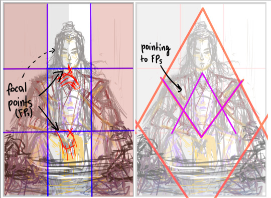
So I started off by doing a digital sketch and focusing on the composition a bit more - I wanted something geometrical, so I went for the diamond shape with Wei Wuxian’s silhouette and the placement of the lotuses. Also the composition is vertical, all the important info is in the middle column - you could cut off 2/3 of the picture and it would still tell the story.
2.3 Lineart
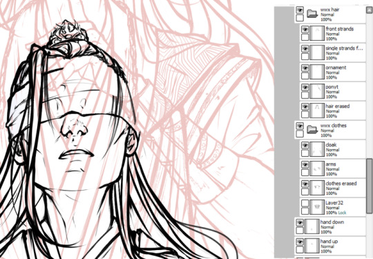
Then I did the lineart over the sketch layer (there was a more detailed one than the “planning” sketch, but it looks like I deleted it once I finished). I usually draw more than I have to and on separate layers, so that I can move/modify things easily later - for example JC’s headpiece here didn’t really make it that much into the final piece but It Was There. Once I was satisfied with the lineart, I cleaned it by erasing overlapping things, like Wei Wuxian’s clothes behind Jiang Cheng’s head.
2.4 Planning the lighting

After doing the lineart I blocked the characters with a single color and planned the lighting. The golden core is the main light source here, so it dictates which parts are gonna be lighter and which darker (although there is gonna some ambient occlusion from the background + reflected light from the water). I also added water and lotuses in the foreground + painted the background.
2.5 Shading the characters

After that, I started shading the pic. I usually do two steps here - one with “base” shading - focusing on the details and values based on the light source, then the mood shading with more coloring - based on the setting the characters are in. The first one is mostly done with the Multiply tool and base layer blending/painting, the second mostly with layer modes like Overlay and Luminosity. I also colored some parts of the lineart to make the shapes stand out (see: wwx’s front hairs)
2.6 Environment and touch-up details

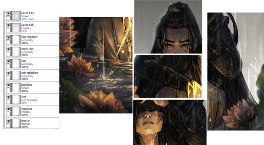
Then it was time for the water and lotuses + the “special effects” for the rain and all the stuff associated with it - water splashes, mist, sparkling drops! Also some more mood lighting. Lots of new layers to keep everything organized and separated.
2.7 Finished pic
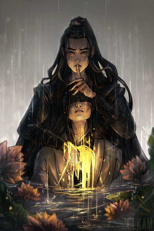
And done! After finishing I usually adjust the contrast/gamma/saturation of my art (or just edit it all in curves) + sometimes sharpen it to bring out details → I make a few different versions and pick the one that works the best. Although with this pic I was satisfied with the raw result so no major changes happened.
3. Posting
For posting I always scale down the pictures and upload them as a draft on this art blog. Then I check if things look okay on mobile as well - from what I’ve noticed my phone makes everything more warm-toned. Depending on the time I finish drawing, I either post it right away or wait until the next day, when there is more traffic on tumblr. I finished this one around 8PM of my local time, which is fine - so I posted it right away (also I was just excited, couldn’t wait 😅)!
As caption I used the lyrics from Brother by Kodaline, as mentioned before!
So yeah, that would be it!
If you made it till this part - thank you and I hope you have an awesome day! ✨
Let’s keep the artist vibes here - I’m gonna tag (not 5 ppl but shh) @still-snowing and this piece that still breaks my heart @driszol and this Song Jiyang pic that lives in my head to this day @kushexi and this pic with fox Wei Wuxian and A-Yuan bc it still makes me melt → no pressure of course! or if you want to do some other piece that’s awesome as well!
#showyourprocess#[and now tags for my own blog →]#not art#art process#oh this was fun - thank you for tagging me!!#always crying abt those self-sacrificial siblings :'')
132 notes
·
View notes
Photo


Finally !!! The raffle I promised months ago is here. As you can see above, there are three prizes. Each of them has a theme : Roccoco, 20’s and 60’s. Together, the three themes are supposed to show an evolution of Crowley and Aziraphale’s relationship through dancing, as well as portraying my headcanons regarding their gender identities and abilities to shapeshift. More about that on the individual pieces ( links in reblog ). Also, I can promise you that every image is actually better irl, it’s just that... I have poor lighting and disgusting photo quality on my phone lol. Under the cut, you may find more informations about each prize, as well as all the rules I’ve set for this raffle (it’s quite long but exhaustive, if you’re serious about participating, please read them first). The most important to know are these: - to participate, you only need to follow my blog ( @thegoodomensdumpster ) and like this post - reblogs won’t count as participation but are appreciated - if you’re a minor, ask your parents about participating first please - the participations will only be counted from the moment this post is online up until Sunday 1st of March 2020, 8 pm GMT. After that, it’ll be too late to participate.
- The Roccoco prize contains :
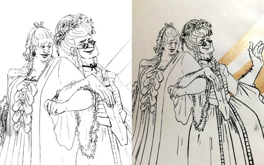
. one original sketch of the Roccoco picture ( pencil ), A4 . one original inked drawing of the Roccoco picture ( India ink and golden paint ), A4 . one print of the Roccoco picture, digital drawing, color, A5 . one print of the 20’s picture, digital drawing, color, A5 . one print of the 60’s picture, digital drawing, color, A5
- The 20’s prize contains :

. one original sketch of the 20’s picture ( pencil ), A4 . one original inked drawing of the 20’s picture ( India ink and golden paint ), A4 . one print of the Roccoco picture, digital drawing, color, A5 . one print of the 20’s picture, digital drawing, color, A5 . one print of the 60’s picture, digital drawing, color, A5
- The 60’s prize contains :

. one original sketch of the 60’s picture ( pencil ), A4 . one original inked drawing of the 60’s picture ( India ink and golden paint ), A4 . one print of the Roccoco picture, digital drawing, color, A5 . one print of the 20’s picture, digital drawing, color, A5 . one print of the 60’s picture, digital drawing, color, A5
- There will be three winners. They will be chosen as follow : . Like this post, and be a follower of @thegoodomensdumpster. These are the only conditions to enter the raffle. Really. . ( Reblogs are appreciated to spread the word to people who might be interested, but won’t be counted as entries for the raffle. ) . ( This is not a condition I can check on, but I’m asking you not to enter the raffle if you don’t actually like my art and just want free stuff. That would be quite ridiculous and a bit sad. For me. ) . Three winners will be randomly chosen. . Winner 1 : The first person drawn as a winner will have the right to pick their favorite prize between the Roccoco prize, the 20’s prize and the 60’s prize, as well as a bonus print that shall remain a surprise for now :) . Winner 2 : The second person drawn as a winner will get to pick between the two remaining prizes. . Winner 3 : The third person drawn as a winner will win the last remaing prize.
. I will announce when the winners have been drawn, but will contact you in private to discuss your prize with you and get authorization to say publicly that you were the winner. .Make sure your PMs ( ask box or the chat options ) are available in your settings, these will be my only ways to contact you, and if I can’t do it fast enough… Well. You won’t be counted as a winner anymore. .From the moment I’ve first tried to contact you, you’ll have two days to give me an answer before being considered a forfait. . As a follow up : if, for whatever reason, I can’t keep one of the winners as a winner, another name will be drawn to replace them and the previous winners will get to be one rank higher. For instance, let’s say Winner 1 forfaits. Winner 2 becomes Winner 1, Winner 3 becomes Winner 2, and the newly drawn person becomes Winner 3. - About the shipping of the prizes : . Unless there is a terrible terrible surprise with the cost of the shipping – which I’m already expecting to be rather high - I am willing to ship worldwide. . If there is, unfortunately, a problem with the shipping cost, I will contact the winner and we will try to find an arrangement. They will, at the very least, get a high ref JPG / PDF version of all the pics ready to be printed so as to not be empty handed. If shipping proves impossible for one destination, another winner will be drawn to get a chance to grab the prize. ( Previous winners will get asked if they would exchange their prizes first. ) . All winners will actually get those high ref files in case the delivery gets lost during transport. If such a thing was to happen, I will very likely not be able to ship anything else again, as this is going to get too expensive otherwise. . Because, yes, everything will come out of my own pocket. Which is one of the reasons I’m really asking people to only take part in this raffle if they genuinely like my art. I am willing to cover some shipping costs myself if I know my drawings will make the person who receives them happy, but it will be very sour to put so much time, energy and money to get them to someone who doesn’t really care.
- How long will the raffle last ? From the moment this post is made public to the following date :Sunday 1rst of March 2020, 8 pm GMT. Any likes given after that won’t count. - By entering this raffle, you are ok submitting to me informations such as : . your mail address . your email address . your name, or a way to identify you correctly on the shipping parcel . your age - If you are a minor, ask your parents about entering the raffle first. I am not going to go check in depth whether or not you are a minor or an adult, but I don’t wan’t minors getting in trouble receiving a strange package their parents weren’t aware of, or giving away their mail and email addresses to strangers on the internet. Granted you will get some info about me in return, but still. Take care, kids. - As you can see, the pictures represent overtly queer characters, so please, make sure you can receive these items in an LGBT friendly environnement.
- That being said : this raffle is 100 % SFW.
This raffle is very much a one time only thing !!! I think you can say from the load of text above that this was not light organization, and it’s actually costing me money, so I’m not going to be able to do that everytime I would actually like to. But Good Omens has made me very happy, and I wanted to share some of the happiness it brought me with you guys. This raffle has been a project I’ve had for quite a while, so I hope you’ll like it as well :) You can search #yihaGOraffle to make sure you are not missing any post regarding the raffle.
I think that’s all there is to know about the rules and everything. Let the raffle begin !
335 notes
·
View notes