#that artwork!!!! that's not just good comic art that's objectively art all on its own. every page
Explore tagged Tumblr posts
Text
okay supergirl: woman of tomorrow is all that. genuinely so good wtf
#that artwork!!!! that's not just good comic art that's objectively art all on its own. every page#i wouldn't be surprised if i saw it framed on someone's wall#and the STORY holy hell#what if we did a revenge road trip bonding exercise while traipsing through the galaxy on the way to kill a guy who sucks#and you might learn a lesson while you're at it! it's like doctor who. literally#the way ruthye has my entire heart bc her syntax and character design and bloodlust were just so <3#i have heard terrible things about tom king in my day but he did pop off with this one i have to admit#supergirl#file this under things that are incomprehensible to anybody but me
1 note
·
View note
Text
25 asks! Thank you! :}} 👹

I have it in the back of my mind, but I haven't actually made any steps in making more master posts.. 😔

ReBLOGGING is good! Its a feature of Tumblr and helps more people find my artwork! Very nice :))
RePOSTING is stealing my art and posting it on your own account. Giving you and only you all the credit. That's theft and no good!

I think I remember wanting my sona to be an object head of some kind. I think I doodled probably a dozen different ideas before I got frustrated and just scribbled my most recent attempt out.
But then it hit me. I doodled two little white eyes on the scribble and I knew I had found my sona XDD

@xxthedragonrebornxx
XD Thank you for remembering my boundaries and respecting them! :)) And THANK YOU FOR THE CUPCAKE!! :DDD

I haven't read it, but I've seen it blowing up all over tumblr. It must be pretty cool! :00

@milk-powrit
<XD I won't lie, Bill is a fantastic villain. I just "hate" him because Stanley is my favorite character and Bill put his family through hell 💀

Most of the team: "Aww 🥰💞💞"
Gloria: "WHO ARE YOU AND HOW ARE YOU HOLDING ALL OF US UP AT ONCE"

@pink088
<XD These past 2-3 days have just hammered me health wise, but I can at least say that I've been sleeping enough!
And thanks for the check in! I wish you the best :))

(Pokemon violet comic(?))
:DD Thank you!! I'm glad you liked it!! :)))

If I ever really go into those series I would :00 But I cant remember the Godziilla movies- plus that would be really hard to draw <XDD
There's so many sonic medias that i wouldn't know which one to go by- and I've seen playthroughs of Poppy playtime but it never really grabbed my interest.. <XD

I'll do my best to keep up with all that <XDD Thank you!

(Frank butterfly post)
Oh there's no need to worry about Frank! It might be hard to tell- but that was actually a moth! Frank had bags under his eyes because he was out late studying moths :))

<XD Well considering Homes intentions are intended to be unknown- you're free to imagine that! :D

@skywillow28022
ohmygosh the third movie is so good I actually cant watch it anymore lest I burst into tears 😭😭😭💞💞💞 10/10 WOULD recommend cars 3--
Anyways- I ADORE the cars franchise and absolutely would have drawn them more.. if cars weren't so hard to draw <XD Plus my favorite thing to draw is angsty cuddles and hugs and big droopy eyes and tears- that's kiiiind'a hard to pull off if your characters are cars-
Of course I could always draw them as humans like many other artists have.. but idk, it just doesn't feel the same you know? <XD
Also thank you! I hope you day goes well too! :))


@neo-metalscottic (Welcome home post(?)) (Octonauts eye study) (Oxem and Pepemijo comic)
AAAAA Thank you sop much! :DD I'm glad you've been liking my recent posts!
As for Oxem and Pepemijo, I cant show images because of the stupid 30 images limit-- But Pepemigo is based on/inspired by the Year of the dragon mask, and Oxem is based on the current season of Duets seasonal guide mask! :00
I imagine there are other dragons out there, like that other sky dragon that I made one time-- <XDD I don't really have any ideas for their powers or their story, but I had intended that Pepemijo at least knocked the krill out in self defense. Thankfully they wont be hunted by krill following that event- Oxem got them to a safe place and he knows that he should steer clear of krill territory in the future <XD
And of course! I'd love to see any critters that you've made! :DDD


@sussyhahag
uhg, always disappointing to see.. thank you for letting me know though 😔


*VERY LOUD CARTOON BROKEN HEART SOUND* (I LOVE THISSS)


<XD yup.
Also even though that disclaimer is there for FNAF and Octonauts, I still get people harassing me anyways!.... :')

@vesselofmanythings
AAAA THANK YOU SO MUCH!!! :DDD And I wish you luck on your slime rancher creative adventure!! :}}}

AAA THANK YOU SO MUCH!! :DDDD That means a lot!!! :))

@starsbee
This shouldn't have made me laugh as much as it did XDD

@wolfie-777
Oh no.... THAT MUST BE ME WELCOME HOME AU COMING BACK--

@anikakitty11
Somethin ain't right with that dog <XDD

@edelgeist (Referencing this post)
oooh :00 I wasn't aware of that- thank you for the info! Perhaps I should invest in a cooling pad <XD

I have not <:( But after googling it- I love the artstyle! :DD
87 notes
·
View notes
Text
Answering these bc no one looks at my blog so might as well
1. Procreate. That bitch fucked up my pen pressure and so I refuse to use it out of spite. Also flippaclip.
2. Facing right and I’d put money on the idea it bc I draw with my right hand
3. My current OCs for the lighthouse guidebook (and in general the want to create my own fantasy story.) I was very much into mythos and fairytales when I was little, along with being read diskworld stuff before bed.
4. Arthur bloody Kirkland, can’t draw him consistently. As for subject generally, landscapes and housing, like I love them but fuck I can’t draw them
5. I post most my art, but it’s scattered across the abyss. Some bits are on tumblr, some bits are on Instagram, some bits are on twitter. What isn’t posted is things I planned to finish then never did… my sketchbook won’t be posted bc all that’s shite
6. I can never escape BNHA, in the eyes and hair I draw ot always remind me of it. That and Pokémon.
7. 3D and animation. Like that shit takes sooo much patience, y’all have my utmost respect
8. Less loss interest and more realised what I was attempting required a lot more research and plotting than I had patience for. My little polyamorous vampire comic idea.
9. Brief description of the piece, let me grab an example for you. Sometimes it’s silly shit like ‘cringe bastard’ tho

10. I think pilot jackets, they’re fun to draw. But also corsets and silly shirts. Hijabs are also fun to draw but I need to try gather better references
11. Depends. Sometimes it’s a playlist, most times tho it’s a show or a gaming stream
12. NONE OF IT ITS ALL TRICKY (noses)
13. Uhhh a lot of artwork in museums, especially a lot of pop art. I feel bad for saying it because it has shaped a lot of modern art but sometimes I’m like ‘…huh.’
15. On the bus, currently. Or at college. Just spots where I can have a little bit of peace
16. Detailings. This could be jewellery or patterns or such. Like the end products pretty when I can be arsed, but fuuuuck I always forget and stuff.
17. Usually if I am, I’m snacking, I can’t draw and eat a proper meal. So usually it’s chocolate and lucazade.
18. Not a lot actually! Which is shocking. Uhh a couple of my oil pastels are snapped and I severely fucked up my secondary schools watercolours rip
19. None of them fuck inanimate objects (maybe weapons? I’m not good but they’re fun)
20. Probably armour. I’m shit at shading metal but I’m decent at drawing it in my personal opinion
21. You know those surrealist pieces where the faces stretch? Specifically those. Also a lot of library/lineweight heavy styles
22. None because uhhh I’m stupid
23. Yes. I would be nowhere without multiple and linear burn.
24. Stock images are more for moodboards. Every so often there’ll be one that works for poses but…not usually
28. A couple dtiys things but that’s it, I wish I was apart of a zine but I’m not so lucky yet.
30. A couple pieces I wish got more love. Personal favs of mine


Weirdly Specific Artist Ask Game
Didn't see a lot of artist ask games, wanted to make a silly one.
(I wrote this while sick out of my mind last year and it's been collecting dust in my drafts, I might as well let it run free) 1. Art programs you have but don't use
2. Is it easier to draw someone facing left or right (or forward even)
3. What ideas come from when you were little
4. Fav character/subject that's a bitch to draw
5. Estimate of how much of your art you post online vs. the art you keep for yourself
6. Anything that might inspire you subconsciously (i.e. this horse wasn't supposed to look like the Last Unicorn but I see it)
7. A medium of art you don't work in but appreciate
8. What's an old project idea that you've lost interest in
9. What are your file name conventions
10. Favorite piece of clothing to draw
11. Do you listen to anything while drawing? If so, what
12. Easiest part of body to draw
13. A creator who you admire but whose work isn't your thing
14. Any favorite motifs
15. *Where* do you draw (don't drop your ip address this just means do you doodle at a park or smth)
16. Something you are good at but don't really have fun doing
17. Do you eat/drink when drawing? if so, what
18. An estimate of how much art supplies you've broken
19. Favorite inanimate objects to draw (food, nature, etc.)
20. Something everyone else finds hard to draw but you enjoy
21. Art styles nothing like your own but you like anyways
22. What physical exercises do you do before drawing, if any
23. Do you use different layer modes
24. Do your references include stock images
25. Something your art has been compared to that you were NOT inspired by
26. What's a piece that got a wildly different interpretation from what you intended
27. Do you warm up before getting to the good stuff? If so, what is it you draw to warm up with
28. Any art events you have participated in the past (like zines)
29. Media you love, but doesn't inspire you artistically
30. What piece of yours do you think is underrated
34K notes
·
View notes
Text
Discover the Vibrant World of Pop Art Shopping with PrintNZ
Pop art, with its bold colors, playful themes, and nods to popular culture, has captivated art enthusiasts and collectors for decades. At PrintNZ, we celebrate this dynamic art form by offering a wide range of high-quality pop art prints that bring a burst of creativity and energy into any space. Whether you're an avid art collector or simply looking to brighten up your home, our pop art collection is sure to inspire and delight. 🎨✨

The Allure of Pop Art
Pop art emerged in the 1950s and 1960s, characterized by its use of imagery from popular culture, such as advertising, comic books, and everyday objects. Artists like Andy Warhol, Roy Lichtenstein, and Keith Haring became iconic figures in the movement, pushing the boundaries of traditional art and making it more accessible to the masses. Here’s why pop art continues to enchant art lovers around the world:
Bold and Bright Colors 🌈
One of the most striking features of pop art is its use of vivid, eye-catching colors. These bold palettes instantly draw attention and create a lively atmosphere. Incorporating pop art prints into your home or office decor can add a splash of color and a sense of fun to any room.
Playful and Whimsical Themes 🎭
Pop art often features playful and whimsical themes, from comic strip characters to everyday consumer goods. This lighthearted approach to art makes it enjoyable and relatable, appealing to people of all ages. Whether you’re a fan of nostalgic cartoons or modern interpretations, there’s a pop art piece that will resonate with you.
Cultural Commentary 🗣️
Beyond its visual appeal, pop art offers insightful commentary on consumerism, mass media, and modern life. Artists use familiar images and symbols to critique societal norms and question the status quo. Owning a piece of pop art is not just about aesthetics; it’s about engaging with thought-provoking ideas and cultural dialogues.
Why Shop for Pop Art at PrintNZ?
At PrintNZ, we pride ourselves on offering a curated selection of pop art prints that cater to diverse tastes and preferences. Here’s what sets us apart:
High-Quality Prints 🖼️
We believe that art should be accessible to everyone without compromising on quality. Our prints are produced using premium materials and advanced printing techniques to ensure vibrant colors, sharp details, and long-lasting durability. Each piece is carefully crafted to capture the essence of the original artwork.
Diverse Collection 🌍
Our collection features works from renowned pop artists as well as emerging talents. From classic pieces by Warhol and Lichtenstein to contemporary interpretations, we have something for every pop art enthusiast. Whether you prefer bold abstracts or detailed illustrations, you’ll find a print that speaks to your unique style.
Customization Options ✨
We understand that every space is different, and personalization is key. That’s why we offer a range of customization options, including various sizes, framing choices, and print finishes. Our goal is to provide you with a pop art piece that perfectly fits your space and vision.
Affordable Prices 💰
Art should be enjoyed by all, regardless of budget. At PrintNZ, we offer competitive pricing to make high-quality pop art prints accessible to everyone. Our affordable options mean you can build an impressive art collection without breaking the bank.
Easy Shopping Experience 🛒
We’ve designed our online store to provide a seamless and enjoyable shopping experience. Browse our extensive collection, view detailed product descriptions, and make secure purchases with just a few clicks. Our user-friendly website ensures you can find and buy your favorite pop art prints with ease.

How to Incorporate Pop Art into Your Space
Pop art prints are versatile and can enhance any room in your home or office. Here are a few tips on how to incorporate them into your decor:
Living Room 🌟
Make a bold statement in your living room with a large pop art print as a focal point. Choose a piece with vibrant colors and engaging themes to create a lively and inviting atmosphere. Pair it with modern furniture and minimalistic decor to let the artwork shine.
Bedroom 🌙
Add a touch of whimsy to your bedroom with pop art prints featuring playful themes. Opt for pieces with calming colors or humorous subjects to create a relaxing yet fun environment. Smaller prints arranged in a gallery wall can add personality to your space.
Office 🖥️
Inspire creativity and productivity in your office with pop art prints that reflect your interests and passions. Choose artwork with motivational themes or iconic imagery to keep you energized throughout the day. Pop art can transform a dull workspace into an inspiring haven.
Kitchen 🍳
Yes, even your kitchen can benefit from a splash of pop art! Choose prints with food-related themes or vibrant abstracts to add color and cheer to your cooking space. Pop art in the kitchen can make meal preparation more enjoyable and visually stimulating.
Contact Us Today! 📞
Ready to explore the exciting world of pop art? Visit PrintNZ to discover our extensive collection of high-quality pop art prints. Our team is here to assist you in finding the perfect piece to enhance your space and express your style.
📞 Phone: +64 211922833
📧 Email: [email protected]
🌐 Website: PrintNZ
Embrace the vibrant and dynamic world of pop art with PrintNZ. Let your walls tell a story and your space come alive with the creativity and energy of this iconic art movement. 🌟
0 notes
Text
Cap gets into Sonic
I miss liveblogging/keeping a record of my interests as they develop, so I'm gonna list which Sonic stuff I've seen so far and what stuff I'd still like to see.
Stuff I've seen:
IDW Sonic:
Very good! Seeing Scrapnik Island at work was what made me interested in Sonic in the first place, and I'm super glad I decided to read the comics! The artwork is gorgeous and the storylines are so fun! I really like the running theme of owning up to your decisions and sticking to your principles for Sonic, and my fave arcs are probably the Metal Virus arc and Surge's arc. Super excited to see what happens next!
Sonic the Hedgehog (2006):
First saw this game from the snapcube dub (which I still love) then watched brutalmoose play the full game on stream. It's objectively a stinker of a game, but I can see a lot of what they were going for and I like a lot the concepts. I think Sonic and Elise's relationship could've worked more if she were a child (or, a younger child), but at its core I love the idea of Sonic encouraging Elise to feel free. I also love Team Dark's loyalty and friendship to each other in this game, wish I got to see it more in others.
Sonic and the Black Knight:
One of my top faves! I loved every bit of stylization and story telling this game had, and Sonic's characterization was peak! The combination of Sonic characters and medieval armor is also so fucking good too. Overall a really simple but solid narrative with great characters and cool as hell aesthetics.
Sonic Unleashed:
I'm surprised how much this game sticks in my mind, I think it's also in my top faves (tho watching penny play it is probably a bit why). There's something about it that has so much heart that just seems so Sonic, despite the lackluster visual novel-esque segments. The Werehog is such a fun concept and a fun role reversal for Sonic, and a lot of the little moments of humor were really good, like Sonic taking pics for Chip while Eggman monologued.
And this def isn't unique to this Sonic game alone, but the music Slaps. Most of my fave music comes from this game, including the werehog's boss battle theme. I play that shit on loop sometimes at work.
Sonic Riders & Sonic Riders: Zero Gravity:
I prefer the fandub's spin on some of the story elements (and the Babylon Rogues's relationships, and just Storm in general), but I still enjoyed this game, especially the ideas behind the Babylon Rogues! I'm still not super clear on their lore (these two games felt like they lacked a lot of explanations for who/what/where) but I like the idea that these three are technically heirs to this long lost civilization and technically have this responsibility to it but they're super into being pirates instead. It's charming! Makes me wish I saw more of them in a serious capacity in IDW.
The Murder of Sonic the Hedgehog:
Played this game on my own and I loved how fun and bright it was! The art was absolutely gorgeous and the music was fun too! I super adore seeing characters "outside" their roles in a more relaxed setting, where we get to see more of their personalities, and I felt like I got to know all the characters a bit more in this game. My only gripe is that the "Think!" sections had some god awful color choices for the tiled runway, it made everything blur together really badly. But otherwise, another top fave!
Stuff I still need to see:
Sonic Adventure 2
Sonic Heroes
Shadow the Hedgehog
Sonic and the Secret Rings
Sonic Forces
Sonic Frontiers
Sonic Prime
Will probably reblog this post with additional thoughts as I finish watching other stuff!
0 notes
Note
Hi Red! I really admire your work and everything you do. Do you have any tips for someone who doesn't know how to art but really wants to learn?
Thanks! Boy, that's a tricky one. I've never been a very good art student, so I can't really speak for what teaching methods work.
For me, what worked best was sheer volume. My older videos are absolute Hot Messes for a reason - I was very inexperienced with digital art when I started out. But with dozens of illustrations in every video I ended up getting a ton of practice; I wasn't setting out to improve, but it happened naturally as I got a better feel for what worked and what didn't. No matter how iffy you are starting out, if you do enough art, you will become more polished. You'll look for shortcuts and simplifications, ways to make certain effects work, and in the process you'll build a style that works for you. This is why having a sketchbook is so useful - doodling a few things a day will make everything a lot smoother over time.
On a more technical level, I always recommend life drawing first and foremost. I'm also very bad at it, but it's ultimately the best way to improve. There's no better way to get a feel for musculature and anatomy, light and shadow, material textures - everything real and observable and frequently stylized. It's very tempting to try and learn by copying other people's styles, and I've seen a lot of very impressive artwork come from that practice, but you can almost always identify the source of the style. I've seen people who very clearly grew up drawing disney princesses, sailor scouts, and even one webcomic where the creator had very obviously learned to draw on Elfquest fanart. It's not bad, but it's limiting; it teaches you the shortcuts developed for that style and doesn't encourage you to find your own way to stylize or capture certain effects.
So: lots of drawing, lots of life-drawing. I think it's also important to internalize that no drawing has to be perfect. I had this huge problem when I was younger where I wouldn't want to draw anything if I didn't know I could do it right. Sketchbooks are for doodles, practice and half-finished concepts, not final "perfected" works. Don't hold yourself to an impossible standard or you'll be too stressed and frustrated to improve.
I also think it's ultimately most important to find a subject you actually enjoy drawing. I stalled out on art for years in middle school until I started developing ideas for Aurora and suddenly had a reason to draw. If you want to draw something, you'll want to get better at drawing it so you can make it look right. I know some people who love drawing environments, some who love drawing incredibly intricate and detailed objects from life, some who love designing characters, and several who love drawing fanart above all else. Like any art, it's important to find the aspects you're personally passionate about and encourage those. Especially if you're trying to get into the practice of art but don't feel confident yet, it's important to identify the things that energize you to draw so you can build up momentum without getting discouraged.
I also strongly recommend consuming a lot of art - comics, cartoons, illustrations, animation, etc. As you develop an artist's eye you'll find you engage with this media in a new way - not just appreciating it at face value, but seeing its style and how its creator handled certain forms of stylization and how they managed to capture and create certain visual effects. (I'm always intrigued by how various styles handle noses. Noses are terrible.) You don't need to reinvent the wheel, and seeing how other artists have done things you might be struggling with can give you a leg up in figuring out your own way to handle it. For instance, the current method I use to do forested backgrounds is partially derived from some pixel art foliage effects I thought were really efficient.
SO - draw a lot, draw from life, draw things you love drawing, don't sweat it too much, consume media, hydrate
76 notes
·
View notes
Note
Your post about witch hat atelier is what finally decided me to read it and I can't thank you enough! I've only read one chapter yet but the art is so lovely, it's almost reminding me a bit of Chris Riddell's haha so it's very comfy and nostalgic
ah, i’m so glad!!! i think i can see what u mean abt chris riddell, his art is also very confident and line-heavy for textures and form building...the art is really incredibly lovely, i cannot at all believe that kamome shirahama makes it so fast...there’s like two volumes a year! to create something at that level of detail and to make so much of it so fast, (AND AS FAR AS I CAN TELL SHE WORKS TRADITIONALLY TOO...I HAVE BIG ADMIRATION!!!)
like it’s not even just the characters who have beautiful detailed designs, but the objects and scenery they interact with...i hope she is having fun at least! how intense...here im gonna share some of my favorite bits in the manga w/o context, all are from very early on in the manga, and don't really contain anything more plot relevant than what i've already chattered about on my blog
(reminder for folks who havent read manga in a while: read from right to left!)


brief pause just to. admire this one especially ^^^ its REALLY difficult to get somebody to read a page going UPWARDS when our gaze wants to go down, so that shirahama-sensei is able to draw the eye upwards so fluidly toward that little figure [upward + leftward direction of clothes and arm as well as the border in rightmost panel leads to the upward and leftward gaze of the character, which we instinctively follow to the tiny figure floating in the high left corner] is REALLY impressive...its not a move that any comics teacher would recommend but she pulls it off incredibly well for being, essentially, Comics Rulebreaking!!!

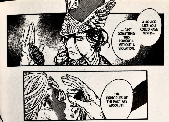
her artwork is SO GOOD...sometimes she posts inking timelapses on her insta or twitter. wonderful...absolutely obsessed w/ her artwork it inspires me to be more careful and intentional with my own
#yamswers#beatriceportinari#i have been trying to get people to read witch hat atelier since i first started reading it in like...2018 or something?#who would have thought i would succeed upon creating a yamato fanart blog LMAO#this is a joke though i'm not the only one talking abt WHA esp these days#its beginning to saturate media more and thats exciting#bc theres so much great media out there most of us will probably only give stuff a try on the 3rd or 4th time we get rec'd it#that guy waving the funky little object in the girls face is one of the knights moralis—what i said yam would be#i should say so that its not a manga which lends itself easily towards shipping#so for anyone who is looking for stories w/ romantic undertones—or even a strong base from which to build romances#WHA may end up being frustrating
77 notes
·
View notes
Note
Do you have any advice for aspiring artists?
My three biggest:
Don’t lose yourself in technicalities. Sure it’s nice to know some basics, but by being too obsessed with perfection and rigorous Art Rules, it comes at the cost of losing a LOT of YOU in your artwork. I can always tell when I’m looking at a Singer Sargent, tell a Leyendecker from a Rockwell, tell my friend’s art from my own, because we all do things differently, we see the artist in their art and their emotion and their style from colours to line hardness, from motion to subject matter. A style is never developed right away, it’s something that develops with you over a long period of time and continues to evolve forever. Art is like poetry. Even a poem that isn’t “”structurally sound””can have more feeling and you in it than one that tediously follows all the rules. Sometimes by following rules too closely, things lose what makes them unique.
Don’t be intimidated by other artists. This is so hard but know that no artist ever starts out “perfect” and no artist ever stops growing. In fact, perfection is purely relative and subjective. By nature, there is no such thing as inherently perfect art, nor is there such a thing as inherently bad art, as those are opinions expressed by viewers, not the art itself. And trust me, every artist you view as perfect views themselves as imperfect; artists are just an endless circle of X saying “I’ll never be as good as Y” when Y is thinking they’ll never be as good as Z and Z is thinking they’ll never be as good as X. The only thing you have to worry about is creating art by how you like, and not what anyone else thinks is “good” or “well executed”. You will always be learning and growing
For the love of all that is good, do not be afraid to use references. In fact, use them. Get physical with them. Trace hands and bodies to know them. Take photos of yourself in the mirror. Set up tiny scenes or shine a flashlight at your face to understand lighting. Run your fingers across fabric to understand its texture, throw the fabric in a heap, let it fall, understand how it moves. Weigh coats in your hands, weigh cups with liquid in your fingers, cups without liquid. Lean into poses, feel where the weight falls. Bend your body, watch how others bend theirs, where fat folds or skin stretches taught over bone. Feel. It doesn’t even have to look “realistic” or “right”. What matters is that you took in every cell and fibre of that object and translated it through your own eyes, through your own fingers, and interpreted it how you think it was meant to be
Extra tip: Doodle from real life objects. Doodling I find is a good idle way to build character to your art. My doodle of a little toy bear can look more cartoonish or realistic, but it’s in this way I learn to take something or someone in front of me and translate it into my own style by my own hand. I have little sketchbooks filled with these random things, like I waited for my mom at the dentist once and drew a bunch of things I saw in the waiting room
Also being “sloppy” or silly in your art is fun. I throw out all these funny little sketchy comics that I spent all but 2 minutes on, exaggerating faces and movement, none of them abiding by any traditional things or really intending them to look good, but they always seem to resonate with people I think cos they tend to be very expressive.
122 notes
·
View notes
Photo
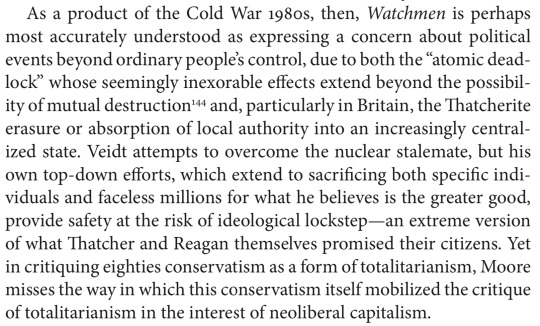


—Andrew Hoberek, Considering Watchmen: Poetics, Property, Politics (2014)
This sophisticated critique is not only the institutional left’s reading of Watchmen, it’s the institutional left’s reading of all the vital literary work from, let’s say, May 1968 to September 2001, the so-called postmodern period. (Walter Benn Michaels is the locus classicus.) Periodizing is inherently leveling: figures as distinct as Spenser, Marlowe, and Shakespeare come to seem equally “Elizabethan” somehow, the way writers like Emerson or Thoreau or even Douglass, who might have spit at the sound of Jackson’s name, come in retrospect to typify Jacksonian individualism. So too does Alan Moore sound in the end like his arch-nemesis Margaret Thatcher, and other critics of the late 20th century have likewise found even Toni Morrison and Thomas Pynchon distinctly Reaganesque.
I criticize the critics, but I’ve made the same charge. It’s the easiest thing in the world to show how the “non-communist left” (phrase courtesy of our friends in Langley) isn’t communist. It does leave this left at a slight disadvantage, as witness the meagerness of Pynchon’s counterforce at the end of Gravity’s Rainbow—not a lot better than a Dickens denouement, with a small, good, familial community subsisting in the interstices of a still-corrupt, still-oppressive society, just the way, come to think of it, that Beloved ends too.
Yet the critique ultimately fails, and not only because mere intellection is always washed away by creative works as powerful as Beloved, Watchmen, and Gravity’s Rainbow.
First, why conflate neoliberalism’s sale pitch with its reality? Like any fraudulent ideology, it preys on legitimate values and real hopes. Neoliberals were entirely right to object to totalizing centralized systems that traduced both the individual and the smaller-scale and more organic community, the same way that communists were right to assail the industrial machinery that sometimes literally crushed the working class. But neoliberals, like communists before them, exploited these justifiable concerns to erect their own crushing and totalizing system, in this case, global corporate control. This doesn’t mean that global corporate control is the ultimate political content of late-20th-century novels sufficiently chastened by mid-20th-century totalitarianism to hesitate before suggesting newly absolute systems as the answer to extant systems’ failures. There are excellent reasons, as well as dubious ones, not to be a communist.
Second, there is the reliable misfit between art and institution, no matter the ideology of either institution or artist. Art takes shape under the creator’s hand even as the hand shapes it, an ungovernable mix of the rational and the intuitive. An artistic genius is not an especially commanding individual, someone uniquely able to realize an overwhelming intention, but rather a person supremely open to influence by ambient currents, an Aeolian harp. The institution, however, knows only rules and procedures, and judges spontaneity a threat. This is not some bias of the crypto-neoliberal hippie, but the actual difference between two situations: free individual or communal creation and procedural social maintenance.
Watchmen illustrates this schism better than most works given its clockwork formalist structure, meant by Moore to signal comics’ aesthetic seriousness to legitimating authorities, therefore art’s own internal institutionalization of one of its possibilities as governing procedure. These structural gears are abraded by the vagina dentata that erupts at the narrative’s climax, a figuration not for nature-as-fatal-woman, as I’d mistakenly assumed in my earlier readings, but rather for a rival artwork, the neoliberal leftist Ozymandias’s harnessing of wild aesthetic chaos to his own excessively systemic political end. Watchmen, therefore, its own form too cold, its climactic content (not to mention the bloodletting throughout) too hot, and both in service to power, incorporates a two-sided autocritique of irrational art’s assimilation to rational authority, of the institution’s desire to manipulate for its own end what seems its absolute exterior, even if that institution is art itself. Yet what one remembers from the book, what I remember anyway, are the looks on the characters’ faces and the work’s whole tone, emergent from but irreducible to its structure.
So the institutions batten on art, complaining all the while that it’s too anti-social, not a good fit, in violation of protocol. Fine for the rest of us, who are not looking for utopia’s floor-plan and HR handbook but only images, however fleeting, of intensity or beauty, transcendence or grace.
Further reading: essays from me on Watchmen, Beloved, and Gravity’s Rainbow.
2 notes
·
View notes
Text
Meet Your Makers: Michael Hingston
Presented by TIX on the Square

If you’re a collector of beautiful books and ephemera, you’ve likely heard of Michael Hingston. If not, you’re in for a treat. He’s half the team at Hingston & Olsen Publishing, an independent press known and loved for its Edmontonia Trading Cards, Short Story Advent Calendar, and deluxe boxsets. Finding stories and giving them a permanent home is Michael’s passion. As you’re about to discover, so is writing, reading, collecting, and being a big stubborn believer in paper books. Meet this week’s maker, Michael Hingston.

TIX: We’re taught to believe it’s what’s inside that counts, but it’s impossible to ignore the beauty of your books and boxsets. Tell us about your decision to not only publish books but also celebrate them as art.
M.H.: Well, thank you! When Natalie (my co-publisher) and I decided to form Hingston & Olsen, in 2015, one of the first things we agreed on was that our books would be beautiful objects in their own right. At the time it seemed like everyone was panicking about the future of publishing in the age of e-books. We decided to double down on the qualities that you can only get from physical books: the tactile feel of paper, pops of colour, and an interactive presentation that you just can’t replicate on a tablet. It’s a better reading experience, not to mention a better deal for our readers in the long term. Ten years from now you probably won’t have access to an e-book you bought today, but every book on your bookshelves will still open up like it always did.
TIX: Which of your strengths (or experiences) as a writer have helped you succeed as a publisher?
M.H.: I’d say it comes down to empathy. Publishing is an act of faith between writer and publisher, and understanding the creative process—with all its up and downs—gives me an extra level of appreciation for the work that our writers entrust us with. That’s not something we take lightly. All of our editorial and design choices are made with the goal of presenting the text in the best light possible. I want writers to love working with us, and to feel that their work is in good hands.
TIX: What’s the first thing you wrote that inspired your career path?
M.H.: That’s a great question. The truth is I didn’t start reading or writing seriously until I was in university and fell in with the student newspaper there. I remember my first few production nights—which routinely kept us in the office until past midnight—where I would frantically write something on deadline, then look at it in print the following week and think, “Huh, that’s actually not bad.” Then we had to do it all over again for the next issue, which was a big part of the charm.
TIX: Tell us about your Edmontonia Trading Cards and what inspired the idea.
M.H.: The Edmontonia Trading Cards are a set of all-ages collectible trading cards that showcase this odd, charming, mostly frozen city of ours. Each card features original artwork
from one of 12 different local artists on the front, and an entertaining and informative write-up about that subject—from landmarks to urban wildlife to the four phases of West Edmonton Mall—on the back. They come in randomized packs of 8, and there are 60 total cards to collect. You can get them at independent shops around the city, or from our website (edmontonia.ca).
The idea for the cards was two-fold: (1) Thinking how cool it would be to make a set of non-sports-related trading cards, and (2) Figuring out what to do with all these odd little stories I was gathering about my adopted home. When I first moved to Edmonton, back in 2008, I kept having all these questions about what I was seeing. Like, why do all these buildings look like pyramids? What’s the deal with magpies? Sure, it’s cold, but what’s the coldest it’s ever been? As soon as those two ideas merged, I got to work, and I’m really proud of how it all turned out.

TIX: Your projects all seem to celebrate reading as an experience—combining the physical act of opening a beautiful “gift” with the pleasures of reading. What was the inspiration for that equation?
M.H.: The age of paper being the default vehicle for communication is gone. Digital technology is way more convenient, and also generates less clutter in people’s lives. But that doesn’t mean paper has no function. As mentioned above, I’m a big, stubborn believer in paper books—and I think one of the things they do exceptionally well is ground the reader in a particular time and place, having a particular experience. Throwing in extra layers, like the element of surprise in the Short Story Advent Calendar or opening a pack of random Edmontonia cards, just makes that experience a little more fun.
TIX: Far too often, the conversations around print publishing are centered around worry for it and what’s being lost. What excites you about the future of print publishing and your role in shaping it?
M.H.: As more of our lives go digital, the funny thing is that people actually become hungrier for offline entertainment. (Have you seen the internet joke about spending all day at work looking at the bad screen, then coming home to look at the good screen? I hate how much I relate to it.) We all want to unplug, or at least to stop doomscrolling for a while. This is a big opportunity for print! It’s one of the few modes of entertainment we have that doesn’t require electricity. That’s one reason H&O doesn’t do e-books. We want to give people a different experience, because we believe there’s value in it.
TIX: Your books and advent calendars have become a favourite gift to receive. What’s a favourite book you’ve been given (and who gave it to you)?
M.H.: I love books about books, and two of the chunkiest and most beloved ones on my shelves were gifts: John Sutherland’s Lives of the Novelists, given to me by my friend Jeremy before he moved away (he’s actually since moved back; hopefully he doesn’t want the book returned, too), and Michael Schmidt’s The Novel: A Biography, which was a Christmas present from my brother.
TIX: You’ve said that the retirement of your Advent Series has freed you up to work on some exciting new ideas. Can you tell us a little about them?
M.H.: We try to keep a pretty tight lid on things at H&O, but I can tell you we’re planning to release more titles in 2021 than we ever have in a given year before. That’ll include something new for the holidays, as well as our first-ever standalone novel.
Want more? Visit hingstonandolsen.com, edmontonia.ca and tixonthesquare.ca for the latest from Michael and other great artists.
Artist Bio
Michael Hingston is a writer and book publisher. He is the author of three books, including Let’s Go Exploring, a history of the comic strip Calvin and Hobbes. His journalism has appeared in Wired, The Guardian, The Atlantic, and the Washington Post. Hingston is also the co-founder of Hingston & Olsen Publishing, an independent press specializing in deluxe boxsets like the Short Story Advent Calendar and the Ghost Box. He lives in Edmonton with his family.
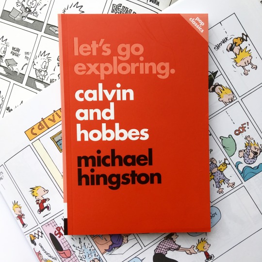
5 notes
·
View notes
Text
MMS 194: JOURNAL
Beginning this journal with the ultimate art question of "What does art mean to you?"
I liked what Thomas McEvilley, professor of art history in Rice University said, "The last time I was in Houston, I went to a place called Media Center, where someone had set up posts as in a back yard with laundry hung all over. I immediately knew it was an artwork because of where it was. If I had seen it hanging in someone's yard, I would not have known whether it was art, though it might have been. It is art if it is called art, written about in an art magazine, exhibited in a museum or bought by a private collector.".
To continue with his point, "What's hard for people to accept is that issues of art are just as difficult as issues of molecular biology; you cannot expect to open up a page on molecular biology and understand it. This is the hard news about art that irritates the public. if people are going to be irritated by that, they just have to be irritated by that.".
Something I also find meaningful to this most asked question is perfectly worded by Arthur Danto from Art critic of The Nation, he says, "You can't say something's art or not art anymore. That's all finished. There used to be a time when you could pick out something perceptually the way you can recognize, say, tulips or giraffes. But the way things have evolved, art can look like anything, so you can't tell by looking. Criteria like the critic's good eye no longer apply. Art these days has very little to do with esthetic responses; it has more to do with intellectual responses. You have to project a hypothesis: Suppose it is a work of art? Then certain questions come into play -- what's it about, what does it mean, why was it made, when was it made and with respect to what social and artistic conversations does it make a contribution? If you get good answers to those questions, it's art. Otherwise it turned out just to be a hole in the ground."
And as a religious type of person I find this short saying from Robert Hughes striking. He says, "The Puritans thought of religious art as a form of idolatry, a luxury a distraction, morally questionable in its essence, compared to the written and spoken word.”.
From here you can see the art differences from Catholics, Orthodox, and the many many denominations of Protestantism. I guess growing up in the Philippines most art I experience is about the religious if not historical. It's always been my dream to visit France and Rome to come and see all the "art" people are identifying as but as society moves forward with nano technology, we can see many forms of Computational Art.
For example are the three below...
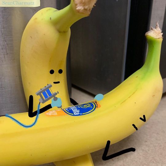
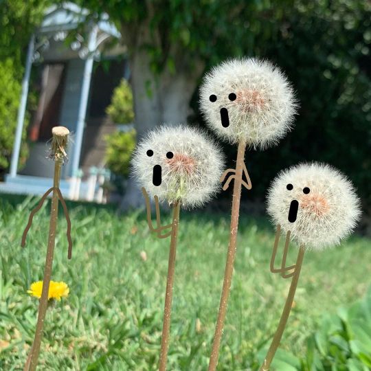
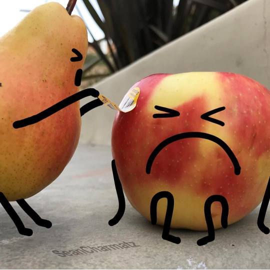
Digital illustrations, sounds cool right? Well, I was thinking of Digital Kinetic Art at first but I couldn't find an artist that purely does a digital version, so I had to look for other options until I finally found this amazing artist named Sean Charmatz. He was born on August 28, 1980, in San Diego, California. He is an animator of Spongebob Squarepants, LEGO Movie 2, and Trolls. He spent several years as a writer, artist, and storyboard director for the television show Nickelodeon. He also shared his digital art talents with the companies like Dreamworks and Disney.
He is making the mundane normal ordinary things as something worth looking at, with a story to portray from scratch!!! Looking into his art, I don't know if I have a bias reason because I grew up watching Spongebob and I really like the show and other types of cartoons too like "The Adventure Time", "Princess Sophia", "Barbie Movies", "Dora the Explorer", "The Amazing World of Gumball", and the like. It's something I find pleasurable as a younger child (actually until now, but I don't have the leisure time I used to have), and as I see his newest digital illustrations, I can't help but be in awe and smile with a childlike smirk. I might do something like this as he inspired me to make the mundane objects into something fun with a cool story to tell.
Especially now during pandemic, and everyone is asked to stay indoors and minimize social interactions at most. We should be creative to learn in entertaining ourselves and making the most of our everyday situations. He is truly inspiring, and maybe with the practice I'll do, I might be able to make cute short children's comics for the next generation.
Here are some of his recent digital illustrations,

Moving from visuals let's talk about our hearing, let's talk about Generative Music. Majority of my life I've been listening to Pop songs and classical ones, usually made the traditional way 100% human, learning about this algorithm or computer composed type of music is a bit odd for me because it feels technical and numbers complicated, in a way distant and out of touch. Computers are a recent invention by the human race, so we can understand why more and more innovations related to it are still growing everyday, a lot of people who doesn't see it's importance will be left behind and soon enough more and more generative music art will enter the music scene, digital divide will be inevitable.
This type of music scene is "experimental" as it's unknown to a lot of possibilities and very different from the traditional music producers and artists, we still don't know how will it click, is it a fad or here to stay? I'm not sure, but I think more types of sounds will be incorporated in music, specially in movies and other types of effects if it doesn't get popularity in the music industry.
Hatsune Miku, the first ever open-source singer is having popularity around people specially those who like anime and the things of its kind. Only this year I was able to discover this type of music scene and I never expected that Hatsune Miku Youtube music has millions and millions of viewers and subscribers. Music analysis software exists that can predict hits with increasing accuracy, and Google Labs have an ersatz neural network up and running that can make convincing music. Along with all the other jobs currently being destroyed by automation, it looks like the most human of all – music – is under threat.

To move forward let’s go back in 2017, I liked this guy from the College of Business Administration and he is one of those cool distant type of guy who gives this big mystery vibe, and what do you do when someone is mysterious? You stalk them online, so I did and that's how I found out about "hello poetry". I didn't know digital poetry actually has a term, a name but I knew it has a community online, which is cool because you can make an online library and records of all your poems easily accessible online if you're into this thing. I actually joined the platform "hello poetry" after reading a ton about my crush's online poems, in a way I was inspired. Once you join it's nice to see other poets about their works, what others are raving about, and sometimes judge inevitably although some are very beautiful others are also unconventionally short and seems like a tweet. This category of art can fall on art & literature which is something purely human, well as of now. Soon enough computers will be able to make their own poems, maybe there already is.
Here's a link to my first and only poem I published in the community, https://hellopoetry.com/fleomae/
2 notes
·
View notes
Note
If you’re up for it, what artist or painting do each of the boys remind you of?
disclaimer: art is subjective, so are people’s opinions, and my choices are based on my perception of the boys’ personalities. you may not agree with me, therefore the paintings might not correspond to what you had imagined… still, i tried to shed a light on my own thoughts, which is something i rarely do on tumblr — i tried to remain as objective and positive as possible!
+ louis —
louis is so fiercely good! supportive, loyal, brave… i’ve never seen someone so witty and intelligent, caring and sensitive. louis shines, louis sparkles!!
but he also tells stories like no else. it is truly fascinating how louis can turn the smallest life experiences into masterpieces!! the raw emotions he’s able to convey in just a sentence: we’re sleeping on our problems like we’ll solve them in our dreams…. it’s easy getting lost into louis’ ocean blue eyes but it’s even easier falling for his talent — through storytelling, louis always shares a positive message and i’m in awe of the way he goes through life despite everything that’s been thrown at him. passionate and driven, louis is authentic and unapologetically himself!
i decided to associate louis with gustav klimt — the artist received a conservative and classical training and began his career painting churches and theaters, following the traditional and historical style popular at the time. quite similar to louis’ mindset at the start of his solo career, klimt focused on what the upper class expected of him! however, he kept developing a more meaningful personal style. one that relied on symbolism and the extensive use of the ornamental gold leaf. his paintings were highly decorative and it is the aesthetic of klimt’s work that made the connection so easy ♡
gustav klimt painted many women in erotic positions, embracing their nudity and a celebration of sexuality, which was controversial at the time. but more than that, the artist depicted loving embraces, abandonment and passion. tenderness. and by coating his paintings in golden powder, klimt created a warm cocoon around his subjects! 1. adele bloch-bauer I - 2. judith I (details) - 3. le baiser (details)
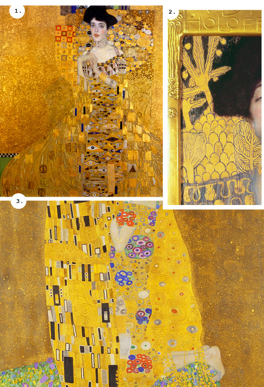
louis is so often associated with the color yellow and it’s easy to understand why — yellow is the most luminous color and is the symbol of happiness, optimism and enlightenment. as a warm color, yellow represents light and creates a sense of hope: it is radiant! gold shares many of the same attributes. it is bright, cheerful and is often associated with love, courage and passion. gold illuminates our world and so does louis!
+ zayn —
zayn is very creative, expressive and imaginative. i’d say he’s cautious and overall very intelligent about his privacy! society will often describe quiet people as mysterious, and it romanticizes anxiety in a way that makes my blood boils… it’s a dangerous culture where people with mental disorders are seen as edgy or cool when in reality they are deeply misunderstood. at times defensive, i believe zayn is strong-willed and values his freedom more than anything!
associating zayn with street art was a given. is there anything more liberating than leaving your trace into the world, anonymously and illegally, without knowing if your work will be painted over in the next few days or a couple of years?
artists such as roa, bansky, kobra, invader or shepard fairey have now made a huge impact, and street art has been popularized. many paintings are known worldwide but before then, you had the travel the world to seek out the artists’ works!
and even if some murals can be seen from afar, they draw you in no matter what. like an invisible pull, some are forcing you to cross the street or climb a few stairs to get closer — zayn draws you in! whether people are affected by his quiet personality, his looks or the sheer quality of his voice, you can’t help but want to learn more about him!
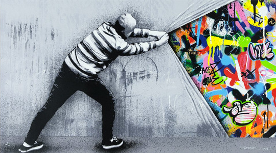
i chose behind the curtain by martin whatson for that very reason! at first cold and unreachable, zayn is full of qualities and life experiences deserving to be uncovered.
martin whatson is a stencil artist working in oslo. looking for beauty in decayed and abandoned urban spaces, he developed his style using grey tones as a basis and adding vibrant colours to bring a splash of life. i also love pull back and behind the wall ♡
+ niall —
to me, niall is the type of person who’s enjoying life as best as he can, and fully appreciating everything there is to offer. whether it be passion, irritation, love, fun or distress. mainly because of his cheerful and bubbly personality, he’s seemingly going through life as if it was a big fest! but don’t be fooled, he knows heartbreak too and there’s more to him!!
niall’s albums feel warm, nostalgic and intimate. we’re being let in into a part of him without any flourishes. a melody strummed on his guitar and here we are, transported into the past and reminiscing about an old lover. niall definitely is a romantic! listening to heartbreak weather, there is so much tenderness into his songs…
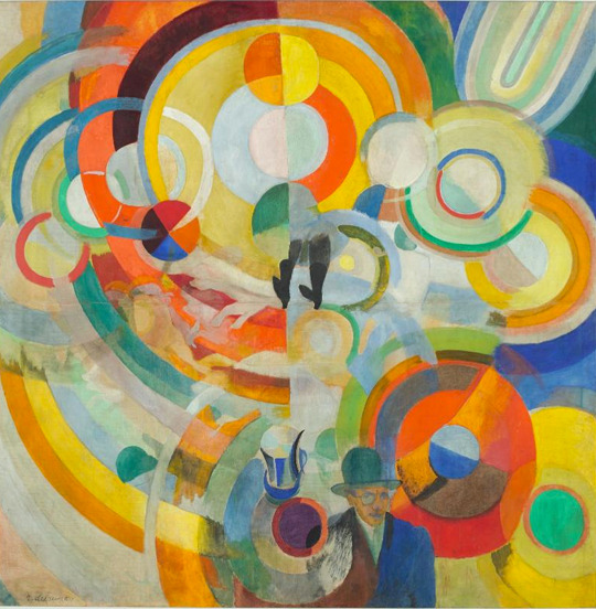
this painting is called manège de cochons by robert delaunay — it is part of a series devoted to modern urban life and popular shows. carried away by a whirlwind of vibrant colors, it recreates the lively atmosphere of the fairgrounds.
it definitely represents niall and his complex mind. the colors, so vibrant, are an ode to his cheerfulness. for delaunay, primary colors and their complements exalt each other by contrast. and the same tone can be perceived differently depending on its intensity or its arrangement!
at first, only the vibrancy and the warmth shine through but just like everyone else’s, niall’s mind is intricate. his emotions are raw and he puts his pain into songs, as if to compartmentalize everything. as if to tame those feelings and memories, maybe too loud at times! the colors aren’t just splash of nuances scattered across the canvas, they are deliberate. with purpose, they tell a story…
+ liam —
liam is good! and he always goes out of his way to do something good. he often tries to be more mindful of his actions. he’s constantly learning and just like everyone else liam makes mistakes, but he actively grows from them!!
liam is extremely talented, funny and charismatic, yet i feel like he’s not easily understood. he’s a very sensitive, sincere and sweet person, and despite everything liam went through, he remains cheerful, generous and courageous!
he is also passionate and pursues many hobbies — be it fashion, art, cooking or comics: he is well-versed in many topics and it’s a real pleasure to now follow him on youtube!!
robert rauschenberg was passionate about many mediums himself, and he incorporated newspapers, photographs and even some objects (undershirt, parasol parts) onto the canvas before adding broad strokes of paint! he kept exploring the boundaries of art and closely followed the current events of the time, using images of space flight and NASA’s photographs into his work — space (tribute 21) is a personal favorite ♡
i actually picked a selection of artworks to match liam’s personality: 1. untitled (red painting) - 2. untitled (red painting) - 3. red interior. i particularly love that last one, as the far-right stripe reminds me of liam’s chevron tattoo!!

for many years now, liam has been associated with red and it’s no surprise at all — red is the color of passionate love, seduction and adventure. strength, vitality and ambition. it used to be seen as the color of fire, a primal life force. to the greeks, red symbolized super-human heroism. liam is a force of nature, strong both physically and mentally. he is hard-working and energetic!
+ harry —
forget about the way harry has been portrayed ever since he was a sixteen-year-old boy. forget about the curls and the dimples. simply observe the person harry is today. take a closer look at what he decides to share with us. pay attention to the way he’s presenting himself.
fine line (the album) takes us on an introspective journey into his deepest emotions — whether it be torment or happiness. and i think it’s fascinating how well-executed his songs are! even in a catchy and happy song such as golden, harry managed to address quite a raw and painful concept: i’m hopeless, broken, so you wait for me in the sky / i don’t want to be alone — it’s heartbreaking, yet you almost wished you could feel it too!
through various allegories and metaphors, harry makes you question yourself. he interrogates you and talks about a reality you didn’t know existed or could relate to. harry is magnetic.

this painting is called composition XI by vassily kandinsky — and i can’t help but compare both harry and vassily. kandinsky was a painter, professor, poet and art theorist, generally credited as the pioneer of abstract art! he spent years creating sensorially rich paintings, and was fascinated by musicians who could evoke images in listeners’ minds. he strove to work with forms and colors that alluded to sounds and emotions!!
in songs like fine line, the music swells and deflates as if it was a beating heart. each track conveys a different emotion and translates a distinct concept! through his melodies, harry aims to make us feel joy, melancholy, determination or bitterness, even when the lyrics are anything but. his albums leave us speechless and wondering, just like abstract art!
+ overall, this is what art is meant to make you feel! it’s supposed to challenge you. art is meant to make you rethink your boundaries and open up your mind. it’s meant to question you and leave you wanting for more! you are meant to listen to a song several times to fully understand its meaning, and meant to stand in front of a painting for hours to start grasping the artist’s thought process…
yet art remains subjective! depending on your own life experiences and upbringing. art is free for you to interpret as you wish and so is music! i hope you enjoyed this post, thank you for reading it ♡
#have i spent way too much time on this? YES#did i turn the ask into an essay?? YES#i hope at least a few people will be interested in this#and as i said in the disclaimer: those are MY opinions#i hope you're still around there anon ♡#jess parle à la lune#jess répond
36 notes
·
View notes
Photo
Review: The Claremont Crossovers
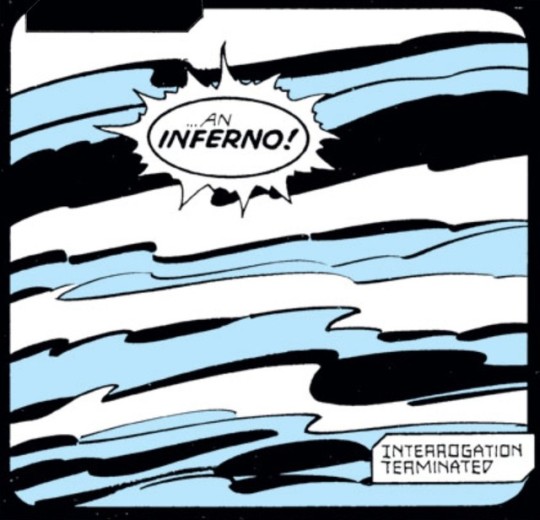
Geez, I haven’t written a review for this blog since my Secret Wars review from like 17 years ago. How can that be? Well, I guess I used to work on this blog a lot more often and now I’ve gotten way more into Super Nintendo games and BDSM. Like a lot of people. But now that I finally finished reading Inferno, it is time once again to bookend my experience with an overly wordy wall of text filled with the worst kind of oblivious meninist butt humor jokes and pretentious sounding run-on sentences that are trying to sound smart but are always improperly ended with prepositions of. And lots of ridiculous comic book panels.
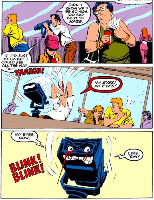
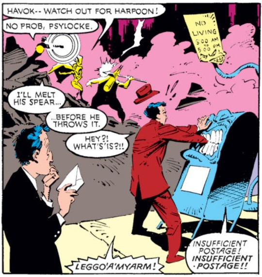
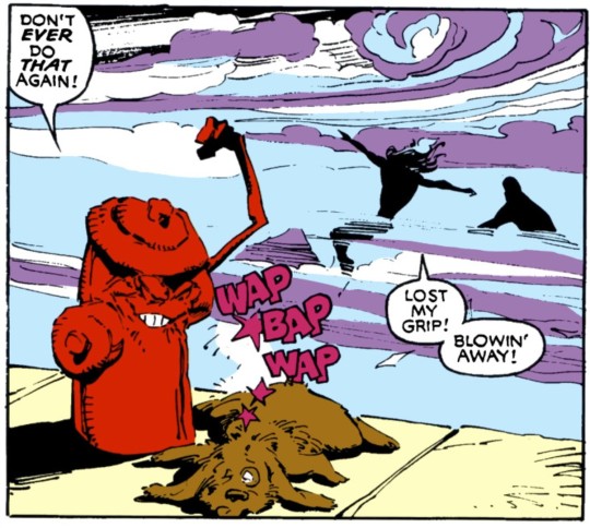
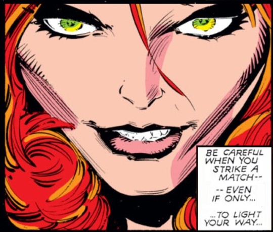
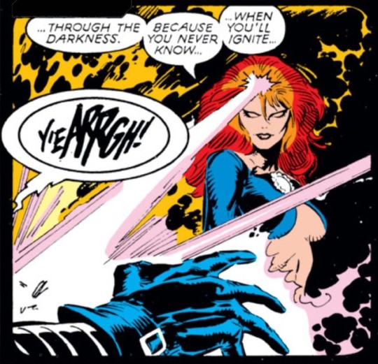
These are only the silliest panels from this reading that I could find after looking for about 25 seconds.
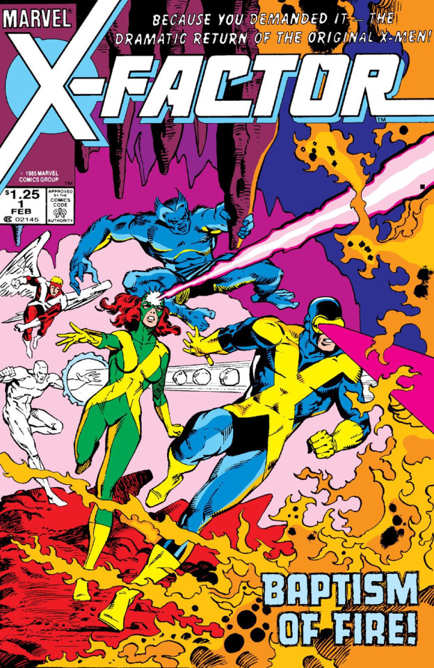
Bookeeping. This review covers everything that I have read since X-Factor #1. This includes Uncanny X-Men #204-243, X-Factor #1-39, New Mutants #38-73, along with a smattering of annuals, Daredevil, Power Pack, Fantastic Four, Spider-Man, Excalibur, and X-Terminators comics that were all part of the Mutant Massacre, Fall of the Mutants, and Inferno crossovers. There were a lot of developments over the course of the 4 years these comics were published. Jean Grey was resurrected and the original members of the X-Men reformed under the moniker X-Factor.
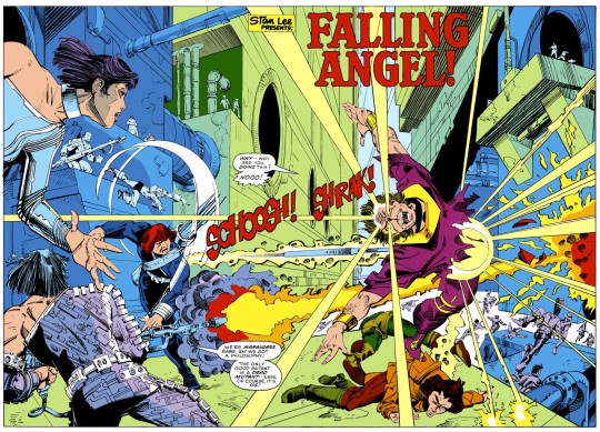
Mr. Sinister formed his band of evil mutants, the Marauders, who would become the X-Men’s main antagonists, and their most devious act would include committing mutant genocide against the Morlocks in the New York City sewers while dealing critical wounds to main X-Men team members Kitty Pryde, Nightcrawler, and Colossus during the fight.
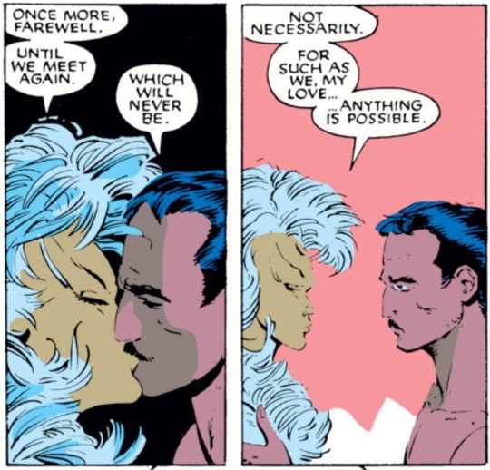
Later, the X-Men were seemingly killed in a struggle with the mystical being known as the Adversary, but in reality they went into hiding in their new Australian outback base.
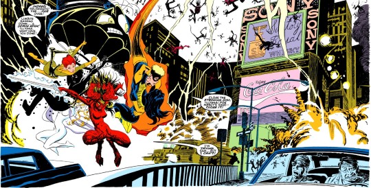
Illyana Rasputin lost control of the hell dimension Limbo which led to a demon invasion of Manhattan.
And finally, perhaps most prominently, Cyclops left his wife Madelyne Pryor and their son to get back together with Jean Grey, an act that led Madelyne to become corrupted with Pheoenix Force power and to turn into the Goblin Queen.
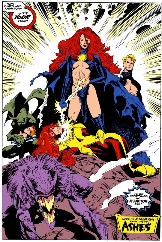
This era of X-Men comics contains the first major crossovers between the main X-Men comic book and its spinoffs. These events would become common as Marvel found ways to use its more strongly published works to carry the weaker ones, and the ploy still works apparently since here I am 30 years later reading 500 page omnibus collections just because there are 4 or 5 absolutely killer X-Men comic books in them. I love the X-Men so much that I’m willing to wade through the unending buildup to get the most out of the climaxes.
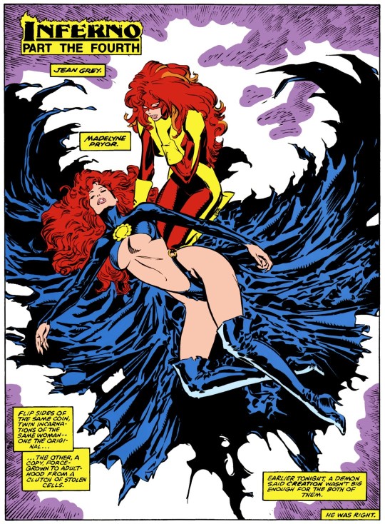
Seriously this artwork.
However, I find that this style of editing leads to a peculiar trend in pacing that can be tough to recover from in-between the major storylines. As Mutant Massacre leads into Fall of the Mutants, which then leads into Inferno, the characters are faced with consistently increasing stakes. With each passing story line, casualties grow and become more grave, and the consequences are more lasting. Mutant Massacre starts with the genocide of a mutant community, and several main characters are critically wounded as the X-Men face the worst defeat they’ve ever experienced. Then a year later in Fall of the Mutants, just as the team is starting to recover, the entire team of X-Men is killed during their battle against the Adversary. They would immediately be resurrected as a reward for sacrificing themselves to save the world, but it is still a defeat that claims the lives of every member of the team, if only for a moment. By the time we get to Inferno, the world is literally ending. Demons are raining from the sky and regular people are straight up getting slaughtered in the streets and elevators as the X-Men are more or less helpless to stop the destruction.
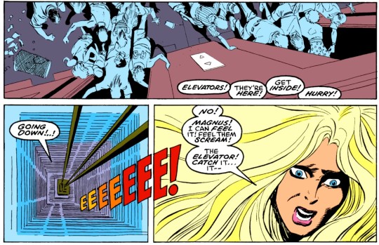
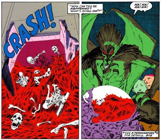
Inferno is an amazing storyline, if only for all the scenes of inanimate objects coming to life and straight up eviscerating common folk who are just minding their own business. Look at this shit!!! How did the comics code of conduct ever approve this. A mob of people just packed themselves into a demon FOOD PROCESSOR and every inch of them was liquefied except their bones. Chilling. (And let’s just forget about how the writers retconned all this blood orgy stuff in the Inferno Epilogue).
This all works in a capitalistic sense. Constantly raise the stakes and don’t let up for a second because if you do, the reader will take their eyes off the page and you will lose money. But the problem is, you can’t do this forever. And if you try, eventually you are going to write yourself into a corner where you’ve raised the stakes so many times, and you’ve re-manufactured the drama so often, people will stop caring. I call this the Dragon Ball effect.
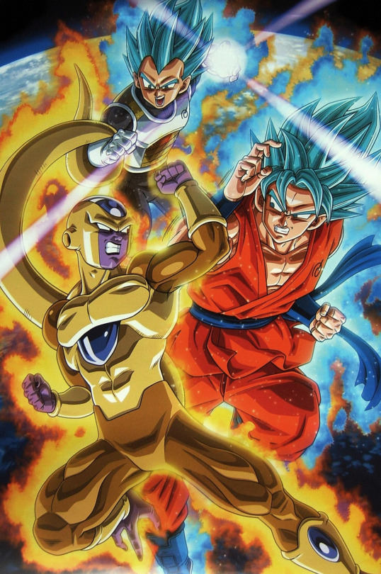
How many times have these characters become gods at this point? Like three movies ago, the most recent movie was literally called “Battle of Gods.” I’m not even watching Super. Once your characters get so far away from humanistic stories people can relate to, you are no longer creating art. You’re manufacturing sensationalism. And it gets boring. These guys are starting to look like different flavors of freezie pops.
Maybe this is why the X-Men comics that come after this, the comics that make up the last leg of writer Chris Claremont’s 17 year run on the series, become so weird. Because perhaps there was no way to continue to raise the stakes any higher. After this point, we don’t get any more big crossovers until X-Tinction Agenda, but even that story is small and quaint when compared to what is presented here. Wolverine completely disappears from the series, all our other favorite characters disappear into the Seige Perilous to be transformed into completely different versions of themselves, and we get a lot of surreal stories that don’t have any sort of climax in the way that we’ve been conditioned to expect. The series becomes murky and ambiguous, without a solid narrative arc, and I think that’s why people regard the end of Chris Claremont’s writing on the series to be the weakest part of his run.
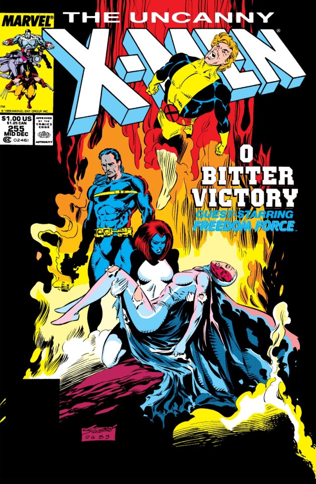
I can’t wait to read the X-Men comics that are coming up next. Because I didn’t know what in the FUCK was going on in these comics when I was a kid and I’m hoping they make more sense now.
Anyway, I’ll be the judge of all that, once I get there. (I may even indulge in the Infinity Gauntlet omnibus because, you know, there’s a couple X-Men involved in that). But regardless of what comes after this, I think it’s also true that the crossovers presented in this reading are generally regarded with less respect than Chris Claremont’s earlier work on the series, such as the Dark Phoenix Saga and Days of Future Past. This I don’t agree with. While the stories in this reading do range in quality, with Fall of the Mutants definitely being the weakest of the three big crossovers, and even though the Uncanny X-Men portion of Inferno isn’t even the central story of that crossover (the critical story elements take place in the far inferior issues of New Mutants and <ugh> X-Terminators written by Louise Simonson), Claremont’s writing is still much stronger, more layered, and more elegant than anything else that is presented in these collections. These crossovers may not be as timeless or original as the most famous X-Men stories, but the writing here is still really darn good and engaging (at least in Uncanny X-Men), and in my opinion, does not represent a decline in aptitude on the part of the writer. It’s clear that Claremont’s writing has continued to mature and become more nuanced, so much so that when you compare it to the first issues he wrote for the series, it seems like he’s a completely different writer.
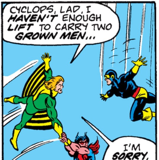

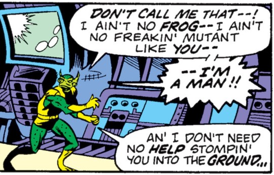
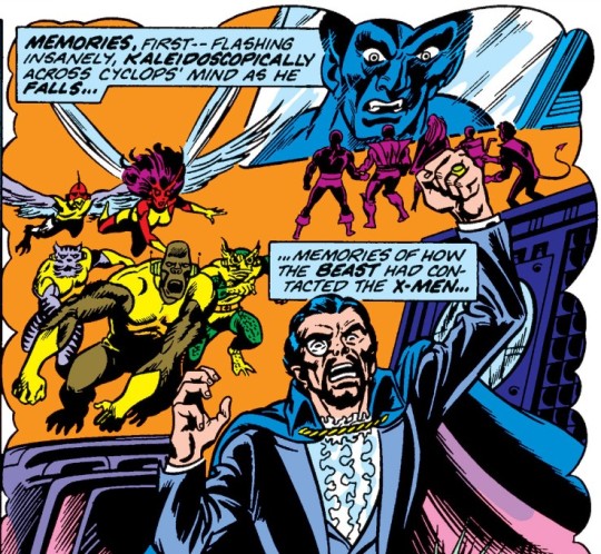
KALIDASCOPICALLY. Again, these were just the silliest panels I could find after looking for about 25 seconds.
Personally, I love this period of X-Men comics. Under Claremont’s executive control, no plot thread gets dropped. No minor detail goes disregarded. Characters continue to grow and develop at such a natural pace, sometimes it feels like my own life is developing right alongside theirs. This adds depth to these readings and I can’t describe how it feels to be a part of them, and I think it’s this element that is missing from so many other comic books written by so many other comic book writers, including nearly every X-Men story written after Chris Claremont left the series.
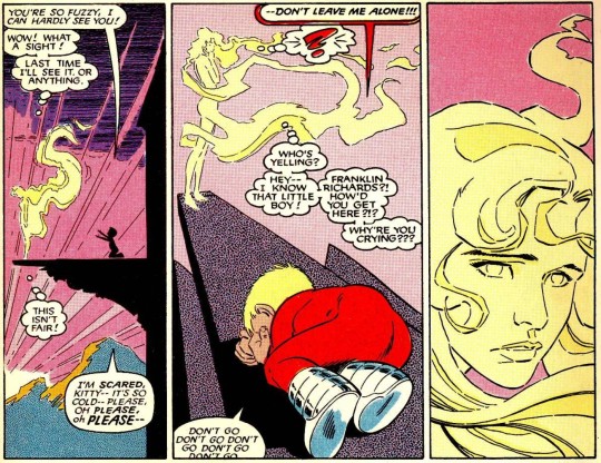
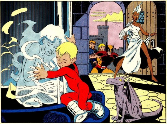
Case in point, there are so many minor recurring characters that appear in these stories, like Franklin Richards. (I seriously tear up every time I see these panels). This little guy bounces around the Power Pack, the X-Men, and the Fantastic Four like a ping pong ball. He’s a key character in the story line where Kitty Pryde finally recovers from the wounds she suffered during Mutant Massacre. And even though Kitty and Franklin have only met each other a few times, those meetings have meaning and they are remembered and called upon in the telling of the current story. All of the efforts made by the writers and editors to keep the narrative linked make these characters seem like real life people with weight and substance, rather than a thin layer of ink on a piece of paper. And it totally works.
Ugh, this review turned into another circle jerk about the writers of these comics, and especially about Chris Claremont. But what can I say. It’s because of the writers that we are here. Love or hate these comics, and I know Claremont’s wordy scripts are not everyone’s cup of tea, but these are the stories that make the X-Men what they are. It’s tough to be aware of these things when you’re in the middle of reading them, but I’m having the absolute best time writing this blog right now, and it is primarily because these are the comics that resonate with me the most. And when I’m finished with Claremont’s material and I’m slogging through some crap written by Chuck Austen, I bet I’m going to look back on these days with envy.
72 notes
·
View notes
Text
ART EVALUATION - MULTIVERSE ASSIGNMENT
themes of the assignment
The multiverse assignment took us through a variety of artistic styles, drawing, printmaking, typography and collage, but there was also a narrative element introduced through the penguin book, we were tasked several times to draw inspiration from narrative elements from the book, or to depict scenes from it, this I felt was similar to fine art, however while on the computers we worked on 'postcards' (personally though I always felt their purpose was more like covers for our books), which again had inspiration taken from the book, this reminded me of graphic design; we were attempting to express a product through a visual means.
the three ‘postcards’ that had text added to them, overall i find that the first one below is my favorite, the central image i feel is a strongly emotive one, figures shrouded in darkness, almost in solidarity over some tragedy, which is why i annotated it “a reminder of better days”, as a reference to how i felt the image was tragic.

this image i annotated it with words associated with god, the drawing i used because i wanted it to resemble an old medieval representation of an angel, which i feels far more visually interesting, and below it is the shattered sky and broken buildings, riven by strange flames, all part of the ‘wrath’ and ‘profound fear’.

here was see the hand receiving what should cause ‘the rapture’ i used the sun as the object because i felt as though the sun’s connection to the heavens, and it being unreachable was going to add to the piece. i also inverted the colours of each of the annotations, to draw contrast between the statements.
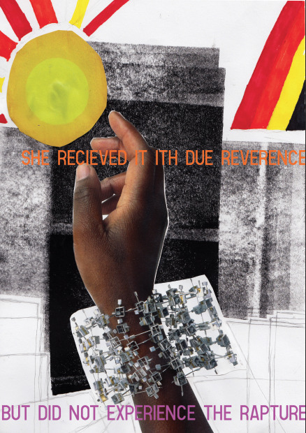
This all being said I'm confused over how the multiverse plays into this, the assignment was about creating art based around a narrative, not around other universes.
Two artists I felt influenced the art I made during the assignment were Brooks salzwedel and pokras lampras, Brooks' art I have already examined, still, he depicts floating land masses, and strange forested scenes obscured by mist, while pokras lampras is an asemic writing artist, his particular
Brooks salzwedel
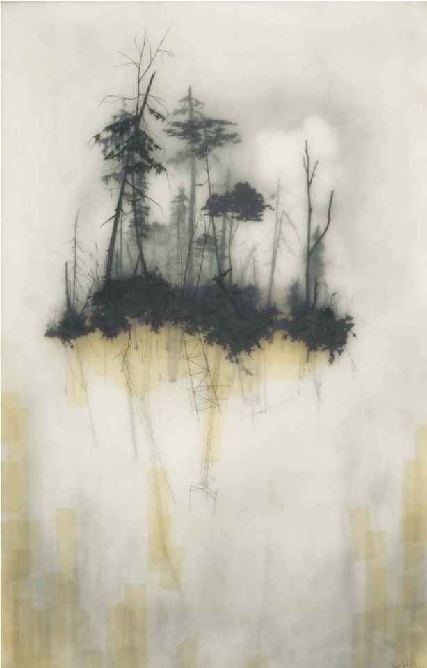
style was structured and merged aspects of Cyrillic, English, Greek and Arabic creating an interesting visual style.
Pokras lampras

What did we learn in lesson
This assignment did not focus on new artisic methods (in comparison to the last unit we learnt screenrinting, intaglio, chalk, graphite etc.) but rather ways to express ideas through it, in this case through the aforementioned narrative.
Animation:
animation is relatively simple, animations are composed of several frames, then the amount of frames per second will determine how the animation plays put, generally the higher frame rates are used for smoother, more high effort animations, 24 fps (Frames Per Second) is industry standard.
In a programme the last frame can be viewed to better let the animator decide where they want to go with the animation.
Light box art:
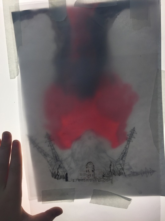
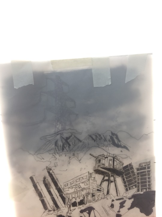
our light box art used tracing paper, each piece of paper was drawn on, the penned, the most 'misted' paper would be at the back, giving an impression of dictance, the paper in fromt would similarly appear closer to the veiwer.
Though as for what we used, screen printing, digital, painting, drawing were all used, of note was the continued use of animations in digital atr.
the use of light boxe was interesting particularly the use of layered tracing paper to create a obfuscated image, though I personally wonder how I could use them in my own art.
Out of lesson
digital art became my focus, I've found my transition from traditional methods difficult, lines are less stable, and dealing with confusing interfaces has proven itself difficult.
The quality of my artwork has been reduced as a result, but this is expected when moving to a new, unfamiliar medium.
Though digital art has allowed me to use colours freely, which again is difficult, as I never developed any real sense over how to use colours using traditional drawing methods.
Inspiration
Additionally I asked each individual artist the same three questions about their work, which were
what is your source of inspiration? (meaning what initially inspired you and what continues to)
how did you start? (what did you draw initailly, when?)
what processes and materials do you use?
void_illustration - Richard Saunders Illustration
Richards art either is obviously biological, where a creature is depicted, or has a distinctly biological edge to it, metals seem to bend,twist and stretch like flesh, nothing seems to be truly just a machine or device, rather every ridge, bulge and groove hints at a more organic truth to his figures and objects.
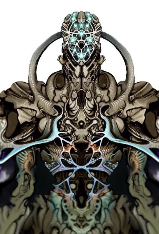
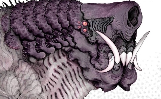
1. im inspired by so many things, its good to pull from a wide range of inspirations.
2. Ive been drawing for a long time, im not professional but im hoping to change that, most of my work forms into narrative universes and then develops on from there.
3. For materials I use a range. My 'bio warrior' series is mainly pencil sketches with marker colours and white paint pen highlights. My brown paper dragons are watercolour on strathmore toned tan paper, lined digitally, though I will layer them up further with paint and markers.
Fuelstains - Nikolay Georgiev
His work similarly to Richard's trends to directly be a creature or rather, monster, these organism often have strongly textured skin, often appearing to have many grooves, showing the musculature underneath, then there are his mechanical pieces, either directly depicting a machine of some kind, such as a robot, or depicting a human who has been massively altered by technological augmentations.
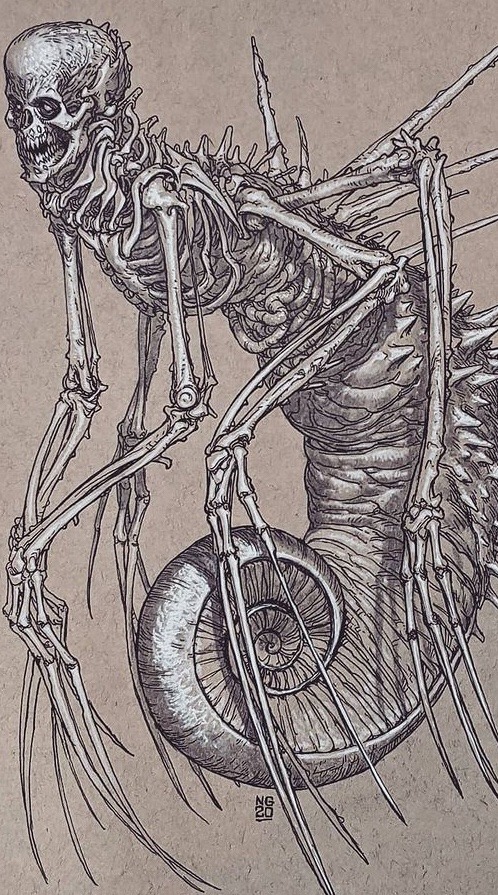
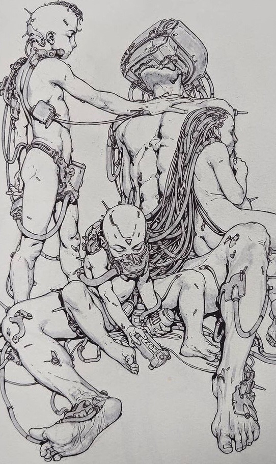
1.I was initially inspired by comics, as a kid, stuff like spiderman, bat man and transformers, but later on it could be anything that inspires me.
2.I started in primary school and it was mostly superheros or stuff from movies.
3.Pencil, ink fineliner, brushpen, watercolour, ballpoint pen, digital.
Milesr.art – Miles R art
miles' art focuses on creature drawings, particularly drawings of alien life, creating some truly bizarrely fascinating, most bearing little resemblance to earth organisms, if any. Another aspect of Miles' work that I appreciate is that it seems grounded, the animals, in spite of their bizzarreness still seem like they could exist.
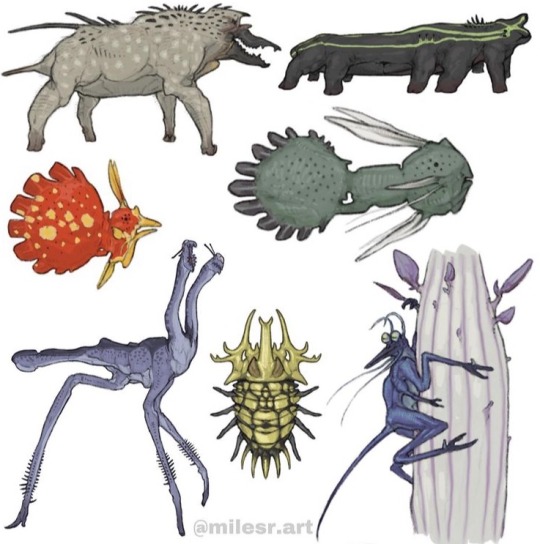
1.some of my biggest sources of inspiration:
- C.M koseman, Brynn metheny, and dougal dixon are some of my most inspiring artists
-just thinking about the natural world in general like on our planet
2.what initially inspired me to draw and that goes into number 2) in kindergarten I saw some kid drawing a honey comb pattern with neon markers and was like huh okay im going to do that but better.
And I always drew monsters and characters, always becoming more based on science overtime, and here I am now.
3.Now I exclusively make finished things digitally with my ipad pro and apple pencil using procreate, but I often make sketches on post it notes with just regular pencil. In terms of processes I feel like I just do what I do it, its hard to define ones process.
1 note
·
View note
Text
𝕬𝖚𝖙𝖔𝖒𝖆𝖙𝖎𝖈 𝖊𝖓𝖈𝖔𝖚𝖓𝖙𝖊𝖗𝖘 | 30/03/20
For this week, we have a new workshop to do, tying into the first brief (Pick & Mix), focusing on surrealism and the theories linked with this by psychologist Sigmund Freud.
vimeo
Attached was the following text written by our teacher to introduce this workshop and the tasks that come with it;
“After a successful week with the post it note comic, and some excellent write ups that are really well documented, this week's task revisits some of the work from Term 1 (as we started in our drawing sessions) with some of the ideas stemming from Surrealism, dada and the psychoanalytical theories of Sigmund Freud.
This task is presented by Bristol based artist & animator Will Barras who will be offering commentary on your work at the end of the week. Follow the PDF attached and work through the tasks at your own pace. You have all week so take your time and experiment as much as possible.
We have more challenges to come, so try to put time into these as they will form the main body of your experimental work.
Upload your results and be as creative and imaginative as possible, but most importantly let go and embrace the ride.
Good luck peoples!”
Consider the primary objectives of a Final Project:
Collect information (Research)
Recall knowledge (Use learning)
Apply understanding through application and review (Propose & make exciting work and evaluate it)
I find that the above points refer to a simplified process of working through meet the final goal that is set by the FMP, althought this also applies to workshops and side projects that gets documented on this blog, as well as the productionfile.
Question: Are you doing these things and how can we improve and develop this?
I feel that I already do these, althought I yet have to further improve on evaluating the things I do, asking “Why” more often.
Answer: Experimentation - (The action or process of trying out new or revisiting ideas, method and activities)
≡≡≡≡≡ ≡≡≡≡≡ ≡≡≡≡≡ ≡≡≡≡≡ ≡≡≡≡≡ ≡≡≡≡≡ ≡≡≡≡≡ ≡≡≡≡≡ ≡≡≡≡≡
This weeks aims & objectives:
To review basic principles of automatic practice in relation to a specific artist
To experiment with working from abstract starting points
Be generate experimental work that shows progression of learning
To compare your work to the work of others

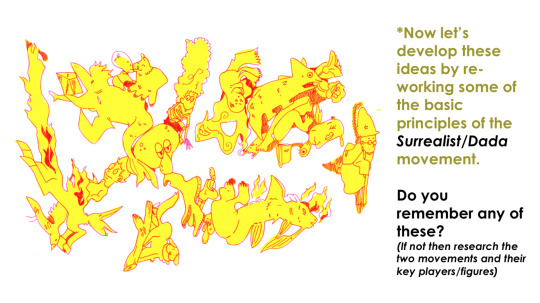
The surrealist/dada movement was an art movement, as well as a literary movement, that began around 1915 - 1917. Some of the key artists leading this movement was Hannah Höch, André Breton & Max Ernst. The movement aimed to break free from the chains that weighed down everyone during the great depression- The artistic field had now begun to evolve into a playground for ones’ imagination, challenging what used to not be acceptable in common culture.
Accident & chance
Embracing Improvisation (What does improvisation mean to you?)
BEING AUTOMATIC!
Surrealist automatism is a method of art-making in which the artist suppresses conscious control over the making process, allowing the unconscious mind to have great sway
Unlocking the unconscious mind.
In Sigmund Freud's psychoanalytic theory of personality, theunconscious mind is a reservoir of feelings, thoughts, urges, and memories that are outside of our conscious awareness.
≡≡≡≡≡ ≡≡≡≡≡ ≡≡≡≡≡ ≡≡≡≡≡ ≡≡≡≡≡ ≡≡≡≡≡ ≡≡≡≡≡ ≡≡≡≡≡ ≡≡≡≡≡
𝕽𝖊𝖘𝖊𝖆𝖗𝖈𝖍:
This weeks challenge for experimentation is bought to you by Bristol based urban artist and animator Will Barras. Your task is to analyse his work, considering the effect of the visual language (how he uses line and tone for example). Find out about him and considering the aforementioned surrealist principles write a short statement to suggest how he uses those principles in his own work.
Will Barras
vimeo

Illustrator, artist and animation director, Will Barras, currently lives and works in London, althought he grew up in Birmingham and later moved to Bristol to study graphic design. He quickly became known for being part of a group of young artists, working within Bristol’s street art scene. This then led to him appearing in a book titled “Scrawl”, alongside the artists Steff Plaetx and Duncan Jago, becoming a core and founding member of the Scrawl collective. “Scrawl”, originally published in 1999, was an influencial book made to document a new movement in street art, graphics and illustration.
Barras was selected to be one of the original artists for this collective. He was selected due to being renouned for his methods of portraying fluidity in movement. He also worked closely with creating pieces that were more narrativly driven compositions, incorperating such narratives into his line work. Barras’s unique composition of these three key elements, made his mark as an artist all the more inspiring, pushing new ideas against the grain of classic art. All of this has led his work to become staple pieces in many galleries across the globe. This includes Asia, Europe and the U.S.
He has painted a variety of different murals around the world, within this mix is one that he did with the members of his Bristol group at Tate Modern’s tubine hall, as well as one that he did for Pow!Wow! Festival in Taipei. In the studio Th1ng, located in central London, he worked as the head of animation.
Visual analysis and study:
His artwork has a very recongnizable style and feel to it. It has an urban flare to it, making it feel very fitting within the scene of street art.
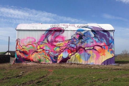
“A big barn I painted in Dumfries with Amy Winstanley for the Spring Fling festival and Recoat gallery based in Glasgow.
http://www.amywinstanley.com
http://www.spring-fling.co.uk
http://www.recoatdesign.com”
The painting below has little information about it, as for what I can find, but somehow the piece almost speaks for itself. The play on perspective, composition and values is very eyecathing. It impresses me how he is able to convey motion to such an extend that you can almost just imagine it moving before your eyes, but perhaps that’s just me.
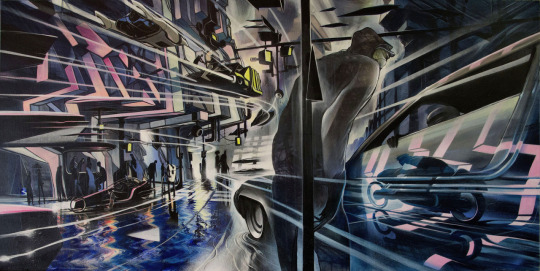
“#divinestyler #defmask #gammaproforma #kallenbachgallery”
I attemped to do some simple continuous warping animation to convey what I mean a little better:
≡≡≡≡≡ ≡≡≡≡≡ ≡≡≡≡≡ ≡≡≡≡≡ ≡≡≡≡≡ ≡≡≡≡≡ ≡≡≡≡≡ ≡≡≡≡≡ ≡≡≡≡≡
𝖁𝖎𝖘𝖚𝖆𝖑 𝖆𝖈𝖙𝖎𝖛𝖎𝖙𝖞:
01: Using a wide brush create a large sheet of accidental/automatic/ unconscious blots & splatters, organics shapes and curvaceous marks using a range of coloured ink/paint. The brighter and more acidic the better!
Because of the fact that I don’t have paper made for paints/ink, I decided to try doing this task digitally- simulating the analogue look of watercolour or watered down ink, or even arcrylics.
I did this by using a variety of different watercolour brushes, made to emulate the look of the analogue mediums. I used them as randomly as I possibly could, trying not to plan where I would put the next brush stroke.
Once I had put down all the paint stokes, I then went over it while the layer was locked with a big soft edged brush, layering up different colours until I was happy with how it looked.
02: Make 3-4 sheets of these and then let them dry.
Digital 01:
Digital 02:
03: Then using fineliner develop these marks into faces/characters/scenes by adding details/features and developing these into detail illustrations that are spontaneous and free flowing.
For the linework, I primarily used one single brush; hard edged and circular. (The one selected in the picture below)

I chose this for the reason being that I have found it to be very responsive to the use of a drawing tablet & pen. It does a good job at making expressive lines with its tilt sensitivity, making it a pleasure to use; It reminds me of how brush pens work and feel.
Here are a few tests on some of the lines I can create with it;
≡≡≡≡≡ ≡≡≡≡≡ ≡≡≡≡≡ ≡≡≡≡≡ ≡≡≡≡≡ ≡≡≡≡≡ ≡≡≡≡≡ ≡≡≡≡≡ ≡≡≡≡≡
Digital 01:
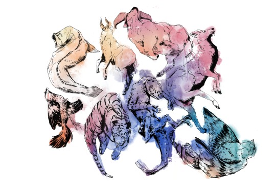
Digital 02:
≡≡≡≡≡ ≡≡≡≡≡ ≡≡≡≡≡ ≡≡≡≡≡ ≡≡≡≡≡ ≡≡≡≡≡ ≡≡≡≡≡ ≡≡≡≡≡ ≡≡≡≡≡
Digital 02: Process
1. I have always found that beginning these blob doodles are the most diffucult for me. Perhaps because it takes me a little while to really get into the flow of continously seeing images in the randomness.

2. I began from the left, slowly working my way to the right and the top, since I felt that I had more clear lines to go from being around the edge of the paint.
3. Eventually I braved it and went right for the middle of the piece. This was the turning point for me in the process of doing this. It enabled me to truly let get, have fun, and not feel intimidated and nervous to do the next doodle.

4. This is when I began drawing creatures of the sea, slowly building up a story/narrative.
5. I don’t actually remember what I was even thinking at this point anylonger- I was simply just letting the pen guide me around the canvas; letting it all flow together however it felt as to do so.
6. I began to delve into the little details. I felt as if they would add to the general flow of the piece; being busy, yet in a manner that lets your eyes wander with curiosity.
7. I was now moving on to doing the right side of the piece. I had a little more trouble visualising the top right corner, so I did that last.
8. At this point I felt a little stuck as to what to do, hence it being, yet again, dedicated for adding some more little details here and there.

9. Eventually I overcame the frustration I had built up and took to do the right side of the artwork.

10. I tried to convey motion and flow by the way the animals are positioned and posed, trying to make it calm in the middle where the girl is, and then busy/chaotic the further away you get from her.

11. This second to last step was, again, for adding detail. I wanted to fill up any bits that I felt appeared too empty and spaced out, so to no disrupt the feeling of flow in the painting.
12. With the inking done and rendered to my satisfaction, the last step was to play around with colours.

≡≡≡≡≡ ≡≡≡≡≡ ≡≡≡≡≡ ≡≡≡≡≡ ≡≡≡≡≡ ≡≡≡≡≡ ≡≡≡≡≡ ≡≡≡≡≡ ≡≡≡≡≡
Digital 01: Colour variations
Digital 02: Colour variations
04: Scan/photograph and upload to Moodle.
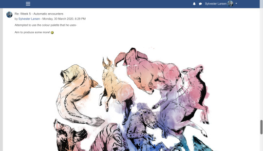

≡≡≡≡≡ ≡≡≡≡≡ ≡≡≡≡≡ ≡≡≡≡≡ ≡≡≡≡≡ ≡≡≡≡≡ ≡≡≡≡≡ ≡≡≡≡≡ ≡≡≡≡≡
𝕱𝖎𝖓𝖆𝖑 𝖗𝖊𝖛𝖎𝖊𝖜 𝖆𝖓𝖉 𝖗𝖊𝖋𝖑𝖊𝖈𝖙𝖎𝖔𝖓:
Which of these words would you use when discussing the work of Will Barras and your own art pieces:

I would most definitly use;
Organic/Fluid
Figurative
Automatic
On top of these I would probably add;
Harmonic
Dynamic
Epochal
Visionary
Can you construct a comparative sentence/paragraph using at least 5 of these words. What are the differences and similarities between the works you have created. What conclusions did you make about this experimentation?
2 notes
·
View notes
Text
Animation As a Kind of Media

Animation can be used to tell, teach, market and express emotions just as reside action can by using the same tactics these types of as the use of colour, film language and sound. The NSPCC advert by Russell Brooke on television is a great example of how animation can be more effective than reside motion. There is no limit to how a lot a problem or an action can be exaggerated but nonetheless continue to be to be convincing. In the advert if a actual child was currently being thrown close to it would be particularly controversial and though it is basically what is likely on powering shut doorways it would be also substantially for some persons to enjoy. The animated character is established in a way that portrays the youngster in a way that will get the concept across. This illustration shows how valuable a software animation actually is, that it is not just a media variety to entertain younger young children. It is also a superior automobile to demonstrate that cartoon violence can be employed to a constructive conclusion. On the other hand cartoon violence can be rather aggressive and graphic like the 'Grand Theft Auto' video clip games series and some Manga capabilities contain a good deal of violence and gore but established in a really sensible way, not suitable for a younger audience where by as cartoons tailored from Marvel comics these as 'Spiderman' and the 'X-Men' are mainly oriented around battling but accomplished in a a lot less bloody way. The combat sequences require a handful of kicks and punches and a superhuman electrical power is employed which will not normally inflict considerably gory, physical destruction on the opponent, as a substitute the loser is left with a scratch or two on their encounter with a trickle of blood oozing from their mouth. The fights, practical as they may perhaps be, are not overly graphic, normally they would have to be shown following the watershed, but they are descriptive adequate to categorical what is heading on within the tale. Most vital of all is the simple fact that great usually triumphs over evil in these cartoons. This does not justify the combating but neither does it inspire it. Fisticuffs in a dwell action attribute is generally additional violent than preventing in cartoons as it involves true people who can get damage while cartoon characters come to feel absolutely nothing, producing the fighting appear to be fewer reasonable than a are living action fight sequence. The perception that animation is a media sort directed generally at young children is not always genuine, but in some situations this can be utilized to the edge of the producers. A very good illustration of this is the current 'DairyLea' commercials, developed in a 3D Prevent Motion strategy it demonstrates some speaking cows encouraging youngsters to consume their product, not just on its own, but with mashed potato. The advert reveals that 'DairyLea' can be blended with other meals and the format is additional unforgettable to kids (the conversing cows), therefore they are far more probably to check with their dad and mom to get them some. Yet another great instance of animation aimed at youngsters is the 'Green Cross Code' (halt, look and hear). This informative industrial reveals hedgehogs crossing a highway in an animated and musical way, encouraging children to do as they do and they will be harmless. This structure was preferred so small children will bear in mind how to safely and securely cross the road as informed by singing hedgehogs-which would not have been doable in true existence as a result of a are living action format. The advert offers an appealing, unforgettable choice to mundane, forgettable, stay action guidelines. Because animation is built preferred by young children, (for example, the phenomenon of the 'Pokemon' sequence) there are a range of techniques producers can capitalise on the start and good results of a series. The producers see numerous approaches of earning far more dollars from a prosperous cartoon mainly because they know that young children will do anything at all to get their palms on aspects of items, for example the 'Pokemon' struggle playing cards. Merchandise does not just prevent at actively playing playing cards although there is stationary, cutlery, bags, toys, outfits, publications, posters and video clip video games. It is this facet of animation that results in grown ups distancing them selves from the style due to the fact of the point that the cartoon sequence is blatantly aimed at little ones and so this is adequate to set them off seeing. Previously the animation format adopted a biased strategy aimed exclusively at a more youthful audience. In the early times animation it was intriguing principle, a drawing that was moving. Due to the fact it was a new notion people today of all ages took an curiosity. Now the omnipresence of the structure by way of the yrs that folks locate it entertaining up to a issue in their lives then just end viewing animation as they get more mature, then when they have little ones of their own the viewing method commences once again. It is since of this misconception of the structure and its association with kids that profitable tries have been produced to break this mould. Considering the fact that some grownups have an interest in animation certain titles and series' have been aimed at an adult precise audience, these include the '2DTV' series, some 'Manga' titles, Comedy Central's 'South Park', 'The Simpsons', 'Futurama' and the Japanese 'Hen-Tai'. To conclude this stage, John Serpentelli writes in an report, that "The relationship among youngsters and animation seems easy sufficient. To a kid, just about anything is attainable and the very same is genuine for animation." The animation format is also equipped to inadvertently teach children about the artistic side of animation, as John Serpentelli states, "Because animation is an artwork sort that can require virtually all other artwork types and children can straight come upon the art world in an unfiltered fashion." A the latest comeback of 80's animation has revealed resurgence in popularity of classics these as 'The Clangers', 'Bagpuss' and 'The Magic Roundabout'. Grownups who viewed these animations when they had been young tune in to see these classics of their working day, and their small children sign up for in. Some grown ups are needed to observe animated films in the office, on difficulties of security. Possessing to enjoy, comply with and understand irritatingly noticeable and drab parts of animation could be adequate to put some older people off the format, believing the style is as negative as the movie they experienced to view. This also demonstrates that animation can be as real looking and educational as are living action, but less difficult to comprehend, exactly where as on the other hand cartoons aimed at young children, on the other hand unrealistic, often incorporate a moral or suggestions at the conclude of the episode, in an energy to instruct the kids watching what is correct and what is completely wrong. When you loved this informative article along with you would want to receive details relating to アニメやディズニーの声優まとめ!出演者情報や驚きの裏話 kindly stop by our webpage. The motive remaining for this is that if children see their favourite cartoon character carrying out a thing or telling them to do one thing then they could possibly be encouraged to do as they say. This just displays that if carried out appropriately animations can be as entertaining as they are insightful or academic for a range of audiences. In online video video games the game titles character which the player controls is introduced to daily life by working with animation. The character would be lifeless if it was not animated and so the use of animation is essential. The incorporation of animation does not cease there as FMV's (Complete Motion Films) are also made use of to convey to a story in just a video clip activity. This is a great instance of how animation can make the unattainable probable by supplying inanimate objects and characters daily life.
1 note
·
View note