#supergraphics festival
Explore tagged Tumblr posts
Text


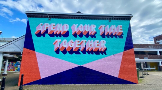
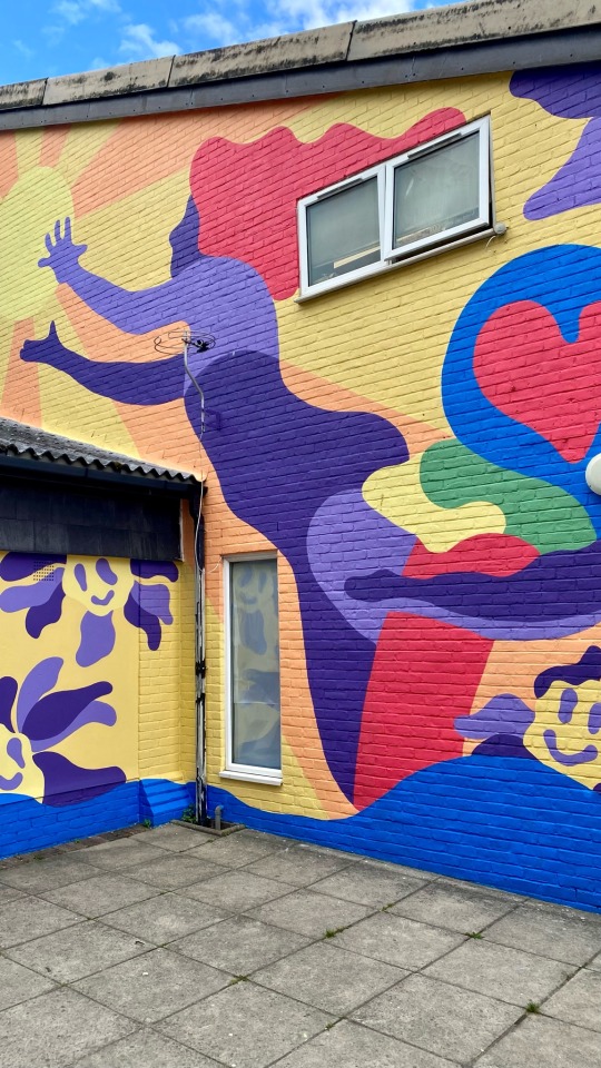
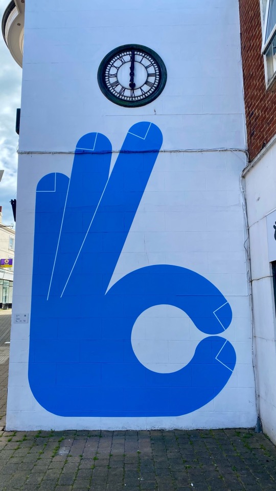
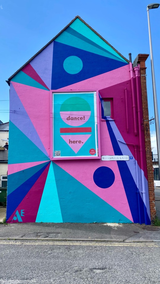
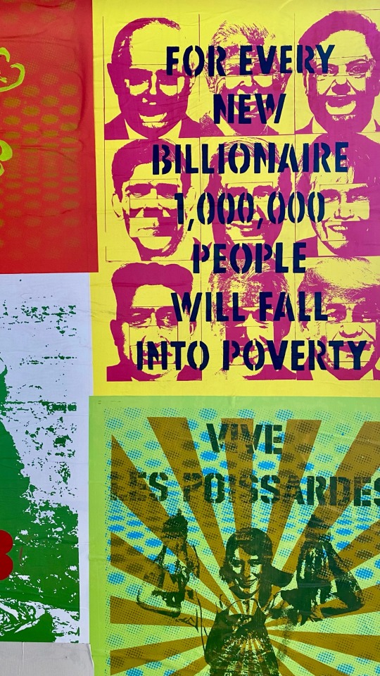
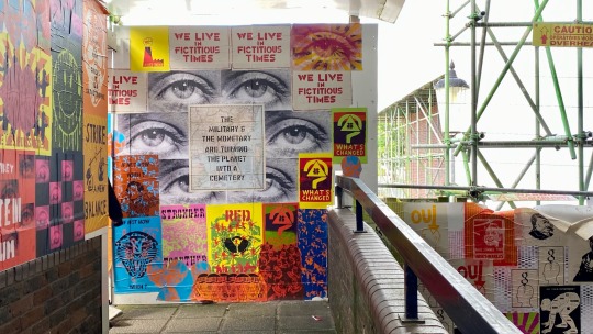


Look Again - Supergraphics Festival Newhaven
#Lee Eelus#Ellie Fryer#Paris 68 Redux#Annie Frost Nicholson#Paul Farrell#Anthony Burrill#supergraphics festival#it’s a bat’s life#street art#brighton bat
6 notes
·
View notes
Photo
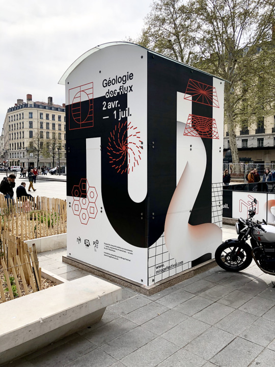
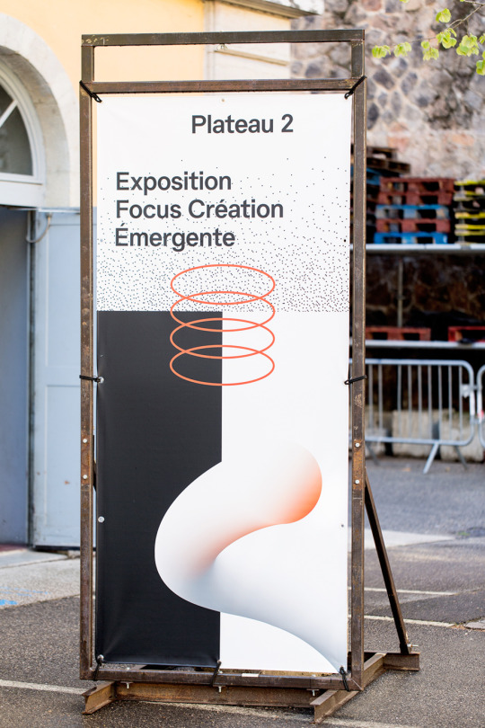
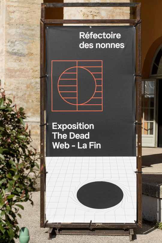
#Cécile + Roger#Mirage festival 7e Edition#supergraphics#series#brand identity#bw#abstract#graphic design#minimal#spatial#experiential#space
27 notes
·
View notes
Photo
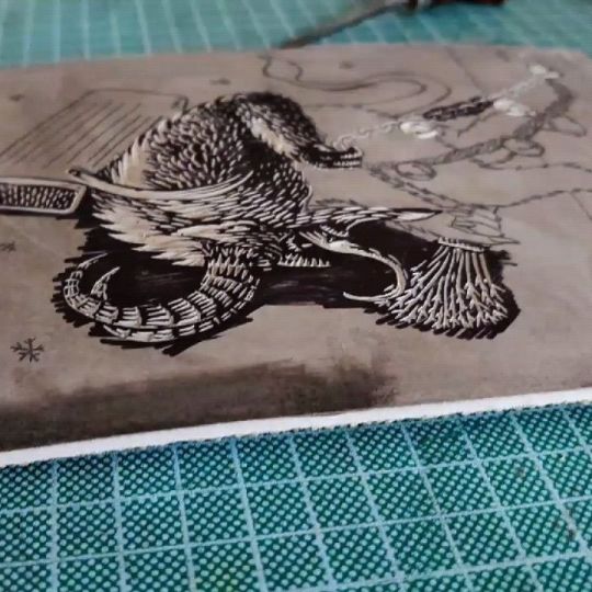
Krampus Linocut Print I carved and printed this edition of Krampus prints about 5 months ago. They're included in the relief print sale in my shop. Limited edition of 15, signed and numbered. £11.25 each plus P&P. Printed on Zerkall 120gsm rough white paper, using Speedball Supergraphic Black ink. Paper measures approximately 19cm x 27cm (7.5" x 10.6"), illustration measures approximately 15cm x 21cm (5.9" x 8.3"). . . . . #krampus #christmas #festive #creature #monster #beast #print #prints #printssale #printmaking #printisnotdead #speedballart #speedballink @speedball_art #lino #reliefprint #reliefprinting #linocut #artwork #art #traditionalart #darkart #macabreart #folklore #horns #horror (at Ipswich, Suffolk) https://www.instagram.com/p/CbkjkjRIBcj/?utm_medium=tumblr
#krampus#christmas#festive#creature#monster#beast#print#prints#printssale#printmaking#printisnotdead#speedballart#speedballink#lino#reliefprint#reliefprinting#linocut#artwork#art#traditionalart#darkart#macabreart#folklore#horns#horror
0 notes
Text
America’s design community comes into its own
A heated plagiarism scandal that rocked design discourse, a splashy return to 1970s maximalism, and independent design came out on top. With New York City’s annual NYCxDesign festival now officially concluded, these are just some of the lasting impressions from two weeks that were chock full of events, launches, and installations.
Held less than a month after Milan Design Week and Salone del Mobile—the world’s largest and longest-standing trade show dedicated to furniture and product design—NYCxDesign is our most comparable stateside counterpart, with several fairs and countless pop-up events spanning the city’s five boroughs. Yet despite the fact that New York is home to a higher density of design professionals than anywhere else in the country, NYCxDesign has often been regarded as an afterthought to industry insiders: Larger brands and furniture houses will often present the same collections just previewed in Milan, and often with activations much less grand than those presented abroad. (It’s hard to compete when Milanese pop-up venues are often ornate, centuries-old palazzos, open to the public just for the occasion.) What’s more, NYCxDesign has rarely been able to contain itself to a single, tidy week—last year, it ballooned to span nearly the entire month of May, making it a marathon event that might dissuade international visitors from being able to take the whole spectrum of events in a single visit.

[Photo: courtesy Jumbo]
All of those factors, however, also give NYCxDesign some distinct advantages: There’s no shortage of homegrown talent, and with the high cost of attending and exhibiting abroad, many local designers opt to go all in on their home turf. With cross-disciplinary collaborations, spirited debates, and a host of openings celebrating independent work, this year convinced us that American design may have finally, refreshingly, come into its own as a platform where designers can speak to a broader audience. This year’s edition of NYCxDesign genuinely felt like a cultural event, more akin to fashion week or a film festival than a staid trade show. Read on for our top five takeaways.

Egg Collective, Designing Women II. [Photo: Egg Collective]
Rise of the designer-curator
In the age of social media, are any of us not curators? This year saw a surge in a particular breed of multi-hyphenate—the designer-as-curator-and-exhibitor—with a number of independently organized group exhibitions in a show of tight-knit community. Last year, in the jarring wake of Trump’s presidential election, the all-women design trio of Egg Collective mounted a show of work by women designers in their downtown showroom, in a positive and constructive flex of dissent against the state of affairs. As a follow-up to the widely lauded effort, this year they teamed with Lora Appleton of Kindermodern on Designing Women II: Masters, Mavericks, and Mavens, featuring an international and cross-generational mix of mixed-media works by Nicola L., Mimi Jung, Mira Nakashima, Bari Ziperstein, and more.

Egg Collective, Designing Women II. [Photo: Egg Collective]
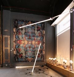
Eskayel, Next Level [Photo: courtesy Eskayel]
Manhattan was particularly hard-hit by the decline of brick-and-mortar retail this past year, with a string of closures in previously high-trafficked districts—look to the formerly boutique-packed stretch of Bleecker Street in the West Village for a prime example of how digital-first commerce has affected neighborhood streets IRL. The vacant storefronts are signs of a changing industry, and for some designers, a serendipitous boon. At a former Superdry clothing store on Broadway—one of several vacancies on the main thoroughfare in Greenwich Village—several studios banded together to present Next Level, a group show of work by their peers and friends, partly looking to channel the cultural fervor that completely overtakes Milan during their design week.
“[Eskayel] exhibited at Salone for the first time ever this past year, and it really opened my eyes as to what was possible,” said Nick Chacona, a partner at the Brooklyn rug studio Eskayel, one of the show’s organizers. “Events are so integrated into the city there, and we wanted to bring some of that approach here to New York.”
In East Williamsburg, the tongue-in-cheek design collective Jonald Dudd (no, that’s not a typo) curated Return of the Living Dudd, a group show housed in a recently abandoned, half-gutted 99 cent storefront. Framed as a “platform for dissenting objects,” it was easily the wackiest batch of works to surface all week—ranging from vessels with live-oozing goop in swirling shades of pink and green, to a seatless chair made of square bathroom tile—all placed in a collage-like disarray upon a swooping, cobalt-blue carpeted backdrop that evoked an appropriately internet-bred aesthetic. As the curators Lydia Cambron and Chris Held held forth: “Punx not dead.”
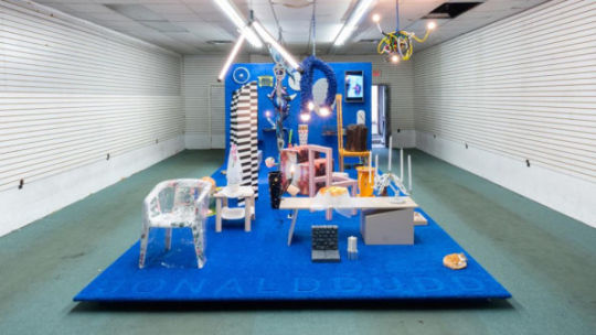
Jonald Dudd, Return of the Living Dudd. [Photo: Jason Mandella]
Their DIY ethos was a refreshing counterpoint to the hallowed halls of Jacob J. Javits Center—home to ICFF, the longstanding trade show anchor to NYCxDesign—and gave the corporate approach a run for its money. New York’s new class of designer-curator-whatever brought out some of the most compelling work of the festival.

Camille Walala [Photo: courtesy Industry City]
Fashion, design, and internet culture collide
Chunky geometries, tubular forms, furry surfaces, and supergraphic patterns were all out in droves this year. It was a signal that 1970s maximalism and a fashion-influenced approach to interiors are still driving many independent designers. Was a secret memo circulated to all of the cool young makers, or has the Internet given birth to a globalized ur-aesthetic? Seen at the various booths of design fairs WantedDesign, ICFF, and Sight Unseen alike, it stood up alongside the enduring popularity of midcentury and Scandinavian modern design. Seemingly more concerned with form than comfort or function, many of these works channeled an approach to furniture and interiors driven by fashion.

Kamarq [Photo: Travis Chantar/courtesy Kamarq]
The idea of how fashionable trends spread, particularly in our internet-driven society, became a topic of heated debate after Kamarq, a Japanese startup aspiring to be the “Netflix of furniture,” was forced to cancel its debut collection within hours of its launch, after copycat claims on Instagram went viral overnight. The designers of the collection, fashion personality and former Lady Gaga stylist Nicola Formichetti, and PJ Mattan, a consultant behind brands like Hem and Bezar—neither of whom had previously ever designed furniture, and extolled the idea of a “fast fashion” approach to home interiors—suggested their tube-and-slab forms were so basic so as to allude authorship, while many others (including this writer) saw undeniable likenesses to a 2015 Matter collection by independent designer Ana Kras. The Wing cofounder Audrey Gelman, artist Katie Stout, musician Dev Hynes, and Hem founder Petrus Palmer were among the many creatives who commented to weigh in on the controversial topic that, fittingly, cemented Kamarq as a “fast fashion” brand indeed.

Vitra+Akris+Alexander Girard [Photo: courtesy Akris]
In general, the fashion world played a significantly direct influence in NYCxDesign this year, with trendy downtown boutiques Philip Lim, Creatures of Comfort, and Opening Ceremony among the many fashion fixtures that teamed up with local furniture designers as part of Sight Unseen‘s curatorial project Field Studies, which paired creatives across various disciplines to produce unique one-off pieces, with proceeds going to a range of charitable causes. Even the big brands got cuddly with the fashion world: Swiss furniture juggernaut Vitra launched a series of dresses and skirts with Akris, featuring iconic patterns by the legendary midcentury textile designer Alexander Girard.

Retrosuperfuture, Slash Objects [Photo: Sean Santiago]
The ecological imperative
The model of a circular economy—by which resources and materials are continually circulated, from by-product to manufacture, in order to drastically reduce waste—has been simmering within critical design discourse for the past several years. And while such thinking has begun to infiltrate even Milan’s luxury-focused design week, it emerged in top billing at NYCxDesign, where some of the most highly attended projects applied the progressive model toward working proofs of concept.
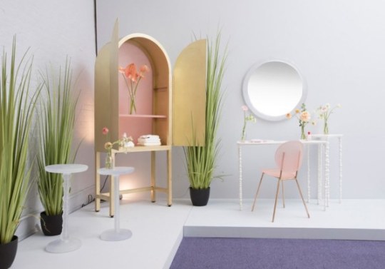
Kim Markel + Glossier [Photo: Charlie Schuck]
At the sunglasses shop Retrosuperfuture, architect-designer Arielle Assouline-Lichten of Slash Objects presented an installation inspired by traditional Japanese rock gardens, but traded stone for rubble-like mounds of shredded tires and recycled rubber. Designer Kim Markel, who often works with discarded plastic bottles to mold translucent, candy-like creations, paired with cosmetics brand Glossier to create a luscious armoire with pink-tinted panels made from the company’s packaging, saved and collected for months by its employees. For her spindly side tables, she lathes spun stone dust, the powdery composite waste left behind from stone cutting. And in Brooklyn, the MINI-backed design incubator A/D/O continued its recently launched, year-long program tackling the global clean drinking water crisis.

Finnish Cultural Institute of New York, Zero-Waste Bistro. [Photo: Nicholas Calcott]
Communal dining proved to be the basis of a winning engagement at WantedDesign Manhattan, a smaller trade show of international exhibitors, where the Finnish Cultural Institute of New York hosted a working pop-up cafe called the Zero-Waste Bistro (full disclosure: this writer will be participating in a program with FCINY this year). Designed and built entirely with recycled materials, it also served a revolving tasting menu of delectable, prix-fixe meals minimizing scrap food waste, with dishes like coconut husk ice cream and chopped asparagus salad, from the chefs of the Helsinki-based concept restaurant Nolla. The project was co-curated by Harri Koskinen and Linda Bergroth, who also designed the space using recycled and compressed Just water bottles and TetraPak waste to dazzling effect, like a pointillist tableau or digital rendering made real. The pop-up bistro was, above all, a tasty sight and experience to behold. The future of design must be ecological, that much is sure—and, as the event’s sold-out seatings proved, style and taste need not go by the wayside to achieve an environmentally responsible outcome.

Coil+Drift, Home Unimprov. [Photo: Sean Davidson]
The performative power of objects
The demands of maintaining a creative practice in a highly digital, politically asinine time is not an easy task—which may be why many designers also took to physical works to explore performative and expressive narratives. While also exhibiting at ICFF as part of the curated Collective Concept presentation, Brooklyn-based designer John Sorensen-Jolink of Coil+Drift—a former dancer turned furniture and lighting maker—presented Home Unimprov at a Soho gallery. Bringing both sides of his work together, the show explored our bodily relationship to designed environments, combining live choreography and short films centered around a trio of conceptual chair designs.
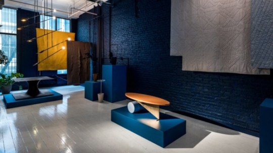
Colony, Balance/Unbalance. [Photo: Alan Tansey]
Over at Colony, an independent design cooperative in Chinatown, founder and curator Jean Lin presented works by Fort Standard, Meg Callahan, Moving Mountains, and more, under the overarching theme of Balance/Imbalance, both physically and sensorially, through color, form, materiality, shape, and even sound. “Perfect balance is a lie, but magic can be found in the space between balance and imbalance,” says Lin, who last year organized a show around the theme of lightness, in response to the tumultuous and heavy American political landscape.
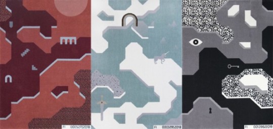
Kosmos Project, Future Illusions. [Photo: courtesy Kosmos Project]
At WantedDesign Manhattan, Polish design studio Kosmos Project presented Future Illusions, a collection of illustrative landscape rugs inspired by video games, complete with a participatory, choose-your-own-adventure element. The designs can be purchased as-is, or uniquely customized through a series of personality quiz-type questions that algorithmically generate a unique variation on a theme. The overall concept, the designers said, was to show both sides of the coin when it comes to big data–and ultimately make viewers more aware of their consequential choices.
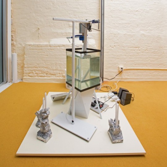
The Principals + Ashley Olson [Photo: Charlie Schuck]
Toying with tech
While big consumer tech brands made a splashy arrival to Milan‘s traditionally furniture and interiors-focused design week last month—with high-profile activations from Google Home, to Sonos and even Instagram—in New York, technology found its way into design show with a decidedly more homegrown and experimental slant.

The Principals + Ashley Olson [Photo: Charlie Schuck]
At Sight Unseen’s highly curated satellite show of emerging talents, Drew Seskunas of The Principals teamed with musician Ashley Olsen to create a custom 3D printer. Sound waves of the singer’s voice were translated into physically rendered wax forms, which were then used to mold aluminum candlesticks—rigorously traversing from immaterial to material, it was an undeniably engaging experiment: call it design synesthesia. Hailing from Warsaw, UAU Project exhibited a more market-friendly approach to 3D-printed wares, with a colorful range of lights and small tabletop objects made from a reused corn byproduct. They were available for cash-and-carry, or, for a reduced price, as a digital file compatible with any desktop 3D printer.

Rich Brilliant Willing [Photo: courtesy Rich Brilliant Willing]
Darlings of the hospitality and contract market, lighting studio Rich Brilliant Willing wowed with a series of conceptual, working prototypes exploring the new formal possibilities of OLED technology and 3D-knit textiles. The team took a minimal, sculptural approach to thin, pliable strips of OLED, which read more like ambient surfaces or screens. Unlike traditional bulbs or LED diodes, partner Theo Richardson explained, OLEDs naturally emit soft, diffuse light—meaning no shade or additional element is required. Instead, the studio added its first experimentation with 3D-knit textiles into the mix, sheathing each of the OLED strips—molded and hanged to gently bend by the weight of its own heft—with translucent, graphic-patterned sleeves.
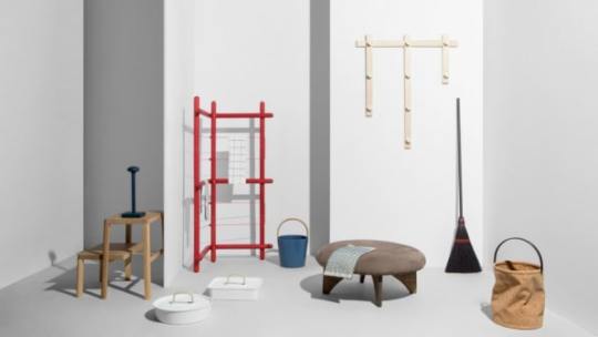
Design Within Reach, Hands at Work. [Photo: Charlie Schuck]
Not all young designers embraced new-fangled technology; some even eschewed it the name of mindfulness. At Hands to Work, the third edition of Furnishing Utopia, a now-annual group show sponsored by Design Within Reach, dozens of designers were commissioned to develop simple, useful items and tools with an intent to engage and transcend the tradition of Shaker design. The overall vibe was gleefully analog, as visitors were invited to engage in “sensory isolation,” and left to their devices in an all-white room containing only a tidy tray of gravel and an immaculately designed dustpan and brush. Among the wares displayed on the main exhibition floor: a wheeled planter by Jamie Wolfond, a basket bound with cable ties by Shigeki Fujishiro, and a wooden dish rack by Studio Tolvanen.
Hands to Work exhibit featuring @patkimpatkim Roomba cover that brings a new sense of life to robotic machines. Shot by @charlieschuck, styled by @natashafelker, creative direction by @ladiesandgentlemenstudio / also thanks to special support from @designwithinreach @norwaynewyork @_sightunseen_ / May 22 is the the last day to see the exhibit/ 158 Mercer, 9am-5pm #furnishingutopia #handstoworkexhibit #dwrxutopia
A post shared by Furnishing Utopia (@furnishing_utopia) on May 21, 2018 at 9:42pm PDT
All conveyed a cheerful attitude to hand labor and daily chores, with the exception of a tongue-in-cheek piece by designer Pat Kim: a handsome cherry wood casing for an automated Roomba vacuum, which amused visitors as it made the rounds and reminded us that not all labor is sacred.
America’s design community comes into its own published first on https://petrotekb.tumblr.com/
0 notes
Photo

Graphic Fest by @victionworkshop / Designed by @victionworkshop / Published by @victionworkshop * * * * * #graphicfest #festival #fair #festivaldesign #logo #typeface #supergraphics #branding #visualidentity #type #typography #design #graphicdesign #designer #graphicdesigner #book #books #booksondesign #designbook #publication #publishing #graphicbooks #grid #layout #designstudent #designstudio https://www.instagram.com/p/BqxgWYPhGge/?utm_source=ig_tumblr_share&igshid=2flt264ekfmt
#graphicfest#festival#fair#festivaldesign#logo#typeface#supergraphics#branding#visualidentity#type#typography#design#graphicdesign#designer#graphicdesigner#book#books#booksondesign#designbook#publication#publishing#graphicbooks#grid#layout#designstudent#designstudio
0 notes
Text
‘The catfish is plenty good enough fish for anyone‘ – Mark Twain
It is said that the face of Helen of Troy launched a thousand ships. In that vein, the whiskered face of the catfish launched my quest to track down Supergraphics. While participating in the RAIN bicycle ride in Indiana, I’m contemplating a sabbatical of travel. Unsure of what my goal or destination might be, I see a U-Haul trailer with catfish emblazoned on the side. It announces Belzoni as the Catfish Capitol of the World. That was it, I had to see what this venue was all about. Luckily my visit coincides with the annual Catfish Festival.
I can not find an available motel room near Belzoni and opt to overnight about a half hour north in Greenwood, MS. I spend the evening tracking a thunderstorm and tornado producing cold front that is ripping through the area. Though weather forecasts are not looking favorable for the festival, I look forward to a drive through the Delta anyway.
Heart of the Delta
Belzoni is located in “The Heart of the Delta”. The Delta is the distinctive northwest section of Mississippi which lies between the Mississippi and Yazoo Rivers. I drive towards Belzoni on Highway 7 through the towns of Itta Bena, Quito, Morgan City and Swiftown. The farm fields are muddy and empty.
While the soil may be rich and fertile, it’s obvious that the economy is not. The once labor-intensive money crop of cotton has been mechanized and textile industries moved overseas. The towns are relics of their former selves, bordering on virtual ghost towns. While the buildings may be dilapidated, I get a sense of a rebirth and pride.
Mississippians are a hard working and prideful sort and not prone to quitting. In the 70’s, the effort to supplement farmers incomes with catfish farming begins. Farmers had to overcome the catfish’s normal tendency to be bottom feeders. This feeding habit makes for a muddy tasting meat. The industrious farmers develop ways to convert pig and chicken feed into floating fish pellets. Subsequently, this rewires the catfish DNA to eat suspending feed and thus produce a more tasty food source for humans.
In just a few decades, catfish farming has become an important economic resource for Delta life.�� In fact, the Delta farmers have become so prolific in catfish farming that the area produces over 70% of the catfish consumed in the United States. This distinction earns Belzoni the designation of Catfish capitol of the world.
I see the Belzoni city limit sign and immediately begin seeing colorful catfish statues around the local businesses. Part of the Catfish on Parade Arts Project, the 33 fiberglass statues are themed and painted. I track down many of these before the Festival opens at 9:00.
Catfish Festival
It is with Southern pride that Belzoni celebrates the farming achievements with its annual Catfish festival. The organizers tout the festival draws up to 10,000 visitors each year. With temperatures just above freezing and howling winds, the crowds are significantly less this year.
I enter the festival and head toward the Catfish museum, a repurposed railway depot. Despite the weather, the attendee’s spirits are high and people friendly. The women are well dressed, make up heavy, hair teased and sprayed as if its date night. The vendors and shop owners are cordial, offering a smile and a “hello, how are ya”. Wondering if they somehow know I’m an out of towner, I come to the conclusion that they are just normally that friendly.
I am interested in the museum, but really just want to get warm. While I glance over some of the exhibits, I overhear a few locals engaging in some local gossip and goings-on.
I manage to insert myself into the conversation which invariably turns to the age-old question: Is catfish better fried whole or filleted? Being from Western Kentucky where the whole catfish “fiddler” is the only way to eat catfish, I take the position of “whole”. Soon, those supporting the local favorite of filleted outnumber me. Leading the fillet contingent was Dee, the days’ museum curator.
Cap’n Catfish
Our lively debate quickly abates when a big young man enters the museum reporting to duty with his oversized catfish costume in tow. Dee and crew treat me as part of the family as the hilarity of puns and jokes ensues as it takes a committee to get this guy into the suit. Seeing the consternation of the would be “catfish”, I offer to take a shift, as the suit looks comfy and warm.
Ms. Dee and Capt’n Catfish
When my offer is declined, I say my goodbyes and return to the festival streets. I grab a bag of freshly made pork skins from a vendor and head over to check out the Little Miss Catfish Pageant. However, the cold winds don’t solicit the cheery smiles and waves of the young evening-gowned contestants. As such, the event is cut short. Many vendors, tired of resecuring their blowing away tents, also begin to shut down shop after only a couple of hours.
Maybe Next Year
I too, have tired of the cold but don’t want to leave without the much touted “filleted” catfish. I duck into Allison’s restaurant. Allison’s is located inside an old non-descript downtown building. Probably an old department store. The entrance is an old heavy wooden door and the also wooden floors are creaky. The walls are brick and the place is warm; much like the cheerful staff. Of course, I order the catfish fillet platter. A southern tradition of fried catfish, french fries, hushpuppies, and coleslaw. I finished it off with a jar (yes a mason jar) of banana pudding that I purchased from a vendor before they shut down.
The food was hot and tasty. The wait staff was overly apologetic about the weather and low festival turn out, seemingly taking it personally. Their personal pleas to please come back next year were sincere and heartwarming. If food and hospitality are an indication, Belzoni helps the region earn its title as “The Most Southern Place on Earth”. It feels like home, even if they don’t fry their catfish whole.
This slideshow requires JavaScript.
Belzoni, Mississippi 'The catfish is plenty good enough fish for anyone' - Mark Twain It is said that the face of Helen of Troy launched a thousand ships.
0 notes
Photo

Deborah Sussman was born in Brooklyn, New York on May 26, 1931. Her father was a commercial artist and her mother was a linguist. She always led a creative life and took summer courses at Black Mountain College receiving a diverse education in the arts. She went to the Arts Institute in Chicago and got and landed a summer internship with Charles and Ray Eames. She received a Fullbright Scholarship to attend a school at the Ulm School of Design in Germany and worked in studios in Milan and Paris.
She was drawn back to Los Angeles to work for Charles and Ray Eames and worked closely with them on researching and documenting communities in culture. Travel was a big part of her work and so she visited places like Mexico for to see their Day of the Dead Festival and India to understand the Nehru Royal Family.
In 1968, she founded Deborah Sussman & Co., which became Sussman/Prejza in 1980 after she married designer Paul Prejza. As her worked developed she began to champion Environment Graphic Design and coined the term “Supergraphics.” Sussman described that its “not that it was just big, but that it was bigger than the architecture, that it didn’t have to fit into prescribed spaces in a traditional way. That it could have its own life and go beyond the ceiling, be cropped, be as though it had almost flown over the architecture.” This is very evident in her work for the 1984 LA Olympics that used graphics in such bold and way that the architecture was not obstructing the design, but rather upholding it.
Her typographic work uses striking colors and large scale which served function in many of her wayfinding projects, but also defined the aesthetic for the city of Los Angeles. She has a discipline of playfulness in her designs that she called on through imagination. humor, and a full embrace of color and detail. She knew that a public space was going to be experienced and create a culture for it’s visitors.
Her husband describes her as “bright, sunny, and always fashionably dressed.” Debroah Sussman passed away from Cancer on August 20, 2014. Before she passed a retrospective of her work was displayed at a exhibit called “Deborah Sussman Loves LA” at the WUHO Gallery.
0 notes
Text
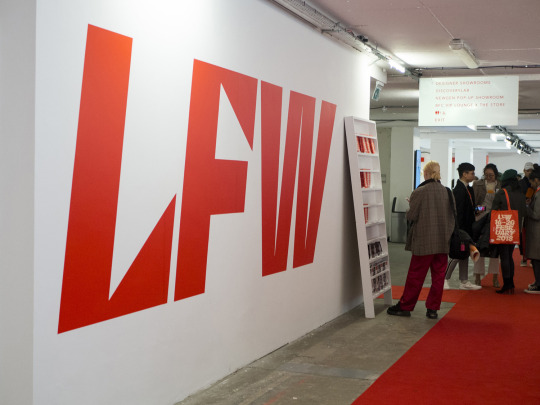
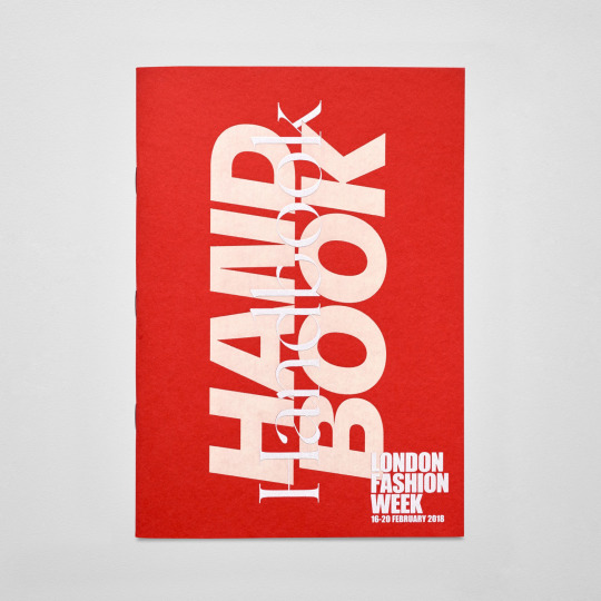
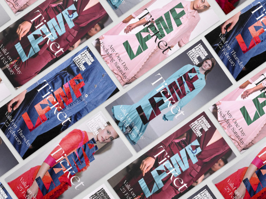
London fashion week identity by Pentagram
Twice a year the British Fashion Council exhibits the very best in British fashion to national and international audiences. It does this through three events, each held at Store Studios on the Strand. London Fashion Week (LFW) and London Fashion Week Men’s (LFWM) offer the industry a look at upcoming womenswear and menswear collections, while London Fashion Week Festival (LFWF) provides the general public with a unique shopping experience.
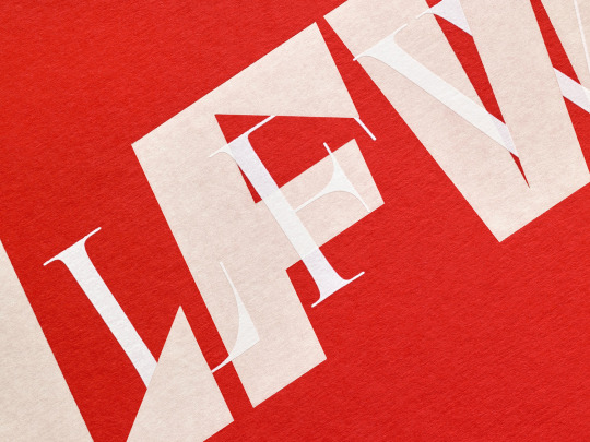
The London-based studio of Pentagram, led by partners Jody Hudson-Powell and Luke Powell, created the graphic identities for all three events. While each is distinct in its content and audience, they are linked by the concept of ‘discovery’, and the intention of bringing to light and juxtaposing emerging new talent and London Fashion Week’s enduring legacy. This is expressed by the intersection of lettering and type. Each event is founded on this interaction, yet has its own unique character which then forms a continuity across their own print and digital communications, from posters and brochures to motion graphics and supergraphics.
I think this is a very good example for me to learn from because it is very powerful and striking design and is also related to fashion.
The typography and use of colour together create an amazing visual which is very recognisable. They have mixed the modern day feel of the sans serif font mixed with the classic style serif font to show that London Fashion Week has been going for a long time whilst still staying current and up to date. It’s also good to get a chance to see what there ephemera and wayfinding for this looks like.
0 notes
Text
Insights on Accomplishing Real Marketing Outcomes with Scott Brinker
Ahead of the upcoming Martech Festival, we sat down with Scott Brinker for an exclusive on his session at the event. He explains why prioritization of goals is important before zeroing in on the right tool; and shares his thoughts on the separating the hype from reality for AI in marketing technology, while elaborating on the age-old triangle of technology, people and process. A man with many hats, between ion interactive, chiefmartec.com, and the MarTech conference, he doesn't have much time for other interests! “Luckily, I’m still as fascinated by the martech space as I have been for the past 10 years. It's an amazing and dynamic industry,” he says
Ginger Conlon:
Hello and welcome to MarTech Advisor's Executive Interview Series. I'm Ginger Conlon, a Contributing Editor to MarTech Advisor and joining us today is Scott Brinker who is Editor of chiefmartec, he's Co-founder and CTO of ion interactive and he is creator of the renowned marketing technology landscape Supergraphic and Scott is speaking at the upcoming Martech Festival presented by Martech Alliance on November 16 in London. So we are going to get a sneak peek of Scott's upcoming session at the festival. So, welcome Scott.
Scott Brinker:
Thank you Ginger. Great to be here with you again.
Q- Ginger Conlon:
Yeah so glad you're here. We are going to talk about marketing technology trends and as I said get a sneak peak into your session but let's start with a bit about you. Sure most of our audience knows who you are quite well but just in case let's give them the overview of Scott Brinker.
A- Scott Brinker:
Okay so I wear a couple different hats. I am the Co-founder and Chief Technology Officer of a marketing software company myself, ion interactive which is a SaaS platform for interactive content and like assessments, quizzes, calculators, fun stuff like that. For the past almost 10 years here now I've also been writing the blog chiefmartec.com. Really looking at this intermingling of the tech world in the marketing world, particularly fascinated with how people with technology backgrounds and skills have really become an integral part of how marketing operates and let's see here, yeah, we also run a conference of our own around that, the Martech Conference and have got one coming up in Boston too.
Q- Ginger Conlon:
Excellent, excellent. So let's talk a bit about marketing technology and the surrounding trends. Let's take a look at your Supergraphic first. So the marketing technology landscape Supergraphic at this point now has more than 5,000 solutions listed on it from more than 4,800 companies. So it's just huge and I recently actually saw it on a screen at a conference which was probably appropriate size for showing that. So what advice do you have for marketer who's looking at the Supergraphic trying to get a sense of the possible solutions that they could adopt in your organization?
A- Scott Brinker:
Yeah. It's a pretty overwhelming landscape. I mean that graphic, I always am quick to disclaim is largely just intended as a conversation piece. It's a chance for us to step back and look at that 50 thousand view of just how diverse and vibrant this industry is, but when it comes for the process of actually selecting technologies and evaluating them, it really isn't very helpful for that. There's so many great tools, so many great sites out there, all these crowdsourced review sites and systems, there's a lot of great places that people can turn to, but I think the best thing for most marketers is actually to set things like those graphics aside and really just start with the question – what do we need to do to connect and serve our audience, the particular market group that we're going after, prospects and customers and out of all the possible things we could do, really make some of those tough strategic decisions about prioritization. Like what's most important here in the next six months to really focus on and to get clarity around that before you start looking or evaluating technologies because there's a tool for everything out there.
That's usually not where the greatest challenge is, it's figuring out what we want to do and the matching the right tool for that
Q- Ginger Conlon:
That's perfect segue into my next question because you're saying, wisely start with the end in mind, what are your goals and what's your strategy and then you look for the software that best fits that. I feel like even that can be a little overwhelming because a lot of times you've got an apples and oranges situation even in within one category. So any advice there to help markers not feel overwhelmed by trying to select the right technology and build out their stack but along with your great advice, what are your priorities?
A- Scott Brinker:
Yeah one of the things is, I recommend that people look at this from a – economic term for it is satisficing. So it's looking for a solution that will do the job you need. It doesn't necessarily mean it's the most perfect tool out of all the tools in the universe that you could conceive of. The odds are there's probably dozens if not hundreds of tools on that landscape that would be perfectly sufficient for doing what you need. So again it's always good to look at several different vendors and evaluate not just what their capabilities are technically but how does the pricing model fit with yours, what sort of support and services models do they have, look at the kinds of other customers they serve, how similar are they to your business.
There's lots of great ways to evaluate potential vendors that you might look at, but again so many of these tools as you point out, they overlap in capabilities.
Rather than stressing yourself out over finding the absolute perfect tool, go through a process of narrowing down, reasonable set of two or three folks if you think are good matches. Pick one and run with it
There's one other aspect of this which is important to keep in mind is, the space is just changing so much, at such an incredible rate that I think the days are gone where we imagine that we can pick a tool and that will be a lifelong relationship, it's us in this tool vendor for the next 20 years. You have to keep your options open to say – okay well this looks like a tool that will do what we need to do today, it looks like it has some runway for what we think we want to do tomorrow. We want to build into both the technical integration and also the business relationship. A little bit of flexibility to say – hey if you know a year from now or two years from now you're not serving our needs, our needs have changed or you haven't kept up with them. It's entirely possible that we may want to be able, we will want to switch to a different vendor. So,
sort of building with that flexibility in mind I think is valuable too
Q- Ginger Conlon:
Absolutely and that's another great lead-in. On your chiefmartec blog you have this great article about whether the landscape is shrinking or growing and I was just really intrigued by that. So which is it or what's your prediction?
A- Scott Brinker:
Yeah it's like one of these like Schrodinger's cat or these physics things where like what stage is it in, is it growing, is a shrinking? It is a little bit of both. You've got consolidation happening in the sense there are some very large companies in this space – Adobe, Salesforce, Oracle. I mean that have billion dollar plus revenues in marketing technology. So regardless of all the other logos on that sheet clearly a tremendous amount of the money spent on marketing technology is going to those major players. The reality is also that you've got this incredibly vibrant ecosystem of someone who has different more specialized capabilities, new innovative vendors, a number of them plug into those large systems. One of the things we've started to see this platformization of the martech space. Many companies have one or two like core systems of record that service their foundation. Then on top of that they're having their more specialized capabilities or new innovative tools.
So the landscape is consolidating in some ways and growing in others. Again rather than worry too much about predicting is this it, is it going to get bigger, are we finally going to start to see the trend reverse. At some level it almost doesn't matter because I think we can be pretty sure it's not going to consolidate down to like five in the next year or two. We're in an environment where just marketers grab a lot of choices. So whether it's 500 or 5,000 or more it really doesn't change how we need to operate.
It is to really focus on these core systems, have clarity around the priorities strategically, what we're trying to accomplish and then build into our systems. It is the flexibility, the ability to change tools or add new ones as requirements band-aid
Q- Ginger Conlon:
So speaking of change AI is such a hot topic right now and especially in marketing technology. I keep seeing announcements of all the different vendors especially the big ones either adding new AI capabilities or introducing new ones. So how do you see AI evolving in marketing technology, in any expectations in terms of adoption, in terms of predictive analytics and things of that nature. This fits around but in that what else is next, it is still really early days it seems?
A- Scott Brinker:
Yeah there's the hype and there's a reality and AI to a certain degree has definitely become our new favorite buzzword. It's right up there with like if you're on the B2B side, it's Account Based Marketing(ABM). It wasn't too long ago that everything was big data. So we've got AI for big data, for Account Based Marketing. Oh my goodness, the world is gonna be beautiful.
The thing that's interesting is even though these terms do get hyped, there is some fire underneath all that smoke. We have lot of these machine learning algorithms, we have sufficient data and we have sufficient computer processing power. Some of these cloud services to be able to like do real useful things like the predictive analytics stuff is great. This idea to be able to better identify accounts or customers that are at risk, to be able to take a more algorithmic approach, to think about lead scoring, to think about customer segmentation. You'd then start to have all these use cases where you look at mapping what's the next best offer, the next best content to provide a particular look-alike targets as determined by these machine learning algorithms.
So I think people are experimenting with a lot of ways to leverage these AI algorithms. I don't think any one of them in the short term is going to just solve it for us magically, like we're just going to finally turn on the great big marketing machine, just do it all for us.
I think most marketers jobs are still fairly secure in having the sensibility to understand how to connect the different pieces across a marketing mission but getting the computer to do a little bit more the crunching for us, a little bit more the legwork, a little bit more the sort of data science exploration of the data we have
I think there's some really exciting things happening there now.
Q- Ginger Conlon:
Absolutely. So tell us about your upcoming session at the Martech Festival on November 16th in London. I'm intrigued.
A- Scott Brinker:
I'm looking forward to it. I should caveat that and this space changes so rapidly that I have reserved the right to adapt as new things come up between now and then. The main thing I want to focus on is the question you started with. For marketers who aren't doing this because they have a technology fetish, they're doing this because they actually need to accomplish real marketing outcomes. Just taking a look at that triangle, the age-old triangle of technology people in process, certainly understand a little bit of how do we get the right technology infrastructure in place, how do we build in that design for change to be able to adapt as new systems come out. I think it's as important to look at the people and process side of that as well to the technology. Not just our technology in marketing but really just technology out in the world, the expectations of customers. It is the digital environment we're operating in.
It has just really change the way in which for a lot of companies we need to think about just running markets, operating, how our teams structure, what's the organizational structure look like, what's sort of the management metabolism that we use to identify, what our priorities are, what we're going to be working on next, how do we get those feedback loops from everyone, logs, data-driven decision-making, what does it actually mean when you're dealing with a marketing organization and scale, at what level is that data-driven decision-making happening. So these are topics I'm just fascinated with. It's all work in progress. There are very few companies that have it all figured out and so I think we're all learning from each other and I hope to share at least a few of the things that I've been learning from other people at that session in London.
Ginger Conlon:
Excellent. Scott thank you so much for all the insight and the sneak preview. I want to thank everyone who joined us on the video today and say be sure to check out and subscribe to MarTech Advisor's YouTube channel for other Executive Interviews. Also, check out the Martech Alliance site to look into maybe things got in person in London. Thanks again.
Scott Brinker:
Thank you Ginger.
This article was first appeared on MarTech Advisor
0 notes
Photo

Krampus Linocut Print I carved and printed this edition of A4 Krampus prints last week, but they've taken over a week to dry because of the cold weather. They're now ready to be sent to new homes. Limited edition of 15, signed and numbered. Printed on Zerkall 120gsm rough white paper, using Speedball Supergraphic Black ink. Paper measures approximately 19cm x 27cm (7.5" x 10.6"), illustration measures approximately 15cm x 21cm (5.9" x 8.3"). . . . . #krampus #christmas #festive #creature #monster #beast #print #prints #printsforsale #printmaking #printisnotdead #speedballart #speedballink @speedball_art #lino #reliefprint #reliefprinting #linocut #artwork #art #traditionalart #darkart #macabreart @macabreartworks #folklore #horns #horror (at Ipswich, Suffolk) https://www.instagram.com/p/CV8DTwoIiHB/?utm_medium=tumblr
#krampus#christmas#festive#creature#monster#beast#print#prints#printsforsale#printmaking#printisnotdead#speedballart#speedballink#lino#reliefprint#reliefprinting#linocut#artwork#art#traditionalart#darkart#macabreart#folklore#horns#horror
0 notes