#style polarr
Explore tagged Tumblr posts
Text


dear captain ★ polarr filter
rules: do not use it to make yours, do not claim as yours, only for personal use. this is free, but i'd appreciate like or reblog.
#filter polarr#polarr#polarr filter#code filter#filter code#filtros polarr#polarr code#code polarr#polarr style#style polarr#polarr psd#photo filters#psd for icons#icons with polarr#icons with filter#dead poets society#dead poets society icons#icons dps#80s icons#psd coloring#free psd coloring
46 notes
·
View notes
Text


⚡️Wallpaper Harry Styles
🧁 𝘳𝘦𝘣𝘭𝘰𝘨 𝘰𝘳 𝘧𝘢𝘷𝘰𝘳𝘪𝘵𝘦
#bookstan#icon girls#polarr icons#twitter packs#girls icons#icons#icons boys#packs#booklovers#gg icons#harry styles#lockscreens aesthetic#lockscreens#lockscreen harry styles
7 notes
·
View notes
Text

Miya Wallpaper made by me.
#sk8 the infinity#miya#sk8 anime#sk8 fanart#wallpaper#wallpaper anime#anime boy#anime#colored text#green#purple#pink#orange#manga boy#skateboarding#skate boy#polarr filter#ibispaintx#deviantart#my edit#edit#anime style#cute#photopea psd
13 notes
·
View notes
Text
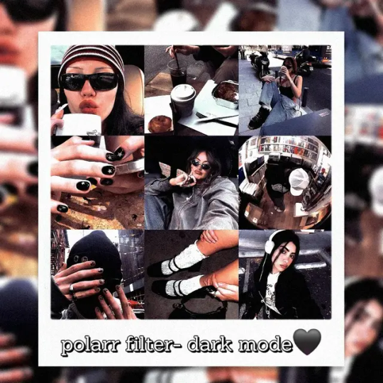
NEW POLARR FILTER 🫰🏽🖤
READ!
to get: follow me on Instagram/ Polarr/ Tumblr + like or reblog + comment this post
pra conseguir: me siga no Instagram/ Polarr/ Tumblr + curtida ou reblog + comente nessa publicação
GIVE THE CREDITS IF YOU USE/ DÊ OS CRÉDITOS SE FOR USAR 🩷
#code polarr#polarr code#polarr filter#polarr#psds#free psd#filter#makersleague#dailypsd#cottagecore#black aesthetic#dark mode#black style#dark moodboard#dark moon#resources#psd coloring
4 notes
·
View notes
Text
so last week i was scrollin thru pinterest and i stumbled upon this masterpiece

the ''help'' got me so hard i shared this thing in my contestshipping server and a very cool someone dared anyone to draw it, n i take everything seriously and to heart so i was immediately on it LMAO

I kinda tried to remake the pokemon anime's style,, but I'm not the best :,3 I really wanted to draw it that way nonetheless. originally i was going to keep the same colors but it HURT MY EYES SM that i was like no fuck you im doing it my own way, ya'know??
i kept the ''help'' text because it was supposed to be satire
drawn on Ibispaint X, filtering/coloring from polarr
#pokemon#pokemon fandom#my art#contestshipping#artists on tumblr#art tag#art#digital art#digital artist#artwork#contestshipping my beloved#contestshipping day#coordinator may#drew x may#may x drew#pokemon may#may pokemon#drew pokemon#pokemon drew#shu haruka#illustration#art process#drawings#digital illustration#procreate#sol art posts#coordinator drew#pokeblogging#pokemon advanced challenge#pokeblr
36 notes
·
View notes
Note
Your replication of the game style is amazing! What program do you use to make your drawings? :)
thank yoooouu honestly I'm just using ibis paint x / polarr to add filters if needed
if you're curious about brushes that I use:
1) lining
2) coloring
3) powder effect


35 notes
·
View notes
Text
More retro style hotd icons today because ya girl went a bit ham experimenting with filters. Sorry not sorry ❁ཻུ۪۪♡
PS, my requests are currently open
Applications used: Picsart, Polarr

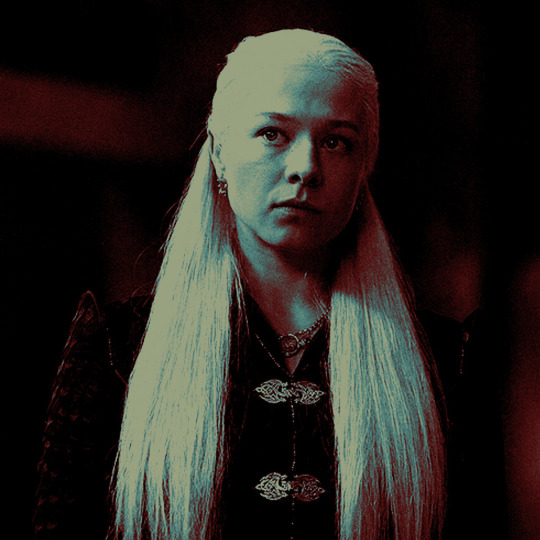


#game of thrones#house of the dragon#got icons#game of thrones icons#house of the dragon icons#hotd icons#aemond targaryen#rhaenyra targaryen icons#aemond targaryen icons#rhaenyra targaryen#the white wyrm#mysaria#mysaria icons#hotd s2#team green#team black
20 notes
·
View notes
Text

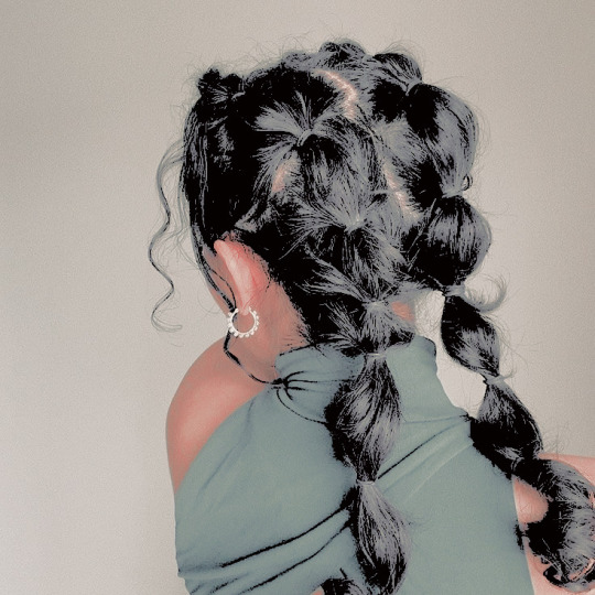

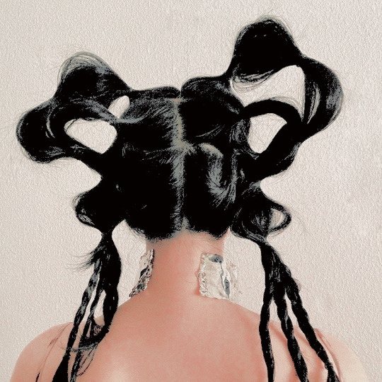
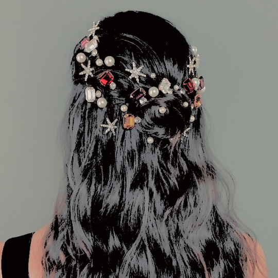

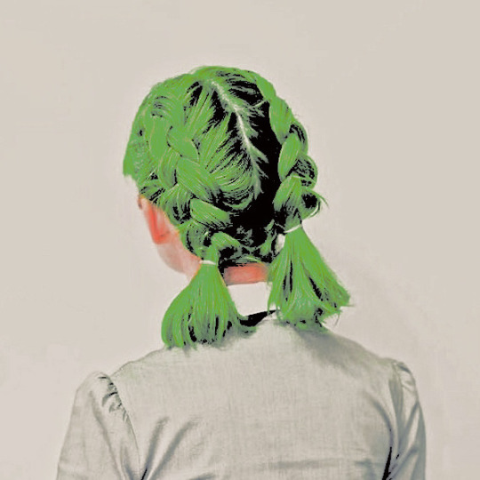


⟡ ◞ ˚ faceless hair-style icons.
coloring by me aka kaijucat! on polarr. filter: half-day.
like or reblog if using. ♡
#icons#icons with psd#my icons#free icons#kaijucat#filtered by kaijucat#kittenkaiju#faceless icons#pinterest icons#site model icons#site model random#hairstyle#hair icons#faceless#aesthetic icons#rp resources
41 notes
·
View notes
Note
hi!! im currently a tumblr writer and planning on starting a new blog fresh. i love the look of urs sm and was wondering if u have any tips or ideas or references on how to design a good looking organized styled blog?? id love any help or guidance huhu
Thank you so much anon I’m so happy you enjoy the look of mine 🥲🫶 Hmmm,,, I’ll tell you the process of me making my blog and hopefully it’ll be helpful! (Had to add cut bcs it a bit long)
What I did first was look at other blogs to get inspiration for my layout and also see where they got their dividers from (mostly from @/cafekitsune but there are so many other blogs that have lovely resources!)
Once I had a layout in mind I went on deviantart and picked a psd (filter) for the colors. I use photopea (website) for filtering however polarr is also lovely filter apps that have a variety of filters on pinterest !! I try to use images that work well with the filter and have a relatively similar color scheme outcome as well as match each other — for example in my intro post I made it look like liz was taking a photo of robin.
I related my theme to my user — my user is lizdive which is a combo of the kpop idol liz from ive and the group’s popular song 'love dive' however in my into and my asks it’s based off of their song 'ascendio' and for my masterlist i referenced robin with her song 'hope is the thing with feathers'
There’s a lot of blogs that have pretty symbols and moodboards for various fandoms and aesthetics :3
For me personally organized means not too messy and neatly sectioned but of course it depends on what YOU want to do. It’s YOUR blog so do everything as you please and be as maximalistic or as minimalistic as you please !!
I organize my blog with special tags so that it’ll be special to my blog and also so it’ll be easier for people to navigate my blog — if they wanna see all my notes and interactions they can go to robin’s notes / robin’s stars and if they want to see my writing they can use robin’s writing. For a little more organization if they wanna see things written from requests they can do that with the robin’s stars as well. I find organizing with tags very useful.
Also, there are blog themes / layouts that you can use if you wanna get extra complex with your blog layout !! There are many that are very pleasing to the eye and will make your blog look a little more sophisticated (is that the right word?) however they’ll take a bit more time to figure out,,,
I use a this website to do gradient text (there are tutorials on how to properly format it on posts) and this website to color pick from images. Personally I prefer using specific colors so that they, again, will match my blog theme. The tumblr default colors are nice and all but I find that they are too vibrant for most images I use for my theme and therefore will not look too nice. They work well if you plan on having a brighter theme for your blog, tho! I just like following the theme a bit too much 🤕
And the most important thing of all: make sure you have fun with your writing blog and that you actually enjoy writing. Don’t let anyone pressure you or overstep your boundaries 🫶
I hope you’re blog is super successful and if you have any questions I’m always open to answering and helping 🩷 I think that’s everything and hopefully this was actually helpful tho LMAO 😭
6 notes
·
View notes
Text
Things graphic designer should know. 4 pt.
a unprofessional graphic designer telling you some knowledge and information about graphic design.
for only wattpad users. :(

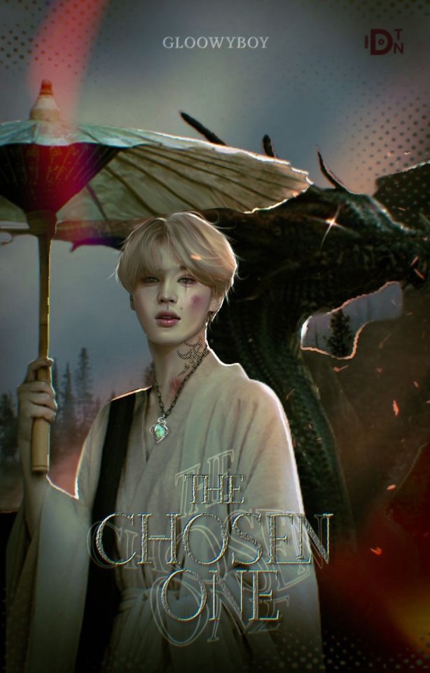

The manipulation style is without a doubt the most complicated.
It is when we choose different materials that have nothing to do with it, and we create something new, something unique.
For example, a zombie Jimin, a merman Taehyung, etc. You can add blows, blood, fangs, crowns, and things like that. This style of covers is found in many genres, it is more to the taste of the author.


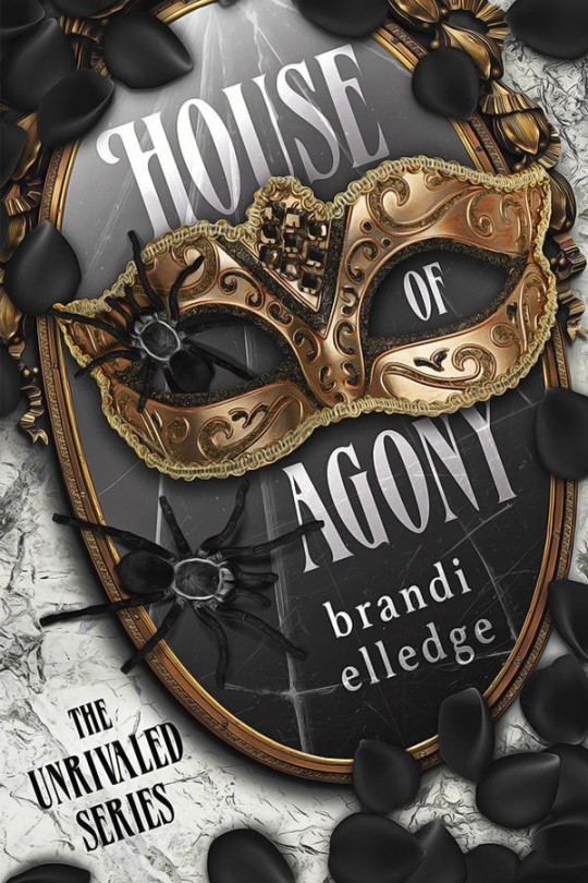
The vector style or vectorized cover is easy to do but I don't even know what the hell it is, it's practically a game of tones. So when I go to explain to them, they will understand me.
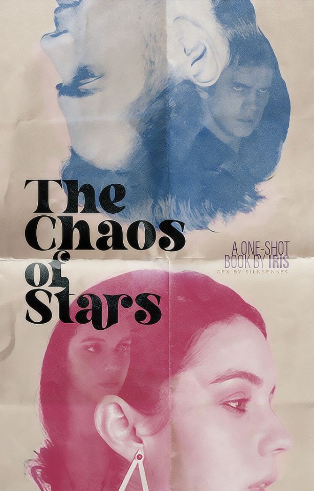

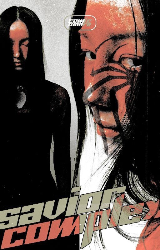
The paper style is the most eye-catching or aesthetically pleasing cover. It looks like a newspaper ad or vintage movie poster.
This graphic design has more contrast than regular graphic design to make it look like a 80's photo quality or like a movie poster.
This is freaking simple, if your graphic skills suck but you want a good looking book cover (or any graphic design) then try this. All you need is a polarr filter.
1 pt. , 2 pt. , 3 pt.
#graphic design#kpop graphics#aesthetic#editingresources#kpop moodboard#kpopmanip#packpng#resources#kpop icons#png#wattpad books#cover wattpad#capa para wattpad#capa de fanfic#design simples#capa de fic#capa para fanfic#capa divertida
5 notes
·
View notes
Note
💖 - make something in a way you never have before! (e.g. different style, program, format, techniques, etc.) congrats on 1k!! 💕
I just gotta say I loved doing this! Thank you for this ask! I usually use this app called polarr instead but I used photodirect, I looked up photoshops and that app came up so I tried to. Honestly I didn't mind it was fun! So in all what I changed was the program or app and I did more of the adjustments than usual but I don't mind! Thank you so much for requesting this I hope you like the edit I'm sorry for quality it's not the best! Also thank you <3

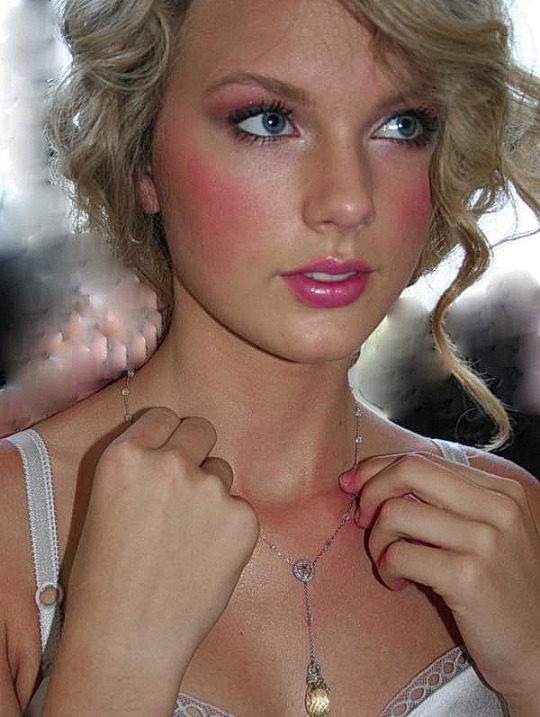
𝐓𝐚𝐲𝐥𝐨𝐫 𝐒𝐰𝐢𝐟𝐭 𝐝𝐞𝐛𝐮𝐭 𝐩𝐡𝐨𝐭𝐨𝐬𝐡𝐨𝐨𝐭 (𝐩𝐡𝐨𝐭𝐨𝐠𝐫𝐚𝐩𝐡𝐞𝐝 𝐛𝐲 𝐚𝐧 𝐮𝐧𝐤𝐧𝐨𝐰𝐧 𝐚𝐫𝐭𝐢𝐬𝐭) requested by anonymous
#taylor swift#taylor#taylorswift#taylornation#swift#tswiftedit#tswift#tswiftnation#tswiftdaily#t swift#tswiftedits#ts edit#ts edits#debut#debut era#taylor swift debut#era: debut#debutedit#taylorswiftedits#taylorswiftedit#taylor swift photoshoot#photo edit#photoshoot#request#requested#ask#mae's 1k follower celebration
5 notes
·
View notes
Text
the coolest filters for icons 😎


rules: do not use it to make yours, do not claim as yours, only for personal use. this is free, but i'd appreciate like or reblog.
#filter polarr#polarr#polarr filter#code filter#filter code#filtros polarr#polarr code#code polarr#polarr style#style polarr#icons with psd#icons with polarr#icons with filter#filtro polarr#polarr filter code#polarr filters#polarr filtro#abbott elementary#ouat
41 notes
·
View notes
Note
What app do you use to edit your photos?
I’ve answered this same question many times. My app of choice is Polarr. Other than that, I’ll use Old Roll for specific styles of cameras.
I was also using Dazz, but it was far more leisurely and less efficient. I have not used it in a couple months and it was just taking up space on my phone. I am thinking about testing Pro Camera app next, which might help me with trouble shooting detail functions like clarity. My phone is extremely outdated and the lens has been busted for at least a year. It’s suffering from black film burns that look ghastly, or will make quality inconsistent.
Overall, it’s going to depend. Many photos I’m sharing recently aren’t edited further besides some cropping/centering. If you’re wanting knowledge about a specific photo and how it’s photographed you’ll have to ask. I’m not keen on giving too much advice on my style though, so what you’ll learn will be limited.
0 notes
Note
hii ame! i have a bucket load of questions id like to ask, and im sure not all of them are exactly good questions.. so feel free to pick and choose which youd like to answer haha first off, do you have any general editing tips? where should i look for sources? alike, what are some keywords to find good overlays etc?
how do i make my polarr filters look good? what settings should i play around with?
should my editing have a consistent style/component?
how can i motivate myself to edit more often?
if theres anything else you think of, id love to hear it! thank youu ♡
awawawa ty for the questions ! i’ll try to answer to the best of my ability , , , under the cut for length !
firstly , my number one most important tip is to just have fun with it ! it’s really easy to get burnt out quickly from editing & it’s important to establish boundaries . even if you’re begging for requests , if the requests you do get turn out to be uninspiring or demotivating - deny them ! trust me , you might feel discouraged , but it’s better to create an environment that YOU work well in rather than bend over backwards & stress yourself out . ( this is less of an editing tip and more of a blog tip , i suppose )
i’m not really sure what you mean by sources ? ( sorry ,, )
as for overlays , i haven’t used overlays in a while so i can’t really say . . .
polarr filters are on the easier side of editing accessibility , in my opinion . generally , just mess around & find out ! you’ll eventually find a style you like . although personally , i tend to utilize the duo tone overlays on polarr a lot ! ( i usually do a base editing style leaning toward the theme i’m going for and then just mess around with duo tones until it looks right )
honestly , i think its fine either way & really just depends on preference on whether you should aim for consistency ! edits can be good even if they’re not consistent . it’s a good goal to aim for if you DO want consistency , though .
motivation is a really tough subject to tackle , and i think it ties into the first paragraph i wrote . if you force yourself to do stuff that demotivates you , you’ll be demotivated . it’s really a game of knowing your limits and not pushing yourself too hard . even then , it’s totally fine to get burnt out & demotivated !
as for any more advice , hm . i recommend brushing up on basic color theory ! you don’t have to get too far into it , but it’s good to learn ( because colors are really the backbone of edits , if you think about it )
i also recommended looking at how different blending modes work in an art program ! again , it’s good to know about the stuff you work with .
& don’t be afraid to mix programs ! like a feature / layout of one program but prefer another for specific things ? just use both ! ( for me , this means filtering in polarr & doing tinier adjustments + blur effects in ibis paint x )
and again . . . just have fun with it ! at the end of the day , editing is a hobby , and you shouldn’t stress yourself out over it if you can help it ! !
#☆★ // questions .#pls know that i LOVE helping beginner editors out even thought 85% of my advice amounts to ‘fuck around and find out’#when i started out there WERE no blogs like this to help new editors because we were ALL new editors more or less !#or at least there were none on my side of editing tumblr lol#so im very very happy to at least try to help ! ! !
1 note
·
View note
Note
Hi.. Could you please make this filter as a polarr code? Please. It would be of great help if you make it. I just came across your video about turning a psd into polarr code. Please.

hey, i tried. this "filter" is probably from a film camera (but i'm pretty sure it's polaroid). anyway, i tried to make something similar and i hope you like it. there's a before/after preview below and polarr code.


if you think they're too different, i'm sorry. i hope i helped.
#polarr#polarr filter#filter polarr#polarr style#style polarr#polarr code#code polarr#polaroid filter
151 notes
·
View notes
Text
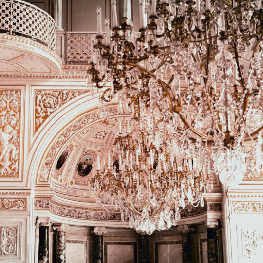
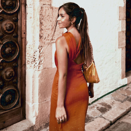


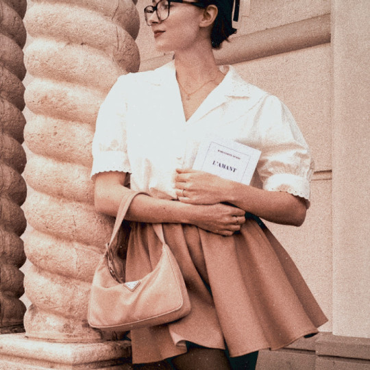
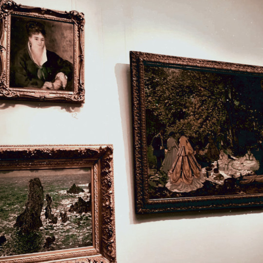
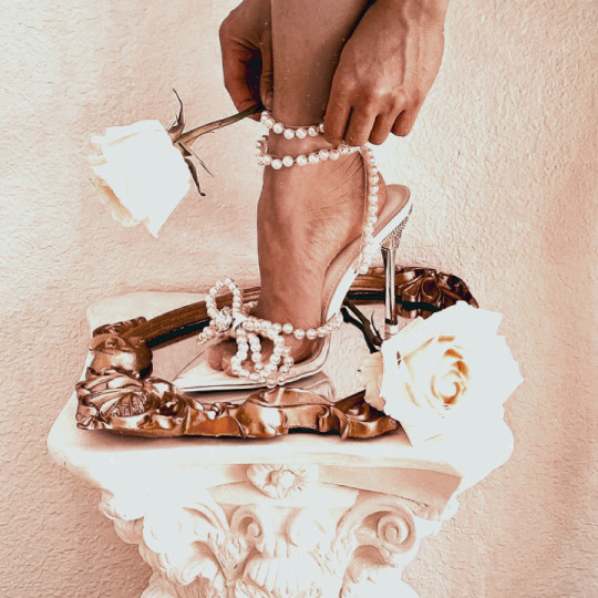
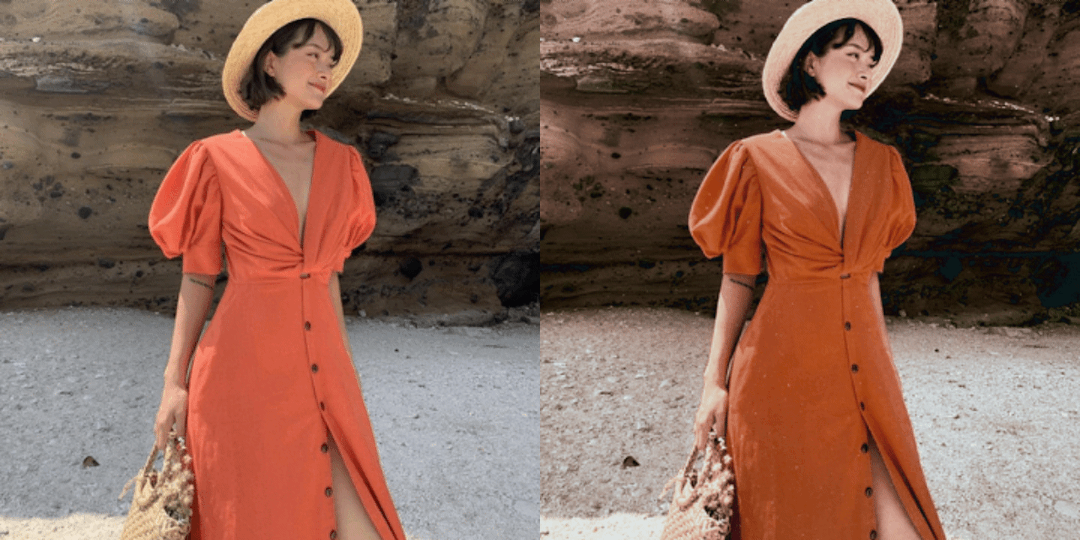
•bronze⚜ by ryfilters•
don't repost my filter🚫 -to get: follow me + like or reblog + comment this post♡
#code polarr#polarr code#polarr filter#polarr#psds#aesthetic moodboard#free psd#cottagecore#classic art#harry styles#psd coloring#bronze#brown moodboard#romantic academia#makersleague#resources#dailypsd#polarr filters#film photography#film
99 notes
·
View notes