#studioiv
Explore tagged Tumblr posts
Text
Skill me Up Scotty...
The name of the game this semester has been Up Skilling. Up Skilling is when you focus on a particular skill in an effort to become better and more experienced in it. This means that the majority of the learning that I have done has been technical modelling skills which have improved greatly over the course of the semester. One thing that is clearly evident of this is the multiple iterations that out main NPC Kevin has gone through.

Kevin went through two rapid prototypes. Initially based off of the Animal Crossing style he came out rather cartoon-ish and not exactly what we were looking for. After receiving feedback and making a few more attempts he ended up in a passable state and stayed that way for a few weeks while other work took priority. However as the semester went on and we made more design decisions around our characters style he started to look very outdated and unfit for the final project. This is why I had another run at making Kevin and settled on this design which the group agreed was a much improved state than what he originally was. I went through a long process of iteration at every step ( this is Version 26 of Kevin) and managed to show a process of learning through experience as well as receiving peer feedback.
The final Kevin (missing eye texure) which is much more inline with our other characters:

1 note
·
View note
Photo
Final Fabrication Reflections
Week 13: 22-26/10/18
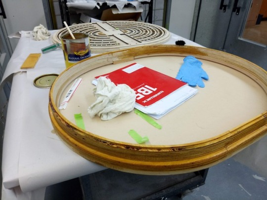
The whole fabrication process has been super hectic, stressful and challenging. Here is what I learnt:
1) You got to plan for the unplanned
While I did a pretty thorough construction plan and basic timetable, things still went wrong which ended up eating more time.
Things take time
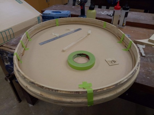
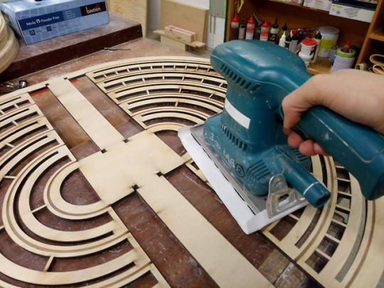
Before heading into final construction, I had completely forgotten about the prototyping phase for construction. While I had done cardboard mock-ups, I still had to do iterations on how that would translate into the final materials. So, although I had planned to leave a month for final fabrication, the prototyping phase took up about 3 weeks of that. Thus, in the end I was left with about 1 week for final fabrication. At the time, I thought that would be just enough time, now I realise that this was not enough time at all because things took longer than I expected.
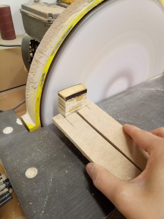
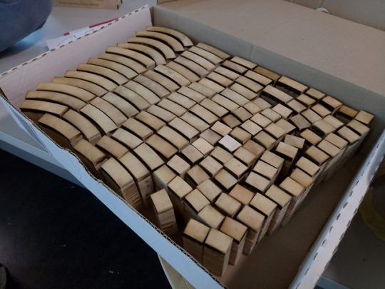
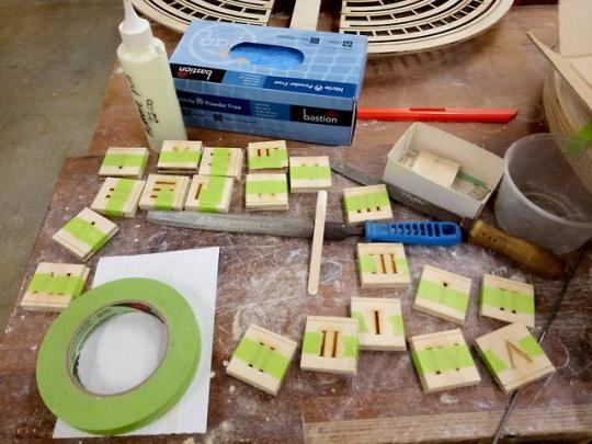
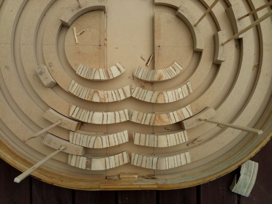
On top of that, my design has a lot of complex components and I didn’t fully realise was how long each component would take. Especially regarding the mass production of the blocks. Making a few blocks was a very quick process, however, making about 120 was a very long process. And upon reflection, to save time I could’ve worked a bit smarter. E.g. instead of cutting up all the blocks and then gluing them, I could’ve glued the arcs all together and then cut them up once they had dried.
Thus, in future, I’ve should slightly over-estimate how long each element takes so that I leave sufficient time for each.
Planning a Plan B is important
Before going into construction, I didn’t create a plan B. So, when things got behind, I had to think on the spot about what I should prioritise next. Upon reflection, as a result, I may not have made the most informed decision compared to if I had considered this beforehand. For example, when I was running out of time near the end of the week, I pushed the first coat of stain to Friday afternoon. Now, I realise I should have prioritised the functionality of the design over the aesthetic, and I could have left the staining till Saturday afternoon/Sunday morning. Had I planned for this earlier, this would have bought me 2 more hours in the 3D lab to really work on the slider mechanism.
Thus next time, I should make a contingency plan of some sort as well as fully prioritise what is necessary to fulfilling the purpose. Which leads onto…..
2) Going back to the purpose.
Amidst the whole process of sorting out the fabrication, it was easy to lose sight of the overall purpose of the project. Thus, it was a matter or prioritising the different agents of necessities i.e. functionality vs. aesthetics. I don’t think I did this particularly well because I was rushed and this was reflected in the overall design of the kinetic table.
Upon reflection, there were some aspects of the design that were more complicated than they needed to be. For example, I could’ve fulfilled my purpose in a much simpler way by just creating a rectangular table. While this wouldn’t have necessarily fulfilled my aesthetic desire, in the end I would have more easily gotten a working prototype that people could interact with.
This then leads onto….
3) Keep it Simple Stupid
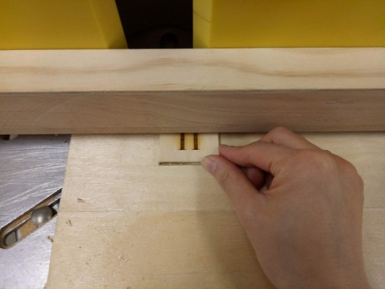
Throughout this process, I had to continually consider how I could simplify the design so that it could still achieve the same outcome but in a more efficient way. From this, I was reminded that the first idea generally is not the best idea and that there are other ways to do it. For example, with the sliders, I realised that I didn’t need to use a dowel to support the slider, but I could instead just double the wooden insert leftover from cutting the base board
4) Two is better than One
So many of my friends were so kind and helped me out with my project where they could. This meant so much and really sped up the process. While I have really enjoyed working by myself this semester regarding the idea development and prototyping phase, for the fabrication, I really struggled to do everything by myself.
Shout out to Olivia, Carol, Andrew, Vaani and Sheena. You guys are the best :)
Overall, this has been a rich (and extremely stressful!) learning experience.
7 notes
·
View notes
Text
This is my reflection and method that went towards my framing. This is also a photo of the final setup and the video trailer Vaani made.
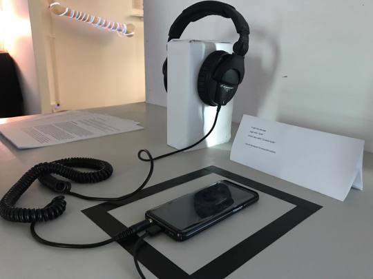
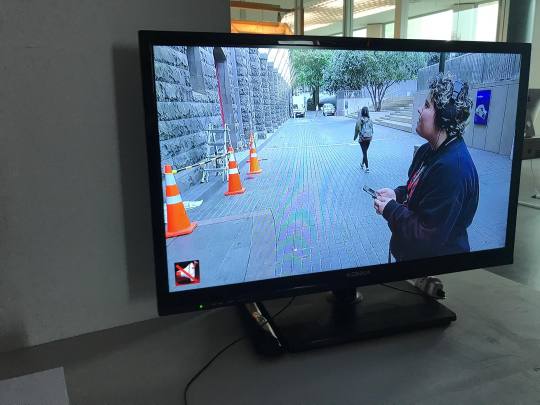
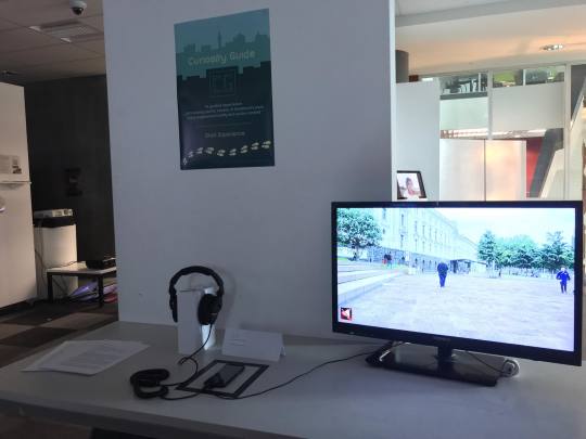
youtube
Method
My contribution to the group involved working on the Augmented Reality research and implementation, as well as the app development and 3D modelling. I used Google’s HelloAR as a base, to further develop and learn AR development in Unity.
https://developers.google.com/ar/develop/unity/tutorials/hello-ar-sample
I used ‘SpeedTutor’ to understand the basics of building the app, including learning to import UI, making the buttons, implemented the AR models and resizing them to fit the screen, as well as scripting the music to run throughout the play mode.
https://youtu.be/FrJogRBSzFo
At first, Vaani and I tried using MapBox SKD for the geolocation aspect of the app, although we didn’t end up using it, we still would have liked it in our app. During the holidays, I looked at many tutorials to follow them, to have a map that in order to have a map that displays the accurate location of the user during the time of use. This was a difficult process and required more time and research, which why we postponed learning this aspect. Instead, we decided to have a still image of the map that highlights the three locations using a 'location pin,' to inform the users to walk to that site.
https://www.mapbox.com/
Techniques used:
· Unity: I used this software for the App and AR development/building
· Fusion360: This was used to create the 3D models for the AR section.
· S8 prototyping: I’ve used the S8 Samsung phone to a prototype version of the app/AR/Stories.
· Mapbox: I used the Mapbox SDK for Unity to learn the geolocation part of the app.
Reflection
Reflection
This Semester I built an app with the help of my team members. I utilised Unity as my main tool for building the app and used ARCore to develop the Augmented Reality aspects. ARCore requires the use of a compatible phone which meant I had to purchase one. Using this technology meant our AR had a more interactive quality to it and was easier to use in Unity. This meant I had an easier time learning how to use ARCore. Unity has a lot of online tutorials, utilising these resources meant I could rapidly prototype in unity to test what could work. We changed from Unreal to Unity which was one of the best decisions we made as a group. We tried using geolocation with Mapbox and while it didn’t end up working it still taught us a lot. We used MapBox to build our static map and postponed using geolocation in this version of the app. If we were to continue building on this app I would implement geolocation.
I used Fusion 360 to build my 3D models. While I was able to create models fast and efficiently I could not export with the fusion textures. This is a fusion problem, but I should have thought about this and tried building these models in blender where I could add UV maps.
My blogging this year was always late as I never knew what to include. I spent a long time trying to write the perfect bogs and this meant I took a much longer time then I should have written them. Next year I hope to keep a constant stream of well-written blogs posted on time so I can follow what I had done. Taking progress notes and images was also something I forget to do and next year I want to try and keep better notes on my self-reflection during prototyping.
This year’s group dynamics could have been better. At the beginning of the project we had good communication within the group and everyone was kept in the loop. After the mid-semester break, everything fell apart. We didn’t communicate so there where miscommunication within and that led to hurt feelings and verbal fights. On the cusp of the biggest fight between group members, we decided to try and solve this with a private meeting where we could sort out everyone’s grievances. While we came to a mutual understanding, feelings were permanently hurt, and the group couldn’t function as well as it once had. I believe that this leads to a halt on the process and meant we didn’t get things done in the way we wanted to. In hindsight, I believe that because of poor communication during the break we stopped behaving as a group. Next time I work in a group I would have to work on my communication skills. While this I liked this project as a whole there are things I could have done differently to achieve maximum productivity.
5 notes
·
View notes
Text
Studio IV - Showcase 2018
The night of the Showcase was very important for Carol, Shades and I, as we wanted to express our project in a positive light. Although we didn’t win any awards for our App, we were still proud to present what we have achieved over the course of one Semester. This would be included in our Portfolio to show the Creative Industry our skills and ideas, and maybe help towards our future job seeking in the creative field.
Some pictures from the Showcase:
Overall, the night went superbly. We had many people taking interest in our Project, and wanting to try the app. I tried my best to “sell” the App and properly explain the conceptual ideas behind our Project, however I think I should have practiced more beforehand. I also realised that the Augmented Reality aspect was much popular amongst little children, while the adults were more interested in the storytelling and map side of the App. In conclusion, I believe that our night was a success because our Project was functioning properly and we had FUN!
Until next year, Vaani OUT 🎤 [hypothetical mic drop]
———————————————————————————————————————————
1 note
·
View note
Photo

We need more posters for our studio wall.
3 notes
·
View notes
Text
Final
I’ve made a lot of progress and change since my original first idea conceived at the beginning of the semester and the start of Studio IV. I’ve swapped from thinking about aiming to understand the issue of personality clashes, to understanding why technology is important in the developmental stages for kids in combination with tactile and sensory stimulation. I went from trying to create a game of turning blocks displaying faces of a design made up of materials I’ve kept at home as part of my childhood. In theory that practical idea for the installation was great and created a sentimental and personal connection to my project but in the end, it wasn’t time efficient nor did i have enough materials to accomplish the frame on the scale i was planning. So i up-sized the frame and decided to rethink my installation. Who am i trying to attract, who will my project benefit and why? what am i trying to understand and what am i trying to communicate to my audience? In answering these questions, i realized i needed a whole lot of research in order to understand myself, what my project was based around conceptually and how it was built up contextually.
Looking at it now, I’ve had to relearn processing codes and arduino circuits, I’ve been required to get my hands dirty and do some work in the wood shop to make the frame and mount it on the T-wall. I’ve needed to focus really hard and pull the second last ditch effort due to my unending indecisiveness and forever changing and evolving of concepts and ideas in trying to improve my project and project my message clearer and more interestingly.
Reflecting on it all, I wish I had changed my physical installation plan earlier in the semester so i wouldn’t have had to push so hard in the last half of the semester as i was limited to the knowledge of what i knew about processing, arduino, wood, installations, and how to portray my message symbolically and easily to receive as a viewer/user. I had a lot to do and with the kind help of many of my BCT peers, i managed to get it done and bring my vision to reality.
I have to admit, this semester was very stressful and i definitely could have been kinder to myself had i prepared better but in hindsight i had no idea i would have changed my installation plan so late. The one thing i can say confidently is that i was and still am glad i stuck to my original concept. It was something that i found was easy to relate to as it was an issue i’ve faced personally with my younger sister therefore the issue i was trying to understand through my project was close to home.
When talking to Clint earlier this semester i remember him telling me to chose an issue or topic that is close to home and in most ways possible, i’ve tried to put my personal understanding into the whole of the project to make it what it is.
I’m not sure if this is the last post of the year but it may be if you dont count a post of pictures showing my installation :)
1 note
·
View note
Text
THE REVENGE OF SPACE, IMAGE AND SOUND #15 (03.09.17)
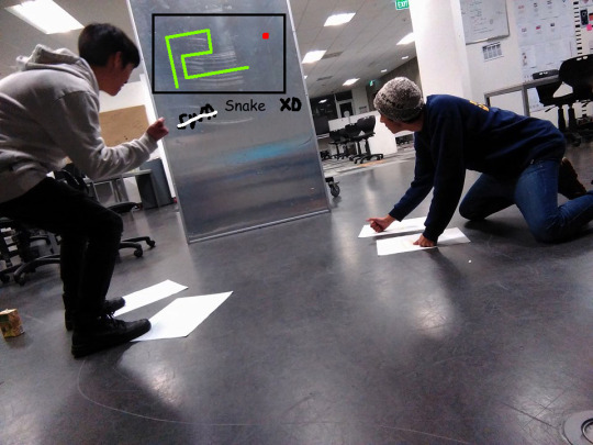
As stated in yesterdays blog, today we met up in order to lock in our installation idea (our ‘How?’). We pretty much spent the whole day trying to run down our installation idea, but heres a rapid overview. Our theme for the interface of our installation was to be playful and evoke nostalgia from the audience. So we started with the Etch-A-Sketch, then Pac-Man and finally decided to use Snake. Our first goal was to make Snake into a collaborative experience, rather than just a versus game where participants try to win against each-other, since that would have no connection to our purpose and meaning. We realised snakes ‘game objective’ is rather easy and the movement is pretty simple; just X & Y movement. We thought ‘why don’t we split X and Y movement to their own corresponding object, therefore the UP, DOWN, LEFT and RIGHT movement are all separated and can therefore be delegated between members. So here’s the process;
So we started thinking in terms of controllers for the installation and we already had a concrete theme, which was for them to be silly and unique. Here’s an excerpt I wrote down in our teams Google Doc.
“Theme (Silly/funny) : make our controls 'silly' , in order for participants to break that wall of seriousness and remove any bad energy; I re-watched interactive installation video (the one about the balls) quite a bit, and I pictured myself jumping next to a random person, and I realised you need to ditch your self-image because you are going to end up looking funny maybe, but its compulsory, both participants are in on it, and you feel this sort of connection; ‘He’s doing it right....so why shouldn’t I?’, twos a team, or however that saying goes.”
We were struggling for a while trying to get the perfect controls that would map to the collaborative snake game in the most unique and silly manner, also to find the perfect balance of chaos for our controllers, whether they be input devices or movement oriented, they needed to be not too boring but not too chaotic either. As our inspiration ran dry from looking at images on Pinterest, we decided to go for a quick walk at the Arcade at Queen Street. Although we gained no insight from this trip on our walk back we started thinking in terms of using weird objects to control both the X & Y axis. We wanted to use balls for movement, because you wouldn't think balls have any correlation at all with Axis movement; we wanted participants to bounce corresponding balls to corresponding spots on the floor. Although we quickly realised even though this was a fun and silly idea, it was too chaotic and it’s difficulty would have demotivated the audience from engaging or staying to collaborate with others. We finally decided to map floor pads to the movement; although the floor pad layout has nothing to do with Dance Dance Revolution at all. We wanted participants to work together and decide movement roles by allowing them to move around the pads or even holding them, or coming up with other creative ways to play move the snake and ensure their success or doom. The movement roles are exchangeable, active movement is required and it would be a fun way to play snake, as the controllers emphasise teamwork is needed.
Obviously today we just came up this idea, but hopefully throughout the creation stage we can develop it further. The picture below shows a basic picture of some layouts we have in mind. The white pages are each delegated movement (UP,DOWN,RIGHT,LEFT), again they can be moved to be used in creative ways while playing with other participants.
Tom.G
2 notes
·
View notes
Text
Accessible designs

Studio IV: 7/09/2017
Firstly, I must cover how colourblind may impact a user who is interacting with your project. The most common is red/green color blindness, where sufferers mix up all colors which have red or green as part of the colour.
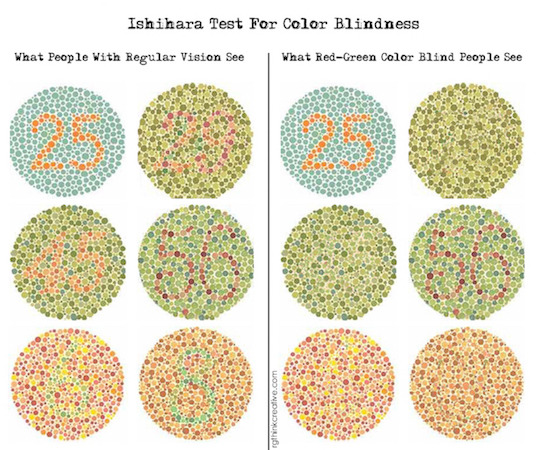
Just imagine if this was in an application, say a button:
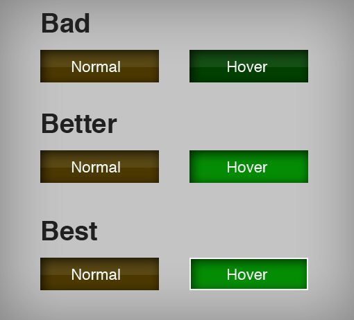
("Tips for Designing for Colorblind Users | Design Shack", 2017)
In the decisions to creating our styles, I have been referring to a great tool that eightshapes have created which allows you to test for accessibility in accordance to WCAG 2.0 requirements. This tests the contrasts between colours and their choices to determine whether they’re readable or not to those who may suffer from most vision impairments.
This is a living document on our server and I have attached a screenshot to this post to show how it looks. our color choices are strong with the bottom side of the grid being our backing colours and the above all text colours.
Furthermore, I have been playing with stark to quickly see how the design is looking to those who are colourblind to also see outside of the grid whether it’s easy enough to read or not.
I have attached an article in the references which outlines some of the important reasons as to why designing with colourblindness in mind is extremely important and how crucial it is to their experience using your product ("Why all designers need to understand color blindness", 2017). It’s amazing how easy it is to forget about how big of a difference it makes when designing something, I am guilty of this in many projects I do.
References:
Cat Noone, B. (2017). Stark Plugin for Sketch. Getstark.co. Retrieved 2 August 2017, from http://www.getstark.co/
How to design (in Sketch, Photoshop and Web) for color blind users. (2017). Medium. Retrieved 5 August 2017, from https://medium.com/sketch-app-sources/how-to-design-in-sketch-for-color-blind-users-2b189c0d58fe
Why all designers need to understand color blindness. (2017). 99designs Blog. Retrieved 9 July 2017, from https://99designs.com/blog/tips/designers-need-to-understand-color-blindness/
How to Design for Color Blindness. (2017). Usabilla Blog. Retrieved 6 September 2017, from http://blog.usabilla.com/how-to-design-for-color-blindness/
Tips for Designing for Colorblind Users | Design Shack. (2017). Designshack.net. Retrieved 7 September 2017, from https://designshack.net/articles/accessibility/tips-for-designing-for-colorblind-users/
1 note
·
View note
Text
#ctec608 ‐ Final Entry ‐ Alyssa Kerrigan ‐ Project Kē
Orthographic View of Mask - Studio
Foam Mask Model - Studio
Group Documentation Guide - Studio
Photography/Video Brief - Studio
Photogrammetry - Studio
Maya 3D Model - Studio
3D Render of Mask - Studio
Progression of timeline/time management - Studio
Cardboard Mask - Studio
Cardboard Stencil - Studio
Showcase Posters - Studio
Mask Assembly - Studio
Spray-painting - Studio
Milliput - Studio
Editing - Studio
Making of Title Intro - Studio
Satin Padding - Studio
Physical Artefact - Studio
Project Video - Studio
Resources:
[1] Basic Helmet Construction with Worbla | Worbla Thermoplastics. Retrieved October 29, 2020, from https://www.worbla.com/?p=8457
[2] Laser Cutting Worbla – Part 1! | Worbla Thermoplastics. Retrieved October 29, 2020, from https://www.worbla.com/?p=7042
[3] Laser Cutting Worbla – Part 2! | Worbla Thermoplastics. Retrieved October 29, 2020, from https://www.worbla.com/?p=7907
[4] Laser Cutting Worbla: Creating a Digital Template | Worbla . Retrieved October 29, 2020, from https://www.worbla.com/?p=8281
[5] Maskmaking Examples with Worbla | Worbla Thermoplastics. Retrieved October 29, 2020, from https://www.worbla.com/?p=7898
[6] Paint a Faux Marble Finish : 4 Steps (with Pictures) - Instructables. Retrieved October 29, 2020, from https://www.instructables.com/Paint-a-Faux-Marble-Finish/
[7] HOW TO USE MILLIPUT PUTTY - YouTube. Retrieved October 29, 2020, from https://www.youtube.com/watch?v=iWT9mnaUy0M&list=LLi_2So1RoTUaqDKyE3NpQxQ&index=4225
0 notes
Text
Learning Through Failure

One key thing I have learnt this semester is that not everything goes to plan and that is alright, as long as you learn from your mistakes. To put it plain and simple, our instrument, something that I was put in charge of, ended up being not operational for our submission. Instead, we will be having a digital mock-up to display what I was planning to create and we will be using a computer keyboard instead for controls. The reason for our instrument not making it to a working stage was not because of one simple failure, but rather a compounding of mistakes and misjudgements that eventually even lead to the project being unfinished, and some of the bits that were completed were completed to a sub-par level. Being the ones without a set job, Jacob and I were originally put in charge of sorting out the instrument. Unfortunately, Jacob went AWOL after semester break, leaving me to create the instrument by myself, something I had no previous experience with and didn’t feel comfortable doing solo. I voiced these concerns to our Oscar (team manager) and where possible he and Max both lent a hand in attempting to create the instrument. Despite their help, the instrument ended up being of poor quality and in the end was not something I would have been proud to show as part of our submission. This was mostly due to my lack of skill in the required areas (woodworking and electronics) but the straw that broke the camel’s back was a failure to get the components ready on time. One major part of the instrument was that the keys would be 3D printed using the 3D labs over at Art and Design. I printed a test key a while ago so that we had something to test with which was quite successful. The problem arose however when I decided to wait to print the rest of the keys until too late, the 3D labs printing queue was so long due to other students work and would be unlikely to get them done by submission time. My reason for delaying the printing was to make sure that we had a working design first however this backfired. We also tried to outsource the printing however the cost fell outside out budget and would only barely get it finished before submission with no time for testing. In all this series of unfortunate events has taught me a few things, firstly that time management is key, if I had started working on things rather than waiting around a solution could have been found. Secondly, that being thrown for a loop is more common than things going well, and I should be better prepared for things to go wrong. Thirdly, splitting myself up into two vastly different tasks (modelling and instrument creating) is not a very efficient way to work. Lastly, I should be more outspoken when I believe I can’t finish a task. Through my upbringing I have learnt to not make my problems someone else’s and to push through a difficult task. This however was detrimental to my team as I gave them too little warning to effectively help me on creating the instrument. There is no way to spin it the instrument was a failure however there is not much point in dwelling on it as that won’t change the outcome, rather I want to look to future projects with the lessons I have learned. Avoid unnecessary delays, work to the best of my ability and take responsibility for my mistakes.
3 notes
·
View notes
Video
youtube
Slider, Bumps and Blocks
Week 11: 8-12/10/18
This week, I focused on prototyping and playtesting different elements of the design. The above video is a short summary of the playtesting and prototyping I did this week.
This process was really insightful because I was able to learn and practice different methods of fabrication. It also enabled me to test out my ideas in a physical context and from that, iterate on the designs.
Here were the elements that I tested this week:
The Slider and Bump:
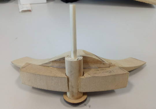
I’m really happy with how the slider and bump mechanism work because the slider moves really smoothly. However, the bump may have to be iterated on further so that it works more smoothly with the blocks.
Slider with Bump:
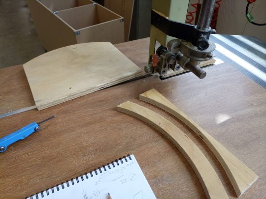
Slider base cut using bandsaw:
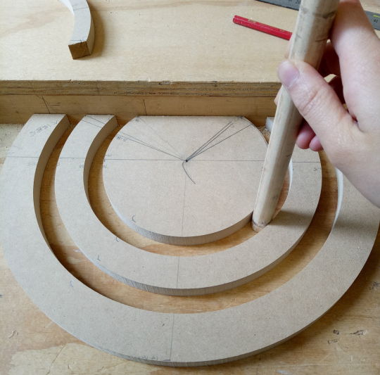
The Blocks
This is the element I had most difficulty with this week, and I am yet to solve it. The design of the blocks and slider mechanism is based off the CAM mechanism whereby the bump is the CAM, and the blocks are the followers. To reduce friction, my initial design used a spherical follower. While the roller follower is more extensively used as it creates the least amount of friction, I decided not to use it due to the number of rollers I’d have to buy/make (approx. 120).

(Reference: https://nptel.ac.in/courses/112103174/module4/lec3/2.html)
I decided to test out this mechanism using the second ring of blocks (2nd largest blocks) because if I can get these ones to work, I know I can get the smaller blocks to work.
Prototype 1 with cardboard sides and rounded dowel
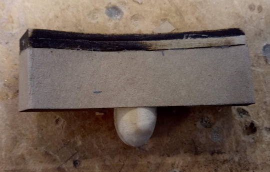
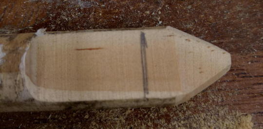
An alternative knife edge follower made from 16mm dowel:
Prototype 2 made by gluing together blocks of wood, and MDF follower base:
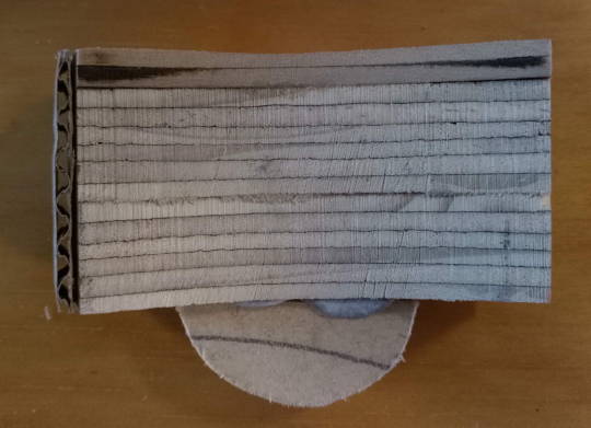
The main problem I encountered was that my blocks were experiencing a lot of lateral motion (tipping side-to-side). E.g, Prototype 3:
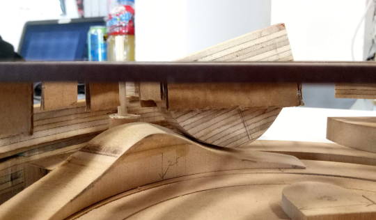
After doing a few different prototypes with different follower designs, I think the problem is a combination of:
Friction between follower and bump which is causing the block to be pushed sideways, as well as friction between guides and blocks causing them to get caught on the edge.
Loose guides which aren’t supporting the blocks’ upwards motion well enough. (below: testing different guide heights and structures)
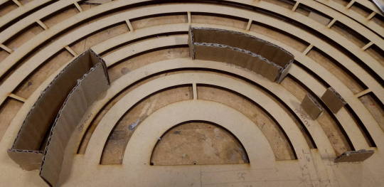
Perhaps too heavy because in contrast to my cardboard prototype which works 80-90% smoothly, these blocks don’t rise and fall easily. Moreover, they may be top-heavy which may contribute to them tipping side-to-side.
Amount of Anchorage – I need to ensure that there is enough block length below the table surface so that this anchors the block as it rises above the surface.
Thus, moving forward, I need to iterate on the design so that it reduces friction, is balanced and has sufficient guide structure.
I am beginning to get quite worried about the amount of time I have left for construction (2 weeks!!!!!!). The last thing I want is to create something that is so finicky that it takes away from the purpose of the project. Hopefully I can get the blocks to work ASAP in conjunction with the slider, because I don’t think I have time to dramatically change the design.
3 notes
·
View notes
Text
week 11
This is a short one.
During the last week, all three of us have another class due very soon (Synthetic Reality’s). Monday the 15 to be precise so it has been a very unproductive week. On Friday a finalized app was to be done by me, but I had to postpone that till next week Tuesday.
What I did do this week is finish building the two AR models, a court desk and a bar. I’ve done these on fusion as I am most comfortable in this program from previous use.
(Models by ME.)


Shades, as she was behind in time the sound recording and editing while trying to finish it off this week didn’t happen so we will be reviewing and ‘playtesting’ the audio next week. Another thing we want to do next week is test out the UI and what people really want to see when hearing the recording.
5 notes
·
View notes
Text
Curiosity Guide - Contextual Statement
Curiosity Guide is an App that utilizes Augmented Reality and audio play to inform users of the quirky history of Auckland City. The App incorporates the structure and frameworks of several mediums and practices.
Pokémon Go (Niantic, 2016) and Jurassic World Alive (Jurassic World Alive, 2018) are successful examples of an AR application, both rely on the Google Maps Platform Gaming API (Google, 2018) for real time geolocation (Webster, 2018). We applied for access to the platform but were greeted with a form email, the assumption we made is following is that access to the technology may be prioritized to larger businesses. We attempted some work-arounds using other services but Google monopolizes the premium services and documentation is this area and seem to favour big players in the industry. We also looked at negative aspects of these Apps. Although evolving technologies that overlay information on top of a natural environment can be beneficial, it is proven that they can cause distraction (Joseph & Armstrong, 2016). For this reason, it was decided that we will not allow access to the AR experience until the user is at a safe and specific location.
In form Curiosity Guide is largely similar to any “city guide” experience since the advent of the tourist guidebook. The user of the guide holds special information unknown to the casual passerby and converts this into the spatial practice of a tour (Cocks, Doing the town: the rise of urban tourism in the United States, 1850-1915, 2001) or structured narrative (Davis, 2001). In developing content for Curiosity Guide we have curated aspects of history with the specific intent of providing an alternative to the narrative supplied by the tourism industry. The stories are centred on people and include elements of conflict whereas most Auckland Tours centre on ‘nature’ as an essential part of Auckland identity and sidestep complicated issues of culture (Bell & Lyall, 2004). ‘Walking Tours of Manhattan’ a tour built around absent landmarks set out to make visible African-American histories in the city, absence of historic artifacts can be a powerful way to connect with the past (Davis, 2001). Curiosity Guide centres two of the stories at absent landmarks to highlight the AR aspect which adds a layer of curiosity over reality, but this is still an ephemeral experience transforming the space with stories of the past. Our goal in constructing a spatial narrative is closer to ‘Walking Tours of Manhattan’ than it is to local mainstream tours such as “14 Big Attractions” (Bell & Lyall, 2004).
Inspired by the idea of history as an alternate reality, we aimed to have a narrative with more than one voice and intersect ‘fictional’ elements with real world interactions (Watson, 2017). Many existing AR experiences also incorporate communications that exist outside of the App, extending the story into the real world in other mediums (Misa, ARG - Conspiracy for Good, 2018). While Curiosity Guide remains an in-App experience, the content expressly contains multiple voices with differing views on the retold events.
Sound is one medium that can evoke a “cinematic” experience all on its own (Misa, Precedents -“Subtle mobs”, 2018), and the decision to use voices as means to communicate the events was an aesthetic as well as pragmatic decision. The vision was to tell the story through some sort of performance, the most direct method of performance would be street theatre (Misa, Guerrilla Theatre - some background, 2018). A way to bring more of the performance directly into the App would have been some sort of motion capture which was not possible at this time. Video would be difficult to reconcile with the AR elements, was dismissed due to longer production time.
However, there were benefits of the ‘audio play’ approach in that it left room for the user to “fill-in-the-blanks” from their own insights and imagination (Misa, Precedents -“Subtle mobs”, 2018). Audio storytelling lends itself to formal abstractions like specific structures of storytelling as shortcuts for genre in podcasts (Misa, Studio IV : A New Hope - pre-briefing II, 2018). We were able to incorporate temporally disparate elements of a story without having to ‘cut’ as we would with video by using introductions, sound effects, distinct voices and narration to explain them.
Interface is a thing, not a process (Blair-Early & Zender). Apps such as The Big Hoot (Haier, 2018), Auckland Virtual Tours (Ngāti Whātua Orākei, 2018), MiAR (Curiat, 2016), Subway Surfers (Kiloo) and Crossy Road (HIPSTER WHALE), use UI design which can be referred to as “intuitive interface.” Each App is easy to navigate, as well as being visually appealing. Curiosity Guide follows in this tradition, this includes coherent use of icons and buttons, which are nearly synonymous to the interface (Blair-Early & Zender).
Looking specifically at Auckland Virtual Tours, the App design is very clean and consistent. For this reason, it was important to keep a visual theme running throughout our App. Auckland Virtual Tours also supplies the user with introductory content, which informs their future interaction. Through the inclusion of an introductory page Curiosity Guide introduces the beginning of a pattern that indicates how to interact with the App.
References:
ARCore. (2018, September 27). Explore the HelloAR Sample App Code. Retrieved from ARCore: https://developers.google.com/ar/develop/unity/tutorials/hello-ar-sample
Armstrong, D. G., & Bellal , J. (2016, October 5). Potential perils of peri-Pokémon perambulation: the dark reality of augmented reality? Oxford Medical Case Reports, Volume 2016(Issue 10). doi:https://doi.org/10.1093/omcr/omw080
Bell, C., & Lyall, J. (2004). 'Welcome to Auckland': A City Bus Tour. In I. Carter, D. Craig, & S. Matthewman (Eds.), Almighty Auckland? (pp. 210-224). Palmerston North: Dunmore Press.
Blair-Early, A., & Zender, M. (2008, Winter). User Interface Design Principles for Interaction Design. Design Issues, Volume 24(Number 1 ).
Cocks, C. (2001). Doing the town : the rise of urban tourism in the United States, 1850-1915. Berkeley: University of California Press.
Curiat. (2016). MiAR. Auckland: Curiat. Retrieved from https://play.google.com/store/apps/details?id=com.Curiat.AllSigns
Davis, F. (2001). Uncovering Places of Memory: Walking Tours of Manhattan. In C. E. Barton (Ed.), Sites of Memory (pp. 27-36). New York: Princeton Architectural Press.
Diwan, V., Misa, S., & Taka, C. (2018). Actual Reality - Statements. Auckland: unpublished.
Haier. (2018). The Big Hoot . Auckland: Haier. Retrieved from https://www.thebighoot.co.nz/app/
HIPSTER WHALE. (n.d.). Crossy Road. Melbourne, Victoria, AUSTRALIA: HIPSTER WHALE. Retrieved from https://play.google.com/store/apps/details?id=com.yodo1.crossyroad&hl=en
Jurassic World Alive. (2018, March 14). Canada: Ludia. Retrieved from https://www.ludia.com/en/games/jurassic-world-alive
Kiloo. (n.d.). Subway Surfers. Kiloo. Retrieved from https://play.google.com/store/apps/details?id=com.kiloo.subwaysurf&hl=en
Misa, S. (2018, October 28). The research process and context for stories. Retrieved from Haunted.Market: http://haunted.market/post/179509195374/the-research-process-and-context-for-stories
Misa, S. (2018, October 27). The Editing Process. Retrieved from Haunted.Market: http://haunted.market/post/179493855759/the-editing-process
Misa, S. (2018, October 24). Retrieved from Haunted.Market: http://haunted.market/post/179378774019/paper-protoype-from-week-10-using-ui-design-by
Misa, S. (2018, August 12). ARG - Conspiracy for Good. Retrieved from Haunted.Market: http://haunted.market/post/176930207439/arg-conspiracy-for-good
Misa, S. (2018, August 12). Guerrilla Theatre - some background. Retrieved from Haunted.Market: http://haunted.market/post/176927772074/guerrilla-theatre-some-background
Misa, S. (2018, July 20). Map of sites of interest from research walk undertaken on Thursday. Retrieved from Haunted Market: http://haunted.market/post/176078471089/map-of-sites-of-interest-from-research-walk
Misa, S. (2018, July 29). Precedents -“Subtle mobs”. Retrieved from Haunted.Market: http://haunted.market/post/176401142839/precedents-subtle-mobs
Misa, S. (2018, July 16). Studio IV : A New Hope - pre-briefing II. Retrieved from Haunted.Market: http://haunted.market/post/175945121774/studio-iv-a-new-hope-pre-briefing-ii
Misa, S. (2018, August 7). The short version - A story research manifesto. Retrieved from Haunted Market: http://haunted.market/post/176727251629/the-short-version-a-story-research-manifesto
Ngāti Whātua Orākei. (2018, April). Auckland Virtual Tours. Auckland, New Zealand: Google Play. Retrieved from https://play.google.com/store/apps/details?id=com.MTheory.AucklandTours
Niantic. (2016, July 16). Pokémon Go. Japan: Niantic. Retrieved from http://origin.pokemongo.com/
Watson, J. (2017). Games Beyond the ARG. In A. Garcia, & G. Niemeyer (Eds.), Alternate reality games and the cusp of digital gameplay (pp. 187-207). New York, New York: Bloomsbury Academic.
Webster, A. (2018, March 14). Google is opening up Maps so game developers can create the next Pokémon Go. Retrieved from The Verge: https://www.theverge.com/2018/3/14/17114494/google-maps-location-games-jurassic-world-walking-dead
———————————————————————————————————————————
1 note
·
View note


