#still wont be consistent. i even added the red eye highlights this time and i can see why ppl like drawing him like that
Explore tagged Tumblr posts
Visit Tumblr Blog
Explore Tumblr blogs with no restrictions, modern design and the best experience.
Last Seen Tumblr Blogs


Fun Fact
Tumblr posted its first advertisements in May 2012 and subsequently earned $13M in revenue.
Text

forgot i made this my obsession a while ago
#wukong jumpscare... woag#i still get recommendations for lmk blogs even though i havent touched it in at LEAST 2 years#my past still haunts me.. i wanna come back to it at some point but idk when. which is weird since its not#like im currently fixating on anything. if anything im underwhelmed and desperately need smth to obsess over for my health#its been so long since ive drawn this guy i actually had to look at my past drawings. and if i do it again it probably#still wont be consistent. i even added the red eye highlights this time and i can see why ppl like drawing him like that#dont look at the folds too closely theyre not really accurate and i wasnt thinking abt it that hard#my art#myart#doodles#sun wukong#lmk sun wukong#lmk monkey king#lego monkie kid#monkie kid
2K notes
·
View notes
Photo

not sure how to make an introduction for this tutorial. i might have gone too extra because it’s so long...but this is highly requested and i said i would do this as detailed as possible, so here we go!

adobe photoshop 2018 (ahoy, matey!)
topaz lens effects (just for grain)
srwe (sometimes, but not for this tutorial)
reshade (i dont use a specific preset)
drawing tablet (wacom intuos art)
macbook pro mid-2015 (but bootcamp)

//part one
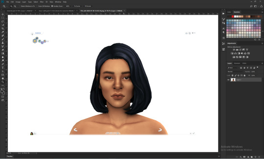
grab a screenshot from your own lovely screenshot folder! mine is straight from my reshade screenie folder. then crop it how you like it! my original screenshot size is 2560 x 1600, and i almost always cut the background out. this is how i do it:
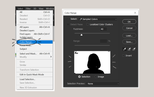
click color range, then click on the background of your sim. the little screen above will look like that. the background should be white. it’s easier when it’s a fully solid color. those are my settings above. click ok! the selected area will have those teeny tiny marching ants.
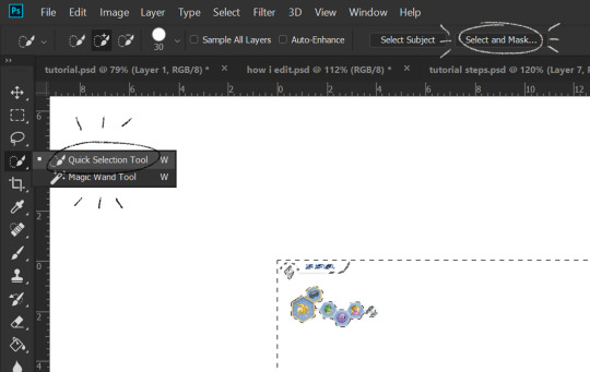
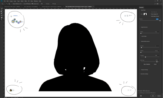
click quick selection tool, then select and mask...
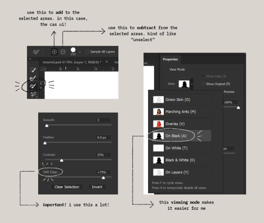
i drew over these circled areas using the “add brush” i showed above. use “on black” viewing mode, then make sure that the sim is completely filled black (it’s the unselected area). use shift edge so there wouldn’t be any of the original bg left over. my settings are shown above. then click ok if you’re all done. press delete and then ctrl + D to unselect. the marching ants should be gone. go ahead and crop it!
after cropping, i resize the width of the photo to 1280px! always!
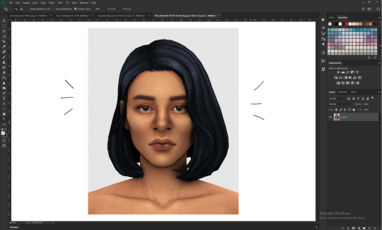
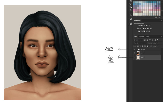
i create a new layer for my background, then add in the psd that i use for my edits. (i hide my psd layer while drawing)
sometimes i also use liquify to edit things like this:
//part two
i use a soft round brush to do everything! it’s literally from adobe, but i changed a few things like the flow jitter in transfer.
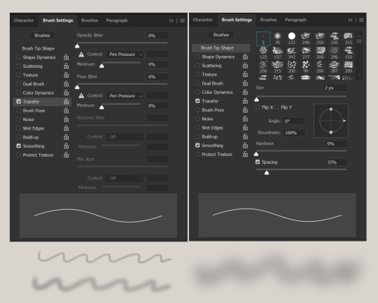
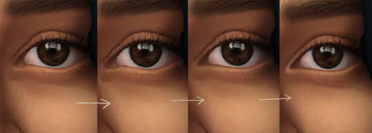
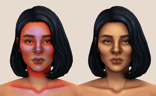
red areas are usually where i put the shadows, purple areas are usually where i put the highlights
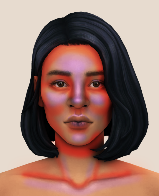
i usually do the shadows before anything else! it’s pretty simple. using the brush i showed above, i create a new layer.
use the eyedropper tool on her skin, then pick a slightly darker shade. change the blending mode of the layer to multiply, then draw the shadows.
right click on the layer, then select “create clipping mask” to make your life a little bit easier. an arrow will appear beside your layer.
//part three
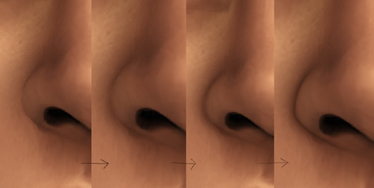
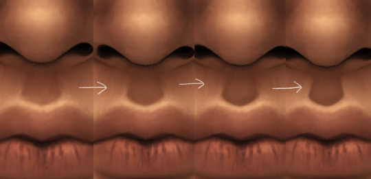
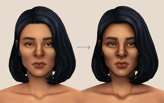
this is where i draw over the features. let’s look at her face. these are basically what i think it needs:
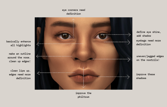
pay close attention to the imperfections and clean it up! that’s what makes it “sharper” in my opinion. small brushes will do the job! something like this:
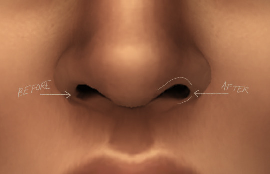
define the edges!!! define!! zoom in and take a look!! even though these are tiny little details, it makes a whole lot of difference! the eyedropper tool is your best friend!
i start with a big brush and then i use smaller and smaller ones as i go, which creates the sharpness. go a little darker as well! im not very skillful with my graphic tablet, so i add stuff bit by bit since it tends to become too harsh when i just go for it! im not as talented as some of u here ;-; i just wing it and pray it doesnt look too bad. half of the time im just experimenting since i literally do not know where some shading goes
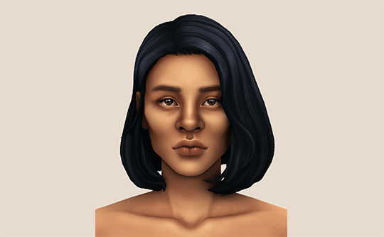
i wont be showing every single thing, but basically that’s the idea! i’ll add in the stuff i pointed out above and more shadows. sometimes i might turn down the opacity of some layers if they look a bit too much. here’s what we got so far:
i also like adding some face pores using this amazing “skin texture 1″ brush from this brush pack!
//part four
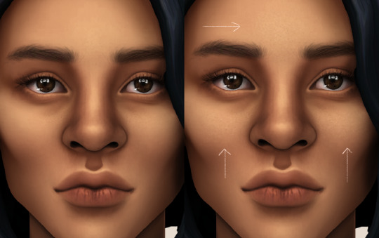
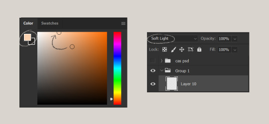
for the highlight layer, i change the blending mode to either overlay or soft light. use a slightly bigger brush for the bigger areas. use the eyedropper tool on her skin, and instead, pick a lighter shade.
let’s start adding highlight to the purple areas i marked above!
try to enhance the highlight on tiny details too such as the eye corners! if you want something more dramatic, create a new layer and do an overlay layer this time! don’t be afraid to add some on the hair, eyes, lips etc.
//part five
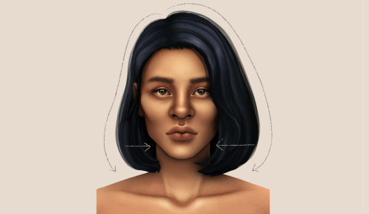
ok lets add some not decent looking hair strands. i almost always avoid this part because i literally have 0 idea on how to draw hair. i use the “hair base” brush from the same brush pack i linked to above and also have smoothing on to about 35%! the eyedropper tool is still your best friend! just follow the flow of the hair and i guess you’ll be fine ???
i’ll also fill in the annoying gaps beside her neck
unhide your psd layer and wooowweee
//part six
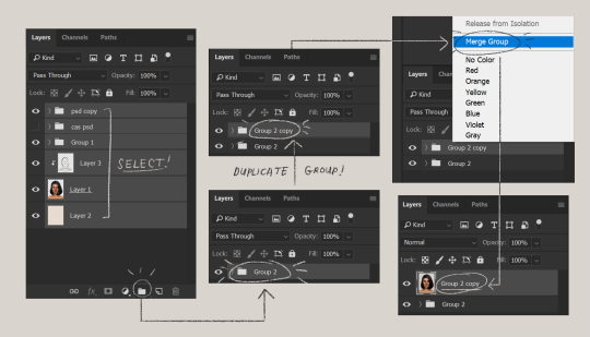
select all the layers, then click create a new group!
select the new group, then hit ctrl + J or right-click the new group, then click duplicate group
right-click the duplicated group, then click merge group!
i do this so i have a backup of the collapsed layers and can make changes anytime.
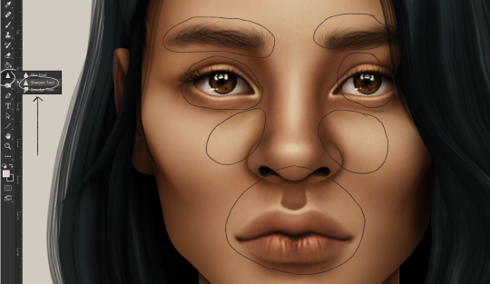
i use the sharpen brush on small details i circled below. i used to do stylize > oil paint or topaz clean before, but since the personal action that i use blur things a lot, i try to keep small details visible and sharp.
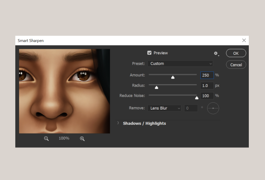
next is smart sharpen, my settings are below. sometimes i go for a smaller radius, but it looks like this most of the time.
my personal action set consists of this:
duplicate the layer that you just used smart sharpen on, then click lens blur!
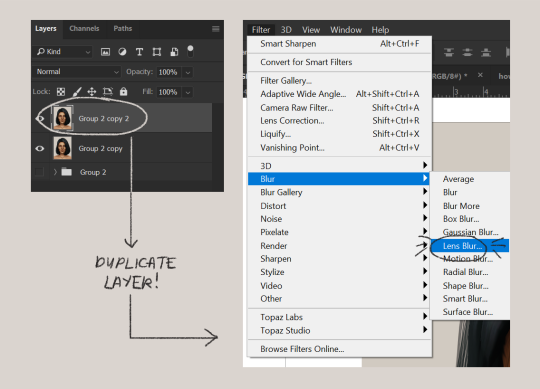
below are my lens blur settings
turn the opacity of the layer (that you just put the lens blur on) to 40%
select both layers, right-click then merge layers!
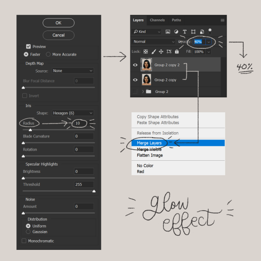
duplicate the layer again (yes, again) then right-click, choose blending options.
uncheck the R located on the “channels” under “advance blending” then click ok.
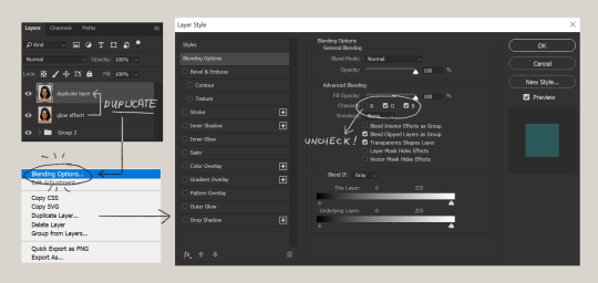
an icon will appear on that layer!
make sure you have that layer selected, then click the Move tool
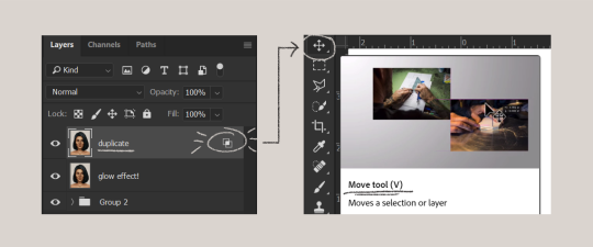
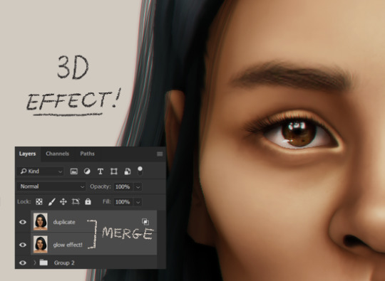
then hit your arrow left/right key once or twice! i do it once because i only want a subtle 3d effect! go ahead and merge those layers!
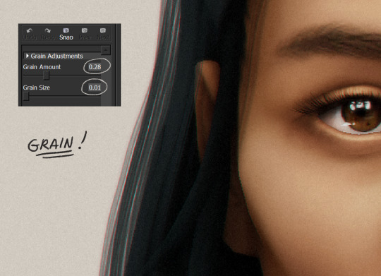
last step is the grain effect. i use topaz labs > topaz lens effects. if you don’t have this, you can also use filter > noise > add noise that photoshop has.
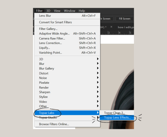
these are my settings:
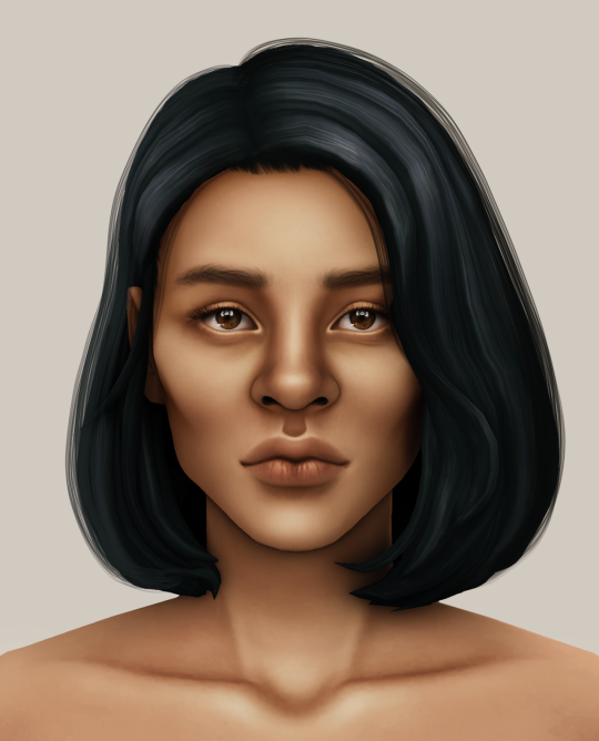
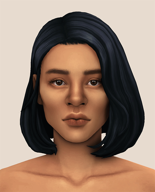
//final look!
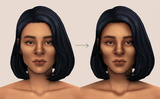
here’s a before and after gif! (here’s the finished edit) i hope everything’s clear! i’m really bad at explaining things (っ˘̩╭╮˘̩)っ
feel free to tag me when you use this tutorial for an edit!! i would like to see it! i hope this helps! ♡\( ̄▽ ̄)/♡
2K notes
·
View notes
Text
Shooting plans for portfolio
Studio - Portrait
For this shoot I will do a studio portrait of a class mate in which I will try to use my prior knowledge of studios to create an interesting portrait. I will use my 50mm lens as this will provide a picture that will match that of the eye normally. This will be a high contrast portrait which will highlight the emotion of sadness, I will set the subject off centre to add a distancing effect and help add to the emotion on display. I will use a black background, this will relate to the emotion as it will imply that the subject is shrouded in darkness and this will tie into the theme of sadness. I will use 1/200th of a second as this is my camera’s sync speed, an aperture of between 4-8, depending on what’s required for the right amount of light and the create as shallow a depth of field as I need. I will not require any props for this shoot. As this shoot will be done in the studio I wont really need to consider the time of day or the type of natural lighting.
Studio - Product
I will bring in my film camera to make a good studio shot of it as it is something interesting to me, again I will use my 50mm lens. I will try to create a shot of this camera that will draw the eye and look like a good corporate style shot for a product. I aim to draw the viewer’s eye into the image and so I will use a contrasting background colour, blue, red, purple, green and maybe more. I will fill the frame with the camera adding a small amount of empty space at either end to keep the image balanced. I will use 1/200th of a second as this speed will sync the camera and the lights together. The depth of field is somewhat irrelevant as there wont be anything in the background other than matte colour, I will therefore use which ever aperture is required for my light’s strength. ISO will remain at 100. I will require a tripod in order to make sure that I get a consistent framing and to prevent any clipping of the subject off the edge of the frame. Due to this being a studio shot the time of day will not matter.
Location - Portrait
I will achieve this through street photography. I will go out into Glasgow and walk around taking some candid street photos. I will only require a camera. I will use my 50mm prime lens as this is a good lens for street photography. I will likely an aperture of around 2.8-4.5 for this shot so as to throw the background slightly out. I will do this at mid day so as to have an even light and not too many shadows from the surroundings in Glasgow. I will require only my camera. I’ll use a shutter speed ideally of between 100th-200th, this would eliminate camera shake and still allow enough light in to make the shot well lit. The inspirations for this shoot are people like Martha Cooper, Henri Carier Bresson and Kevin Carter. I will try to capture images in a similar style to them.
Location - Lennox Castle
I will go to Lennox Castle for this shoot. I will try to capture the ruins in an interesting and unique way. I will need to use a camera on a tripod and I could bring a torch to try painting with light. I will go during the mid/early day so as to get nice natural lighting. I will attempt to highlight the effects of time on the structure and create a photo that causes the viewer to think. I will use a long depth of field so that there is a lot in focus, this will allow the viewer’s eye to explore the area and look around the image, rather than being confined to one focal point.
Photo story & Macro images will be taken from their respective projects to be used here also, this will constitute the other studio and location shots.
0 notes
Text
I’m back! I’m back with part two of my March faves! The procrastinator in me had to physically fight the urge to say, ‘meh, does it matter too much if my March faves go up in April?” , but here I am! Actually finishing something! I’m sure my uni seminar leaders would be very proud whilst also being a tad annoyed that I can’t apply the same motivation to my law coursework.
So, let’s get back into it!
– NARS RADIANT CREAMY CONCEALER –
NARS Radiant Creamy Concealer in Chantilly
As a huge lover of all things NARS I decided it was time to put their products to the test and try out one of the make up items I am truly fussy about- concealer. Before purchasing this I hadn’t actually heard any of the hype surrounding it (sometimes uni life leaves little time to stare longingly at peoples makeup collections on youtube, boo hoo) so it came as a lovely surprise when I found out just how great it was. I decided to go for the shade Chantilly, the palest shade in their range. I know what you’re thinking, am I really that white? Well, no. When I Said I was looking for a concealer, I was looking for a concealer that would brighten up my dull as hell skin and give me what I deem a natural glow, especially under the eyes. Now don’t worry, it’s not so white that I look like I’m half way to applying a face full of vampire makeup, with a little blending it’s a lovely light colour, perfectly brightening my under eye area and staying on practically all day with a little setting powder dusted on top!
One of the things that really impressed me with the NARS concealer was the vast range of colours available. They seem to have really hit the nail on the head! Don’t get me wrong, brands like MAC have been paving the way for shade diversity since I can remember (Yes, I’m 20, so not too long), but your usual high end brands such as Bobbi Brown have been severely lacking. I tried to find my shade with Bobbi Brown only to be told by the assistant that they didn’t do a shade as light as my ghostly complexion.
Now, onto my main love for this. The texture! I suppose it’s pretty obvious, being the name of the product and all but wow, the Radiant Creamy Concealer reeeeeally is creamy. It’s such a unique consistency when compared to any other brands I’ve tried, including my holy grail the Urban Decay Naked Skin Concealer. Not only is it super soft to the touch but it also feels light and airy, something I havent experienced much before. The creaminess makes it peeerfect to blend, it’s so easy and looks fab. The NARS Radiant Creamy Concealer really does live up to it’s name! So creamy that it’s a delight to work with and just radiant enough to give you a beautiful natural and healthy glow. I highly recommend giving it a try!
p.s Little tip, I also think NARS’ Chantilly would make a great contour colour for you girls with a slightly darker skin tone!
– LAURA MERCIER MATTE RADIANCE BAKED POWDER –
So, this is probably going to be the shortest description of a product I’ve ever ever given. Purely because all I can really say is it’s the best powder highlight I have ever used. This shade is in Highlight 01 and it’s basically my all time fave beauty product in the world right now. I wish I’d have swatched it because you really can’t see a glow in the above picture, but i promise you, never have I seen such a lovely sparkly highlight. If you’re not a fan of the glittery highlight, then maybe this isn’t for you, but if you’re after that instagram glow just like me then you’re onto a winner! 100% better than the Hourglass Ambient Lighting Powder, something I was super excited to try only to be hugely unimpressed when comparing the two! If that isn’t enough already, this product goes on fantastically, with only a little product being used you can still get a gorgeous highlight so you wont be getting through the powder too quickly! Lastly, it stays on perfectly. I put this on in the mornings before work or uni and even after an 8 hour day I can still see that glow. You guys need this product in your lives!
– NYX ANGEL VEIL PRIMER –
Holy Guacamole this stuff is good. Despite a weird liquidy texture that occurs whenever I don’t shake the product (idk), when it does come out, it’s great. As someone with combination skin, this primer is really great for my oily areas, it’s as though it soaks up the excess oil and smoothes out every pore whilst it does it. As it says on the packaging, it’s “skin perfecting” something I think I can atest to! My redness seems to reduce and my skin appears smooth. If I was to compare it to any other primer on the market I’d compare it to Loreal’s Infallible primer, a product that’s really great for making your skin looks its best before foundation. I even wear this on it’s lonesome it’s that good! My pores look smaller and any discolouration fades.
In reference to helping your makeup stay on longer, it also ticks the box. I’d even go as far to say that it beats Loreal’s concealer when it comes to longevity. With my skin type, foundation tends to completely slide off throughout the day no matter the brand, but with this applied underneath, the staying power really seems to improve!
– BENEFIT BROW ZINGS –
Ok, so I fully admit that when it comes to brow products, I am the fussiest person on earth. We all know how important brows are nowadays and how having a strong brow seems to be more important that how well you preform at work. Basically, you gotta look after those eyebrows! I’m a big fan of the natural look, therefore always on the lookout for a product that can help me achieve that. For a little advice, I made my way to my local Benefit counter – I’m not always a huge fan of makeup counters and the way they do makeup, sometimes I find it far too heavy and cakey, but Benefit really are great when it comes to brows. She matched my shade and talked me through the products. As a girl with the darkest brows known to man, it was recommended that I try a wax and powder, (something I’d steered away from for a really long time in fear of looking too fake) pencils just weren’t enough on these bad boys!
What I love about this product is the brush that comes with it! (shock horror, someone loves an applicator that comes included with a product!) Not only is it handy enough to fit inside but it’s super precise! The angled end is perfect for helping to achieve a precise, sharp arch. Just how I like it. There’s also the added benefit of the rounded end, this is the end I use for the powder. The product stays on the applicator really well and seemingly clings to the bristles, meaning you hardly have to use any product, something I’m a huge fan of considering I hate hate hate having to repurchase so quickly!
One thing I will say about the product is that despite the perfect colour match, intensity and naturalness, it does sometimes have a tendency to smudge! If you can ignore the slight possibility of having your eyebrows smudge half way up your face after a gym session, then I’d say go and give it a go!
Again, if you made it this far, thank you so much for reading!
xoxo, Liana
My Monthly Faves – March pt 2 I'm back! I'm back with part two of my March faves! The procrastinator in me had to physically fight the urge to say, 'meh, does it matter
0 notes