#sounds a hell of a lot easier than reformatting the entire website
Explore tagged Tumblr posts
Text
no kidding
if I wanted to use Twitter I'd just use Twitter 🙄
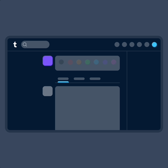
A new way to navigate Tumblr
If you use Tumblr on a web browser, you might have noticed us testing a brand new navigation on your dashboard in the last month. Now, after some extensive tweaks, we’ve begun rolling out this new dashboard navigation to everyone using a web browser. Welcome to the new world. It’s very like the old world, just in a different layout.
Why are we doing this? We want it to be as easy as possible for everyone to understand and explore what’s happening on Tumblr—newbies and seasoned travelers alike.

Labels over icons: When adding something new to Tumblr in the past, we’d simply add a new icon to our navigation with little further explanation. Turns out no one likes to press a button when they don’t know what it does. So now, where there’s space, the navigation includes text labels. Since adding these, we’ve noticed more of you venturing to previously unexplored corners of Tumblr. Intrepid!
What’s already been fixed? Thanks to feedback from folks during the testing phase, we’ve been able to make some improvements right out of the gate. Those include returning settings subpages (Account, Dashboard, etc.) to the right of the settings page instead of having them in an expandable item in the navigation on the left; fixing some issues with messaging windows on smaller screens; and streamlining the Account section to make it easier to get to your blogs.
What’s next? We’re looking into making a collapsible version of this navigation and improving the use of screen space for those of you with enormous screens. We’re also working on improving access to your account and sideblogs.
That’s all for now, folks. For questions and suggestions, contact Support using the “Feedback” category. Please select the “Report a bug or crash” category on the support form for technical issues. And keep an eye out for more updates here on @changes.
#they're literally just turning it into Twitter#they (royal) claim no one wants to learn how to use a new website layout#but that is literally only because they're designing all websites to look exactly the same#so there's no need to develop internet literacy skills or learn how to navigate unfamiliar formats#how about instead of homogenising the internet#we start actually teaching people how to use the internet again?#remember less than like 20 years ago when people would actually teach themselves how to use a website?#and I'm sorry but anyone claiming it's too difficult to learn how a site other than Twitter works is simply a lazy dumbass#'cause they had to learn how *Twitter* works too at some point#like hey tumblr here's an idea#how about instead of copying Twitter's layout#you just make a ''how to'' page for navigating Tumblr's current format?#sounds a hell of a lot easier than reformatting the entire website
27K notes
·
View notes