#sorry this comic is kinda low quality. i did not do lineart and you can tell lol
Explore tagged Tumblr posts
Text
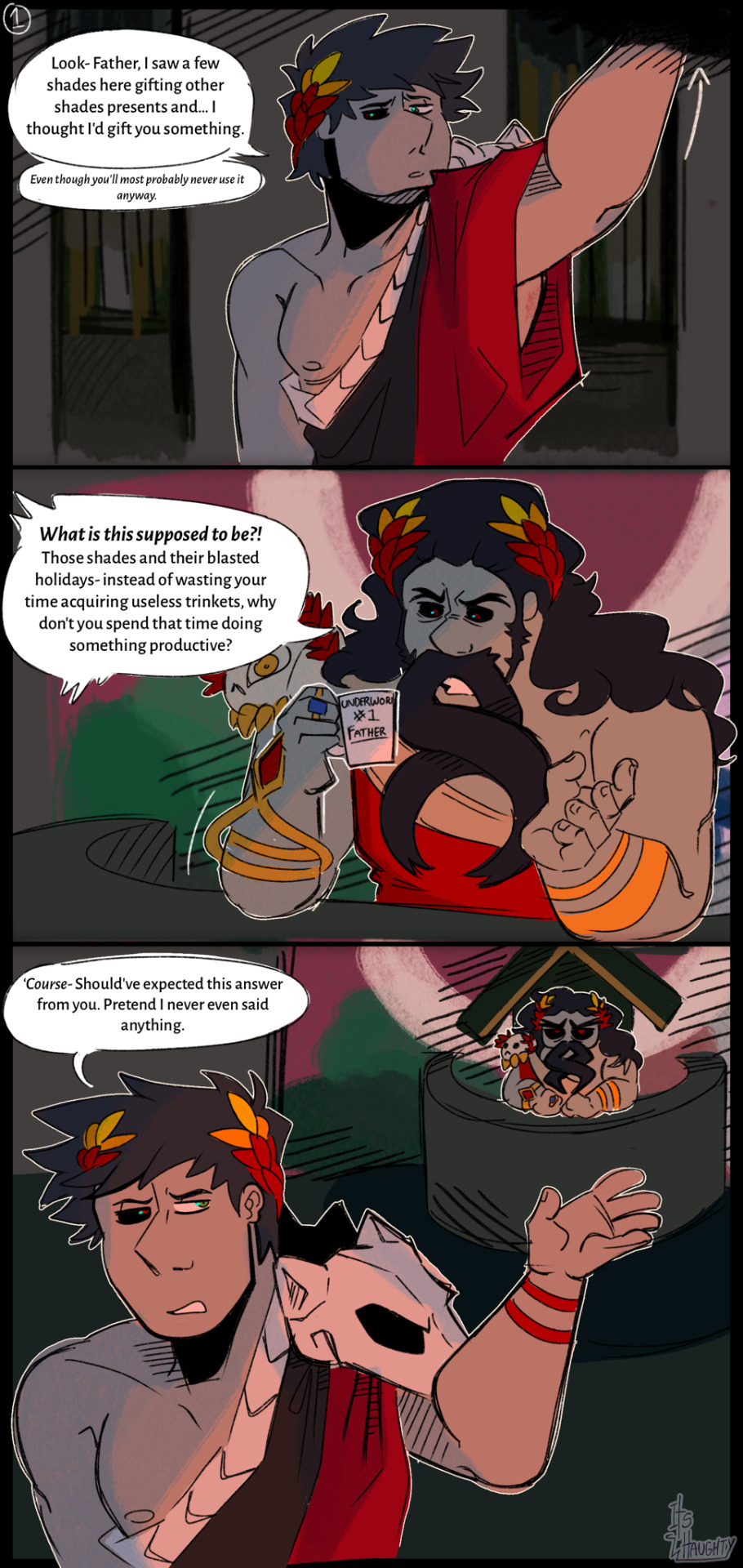
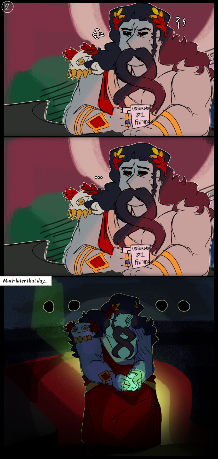
Shades and their damned festive holiday
#sorry this comic is kinda low quality. i did not do lineart and you can tell lol#originally wasn’t gonna colour it either but for the last frame to actually have impact#i needed the whole comic to be coloured#soooo ya#anyway this father and son dynamic seriously drives me insane#merry christmas!!!#digital art#art#hades game#hades fanart#hades supergiant#hades zagreus#hades hades#???? idk how you tag hades the Character
85 notes
·
View notes
Note
please how do you pick colors 😭 I'm trying to learn how to color and I am obsessed with your comics (like your ivantill ones lol) and how do you pick such a cohesive color palette and choose where to put what????
Your art is amazing like actually :) happy holidays!!
😭 tysm anon and happy holidays to you!! i did my best to explain some of the process behind my color picking and choices for the ivantill comics under the cut, i hope its coherent cuz quite frankly it also takes me a long time to decide what colors to use
a little disclaimer: i tend to just put base colors, before i start adding shading or lighting. i also dont usually start off with a fixed color palette in mind, because my process is pretty much figuring out as i go along, and playing with all sorts of colors; however whenever i do end up with a fixed idea on the color palette the process is still applicable anyways so hopefully its helpful for u too :’]
ok so i usually decide colors by asking what kind of mood or tone im going for. for example, the recent ivti comic i did
the comic imo is pretty playful - theres a romantic element ofc but i think the focus is rly on how ivans being kulit / annoying as usual so i thought a spunky, albeit warm color would rly fit. theyre also chilling in tills house so i thought a home-y, comfy feeling would be good
i was still playing around, so for the first attempt at realizing that tone, i added a hot pink multiply layer to see how it looked
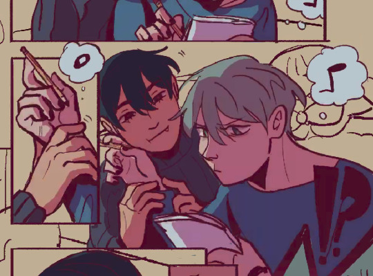
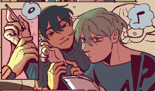
(first attempt vs final colors) (also im sorry for the low quality procreates timelapse is wack)
ironically enough it actually created a really cool looking color palette which was not what i was going for. so i kept testing colors for a bit; the shadow is hot pink, and i ended up going for a bit of a desaturated green as a base / overlay because it mellowed out the pinkness. i also put both the base and the shadow on a darken (50%) layer so that the og colors peek through a bit more compared to a multiply layer. in the end tho, i ditched pink and went for a saturated red
the green also makes for a nice complimentary color to the red, and it overall has that home-y, warm but playful feeling i wanted to include ⬇️
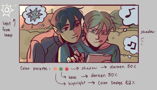
i added a highlight layer (color dodge, 82%) so that it pops a bit more, and also bc i knew i was gonna draw a big lamp on their right in the bg. speaking of the bg i made it a green/yellow hue so that the base for green on ivan n till make sense, and it ended up working for the best cuz the red acts as a nice contrast
(admittedly i think if the lighting of the room is green the shadow should also be green, but tbh i tend prioritize contrast as much as possible regardless cuz it looks nice 🤡 even if it fails to make sense realistically its for the vibes)
^ i ended up remedying this a little bit by adding bits of green to the shadows on ivan n tills hair and clothes, and also because its fairly complementary to the pink palette i have going in for the shadows and even the highlights (esp on ivan)
i also decided to shade in dark parts in the lineart so that it pops a little more
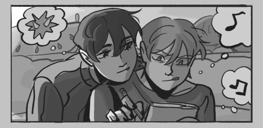
looking at the values also really help! esp in comics, where each panel can have its own lighting depending on what angle ure drawing. u can do this easily by adding a pure black layer above the entire piece, and setting it to color (100%)
for me the values actually made me realize things that may look too similar, which usually leads to me changing the color. for example, the couch and stuffed animals behind ivan and till were actually a lot darker before i changed it. bc it kinda blended into ivti a bit, it also got the eyes’ attention away from them. i ended up adjusting their hue and values so that it matches the bg, and ivan and till stick out more (alongside other color adjustments) ⬇️
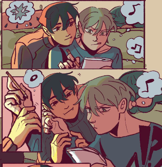
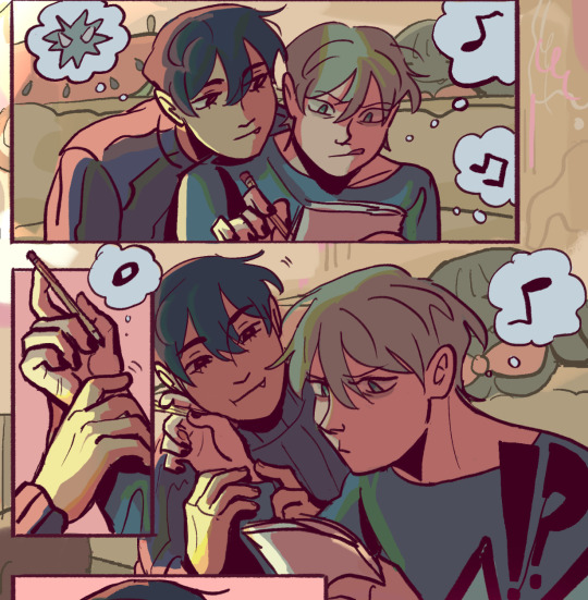
changing the lineart also helps quite a bit! i made the lineart for ivan and till a little darker, while the bg elements got a darker green instead so that the bg elements dont take as much attention
looking at b&w values also helped me realize that the og pink i was using for the panels was a little too dark, so i made it significantly lighter so that the panels stick out more (esp bc they take huge precedence in the second page)
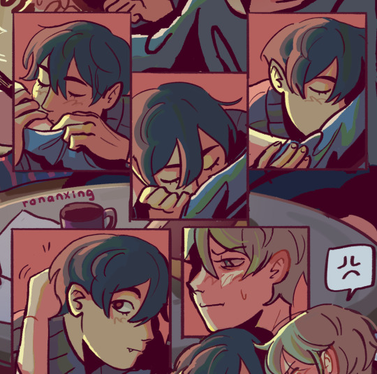
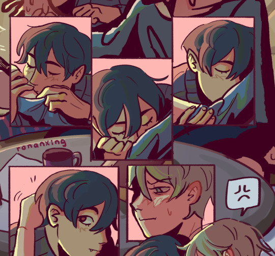
(og panel color vs final)
and finally when i pick all the colors and am satisfied with them, i merge everything into one final color layer for easier rendering :> procreate (and im sure other programs) allows for color / hue adjustments so you can def play around with those!
as for the harana / first ivantill comic i made, it had all the similar steps of the recent comic so ill just talk a little bit about the palette
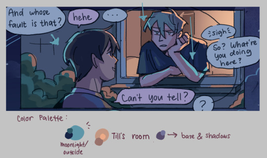
so im ngl this comic was a bit of a struggle to color for me,, cuz i wanted it to be romantic but it was set at night. usually that dictates cooler tones and colors, but i was aiming for something warm. thats when i figured i could just let tills room wash an orange color, which would help with making warm lighting but also help till and ivan stick out again from the surrounding darkness / blues
i went with a purple base, cuz i thought it was a nice warm ish color at night and it makes blue and orange pop. i also figured that i could make the base both purple since the highlights are the most attention grabbing / contrasting colors
also used the moonlight as rim lighting so that ivan sticks out a little more,, i also figured that tills room would be projecting harsher lighting over the moonlight
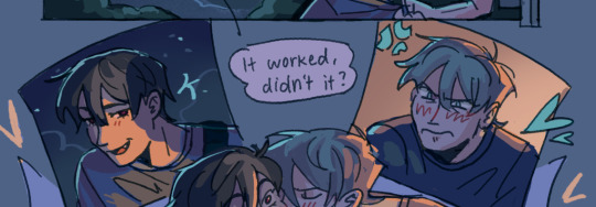
lighting it this way also allows for nice color contrast regardless of what character is in the center: ivans outside but awashed in orange lighting (from tills room), and tills inside but hes sticking his head out a little so hes noticeably purple. it allows for characters to stand out while also being pleasing to the eye
and im ngl i cheated a bit again 😅 i think till shouldve projected a shadow on ivan a couple of times and the highlights might be too harsh but again i just prioritized making their facial expressions seen LOL
for this one i didnt use any layer modes aside from (if i remember correctly) a purple multiply layer and overlay for shadows and base respectively
and thats pretty much my process for figuring out the colors !!
TLDR; i look for the mood or tone im going for, try to make interesting contrasts / complimentary colors and i also double check if each character sticks out by checking values :> it really helps me too to play around a LOT, i think it takes me like an hour or just 30 mins to figure out what colors to use and also adjusting it significantly when i merge everything together
#asks#im sorry this is so long 🫡#hope i was able to help u anon#but ty for the ask it means a lot to me !!#esp cuz i also still struggle with colors
11 notes
·
View notes