#sorry if you wanted a specific cog. if you did you can resend an ask and specify but either way i hope this helps you! or anyone else
Explore tagged Tumblr posts
Note
tips on how to draw cogs?
truth be told, I haven't drawn many cogs (mainly just one or two), but I will try to answer this as generally as I can!
This is a long post so I'll post this under the cut.
my biggest tip, as well as for anything, is to break down the shapes. If you try to look at everything at once it becomes really easy to overwhelm yourself. Examples will be drawn sketchy, but hopefully the point gets across.
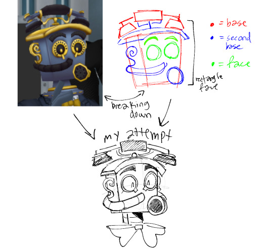
Our first test subject is mouthpiece which I've never actually drawn before [marketable plushies post doesnt count]. as you can see, I tried to break down a lot of the shapes into much more simpler ones. A lot of cogs seem to share some very obvious shapes, probably because a lot of them are object-related (normal cogs included- first that comes to mind are pencil pushers).
You can do this with really ANY character. Here's our second test subject DOPA for another example.
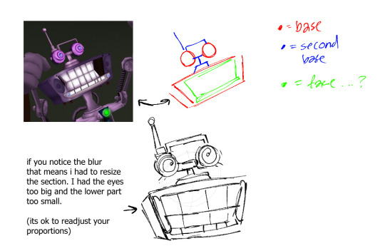
now these are mainly references from the pictures themselves, which are great as a starting point. my other big tip is just to practice. you don't have to do big full pieces every day, but even just little doodles will help you. i think its very rare for anyone do to super good their first time and this goes with anything, even if you're a highly skilled artist.
you've probably also noticed but I've left out details in my examples, such as the little dots on mouthpiece's eye borders. If you feel that adding all the small details would overcrowd your drawing or just not help it, then I think it's fine to leave them out (of course there are always exceptions to this but as a general rule, its ok).
along with removing details, i think adding details also cannot hurt [to an extent]. if there's something you think would look nice then add it. who cares its your drawing have fun. As an example I'll use prethinker. I always add the little line in the middle, which his model doesn't have. But this is also based off of the 1.3 promotional art as well. Another example could be that when I draw misty, I add a line that connects their eyebrows to their eye. idk just feels more robotic to me and i like it
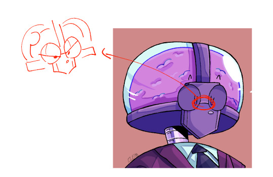
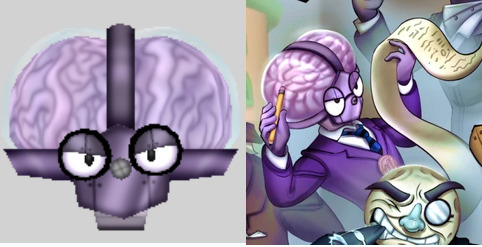
and again as you notice, my drawings are not model accurate. your style is most likely not going to be exactly like the game and that's completely fine. adjust to your liking, interpret as you will. enjoy the process of creation.
And finally, I'll add my little tip for metal coloring. One thing about metal is that usually the lightest highlight is next to the darkest shadow
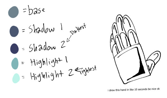
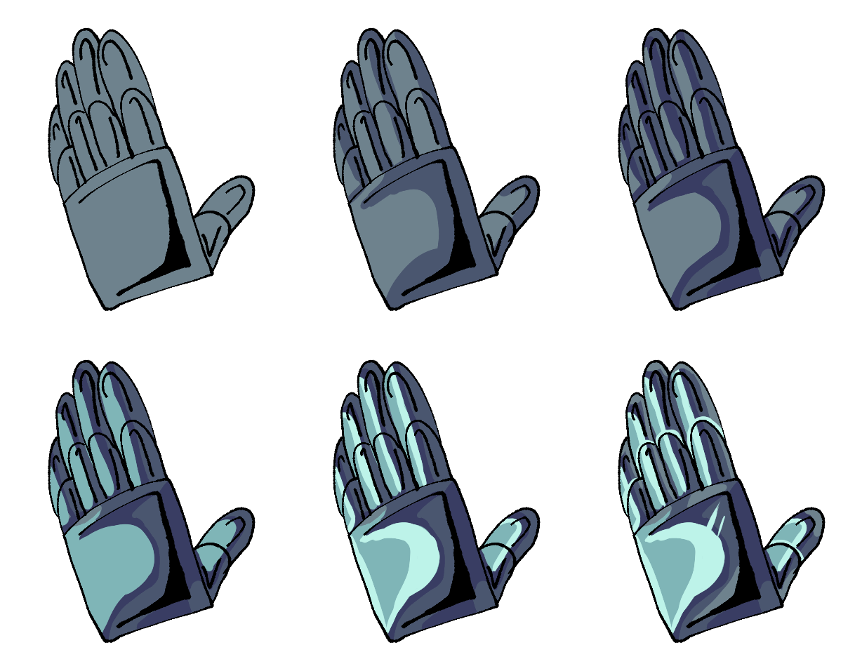
The gif goes as base -> shadow 1 -> shadow 2 -> highlight 1 -> highlight 2 -> cleanup + extra
I like to add a few light marks to indicate scratches. although if you wanted more depth, you'd take the darkest shadow and lightest highlight and put them together like this

often the metallic parts are not the focus of my works so I leave it without. As for the random black marks on the lineart, that just also gives it more depth.
And finally, look at other peoples art. Look at the way they draw and pick out bits and pieces of what you like and try to interpret that in your own style.
ok I think that's all. Hopefully this helped!
#clemask#long post#sorry#these are kind of vague overall art tips rather than specific ones but i think its because a lot of my processes follow the same general ar#tips that i follow#but yeah my general rule is just to practice and observe. there will be things that you change and thats fine#sorry if you wanted a specific cog. if you did you can resend an ask and specify but either way i hope this helps you! or anyone else
28 notes
·
View notes