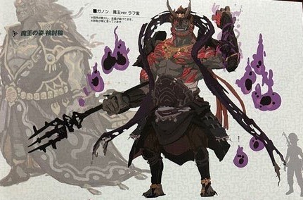
#sorry but totk gan normal looks a lil boring though i like the pattern in the robe
Explore tagged Tumblr posts
Text
you know im unable to shut up when i have any opinion on zelda (though i try and have thus far succeeded at not commenting on any other concept from the darn book)- i find most totk ganondorf concept art worse than what we got to insulting even (of those i have seen) ..... this one though

much more the one in the background than the one up front, still at least he has the collar and the weapon we saw in the first trailer of things that never happen in the end (like so much else)
#ganondoodles talks#zelda#it looks like he got actual shoes in the bg one#which i like#also the big flowing robe is jsut cool as fuck#i like old japanese aesthetic but i still dont think it fits at all in totk#like its so clearly done to other him from the gerudo despite wearing their symbol all over#idk it looks so much more unique and memorable#sorry but totk gan normal looks a lil boring though i like the pattern in the robe#and his deeeemon form looks more like they tried to do demise again but not quite#like yeah lets use the design things on the uncool and forgotten and possibly retconned villain#and staple it too the much more known one :)#like yes he looks different from the gerudo still and very much still japanese in this concept#but it .... just kinda looks more unique and interesting to me#like in an either go all the way or leave it kinda way#yes i am biased#i love both demise and gan#anyway- i am still a prisoner of art (cant draw weeeee)#(plus IRL stress with my parents and weather change thus migraine yippiiie)
237 notes
·
View notes