#someone take the halftone brush away from me
Explore tagged Tumblr posts
Visit Tumblr Blog
Explore Tumblr blogs with no restrictions, modern design and the best experience.
Last Seen Tumblr Blogs


Fun Fact
China blocked Tumblr because of pornography and censorship problems in 2013.
Text

Sometimes healing is just drawing Scott Smajor with reckless abandon, and a halftone brush
#scott smajor#scott smajor fanart#dangthatsalongname#dangthatsalongname fanart#life series fanart#third life fanart#last life fanart#double life#limited life fanart#trafficblr#traffic series#elis rambling art tag#someone take the halftone brush away from me#i love drawing my Scott design
32 notes
·
View notes
Text
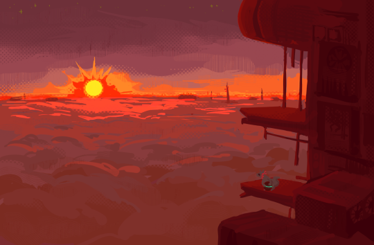
sundown
#someone needs to take halftone brushes away from me i use them far too generously#rain world#rw rivulet#art#fish makes art
807 notes
·
View notes
Text
Presentation script
I've had an obsession with camouflage my whole life, growing up in the bush made it seem so normal, and those thoughts were boosted by going to a beautiful rural school. That pushed the ideas of being one with your environment, and how important we are to it and vice versa. When I was at school I used to have problems with keeping my attention on the teacher, always daydreaming into my own world. There was always something to disrupt or distract me, keeping my attention away from what was in front of me, which leads me into my topic. Disruption camouflage, and how to provoke the public to see you standing out and drawing attention, rather than looking away or making you invisible.
(slide)
I wanted to show some examples of disruption camouflage to give you an idea into my thinking. Firstly I'd like to start by adopting a phrase ‘nega camouflage’ (nega meaning negative or in this case opposite), which is another way of saying camouflage that shows. A great example of this was Norman Wilkinson’s Dazzle camouflage (also known as Razzle Dazzle) first trialed in 1919. It’s counterintuitive camouflage technique, focused on confusing the vision of German u-boats. Creating a visual disruption giving British naval boats a momentary advantage, in a war fort in millimeters, if a German u-boats torpedo was even a few millimeters off course, it could result in the ship being completely missed. Professor Roy R. Behrens quotes, “for Wilkinson to come up with the ideas of redefining camouflage as high visibility as opposed to low visibility, was pretty astonishing”. This concept was so astonishing because up until the start of the 19th century camouflage was only seen as a form of concealment, Wilkinson however showed that camouflage was much more than a cloaking device. It was a tool that in the right hands could distract and disrupt the vision of the opposing ships, confusing the size, speed, and direction of the vestle.
(slide)
Another technique of disruptive camouflage is the example of Disney’s ‘Go away green’. The purpose of ‘Go away green’, is to obscure security equipment, construction sights, and blend large objects into the surroundings. This technique of disruption focuses on making the viewer's peripheral vision believe the area continuous, giving them a false sense of awareness, which falls into the optical illusion side of my thinking.
(slide)
Being a graphic designer, even a presentation needs a table of contents, so I thought early on I would outline the key components of my presentation, firstly my methodologies, both digital and textile
(slide)
My key themes, distortion, reconstruction, and layering.
(slide)
And finally my practitioners I will talk more in depth about, Akiyoshi Kitaoka, Adam Harvey, Sir David Attenbourgh, and...
(slide)
Jonathan Castro
(slide)
This year I really wanted to look deeper into halftones and an artist that I've always admired is Jonathan Castro, and his halftone system. The major elements I was interested in were his use of opacity, layering, image distortion, and vibrancy. Which I want to develop into my own practice.
(slide)
Which brings us to my digital system development
(slide)
And the systems I have developed from Jonathan Castro’s work. This year I developed two different digital systems that i've used to throughout my practice
(slide)
My first system works on taking photos or finding photos, and building different versions of them. Starting with creating each image into a halftone rendering, I then began playing around with line art, inversin, and grayscales of the image. Creating 2-5 different versions of each image gives me more options when it comes to the layering process.
(slide)
Next I thought I'd break down the layering process of a work from mid years, titled ‘master piece’. These aren't all the images used as it didn't fit nicely, but it's enough to convey the system. Which relies on individual placement and sizing of each image. With each layer having its own opacity to give the desired effect, predominantly layering difference, multiply, hue, and saturation opacities, but testing every form of opacity before setting on what I was happy with.
(slide)
Until we get to the final outcome, where the original images are being so distorted that you start to build your own imagery. As you come in closer..
(slide)
You become even more entranced in the image, finding more are more, diving deeper until it becomes too overwhelming and a mental rest. This system mostly focuses on distraction, building eye-catching imagery that draws the viewer in through its excessive detail, building on my concept of ‘nega camouflage’.
(slide)
Which brings me to my second digital system
(slide)
Starting the same as my first system, but focusing on adding things on top of a singular image, distorting the original.
(slide)
Building on the concept of distortion, I focused on layering and in this case using ‘master piece’ zoomed up very close to layer over the image. The system is quite similar to my first at this point playing around with different opacities, till I find the one I'm happy with.
(slide)
Next step, More versions. Lots more, and where this system starts to separate is focusing on a singular image as reiterated earlier, in this case creating 72 variants of the image, using different parts of ‘master piece’. On the left you can see the opacity system that I used to create each image, black darken the image, light blue difference, aqua lighten the image, and green was a free for all, giving a bit more playfulness to the process, and randomness.
(slide)
Moving forward, more layering, now layering the opacity pattern over top with a hue opacity.
(slide)
And now beginning the selection process, breaking down the image into segments. As the original image becomes more and more distorted, and start to reconstruct the meaning. I refer to this stage as ‘finding the tasty bits’, and ideology from our lectures when researching for our literature reviews. I've outlined the segment that we will zoom in on in red.
(slide)
Now that we have our segment, it's even more breaking down. Scaling it back more and more, down to the size of the original image, which has again been highlighted in red. I call this part ‘finding the taste bit within the tastiest segment’.
(slide)
Until we reach our final outcome, the tastiest bit within the tastiest segment. So distorted that it now has its own meaning, but if you held it next to the original image you would still be able to see the reminisce, or resemblance. I think in a nutshell this for me is closer to Castro’s system, but I think adapting parts from each system will be my overall outcome.
(slide)
Which brings me to my second practitioner..
(slide)
Akiyoshi Kitaoka
(slide)
You can't truly distract someone without an illusion, and there is no more iconic illusion designer than Professor Akiyoshi Kitaoka, based in Japan, Kitaoka is seen as the modern godfather of peripheral drift illusions. I thought I'd take this moment to break down how they work as it's an integral part of my disruption camouflage. This illusion is called ‘Rotating Snake’, and I don't know about you, but when I was little this and camouflage were the shit. I covered all my books for years in this exact pattern, which probably was one of the reasons I was so distracted in class. Anyway, into the science behind the illusion. ‘Rotation snake’ is a four colour system relying on a delayed release of motion detection neurons, which I refer to as ‘lag time’ in the visual cortex. It starts with an instant burst as the black and white colours are perceived, and then a second longer and slower release of neurons as the contrasting blue and yellow are perceived.
(slide)
The result is a moving static image, which is an oxymoron, and I think this is what inspired me to want to work with this specific illusion. The concept of a static image creating movement is just so mind blending, and I wanted to see where we could push it.
(slide)
I started with applying the peripheral drift illusion to one of the images from system two, and was surprised how much it added to the work. I began thinking about how I could layer the illusion? And how I could push this illusion into a textile world.
(slide)
Which brings me to my own development of Akiyoshi’s ‘rotating snake’. I figured out how to build his illusion by messing around with building pattern brushes and symbols, and through trial and error, rotating and reshaping I came up with an almost perfect version. I then began testing different colour schemes to find the strongest peripheral effect. As you can see on the right of the slide, this is the optical illusion contrast wheel, pairing up contrasting colours that have the best visual cortex reaction.
(slide)
Through a bit of mixing and matching I found there were 2 major standouts on the left, a green and pink colour scheme I call ‘Watermelon’, for obvious colour reasons, and on the right Akiyoshi Kitaoka’s colour scheme, which I fittingly called Akiyoshi’s.
(slide)
The goal with these ‘rotating snake’ illusions is to apply them to clothing through sublimation, a form of inkjet printing, much like a printer does with paper, only onto fabric. The idea is to start building the concept of disruption camouflage in a more urban tangible setting. The concept of disruption camouflage is more than illusions though, it's about attracting the attention of your surroundings, I guess in a nutshell it's standing out from the crowd.
(slide)
The Idea of being able to stand out in a crowd leaves you somewhat vulnerable to options, which is expected, but there is a more obvious threat wherever you go, that threat is servanice.
(slide)
Which leading into talking about Adam Harvey
(slide)
Adam Harvey is the founder of ‘Hyperface’ servanice camouflage, a digital made textile system, which uses facial recognition patterns to disrupt and distract servanice cameras. In the aim of reducing the correct detection of facial recognition by providing false faces, that distract computer vision algorithms. Why this concept works is due to computer vision algorithms' non definite depiction of a face, there is never one perfect face, only face like or non face like.
(slide)
I started thinking about some works I'd done earlier in the year, where I had been researching Akiyoshi Kitaoka’s ‘Distorted figure’, an optical illusion meant to trick the mind into believing that the segmented squares are not evenly laid out, and how the process wasn't that different to Adam Harveys ‘Hyperface’, in terms of pattern development.
(slide)
Continuing on with Akiyoshi Kitaoka’s ‘Distorted figure’, I developed a series of camouflage scarfs based on my favorite camo ‘choco’ as my template, and overlaid the colours with important places from my childhood. Creating swatch colour pallets and adapting them to the form of the illusion, I called this Collection ‘Childhood Camouflage’. In hindsight I wish I had known about Adam Harvey before making this collection, because it would have pushed me to think more about the shapes, and forms I was creating, and the effect it could have in an urban environment. But nevertheless I think the outcome was a step in the right direction.
(slide)
I decided to do a run of seven sublimated scarfs of my ‘Childhood’ print, because realistically I wanted to see something physical, and the confidence that I could make sublimation tangible.
(slide)
I thought now would be a good time to look at a couple textile practitioners that I've been looking at for inspiration. Firstly Daoyuan Ding, the ITS fashion show winner from 2019, and his textile work. With my practice I don't hope to mimic any artist style, but I do like to draw elements from their work, as stepping stones for my practice. Daoyuan Ding is a great example of not overdoing the work, and that's something that I personally struggle with as I tend to just want to add more and more layers until it's an explosion of colour, and detail. So with the sublimation I'm going to do moving forward, I'm going to think about giving the garments or accessories breathing room. Or atleast make the important parts stand out and the rest blend together.
(slide)
The second practitioner and fashion designer is Chez Ichiro, going by the alias ICHI, and his amazing distorted prints. ICHI in a similar way knows how to use negative space with his garments, creating eye-catching moments and allowing the garments to still be formal.
(Slide)
I think the important thing for me with ICHI’s work, in terms of my practice, was the creativity. It showed me that I wasn't even thinking out of the box yet, which gave me hope that my practice will flesh out over time, and to be a bit more crazy with my ideas.
(slide)
Which brings me to my final inspiration..
(slide)
Sir David Attenbourgh
(slide)
I was on netflix at night early in the year, and I was saying to myself, “man I really need something to inspire me for these lit reviews coming up”, and bam there it was. Sir David Attenbourgh’s ‘life in colour’, a three part series looking at all the weird and wonderful colours and patterns found in nature, made by nature. One interesting element that stuck out to me was when he talked about seasonal arctic animals, and how they change their coats to match their environments.
(slide)
After watching the Sir David Attenbourgh series I wanted to see if I could adapt the seasonal arctic animals camouflage into a digital system. I did this by creating a 360 frame hue camouflage, capturing a segment of as many abnormal and normal environments as I could.
(slide)
Here are some examples of how camouflage can adapt to different environments, and I want to keep pushing this idea of adaptable clothing and camouflage into my textile practice.
(slide)
When thinking about how not to approach adaptable camouflage, a great example is the tiger. The tiger is orange because it predominantly hunts deer, and deer can't see orange. In the example picture we see what a deer see’s on the left vs a human on the right, and I think this is an important trait to get right when thinking about an adaptable camouflage.
(slide)
I continued on my thinking by looking at the Monster moths of Britain, thinking about how their wings disrupt predators, giving the moths a few seconds of hesitation or a second thought before they are attacked, and how that was similar to the way dazzle camouflage is effective. I then began to think about what that might look like in an urban environment, is it eye-catching like a detailed digital work, or does it attract the viewer in by being really different, vibrant, and standing out.
(slide)
Which brings me to some more examples of adaptations of insects in their environments, to give them an advantage in survival. The two examples I have here, the Sphinx Hawk Caterpillar and the Metalmark spider, both use an adaptation I call ‘Shapeshifting’. The idea of shapeshifting is to be able to adapt to multiple environments, and is a concept that has been tackled by the last couple practitioners..
(slide)
Firstly Ding Yun Zhang, and his orange metallic helmet bag. Which is able to change from a bag to a helmet, to a backpack. Although it's not exactly what I have in mind as it doesn't really adapt to the environment, it does adapt to the users needs, which I think is a step in the right direction with my process.
(slide)
Secondly, Virgil Abloh’s 2054 adaptable vest. Turning from a vest, to a long sleeve windbreaker, to an under hooded windbreaker and a puffer vest. This is a great example of shapeshifting clothing, and a real inspiration for my conceptual ideas. Again similar to Ding Yun Zhang, this is more of an example of adapting to users needs. But I thought in terms of weather this is a great concept for environmental adaptability. (If video hasn’t finished banter, if it has slide)
(Slide)
To end I thought I'd show you where my current practice is at. Because I've been unable to sublimate anything because of Covid, it's made me think outside of the box a bit more. So I was playing with the idea of something that made you look one way in the day another at night, and what better example than Bioluminescent mushrooms, in this case Ghost mushrooms.
(slide)
So I tried to adapt that into a series of hats, using resin and glow in the dark powder. Creating an object that can change how you are perceived in different amounts of light, or environments.
(slide)
Digitally, I've been working on Akiyoshi Kitaoka’s ‘rotating snake’ illusion, and different ways I can make it environmentally adaptable. An interesting idea I had moving forward was to cut out different components of the illusions. Whether it's, the black allowing the surroundings to build the negative colour.
(slide)
Or using the contrasting landscapes of our urban jungle, and the real jungle, under laid beneath the cut out of the illusion. Which due to the variety of colours, makes the optical illusion work.
(slide)
And thats where im at, thank you for listening
0 notes
Text
Music Video Analysis
Here are some music video’s that inspire me, including, styles, colours, concept or visuals.
SIA - Snowman - https://www.youtube.com/watch?v=gset79KMmt0&list=WL&index=5
I like this music video for a couple of reasons, Firstly, the storyline is really cute, I really like how the child helps the snowman find his home and protects him before the sun comes out and melts him. Secondly, I like the style of the video, the clay stop motion style is really cute. It reminds me of a children’s TV show. I think they style of the video makes it even more special and add’s a cute theme. There is also video where it is shown how they made the clay figures and made the music video - https://www.youtube.com/watch?v=vfJSdJ_M4Uw&list=WL&index=6

LSD (Labrinth, SIA, Diplo) - Genius
I like the art style, colours and visual in this music video. I think the art style is really cool looking and unique, mixed with the colours makes it stand out a lot. I like the theme of the vibrant colours, I think it add’s effect to the video with all the funny and strange patterns in the background. I really like the visuals because they are interesting and unique with all the different colours and patterns. I especially like the scene where they are switching between doors into different times and galaxy’s, I think it adds a nice effect and also plays on the theme of the multi-verse.

Britney Spears - Break the ice
I like the concept of this music video. The concept is about a girl who has been cloned and is trying to take over the world. I think this is a cool concept as being cloned is a surreal and strange thing that we don’t usually see in real life. The clones trying to take over the world sounds like something from a dystopian story or movie. It’s a very out there and interesting concept/story line. The video actually reminds me of many cartoons there there will be someone taking over the world or being cloned and others would have to try to stay away from the clones.
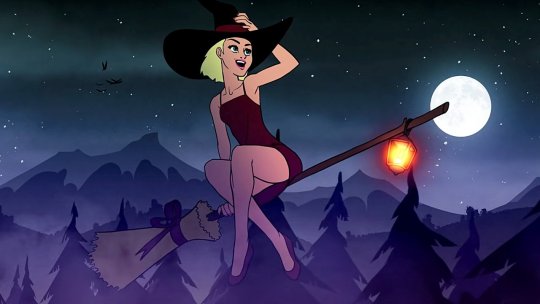
Katy Perry - Cry about it later
I like the visuals/art style and idea of this all for the same reasons. I like the idea of the witch in a supernatural- like world with magic and spells. I that was a really fun idea to add to the music video. I really like how they have made it appear dark with all the different coloured lights and how the lights have been presented, I think it adds effect to the music video and makes it more appealing with all the different lightings. I like how the art style is an almost pop art style, i really like the pop art style, I think it adds a retro effect to things, this music video looks like the pop art style in some scenes but without the halftone brush on the characters.
Billie Eilish - My future
I like the visuals in this music video, I think it has a certain style to it and it different from the other ones. I also like how Billie is walking through the rain at night in a sad mood, not impress by her surroundings and how my music video contrasts to a more upbeat tune and becomes more bright with the rain stopping. Billie then starts to look around and is impressed with her surroundings with her surroundings thriving and growing wildlife all around. i really like hoe Billie build that concept around her life, how she was once sad and depressed and has gradually changed to be a happy person who has hope and is excited for their future and whats to come.

0 notes