#so mad i didnt record a timelapse
Explore tagged Tumblr posts
Text
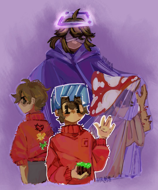
Many versions of Grian
#grian hermitcraft#grian fanart#grian#art#drawing#digital art#digital drawing#illustration#my art#fanart#fan art#artist on tumblr#hermitcraft#mcyt#third life smp#double life smp#and all the other life series that i dont remember jxhsjs#so mad i didnt record a timelapse#where is the outomaticly reckord timelapse button when you need it :(
87 notes
·
View notes
Text
TIME FOR A PROCESS POST let's talk abt getting from this (client sketch - which, btw, i know other artists have talked about this plenty, but i LOOOOOOVE a client sketch as early direction on a commission. LOVE it)
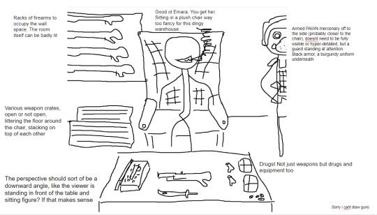
to this!
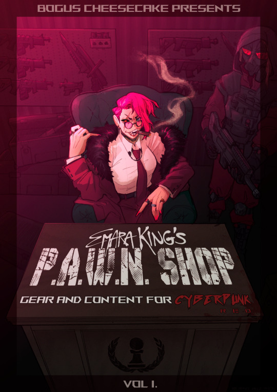
at first we didn't know if the title was going to go across the desk, or over the central figure (emara's) head against the back wall. so there was a 1st version where we were favoring a higher title, then we started favoring the desk so we scrapped the clutter + centered it more

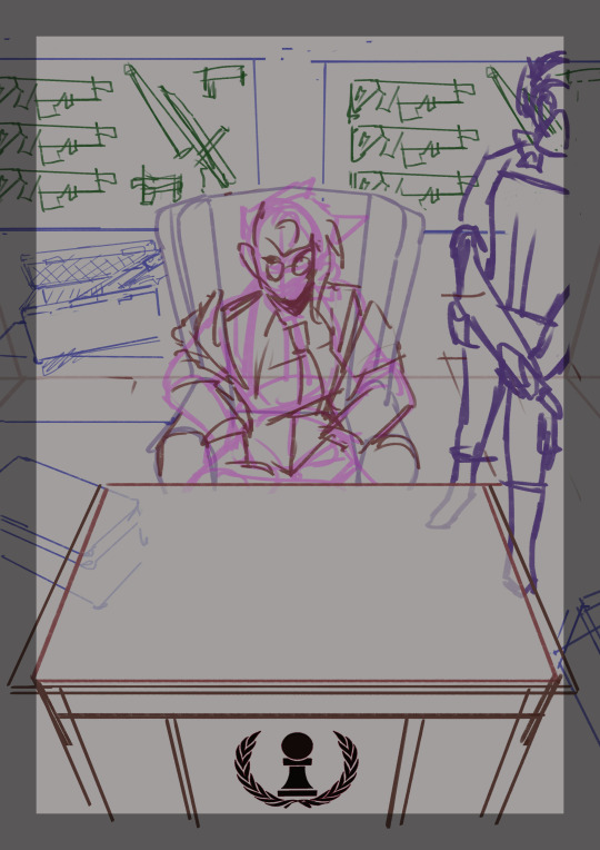
i used clip studio's 3D models (particularly for the chair, guard, + weapon crates) and perspective rulers to help with laying everything out at this stage, tho i abandoned the 3D pretty early on bc it's a bit too clunky for me. maybe i'll find it quicker to use w more practice!
(the rest under the cut!)
once the basic layout was approved, i threw together a value study to explain how in the final image all the clutter of the bg detail would be unified and pushed back. lately i find myself thinking abt value earlier + earlier in the process; planning ahead saves me a lot of time!
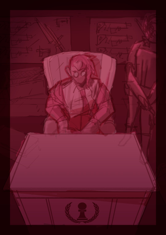
i fiddled with starting to refine things digitally, but then i got A BRAND NEW LIGHTBOX delivered in the mail with perfect timing (lmao) so i just ended up printing off the digital sketch, finalizing in pencil, + scanning back in

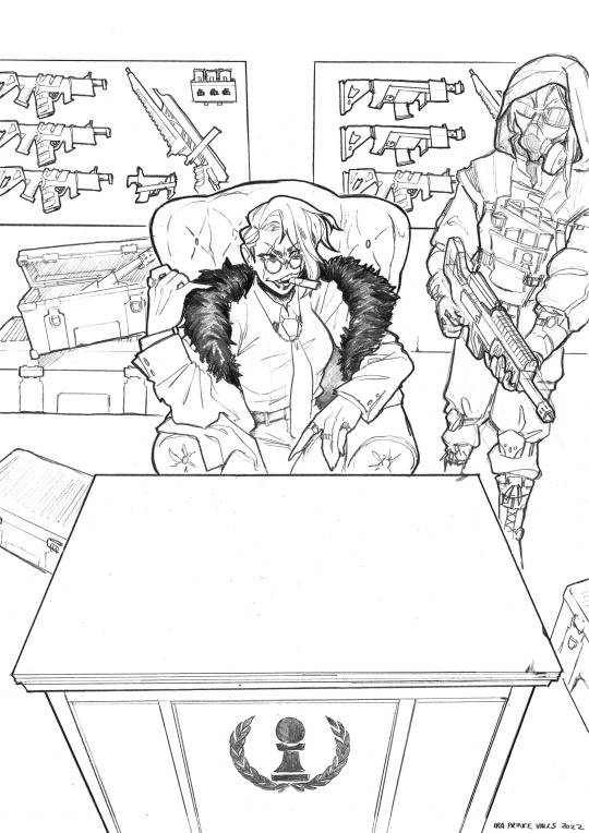
then comes five billion different steps of locking in values, again. i did everything greyscale first, but i didn't worry abt getting things super polished at this stage bc i knew color would factor in a lot to later decisions
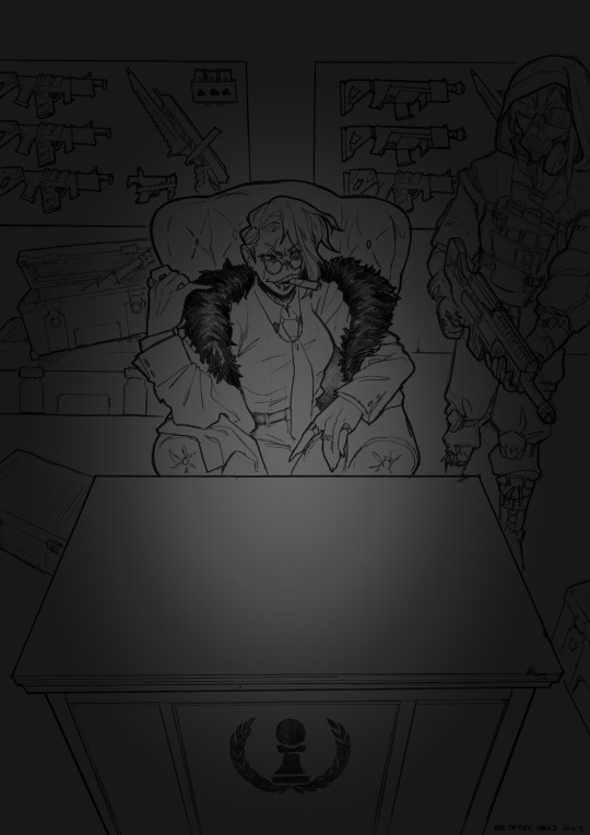

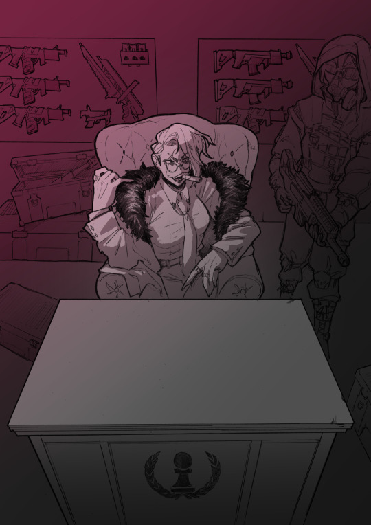
this is the point at which presenting these wips "step by step" is kind of misleading; i didn't do these stages one at a time, but rather had a BUNCH of different lighting/shading layers that i kept toggling on and off as i worked to make sure everything was coming along well.
(to get some of these caps i actually went into the main file again and turned a bunch of stuff on/off just for the sake of getting specific examples, because actually when i was actively working on it there was rarely a point where i was actually working on something with "all lighting turned off and just the shading on," or anything like that; but i AM interested in showing what effects different lighting/shading changes had on the base colors, even if i wasn't really making these changes in a rigid order.)
i.e., just for the sake of interest, here's how the flat colors look without those adjustments!! but i honestly never looked at it like this on its own for long...i had all the shading/lighting turned off so i could see what i was doing while flatting, but i was constantly checking back and forth.
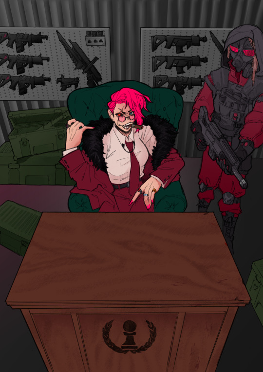
then tones added on top (which were actually just two copies of the tone folders in the above posts, set to linear burn and overlay) -
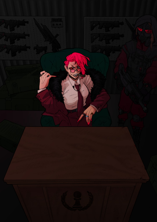
which makes it get HORRIFYINGLY dark, but that's when we go in and add a bunch of lighting adjustments.

the most obvious lighting change above is the big burst of hot pink light from the corner, but there was also some masked overlay + burn layers to pop out the guard + emara and make sure they were pulled out from the bg. if this were a standalone illustration, i maybe would have let the bg (and all that painstakingly drawn detail..........) stand out a little more, but a cover functions differently, and i wanted to make sure the eye goes to the title first. that means sacrificing bg detail even if it looks sick lol
then final touches! a lot of my very last touches are things that are close to invisible; gradient maps on very low opacity, noise, a little bit of scribbling on upper layers. the typesetting was all by the client, except for the lettering for "emara king's," which i did myself!
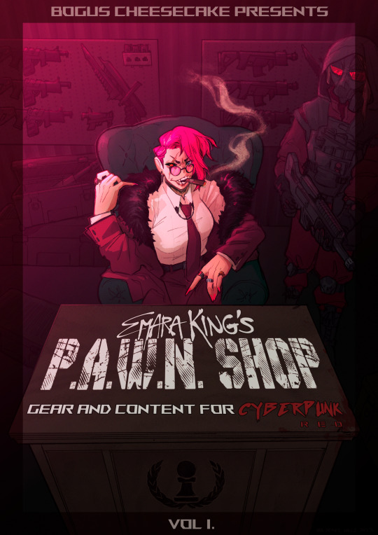
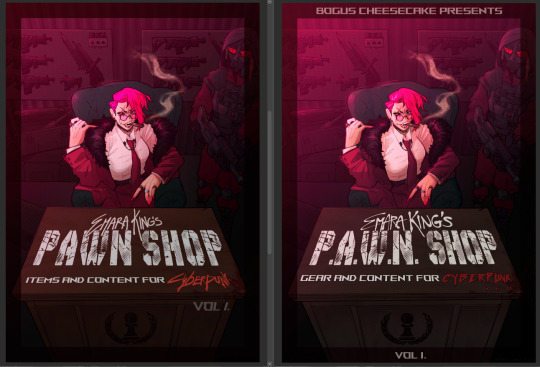
finally, here's a comparison of ⬅where i left off one night close to the deadline thinking "it's probably done, but i'll sleep on it just in case," then all the adjustments i made the next day with fresh eyes.➡ and that's it!!! phew!!! that's how i make a cover!
#my art#process#wip#tutorials#<- not really but. i just figure someone browsing my tutorials tag might be into this#i am so so so so so fucking mad that i didnt think to turn timelapse recording on for this#bc a timelapse wouldve been so fucking sick. but i can at least share this
611 notes
·
View notes
Text
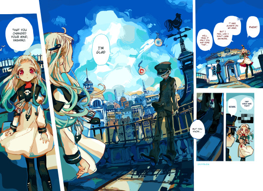
yashiro nene yashiro nene yashiro nene yashiro nene yashiro nene yashiro nene yashiro nene and hanako i guess yashiro nene yashiro nene
this is the pilot by the way, before people ask
#tbhk#jshk#toilet bound hanako kun#jibaku shounen hanako kun#i keep forgetting you can put spaces in tags#(this took 10 hours)#(all one day baby!! on the grind!!!!)#YASHIRO NENE#yashiro nene :)#NENE YASHIRO#!!!!!!#hanako#i guess#im so mad i turned the timelapse on BUT IT DIDNT TIMELAPSE!!!!! i swear i pressed record#i got the last few hrs tho but that was all the boring stuff . no sky timelapse :(#jshk coloring#tbhk coloring#manga coloring
167 notes
·
View notes
Photo
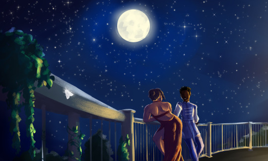
The Balcony
A scene from the D&D campaign I’m part of, featuring my fighter Kulli and her new friend, Zaydrosis.
#my art#friend.........for now ;3#i am hardcore bout to romance this guy#he's a dragonic demigod son of bahamut#he was close friends with my character's ancestor#i was doing a timelapse recording of this and didnt realize you need to manually turn on the recording every time you open the fucking doc#so i lost ALL THE RECORDING IM SO MAD UGH#dnd#D&D#dungeons and dragons#digital art#illustration#digital illustration#fantasy#art#artists on tumblr
56 notes
·
View notes