#she's triangles how do i translate that to Cube
Explore tagged Tumblr posts
Text


skins i made a good while back! v and lux :]
#dunno if i ever posted these!! but :]#sjdgfksd my friends r like 'it's so easy to spot you. you're so fucking blue'#my art#mc#my ocs#i wanna make a chungy skin but like. how#she's triangles how do i translate that to Cube#eyestrain
9 notes
·
View notes
Note
Do you have any tips for making animation-friendly designs? My designs are intentionally accurate to real-life cats, and I love them, but I know they would be super tedious to animate, or even use in a comic! How do you make such simple designs that are still so amazing and beautiful?
Well, it just takes practice and iterations I think! Mostly. But I have a few tips that I fall back on frequently I could share so Here’s my quick hot take on making animation designs:
Simplicity is your friend. I had a professor that used a term “simplexity” to describe the balance needed in order to make a character unique and easily recognizable, but also not hell to render out in a full animation. This is going to mean different things for different productions, for example something on the scale of Disney can have a character like John silver with a multi faceted robot arm whereas if we’re trying to do something low budget (*COUGHforfreeCOUGH*) you’re going to want to minimize the headache people have when drawing your character by leaning into the simple side of this term, so that they don’t want to murder you and will still be your friend after the project is over. (more under the cut!)
So what does this mean exactly? You’ll want to keep the line mileage to a minimum. For cats, this means limit the amount of detail and rendering you give the fur in your linework. I’ve seen Artists who break this rule magnificiently (like Raevi goddaMN GIRL) but for a design it is much easier on artists to streamline down to core body shapes and key character Accents in the fur (like tail shapes, cheek floofs ect). This can be pretty diverse, but I’d minimize it as much as possible (if possible down to three accents, more on this later).
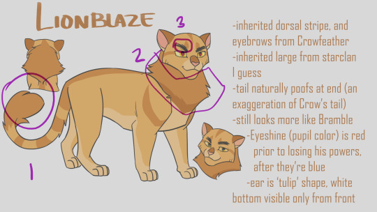
For examples, On lionblazes design (line art only at this point) his Character traits are his tail shape, Mane, and Scribbly eyebrows, all aspects that mean more strokes are being taken and work done, but that are easily recognizable between frames, and artists. I also have brought up Dovewing’s design because it’s more complex in it’s line art, but I could simplify it down even more to just her butt shoulder and ear floofs and still recognize her character silhouette. In fact, paring it down even further would strengthen her recognizability.

The amount of strokes you have people draw in cleanup will drastically change the amount of time it takes to render a character. Between Firestar and Bramblepaw in this shot Bramble easily took twice as long to line (or more!) thanks to his beautiful luscious curls.

Next! Principle I use in simplexity is the rule of three. For whatever reason, the number three is your best friend. It’s not as weirdly symmetrical as two or four, and maintains a unique organic-ness to it without getting carried away by five or seven. Now what am I even talking about? Pretty much everything. This is the secret of markings. This is the secret of character accents. This is the secret of color picking. The Rule of three is your best friend.
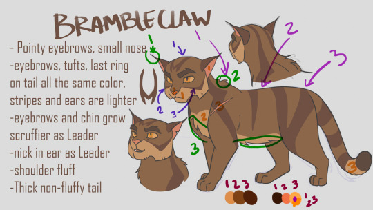
Take Brambleclaw for example. I gave him three stripes/markings on his face, and three on his side. It feels nice and natural and organic, without being overwhelming. I also gave him three specific fur accents in his line art, his ear tips/eyebrows, Belly floof, and shoulder puff. I used the rule of three in picking his colors, three main pelt colors, and three accent colors (eyes are always gonna be more complex if desired, people love rendering the shit out of eyes) and even so, three colors for the eyes. I used his lightest pelt color in only three places, and his Pink color in only three places, and his darkest color in only three places (eyebrows, Tail tip, and if I had thought to write it down, his paw pads). Even his forehead marking has three parts to it. You do it enough and it becomes really natural and subconscious. Of course, like all rules, you can still break it if you need to, but It has been one of my best friends.
Alright last thing to think about for now, (see what I did there? There are more things, but it helps people remember better to learn Three at a Time), are Shapes. Specifically using Simple identifiable shapes when constructing the body or face of your character. This is going to sound similar to the line mileage point, because they are related, but they are different. This is focusing on the macro details of a silhouette whereas Accents are about Micro details. This point also has the added benefit of helping characters look and feel related to each other if you use it potently!
Let’s take Hawkfrost and Mothwing for example. Specifically their faces. Hawk I designed first, and I wanted him to feel dangerous, and maybe a little twisted. So I decided to integrate a lot of triangles into his design because, a triangle’s shape language reads as dangerous. They’re pointy, and sharp, like teeth claws, and knives. We can’t in good conscious put an especially triangular object next to a baby because it inherently feels dangerous. They’ll poke their eye out with that tall prism. Other shapes have their meanings as well, Rectangles (cubes) are sturdy, and circular objects are the opposite of triangles, they’re the shape of eggs, fluffy pillowy things, and babies. They’re inherently safe, and soft.
Pull back from digression. Look at hawkfrost and his triangles. They have sharp claw like tips, which are emphasized even with a noticeable downward curving to their points. This motif is repeated multiple times, in his cheeks, his ears, his eyes, his chin, his nose. This becomes unifying, and inherently feels dangerous and curved, or twisted.
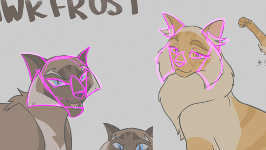
Now look at moth. She has triangles too, but I deliberately went through the effort to make them rounder, softer, inverting the angles of her eyes to feel sad and not cruel. Yet she remains similar in enough ways that she feels related. Her nose curves in a similar downward manner, her ears retain the out down curve without the dangerous point to them. The fur accents of her cheeks add to the roundness, making her feel softer while sharing hawks cheekwings.
Let’s take another example, Bluestar and Snowfur. They are proof that similarities do not have to be reserved to face shapes alone to give that strong feeling of relatedness. In some ways I think theirs is the strongest sibling bond I’ve read in the books, and that obviously translated to how I designed them haha! The idea behind their design was ‘curvy sturdy’ which is reflected in their circular based hourglass figures emphasizing Bluestar’s ‘broad shoulders’. I tried to make their heads more of a squashed circular shape, to give it more sturdy strength while feeling soft and maternal. Her ears are very rounded at the tips, and the particular downward turn is easy to identify and reflect in both cats. Lastly, their square “pants” because let’s be honest, both these she cats wore the pants in their families. There are also enough differences that in pure silhouette you would still be able to tell Snowfurs bushy tail apart from Bluestar’s thinning fur, and snows’ cheekfluffs from blues wide round jaws.

Of course I am not perfect at all of these elements, and there are even more things I could say that make designs unique and easily animatable while also identifiable. If you are looking for more or different suggestions, I liked Tenielle Flowers’ Video she released on the subject: https://www.youtube.com/watch?v=lO-kNlyHn8A .
And good luck!
541 notes
·
View notes
Text
November 17, 2020: 8:39 pm:
From Twitter suspended account rantings I do about Global terrorism today:

Could that be a million Trump terror soldiers all equipped with Pixel Suits? Shane and Zack were wearing them the other night, that is a sign of Pixel Suits in greater number, and lower ranking soldiers than usual equipped with them. The ones with the Pixel Suits started out being select soldiers, now this year the suits are worn by increasing numbers of terror soldiers, the suits are made by Google, is the information I have. Introduction of iPhone 12 is a heads up for more video capability to power the high demands of the Pixel Suit video requirements. The suits run on iPhones to power the video needs, dispite that the suit is made by Google. There is enough information in the launch of the Space X news combined with other information from Music industry promotional email command orders to support the possibility that disappearing Tweets are really a Twitter army equipped with new uniforms of invisible electronic camouflage for the final stages of the Corona Virus terror takeover of the USA. The current model of Pixel Suits requires seven iPhones to wear the suit, one per leg, one per arm, one each for front & back torso, and one more to glue it all tother into one controlling unit. With the iPhone 12 they are likely to demand fewer iPhones to run the video, making the suits less costly to use, and drawing less attention from increased iPhone sales or manufacture, in event there are people who keep track of phones and numbers of people who are said to have purchased them. Some clues in the Space X include the trip to the ISS was said to have been 27 hours. That is a containment statement, 3 cubed for the trinity rule application so terror soldiers can read the comm, they need clues like that. Other comm is an association to a "Cole Clark Angel" acoustic guitar advertisement, and some very tiny details in the photography of the guitar, and then translated to a video presentation of the Space X docking today. Too complicated to explain, but, there is a scene in the video where you can see that parts of the space station are somewhat similar looking to a video game controller. There is also a Taylor acoustic guitar model that also has photography of the guitar advertised showing the sound hole rosette is overlayed on top of, and covering the strings of the guitar, presenting an obviously enhanced bit of illusion on the advertising of the guitar. The result read, is that the strings on the guitar where the photo was manipulated, are to be interpreted as the astronauts as they are entering the space station through the door. So, you are to understand at that point that there is something about the astronauts that you must go find in the video. What you find is that the trip lasted 27 hours to get there, and those space suits they are wearing are very smooth, hard plastic looking space suits. That is what a Pixel Suit looks like when they are not turned on, smooth, black, stiff looking, wearable video screens. The ads are from Zzounds Music. You need to look at this at Zzounds: Taylor AD27 American Dream Grand Pacific Acoustic. Then, you need to look at this other one:Cole Clark Angel 2EC Australian Blackwood Acoustic-Electric Guitar (with Case)
This crooked tuning key (is called “Tuning Machine. Details matter)

You need to see that the tuning key is crooked on a very expensive guitar the Angel key for the small E string. that means "inclination to do terror" Then, you look at the rosette at the sound hole, it's white, nearly invisible. That tells you about the inclination, to be invisible. Then, this other rosette on the Taylor:

You need to see that the strings are beneath the rosette. That means "Illusion" is happening somewhere. They made illusion for the comm so you can read what you need to know. "Don't look inside this sound hole, go find a different sound hole to look at". It's dark inside the sound hole, you cannot see the internal bracing like you are supposed to, means "Shhhush... it's a secret" Then, you already are supposed to know that Space X is fake, there is no space station, so, you go look for that video on Twitter, where your marching orders have been coming from for the past 12 years. Then you make assessment that the astronauts are the strings, and they need to tell you something as they are passing through the fake door on the fake space station. They are saying: "we are not wearing our space suits at the time that we passed through the fake space door." That means there is something about the suits. You have a whole bunch of information at that point that tells you about illusion, suits, invisible people who are displayed as steel strings, and invisible white rosettes on a guitar called an Angel with one crooked tuner key, is very expensive. When you add Mike Pence, a penny, the Angel is $2,300, and satisfies the Trinity rules with 2 and 3. Go find the video of the docking at ISS. There is a still scene midway in the video, find a round hole on the space station, the place where it dock on approach I think is what they are showing. To the right you see six small round black circles. Three of them are shaped as a perfect triangular shape, and the other three are not quite a perfect triangle shape. Those are representations of the audio controls on the Taylor guitar and the crooked tuning key on the Angel. One of them is crooked, so, now you know you found the holy grail you were looking for, because is all checks out. And those look like a video game controller, sort of, while the circle docking area is the sound hole on both guitars. I suspect there is more clues for this contained in news about the new Xbox and Sony play station games from earlier this week that can also be looked at. There is a lot more to the comm. I can only explain so much on a suspended Twitter account though, and no one reads my Tumblr account, so, that won't help. Bottom line is that there seems to be a distribution of Pixel Suits on a large scale. That is bad news for Freedom, bad news for USA, bad news for people all over the world. The comm is very Vatican, Very Google. The comm is at a time when Jack of Twitter was presented in congress, and we almost never see Jack. He was presented while on a boat, but they didn't say he was on a boat, in a pool in his backyard, you have to figure that out on your own. It means that the news is orgasmic, in a gay sort of @Jack way. Jack was "Out of the Box" today. It's an "Open Box Sale Event". Jack is the sale on the mast of the pirate ship propelling the boat at Congress to inform the terror bastard actors who portray US Congressmen & women about the Google Pixel Suits being ready to ship. Dolly Parton is also participating in the comm, she is a terror operative. You need perquisit information to see what is going on with that part. Her braziers are made by Acme Tool & Die, they are equipped with hasps made by Zero Halliburton, a company that makes breif cases that are suitable for Top Secret information. That is the prerequisite info about Ms. Parton. This is the terror comm email from Zzounds Hollywood terror command HQ from today:

More showing that the one you need to look at is the one that is skewed on an angle.

This is the guitar on the website:

This is the illusion that you need to see. The sound hole rosette is showing over top of the strings:

You have to find the Angel on your own when you look at the Taylor at Zzounds Music. They put it right there at the bottom left of the Taylor ad so you don‘t have to go too far to find it.
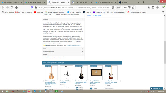
The Angel: (I want this guitar, please send one to my house.)
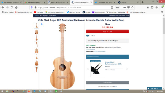
This is where you see that the tuning key is crooked on the one for the small E String of a very expensive guitar:

8:42 pm.
This added 9:51 pm: You may find evidence of “Time Warp” terror here. This space station concert might help to prove that what we see on Twitter is mostly reruns of old news presented as new. This may be part of another time in the past when those same guitars and same ads were used in association with the same space station Space X launch for the purpose of announcing the distribution of next generation Pixel Suits. The information I shared above is old, happened the exact same way before in the past many years ago, and was all presented as new on twitter with the congressional hearing, and with the very same email advertising. This kind of evidence is difficult to prove, so, make your own assessments based on your own research, and especially your own memory of events that already happened long ago.
https://www.youtube.com/watch?v=wM7XerPy2kY
youtube
10:00 pm.
https://twitter.com/Space_Station/status/1328584819148804096
added 10:18 pm: This may spark a memory of Big Hair Blonde Astronaut who seems to have been up there for more than ten years. The original stories that feature her have been purged from the internet, but I remember her from long ago being in the space station, maybe you do to.

Here below is the thing I was referring to that looks like a video game controller, and the sound hole comm for the guitars. It’s all very secret, is very subtle, but once you make the association and see that all of the communication necessary was done on the same day, you can make the connection the same way the terror soldiers do, intuitively.
The link to the BBC news on Twitter:
https://twitter.com/BBCNews/status/1328730003396300800

10:33 pm.
=========================
additional:
Bonus terror communication also from today includes this email promotion from American Music Supply Hollywood Command HQ featuring keyboards and synthesizers:

There are many in the advertisement:

You need this Moog Subsequent 37 for more terror comm:

This is how it looks on the website:
You need to look at that top video and watch the demonstration:

Please pay attention to the room, that background says a lot all on it’s own. Those lights are symbolic Christmas lights, among other things, see the familiar way the lights are out of focus to give you that warm fuzzy feeling you get when you see them there. See the way the man playing the instrument is a very happy fellow, and he plays it real good. See that he is preoccupied with the instrument, then, after that, you are on your own to make assessments.
You need to know that Moog is a employee owned company to solve problems that they are part of.
There is way too much happening in the video presentation, but pay special attention to the parts where the narrator does some comparisons for you, about the Sub 37, and the Subsequent 37... two different models that look exactly the same to me, he has analytic machinery, very specialized equipment. There is a timing statement being made, and is about specifics of attack plans that the Pixel Suits were delivered for, so, timing is short, details matter, and the time to act is now.
I am not going to read the video, there is too much going on. I want to share it so that others who are more qualified can make assessments and solve problems.
(I want one of these things, please send one to my house)

11:20 pm. more additional thoughts: Think about this as you watch the Zuckerberg look-a-like tell you about those two instruments: 11:33 pm:

2 notes
·
View notes
Text
Art F City: An Interview with Brian Belott: Frustrating Expectations
Brian Belott at Gavin Brown
Brian Belott admits that he’s “anything but subtle.” The artist has carved out a reputation for creating exuberant over the top spectacles wherever he goes. Known for his wildly uninhibited paintings that vibrate with movement and motion, Belott also courts chance and accident in his hilarious, absurdist performances.
Belott’s latest project at Gavin Brown’s Harlem outpost expands on his 2015 show at 247365, (discussed with AFC’s Paddy Johnson here)— and is a multi-faceted homage to Rhoda Kellogg, a little known children’s art pioneer. Her obsessive studies innovated child psychology and contributed to the formation of the Montessori method of teaching that places its emphasis on teaching children based on their own individual interests and skills. By collecting over a million examples of children’s art over the course of her lifetime, Kellogg discovered that universal patterns and developmental stages emerge in all children’s art from around the world.
The sprawling, rambunctious exhibit comes to life in three parts. For the first part, Belott hand-picked approximately 300 pieces of children’s art from the Rhoda Kellogg International Children’s Art Collection, which is the first time that such a large portion of the collection has been shown to the public. The second layer features 50 paintings that Belott recreated on canvas, based off of Children’s paintings, and drawings. The third aspect of the exhibition; is an actual children’s art classroom that’s channeling Kellogg’s own approach, which allows children from around New York City to make art based on their own interests and instincts with very little interference or guidance from adults.
I had a chance to sit down with Belott to discuss the show, the impact of children’s art on modernism, as well as his own lifelong obsession with children’s art that mirrors Kellogg’s.
Irena Jurek: When you set out to create the exhibition, did you anticipate it being so complex from the beginning?
Brian Belott: I didn’t want to make a polite show. My aim was to create this dense, overlapping nexus of children’s art. It all started with my devotional copies of children’s paintings, which led to my interest in the wallpaper, the Rhoda Kellogg collection, the soundtrack from the found recordings, and then finally the outreach to the Ps1s in the local communities, and having work made on site.
IJ: When did you first start working with children’s art?
BB: I’ve always been interested in it. My parents saved a really big chunk of my own childhood art; I have around a couple hundred examples. When I first went to Cooper Union, I tried to dig this stuff up and copy it myself, but I found that to be a little loaded, because it was coming from my own psyche as a kid. When I finished my schooling at SVA, I found some garbage bags of children’s art on the street in the Lower East Side, and ended up making an entire series based off of it.
IJ: What would you say fueled your fascination with childhood art?
BB: Children’s art has always been a thread running through my production. It has to do with the nature of children, and their exuberance, overflowing of excitement, as well as their innocence. That unpretentious way of experiencing the world excites me. In school I was trying to figure out how to tap into that spazzy zone.
IJ: So in a way, your interest in children’s art has to do with the mentality of children.
BB: Absolutely. We still have ways into tapping into that mentality. When you wake up in the morning with an incredible amount of energy, and it’s almost spastic, like you’re bouncing off the wall! Maybe you have your first cup of coffee and you feel like a kid. When you make a crank phone call to a friend and leave a crazy message! Even going on vacation creates a different strata; the first day of vacation is jam-packed with excitement, because you’ve cut all strings to responsibility. You’re not thinking about limitations, you’re just thinking of soaring into a world of no expectations and pleasure.
Brian Belott at Gavin Brown
IJ: The modernists were also in pursuit of that childlike freedom and lack of self-consciousness that you’re talking about.
BB: One of the most outspoken authorities on children’s art was Picasso. What’s funny is that his work never really became that childlike.
IJ: Definitely. He had that one quote on how it took him his whole life to draw like a child; meanwhile he was knocking off Ingres!
BB: It really doesn’t make any sense. Picasso was seasoned by a group of writers like Apollinaire and Gertrude Stein. He was so good at those zingers, and there’s no doubt he picked up steam from that milieu.
IJ: How did you come across the Rhoda Kellogg collection?
BB: When I was working for Donald Baechler, I came across one of her [Kellogg��s] books in his immense collection of books on children’s art. A great deal of the book was dedicated to scribbling and the early developmental stages of children’s art. Her contribution led to so much writing on the psychology of children and their first marks made. From there I started to find the rest of her books, and there were these incredible books on drawing, where she collected drawings from around the world. She was going around to multiple classrooms, obviously in communication with a whole string of teachers. It was really important for her to make the sample a large one.
That’s especially true when she focused on these early developmental stages of children’s drawing, you know, right after dribbling saliva, they’re scribbling and finger painting. Her colleagues weren’t interested in these stages of development. They thought it was nonsense. What she found out was that before we get socialized, that every kid is essentially making identical drawings from around the world. Before we are socialized we are part of the same family.
Joseph Campbell was interested in comparing hero stories and myths—in finding a common thread between Christianity, Islam, and Hinduism. Rhoda was doing something identical through studying messy art making made by two to three year olds.
IJ: So through her studies she also discovered these implied shaped that are universal?
BB: Yes, through the act of scribbling, as the young human hand goes over the surface of the paper repeatedly, the drawing begins looking like a mish mosh or a web. What she started to see is that the arms like making squares, triangles, or mandalas. So what she pulled out of this gobbledy gook is implied shapes. Not only do you see our universal similarities in these examples, but you also see the beginnings of language emerging from children’s scribbles.
IJ: So essentially this is something that’s intrinsic and universal to human development?
BB: It comes directly from the motor skills of a human.
IJ: Aside from showing three hundred examples from the Rhoda Kellogg collection, you’ve also copied 50 children’s paintings, which you describe as being devotional.
BB: I actually returned to making copies of kid’s art while I was on vacation in Vermont in 2014. Having had all my responsibilities put on pause for a moment, I decided to make the copies once again. I love doing copies because it’s smooth sailing; you have everything laid out for you, it’s a matter of translating that onto another surface and thinking about the composition and its parts in relation to its colors. Once I started making these copies, I couldn’t stop.
IJ: You mentioned before that your colleagues were wondering why you weren’t riffing off of these paintings and using them as a springboard to make a different type of painting.
BB: Yes, and I wasn’t interested in doing that. I wanted to humbly make a copy. Quite a few people told me that I should blow up the scale, which would signal to the viewer that art had been made and something had been transformed. If you see a five or six foot painting done in a child’s style, you’re probably going to think that an adult did it, because of the materials children usually work with and the materials that are normally at their disposal. I wasn’t interested in any of the solutions that the holy white cube insist we do.
IJ: Another parallel seems to emerge between Rhoda’s colleagues’ reactions to her work, and your own colleagues’ reactions to your work. Stepping outside of accepted convention can often make people uncomfortable.
BB: I’m stubborn and I don’t want to do what’s expected of me. This should be a trait in all artists. At some point in their production, they should dig their heels and do the opposite of what’s expected of them. Essentially any good joke or story is about frustrating expectations.
from Art F City http://ift.tt/2sXvgDZ via IFTTT
0 notes