#sharing the icons one may also lead to... *ahem* “other issues”
Explore tagged Tumblr posts
Note
do you plan on/have you ever shared your windows xp theme config?
Well, I could not in good conscience share it in the state it's currently in, no. But I can point you to the one I've used as a base! That'd be this one here on Github, and it seems they've advanced a lot since I last checked on it.
Most of what I did on mine was add themes for Kvantum (for Qt4/Qt5) and for KDE's widgets. And that is not production-ready, or so to speak. Oh, I also made the icon theme I'm using, but the coverage right now is terrible.
2 notes
·
View notes
Text
Android 9 Pie Features review
Here’s the story with every new version of Android, in a nutshell: it’s great, but you can really only get it on a phone that Google makes. Sometime next year, new phones by other companies will launch with it. The Android phone in your pocket might get it, maybe, but it’ll take longer than you want, and honestly, the new version isn’t that different, so you shouldn’t sweat it too much. Yes, fragmentation is an issue, but it’s better now than it used to be, thanks to Google’s ability to push some key updates out through the Google Play store instead of having to rely on full system updates. The story with Android 9 Pie isn’t radically different, but it changes some of those tried and true (and increasingly tired) lines a bit. For the first time, I’ve had a chance to test the official release of a new version of Android on a phone not made by Google, the Essential Phone. That’s a good sign. Although a few of the promised features aren’t shipping or are still in beta, I think this version of Android is good enough that users should demand the update for their phones. I’m not trying to organize a campaign to shake off our complacent acceptance of a terrible update status quo, but I am saying we should bring back a little bit of the old outrage at carriers, manufacturers, and Google itself. The many features in Android 9 Pie cohere into something that feels more polished than the last few versions of Android. There is a lot to like and fewer excuses than ever for updates not to come out for existing phones in a timely manner. We’ve been living with the same three-button core navigation system in Android for several years now, but with Pie, Google is finally giving a gesture-based interface a shot. It may not be the most important new feature in the OS, but it’s certainly the most prominent and the most divisive. Bear with me here because I’m going to overthink this, but I think it’s worth it because it illuminates a key point about Google’s design direction. The new system replaces the back, home, and multitasking buttons with a singular home button, gestures, and other buttons that appear on an as-needed basis. In theory, it will make future Android phones more accessible to users who are used to the iPhone X’s gesture system, and it also offers some benefits (swiping requires less accuracy than tapping). Overall, the new gesture system works, but it’s conceptually complicated.

To see what I mean, here’s a brief description of how gestures work: You swipe up once to get to an overview page. The Overview pane (aka your recently used apps) lets you swipe between apps or enable split-screen with a hidden menu on the app’s icon. On Pixel phones, you’ll also get an AI-driven list of suggested apps and a search bar. Swipe up again, and you’ll get to the app drawer with icons for all of your apps. You tap the home button to go home, or you can drag the home button to the right to quickly switch between apps in a screen that’s similar, but not identical, to the Overview screen. Along with all of this, the traditional Android back button will still show up from time to time next to the home button because Google hasn’t yet developed a gesture for “back.” It’s... a lot. I’m not against complication in principle when it comes to UX — I have faith in humanity’s ability to learn — but there’s no denying it takes some time to feel like you know your way around. The funny thing is, I think the negative reaction isn’t about how complicated gestures are. Instead, it’s about how they feel. As I’ve written before, switching to a primarily gesture-based navigation system is a risky move for Google, because those systems only feel good if they... feel good. Any “jank” in the animation or weirdness in the physics of moving elements on the screen will make a user feel unmoored and unhappy. The good news is that — at least on the Pixel 2 XL — Google finally got to a place where the animations work as they should, and the jank is gone. But the physics and ergonomics still feel a little off, especially if you’re used to the system on the iPhone X. (After a rockier beta, animations were also fine on the Essential Phone with the final version.) Where the iPhone’s gestures let you flow from one thing to the next with a single gesture, Android’s feel a little more staccato. As just one example, you theoretically have the option to do a long swipe up to get to the app drawer instead of a double swipe (once to the overview, once again to the drawer). But in practice, you have to do a loooong, loooong swipe to get it to work, which you’ll invariably get wrong, and the dock will give you a fussy little bounce in a futile attempt to indicate you should just double-swipe up. I’m overthinking all this in part because I don’t think Google thought it over enough. I would have jettisoned the long swipe and just encouraged people to double swipe. That would have the side effect of pushing people into the Overview screen more often, which would be a net good for Google. The app suggestions are very often exactly what I want and the swipe-tap motion to start a search is faster than any mobile search UX we’ve had, going on seven years (since, you guessed it, just typing on the physical keyboard of a webOS or BlackBerry phone). But, of course, that enhanced Overview screen is a Google-exclusive feature. Other phones, like the Essential phone, don’t have those Googley-bits at the bottom, they just have your app dock and no search bar. THE GESTURE SYSTEM IS AN OVERALL IMPROVEMENT, BUT IT NEEDS SOME TWEAKS With Pie, Google is leaving the buttons as the default navigation for current phones, and users will be able to switch back and forth from buttons to the gestures. Choices are nice, but offering them instead of just going with what you think is best often reveals a lack of confidence. As you can tell, I share what I sense is Google’s lack of confidence in the current system. Despite all this belaboring, I do prefer the gestures to the buttons! It’s a lot easier to just swipe up anywhere from the bottom of the phone, and I’ve used the copy-and-paste trick directly from the Overview screen a few times now. I just think they need a few more tweaks, and I suspect those will come in due time.
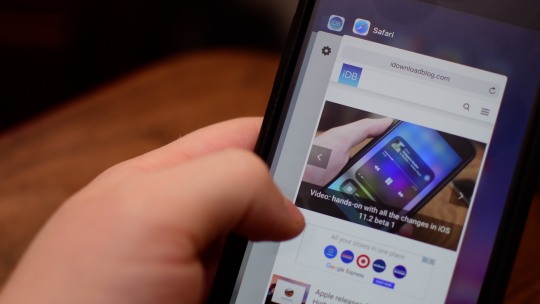
The new horizontal Overview / multitasking screen is the biggest visual change, but there are plenty of other nips and tucks around the interface. Nothing here will really feel alien to longtime Android users, it generally is just a bit more elegant. Android still maintains its lead in usable, manageable notifications. They have a slightly cleaner layout, and the entire notification panel has rounded corners. There are still multiple priority levels, grouping, an overflow area, and no distinction between what’s shown on the lock screen and notification panel. If you dismiss a notification from an app a lot, Android will eventually prompt you to just turn it off completely. The quick settings panel up top has been simplified (some would say oversimplified), requiring you to long-press to access more settings instead of giving you an in-menu dropdown button. As it does with literally every revision, Google has also adjusted the main settings screen. There are colorful icons for settings, and it’s more prominently adding suggested settings at the top more often than before. A system-wide dark theme is now an option for everybody, whether you have a dark wallpaper or not.
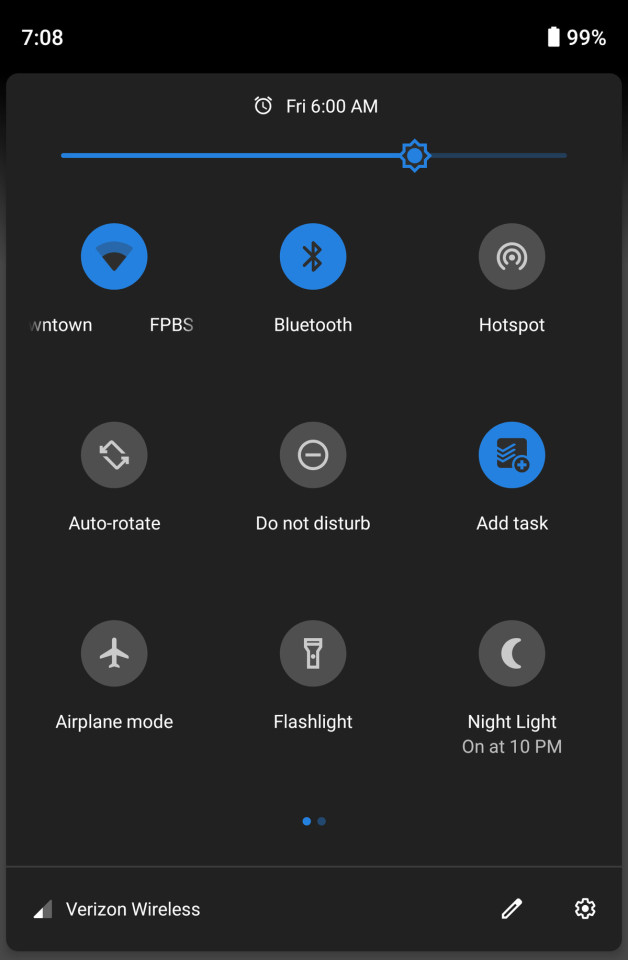
Back to polarizing changes, though: the status bar has been rearranged to better accommodate phones with notches (which apparently is going to be damn near all of them not made by Samsung). The time has been shifted over to the left of the screen and the little notification icons that appear over there are capped at four, whether you have a notch or not. It was a necessary step given the hardware trend, but I’m hoping that eventually, manufacturers will be able to report how much space their notch is taking up so Android can display more icons if there’s space for them. Google has changed the volume button behavior a bit — they only adjust media volume now with a little on-screen pop-up that lets you toggle your ringer between vibrate, silent, and on. It’s more predictable, and I think most people will prefer this behavior, but I’m an old person who actually adjusts ringer volume a lot, so it’s less convenient for me. ANDROID 9 PIE IS DESIGNED FOR NOTCHES, WHETHER YOUR PHONE HAS ONE OR NOT The other little pop-up on the right side is the power menu, with options for restarting and taking a screenshot. I recommend hunting down the “lockdown option” in settings, which adds another button to that menu. Tap it, and your phone will require a passcode instead of letting biometrics unlock the phone. Honestly, that button should have been set to “on” by default.

I’m not sure what took so long, but Android finally has a magnifier when you’re trying to move the cursor when selecting text. Another “finally” is a screenshot markup. When you take a screenshot now, you’ll have an option to crop it and draw on it before saving or sharing. Last but not least, if you’re the sort of person who leaves rotation lock on, Google will pop up a little button when you turn the phone to temporarily let you put it in landscape mode. Something about big phones has always caused them to be too aggressive at rotating the screen for me, so it’s a nice feature. It can be annoying, though: most of the time you want to go 90 (ahem) to watch the video, and video by default hides the main navigation buttons. It’s a few extra taps to get back to the portrait.
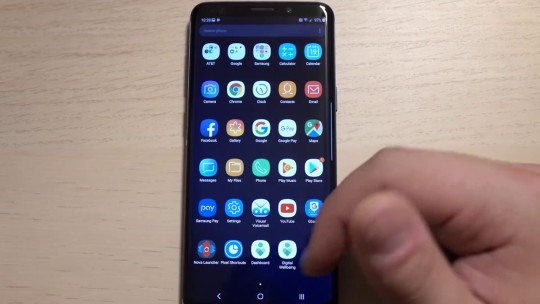
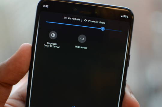
In my initial look at Android 9 Pie, I called it Google’s “most ambitious update in years.” I still think that’s true, but unfortunately, right now, Android doesn’t quite reach those ambitions. There are two key features that aren’t shipping until later this fall: the so-called “Digital Wellbeing” dashboard and a feature called Slices. Digital Wellbeing is available as a beta, and I’ll wait until it’s official to review it. But even in beta, it’s useful. You can see how much time you’re spending in apps, set limits, and turn on a great feature called “Wind down,” which toggles on Do Not Disturb and sets the screen to monochrome. Honestly, I wish there was a way to turn on Monochrome more easily anytime.
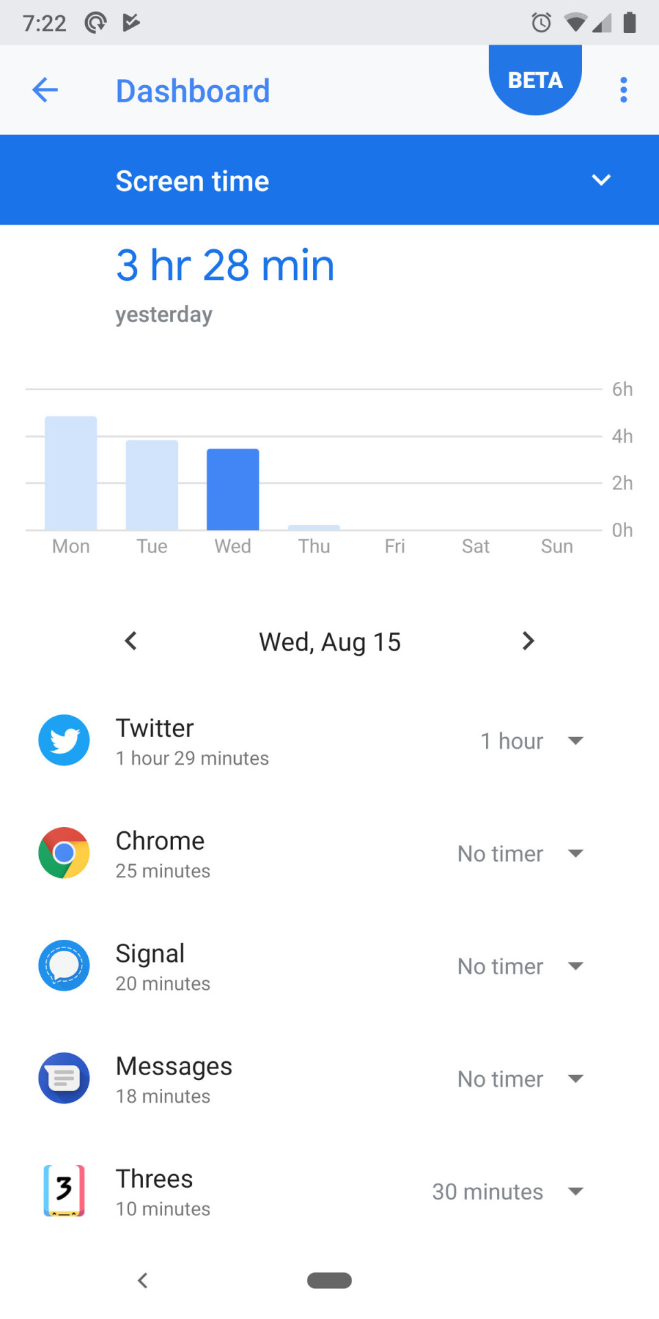
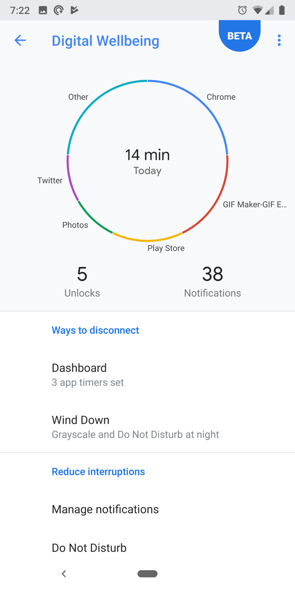
Do Not Disturb, by the way, has changed a little. It’s much more aggressive at hiding notifications by default, down to not letting you see them at all unless you mess with the settings or turn DND off. The default is a little overbearing for my tastes, and I wish there was a better middle ground. Slices are part of Google’s initiative to bring more AI and machine learning to Android’s interface. The idea is that the functions of an app can be “deconstructed” and spread out to other parts of the OS. So when you search for a thing you want to do, an app can show its own interface or button directly in the search results. The commonly cited example is hailing a car. We’ll test it in the fall when it becomes available. GOOGLE’S AI-BASED SUGGESTIONS ARE OFTEN EXACTLY WHAT YOU WANT TO DO NEXT But there are other AI elements to Android that are available right now. Both battery life and screen brightness are automatically handled by machine learning that adjusts settings based on your usage. I can’t really say how effective either are with any level of confidence, but anecdotally I do think I’ve been messing with screen brightness less often. AI also determines which icons appear at the bottom of the Overview screen, and it’s crazy good — the app I want to open next is there at least half the time. Finally, there’s “Actions,” a feature that complements Slices and is available now. Where Slices will show buttons for app actions when you actively search for something, Actions puts those buttons directly in your app drawer. As with those icons in the Overview screen, Android tries to guess what you might want to do, only here it’s a button that deep links into a part of the app. It might be sending a text or opening the podcasts app before you start your commute. They seem fine, but I’m not in the main app drawer often enough to make heavy use of them.
Android 9 Pie is a great update, and I wouldn’t want to go back. I love that it’s chock-full of ideas about how an operating system can be smarter, even though some of them (pardon the inevitable pun) don’t feel quite fully baked. I see a few trends beginning to come to fruition here. Through battery management and notification changes, Google is continuing its efforts to corral an ecosystem of bad-acting apps through a better-managed OS. The other big trend is one I’ve been talking about for a couple of years now: moving toward making AI the new UI. ANDROID 9 PIE IS FULL OF NEW IDEAS OF HOW AN OS CAN BE SMARTER Two years ago at the Code conference, CEO Sundar Pichai told Walt Mossberg that Google intended to be more “opinionated” about its own phones, and the Googlification of Android on Pixel phones is stronger than ever now. The heavy emphasis on the Overview screen, Actions, and (eventually) Slices are all examples of Google trying to use its own AI chops to surface what you need instead of making you hunt through home screen folders and apps. It’s been fascinating to compare Google’s strategy to Apple’s with iOS 12 — and will continue to be. Of course, if we’re bringing up iOS, we have to circle back to where we started: updates. Apple still trounces Android when it comes to getting phones updated to the latest OS. Last year, Google built the Treble infrastructure to make it easier for companies to push out these big OS updates faster. This year, I’d like to see more companies take advantage of it. Android users have more reason to hope than we have in a long time; the Essential Phone was the first non-Google phone I can remember that got an update the same day as Pixel phones. But that’s just one phone out of hundreds (or more). As happy as I am with all the individual features in Android 9 Pie, I’ll be even happier if the Android ecosystem gets its act together and releases it. Read the full article
0 notes