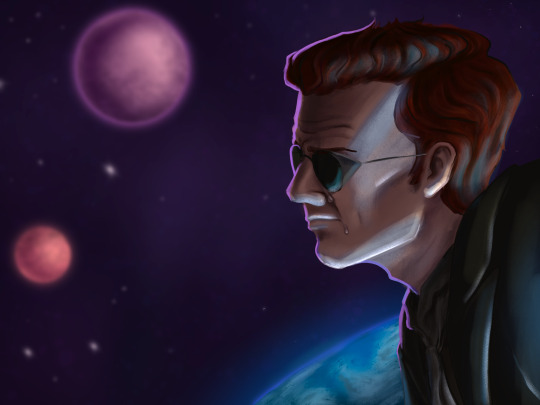
#seriously wtf this was meant to be a couple of quick drawings
Explore tagged Tumblr posts
Text


#good omens#art#ineffable husbands#good omens season two#seriously wtf this was meant to be a couple of quick drawings#how did it come to this#haha suffer
15 notes
·
View notes
Photo


HEY QUICK QUESTION. WHY THE FUCK IS SHE WEARING COMPLETELY DIFFERENT STYLES OF CLOTHING AND WIELDING COMPLETELY DIFFERENT WEAPONS IN EVERY COVER?
(and what the fuck is she wearing in the H0F cover? please, tell me again how S/jm isn’t guilty of cultural appropriation because. UGH.)
WHY DID WE DITCH THE VIGNETTE EFFECT? HOW IS HER HAIR THAT LONG ALREADY. THERE ARE LIKE THREE DIFFERENT MODELS IN THESE COVERS.
seriously tho, what is going on with the text in k0A? do you see how asymmetrical the lettering is in the middle of ‘kingdom’? why isn’t it centered over ‘of’? i know that sizing text is tricky but this feels like a rookie mistake. like someone couldn’t be assed to care and schlepped it together in a couple of hours. and the lack of consistency in the placement of the ‘#1 nyt bestseller’ line is really, really annoying. PICK ONE. COMMIT.
the ONLY decent cover in the whole lot is the q/os cover, and MAYBE e0s, bc at least there, the grey skin doesn’t look completely out of place. but she’s also off-center in that one so idk. q0s is the only cover in which she looks like she could actually use the sword she’s holding.
and can we talk about those swords? like, the fact that it looks like she’s wielding the same sword in e0s and k0a, but it suddenly goes from being a one-hander to a two-hander? or how about the weird angle of the handles in her palms in t0g - they’re oval handles, meaning the flatter side should lie against her palm, but in this they’re perpendicular to show off the blades. if you want to have her holding them properly and still show the blades, you need to turn her wrists out. Oh, how about the fact that she has a reverse grip on a sword that’s meant to be swung in the c0m cover - you’re not supposed to use longer weapons with a reverse grip bc you can’t support their weight like that. and her archer’s stance in h0f (which doesn’t even have any reference to fire in the design, wtf) - her chin should be over her shoulder, and she should be drawing the bow with her dominant hand, seeing as she’s right handed in all the other covers...
bonus:

It’s literally the exact same illustration as the T0G cover, with different knives/hair shopped in, and a cloak thrown on top. It’s insulting.
BONUS BONUS:

I didn’t even realize. But E0S and K0A literally used the same base stock photo. The artist just changed her arms and threw some armor on her. also that green stripe in the middle? that how much is missing from the left side of the k0a cover.
#these covers just. look so cheap.#for fucks sake just. have better covers.#or don't if it means less people will read your shit.
42 notes
·
View notes