#same goes for all the movie posters and background details that show up seasons prior only to end up being Massive foreshadowing
Explore tagged Tumblr posts
Text
Mike's state of mind and the basement in s4
Mike's basement has been one of the most important and reoccurring locations on the show. it's one of the few places that shows up in Every season, even the one Mike is out of town for. as it's a consistent location it also has very consistent set design throughout the seasons.
so it's interesting looking at it in s4 because for the first time in 4 whole seasons it looks different. and these changes raise some questions. (also a prime example of set design telling it's own story which hasn't been verbally highlighted to the viewer, which is super fun)
1.) the basement is a Mess
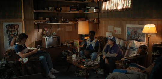
like, I'm serious it's BAD
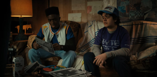
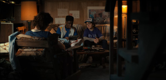

games are lying everywhere, on the table, under the table (something must have changed about the "games are for kids and we're not kids anymore" mindset ig), toys and figures are also just next to the table on the floor. the desk Max is writing on is so cluttered she barely has room to write. there's also food wrappers everywhere. not "real food" as the show calls it but instead mostly sweets. there's even a full box of applejacks and poptarts laying about (poptarts which we also see Mike throw in the toaster in e1, got to love the consistency). on the drawer next to the couch is at least a hint to someone eating "real" food down here in the form of an empty plate with cutlery in it.
so. looks like someone's been spending a lot of time down here. but this isn't bad per se. Messy teenage boy behaviour. Max has been distant from the party, Lucas joined a new club, Hellfire replaced Mike's basement DND sessions, so the overall visiting rate must have decreased significantly over the 6 month time skip. if it's just Mike hanging out here on his own, is it really weird that it's messy?
well, the same season rightfully goes out of it's way to introduce the very real practice of comparing a person's behviour to their previous behavior to determine if it's unusual.

so let's do that. what IS normal for the basement?
here's the basement 6 months earlier in s3:
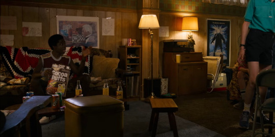
and, well. it looks perfect. no plates, no wrappers, all games are stored away. the same Simon game we see strewn on the table in s4 is neatly placed next to the drawer. the only remnants of food we see are the cocoa puffs Lucas is actively eating and the sodas on the table they're appearing to be drinking right now. and there's also no crumpled blankets lying everywhere and over every seat either.
the s3 basement looks how the basement has looked in all prior season. neat and cozy. in s4 that has now subtly changed. the basement is a mess now.
it's surface level, not too in your face, but it's there, constantly in the background. Max has to write around all the litter on the table. it's both in your face and completely in the background - and without comparing it to previous renditions of the basement we've seen we wouldn't question it. (very similar to Mike's room in s4. it's an absolute mess, closet open, bed messed up, clothes on the floor, he even ends up just grabbing a worn floor shirt when he leaves. which in itself isn't too weird. "teenage boy behaviour". unless you look at Mike's room in any of the previous seasons which is Very tidy and neat)
the mess is out of character for Mike judging by everything we've previously seen of him.
but if we're already comparing the basement of different seasons, there's also the next point
2.) Mike has also probably been sleeping down here at least a few times
the blanket we've seen folded up in previous seasons is now strewn over the couch and a bed-pillow is restricting Lucas' movement.
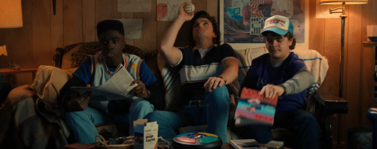
if we want to compare again. bellow are the normal couch pillows in previous seasons (screenshot from s1 where you can see all of them the neatest). there is no pillow used for beds in the basement until s4. and then there's also a picture of the comforter hanging over the couch in s3, a loosely knit blanket. which is replaced by the Actual blanket in s4 that was unused in all the previous seasons.


the fact that Lucas constantly bumps into the pillow also makes it clearly thought out set design because it's actively restricting the actors and wouldn't be placed there without reason.
but there is also something general to be noticed when comparing the basement of s4 to it's previous renditions:
3.) the basement lost it's comforting light. it's dark as shit down here now
this is something i haven't seen anyone talk about directly before but it's so jarring. the basement is always shot as a pretty cozy place. but season 4 gets a bit silly and goofy. we see the s4 basement during the day so lets compare that with s3 where we also get an equally long sequence in the day-basement:
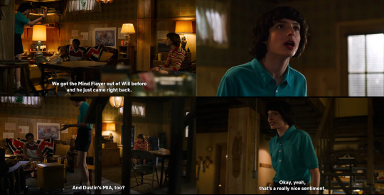
this is what we're used to in s3. the basement is actually a very open area. multiple windows, a windowed door leading out to ground level, big enough to have an adjacent bathroom. the basement is a big open space. there's lights on everywhere you can see all corners of the room very well and the light brown colour of the walls makes the room feel warm. but light is also coming through the slightly open curtains and big door-window. you have warm artificial light but also natural sunlight. it's the main hub of the party and feels cozy.
now look at s4:

the basement is dark as shit. it's daytime during both these scenes but they have an entirely different feeling. if you didn't know it was daytime you could also just assume it's night. we never once even catch a glimpse of the door with the giant window, it's kept out of shot deliberately. we only have one angle with a window even in frame and in it the curtain is now completely closed, the plant previously on the window sill is also not visible anymore.
the bathroom and under-the-stairs area is so dark it's almost impossible to make anything out back there. the shadows in this scene are absurd when compared to s3. there are no warm shadows in corners and cozy walls anymore, there's just dark behind and between the characters and you can't even tell the colour the wall has near the bathroom door in s4. the white lamp in the background also becomes a primary light source for once this season, by being center frame constantly + the added lack of sunlight in the scenes, which makes it feel even more uncomfortable and cold.
and if the shadows and odd lighting choices aren't enough. the entire space feels much heavier now. the dark shadows shrink the room away, the hidden windows and door make the room feel closed off and Actually underground, and on top of that, clutter is Everywhere which closes the already tight space even more.
Max is sitting far back in the darkness (because she's cursed and emotionally distanced from the others) so the gloomy lighting of the basement is clearly intentional here and not just a fuck up from the lighting crew. the basement is supposed to feel dark here.
-> somehow the basement lost it's calming open nature between s3 and s4. it's still the hub of the party but it feels less cozy than it once did, it feels closer to suffocating now.
4.) and characters are giving dialogue nudges to that change too
the general change of the basement, both in appearance and vibes is so apparent, but what if it's just supposed to be a fun background detail that we shouldn't pay closer attention to? - well, first of all, you should be paying attention to the sets of ST 100% of the time after what we know they hid before. the set designers really love their job there apparently since they keep putting their whole setussies into these backgrounds (sorry). but also secondly, both Max and Nancy actively comment on it and suddenly it's not only the set design but even the dialogue that vaguely gesticulates in the direction of what the sets are already telling us:
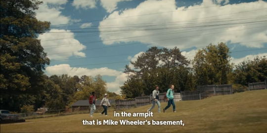

Max, despite having no problem with Mike's basement prior, now calls it an armpit. and Nancy goes out of her way to jab at Mike's (now) messy room by telling everyone it's looked worse before than the absolutely wrecked cabin.
the basement is in an absolute state in s4. both from the way it looks all the way to how the camera work and lighting portrays it. and even later dialogue points out Mike's messy state of living (both his room And the basement are a mess).
Mike's basement has been the central heart of operations since the first seasons and a has been a place of comfort and consistency all throughout. in season 4 it still serves that purpose, however, it's starting to look worse for wear now. it's function is unchanged, but you're able to see that something is different now if you actually pay attention or compare it with what's normal for it. (as s4 kindly tells us to do)
the set design on this show is absolutely amazing but this is really such a cool case of telling a story in the background. even without getting direct dialogue in s4 we can infer that Mike has been spending a lot of time in the basement, presumably also at night, doesn't bother to tidy it up along with his room, and that the general atmosphere of the basement has lowered.
Mike's general off-ness and state of mind are left unaddressed by the end of s4 despite the many nudges in it's direction we get both verbally and non verbally. and the basement is just another part of massive character work done entirely through set design and camera angles/ lighting choices.
#i love the subtle character work the show does to build foundations to their characters#same goes for all the movie posters and background details that show up seasons prior only to end up being Massive foreshadowing#i love set design and behind the scenes work but ST is such a fun show because of how much care consistently gets put into it#stranger things#st analysis#st4 analysis#mike wheeler#mike's mental health
290 notes
·
View notes