#robin's features were anime but her shape was very realistic
Explore tagged Tumblr posts
Visit Tumblr Blog
Explore Tumblr blogs with no restrictions, modern design and the best experience.
Last Seen Tumblr Blogs


Fun Fact
Mobile Tumblr US users spend an average of 4.04 minutes per session on the app.
Text
been drawing more and I get so frustrated, not with my skill level, but with my style. it's such a mishmash of so many things and it doesn't go well together at all and it makes everything look wonkier than I think anything else. My anatomy and posing and line weight and coloring and everything is not super high quality, but has significantly improved over the past couple years (imo at least and that's all that matters lol) and I know it will continue to improve the more I draw and practice!! but I have seen zero change in my style. It's this super unfortunate middle ground between realistic and anime and kind of cartoony and it doesn't work at all. And I cannot figure out how to change it
#brought to you by drawing robin yesterday and waddles today#robin's features were anime but her shape was very realistic#so it makes everything look wonky#and then waddles his hair is too anime and his face shape is too realistic and his eyes are like realistic that's trying to be anime#and it's is ugly and then his ears are like cartoony#idkkkkkkkkk. I just don't like it#this is the biggest reason I don't draw tbh#cause I will come up with ideas or poses or things that would be fun and I want to do!#and then the weird realistic/anime mix up hits and I just sit there and go >_> wat is that 😬#and I know that so I just never draw cause I know it will frustrate me#(I do know that I'd fix this and then get frustrated with something else lol. but right now it's the one I hate)
1 note
·
View note
Photo
Blacked out card for @barisifandomevents !
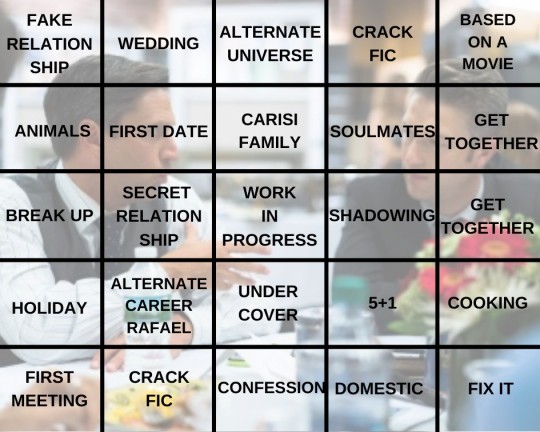
Fake Relationship: Dreams – Asmodesgold (M)
· Barba gets the flu. Carisi gets more than he bargained for. A sweet, soft fic full of longing and loving care.
Wedding: In Vino Veritas – etothepii ( E )
· A bachelor party, a wedding, late nights in the office, and confusion. One of my favorite fics of Carisi figuring himself out, featuring a lot of unique but realistic situations, tenderness and heat, angst, and hopefulness. A fandom must read.
Alternate Universe: The Primitive and Sanctified – Konigsberg ( E )
· Demons exist, unbeknownst to SVU… except the members counted amongst their ranks. This is one of my favorite stories of all time, and please don’t let the supernatural elements (or the fact this is sadly still a WIP) “scare” you away! The “monstrous” elements are used to perfectly capture characterization, and this is the most tender fic I’ve ever read. Makes you want to crawl into the soft, dreamy feelings and live there forever. Please give this a shot if you haven’t already; perfection.
Crack Fic: Overstepping – rellkelltn87 (M)
· A raid on a real-life mad scientist goes horribly wrong, and ends with Carisi “in a family way.” I never thought I’d see an mpreg story in this fandom that could come off so believable, but this author works miracles (in a much kinder way than her characters!) Part casefic, part romance, all suspense, don’t pass this one up, you will not be disappointed!
Based on a Movie: Do Monsters Dream? – bourgeois ( E )
· Shape of Water AU in which Sonny works at an aquatic research facility and meets someone special. Takes place in a timeline where we see Carisi struggling after the Tom Cole incident, heart wrenchingly portrayed through his losses, personal and professional, and his meeting of another lonely, imprisoned soul. Beautifully written, absolutely captivating prose, wistful, heartfelt and magical.
Animals: Yuletide by the Fireside – Juniperhoot
· First Christmas with a new love, and unfortunately a new, smaller paycheck. Tenderness, cozy domesticity, and the most adorable dog ever singing along to bad TV music numbers; what more could you want? If your answer was ‘thoughtful characterization’ – that’s here too!
First Date: Everything Seems a Little Bit Sweeter – rafaelbaseball, burgeois
· Barba is obsessed with a YouTube chef, and enters a contest to meet him for dinner. One of the earliest fics I was obsessed with. The whole series is lovely, and the actual date is so tentative and lovely it makes my heart clench. Barba finding himself not in the age group of Sonny’s fans is painfully relatable and a stroke of genius.
Carisi Family: A Healing Year – Adrianna_m_scovill (M)
· A year in the life of Barba and Carisi, in which Barba faces his insecurities and begins to heal, and to love. A fantastic story from start to finish, with top notch characterization and intense emotions, steamy sex, and everything in between. I chose this for my family fic not just because there’s a lovely holiday spent with the Carisi family, but because the fic also embodies how Carisi manages to make everyone in his life his family. Utterly captivating story from an author that always makes an emotional impact.
Soulmates: Choose To Be With You – Robin Hood
· Sometimes the person who has your heart doesn’t have your soul. Great take on the soulmates trope, heartfelt, heartbreaking, mature. Insightful characterization of both characters, but especially Carisi, who faces an impossible situation, and reacts exactly how I believe the character would do.
Get Together: Noche Sin Estrella – Lambnoire
· Casefic in which Barba is injured, and Carisi figures something out about himself when his protective streak becomes something more. A pretty much perfect fic; perfect characterization, strong and realistic casefic, recurring canon characters that feel true to themselves, whump that expresses the right amounts of terror without delving outside the scope of the show, and a slow burn journey of romance and self-acceptance that is meticulously paced, utterly realistic and hits every emotional mark flawlessly. Now that it’s back, make sure you don’t miss out.
Break Up: Every Time We Touch – OblivionCastro
· Soulmate AU where the touch of your partner gives you pain. A 5+1 fic, a soulmate fic, but mostly, a lyrically written story of enduring pain and enduring its loss. A wonderful metaphor for the agony of love and loss that brings me to tears every time.
Secret Relationship: Pink (& Other Promises) – leslielol
· Barba and Carisi fall together, and decide to keep it under wraps for a while; results vary. A common premise with uncommonly good prose. Vivid, lyrical language wraps around a soft story about affection, subterfuge, and acceptance. A very different look at Barba and Carisi than the author’s main fic, but no less enduring and amazing.
WIP: Much Farther To Go – nukablastr (M)
· The threats on Barba’s life have been declared a cold case, but Carisi decides to do some investigating on his own to protect the man he loves. This is the third part of a long series detailing the “missing” events in S17, and exploring beyond into “what could have been” if this major plot hadn’t been dropped. I added part 3 for the WIP, but recommend reading from the beginning. This story is expertly paced and plotted, and feels absolutely like it could be a piece of canon. One of the seminal works of the barisi fic fandom; read it if you haven’t.
Shadowing: Mind if I Sit Down? – Larkin21 ( E )
· Another episode tag based story from S17, featuring Carisi and Barba entering into a casual relationship behind the scenes. There’s not really many (or any!) full stories of Carisi shadowing Barba, but I was glad to be able to include this series, which features a full chapter on the shadowing episode. Again, I recommend reading the entire series, as it’s full of fantastically written plot and characterization, seamlessly weaving deep insights on the characters and blisteringly hot sex into the best seasons of the show. Another not-to-be-missed series!
Get Together: I’m gonna leave it all out there to dry – littleblacksubmarine ( E )
· Carisi is barely keeping it together, and Barba is waiting to be allowed to help; a story of depression, self-loathing, comfort and devotion told through incredibly poignant intimate and sexual encounters. An unusual depiction of a very dark Sonny, and a protective, self-sacrificing Rafael who’s there for him every painful step of the way. Amazing story that captures perfectly some very different aspects of the characters than we typically see, and still feels 100% true. This story has broken and healed my heart so many times.
Holiday: Pass Here and Go On – abogadobarba
· After the events of Undiscovered Country, Barba and Carisi reconnect, by chance, on a train of all places. Full of atmosphere, literary references, and some of the best prose in the fandom. This story is pure poetry, creating a tone of loneliness and longing, the sense of expanse and yet confinement that only travel can bring, and ultimately peacefulness and hope.
Alternate Career Rafael: In This Light – Astronaut_Milky (M)
· Barba is a photographer, Carisi is a model, both men destined to keep finding… and losing, each other. Beautiful, sexy story about two men whose jobs keep bringing them together, and tearing them apart, full of light and heat and beautiful people and beautiful imagery.
Undercover: Have You Ever Wished For An Endless Night? – minnesotamemelord
· Carisi goes undercover at a high-powered legal event, and runs into someone familiar. A look at Sonny getting to go undercover at a nicer event than we normally see! Well written characterizations, and some interesting contemplations on unique issues, such as Carisi’s opinion on wealth and the wealthy that felt so spot on I immediately felt they were canon. Also, poor Rafael; he has such terrible friends!
5+1: We Had No Haste – alwaysbuddy
· Carisi and Barba meet over and over in the most coincidental of places, but succumb to their own insecurities. Breathtaking story about two should-be fated lovers who continue to meet and connect over a multitude of vacations, but can’t bring themselves to reach for what they want, until they fear it may be too late. Gorgeous, atmospheric, romantic and sad, in equal measure, with an ending that’s happy, but still exudes a sense of so much lost time. This fic haunts my thoughts in the best ways.
Cooking: Sustenance – AhumanFemale, tiberius (E )
· Barba’s friends buy him a live-in chef for a time, so he can stop living on pretzels and coffee. Sweeping piece of art that exudes sensuality and the feel of time slipping through your fingers.
First Meeting: Here and Now – wormghoul
· Barba and Carisi meet, and have a whirlwind romance, at LSAT camp before being parted until they meet again at SVU. The imagery and language used in this story has stuck with me for a long time. Shockingly, wrenchingly accurate descriptions of the feelings of holding memories dear, “as a talisman,” and the devastating feelings of having them torn away from you by reality… but also the hope that they can be made anew.
Crack Fic: It’s Not Too Late/Gag Order – cupidmarwani
· Carisi has a superpower, and has reached the end of his rope. Carisi has seen too much, and has the power to burn it all down. Barba wants to save him, but has to face stark reality. Short, intense story about the toll Carisi’s job takes on him, and how he becomes one of the monsters that he used to fight. Depressing, heartbreaking, terrifyingly relatable, this is an overlooked gem.
Confession: Him. – keraunoscopia
· Carisi struggles with his sexuality and internalized homophobia, and seeks aid from the Church. Quiet, powerful, painful, and so, so beautiful.
Domestic: Daylight – cypress_tree ( E )
· Carisi stays the night for the first time and Barba sees him in the sunlight. Short, sweet, hot. What’s more domestic than two people in love, unwilling to get out of bed and leave one another’s presence?
Fix It: Good Morning – Kaye_21 (M)
· A threat to Barba’s life does not end well – repeatedly! Another “supernatural” style fic that shouldn’t be overlooked, even if it’s not your genre. Barba, stuck in a room with Carisi and a man out to kill them both, needs to figure out what is required of him to prevent their deaths, before he loses his mind. Fantastic character study. Terrifying, sad, sexy and hopeful. I chose this one for “fix it,” since as barisi itself could be considered a canon “fix it” or missed opportunity, and this fic itself embodies Barba himself finding a way to be that fix.
33 notes
·
View notes
Text
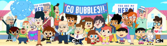
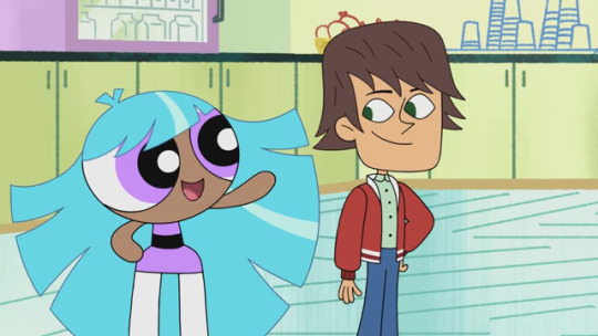
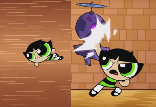
Saving the Day before Bedtime in Style: The Powerpuff Girls Then vs. Now
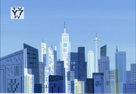
THE CITY OF TOWNSVILLE!
I remember growing up a little with The Powerpuff Girls, namely the pre-2002 episodes on CN and a promo for the show on my VHS of Animaniacs: Wakko’s Wish. That show is a part of my childhood. My sister had an Easy-Bake Powerpuff Girls “Cookie Makin’ Bake Set” and a Burger King 2002 figure of Bubbles. The length of the series’ run is now 20 years old, though the franchise as a whole is over 25 years old, if you count A Sticky Situation.
In the past, I watched little of PPG because I neither understood nor appreciated action at a very young age; the same went for Samurai Jack & Star Wars: Clone Wars (2003), though I did watch Star Wars: The Clone Wars (2008), which included a former PPG writer, Brian Larsen. Now, “Cartoon Cartoons” like @crackmccraigen‘s Foster’s Home for Imaginary Friends, Dexter’s Laboratory, Grim & Evil, Courage the Cowardly Dog, The Marvelous Misadventures of Flapjack, Ed Edd ‘n Eddy, Chowder... I grew up on those. I remember little about 2 Stupid Dogs (now officially available on MOD Disc DVD) and Captain Planet. I didn’t see the PPG marathon in 2009 with the final McCracken-produced episode so far, The Powerpuff Girls Rule!!! (my sister watched it, though). I began to return to PPG as I saw excerpts from the show on Netflix in late 2015, prior to the reboot. Tara Strong’s tweet of dismay, I think, was how I heard of the new PPG episodes.
The first time “Painbow” was encored (that is 2nd airing), during like 6 in the morning, I began to love Ms. Keane, their teacher, who’s voiced by Jennifer Hale (I knew her best for voicing Gladys, Billy’s Mom, in Grim & Evil / The Grim Adventures of Billy & Mandy, whose voice is nearly identical to Keane’s). What I love about Keane is that she’s sweet, somewhat perky but usually mellow, and kind, in addition to her voice, big blue eyes, and hair style, that I find to be attractive, but ultimately she is very nurturing to her students, like a mommy. Ms. Keane is why, in 2016, I became really into The Powerpuff Girls... and, including regard for the former CN Studios team, hyped for the return of Genndy Tartakovsky’s Samurai Jack (season 5, which featured Craig Kellman and other familiar creatives). However, though The Powerpuff Girls is my personal favorite of Craig McCracken and I grew up somewhat more on Foster’s Home for Imaginary Friends, I do feel that Wander Over Yonder is Craig’s greatest achievement as it excels at not only humor--both slapstick and... well... “modern”--but also some very important life lessons and ultimately the heart.
Now, many PPG fans were upset with the new episodes for many reasons that were, in my opinion, nostalgically incorrect. Personally, like many fans, I mostly prefer the former art styles of the series (specifically the 2002 movie and episodes, as well as the following designs by art director Paul Stec and character designers Carey Yost & Stef Choi) but I also highly admire @cheyennecurtisart for adding more defining details to our favorite crime-fighting and now ex-kindergarten students (and also for designing my other favorite woman, Star Butterfly, whose title show @crackmccraigen, creator of The Powerpuff Girls, wanted to produce for CN). The main reason for the hate is apparently that the new actresses replaced the former ones for the title characters. They are fairly good voices, but I still prefer the former, namely Tara Strong as Bubbles (No offense, Kristin Li, but, to me, it feels impossible to turn down Tara’s acting). Natalie Palamides as Buttercup is probably the closest-resembling to the original voices, but she still stands out differently; likewise Ms. Keane’s voice, though akin to the voice direction of Jennifer Hale by Craig McCracken and later Colette Sunderman, also has an accent that stands out, while Tom Kane is generally true to the nature of Utonium’s voice. Of course, once the casting and/or voice direction changes, maybe Cavadini, Daily and Strong will return. Also, E.G. Daily said in an interview that Cavadini, Daily & Strong originally did record for, I believe, Escape from Monster Island, until someone else replaced them; if bonus features exist on future season releases of the Jennings-Boyle PPG episodes, then an original dialogue recording track for the episode should totally be on it.
WHAT LOOKS DIFFERENT ABOUT THE POWERPUFF GIRLS?
Another reason for dislike from PPG fans is all about the art direction. Although @eusong Lee worked with Craig Kellman on Storybots and current art director Roman Laney designed and painted backgrounds for Craig McCracken’s Wander Over Yonder, their art direction resembles that of a more streamline, smooth, round, futuristic, not-so-cartoony look contrasting with the simplistic, storybook-like art direction of Craig Kellman, the cartoony but simple art direction of @donshank, and the defining and Hanna-Babera like art direction of Mike Moon, Paul Stec and Sue Mondt. The buildings in the Jennings-Boyle episodes are more straight, detailed and lineless, whereas the former designs were more extreme and exaggerated with building shapes.
Comparing the designs above of Andy Bialk & Stef Choi (whose designs were of many shapes and sizes; former monsters had sometimes simple but also very wild designs)...
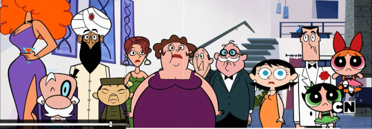
...with those of Alan Stewart & Steve Lambe and Dean Heezen & Carlos Nunez reveals great contrast. The character design of current Townies, like the backgrounds, are more round-edged and of more simplistic, specific shapes and sizes. The monsters are different too; props are more realistic and explosions usually look simpler and more streamlined, round-edged, etc. Also, character & prop outlines aren’t really thick, which many CN/H-B cartoons are know for having. As the current designs from Memory Lane of Pain show, the Mayor and Robin Schneider are seen, along with an elderly woman who looks similar to the usual one in former episodes and a kid who somewhat resembles Mitch; next to those 2, there’s also a big guy whose model appears... shrunk for some reason.
Now, some Season 8-9 designs look a little more familiar, like the disguise character of an alien in Never Been Blissed, Locan Logan. He looks fairly akin to the works of Craig McCracken. Could the alien be disguising himself as Mac (from Foster’s) at an older age?
Not belittling @cheyennecurtisart‘s contributions, character designs developed for The Powerpuff Girls Movie are some of the finest ever done for the series, lead by Carey Yost; these designs were eventually implemented into the series, supervised by @andybialk and Chris Reccardi and designed by Stef Choi. Ultimately, though, @cheyennecurtisart and Carey Yost plus Andy Bialk (2002-2004 only for the latter two), did my favorites.
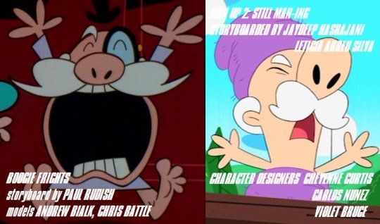
As you can see here, Man Up 2: Still Man-ing was the one of the few current episodes where the Mayor’s mouth is visible... but it wasn’t the first time. Paul Rudish storyboarded the Mayor with his mouth for transition in Boogie Frights; some official models of him (as well as a comic book cover) show the mouth as well. It’s unorthodox, but honestly I’m not hating on the new creatives for that. In most of the episodes excluding Man Up 2, it’s probably a mistake, since in those episodes he also does the mustache lip-sync thing he tends to do.
On the bright side regarding nostalgically correct art direction, the Pokey Oaks flashback in The Wrinklegruff Gals (art direction by Eusong Lee) was very true to that of Paul Stec (I’d think that Ms. Keane’s in the first shot, but these shots are 1.78:1 and not “letterbox” widescreen like the DVD covers of most CN shows in the last decade claim them to be in). They included students Mitch Mitchelson, Elmer Sglue, Robin Schneider, Harry Pitt, Suzie Jenkins, and Clara (the African girl in purple dress, called by Ms. Keane in ’Twas the Fight Before Christmas; in other episodes Jennifer Hale voiced her and the other dark-skinned girl in a pink dress). The new art creatives were so good at that, that I wondered if they’d contribute to season 5 of Samurai Jack. Speaking of that, the series finale of Samurai Jack, EPISODE CI (as did EPISODE II and Comic Issue 19), referenced The City of Townsville with the city of dogs that Jack saved! I also recently noticed a background from The Powerpuff Girls Meat Fuzzy Lumpkins in Aqua Teen Hunger Force, cleverly called “Powerpuff Mall” (tweeted here), and the episode “Universal Remonster” features a PPG with a mohawk on a Spring Break Cancun shirt!
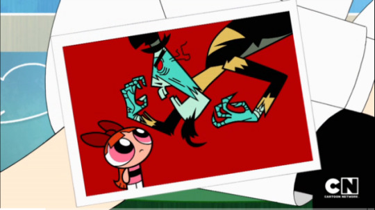
Also, there’s the reference to Abracadaver in Memory Lane of Pain, where Blossom realizes how different she looked then and a re-orchestration of the PPG’s theme plays in the background, as in the new intro itself. The shot in reference is a digitally traced, cleaned-up version of a shot with models by Andy Bialk & Chris Battle.

Relatively, former character designer @chrisbattleart designed for the PPGs in the Teen Titans GO! episode “TTG vs PPG” which were true to the improved designs of @cheyennecurtisart...
...though they sometimes resemble the pre-2002 models, which he reflected in the last Craig McCracken-produced episode, The Powerpuff Girls Rule!!! As with both specials, the PPGs have thick outlines & black-colored mouths and are in model-rigged or “puppet-ed” animation.
Also relatively, Wander Over Yonder, which referenced both PPGs & Samurai Jack, featured @lambebeardo, who storyboarded the PPG-referencing episode The Boy Wander, who did some character design on season 8 PPG episodes.
The new theme song implements the general PPG theme within, as I said before, but there’s more nostalgia than that: the extended version of the current intro/theme song, “Who’s Got the Power?”, opens up like the original intro, with the original Tom Kenny narration, score and certain sounds. “Sugar, Spice, and Everything Nice. These were the ingredients chosen to create the perfect little girl, but Professor Utonium accidentally added an extra ingredient to the concoction...” Yes, except that Utonium didn’t break the bottle of CHEMICAL X by throwing his fist in success, though; Mojo rammed him into it. That is an error of continuity, which some episodes have, namely The Power of Four (regarding a rival of Utonium, Netronium, creating the perfect little boy)... though there is one thing that that episode did right...
TV PUPPET PALS PUPPETS! These character originally appeared in a few episodes like Mommy Fearest, and were created by either Genndy Tartakovsky and/or @crackmccraigen for The Justice Friends, whose pilot was about TV Puppet Pals. Once again, some nostalgia is preserved; thanks to Prop Designer Nathan Alexander Rico (and/or the act’s character designers/storyboard artists)!
In case no one noticed: I refer to the current seasons of The Powerpuff Girls, produced and directed by Nick Jennings & Bob Boyle, as the 7th, 8th, and 9th seasons, since, to me, it’s still the same show; despite different art direction and other styles. The other reason is that some episodes did call back to former events, like I said about Memory Lane of Pain.
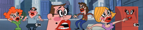
Another thing that seems to be lacking in The Powerpuff Girls is the visually cartoony stuff. Memory Lane of Pain is the only episode to use a “pow” cloud as the Rubber Bandit streaks out of a shot. This was common in earlier episodes, often accented visually with words like “POW”, “ZIP”, etc. In most current episodes, characters run out of a shot more realistically.
WHAT’S WITH THE ANIMATION?
Additionally, most of the animation direction, though still with Robert Alvarez, Randy Myers and Richard Collado, is pervasively slow-paced, compared to the pre-2016 episodes, namely those of seasons 5-6 and, of course, The Powerpuff Girls Movie, on which Genndy Tartakovsky was the main animation director. Unlike most current CN Studios programs, however, Samurai Jack season 5 did its “sheet timing” very well, particularly in EPISODE XCVIII and its scene of Ashi owning a whole army of orcs (Sheet Timing by Rob Renzetti & Robert Alvarez; storyboarded & written by Bryan Andrews & Genndy Tartakovsky).
As with that and most CN Studios programs, both Samurai Jack and The Powerpuff Girls have animation that is checked by CN’s Sandy & Julie Benenati. Speaking of creatives still involved, there’re at least 25 people still working on The Powerpuff Girls just as they did decades ago... including @joltumblingart, a former BG/Prop designer! At least us nostalgia-craving fans can appreciate that! (By the way, if you crave classic CN Studios projects, you can watch the ENTIRE series of Samurai Jack here!)
WHAT OF THE NEW GIRLS AND GUYS ON THE SHOW?
Now, I can say that some of the new creatives could serve The Powerpuff Girls well:
Character designer @cheyennecurtisart did designs for Star vs. the Forces of Evil; the show’s art direction (namely season 1/Joshua & Justin Parpan, but also including Israel Sanchez, who all worked on Wander Over Yonder) is similar to the works of @crackmccraigen and closer to the Mike Moon / Paul Stec styles I prefer, specifically elements of background/location design and character design. Some designs of Princess Bluebelle in the Emmy-winning episode Once Upon a Townsville seem to resemble the looks of Star Butterfly. Also, SvTFOE location designer Larry Murphy did background design for PPG episodes “Save Mojo” and “Substitute Creature”. A number of creatives from SvTFOE should work on current PPGs too, regarding art direction/design/storyboarding action, in addition to former creatives involved with Samurai Jack (including season 5) and Paul Rudish’s Mickey Mouse, including clean-up artist king Robert Lacko. Relatively, SvTFOE location designer @peteremmerich served as the art director on Netflix’s Harvey Street Kids, whose background design is very much like the PPG locations under Paul Stec’s art direction.
Character designer @lambebeardo did storyboards for Disney’s Wander Over Yonder, created and executively produced by @crackmccraigen, as mentioned before, including “The Boy Wander”, which ends ala “The Day is Saved!” segment. There’re 2 specific creatives for a season 7 (or, in reboot terms, season 1) PPG episode...
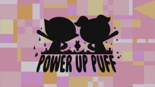
Power Up Puff features storyboard artist Roque Ballesteros, who storyboards for Star Wars: Forces of Destiny and did animation/layout on CN’s Enter Mode 5 at Ghostbot. One could compare that to Bryan Andrews who did storyboards for Star Wars: Clone Wars (2003-2005) at Cartoon Network Studios, where Power Up Puff was produced; Brian Larsen, who worked with Bryan Andrews, also did storyboards for PPG and Samurai Jack, as well as (the non-Cartoon Network Studios) Star Wars: The Clone Wars (2008-2019)...
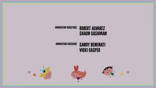
...and then there’s animation director Shaun Cashman, who did animation/sheet timing for another CN Studios original, Genndy Tartakovsky’s Sym-Bionic Titan. Cashman also supervised the timing on Disney’s Star vs. the Forces of Evil and produced Grim & Evil AKA The Grim Adventures of Billy & Mandy for CN. I think that there’s some good animation timing in Power Up Puff, which’s rare due to the way CN Studios and SMIP do the animation these days.
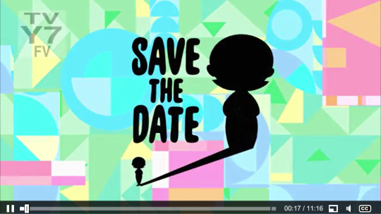
One episode I intend to note here is Save the Date, which’s about Ms. Keane, as was Keen on Keane. A few aspects on design are covered below. One is about the title cards as shown above (which uses props/characters to reflect the episode’s subject/theme) and below.
These cards swipe to the right, rather than having the PPGs beam by and then reveal the storyboard artist/writer and art director. Originally the text was still, until after the movie and they’d zoom in slowly, not italicized and even glowing the tiniest bit. Also, some of the writers aren’t storyboarding, and the art director’s listed on the credits.

Lastly, of course, every single episode is directed just by Nick Jennings and Bob Boyle, aside from a supervising director. Can’t someone from Samurai Jack, Wander Over Yonder, Star vs. the Forces of Evil direct instead? Often, an animation director like Robert Alvarez or Randy Myers would direct The Powerpuff Girls, Samurai Jack, Grim & Evil, etc. For that matter, someone on the show should get, like, Genndy Tartakovsky (currently at Sony Pictures Animation) to direct. High-octane action and slapstick are a big part of his direction.
Since the Season 7 episode People Pleaser, @deanheezen is the main character designer, in place of @cheyennecurtisart; @carlosluisnunez still contributes, but usually Dean Heezen or Gordon Hammond (and sometimes Steve Lambe and Alan Lambe) are the only designers for an episode. From the episode Save the Date onward, Ms. Keane has only one bang, when she usually has 2, though there is one shot in Keen on Keane where she has one bang, (in various shots of the episode, she has 3 bangs).
In Save the Date, Ms. Keane’s fashion is different from hers in Keen on Keane, which was modified in Octi-Gone. Also, Keane didn’t walk well in high heels in Save the Date, unlike Keen on Keane.
Pertaining to certain fashion, like Keen on Keane, more of Ms. Keane’s body shape is exercised, namely on her legs. Unlike Keen on Keane Ms. Keane’s calves aren’t as obvious if [one of] her legs are straight. Usually, her legs appear shorter as well... kind of stubby, which I think is cute. In some shots in Save the Date, Ms. Keane’s hands are sharper-looking, as were the designs by Carey Yost and Stef Choi.
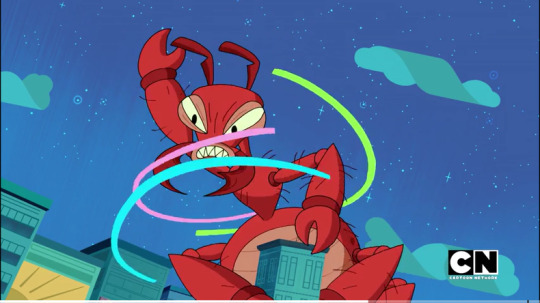
Relative to both animation and design, compare Ms. Keane fighting the giant, radioactive ant in Save the Date with the aforementioned sequences in Samurai Jack EPISODE XCVIII:
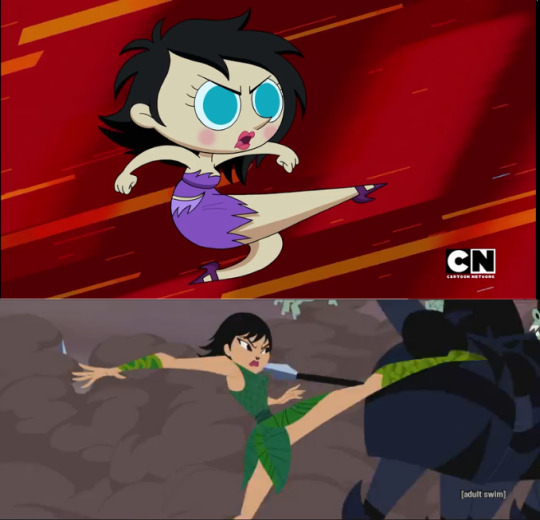
Now, in these 2 shots, you can see more detail to the design/form of the legs in action. If Carey Yost did the designs of Ms. Keane like those they did in Keen on Keane, the look and form to Keane’s legs in action would appear maybe somewhat stylized, but far more realistic.
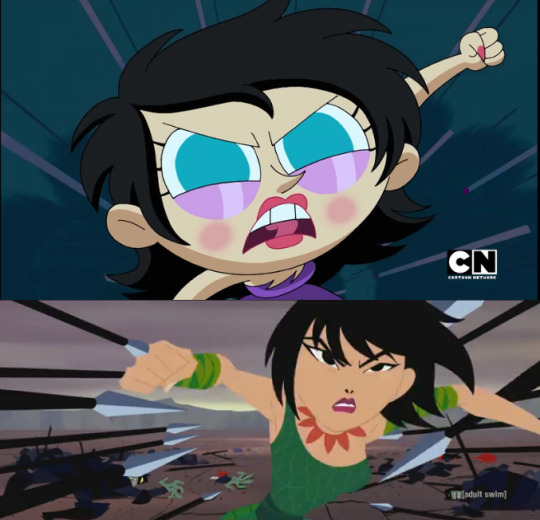
In the fight in Save the Date, there’re a few pieces of fast-paced animation, but only a few as, like I said before, animation in CN shows these days are usually slow-paced. In Samurai Jack, of course, there’s much balance between both fast and slow-paced animation which helps convey more realistic (and intense) action. Robert Alvarez was an animation director with Sherri Wheeler (supervising) & Randy Myers for Save the Date and did sheet timing with Rob Renzetti for Samurai Jack EPISODE XCVIII.
Now, like Samurai Jack, Ms. Keane here shows good form in an action pose. The lines in the PPG shot are similar to the shot of a falling catapulted rock in Samurai Jack EPISODE III, too.
Relative to Samurai Jack EPISODE XCVIII, the Dexter’s Laboratory episode Dexter Dodgeball has a very nice sequence of well-timed, balanced traditional animation including much fast-paced animation; Dexter’s hair animates somewhat as well. In addition to being filmed and animated with cels, the timing/animation direction gives to moments of this scene movie-level quality of traditional animation. “Additional Animation Direction” is claimed to be done by Robert Alvarez, @crackmccraigen and Rob Renzetti.
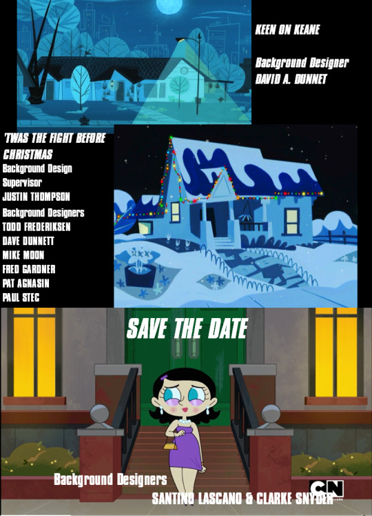
Ms. Keane’s homes vary in the series: Dave Dunnet designed 74A in Keen on Keane and another house in ‘Twas the Fight Before Christmas, while Santino Lascano & Clark Snyder revealed a much bigger home for her in Save the Date.
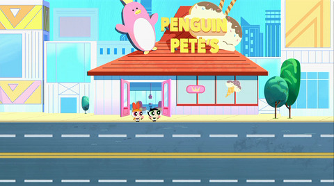
Speaking of location, current episodes have new places like The Snooty Rose and Penguin Pete’s...
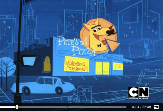
...but what about Pete’s-a Pizza, Malph’s and La Donut King Donut?
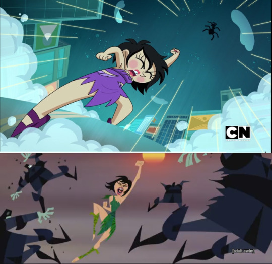
One interesting thing to note about Save the Date is a matter of size (this’s also the first time in the entire series that sweet Ms. Keane cries). Of course, she’s not the only one with concerns of size.
The PPGs themselves were made to be giant by Mojo Jojo, too, in What’s the Big Idea?, one of the last McCracken-produced episodes (and starring @donshank as a protest leader. He’s the Townie in that fallen building).
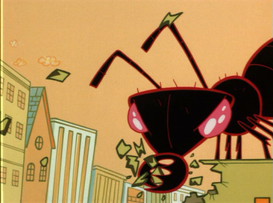
The other thing notable about this episode... “WHAT ABOUT THE GIANT ANT” in Bubblevision? Of course, that was a different ant that looked more realistic and just gnawed on stuff at random, but I like that more. The giant radioactive ant in Save the Date was only pushed back by the heat ray of the PPGs, but in Bubblevision the giant ant totally burned up.
One thing I don’t like about the credits--aside from lacking BiS’s popular hit, The Super Secret City of Soundsville Song, which’s the PPGs’ End Title [Theme] Song--is that they don’t specify the voice of the episode’s lesser characters (such as “Todd”, who kind of sounds like Tom Kenny... just a hint of Commander Peepers in his voice). Of course, Samurai Jack season 5 sometimes did this too. Typically, they don’t credit sound designers or foley artists/recordists, either; at least The Powerpuff Girls Movie gave credit to Joel Valentine and his team for Sound Creation and Design and foley.
Now, there’re approaches to character design in current episode that I do enjoy. In this shot from Buttercup vs. Math, Blossom recoils from intense emotion with a very funny yet simple face.
Prior to that, of course, the former emotions are also very wild and creative...
...but that doesn’t mean that Andy Bialk, Carey Yost & @chrisbattleart didn’t do that either (though rarely), as this shot from A Very Special Blossom proves. Art Director @donshank and Models guy Carey Yost, like many great CN Studios creatives, were formerly involved with Spumco, particularly on The Ren & Stimpy Show, which could account for this wild, somewhat detailed design.
Unlike most of Craig McCracken’s former works, except for Wander Over Yonder, character reactions in design weren’t usually as exaggerated as they are in the new PPG episodes. Such design extremes tend not to apply to Ms. Keane as she’s rather mellow and more realistic with emotional reactions, and usually not in grave danger or needful otherwise, compared to another woman designed by Cheyenne Curtis, Star Butterfly, who tends to be highly poignant with emotion (in most ways I love her more than Ms. Keane because Star’s been through a lot, needful and emotional).
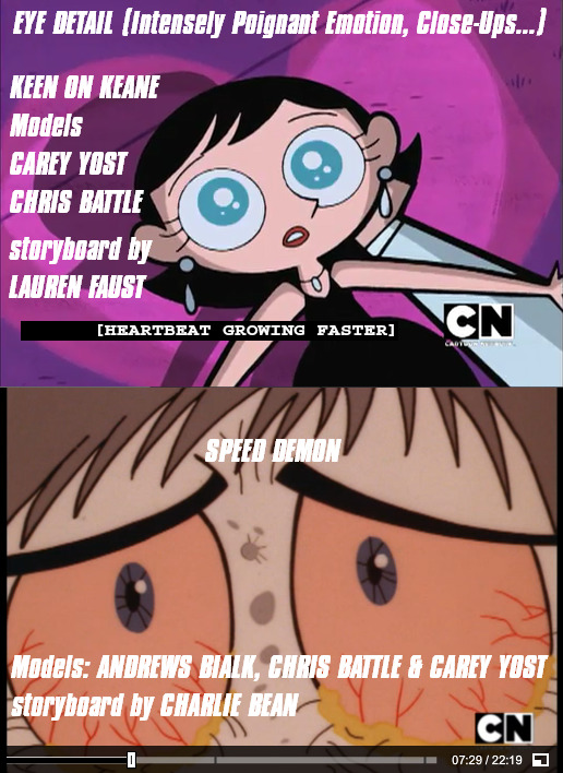
In very rare cases, though, like these shots in Keen on Keane and Speed Demon, Ms. Keane shows catchlights in a closeup, which may contribute to either intensely poignant emotion and/or close-up detail (including lighting). Her look in Keen on Keane (Carey Yost) does suggest a needful emotion, but not too exaggerated.
As I said before, I don’t care for the current art direction as much, except for @cheyennecurtisart‘s part; eventually Dean Heezen took over until Gordon Hammond started doing all of the character design, which aren’t really much different. Some others don’t like the designs currently with The Powerpuff Girls, including one artist who decided to re-design and re-animate the promoted scene from Man Up. The designs of the PPGs look very much like the SSN 1-4 models, and the rest vary; some resemble Andy Bialk/Stef Choi or Stephanie Ramirez. The backgrounds are very detailed but similar to the original art direction.
Tom Kenny’s famous, lovable narration that began and ended all pre-2016 episodes has been absent in most current PPG episodes (except for a few, like Painbow, Little Octi Lost, and Fashion Forward). Even worse is a talking snowman voiced by Maurice LaMarche narrating instead--and on-screen--which is one of the major crimes to The Powerpuff Girls in their second Christmas episode, You’re a Good Man, Mojo Jojo. “I BEGIN AND END EACH EPISODE OF POWERPUFF GIRLS, ME, THE NARRATOR!” he claimed at the end of Los Dos Mojos. Next to Scaramouche, Spongebob and Commander Peepers, his narration on The Powerpuff Girls is one of his finest and most memorable roles.
Also missing are more familiar and specific Townies like the Chief of Police, the Pokey Oaks students (excluding the flashback scene), Floyd & Llyod... Also, since Chuck McCann died, I wonder who’d voice the Amoeba Boys now. Perhaps former creative Lou Romano could, since he was their original voice in the pilot/Craig’s student film A Sticky Situation. Some creatives and production staff on the show made cameos, namely @donshank (voiced first by Tom Kenny and then Shank himself), who, himself, served as a supportive character in What’s The Big Idea? leading a protestant group against the PPGs. This Easter egg is rare in cartoons these days (though a recent Teen Titans Go! episode put @chrisbattleart and other creatives in a city crowd), but the episode Electric Buttercup implemented creatives like @cheyennecurtisart, Nick Jennings & Bob Boyle, Kyle Neswald, and others in “THE ROCK & ROLL HALL OF SHAME��.
In general, the approach to sound design on the show is a bit quieter but uses more Disney sound effects and other typical Hacienda Post sound design, as well as aural gags thematically associated with noting a certain subject (e.g. a cash register opening and ringing accents a thematic element pertaining to the Monopoly-esq game in Rainy Day, as money is a relative/thematic element). Although Hacienda Post (namely the team) has always been involved with the series since 1998, the original “Sound Creation and Design”, debuting on the episode Crime 101, was by Joel Valentine (Samurai Jack, Big City Greens, Wander Over Yonder), one of my favorite sound designers, who was only credited on The Powerpuff Girls Movie; episode credits would mention only Twenty-First Century Entertainment, Inc. for “Sound Editing”, though they obviously did sound design and foley too. Whether or Joel or all Hacienda, foley members are usually uncredited on the show, yet they bring our favorite Townies to aural life. Joel used his funny little castanet sound to accent many emotions, and the “SINGLE MAGIC WAND HIT” among other sfx to accent the PPGs beaming away. The classic H-B/Universal explosion often accented big feet, impacts and explosions, as well as the original title reveal in the intro; Joel would use some more tweaked variants of that sound too, and, next to Skywalker Sound, Joel is the only one whose consistent use of that sound excuses the general cheesy nature of that sound. Of course, in my opinion “ROCKET LAND SPEEDER: START AND AWAY”, which often accented the PPGs flying (usually for relatively fast/increasing speeds), seemed particularly exaggerated, but Hacienda Post seems to avoid overusing that.
Also, the music style often is more pervasive compared to former episodes, and Mike Reagan did some very nice cartoon-y music, like in the beginning of Rainy Day, though the style feels different from that of Thomas Chase & Steve Rucker in episodes like Pet Feud. The stylized sound of horn sections and strong techno beats in the score by James L. Venable (AKA “DJ Avalanche”) are very cool but aren’t so common in the current episodes, though respectively the action doesn’t live up as well as former episodes, like Live and Let Dynamo.
Near the end of this post, I note that I found great value in The Ren & Stimpy Show as many creatives on it/at Spumco worked on The Powerpuff Girls, Star vs. the Forces of Evil, Samurai Jack, Spongebob Squarepants, The Iron Giant, The Twisted Tales of Felix the Cat, Adventures of Sonic the Hedgehog, and many other great animation, including a gem of a Cartoon Network “Minisode”, Buy One, Get One Free*. My love for the work of John Kricfalusi/Spumco boosted with [adult swim]’s airing of the Yogi Bear/Ranger Smith episode “Boo Boo Runs Wild” on August 13th, 2016 A.D.
To conclude: The Powerpuff Girls is an iconic show that deserves to still have some design that feels signature to it, over 25 years after the pilot, @crackmccraigen‘s CalArts student film A Sticky Situation (originally with a mildly profane name for the trio, though Paul Rudish came up with their official name). In my honest opinion, there’re 5 original people whom I wish and pray would contribute to The Powerpuff Girls again: Carey Yost (with or without @chrisbattleart), Tara Strong, Dave Dunnet (with or without @shinypinkbottle), and at least Joel Valentine. Honestly, regarding Star vs. the Forces of Evil, I hope and pray that Joel Valentine, Genndy Tartakovsky’s band of excellent writers/storyboard artists, and even @crackmccraigen could/would contribute to that franchise’s future media. Additionally, the new creatives in season 5 of Samurai Jack, like Dustin d’Arnault, David Krentz, @stephendestefano and Amanda Qian Li, should contribute to these shows too. Again, I also suggest that the former voice of The Amoeba Boys, Lou Romano (in A Sticky Situation), should replace the late Chuck McCann. While Craig’s first words to me suggest that he may not return, more or less, to PPGs, still at least members of his team deserve to, and who wouldn’t want to come back? Meanwhile, at least Craig’s working on new stuff to be announced, including Kid Cosmic for Netflix.
I leave you with not only a petition image to suggest ways to bring nostalgia back to our favorite kindergarten crime-fighters, but also IMDb lists of appropriate creatives for future media of PPG, future media of Dexter’s Laboratory, and even future media of Samurai Jack (pre-Season 5 events to fill a more or less “50-year” story gap). Spread the petition (and/or IMDb lists), and perhaps our childhood days will be saved--thanks to fans like you! GO, POWERPUFF! [z, z, z-z-z-zuuu...] *cue H-B swirling star* (also a Tumblr post)
#powerpuff girls#ppg#cartoon network#craig mccracken#genndy tartakovsky#nick jennings#bob boyle#ppg reboot#nostalgia#nostalgic#cheyenne curtis#cartoon network studios#hanna barbera#hanna barbera cartoons#dean heezen#chris battle#carey yost#stephanie choi#stef choi#andy bialk#andrew bialk#jennifer hale#character design#art direction#ppg 20th#powerpuff girls 20th anniversary#the powerpuff girls 20th anniversary#james l venable#thomas chase#steve rucker
14 notes
·
View notes
Text
Exercise: The History of Illustration - E. H. Shepard and Dave McKean
E. H. Shepard (1879 - 1976) began his career illustrating editions of Aesop’s Fables, David Copperfield by Charles Dickens and Tom Brown’s School Days before drawing cartoons for Punch, a popular satirical and comic magazine. During the First World War, in his thirties, he served in the trenches and for military intelligence, recording enemy positions with his illustration skills. After the war, Shepard continued to work for Punch, for a time as Head Cartoonist, before being removed by the new manager in 1953.
Whilst at Punch, E. H. Shepard was introduced to A. A. Milne by a colleague and established a productive working relationship, E. H. Shepard providing the iconic illustrations for the Winnie-the-Pooh series, which were used as a basis for the classic Disney movie. Shepard also illustrated Kenneth Grahame’s The Wind in the Willows. For the purposes of this exercise I’ll focus on E. H. Shepard’s Winnie-the-Pooh illustrations, as they are the best known of his work and there’s a large pool of work there to analyse.
Dave McKean (1963 - ) is an artist, illustrator, photographer, musician and filmmaker. His career began in 1986 when he met author Neil Gaiman, and the pair published several smaller comics together before the highly successful The Sandman series was released, which brought McKean and Gaiman properly into the public eye. McKean also illustrated DC’s Arkham Asylum. Since then he’s published numerous comics,illustrated several more Neil Gaiman works including Coraline and The Day I Swapped My Dad For Two Goldfish, illustrated books by S.F. Said, David Almond, Steven King, Ray Bradbury, Richard Dawkins and many more. He’s designed album covers and promotional artwork, produced concept artwork for major feature films and directed MirrorMask, written with Neil Gaiman from 1998 and released in 2005.
Did the work of the illustrator you chose seem old fashioned? How?
Shepard’s illustrations for Winnie the Pooh have a classic, literary feeling, reminding me of the pen and ink style I’ve seen in illustrations for Sherlock Holmes or The Secret Garden, however with a bit more of a sweetness and cosy humour, a bit more playful and cartoonish than those more representational images. I feel like Shepard’s style fits the books and characters very well, with their reassuring combination of more grown up thoughtful-ness/ character observation and gentle humour reflected by the “classic” pen and ink style and “cartoonish-ness” where the lines become less representational and more humourous. When I read the books growing up, the illustration style made me feel like they were somewhat serious and mature books for me to read, which made me feel accomplished. They feel quietly enticing like doodles in the author’s notebook, as if you were being read the stories directly by the paternal voice of A. A. Milne and being given an inside look. The landscape of the Hundred Akre Wood is relatively realistic, somewhat sparse and scrubby, so feel more relatable and familiar than a big colourful jungle - you could meet the characters in the trees at the bottom of your garden.
“I was able to draw many of the places with the comfortable feeling of - it really happened here-” E. H. Shepard on creating studies from life at Ashdown forest to consolidate into the finished Winnie the Pooh illustrations.
What attracted you to the work of your chosen contemporary artist?
Dave McKean’s artwork is highly textural, feels cinematic, can feel both bleak and stark or warm and intimate through specific lighting and colour choices. I love his combinations of rich colour and texture with deep black shadows or scratchy black lines, this is something I love producing in my own artwork. His illustration work and faces feel very sculptural and influenced by his 3D work, like masks but also sensual. There’s an off-putting, distant feeling by the mask-like nature, but intimacy from warm skin tones and fleshy shapes. Cinematic feeling from almost theatrical lighting and texture, cartoony feeling where the text requires more comedy with the scratchy lines and wacky shapes and expressions.
I picked McKean’s illustrations of Neil Gaiman’s The Wolves in the Walls to focus on for this exercise because I thought the comparison with E. H. Shepard’s work would be interesting. Both works feature anthropomorphic animals and relatable childhood experiences (playing with soft toys, being scared of monsters hidden in your house) but the nature of the animals is far darker and chaotic in The Wolves in the Walls, and I feel like the multifaceted, abstracted mixed media artwork reflects this mood.

Sometimes the wolves are completely abstract; mad and dark shapes, they warp and twist, especially when Lucy is at the bottom of the garden worrying about what the wolves will do to her puppet pig. When she enters the house to save her pig, the wolf she sees in reality is white and hairy, a living, sleeping, solid animal instead of a twisted demon. Having faced the reality of her fear she feels braver and encourages her family to take back their house from the wolves. Something I think is really clever is that the wolves don’t lose all their character and become docile cute and fluffy, they are more realistically drawn/more grounded than before and white instead of black but still wacky and scratchy and cartoonish, just the nature of that abstraction has changed. Now having taken over the house, they’re more force of mad chaos instead of a dark ominous threat and feel more comical and cathartic than terrifying.

How did each artist produce their illustrations, what tools and materials did they use?
E. H. Shepard began his illustrations by making pencil studies from life in the countryside of Ashdown Forest, the basis for The Hundred Acre Wood. He’d then take these home, make thumbnail sketches to develop his ideas, then trace from his studies to compose his final images. He would “drop in” the characters on top of these scenes, drawn from imagination but originally based off the real life Christopher Robin and his toys, along with Shepard’s son’s bear Growler as the eponymous Winnie-the-Pooh. Then Shepard would ink over his pencil lines with a nib pen, later adding simple and bright watercolour washes when the books were later published with colour illustrations.


Images from The Art of Winnie the Pooh by James Campbell
In keeping with the technological advances of illustration since Shepard’s days, Dave McKean uses a more technologically based approach to create his illustrations, and uses a wide selection of media. On his website FAQ he writes “I use whatever is appropriate for the job. If the story needs close storytelling and a light, simple style of narrative, then probably pen and ink, or brushpen, or pencil would be best. If the story needs a more symbolic approach then maybe collage, or paint, or digital. It all comes down to the emotion and atmosphere you want to convey.” For The Wolves in the Walls he uses a mixture of traditional and digital painting for the humans, scratchy, powerful traditional ink lines for the feral wolves, and photography and found textures to construct objects such as the puppet pig, father’s tuba, mother’s jam and walls and fabrics of the house. Natural forms like plants and fire are totally digitally painted; little abstract elemental flourishes occasionally dotted in. All these parts are compiled and layered together digitally in Photoshop, reminiscent of Shepard’s method of compiling several sketches into one piece by tracing.


2 notes
·
View notes
Text
(FMP) Animation research
The first animator that comes to mind is a man called ‘Don Bluth’ he is one of my favourite animators of all time and in my opinion the man that defined traditional animation with strong story telling for many years. He used to work with Disney full time in 1971, which he helped produced Winnie the Pooh And Tigger Too, The Resurcures and even directed Pete’s Dragon.
Don Bluth Bio: Don Bluth was born in September 13 1937 and spent a bit of his life in ‘El paso’ In Texas. When he grew up to be 6 years old he and his family moved to Payton in Utah. He then lived on a family farm in which he worked. His personal quote on his experience of this is “milking 24 cows morning and night and singing Disney songs" Though he was "honestly dreaming of working" at working at Disney.
He first experienced his first Disney film at the age of 7 in which his first Disney movie was ‘Snow White’ he was so impressed with the film that when he arrived home and drew the 7 dwarfs and also Snow White.
In 1954 he and his family moved to Santa Monica California he studied at Brigham Young University. When he finished, he showed his portfolio at a Disney Studio in Burbank. He was hired in 1955 to be a assistant animator and worked on Sleeping Beauty. He also worked as assistant to John Lounsberry, he however left in 1957 to pursue his dream. In quote "I left, I think, because I found it kind of boring. I didn't want to do it”
He then worked at Disney again as a assistant again for the animated movie called ‘The sword in the stone’ In 1967 he worked at a company ‘Filmation’ however he wasn’t that satisfied, so he left and said by quote “"I realized that all of that industry out there was really making trashy art that wasn't good for kids to look at and eventually ended up in the trash can anyway. Everything was for money; nothing was for art,"
So he then said "I grew tired of that and said, 'Well, if I'm going to do this for a living, why don't I go back to Disney because they do it right." So in April 1971 he joined Disney and joined their training program of animation, who was the first to reach the highest rank of being an animator. His first project as a animator was Robin hood and other he worked on other animations. (The rest are above)
Around the 70′s 3 people called ‘Garry Goldmen’ ‘John Pomeroy’ and of course Don Bluth realized that they had animation talent and decided to co create the company ‘Sullivan Bluth Studios’ also know as ‘Don Bluth Productions’ Which they finally created their first animated film called ‘The sercet of NIMH’ Which was created the traditional way of animating. Which the labour intensive hand drawn frame by frame. But it is painted, so it was even harder
The Sercet Of Nimh:
Source of image: http://www.denofgeek.com/us/movies/secret-of-nimh/244316/the-secret-of-nimh-remake-gets-director

Dragon’s Lair:
Source of image: http://store.steampowered.com/app/227380/Dragons_Lair/

The Sorcerer's Apprentice:
One of my favourite and most classic animation is ‘The Sorcerer’s Apprentice’ which was released in 1941 in the UK. It is animated beautifully and is my favourite animation short. It is also one of the animations, that is cartoony and looks realistic. For example the cute and funny character ‘Mickey Mouse’ wears realistic clothing in which a human would wear.
Source of Image: http://disney.wikia.com/wiki/The_Sorcerer%27s_Apprentice?file=Fantasia-disneyscreencaps.com-2363.jpg

The Sword in The Stone:
One of my favourite Disney movies of all time. It is a very realistically drawn movie. The character’s body proportions look really accurate and are well detailed. Especially the backgrounds, which has a very beautiful hand painted and drawn look to it. The colours are bright and also for some character’s are dark or dull, to show the realism or character’s personality.
For example, a person with bad intentions or just generally somebody that enjoys being bad, would usually have the typically dark clothing and look serious. The boy’s bright colors are bright and colorful for a reason. It is to show that he is a happy and good natured boy, while he may be a bit naughty. He only does it for a joke or a laugh as naturally most young boys do.
However the man with dark clothing who wields a bow with arrows and shows himself as a serious man. Shows that he is someone that won’t hesitant to hurt somebody or something. The weapon proves it as it is used to attack from a distance and from the look on his face. He clearly isn’t in the mood to mess around, he is clearly focused on a target or something.
If my one of my stories were to include a good and bad character, I would take inspiration from this film and how they portray them as such
Walt Disney Bio: He was born in 1901 in Hermosa, Illinois, he spent most of his childhood at Marceline, Missouri, where he began a early devolution for art, in which he did drawings and painted pictures and sold them off. He then later attended McKinley High School in around 1917 which be became a cartoonist for the school newspaper and also drew patriotic pictures during ww1.
He tried to join the American army in the mid 1918′s but wasn’t accepted due to his age. However he did join the Red Cross as ambulance driver.
A few years later later in January 1920, he started a tiny business with his friend ‘Iwerks‘ which is called ‘Iwerks-Disney Commercial Artists’ though this business failed horribly. So Walt Disney and his friend made an agreement, Walt Disney would work for a company called “ Kansas City Film Ad Company” to earn money to support the company
Source of image: https://www.cineplex.com/Movie/the-sword-in-the-stone/Photos

However, these are just my favourite animation styles, it is hard to replicate the styles of them. So I wish to do a simple modern cartoon animation style for my FMP Project.
Here is some of my favourite animation styles of modern times:
Simpsons:
Source of image: https://www.theverge.com/2015/10/25/9457247/the-simpsons-al-jean-interview

While it is an old running series, it is still on going. It is very colourful and appealing to the eye. All the character’s within the picture are bright and colourful and usually goofy.
The whole appearance of the character’s are proportioned in a exaggerated cartoon way. They don’t look accurate to a real human figure, but they do look like a human figure, they just have odd exaggerated facial features and bodies. For example. Look at Lisa, The girl who is located left end corner. She looks human, though also looks like a cartoon due to her spiky hair and big eyes.
Archer:
Source of image: http://archer.wikia.com/wiki/Season_7

Here’s another animated series that i really like the style of. It is just simply realistic with bright colors. It reminds me of retro comic book styles of like the 50′s 60′s something akin like a marvel comic book of the time.
Spongebob squarepants:
Source of image: http://variety.com/2017/film/news/paramount-delays-spongebob-movie-release-until-2020-1202645765/

A classic late 90′s to 2000′s tv show for kids. The art style is appealing to the eye and very simple but strong. The exaggerated facial features quickly shows the character’s personality in the picture. As seen above, the character ‘Spongebob Squarepants’ has a big exgerated smile and mouth, his eyes add to his excitement and also shows the uncontrollable crazy nature of him. When you look at him, you can quickly tell he is happy and easily excited character.
Even though the character’s design is simple, the backgrounds are really well detailed and smooth. It is bright and colorful and also looks real, but at the same time wacky in nature of the show.
Gumball:
Source of image: https://www.cosmicbooknews.com/content/cartoon-network-announces-amazing-world-gumball-season-6

Here is another crazy and wacky cartoon show from the modern day. The shapes and bodies of the character are unrealistic and look like something out of a kids drawing. Which is a happy,unrealistic but cute and funny style. There is nothing wrong with not being realistic. It’s actually 2 styles, People create realistic cartoon shows and also create wacky and family friendly TV shows.
As seen above the crazy proportions of their bodies clearly show it is intended for a young audience and also intended to strengthen it’s comedy and enjoyable aspect of it. You can tell that it’s a wacky and funny series from the way their are portrayed.
So there are my modern animations styles that i like, which i could take inspiration from. Though here is my last list of animation styles that could inspire me to generate ideas or styles for my FMP animation
Spiderman the animated series 1994:
Source of image: https://www.hollywoodreporter.com/heat-vision/spider-man-animated-series-cast-745604


Source of image: http://www.spidermancrawlspace.com/2010/10/12/1994-spider-man-episode-32-the-rocket-racer-review/

Source of image: Same as above
One of my favourite Marvel cartoons were the one seen above. It is as if the comic books have come alive. The style is realistic though with colourful colours, although not over the top and exaggerated. Just enough to be pleasing to the eye, while showing a serious adult theme into it. Character’s proportions and body sizes are realistic. Though the hero spider man and villains are designed in a cool and bulky way. The simple realistic drawing of them is what i really like the most, accompanied with realistic backgrounds. Makes it a very appealing and cool style and show to watch as well.
0 notes