#redraw of that one panel in the plane
Explore tagged Tumblr posts
Text

yea okay last one
#can you tell i got lazy toward the end#redraw of that one panel in the plane#digital art#art#prox.art#tf2#team fortress 2#man. ok character tags#tf2 heavy#tf2 spy#tf2 medic#tf2 scout#tf2 demoman#tf2 soldier#tf2 pyro#tf2 sniper#tf2 ms pauling#okay cool#tf2 issue 7#issue 7 tf2#comic 7 tf2#tf2 comic 7#tf2 comics#< for people avoiding spoilers
5K notes
·
View notes
Text
❗One Piece Egghead Spoilers⚠️
Thinking of redrawing some Kaku panels for fun.

⬆️ I redrew this one. Check it out on my Twitter.


I've drawn him irate but I don't think I've drawn him sad. Wish me luck. 🫡
6 notes
·
View notes
Text

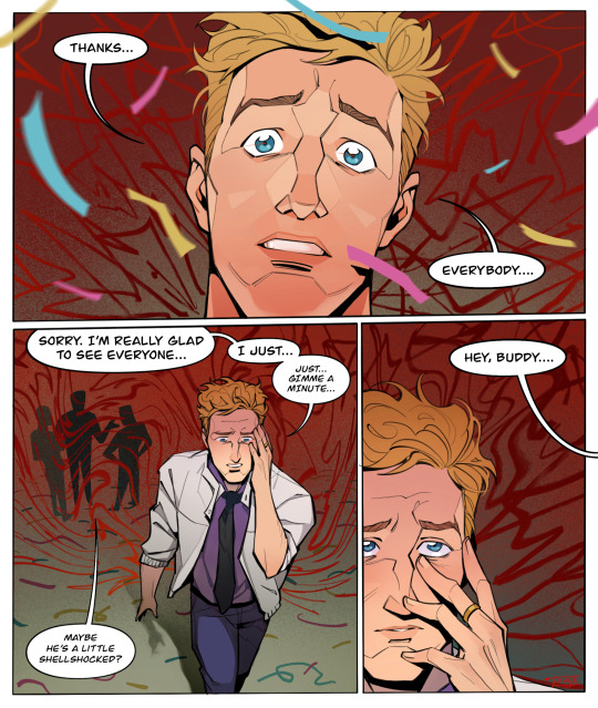
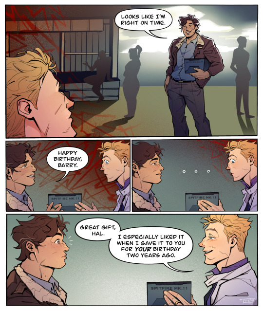
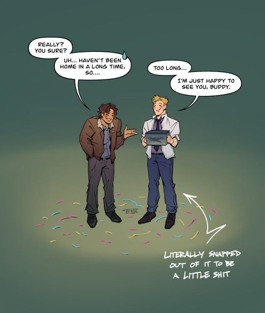
happy birthday barry, hope this one doesn’t give you war flashbacks 🎉
redraw + remix of Flash: Rebirth vol. 4
[ID in alt text + below cut]
Fanart comic of Barry Allen’s birthday, page 1: Barry is rigid in shock as Iris pushes him towards his surprise birthday party. Along the side are panels of each guest wishing him a happy birthday as bloodied flashbacks play behind them of the moments when Eobard Thawne had murdered them.
Page 2: Panel 1 is a close up shot of Barry with a horrified expression, beset by a red background reminiscent of the bloodied flashbacks. He manages to get out the words: “Thanks… everybody….” Panel 2 is Barry walking away from the guests, touching his face in distress. He says, “Sorry. I’m really glad to see everyone… I just… Just gimme a minute….” One of the guests behind him suggests, “Maybe he’s a little shellshocked?” The red background continues to swarm him. Panel 3 is a closeup of Barry’s face as an off-screen voice says, “Hey, buddy….” His fingers slowly slide off his face as he looks up in its direction.
Page 3: Panel 1 reveals Hal Jordan holding a box and wearing a smile. He says, “Looks like I’m right on time.” The red swarm surrounding Barry doesn’t seem to touch Hal. Panel 2 is Hal handing Barry the box, which contains a model plane, as he says, “Happy birthday, Barry.” Barry takes it in his hands with a worn but blank expression. Panel 3 is much the same with Barry unmoving as he’s processing the exchange. Panel 4 is Barry suddenly giving Hal a fond, sarcastic smile as he says, “Great gift, Hal. I especially liked it when I gave it to you for your birthday two years ago.” The red swarm gradually dissipates from each panel, clearing up entirely in the last one.
Page 4: Simplified doodles of Hal and Barry stand in the large, empty space of the page. Hal has one hand in his pocket and the other gesturing in explanation. His expression is embarrassed but good-humored as he says, “Really? You sure? Uh… Haven’t been home in a long time, so….” Barry responds, “Too long… I’m just happy to see you, buddy.” He holds the gift close to himself with an innocent, close-eyed smile. An arrow points to him, reading: Literally snapped out of it to be a little shit. /end ID
#the flash#barry allen#iris west#hal jordan#james forrest#henry allen#westallen#halbarry#dc#detective comics#dc comics#dc fanart#comic#danart#blood#alt text#described#his most updated canon bday is may 13 but he’s too much of a pisces for me to accept that#trust that when it comes around i will still celebrate it tho lol
1K notes
·
View notes
Note
Bit ooc but I have a question. How you do go about planing out your PLA comic? Like how do you actually turn your ideas/ storyline into comic form? Is it chapter to chapter or do you have the whole idea already planned out? Trying to find my own way in comic making so I’m just wondering if you could give any advice. Feel free to ignore if you don’t feel comfortable answering
So, at first this was al i could think to send.
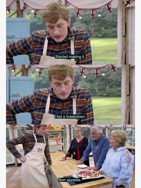
because its incredibly accurate to my process.
Jokes aside, a lot of how i work is back and forth chaos, fighting with ideas until im happy with them. I will start with a list (usually not written down because im unhinged and keep a ot of it in my brain) and organise it in a way that makes sense to the situation, in this case workign with a game with an established plot...not that its a very strong one.
with a set of ideas, and a game to work around i will ramble and rant to a few choice people who i bounce well off, and also stare into space for hours on end building the ideas. This process can be days, it can be years. For context, i have some notes from 2019 about things i wanted to include that are still relevant. I have been scheming how to break and rebuild this OC for ages. Theres no correct time frame, so long as you simply do the work.
Once i have a fairly loose plan, i start to solidify the benning and the end. What is required to make a character compelling, what makes them believable, what makes them human in a way that we recognise. this isnt always a positive thing, people like to call characters who do bad things problematic, but its human nature to make mistakes and be damaged or difficult, the process of the story is not always rainbows and sunshine. For me, this hits even harder, as im trying to tell a story from the perspective of someone fundamentally broken, so showing those breaks and cracks has to be done wisely.
This is the point where i make notes about things that need to change from the start to the end. And ill say one thing, this story in particular, I have not solidly planned the middle. I am allowing space for me to come up with new ideas at points. Being locked into a dead set of ideas can be quite limiting, and as creators we consume and process things constantly to generate new stories. Id be a fool to make a plan and stick to it. everything i do is vague guidelines.
However, I know exactly how the story ends in Hisui, and where it goes to from there. And i think me personally knowing the end goal makes it easier to plot steps towards that, and some of those steps are anything but progressive.
If nothing else, the end was the only thing i saw clearly, and it has only become more complex and loaded and emotional as the rest of this has fallen into place. If you can see the goal, you can work out how to get there with time.
Regarding the chapters, i tend to draft plan up like 3-4 of them at a time, and then go in order to sketch out one after the other, so i have plenty of time to change things while i adjust. its constantly a process of seeing what you make, seeing issues, and scrapping whole parts just to redraw something better or new, unique even. I dont think a single page ive posted has resembled the very VERY first draft thumbnail ive made, and thats just how i do. Every panel, how big they are, the angle you hand the viewer, the way you light things, the expressions, this all dictates SO SO much.
Taking time over it is kind of the job, and let me stress, this is normally a job done by a team, especially the highly popular comics. one inks, one colours, one shades, one handles text, one edits, theres so many people behind it, so dont be bothered by the pace at which things are made if youre working alone like i am. One person means longer production times, if you can, spread the workload out, but its not required. Its why i always say it doesnt matter how long it takes to make, so long as youre still making.
I think its also worth noting, comics are consumed quickly, the bakcgournds and small details can be lost in the ace of the storytelling, pick and choosing your battles is wise, save your time on panels where you want the reader to shift along quicker, keep that pace high, and add in more detail and depth to panels you want to champion or get the viewers to hang around on more. its ok to let go of a "perfect" image in favour of getting content out, if youre being driven nuts by it. Again, time be damned, be happy with it. And if you can let go of petty details, id suggest doing it when possible, so long as it doesnt effect the storytelling.
I mean what else can i even say. This work is a passion project, I love it, more than i can even put into words, and i think you kind of have to, to make comics without monetary motivation. sure you can get lucky and find ways to make it big, but for most of us, its the love of the story. So maybe try not to be your biggest hater, its easy to slip into the behaviour, so try be gentle on yourself and the process. I should take that advice myself haha! but i really do mean it. This is HARD work, so be kind to yourself over it.
anyway, with a rough idea, a bunch of sketches, and time, they get inked and fussed over, i make a billion changes to layout and story, and eventually posting can happen but not after fighting with the monster that is creating. Idk what else i can say. This is not work for the feint of heart, but anyone can learn to do it.
Good luck, comic artists can always use it!
41 notes
·
View notes
Note
Your art has gotten a lot better recently, did something change with your approach?
I try to always learn from my mistakes and improve! Maybe I've just been lucky lately? It's been helpful to revisit past scenes and elements and have to redraw them years later - like Sette's bedroom, Nary, freshly dead Duane, some upcoming khert stuff. I can see the problems all these things had originally and improve upon them in the new stuff. I've never been one to go back and redraw old work, really, but this is the next best thing.
My number one art weakness has always been comprehensible colours. I don't separate planes enough and call proper attention to the most important elements in a panel. That's something I've been really working on the past few years. Detail without it devolving to busyness. Or just dropping detail at the wisest points so things read better. Editing really is an art all its own.
24 notes
·
View notes
Text
Blog Update!
Alright so I've got two major things to go over.
The first is that I live in fucking Looney Tunes and my tablet cable is kaput because a couple of Lindor chocolate truffles exploded in the same bag the cable was in. My tablet and laptop just had some surface-level gorp, but the cable was proper saturated. All of the nooks and crannies of the USB and HDMI heads are gunked up. I needed to replace it anyway because the damn thing's long since gone positional so whatever. I was working on part of the Lamorak comic when this happened and got exactly 1 panel done before I met my chocolatey doom, pictured below.

The second thing is the keychains! I've since sent the keychain out to the one address I got, but I've yet to receive word on the other four so check your tumblr DMs if you entered! I'll send out another round of messages in a couple of days. If I don't get any responses by next Monday, I'll need to redraw. I had to actually go another town over to use their post office because mine is godawful and I think inflating their prices. Once more, I live in Looney Tunes and that Post Office is my Elmer Fudd, or whatever.
I made one major mistake with that giveaway and that was thinking that international shipping would be cheap for something less than an ounce (it's not). Any non-US winners will still get their keychains, though it might take a while. I'm going to Europe in a month or so, and assuming that doesn't fall through, I might just take any further European winners' keychains over with me and mail them once I get over there. Outside of Europe/North America I'll just have to snail mail them. Apparently stealing and then flying a plane without a license across international borders to use other countries' post offices is 'extremely illegal' and 'will land me in Super Guantanamo'... whatever THAT means.
Anyway, that's about it. Things have been hectic hectic hectic, and now they're NOT for about a month and this unstable schedule is hell upon my war-torn, ADHD-addled brain. Watch the weather and stay safe! And remember, international waters start way further out to sea than you might expect.
11 notes
·
View notes
Text

November Levi A Than Redraw 10 of 30!
First one of the shots that are essentially minis that I got. Thanks to this I realized that the manga a majority of Levi's Belts are actually white. This got changed in the anime to be black aside from the main cross belts. I figure it was likely done to ease certain shots as the belts were made the same colour as his uniform so that it was probably easier to blend during actual animation. While Bel's remained untouched due to them being well like. Two of them. But I also think this is one of the only panels where levi doesn't have his cross straps on so that's interesting... he looks so peeled. (though i may be wrong and it's just small + bad scans equally likely here)
Also if you’re interested in Submitting for other Varia members for me to redraw in their months you can check what I still need (here~)
The Image I redrew is under the cut, just to keep the post small.

micro-organism, he's also the only one to really have anything to do. either they're sleeping or looking out a plane window for like 2 hours. He was prepared.
18 notes
·
View notes
Photo
Drawn: 2019 (Updated 2020)
Analysis: I can't believe we're here already! This page and the next really set the bar for the comic's art style, at least in representing the various evolutionary steps the art had taken over several years of drawing, but also in being the first pages to really cement in my mind the use of simulated depth-of-field effects and the finishing chromatic aberration effect. As you can imagine, the detailed backgrounds here took quite a while to draw, and while I like showing off lots of detail, I didn't want to drown out the main characters in a scene full of people... The selective blurring really helps (and is most apparent) in scenes with multiple "planes" of depth, such as this one, and I think the technique both looks great and achieves the focus I desired, especially in conjunction with the atmospheric lighting I'd been using prior.
As for the composition and panels themselves, yep, it's a lot of rectangles. With so much detail in the scene though, I needed to make TWO big panoramic shots! I'm really happy with how both of those turned out, and the character art came out pretty good too (though Hartwin still looks a little weird in the third panel) and the interactions are fun. I had to do some last minute adjustments to the dialogue though, so things probably could have been a little better, but all in all I think it's still fine and doesn't detract from the page's successes.
If I drew it again: This page was a lot of work already and I really like the big open shots, so I don't think I'd bother to change much unless I was illustrating a bigger change in the script... As I mentioned above though I could probably do better redrawing Hartwin in panel 3; something about his arm looking a bit stiff, or maybe his eyes are too big... I can't exactly put my finger on it, but it's the only thing on the page that I'd consider fixing at the moment. Favorite Panel: Probably the first panel, as it has the big detailed background and I really like the depth the first panel has with Schmitt being so close to the camera, Hartwin sitting in the bar, "Bowie" and Rick entering the cantina, and the other guys sitting in the background. Runner up: The last panel, because I think I actually prefer that background itself more, and I'm really happy with those character poses. However, the overall composition is a bit simpler than above, so IMO this one takes second (but not by much!)

16 notes
·
View notes
Text
part 2/6
2nd part of my old Black Sails scraps and doodles from 2016–2021. Not in any particular order.
This time the drawings are short comics that were abandoned for a reason or another, mostly because I lost the interest or felt like there was too much to redraw compared to the satisfaction of finishing something else more interesting. There’s also some talk about rigid mindset and how overthinking can lead to stagnation.
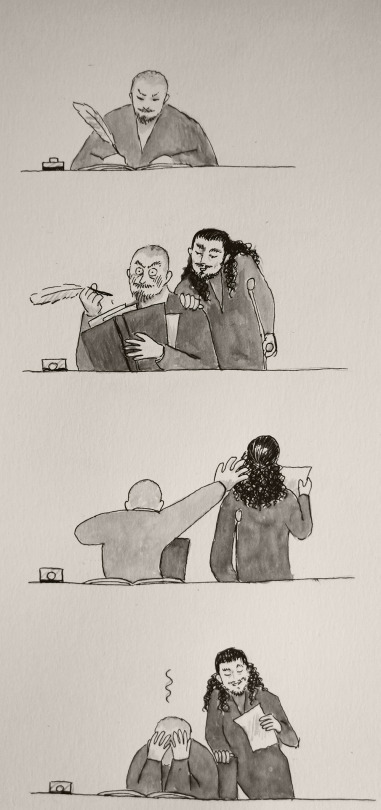
Contains early silverflint moments, specks of dust, rackham's glasses are found, jealous-Billy spying, desk-Flint gets caught, "squint-squint", a quiet moment and its bird dilemma etc.
And please do not steal and repost elsewhere. But if you do get inspired, feel free to make your own interpretations!
Long-ish post under the cut!
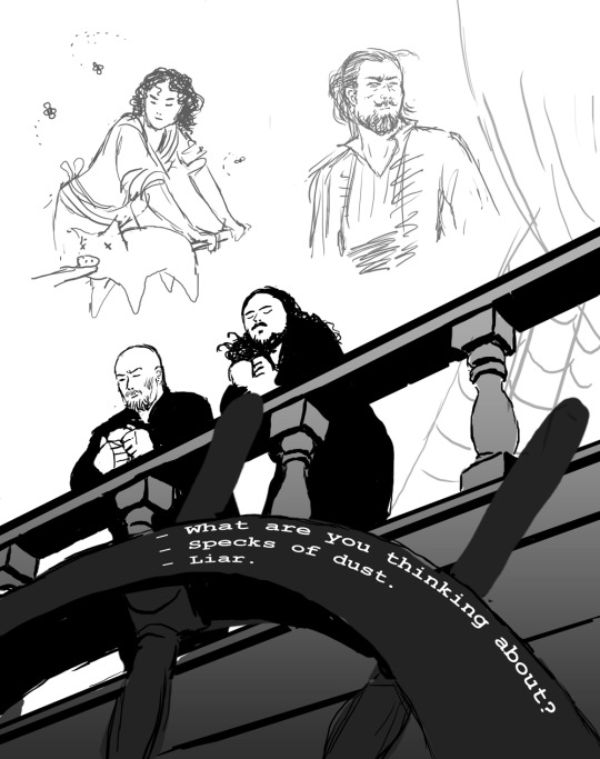
“What are you thinking about?”
“Specks of dust.”
“Liar.”
The idea was to show how much they and their relationship had changed. This was around 2016 when the season 3 began and I was still re-learning to draw with a tablet. Another art from the same time period (and idea) is this art: The Dynamic Duet.
And for some reason I was really stuck up thinking that I’d have to first do the sketch, then the clean line art, then planes underneath, then shadows etc. and I have always struggled with that kind of approach! Mainly because I hate doing clean line work, lol. And I was a fool for trying to start with a white canvas! It’s so much harder to find values and plan things, or at least in my opinion..
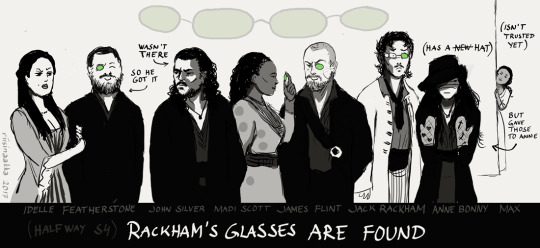
“Rackham’s glasses are found”
To celebrate their new pirate alliance, they share the four lenses of Rackham’s sunglasses as they were also found at the time (because I wanted it to resurface and they could be made into jewellery you know...). This was right after the episode where Anne fights and hurts her hands (here wearing protecting mittens from Max even though she’s not trusted at the moment). Uh, this doesn’t spark joy interest me much and it’s quite stiff and would recuire a lot of redrawing faces, so - discarded!
I somewhat like the idea still (them having something to share, although it’s on Jack’s detriment). I tried to find a stylished comical easier doodlier? way to draw them and draw clean lines etc, but it just wasn’t for me. Also here too, the background is blank and too bright. Later I started to think things as scenes and draw everything at the same time instead of adding the bg later or trying to show everything (and everyone) at the same time.
Here’s also Billy in the same story:
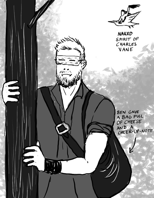
He’s spying on them and since it’s so bright he’s wearing his diy “sunglasses” and being envious to the others. *cough* uhhh...Idk? Also people were shipping Ben Gunn (and cheese) with Billy, so that bled into this too... Charles’ spirit is riding the “big white bird” that was mentioned in Teach’ story and in this case it’s a pelican.
As you can see, I also wasn’t using the brushes that I use nowadays. A hard (or soft) round brushes with no change in opacity just aren’t for me. For example, in traditional art, I struggle with markers and copics, but really enjoy charcoals and watercolours. I prefer ragged edges, layering and thus blending things into each other (and leaving the viewer to fill in the gaps) instead of having stark or definite things. I also struggle with vector drawings, although I have decided to finally start learning to use them...somedayyyy.
Also, I wasn’t paying attention to anatomy, like, at all LMAO. I was just so happy to be able to put something on the canvas.
This is one of my first ink drawings, but I cannot find the original anymore. Again, I like the idea, but not how things look art-wise. And I was so adamant, that I have to get everything right in the traditional drawing and not fix anything later on on photoshop because then it would be cheating. And thus, I was never able to move on or finish this properly the way I liked it (idiot).
BUT! It was a good practise to just draw and test things on paper and gain confidense on drawing things in overall (as I was still getting back into art). To get over the fear of blank paper you know, and try to find my style whatever it would start to form into.
Oh, yeah, Desk Flint.
Desk Flint was a thing for a while (still is, lol). Another drawing from that time is this Slingshot Pirate (2016). And Desk Flint keeps repeating in many later works too. The point is mainly “Flint sitting behind his desk and people interrupt him and I don’t have to draw him fully”
Well, anyway... moving on.
Here’s a plan that has been stuck for years. It’s name is “Squint-squint.” Left is the sketch (with another sketch underneath because the expressions were clearer in the old one). On the right is the continued piece with colour scheme but I cropped the eyes panel and faces out (it was so ugly for some reason) but if I ever continue/finish this, it will be redrawn there in the middle.)
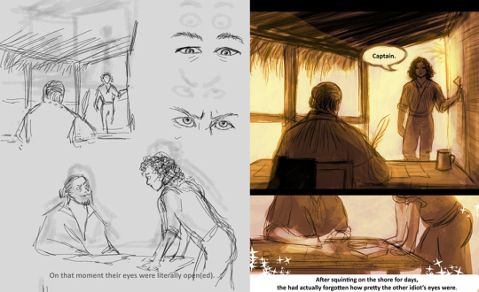
Left. “On that moment their eyes were literally open(ed).”
Right. “After squinting on the shore for days, they had actually forgotten how pretty the other idiot’s eyes were.”
I still like it, quite a lot, but my perfectionist ass only sees too much “boring” things to draw and get right, so it hasn’t been a priority for a long time and other works have kept me occupied and more interested in them.
--------------------
“Quiet Moment.” 2018 (a wordless comic happening after the events of Charles Town)
I’m going to explain after these pictures, but see how big the difference is when you start to look at references and plan things together (the space, “camera” movement, background etc). I also started to colour with coarser brushes:
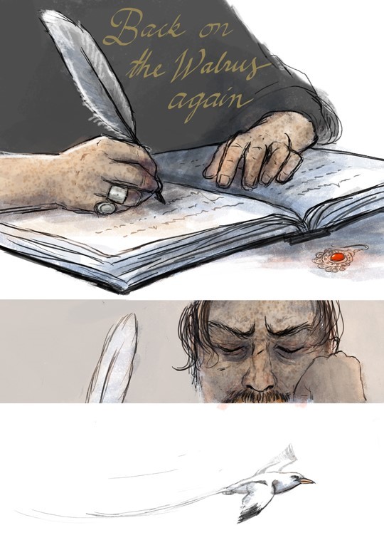
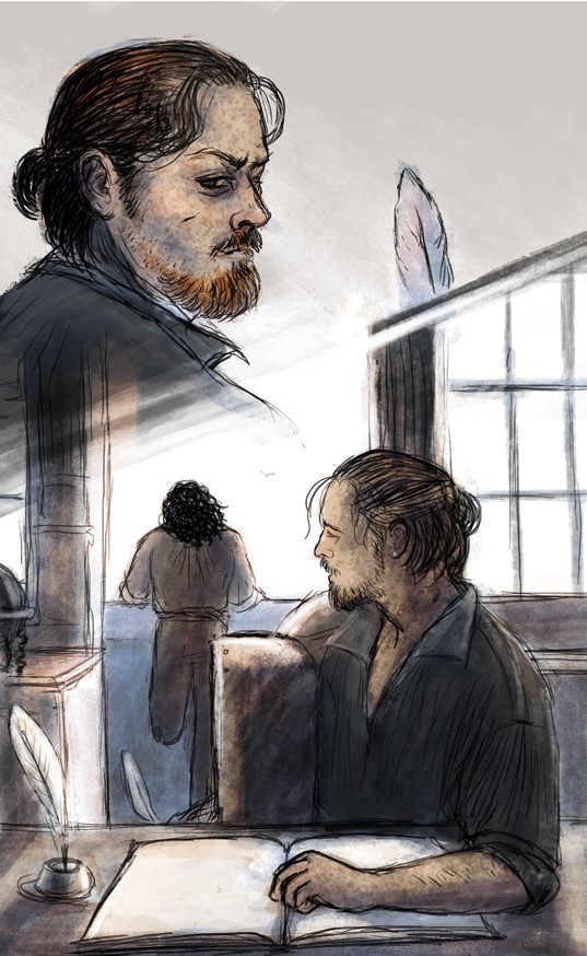
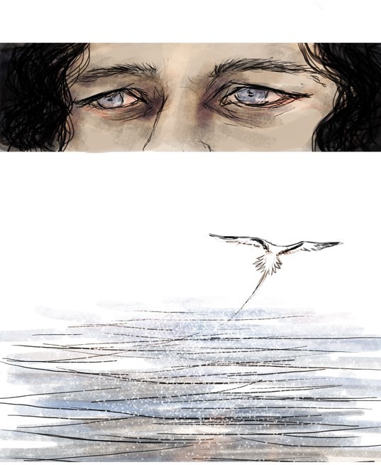
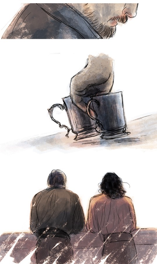
I drew this around early 2018. A lot of improvement! Still quite a lot of negative space (empty white backgrounds), but it fits this work. A few things tell where we are (the ship’s cabin and the balcony). Changing distances and how things are cropped/framed make things more moving and focused (and less to draw, lol). Colours and brush strokes are softer, more layered and so on.
But guess why it’s still a wip!
I couldn’t decide what bird is flying over there.
Yeap! At first it was an albatross (doesn’t go to Bahamas?). Then a seagull (but which seagull? there’s so many subspecies! Is the ship at sea or at the harbour? what birds are there on the open water/ close to the shore?? oh noo...) So, yeah, wayyyy too much over-thinking.
At some point I ended up with white-tailed-tropic-bird which was a plus! because it sounds like the bosun’s whistle, but at that point I was so tangled and frustrated and still had so much to finish with this that I left it be. Also Flint’s face looks different in every frame so I would’ve had to change some parts, lol. And then I forgot it for a couple of years! And then I had learned to draw a bit differently and again saw too much things to do, so it’s quite hard to take on this again, especially when there are so many other interesting wips waiting...
But I still really like the feeling of it! And the colour scheme. So I might just limit the things I’m allowed to fix and then post it as it own someday. I mean, it’s 90% finished, but the last reach just feels like miles.
And that’s what usually happens with my wips. They reach a certain point and it suddenly becomes really hard to finish or get back into.
But every time I learn things and then use the information in another work! :D
Final note for this post (altough this has been said hundreds of times): use references and look how things go and try to see the structure and form beneath things. And think where it is happening and how the light and surroundings affects the characters and/or spaces. And maybe think what you’re trying to convey with the art, what idea? what emotions? what purpose? or like, what are you trying to learn with the piece? and so on...
Thanks for checking this out, I hope you had fun <3
#black sails doodle#long post#but not as long as the future ones heh#tag for Block Spoils doodles#<- if you want to black list these
39 notes
·
View notes
Photo

Preview panel only. Click here for full cartoon. Or see the on-site navigation tutorial. Cartoons may contain unmarked spoilers. Thanks for reading.
This is the 2000th cartoon produced under the title The Hero of Three Faces. This includes sketches, and imports/redraws from my first fanfiction site, and cartoons indexed only on the pre-2014 archive page - it includes any of those with a Three Faces four-letter sequential index/filename.
(You may be looking at the site index/filename convention and wonder how bbmg, the index of today's cartoon, comes to 2000. First, I inadvertently skipped over the aax* ones. Second, when I rebooted the site format and continuity in 2014 I skipped from abnk [999] to baaa. Third, since the site reboot there have to date been six imports or redraws from my original fanfiction site which instead of being indexed in order as new posts have been assigned one of those aax* index names I skipped over, aaxa-aaxf.)
I first uploaded a daily fanfiction comic strip to the internet with triangle caricatures instead of scanned line drawings in December 2001, because my first scanner had quit working and I found it impossible to draw a steady line with the trackball we had on that computer instead of having a mouse.

The triangles in this have no limbs because triangle figures were initially invented about ten years previously for animating on an Amiga 500 with no storage (just a floppy drive) and no extra memory, in a keyframe 2D animation program called Fantavision (last time I websearched that name, most of the results were for a fireworks simulator). The characters in the first of those "animated sketches" didn't even have faces, they were just featureless triangles that moved, but eventually 90s Amiga-animated triangles came to look like this:

The caricatures in the full strip are a little more elaborate, but it still took me about a month to figure out that in MSPaint art, unlike in Fantavision animations, there was no reason that the figures might not as well just have limbs instead of, to save memory, growing limbs only when an action called for one.
Also, in my internet stories and cartoons of this strip's time, it was a different continuity where most franchises' characters lived on the same plane instead of living on different fiction planes as in today's continuity; or I probably would have reprinted this at The Hero of Three Faces today instead of here (unless I already had).
In 2007 I ran out of room on my original fanfiction site where triangle fanfiction was first hosted, because it's the free allotment of webserver space that comes with the account with my email address, and I'd hit the limit. (You know, I should check whether the limit's been expanded since then ... though, having moved on from that multiverse, I don't know what more I'd do there if I should find there's more room now.) Initially in 2007, for ease of operation and with hopes of reaching a bigger audience, I continued triangle fanfiction - for the first time under the title The Hero of Three Faces - on the WebcomicsNation.com hosting service operated by the biggest name in webcomics culture who didn't draw one, Joey Manley. But after two or three years at WebcomicsNation.com I realized I want greater control of presentation of my work than that (the same reason I've always hosted my prose and cartoon fanfiction myself till then and since then, instead of at GeoCities or at Fanfiction.net or even at AO3), and The Hero of Three Faces moved to its own subdirectory on the Arthur, King of Time and Space site. A few years after I stopped updating the WebcomicsNation.com Hero of Three Faces, the site vanished, so it was for the best. Then in 2012 I decided The Hero of Three Faces needed a face on Tumblr and the rest you know.
In 2006 I spent a little time learning to animate triangles in Flash, but ultimately I didn't take to it. If I get to retire ever and need something to do, I may hunt up an Amiga emulator for Windows and a copy of Fantavision (or possibly I may hunt up whatever the latest home 2D keyframe animation software is out there at the time), and tackle triangles for web animation again. Or maybe not. The reason I didn't take to it in 2006 was because I ran out of ideas. Same as with all the Tumblr sideblogs I've started, come to think of it, even the puppets it's looking like.
I suspect if I'm remembered after I'm gone, for something I did rather than for being someone else's friend or relation, it'll probably be for Arthur, King of Time and Space. That'd be cool and all but my fanfiction's where my heart's always been.
6 notes
·
View notes
Text
Просмотр Dwg For Mac Os
We already covered the ten free and useful CAD software for every type of platform.
Free Dwg For Mac
Dwg Viewer For Mac
Here is another ten best CAD software for Mac that will run natively on the Mac OS X operating system.
It is fully compatible with the Mac operating system and no need to use any specific emulation software or a compatibility layer to uses this software.
Software for the Mac to view, print, and review all types of eDrawings files. In addition, eDrawings Viewer allows convenient viewing of native AutoCAD files (DWG and DXF) and native SolidWorks. Software for the Mac to view, print, and review all types of eDrawings files. In addition, eDrawings Viewer allows convenient viewing of native AutoCAD files (DWG and DXF) and native SolidWorks.
1 Vectorworks CAD for Mac
Vectorworks is an object-oriented CAD software for Mac OS. The software primarily uses for 2D Drafting, technical drawing, and highly effective 3D modeling.
It gives 2D, 3D, production management, and presentation capabilities for all levels of the design course.
It additionally very versatile, so designers have the complete freedom to design how they want and very handy to create, model, and present easily and precisely with one software.
Website – Vectorworks
2 AutoCAD for Mac
AutoCAD for Mac is a robust 3D free form design tool and powerful drafting capabilities for your favorite platform.
It has a simple, Intuitive graphical User interface that makes your ideas into reality.
It saves all your work into DWG format, so you can easily share files with clients, suppliers, and partners around the world, regardless of platform.
Website: AutoCAD for Mac
3 CADintosh for Mac
CADintosh for Mac is a 2D-CAD software for electrical, mechanical, and architectural drawings.
It has interactive window redrawing, where users can work at the same time as the window redrawing.
You can easily import and export your work into multiple formats such as HPGL, DXF, and PICT.
There are two types of modes provided by the software. One is Pen oriented Mode, and another one is the individual Mode.
Pen oriented Mode gives you 8 line widths/line colors/pens, and individual Mode gives you line width from 0.0 to 99.99 mm, pattern, and colors.
Website: CADintosh for Mac
4 BRL-CAD for Mac
BRL-CAD is a powerful cross-platform solid geometry (CSG) modeling system.
The software comes with interactive geometry editor, ray-tracing for rendering & geometric analyses, network distributed frame buffer support, image & signal-processing tools.
Website: BRL – CAD
5 Domus CAD – 3D Architectural CAD for Mac
Domus CAD is a 3D Architectural Parametric CAD that allows you to create a three-dimensional element without starting from a two-dimensional plane.
It provides ready elements such as walls, floors, roofs, and stairs that built from the onset in their full three-dimensional form.
You can easily see the 3D model changes in real-time as you design in your plan.
Website: Domus.Cad
6 Sailcut CAD for Mac

Free Dwg For Mac
Sailcut CAD is a sail design and plotting software. It means that you can design and visualize your personal sail and compute the actualgrowth of all panels in flat sheets.
Sailcut CAD is ready to do cross cut, twist foot cut, vertical cut, mitre cut, and radial cut sail design as well as wing sails, all in quite a few languages.
It alsoincludes a viewer whereyou’ll be able to assemble a hull, a rig, and a set of sails to see how they match.
Sailcut CAD has been successfully used for making sails for racing and cruising yacht as well as for model boats.
Website: Sailcut CAD
7 MacDraft Pro for Mac
MacDraft Pro is the 2D CAD software that makes it easy to design floor plans, architectural drawings, and illustration simple on the Mac.
Create detailed and professional 2D drawings in moments, with this easy-to-use, powerful, and affordable drafting software.
With its precise vector tools, smart units, and fully-featured scaled atmosphere, MacDraft Pro is designed to implement an easy-to-use solution without wasting too much time to learn techniques to use more complicated software.
The latest version of MacDraft Pro contains some important changes and features that make it more intuitive, highly effective, and easy-to-use than ever before.
Adding a wide range of features not only make MacDraft Pro easier but also speed up your design process.
Website: MacDraft Pro
8 HighDesign 2D CAD for Mac
HighDesign is the alternative, fully featured 2D CAD software for Mac OS.
it’s a perfect combination of advanced drafting and design tool with a modern, performance based user interface designed to help the user in every stage of the creative process.
HighDesign offers in-depth knowledge of drawing and editing skills, from the vital drafting methods to extra superior, DXF/DWG compatibility.
parametric tools like vector hatches and patterns, smart annotations, symbols with several views, partitions, columns, windows and doors, and more.
The software is really helpful to satisfy the actual requirements of architects, engineers, and design professionals.
it allows them to design difficult projects with accuracy and strong management over several parts of the projects.
Dwg Viewer For Mac
Website: HighDesign
9 QCAD for Mac
QCad is a software for computer-aided drafting in two dimensions (2D).
With QCad you’ll be able to create technical drawings such as plans for buildings, interiors, and mechanical components, or schemas and diagrams.
QCad works on Windows, Mac, and many Linux and Unix systems. The source code of the QCad community edition is launched under the GPL license.
Website: QCAD
10 Graphite for Mac
Graphite is a 2D and 3D wireframe CAD software for Mac. The software is previously known as Vellum.
It has a simple, easy to use user interface that helps creative people to create a precision drawing and Drafting without having any knowledge.

With Graphite, the user can create 2D and 3D wireframe designs of immense complexity and precision detail.
Website: Graphite
0 notes
Text
oh my god, yesterday was the wooooorst.
i left for the airport on time. the bus app said that the bus would arrive at the stop in 10 minutes (and it was a 2 minute walk away). so i had 2 hours to make a ~30 minute ride.
i missed the bus by so much that i didn’t even see it drive away from the stop before i arrived. the app had just, completely lied i guess? the rest of the day was also like that.
so i walked to the downtown station to try to catch the other bus. i also just missed that one according to the lady at the counter. she said the next downtown bus was coming in 40 minutes. so i called a taxi after fretting about it for a few minutes. the taxi driver said they’d be there in 15-20 minutes so i was like “ok.” the other route would go by in a half hour so a taxi would be faster.
the taxi took over 40 minutes to arrive. i told them never mind and got on the second bus. they said they had just pulled into the station and seemed pretty salty about it. but like... that was more than twice as long as they said they’d take.
the bus didn’t leave the station for another ten minutes. i made the wroooong choice. the bus also stopped at every single stop along the route and got stuck at some long red lights. i called my mother. i complained about it to harrison. but nothin was gonna make that bus go faster.
i missed my flight by 10 minutes.
i got put on the next flight... which was in six hours. instead of 9 or 10 pm, i’d be getting home at 3 am (my time). so i spent 6 hours bumming around the airport. i couldn’t get food when i was hungry because the person behind the counter at the snack bar didn’t show up for a very long time. i started drawing a picture on my ipad that i’d planned on working on during the flight.
the flight took off late. i had had a 20 minute layover in charlotte, so every single minute was making me more and more antsy. then when we arrived in charlotte we got put at the wrong gate so the plane sat there for more than 5 minutes before trundling away to the new gate.
the gate was at the end of one terminal. the plane i had to catch was on the other end of the airport at the end of another terminal. i sprinted!!! i had ten minutes to get there!!!
i was really bummed because you’d think since i can bike 12 miles that i could run for more than one minute before completely losing my breath and stamina. though to be fair i had not eaten and was wearing a heavy backpack and a bra that’s a little too tight. i was wheezing after a few seconds.
i actually made it? and i got my boarding pass printed at the counter with 4 minutes to spare before boarding started. i ran back to the bathroom but the line was so long i’d never make it back to the gate (the area was under construction and the nearest bathroom was more than 2 minutes away from the gate).
it had been a few hours since i’d gotten to use the restroom, and with my gallbladder out i’ve had less... like, tolerance for waiting. that might be a “stress has destroyed my body” thing more than a gallbladder thing though.
anyway i had to fidget in my plane seat for 45 minutes while waiting for boarding to end and the takeoff and then we had to reach cruising altitude.
on the flight my ipad pencil wouldn’t connect to the ipad (airplane mode i guess?) so i couldn’t draw for the 5 hours i was sitting there. i got out smash instead since i got my 3ds fixed the other day... i got really REALLY good at hitting rest on a moving target as jigglypuff. i spent like 40 minutes doing nothing but that. the other hour was just working on general combos and taking on the computer as dedede. because i had nothing else to do and wanted to get good at it again. i made a gunner mii based off blue but the mii characters don’t really seem to have any natural combos? it’s just really hard to rack up damage with them. jumbi’s way easier to play as, at least. she’s got a sword.
my thumb started hurting from the new thumb stick (it wasn’t broken in yet i guess) so i put the game away and dozed for the rest of the flight. i made some notes for the story... just thinkin about how i wanted to work out some conversations. i mostly wanted to rest because i’d be getting home at 4 am in the morning my time, the airport is an hour away from my parents’ house. i didn’t get any sleep at all.
when i got to the airport my mom and dad were actually there? i thought they’d be picking me up at the curb. but they snuck up behind me while i was trying to get to baggage claim and mom almost pushed me down the escalator.
dad acted like everything’s normal. and i guess things are “normal” now. as in, this is the new normal, because dad has either completely ignored what he did or forgotten about it.
he probably forgot about it. grabbing and threatening me and using real personal insults wasn’t a big deal ~to him~. grabbing me while i was laying in bed trying to sleep wasn’t a big deal ~to him~.
i pretended to sleep on the car ride home but again couldn’t manage to doze off. i wrote a few more story notes in my memo after a while because i gave up.
when i got home i went basically right to bed without even putting on pajamas and then i couldn’t sleep. wiley came to cuddle with me for a little bit. once he was satisfied that he had stepped on me enough times he left. i still couldn’t sleep.
when i finally did doze off, i woke up like two hours before my alarm was set to go off. so i guess i got like five hours of sleep maybe?
today was a blur. i spent a large fraction of it scanning in my old comic pages. i couldn’t get my sketchbook to fit in the scanner though no matter what i tried (i tried a lot of arrangements). so i’ll either figure that out later or not bother. there was a big dark line down the left side of the images. i was also a little upset that my loose pages didn’t fit in the scanner, so there’s a bit of the side clipped off every page image now. i was so broken up about how much i was losing that i didn’t even change the deviantart images. i know i shouldn’t put stuff on the edges of the page, but i didn’t really register it when i started the comic. i had started to use the whole page, and i put dialogue at the top and off to the sides to give myself more room to draw. i had to erase and redraw a lot of speech bubbles.
then i think i dicked around online for a while, uploading the images and stuff, and then i went downstairs to try to draw on the ipad and maybe finish that picture i’d started. i don’t think it’s going to be a fast picture... i don’t have the energy for shading though.
my brother came home so i said “hi” and “nice anime hair.” his hair is more than twice as long as mine, at least in the front. in the back it’s not quite that much longer. we drove out to freddy’s for dinner and both got real sick from the greasy burgers. he got it worse though because i had a veggie burger. then we got ice cream because we’re geniuses.
then we got groceries but i couldn’t find any tempeh. so tacos are gonna have to wait.
mom came home at 8 pm. she’d been out of the house working or driving to/from work for 13 hours today. she’s going to work for 6 hours tomorrow too. she told me about our my financial situation. but then she gave me a bunch of excuses to not teach me how to do taxes yet again this year.
i gotta start paying off my student loans though. can’t let that interest build up.
villanova apparently blew all my parents’ retirement funds. i didn’t realize they didn’t actually provide us with any financial aid. we couldn’t get loans because of the retirement money... all i managed to do at villanova was almost die!
while i was hanging out with my brother he made a few “jew” jokes. i pretended to be extremely confused. he asked if i’d never heard of jew jokes before and i shrugged and said not really. at least it got him off track. he didn’t tell any more.
i need to read up on how to deal with family members who get... weird about race. my brother’s already made holocaust jokes though. he’s been doing that. i get the feeling he fell in with the wrong crowd. i don’t remember what to do about it.
genevieve seems bored to tears. from the way my family describes her behavior she seems... depressed. she won’t go for walks. she doesn’t leave her bed and doesn’t come when called. she still won’t touch the stairs and she doesn’t spend much time in the backyard.
i got her to come twice when i called today at least. i had to be really insistent and annoying but she did come over eventually and i highly praised her generosity. that seemed to cheer her up. she wagged her tail and everything. it’s so hot out... maybe tomorrow i can get her to go to the park for a few minutes. we’ll see.
whenever i try to interact with eve my family, like, tells me how it is with her. like she’s just Like That now and there’s nothing they can do about it. “she won’t go up the stairs. she just won’t.” “she won’t come when we call her. she just looks at us. that’s all she does.” when i called eve my brother actually interrupted me to tell me yet again that she doesn’t come when called.
i got her to come.
when i try to encourage eve to check out the stairs my mother has interrupted me three times to tell me eve won’t go up the stairs. like she doesn’t want me to even try. eve is so lonely. i can tell. she’s bored and lonely. that’s why she’s started chewing up cardboard and stuff left on the floor.
i’m gonna take my work downstairs tomorrow and work in the kitchen i think.
this evening i tried to start drawing for the comic again. i got one panel done, but IT’S SO HOT HERE. MY HANDS WERE SWEATING BEFORE I COULD EVEN PICK UP THE PENCIL. EVERYTHING GOT SO SMUDGED!!! it’s going to be a real struggle to finish two scenes this week. ten pages... i’ve got three finished already and in my drafts on the comic. so, i need to draw seven pages. i’ll work on it tomorrow if i can. these pages might suffer because of the heat though. i smudged one of the older pages before i could even get it in the scanner. i somehow got graphite on my LEFT hand, which never gets smudgy when i work... it’s always the side of my right hand since i rest it on the paper so it doesn’t shake.
my back really, really hurts. my shoulders and neck also really hurt. i tried stretching, but i didn’t really put a lot of effort into it... i always feel so, like, unable to do things here. unwilling to do things, maybe. lethargic. i didn’t get to meditate yesterday and i’m skipping it tonight because i don’t want to make noise with the guided thing. i’ve been lax about it anyway. i feel so on edge.
when i tried to have lunch at like 10:30 (? i lost track of time) this morning i was immediately very ill. so i ended up not having any food for about 27 hours, if we decide to cut out the leftovers adventure there. i didn’t try to eat again until i went out with my brother. to fast food... only good decisions, folks!!
still feeling super lethargic even though i finished a panel. i’ve got a lot of drawing to do. i hope tomorrow i feel better. on sunday i’m going to the movies with asher, i think.
you know what i’m probably feeling so low energy because i didn’t eat for so long and also i haven’t slept well in two days. or, really, in a very long time, but especially the last two nights. i still need to talk to mom about finances for, like, hiring a study specialist... i don’t think we’re going to have the money to afford the psychiatrist my therapist recommended. she REALLY wants me to get a second opinion on my meds but i just don’t think it’s a big enough deal to warrant shelling out for full price psychiatrist appointments. that doctor doesn’t take insurance and it’s just... i know how expensive this gets. it’s already expensive enough getting even regular check ups for snoopy.
i hate living here... it’s so dirty and dusty and dilapidated. in my apartment i keep everything pretty orderly and don’t hold on to things i’m not using. or at least, i try not to. i don’t have enough space to hoard random stuff and i don’t get that attached to those things anyway. my mom won’t even throw out old food that nobody ate for the 3 years before it went bad (2 years ago). they’ve been using my room as a storage space while they paint the game room, but that project’s going super slow because they’ve been at it for months now. so now there’s just tons of crap stacked in front of my dresser (so i can’t actually get to the clothes i left here) and you can’t even get to my sister’s door. she’s in korea anyway i guess so that doesn’t matter as much.
ok anyway i’ve been writing for a while now. thanks for listening. i’ve got a lot more sore muscles than just my back and neck and shoulders. maybe i pulled something while sprinting around the airport yesterday, because breathing is a chore and my legs are just... not feelin it. i’m just trying really hard not to get sick. my mom came in my room and coughed all over me without even covering her mouth so it’s like, well, guess i don’t have any control over that either!
high stakes, no control!!!!!!!!! just how i’m used to it!!!!!!!!!!!!!!!!!!!!
it’s 11:40 arizona time but i know my body thinks it’s way later. i’m so tired. i don’t think i’ll be able to sleep though. guess i should try anyway.
1 note
·
View note
Text
THE HISTORY OF 3-D COMIC BOOKS
The following article was written and first published by Daniel L. Symmes in 1982. We have updated some text and added newly restored 3-D images utilizing our unique anaglyph restoration process so bring your glasses to view the classics!
There were fifty 3-D features produced and shown in Polaroid 3-D during the Golden Age. Ironically, there were fifty 3-D comic books as well. Unlike the movies which had peaked during April through December 1953, the comics had a much shorter life span. Here is their story.
In the summer of 1953, as the 3-D movie craze was approaching its crest, 3-D printing began to flood the newsstands. Anaglyphic 3-D advertising appeared in the Los Angeles Times, the Boston Globe, London’s Picture Post and the Wisconsin Waukesha Freedman. “Stars and Stripes,” the newspaper for U.S. soldiers stationed overseas, stuck a pair of glasses in a special issue and printed a 3-D article featuring a still from THOSE REDHEADS FROM SEATTLE. The folks back home got an even bigger thrill with the first issue of 3-D Movie Magazine, which ran an ultra-dimensional photograph of Marilyn Monroe dancing cheek to cheek with Walter Winchell. Popular Science Monthly included a 3-D article on how to run a buzz saw. Thriftily, they left out the glasses and instead showed readers how to make their own using filters of gelatin and food coloring.
All these publications were printed from stereo photographs using techniques that had been developed decades earlier. Some were even printed by American Colortype, a firm that been in the 3-D printing business since the 1920’s. But when hand-drawn 3-D comic books hit the newsstands in early July 1953, the world saw something new.
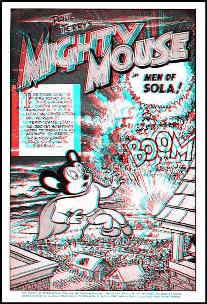
Mighty Mouse was the first to appear, in an action-packed comic full of meteors and nasty cats from outer space. The added dimension opened a world of new directions in which the little mouse could fling his enemies. Published by St. John Publishing Company, by special arrangement with Terrytoons, the 3-D Mighty Mouse provided the first public demonstration of a process invented by Joe Kubert and Norman Maurer, two young comic book artists. Kubert and Maurer were friends from childhood in New York, where they had shared an early passion for cartooning. Each had started taking commercial work before the age of twelve.
In 1950, Kubert joined the Army, and, while stationed in Germany the next year, he came across a German movie magazine with red and blue anaglyphic photographs and glasses. He was immediately struck by the possibilities for using the effect in comic books.
After his discharge from the Army in 1952, Kubert approached Archer St. John –an innovative young publisher—with ideas for some new comic books, including one based on the character Tor, which Kubert had developed while in the service. St. John was interested, and the two entered into a co-publishing arrangement. Kubert handled the writing, drawing, and production; St. John paid the bills; and both men shared in the profits. It was a good arrangement for a young artist at a time when most people in the field were drawing for a low page rate.
With high hopes for the success of his new character, and with the knowledge that he was now in a position to test 3-D comics, Kubert asked Norman Maurer to join in the venture. Maurer was living in California, married to the daughter of Moe Howard of the Three Stooges, but with some coaxing he was persuaded to move to New Jersey, where Kubert had set up a studio.
In the early spring of 1953, the two began to draw for St. John. They started with a book featuring Tor and a cartoon version of the Three Stooges. While strolling through Times Square in late April, they had noticed the huge crowds lined up to see HOUSE OF WAX at the Paramount Theater. They set out to draw and manufacture a high-quality 3-D comic book at a price competitive with the full-color ten-cent comics that were then the standard. With the help of Norman’s brother Leonard, who had an interest in science and mechanics, they attacked the problem. They determined where to have the glasses made and how to insert them in the books. They chose printing inks to work with the colored filters of the glasses and developed a simple and efficient method of making drawings. It was in this crucial step of preparing the drawings that they brought real innovation to the field of comic books (although their claim to the invention would later be challenged in a patent dispute.)
Film animation studios had long worked with acetate cells as a labor-saving device. Using the cells, only certain parts of the artwork had to be redrawn for each exposure, and other acetate layers could be easily shifted in measured steps to yield the effect of motion. It required only a small leap of the imagination to create stereo cartoons with the acetate cells, as the various layers could, without too much trouble, be spread apart in space and photographed using normal stereo techniques. Tru-Vue had made 3-D cartoon strips since the late 1930’s using this method, and even comic-book companies, including E.C. Comics, had experimented with the process, but found it un-economical. The obstacle lay mainly in the way comic-book publishing was organized; the artwork was prepared at the publisher’s office or in the artist’s studio, and the camerawork was done by the printer. Either time-consuming, elaborately lit setups had to be made at the printer’s, or the publisher had to invest in camera equipment.
Kubert and Maurer neatly bypassed the problem by putting two sets of carefully placed peg holes in the acetate sheets. Using their keying system the printer could photograph all the layers sandwiched together as a flat piece of art, then easily and accurately shift the second view of the stereo pair. The artist had only to leave some overlap in the background layers-so that gaps wouldn’t appear after the shift-and create an opaque backing for the foreground objects-so that the background wouldn’t show through.
Kubert and Maurer named their system the 3-D Illustereo Process, hired a lawyer to file a patent for it, and formed a company – the American Sterographic Corporation – to sell licenses. They decided to give St. John first shot at the process, after which they would make it available to other publishers. They prepared two sets of sample pages – one set featuring the new character Tor, and the other a Three Stooges. A fellow artist, Bob Beane, drew a third set, using halftone shading, of a bathing beauty at the beach. (Beane moved on, in the 1960’s, to head Wilde Productions, a major animation studio.) The three sets of samples were brought in to show Archer St. John. St. John went wild for the idea, just as Kubert “knew he would.” He loved it and wanted to go into production immediately. But rather than using Tor or the Three Stooges, St. John decided to try Mighty Mouse for the first test, as the little mouse had built up a loyal following over the years. St. John presented Kubert and Maurer with a book that had already been drawn, that was ready to go into production as a color comic, and asked the enterprising pair to convert it to 3-D and get it on the newsstands as soon as was humanly possible.
The two artists returned exhilarated to their New Jersey studio. Three days and three nights later, finished art in hand, they flew to Washington, to the plant of a printer outside the circle of New York trade talk. There they set up story boards, supervised the camerawork, and followed the book through a rushed production. The first printing of a million and a quarter copies arrived at newsstands on Friday, July 3, barely six weeks after the original meeting with St. John.
Despite its price of twenty-five cents, on racks full of ten-cent comics, the extra-dimensional Mighty Mouse was an astounding success, a virtual sell-out. Children loved the effect of putting on the Mighty Mouse Space Goggles to discover a magical world growing from the book’s pages. Spaceships flew through space; explosions scattered flying debris; and asteroids came at the beleaguered hero from all directions.
When the sales results started coming in, St. John saw a bonanza in the making. He wanted to convert everything on his list into 3-D. Kubert and Maurer were assigned to produce 3-D editions of Tor and the Three Stooges, and a staff was hired to redraw existing comics. By the end of August, St. John had produced five more 3-D comic books: the October issues of Tor, The Three Stooges, Little Eva, The House of Terror and a new satire comic, Whack.
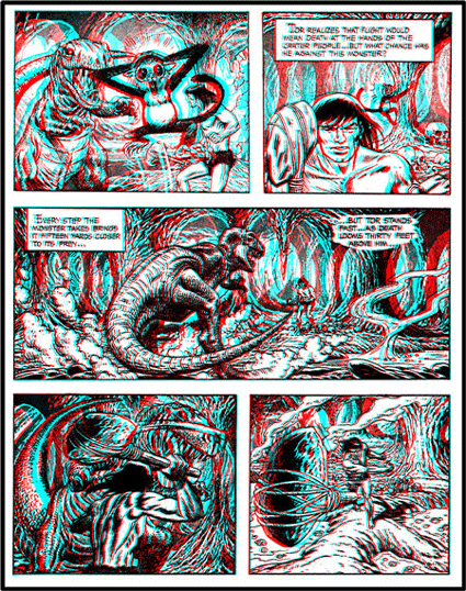
Tor had made his debut in the 2-D September issue. He was a super-strong, super-handsome caveman of a million years ago, who carried a cave monkey, Chee-Chee, on his shoulder. In the 3-D issue, he continued his exploits, battling dinosaurs and evil cavemen with his strength and wits. Torchlit caves that fade into a murky distance, rocky outcrops, lunging prehistoric beasts, and Tor’s active club, all provided opportunities for the artists to show off the graphic potential of 3-D drawings. In the first story, Tor is captured by an ugly clan of cave people and sacrificed to a “killer beast,” a Tyrannosaurus Rex, which he manages to spear with a giant stalactite. In other stories he wrestles a giant turtle, escapes a destructive fire, and gives the reader a tour of his world, where “might is right,” and “your life can be decided at the whim of a breeze…sniffed by the giant dinosaur.”
Tor met more human enemies in his next issue – giants, madmen, and tyrants – and Kubert tried out a variety of panel arrangements, from tall, thin segments, to a two-page center spread, dubbed a “Panelrama.” Through skillful blending of planes – a Brontosaurus in one drawing stretches through four levels, the breaks in its neck, body and tail visible only with careful scrutiny – Kubert created a sophisticated stereo world.

As might be expected, the Three Stooges found zanier adventures. Their 3-D panels are crammed with sight gags and oddball graphics. Kubert and Maurer had drawn two Three Stooges comics in 1949 for Jubilee and had started the series up again with St. John in 1953. The 3-D October issue is almost too much for the eyes to take; every frame is crammed with the calamitous adventures the boys get themselves into. In the first story they take a roundabout trip to the moon, along the way crashing a junkheap of an airplane after deducing that its propeller is the cause of a draft. The Stooges also make a showing as medieval knights in diving suits – Moe wearing an Ike campaign button – and end up in the water beneath the Olden Gate Bridge. In the November issue, also in 3-D, the Stooges are given title to Belly Acres Ranch and discover gold there – in Moe’s teeth. Despite the obvious silliness of the stories, Kubert and Maurer clearly put a great deal of effort into the artwork. The depth in most panels was broken into five or six levels, and great care was given to every detail of draftsmanship.
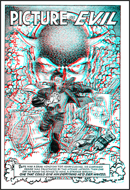
The House of Terror proved to be St. John’s only venture into the 3-D horror line, but not because the book lacked grisly effect. Though the cover is less than forbidding, young readers in 1953 must have known they were in for a treat when they donned their glasses and looked into the gleaming eyes of Satan on the first page. “Picture of Evil,” “The Violin of Death,” “The Curse of Khar,” “The Devil’s Chair” – the story titles themselves are spine-chilling, and they are presented one after the other without so much as a Dubble Bubble ad to ease the tension. Evil curses, twilight mists, and walking corpses abound here, made even more chilling in 3-D.

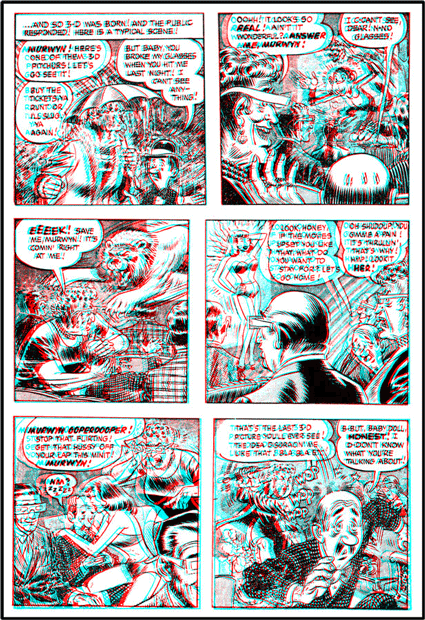
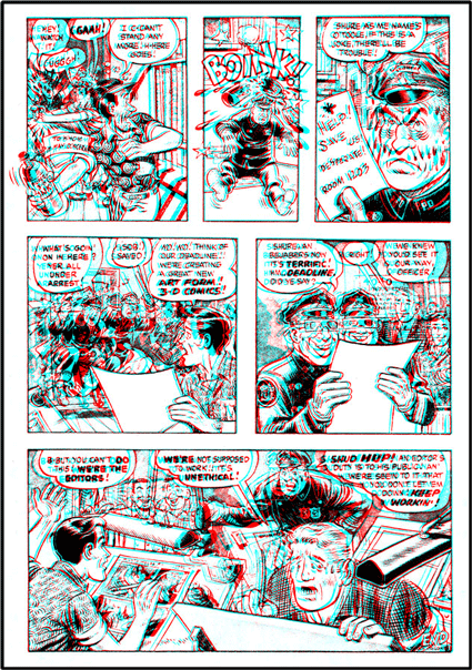
Whack, St. John’s answer to the just-founded Mad from E.C., contains spoofs of Dick Tracy (“Keyhole Kasey” by Chestnuts Mould), and Mickey Mouse (in “Mouse of Evil”), a love story featuring Scowboat Sadie, and a story about Maurer and Kubert titled “The 3-D-T’s”. In the last tale we get a rare glimpse of the two artists drawing 3-D comics, or rather driving their workers to draw them. The last panel of the story is inscribed, “The End, thank goodness,” the final touch added by an exhausted slave to 3-D.


By August 1953 St. John was moving heavily into 3-D and had more than thirty people at work redrawing all the artwork on hand into acetate sheets. Kubert and Maurer had also moved ahead with plans for licensing the Illustereo process to other publishers, though their lawyers were still troubling over the patent application. Power Publishing Company had purchased the first license for a 3-D comic to be called “The Space Kat-ets,” and E.C. Comics had expressed an interest. But in a disturbing turn for Kubert and Maurer, other publishers were preparing 3-D comics without consulting them.
National Comics was unabashedly proceeding with a large-format 3-D edition of Superman. After the success of Mighty Mouse, Jack Adler, the production manager at National, was asked if he could put out a similar book. Without a second thought he said yes, secure in his memories of the MacyArt books from his childhood that there was no great secret to 3-D printing. After a careful inspection of the St. John Mighty Mouse comic, Adler figured out for himself the method used to shift the layered drawings to produce the two stereo images, and instructed his staff artists in the technique.
Superman, in startling 3-D Life-Like Action came out in September 1953 in an edition of over a million copies and proved a huge success. Though the stereo effect was far from elaborate – four levels of depth is the maximum – the star of the book was Superman, and National had cast him in some classic stories, including "The Origin of Superman."

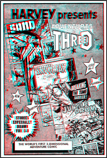
Harvey, too, published a 3-D comic in September; the now-classic Adventures in 3-D, which featured Harvey’s own “True 3-D” process. Inside the front cover, the publisher described the “many years of research and experiment” that had been spent on the process in order to produce “a sensational TRUE-LIFE depth.” Actually, the idea had come to Harvey just two months earlier, after the competition’s success with Mighty Mouse, but Harvey had indeed come up with some new tricks.
Sid Jacobson, an editor at Harvey, saw a golden opportunity in a 3-D comic book aimed at older children, a market Harvey was already serving with a series of mystery and adventure comics. Jacobson, Leon Harvey, and Warren Kremmer figured out the basics of the process, then went a step further by finding an artist who could make drawings that receded into the distance evenly, without being broken into flat planes. (In fairness to the history of 3-D, it should be stated that this sort of drawing dates back at least as far as Professor Wheatstone in 1838; and sophisticated stereo drawings had been made though the 1840’s; also, a very simple example of a pole stretching from in front of the page to well behind it appeared simultaneously in the second 3-D Three Stooges comic.) A careful look through the pages of Adventures in 3-D reveals some unusual effects: a spaceship that spears back into the page, a leopard that leaps out toward the reader, and on the first page the work “THREE” angling back through the center of a “D.”
For the artwork Harvey hired Bob Powell and Howard Nostrand. They were shown how to prepare the acetate layers and were offered twice the normal page rate for their work. The two split up the assignment, each handling two stories in the first book. Powell, assisted by Marty Epp and George Siefringer, worked in a studio in Oyster Bay, Long Island. Nostrand, twenty-two at the time and a former inker for Powell, had just set up his own studio in nearby St. James. For the background drawings the artists used a material called Craf-Tint, which, if wetted with a special fluid, gave shading in vertical lines and, if treated with another fluid, produced darker cross-hatch shading. The acetate they used was untreated and would accept only a very thick, sticky ink. Nostrand, an extremely talented inker, remembers most clearly the aggravation of working with this special ink: “It was like tar,” he recalls, and the artist had to wear cotton gloves to prevent smudging. They were given a tight deadline, and Nostrand often spent nights drawing on the acetate while his wife whited in the backs of his finished sheets.
When it was completed, Adventures in 3-D was an exceptional comic. The stories led the reader through some nice twists of the imagination: time travelers fought among themselves; the reader became a monster in one sketch; and every story featured an unexpected ending. The artwork remained consistently strong, and the “True 3-D” touches helped to break up the cardboard cutout look.
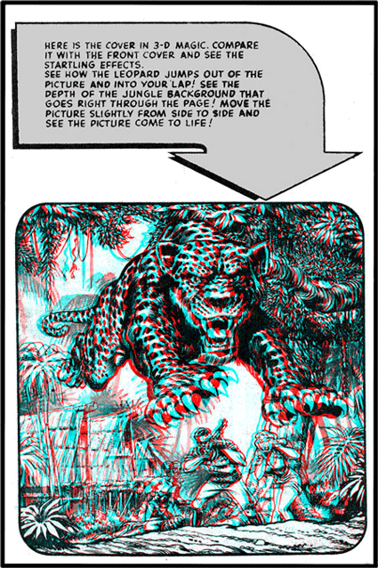

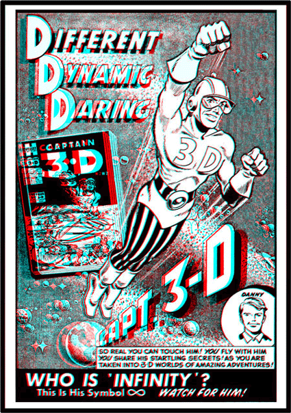
Harvey stepped deeper into 3-D with the December issues of True 3-D (a sister publication to Adventures in 3-D), 3-D Dolly, Harvey 3-D Hits (featuring Sad Sack), and Captain 3-D, a new character drawn by Jack Kirby. Harvey had high hopes for Captain 3-D, a superhero able to travel in “unseen dimensions,” invented by one of the kings of comic book art. Early in his career, Kirby had joined with Joe Simon to create Captain America, and he had since come up with a stable of successful characters. Harvey contacted Kirby in the summer of 1953 and asked him to develop a hero to lead the 3-D boom. Captain 3-D was the result. Passed down through the generations in the Book of D, Captain 3-D came to life when viewed through the ancient glasses, fulfilling his mission to battle the forces of evil.

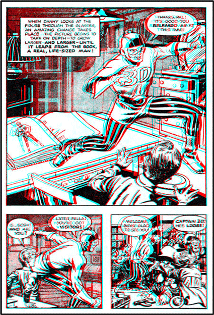

Unfortunately, by the time the Captain reached the newsstands, Harvey was discovering the fragility of the 3-D comic-book market. St. John, as the first publisher in the field, was also the first to discover how easily success could evaporate. After the incredible ninety-nine percent sale of Mighty Mouse, St. John had plunged headlong into 3-D, with five October issues, and seven November issues, all with editions of more than a million copies. But sales, instead of gathering momentum as expected, began to dwindle instead. The second batch of comics, the October issues, yielded sales of only seventy-five percent and fifty percent, and the third batch, the November issues – which appeared with National’s and Harvey’s first efforts – showed miserable sales of thirty-five percent, twenty percent, and even ten percent. That drove St. John from the field. The final December issue of Mighty Mouse was a parting gesture. For St. John, a small business that had made a massive commitment to 3-D with huge print runs and a special staff of thirty artists, the financial losses nearly proved fatal.
Harvey managed to slide through the fall without serious damage, but there are signs that they, too, beat a hasty retreat from 3-D. Their November Adventures in 3-D and December True 3-D issues sold exceedingly well, each more than ninety percent, but the company viewed those results warily. They had taken on eight extra artists to put out four December issues, but that was their peak month. In January and February they published only one issue each of Adventures in 3-D and True 3-D, an ad for a second Captain 3-D that never appeared, and a pair of ten-cent comics, The Katzenjammer Kids and Jiggs and Maggie, which each included a single 3-D story, but no glasses.
Behind the scenes, there was a heated legal battle between Archer St. John and William Gaines over the patent dispute. The December issue of Whack published a satirical version that was not far removed from the truth.
The withdrawal of three publishers from the field did not mean the end of 3-D comics – not quite. A number of other publishers were busily preparing to give the idea a try. In December 1953, twenty-three new 3-D comics hit the stands, more than any other month: 3-D Love, Jungle Thrills, Indian Warriors, Jet Pup, Sheena the Jungle Queen, Katy Keene, Felix the Cat, The First Christmas and a number of children’s cartoon books were released and all met with rapidly declining sales and interest.
3-D Love, and the January 1954 3-D Romance were the only 3-D comics made for older girls. Both were published by Steriographic Publications, a company formed by Ross Andru and Michael Esposito, and both are filled with surprisingly sophisticated stereo graphics. Inner thoughts and feelings are given a hovering presence in the distant background, flings in the city show up in a crazy collage of champagne bottles, dancing couples, neon lights, and maracas layered into diminishing space. The stories are sometimes unexpectedly sordid. A Viennese beauty marries an American soldier only to discover when he brings her home to Ohio that he is – horror of horrors – a factory worker! A gigolo’s life is ruined, his heart broken, when he falls for a gigolette. A career woman lies and cheats her way to the top only to be stuck with a man who is as sly as she. Alcohol, full moons, treachery, and tragic endings swirl thickly through these, the scarlet ladies of the 3-D comics.


Sheena the Jungle Queen was a heroine tailored – or untailored – to the interests of adolescent boys. Her full figures and skimpy leopard-skin outfit must have had great appeal among junior high romeos. In a reversal of the Tarzan-and-Jane syndrome, Sheena had her Bob, a handsome klutz who required constant rescuing. Sheena’s jungle reign began in 1937 and ran until 1953. The December 3-D issue was her last appearance, and she fought her way through it in a parting blaze of glory, dodging spears, swinging through the trees, and breaking up a slave ring. Sheena’s disappearance in 1953 coincided with a growing movement toward censorship of the comics. Her shapeliness aroused the indignation of worried mothers and forced her into early retirement.
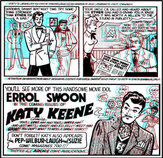
In another memorable one-time appearance, Katy Keene put on a fashion show in her only 3-D comic, published in December 1953 by Close-Up, an imprint of Archie Comics. Bill Woggon, her artist, was asked to work up flat art for a special 3-D issue, which would be redrawn for 3-D in Archie’s New York office. This Woggon did, fitting Katy into costumes submitted by readers from all over the country. From her dresses down to her underwear – and even to her boyfriends’ cars – Katy appeared as her readers wanted to see her. (Had she had veto power, she might have escaped appearing in a Jolly Green Giant suit, but Woggon had the final say.)

From the flat line art, Bob White, at Archie, prepared the 3-D version of Katy Keene. His treatment is limited to three levels, crude work compared to St. John’s or Harvey’s comics, but he did come up with an interesting effect by leaving plain areas of red and blue for sky, walls, and decoration. The colored areas certainly make the book the most attractive to look at without filters, but seen through the glasses, colors take on a neon look, as one eye sees white and the other black. The red-and-blue patchwork technique is hard on a reader’s eyes, but it does liven up Katy’s surroundings.
The flurry of 3-D activity in comic-book publishing during the summer and fall of 1953 did not go unnoticed by American gum-card manufacturers, who were looking for enticing ways to sell gum to the same children who bought comic books. Before the end of the year, the young adult had three 3-D gum-card series to collect: a set of antique automobile cards, from Bowman, and two sets of Tarzan cards from Topps, showing the stories from the new movies, Tarzan and the She Devil and Tarzan’s Savage Fury. While the Bowman set only contained a handful of actual 3-D cards mixed in with color images, the Tarzan cards were extremely well produced, printed on a bright, coated card stock. They remain among the finest examples of anaglyphic printing. The drawings, by an artist whose name has since been lost, made fine use of stereo imagery within the restrictions of the small card size.
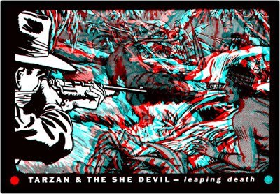
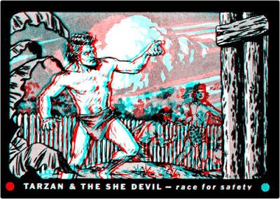
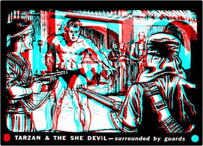
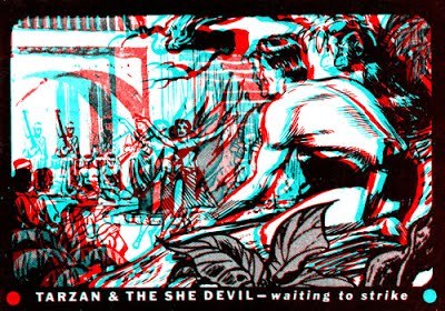
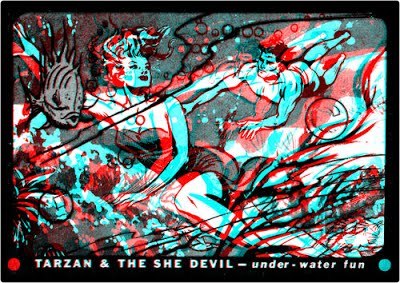
By January 1954 publishers were drawing back from 3-D. St. John and National, as we have seen, made their last attempts in December 1953, and by January, Harvey was experimenting with limited 3-D issues at the standard ten-cent cover price. In the same month Atlas – an imprint covering the work of a number of publishers – tried their hand with a pair of over-size, full 3-D comics at the bargain price of only fifteen cents – complete with two pairs of glasses.
The two Atlas titles, 3-D Action and 3-D Tales of the West, offered rough, tough tales of war and adventure in limited – three level – 3-D. The western book served up gunfights, brawls, Indians, and all-American patriotism. In one scene Big Jim Fraser stops a band of raiders from attacking a work party on the transcontinental railroad by punching their leader and giving the rest a speech. “He told them about the Railroad and about their country! He told them about his dream and their future! They listened – ‘That’s what this Railroad means! It means commerce and industry! It means America will be great…There will be schools here, great cities, happy families, and good living…’” When the moralizing ended, the raiders signed on as members of Fraser’s work party.
3-D Action presented championship boxing, Russian spies and combat adventure from Korea. In one leathery story Sergeant Socko Swenski explains how to take a Korean hill, first blasting the “Reds” on top with howitzers and mortars, then charging up with bayonets. When the “scummies” run, the bombers are called in to finish the job. As a final touch, “some G.I. pulls a flag outta his shirt and hangs it on a battered tree!”
These were pre-Vietnam times of American bravado, of patriotism frenzied by fear. The Russians had exploded their first atomic bomb in 1949, and while Americans dug bomb shelters under their lawns from coast to coast, the cold war stakes rose. In November 1952 a U.S. test of the hydrogen bomb destroyed the atoll of Eniwetok in the Marshall Islands, and just nine months later the Russians exploded their own H-bomb in Siberia. In October 1953 Senator Joseph McCarthy launched an investigation of the U.S. Army, which he suspected of Communist subversion. And in the national climate of fear and suspicion, the comics too came under attack – not as Communist propaganda, but as corruptors of youth.
The two Atlas comics seemed to be making a conscious effort to remove themselves from the line of the coming attack, and , indeed, they each carry a tiny star on the cover with the legend “conforms to the comics code,” an early indication of self-regulation and self-protection by the comic industry. During the spring of 1954 popular outrage against comic books reached a fever pitch. In April, in response to “thousands of letters,” a US. Senate subcommittee investigating juvenile delinquency began to focus its attention on comic-books. In the same month, Frederic Wertham’s book, Seduction of the Innocent, was published to a great hue and cry.
Wertham’s book is difficult to read seriously today, as its assertions are often wild and unfounded – that Batman and Robin, for instance, were homosexuals and that Wonder Woman was a lesbian sadist – but at the time it was read with great concern by parents across the country. A pre-publication excerpt in the
Ladies’ Home Journal generated a flurry of letters, and women began to form censorship committees to blacklist comics and convince newsdealers to carry a more limited selection.
In the middle of the dispute, hoping it would all die away, sat the comic-book publishers. One of the prime targets among them was William Gaines, the originator of horror comics in the 1940’s and the last to publish 3-D comics in the spring of 1954.
Gaines’s father, M.C. Gaines, had been a comic-book pioneer in the 1930s; by some accounts he created the standard comic-book format. After World War II the elder Gaines formed a new company, Educational Comics, popularly known as E.C., which published a wide range of material from Bible stories to adventures of the superheroine Moon Girl. William Gaines inherited the company in 1947 and, after a period of searching, began to turn the business on its ear with some radical innovations. In 1950 he launched Crypt of Terror, The Vault of Horror, The Haunt of Fear, Weird Science, Weird Fantasy, Two Fisted Tales, and Crime SuspenStories, in what he described as E.C.’s “New Trend” in comic books. Their success can be measured by the flocks of imitators that followed over the next few years.
Gaines had assembled some of the finest artists and writers in the industry when he launched his “New Trend” line – Graham Ingels, John Craig, Albert Feldstein, Harvey Kurtzman, and Wallace Wood. When the comics went into circulation they attracted even more artists to E.C. – among them Bernie Krigstein, Will Elder, Jack Davis, Frank Frazetta, Joe Orlando, George Evans, and John Severin. The comics they produced stood out from the competition like the apple in the Garden of Eden, and in the end caused almost as much trouble.
In 1952 E.C. introduced Mad, the invention of editor Kurtzman, and it swiftly grew into the wildest success story in the business. Gaines had turned his company – and the comic-book industry – around and onto a new track in the space of three years.
It is not surprising that Gaines wanted to try 3-D when it came along, nor is it surprising that he pursued a course different from that of his competitors. He had long been interested in 3-D, even outside his business. He was one of the early owners of the Stereo Realist camera, and when 3-D movies started coming out, he went to every one, wearing a pair of specially made prescription 3-D glasses. In 1952 Gaines and Al Feldstein experimented with 3-D comics, using stereo cameras and three-dimensional setups, but they couldn’t devise any practical production methods. Both men recognized the breakthrough Kubert and Maurer had made when Mighty Mouse was released, and E.C. purchased a license from the two innovators for the production of two comic books. As part of the agreement, Will Elder was sent to New Jersey for training in the Illustereo process.
The first, Three-Dimensional E.C. Classics, included stories by Wood, Krigstein, Evans and Ingells, redrawn for 3-D from their original appearances in Mad, Weird Science, Frontline Combat, and Crime Suspenstories. Classics is an odd assemblage of the whacky and the mysterious, containing both a Mad-style story by Wallace Wood about a voluptuous vampiress – the only woman in all of 3-D who rated an extra plane for her bust – and an elegantly drawn Krigstein tale, “The Monster From the Fourth Dimension,” in which deceptively simple graphics evoke the plain, open feeling of a Midwestern farm invaded by a gruesome time-traveling blob.
The second E.C. comic, Three-Dimensional Tales from the Crypt of Terror, is more consistently horrible. Stories by Davis, Elder, Craig, and Orlando have been redrawn from Tales from the Crypt and The Vault of Horror, to give the reader a chain of grisly 3-D thrills. Davis’s contribution, “The Trophy,” is a perennial favorite in its flat version. Equally macabre are Elder’s story, “The Strange Couple” – which at the end sends the reader spinning in an angst-producing cycle of repetition – Craig’s piece about a true batman, and Orlando’s “The Thing from the Grave.”
All the stories in the second volume are introduced by the Crypt Keeper, E.C.’s famous M.C. of horror. He delights in serving up a nasty bill of severed heads, partly decayed corpses, and bloodthirsty fiends in a dank milieu, shaded to a heavy grayness by the E.C. artists.
NOTE - New information has been discovered which dates the release of the two EC 3-D comic books to mid-October 1953.

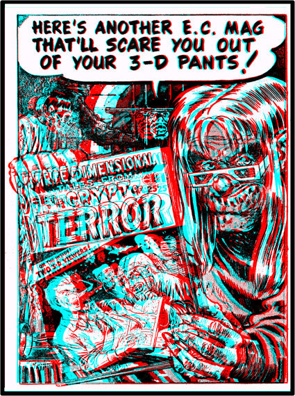
The E.C. comics provided an appropriate finale to the brief flurry of 3-D comic publishing – a fitting last gasp. In April 1954 the national mood of suspicion about comic books provided Gaines with more serious worries than the failure of his two forays into 3-D. In that month he was called to testify in a special televised hearing before the U.S. Senate subcommittee investigating the causes of juvenile delinquency. Gaines’s testimony followed that of Frederic Wertham, author of Seduction of the Innocent, and the senators were clearly eager to get political mileage out of grilling a horror-comic publisher. The New York Times, in a front-page story, described Senator Estes Kefauver asking Gaines if he considered in “good taste” the cover of one of his publications “which depicted an axe-wielding man holding aloft the severed head of a blonde woman.” He replied, "Yes, I do - for the cover of a horror comic. I think it would be in bad taste if the head were held a little higher so the neck would show with the blood dripping out." Senator Kefauver responded: "You've got blood dripping from the mouth." Gaines came off poorly in both the interrogation and the news accounts.
After his television appearance, sales of Gaines’s comics plummeted, as newsdealers steered clear of the poisonous publicity. During the spring and summer more citizens’ groups came out against comic books. The activists included the Women’s Club Federation, the County and Prosecuting Attorney’s Association, and the American Legion. In September 1954, comic-book publishers responded by forming the Comics Magazine Association to enforce a “comic code.” As one of its first actions, the group banned crime and horror publications.
Comic books as a creative medium disappeared under this censorship, and the industry was not to recover for many years. William Gaines was forced to divest himself of every title except Mad, which he put into a longer non-comic-book format in order to sidestep the critical eye of the association. He is still saving the artwork he amassed for a 3-D science-fiction comic, completed in 1954 but never published because of the pressures of the marketplace. (The fanzines Witzend and Squa Tront eventually presented the unpublished science fiction stories. Unfortunately, they were only released flat.)
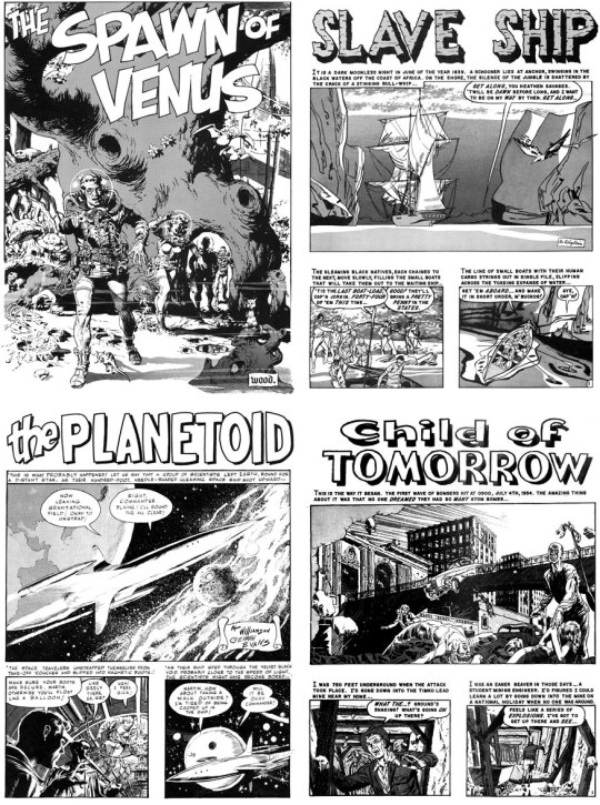
Just as 3-D comic books were dying on the stands, several publishers began issuing full-color comics with a 3-D effect. The first company was the American Comics Group and their process was called Truevision. Appearing in Eight issues of Adventures into the Unknown, two issues each of teen comics The Kilroys and Cookie, several issues of Lovelorn and Romantic Adventures and one issue of Commander Battle and the Atomic Sub, Truevision consisted of letting characters and objects slip out of the restraints of the panels and into the area surrounding them. At the same time they had the artists render the background less distinct, like something seen at a distance, while the colorist saw to it that only the close-up main characters were in full color.
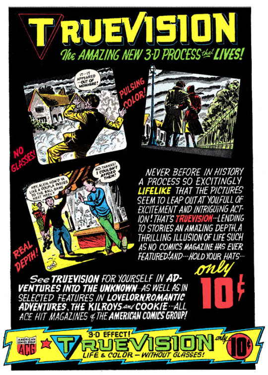
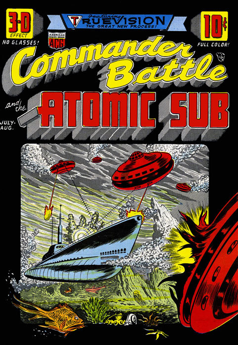
Other publishers quickly jumped on the bandwagon and released several comics with 3-D effects. The Magazine Enterprises art by Frank Bolle utilized in Red Mask and Tim Holt was similar to the Truevision comics except they retained white borders around the panels. The Deep Dimension comics Crime and Punishment and Black Diamond were drawn by Alexander Toth utilizing layered halftone screens to make faces and figures more dimensional. In addition, the artwork was presented in a curved panel, simulating the widescreens commonly seen in many theaters in 1954. PictureScope Jungle Adventures was a black and white coloring book with artwork by Jay Disbrow. Each page featured a single panel with a 3-D effect image.
By the summer of 1954, just like the stereoscopic movies which had inspired their creation, 3-D comics had all but vanished. Mad featured a satirical look at the 3-D fad in their June 1954 issue. When the dust had finally settled, Harvey had such a huge stock of comics in their warehouse, they were still selling copies in 1960 through ads in Famous Monsters of Filmland.
Today, the original 3-D comics are highly collectible. Many of the issues can still be found for reasonable prices, especially the early ones that were printed in such large quantities. Our cover gallery will show you every issue published in 1953/54. Get out your Three Dimension Space Goggles, shop around and have fun! A very special thank you to the following individuals for their help with this article: Peter Apruzzese, Hillary Hess, Lawrence Kaufman, Greg Kintz, Greg Theakston and Jack Theakston.

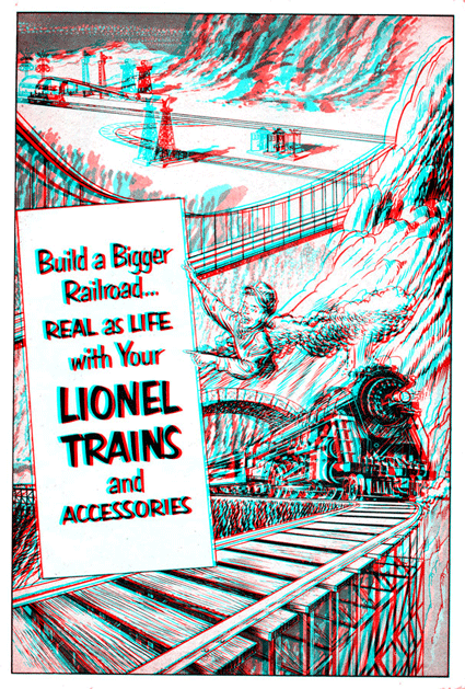
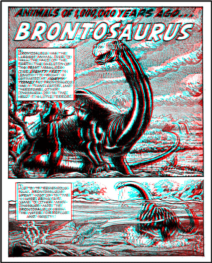
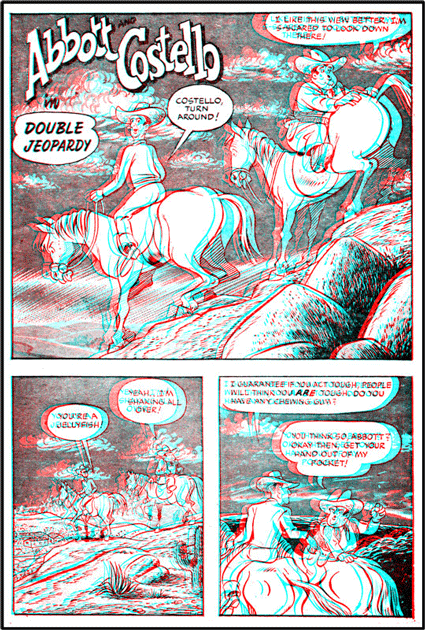
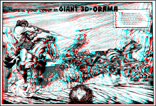

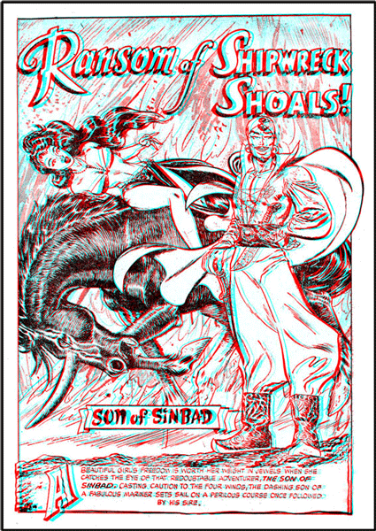
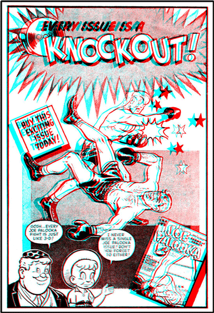


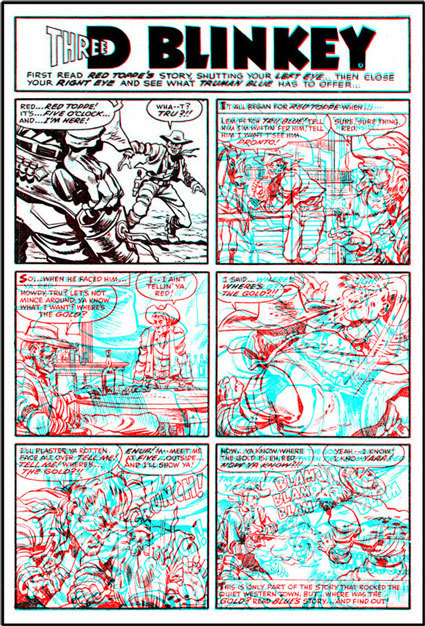
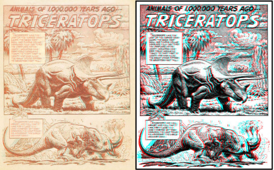
Original Article: http://www.3dfilmarchive.com/home/images-from-the-archive/comic-books
0 notes
Text
Choosing a Monitor
Which one is right for me?
Maybe you’re buying a monitor for the first time, or maybe you’re looking to up your game. Either way, these days there are so many buzz words and fancy terms for the many features of a monitor. It can be a challenge weeding through what’s important to you, and what’s not.
Fear not, as I dive into some of the more common features and break down what they mean and how they may be important to you.

Because there are so many options to choose from it is best to narrow down some of your options, let's start with the easiest— Size.
Monitors come in a variety of sizes from as small as a tablet to 50+ inches. Determine which size suits your needs and fits your workspace, but not without first considering the following information:
The resolution, which is the number of horizontal and vertical pixels that can fit in a display, can vary in sizes. The most common in the U.S. is 1920x1080. Pixels are the tiny individual squares of color that collectively make up the image displayed on your screen. The more of them you fit into a display, the more information you can see without needing to scroll. Therefore, a higher resolution will be able to display more information than a similar-sized monitor of lower resolution. Images will be sharper; icons and text will be smaller. But don’t base your decision solely on resolution alone, let’s also talk about brightness and color.
Brightness, measured using NITs, range from 250-600+. For general purpose displays, the lower end of that spectrum should suffice. For movies, gamers, and laptop users, a higher NIT may be desired closer to the 400-500 range. A higher NIT means your display will be capable of displaying brighter, especially useful for those who like to use their laptop outdoors where there is a lot of natural light.
While we’re discussing brightness, let's also consider the Contrast ratio, which determines how well your display can portray true whites and dark blacks. A contrast ratio of 1000:1 will display richer blacks, whereas a lower ratio of 200:1 may display the black as gray. Higher is better but can also result in a higher cost.
Monitors come in many different color profiles, and this seems to be one of the hardest areas to find clear cut answers. This is because of many variables, including the basis that not all of us see colors the same. The good news is most monitors allow you to adjust the RGB color values, brightness, contrast, and more. In addition, you can download color profiles, or create your own, in the form of an ICC file. This means that two users with the same monitor can configure their displays to output differently.
There are 2 main display types to consider, TN (Twisted Nematic), and IPS (In-Plane Switching).
While TN monitors will work great for most users and Gamers, an IPS monitor may be preferred for those who work heavily with photos, editing, video, and colors. This is due to its ability to reproduce colors more accurately. This can come with a side effect such a backlight glow when viewing in a dark room. IPS monitors often have a higher response time and may not be as appealing to gamers than a TN monitor.
Let’s talk about what Refresh Rate and Response Time are and why it’s important. The refresh rate is how fast your monitor can redraw the image per second— higher is better. Response Time is the amount of time it takes each pixel to change colors— lower is better. With a 1ms response time, it can change fast enough to reduce ghosting seen otherwise with a higher response time such as 5ms.
So now that we have a better idea of what all these features mean...
Which monitor is right for you? Consider your use case— are you a casual gamer, or are you a competitive heavy gamer? Will you be using this monitor primarily with imaging programs where color accuracy is important? Maybe you are a light user who periodically checks their email and plays an occasional game of Solitaire. In the end, only you can decide which monitor will be best for you. Hopefully, this article helps you in your search for a new shiny panel.
0 notes
Text
Magnitude and Direction, Issue #40 | 23 Aug 2019
Hardware, Prototyping, and Fabrication
Via The Prepared: The VertiWalk is essentially a human-powered elevator (it's not as hard to operate as it sounds) that can improve mobility for people struggling to get up and down stairs. Blaser Hub has scientifically tested which nerf darts are best, so you know what to stock up on before the next office war. 🧲 This 252-segment ferrofluid display is part digital clock, part lava lamp.
Software and Programming
🤬 Try to play this horrible-UI game without losing your mind. 🔊 There's been speculation of secret codes and messages hidden in songs for generations. Now, though, it's finally come to pass. Not only does this article provide an informative and interactive breakdown on what a JPEG really is and how it works, it also provided this somewhat disturbing factoid: "...in the same way you confuse your brain when you rub your eyes too hard andstart to see blotches of dimness and color! These blotches you see—known as phosphenes—don’t come from any light stimulus, nor are they hallucinations made up in your mind. They arise because your brain assumes that any electrical signal arriving through the nerves in your eye is conveying light information. The brain needs to make this assumption because there’s no way to know whether a given signal is sound, sight, or something else. All the nerves in your body carry exactly the same type of electrical pulse. When you apply pressure by rubbing your eyes, you’re sending non-visual signals that trigger the receptors in your eye, which your brain interprets—incorrectly, in this case—as vision. You can literally see the pressure!" This new knowledge makes me wonder all kinds of things about brain-computer interfaces I wasn't thinking about before!
Science, Engineering, and Biomedicine
As climate change causes the loss of glaciers around the world, more than environmental issues are being precipitated. In the case of Italy, it means they have to keep redrawing their borders. 🥑 Rest easy, folks, we've sequenced the avocado genome. It may seem like just a white orb, but the eye is one of the most complex organs in the body and notoriously hard to replicate in vitro, which makes this tear-shedding artificial eye all the more impressive.
Mapping, History, and Data Science
I came across an interesting article by Jeff Sisson on the BetaNYCSlack Group the other day investigating how a section of Queens most people would probably indentify as Maspeth ended up getting labeled "Haberman" on Google Maps. The conclusion he arrived at, while not 100% confirmed, does seem likely and serves as a reminder that our data is only as good as we are, the topic of this week's Moment of Inertia. "There will probably never be a year in which no one dies in an aviation accident, but there will definitely never be a year in which 10 percent of the global population dies in a single plane crash. Yet that could happen with a supervolcano, an asteroid strike or a nuclear war." The New York Times on why our perceptions of probability make us woefully under-prepared for existential threats (ourselves included). Much to my chagrin, you can't technically ride the entire NYC subway system in alphanumeric order (i.e., 1-2-3-4-5-6-7-A-B-C-D-E-...-Z) with a single metro card swipe (the lack of transfer between the G and J trains is what does you in, in case you were wondering). You can however, travel 154.6 miles in the system without ever doubling back on yourself with a single swipe, as this WNYC article explains. (Also, in case you were curious 154.6 miles is roughly the distance from New York to Baltimore.)
Events and Opportunities
Remember two weeks ago when I said this section was the longest it had ever been? Well, the community may have one-upped itself yet again this week.
TONIGHT, 8/23 Join the New York Academy of Sciences for a brainy comedy night where local scientists will attempt to confirm the hypothesis that science does indeed have a sense of humor.
Tuesday, 8/27 The New York 3D Group hosts their first meetup at The World Bar, where participants can learn about 3D scanning technologies and even how to get a scan of themselves.
Wednesday, 8/28 The NY/NJ chapter of the Society for Conservation GIS are gathering for an informal chat over snacks and drinks. Come network with the organizing committee and other members of the chapter. If your map-minded data enthusiast like myself, they're always looking for volunteers, presenters, and suggestions for activities.
Wednesday, 8/28 The Hardware Startup meetup may not be having formal events over the summer, but that's not going to stop the community from getting together for their second happy hour of the season.
Tuesday & Wednesday, 9/3-4 If you've got some time to take a trip up to Cambridge, join the Harvard Biotech Club for their 20th anniversary Bridging the Gap symposium, annual Career Fair, or both. Students from all academic institutions are welcome and dozens of companies will be on hand for networking and recruiting.
Wednesday, 9/4 The Transit Techies meetup is back with all of your favorite transit-and-data-related projects. If you like trains, data science, and/or the view from Hudson Yards, I highly recommend you check out what is one of my favorite meetups.
Wednesday, 9/4 NYDesigns is hosting is next Women in Tech Happy Hour at Bierocracy in Long Island City. As always, individuals who identify as female and men are also welcome to attend.
Thursday, 9/5 Join Columbia Nano Labs for their annual Industry Day conference. Learn how you can use and leverage the Nano Labs facilities, hear from a panel of entrepreneurs who have done just that, and listen to faculty and technical experts discuss the way these sophisticated tools contribute to cutting-edge research.
Thursday, 9/5 The HAX hardware startup accelerator is journeying east from their usual haunts of San Francisco and Shenzen for a visit to New York to connect with the local hardware community with a special after-work hardware meetup and a night of socializing, drinks, and bites.
Friday 9/6 I'd like to say Nanotech NYC scheduled their next nanonite happy hour in honor of my birthday, but I don't think Jacob or the other organizers know when my birthday is! (Although they do now.) At any rate, NYC's nanotech community (practitioners and enthusiasts alike) will be getting together at Clinton Hall in east Midtown.
Some other upcoming events to keep on your radar...
Monday, 9/9 Small science gets a big showcase at Nano Day at the CUNY Advanced Science Research Center. Learn about some of the most exciting nanotechnology research and innovations coming from the NYC area and meet other technologists working in the field.
Wednesday, 9/11 Scientists, researchers, cartographers, artists, andeveryone in between will be gathering together at Peculier Pub for the next SciArt mixer.
Friday, 9/13 The Nanotech NYC meetup hosts Kendra Krueger, the founder of 4LoveandScience, a research and education platform that inspires new modes of working and learning in a complex world. An electrical engineer with nanotech experience in academia and the photonics industry, Kendra is also a trained facilitator in mindfulness, sustainable design and social justice.
Thursday, 9/19 LiveIntent is hosting their first tech happy hour at their office in lower Manhattan. The event promises to be a great opportunity for New York tech professionals to network, share ideas, meet our team, and learn all about LiveIntent and how their re-imagining email. There will be food, beer and wine provided, along with video games andboard games available!
Tuesday, 9/24 Join GeoNYC and Doctors Without Borders for a special map-a-thon to fill in missing geospatial data for underserved regions in order to provide international and local NGOs and individuals with the data they need to better respond to crises.
Wednesday, 9/25 Coming off their 1st birthday party, the NYC JLABS crew is taking a short break for the summer but will be back in September for their next Innovators and Entrepreneurs mixer.
Wednesday, 9/25 The RobotLab meetup's September event focuses on the good, the bad, and the ugly of Industry 4.0 and autonomous manufacturing.
Saturday, 9/28 Admission is just the swipe of a metro card for the Parade of Trains at the Brighton Beach station. Vintage train cars from all periods of the subway's history will be on display, as well as taking passengers on short trips around south Brooklyn.
Tuesday, 10/1 The next stop on Ogilvy's healthcare innovation pop-up series takes them to Hudson Yards, where they're teaming up with the HITLAB and SAP.iO Foundry for an event that will focus primarily on the female and underserved health innovators who are disrupting healthcare today.
October 11-16 Innovation Week at Mount Sinai. What started as just the SINAInnovations conference is now a week's worth of activities dedicated to bringing New York's biomedical innovation communities together. Here's the full lineup:
Friday-Sunday, 10/11-13 Mount Sinai Health Hackathon. The 4th annual Mount Sinai Health Hackathon will be an exciting 48-hour transdisciplinary competition focused on creating novel technology solutions for problems in healthcare. This year’s theme is Artificial Intelligence – Expanding the Limits of Human Performance.
Tuesday, 10/15 Careers & Connections 2019. October may feel far away, but I promise you it's not and you'll want to be sure to mark your calendars for GRO-Biotech's next big event, the Careers & Connections mini-conference and networking event, held concurrently with emerging healthcare technologies conference, SINAInnovations.
Tuesday & Wednesday, 10/15-16 SINAInnovations Conference. The Icahn School of Medicine at Mount Sinai is hosting its eighth annual SINAInnovations conference around the theme of Artificial Intelligence. A range of talks andpanels will focus on the explosive growth of AI in our society and in particular in medicine, featuring international thought leaders across the range of relevant domains.
Saturday, 10/26 The Future of Care conference is back at Rockefeller University featuring some of the latest breakthroughs in clinical care and the innovators helping shepherd them from bench to bedside. Apply to attend the conference by September 6th.
Map of the Month
What will the climate in your city feel like in 60 years?
Odds & Ends
Meteor showers are amazing from earth, but they're even more breathtaking from space.
0 notes
Text
How to take your vector logo from 2D to 3D
In this tutorial, we're looking at however you'll take your vector-based logos from creative person and Photoshop into Cinema 4D and provides them form, texture and lighting. Amazingly, it's easier than you think that and it will solely take 30 minutes with some basic data of C4D to create a professional logo design. If you wish to bone on your C4D skills, we have got an excellent choice of Cinema 4D tutorials to assist you out. Except for those of you who are able to go, let's start.

Step #1
Once you have got your style nailed in artist, break it down into its basic shapes. If you continue to have any live text, you will need to make the outline (Cmd+Shift+O) to convert everything to a path. During this case, I've 3 main shapes – the blue define, the most orange kind and therefore the yellow detail – we're ignoring the shadow, that we'll add later in C4D.
Step #2
Once you have your basic shapes separated, choose every form and mix them alongside the guide (Cmd+Shift+F9) Union button, this can be the one with two squares merge along. Within the case of my logo, an example would be change of integrity the B and therefore the remainder of the character within the orange kind. Another smart tip is to appear closely at your ways in define mode (Cmd+Y) and redraw any wonky points as a result of these can show once you begin modelling in CD4 later.
Step #3
The easiest way to get a path in Cinema 4D is to travel through PhotoShop. Thus Copy (Cmd+C) one amongst you shapes from artist and Paste (Cmd+V) directly into PhotoShop. Once traced, produce a brand new document the dimensions of the writing board and paste (Cmd+V). Once the Paste cubicle seems choose Path. Once in PhotoShop, move to File/Export/Paths, then to artist, this vector file is compatible with all versions of Cinema 4D. Create .Ai files for all elements of your logo.
Step #4
Open all the .Ai file into Cinema 4d, once prompted by the Adobe illustrator import box, check that the Connect Splines box is ticked. What you would like to do now's to chop and paste all of those Splines (paths) into identical document. The simplest thanks to try this is to pick out the form icons from the item panel (normally within the high right of the interface) this can select all the weather with every Spline.
Step #5
Once you've got all the weather in one document, press (F4) for the front read and set up every one to make your logo. Press (F1) to travel back to the most Camera. A fast tip: to maneuver around Cinema 4Ds camera, use (1), (2) and (3) keys.
Step #6
Select the Extrude tool (see screen) for every a part of your design. They’ll seem in your object panel with you splines (paths). To induce them to figure, grab your splines and move them within the extrude icons. If this does not appear to figure, choose squeeze out, then within the attributes panel below, click the article tab and ensure the graded box is ticked. To alter the depth of every half change the third Movement figure on identical tab. By default, this is often unremarkably twenty cm, however attempt a minus figure.
Step #7
To give slightly semicircular edges to components of the brand, choose the extrude tab within the object panel, then click the Caps tab within the attributes panel below. Within the Caps panel modification each begin and finish attributes to Fillet Cap, then Fillet sort to bell-shaped. You’ll alter however semicircular it's by ever-changing the radius values. Whereas you are here, attempt sterilization the Fillet sort for various edges.
Step #8
It's time to place this on one thing. Choose a plane from the shapes menu (see screen). For a fast tip, there are 3 fast keys that permit you to maneuver an object within the scene: (E) permits you to move on an XYZ axis, (R) permit you to rotate and (T) permits you to vary the dimensions. Thus grab your plane and move and scale it beneath your logo. To urge a higher plan of however your logo is wanting press (Shift+R) to render it in a very window to look at.
Step #9
A great place to begin with Material in Cinema 4D is by staring at its predetermined library. To seek out this head to Windows/Content Browser, a window can pop and within the facet panel head to Present/Prime/Material. To use the fabric simply drag it from your material panel to the item within the object panel. A good tip: there is a heap of free material out there on the online and that is simple to put in within the plugin folder.
Step #10
For the lighting, I've unbroken it easy by exploitation Cinema 4D's Physical Sky lighting. It's found beneath the menu with the ground icon (check out the on top of screenshot). To change the time of day, choose the Physical Sky icon within the object panel then the Time and site tab within the attributes panel. For extended shadow, assume later within the day. To envision the sunshine and shadows, render it during a window. (Shift+R)
Step #11
Go to Render/Edit My Render setting menu. On the left-hand facet of this window, there is a ton of various attributes for rendering, however we're solely addressing 2. First, click output, this panel enable you to change the resolution of the ultimate image. Second, click Save, this panel permits you to vary the format of the file. If you are looking for an additional realistic render, attempt close Occlusion, this can be a setting from the impact button on the left-hand facet. However be warned, this can take longer to render.
Step #12
Once all of your settings area unit sensible, begin your render (Shift+R). This may render your image in a very completely different window, as before, that is sweet as a result of it permits you to still tweak your scene if you wish too. Reckoning on resolution and therefore the speed of your machine, the rendering will take your time. Once it's finished within the image viewer window, head to File/Save as. Straightforward once you know how.
0 notes