#ravensbourne profressional trajectories
Explore tagged Tumblr posts
Text
SELF PROMOTION
I started off my self promotion idea with, well, nothing.
I left it to the last moment as I had to focus on my main project and all of that.
Over the last two days (14th of June), I’ve been thinking about what exactly to do. I thought about how best to promote myself, what do I like? What do I do best? These questions lead me on to a starting point.
Blue and yellow.
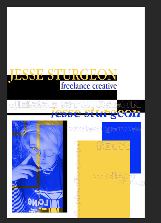
Blue and yellow are my two absolute favourite colours and I thought that they should be the main colours in my self promotion. I went with these colours and decided to look down my ‘adverts’ pinterest board, which includes a load of posters that I find interesting and inspiring, and it was!
The posters and photos I decided to look at and research all have a lot in common. They all have two prominent colours + one background one (and occasionally just black and white). As well as that, they mostly feature squares and lots of grids. While my work doesn't feature any grids, it does feature the two colours (blue and yellow), squares and also multiple eyes, that were included in one of the pictures I researched.


These pictures remind me of vintage skateboard and snowboard magazines, which I’m very interested in! I love the typeface they use and managed to grab one of them for free (which I ended up not using, but as you can see I did try to implement it)
I messed around with quite a few different ideas, different fonts and more…

The beginning. I started off with just a black square and Rochester Twee font - I absolutely fell in love with this font, for some reason it just works so perfectly and is very aesthetically pleasing for me.


Here’s an up close picture of my face with my editing - the eyes came from one of the posters I researched.

I tried the eyes without the yellow first, however they didn’t stand out as much as I had wanted them to, as shown here:

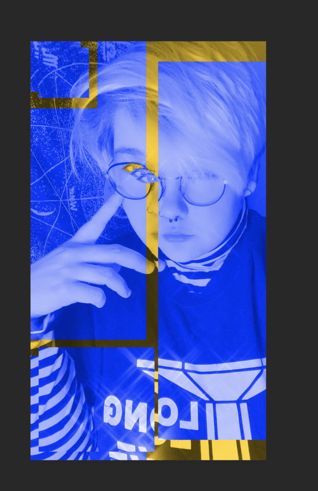
My dad helped me get to this point, which was amazing as I definitely needed a little creative guidance. We messaged around with the lines that went off from around my picture, then trying to bridge the gap between all the images to make them connect just like the images we’d researched. All of those images had something tying them to an anchor point and I decided that I needed to have them connecting.

However, I wasn’t completely satisfied.
I worked on this for ages, shifting through different fonts and other ideas and after deliberating with my dad, spending time looking at the other pictures for reference, I decided to make this piece my final idea.
With help from my dad, we went through the different pieces and picked out our favourite parts.
It encompasses me, my interests, what I can do as well as look creative.

I’m very proud of this piece. Not only does it work as a standalone piece, but I’ve used these colours and this specific font,

To title my PDF portfolio, which can be seen on my presentation - I feel as if this font and the way it’s cut will become a part of my branding for the future. While it may not always be in blue and yellow, the font really speaks to me. Overall, I’m very proud of this piece of work and I’ll be using this to promote myself in the future.
1 note
·
View note
Text
INSTAX @ HOME PROJECT.
For this project, I decided to recreate one of the first ever projects I did in my first year of university at UAL.
This project consisted of two images, showing off various polaroids that I had, however that project - although aesthetically pleasing - didn’t exactly make me feel any type of way towards it. It was pretty but I felt that it lacked depth and meaning, which always helps an advert feel more personal.
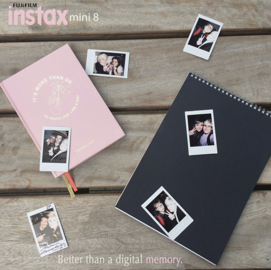
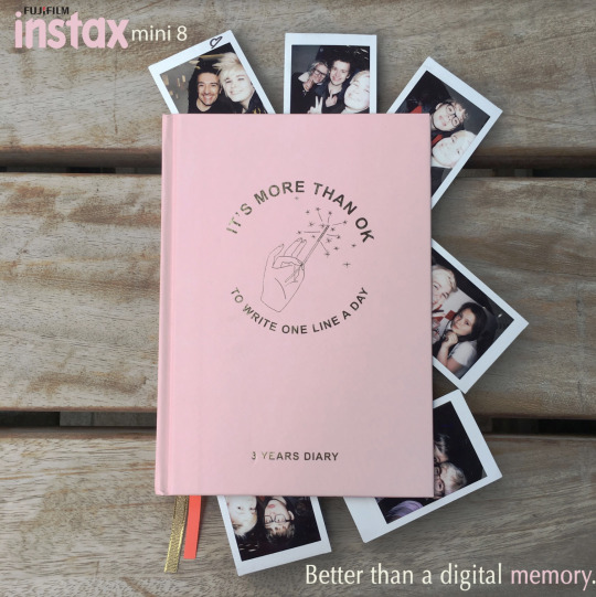
With this, I decided to start researching up previous Instax adverts. While I researched, I realised that their adverts were quite minimalist and bare and I wanted to step away from that.
Not every memory is shot like a day in an Instagrammers life, I wanted my adverts to be messier and more lifelike, something people can relate to in their busy lives, especially now with all of us staying home and houses getting messier, more memories being made despite everything and I wanted to be able to catch that at this vital moment.
I went through a lot of ideas, debating whether I should stay with just photo advertisements or branch out more. I decided on the latter, however the progress to it gave me a lot of things to research.
Instax’ previous adverts are very minimal.

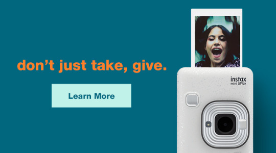

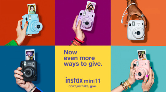
They’re almost similar to my first try back in 2017, hence why I tried to go in a different direction. I focused less on the partying and the adventurous aspect that Instaxs hold, but I inside went for the more close to home and personal vibe.
I asked my friends and people close to me to take photos of their own polaroids, scattered on their bed with things they love and that define them.
With these photos, I tried a few different methods of what I wanted to do (insert pic of the faded adverts w the slogan), I was still stuck on wanting to do print adverts before Brian suggested that I try to do this as a live project, so that’s what I did.
I researched into two projects, one called the ‘It Gets Better’ project (@itgetsbetter) and The Live Drawing Project (@livedrawingproject).
These two projects both have under 100k followers and while rather small, they still have a community within them. I first looked at ‘It Gets Better’.

The ‘It Gets Better’ project focuses on uplifting, empowering and connecting with LGBT+ youth around the world. Their posts are primarily video posts from actors and other people all around the world, sharing and showing their support for the LGBT+ youth, especially during this tough time. They’re still active, receiving a decent amount of likes on each post.
I looked at this project as I want my project to be able to uplift peoples day to day lives, showing them that there can be memories in everything, showing them that this quarantine can be used to create memories, despite how sullen the world is currently.
The second project is the Live Drawing Project.
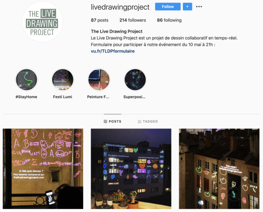
This instagram is the home of LDP, an art project started in France. While the location exactly is unknown (I’m unable to enter their website as I don’t have a log in), their instagram shows pictures of peoples art and creativity shown up on the walls of buildings and houses. They also have an event called the Night Of Illuminations where they’ll have people gather while they project the drawings for all to see in the night, making them show up best.
I absolutely adore this project, I love the fact that it’s still being updated this year and that many, many people are joining in.
While only a small following, they’ve been around for a year and have grown a gathering of people who will follow their projects. They also hosted various art lessons throughout France, which I found amazing.
I chose to focus on this project as I wanted to see the drive that a smaller instagram had. They may not have thousands of followers but they’re still updating and inspiring others to do the same as I said previously with the ‘It Gets Better’ project. I want to bring people together and to inspire them to create memories from their own homes.
I started to create the adverts with Instagram in mind and started to look through the photos and choose which ones I wanted to post first on the ‘gram.
I used these two pictures that my mum (picture one) and my best friend (picture two) sent me and used these to create my first set of posts on my Instagram.
I decided to have a white background as Instagram doesn’t have a ‘dark mode’ and therefore works with the minimalist feel of the whole account. I also used the yellow from the icon as it would match.

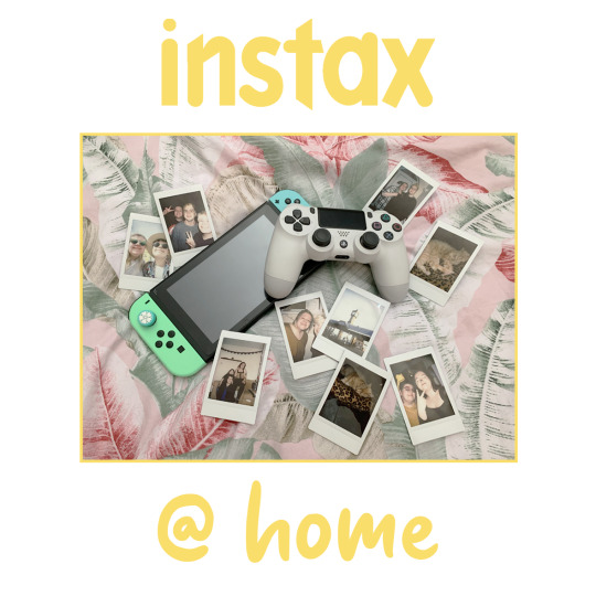
For the ‘@ home’ font I used Sweet Purple, a fun and simplistic style yet one that looks homemade and personal. I’ve used this font on other projects such as my Animal Crossing Amiibo Cards, that can be found on my portfolio here.
I posted these with a relatability in mind. I wanted to hone in to people's personal sides, to make them feel nostalgic and happy to look at photos that they took with loved ones and I want them to feel the urge to create them within their own home, to make memories that’ll replace the thoughts and things that have happened over the last few months.
While creating the Instagram posts, I decided to go with a yellow colour scheme. Yellow is not only my favourite colour but it’s also widely recognised as the happiest colour, according to sources. I wanted to keep the colours light and happy to keep with my message of creating happy and fond memories.

I decided on having ‘picture breaks’, where I’d include a picture like the one above in between photos to somewhat break up the posts, and to be able to give commenters a place to ask questions and talk if they wanted to know anything but didn’t want to comment on the polaroid picture itself. I added a post with what Instax @ Home is, explaining my ideas behind the project and what I would like people to do (partake, comment, tag me in posts, etc). This turned out to work wonderfully, as I’ve had people tagging me in posts!
I created 5 of my own polaroid posts to beef up my feed and to get traction within my account, creating content and tagging it so it can bring in more traffic to my page, as well as bringing in people who’ll want to take part! These photos are ones rom my past memories,


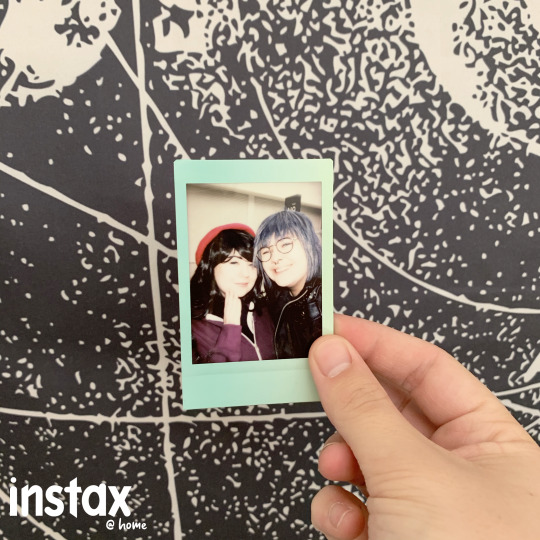


This is what the account looks like currently (apologies if the image is bad quality - it shouldn’t be!).

Now the Instagram is live and I’m waiting for people to start joining in. I’ve got a lot of likes on my first few posts and I hope that I’ll be able to continue this project well after the deadline, or for as long as quarantine is.
UPDATE: 17TH JUNE 2020, DAY BEFORE HAND IN
After I posted the images on Instagram, I got immediate following and interactions!

While I only have 30 or so followers, I’m getting interactions and people tagging me and sharing their own Instax pictures!
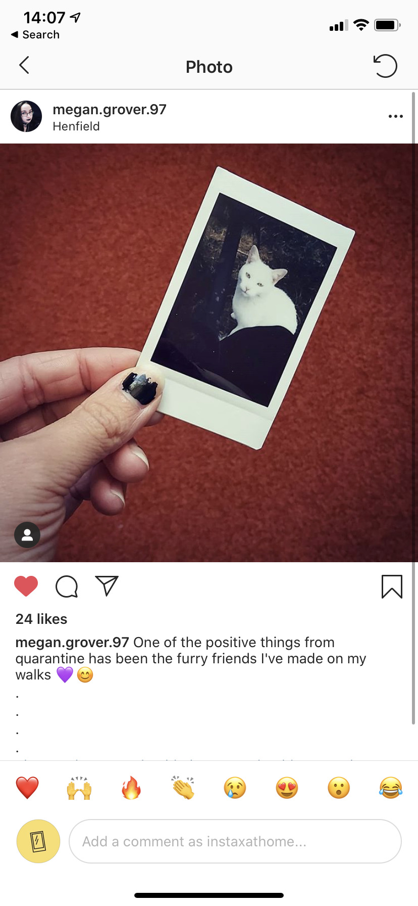

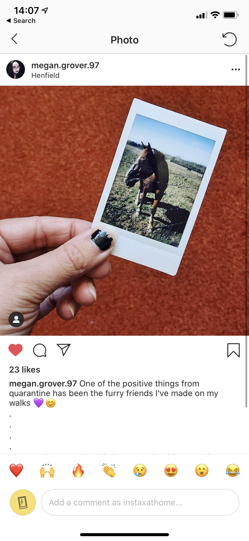
I realised, I shouldn’t be so focused on making new memories in a household, but instead finding the polaroids and reminiscing on the old photos that have been taken.
One person, under the @ silenceofthesunflower, they captioned a picture of themselves with ‘a long throwback, @instaxathome made me miss my polaroid camera. I should’ve brought it in with me’

This made me realise that people don’t particularly want to make new memories in this pandemic, but instead focus on the past ones to be able to remember happier times. I wanted to combat the sadness of the world's current situation by creating more memories, but I realise now that some people just want to remember, and that’s okay too. I will be posting both old and new polaroids to this account as a way to expand my userbase!
However, despite that, I do hope this makes more people pick up their Instax camera and use it more in the future. I have my own and I know I don’t use it as much as I should. This project has made me realise, as well, that I should be using my camera more often. I have the means to make memories so why aren’t I?
I know I will absolutely be continuing this project past my deadline and hope to make it a fully fledged account with followers and interactions daily.
0 notes