#practicalresearch
Explore tagged Tumblr posts
Text
╔═ *.·:·.✧ ✦ ✧.·:·.* ═╗
05/07/23
I got up extra early today because I still needed to go to mass and do some housework. I then took a bath and fixed my laptop so I could take it to my PR groupmate's place. Our other group member and I meet up so that we can travel there together. We stopped at a 'palamig' kiosk on the way there to purchase a halo halo because it was so hot. We were welcomed when we arrived, and we immediately got to work on our researcher so that we could finish it early. We took a short break after finishing chapter 4 and talked with each other before deciding to grill a hotdog so we could eat before leaving. They asked me to cook it, but because I'm not very skilled in the kitchen, I ended up burning some hotdogs. We all laughed, and they mocked me about it.
#groupings #practicalresearch #adayinmylife
10 notes
·
View notes
Text
Research & Development - Arabic
Anatomy & Analysis Of Arabic Stroke Motion
Anatomy
Parts of letters
Baseline - Imaginary or actual line on which the bodies of the letters are written.
Upper baseline - Imaginary line marking the upper limit of the tall letters. For primary Kufic, this is five points above the baseline. (EACH POINT IS ONE NUQATS)
Lower Baseline - Imaginary line marking the lower limit of the tails. For primary Kufic, the lowest tail three or three and a half points below the baseline, but these vary.
Stem - Tall, vertical part of a letter such as an alif.
I’jam - Light touches of the qalam forming short diagonal strokes above or below the letter outlines to differentiate otherwise similar consonants (nuqats)
Tooth - Short, vertical stroke resting on the baseline. It is drawn downwards and always begins with a curved top.
Cup - Hollow part of the letter, formed by the meeting of a downward curved stroke and a horizontal, as in the letter Nun. https://www.pinterest.co.uk/pin/472315079660004170/
Head - The dense part of the letter at the top.
Body - The dense part of the letter in the middle or on the baseline.
Tail - Final part of a letter, which is drawn last and is often extended.
Top - The beginning of any stroke.
Tip - The uppermost point of either end of any stroke. For example, the tip of a tooth is the upper point at the top of the stroke; the tip of a tail is the final point at the end of the stroke. The same word is used in relation to the writing surface of the qalam. So to avoid confusion within my development work, I will always qualify this word as in "tip of the letter/stroke" or "tip of the qalam"
Leading serif - Slender diagonal line emphasizing or extending the tip of a stroke, as in the letters dal, kaf, ya, and ayn. Mashq horizontal extension of the letters.
Equipment
Qalam - Traditionally, this is a pen cut from a reed. However, the word can refer to any implement used for calligraphy, including a brush, modern pen, or pencil.
Pen Knife - knife used for cutting the writing top of the qalam
Ordinary Pen - A ball-point, fibre-tip, or gel pen. Choosing one with a smooth generous flow of ink or gel.
Parts of the Qalam
Tip - The writing surface of the qalam, known in the west as a nib. The same word is used in relation to the calligrapher’s stroke, So, to avoid confusion in my development work, I have clearly/qualify this word as in “tip of the qalam” or “tip of the letter/stroke”
Upper Edge - The side of the qalam tip that is uppermost when making a stroke using the normal qalam position. In primary kufic qalam, this edge will be slightly dished. It is formed from the outer surface of the reed.
Lower Edge - The side of the qalam tip that is lowermost when making a stroke using the normal qalam position. It is formed from the inner surface of the reed.
Arabic Alphabet Stroke Motion
Modern day design processes for Arabic calligraphy follow a completely opposing approach to the conventionally established design templates of calligraphic script. There are set rules and guidelines which are essential to follow when writing Arabic script. Ensuring that the positioning and the motion of the pen are correctly followed through for each individual character, is crucial when conveying a specific style of script. There is a certain procedure that must be followed in terms of what stroke must be completed before moving onto the next marking. The composition of the strokes is very important as Arabic is both read and written from right to left. Being so familiar with the standard English format (left to right), learning to do the opposite and beginning from the right continuing towards the left was an obstacle which I initially encountered.
However, each Arabic script has its own variant/different sense of style, motion and design. For example, Kufic script is entirely and totally different to Thuluth or Naskh in terms of pen motion, aesthetic visuals, style/design but this also implies the anatomy of the script itself. For example, if you were to carefully look and analyze kufic script the Arabic letters are actually starting writing above the baseline and the continue on with the letter by connecting and adding another letter to the baseline (as shown in the image below in FIG1 & FIG2) So essentially if you were to create a word in kufic script you would first right the first Arabic letter of the word above the baseline to then create and connect your next Arabic letter to your previous Arabic letter which was above the baseline to the baseline to than you would conitune to write on the baseline as a normal arabic script like the Naskh Script. Naskh script anatomy is created and formed on one line; the only differentiation between the Naskh script and kufic script is how some individual Arabic letters from the kufic script/scribe start above the baseline while all the letters which are created and present in the Naskh script is used on the baseline, no Arabic letters start or are formed above the baseline unlike the kufic script - BUT THIS ONLY APPLIES WHEN IN WRITTEN FORM AND NOT AS INDIVIDUAL LETTERS. Furthermore, most designers who produce Arabic typefaces follow the principles and following of the Naskh script which is writing within/on the baseline, not many designers have essentially incorporated or followed the kufic system script since it was so outdated/old and was also very hard to distinguish letterforms.
You can instantly tell in Fig 2 the massive differentiation between the two different Arabic scripts - Naskh and Kufic. All forms of calligraphy that derived from Arabic script were respectively developed according to the country that they were developed in.The distinctions in the Arabic letterforms, stem as far down as the different tribes that existed within each of those Arab countries. Different dialects relied on different means of expression which were taught by the local schools that they attended. This explains why there is a wide range of differentiation of different Arabic scripts and styles.
However, if you were to look at the thuluth script which is created and formed in a more calligraphic manner - most of the letters aren't necessarily on a baseline (image below-showcasing thuluth script).
The only time for which when the Arabic letter touches the baseline in the script from is to when they are combined other than that the thuluth script is very free-flowing/calligraphic.
Understanding the disparities between a line and a stroke is a very simple way of interpreting the variances between the two developmental processes in the discussion. A straight line will always follow its guide (ruler/triangle) to its destination. A stroke, however, has the freedom to change its course whilst making its way to the destination. The differences between the two methods of design compare theoretically to artificial and natural beauty. One is forcefully created, the other takes place naturally.
Nuqats
The dots for which are presented and created on some Arabic letterforms are called ‘Nuqats’ and each Nuqat usually take the form of a diamond due to the nature of the pen stroke.
An example of how the dot system works/implemented into the letterforms above. Fig1 shows how the letter ‘Baa’ (letter B) is recognised by the use of a single Nuqat placed in the descent of the baseline. Parallel to that, Fig2 shows how the letter ‘Taa’ (letter T) is highlighted through the use of two Nuqats that sit above the letterform. Very similarly, Fig3 shows the letter ‘Thaa’ (letters TH) being differentiated through the use of three Nuqats sitting in the ascent of the letterform.However these are not the only letter of which include the Nuqats, there are many other Arabic letterforms of which include the Nuqats as shown in the very first image above.
The Nuqat was far from merely being a single purpose element of Arabic script and in-fact held huge weights of importance in both the functionality and the aesthetics of Arabic calligraphy.
Irrespective of the contrasting design elements that the several forms of calligraphy display, the one factor that is unanimously present in every single form of calligraphy; is the beauty of hand crafted, naturally flowing pen-motion. Digital design and production has no place in the history of Arabic calligraphy as technology was non-existent during the revolution of calligraphic script.
The Nuqat very quickly became commonly used as a precision tool to help maintain the consistency in dimensions across all the letters within the scripts. What is now known as ‘The Dot System’ was widely adopted as means of measurement in all aspects of the letterforms; character height; character width; a weight of the stroke and calligraphic curvature. These measurements are crucially essential for each of the individual phases of the Arabic letterforms; Isolated; Final; Medial and Initial (See Fig1).
Traditionally, use of the diamond dots was favoured by preference as it not only gave the calligrapher a consistent template for design but also complimented it with the freedom to explore decorative elements such as flicks, curves and arches. E.g. the thickness of the Nuqat always determines the thickness of the strokes, but the extended curvature that you create with that stroke is purely personal preference. Given that the script’s visual identity remains at the core of the template, The Dot System offered the balance of allowing the calligrapher to maintain their right to espouse their personal approach and freely express their creative and artistic flare.
Each script has essentialy their own
Nuqats - The use of dots to analyze and estimate the height, weight, and thickness of each individual Arabic letter - both in height and width. These measurements are essentials and crucial for every single individual Arabic letter which is created, the thickness, height, and weight of the stroke must be consistent, this process is also consistent with each phase of the Arabic letter as well the Isolated, Final, Medial and Initial. The weight/length/thickness of the strokes must be equivalent to the weight/length/thickness of the dots.
History of the Nuqats.
However, after all, that being said the nuqats/dots have not always been implemented/incorporated into the Arabic language and script. Primary Kufic did not initially consist of any dots or markings that enforced a grammatical system upon the Arabic alphabet. The incorporation of a system was much needed to ensure legibility and understanding to all non-Arabs who read the scripts since the complexity of the language proved intensely difficult to comprehend. considering the widespread increase of non-Arab Muslims arising around the world, the relevance/importance of Islamic scriptures became much more significant.
The first ever Arab grammarian ‘Abu al-Aswad al-Du'ali’ is credited for facilitating the consonant-pointing and vowel-pointing (markings) system, which enabled people to identify the correct pronunciations of Arabic letters. This system employs the use of distinctive combinations of dots that aid in distinguishing various letterforms that would look very similar otherwise.
0 notes
Photo
My grade 12 advisory class STEM2110 on their defense for their Practical Research subject! Congrats guys! You did great! Thank you Mam Divine for being a wonderful teacher #PracticalResearch #SeniorHigh #STEM2110 #Grade12 (at Lyceum of the Philippines University-Cavite)
0 notes
Photo
Remember our SHS students are still part of the Basic Education, learn to set our expectations to our reality to minimize frustrations. 😂😂😂 #RRLAS #PracticalResearch #UBNHSSHS
0 notes
Photo
After all these almost sleepless nights, never ending research, brainstorming , almost zombie like face and thankfully it yield a good fruit. Success for our oral defense. Group 4 thank you for staying beside me and trusting me as your leader. Thank You for putting up on all my mood swing and tantrums and no matter what happened I'm thankful that you are my group mates. #instagram #artstagram #research #practicalresearch #success #oraldefense #dday #defense #suitandties #formals #
#success#oraldefense#research#practicalresearch#defense#artstagram#instagram#suitandties#formals#dday
0 notes
Photo
The submissions for #ICTAPR2023 scheduled to happen at #Asia is now open. Visit: https://econf.co/ictapr2023/ for more details about the event and submission. #ASDFInt #Sponsored #Conference #Singapore #2023Conferences #Academic #Event #Trends #PracticalResearch
0 notes
Text
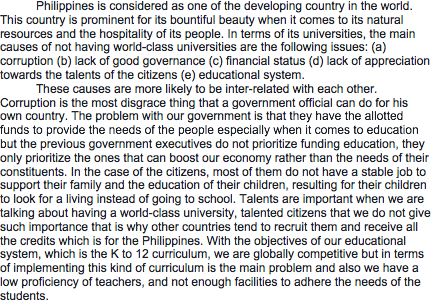
Why do the Philippines do not have a world-class university
0 notes
Text
Experimentation Pen & Paper
Pens
Having to adapt to the use of different pens was a challenge that I did not anticipate. My experimentation with parallel pens has helped me better understand how much a different pen can affect the outcome. Parallel pens enforce a great level of restraint, causing the motion of the pen to lose its flow in order to keep within its restrictive limitations. Much of the curvature becomes very difficult to create and if the pen is not used correctly it tends to break. Another factor to point out is how the pens would constantly bleed out the ink in which thus ruing the letterform of the letters.
Parallel pens are actually intended for Latin typefaces so it is understandable when complications arise while transitioning to Arabic.
(Parallel pen on the right and qalam pen on the left) you can instinctively/distinctively tell the letterforms apart. The curvature smooth arch can only be created with the use of the qalam pen and not essentially the parallel pens due to the fact fo the nibs
The control of movement that I possessed when using the traditional Qalam pen was vast in comparison to the parallel pen. The aspects of effortless pen motion, sturdiness and ergonomics were all features that the Qalam pen thrived in. Inversely, the parallel pens were very resistive and delivered high friction between pen and paper, driving the form of the letters to appear rigid, blocky and geometrical. The angles at which both pens should be held were also different.
The Qalam pen is to be held at a 90-degree angle whilst a parallel pen is to be held at a 45-degree angle. The results showed that the parallel pens commonly bled out on most parchments of paper. This was surprising as one would expect that modern-day pens would be developed with attention to detail allowing no room for errors as such.
A drawing technique called ‘The two pencil method’ was prescribed to me by Balvir Nandra in order to help gain a better understanding of the contrast between the thick and thin within Arabic letterforms. This method was very easily executed but was very impractical as both pencils had to be held together by hand, with the pencils sometimes beginning to drift apart as there was no mechanism holding them together. This created an imbalanced thickness of the stroke which meant that the drawings required constant revisiting and refinement. Another key factor is that I had also cut my very own qalam pen after many many practices.
Paper
Not only did I experiment with different pens, but I also experimented with different paper GSM’s to see if this would alter the outcome - I had experimented with a series of different gsm papers to see which was most ideal and effective when writing calligraphy; since some gsm paper are much more efficient and effective due to the thickness, feel and material. When writing and using different calligraphy pens some material actually work in favour of the pens, for example, I had used if I were to use a gsm thickness between 35-55gsm the ink would just bleed rough the paper and the pen would consistently spill/splatter out when writing calligraphy but if I were to use a thicker and smother gsm for example like 250 its would be more ideal since the ink would not bleed out through the paper and when writing calligraphy the ink will not splatter/spill out. So after many experimentations, the most efficient and effective gsm for which I had used most consistently were the 90gsm and the 250gsm both of which felt good when writing and the pens which I was using didn't constantly bleed either through the paper or the pen.
35gsm to 55gsm: This is very thin paper indeed. Most newspapers will commonly be printed on this paper thickness.
90gsm to 100gsm: This is the weight of most household printer paper.
120gsm to 140gsm: This GSM range covers the paper thickness of most posters you’re likely to find on pub walls etc. Paper with this GSM is sturdy enough to withstand a bit of wear and tear.
210gsm to 300gsm: This GSM range will cover most of the sturdy printed flyers you get given in the high street. This paper stock range is approaching card but will still have a bit of a bend when held with two fingers.
350gsm to 400gsm: This GSM is essentially card. It will stand up under its own weight and is most commonly.
0 notes
Photo
Last year I attended an extra credit lecture that was about how often when people are bullied the only advice we have to give is encouraging them to survive and that it will get better eventually. This lecturer challenged that discourse arguing it took the responsibility off the bully themselves. I found the contact card today while cleaning out my wallet and on a whim sent an email thanking them for the inspirational and challenging research. And I am so pleased I did. #practicalresearch #psychology #feelingmotivated #100happydays
0 notes
Photo
Inspired by snail mail my email and uncreativity, I decided to conduct my own version.
"Type a message to a friend, family member or pet, politician, or lover, and email it to [email protected]. Then sit back and relax while your email is handwritten, sent out, and delivered to the recipient of your choosing, completely free of charge."
I advertised this on facebook. These are the actual instructions from the 'snail mail my email' project, except i replaced the email with my own.
Through this practical research, I found that by simply reading a small paragraph and even several words, offers a huge insight into an individual's personality and the intimacy between two people you do not know very well.
1 note
·
View note
Photo
The submissions for #ICGTPAR2022 scheduled to happen at #UAE is now open. Visit: https://econf.co/icgtpar2022/ for more details about the event and submission. #ASDFInt #Sponsored #Conference #Dubai #2022Conferences #Academic #GrowingTrends #PracticalResearch #AcademicResearch
0 notes
Text
Arabic Kufic Script
Kufic script letters are very upright characters that stand as tall ascenders, often recognised for having large extracts of text that are written using just one stroke. The visual aesthetics of Kufic script - the letterforms of the kufic script are very angular with some letterforms being very condensed, short, broad vertical strokes and while others are more elongated/extended horizontal. All Arabic letters are created and presented on a horizontal baseline.If you were to look at the baseline of the kufic script it is relative a flat surface with no arch or curves implemented but if you were to look at the baseline of the Naskh script each and every letterform implements/includes a curve or arch when combined. Kufic script is a much more bold and thicker typeface making it quite difficult to distinguish letterforms as well as the fact that the letterforms have drastically changed from kufic to naskh. Especially when in written form it is very difficult to distinguish letterforms.
Just look at the image above and then you can see what I mean the bigger letterforms which are in ink are the kufic script and the smaller letterforms are the naskh script. The letterforms are so different it's beyond believable at the same time I still find kufic more intriguing and amazing. Just the articulation and smoothness of the letterforms are so pleasing, subtle and actually feel more sacred than the naskh script... kufic script is more traditional and visually aesthetically better style/design
The problem for which I am encountering is staying as close as possible to the traditional 21st-century naskh Arabic letterforms since this Arabic script is the most and ideally used form of script used within the 21st century (and used in the Qur’an) and the kufic letterforms are so drastically different in terms of calligraphical forms/designs/visuals to the naskh script. The two different Arabic script letterforms (naskh and kufic) are so drastically different it is quite a difficult task to find a middle ground to which I can work with. Both the anatomy, design, style, letterforms are different. Some letters which are presented and created in kufic are much harder to read and understand but however in my perspective I find them more beautiful and sacred than the naskh script. But the major downside to the kufic script is legibility and readability which is the most crucial and important factor for script writing, something for which I had found out in doing my dissertation. But unlike the kufic script, the naskh is readable and legible to the individual, something to which highly consider and think about for my development work, something for which to highly consider for when developing an designing the script.
Updated/Edited - After some in-depth development and understanding and looking into both naskh and kufic script. I choose to revive a stunningly beautiful, traditional aesthetic of extravagantly smooth fluidity kufic script for which is also combined with the foundation of the naskh letterforms but also incorporating curvatures, arches form this script to form a beautiful form of a script for which should be seamlessly interpreted by the human eye with no visual disruptions.So essentially the foundation to which I am going to be working upon in the naskh Arabic letterforms but I will incorporate the aesthetic features and style of design from kufic into naskh and vice versa but yet still be staying as close as possible to naskh script. so incorporating aspects of both script elements - vice versa - kufic and naskh combined inspirational elements.
I will be creating a script typeface for which is inspired by both naskh and kufic visual aesthetics. Such as the elongated horizontals and condensed bold, thick lines for which is used to create a kufic script to then the aesthetic appearance/visual of the curvature and arch from the naskh script. I will heavily and deeply consider the visual aesthetical appearance of the scripts for when developing in major studies
Unlike Tareq Mahfouz who has slanted and ruined the kufic legacy design.
1 - Letters with long horizontals
Known as long letters, these letters have single or paired horizontal strokes for which can or may be extended as far as possible or want. This extension is known as mashq’, which means stretched. In some historic manuscripts, a single letter, such as ya, can take an entire line. That is an example of extreme mashq’. More typically, the long letters vary in length and share the line with other letters. The extensive elongation extension of the mashq all depends on the individual/calligrapher for aesthetic and interpretational reasons. Horizontal strokes of the long letters are generally made with a slightly more slender stroke than is used for the verticals. This enhances the grave of the letters. The twelve long extensive letters are as listed, fa, sad and dad, ta and dha, ba and ta and tha, dal and dhal, kaf and ya.The horizontal connectors of four other letters may also be extended. These letters are min, lam, ‘ayn, and ghayn, however, the lengthening/extension of these four letters are decided on the individual/calligrapher discretion.
2 - The Sub Circular letters
These letter bodies are formed with a tightly curled stroke that is almost circular or almost part-circular. The six almost full circle letters are mim, fa, waw, qaf, ya and ha. The three part-circle letters are jim, ha and kha. two other letters are closely related to this group. They are ra and zay
3 - The vertical and Toothed letters
These are the letter whose body is formed with a vertical stroke. the four vertical letters are, alif, lam, kaf, ta and dha. The eight toothed letters are ba and ta and tha, sin and shin, sad and dad, and nun.
This book was an essential asset to my studies and research since it provided me information purely on the development, historical and creating a kufic script. I It has most benefited me in the aspect of learning how to write in traditional Arabic kufic script, learning the process and basics of writing Arabic kufic. Writing/forming individual Arabic letters and words.
Learning the articulation and calligraphical motion and formation of each and every Arabic letterform - provided by this book above.
A series of images taken from the book show how to physically write each and every stroke for each and every individual Arabic letter. This has drastically helped my in the development and research aspect of learning and understand Kufic Arabic script.
The first of the Arabic scripts to participate in the maturity of calligraphy; ‘Kufic’ script is of southern Iraqi origins, having been first discovered in the city of Kufa – An early Islamic centre of culture (around 110 miles south of capital city Baghdad). One of the oldest forms of Arabic script to be developed, it is, in fact, the very first form of Arabic script that was used to document the holy book of Islam (The Qur’an). With the spreading of this internationally practised religion, the Kufi script has gradually evolved to offer an increase in legibility and understanding to the non-Arab Muslims of the world.
The Kufic script developed stages as it progresses through the ages and which were categories as; Primary Kufic; Eastern Kufic and Maghribi Kufic, with each style of the kufic script being slightly developed and altered differently. From the 4th century AH onwards, the kufic script gradually became a personal and expressive art form and was used especially for unique and expensive Qur’an. The eastern kufic is the closest to contemporary Arabic scripts, and it offers useful design ideas. Because of it being developed from primary kufic, the two styles can be combined creatively for creating monograms and other calligraphic design pieces. Maghribi Kufic is also very important; showing and giving the idea of how versatile the kufic can be. Essentially all three developed stages were laid on with a brush rather than a reed pen. Developing my Non-latin typeface from the style of primary kufic.
Having been curated specifically for the documentation of the Qur’an, Kufic script was considered very sacred right from its birth and its prestigious and historic superiority simply grew after Muslims deemed it appropriate to use Kufic scripts on elaborate gifts conveying spiritual wisdom and righteousness. Ceramic gifts dated to the 9th and 10th century, display a combination of all three Kufic script forms working in complementary fashion alongside one another. A clear exhibit of the versatility within the Kufic script steers many to agree that aesthetic development is completely unnecessary.
Although Kufic script was out of general use by the 13th century, its legacy is honoured by a trail of memorabilia in the form of paintings, mosaics and tile designs that remain on the walls of many architectural structures and for decorative purposes until this very day. Its contemporary use in etchings and engravings of everyday materials like; timber; clay; glass and metal, allow it to live on juxtaposing with the Arabic scripts that have superseded it today. Even in the newer cursive Qur’ans, Kufic was often used for the chapter headings. The continued importance and prestige of this family of scripts could not be shown more clear.
It is also commonly referred to as the source of inspiration when describing very low-contrast typefaces that have become ubiquitous in recent years in attempts to harmonize Latin and Arabic. However, a comparison of these styles and Kufi calligraphy shows great dissimilarities in the letterforms and their proportions.
Tareq Mahfouz - Critical Analysis
0 notes
Photo
Arabic Influential English Latin typeface
These calligraphic Latin typefaces are the results and execution of the incorporation of the Arabic Kufic script foundry. All of my calligraphic designs have all been designed with a Qalam pen, the same Qalam pen which I had cut and used to create the Arabic letterforms in my previous post. I had implemented techniques, skills and styles from which I had Learnt from writing both Naskh and kufic script into my English Latin typeface and these are results of this execution/idea. The same sense of pen motion, curves, arch, swiftness, extended and thick strokes have been all implemented within this typeface and have been carefully considered and thought off.
This process actually turned out to be an easier task than I had imagined, and the reason for this could possibly be because of how thoroughly deconstructed, analysed and dissected each and every single stroke form for every single letterform that it was quite easy to implement these strokes, techniques and skills into the English Latin Typeface. When I was creating and drawing out my letter with the Qalam pen that I became so natural and easier to follow and understand.
I had implemented all of my knowledge, insights, understanding and analysis which I had gained from writing and practice and analysing the Arabic script both Naskh and Kufic into my English Latin Typeface and these are the results. Incorporating features, skills and techniques such as the extensive, extended long and thick horizontal and vertical strokes, with yet the subtle and undulate curve and arch and the incorporation of the minor little flicks, heads and tails. From the insights that I have gained from learning and understanding how the Kufic and Naskh script is presented, formed and created; I have created a foundation to which I can work with for my major study. ( previous post below) I have created my very own personalised Arabic letterforms/script and have created these letterforms to set myself a foundation to which I can work with and improve on in my major study as well as an English Latin typeface which is also inspired and has implemented techniques and features and skills from the kufic and Naskh script/letterforms.
Created an English Latin typeface which has implemented techniques, skills, strokes formations and style from the kufic Arabic script.
I have created my very own personalised Arabic script typeface (foundation to which I am going to work with and improve upon in my major study)
(to learn and understand more please look through my development work)
0 notes
Text
Arabic Naskh & Thuluth Script
Thuluth
The thuluth scripts present and create vertical strokes have a leftward slant, horizontals have a deep curve. The ends of most descending letters come up in a hook. The way the letterforms are created and presented are often written so the letters interlace with each other.
The thuluth script is possibly the most engaging, fun and wildest Arabic form to write since it is the freest form of Arabic script, unlike the kufic or naskh script which are bound to the baseline, with the thuluth script it is all freehand motion and its all up to the individuals discretion for as to where he wants the pen to exactly go or flow or how he even wants to present the letterforms, it is all up to the individual, which is one of many reasons why I like the thuluth script so much because of how freehanded it is as well as notion that its all up to the inidiviidual to deciced the execution of the asthethic visual of his letterform or final piece. But as freehanded as you may be the holding/positioning of the pen must never change.
The thuluth script is primarily focusing on articulation, curvature and freehand, unlike many other Arabic scripts which are much rigid and not as articulate as the thuluth script. Thuluth is often considered the most powerful and versatile script. Implementing aesthetics such as the long elongated and repetitive curves, arches into my personal type.
Possibly implementing that sort of freehanded motion/notion into my personal Arabic type if and when performed in writing calligraphy. So an idea for which I had was possibly for my typeface creating some sort of calligraphic style or rule for which people to follow to create my personal Arabic type.
The Thuluth is scripted by using a chisel tip instrument in which is an absolute required equipment. Traditionally reed and bamboo qalams were used in scripting and producing/writing Thuluth script. The angle at which Thuluth is scripted ranges between the chisel tip being perfectly vertical and rotated - 80-degree angle, unlike the qalam pen of which is 90 degrees. The shorter end of the chisel tip should be at the bottom and the longer end should on top.
CRITICAL CRITICAL NOTES
Almost always the entire surface of the chisel tip should be on the surface of the paper at all times. Getting into the formality/habit/procedure of holding the Qalam pen with the index finger on top of the pen and the middle finger curled underneath either for both left or right-handed individuals. An effort must be made to keep the wrist steady and to let the movements be directed from the elbows and shoulders. At times the wrist will need to move and a portion of the chisel tip will need to be lifted - the flicking of the wrist is a good common practice.
The markings above and below each of the letters,these are called Harakat, and they demarcate vowel sounds. The placement of the Harakat changes from script to script; for Thuluth, they are placed further away from the letters, which allows for more room to be creative and play with the placement of the characters.
Thuluth was one of the earliest cursive scripts to emerge in the 11th-century following the steady decline in preference for the preceding angular kufic scripts. The script was put forward by Ibn Muqala Shirazi in Baghdad as part of a larger movement to make the use of cursive scripts more common for day to day use. The Thuluth script became known as a large and elegant script and eventually found its primary purpose of use - it became most common for scripting titles and producing creative artwork.
The Thuluth script has been through 3 major milestones or calligraphic revolutions. The first and undoubtedly the most significant was brought by Seyh Hamdullah in the 15th century who developed the first curriculum to teach the script in a methodical manner. The second revolution occurred in the 17th century by master calligrapher Hafiz Osman who established the Hilya, or calligraphy panels consisting of phrases from the Quran and hadith. The third revolution was brought by Mehmed Sevki Efendi in the 19th century. Efendi is known for formalizing a set of rules all scaling, measurements and guidelines on writing words and sentences for Thuluth script.
Naskh
The Naskh script eventually replaced Kufic as the script of choice for the Koran; now more Korans are written in Naskh than in all other scripts combined. Thuluth is also the larger script often used in conjunction with naskh. As like I have previously mentioned naskh is bound to a baseline while thuluth is not in which restricting the free motion in which thus composing small scrip, neat and balanced letterforms.
The letter shapes are more fluid and curved but the naskh letter, however unlike most scripts what different about naskh is that the letters lean slightly to the left. Descending letters end in an upward hook. An equal division between flat and round shapes and heavy and light strokes with letterforms. What I like most about Naskh script is how simple and easy the letterforms are to produce, the letterforms are highly legible, clear and quick to write, unlike the kufic and thuluth script which need more preparation, time and dedication.
This book had drastically helped in the understanding, motion and the anatomy of the naskh Arabic script. Showing how to write each an every single letterform and learning what and how each letter works and sits and combines with others letterforms - I had learnt the same things from the kufic book and the thuluth book. So essentially I learnt how to practice and write in 3 different forms of Arabic as well as the anatomy of how the Arabic letterforms essentially work and are created stroke by stroke.
I WILL NOW IMPLEMENT ALL OF MY KNOWLEDGE AND PRACTICE IN PERFORMING IN CREATING A LATIN TYPEFACE. FROM MY UNDERSTANDING OF THE CALLAIGRPAHICAL PROCESS/PROCEDURE /STYLE TO THE STROKE MOTION AND DESIGN - WITH ALL OF THIS I WILL IMPLEMENT AND ATTEMPT IN A CREATION OF A LATIN TYPEFACE. SO ESSENTIALLY AT THE END OF NEGOTIATED STUDY, I WILL HAVE A LATIN TYPEFACE FOR WHICH IS INSPIRED BY TRADITIONAL AND CULTURAL ARABIC CALLIGRAPHY.
The Arabic alphabet and written language have remained remarkably constant since the sixth or seventh century AD, largely due to the unifying factor of the Quran. Arabic is a Semitic language related to Aramaic and Hebrew. Many calligraphic styles are very ornate and intended more for decoration than comprehension.
0 notes
Photo
Latin Typeface Testing
Before I even attempt to create a Latin typeface; I did a mini exercise, I had created a rough typeface. I did not create a full alphabet, just a few letters of the lowercase. Since I already know so much about creating a typeface I don't need to go too in-depth with the understanding or process but what I will show is the rough development for which I had created just like a foundation to work with and just to get my head back into it and plus more development work to showcase. I had created a rough blueprint of a serif typeface but with a slight incorporation of Arabic Kufic anatomy/script; I have incorporated and altered the form ever so slightly within the brackets, serifs, final, tails, shoulder and stem. These alterations and changes have been inspired by the kufic script/anatomy such as the attention to detail of the flicks, tails, heads, arches and curves within the Arabic anatomy were and has been included within this rough mini excessive typeface above. I have implemented minor detail of Arabic kufic script within some of the English letters above.
0 notes
Photo
Arabic Influential painted Letterforms
Some more experimentation which I have conducted. The use of paint brushes to create some individual Arabic letterforms, this experiment was just to see how different modern day equipment would perform in creating letterforms of that of the past and from my experimentation not too well. Some of the letterforms which are supposed to be created and present with more archness and curves have actually been actually created in a much more rigid form due to the brush. With many attempts, I tried to create a very subtle yet smooth curve but what tend to kept happening was that the brush would not create these arches or curves it had only created them if I had continuously gone over the same stroke over and over again and only then would I get a nice subtle and smooth curve and arch. If I had dipped the brush in a tub of paint and had instantly attempted to create a stroke of whatever letter, the stroke or letter would appear very rigid and blocky which is what I don't want and need.
I have experimented with a series of different techniques and tools from paint brushes, Qalam Pens, Parallel Pens, Quill Pens and 2 pencils. Qalam being the most successful, efficient and effective; but however they were and are some positives with the usage of the other 4 pens which I had experimented; the four following pens: Paint Brush, Parallel Pens, Quill Pens and 2 pencils do have some positive point and aesthetics/visuals but also have some negative points too at the same time.
0 notes