#please don’t @ my lighting I’m not an artist I just bought Procreate cause I was bored
Explore tagged Tumblr posts
Text
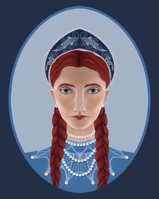
Catelyn Tully, the young lady of Winterfell
#valyrianscrolls#asoiaf art#catelyn stark#my art#riverrun#asoiaf ladies#making asoiaf art instead of studying for my finals AGAIN#I made a pearl brush for this…#please don’t @ my lighting I’m not an artist I just bought Procreate cause I was bored
141 notes
·
View notes
Note
So I know you do digital art, but The Hanged fireMan looks like a watercolor. Do you work with watercolors as well, or is it the program you use?
(please brag about your art process, basically)
Yeah! So I do all my (fan)art in everyone’s favourite innuendo of an art program, Procreate. (Specifically on a 2019 ipad pro with a 1st gen Apple Pencil, both of which I would tentatively recommend if you can get them 2nd hand for less than 200euro like I did)
I did a lot of painting as a teenager, and still paint often to this day. Though I mostly worked in acrylics, I have been known to use watercolours (like, when I was in college I bought a little 3euro paint set and would use the inside of cardboard cereal boxes as diy watercolour paper and paint wild little Irish landscapes… and Winter Soldier fan art, sometimes. 2017 was a different world)
So in summary - I ‘paint’ digitally using some very traditional techniques I picked up over the years, and I kinda prefer digital art now, which I will elaborate on below the cut as I detail how I created The Hanged fireMan…
I’ll start with my favourite digital art ‘cheat’ which is that I use So Many Layers. Like seriously, pretty much every new colour goes on its own layer because I am a control freak and love being able to tweak them all as needed. So for this relatively simplistic piece, I’ve still got something like 20 layers all together.
I’m also usually better at grouping layers but in this one I gave up at some point and it felt dishonest to group them nicely before showing you guys lol
So yeah layers is my biggest hack, but the other is using specific texture brushes
I spent a while playing around with various brushes before finding this Tarraleah one which has just the most delicious watercolour-y texture and a really fun edge to it (and it’s got pressure sensitivity, so I can really control the amount of colour I want to put down on the page)
This background was painted entirely with the 1 brush & colour, and I think it turned out pretty cool. For this particular piece I did have a reference on screen to work off for the most part, but those clouded were just painted with my heart
Next (or maybe before, it’s a while sinceI drew this and sometimes I mix it up) is the lines, which are always done with my best friend, the Procreate Pencil!! I love her, she’s so fuzzy and textured and also if you tilt the tip on the pencil you get a broader line (like with a real pencil) which is just the coolest thing!
When it comes to lines I just sort of go for bigger shapes 1st and details later, and basically always with some kind of reference. I also use a very old & well known trick of putting the most detail into the object of most importance, and leaving the background more loose and vibey
Artists will tell you that this is to draw focus with details. Artists are lying. It’s cause we got lazy after drawing he fun part & phoned the rest of it in lol (I know this because I am an artist)
Also I love this pencil because I don’t have very steady hands and I actually cannot draw straight/smooth lines to save my life! If you’ve ever seen anything resembling a smooth line in something I’ve drawn, it is almost certainly a whole bunch of lines over each other and then erased at the edges to make it look neater
But who needs straight lines when sketchy sketch lines are so fun!
Next is flat colours (the 3layers in the middle with check marks beside them)
I used the same colours as the background, which you can tell from where they completely blend together right down the bottom, and what I genuinely do is use the Tarraleah brush to generally block out he shape, and then go back in with an eraser and smooth out the lines
Why do I do this? …good question
Next is one of my favourite parts, which is adding the lights! Procreate has some really fun -glowy- layer effects - my favourite is probably Add (A) though Colour Burn (CB) is great too for its vibrancy.
Also those 2 layer 11s are there because I duplicated one and then used the ‘Gaussian Blur’ feature to ‘fuzzify’ it (yes, that’s the technical term) It’s a pretty quick and easy way to add a more diffused light effect around something. (I did the same for the yellow reflective strips on the turnouts too!)
Last step now! So full disclosure - I absolutely traced that writing from a photo of a tarot card lol. I actually always trace writing, as, much like drawing straight lines, I’m bad at handwriting on a screen
I also stumbled upon the Exclusion (E) effect by accident - Originally it was going to be a plain cream boarder like a traditional tarot card had, but I wasn’t fully happy with it, so I just flipped through a few layer effects and as soon as I got to this one, I knew it was the right choice
I love the dreamy contrast of the pinks and purples to the dark navy and grey & how it makes everything looks kinda unreal and outer-spacey
And yeah that’s about it! Everything else comes from my 15+ years of Practical Art Knowledge but these are the specifics of how I utilise it digitally!
This was a lot of fun to write out, and I hope that if you’ve made it all the way here, it was fun to read too!
12 notes
·
View notes