#pinterest put those two comic icons of them together for me !!
Explore tagged Tumblr posts
Text

@neonwebs requested a moodboard !!! // ( accepting )


Miggy && Jessie.

#RYAN -#have i told u i love them lately#feels like it's been 10 or so hours since i've said it#and that's too long frankly#pinterest put those two comic icons of them together for me !!#i was just !!#( miguel & jess┆neonwebs. ) ⸺ ⌜𝕕𝕠 𝕪𝕠𝕦 𝕝𝕚𝕜𝕖 𝕚𝕥 𝕨𝕖𝕝𝕝 𝕕𝕠𝕟𝕖 𝕔𝕒𝕦𝕤𝕖 𝕚 𝕕𝕠 𝕚𝕥 𝕨𝕖𝕝𝕝⌟#( aesthetic. ) ⸺ ⌜𝕒𝕟𝕔𝕚𝕖𝕟𝕥 𝕕𝕣𝕖𝕒𝕞𝕤 𝕚𝕟 𝕒 𝕞𝕠𝕕𝕖𝕣𝕟 𝕝𝕒𝕟𝕕⌟#neonwebs
3 notes
·
View notes
Text
Denis Leary is making an animated vignette series based on Dogs Playing Poker and 10 Other Pieces of Kitsch Art That Should Be Turned Into TV

KITSCH auction house tremors and stampedes.
Dennis Leary basically discovered sex, drugs and rock n’ roll with his 2015 two season FX series Sex & Drugs & Rock & Roll. Leary’s always been one of those guys that can’t be beaten down in spite of how dopey and cynical his edgy working class personal brand is. He’s got an entire deal set up with Fox, the flailing broadcasting company has placed all of their chips on a Denis with only one lousy “N” in his name. I can’t even with this fake Irish Bostonian droid. Relish in the delicate thought process of Leary and leftover former Daily Show producer, Jim Margolis, bringing up a Pinterest screen grab of the Dogs Playing Poker by Grand Master of Kitsch Cassius Marcellus Coolidge and money signs popping out of both of their heads. Here is a dramatic retelling of this thought process:
“Yo, get this Big D,” salivates the recently fired from Netflix Jim Margolis to Leary over a Zoom, “Fox got this Bento Box Animation Studio sitting around doing nothing but churning out animated interstitials for the Masked Singer, Paradise PD, The Prince, The Blues Brothers animated series, animated Harold And Kumar, Housebroken, The Great North, and ugh..um..Hoops..”
“I fuckin love Hoops, Jimmy! Why aren’t we pitching this on Netflix again?”
“Because Dogs Playing Poker is going to work so much better as pregame filler for live Sporting Events...on Fox.”
“Oh yeah. All of those rotten good for nothing grease monkey and lunch pail people will probably be giving each other Budweiser flavored Covid at the local saloon with these damn dog pictures hanging up. It’s like when old drunks would stay out late and watch the Flinstones at the bar, did you know that actual human male adults would sit in a town like Boston and waste away in a bar watching Flintsones. Can you believe that Johny?”
“My name is Jimmy, err Jim, but yeah Denis we’ll send you the scripts over. Any idea who we should cast?”
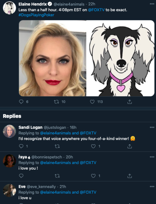
“Get me the hot blonde from Inspector Gadget 2, God dammit I miss Louie..are we sure we can’t get Louie back on air?”
“Afraid after Patton Oswalt dognapped his role from him in Secret Life of Pets, Louie CK has been banned from ever appearing as a talking dog again.”
“So bogus. Bobby Kelly will have to do.” Denis gets a text. “Dammit, Adam is getting all thirsty for this juicy delicious bone. Gotta throw a big bone to my dog Ferrera. Who else?”
“Ok. I’ll get one of those sad Daily Show losers. Um picking one at random, Roy Wood Jr. They’ll pretty much jump into anything, because John Oliver was in Love Guru they start thinking they can fail their way up.”
“I said no politics at the table! Paws off the table! This is going to be so fucking lit!”
////
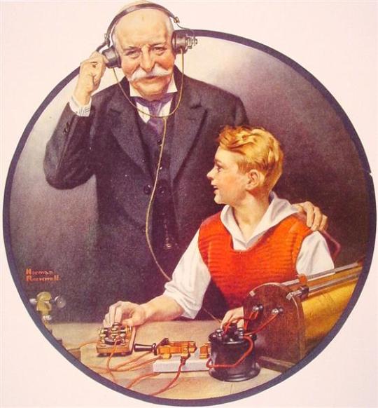
Kitsch Art deserves so much more. George Lucas, retired American filmmaker, robber baron of childhoods and all around mensch has been heavily invested in the kitsch art of Norman Rockwell. There are a bounty of stories to tell. Too many of them are far too white and basic, but there are rich narratives to be found in his out of date even for his own time romanticism of The Old Masters. Hopelessly out of date could have been a failing of Rockwell, but his politics grew progressive as his career went on and fought against the system. Cassius Marcellus Coolidge is the man that operated the first bank in Antwerp, New York had the astronaut-like grace to wonder, “what if dogs played poker like people played poker?” A painting that dates back to 1894 used as means to sell cigars. What strikes me most about this painting is that they aren’t wearing clothes, but I bet when you try to imagine the painting you imagine these dogs fully decked out in some sort of work coat. There is a further anthropromized version of the ad called “His Station and Four Aces” that depicts a glimpse at a look at an entire canine furry society. His ideas of putting an animal in clothes remains to this day one of the most novel and surefire commercially friendly means of artistic expression. The original cynical man laughing all the way to the bank, his own bank that he founded to boot.
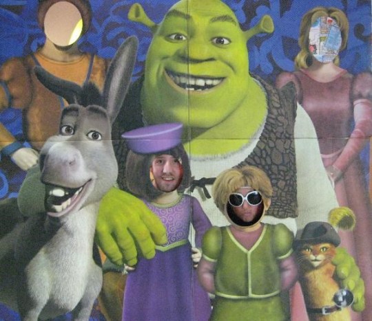
Seen above: An example of a Comic Foreground that also demonstrates the failings of having too few people in your party to properly partake in the comic foreground experience.
“Cash” Cassius wasn’t the first man to imagine a domestic pet in people clothes, but he’s probably one of the few to do so with such commercial finesse. The man also at one point filed the patent on the “Comic Foregrounds,” which is the technical name of one of those carnival boards with holes to stick your head in. In post Covid times how many more heads will be salivating and rushing towards those holes to pop their heads in to create a lasting memory, if only for a second. So when I start learning more about this remarkable weirdo Cassius Coolidge, a man according to his official website dogsplayingpoker.com’s Biography: “Trying to chase mischievous boys from an abandoned house, he fell from a window and hurt his knee, leaving him injured for the rest of his life.”
Flash forward back to 2021 and Denis Leary and his career a man with a wikipedia with fun entries about all the accusations of plagiarism and hate speech against autism I start to worry about the legacy of more Kitsch art falling into the hands of other greedy and desperate TV executives. That being said if you are a greedy TV executive who happens to be a maniac that likes reading rando’s tumblr pages do I have a list for you!
TOP TEN PIECES OF KITSCH ART THAT SHOULD BE TURNED INTO SOME KIND OF SOMETHING
“We Are Having a Heavenly Time” Columbian Bike Monkey and Parakeet by, once again, Cassius Coolidge
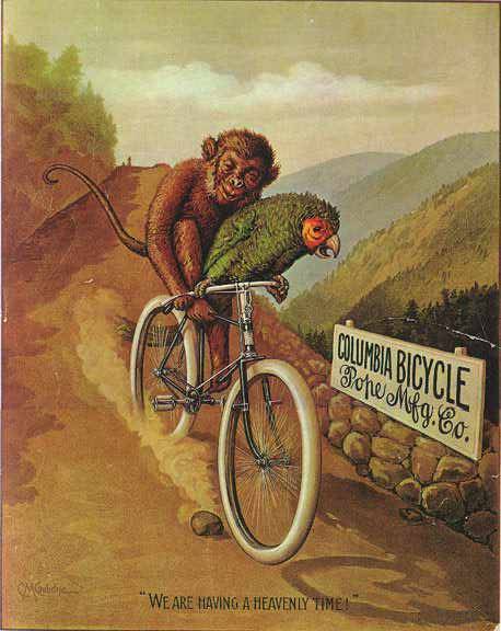
Coolidge’s anthropomorphic foresight strikes again! This time he effortlessly establishes a captivating duo that could be easily voiced by an endless combination of celebrity voice actors. PAUL RUDD as “Monkey” and ISSA RAE as “Parakeet” present “We Are Having a Heavenly Time” present a travel show. You could basically use whatever leftover footage you have lying around from the many Conan O’Brien segments and plug Monkey and Parakeet and their trusty bicycle anywhere for an irreverent glimpse into the foreign World around us.
2. “Clown and The Girl” by Haddon Sundblom
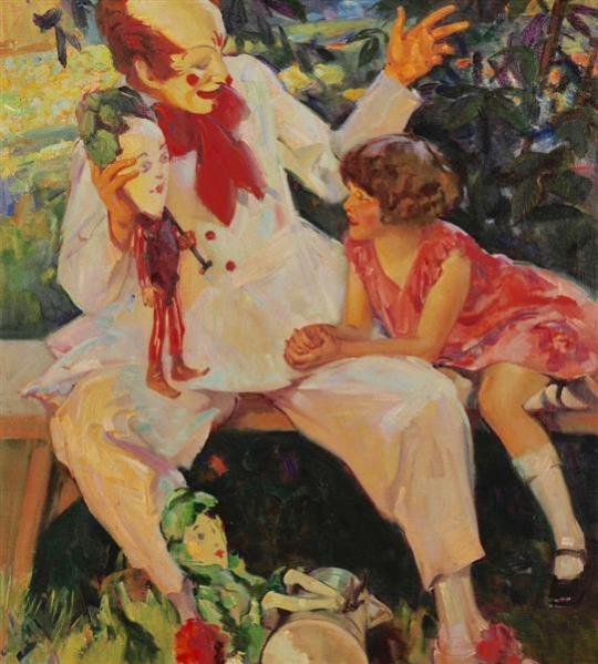
Now I know what you’re thinking, that title is miserable! I agree, but with a little reverse engineering you get The Girl and Clown, which could be a whole new addition to the Girl on a Train, Girl with a Dragon Tattoo, Girl with a Dangly Earpiece, the Girl-Verse! The girl appears to be quite fearless of this clown, which is good because we need someone to be brave for when the clown takes off his mask.
Sundblom is also the original artist for the Coke a cola Santa Claus and how is it that we have gone this many rotations around the sun without a single Coke a cola Santa Claus special is the real reason why Christmas will always be the saddest time of year.
3. “Clean Your Fornasetti” based around the artistic Plate collection of Pierro Fornasetti
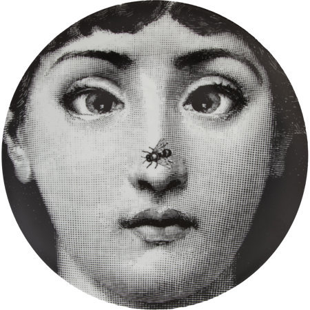
Muk bangs, videos of people eating are a huge cyber traffic boom. People love watching people eat. Why not add the element of surprise by what kind of playful Fornasetti chanteuse is hiding underneath this plate full of gruel? Fornasetti is an artist with over 11,000 items created in his name and over 500 of them are based around a variety of expressions of a single woman. Clean Your Fornasetti is a deep and poetic rumination of the romance between the act of someone cleaning their plate and the reveal that the plate contained a visual feast all its own.
4. “Mickey’s Kinkade Playhouse” by the one and only Thomas Kinkade
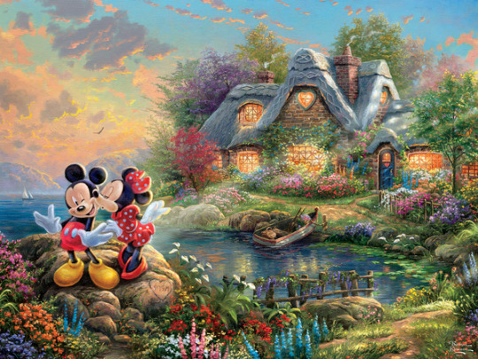
The Kinkade Studios features over 63 “narrative panoramas” featuring Disney characters, but largely Mickey and Minnie, simply vibing. It’s time we stop pretending that small children like Mickey Mouse and market him for wistful older audiences that want to radiate in a nice long warm bath of color and sound. I am not sure I am even pitching an actual series but more of a Narrative Panoply. One thing that is missing from Disney Plus, and streaming services in general, is a severe lack of programming frills and flourishing. The iconic Adult Swim bumps are something completely lost to the dustbins of programming history left to remain in youtube compilations. Thomas Kinkade is a lot like Enya. Art critics treated him like a comedic punching bag for so long, but I doubt there’s an artist that grasps the kind of sterile enchantment people want after a long day of opioid benders. We’re all trapped inside doing puzzles why not do the bare minimum of slightly animating a pleasant scene of Mickey and Minnie roasting marshmallows or enjoying a breath of fresh Alpine air?
5. “Dust Lickers” by Odd Nerdrum
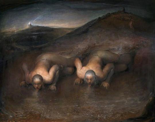
Quick! Get me Trash Humpers’ Harmony Korine on the Line Show him Shit Rock! The world of Odd Nerdrum is a harsh and primeval one that would make for an astonishing animated landscape. Odd Nerdrum himself feels like a worthy subject of some kind of documentary based around his imagery and insistence on making his art in the most arcane and old fashioned methods possible. Once again, maybe the visual world of Odd Nerdrum may not make for a full on narrative series, but once again would make for one hell of an animated segment.
6. “Homemade Pasta” by John Currin
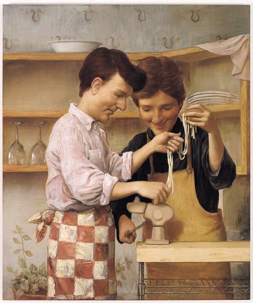
A cozy Queer slice of life cooking drama based around the two charming fellows of John Currin’s Homemade Pasta scene. A series of vignettes based around the completely unfabulous and domestic version of bliss that was denied many people as a result of the AIDS crisis. You can’t tell me you don’t see those two nice guys getting cozy and making pasta together and you aren’t dying to see how they go about rolling out their own focaccia bread.
7. “The Velvet Elvis” by the Collective Conscious
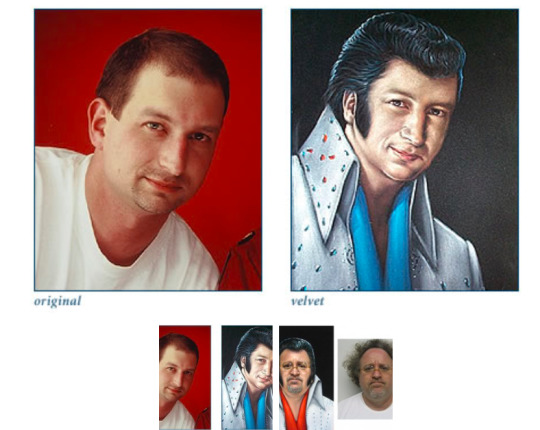
David Lynch at one point in time was trying to crack into making his own Elvis biopic. I think it’s pretty safe to say that the age of a public wanting a David Lynch directed Elvis biopic has probably passed, but that does not stop Velvet art enthusiasts. TheVelvetStore.com is featuring a remarkable promo that could really bump up what a David Lynch Elvis movie could be like and the horror of having one’s soul trapped inside of a Velvet Elvis rendition painting seems like a pretty fertile place to begin a proper story about Elvis in America.
8. “Big Eye Bunch” by Margaret Keane

Yes, it was only a matter of time before Ms. Big Eyes herself, Queen of Kitsch, Margaret Keane would come up on a list like this. Tim Burton tried and sort of kind of captured what it so endearing about Keane’s work, but I think a fully animated dive into an orphanage full of sad Big Eye kids that time travel and meet other Big Eyed children version of historical figures is a Big Idea that could make a whole new generation keen on Keane.
9. “Banality” by Jeff Koons
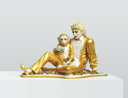
An animated series based around the artistic sensibilities of Jeff Koons would be a tricky affair, but just the kind of gaudy whimsy that someone like Michel Gondrey could use to proper effect. A series based around someone trying to steal the fifteen million dollar Michael Jackson statue would also be appropriate.
10. “Groovenians reboot” by Kenny Scharf
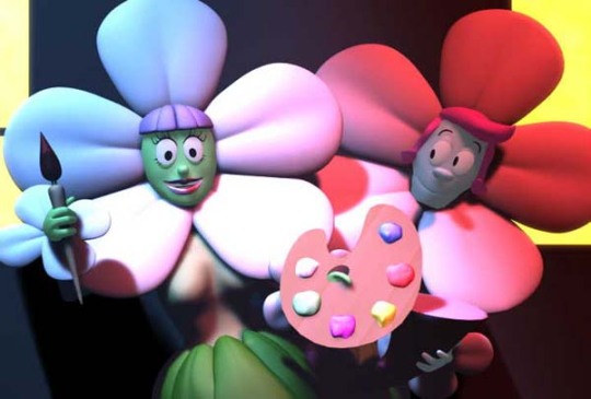
Scharf is the only artist on this list that actually was a kitsch artist that caught the attention of early aughts adult swim. A tv show that only features the artistic sensibilities of Scharf but also a voice acting cast that consisted of Paul Reubens, Rupaul, Vincent Gallo, and Dennis Hopper. There’s also a theme song performed by the B-52s and musical direction by Devo’s Mark Mothersbaugh. One of the only known published reviews of the pilot describe the show as needing mind altering substances to enjoy and that it is essentially like “watching a cartoon reflected off of a funhouse mirror. This is basically a description of the modern tik tok addled twitchy type content that makes a killing on the Internet for millenial and zoomer types. Basically the whole aesthetic of a warped and broken looking cartoon is the exact sort of thing weirdos deep diving at youtube at four in the morning are looking for and seeing that this gets a failed pilot and Denis Leary’s Dog Poker vignettes get greenlit is exactly what’s wrong with the world.
#Kitsch#surrealism#Pop Art#Denis Leary#Animation Domination#Cartoons#art critique#art criticism#Dogs playing poker#Norman Rockwell#Disney#thomas kinkade#Jeff Koons#Kenny Scharf#Margaret Keane#Big eyes#Velvet Painting#Velvet Elvis#Elvis#John Currin#pasta#odd nerdrum#fornasetti#haddon sundblom#cassius coolidge#art talk#Tv pitch#Animation#Adult Animation#B-52s
4 notes
·
View notes
Text
Notes for Storming the Castle, Chapter 4
Hello again, my dear AkaFuri readers! These notes are kind of long since I rambled on and on about Disney movies because I’m me. (And now after this chapter everyone knows why I put Disney movies in the Ao3 tags! //laughs)
So we’ll start with the Disney stuff, then I mention a few things about Akashi’s sexuality in the fic, and then the usual cultural notes. (Plus the real-life inspiration for the last scene!) Also as a reminder, I have a Pinterest board with photos that helped inspire the first half of the story.
(Cut for me being an incurable Disney nerd, plus notes about sexuality, love hotels, Japanese convenience stores, and other things!)
On The Disney Movies
I should probably feel bad about putting so many Disney references in a fic. //laughs (I’ve been Disney obsessed since I was little, and I wish I could pretend I grew out of it, but I really, really didn’t). But it seemed like a fitting way to bring up the lighter side of fairy tales, since that’s a major theme in the story.
It’s also worth mentioning that Disney stuff is a popular obsession in Japan! There’s Tokyo Disneyland, tons of great Disney stores, you get the idea. I’ve also seen a few Japanese dubs of the movies, which are excellent. <3
I didn’t plan to go into so much detail, but I wanted to try to make the movie references as accessible as I could. And if you haven’t seen the films, I do recommend them because I am a sappy dork. I chose them to match the story, and hopefully to create some interesting parallels to both Akashi and Furihata.
So first, The Little Mermaid! Random fact: This was the first movie I ever saw in a theater. (Also one of my first memories! I was three.) The songs are great, and it’s an interesting take on the fairy tale. But mostly I just thought it would be kind of funny that Furihata would like a movie about a redhead who has issues with a super-strict father and a hard time fitting in with normal humans, because of course you would Furi. (I mean Ariel was basically the reason all of us 90’s kids were in love with supernaturally red hair, right...? No? Just me? //shutting up now)
(… I would absolutely read a fic about merman Akashi trying to comb his hair with a fork though, I don’t know how that would even be in character BUT I’D READ IT. XD)
And if you haven’t seen the film before or want a trip down memory lane, here are some YouTube clips of parts I mentioned in the fic! The opening, Fathoms Below, has beautiful atmosphere. Part of Your World is Ariel’s most famous song, and I pretty much ripped off the reprise of the song in Akashi’s dream sequence so let’s all crack up together about that visual, haha. I think Poor Unfortunate Souls is one of the best villain songs ever, and of course Kiss The Girl is famous and adorable (and you can see how it ends if you didn’t already know, or you forgot!).
As for Cinderella, it’s so iconic that I feel like I don’t really have to say much about it... I did briefly mention the scene with Cinderella getting ready in the morning, which is pretty well-known (also I want you all to really imagine Akashi and Furihata watching a movie where the mice all sing in those tiny high voices together), but the main thing I wanted to link is the fairy godmother’s song! It is precious and iconic and absolute NONSENSE and I will now always think of Akashi cracking up when I watch it. //laughs I also quoted the song with Cinderella and her prince, So This Is Love, which has gorgeous scenery.
And last but not least, Beauty and the Beast! For some reason I’ve had in mind for a VERY long time that Akashi only saw this Disney movie when he was a kid. (I wrote a really silly GoM fic about my headcanons for all their favorite Disney movies back in 2015, but never got around to posting it. //laughs). In any case, hopefully I made it obvious enough in the chapter why I think it’s an Akashi sort of story. (Because of course in an AkaFuri fic Akashi’s Disney crush would be a book-loving brunette who’s off in their own little world, right? Pfft.) Also, full warning, this chapter won’t be the last time I include a painfully obvious homage to this movie… I apologize in advance. xD
Anyway, one of my favorite parts is the prologue! That chiming music is so epic, and the art is breathtaking. And of course Belle’s opening song in the village is brilliant. Those two clips show off the scenery well, which ties in closely to why I referenced it in the fic. The song Something There is a great example of the way the romance develops. And I could ramble on and on, but those were the main things I referenced, so that’s probably sufficient. //laughs
… Okay and also can we just agree that all happy-ending kisses should end in a magical firework explosion? Yes? Yes. (I may or may not be planning to write a scene kind of like it for, um, a certain fic that isn’t this one… And now everyone will know my not-so-secret influences. //cough)
And if you happen to be in a Disney mood now, I’ll also link a countdown I found of the top 20 best Disney endings, which includes almost all of my favorite Disney films/some sadly underrated ones! (My personal favorites will always be #13 and #7, but I could not agree more about the top five rankings, because I am a Disney Renaissance kid. <3)
On Akashi’s Sexuality in the Series
I mentioned this a while ago, but now might be a good time to mention it again! In my AkaFuri series, Akashi is on the asexual spectrum, but I haven’t used the specific term for his identity in the fic. Partly because this fic takes place when those terms were even less commonly known (back in 2010, which is only a few years after I first came across AVEN, so the idea would have been even less familiar in Japan), and partly because he hasn’t fully discovered this about himself yet.
One of the reasons I started writing this series was that I wanted to try to capture how it feels when you haven’t completely figured out your sexuality yet. That was pretty normal among my friends and I when we were sixteen, for a lot of different reasons. (Furihata will be having a similar experience in the series too, which I’ll get into later!) Anyway, I’ll be exploring these issues in more detail in the next fic in the series, but since this chapter does mention some of the feelings Akashi has been struggling with, I thought it would be good to clarify.
On College Kids in Japan in Relationships
I had a lot of fun writing the scene where Furihata’s brother sneaks back into the house, and since it loosely references an aspect of modern Japanese culture, I should probably mention that here…
It’s not too uncommon for university students in Japan—and other young people in their twenties—to still live with their families. Which means that for the ones in relationships, it can be hard to find some (ahem) private time, especially since living spaces are often crowded and PDAs are discouraged. So it’s very normal for young people in Japan to go out to places like love hotels with their significant others…
… And that’s basically what I was implying, when it comes to where Furihata’s brother snuck off to. //laughs That’s also the context of Furihata’s mother’s lecture, and I tried to capture some of the Japanese norms about sex there as well. It’s tricky to explain how they differ from Western norms, because they’re not more “conservative” or “liberal” exactly, just different. (And they vary a lot depending on the person and what generation they’re from!)
But basically, to sum up, I was hoping to convey that Furihata’s mother isn’t upset about what Furihata’s brother is doing per se, it’s more that she’s worried about him being responsible and “appropriate” while he’s doing it. My impression is that it’s unusual that a parent would broach the subject like she does--but hopefully it’s clear that this is a part of her character. Similar to how she dealt with events in Chapter Three. (And that’s also why a character like Akashi is very embarrassed to have overheard it, poor kid. xD)
Also! For those of you who are 18+, if you want to learn more about the cultural context of love hotels in Asian countries, and what they’re like (answer: epic) I love this comic that sums it up. (The comic isn’t explicit, BUT it’s hosted on a webcomic site—that I personally love—that features 18+ comics about sex ed and sex toy reviews. So please be aware, the ads and some of the site’s illustrations are explicit! And very inclusive, sex-positive and awesome.)
On Elementary School Uniforms
I also wanted to briefly mention one of the cultural tropes in Furihata’s family photos! Japanese elementary students wear bright yellow hats when they walk to school, as a way to make them more visible to prevent accidents.
On Conbinis
This is basically just a note to say that I love Japanese convenience stores. //laughs They’re everywhere, everyone uses them, and the major chains are extremely competitive. So they’re often open around the clock, their services are amazing, and their food is delicious.
Also, here’s a random fact! Kit Kats are hugely popular in Japan, and they have all kinds of unusual and regional flavors, including green tea and wasabi and sweet potato. (Yes, really.) The trend started because of a pun in Japanese that made them a popular good-luck gift to give to exam students. Now they’re so well loved that they even have fancy chocolatier stores that sell ultra-fancy Kit Kats because… Because Japan, that’s why. XD
(Also when I post this chapter, I’m rewarding myself by ordering some hojicha Kit Kats from Amazon, because roasted tea flavored Kit Kats from Kyoto are you serious of course I want that in my mouth.)
On the Inspiration for the Walk with Furi’s Dad
I also wanted to make sure I mentioned one of my biggest inspirations for this fic! Which is that when my sister studied abroad in Japan, she stayed with an amazing host family near Hiroshima.
I’ll never forget all her stories about what it was like, but my #1 favorite is that she was awake one morning and her host dad invited her to come on a walk with him… At which point he put the family cat in a harness and they went out and walked the cat. (Maybe that’s more common in some countries, but at least in the U.S., I don’t know anyone who walks a cat? XD) She tells the story a million times better than I do, but the gist of it is that they wandered around this ultra-tiny parking lot for a few minutes and he showed her the strawberries in their garden and it was adorable and a little strange and the best thing ever. <3
I didn’t have Furihata’s dad walk a cat in the fic, sadly enough! (I decided it would be kind of distracting… Also, the Furihatas don’t technically have a cat in canon. //laughs) But I did put a cat in at the end. Partly because everything’s a metaphor, the metaphors are out of control, someone save me from myself. But mostly because I wanted to include a nod to my sister’s host dad and his family, and how much they influenced this story, by being so welcoming to her when she was so far from home. <3
10 notes
·
View notes
Text
Engaging eLearning Design
All of us have experienced dry, boring, painful eLearning. I can say that with confidence because it’s so prevalent. The question is–why is there so much of it? My answer, or at least part of it, is that eLearning designers and developers have very few good examples to reference. So, when the Big Boss comes and tells you something is due in two weeks, what’s the easiest solution? Do what you’ve always done. Throw some slides together. Get some bullet points on there. Find a stick figure gif. Embed a quick YouTube video. Call it a day. There is so much more we could be doing, though–if we take the time to consider how to design in an engaging way.
Today I want to provide some examples of:
Engaging ways to open your course
Engaging activity elements and
Engaging presentational strategies (for when information just has to be presented and there’s nothing very active about it)
If you want to SEE examples of some of these ideas, check out my free one hour webinar recording for “Elevating eLearning Design.”
Engaging Course Openers
You’ve got to remember that every learner is opening your course expecting to be BORED. If you can surprise them right at outset and capture their interest, they’re willing to open up to the idea that your course has something valuable to offer. Consider these ideas:
Tell a Realistic Story: Immediately immerse the learner in a story that sets up their role or plays out what happens when the desirable action for the course does or does not happen. In short, show the impact and results to others and the organization. This helps create interest and reinforces the relevance of the topic to the learner. Capture their attention by showing them what can happen when they’re successful or what happens when they’re not. Then, step back and show them how to be successful.
Use an Analogy or Fable: Start out with something compelling and interesting, like an analogy or fable that seems completely unrelated to the topic at hand. Then, connect the dots and show them how it pertains to the content and their role. For example in a customer service course, to address an issue of technicians who were being demeaning to customers, I once started a course out by telling them their child was sick and letting them select the doctor who would care for them based on word and tone choice (with some doctors modeled after the exact behavior customers were complaining about). After that I “flipped the script” to make comparisons about how bedside manner really counts when someone’s in a tight spot and worried and needs help.
Give the User a Role: Ask the user for their help and show them what interesting—and relevant to the story—tasks they’ll need to accomplish during the session.
Create a Villain: Adding to the previous idea, set up a villain character with destructive intentions and let the user help defeat them.
Object Lesson: Use an “object lesson” approach to gain attention: this can be done just as easily in eLearning as in the classroom. If in the classroom you talk about time management by using the age-old “rocks and water” example you can still illustrate that in your course. Ask them to drag things to a jar to fill it up and see the results, etc.
Illustrated Concept Video: Create an interesting animated concept to illustrate the “What’s In It for Me (WIIFM)” of the course using a tool like GoAnimate or the basic animation functions in your rapid development tool.
Elephant in the Room: If there’s something undesirable about the course or goal, play it out in a story or other form to get it out in front of the learner, address their objections, and address the value of the course. “Does it ever seem like a total waste of time to input your task hours into the company’s online tracking tool?…”
Put Them On the Spot: Ask the user for their opinion, decision, judgment, or “bet.” A lot of courses start out with statistics or reasons why a program or product exists. Rather than lecturing about why something is important or sharing information about why a change is being made, ask the learner what they think. Ask them ‘how bad’ they think a problem is or how prevalent it is. Ask them how many customers they think are lost every year due to lackluster customer service scores. The list goes on. If you ask them to think and actually put a stake in the ground, they get far more interested whether they’re right or wrong, and in the actual information.
Engaging Activity Elements
Activities are so much more than “click and reveal” or “drag and drop.” There are so many more things you can add to spice it up. See my blog about converting ILT to engaging eLearning for a detailed model and walkthrough of how you can do this, but here are basic ideas for engaging online activity elements:
Jump Right In: When appropriate, let the learner jump right in and make a decision, using your content to provide support resources (rather than making them sit through several presentational slides and then quizzing them on the content). Most adult learners are fine with getting involved—especially with a provided resource—rather than being lectured at before getting involved. This is especially true if it’s clear it’s not a graded assessment.
Make it Fun: Through visuals or controls, make interacting with the page fun and appealing. Rather than a click and reveal, try a fun slider with a theme. Try a dial. Let the learner ���play” with manipulating an image through destroying or building something. Visually theme the activity so that it doesn’t feel like it’s just any old page.
Match Story, Role, and Task: In a course that has a central story and where the learner has a role, have the activity’s task align with the user’s role and move the story forward. Often, the learner isn’t given a role or purpose in the story – or if they are, it’s marginal or mismatched to the actual learning objectives. Aligning story, role, and task is an advanced concept but when you make it happen successfully, you can create award-winning courses.
Show Impact: After the user interacts, don’t provide feedback. Show them the IMPACT of their choice first, then let them modify their choice. This is a great way to address common mistakes and understanding and use emotional impact to increase retention. See my blog article on the 4Cs to Creating Meaningful Scenarios for more information—specifically the “Consequences” article.
Full Bleed Immersion: Find a way to make the screen “full bleed” to create the feeling of full visual immersion in an environment (aka have the picture extend all the way past the edges of the screen so there are no margins rather than slapping a square picture in the middle of a white slide) and ask the learner to interact with the “environment” by exploring a desk or peering inside someone’s inner thoughts.
Approximate Reality: Ask the user to do what they’d be doing back on the job. Approximate their reality to the highest degree possible in an electronic format. Relevance is engaging. Theoretical disconnect is not. If the task is to build something, try to find a way to let them build it. If the task is to evaluate something, put it in front of them to evaluate it. Sorting, matching, evaluation, judging, etc. can all be mimicked in eLearning very directly and built as part of a story or an environment.
Let Them Play/Easter Eggs: Build some fun elements into the page that don’t have anything to do with learning, but encourage the user to stay engaged and maintain curiosity. For example, you could let them change the radio station on someone’s desk…or show the seasons changing outside a window.
Violate Their Expectations: Any time someone expects something and the opposite happens, you have their attention. Ask yourself what they expect, then do the opposite (for important points).
ENGAGING “PRESENTATIONAL INFORMATION” TECHNIQUES
Sometimes, the learner doesn’t need to do anything with the information you’re presenting, but…it has to be covered. Even still, there are engaging ways to get it across.
Narrated Example or Story: Instead of directly explaining theoretical information, consider telling it in the form of a story, case study, or narrated example, calling out key points as they appear along the way. Quick comic book/novella formats can easily be made in any tool.
Infographics: Convert the information into an infographic. People would much rather visually explore something interesting than read a paragraph of text. There are simple ways to do this.
Iconic Illustration: Illustrate the main concepts through iconic illustration. Bring the icons and in and out of the slide with movement and narration or music to maintain interest.
Exploratory Interactions: Click to reveal, timeline, or slider-based exploratory interactions can at least chunk, sequence, and put some visual appeal to presentational information.
Visual Presentation: The associated visuals with your content can go a long way toward making the content feel more interesting, rather than boring. Vary your layout and images from page to page while being consistent about what matters, like brand and navigation. Tie concepts or acronyms to graphics and let the learner explore those to study the concept. Find a way to make the reading “active” if there is no way to get around the reading.
Interesting Layouts: Changing up your page layout and creating interesting layouts and bundles of information can help it feel more interesting than it is and keep the user from becoming visually bored with the same layout and approach slide after slide.
There are so many good ideas out there! Explore online communities, Pinterest, LinkedIn groups, and other resources to get ideas. The more you see—and create! —good eLearning, the more you can distance yourself from the reference and habits of boring eLearning. Take some of these ideas and try to implement one or two in your next course. Have some ideas to add? Share them in the comments below!
Contact our Custom Solutions team to see how we can help you build engaging eLearning.
Custom Solutions
The post Engaging eLearning Design appeared first on eLearning Brothers.
from Free Online Courses http://elearningbrothers.com/engaging-elearning-design/
0 notes