#personal preference? i would've loved it if the animals has less stylized faces. that would've really elevated the film for me personally
Explore tagged Tumblr posts
Text
I saw The Wild Robot a few days ago, and I think I would need to see it again to know how I feel about it. Visually, it was gorgeous: the coloring, layout, animation, effects, etc etc were all just a treat to look at, and while it seems to be following the recent trend of blending aspects of 2D and 3D, it's stylistically distinct from the others. Like Puss in Boots: The Last Wish, it would've been worth seeing for the art alone even if everything else had sucked. I felt like the score was doing a lot of heavy lifting in terms of narrative and emotion as well. I did cry a couple times in the theater.
That said, I couldn't help but be hung up on the writing the whole time I was watching it. It often felt too straightforward and preachy. There were multiple times where a character would make a statement about an emotion and I would wish that we had instead gotten to witness the emotion for thirty seconds instead. (To be clear, this isn't an issue with Roz or overly literal robot speech styles: that's my jam and I love it. All characters were guilty.) This would ruin most movies for me, but again, the art and music were carrying so hard that I'd end up feeling the emotion anyway.
It also felt like the pacing was strange: it felt very storybookish in that one thing happened and then another thing happened and then another thing happened and now the movie's over. There were three climaxes: Brightbill's migration, Roz saving all the animals from the blizzard, and the final robot fight, but all of them felt like they were fairly equally weighted so each subsequent one felt less impactful because, what, again?
I feel like I would have liked the movie better if:
1. Less dialogue period. Maybe Roz is the only one who speaks, and the animals communicate through body language. If they must talk, maybe rather than learning animal language through a scan in a montage, Roz slowly learns their language throughout the film from the ones she's close to. I feel like that would've been more impactful for their relationships and the theme of Roz having to learn how to do things differently than she was programmed to. (see footnote)
2. If they took out that stupid old freaking goose. Mentor death was a layer that did not really add to the movie, the goose wasn't there long enough for me to care, and having one old goose who doesn't hate Brightbill for some reason doesn't really help connect him to the other geese at all. Have him form a connection with someone rather than having this wise old grandpa bird show up out of nowhere for no good reason. I'm not even glad he died because I'd rather he hadn't been in the movie at all.
3. Give the movie a little more time and use it wisely. Everything is in montage form. Give us a couple non-montage scenes of the characters doing stuff together so it's more impactful when they break up. Alternatively, take away at least one of the three climaxes so the focus doesn't feel so scattershot.
4. Tie the human civilization into the themes more. I don't think there should actually be humans in the movie, but there seems to be something there about how the animals learn they're stronger together, and the human civilization seems to have sealed itself away from nature in biodomes (probably for safety from the effects of climate change), and they chase the geese away, unlike Roz, who takes all the forest animals into her own dome-shaped house. But like, the humans seem to be doing fine. I feel like it'd be way more interesting if there were background glimpses of things beginning to fall apart juxtaposed with the shiny advertisement videos for the robots. I think it'd help make that theme of outward focus and making the world a better place stand out more.
In conclusion, I do think it's a very beautiful and worthwhile movie to see. However, it could have been a masterpiece with less heavyhanded writing and tighter, more coherent theming and plot. And that kinda bugs me. It could've been perfect.
(Footnote: Pet peeve territory, but it also would've made more sense. Roz is presumably programmed to pick up human language with grammar and syntax, and while I'm willing to suspend my disbelief for talking animals in an animated movie, they are absolutely not talking like humans would be even if they appear to be speaking English for the audience's convenience. That montage literally showed Roz doing like a find-and-replace language reconstruction on those little projector screens, and like... really? Animals have a language that is analogous to human language structures and nobody has put that together yet or it would be in Roz's database. Shut up. People have been WISHING animal communication worked like that for ages, but it doesn't. No way algorithms designed for human language syntax structures would work on animals and no one would know. Either handwave it completely or get me a semi-satisfying explanation; don't put that crap on the screen and force me to think about it.)
#pickle pontificates#I'm probably not gonna tag this for the movie. i still haven't seen any reviews so I'm looking forward to seeing what other people think#i know response has been generally positive and I think that's deserved#but like. the fact that I feel so conflicted is both praise and condemnation#i would not care if it were straight up mediocre#it's just that it was so close to being amazing that I can't stop thinking about it#also I didn't think this was important enough to put in the post but like#personal preference? i would've loved it if the animals has less stylized faces. that would've really elevated the film for me personally#i don't want hyperrealism at all but like#smaller darker eyes at least?#i think it would've made it feel a lot more ''wild'' and less... disney idk
2 notes
·
View notes
Note
Thoughts on meowth and it’s evos/forms? I liked Galarian meowth until I saw that it wasn’t round and floofy and instead had a weirdly flat…beard
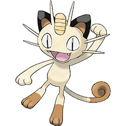
Meowth's always had a pretty nice design. It's based off of the maneki-neko (beckoning cat), said to bring prosperity and good fortune, hence the coin (koban) on its forehead and the payday move. I'm a big fan of lucky cats in general, so I'm already biased here, but I also like the design. It's nice and simple, I love the stylization of the whiskers and the darker points on the feet and tail, and the face is great as well.
My only big thing with Meowth is that it's always depicted as standing in modern games due to the anime... but it was supposed to be quadrupedal and only stand up on its hand feet sometimes. First, the games and anime are two separate continuities, so no reason to change it just to match; and secondly, it was something that made Team Rocket's Meowth more unique. The entire point of him changing to impress a girl is kind of loss when all Meowth are now like this by default, you know?
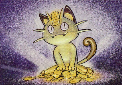
Also, it's weird that the ears are black but everything else is brown. I would've just made the inside the cream and the outside the brown for consistency. Other than that, this cat is free to steal my wallet any time.

A lot of Meowth fans don't like Persian (terrible name, btw; not only is not a Persian cat but that's also like, an entire country), and... yeah, I kind of agree, though I don't hate it. I do like big cats, and it does do a good job of looking like a more powerful Meowth.
However, Persian's problem is that it drops the most interesting elements from Meowth's design. The face is now just a generic cat face, the koban has been replaced with a generic gem (which I kind of get--gems are worth more than coins--but so many Pokemon have forehead gems that its not a unique element, nor does it have the nice framing with the forehead whiskers like Meowth's coin has), and the brown points are gone. Which is particularly weird because the original sprite had them, and I have literally no idea why you'd drop them, especially because the otherwise caucasian-colored skin makes it look bald:

I think I would've either liked to see it based off of another yokai cat--the bakeneko, maybe--or lean more into the maneki-neko theme more. Imagine a Persian that has deep golden fur or at least golden points, with red accents and tons of jewels all over the "collar", making it look like an absolute portrait of wealth.
And I'm not saying Persian is inherently bad--the imposing nature may be more appealing to many people than Meowth's more cartoony look--just that it could've stood to be much less generic.

I'm not a huge fan of Alolan Meowth. This is entirely personal preference, but I just don't like regionals that are basically just recolors of the original that change maybe one or two other things (in this case, the whisker direction and the expression). Given that shinies already exist, it just feels inherently boring when so many regionals manage to add a completely new, refreshing twist on old classics, you know?
Now on the plus side: I do love the blue color, and because so little changes, I still like it in the sense that I like Meowth. I just feel like it could've been more interesting.
In general, I just feel like a British Shorthair isn't the best choice for a regional. Why not go with a long-furred breed, which would instantly give it something to set it apart from the original, like how A. Vulpix's fluffier tales help keep it from being a complete recolor? Hell, go with an actual Persian cat and have Persian's name finally feel warranted. Speaking of which...
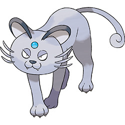
what is this.
Okay, so the good news is that it's not a complete recolor this time, and the blue fur looks so, so much better than the skintone color of the original, so that's great.
However, the execution of this is very botched. Here's the thing: British Shorthairs have jowls, which go to the sides and under the head. Here's a good shot of what I'm talking about:
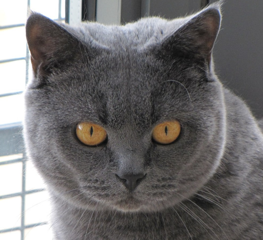
You can still see the regular cat head shape, with the fat going under the head like a double chin. By making the entire head perfectly circular with no indication of the muzzle like this, it makes the head look swollen, like it tried to eat a Beedrill, rather than simply round and fat.
The other problem is that the body is that of a cougar, while the British Shorthair has domestic cat anatomy, and is generally much stockier. You needed thicker, shorter limbs--almost like a tiger, if we're talking big cats--rather than Persian's regular anatomy. Combine that with the out of proportion head, and it looks ridiculous, and not in a good way. If the anatomy was better--either more realistic or way more cartoony--I might've really liked this, but the botched execution ruins it for me.

I have no idea why there are British Shorthairs in Hawaii instead of the England region.
With that aside, I do like G. Meowth quite a bit. First, the viking theme is fun and distinctive. The ears and points on the body finally match (yay), and the long Norweigan Forest cat-esq beard is good... in theory. However, Gamefreak's terrible texturing and modeling makes it look less like a furry beard and more like a lump of fat, which is just unpleasant.
Also, I feel like the entire body, once again, should have been long-furred. That's the only way the beard works the way it's supposed to. With that said, however, I still like this a lot (with one other caveat--see below).

Perrserker is also great, even more so than G. Meowth. The helmet and the horn ears look great (though I think the points on the helmet could've been removed and the horns moved up to make the ear thing clearer), the awful neck fat illusion is gone in place of a much clearer beard, the sword claws are a great touch, and the colors are great, especially with the pop of orange the eyes add.
However, here's my big problem with this line, which has nothing to do with the visuals or even the theme--it shouldn't have been connected to the Meowth line at all. There's no thematic connection here; the closest I can get is that Meowth hoards coins, and vikings plunder, so maybe that's what it was going for? But it's just too disconnected, and the extreme visual differences, combined with it evolving into Perrserker instead of a Persian regional, make it feel disconnected. As far as I'm concerned, G. Meowth could've been dropped entirely, and Perrserker could've been a fantastic non-evolving new Pokemon; just get rid of the koban coin and change the tail shape and you're good to go.
So on the plus side, it's a much more interesting Meowth regional than the Alolan version. But on the minus side, it's also too different, and feels like it's forcing a unique concept onto the Meowth line for little reason instead of embracing it as its own thing. Still, I'm glad it exists regardless.

What I'm not glad exists is G-max Meowth. For god's sakes, Meowth already had a regional, now you're giving it another regional and a g-max form in the same generation? This is getting to Charizard levels of ridiculous!
But with that aside, I also just... don't see the point of this one. It's a meme. There's no theme or deeper connection, it's just a nod to the longcat meme. The Bulbapedia trivia literally has several sentences to explain the other forms and OG Meowth, while all it says for g-max Meowth is that it's a meme.
I point this out because not only does it make this shallow, but why not give it to a different cat Pokemon? We have tons, and it works just as well for any of them; and like I said, Meowth definitely doesn't need anything else.
Now the good news is that I do like some of the visuals. The large glowing eyes look cool, I believe the koban has been increased in value on the head, which is neat, and the symbol on it is a nod to the writing on the coins carried by lucky cats. It's also hilarious, because the 'dex claims that "The pattern that has appeared on its giant coin is thought to be the key to unlocking the secrets of the Dynamax phenomenon"... but from what I understand, it just says "big". The secret to the Dynamax ability (shouldn't that be g-max? whatever) is Big. That is hysterical.
So basically, overall: Original Meowth has a good design and a nice theme, but Persian is a bit too bland for its own good. Alolan Meowth is also too bland for my tastes, while A. Persian is a hot mess due to the anatomy. G. Meowth is pretty decent but I hate the beard rendering, Perrserker is great but should've been its own Pokemon instead of a regional, and g-max Meowth Exists. That's a lot of Meowths, right there.
78 notes
·
View notes