#people are also pointing out how their beta sprites have different eye colors
Explore tagged Tumblr posts
Text


It’s been cool getting to see Ingo and Emmet’s beta designs! (Bless @enhancedpartytime for working hard to get the sprites and feed this fandom!!)
#I’ve had no time to properly draw them#what you are seeing is just edited images of a new promo sticker design#so you’ll be seeing these in my store next year#probably#but as their actual designs not their beta designs#people are also pointing out how their beta sprites have different eye colors#but their final sprites do as well#so I kept their eyes the same#submas#Ingo#Subway boss Ingo#Subway Master Ingo#emmet#Subway boss emmet#subway master emmet#pokemon black and white#pokemon bw#pokemon#waywardstationart
710 notes
·
View notes
Photo
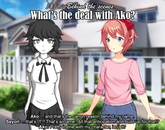
Hello everyone! Yui here, with today’s special feature, DDLitG Behind the Scenes: What’s the deal with Ako?
In this special update we’ll talk about her character in general, design, her place in the story, and more! So get comfortable in your seat, get yourself some good snacks, and let’s delve into the background of DDLitG’s 1st-ish original character~
Who is Ako?
Ako, formerly known as “female student”, was originally one of the many NPCs used by the game’s engine to fill its world with nondescript background characters, so as to make it feel less empty. However, Sayori took a special interest in her, and decided to befriend her, following the steps of a young MC who befriended Sayori in a similar situation and ended up saving her life. This would in turn allow Ako to grow as a character beyond her 1 line of coding and get her own sprites, as well as being able to interact with the world. She would later go on to fall in love with Sayori and shenanigans ensue.
Ako was created with the purpose of telling the story of the Friendship arc.
Designing Ako.
Let me make one thing clear: I’m not a character designer. I don’t know jack about it besides the very basics. But I did try to make someone who looked mildly original and, most importantly, different from the other girls.
Originally, she was going to be the image of a shy, fragile girl who Sayori befriended out of pity, more than anything. Based on this initial idea, I made this beta Ako design on one of my copybooks when I should’ve been working:

As you can see, her very first sprite was the one where she’s shyly looking away to avoid eye contact (and to seem annoying, but more on that later). I was happy with the pose but not with her face, as it looked super unoriginal. She resembled Ochako Uraraka from My Hero Academia a bit too much, so I tried to change her hair to make her stand out more. Here is her second iteration:
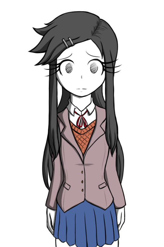
This time, I felt like I cranked it up too much to the other side. Now she stood out TOO much. Her hair felt like it came more from a protagonist than someone who’s supposed to be a background character. I adopted a new philosophy after seeing this result: she had to look as bland as possible. She had to be the kind of character you see all the time in the background of an anime - those simple, unassuming designs you’d never look twice at because you’re too focused on the protagonists with candy-coloured hair. In DDLitG’s canon she’s a filler NPC brought to the forefront, and her design had to reflect that more than my desire to make her look “cool”.
With this in mind, we come to Ako v0.3
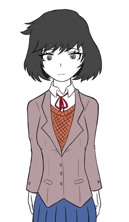
As you can see, this is much closer to her current design. But this was still a sketch (even the drawing above is very much unfinished). As you can see, I got closer to her 0.1 version with the hair, but changed the eyes to make them look more unique, giving her that more neutral, “nothing” expression. Having finally found some ground I was comfortable with, I redefined her design a little further, gave her some more details around the hair and clothes, adjusted the proportions of her body (because apparently I draw heads huge), and made her finalized design.
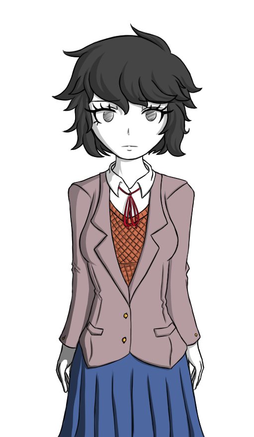
I was happy.
What’s with this sassy... monochrome child?
If there’s one constant to be found in the pictures above, is that she was always meant to be black and white. There are plenty of reasons, which I’ll list because, honestly, there are a lot.
1. I didn’t want to look her like the rest of the cast at fucking all. She is an OC introduced in a story with already established characters made by a much more talented writer. She’s an outsider, someone who doesn’t belong with this cast of colorful characters, and I wanted readers to be able to tell that at first glance. No, she’s not like the other girls. They don’t belong in the same place. She is not a member of the original DDLC cast, and it shows.
2. I know I can’t draw as well as Satchely, so trying to copy DDLC’s art style would just end up looking awkward and wrong. I had no choice but to do my own thing. And if I’m doing my own thing, why not take it all the way? I already gave myself artistic freedom, I might as well go crazy with it~
3. I just adore characters in a fictional universe that look different from the rest of the cast or have some strange design choice for literally no reason. Like Krillin from Dragonball, with his eyes that make him look like he belongs in an entirely different manga...
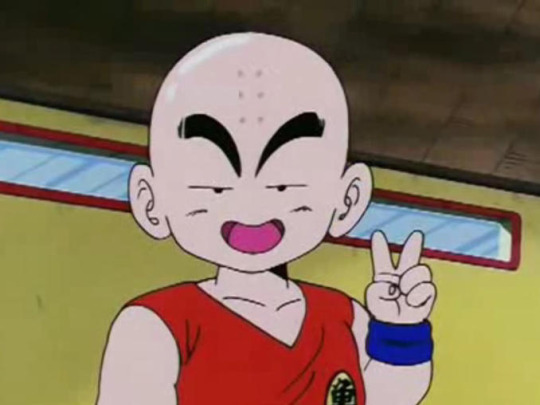
...or even Jotaro Kujo, whose hat merges with his hair because why not!

I live for dumb crap like that.
4. A huuuuuge inspiration for me while writing (besides my own uninteresting life) is music. Many times I listen to a specific track or imagine situations with specific background music to make them seem more real, and be able to better portray the feelings of a scene when writing [For example, I listened to My Chemical Romance’s Welcome to the Black Parade a lot while writing Monika’s Death].
Ako’s creation was no exception. Her appearance was partially based on the cover for not only one of my favorite Vocaloid albums of all time, but one of my favorite albums period: Wowaka’s glorious Unhappy Refrain.
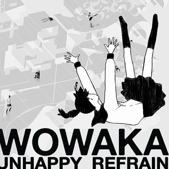
I’ve been writing stuff based on this album alone for years because it’s just so damn striking to me. The picture of the faceless schoolgirl falling into the unseen abyss, the background uninterested characters that imply they are used to seeing fellow girls suffer, the distorted world they live in, the album’s way to explore teenage depression, the freaking name of the album, EVERYTHING! IT’S SUCH A GOOD EXPLORATION OF THE DIFFICULT LIFE TEENS FACE THAT OFTEN GOES UNNOTICED!! AAAAAAHHHH IT’S SO GOOD.
5. Ako was also based on a previous design I made for another character meant for an original visual novel I was writing and I’m probably never going to finish, who was also going to be monochromatic to reference this album (in that context it made more sense though cuz every character was a musical reference).
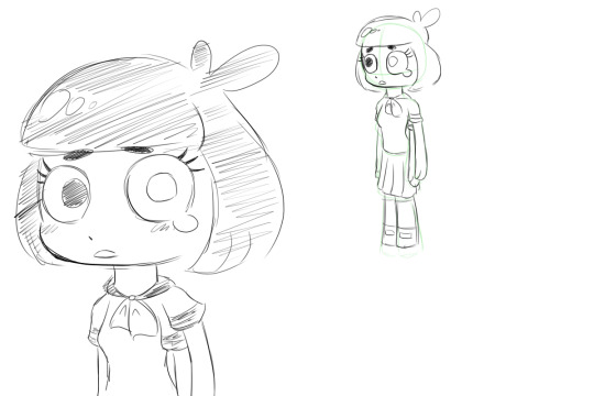
This character, in turn, was based on Monoko from Yume Nikki, which is more obvious because of her crying eye and extra arm.
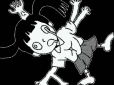
So basically at this point it would’ve been weird if I hadn’t made her monochromatic.
Naming Ako
This was one of the most difficult parts, ngl.
As I mentioned, Ako was originally going to be a fragile, shy girl. Based on this, her original name during the design face was Moromi, which is one more letter than “Moroi”, which Google translate promises me means “Brittle” or “Fragile” in Japanese.

However, after the philosophy change that happened during her conceptual stage, “Fragility” was no longer at the core of her character, as it was now “Nothingness/Blandness”. Because of this, I changed her name to “Ako”.
Many people have submitted their interpretations of the name, ranging from its meaning “To teach/to learn”, and “To yearn for”, which all fit better than the original tbh.
The intended meaning is for “Ako” to be read as “A-Ko”, which is a way by which Japenese media often refers to filler characters, as it translates to “Girl A”.
Examples of this can be seen in Super Danganronpa 2, where a character in a videogame is called “A-Ko” to hide their identity...

...and in a movie called “Project A-ko”, which was a parody of the anime tropes from the time, so they gave the protagonist the most generic name ever. The antagonist and side character, by the way, are called “B-Ko” and “C-Ko” respectively. This movie is fucking awesome.
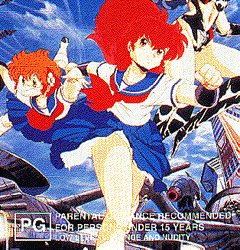
This name also made sense in the context of the story, because we already had a character named “Student A”, so this goes to show that the game just gave Ako the default name it had stored for female NPCs.
Blinded Ako, or How I Learned to Convey Emotion Through Ahegao
When I came up with Ako, she was meant to have most of her character revolving around her infatuation with Sayori. She was, after all, written in the story with the purpose of falling in love with her, and nothing else. Her character, personality, likes/dislikes, and hobbies came afterwards. As the story progressed, however, I decided that she should have a personality separate from just being in love with another character. So to separate the actions she committed under the influence of her passion, I did a little design change in the middle of the arc: Blinded Ako.

In this version, Ako has been literally blinded by love and stops being rational. This is represented by the hearts covering her eyes, and clouding her judgement. This was done not only with the purpose of representing she was past her breaking point, but also to differentiate the Ako that makes mistakes with the Ako that was introduced in the beginning of the arc. Almost so as to make them two different characters, so when she is reintroduced as a regular character after Friendship, readers could think “oh, she’s not going to do dumb stuff again, she’s not blinded by love anymore.”
Many people compared the above panel with “ahegao”, a trope in hentai manga where a character does a silly face to represent them breaking from enjoying themselves so much. This was done partially on purpose. The main idea was to represent Ako being blinded by her infatuation for Sayori, not to equate her sate of being with anything sexual. It DID end up looking more hentai-esque than I expected though, as, well, Ako is in black and white, and the heart eyes are also a trope in ahegao. And she’s sweating. And she’s saying that she’s about to break....
.....
....well at least I drove my point home.
Ako’s musical influences
Above I mentioned how music was a big part of my inspiration, and how I listened to Welcome to the Black Parade while writing Monika’s Death, so the question in no one’s mind is: what music did Yui use as inspiration for Ako’s character and the arc? 🤔
Well, hypothetical reader, the answer is that since Ako was meant to be bland and flavour-free, her original depiction is not based on a song or anything. Her desperation towards Sayori and Blinded Ako, though, are based on TRONICBOX’s 80′s style remix of Ariana Grande’s Into You. And yes, this 80′s remix in specific. Not the original song. I highly encourage you to give it a listen and pay attention to the lyrics if you want an insight into how Ako was feeling during her breaking point.
youtube
Also, as a side note, no one has asked me this, but I imagine Ako’s voice to sound like the vocals of Panty and Stocking’s ending, Fallen Angel. It’s a truly beautiful song, and once again, I highly encourage you to give it a listen and pay attention tot he lyrics if you want an insight in Ako’s current feelings towards Sayori.
youtube
Ako’s reception
This is more something personal than an explanation of the character, but it’s something I want to share nonetheless.
Remember when I said Ako was meant to be annoying? Yeah... xD
When I decided to add a new character I did so under the idea that everyone was going to hate her, because it’s a purposefully boring OC made by some insane person with the sole purpose of being added to an already interesting and loved cast of characters just to fuck everything up.
The first scene I ever wrote for Ako was the part where Monika asked if she had hurt Sayori, and she said “Not intentionally...” while looking away, which is why her first sprite ever was in that position. She was meant to make people feel frustrated over this girl just looking away from her problems and avoiding responsibility, while also telling Monika to her face that she had done something bad to Sayori. Readers were expected to hate her. That’s why in the beginning she says she doesn’t like literature, to assure you that she’s not joining the literature club. That’s why there’s a scene where she gets punched in the face. That’s why she looks so extremely out of place.
YOU WERE SUPPOSED TO DISLIKE HER!! omg I’m still surprised at how warm the reception was, you guys are just too nice for me~ ❤️
Because of the unexpected reception I had to change some parts of the arc, which were originally going to be much crueler towards her [I even questioned adding the punch at all, but it was an important part of Monika’s development so I felt it]. I also established her as a recurring character in spite of her dislike of literature, and did my best to make her less hate-able than she was originally going to be, even cutting some planned lines of dialogue that made her pretty irredeemable. Looking back, I am glad I did those changes, we ended up with a well-liked and pretty nice girl because of it~
Final thoughts
The introduction of Ako and writing Friendship in general was a very intense experience for me. It was very difficult to balance Ako as being both relevant to the story and moving the plot forward, but not make her the sole focus of everything and have her obscure everyone else, because OCs in established pieces of media tend to do that.
This arc also got a LOT of mixed reviews, some people liking it, some hating everything I did. This made me really question what I was doing and at many points even regret I was writing Friendship at all. At a certain point I lost almost 50 followers in a single update.
I also had trouble writing some parts because they were too sad. And that’s not my style! I like writing happy people being good friends, damn it, not everyone crying and hating each other.
But when all is said and done, I’m happy I wrote both Friendship and Ako into the story. I’ve received many wonderful, supportive messages telling me how much readers enjoyed it. Even some people saying they had been in a similar situation to the one depicted in the story, and were glad to see a story that showed a positive outcome.
Will I write more OCs into DDLitG?
Meh, who knows. I love writing more original stuff and expanding the world of DDLitG, but I also feel like if I introduce yet another OC, people will crucify me and hate me for flooding the story with too much stuff that’s irrelevant to the DDLC they’re used to. That being said, writing this blog is my first, and very possibly last chance to expose my stories to such a large audience. And seeing people like what you do not only because you’re riding the coattails of a recognizable brand, but because they like what you do with it, makes me pretty darn happy. Being completely honest, I’d like to add another character. But just one. And only if it’s something that will push both the story and the girls’ character arcs forward. Not just adding OCs for the sake of it.
Thanks for sticking until the end of this BTS, and I hope you found it an enjoyable read, or at the very least I made you a little bit less bored~ ❤️
Next time, in DDLitG Behind the scenes: What’s the deal with The Perfect Yuri?
187 notes
·
View notes
Photo
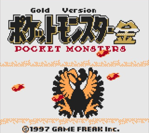
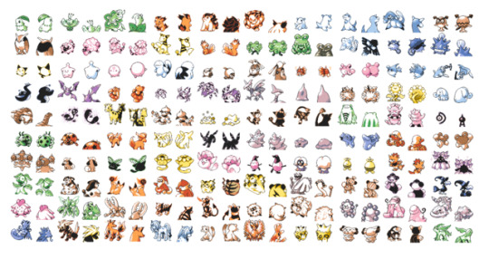

At this point anyone who is a Pokemon fan has seen screenshots and sprites from the leaked Pokemon Gold Beta released at Space World 97′... Thank you... Thank you so much... you gave us fans something incredibly special.
(if youre curious you can download it yourself here: https://tcrf.net/Proto:Pok%C3%A9mon_Gold_and_Silver)
Above is a screenshot of the title screen and all the sprites from that demo (in color). I figured I would take this time to go sprite by sprite and analyze them. I’m sure you’ve already watched at least 5 youtube videos and read 100 posts on this BUT here’s my take.
This generation of Pokemon was the second in the series. In the official release, they introduced a lot of pre and post evolutions to Pokemon we had already seen from Red and Blue but from what we’ve seen here it looks like they were ready to cap off a lot more Pokemon evolution lines. So without further adue lets get into Beta Pokemon Gold and Silver: the Missing Links.
(note: I wont mention Pokemon that are the same as their official release or close enough -- ALSO updates to theories with NOTEs)


First we have the grass starters. Whats interesting to note is the secondary evolution. At first this seemed weird but if you think about it, it’s as if the leaf on Chikorita’s head is mid bloom. Then the final evolution is the flower fully bloomed. Also to note is that the second evo could've been used for a future Floette? ALSO note how the beta art below the sprites looks more oddly shaped. Like more of a plant thing than a little creature. This makes the second evo feel a little more natural.

For the fire starters, instead of Cyndaquil we have this fire bear looking creature. It’s looks as if it could burst into flames following the classic fire theme. Below is the beta art we saw years ago and now we get to see where it fits in!


Then we have the water starters which, just like the fire starters, we have our answer to yet another beta design. Interesting little dragon seals but kind of basic.

Hoothoot is relatively the same only with different patterns on it’s body. As for the evolution, it’s completely different displaying a very sharper and sleeker design.

Like I stated in the intro, this game was all about filling the pre or post evolutions of many Pokemon. This is our first example. It appears to be the pre evoluton to the Vulpix line.

This has been speculated as the pre and post evo of the Tangela evo line which it very well could be. The pre having one eye showing which evolves into Tangela having 2 eyes. Then into the final evolution having no eyes but a mouth showing... but we will never officially know.

Here we have a complete new Pokemon. You could say it resembles Mantine as it looks like a manta ray BUT there’s something special here. Its underside shown in the first sprite is all light whilst it’s back is all black with an evil looking face. Could this have been some sort of dark/light type?

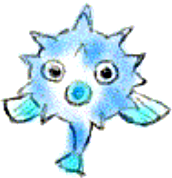
Here we have Quilfish’s and it’s evolution. Quilfish looks the same despite there being beta art out there (feature below the sprites) but it’s evolution is brand new. It seems to resemble some sort of goofy sea mine.

Now we have another baby Pokemon. What i can only presume is the first look of the pre evo of Pikachu, Pichu. only here Pichu looks to be more of a cute little ball.

Next on the baby train is the pre Cleffa which I’ll say looks a lot more alien which is great and relates more to the origins of the Pokemon coming from space.

...Igglybuffs beta... kinda the same... just bubblier! yeay!

This is clearly Quagsire BUT with no pre evo. Which seems to be another part of what the game was going to be. Either a pre evo a post evo or something new. I think when Gamefreak redesigned the game for release they got rid of a lot of the babies and added new evos to push the games forward.

Another baby. What looks like a guppy Goldeen. a pre evo to Goldeen. Yet another of the many babies we are going to see.

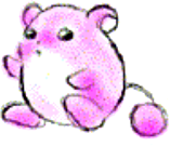
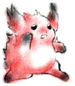
The beta to Marill which was known at one point as Pikablu. which was also known earlier to at least me and my friends as Pikapink. This is another example beta Pokemon that had never seen the light of day, now getting its time to shine. Below the sprite is that beta art.


These are original new Pokemon. It looks like a small fish that evolves into an anchor shark but just like so many Pokemon when evolved a certain way it could instead of evolving into the anchor shark, evolves into a deep sea eel type. Before the drop of this Gold beta a few early design sprites surfaced. One being the black and white image below the sprites. You can see Game freak was really working on combining an anchor and a shark.
NOTE: It doesn’t look like the deep sea eel is apart of this evolution but still cool.

This is interesting. It looks as though this could be a pre evo to Paras. It looks like a larva breaking out of a mushroom. The idea being that before Paras gets taken over by a mushroom it actually emerges from one in the first place... and the circle of life is complete! Babies!

This is the Spinarak line only with new patterns on the backs of these spider Pokemon. Also featuring new positions.

I could be wrong here... BUT I heard Ditto was supposed to have an evolution. This could be the second stage in Ditto where not only would it be able to transform, mimicking other Pokemon, but it would also maintain it’s aggressive attributes and aggressive demeanor.
NOTE: Apparently you need a metal coat or metal item to evolve Ditto.

This seems to be an original Pokemon... BUT... Possibly a pre evo to Doduo? It resembles baby birds in a nest with feet which would make sense to Doduo and Dodrio. The body is only hidden by then “nest”

...just Sunflora... but odd... no pre evo. Maybe Game freak was saving all the 2nd round babies for the 3rd generation of Pokemon?

This is great because we get to see Donphan and ALSO it’s pre evo in a new baby form. A softer more bubbly form.

Here we have an original Pokemon that looks like a ghost type but could possibly be a branch off evo of Gastly? Where instead of moving on to haunter it becomes a duel ghost Pokemon? Maybe? who knows...
NOTE: SOOOO this is crazy. I was totally wrong... This thing evolves into Giraffarig! HA! That’s so cool.

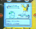
This is Giraffarig only in this beta version we see how it’s back end wasn't a strange tail creature but more like the darker version of it’s original head. Dark Pokemon started in gold so maybe this was another half dark type Pokemon?

Next up is most likely the pre evo to Meowth. it’s interesting that it looks like it’s eyes are closed but a third eye where the coin would be is open. There are also 3 coins or bubbles or eyes? above it. Perhaps it was little psychic kitten?

More originals are these cat like Pokemon with little bells on thier tails. They also have a very dark tone. Could this be an alternate to Meowth’s evo line? The dark side?
NOTE: Doesn’t look like this is a Meowth evo...

Polioad was an alternate evo to Poliwrath and we can see here the beta version of what it became. Not as friendly this time around.


Another interesting thing. It seems as if Lediba didn’t have an evolution but maybe an alternate version? Perhaps Gamefreak was leaning into the dark/light versions more than we thought and these were the 2 types versions?

Like Vulpix’s baby evo, it looks as if this could be a ponyta baby. Dawwww...

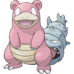
This surprised me the most. We finally get to see the spiral Shelder. The version of Shelder we see when it attaches to a slowpokes tail evolving it into a slowbro as seen above... only now... we get to capture just the mean ol’ shell!
NOTE: This is rather interesting... Apparently this isn’t a spiral Shelder BUT Slowking’s Shell/Crown... hmmm...

This confused me at first but thinking about it... this is a baby... a little baby Grimer. People seem to think that it has an open mouth with a tooth but I think it’s a little nubby nose and the white is the shine.

This is one of the most interesting of the reveals. Remoraid and Octillery were always supposed to be shaped after weaponry, a gun and a tank... welp... here is your proof! The hand gun Remoraid and the tank Octilery. It’s very clear with these sprites. You can see where the bullets would be and the trigger fin on Remeraid. On Octillery you can see it’s tentacles curled up like tank treads and it’s head looks more like the top latch and cannon of a tank.


These are the beta Tyrogue and Hitmontop. In my opinion you can really see a lot more of the relation in Tyrogue to Hitmonlee and Hitmonchan. The pre evo looks like a little fighter in a helmet and gloves, like a basic fighter starting training. As far as Hitmontop’s beta goes it looks a little bizarre... probably for the best they toned it down a bit.

Following along side the rest of the babies... here we have puppy Growlithe! I can see why they ditched some of these though. They are pretty basic and unless the babies had some new abilities I agree they were probably not necessary BUT adorable.


Here we have the beta forms of Hoppip evo line. They’re close to the final version but remind me more of how Digimon were designed.

I’m not certain but I think this is the pre evo to the mr. mime evolution line. A little clown egg :)

Following the baby lines we have the pre evo to jinx...

The beta of Electabuzz... which looks much different...

Magby... who looks a little different.

I’m not quite sure what this is supposed to be but following in line with all the branch off evoltutions I’d have to say this might be if Weepinbell didn’t evolve into Victreebel... but this? I don’t really know but it totally looks like a weird Bellsprout.
NOTE: Apparently this evolves from Weepinbell with Poison Stone!

Here’s a brand new original Pokemon. Possibly a water/fire type? It looks like a seal that balances a fireball on it’s nose.

Delibird looking a lot more like Santa!

I don’t know if this was supposed to be a different Pikachu but it defiantly looks like an electric mouse Pokemon.

This is one of the more interesting pokemon designs. It looks like the evoluton of Farfetch'd possibly holding a different plant instead of a leek. Or possibly the leek has become part of Farfetch'd? Interesting.
NOTE: Confirmed!

This is a strange new design. It resembles a voodoo doll Pokemon that evolves into some sort of japanese zombie Pokemon. Can’t wait for the fan art of this guy!

This seems like a new take on Mercorw. Notice there’s no secondary evo along with it’s new design. This just goes along with the idea of pre post or new singular...

I’m a little torn on this. It’s either a pre or post evo of Chansey. It’s size makes me think pre but the double egg sack makes me think post...
NOTE: Turns out this is the EVOLVED for of Chansey. Pretty cool.

This is an early Scizzor design. It resembles more of Scyther which i think is great. It also seems to look like it’s claws have eyes on them. I think I like this more than the original design

This has to be Pinsor’s early evo. I don’t know if it has no eyes or that’s a small mask on its face? Either way it’s nice to see the early design of Heracross.

Here’s another GREAT original. It looks like a creature wearing another creatures fur which is fantastic! It’s a great design and i’d love to see more of this character.

This is just... bizarre... a toy orb lion? I dunno but i like it!
NOTE: Another WOW moment... this evolves from Porygon with Up-Grade. Makes sense. Upgrading a digital monster to look more “real” I guess. That’s pretty cool.

This has to be an evolution of either Lickitung or a Slowbro somehow. Clearly There’s a huge tongue but the little hat and odd shell hat design makes me think Slowbro... maybe a new shell leads Slowpoke to this form?
NOTE: So it’s defiantly Lickitung’s evo at level 32

I think this is an early Kingdra design. It seems to resembles more of a genuine dragon which is a nice touch.

These are beta designs of the legendary beasts... These are weirdly fantastic like old anime creatures. Not much to say here. Just look at them! Sharp Sassy and Sappy.

I think this Pokemon was replaced by Lugia but more of a small Mew type. Instead of 2 large beasts we have the Mew/Mewtwo dynamic. Or maybe a Mew evolution?...
NOTE: I was very wrong here lol. this is just an early Sneasel design. Makes sense.

This seems to look like Aipom. The monkey with a hand tail but a very early form... I don’t know why it would be so late into the Pokedex though. Is it a legendary?

...and finally we have the Leafeon beta... it’s different in that its arms and legs look like roots and the body looks like wood resembling a more earth like form. Perhaps this being the last Pokemon means this wouldv’e been a promo give away for a special eevee event? We’ll never know!
That ends our look back through the beta of Pokemon gold. Filling in the gaps of all the missing post and pre evolutions plus new things we’ve never seen!
If this has peaked your interest why not also check out a little game idea I had for a Pokemon that took place before Red Blue and Green.

http://funhaversclub.tumblr.com/post/48832670099/so-heres-my-little-project-in-lue-of-all-the
http://funhaversclub.tumblr.com/post/49093816290/beta-pokemon-the-starters-of-the-cinnabar
http://funhaversclub.tumblr.com/post/49147031388/to-continue-on-here-are-more-capsule-monsters-you
http://funhaversclub.tumblr.com/post/49391556862/just-like-before-with-every-picture-ive-added
http://funhaversclub.tumblr.com/post/50761038816/got-the-laptop-working-this-is-the-final-post-for
(check out a few articles here!)
11 notes
·
View notes
Text
Help wanted - recruitment
Here is the recruitment post I mentioned I was typing up over the past week.
We’re in dire need of new artists. Dire to the point where, we can’t release a new version until after we get new artists.
If you’re not an artist, there is another job not really art related we’re looking for, that only requires a decent image editing software. This particular one is more like a ‘favor’ and we’ll just need you until you finish it, but despite that, you will be credited in the game credits under “Special Thanks” and we’ll be eternally grateful.
Anyway, if you are interested in helping, please read these following guidelines first:
You need to have time for this. I can’t stress this one enough. I have had several people join the project (all of which artists) only to back out because they realized afterward were too busy with school. Don’t join if you think you’ll be too busy.
Please, be nice to the fellow devs. We’re all supposed to be a team. You can critique others’ work but don’t be so harsh about it and try to praise them too.
Keep in mind that this is at the core meant to be a fun project!
Try to stay positive. We want the game to succeed, and you too must believe that it will.
You need a Discord, we have a dev chat where we discuss the game, and also one of these jobs will require cooperation with other devs and Discord will make it easier for everyone to stay in contact.
Under the cut is specific information about the positions. (Remember, one isn’t really art related and just requires a decent editing software!) Please read them if you’re still interested so you know what they entail.
Designer:
A designer designs the outfits that the characters will wear in this AU. Since the theme is medieval fantasy, you can be creative with them and take inspiration from other medieval fantasy game character designs if you wish, but I must ask that you please refrain from unrealistic fanservicey design choices, such as “boob plate titty armor” and unrealistically short skirts. The only characters who should have particularly fanservicy designs are the ones that it would make sense for. We’ll discuss that topic more in private.
I made a post about this a few days ago, but since there are so many characters to design, that it is quite a taxing job. So myself and Munakata I decided that there will be multiple designers, with certain characters assigned to you to design based on what they are best at designing or what characters you like most, but if multiple people want to design the same character, you guys need to be able to reach an agreement.
If the designers worked together, giving each other feedback, there would be relative continuity between the outfits that wouldn’t be apparent through the spriter and portrait editor’s work shown in-game. Remember that the designers’ work is behind the scene stuff for the portrait editor and spriter to work from. But tldr, you NEED to be able to work together with others!
Send in a proposal demonstrating your skills. We won’t accept you if you don’t.
Portrait editor:
A portrait editor basically makes these, for usage in textboxes for dialogue.

For the most part, you’ll be looking at the references that the designers drew, and edit the clothing from there.
In order to be accepted, you need to be good at replicating DR’s style, because it can’t look like a clash between styles when you edit the DR sprites to make the portraits.
Some characters will need more major edits that isn’t just about clothes, for example, we want some of Fukawa and Syo’s DRAE sprite poses to be made into their DR1 sprite style (the color palette along with having her hair in braids, idk how else to put it.) Certain characters, such as Komaru, will need her sprites edited to look more like she did in Naegi’s video. So yeah the edits aren’t just about clothes.
That all said, this job can be quite taxing, given all the characters, so please keep that in mind. But also keep in mind that you’re not doing everything at once, and there will be breaks between while you’re waiting for the designers to finish designing the characters’ outfits.
We might accept more than one portrait editor, since some people are better at editing clothes, while other people are better at editing hair, which some sprites will need but mostly it’ll be just clothing edits. We’ll see.
Send in a proposal demonstrating your skills. We won’t accept you if you don’t.
Artist:
This position can be fulfilled by a designer or portrait editor, but I figured I’d also mention this on here while I’m at it. We also need someone who can make DR-esque event images. An ex-member of the team who I don’t like talking about edited some of the event images from DR1 into scenes from this game to use for a similar purpose, such as this one:

However, we’d like someone who can make stuff like this from scratch instead of just editing because this game is much different from the main series so different stuff happens and not everything can just be an edit.
It would also be nice if there can be one designated person who can make “official art” of the playable characters in this kinda fashion for promotional purposes, like for the eventual trailer:

Speaking of promotional stuff, I have been saying this for a long time but we really need this blog’s sidebar image changed and the artist can also make that.
Someone to make ‘placeholder portraits’:
This is the non-art related help I was talking about. We really need the current character portraits out of the game, asap. Really badly. We’ve had this problem for nearly a year now and it’s made it hard to work on the game for reasons.
So we need someone to take the normal unedited dr sprites from the original games and make them into placeholder icons. I’d like to have your Discord too for this, because it’ll just make things easier. Like I said earlier, you don’t really need art skills to do this, you just need a decent eye and an image editing software that supports layers and transparency.
If anyone wants to help out with this, we’ll be eternally grateful. I’ll let you be a beta tester as well as your name will appear under “Special Thanks” in the credits.
____________
Please consider joining because I don’t want to give up on this project.
-Fukawa
#please try to spread this around we are in dire need and honestly without new artists we can't continue the game#i know we haven't posted much at all in a long time but volunteering to help will really help us get back afloat on this project
38 notes
·
View notes