#paletteone
Explore tagged Tumblr posts
Text

"Hello, Stranger! Welcome to the world of Pokémon.. and sentience!"
A kindly lady who claims to be the most respected Professor in all of Waivelenth. Whether that's true or a very, VERY grand delusion, one thing is for sure: Prof. Coreopsis cares very deeply about you. You'll see her all throughout your journey, when not gallivanting on all fours through the woods, Marge Coreopsis can be found selling tchotchkes galore in assorted towns and cities.
#fakemon#fan region#pokemon hokum#fan pokemon#artists on tumblr#fanart#pokemon#starter pokemon#art type#paletteon#pokemon oc#oc#original characters#professor Coreopsis
6 notes
·
View notes
Photo

Soft veggie palette
One of the early prizes someone won in Trick or Treat 2023! Wanted to make some random fanart! <3 AJD . ART
#CloverCoin#Clo#Cloverse#Pillowing#Pillowings#PillowingPile#Pillowing Pile#Pillowing_Pile#stuffedanimal
17 notes
·
View notes
Link
#Dining#DiningNYC#DiningReview#flavorfusionny#greenkitchennyc#highwaternyc#RestaurantRow#Restaurants#therivercafe#viatoscananyc
0 notes
Photo

Evil inspired #makeup #younique #paletteone #heartbroken #leagueofguardiansseries #crystallinedreams #readersofinstagram #readers #ebooks #bookseries #angels #demons #sexybadboys Amazon/kindle: http://ow.ly/PCYw300kJQm Amazon UK: http://ow.ly/MHov300kJZG Smashwords: http://ow.ly/c4I4300kNBN Nook: http://ow.ly/RnMQ30322Jz Kobo: http://ow.ly/sq9f30495RD
#angels#sexybadboys#demons#leagueofguardiansseries#readers#crystallinedreams#makeup#bookseries#ebooks#younique#paletteone#readersofinstagram#heartbroken
0 notes
Photo

Today's makeup was - ❤ Glorious Primer ❤ BB Flawless in Bisque ❤ Loose Powder Concealer in Fabulous ❤ Beachfront Bronzer in Sunset ❤ Mineral Touch Blusher in Sweet ❤ Chipper from Palette 1 for Eyebrows ❤ Elated, Sincere, Swanky and Brassey from Palette 1 for Eyes ❤ 3D Fiber Lashes+ Mascara ❤ Splash Matte Liquid Lipstick in Soulful #younique #lookoftheday #paletteone #natural #mua #weddingmakeup (at Younique with Emma - UK)
0 notes
Text
5 Awesome New Procreate 5 Features
The day has finally come – check out these new Procreate 5 features! There are so many features to explore within each of these areas, but I’ll try to keep this post short.
1. Canvas Info
Now you can really control the details of your Procreate canvases.
There is a new About This Artwork pane that shows information about – you guessed it – info about the artwork including date created, date modified and even a place for you to sign your artwork. Cool!
Next in the canvas info is the Dimensions tab. Here you have total control over your canvas size and resolution.
Then we have the Layers tab which shows really helpful information like how many maximum layers you can have based on your document dimensions, how many layers you’ve used and how many you have available.
The Color Profile is next which is a very welcomed addition for professional artists and designers. Here you can switch between multiple options for both RGB and CMYK color spaces.
Next is Video Settings which lets you choose the resolution (up to 4K!) of your time-lapse replay video.
And last we have Statistics showing total tracked time in the artwork, file size and total strokes made. I think these offer unique and helpful info for your artwork.
2. The Color Palette
One of my favorite changes in Procreate 5 is the change to the color palette. Now you can detatch the color palette by tapping and dragging on the little bar at the top.
This change alone will speed up workflow tremendously as you won’t have to tap to open the colors every time you want to change colors.
Another important feature is the addition to the color palette is a history of colors used in the document. This will help you quickly access your color scheme without having to use the eye dropper every time.
3. Saved Selections
Go up to the selection tool and make a selection. Now down in the toolbar, go to “Save & Load” to save the selection.

Saved Selections in Procreate 5
I can see this being useful in a number of ways!
4. Animation
Now you can animate in Procreate 5! You can take the time to make the animations as crude or as refined as you want using a technique called “onion skinning”.
Basically each layer you draw is a frame in the animation. When you add a new frame you can see the layer behind it so you can visualize the next position of the character, environment or anything you want to animate.
Simple fire animation in Procreate 5
Procreate Animation Challenge: try animating a fun flame growing and flickering. Added bonus if you can go from a small yellow flame to a big orange and red flame!
5. New Brush Dynamics and Options
Brushes have received a total overhaul and use a new and improved engine for quickly and accurately rendering brush dynamics.
Enjoy the new brush dynamics like water color and have your art feel like using real art supplies! (Or as close as any digital interface can get to it).
Quick demo of new brush panel in Procreate 5
There is a huge online market for Procreate brushes but now you can customize and create your own with ease, and even use Photoshop brushes (finally!).
I hope you’ve enjoyed this round up of 5 Awesome New Procreate 5 Features.
What are your favorite new features of Procreate 5? Let me know in the comments below!
Good day, and good design!
The post 5 Awesome New Procreate 5 Features appeared first on The Modern Jedi.
Via https://themodernjedi.com/5-awesome-new-procreate-5-features/
source https://themodernjedi.weebly.com/blog/5-awesome-new-procreate-5-features
1 note
·
View note
Text
Week 8
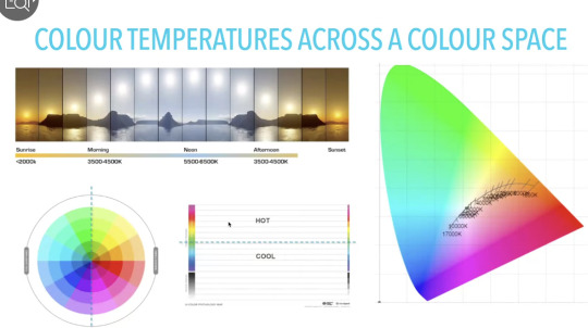
Colour temperature:
Linked to multi-sensory experiences, when creating work it is important to remember that screens and any video work produced with colour will sit within the cool/middle of the day blue light range (3500K-6500K). Noon, the time at which we experience the most cool light also happens to be the time where human function and coordination peaks. At this time cortisol, the chemical which helps us focus produces rapidly and when we use our phones at night, we are affected by blue light, continuing to produce cortisol and disrupting our circadian rhythms.

Colour temperature and colour space: By playing with the yellow and hot colour palette I have so far, I would theorise that since the colour palette is warm it is able to generate that sort of nostalgia and since the colour palette is warm, not as much cortisol would be produced to fully engage the audience’s attention but enough to keep them interested and mentally occupied. I also did begin to play with shades of black which is considered a cool colour so perhaps modulating with both the warm and cool palettes accordingly may keep the attention span/engagement of the audience I want to satisfyingly (colour harmony !!)


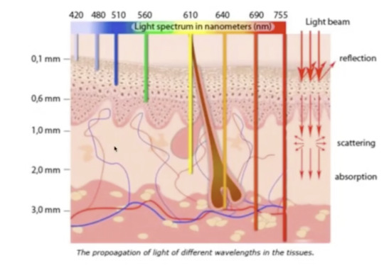
I also found it interesting that physiological factors affect how we perceive and receive light as well i.e. the amount of vitamin d/melanin that is able to be absorbed by how fair or dark we are.
Cooler colours of light also penetrates less layers of our skin than that of warmer colours. Warmer colours like red are also processed more quickly by the human eye therefore this may have something to do with how the colour is able to penetrate through more deeply through our skin.

Digital eye strain and photosensitivity: It is important to be wary of photosensitivity and creating epilepsy-safe works using trigger warnings if I intend to use flashing (especially if they are of more than 3 flashes per second) in my work. It is also worth noting that works with visual aberrations i.e. zebra-patterned (although this occurs naturally in zebras for the sake of predators...) people generally turn away from and do not really prefer to process, at least not for too long.
This may cause digital eye strain which is often caused by screen glares, poor lighting*, uncorrected vision problems etc.
*while poor lighting is a very physical asset that causes digital eye strain, this may also be translated visually also by how much light is replicated on screen to simulate a physical experience or provide the audience with a certain kind of ambience.

>>> Rental ganglion cells produce melanopsin protein which senses blue light

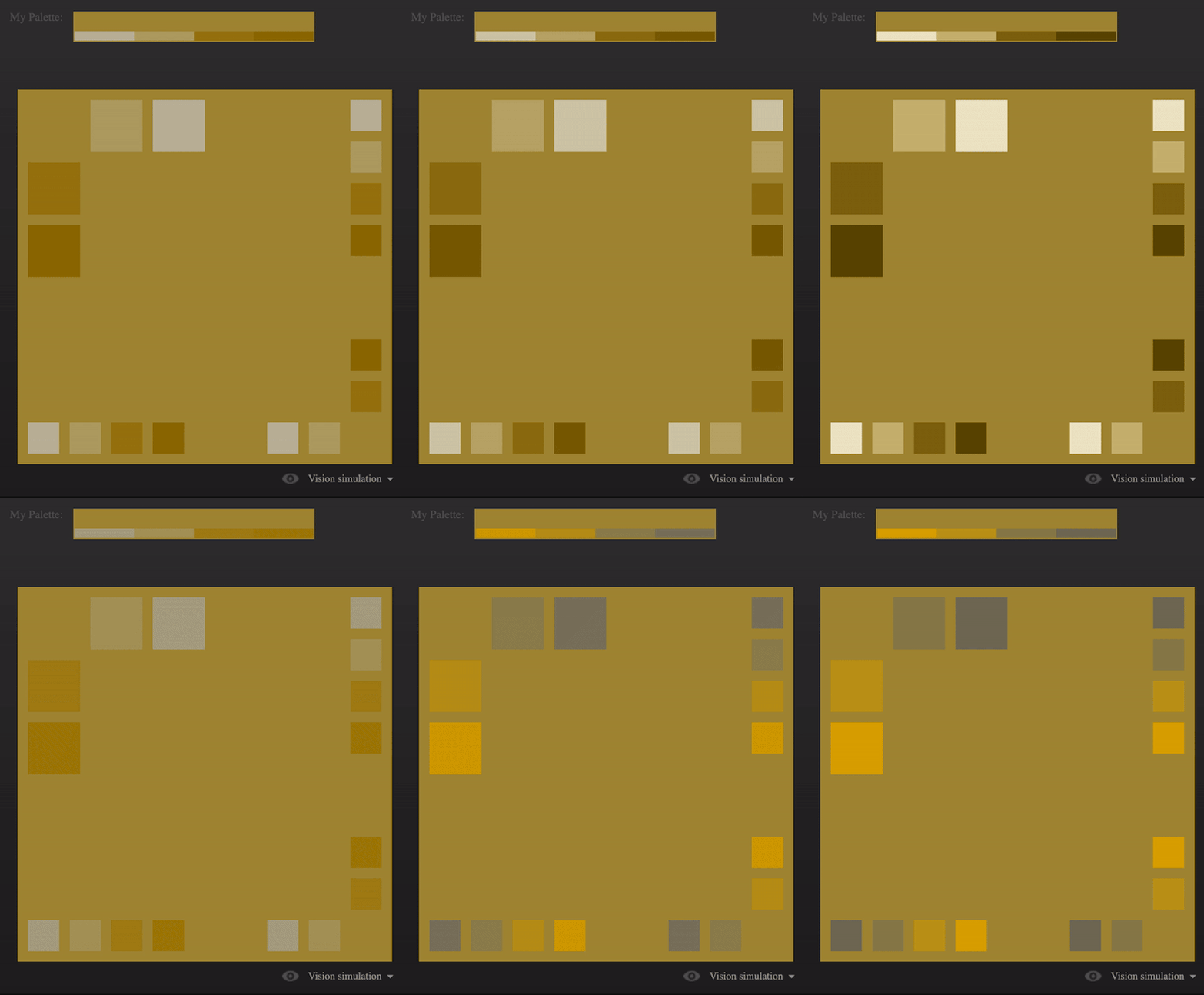
Using the Paletteon website, I began to try and modulate my first colour palette. What I noticed is how the smaller squares impact the background colour quite drastically and serves as a note to self that using smaller shapes within the background could really impact the way my piece is perceived and what sort of emotions arise out of that. As the smaller shapes shift from darker hues to more vibrantly coloured ones, I find that I feel more energetically awake but in a transient way before that feeling settles to being more stable and somewhat calm again. This made me think about how emotions can change within seconds and I should keep in mind what sort of emotion I am trying to generate and how that can be dependant on how slow this transition is (in seconds).
I also realised that simply from varying use of squares, with colours alone I am reminded of a that sort of backroom/uneasy but also nostalgic feeling even though there are no distinct shapes to tell me that it has anything to do with that sort of concept.
0 notes
Text


CONGRATULATIONS! YOUR EEVEE HAS EVOLVED INTO PALETTEON!
A funny sort, this one! Paletteon is a jolly Mon with an appreciation for beauty... though, one must wonder, how can Eevee evolve into this strange evolutionary variant?
More than likely, something to do with using an ART type move..
#fakemon#fan region#pokemon hokum#fan pokemon#artists on tumblr#fanart#pokemon#eeveelution#eevee#art type#paletteon
6 notes
·
View notes
Photo

#selfieofday #internationalselfieday #naturalsmokeyeye #paletteone #younique #youniquemakeup
0 notes