#overall this was really fun texture and lighting practice I did pretty quickly!
Explore tagged Tumblr posts
Text
Learn Log #4 - Grassy Grove
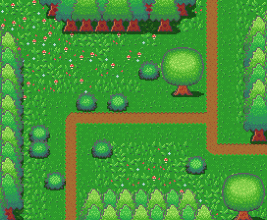
On week 4 of my pixel art journey, I learned how to make objects of nature including grass, bushes and trees. Unfortunately, I had to postpone this to this week when the learning and blog post was set for last week as I was just preparing for a return to university (it’s all online – social distancing dw). Anyway, I ended up making the forest scene you see above, and it was a lot of fun. I think that the GUI elements last week had a focus on technicality and exactness. Letters are very rigid, and we have somewhat set ideas about what each character should look like. However, nature is more flexible and therefore logic isn’t as heavily involved.
Tile Sets
Before jumping into the actual elements of this week’s piece I want to talk about making pixel art tiles. You will have probably noticed that the nature scene is quite rigid like each element is set into a box. This is because I’m learning pixel art to make games and games often use tile sprites to build their environment.
Tile sprites are the floors and sometimes walls of the environment. They often loop or repeat to cover the environment, however, some engines have tools allowing game designers to build environments tile by tile.
In the first case, the tile sprite will have to be created with its looping in mind and details may be added to provide variation in the environment. However, these added details may highlight the repeating the pattern and the more a detail sticks out the obvious the repetition becomes. Additionally, smaller tiles will repeat more frequently, and this also shows repeating textures.
The second scenario requires variation to be created from the creation of multiple tiles. This is great for creating variation; however, the tiles will also have to line up with each other which may be trickier for more rigid surfaces like rocks or bricks.
Since Unity has a tile builder tool and I was creating a natural environment where tiles wouldn’t need to line up so clearly – I decided to go with the second option.
The size of the tiles may also dictate the size of the rest of the game. For example, a bush may be 1 tile large in terms of level design, so the size of that bush is determined by the size of the tile. This also goes for the player whose sprite will typically range from 1 tile to 2x2 tiles. I decided to just make my tiles 16x16 as I enjoy learning within that space.
Grass
A grass tile is typically made of a green background with blades of grass texturing the surface. Many people may open up a couple of green canvases and start texturing them with green lines, however, there’s a much better way to do things I think. Since we’re working with 16x16 tiles there’s a limited number of shapes that look like grass and are small enough to fit within the tile. So, if we make a bunch of lines in green then we have blades of grass that we can copy and paste into each tile (the blades should typically be a lighter green as light will be hitting them).
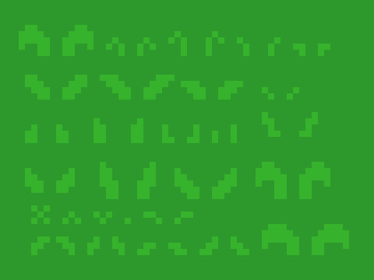
However, having blades of grass like this make tiles look flat. Adding shading will fix this issue by giving the grass depth, however, more complicated shading will obviously make the background more complicated which can affect the readability of your game.
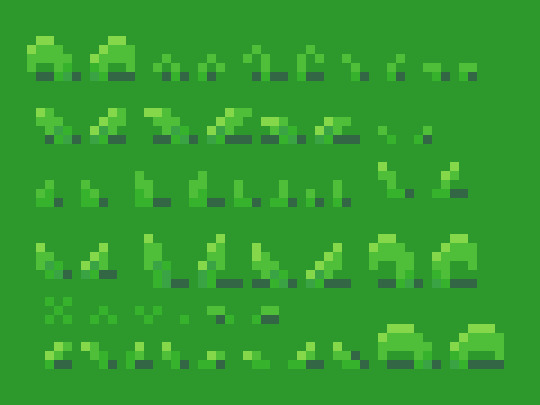
Each blade of grass can now be copied into a 16x16 canvas to make grass tiles. I made 4 grass tiles shown below putting approximately 10 blades into each tile. I made each tile with different elements of the environment in mind such as short grass, long grass, bushy grass and leafy grass.
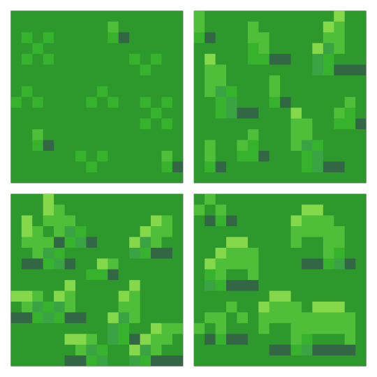
With these tiles, I created a larger image to test the repetition of the tiles. The repetition wasn’t a big issue; however, I didn’t think the leafy grass fit with the rest of the grass, so I decided to leave it behind for the next stage.
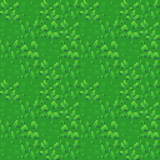
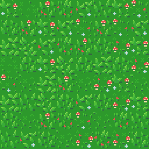
Next, I was going to add an extra tile for each of the current textures to reduce repetition as well as two flower variants for each tile type to add some colours into the textures. I did another test of the tiles’ repetition and overall look and it looked good but somewhat cluttered though I figured that this wouldn’t be an issue when I deliberately place the tiles rather than randomly scatter them.
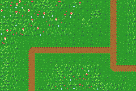
I had in my mind the type of scene I wanted to make for this week, but it required dirt paths. Luckily this wasn’t an issue to make. I made two variations of the straight, one-way paths as they would be tiling and altered one of these tiles slightly to make the curve and intersection tiles.

I then assembled these 15 tiles into the image below.
Trees
Next, I wanted to add some plant life which would involve trees and bushes. I decided to do trees first as they would be larger than the bushes. First, I started with the shape of the tree which would be fairly basic. I made a rough tree trunk shape to start with and topped it with a circle that was a little squished before refining the shape a little more to get what’s shown below.

I then added colour into the tree. A simple brown for the bark and 4 shades of green for the leaves. These greens were made by colour picking the base green background and hue-shifting it towards yellow so the tree would stand out more from the background.

The colours are organised into ovals to help give the tree a sense of depth. The dark shades wrap around the edges of the tree to show the tree’s roundness. The colour thins out as it goes around because you’re viewing the shaded leaves from a side-on perspective.
Next, I blurred the lines between these circles by mixing the colours slightly. This was the start of adding leaves onto the tree. Quickly after that, I added more detail to the leaves by spotting the head of the tree with lighter greens. The details added were in ‘leaf-like’ shapes like hearts, single lines, and arrows. They don’t look like leaves individually and can’t receive much detail themselves (such as a stem) but together they make the tree look nice and bushy. I also added some detail to the tree trunk including shading.

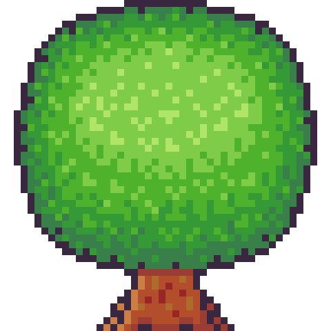
The tree trunk seemed a little off when I checked it out with the image I had so far, unfortunately. So, I added some extra trunk at the bottom along with a nice shadow. This shadow was the colour black at a transparency of 127 (or half transparency). This works really well as a quick and easy shadow on detailed background, but it does, unfortunately, mean the shaded area is not hue-shifted as typically preferred. The final product is below.
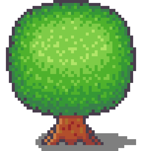
Looking at this sprite you may think it would be difficult to construct a game environment due to the leaves, trunk shape and shadow involved. However, we can place each section down as a separate 16x16 tile with the main trunk tile being a collider and other tiles not having a collision box (like decoration tiles – we don’t want players to run into tree leaves). This works out really well, and I focused on the main trunk tile when positioning the sprite in the piece. Which is shown below.
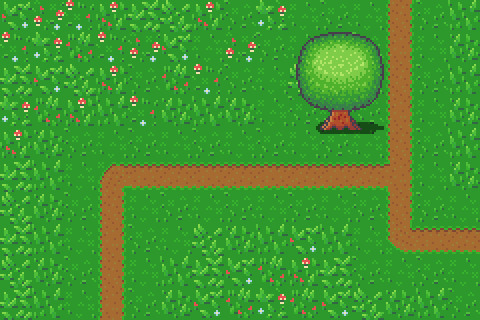
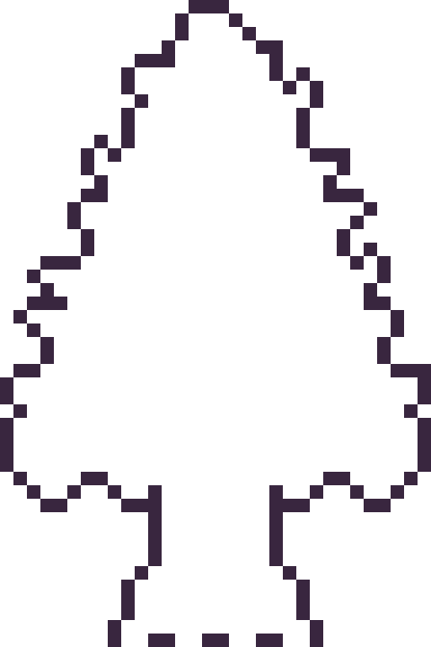
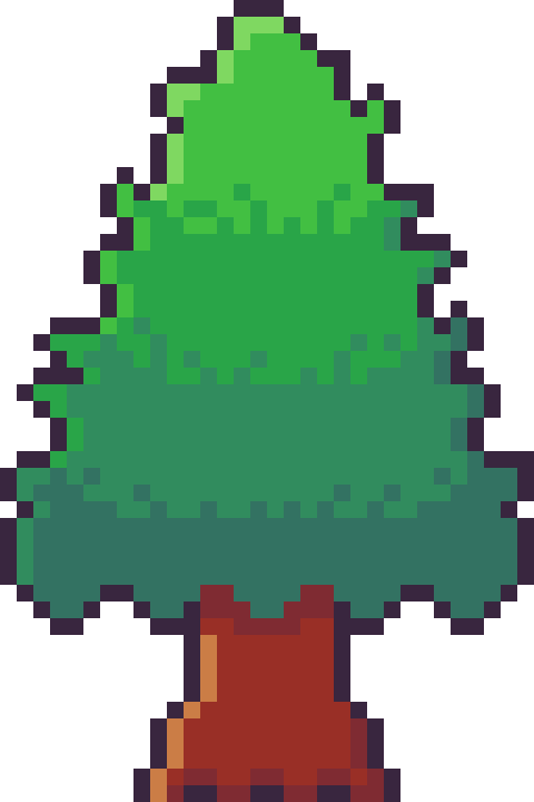
However, the scene below is bit lonely so I thought I’d add some pine trees as a level border. The process of the pine tree is similar so I won’t describe each step but will show the images. This time around I did shape the tree a bit more wildly with branches and leaves sticking out from the tree. I also hue shifted towards bluer colours rather than the more yellow colours I used in the round tree.


Next, it was time to add more trees into the scene and add some grass beneath them. I made the grass beneath them short grass simply because it looks a bit neater than the other grass types.
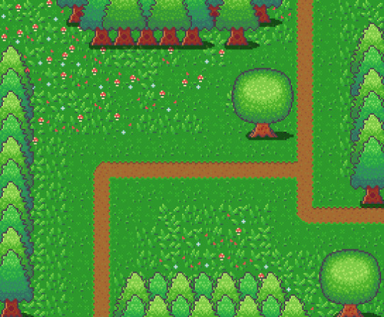
I think it looks pretty neat! I made a pine tree variant by swapping the colours with that of the round tree for some variation which worked as a nice, easy trick. But it would look livelier with some bushes.
Bushes
You might have looked at the trees just before and thought, ‘That kind of looks like a bush on a stump.’ That’s because the techniques used to make bushes and trees are typically very similar depending on the style of the game. Since we’re using a 16x16 size which is somewhat limited they will likely turn out in roughly the same way.

I started with a circle shape that was modified at the bottom to be a bit flatter. This will hopefully give the impression that the bush is touching the ground and rounds out on the top

I did a similar process in colouring the bush as I did with the tree, however, I used fewer colours as I didn’t have as much room for highlights with the bush. The colours used are actually the same as those in the pine tree.
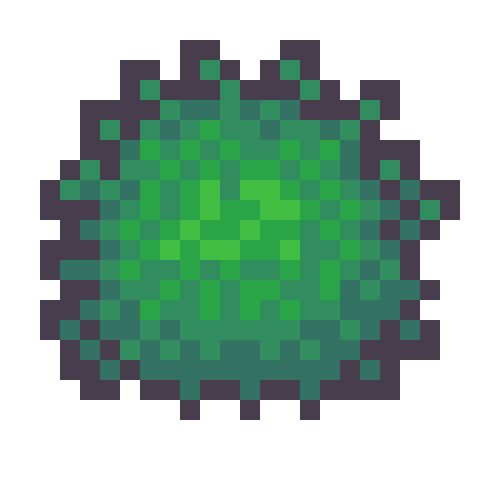
I then adjusted the outline to give the bush a wilder feel as well as texturing the inside of the bush to create the appearance of leaves.
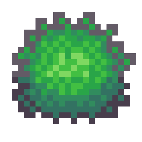
The bush still felt a little flat, so I added highlights to the top of it to add a greater sense of depth. The highlight was rounded towards its end at the bottom to enforce the rounded nature of the bush. This required me to add another outline tone for highlights which I might apply to other elements of the picture. I was pretty happy with the bush, so I made another for variation and added them into the picture with some shadows.
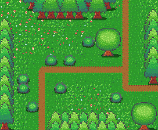
The picture looked pretty good, but I thought some touch-ups might make it just that little bit better.
Touch-Ups/Conclusion

To touch up the piece I added some more trees for denser looking forest, added the lighter outline colour to the tress and expanded shadows around some of the pine trees. I’m pretty happy with how it turned out. I think the shadows could use some refinement at the top border of trees. I also think that top border highlights the repeating pine tree trunk which could also be changed to tile better. I do wish my bushes were a bit leafier than shrub-like, however, I think my ability to make leaves on both bushes and trees will improve as I practice. I also think a 32x32 base picture would allow me to make some more defined leaves. The lighting on the pine trees also uses a different technique to the round tree so next time I’ll try to be more consistent with that. Overall though I’m happy and I quite like the outline highlights as they make the image a bit softer.
That concludes week 4 of learning how to make pixel art. Next week I’ll be looking at sand, water and rocks to make a top-down beach scene.
My learning and this blog post wouldn’t have been made possible without these fantastic resources. Go check them out if you wanna learn some stuff about pixel art!
How to Draw Tiled Pixel Art by TipTut
Creating Variation in Pixel Art TutsByKai
Pixel Art 101: Grass by Pixel Pete
How to Make Pixel Grass Tiles by TutsByKai
RPG Grass Background Tiles by HeartBeast
Pixel Art 101: Trees by Pixel Pete
[Let’s Pixel] Tree by HeartBeast
[Let’s Pixel] Spruce Tree by HeartBeast
Pixel Art 101: Bush by Pixel Pete
203 notes
·
View notes
Text
Cyberpunk 2077 Review
https://ift.tt/3mI17m9
A preface: Cyberpunk 2077 has had one hell of a rocky release, and it’s almost impossible to play the game while also ignoring the controversy surrounding its disastrous console launch, among other points of contention. That being said, in my time with the game—which I reviewed on PC—I remained focused on assessing the game that was in front of me, period.
Cyberpunk 2077 is without a doubt a mixed bag, though its strengths ultimately outweigh its weaknesses. The game blew my hair back with its immersiveness, art and sound design, staggering scope, and production value (at least on PC). But its shortcomings are just as notable, although never catastrophic or deal-breaking. Gameplay has blemishes all over, the writing is tonally inconsistent, and bugs do mar the experience to a certain extent. This is far from a perfect game in its current state. But in spite of all this, part of me fell in love with the game for its ambition, boldness, and eye-popping presentation.
The story is set in the year 2077 in Night City, a Central California metropolis run by megacorporations, populated by millions of cybernetically-enhanced denizens, and poisoned to the core by deep-seeded corruption and crime. You play as V, a small-time crook who by seedy happenstance befriends another gun-waving lughead named Jackie. Together they take on a big-time heist that goes tragically wrong and results, impossibly, with the personality construct of a decades-deceased rockstar/terrorist named Johnny Silverhand (Keanu Reeves) implanted in V’s brain, chopping his remaining life expectancy down to a sliver. V and Johnny must work together to split their respective consciousnesses and take down the Arasaka corporation, whose borderline-demonic tech brought forth their doomed coexistence.
From this point on, you’re free to explore the city and get into all kinds of trouble. There are a multitude of slimy sleazeballs to meet, complete jobs for, and get into shootouts with, as well as all of the other side tasks you’d expect from an urban open world. You can buy/steal cars and motorbikes and use them to compete in street races, stumble upon police shootouts and join in on the action, or steal copious amounts of money and paraphernalia from warring street gangs. There’s A LOT to see and do in this game—the question is, is any of it fun?
The answer is complicated. In short, my answer is “mostly.” I find Cyberpunk 2077’s gameplay to be problematic at worst and, at best, reasonably fun. If the game didn’t look and sound so good, I don’t think I would have enjoyed the gameplay almost at all. I have yet to tire of playing Cyberpunk 2077, but I think that’s a testament to how much I love the audio-visual presentation and the characters, not the gameplay itself.
Before diving into the gnarled, twisted matter of gameplay, let’s get this out of the way: this game world is one of the greatest I’ve ever seen. Several studios have delivered amazing looking game worlds this year, but Night City is a serious design achievement that the folks at CDPR should be very, very proud of.
Looking up at the looming, almost monumental buildings that shape Night City’s skyline is breathtaking, but it’s what you see when your eyes come back down to street level that impressed me most. Trash bags piled up two stories high, plugging up alleyways with graffiti of cybernetic freaks scrawled across deteriorating walls. The environments are insanely detailed, but they tell a story, too: look up and you see big money, squeaky clean windows, and technological ambition; look down and you see a sea of sufferers, psychologically and physically wounded citizens bled dry in the name of corporate conquest. From a purely cosmetic perspective, the game looks phenomenal, but it’s the artistic intention behind the designs that really makes the visuals sing.
As far as technical prowess is concerned, the game is spectacular provided you have the right machine to run it. Texture quality is insanely high, the environments are absurdly detailed, and the game’s lighting, especially with ray tracing enabled, is incredibly realistic. The atmosphere in this game is as thick as I’ve ever seen, and combined with the game’s pulsating, evocative, synth-based score, it creates a mood that few other titles can rival. Simply taking a walk around Night City and soaking in the sights was my favorite thing to do.
The character models are another high point–from the detail of the models themselves, to the way they move, to the top-notch facial animation, every weirdo you meet in Night City is unique and expressive. An interesting thing I noticed was that during some cutscenes that I found to be banal from a narrative point of view were still captivating to a certain extent simply because the character animation and voice acting were so well done. Some of the writing is a little odd, particularly when characters who are meant to be thugs and grifters speak in an unusually formal tone, but overall, the voice actors and animators do enough to make the dialogue-driven moments engaging.
What I fear won’t be discussed enough about this game is its sound design, which is just as excellent as the graphics. Cyberpunk 2077 embeds you in its world better than any game I’ve played this year, and that sense of immersion can be largely attributed to the finely-tuned symphony of sounds that is constantly being streamed into your ears. From the squeaking of leather couches when you sit in them, to the muffled thuds you hear when you drive over speed bumps, to the way crowds sound in enclosed spaces versus outdoor spaces, the level of detail and care that went into immersing the player is incredible. The three-dimensional sound design actually makes the visuals appear more vivid and tactile than they actually are.
As for the gameplay, I found Cyberpunk 2077’s combat in particular to be clunky and a tad slow. It isn’t broken or imbalanced, but it isn’t snappy enough and there isn’t that x-factor that you find in most great shooters that keeps you obsessively coming back for more. To put it another way, The Witcher 3’s combat was so compelling and entertaining that I happily played that game for over 400 hours largely because of the combat. Cyberpunk 2077’s combat is absolutely not what pulled me through the game for the 60+ hours I played it, and there are many reasons why.
Release Date: Dec. 10, 2020 Platforms: PC (reviewed), PS5, XSX/S, PS4, XBO, Stadia Developer CD Projekt Red Publisher: CD Projekt Genre: Action RPG
Combat is of the typical first-person shooter variety, with both shooting and melee combat supported. There are a slew of weapons to acquire and upgrade via the game’s crafting system, and the weapons all look and sound pretty sweet but are somewhat forgettable, which is a shame for a game boasting such a breadth of artillery. The “iconic” weapons, which you earn at different points throughout the campaign, stand out the most and come with useful perks. But none feel exciting to wield are pack the punch of Doom’s BFG or Half Life’s gravity gun. I did however enjoy the smart targeting feature you can access through a combination of smart weapons and a handy body mod, which allows your bullets to find their target no matter what direction you aim and can save your ass if you’re cornered and hurting behind cover.
Then there are the other two pillars of combat: hacking and stealth. Hacking allows you to wreak havoc on enemy tech to sabotage or distract them long enough to give you an opening to pounce guns-a-blazing. You can frazzle a baddie’s optics while you sneak up behind them, take control of all security cameras on a given network, or turn on a flood light to manipulate enemy movements. The possibilities are innumerable, and it all sounds great on paper.
But in practice the hacking system just isn’t all that fun to use. I was amused for a time, as I got increasingly more creative with how I used my scanner to tag enemies and objects and sabotage them from afar. But after a while this system became tedious because it slows down the action to an absolute crawl, and the tactical aspects of combat just aren’t polished or engaging enough to make up for the pause. In the later hours of my playthrough, I found myself almost always resorting to in-your-face combat because, well, it solved problems more quickly.
Stealth feels even shoddier than hacking, unfortunately. In most missions, there’s a big emphasis on taking your targets out quietly, but for me sneaking around almost always led to bouts of frustrated groans and eye-rolls. For one, enemies’ lines of sight are really difficult to gauge—some will spot you from seemingly a football field away, while others won’t notice you cross a walkway mere feet in front of them. On top of this, the window of opportunity you have to grapple enemies from behind is finicky—I’d be standing right behind a guy ready to grab him when suddenly the “grab” prompt would disappear inexplicably, when neither of us had moved an inch. I’d move in closer to try again and he’d turn around and…you know the rest.
I believe that if the stealth and hacking were more polished and refined, or even de-emphasized to a certain degree, it would free up the shooting to feel a lot more kinetic and exciting. As is, the combat grows old over time, which is a real shame when you think of The Witcher 3’s combat system, which is incredible and only gets sweeter as you play.
Read more
Games
Cyberpunk 2077: Every Romance Option in the Game
By Matthew Byrd
Games
Cyberpunk 2077: The Best Cyberware Upgrades
By Matthew Byrd
There is a whole litany of gripes I have with Cyberpunk 2077’s gameplay. The driving—be it on four wheels or two—feels slippery and unwieldy. The menus are an eyesore. Melee combat is atrocious. The “braindances”–investigative crime-reconstruction mini-games–are headache-inducing…I could go on. But there were other aspects of gameplay that I did enjoy, like the streamlined stash mechanic, the flexible crafting system, the number and variety of missions available at any given time, and most of all, the well thought out RPG elements.
The character progression system didn’t immediately strike me as anything special, but the more I played the game and explored the five skill trees (Reflexes, Technical Ability, Body, Cool, Intelligence), I found that the omission of a traditional class system actually makes character progression more fluid and encourages experimentation as opposed to nudging (or shoving) you down a particular path of mastery. Although I didn’t always enjoy enemy encounters, I did feel like the different perks I acquired helped me succeed in combat in ways that were easily measurable. For example, the “Vanishing Point” perk, which increases your evasion stat for seven seconds after you dodge if you’re dual wielding a pistol and revolver, totally changed the way I approached enemies. I quit stealthing for quite a while because darting around with my pistols blaring turned out to be super effective for me.
Generally, I did enjoy Cyberpunk 2077’s story and the fact that it’s more character-based than plot-based. The relationships between the characters take precedence over the machinations of the narrative, and I appreciate that. As in most RPGs, you meet characters and complete various tasks and quests for them, but with Cyberpunk 2077, I felt that the characterizations were so strong that I was actually more compelled to find out how the relationships between V and his supporting characters progressed than I was to collect precious loot at the end of missions.
I found all of the game’s characters to be memorable, which comes as no surprise considering the character work CDPR has done in the past. Rogue nomad Panam can be both compassionate and vicious; the dutiful Goro Takemura is almost comically stoic and serious; Jackie’s tight relationship with his family and friends permeates the game in a poetic way. And Reeves does a fine job as Johnny Silverhand, though his style of voice acting took a bit of getting used to for me, particularly when compared to the rest of the cast.
The nice thing about V’s relationships is that the more you explore the city and the more characters you meet, the more possibilities open up to you in the campaign’s final act. There are a multitude of endings that you can reach, but these outcomes are largely dictated by the people you’ve met and how close you are to them.
What irks me about the game’s last act is how it plays out leading up to the ending. After playing for hours and hours in the beautiful game world that is Night City, I was expecting to be treated to even more imaginative environments and enemy encounters at the game’s conclusion. Without spoiling anything, the final enemy encounters and environments are almost laughably unimaginative and generic, and that was a big letdown.
I indeed experienced bugs during my time with Cyberpunk 2077, but far less than I’ve seen for other platforms online. A couple of crashes and a slew of visual glitches definitely cropped up for me, but they didn’t color my experience nearly as much as the game’s positive traits did, particularly in the visual department. The bugs that bothered me most were the ones that affected the narrative, like when dialogue options would be missing or when characters’ voices would drop out inexplicably. But overall I had a relatively smooth experience that was no more buggy than your typical open world game.
cnx.cmd.push(function() { cnx({ playerId: "106e33c0-3911-473c-b599-b1426db57530", }).render("0270c398a82f44f49c23c16122516796"); });
My relationship to Cyberpunk 2077 is a fraught one. I have so many issues with this game that I couldn’t possibly fit them all into this review. And I have just as many positive things to say. The grandeur of the project is both what I love and hate about it. I do wish CDPR had tightened its focus and worked out some of the game’s more glaring issues before rushing Cyberpunk 2077 out for a holiday release. But at the same time, I deeply respect the scope of the studio’s vision. This is a game with a strong sense of identity, and that’s something that you can’t say about a lot of AAA open-world games these days.
Cyberpunk 2077 is problematic, but ultimately I’m a fan of it in spite of its flaws. And I think in time its flaws will be ironed out and my fandom will only grow.
The post Cyberpunk 2077 Review appeared first on Den of Geek.
from Den of Geek https://ift.tt/2Kgqy1m
0 notes
Text
Evaluation
This was a really interesting project to work on, as it was a task to make a games concept but with a literature based starting point. I came up with the base concept for the game (Halloween Dating Sim) before we even started this project as it’s something I hadn’t really done before yet, and would give me a chance to explore a new aesthetic. I also really wanted to do a game like this as it would allow me to work on my background drawing skills - since they are a huge part of these types of game.
Since I already had a brief idea of what I wanted to do before I started, I chose to research all the books that had supernatural themes or creatures that weren’t regular humans - so that I could relate it to the monster idea I had. I chose these books to research: Woman in Black, Jekyll & Hyde, Frankenstein, Let The Right One In, and Do Androids Dream of Electric Sheep?
The main book that I chose to influence this project was Jekyll and Hyde, since I loved the mystery and secrecy aspect of the novel, as well as the main character - Jekyll - and his issues with split personality and the supernatural. This Victorian Gothic novel combined with my original idea to make the dating simulator meant that I now had a dual genre game. While the initial game appears to be a modern dating simulator set in a cursed town, it is actually a detective game which allows you to expose the darker side of the town’s residents. In that sense, the novel starting point has actually stayed very prominent in my project - there is a character who is based on Jekyll & Hyde who is the main villain, and the main character you play as (Bailey) almost takes on a similar role to Utterson, trying to solve the mystery.
For this project - Cauldron Hollow - I have created many different characters, some background artwork and a book cover, as well as some fake screenshots of how the game-play could look. When I went into the project I had planned to create more expressions and poses for each character and draw more backgrounds, but due to my limited time frame I am happy with the amount of work i’ve been able to produce.
The Characters
I wanted to design a range of date-able characters for this game so that I would have more examples of character design for my portfolio. My poor time management definitely affected the outcome of this work quite significantly - as it was at least a week into the project when I started making the characters. I gave myself some time to think about the designs but did very few concept sketches before jumping into the final artwork, as I was worried that I wouldn’t have any actual finished work to show if I didn’t do it quickly. I wanted to have a decent amount of characters to show a lot of variety in the designs, which led to me having hardly any time to focus on each one.
I did all the artwork over one weekend, which was a very poor idea - as I had no time to come up with several iterations for each. On top of this, drawing 9 characters in such a short amount of time left me severely burnt out by the end, and as a result some character artwork clearly has significantly less effort put into it. The character I made last, Robin, as a result was the one I liked the least - the colours didn’t really fit properly, the pose was a little rigid and the linework was messy. I think that this was partially due to the type of brush I was using, which I don’t think is suitable for the kind of clean line-work I was after - as a result I will change my brush for the next project to try and get a more appealing finish.
If I could redraw these characters, I would do a lot of things differently. I would dedicate more time to each one and really focus on the ‘quality vs quantity’ as my mindset for this project was ‘more work means better’. I would also spend more time creating multiple different looks for each character so I could then pick the best concept and refine it, rather than finalising the first result in my head. On top of this, I would like to spread out the character design across a wider period of time, so that I don’t overwork myself on one - or even just do less characters.
There are some things I did like about the character design - I did try and vary my poses more; each character does have a fairly unique pose (even if the anatomy isn’t great, which I’d like to focus more heavily on in the next project) which I haven’t really tried before, and I think that they definitely look better because of it even if it isn’t a massive change. I also really like the colour schemes of some of the designs, and the outfit design I did, as I think it matches the kind of aesthetic I was going for. One final thing i’m glad I did was to keep the characters consistent in terms of shading, highlights, art style and brush texture - they do all look like they’re part of a set rather than all being drawn in completely different ways. I think the fact that I used a consistent colour palette throughout the project definitely influenced this, as I found that most characters fit pretty nicely together.
The Backgrounds
I came into this project wanting to improve my backgrounds, since they’re a big part of dating sim games and aesthetics. I am actually really happy how they turned out since I’m not normally very confident with them. The first background I made was of a bedroom and window, which I coloured in the same way that I had done the characters. Thanks to the perspective drawing feature, all the features of the room look relatively accurate, which I’m really happy about. It was only the hand drawn features (such as the pumpkin clock) which look a little out of place- but to remedy this I think I just need more practice with perspective.
For the window background, if I could improve it I think I would have added more detail to the walls - as the painting and picture frames are empty. I would have also liked to make the space outside of the window a lot more detailed - but I was too tired after drawing the initial room to bother spending more time on it. To fix this, I could have left it and came back later to finish it off when I was inspired to do it.
I coloured the room with the same colour palette I had used for all the other work, which complimented the character well but also left me with a very limited range of tones that I could use. Overall, I think that trying to work entirely in a certain set of colours was a nice experience, but I don’t think it was really noticeable at all for the most part - I think I should either use 4-5 colours in a palette next time or non at all, but it was still an interesting experience.
I was planning on creating a range of backgrounds but I had not anticipated how much time I would spend on the next one. It took me over 7 hours to draw from start to finish, and while it was absolutely worth it, it didn’t really give me a lot of time to do anything else. This is also an issue which I think can be fixed with practice - as I was still pretty new to the idea. I do really love the Garden background and how it turned out, especially thanks to all the soft lighting and level of detail which I included. For these backgrounds, I actually looked at a variety of reference images while creating it, and it really paid off I think - so hopefully I will continue to do so in the future. While I’m really happy with the few backgrounds I did produce, it would have been nice to have the chance to do more.
The Book Cover & Designs
Having to design a book cover was a pretty challenging part of this project as it’s new to me, so I wasn’t really sure what to put on the front. I did a few different ideas and eventually settled on the one that would allow me to both draw a background and a detailed character. This particular scene involved me having to draw a foreshortened character, which I struggled with. I kept at it until it looked right to me, but in hindsight I could have just looked up a reference to help me. Like the other backgrounds, I looked up reference images for the building rooftops, and as a result I think they turned out really well.
The actual character artwork had some issues initially - her face was too wide, the eyes were slightly wrong for a reason I couldn’t pinpoint, and the whole thing looked a bit flat. I ended up having to change the colour palette at this point just to help the character stand out from the background. I’m glad that I went back and fixed all the issues before finishing the work, as i’m a lot happier now with how it’s turned out, although the face still bothers me a bit. I think if I could do this again i’d love to attempt an actual painting, rather than just soft shading and adding overlay layers, as it’s something I haven’t done in a while. I’m happy with how the character is posed as well as I think it actually looks different from my usual static poses. On top of this, I’m really glad that I went for a handwritten title as it gives it more of a fun feel. I do however think that it doesn’t really show the dating simulator aspect of the game- but I would have liked to create an alternate cover that is a lot happier and more pastel if I had more time, to show the dual genres present in the game.
0 notes
Text

“The Gnaw’s plague is upon you.”
“Goodbye.”
#you will look at my body horror /j#Fun fact this scene/animation STILL creeps me out 300+ hours into the game#thus I made it worse!! and I chose willow to do this with because seeing things we love being mutilated makes horror stronger :)#overall this was really fun texture and lighting practice I did pretty quickly!#my art#willow dont starve#the gorge dst#dst#dont starve together#body horror#blood#a tiny bit#teeth
18 notes
·
View notes
Text
Learn Log #5 - Sandy Shores

Before I begin with this post, I just want to say a quick thank you for all the support on the last learn log. I didn’t expect to get to 10 notes let alone over 100 so it was a really exciting and pleasant surprise. I got some nice comments too which I really appreciate. Thank you, everyone.
On my 5th week learning pixel art, I learnt how to make sand tiles, water tiles and rocks. I actually made this piece with 32x32 tiles instead of my typical 16x16 which was an interesting challenge but I enjoyed working with and learning from it.
Sand
When I started with the sand I, of course, started with my typical 16x16 tile size. I made a shoreline tile which had mounds of sand pushed back by the ocean’s waves which are shown below.

Making sand tiles, I soon realised, was going to be trickier than making grass tiles. I mentioned last week that with grass and similar environments you can make multiple small tiles and then place them in a scene in a variety of ways. However, with textures like stone, sand and water the design or condition of a tile should realistically have some impact on neighbouring tiles. As such one tile’s design might be repeated across the entire environment. Some pixel art software allows a tiled view so you can design the tile ensuring tiles connect and aren’t repetitive – unfortunately the software I use does not have this view. Therefore, I did a similar testing method to the grass last week where I copy+paste the tile across a larger canvas.
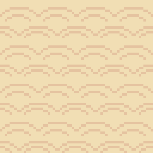
You can clearly see that this 16x16 tile forces mounds to be a bit to round and close together. This is when I decided to make the shift to 32x32 for this piece.
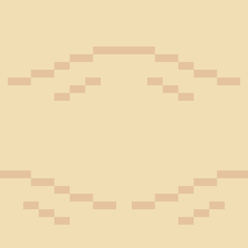
Above is my first 32x32 shoreline tile. You can see the larger size allows the mounds to space out a bit more and stretch so the mounds don’t feel as large or round. The two lines pointing into the mound are present to provide some sense of depth going into the mound. I decided to test it out and see how it looked.

This test looked a lot better, so I was satisfied with the design. Within the test, you can see it is quite repetitive. This is partially because the tile doesn’t do well with vertical repetition - making repetition more apparent. Additionally, I think the repetition might be a little less obvious when wedged between wave and beach textures. You might also notice the mounds are now slightly separated. This is because the mound has reached level ground and thus a hump would not be visible. The disconnection between mounds makes the tiles a bit less man-made, thus, a bit more natural. I decided to make a few final modifications on the shore tiles and finish it up.
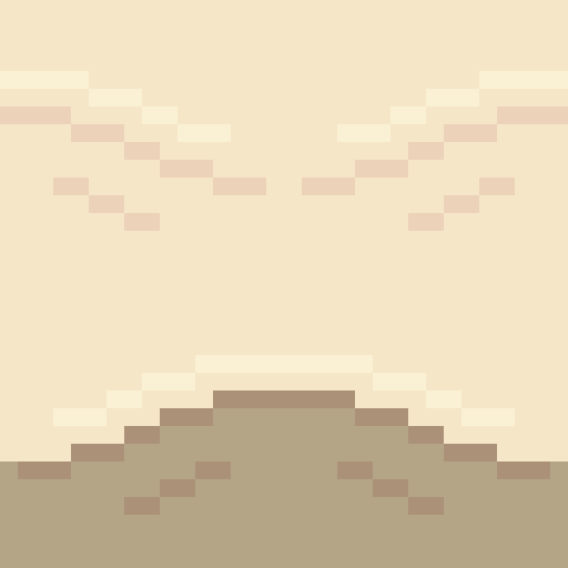
You can see here I added a highlight to the tops of the mound and darkened the first mound. The highlight is there to emphasise that the mound is sticking out and thus hitting more light while the darker colours were simply added as that sand will be freshly wet. I decided to add these tiles into a larger canvas to separate the water and the beach.

I added a blue background just to have a representation of water within the scene. Next, I needed a separate texture for the beach and tiles to connect the shoreline diagonally.
I wanted a separate texture for the beach because: A) the shoreline tile did not do well repeating vertically, and, B) the shoreline and the beaches of a coast look quite different. Obviously, if I made a pattern of mounds going horizontally or vertically like the shorelines I would run into issue A quite quickly so I decided to make mounds moving diagonally.
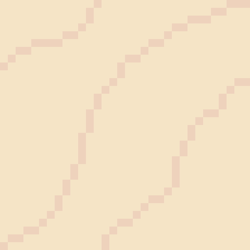
I made this beach tile using the colours of the final shore tile. I simply drew some squiggly lines diagonally with my mouse, removed the doubles from these lines and made sure the lines connected. I then used the same testing method as before to test the repetition of the tile.

This test is a mess. Some of the lines don’t connect and the mounds don’t feel smooth, rather, they feel choppy. Don’t worry, this is bound to happen if you use a mouse and maybe even if you use a drawing tablet and pen. So, I used this test to smooth out and fix up the lines as shown below.

Ahhh much better! The mounds look much nicer now. The texture looks a bit repetitive but not significantly so. The next step was to just add some more details now that I was happy with the pattern.

I added some highlights to and disconnected the mounds like the shoreline. This did increase how repetitive the tile looked but I did feel as if it was worth it as the change adding more depth to the texture.

I added in the beach textures and then fixed up the diagonal shorelines. The diagonals were canvas adjustments rather than individual tiles which of course wouldn’t work in a game engine like Unity, however, I’m sure I could make tiles of these diagonals once I created them in the canvas. Overall, I’m pretty happy with the beach so far. It’s a bit blocky right now but that might change once I add the water.
Water
I wanted the water in this piece to have a tropical island feel to it. I used the blue water texture I had picked and a white colour to draft a pattern I was happy with.
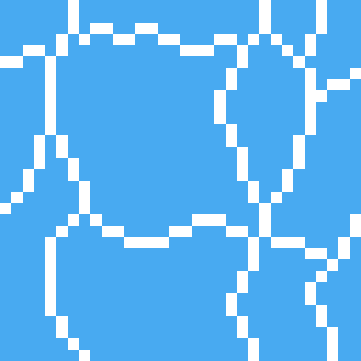
I felt this tile had a similar pattern to pictures of tropical beaches I’d seen online so I decided to go with it.
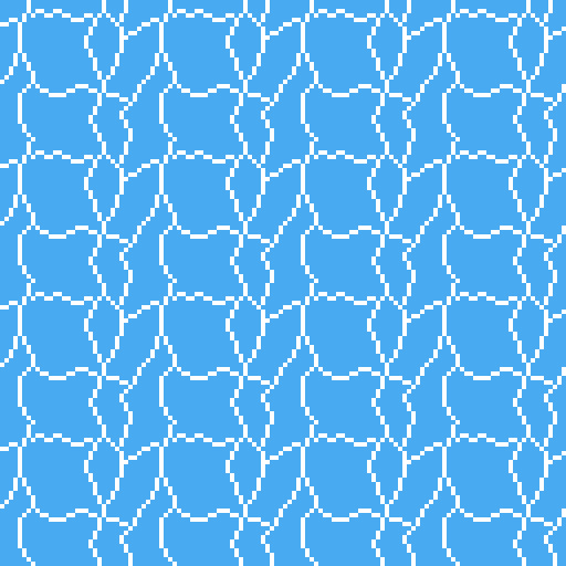
The test shows that this pattern is really repetitive due to the large square in the centre of the tile. This was pretty concerning; however, I wasn’t sure how I could really fix it up without starting the tile over. Sometimes you’ve just gotta let stuff go, so that’s what I did. I hoped that a few small adjustments would decrease the repetition of the tile.
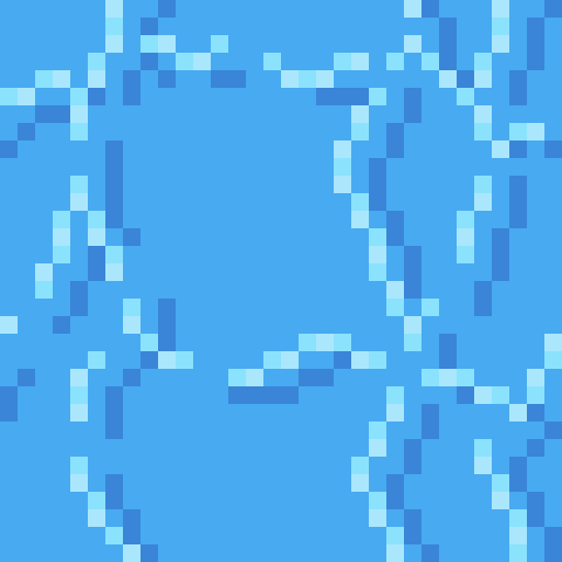
I changed the white lines into two shades of light blue. This would hopefully make the lines less contrasted and the repetition less noticeable. I used two shades of blue to somewhat portray water that was dynamic in some sense, because of bubbles or the flow of water. This two-tone approach wouldn’t really affect the repetition.
I then added the same set of lines in a darker tone. I think water should have both highlights and shadows. It adds a bit more detail and even depth into the texture. This would hopefully also reduce repetition, but I wasn’t so sure.
Finally, I cut the lines similar to the sand. It’s unnaturally for all the water to be directly connected and it definitely emphasises that it’s a man-made repeating pattern.
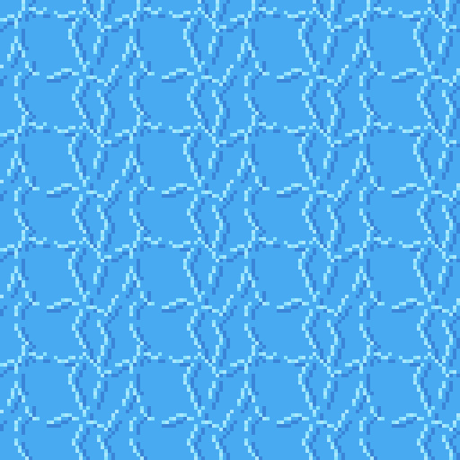
I think this new tile looked a lot better. Particularly because of the change from the white colour which contrasted far too strongly. There is still noticeable repetition, however, I was happy enough with this tile to move onto the waves.

The waves were easy enough. The wave should approximately match the shore’s sand mounds because the mounds were created by the waves. I used this pattern up the top with a very light, almost white, blue to represent the crashing ocean foam. I used some dithering into the standard ocean colour to create the foaminess. At the top, I just added the wet sand colour because the waves were not covering that area. I continued the ocean tile pattern into the waves a bit just to make sure there wasn’t some strange abrupt stop into plain blue.
Once the ocean wand wave tiles were done, I added them into the scene.

Of course, the first thing you notice in this picture is the missing diagonal waves, however, you also notice the strange stillness in the wave tiles. Its strange that the pattern continues unaffected like that when the waves are colliding with the shoreline. Additionally, there is a significant lack of depth in the image.

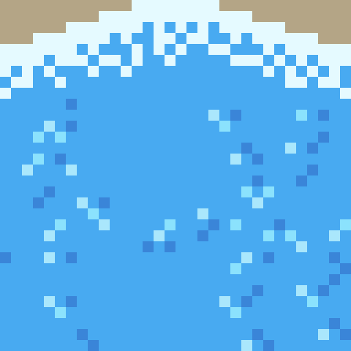
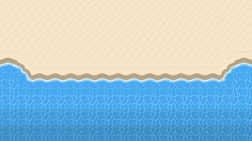
Here’s a fixed version of the beach. You can see I added the diagonal waves and changed the wave tiles so that the pattern is scattered due to the crash. The new wave tile means that while the pattern doesn’t stop abruptly, the water doesn’t seem still and lifeless. I darkened the two back lines of tiles to show that the water is getting deeper. Next, I needed to add a bit of variety into the beach.
Rocks
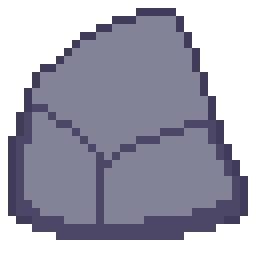
The first stage in making the rocks for the beach was drawing an outline of the rock with a few segments to show off either cracks in the rocks or the shape of the rock. Rocks aren’t perfectly smooth or round so you have to make rocks with that in mind.
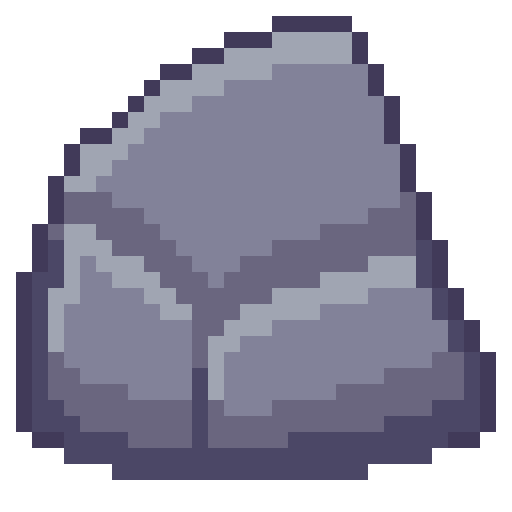
Next is to add some shading to the rock with highlights and shadows. Removing dark outlines and replacing them with shadows is a good idea as it feels more natural rather than drawn.
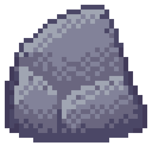
Like I just mentioned, rocks aren’t perfectly formed, and their shading should reflect that. I used dithering to add some texture to my rocks and added some small cracks and divots with darker pixels invading the space of lighter pixels.

I made another two rocks and spread them through the scene. Rocks on the beach were given a small shadow and rocks in the water were given a water collision line so that they felt like part of the scene. I was happy with the rocks, but the beach could still do with a bit of life.
Crabs/Conclusion

Anyone else think crabs are pretty cute? Snip snip. I didn’t do touch-ups on this piece, but I did add crabs! I feel like they finish up the scene nicely.
I’m fairly happy with this week’s piece. Practicing dithering was quite fun. The textures are a bit repetitive and that is definitely something I’m going to have to think about going forward – different methods of reducing repetition in certain tiles. Additionally, I did a lot of modifications within the canvas rather than building the scene tile by tile. While making this piece did give me a lot of practice, I won’t be able to make pixel adjustments in a level. I’ll need to develop an understanding of what I exactly need for a level and then make tiles for my needs. Overall, while I enjoy looking at this piece it has given me some food for thought about how I’m going to build my levels and create the art required for that task.
That concludes this week’s learn log. Next time I’m going to be tackling a bigger task – learning how to make houses, furniture, snow, stone and man-made textures. This might mean I skip a week of posting or split the piece across two posts as I’ll be making both the interior and exterior of a cozy cabin on a snowy mountain.
My learning and this blog post wouldn’t have been made possible without these fantastic resources. Go check them out if you wanna learn some stuff about pixel art!
How to Pixel Art Sand by TutsByKai
Pixel Art 101: Water by Pixel Pete
How to Animate Water by TutsByKai
[Let’s Pixel] Water Tiles by HeartBeast
Pixel Art 101: Rocks by Pixel Pete
[Let’s Pixel] Boulder by HeartBeast
[Let’s Pixel] Lava Rock by HeartBeast
12 notes
·
View notes