#over black underglaze for the markings
Explore tagged Tumblr posts
Text


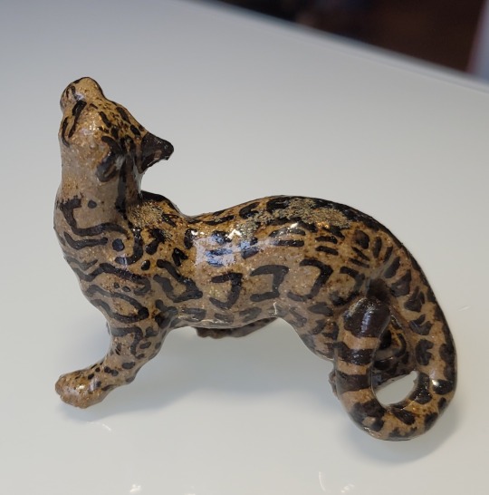
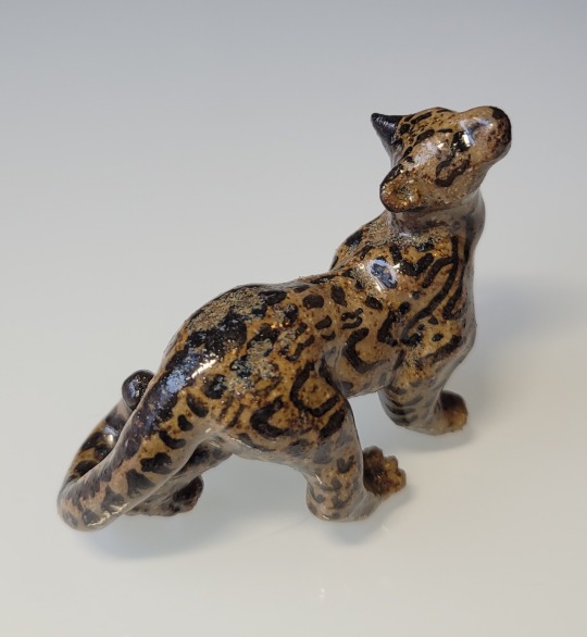
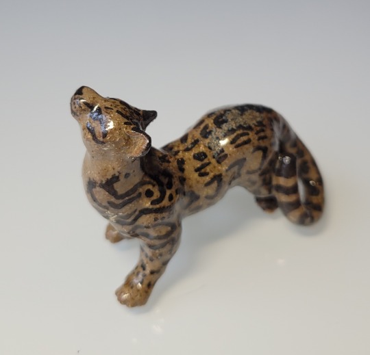
Jaguar cub in dark clay
[image descriptions: four photographs of a ceramic jaguar cub. The jaguar is looking up and crouching as if the cub was surprised in the middle of walking; its front left and back right paws are extended forward, and its shoulders are hunched. Its tail is curled around one leg to its hip. The glaze is slightly mottled on the jaguar's back, but clear enough to reveal its warm-brown body and black markings imitating a jaguar's rosettes and stripes.]
#the clay itself is a deep brown#the jaguar is glazed with very light very transparent rutile glaze#over black underglaze for the markings#ceramics#ceramic art#ceramic sculpture#animal sculpture#jaguar#described#sold#edit: sold#edit: I fixed the description! ty for pointing it out argentlief
602 notes
·
View notes
Text


This is our second post from “Oriental Ceramic Art, illustrated by Examples from the Collection of W.T. Walters” (1897) to share some of the beautiful chromolithograph plates that we simply cannot get enough of. Yellow seems to be the right color to brighten a wintery day in New England especially after such stormy weather with strong wind and heavy rain yesterday.
Chromolithography is a method for making multi-color prints. This type of color printing stemmed from the process of lithography and involved the use of multiple lithographic stones, one for each color. The initial chromolithographic technique produced high quality results but was extremely expensive. As you can see in these plates, the colors are quite vivid, and the print quality is superior to 4-color process and halftones printing. (Summarized from Wikipedia)
This series has been reprinted in paperback, and you can also view digitized images from volume 2 of this set on the Internet Archive.
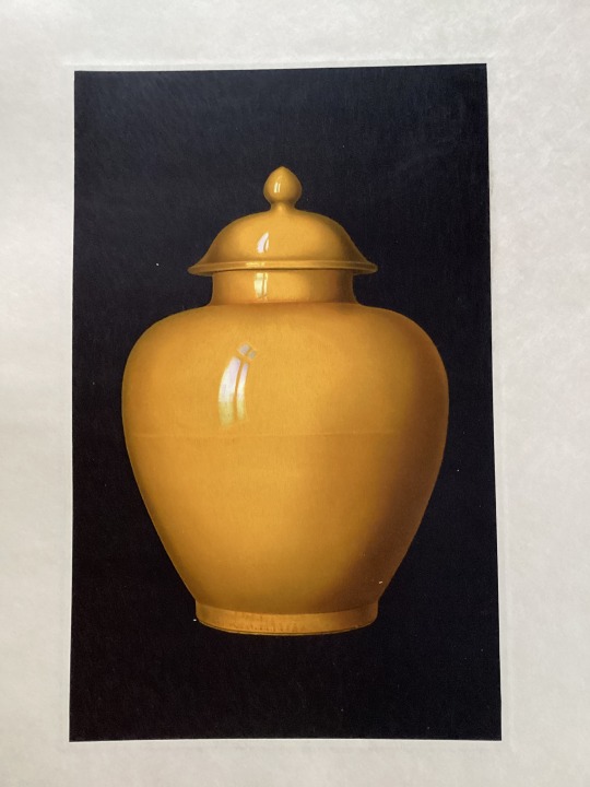
Plate V. Imperial Yellow Jar.
Jar (Kuan), nine inches high without the cover, enameled with a monochrome glaze of imperial yellow. The faint horizontal line in the middle indicates that the jar was originally fashioned upon the wheel in two pieces. There is a “mark” underneath, written in underglaze cobalt blue in large, bold characters, Ta Ch’ing K’ang-his nien chih – i.e., “Made in the reign of K’ang-his (1662-1722), of the great Ch’ing [dynasty]”
Oriental ceramic art : illustrated by examples from the collection of W. T. Walters : with one hundred and sixteen plates in colors and over four hundred reproductions in black and white Author / Creator: Bushell, Stephen W. (Stephen Wootton), 1844-1908. New York : D. Appleton, 1897. HOLLIS number: 990041622660203941
#OrientalCeramicArt#Ceramic#Porcelain#SangDeBoeufGlaze#ChineseCeramic#ChinesePorcelain#Jar#SpecialCollection#ChineseArt#HarvardFineArtsLibrary#Fineartslibrary#Harvard#HarvardLibrary
15 notes
·
View notes
Text
Movement
Ceramic Workshop 26th of February 2024
On Tuesday I glazed my underglazed pieces in a transparent glaze. I glazed most of my pieces but I left the ones I painted in black underglaze without glaze as I felt the rough texture added to the overall effect that I was going for.

I really liked how my idea for these pieces came out, I think the form of these pieces portrays the aerodynamic movement that I was exploring for this project.

I wanted these pieces to look like the aerodynamic lines that move over objects in aerodynamic wind tunnels. I feel this is a sense of movement on these ceramic pieces.

I took these pictures that show the movement in these ceramic pieces, the photos capture a lot of the mark-making that I was focused on in the first ceramic workshop that I attended.

Overall, I really like how this aspect of my project came out, I liked how the stiff rigid form of the ceramic gives off the effect of moving over an object that is not there. the way the ceramic moves over itself gives it a sense of aerodynamic movement.
0 notes
Text
Glazing with slip:

I glazed my white feathers with red slip and a black underglaze, like my prints on tiles. I wanted to use more natural colour tones on these as I admire their natural form. I painted on red slip and sponged it off so it would only lie within the marks I made. I then painted a black underglaze over it to darken the colour of the red slip to create a more earthy tone.

1 note
·
View note
Text


[image ids: nine pictures of a small ceramic lemur. It is glazed with a translucent pale green glaze over dramatic black markings in underglaze. The lemur crouches with its elbows resting over its knees and its long black-ringed tail tucked over its left shoulder, curling down to touch its left forepaw and then back up to the top of its chest. In two of the pictures, the lemur sits on a quarter; it is just large enough to have its feet stick out on either side of the quarter.]
#ceramics#lemur#ayyyy!#I made him years ago but I still remember how frustrating but fun it was to get those eye patches to look right#cone six#by the way#copper glaze#electric kiln fired
44 notes
·
View notes
Photo

Big and Beautiful! Rose and ribbon decorated wash basin by Davis Collamore & Co. which was a high-end New York City importer of porcelain and glass, headed by Davis Collamore (from Scituate), in the 1880s. The firm, rivals to Tiffany & Co. and Black, Starr & Frost, commissioned designs from Copeland Spode and Thomas Minton Sons, that featured hand-painted details over transfer-printed outlines and often rich gilding. Porcelain by Haviland, Royal Worcester, and Villeroy & Boch also appear with the firm's stamped underglaze marks integrated with the manufacturer's. This large, high end bowl is available at the Sandwich Antiques Center. (at Sandwich Antiques Center) https://www.instagram.com/p/CoIFojGrOr1/?igshid=NGJjMDIxMWI=
0 notes
Text
IN THE STUDIO
CERAMICS
Assembly of vessel
Desire Lines - Mark, He Used to Give Me Roses; After Voulkos, 2022
Stoneware ceramic


Thinking about how I will assemble the first vessel, and imagining glazes.
The conceptual side of the vessel:
“He used to give me roses” from the opening titles of 1970’s Australian Drama series Prisoner Cell Block H. This is a series myself and the subject of this vessel would watch, up to 3 episodes a day, over the course of many years. 692 episodes in total, even to the point of repeating the series again, at which point I checked out. The excerpt also implies a relationship is over. In terms of surface decoration, my dipped wire rings could be used to look like a sprawling green vine of some sort; possibly roses, but also the passionfruit vine that was significant in our garden, a constant source of wonder for its impressive growth, but also for the flower and bees that inspired many artworks for me at the time. If I glazed the ring in a dark green ash glaze, it would look organic, but also slightly sad. I’m not sure it’s important to have flowers on it, as flowers imply vitality and growth, as this vine is withering, but at the same time, it might be a good excuse for little pops of colour, in red, white, or purple.
At significant moments in the relationship, I would give a t-shirt with numerical markings that would count the number of days. It was commented by various people that the markings look like the kind people use in prison to count days locked up. In this context I think it works. I imagine a dedicated ring with black underglaze pencil counting the total number of days until the day I moved out.
Guided by the results of testing, i think the gold 1100 glaze looks great over my stamped numbers, so a ring of significant numbers could be another point of interest. It also ties into my repeated use of numbers in my ongoing ‘BINGO!’ series of artworks. This would require an additional firing, so hopefully I can get one in this month. Ideas for numbers include postcodes, dates, days etc.
I guess the main conceptual part of this vessel is the fact it is broken. The idea that I was dealing with something broken without initially realising it, and the idea this brokenness is in flux with moving parts; a constant mashing, reconfiguration, and addition of parts. Significantly, the acknowledgement these breaks were not due to me or one person specifically, but the result of past experience; an experience that I did not experience, and as such, should refrain the urge to pass judgment on, or criticise the ways these experiences have coloured attitude, or result in behaviour I don’t understand. Saying all this, the subject of this vessel isn’t the only one who’s life experiences have broken bits into fragments, or created cracks; it happens to all of us in varying degrees, and despite these breaks, we go on. My art for me is the way I look at these cracks and breaks within myself to try to understand what happened, and try my best to play with ways of reconfiguring the parts so I can move forward, much like the physical process of creating this vessel. All these broken bits he had when we met, had nothing to do with me, yet I had to deal with them best I could. In retrospect, the way to deal with these broken parts is with unconditional love, support, and time, and I failed to do this. Maybe this vessel is my second attempt, my redemption story, or just closure on a significant life event.
0 notes
Text


Available.
www.orientalceramics.com
A Kangxi Faille Verte Porcelain Dish of Flower Shape c.1700. Painted in rich colours including overglaze blue, green, mustard yellow and black. The scene in the center is of brightly coloured mythical sea creatures, Shen (Clam-Monsters) with flaming pearls, being tossed about among the waves. The border with more Shen and birds on flowering branches divided by panels of rich brocade. The base with an underglaze blue seal mark.
Condition
In very good condition, the enamels are strong and bright, however there is some very slight rubbing to the inner gold border and one loss of over-glaze blue enamel at the bottom of the central scene.
Size
27.2 cm (10 1/2 inches)
0 notes
Photo


Chinese Porcelain
I decided to focus on Chinese porcelain. I learned about the history of Chinese porcelain as a whole, as well as different eras and how the materials, designs and styles changed over the centuries. The primary purpose of Chinese porcelain ranged depending on the materials used, shape of the porcelain and who purchased it. These factors determined the price of porcelain in the Chinese domestic market. Their purposes ranged from being used as food dishes, vases for flowers or even just as decorations. A common type of decoration would be a symbolic Chinese animal valued in their culture. One common example would be a porcelain dragon to represent power or strength. The porcelain I researched is primarily used as decoration today and is looked at as being very luxurious, with some selling for millions of dollars. The most common type being the blue-and-white porcelain.
Eras of Porcelain (Art Institute)
One of the first types of porcelain production in china is known as “Celadon”. This particular type of porcelain was among the most celebrated creations throughout the era of the Song Dynasty, taking place from 960-1279. All Chinese porcelain was required to go through a process known as the kiln. The kiln is responsible for exposing the porcelain to extreme temperatures in order to harden and solidify the ceramics. The kilns were invented by the Tang dynasty taking place prior to the Song dynasty. The kilns initially fired the ceramic using burning coals. The combination of the coal, iron casts and oxygen exposure were what caused the olive-green tone of the celadon porcelain. The Song dynasty treasured this olive color simply for the fact that it made the designs or the porcelain and intricate textures pop. The celadon porcelain was used both for decoration, as well as utility, however, it was and still is common to see symbolic Chinese animals made in this style and color scheme.
The next type of porcelain I researched was most prevalent in the late 1100’s through the late 1200’s and today are considerably hard to come by. This style was known as “Cizhou[DS1] and Jizhou Wares”. This style featured more basic color schemes using mostly brown and white while using occasional floral designs, which according to article by Lauren Mack from Thought Co. to represent love, beauty, and represented unity when on a vase. As stated by the Art Institute of Chicago, the Cizhou wares were named after a kiln center in China. This particular network of kilns spanned hundreds of miles. The Cizhou wares varied in aesthetics and intricacy. Typically, the simpler wares were meant for domestic sale and purposed for everyday dishes meanwhile the more detailed and higher quality wares were meant to be decorative and sent to the international market. Both the Cizhou and Jizhou wares were created through a mixture of clay and water which were then accessorized with design, texture and color of the artists choice. These types of porcelain were used both as decoration and utility. These were often used for utility because of their lack in designs and basic color scheme.
The final type era of porcelain production is actually the most prevalent in today’s society. It is known as Blue-and-White porcelain. The Art Institute spoke about the influence of international trade and the cultural influences that had to come together, in order for the creation of this popular art. This style usually features a smooth white glaze paired with magnificent detail added on top in blue. This particular style of painting was originally found in Mongolia and made its way into China. The blue color which was previously unheard of was a result of the introduction of cobalt-blue ore. This type of porcelain is generally used for decoration rather than utility.
Modern Contemporary Porcelain
Much of historic Chinese culture regarding porcelain is still around today and shockingly not much has changed. They use the same types of kilns, same materials, and even the same designs and color patterns. One example of a contemporary porcelain artist today is Ah Xian from Bejing. According to artradar.com, Xian “takes inspiration from his life experience to create work that was inspired by Xian’s desire to merge Eastern and Western culture.” (ArtRadar) Despite Xian’s western influences, he manages to still represent historic Chinese values as well as designs from previous eras. One type of porcelain commonly produced by Mr. Xian is the blue-and-white porcelain for decorative purposes. Xian was asked about how he identifies if his artwork incorporates multiple cultures and values. He referred to his popular western bust with eastern traditional designs. He speaks about how he uses his decorations on the skin like tattoos to represent the permanent mark cultures have had on him.
Another contemporary artist from China named Bin Mao enjoys putting his own spin on his porcelain. He incorporates aspects of traditional Chinese porcelain while oftentimes adding a colorful underglaze. Not only does Mao enjoy adding color, but he also glazes images of sacred animals such as birds and local vegetation from his home. Mao oftentimes includes Chinese calligraphy in black to contrast the white glaze and symbolize the Yin and the Yang.
Works Cited
Mack, Lauren. “The Meaning of Different Chinese Flowers.” ThoughtCo. Dotdash, May 23, 2019, August 2, 2019. < https://www.thoughtco.com/chinese-flowers-info-687455 >
Art Radar. “Reshaping Tradition: 7 Contemporary Ceramic Artists from East Asia.” January 25, 2016, August 2, 2019. < http://artradarjournal.com/2016/01/25/reshaping-tradition-7-contemporary-ceramic-artists-from-east-asia/ >
Nilsson, Jan Erik. “Chinese Porcelain Marks.” GoTheBerg, 2007, August 2, 2019. < https://gotheborg.com/marks/porcelainpainters.shtml>
China Highlights. “10 Interesting Chinese Porcelain Facts.” 1998-2019, August 2, 2019. < https://www.chinahighlights.com/travelguide/culture/china-porcelain-facts.htm>
Art Institute of Chicago. “Chinese Porcelain.” August 2, 2019. Chicago, IL.
[DS1]
0 notes
Link
Artist: Joanne Greenbaum
Venue: Richard Telles, Los Angeles
Date: April 11 – May 25, 2019
Click here to view slideshow
Full gallery of images, press release, and link available after the jump.
Images:
Images courtesy of Richard Telles, Los Angeles
Press Release:
“Progress is not a ladder, but a spiral”*
For her second solo exhibition with the gallery, Joanne Greenbaum pairs her sculptures and paintings. For her, almost any surface is for riotous mark marking and color, unguided by pre-existing ideas, which if anything would hinder Greenbaum’s need to push her works to maximal complexity and surprise.
In contrast to her new paintings, Greenbaum has made a suite of new porcelain sculptures, whose forms deviate from and towards the spiral, alternatively glazed or coated in various black media: siggilata (an underglaze), black glazes, enamel paints, and even sharpie markers. The diversity of these black surfaces is a counterpoint to the polychromy of the paintings. Yet, blacks punctuate their way into some of them amid Greenbaum’s sweeping gestures of electric color. And within these fields of color, varied forms of mark making and sheen can be found: the flat matteness of acrylic comingles with the transparency and precision of marker, while both underlie thicker, glossier skeins of oil paint. Greenbaum deploys them all into an ostensibly haphazard array that coalesce into an unexpected harmony, a process owed to her automatic style of drawing and painting honed over a lifetime. She continuously discovers new byways in her process that inevitably inform and influence her painterly instincts, yielding results that always differ and expand outward like a spiral.*
*Joanne Greenbaum in a recent interview with Erica B. Hess in the podcast, I Like Your Work.
Joanne Greenbaum has exhibited internationally. Her most recent solo exhibitions include survey of her work at Tufts University Art Galleries at SMFA, Boston which traveled to the Ben Maltz Gallery at the Otis College of Art and Design, Los Angeles in 2018; other solo exhibitions that year include Texas Gallery, Houston and 56 Henry, New York. Other recent solo exhibitions include Nicolas Krupp Contemporary, Basel, Switzerland and Van Horn Gallery, Düsseldorf, Germany in 2017. Recent group exhibitions featuring Greenbaum’s work have been held at Brennan and Griffin, New York; Venus Over Manhattan, New York; and Galleri Thomassen, Göteborg, Sweden, all in 2018. Greenbaum’s work resides in the collections of the Museum Fine Art, Boston; Museum Abteiberg, Monchengladbach, Germany; Haus Konstruktiv Museum, Zurich, Switzerland; and the Brandeis Rose Art Museum, Waltham, Massachusetts, among others. Greenbaum lives and works in New York.
Link: Joanne Greenbaum at Richard Telles
Contemporary Art Daily is produced by Contemporary Art Group, a not-for-profit organization. We rely on our audience to help fund the publication of exhibitions that show up in this RSS feed. Please consider supporting us by making a donation today.
from Contemporary Art Daily http://bit.ly/2VwgYGW
0 notes