#orientierungsdesign
Explore tagged Tumblr posts
Photo
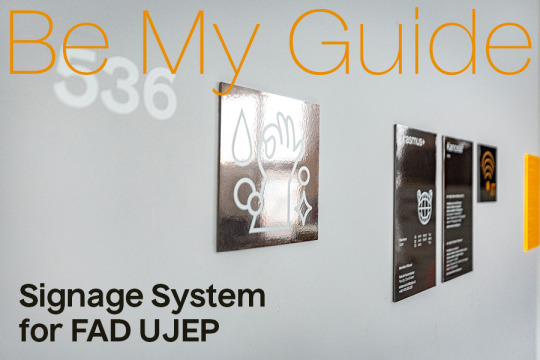
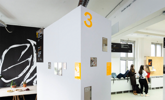
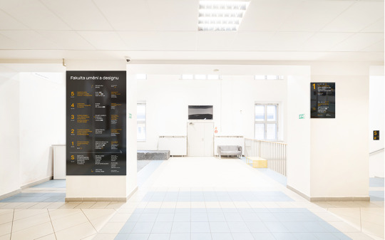
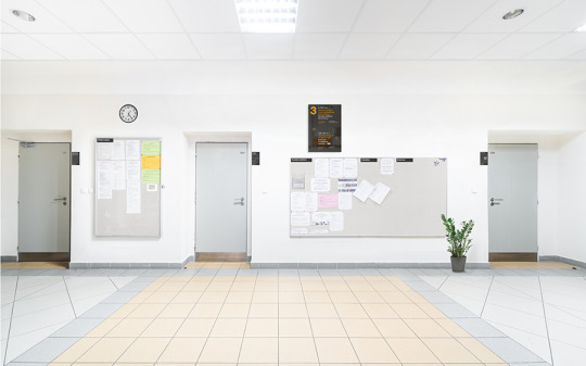


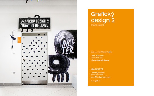
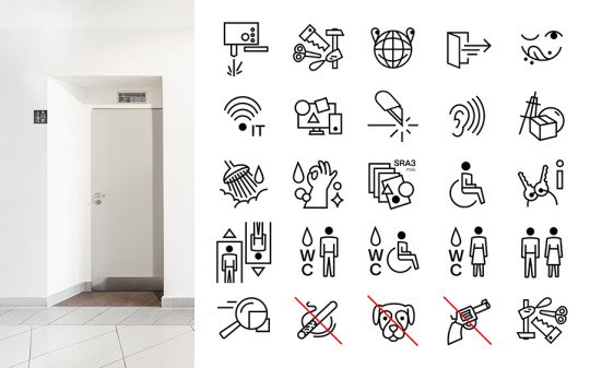
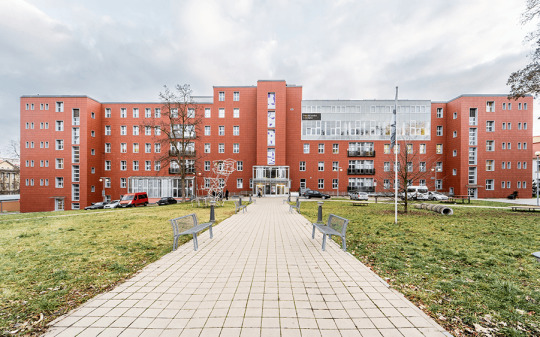
Signage system for Faculty of Arts & Design, UJEP / 2020–21 / unfortunately unrealized
Wayfinding — Orientationsystem — Orientierungsdesign
The orientation system was created for the UJEP Faculty of Art and Design, which is elegant, clean, but above all functional. After a thorough search and the creation of a clear structure of information, we created a system of signs placed on the edges at a height of 180 cm. The Czech Nuckle font is complemented by playful pictograms that humanize primarily functional design. The basic material is black chrome-plated metal, which shines softly from various angles. The signs at the studios and the floor numbers are made of glowing orange plexiglass. Orange indicates the most important layer of information. The set of entrance and floor signs is further complemented by the signage of the side staircase, elevator, merchandise, notice boards and exterior signs of the faculty.
Cooperation with Jáchym Moravec, Veronika Opatrná and Nikola Iljučoková ❤
#jjjudita#judita kostak#judita košťáková#portfolio#art project#sgnage#signage system#orientation system#orientierungsdesign#wayfinding#graphic design#designer#fud ujep#faculty#of arts#art#signage#research#information#student#art student#usti nad labem#project#design#pictogram#icon#plexiglass#material#metal#function
5 notes
·
View notes