#one of these days im going to learn how to use photoshop cc
Explore tagged Tumblr posts
Text


— The Smiths, Hand In Glove, Glasgow Barrowlands 1985
#the smiths#i love this song it means so much to me#low effort#one of these days im going to learn how to use photoshop cc
10 notes
·
View notes
Photo
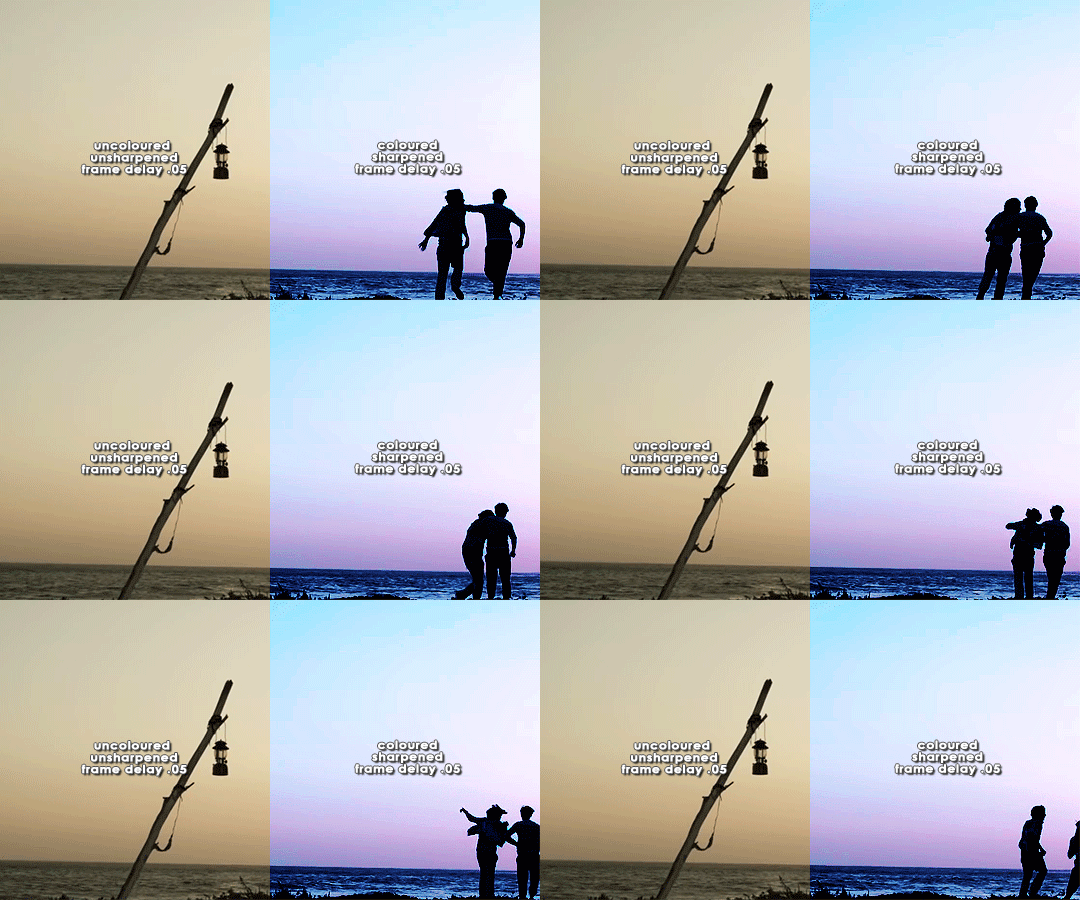


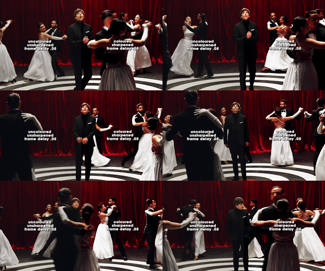
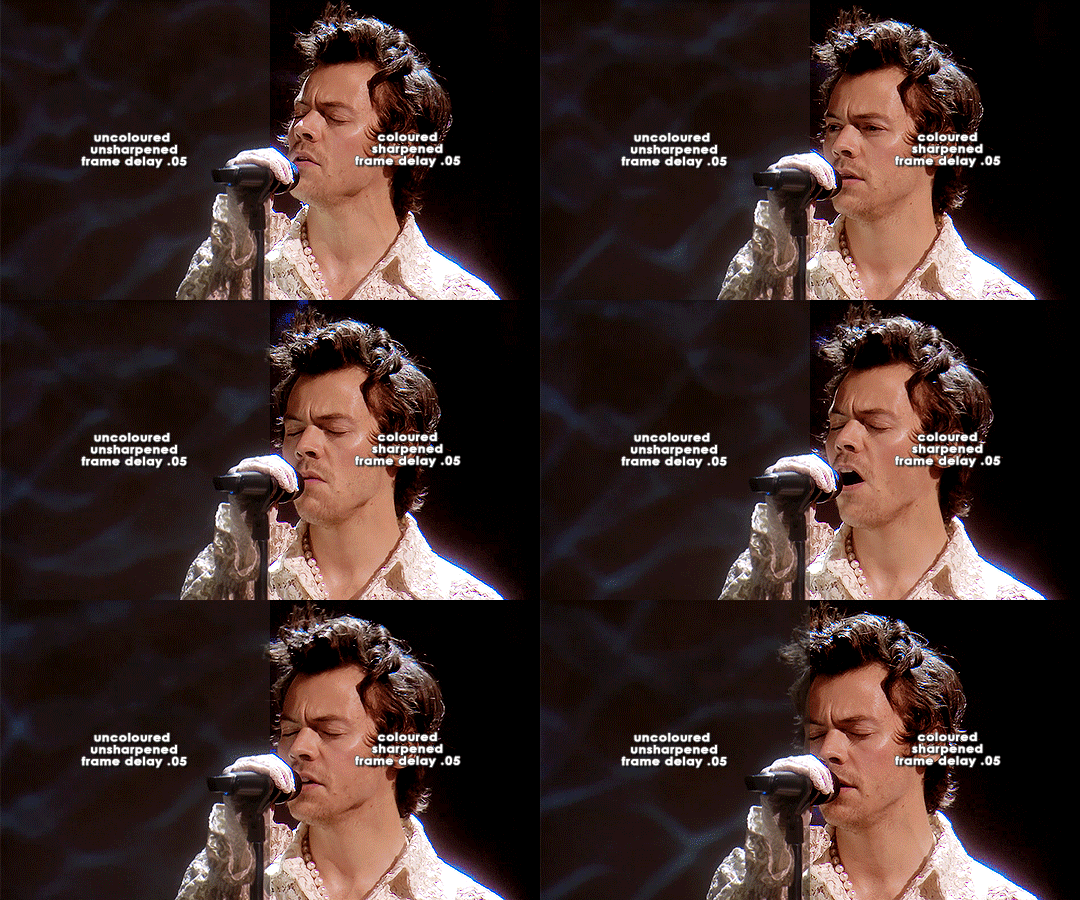
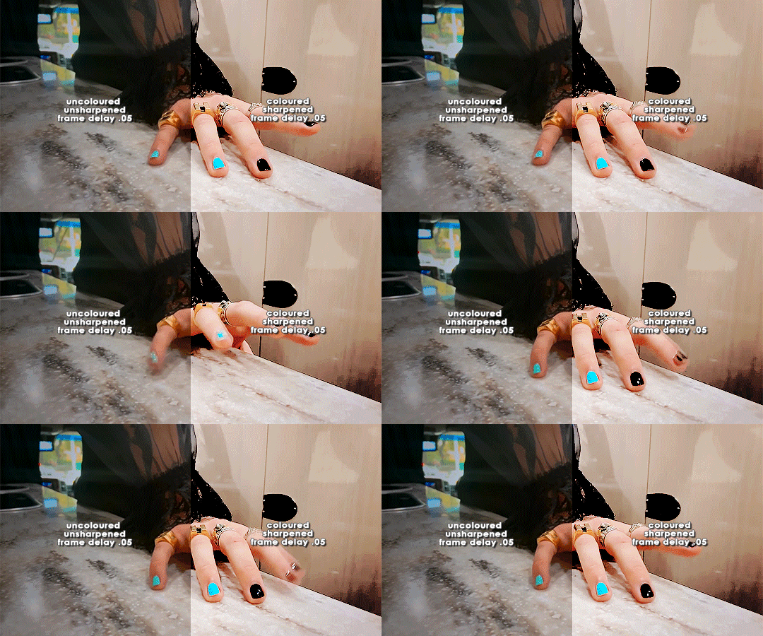
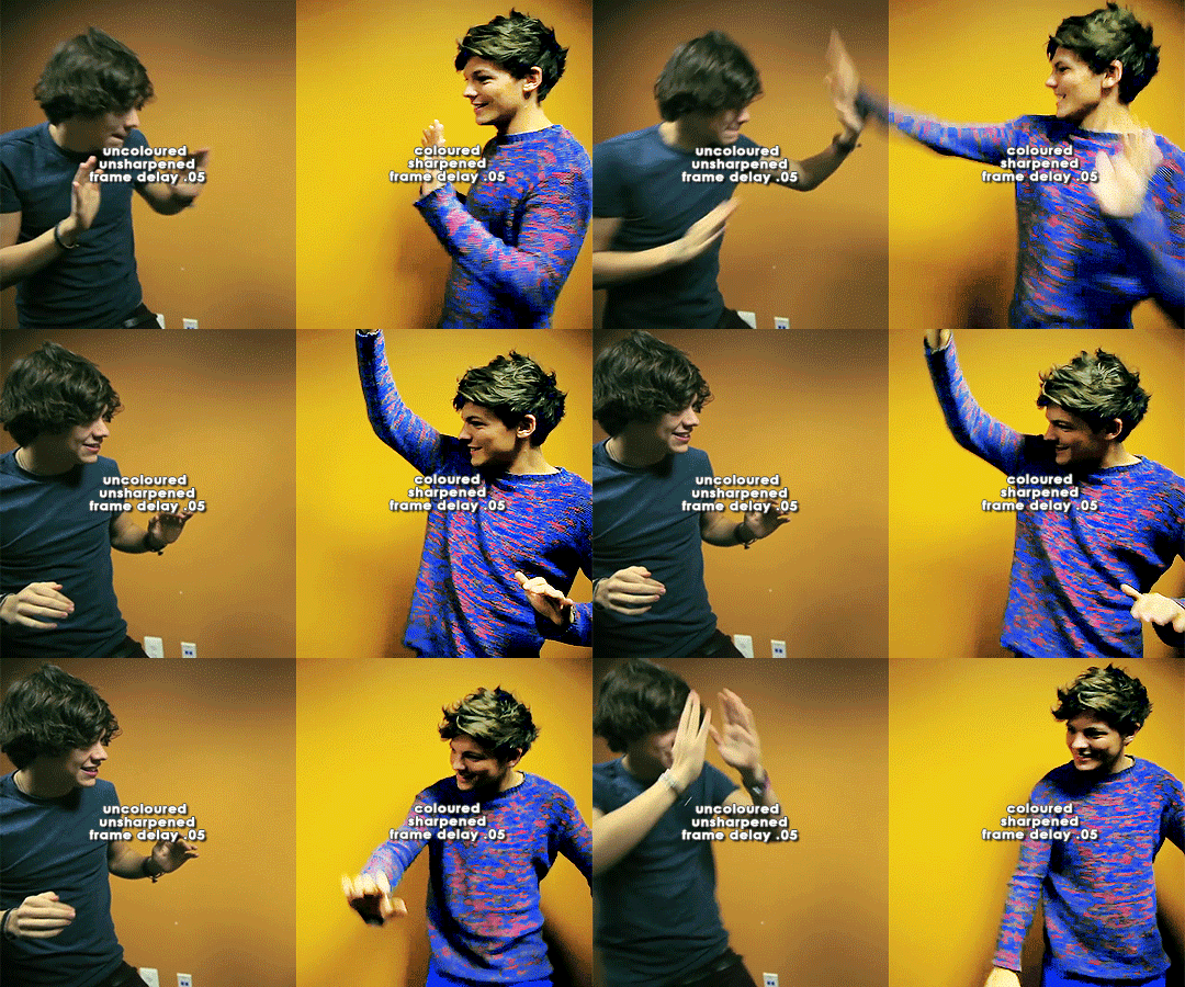
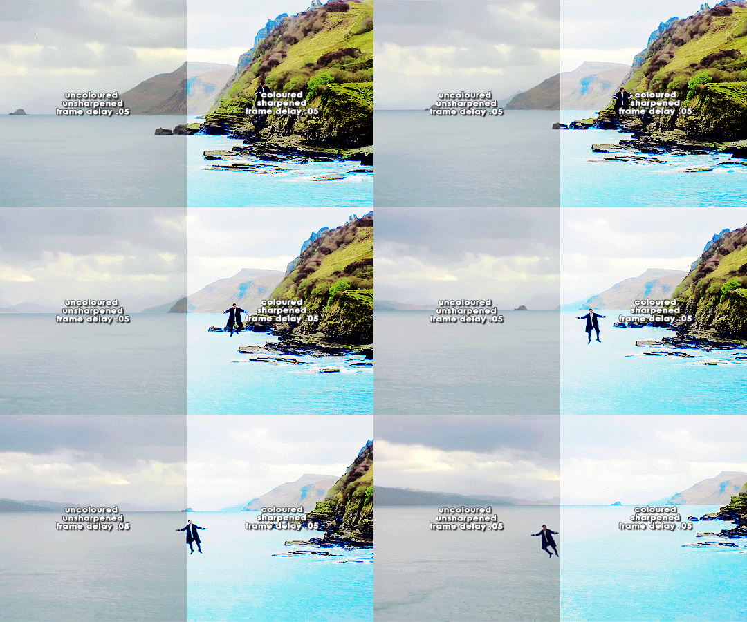
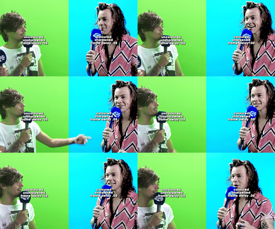
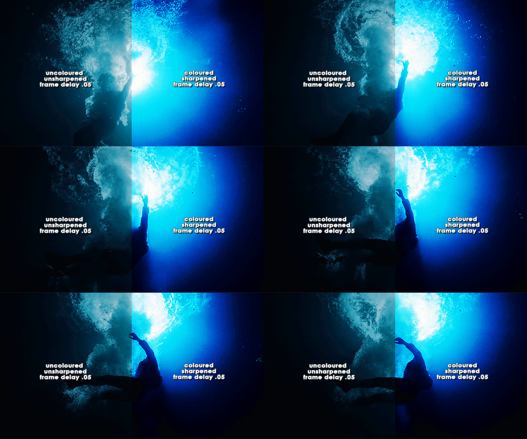
ORIGINAL → EDITED
gif making process
thank you so so much to the lovely and talented @pridesobright and @supportivehusbands for tagging me :’) reading about your processes was so interesting!!
LEFT: cropped, resized (height 300px; width 540px), unedited, unsharpened, frame delay set to 0.05
RIGHT: cropped, resized (height 300px; width 540px), edited, sharpened, frame delay set to 0.05
ideally, 1080p is what i’d use for everything, but sometimes you just have to settle for what you can get (and if you’re cursed…………. you have to battle with less than 480p……….. im looking at you, miss ‘now kiss me you fool’ footage). for this post, i made gifs from ten separate videos to illustrate how even though your source materials are wildly different from each other, the resulting gifs can still be stylistically similar. this is why it’s so upsetting to see people steal gifs like it’s nothing. we put so much thought and care and time into our posts and i can’t even put into words how discouraging it is to see people act like crediting gif makers is a hardship.
i have a note filled with ideas for lyric sets, parallels, etc etc that i work from, but sometimes i’ll just sit down and pick a random video and play around with whatever idea i have in the moment. (that’s how this set came to be!)
after i’ve imported the footage to photoshop (i use cc 2019, although i first started out using cs5 and it’ll always have a soft spot in my heart), removed any redundant frames, and cropped it, i’ll resize it (to 540px more often than not), and set the frame delay to 0.05. when all that’s done, i can colour.
i colour every gifset from scratch — i’ve never had much success with using the same psd on other gifs. it totally works for gifs from the same source, but when you’re using like six different videos for the one gifset, you have to take much more care in making them all correspond to the aesthetic you’re planning for the post. i tend to choose a dominant theme or colour to work from, like blue, green, magenta, pastels, rainbow, etc.
i usually begin with curves and levels until im happy with the brightness. then i’ll move on to either selective colour or colour balance or vibrance, depending on the original colours of the footage. i almost always skew my gifs towards blues and cyans and magentas rather than yellows and greens (i lean more towards coolness or neutrals rather than warmth). and im just really fond of blue, which is apparent if you’ve ever seen anything i’ve made lmao especially if louis’ eyes are involved. this is definitely where i spend the most time messing around with different settings (like increasing cyans and blues and blacks in general / increasing cyans in whites if i want the sky to look more blue / decreasing the blacks in whites for contrast / decreasing the cyans in reds to make them really red / decreasing the yellows across the board, but most definitely in blues and cyans / decreasing magentas in greens if i want Very Bright greens). sometimes i lose my mind a little and i end up with like twelve selective colour layers and im like This Is Fine . skdjfskjf anyways, when everything looks as vibrant and colourful as i want it, i’ll go back to curves or levels or add a contrast layer to make everything look stronger. i also might go back to selective colour or vibrance with incremental changes at the end, just as a final touch. [tl;dr: curves > levels > colour balance > vibrance > selective colour > contrast > go back for any little amendments] for black and white gifs, i’ll start with a gradient map and then continue with curves, levels, etc. after all that’s done, i’ll convert to video timeline > select all layers > filter for smart objects > either sharpen with this action or use these smart sharpen settings > add text if the post calls for it (if it’s a concept/lyric gifset, i like to play around with the settings — although century gothic is my favourite font for this — and if it’s a captioned gifset my standard is arial bold italic / drop shadow to 140 degrees / grey stroke / adjust font pt according to the size of the gif) > export > save for web. et voilà!! one gif down, probably nine to go sdkfksjdfhsjdf
the double edged sword of making gifs for one direction fandom is the sheer volume of footage available to you: on the one hand, you have a whole decade’s worth of moments to gif (and that’s incredible!!!), and on the other, it’s so difficult and time consuming to colour all of these separate moments in a cohesive way that hopefully expresses your own unique creative style. so sometimes it’s frankly impossible to make certain things look the way you want them to. maybe you can’t find high quality footage (the absolute BANES of my existence are the rtl footage where they reacted to themselves playing football at boston common and the louis is loud……loud……….and……..loud footage where you can see harry’s face close up. it’s a TRAVESTY that they don’t exist in 1080p and i WILL scream it from the rooftops), or the moments you want to gif simply refuse to look good next to each other because they’re so wildly dissimilar in hue that no matter what you do, they look strange and disjointed when juxtaposed (in those moments i do tend to either give up or choose to make them black and white). but honestly? the obstacles i’ve come across while making gifs for this fandom have been amazing learning opportunities for me. i’ve grown into and experimented with my style way more than i ever did anywhere else, and i continue to feel inspired by this fandom every day, so thank you to every single creator for your ingenuity and hard work!! 💖💖💖💖
i think y’all have been tagged or done this already, so im just going to tag everyone i admire to say you’re legends and i love your content very much a lot!! @caparius @sunflowrsix @jimmytfallon @stylex @tmlnsn @cuddlerlouis @2tiedships2 @moonshinelouis @ltpolari @itsastorm @finelinee @ltwalls2020 @half-lightl @fallenwalls @tomlinsun @louisbravado @tattooedlovers@lordtomlinson @livehabit @halosboat @thepeacering @alinok
#photoshop#gif tutorial#kinda idk ?? sfkjhskdfjdfg#gif making process tag#the first gif is almost jarring to look at . like sometimes i forget how aggressively i remove warmth from the wmyb video dskfjhdkfjhdjgf#one direction: yellow/warmth. me: NOT IN MY HOUSE#anyways sorry this was so long i just got so excited kskdjfhskhdf#i love making gifs!!! even when i fucking despise it!!!#**#*#creations
93 notes
·
View notes
Text
giflinsky’s gif tutorial
ok so !! before i start, a disclaimer: i do not claim to be a professional at photoshop or know how to do everything omg i know there are multiple ways to make gifs, but this is just how i personally learned how to make gifs from a mix of tutorials that i’ve found over the years
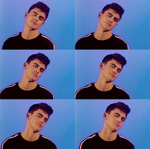
now onto the tutorial !! i’m gonna be gif’ing my baby ofc & here’s the end product
step 1: pick the video you wanna gif
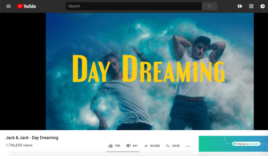
usually i get my videos from youtube or instagram, especially since i mostly gif jack gilinsky & insta is where i get like 90% of his content from lol. for this tutorial, i’m gonna gif jack & jack’s day dreaming music video ok cool
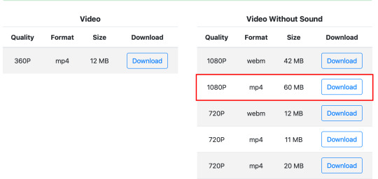
i use keepvid to download youtube videos, making sure to get the highest quality available ( 720p — 1080p ) & that the format is mp4
step 2: opening in photoshop
so i currently use photoshop cc, but i’ve used photoshop cs5 & photoshop cs6 to gif in the past. tbh i can’t remember the differences so i’m pretty sure the process is the same?? if not lmk
anyway so to import the video, go to file > import > video frames to layers
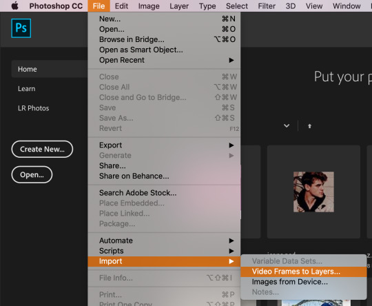
upload your video & this thing will pop up
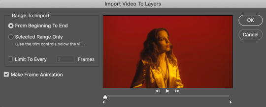
depending on the length of the video & what scene you wanna gif, you can either click from beginning to end or selected range only. if the video is 10 seconds or shorter i usually pick the 1st option, but since this is a whole music video & i only wanna gif one tiny part of it, i chose the 2nd option. either way, check the box for limit to every 2 frames (tbh i’m not sure what happens if you change the number; every tutorial i read just said leave it at that lol)
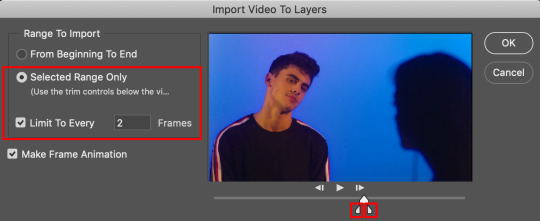
to clip the video to the part you want, use those lil’ sliders. it doesn’t have to be exact bc you can delete frames later
once you click OK, the gif should open in photoshop. make sure the timeline is open at the bottom & if it’s not go to window > timeline
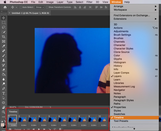
step 3: trimming the frames
so since i imported some extra scenes from the video, there are frames that i don’t want in the gif. all i have to do is select the unnecessary frames & click the lil’ trashcan at the bottom
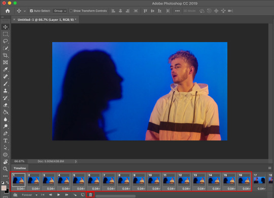
this next step isn’t really required, but i found that it helps load things faster ig? so i select all the layers in the right sidebar by using the shortcut option + command + a (control + alt + a on windows) then i press command + g (control + g) to group them together
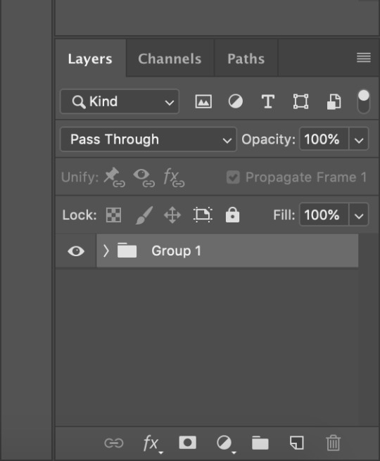
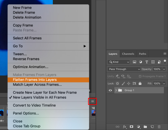
then i click the 3 stacked lines button & flatten frames into layers so that it’s only the frames that i want
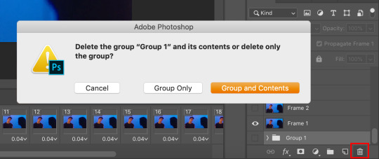
then i delete the original group bc i don’t need them anymore
step 4: cropping
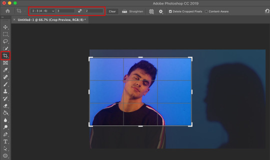
it’s just like cropping a regular image. it depends on the video (i.e. if it’s horizontal or vertical) & you can do whatever you like, there’s really no rules? for this gif, i used the 2:3 ratio to isolate gilinsky’s face
step 5: resizing
since the video size is pretty big, i have to resize it to fit tumblr’s guidelines. these are the photoset sizes for 2019 for reference
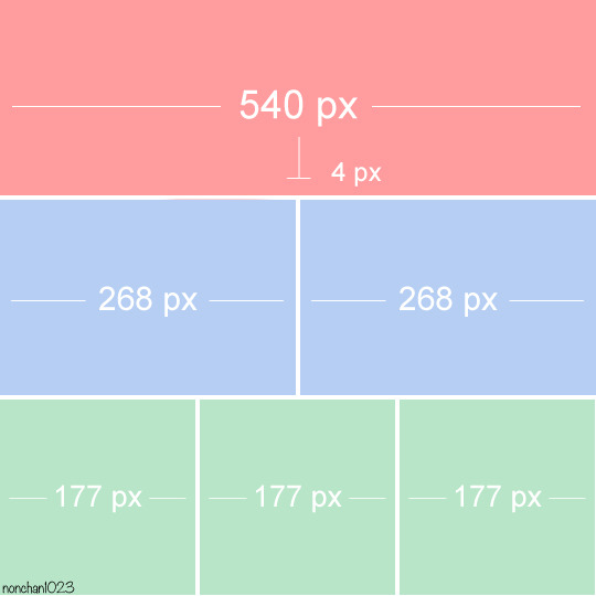
i usually make my gifs a little bit bigger, for example i size up 268px to 300px. i don’t really have a reason lol i just prefer things a little bigger i guess? anyway so to resize, go to image > image size or the keyboard shortcut option + command + i (control + alt + i)
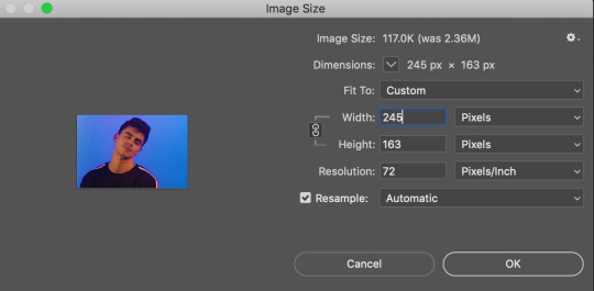
i made the width 245 pixels & it automatically set the height
step 6: sharpening
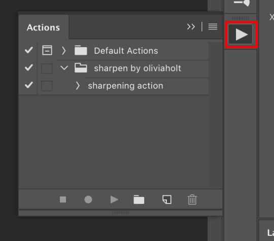
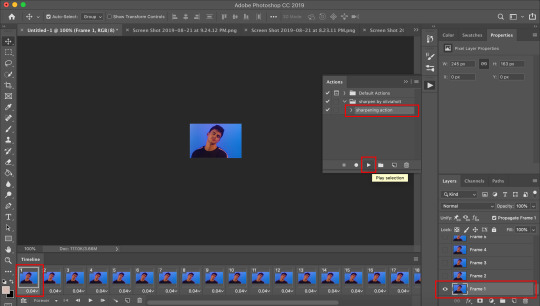
this step is optional, but i’ve found that it can make a difference in quality a lot of times. i use this sharpening action. in order to use it, you’ll have to load it onto photoshop, so click the play button thing on the right sidebar or go to window > actions
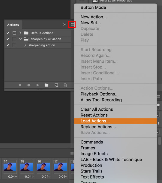
click the 3 stacked lines, go to load actions, then select the sharpening action i linked
once it’s loaded, make sure the 1st frame in both the timeline & layers are selected, then click play selection on the action bar & it will work its sharpening magic
step 7: gif speed
after you sharpen the gif, all the frames should be highlighted/selected. click the drop down arrow next to 0.06 on any of the frames & some numbers should pop up
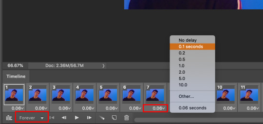
these are the options for how fast you want your gif to be. i usually use 0.08 seconds for gifs with more frames, but 0.1 seconds is a good general speed for most gifs
oh and make sure that drop down is set to forever, which loops the gif
step 9: coloring
this step is also optional. it’s really for aesthetic purpose, especially if the color isn’t to your liking
i’m not creative enough to make my own colorings lol so i usually use one of these PSDs to color my gifs. for this particular gif, however, i used this one. you can find a bunch of other PSDs just searching through the tumblr tags
i just open the file onto photoshop, drag the group over to my gif & it makes it pretty?
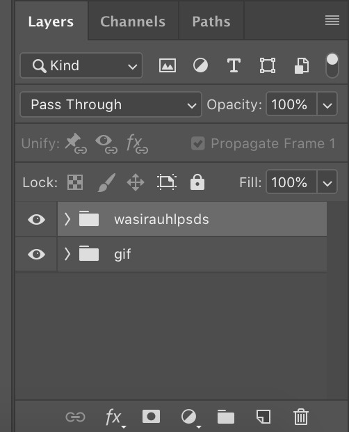
it changed the gif from this

to this

step 8: saving
your gif is made! now all you gotta do is save & you’ll be able to use it however you please. go to file > export > save for web
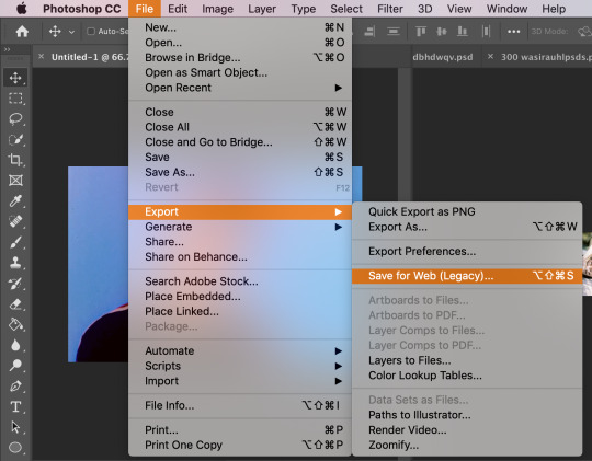
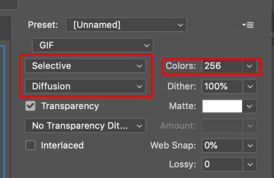
there will be another pop up window. these are the settings i have (based on the tutorials i’ve read). colors should be 256, but you can mess around with the selective and/or diffusion to see how your gif looks
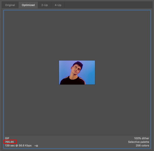
the last thing to check is the gif size. i believe the maximum for tumblr is 3.00M? any larger & the gif will freeze
& that's all i have for y’all !! i hope this made sense omg i really tried to be thorough & provide enough screenshots but like tumblr made the quality booty so if you can’t see something or if you have any questions at all please feel free to send me an ask or hit up the IMs & i’ll try my best to help you out :)
thank you to the anon who liked my gifs enough to request a tutorial, i really appreciate you & anyone who cares to like/reblog my posts !!
#gif tutorial#how to make gifs#how to edit gifs#photoshop#photoshop help#???? idk what else to tag#*#*personal
84 notes
·
View notes
Note
1-5 and 20-25 :-) sorry for all of them hehehe — 🖤 also i’m getting off work I WILL SEND U ANOTHER ASK HEHEHEH
oaiwenfoia you’re sooo c*te perhaps i’ll d*e………. hm………… anyway;; thank you angel (sorry it took me so long to do this ;; ___ ;;)
also this got mad long so i’ll put it under a cut!
1. how did you get into graphics / gif making?
i was an early ‘the vamps’ and ‘5sos’ fan and because of that, i used to make lil graphic type things?? i guess?? like i tried to make stuff like the ones i saw online omg… and mine were soooo bad but it was like so fun and i used to use this online editor and it was trash but like i would have so much fun… (and that was back when i was in grade 7-ish..? so i would’ve been like jfjfiwaoefo 12/13) and then i just kept doing it;; eventually in grade 10 i took a graphic design course and i got a hold of photoshop and it blew my mind and from there i just kept kinda… doing it??
and with gifs omg… ok i swore i would never make gifs cause it looks SO complicated like bitch ill kill u what do u mean layers to frames wtf !!!!!!!!!!!! and then when i was in my first year of uni in around june i was like… omg i wanna try again… cause i’d tried it before and my ps just crashed… so i was like let me give this another go.. and i did… and it worked.. and my mind was like blown omg… i was in AWE… omg i just realized its been a whole year since i learned how to gif stop ill die
gfx/gif questions
2. do you do something creative/related “irl” as well?
well!! i just got into college for graphic deisgn hehe;; so i’m hoping that that’ll be my future :’)
3. who/what inspires your graphics / gifs?
hm, well!! whenever i see really great pieces of gfx or even in real life when i see a magazine piece or a billboard that just looks stunning i feel inspired!! and i’m like eugh i wanna try making smth like that ;; also music and movies and games inspire me sometimes?? but if i was to say who!! then it’d probably be all my amazing content creating mutuals!!! their work is always wowing!! i always tag ppls gfx with ‘gfx inspo’ bc im genuine :0 when i see it ;; ___ ;; like how is everyone so creative and talented;;
4. what do you enjoy about making graphics / gifs?
oh wow, mm… it allows me to be creative? and put to use skills that i think aren’t always appreciated? like my p*rents never take me doing graphic design seriously;; but then recently my mom wanted me to make a lil label for her for a friend’s garden and i did and she was like !!!!!! so happy abt it i was like TT TT cause both my parents were finally like ok i get it sorta;; i really like that i’m able to make smth kinda outta nothing?? like art is really interesting bc you get to let your thoughts and experiences affect the outcome of your work so?? like.. i like that everyone has a different style??
and for gifs;; i really enjoy that its such a structured task like… its very.. orderly and routine based?? like i know what i’m doing everytime?? and the places where i get to change it up are like the colourings and the style of set i make and that makes it fun and creative too;;
5. what do you dislike most about making graphics / gifs?
mm the creativity block;; i feel like sometimes i cannot think of ANYTHING to make and those days i feel kinda useless as a cc…… it sucks but foiawnefiawn eventually i’ll figure smth out if i move things around enough fajwefowaeo
and giffing omg…… idk… probably the colouring process…… but thats majorly because my laptop’s screen displays colours kinda whack from how they actually look and so i have to do 2x the work to make sure it looks good and smdays its like idc anymore just post the set and pull the trigger
20. your favourite fandom(s) to make graphics / gifs for?
for gfx it’s definitely stray kids!!! they have some of the most fun lyrics to work with and their concepts always always inspire me like crazy!!!
for gifs its the tmg fandom! everyone in that fandom is suuuper nice and supportive and like;; even if i’m not always making gifs i dont feel like i’m falling behind or ? like ppl will be mad or smth ? like its a safe small community and bc of that it feels so good ;;;
21. how much time do you spend on a single graphic / gif?
very dependent! gfx can take from like an hour to like a week+?? it just depends on how intense and intricate it is ig;;
gifs are shorter;; probably take me a few hours?? the longest a set has taken me is maybe like 6 hours but that’s bc i was being slow about it and trying to find all the necessary parts! but on average itll take abt half an hour to maybe two for one set
21. what is your biggest improvement since you started making graphics and or gifs?
ogoaiweniogaw stop this is so funny.. i wanna go find my old wattpad covers so you can all cringe with me but… mm, with gfx i guess i learned what my Aesthetic™ was and what i really liked and like fjjfaiosdksfd i learned how to use photoshop which is a big thing lmaoooo……… and with gifs!! definitely my quality (shout out to vapoursynth) and my colouring :’)
23. what is your biggest improvement in the past month?
hm… time management jfaiweoofiaw i’ve definitely gotten wayyy faster at giffing and i really do not take as much time anymore;; which gives me some peace of mind lmao
24. what is something that you’re wanting to learn right now?
illustrator! i’ve been fooling around with it a lot recently;; and even one of the pieces i submitted in my portfolio was smth i made on illustrator heh;; but theres a huge learning curve (like btich what is the pen tool ill kill u) fnaoiefiownf so i wanna get lots better with it ;;
25. what would you like to see others learn how to do?
this is an interesting question;; mm i guess everyone is different?? so idk if i can answer this question cause i think everyone’s style requires them to learn in their own ways?? so idrk ;; i guess something to make certain people’s lives easier would be like LEARN KEYBOARD SHORTCUTS !!! that shit saaaves my life like idk man it cuts down on my time for sure;;
#🖤 anon#anon#answered#thank you babie#i'm soooo sorry this took me as long as it did#also sorry this is sooo long fjaowiefnoaiw#i hope you're well angelllll
1 note
·
View note
Note
H e l l o! How was your day? It’s definitely been like 70 y e a r s since we last talked. (h a get why i said 7 0 years) I got jokes. Anyways, I have a very serious question?? How do you make gifs? I really wanna learn how, but i don’t know where to start? Like, do you need to have photoshop to make them? A l s o, I changed my theme and I kinda really want you to see it? Like it’s really pretty and I made my icon and everything. ~Your Secret Admirer
h e l l o !!! i really hope those 70 years were kinder to you than they were to steve and bucky :))) and aah i really want to see your new theme/icon now! i’m sure it’s gorgeous 💗💗
regarding gifs: the primary way i’ve seen them made is with photoshop, yes, though my love @kamalakahn made a very detailed tutorial on how to make them using your iphone! though i’ve never tried making gifs on my phone, i would recommend photoshop due to its sheer versatility - you can make literally anything you can think of on photoshop! you can either purchase it - it’s expensive, but if you have the money and plan on using it for an extended period of time i would say it’s worth it - or obtain it through semi-legal methods like i did such as this (this was the one i used, but im not sure if it still works) or this (i haven’t tried this one, but it’s for the more recent version, photoshop cc 2019).
as for where to start w/ gifs, tutorials are the best way to go about it! i learned how to start making gifs with this tutorial - it uses screenrecording, which is a method that i personally prefer due to its simplicity, but if the video you’re using isn’t of high quality you’ll have repeated frames which gets annoying. here are a few other tutorials. it’s mainly a matter of practice from there - once you memorize the process, making the gif gets much easier and from there you can start experimenting with coloring (if you want, there’s tons of coloring tutorials on blogs such as @yeahps and @completeresources)! i hope that helped, and let me know if you’ve got other questions abt gifs! ilysm, secret admirer 💗
11 notes
·
View notes
Note
hi! im that anon that asked for a tutorial and you said something specific and i really liked your harvey dent edit? the one that said, god is dead. and it was all red and stuff and super cool looking? no pressure! i just think your stuff is really cool and was wondering what the process behind some of it was!
ofc! it’s no problem at all :)
so i’ll just give a brief rundown and a v rough tutorial on how i made those particular graphics. thank u so much for the support, i’m especially proud of them too and it’s nice to hear u like them as well!
what you’ll need:
photoshop cc 2015.5 but any ps would do really
basic knowledge of photoshop
patience
fonts: dk shaken not stirred, liquido, couture, helvetica, helvetica neue, votu
so the first graphic is a really stupid move and i just realized it like hours after i posted it: it’s one of two graphics that feature a fanart instead of a faceclaim. looking at it as a whole, cohesive set it looks really stupid and surreal? bc it doesn’t match and just throws u off? so my advice is don’t do that. if ur gonna edit from an actual comic then the rest should be like that too (2D) but if ur gonna edit with real life elements i suggest to just stick to that path (3D) so that everything looks coordinated and neat :)
the second one actually took me a while to get right but basically the red circle is in [linear light] and the black circle is in [hard light] mode while the top most white is in [normal]. the paper texture is above all three layers and is on [multiply] mode so it only looks visible on the white circle. the “angels” text is just some basic layer mask so it looks like it’s inside the white circle. as for the style of the graphic itself it’s just based on the previous harvey graphic i did here, the last one on the left. the thing with that is i look for inspiration from other graphics i find and there’s a lot on behance, flickr and even pinterest. just search for ‘graphic designs’ and you’ll find a lot of good ones. u don’t have to copy them exactly but u can adopt and transform it into something urs! but if imitating some designs and tricks is what helps, then it’s fine too. nobody is born an innate artist/designer/whatever so just explore and experiment with what u know and what u want to see. eventually, u’ll be able to develop ur own style.
the third one is basically the same as the second and fairly straightforward. the big, red 2 is set to [darken] mode. i guess with this graphic it’s mostly abt negative space??? and also maybe laziness but negative space is good so that overall, ur graphic set wouldn’t look too cluttered. it helps the eyes breathe i think. also the main focus is the faceclaim, and since the graphics above and below it is already optically centered, it’s at the rightmost side for asymmetry. just a thought.
ok i’ll be real this is one of my faves bc it just looks so harvey i couldn’t believe my eyes when i saw that hand. i just cut it and applied a gradient map of white and light red i believe so it looks like it’s sketched out or smthng. it looks just like harvey’s burned hand but bc i’m an idiot i forgot to flip the canvas so that it would look like his left instead of his right hand. to this day i regret this mistake. if u look close enough the coin has harvey’s face on it too. damn i love him. but moving on, the lines are made with the pen tool. the pen tool can be a hit or miss thing to use and i just recently learned how to use it properly but it’s v convenient once u got around it! it’s like a sophisticated brush tool if u want to incorporate more lines in ur stuff. u can also use it to cut stuff out (like with the quick selection and magic wand tool) but i don’t do that method often so probs don’t listen to me. i only have a v basic knowledge on it but there’s a yt video tutorial on how to properly use the pen tool if ur interested.
this fifth one is very….. meh. theoretically, it could’ve been better but since i’m the Worst in practice it ended up like that. the design is p much those adidas ads with the many dots? sorry for the plagiarism, adidas, but i don’t make money off of this. so when in doubt just slap some geometry on ur edit and ur good to go. i go for circles bc they’re more aesthetically flexible, if that makes sense? i find rectangles cool but they tend to look out of place in something so vertical; it leaves little space for words and other elements. but polygons look better on horizontal canvases so u can try that too!
the last and definitely least is the most ���meh’ out of the bunch bc i literally stopped caring abt 2/3 into this thing. the thought that comes to mind is: time magazine cover nov2017 so what does that say abt it really. the text is naturally like that thanks to the font: liquido with a wave-like option if ur into that kind of stuff. some layer masks too to get the effect of the text being inside the harvey art. it looks so dumb now wtf i’m an idiot. but hey, 2 harveys. i’m a visual genius in that respect. again, some gradient maps and a red rectangle border. tip: u should most definitely add a contrasting color or accent in ur graphics, which i once again failed to do here. in this case it’s black since the color palette is red, white and black. it adds a depth to ur work. if ur skilled enough, u can use a wider range of color palettes instead of the usual black, white, [random color]. i, myself, haven’t mastered that yet so that’s what i usually use but one extremely prolific graphic maker who has a good eye for these colors is user mattelektras. u can check out her stuff and see how she uses complementary colors in her edits.
some other things to note:
if u need a paragraph-like text for filler, u can go to type > paste lorem ipsum then adjust the font size to ur liking (somewhere around 0.8pt for maximum unreadability)
it’s good to pay attention to colors and spaces in ur works! the color wheel is ur friend in this trying time
smart sharpen always and forever (at abt 65-130 depending on ur image size)
this got lengthy but i hope i was able to help! i know it’s not that detailed but if u have anymore questions don’t hesitate to ask :) i’m not bothered at all so don’t worry abt it. happy designing!
4 notes
·
View notes
Note
Hey, I don't know if you take questions so srry for bothering you in advance :/ Ummm I am really interested in getting into animation but I have no idea how to start. How do you take real life drawings and put them onto the computer to mesh? Do you need a certain program for that? What equipment do you need, how do you color animations, how long does it usually take to finish a simple animation? How do frame rates work? I don't even know where to start. Again, srry if I bothered you.
I take questions anytime! You didnt bother me at all. Im here to help with almost any art related question! ^^
Although, im still learning about animation myself so Ill try to help you the best that I can owo;;
1. You wanna learn how to start animating hmm? To start, try something simple. Something thatll get you started but not to get you frustrated with its difficulty. This could be something simple like a stick figure walking or something akin to the classic “Bouncing ball” Flip book animation. ( Example: https://www.youtube.com/watch?v=c2KRS2w1Vh0 ). This can be used as a start to become familiar with the basics of movement in animation. Dare I say it, even Animation Memes can be a start since the majority of those contain basic movements that demonstrate the concept of animation ( the good ones that is). There’s tons of animation memes on Youtube so, if you want to begin practicing animation, there’s a start. Pick a song, type meme in front of it, and try to find a good one thats also your favorite song. I guarantee theres at least one meme for a song you like. Along with that, take into account that everything you see moving is, in fact, animation. Your hand moving, that bird flying, the grass swaying in the breeze. Studying movements in real-life and applying them to your animation is another way to go about this since studying from life is 100% recommended. Also, another note: STUDY THE WORKS OF OTHER ANIMATORS. If its a Youtube video, Youtube has a speed option. Slow down the video so you can analyze how the animator was able to make the character move that specific way that you liked and pause it if its still going too fast. Analyze and apply.
2. Putting real life drawings onto a computer? My guess would be that each drawing is scanned individually, which is then sent to the artist’s computer to be compiled in a video editing program. Again, this is the only method I know of since im not too familiar with traditional animation.
3. There’s tons of animation programs out there! The ones I see everyone talking about are Toon Boom Harmony ( you can try a 21 day trial for all 3 versions), TVPaint, and Adobe Animate CC ( Formerly known as Adobe Flash ). These are the professional programs. But I have seen some people do amazing animations in normal art programs such as Paint Tool Sai, Photoshop, and Clip studio paint! There are tutorials online on how to use these programs for animation purposes. Also, ezimba.com is a neat website thatll turn your sequence of pictures into a gif if you dont already have a program to do that for you.
4. The time to finish animations varies depending on what you want to make. For example, I did an animation for april fools day a while ago ( https://www.youtube.com/watch?v=FO2KJTSsvl4 ). It was made in Toon Boom Harmony by the by. The first 15 seconds of animation there? It took me about 40 hours of work to get it to that point. Then again, I still can be considered a beginner so my speed may differ from other people. Animations take a long time to complete from start to finish depending on its complexity so be prepared to sink a few hours or days into finishing it.
5. Frame rates are basically the speed of the animation. The higher the number, the more frames youll need to draw per second. This usually results in very smooth looking animations. The lower the number, the less youll have to make. This usually results in very choppy animations, like the ones you see in anime. Here’s a little video explaining some differences between frame rates:
They also have more tutorial videos regarding animation so if you have the chance, check them out. Theyre pretty good :3
Phew, this was long OuO. That’s all I have for now. If i got anything wrong, someone please correct me. I hope this helped you anon! ^w^
Future Edit: There's one crucial detail i seemed to have missed and that's becoming familiar with the 12 principles of animation. These are incredibly important to understand so that you can thoroughly emulate motion. Here's a video explaining them all!https://youtu.be/uDqjIdI4bF4
23 notes
·
View notes