#one can perceive this constrast between the two immediately
Explore tagged Tumblr posts
Text

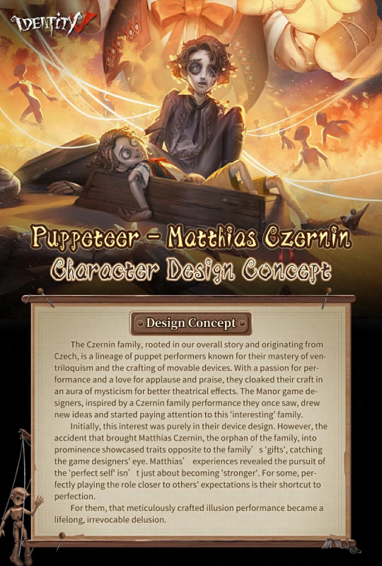
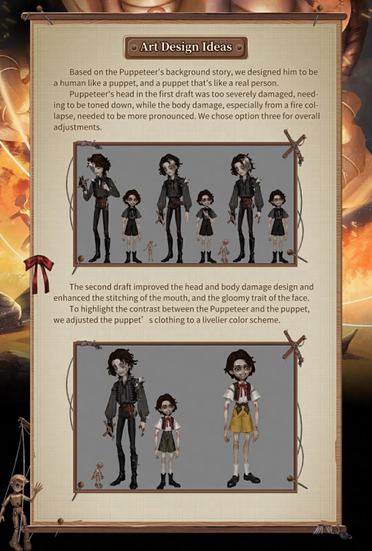
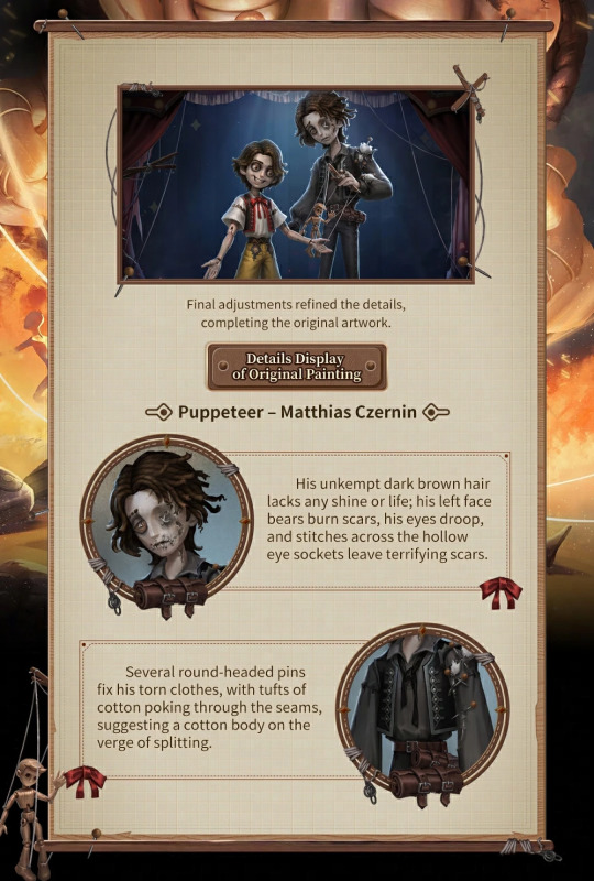
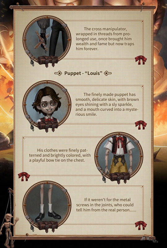
/ ANYHOW! look at p.uppeteer's character design sheet !


#;about#about#;self#self#/i think it was a really neat concept to make the puppeteer look like a puppet and the puppet to look more alive than the puppeteer himself#/its that contrast; when i first saw him i was like; i have to know what is going on in here#also i just really like the theme of puppets in media in general#the line 'what once brought him wealth and fame now traps him forever' is a banger#another thing that was so spot on is how when he came out; the attention was immediately set on louis (the puppet)#and its like;;; that's exactly the point of his design; i just think that even without having to write these notes#one can perceive this constrast between the two immediately#and of course louiss catches ur attention more in comparison bc of the brighter colors and such#(putting to the side the fact he looks funny and scary of course)#but its that instant storytelling through design that i really like about i.dv characters#its the lil details that make u want to knowmore about each of them and reveal clues about them#like how m.atthias looks like he's decaying; the burnt parts; the stuffinf coming out of his arms; the pins trying to hold one side in piec#i wish they kept the stuffing on the head part; but perhaps it would be too obvious#from the detail of matthias' hair looking messy and torn and louis' hair looking tidy and combed#and u can tell the puppet has a resemblance to him; their hairstyles are essentially the same#its about the decaying man- like a flower no longer receiving the sun; shrinking and loosing its color
5 notes
·
View notes