#ok you see. the difference is. tlou is basically already a long movie
Explore tagged Tumblr posts
Visit Tumblr Blog
Explore Tumblr blogs with no restrictions, modern design and the best experience.
Last Seen Tumblr Blogs


Fun Fact
Tumblr was the first site to host the blog for President Barack Obama in 2011.
Text
i understand that not everything needs a film adaptation least of all a game where the whole point is that every action you make actually has consequences HOWEVER COMMA the way i see this is that there are people who don't play video games who would otherwise really like the story. the movie is for them. i know being protective of a thing you like is common but when i'm a fan of something then i do want more people to see it, and if it's through a movie adaptation, then like. as long as the movie is good. then why not.
#uhhhh me#i say as if i wasn't underwhelmed by the tlou show#ok you see. the difference is. tlou is basically already a long movie#as i was watching the show i was just thinking ok. i'm not getting anything new.#and i don't think ppl who saw the show and decide to play the game would get anything new from the game either#HOWEVER. until dawn is a completely different kind of game#i for one am super interested to see which plotlines and choices they decide to keep#plus. ppl who watch the movie and then want to try playing the game WILL get tons of new material#also i think this will be good for the director bc he gets to go back to doing horror#i just think THEY SHOULD HIRE A NATIVE CONSULTANT or change the monster name
14 notes
·
View notes
Note
Hi!!!! No worries if you don’t want to tell me or respond lol. But I really like the colour grading you did on that most recent Joel Miller gif set. I do photography and I’ve been struggling for ages to find a way to bring out the warm sort of brown tones without making things feel too muddy or red. Just curious about what HSL adjustments you made / what colour grading helped you get that look?
ohhhh my god thank you so much??? this might be a convoluted answer/unnecessary rant so i apologize in advance lol but i tend to keep the colorings/psds i use for gifs saved in a folder so every gif i make in a set is consistent with color/lighting/shading/whatever. i get anxious if there's even a little bit of difference per gif lol
a lot of what turned out in those gifs has to do with the lighting/coloring that's already in the show/that specific episode/scene. i've got the rest of the episodes' gifsets made and finished but i can try and kind of show what i'm talking about. they all look different color-wise, at least in my opinion, because of the differences in each episode's lighting. if that makes sense.
the goal with any gif i make, regardless of show/movie, is to make them either
1) better than what was there before (for example, if the movie is INCREDIBLY blue/yellow then i try and color correct that blue or yellow to be more neutral)(i'm looking at you triple frontier and your dark, blue ass scenes dfjkdflh)
and
2) not whitewash pedro. this is incredibly important (at least in my opinion) because i've noticed a lot of gifmakers (or least they used to) went for a really pastel/pale look and it whitewashed poc so dramatically and it was ~problematic~ to say the least. (i used to make gifs for a band that consisted of all mexican band members and i got hate a few times/people policing how i should color my gifs so the band wouldn't get whitewashed, so it's something i've been hyper aware of ever since)
so, even if i'm going for a more moody/darker aesthetic like i am with these gifsets of tlou, i never try and diminish the color pedro has in his skin tone. he's got a lot of color in his skin and i want to be able to see it, y'know what i mean?
basically, that boils down to keeping a lot of the warmer tones while also going for an ~aesthetic~ and it can be really hard sometimes. sometimes a show or movie, in this case the last of us, every episode is lit a little differently since it takes place over the course of a year.
i'll put some examples under the cut:
ok so i'll use episodes 2 and 8 as my examples.
to begin with, the last of us has, what i call, a "post-apocalyptic filter" over the top of it so i kinda have to work with that from the start. lots of greens/earthy brown tones and stuff.
this is with only sharpening applied and no color or anything:
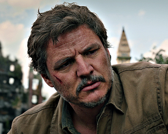
and this is with my previously mentioned ~dark and moody~ psd applied on top of that sharpening:
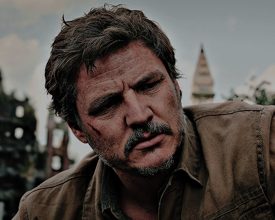
now, this is the same color grading i used on that gifset you were mentioning.
this is also the same color grading i used on episode 8, which takes place in the winter/snowy areas so the coloring to begin with is going to reflect that:
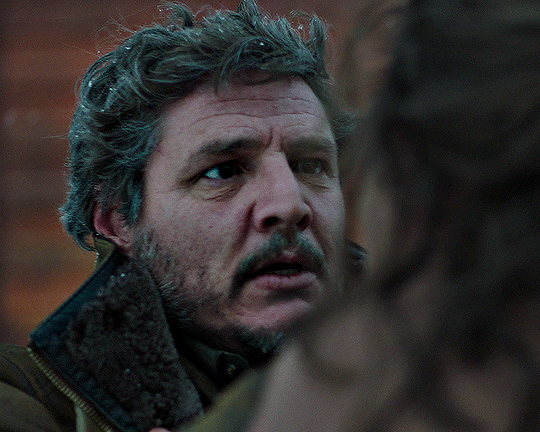
and now with the coloring:
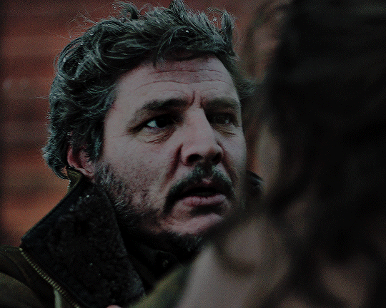
the big thing between these two scenes is that in the winter one, he's also recovering from actively dying and being deathly pale so any color he had in his face is really minimal lmao
so this is already way too fucking long and i don't think i even actually answered your question i am so sorry lol
to start, i ALWAYS start with an automatic curves layer and then adjust accordingly.
the actual color grading part mostly consists of vibrance, hue/saturation, selective color, channel mixer, gradient map, and level layers. i'm willing to give you the psd privately if you'd like to have a closer look at them!
thank you so much for asking and for putting up with my ranting lmao
#toointojoelmiller#asks#i really hope i answered this jfc#if i didn't i'm really sorry#it felt like i was trying to explain like 7 things at once lmao
3 notes
·
View notes