#oh my god adn then the cut went crazy okay now ive fixed that
Explore tagged Tumblr posts
Note
HELLOOOO I hope you've had a good day :D I was just wondering how you end up with the colours for ur compositions :O? Are you the type to use a lot of colour adjustment layers (multiply, overlay, etc) to get at a satisfying hue, or do you just eyeball directly from the colour wheel? I remember you saying for one of ur pieces that u eyedropped directly from like,,, a dead corpse of some animal XD but i assume that isnt ur process for everything hahaha. Do you use a lot of references for the specific vibe you wanna convey?
ANYWAYS keep up the amazing work!!!
YOOO!!! I didn't recognize u at first omg (p.s. ty!)
The way I made the zolu playlist drawings isn't my Usual drawing / coloring process but I formed some sort of Strategy for it
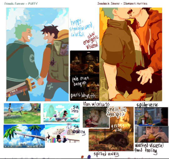
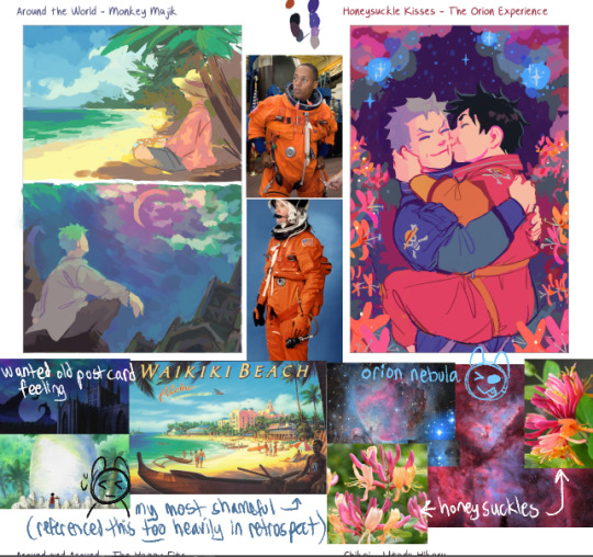
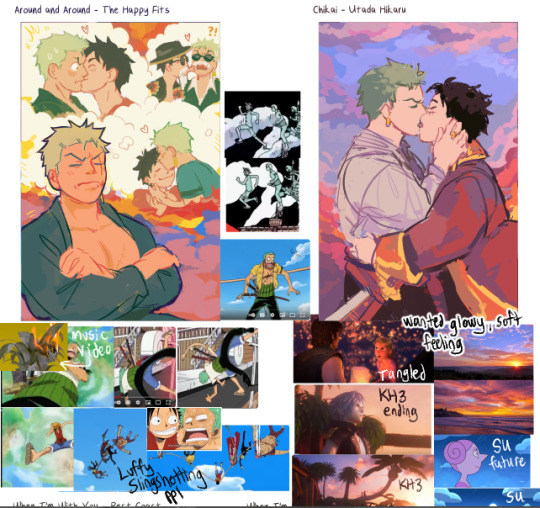
Actually I think sharing the literal refs I used for each image would be fun and maybe demystify the art process
Pics below cut! 😊


I mostly eyeballed from the colorwheel. I think I only used color adjustment layers on Chikai and Around the World to get a soft glowy effect in the clouds. BUT!! I'll frequently play around with adjusting the colors through the hue/saturation/luminosity sliders, or I'll go in to Tone Curve and play around with the levels until things are looking how I want. Especially for backgrounds
I also colorpicked from ref photos (like you mentioned w the lion eating a carcass). I GENERALLY tried to avoid overly referencing any one pic, but Simple song and Around the World were the two worst offenders 😓
---Color Choice---
I went by pure gut feeling at first while listening to the song, how the instruments sounded and what color they were
And then after that, I'd try and refine it a little more by Overall Vibes (making it feel more Glowy) (adjusting how colors interact w eachother like toning down a too-saturated color or making skin tones warmer or cooler to contrast w the background)
And then i gathered references n either colorpicked from them or I used them as vibe inspiration as i was painting
---More General Color Stuff...?--- This section is riddled with over-explanation.
-> To make a color stand out as Really Saturated, I surround it w neutral colors, esp contrasting ones (e.g. if I want a red to pop, I put it next to a cool gray)
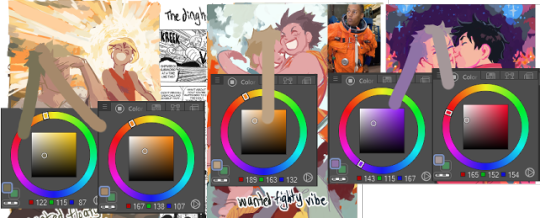
-> if the overall painting is really warm (like, everything seems cast in a warm light) and i need to have a specific cool-tone color (like green), I take one of the warm colors and drag it a ways Towards the cool color I need (so , colorpick a red, and drag the slider until it's on yellow) and then desaturate it a lot. I then test that color on the piece and see if it Looks green. Same goes in reverse (cool-tone paintings that need a warm color) So, Like...for example: Zoro's hair is some really weird colors.

-> I try to limit eyebuzz (places where two colors meet, where the hue [tone] is different, but the brightness [value] of the color is almost exactly the same. Basically, if you made everything grayscale, you dont want two grays of the same color right next to eachother [or, you want to do it intentionally?]) (called eyebuzz bc at really high saturation, two colors of the same value almost vibrate next to eachother)
(Sidenote: I think "eyebuzz" mustve just been a term my high school art teacher used bc i don't see any relevant results for it on google... there's probably a more professional term for this lol)
Examples:


I esp try to limit eyebuzz between foreground and background objects
I know some artists are intense enough about contrast that they toggle grayscale on n off as they're painting. I just kinda eyeball it.
-------
This ended up really long again oh my goddd I think those are the main things on my mind when choosing colors...?
Hope this is helpful 😅
#not art#kinda#animal death#as one of the reference photos#the animal is not recognizable#just looks like meat#also the image is very small and low quality#eyestrain#when im talking about hue and value#long post#i cannot stop myself from overexplaining#my apologies#oh my god tumblr did something really strange w the tag order again#tried to fix it#oh my god adn then the cut went crazy okay now ive fixed that
16 notes
·
View notes