#of making them fit into the space and layer and make sense together and redraw every single one based on the tracings
Explore tagged Tumblr posts
Text

This is so tedious ahhh
#okay yes i cheated by tracing from photos of various toys and then putting those tracings together but i still have to do the work#of making them fit into the space and layer and make sense together and redraw every single one based on the tracings#and changing lots of parts just to have it not be the same as the tracing#anyway its still fucking tedious lol
3 notes
·
View notes
Text
Manga Colouring Tutorial
I was asked by @niiveusx to make a manga colouring tutorial, so I’m going to try and cover everything I do!
Note: I’m a complete amateur and I probably do things in a weird, over-complicated way which is totally inefficient. Sorry if I go over things too slowly as well, I don’t mean to appear condescending. :O
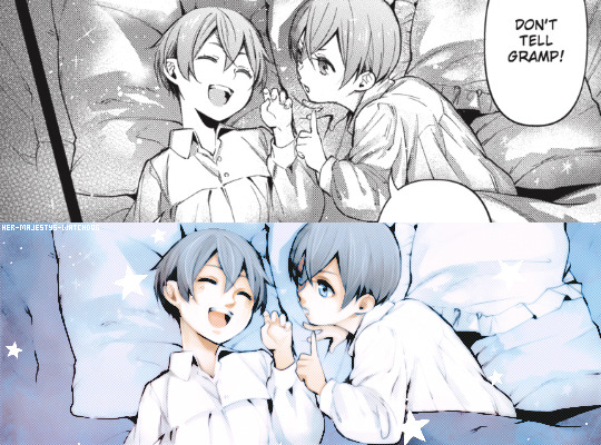
By the way, I'm not actually re-doing this colouring in full, so if you think some of my lineart looks different to the original edit that’s because it is!
Part one: cleaning
After resizing the image to fit Tumblr's image sizing, I cut out the parts that I want to redraw. I'd suggest you avoid enlarging a panel (it's okay to make it smaller) because it'll lower the quality of the edit.
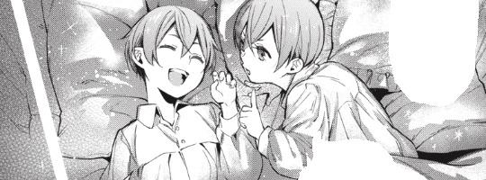
On a layer above draw in the spaces which need lineart, just do it as you think looks best! I'm using Sai to finish this part.
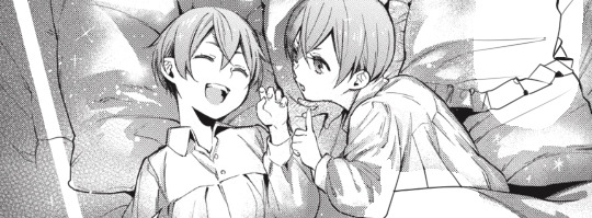
That’ll do. The screen tone is the next thing which needs to be fixed, but it's a little hard to explain so I'll link to a video tutorial below. The more panels you clean, the easier this part gets!

youtube
You can also simply clean a panel by copy and pasting the textures across the image until it looks right, that's actually how I did the above because I was feeling too lazy to open Photoshop. However, it's usually a little worse looking when you do this!
Part two: Topaz Clean
Now I’ll open my image in Topaz Clean, apply the settings I want and click OK. I gave my image a white border here (temporarily) because sometimes you get weird edges.
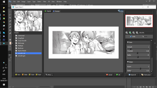
Here’s what it looked like when I used the filter without a border, as you can see it doesn’t look great at the edges.
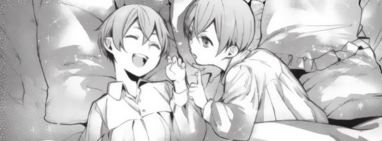
For the most part, my settings stay the same and these are them:

Now put a layer underneath your lineart and fill it in white with the paint bucket tool.
Then, go to ‘window’ and open up ‘channels’ before clicking the little circle highlighted below. Make sure you’re on your lineart layer!
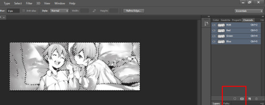
Press delete and you end up with a weird pale looking image.
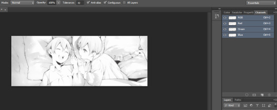
On your lineart layer, change the layer settings from ‘normal’ to 'multiply'.
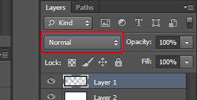
Then duplicate the layer, right click and ‘merge’ them together.
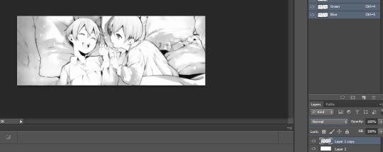
Now you have your lineart which you can colour! Make sure the layer stays on ‘multiply’ otherwise you’ll get fuzziness when colouring.

You might want to mess around with it a bit more though, personally I like it to be a little sharper so I'll edit it. Go to ‘image’ > ‘adjustments’ and then either ‘levels’ or ‘curves’ for example.
There's not much I can instruct about that part, just mess around with the settings until it looks how you want it! The best way to learn this is by doing it and everyone has their preferences.

Part three: Colouring
The lineart is finished so it's time to colour. I don't have a tutorial for this part though! It's really just going onto your preferred art program (I use Sai) and colouring below the lineart like any other image.
But this video seems helpful if you're completely lost:
youtube
After colouring my image on Sai, I ended up with this... clearly the colours are completely different to the finished product.

Part four: editing the image
This is probably the part that takes me the most time, but all I'm doing here is messing around with the filters until it looks how I want it. It’s super simple!

Again this is really subjective, but the main filters I use are ‘selective colour’, ‘curves’, ‘levels’ and ‘colour balance’.
There's no magic trick here because that's honestly all I do ahaha :D
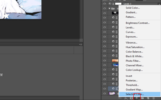
Oh! I also have a couple images I use frequently as screen-tones and overlays, the edit above has this one set on 'linear dodge' for example. The stars are just a layer which has been set on 'lighter colour' and placed above the edit too. You tend to use different textures for every edit you make so I'd recommend searching for some ones you like on Tumblr. :D
It can be frustrating at times but if you keep working at it you’ll probably end up with something you like! Hopefully this made some sense o:
165 notes
·
View notes
Text
Evaluation
This was a really interesting project to work on, as it was a task to make a games concept but with a literature based starting point. I came up with the base concept for the game (Halloween Dating Sim) before we even started this project as it’s something I hadn’t really done before yet, and would give me a chance to explore a new aesthetic. I also really wanted to do a game like this as it would allow me to work on my background drawing skills - since they are a huge part of these types of game.
Since I already had a brief idea of what I wanted to do before I started, I chose to research all the books that had supernatural themes or creatures that weren’t regular humans - so that I could relate it to the monster idea I had. I chose these books to research: Woman in Black, Jekyll & Hyde, Frankenstein, Let The Right One In, and Do Androids Dream of Electric Sheep?
The main book that I chose to influence this project was Jekyll and Hyde, since I loved the mystery and secrecy aspect of the novel, as well as the main character - Jekyll - and his issues with split personality and the supernatural. This Victorian Gothic novel combined with my original idea to make the dating simulator meant that I now had a dual genre game. While the initial game appears to be a modern dating simulator set in a cursed town, it is actually a detective game which allows you to expose the darker side of the town’s residents. In that sense, the novel starting point has actually stayed very prominent in my project - there is a character who is based on Jekyll & Hyde who is the main villain, and the main character you play as (Bailey) almost takes on a similar role to Utterson, trying to solve the mystery.
For this project - Cauldron Hollow - I have created many different characters, some background artwork and a book cover, as well as some fake screenshots of how the game-play could look. When I went into the project I had planned to create more expressions and poses for each character and draw more backgrounds, but due to my limited time frame I am happy with the amount of work i’ve been able to produce.
The Characters
I wanted to design a range of date-able characters for this game so that I would have more examples of character design for my portfolio. My poor time management definitely affected the outcome of this work quite significantly - as it was at least a week into the project when I started making the characters. I gave myself some time to think about the designs but did very few concept sketches before jumping into the final artwork, as I was worried that I wouldn’t have any actual finished work to show if I didn’t do it quickly. I wanted to have a decent amount of characters to show a lot of variety in the designs, which led to me having hardly any time to focus on each one.
I did all the artwork over one weekend, which was a very poor idea - as I had no time to come up with several iterations for each. On top of this, drawing 9 characters in such a short amount of time left me severely burnt out by the end, and as a result some character artwork clearly has significantly less effort put into it. The character I made last, Robin, as a result was the one I liked the least - the colours didn’t really fit properly, the pose was a little rigid and the linework was messy. I think that this was partially due to the type of brush I was using, which I don’t think is suitable for the kind of clean line-work I was after - as a result I will change my brush for the next project to try and get a more appealing finish.
If I could redraw these characters, I would do a lot of things differently. I would dedicate more time to each one and really focus on the ‘quality vs quantity’ as my mindset for this project was ‘more work means better’. I would also spend more time creating multiple different looks for each character so I could then pick the best concept and refine it, rather than finalising the first result in my head. On top of this, I would like to spread out the character design across a wider period of time, so that I don’t overwork myself on one - or even just do less characters.
There are some things I did like about the character design - I did try and vary my poses more; each character does have a fairly unique pose (even if the anatomy isn’t great, which I’d like to focus more heavily on in the next project) which I haven’t really tried before, and I think that they definitely look better because of it even if it isn’t a massive change. I also really like the colour schemes of some of the designs, and the outfit design I did, as I think it matches the kind of aesthetic I was going for. One final thing i’m glad I did was to keep the characters consistent in terms of shading, highlights, art style and brush texture - they do all look like they’re part of a set rather than all being drawn in completely different ways. I think the fact that I used a consistent colour palette throughout the project definitely influenced this, as I found that most characters fit pretty nicely together.
The Backgrounds
I came into this project wanting to improve my backgrounds, since they’re a big part of dating sim games and aesthetics. I am actually really happy how they turned out since I’m not normally very confident with them. The first background I made was of a bedroom and window, which I coloured in the same way that I had done the characters. Thanks to the perspective drawing feature, all the features of the room look relatively accurate, which I’m really happy about. It was only the hand drawn features (such as the pumpkin clock) which look a little out of place- but to remedy this I think I just need more practice with perspective.
For the window background, if I could improve it I think I would have added more detail to the walls - as the painting and picture frames are empty. I would have also liked to make the space outside of the window a lot more detailed - but I was too tired after drawing the initial room to bother spending more time on it. To fix this, I could have left it and came back later to finish it off when I was inspired to do it.
I coloured the room with the same colour palette I had used for all the other work, which complimented the character well but also left me with a very limited range of tones that I could use. Overall, I think that trying to work entirely in a certain set of colours was a nice experience, but I don’t think it was really noticeable at all for the most part - I think I should either use 4-5 colours in a palette next time or non at all, but it was still an interesting experience.
I was planning on creating a range of backgrounds but I had not anticipated how much time I would spend on the next one. It took me over 7 hours to draw from start to finish, and while it was absolutely worth it, it didn’t really give me a lot of time to do anything else. This is also an issue which I think can be fixed with practice - as I was still pretty new to the idea. I do really love the Garden background and how it turned out, especially thanks to all the soft lighting and level of detail which I included. For these backgrounds, I actually looked at a variety of reference images while creating it, and it really paid off I think - so hopefully I will continue to do so in the future. While I’m really happy with the few backgrounds I did produce, it would have been nice to have the chance to do more.
The Book Cover & Designs
Having to design a book cover was a pretty challenging part of this project as it’s new to me, so I wasn’t really sure what to put on the front. I did a few different ideas and eventually settled on the one that would allow me to both draw a background and a detailed character. This particular scene involved me having to draw a foreshortened character, which I struggled with. I kept at it until it looked right to me, but in hindsight I could have just looked up a reference to help me. Like the other backgrounds, I looked up reference images for the building rooftops, and as a result I think they turned out really well.
The actual character artwork had some issues initially - her face was too wide, the eyes were slightly wrong for a reason I couldn’t pinpoint, and the whole thing looked a bit flat. I ended up having to change the colour palette at this point just to help the character stand out from the background. I’m glad that I went back and fixed all the issues before finishing the work, as i’m a lot happier now with how it’s turned out, although the face still bothers me a bit. I think if I could do this again i’d love to attempt an actual painting, rather than just soft shading and adding overlay layers, as it’s something I haven’t done in a while. I’m happy with how the character is posed as well as I think it actually looks different from my usual static poses. On top of this, I’m really glad that I went for a handwritten title as it gives it more of a fun feel. I do however think that it doesn’t really show the dating simulator aspect of the game- but I would have liked to create an alternate cover that is a lot happier and more pastel if I had more time, to show the dual genres present in the game.
0 notes
Text
Star Wars Custom Playmat 100+ Characters
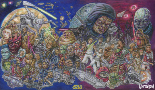
Just make it look cool.
Right. Anything specific you wanted?
Not really...Just get as many characters on thee as you can.
Challenge Accepted.
Yes today on the blog, one slightly vague choice of words leads to the most characters ever on one of my mats. Not by a small margin either, especially if you include vehicles (Which I do, objects are objects in programming) I'll be going over the phases of the mats design from concept to colouring telling stories as I go. We've got a lot to get through, so lets jump right in to my latest Star Wars mat.
0 To 30
Thirty is a nice number, I've done mats with around that before, there should be enough space for everyone and more importantly it should be enough slots to cover all the main hero's and villains.
Step 1: Lets make a list.
If your playing along at home it's at this point you realise there might be a few more than thirty people in the Star Wars universe. It's Ok we can deal with this, we just have to organise everyone into some sort of hierarchy, most popular to least well known. OK, wow, yeah still quite a few people in category one.
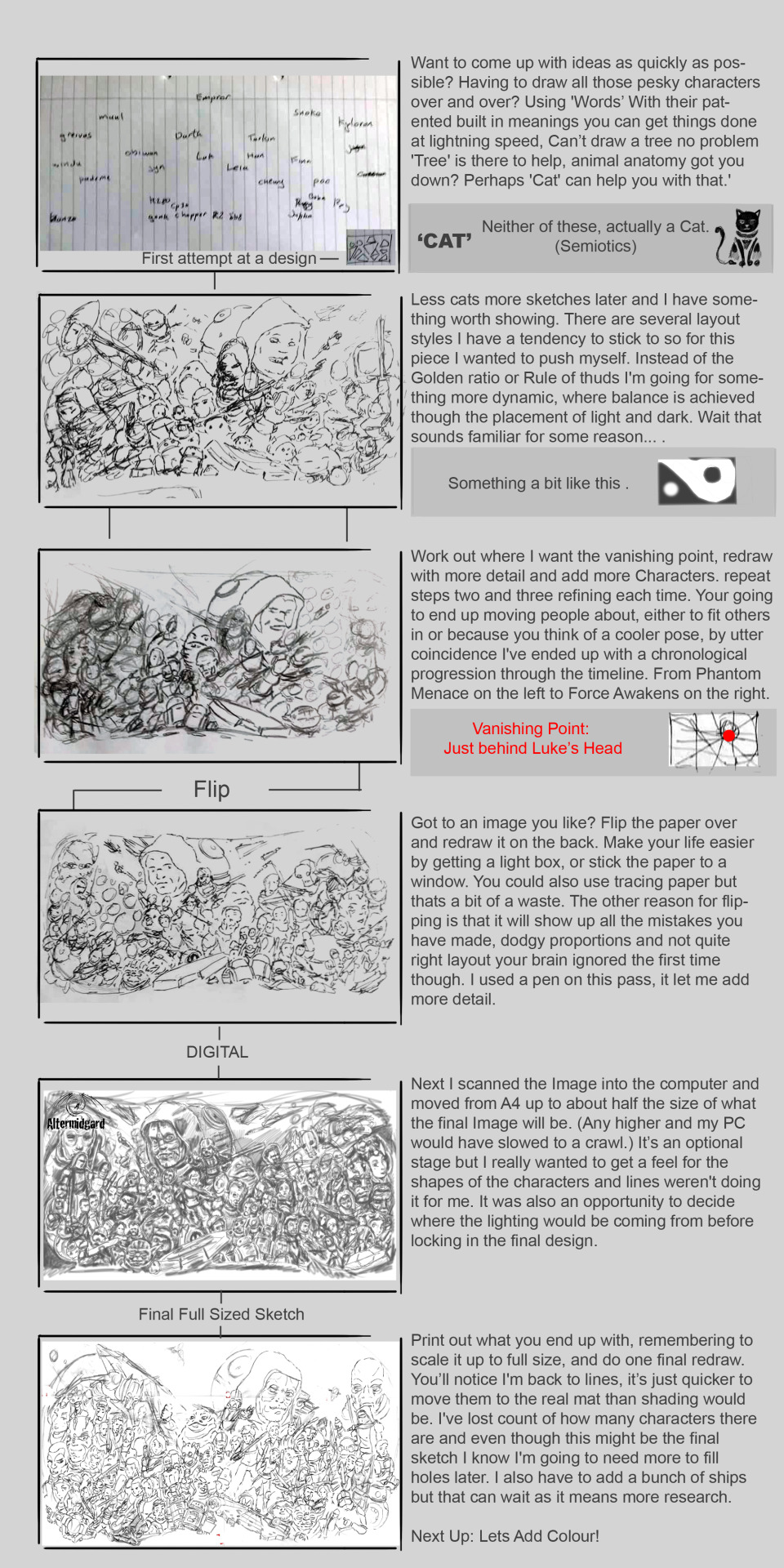
This is where I was at. Making lists. I've been making mats a while now, you get an instinct for how many and how large the components of the design need to be. Thirty wasn’t an arbitrary number, it's what I considered the upper limit for readable characters to be. In first panel bellow that's how many names I finally settled on. There were many brave souls that fell by the wayside though and to be honest I wasn’t happy about it.
31 To 60
Writing the names on a scrap piece of A4 set the trend for the majority of the sketching phase. Usually I would draw thumbnails, four to eight images on one piece of paper but in this instance I needed to go bigger sooner. The second panel shows the most readable of my early sketches. All the previously names characters are there plus I'm starting to think that if I can get them all in at this size with extra space to spare there might be room to add a few more. Circles for heads is all they get right now but it might work. It just goes to show though. Until you actually start on something properly you cant know how its going to turn out.
The next panel is a more comprehensive redraw, more thought gets given to the layout and how the eye will flow around the image. While the rest of the design process is one of refinement and addition it.s here where the design mostly comes together. That's actuality one of the nice things about doing these blog posts. Looking back and trying to explain your thoughts and processed to others gives you insights on your own work you might never have noticed, I recommend people try it
Next up. Working on a light-box in pen gives me the opportunity to add even more detail. For some people this might not be the case but having that extra contrast and a finer point than most pencils really helps me out. The other nice thing about changing medium is that it alters the art style slightly. I'm making quicker more precise marks and it leads to a more dynamic atmosphere. The real trick will be trying to preserve that feel though the rest of the production
60 To 80
A different style again as I go digital. I'm using the airbrush tool and am less interested in line than I am the shape and weight of each object. It's also an early chance to test where the light should be coming fom. Where I've placed the vanishing point is causing a few hiccups. Triangular spaceships are especially hard to get right and a lot of their final placement has to do with that.
The silly thing is I could add more elements to the design. There's still plenty of room, think of the final total!. But no, at some point you have to take a step back and say 'this is a silly amount of work already and adding to it is going to do more harm to the design than good.
80 To,.. Who the heck knows.
I stopped counting at this point, didn't really want to know. We are almost there though. Most lines are either vertical, horizontal, or pointing at the vanishing point, I've got piles of spirals, and grievous's arms finally look right. Although Obi-Wan needs some work if they are going to duel. There are still questions to answer though. Things like what colour Lightsaber should Starkiller have and why is Luke's head not attached to his body. Enough sketching though, lets get started on the colouring,
Balancing the Force
I say colouring. What I mean is 'lets use a light grey to work out the lighting'. The grey will be easily overwritten so we have a bit of room to experiment and it keep me from doing the outlines first. Another option would be to use yellow, it just comes down to what tone you want your image to take on. There's a lot of ships and metallic in this piece so I went with the grey.
Notice how the left half of the image is always darker? Tha'ts intentional. By loading up on characters there's just going to be more dark there. Why have I done this? Because it offsets the big blob of dark on the right that is the Emperor and Darth. Basically I'm looking to balance the force. Its also why Luke and Leia are in white. That and so they are the main focus of the image I want the ye to start or end thee.
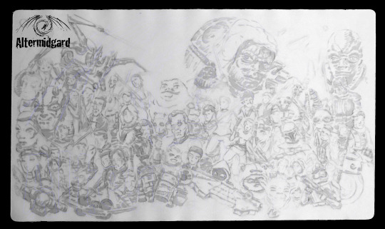
It's a Trap
I don’t want to be using that many colours on this piece. With all the different people and objects here the composition could easily start to break up if everything got its own pallet. This stage then is about making sure that doesn’t happen, all the blues are the same blue, all the browns likewise. I think I even managed to stick with this rule all the way though which is good because it can be so tempting to just think, hmm what if I just add a smidge of this colour here?
I should really have added the ships at this stage though. You can already see how areas of the image I'm less sure about are falling behind the others in terms of how far along they are. (keep an eye on Darth for example)
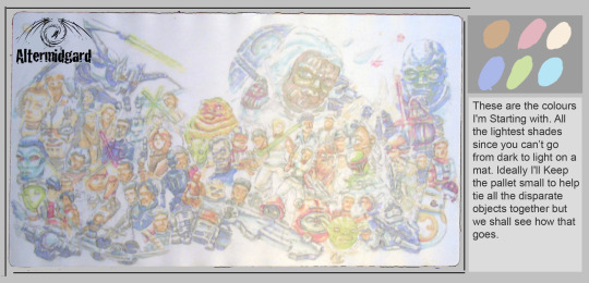
This is the Droid I was Looking for
I was tempted to stop here.
.
.
.
I don’t normally do pastel shades but this was working, all I had to do was come up with a background and...
… Yeah, no, space is dark, I've designed myself into a comer so we will have to keep going.
If you have been wondering about why characters are where they are, beyond the timeline aspect, there were three other considerations.
1. Are you a bad-guy? If yes your probably a big floaty head the rest of the cast can anchor around.
2. Are you a hero? If yes, you probably have most or all of a body, good job you.
3. Are you someone I like? I'm colouring I don’t know how many people and have free reign, naturally your going to find that my preferences bleed into the design.
Yes that is why chopper is font and center.

Space is Big, Like Really Big.
I found these glitter gel pens. No idea if they would wok on this material but if they did it would make colouring stars way easier. Not particularly economical, I used them up just on the background but the nice thing about them is that the glitter breaks up the colours and gives a sense of depth to areas that would otherwise be large and flat. Time will tell if the stars stay on the mat, But you have to experiment right, how else do you learn new things?
I gave it an extra few layers of sealant just for go measure.
Back on topic. I might have gone a little hard on the quantity of red in Maul's face, it's started to spread. Luckily Thawn has darker hair so it's an easy fix but it's still a reminder not to get carried away.
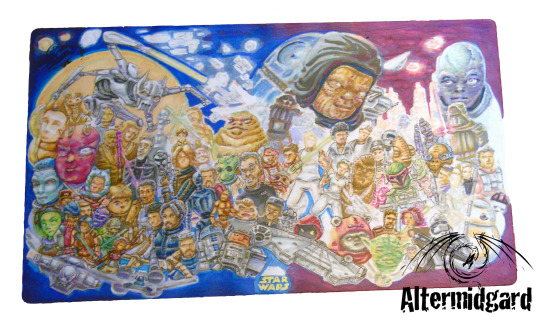
Mostly Harmless
Hey Darth finally has arms, The pose took some time to get right to be honest. It had to fit the existing upper chest and head and align with the vanishing point since its so close. In the end I fond a one that had the Lightsaber out horizontal and after that it was just a case of getting the other arm right. I went back and forth on the city scene, easing the buildings then adding them back in. something needed to be there to contrast with the stuff in front but I just wasn’t feeling it. turns out they just hadn’t been dark enough and making them practically black with little window lights was the way forward.
Almost everything is in now, but as usual I still have the eyes on most of these people to add. I also need to do something with the Emperor. He's the biggest thing on the mat, he needs a little more respect/detail than I have given him so far.
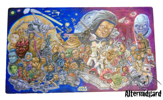
The Final Frontier.
Add clouds to the planets atmosphere, make the stars and Lightsabers glow in the dark (glow under UV light actually) and just generally go around tiding up. I'm just about done here. OK applying the sealant and taking pictures comes last but close enough.
I guess I should actually count the number of things on the mat then. Just a sec...
110ish! Give or take. That's quite a big number, and not something I think I'm going to be beating anytime soon. Probably...
Next time, lets simplify things a bit huh.
0 notes
Text
Artist Interview: Laura Bejarano, Zoe Schlacter
Odette Blaisdell: So how did you come to work together?
Laura Bejarano: Vanessa put us together
Zoe Schlacter: They said they wanted us to work together because we’re really different or something. We are really different in aesthetic.
LB: But also we were having the conversation about gender. We both identify as non-binary, so I think bringing having that kind of unity within the group while making this project.
ZS: And we both are interested in queer issues, and once we started talking about, aside from aesthetics, what drives us to make work and what we care about, we found it was a lot to work from.
OB: So is that common ground something that comes up a lot in this work? Would you say the work is centered around issues of queerness?
LB: I think the theory of queer history is a driving force for sure. Just like representing ourselves in history by making work.
OB: Repetition with difference, I know it doesn’t begin in queer studies, but that kind of makes sense here.
ZS: That is something that’s talked a lot about in queer studies, actually. We like that kind of repetition with difference and having this repeating tile that just repeats infinitely. The power of the infinite. And having our hands actively involved in adding things topically and collaging and having it be this thing that has the potential to be added onto and evolving forever kind of.
LB: It’s pretty empowering to have that control in creation.
ZS: Yeah and Laura’s talking to me a lot about her work of world building and having complete control over this little universe that’s encompassed within the frame and I feel like I do that same thing in different ways. I like having that control over what I’m making and being able to communicate the world that I want. And I like using Laura’s line work with my way of creating worlds. We like thinking about our finished object as like a world.
OB: It’s even a world within a world. Your world in their world. And so here’s a not quite a technical question, but how does your collaboration function? Are you compromising a lot, or sharing, or editing, or is there some other word you want to use?
LB: I feel like it’s been pretty mutually collaborative. We’ve been communicating a lot. And I think this is really interesting and it’s a direct representation of how we’re working: I did smaller drawings in graphite, gave them to Zoe to repeat, Zoe went over the lines on the computer, changed the image so it could repeat in four ways, and now I’m going to go back by hand a redraw them. So it’s like a constant back and forth.
ZS: And I think we were both down to do something out of our comfort zones and different, I think we both went into this with a pretty open mind, which has allowed us to feel like we’re not making compromises.
LB: Plus even though we are people that make really different work, there is a lot of potential in the way our work can come together so I was super excited to just make something together, like a baby.
Laughs from all
ZS: We’re making a baby! This is our child! Instead of world making, it’s baby making.
LB: I think with queerness that’s like a very expanding world view—it builds as you create more community around people experiencing the same things.
OB: So then do you feel like the work you’re producing is yours. Even though it’s collaborative, do you identify with it, like in a baby-parent relationship? Is there a level of connection with it, like in your own work?
ZS: I think for me it’s a little bit different, but it’s a little different from my own work. But I’m really excited about the aesthetics of it and what it’s going to be like when it’s done.
LB: Yeah, it’s different for sure. Like I don’t recognize myself in each step of it, but I know I’m going to have a voice in it. The completed product is something that I really look forward to seeing.
OB: Back to the woman thing, how are your experiences of womanhood different or the same, you guys have kind of already touched on this, but more thoughts?
ZS: That was one of the initial conversations we had, about gender. And we both kind of expressed a little bit of discomfort about being in a show about women’s issues as people who aren’t necessarily identifying as women. But we felt like it was important to talk about queer issues.
LB: Yeah I identify as femme like within my gendered space, I’m a non-binary person. So definitely, I mean our bodies, the biology of our bodies still defines how society perceives us and definitely like adds another layer of the intricacy of these issues. Because we’re non-binary but we have vaginas. It’s a question of what spaces we can fit in, and should we exist in. I think in the society that we live in, it is a conversation that we can have and should be talking about.
OB: Do you feel like the show is still a good place for you guys to exist in? You said it was uncomfortable to be asked to be included, but how does it feel to actually be in it, while not identifying?
LB: I think because I’m working with Zoe I feel good about being in it. I feel like we’re having a very specific voice within the show, we’re saying something about our selves, and in that way, I feel comfortable.
ZS: I would say the same too. I think if I was matched with a partner that didn’t share the same gender feelings as me, I’d feel uncomfortable. Like if I was with a partner that just wanted to focus on like feminist issues or something I don’t think I’d really feel like I was in the same place.
O: But do you feel like feminist and queer issues have common ground that you’re touching upon?
LB: I think queer issues are feminist issues, so at least in my definition of feminism.
ZS: Yeah, and thinking about having an intersectional approach to feminism, I think it’s really important for queer identities to be included.
OB: How do you think audience affects work, though? Like when you come to a piece of art, how does your personal body and self change what it means?
LB: I mean I think there’s pieces that have a very particular male gaze or female gaze, but I don’t interact with a whole lot of queer non-binary people, and haven’t had a lot of people in general interact with my work, so I’m not sure if my own identity is something that really comes through the work. I haven’t spent a whole lot of time thinking about that.
ZS: I also think that because we’re like kind of translating these ideas very abstractly into the work, nothing is explicitly stating, it doesn’t scream like ‘queer’, it’s a more abstract. I think I would hope that people can interact with it and engage with it, and it’s not like something that’s targeted at a specific person.
LB: Which I think is like the beauty of abstraction, you’re not necessarily referencing specifics. And I’m sure certain people with certain identities will be able to relate to the piece more than others, but you know you can’t really control your viewer.
OB: And my last question is, do you have any questions for each other that you want to ask now?
Laughs
LB: I don’t think I hate anything about Zoe
ZS: I don’t hate anything about you.
LB: It’s been a really nice experience. I can like say to you it’s been a nice experience. I don’t know if I have a question to ask but it’s been like nice how accommodating, slash we spent a lot of time becoming friends, or just like talking, sharing space together, that I think has allowed for the making to go a lot smoother.
ZS: Yeah I think the first few meetings we just talked about ourselves our lives and our feelings. And I think that was really good. I’m really glad I got to know you through this, it’s been a really good experience. Even if our piece is ugly, I’m still thankful for the experience. Our piece isn’t going to be ugly.
OB: Don’t say that about your baby! But baby’s can be ugly, it’s true.
LB: And people still say it’s beautiful.
OB: Yeah you just have to lie about your baby all the time.
LB: We’ll call our baby beautiful even if it’s ugly.
ZS: Oh another thing is when we found this fabric we could find both our skin tones in it, our baby’s skin.
LB: It’s also in a lot of other places.
ZS: Everything’s coordinated.
LB: yeah it’s always nice to work intuitively like that and then find the connections in things afterwards.
OB: Yeah you think it’s not there, but of course it’s there, you made all the decisions, you’re the common factor.
LB: Exactly, which is really cool, to kind of liberate yourself. I like that about abstraction too, you can almost let the concept come last.
0 notes