#not one of the pictured artist above but I am part of the project!
Explore tagged Tumblr posts
Text
The Far Roofs
So today I want to talk a bit about what this game wants to be. In particular, I'm going to go over its key technical and artistic goals.
The Far Roofs focuses on immersive hidden world fantasy adventure. It's intended to offer the experience of a grounded, emotionally real base world attached to an idealized, fantastic "hidden world" setting.
One might say, the streets and buildings and houses of the game's world are basically our own. Above us, though, is a stranger, more idealized, and more fantastic place. It's hard to get to. It's dangerous. It's less grounded. It's full of wonder.
Those are the Far Roofs.
This divide exists to make the game feel as real as possible, if you want to go that way. That's part of what hidden world fantasy is about, after all---the idea that magic is here. That it's not in some distant alien land or mythic future or past.
It's here, if you want to reach for it.
(Now, the game is flexible enough that you can play "protagonist" types instead of realer people, and many traditional gaming groups will probably prefer that, but that'll mean getting less of that immersive effect.)
The mood the game is interested in is that feeling you get when you take a huge risk---move to a new place; try a new thing. The feeling you get in those times in your life when everything is alienated and wondrous and terrifying but there's also so much more *hope* than there was in the still times before.
It's a mood of being swept up and called forward.
This is, among other things, meant to be a game for people who've been beaten down or exhausted by the ... everything ... to feel that sensation of moving forward again.
To remember what it's like, why it's worth it, how to reach for it again.
It's meant---and I do understand that I am finite and flawed and this can only go so far---as a tonic and refreshment to the soul.
--
Rules
The Far Roofs uses a 5d6-based dice pool system for day-to-day task resolution. It's relatively traditional and optimized for fast, fun dice reading. There's a loose consensus I've seen in RPG design circles that dice are for when outcomes are uncertain and both options are interesting, and I don't disagree ... but there's also this thing where rolling dice to decide is intrinsically interesting and fun, where it's fuel for a certain part of the brain.
This game tries to get as much out of that side of dice as it can.
You'll also collect letter tiles and cards over the course of the game. This is for bigger-picture stuff:
To answer big questions and to complete big projects, you'll either assemble representative words out of those tiles, or, play a poker hand built out of those cards. Word and their nuances express ideas and shape how outcomes play out; poker hands, conversely, just give a qualitative measure of how much work you do or how well things will go.
In keeping with this, the campaign is represented principally in the form of questions or issues your words and hands can address. Player/GM-created campaigns would be the same.
--
Physical and Electronic Product
I wanted to put the print version within the range of as many people who might need that tonic as possible. That means that for this particular game, I wanted to cover the full territory that I'd normally cover in a two or three volume set (core rules, setting, and campaign) in a single 200-250-page volume.
In practice this means there's a guide and examples for constructing the setting, rather than a deep dive into a fully-detailed world; that there's a bit less in the way of whimsical digression and flourish than in the writing I'm known for; that there's minimal "flavor" text on abilities; and that the campaign presentation is pretty fast-paced.
Conversely, it means that the game should be easy to absorb and to share with other possible players, and, that the game and campaign in this one relatively small volume should provide enough content for five or six years of play.
The book will be 8.5"x11" with grayscale art, available in a limited hardcover print run and a print-on-demand softcover form.
--
On the Rats
You'll see a lot of talk from me and others about the talking rats in this game. They're one of the jewels of the experience, and I think they're probably a significant draw just for being talking rats that are core to the game.
... but I'm going to hold off for now, because, to be clear, this is not a game of playing talking rats. It's just a game where talking rats and probably one of the top three most important setting elements.
I couldn't get that feeling I wanted of ... the base world being grounded realism; of the hidden world pulling you up and out and into a world full of magic ... with your playing rats, with your playing something so distant from the typical player.
So this is not a game of playing them.
They're just ... I like rats, and so I made the rats in this game with love. They're great ... whatever the equivalent is to "psychopomps" is for a magical world instead of for death ... and a way of talking about how in the face of the world, we're all pretty small.
--
I'm really excited about this game; the playtest was lovely.
I hope you'll enjoy it as well!
198 notes
·
View notes
Text
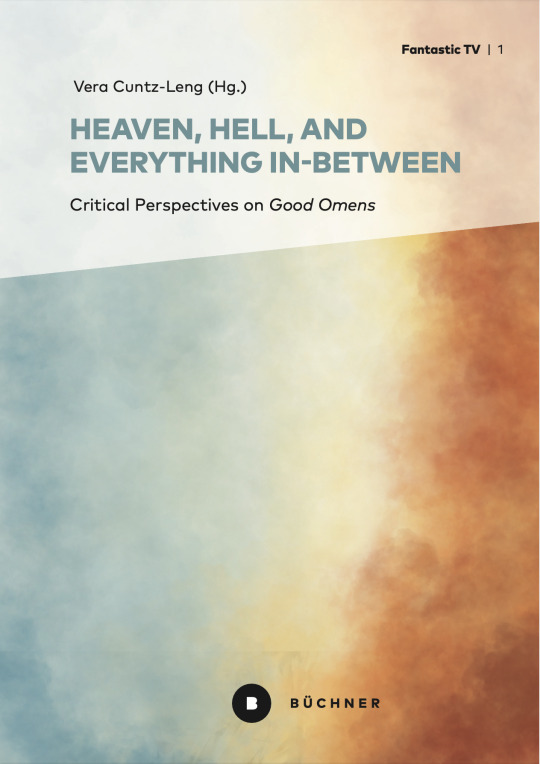
Dear creative community,
I am currently putting together an academic essay collection on GOOD OMENS, the series we all love and adore. The plan is to release the book in the first quarter of 2025 (if everything works out smoothly). I was able to gather a huge number of really intriguing paper proposals - and all the authors are now busy writing their essays. In the meantime, my publisher started working on the cover design for the book. This is the dummy you can see above.
And this is where all you creative fan artists come into play: If you are interested in contributing to the project, I would like to invite you to email a fan art proposal for the book cover to me: [email protected]
This call for cover proposals will be open until the end of June 2024. It would be key that the artwork is easily identifiable as related to GO (even inserted film stills or parts thereof in some sort of collage are possible).
Please keep in mind that this is an academic, non-profit book that will be available in Golden Open Access. It's not that easy to find funding for this "orchid" topic to cover the publisher's costs - therefore, I will not be able to remunerate your work in monetary terms. But of course, you would receive a printed book as a gift.
I will decide on one of the submissions together with the publisher. Please don't be disappointed if your artwork is not chosen eventually. In the end, there can only be one picture on the cover... However, be insured that I am absolutely thrilled and grateful for all your submissions and really looking forward to see all your beautiful proposals. Thank you for considering to contribute!
Please share this call widely with any artist who may be interested. Thank you, you are wonderful!
65 notes
·
View notes
Text

Argo Nauts 1:72 Y-Wing sofubi build update August 7th, 2024
I had posted a scan of this kit's box a few months ago. This is a sofubi (soft vinyl) kit with some brass, pewter, and resin pieces. The main body is vinyl, the disk ventrals at the tail ends of the nacelles are resin, the nacelle beams are brass, and the guns and landing gears are pewter (I think).
This picture above is a quick dry fit of what it looks like so far. I didn't tape the pieces together or anything, but just quickly assembled it for this picture. I later realized that I had hastily attached the nacelles upside-down. I just threw this quickly together to take a photo.
The kit does not come with any decals, so I gave it my own, unique paint scheme. This is a Blue Squadron Y-Wing and I am happy with the stripes I fashioned on my own with masking tape. I painted the vinyl parts with V-Color paints, which are made specifically for painting sofubi kits and toys. This paint is great because when applied properly to vinyl, you cannot scratch it off. It's extremely durable and flexible paint.
I first mixed Light Gray in with Black to make my own German Gray color which I used as an undercoat. I splotched Mr. Masking Neo in areas with a sponge for paint chipping, then went over it with Light Gray. I used Blue and Pastel Blue for the trim, and Orange Yellow to have one panel be a replacement. For the non-sofubi parts, I used Mr. Color 325 (JASDF Gray, IIRC) which is a good match for the V-Color Light Gray. The engine cans were painted a mixture of V-Color Gloss Black and Silver, resulting in a nice gunmetal color.
I later decided to not go with the pastel blue trim for the nacelle tips and re-masked and re-painted them with the matching medium blue I'd used on the cockpit fuselage, which you can see in the photo below. It was a bit tricky, but I also added a small ring of Flesh 1 color on the sensor domes. V-Color has its own clear Smoke color. I made sure to use the Smoke to stain the area around the proton torpedo launchers on the underside. After applying that and a clear gloss top coat, I applied a wash. You cannot use enamel paints on vinyl since they do not react well to each other. Instead I used some Turner Acryl Goache paints, some black with a bit of gray mixed in. Turner paints can be found at any stationery store here in Japan and elementary students use these paints for their classroom art projects. (The jibungous Tsutaya mega bookstore in Maebashi has a great hobby section that has a wide selection of these paints as well as artist oils, pastel chalks, and plenty of other hobby supplies.) I thinned it with Mr. Hobby's Weathering Paint Goache Solvent. (I don't know what "goache" means because I forget... Go look it up if you care.) This is made for making a wash out of acrylic paints. Simple water or acrylic thinner can cause the paint to dry in splotches, but this solvent is made to help the paint run into contours and stay still instead of spreading into splotches.

There is no flat clear V-Color paint, so I had to create my own with Clear and Flat Base and tested it out on some spare vinyl until it looked right. I think maybe it might be a bit too flat, but I'm alright. After this flat coat, the blue looks considerably subdued and blends in better with the light gray.
The photo above is just another sloppy dry fit. Thus, it doesn't look straight. So far I have only glued the nose cannons to the cockpit pod, the sensor array domes to the nacelle tips, the engine cans and the exhaust shrouds that cover them to the engine pods, and I have glued the disk vectrals to the support pylons at the ends of the nacelles. I have yet to secure these beams to the engine pods, which are also not glued to the engine pylons. Nor have I glued the fuselage, cockpit, canopy, and such.

To quote Han Solo, "Here's where the fun begins." While this kit provides brass rods for the support pylons, you have to provide your own wires for the piping and bend them all into shape. If I don't get this part right, the model won't look good. So, I am a bit nervous. I am using Wave's C-Line brass rods. Since I have seen some Y-Wing builds in which the pipes were painted a metallic color, I think I might just leave mine unpainted. A viewer on YouTube suggested to me to paint the wires a metallic color for scale, but I think it looks fine as it is. What do you think? They look a bit too shiny since the fluorescent light is shining directly onto them in this picture. I will apply a wash on the brass rods and I was thinking that I will hand-brush Mr. Metal Primer since it is clear and the enamel or whatever should stick to it better after that. Maybe I'll use that Games Workshop Nuln Oil as a wash over the pipes. The pipes should add the bonus value of acting like pins to keep the pieces together.

So far, my only complaint is the cockpit canopy. It was difficult to cut out the windows and I think it really should have been molded in resin. The Astromech was painted V-Color Gloss Black and masked off. I will paint its trim with Mr. Hobby Aqueous Gloss White. I also need to paint the cockpit instrumentation with various colors too.
I'm really enjoying this build and as a result I'm getting back into the three Nadia sofubi kits by Tsukuda that have been languishing for years as shelf queens. I've made good progress with those and I will post an update on those soon. I've also begun working on a Deedlit sofubi kit by Kaiyodo.
11 notes
·
View notes
Text
I AM ASSEMBLING A TEAM FOR A LOW-BUDGET ANIMATED MOVIE
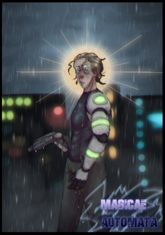
I know am asking a LOT right now, but considering this is a passion project without a deadline or budget, I guess it's why I'm asking here (and well, I'm no professional lmao).
In 2019, I wrote a short quebecois (french canadian) cyberpunk, action, sci-fi story novel. It was my most beloved project, and it still holds a big spot in my heart (even tho some newer stories of mine are higher quality). Ever since I made it, all I've done is draw scenes, characters, anything from it. I have a folder of about 200 pictures, animatics and concept art added to it over the years. One thing doesn't work for me to do the project though: I can't voice act, I can't make music, and I can't animate (well, not anything above basic storyboards, and I wanna do something in 3D lmao).
I have... well, not a lot of money (no seriously, I am VERY broke). So well while I can try my best to pay anyone who is willing to help, I can't guarantee it'll be a lot (which I know it can be frustrating, as an artist, to not be monetarily compensated for your hard work, so that's why I'm saying it now).
Due to all of this, I'm only asking for people who are GENUINELY interested. I can't provide much in terms of budget so I don't wanna give anyone false hopes. But I promise that I will work very hard to fill in any position that I can, like script writing, character and environmental concept art, direction, I can even try to voice-act if there's not enough actors! As for the work itself, I allow as many breaks as needed. You're allowed to work on any personal project if you ever feel tired or overwhelmed. I too will take many breaks. I don't mind how long it takes, months, one year, a few years even, as long as I know it'll eventually be done and that the people working are genuinely interested.
Now if you've stuck this far and are still interested, I'll share the requirements:
MOST IMPORTANT PART: I am searching for 3D modelers and animators (if you can do both that's cool but it would be nice to separate tasks so it's less tiring for each person working). My characters are very diverse-looking and expressive, so above all, I'd prefer someone who can animate faces well because that's really what I want to pop out (but if you can't, that's okay too, I'm not THAT picky) (tho despite being cartooney, I'm more in the simplistic, Clone Wars - Arcane department than I am in the realistic Disney - Pixar one)
I need voice actors who speak french. No English-only speakers, sorry. Most should be natively québécois (or french who can imitate the accent fluently) but there's a few characters who are anglophones or have a french accent, so that could help too if you're not from Québec but wanna make a voice. The story is rather dramatic and action-packed, with a lot of violence, fight scenes, screams of pain and agony, all that, so be ready for that
And of course, I'd like to have some people who can do the soundtrack (one person or more working together). The story is sci-fi/cyberpunk taking place in Québec, so I'd expect someone who can go more techno, european (and cinematic too)
YOU DON'T NEED TO UNDERSTAND FRENCH TO WORK. I'm fully bilingual so I won't have trouble communicating with you. The only language requirements would be in voice-acting, or if you're working in team and need to communicate with someone else, but otherwise there really is no need because, well, google translate is a thing, and I can always be a translator for you as well if needed.
BONUS: If there's someone available (you don't HAVE to for that part, it's just to make things easier, but they're not requirements because those are all things I can do myself), I could always get some bonus script writers to help the process go a bit faster, and translators in case someone wants to put subtitles in different languages
Here is the folder of (most) of the art on Artstation: https://www.artstation.com/rosaliegosselin/albums/2467754
And here is a very short animation I did for it a while back (if you don't want spoilers tho, don't watch it, it's one of the last scenes of the story lmao): https://www.newgrounds.com/portal/view/782216
And here's the story itself (it's just in french tho, sorry about that, but you can just use Google translate): https://www.wattpad.com/story/214223068-magicae-automata
I hope you feel inspired! If you know anyone who might be interested, do feel free to share this with them! I look forward to working with you! Shoot me a DM if you're interested, and if I get enough people, I'll start a discord for all of us to talk!
#movie#animation#3dart#3d render#3dartist#voice acting#advertising#jobsearch#filmmaking#cyberpunk#french#quebec#queer representation#gay pride#3d model#modelling#animated movies#movie production#free work
127 notes
·
View notes
Text
Interstella: How am I supposed to feel?

Just this past week, there was a special one-day screening in theaters of a "remastered" version of Leiji Matsumoto's Interstella 5555. On paper this is a really exciting thing to have happen, as it's one of my favorite films/anime/albums of all time. To me, it's such a breathtaking experience to sit through that I could gush about it for the amount of time it would take you to watch the whole thing :.)
But there's something more to this news that makes the whole situation feel rather... complicated in my eyes. To put it in short: this re-release, rather than being a remaster by traditional means, is one that's forced forward by the power of generative AI (you can notice it especially on Stella in the screenshot above). Just from watching the trailer on Daft Punk's Youtube Channel, things felt unnaturally crisp and, in a way, kind of "alien" to the original version I was so used to. I know that's a pretty personal takeaway for me to present you with, but it did alarm me with just how many keyframes I saw that looked very "unnaturally altered." Don't get me wrong, the picture quality is better than I've ever seen, a real shock to the system, but knowing the history behind this film and its production so well I just can't help but think about how this level of quality was something I was literally never meant to see.
This post is gonna be very different from what I usually like to share online, but since the announcement was made and the actual event has since happened, the thoughts have just been stirring in my mind nonstop. I wanted to put my thoughts out there for once, mostly because of how much this film inspires me.
The film itself is a visual masterpiece that I can't recommend enough. Headed by Leiji Matsumoto, an absolute visionary in the world of classic anime and one of my favorite artists in terms of his pure drawing style. I love a lot of his work, even as far back as Captain Harlock and the original Battleship Yamato, both from the '70s (though I'll always say that Interstella is my favorite project he was ever attached to). Considering he just passed away a little over a year ago, I'm a bit torn up over whether or not this AI driven re-release was really the best way to honor all of his hard work...
And then, if we're gonna talk about what you'll be listening to, you've got Daft Punk with Discovery, which is literally my favorite LP of all time(though I'd say in large part it's thanks to this film). I'll be honest, this post is about the visual film rather than the music, so I'm not going to be talking so much about them here. All of their songs are still there and in perfect condition, and considering these two broke up over 3 years ago I think it's an overall amazing feeling to see their music still being promoted like this (especially when it's Discovery).
It's really exciting for me to see Interstella getting a visual "update" such as this. The entire film is crafted to be a very "flow-based" experience unlike what you'd see in traditional anime/cinema. There's not a single word of spoken dialogue, and things are kept at a very brisk pace with high frame rates and detailed compositions. Not to mention the fact that the entire film is a well thought-out commentary on the music industry's hidden faults: exploitation of talent and destruction of creativity. It's a message that's unfortunately proved itself to be a timeless one, something I think we all need to refresh ourselves on from time to time. Reasons like these are why I'm really glad that this re-release even happened at all, because I think it's a wonderful thing to celebrate this type of creative and visual storytelling.
The debate I've been having with myself, though, comes from what I had mentioned before: generative AI. If you know the full story, they it might make more sense why the people who restored this thing chose to do it this way (well, besides the obvious $$$). Film restoration is a long and laborious process, but it becomes impossible to undertake unless you have the actual original film reel to work with. Toei Animation, the studio who produced the film, had scrapped the old master for the project, so there was literally no physical strip to be cleaned and re-scanned for this modern re-release. The best these new producers could do was to find a recording of the film, use it themselves, and pump that through an generative AI program. This type of approach doesn't make me feel like it was something they wanted to do, but rather saw this new technology as a means to bring easy profits, definitely a very artificial and soulless approach to promote and sell something that honestly didn't need to be remastered in the first place, but I'll talk about that later.
I should make it clear after saying all that, my opinions are very much rooted in all of these statements I'm making. I think it would be unfair for me to claim that I know all the sides of this story, but there are just those one or two key decisions made here that makes it hard for me to keep quiet. Daft Punk doesn't deserve any slack for doing something like this, they've been broken up for years and have already won me over time and time again through their music. And again, I think it's a wonderful revelation to be able to see this film shine again in theaters (even if it was only for one day). If any of you have pieces to this puzzle that might contribute to this rhetoric I'm winding here, definitely let me know by leaving a comment or messaging me. I'd love to learn more!
Because I wanna stay focused on the film itself, I'd actually like to transition to some of the more positive things I took away from all of this. I'll start with this: one thing I'm VERY glad to have noticed is that the remaster doesn't seem to be using AI to "insert frames." A common thing to see with a lot of these generative projects is a desire to have everything running at an unnatural 60 frames per second. The problem with this is that it forces these AI programs to try and fill in the blanks on their own, producing frames that were never actually made in the original animation sequence. This always end up resulting in movement that I think feels far too fluid to be compelling.
Unlike a lot of anime, and animation in general, Interstella already has quite a surprising amount of motion. I think it was likely done to try and tell as much story as possible, but there are so many sequences where I'm left surprised at just how many frames are packed into a single second of animation, lots of really quick camera panning too (High Life is a great example of this imo).


I think this whole idea of inserting frames to make things run at 60 fps is a very naive outlook on what animation is meant to offer. Letting your mind fill in the blanks is what animation is all about, and that's why elements such as breaking movement into ones and twos are some of the most powerful tools in an animator's arsenal. (This is a personal opinion I'd like to tack on, but I also think that seeing the "grainy-ness" which comes with older productions like this can make for a much more whimsical experience. It adds this dreamy, ethereal personality to certain key moments that's difficult to put into words, and it makes the overall watching experience feel much more memorable if you ask me). It makes me very happy to see that restraint from whatever team was in charge of putting this together, because Interstella is still a masterpiece in animation, even over 20 years later.
I really want to recommend that you watch this thing for yourself if you get the chance. Just get cozy, grab a good pair of headphones, turn the lights off, and take the time to appreciate this art in it's original form. The entire film is on Youtube and can be found very easily under a number of playlists, mainly because each single in Daft Punk's Discovery corresponds to a different part of the film. It still feels wild that there was this much I wanted to say about an event that's already come and gone, but I think I decided to take this leap to put some important food for thought out there, as well as to help you learn a little bit about myself. Animation has always called to me, and I've never found myself drawn to these modern-day trends that try to focus on building new spectacle from old works. Part of the fun with animation in watching it is thinking about the artists behind the screen, thinking about everything they were able to paint and produce using all of their effort. Whether it be art in a visual sense of the musical arts, as this film is built around, I hope you might give this film a watch if you haven't already. (And if you have, then why not go for a ride all over again!)


(When I rewatched it I could only think when Daft Punk made a cameo that their reactions are a self-fulfilling prophecy ,><)
3 notes
·
View notes
Text
alright y'all, after four long months I am FINALLY ready to share this fic with the world!
'Fay Ce Que Voudras' was written for the Good Omens Minisode Minibang [@go-minisode-minibang] which focused on fics set throughout the course of human history. My piece takes us back to 1761 in West Wycombe, England, when a chance meeting of our ineffables at a secret society's infernal orgy leads to shenanigans of a most unholy kind. I was absolutely blessed to have worked with the lovely artist @planchettettv, whose art breathes literal life into this fic!!
Rating :-: Explicit Words :-: 19.9k Warnings :-: No Archive Warnings Apply Relationships :-: Aziraphale/Crowley
Summary :-:
As Sir Francis led the assemblage of men through the thick forest, Aziraphale found himself impressed at the air of eerie mysticism Dashwood had cultivated. The foreboding drone of a church bell echoed in the distance, and the dark, winding elm branches shrouded their path in darkness and speckled moonlight. When the foliage eventually thinned and parted, the crumbling Gothic façade of the Abbey itself completed the thoroughly spooky picture. On either side of its massive main door stood a pair of statues, one of Harpocrates - Egyptian god of silence - and another of Angerona - Roman goddess of secret passions - both with single fingers held to their lips in request of secrecy. Emblazoned above the door were the words ‘Fay Ce Que Voudras’, the motto of Dashwood’s debaucherous club.
Do What Thou Wilt.
I sincerely hope you enjoy our work, and be sure to check out the other writers and artists who contributed to the GOMM Ao3 collection!
#good omens#ineffable husbands#aziracrow#my writing#it's time for historical fucking y'all#also aziraphale cosplaying a priest and crowley cosplaying a courtesan#so there's that
11 notes
·
View notes
Text
About me~
Hello! I'm Hannah and if you stumbled upon my blog - welcome! I'm glad you're here 🥰
A little about me: I'm a married 90's kid but I don't have any kiddos (yet). I work part-time as a barista, make designs for Redbubble, and am working on a couple writing/editing projects. I love coffee, tea, purple, pink, and pastel colors. I struggle with fatigue, major depression, anxiety, and C-PTSD but don't let my weaknesses hold me back or define who I am. I LOVE to create and although I've had some major slumps with my mental health, I always find myself going back to it. When I'm not creating, I enjoy spending time with my hubby or my closest friends and family. I also love video games (cozy indie games are my favorite), reading, music, collaborating with characters or story ideas, and watching Bob's Burgers, old TV shows, or anime.
My projects: Skyglass (main): middle grade fantasy series I'm currently writing about a bunch of fae kiddos. Premise: A young orphaned girl learns she’s from a magical world. But she must make an important choice—stay in her comfort zone and let fear control her, or step up and help change the course of history in her new world.
Project Burley (on hiatus): collaborative project I started on Instagram in 2019. It's about a creative arts school that houses middle school through high school students in a world where creativity is severely looked down on. I still love my kiddos deeply from this project, so I plan on posting more about them here. And if you're ever interested in reading my short stories and learning even more about my kids, links to my stories are at the bottom of this post and in my linktree.
TBN "Oreo" project (side): another story I've got in development that'll probably turn into a book. Premise: After being sent to a school for young criminals and social outcasts, Theo must team up with the eccentric Orly. Because their school isn't what he thought it was, and they are all in danger of being turned into weapons of war for their country. (I'll use the "Project Oreo" tag for this now).
AND I'm bound to post about miscellaneous other characters and story ideas. Since I play around with a lot -- but those above are my most consistent/serious ones at the moment.
Other interests: In case you couldn't already tell, I'm passionate about original characters, stories, and content. It's not that I hate fan made content (and you're bound to see fan art reblogged on my side blog sometimes), but there is something truly special about original ideas so that is where my main interest lies. I really hope to find many original character artists and writers here to love and support.
I'm also a huge advocate for mental health and strive to be a light in this dark, chaotic world. I plan to make my blogs safe, happy places for anyone to enjoy who shares common interests with me.
If anything I've rambled about resonates with you, I'd love for you to follow my blog! I promise I'll check out every blog that follows mine and give you a follow back if I like what I see 💜
You can also follow my side blog @heartsintent where I reblog posts.
Thank you for reading!!
Books I'm currently reading: The Golden Yarn (Reckless Book 3) by Cornelia Funke, The Hard Good by Lisa Whittle
Games I'm currently playing/regularly play: Stardew Valley (regularly), Coral Island, Spirittea, Farm Together (regularly), Sims 4 (regularly) -- I'm an Xbox girl, but I sometimes play on Switch too
Follow me on: Instagram | Redbubble | Goodreads | Spotify
Project Burley Stories: Season 1 | Season 2 | Season 3 | Season 4
My bio picture was created by @sakura-artist <3
#about me#personal#tumblr bio#artists on tumblr#writers on tumblr#looking for friends#looking for mutuals
7 notes
·
View notes
Text
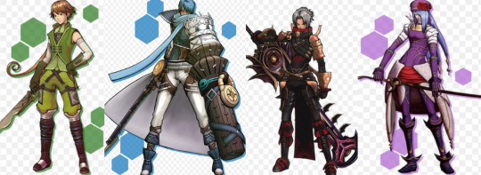
Cosplay 2010 - Sakura Con
Oh man! I was going through my computer and found a bunch of old cosplay photos that I thought was lost! Back in my wee cosplay days of 2010 me and my friends did a .Hack//G.U. cosplay group at Sakura Con here in Seattle, WA. So many people brought fabulous costumes and it was a ton of fun! For that shoot I made four costumes: Silabus, Ovan, Haseo (2nd form), and Endrance (I was Endrance). I was so proud of those costumes, though I would not use the same materials or techniques today at all! This was in the early days where I used materials that looked right even if it wouldn't function right, be too hot, too fragile, not structurally sound, etc. As such, ended up making Haseo out of upholstery vinyl. Don't envy them at all 'cus I imagine it was pretty hot and constrictive!
Not posting their faces because I lost contact with these guys years ago and don't believe in posting faces online other than mine without permission, even if it's a cosplay in a public sphere.

Sylabus is first! I made the majority of the costume mainly because my friend didn't have the time to do so between school and other projects (they are/were an amazing artist!!). I was particularly proud of how this one came out looking considering I had only been doing cosplay for around 3-ish years at the time. The lines look great! They did the wig and the sword. We lost contact years ago after graduating high school so I hope they're doing well for themselves (I miss you if you're out there!).

Next is Ovan! I am so proud of not only how the costume looked but that damn arm of his! I spent so long cutting cardboard and foam core and painting.... ug! But it looked incredible! He paid me $300 for the entire costume including materials at the time. Def would not do that again, ever. But again it was in my younger days where I didn't value my time or effort as much... also it's pretty but, you know, don't look at the seams or the construction lol. Not pictured: the glasses. His face was perfect for the costume but since I lost contact with them years ago I don't want to post their face without permission.
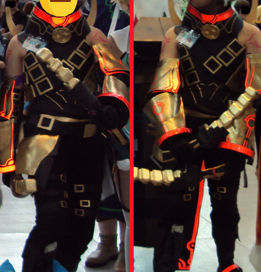
Then Haseo, 2nd form. We saw a hack online about using reflective tape to make costume parts glow when flash is used. It worked so well! As said above, this is all vinyl with puff paint and foam, so it was HOT to wear. Bless this guy for being a good sport, especially since it took me something like 2-ish years to actually put it together...

Finally, myself as Endrance. Once again, a whole lot of work for a costume that I would not at all make in the same way. I bought a cording foot for my machine and carefully pieced together a Jet Set material and sewed the cording on.... the cording did not stretch. So I used a stretch material with a non-stretch cord for what is essentially a body suit.... yiiikkkess! Looks great, don't look inside cus it is not remotely clean. But that's what the early days are about! I had fun, they had fun, tried and learned a lot, so it was all worth it! All the all-nighters and, at times, multiple days of not sleeping. Literally can't do that anymore cus I'm not built like I was at 20. :)
2 notes
·
View notes
Text
a meme!
Thanks for tagging me @notasapleasure
1. Are you named after anyone?
Not after a real person. My mom said it was a name of a doll in some kind of fairy tale that she watched (or read?) and she just liked that name.
2. When was the last time you cried?
A week ago. Well, I guess I asked for it: after all those years I just should have known better than dwell on that kind of stuff from the past and in this part of my hormone cycle. (You know stuff like one of these few extremally rare moments in your life someone from your closest family said sth that made you feel like shit but thinking about it years after still never fails to make you feel like shit all over again?)
3. Do you have kids?
No. Surprisingly no. If asked ten years ago I would most surely say I'm going to. Not that I ever really desired it so much. More that not wanting was always considered as something that is worthy of condemnation. So it was just that "normal thing to do" with no deeper thinking involved nor required, you know?
4. Do you use sarcasm a lot?
It depends but sometimes it feels like the last thing that is left to defence my mental stability. And I'd rather be commenting an absurdish situation (especially in my job) than a person.
5. What sports do you play/have you played?
Table tennis my love!❤ Any other I ever tried playing is not even worth mentioning (I played field hockey two or three times and football once or twice and I remember really enjoying it. But unfortunately girls were let to play it extremally rarely, we were expected to play volleyball or basketball - none of which I ever liked😑)
6. What's the first thing you notice about other people?
I'm not sure what kind of situation I'm expected to consider... So in the place where I am just a random person in the crowd (railway station and such) I would probably first notice if anyone looked angry or impatient or irritated - to make sure I can avoid getting on their way (e.g. being a patient in a waiting room it's about sitting quietly with your head low and ignoring any possible evil comments about healthcare and politics). As for when I'm feeling safe or even going to meet someone new - I will pay attention to people's face expression and eyes, I also like to see someone smiling or doing or wearing something that make me think we have something in common. Also I notice their clothes sometimes if I liked the colour or the pattern (I can't help it, my brain is of visual artist😅 It doesn't mean I judge ppl by their look. Many times I find something ugly in objectively pretty person that I did not liked and in somebody I liked I'd always find some beautiful detail, regardless their look)
7. What's your eyes colour?
Yellow on the inside with blue ring on the outside. I like to think it makes them look a bit green from a distance.
8. Scary movies or happy endings?
If only two options avaliable I'd rather choose happy ending. Life is scary enough😅
9. Any special talents?
Drawing I guess. I am able to project a picture from my brain to a flat paper with a piece of charcoal and it's like freaking magic. It never stopped to amaze me.
10. Where were you born?
In a town in north Poland.
11. What are your hobbies?
Drawing most of all. Also creating short stories on my head I then illustrate or longer stories I sometimes write down. Given more free time I also like to engage into pyrography, sewing stuffed toys or crocheting. From time to time I like to travel, most usually to one of Polish towns but traveling abroad I like too.
12. Do you have any pets?
Cat for the last 4 years. Before that I was having syrian hamsters for almost 20 years (16 hamsters).
13. How tall are you?
165 centimeters.
14. Favorite subject in school?
Mathemathics above everything else! Also liked Polish, biology and chemistry. Most hated was always sports, while geography, history and physics were dangerously close to "hate" line.
15. Dream job?
Dream as "daydream"? I sometimes fantasize if I was born again I'd like to be one of the graphics making animated movie, like those of a Pixar studio. Or a pastor officiating weddings of gay couples
Dream as what I wish or plan: creating art on request or design prints for t-shirt, cushions and children blankets, maybe designing playing cards too - just enough for me to be satisfied that I can do it and my client to have a personalized gift. At the same time working other job 2-3 days a week to earn just enough for a comfortable life.
Tag fifteen mutuals - that's the worst part, how do I get so much?😑 Okey, everybody, feel invited but not pressed: @figuringthengsout , @chrisoels , @morulezopelforever , @sharp-lines-in-charcoal , @parttimereptile , @greenbloodedskink , @krejong , @theflyingrhubarb , @sunlightismydestroyer-blog , @asteeee , @bylercultism , @princesspink48484 , @elephant-reincarnation , @angleshades , @sweetlullabyebye
3 notes
·
View notes
Text
Photo Shoot Plan:


For my photoshoot, I tried an innovative approach for my photoshoot compared to my previous photoshoot. I researched innovative ideas which will work well with my garment with hair, makeup and poses to fit my Japanese project. For the poses, I wanted the poses to be trendy and styled like Harajuku Streetwear as many poses included using hand poses such as the peace sign and kicking the leg up. It reminded me of being quite cutesy and trendy. The way I wanted my style to be for my photoshoot to compliment my garment. For the make-up design, I wanted a style to recreate and make a modern image based off a traditional Japanese Geisha illustration. For the makeup I wanted to keep the focus on the cheeks, the eyes, and the lips. Consequently, to me researching into modern Asian makeup and cherry blossom inspired makeup look. After this I choose blush cheeks and a small part of blush on the tip of the nose to match the modern-day Japanese makeup look. I wanted a pale but standard pink lipstick. For the eyes I went for an Asian makeup look but have a cherry blossom finish. I chose the colours of white silver to fade out to light pink to a deeper pink to finish the look. I used the tradition Asian inspired wing tip as this consist of a small wing with eyeliner to make the appearance of their eyes to be wider. I finished the eye makeup with a small white wing slightly above the eyeliner. I used Pinterest to help me show my ideas for my model to see and understand what look I wanted to capture for my photoshoot. Finally, for the hair I wanted to link it back to the traditional Japanese Geisha look. From this and looking at Pinterest I wanted to keep the original look so for my photoshoot I shall use my souvenir from my Japan clip as I have one of these clip and for the hair I wanted a half up and half down to make a modern take on tis traditional look as after researching the Japanese Geisha look it consisted of buns and some half up and down hair styles. I shall discuss these ideas with my model and prepare my final hair and makeup looks in advance to my photoshoot.

Following my photoshoot planning, I wanted to create a page in my sketchbook to display the ideas for my photoshoot. I used some images from the poses, the make-up, and the hair. I printed these off and cut some of the photos out by fussy cutting around them as I wanted to create a collage to create a mini mood board to shoe a collection of my main ideas for my photoshoot. I wanted to keep experimenting with my layout and presentation in my sketchbook. So, I found some cherry blossom drawings on the internet and I fussy cut these out to lay on my page. I used some words and pictures from magazines to add a title and add some phrases and words linking to my photoshoot planning mood board like my Streetwear mood board. Before I stuck my work in, I did try a few layouts before deciding on my finished result I wanted to display my photoshoot planning mood board. I am happy with the way it looks and gives my ideas and inspiration presented in a perfect way and it shows my key concepts for my photoshoot.
My Pinterest Boards:
-Here are my Pinterest boards to show where my ideas and inspiration was found for my photshoot all credits goes to the original artist.
0 notes
Text
FMP: Shifting Project Focus: Flamingo Park. LO2 & LO3.
Week 7

My new idea is the revitalisation of the seaside town of Hastings, which I visited with my family in summer 2023. Though the inner town was more busy and exciting, the sea front was dismal and nothing was open. This seemingly abandoned part was called 'Flamingo Park' and was notably tacky in its overall design. It is a common artistic approach to seaside attractions now, but I feel there is a missing essence of Britishness and an opportunity to integrate the towns historic past into the design.
The town centre:
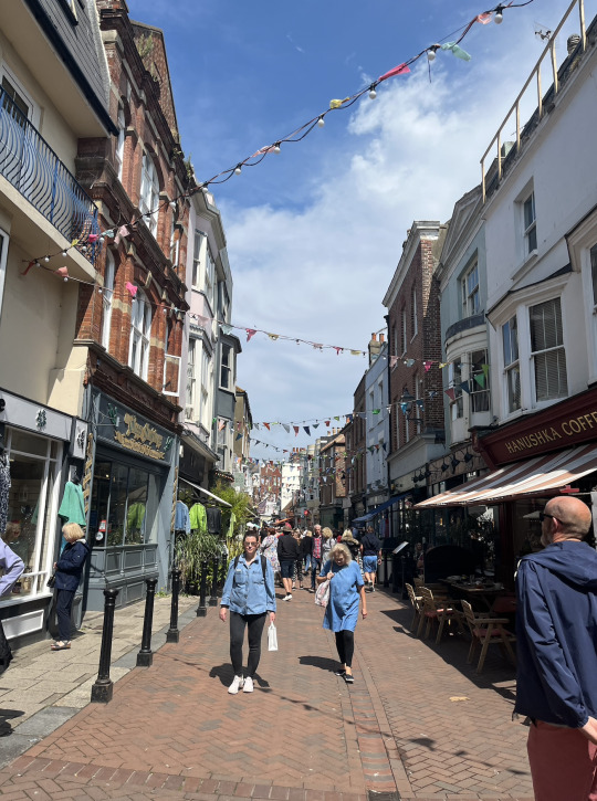
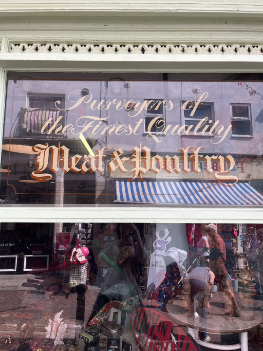


The sea front:
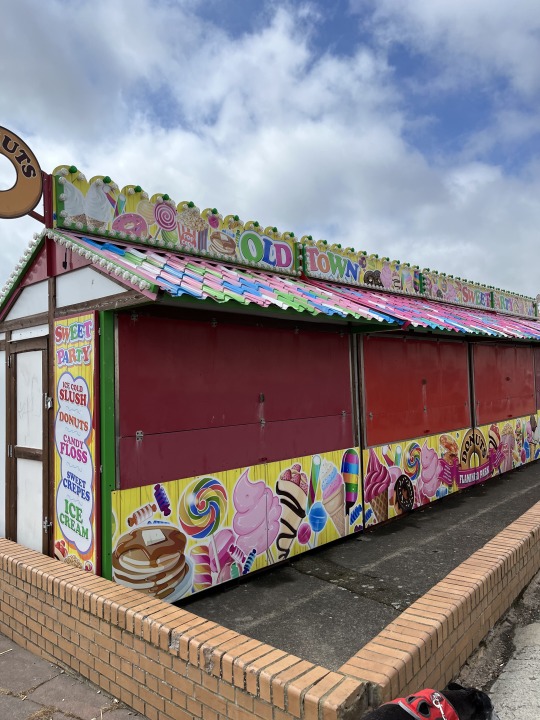

Concept:

I remember on my trip to Hastings, my mum had said how the redesign of the seafront or the analysis of the visual language of beaches would be an interesting topic for my dissertation. Of course, I took a different route in my dissertation but this concept has popped up again and ties perfectly with my aim of exploring more historical styles. I am fortunate enough to be connected to someone whose hometown is Hastings, and he has kindly offered to take more pictures of the seafront when he's back there, as the one above is the only one I have!

0 notes
Text
Virtual Sketchbook
an introduction, tell us one little known fact about you.
Hello all! My name is Alisa Sokolov and a few facts about me are that I love to be outdoors running or spending time at the beach. I recently moved from Illinois and love the weather here in Florida much better.
2. Then, in list form, detail 5 new facts you were able to find out about your assigned artist or the art work.
Christo and Jeanne-Claude 1979-2005 The Gates. Steel, Vinyl, Fabric; 7,503 gates, 16’ tall, 23 miles
-This piece of art was found in Central park which included the completion of 7,503 panels which were made out of fabric.
-The fabric was weaved, sown and all put together in Germany.
-The Gates were fully financed by Christo and Jeanne-Claude and they did not take any donations or help from anyone else.
-The Gates looked like two different things from different angles. When looking at it from above, it looked like a golden river as it was flowing through the leafless tree branches.
-The teams that installed these Gates were responsible for installing 100 panels per team. Each team included 8 people.
3. Did the way you think about the art change from the first time you looked at it? Do you see anything different in the art now?
When I first found out about this assignment, I expected my piece to be a painting or a drawing but this was an interesting idea to call art but definitely expanded my mind to more art as this piece is a big selection of pieces all put together to create one big piece of artwork. My idea of art changed a lot because art is more than just a picture or painting. I was able to see more detail in my art piece knowing how much effort was put into it as well as the color being so bright which can bring someone so much joy on a gloomy day.
2. Art and writing
The piece of art I chose for this assignment is a painting of a river in the center, tall trees on each side of the river and some mountains in the back. This piece of art is very beautiful in my opinion because it is simple and easy to tell what it is. It is painted so it looks as if it were very textured although that is just the illusion because it was used with paint. The use it serves on my wall is adding a pop of color to a whole wall. It brings out the life of the wall because of the colors used in this painting. I personally see it as beauty because the scenery reminds me of Colorado which I think is beautiful
3. Writing a self portrait
The baggage I bring along with me when I look at art, are the memories that go with the art. I am a very visual person so when I look at something, I instantly start thinking and remembering memories from my childhood that relate to when I am looking at. I am 21 and am loving this age and stage of life. I am a woman and I am proud of it. I am Russian, grew up with Russian speaking parents and grandparents so that was the first language I learned. I am originally from Chicago, Illinois but moved to Florida a few years ago and have been living here ever since. I don’t have too much time to just have fun but I love to play pickleball with my friends. It has been so much fun to be active with my closest friends. As well as playing pickleball, I love to go to the beach and spend time out in the sun. I am very involved in my church playing piano every Sunday and going to bible studies throughout the week. It’s an honor learning about the bible with other fellow believers! I work as a nanny for a family I met when I first moved. I watch 4 little kids that I absolutely love! I am also a substitute teacher at a school that is part of my church. I enjoy that job as well. Something that makes me unique is that I am a very down to earth person and am down for anything anytime. My personality is different from everyone’s, I love to be outgoing but can also just be chill and relaxed when I want to.
4. Art project (Self Portrait)

All of these pictures describe who I am as a person. The sum this all up, I will talk about the different photos in this collage! I am very musical, i enjoy playing the guitar which is pictured here as well and playing the piano. There are many photos here of me outside because i love the outdoor! At the bottom is a picture of my friend group and I catching a shark! This was a great experience that does not happen everyday. I love to be active and workout as well and go ice skating. I used to play hockey back in Illinois and I loved it. The bottom middle picture is me helping out with media at a church conference. I enjoy baking which explains the photo of the decorated christmas cookies! I would also say I love energy drink. The top middle photo is my brother and I drinking celsius; we really enjoy them! I also enjoy going to the shooting range when I have free time.
1 note
·
View note
Text
Please read on Ao3 but I'll also post part it below the cut TW: gore and k*lling
That evening, when my whole world flipped, the setting sun seemed to call me to paint it. The sky felt like a moment one would usually call " picture-perfect," at the time, I would have also referred to it as such. But now I know it was just a hollow background for something greater, something my mind would never dare to conjure up on its own. I went on to capture the view as a simple warm-up before shifting my focus to other projects I had kept putting off due to a wall I had seemed to hit in my creative process. The sketch was completed rather quickly; the skyline out of my atelier, though the sky is ever-changing, is one I've sketched a hundred times. So, each stroke of my pencil was familiar and easy to speed through. Satisfied with the rough outline, I began to paint, realizing all too late that I havent enough red to finish. A mistake, though a simple one, is odd as I am one who does not make mistakes when it comes to art. Looking back, this may have been destiny pushing me towards something grander.
Though this was a warm-up, I could not have an unfinished painting as the night's first work. It would set a sour tone for the rest of the night. I quickly shoved my things into a satchel and headed out as clouds began to loom above. Though the skies now spoke of rain, the Store was not far, and I was sure I would return before it started raining. Another mistake, this one less surprising as I am an artist, not a meteorologist and cannot predict the weather, so as I finished purchasing the paints and a few other things I knew I was running low on, it began to drizzle. Though the Store was already close to home, I knew that if I took the back roads and alleys, I could arrive home much faster, and there would be less risk of myself and the supplies I just bought getting soaked. I set out, trying to move quickly through the side streets. Keeping in mind that though this way was faster, it also had its downsides. The side streets are filled with trash and trash-like people who like to lurk in the shadows and pounce on easy targets. It was then when I turned a corner while running, I heard a scream ring out, and I could see a woman in the distance running from something, or rather someone. Flashes of front pages of the last few editions of the paper flew through my mind of "a series of women found dead in gruesome killings," all done by whom they named "Jack The Ripper.". Try as I might, I couldn't recall if they ever managed to catch him because I did not actually read the paper; I had mainly used them to cover the floor when painting. While cursing at myself for my lack of interest in the rest of the world, panic began to sink in as I could now see the woman and the large figure behind her; if I didn't do something soon, I would've gotten caught. I dove behind the trash cans that littered the sides of the alley and backed myself into the shadows. I don't think of myself as someone without a conscience or that I am overly cruel; however, helping this woman was out of the question. What would I have even been able to do for her other than get myself killed in her place? I wouldn't do that for my own mother, let alone a stranger.
#identity v#identityv#IDV#edgar valden#edgar valden the painter#the painter idv#painter idv#jack the ripper#jack the ripper idv#Jack idv#fanfic#fanfiction#idv fanfic
1 note
·
View note
Text
This Week In "Time & Again" #3: Gettin' Technical... Again?! And A Little Cynical
Hello again! I must admit... My weekly blog posting schedule has slightly shifted - first, because I posted the Halloween poster a.k.a. The First Teaser a bit later due to the creepy holiday itself, and second - because a bunch of life stuff is happening (yup, don't underestimate me, I do have a life outside artworks! 🤣). Usually everything has been fairly straightforward and gradual in my life, but there's a bit of certain activity going on in it right now, more than usual. And potentially also non-artistic side projects in my life. Because of that, I didn't get a chance to draw as much as I anticipated to during this week (already last week?! wowie!!!.. time flies, indeed!). But nevertheless, I tried my very best to go ahead with "Time & Again", for this is a project of the greatest importance to me. Slower or faster it's reaching its "well done" state - it doesn't matter. As you know, I'm not big on time limits 😁 At this point of time, the product is still very undercooked, so I'll be cooking it until done (even though I absolutely can't stand it when the packages say "cook until done"... because would you PLEASE be more vague?🤣).
To my surprise, I do not have an awful lot to say today. One might even say I'm ruining the format, for the previous posts I made had quite a (relatively) high word count. That said though - and some people close to me know this very well - every time I say I don't have much to say I end up writing twice or thrice as normal. Which leads us to conclusion that, perhaps, I actually do have things to say?!.. Either way, I'm sure you're not yet tired of me rumbling on and on about strange things that only some people - primarily digital artists - understand... Namely my habits of work. I am sure quite methodical in the way I draw, perhaps oddly. So I'll continue being technical for a while, until I run out of techy topics to talk about. And when I do... then I'll just spam more pictures 😁
However... A small demonstration of progress would be good for a wee little "teaser" of sorts:
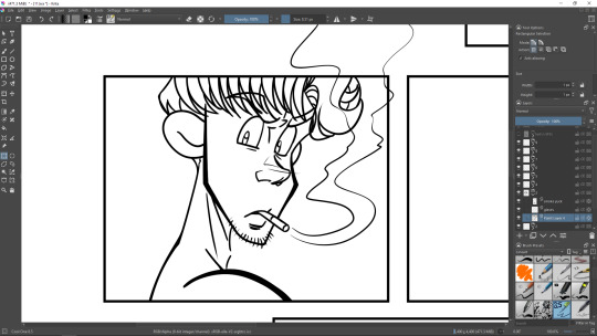
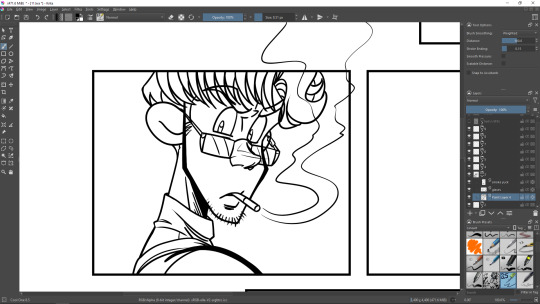
(Note the layer names. I often make typos when I rename the layers - and I just don't bother and leave them as is, because it doesn't really matter. Pains me as a languages and grammar nerd, of course, but also entertains me a bit 🤣 Also, the cigarette smoke has been drawn on a separate layer as well, and it humorously states how I feel about this particular habit of this charming dirtymouth individual. Eeeew, Lothar. Not cool.) I do not always do that, but sometimes I start off drawing the outlines of the characters' bodies and end up "wrapping" clothes around them afterwards, like on the screenshots above. I think the reason why I completed the work on Chapter 3 so unbelievably fast last year was due to the fact that on majority of the frames Lothar appeared topless... Because I've noticed that when the characters don't have much clothes on them, it takes significantly less time to draw them. But of course!.. In this case you don't have to draw every single fold and wrinkle on shirts and skirts, extra seams on jeans, or additional stylish detail on any piece of garment that looks far too plain without it... Drawing characters naked - or half-naked - sure saves an artist a TREMENDOUS amount of time and effort. ... I suspect this is also the reason why in a lot of modern comics and mangas - and animated shows, too - the artists tend to include a lot of nudity in their projects... Why yes, isn't it obvious?! Because who, pray tell, wants to spend extra hours drawing all the clothes anyway?! Come on, clothes are overrated! I'm sure of it now.
... That was plenty enough of cynicism and sarcasm for a single post, I guess. Alas! I'm rumbling, again! That was not planned by me! So let's move on to the main part of this post now! Finally, on to the techy stuff, as promised! Yum! 🤤
First of all, I would like to mention a very important change in the way I work on my graphic novel now. One fine day, not long ago, I have discovered something... that turned my digital artist's world upside down. And the name of the phenomena that shattered my whole life was... Krita's weighted smoothing for the brush. (ok, ok... that sounded very exaggerated and pompous. But oh well!)
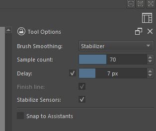
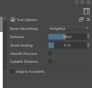
The screenshot on the left shows the brush settings I used all the time prior to Chapter 5. I used amazing Krita's Stabilizer smoothing, because I found it quite useful back in the day as I only started to use my Huion graphic monitor. I was so fascinated with it... It truly felt magical after a few years of using "a blind", screenless Wacom drawing tablet (which I will never ever go back to, for, to be honest, I have no idea how I was able to draw anything 🤣... tried using it a couple years ago just to see the difference, and I ended up exclaiming, "How in the ❤❤❤❤ do you even draw on this thing?!", and I set it aside for good... to collect real thicc layers of dust on the shelf 🤣). The right screenshot depicts the current settings I use for the weighted smoothing. Those are the Krita defaults.
An unskilled eye would probably not even notice any remarkable difference between the two as they watch somebody drawing in real time - or if they compare my older works versus the very latest ones. I must admit, the difference is sure very subtle. But to me, there's enough of a difference in how it FEELS when I'm drawing. The lines turn out better overall, somehow it makes me feel as if I'm drawing on paper rather than on a slippery screen. I could say, to me weighted smoothing imitates pencil drawing on paper very well. Which ultimately means... it's easier to draw in general. Thus, the digital artworks look more like my regular artworks on paper. It makes me happy that I can just be me when I'm drawing on both paper and on the graphic monitor. Back in the day, I was very worried about how switching to digital format was gonna impact my peculiar art style. Turns out it hardly does. ... Not that drawing on a graphic monitor has ever been challenging to me, for I learnt pretty fast, and yet, at times something felt a little off. So right now, I ponder, there's gonna be much less "off" and much more "awesome". Which is indeed lovely.
Now I question myself on why I've never used this brush smoothing before, for I truly think it would've made the process of work much faster and the final result a tad nicer. This proves that one needs a perspective, a few types of materials to compare before springing to any sort of conclusions. Seems like back in the day weighted smoothing simply didn't get enough attention and any sufficient "test drive" from me. But I am very happy I discovered this wonderful thing now. And I'm gonna stick to it - quite possibly forever from now on, as I will keep working on the rest of "Time & Again" chapters as well as everything else including random little arts with the other characters that I love to sporadically work on every so often, and the pieces for my online greeting cards store, and such.
... Like I already mentioned in the beginning of this post, as I write - I might get seriously carried away. And I see this post keeps growing bigger and bigger in size, again, so I should better wrap it up and save a little more exciting information for the next post (that I will hopefully try to schedule properly in order to restore more or less consistent posting timeframe, for now it's aaaaaall over the place!.. no promises tho).
I'm afraid, no animated gifs today. But for a nice goodbye, I'll drop a little "teaser" picture - a very rough sketch for some other "Time & Again" artwork that I'm going to finish up shortly (hopefully).
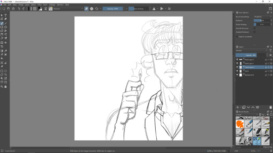
You will most likely see the end result of this particular artistic torment as a layout element on my social pages.
And for now - doooooodly doot doot! - I wave goodbye and leave the online world for a while to keep working on my obsession... and to eat some peanut butter, too, of course. See ya next time! 👋
0 notes
Text
Week 2 - David Hockney


Unfortunately I wasn't in for this lesson because I felt ill after the trip to the Eden Project so I created photomontages inspired by David Hockney in my own time by going out and taking some pictures of scenery and indoors. I did this in Photoshop by using the polygonal lasso tool and making rectangular shapes and then copying and pasting a part of the image and then moving it on top of another section to create a distorted similar to David Hockney's work. I am happy with my outcomes and believe that my photomontages tell a narrative of the viewer moving down the road and moving across the corridor in a distorted manner.


David Hockney is also a painter, stage designer, printmaker and draughtsman as well as a photographer and is considered one of the most influential British pop artists of the 20th century. It was in the 1980s he decided to create photomontages and by connecting multiple perspectives of a single subject into one photomontage and called this a "joiner." He first used Polaroid snaps of a living room while painting a picture of this living room, using different perspectives and glued them together to create one image. He then realised that this created a narrative and took the viewer on a trip around the room, like a storyboard. He then created many more of these, providing different visual narratives each time as well as giving us different ways to look at an image.


Storyboarding and narrative has always been a key aspect in the industry and is the backbone of animation - without it drawing and animating scenes will be very difficult as there will be no visual concept of what is happening in each scene of the story. The technique of storyboarding has been changing since the beginning of the 1920s, when Disney started making his first films, particularly from traditional to computer. The first storyboard shown above is a series of 12 storyboards for Peter Pan which was released in 1950 but was worked on since the 1930s. The storyboards were created graphite and conte taped to a piece of animation paper. There is dialogue from the film written in conte pencil underneath the storyboards such as "We were kidnapped" and "I knew Peter Pan" and there are rough pencil smudges on the paper to show that pencil has been erased, possibly to show many changes in how the storyboard artist wanted the dialogue to go.
The second storyboard is from Pixar's WALLE from 2004 which has been created using a story reel/leica reel on a computer, which is a frame-by-frame arrangement in sequence and was created from around 125,000 storyboards which is an average number for a film lasting around 1 hour 30 minutes. The film, especially the second and third act, was changed a lot but the first act was not which is why these storyboards are recognisable, this is important in storyboards as the audience needs to see the communication between characters. The storyboards are more focused on colour than the Peter Pan storyboards, particularly the light. Because only the light/fire is coloured in the storyboards we can assume that it has significance in the story and therefore the animators should pay close attention to the light when they are animating.
The third and fourth storyboards are from The Owl House and Gravity Falls from 2013 and 2020 so they are a lot more modern than the other two, and are also from shows rather than films. The writing underneath the Owl House storyboards seem to focus on the actions being done in each scene and what characters will appear, unlike the writing beneath the Peter Pan storyboards which focused only on the dialogue. The Gravity Falls storyboards tend to show the rough idea for what is going to happen in each scene rather than directly showing what is exactly going to happen as it shows the beaver in Dipper's hand in one scene, and in the next it is already halfway in mid-air so it would be particularly hard to animate using these storyboards as a base alone. Also, both of these storyboards look more like they were drawn with pen whereas the older storyboards look rougher and more pencil drawn, and they don't focus on shading or lighting at all and tend to leave the backgrounds white.
1 note
·
View note
Text
Since May, I have been working part time with local Blacksmith, Jeremy Cash, based in Mawnan Smith in Cornwall. Since finishing my Foundation year, my time spent at the forge has been a saviour of my mental health.
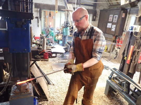

Working alongside Jeremy, learning an entirely new vocabulary of skills, techniques and tools has been an absolute gift and to be paid for the privilege was just the icing on the cake! I have said from the beginning I would have done it for free!
The biggest project I have contributed to during my time at the forge was a commission for a garden gate to be hung on a property in Mylor Churchtown. From drawing it out in chalk on a work-surface to scale it up to rudimentary tasks beyond. In the sawing, drilling & tapping of various parts of the making process, my work seemed very arbitrary in nature. However, as the process wore on, things started to make sense. Especially when I had worked up in my training towards using the forge itself. Even today there are still times I feel unsteady, but Jeremy is great teacher - patient and methodical in his approach.
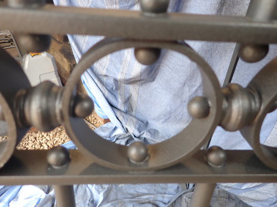

I worked on all of the components in the above pictures, from the linked loops to the forging of the bluebells for decoration. I even did most of the first coat of spray-painting; something I had never done before, but am now moderately proficient at.
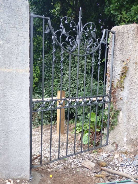

I even helped in preliminarily fitting the gate in its final position, (see above photos). I find it remarkable how that a year ago I was filled with trepidation about not being up to speed in my learning about artistic practice - I would never have dreamt of working with my hands so much as I have in the past year, but now I have a rudimentary understanding of traditional metalwork. Alongside my previous experience in woodwork and hopefully a future rudimentary understanding of stonework too, I am hopeful to have a strong founding in becoming a sculptor of traditional practice.
I must be honest here; I have recently undergone a bit of an identity crisis. I am so far away from the person I used to be. Sometimes I find myself looking the mirror and not recognising the person I have become. I hope one day to be closer to the artist inside myself I know I am.
#drawing#sculpture#blacksmithing#jeremy cash#personal journey#creative life#identity crisis#materials#metalwork#gate
1 note
·
View note