#no you are not seeing things yes I used a shadow render as a ref for the pose
Explore tagged Tumblr posts
Text
practice commission

for a friend fractal, warrior maid adjacent to genshin impact ;3 mutuals will probably have already seen the process but if you havent that see it or not
process below bc idk i like showing where i start
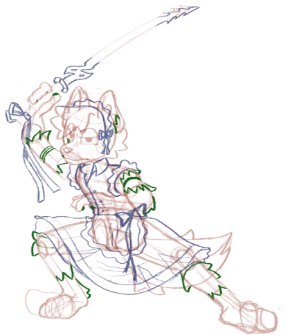
sketching for ideas, found one i liked so i did it (its the yes so perfect)
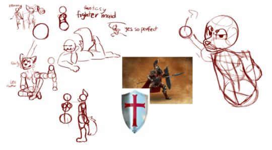
most bottom is a trace of the ref to try to get proportions semi right which i. ignored. and probably shouldnt do
posing time, i tried to do the pose sketch but couldnt and could only do this standy thing but i decided to change it for action line curve
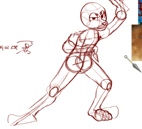
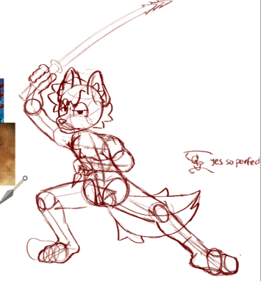
(it will mirror a lot so i can swap between new perspectives everytime) final form sketch
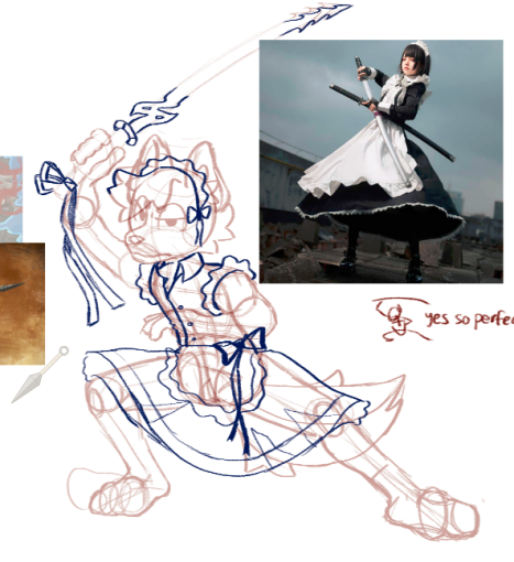
clothes sketch, i used a few "warrior maid" refs and genshin impact katana ref
fur markings , i later realized the sword arm was too long and decided to shorten it later + my layer groups
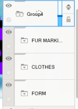
this is JUST for the sketches, havent even started on final
heres starting on the final
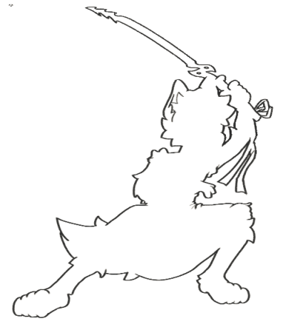
was using a pressure brush, so i did outlines first n made them real thick bc i learned that somewhere
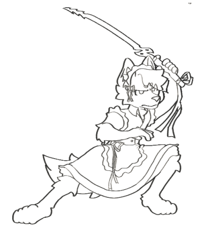
thin inlines
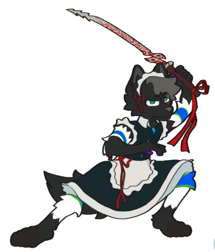
flat coloring, i learned from someone instead of making colors lighter, you make colors darker in the rendering to make the base colors pop out
so i dont have any more process pics other than the final image, but i made a red background, made a portal, added glow effects and embers, and overlayed a dark blue for shadows, and a black darken for the shadow the whole person sets

whole thing, wanted a dr strange kinda vibe and i think i kinda got there x3
#furry#furry art#digital art#art#my art#furry anthro#fox#furry fox#here to fight you or something#also cool blood sword#plus my art process#furry commissions#commission#i guess?#it was for free but the fine was that they were depicted as a maid#x3 and they were a friend anyway
10 notes
·
View notes
Text
alright, the other day i loosely implied that i would make a behind the scenes/tutorial type of thing. momma didn't raise no liar, so here goes nothing i guess!
step 1) rough sketch
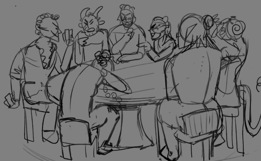
honestly i skip this entirely if have a really concrete idea of what i want to do. sometimes compositions are just beamed into my brain from On High and a sketch is unnecessary.
step 2) 3d ref

this is where i refine the composition, lighting, camera angles, props, etc. i use DAZ studio for model posing and blender for almost everything else (props, horns, lighting, rendering).
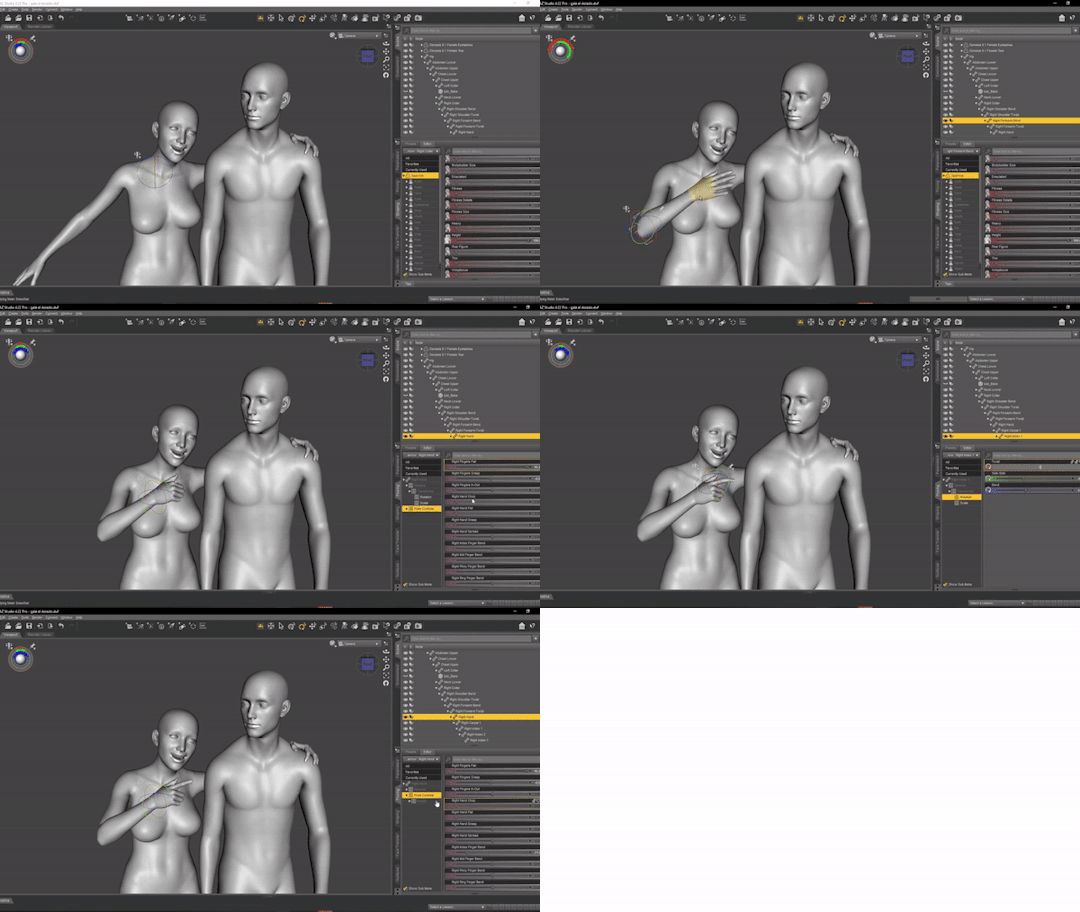
here's a 10 minute video on how to pose models in DAZ if you're interested in doing something like this! it's not very hard! basic posing requires almost no technical know-how.
i've heard magicposer and virt-a-mate are also good for model posing, but i don't have any experience with either program.

after i'm done posing, i transfer the models to blender so i can work on props, environment, and lighting because doing it in DAZ is ass. you can see that i went overboard on the ref for the paladin i worked on last year by modelling armor.
step 3) lineart

at this stage i'm synthesizing my 3d models, reference images, and style choices into lines.
the 3d likeness of my models is poor because I don't have time for that shit, so this is where my humongous folder full of bg3 screenshots comes into play.
for example: looking at my screenshots, astarion's forehead tilts back towards the back of his skull, much more so than my reference model. his chin and jaw are sharper and longer, and the transition between his brow ridge and nose is almost a straight line. if i combine the information from my 3d model and astarion's face, i get something like this:

3d models aren't fleshy (ie, tummy rolls, wrinkles, muscle deformations, butt squish) unless one puts in A LOT of effort like absolute madman chris jones.
you guys know bernini, right? he has a couple great examples of this. see how hades' hands press in on persephone's leg?
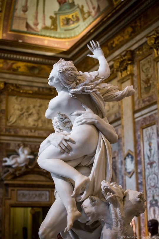

this is what we want to add in the lineart because it's too much effort for 3d. laziness is king.
i guess i draw clothes at this stage too, but for some reason there aren't many in this image. ( ͡° ͜ʖ ͡°)
step 4) base color
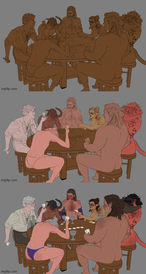
i have a little color picked palette that i use for everybody so i get their skintones right before i start messing with colored lighting. i'll use overlay and hard/soft light layers clipped to the base layer during the shading step later.
step 5) shading
if you thought we were done with the 3d part, guess again! i posterize my 3d reference so i can see the shapes of the shadows and highlights better. if i'm not feeling it, i can go back to 3d and change the lighting really easily.
could I make a cel shader for this? yes. am I going to? No. custom shaders are for people with intelligence and I am fresh out. posterization it is.

from there, i do a pretty standard cel shading deal that i usually blur and set to low opacity. (for this image i stuck to no blur because i had been looking at a lot of morebird's art and was really feeling the hard edges)
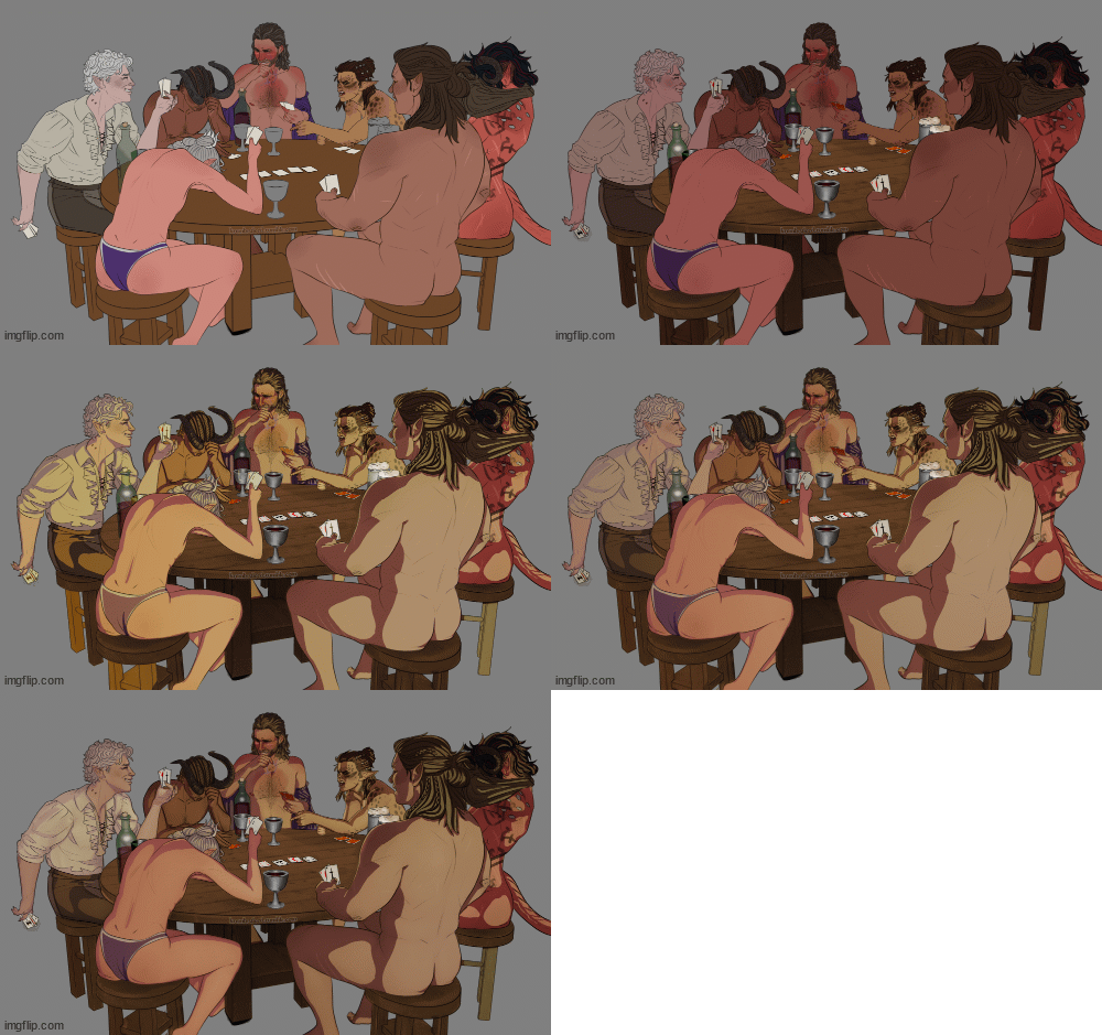
photoshop is what i use for final rendering because it has bangin tools. the brush customization alone make ps worth it, but i also particularly abuse puppet warp, noise generation, the camera raw filter, and layer styles.

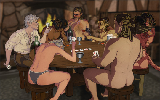
step 6) background
i put the least effort possible into a background and then i blur it into oblivion so you can't fathom the depths of my ineptitude.
and then i have a finished image! ᕕ( ᐛ )ᕗ
#art tutorial#this got long!! the rest is under the cut#i encourage everyone to try out DAZ and blender! theyre both free!!#i love goofing around in 3d#the krem process
115 notes
·
View notes