#my private theory is Disney is trying to kill Pixar by making them make blah movies
Explore tagged Tumblr posts
Text
can someone explain to me why the fuck all Pixar characters have looked like this since the good dinosaur?
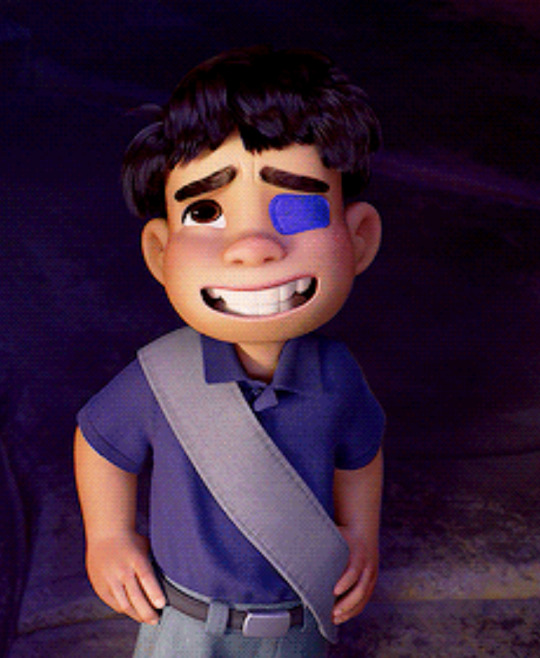
He has a squishy round face, the mouth and eye sections slightly bifurcated. His eyes are large and round, his teeth slightly separate from the inside of his mouth. He has no texture, no shade. He reminds one a bit of Wallace and Gromitt, with the giant teeth, or perhaps an emoji with his simple flat face. Anything sharp or angled has been buffed away. He looks plush.
Luca looked like this. Turning Red looked like this. Elemental and Soul even kind of looked this, with slightly sharper shapes but still an avoidance of any deeper or pricklier design. can anyone tell me what the fuck is going on? what happened to Pixar’s punchy, severe, angular, textured character design? character design from old Pixar movies:


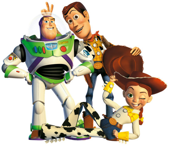
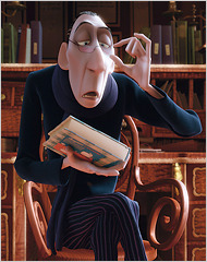
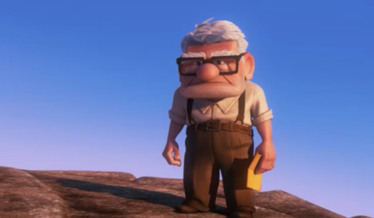
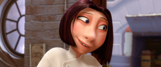
see the extreme angles, characters with clear and differentiated shape types, teeth that can be cranky or jagged, colors that tint a bit darker with shadow, contouring and shading that’s noticeable on faces. The character design gives me hints what these characters might be like—pointy, angular, inviting, or odd. character design from new Pixar movies:


All the teeth sit the same way. most faces are vaguely pear or oval shaped and eyes are all big and round. surface texture and shadow don’t exist unless it’s a slight fuzzy quality, like in Inside Out. you poke one of these and they bounce back like jello. what on earth is going on.
#disney#pixar#elio#animation#my private theory is Disney is trying to kill Pixar by making them make blah movies#while they steal the interesting aesthetics for their own movies#but now NO ONE is doing the weird clear shapes Pixar used to do. No one has the darker edge
124 notes
·
View notes