#musicmodule
Explore tagged Tumblr posts
Text
Presidents Don't All Sound Alike and Neither Should Your Characters - Writing Tip Wednesday
Presidents Don’t All Sound Alike and Neither Should Your Characters – Writing Tip Wednesday
It’s Writing Tip Wednesday and this week, I’m actually going to give a little writing tip. I know!
We all pause for a moment of stunned silence.
Have you ever read a story and every line of dialogue for every character sounds exactly the same no matter what the characters’ backgrounds are?
Like this:
“I love you a lot,” Character #1 said. “A wicked amount.”
“You’re an awesome lady,”…
View On WordPress
#carriejones#dialoguethatisntflat#howtowrite#howtowritedialoge#howtowritefiction#musicmodulation#musictherapy#playingwithwords#presidents#tinkeringwithwords#words#wordsmatter#writing#writingcharacters#writingdialogue#writingtip#writingtips
0 notes
Photo

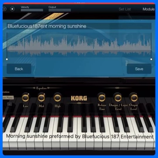
Official Bluefucious 187 Entertainment Instrumentals With Korg Modules #korggadget #korgmodule #korgmusic #playingpiano #uploadedtoyoutube Song Titulo:”Sunshine by dusk” #instrumental #independentartist #independent #uniquemusic #pianosolo #pianist #keyboardscholars #chilltime #somethingienjoy #bluefucious187entertainment #bluefucious187ent #enfurecidostudiosproduction #musicpianolover #musicproducer #korgmusicworkstation #musicmodule #giftedandtalented
#enfurecidostudiosproduction#uniquemusic#korgmusic#korggadget#korgmodule#chilltime#giftedandtalented#keyboardscholars#korgmusicworkstation#playingpiano#independentartist#instrumental#pianosolo#uploadedtoyoutube#pianist#musicproducer#somethingienjoy#bluefucious187ent#independent#bluefucious187entertainment#musicpianolover#musicmodule
0 notes
Text
Build a Music Player with Angular & Electron II : Making the UI
In the [previous]() post on building a music player with Angular and Electron, we were able to successfully setup an environment where our app can live. Angular was bootstrapped, Electron was loaded, and the app opens up displaying a test content.
We also discussed the different types of components which are presentation and container components. In this part of the series, we will build our presentation components which include the following:
Search
Details
Player
Progress
Footer
App Structure
Based on the Angular Style Guide, we will structure our app in a manner that every presentation component is going to be in a folder. This folder will also contain the component's HTML and CSS files. Starting from the app directory, our app structure should look like the following:
|--app |----music |------music-details |--------music-details.component.css |--------music-details.component.html |--------music-details.component.ts |------music-footer |--------music-footer.component.css |--------music-footer.component.html |--------music-footer.component.ts |------music-progress |--------music-progress.component.ts |--------... |------music-progress |--------music-progress.component.ts |--------... |------music-search |--------music-search.component.ts |--------... |------shared |--------api.service.ts |--------music.service.ts |------music.module.ts |----app.component.css |----app.component.html |----app.component.ts
We will not touch the shared folder and the app component in this part of the post. What we will do is build the UI components and assemble them for export using the MusicModule.
UI Wireframe
The music player's design will take the same structure as the of the React's article and the diagram below shows a rough sketch of what we are up to:
Global Styles
Some styles like app background color, resets and tweaks for the music search text box needs to go into the global style which is located in the src folder:
/* ./src/styles.css */ *, *:before, *:after { box-sizing: border-box; } body, html { margin: 0; padding: 0; } body{ background: #000; } .ui-autocomplete, .ui-inputtext { width: 100%; margin: 0; } .ui-inputtext { border-radius: 0; margin: 0; border: none; border-bottom: 2px solid rgb(21,96,150); outline: none; background: rgba(255, 255, 255, 0.8); }
We need font-awesome fonts for our player controls. You can install the font via npm:
npm install --save font-awesome
...then add the font awesome url to the angular-cli.json styles array:
"styles": [ "../node_modules/font-awesome/css/font-awesome.css", "styles.css" ],
Restart the build process by running npm start after adding the style so it can be loaded.
Components
We listed the UI components we need to create above. Let's do that right away, one after the other.
Below, is the MusicModule which imports all the members of the music section:
// ./src/app/music/music.module.ts // Third party imports import { NgModule } from '@angular/core'; import { FormsModule } from '@angular/forms'; import { HttpModule } from "@angular/http"; import { CommonModule } from '@angular/common'; // PrimeNG autocomplete fro search import { AutoCompleteModule } from 'primeng/primeng'; // Custom imports import { MusicSearchComponent } from './music-search/music-search.component'; import { MusicPlayerComponent } from './music-player/music-player.component'; import { MusicDetailsComponent } from './music-details/music-details.component'; import { MusicProgressComponent } from './music-progress/music-progress.component'; import { MusicFooterComponent } from './music-footer/music-footer.component'; import { MusicService } from './shared/music.service'; import { ApiService } from './shared/api.service'; @NgModule({ imports: [ // Define imports FormsModule, AutoCompleteModule, HttpModule, CommonModule ], exports: [ // Expose components MusicSearchComponent, MusicDetailsComponent, MusicPlayerComponent, MusicProgressComponent, MusicFooterComponent ], declarations: [ // Declare components MusicSearchComponent, MusicDetailsComponent, MusicPlayerComponent, MusicProgressComponent, MusicFooterComponent ], providers: [ // Services ApiService, MusicService ], }) export class MusicModule { }
Do not panic at the errors because we are yet to create these members and we will start doing that right away.
1. Search Component
The search component is an autocomplete control so rather than walk the painful stress of building it, we can just make use of what PrimeNG. PrimeNG's autocomplete is a drop and use component and very easy to setup.
First, we have to install primeng:
# Install PrimeNG npm install primeng --save
When npm is done with the installation, import primeng to the MusicModule. We already did that:
import { AutoCompleteModule } from 'primeng/primeng'; // ... @NgModule({ imports: [ // ... AutoCompleteModule, ] })
One more thing to get done with installing PrimeNG is to install its themes and global css. You can do this the same way we installed font-awesome:
"styles": [ "../node_modules/primeng/resources/themes/omega/theme.css", "../node_modules/primeng/resources/primeng.min.css", "../node_modules/font-awesome/css/font-awesome.css", "styles.css" ],
Next, we add the search template with p-autocomplete which is the name AutoComplete's selector name:
SEARCH COMPONENT TEMPLATE
<!-- ./src/app/music/music-search/music-search.component.html --> <p-autoComplete [ngModel]="track" [suggestions]="tracks" (completeMethod)="search($event)" (onSelect)="select($event)" field="title" > <template let-track> <div class="ui-helper-clearfix" style="border-bottom:1px solid #D5D5D5"> <img src="" class="artwork"/> <div class="text truncate"></div> </div> </template> </p-autoComplete>=
The autocomplete uses [ngModel] property to keep track of the value of the text box. [suggestions] is the list it should search in which is tracks. completeMethod is the event raised on keystrokes while onSelect is the event raised when the autocomplete suggestions item is clicked.
The values of these events and properties are passed down from the container component, and we will see how that is done when we discuss the container component.
template is used to provide a custom view for our tracks.
SEARCH COMPONENT CLASS The following is the search component class:
// ./src/app/music/music-search/music-search.component.ts import { Component, Output, EventEmitter, Input } from '@angular/core'; @Component({ selector: 'music-search', templateUrl: './music-search.component.html', styleUrls: ['./music-search.component.css'] }) export class MusicSearchComponent { track: string; @Input() tracks: any[]; @Output() update = new EventEmitter(); @Output() query = new EventEmitter(); search(event) { this.query.emit(event.query); } select(track) { this.update.emit(track); } }
See how this component completely unaware of how the tracks created or even how the search and select events are handled. All it knows is that someday, it's parent will send down tracks to it using Input decorator and when an event is raised within, it is delegated to the parent component with Output to handle.
We are beginning to see how UI/presentation components are dumb and unaware of a lot of things about our application.
SEARCH COMPONENT STYLES
/* ./src/app/music/music-search/music-search.component.css */ .truncate { width: 400px; white-space: nowrap; overflow: hidden; text-overflow: ellipsis; } .artwork{ width:32px; display:inline-block; margin:5px 0 2px 5px; } .text { font-size:18px; float:right; margin:10px 10px 0 0; }
2. Details Component
This component is a simple one because it just has one Input propety, a title which displays the song title:
DETAILS COMPONENT CLASS
// ./src/app/music/music-details/music-details.component.ts import {Component, Input} from '@angular/core'; @Component({ selector: 'music-details', templateUrl: './music-details.component.html', styleUrls: ['./music-details.component.css'], }) export class MusicDetailsComponent { @Input() title: string; }
The component expects just one value from it's parent container for the title property.
DETAILS COMPONENT TEMPLATE
<!-- ./src/app/music/music-details/music-details.component.html --> <div class="details"> <h3></h3> </div>
DETAILS COMPONENT STYLES
/* ./src/app/music/music-details/music-details.component.css */ .details h3{ text-align: center; padding: 50px 10px; margin: 0; color: white; }
3. Player Component
The player component has the most controls with the most events. The controls that control sound -- play, pause, stop, forward, backward and random. The component also receives a boolean Input property to check if a song is playing or not so as to.
PLAYER COMPONENT CLASS
// ./src/app/music/music-player/music-player.component.ts import { Component, Output, EventEmitter, Input } from '@angular/core'; @Component({ selector: 'music-player', templateUrl: './music-player.component.html', styleUrls: ['./music-player.component.css'], }) export class MusicPlayerComponent { // If song is paused or playing @Input() paused; // Controls @Output() backward = new EventEmitter(); @Output() pauseplay = new EventEmitter(); @Output() forward = new EventEmitter(); @Output() random = new EventEmitter(); @Output() stop = new EventEmitter(); }
PLAYER COMPONENT TEMPLATE
<!-- ./src/app/music/music-player/music-player.component.html --> <div class="player"> <div class="player__backward"> <button (click)="backward.emit()"><i class="fa fa-backward"></i></button> </div> <div class="player__main"> <button *ngIf="paused" (click)="pauseplay.emit()"><i class="fa fa-pause"></i></button> <button *ngIf="!paused" (click)="pauseplay.emit()"><i class="fa fa-play"></i></button> <button (click)="stop.emit()"><i class="fa fa-stop"></i></button> <button (click)="random.emit()"><i class="fa fa-random"></i></button> </div> <div class="player__forward"> <button (click)="forward.emit()"><i class="fa fa-forward"></i></button> </div> </div>
The snippet above shows how the events on the component class are emitted when each of the buttons is clicked. The paused property is used to toggle between the pause and the play buttons when the song is playing and paused respectively.
PLAYER COMPONENT STYLES
/* ./src/app/music/music-player/music-player.component.css */ .player{ text-align: center; margin-top: 60px; } .player div{ display: inline-block; margin-left: 10px; margin-right: 10px; } .player .player__backward button, .player .player__forward button{ background: transparent; border: 1px solid rgb(21,96,150); color: rgb(24,107,160); width: 75px; height: 75px; border-radius: 100%; font-size: 35px; outline: none; } .player .player__backward button{ border-left: none; } .player .player__forward button{ border-right: none; } .player .player__main button:hover, .player .player__backward button:hover, .player .player__forward button:hover{ color: rgba(24,107,160,0.7); border: 1px solid rgba(21,96,150,0.7); } .player .player__main { border: 1px solid rgb(21,96,150); } .player .player__main button { color: rgb(21,96,150); background: transparent; width: 75px; height: 75px; border: none; font-size: 35px; outline: none; }
4. Progress Component
The progress component is responsible for displaying how far into a song we have played as well as the played time and the total time it takes the play the song. This one has no events to emit but just 3 Input properties to keep track of time.
PROGRESS COMPONENT CLASS
// ./src/app/music/music-progress/music-progress.component.ts import {Component, Input} from '@angular/core'; @Component({ selector: 'music-progress', templateUrl: './music-progress.component.html', styleUrls: ['./music-progress.component.css'], }) export class MusicProgressComponent { // Played @Input() elapsed: string; // Total time @Input() total: string; // Current time for the progress bar @Input() current: number; }
PROGRESS COMPONENT TEMPLATE
<!--./src/app/music/music-progress/music-progress.component.html--> <div class="progress"> <span class="player__time-elapsed"></span> <progress value="" max="1"></progress> <span class="player__time-total"></span> </div>
PROGRESS COMPONENT STYLE
/* ./src/app/music/music-progress/music-progress.component.css */ .progress{ text-align: center; margin-top: 100px; color: white; } .progress progress[value] { /* Reset the default appearance */ -webkit-appearance: none; appearance: none; width: 390px; height: 20px; margin-left: 4px; margin-right: 4px; } .progress progress[value]::-webkit-progress-bar { background-color: #eee; border-radius: 2px; box-shadow: 0 2px 5px rgba(0, 0, 0, 0.25) inset; } .progress progress[value]::-webkit-progress-value { background-color: rgb(24,107,160); border-radius: 2px; background-size: 35px 20px, 100% 100%, 100% 100%; }
5. Footer Component
This is just for brand sake because all that matters is the HTML content that displays a tiny text and image of Scotch and Soundcloud.
FOOTER COMPONENT CLASS
// ./src/app/music/music-progress/music-progress.component.ts import { Component } from '@angular/core'; @Component({ selector: 'music-footer', templateUrl: './music-footer.component.html', styleUrls: ['./music-footer.component.css'], }) export class MusicFooterComponent {}
FOOTER COMPONENT TEMPLATE
<!-- ./src/app/music/music-progress/music-progress.component.html --> <div class="footer"> <p>Love from <img src="http://ift.tt/2kAEvZp; class="logo"/> & <img src="http://ift.tt/2kAvnA5; class="soundcloud"/></p> </div>
FOOTER COMPONENT STYLES
/* ./src/app/music/music-progress/music-progress.component.css */ .footer{ color: white; position: absolute; bottom: 0px; width: 100%; background: #030C12; } .footer p{ text-align: center; } .footer .logo{ height: 25px; width: auto; } .footer .soundcloud{ height: 25px; width: auto; }
Up Next
We are making great progress. We have our UI almost done and in the next (and last) post, we will tie everything together using the container component.
via Scotch.io http://ift.tt/2k89Rpv
0 notes
Photo


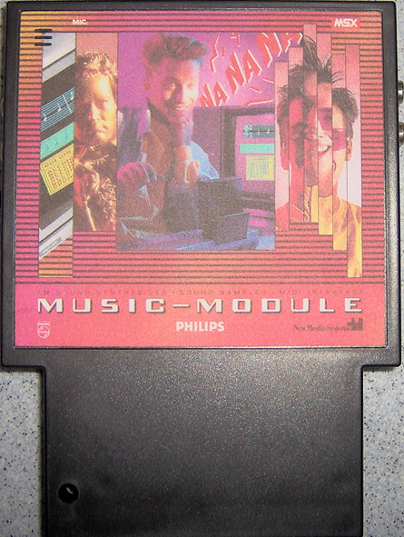
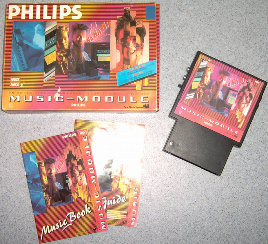
MsX MUSic ModULE
19 notes
·
View notes
Video
What up? Can a homie get a good morning? 💀 #musicislove #musicmodule #giftedandtalented #bluefucious187entertainment #independentartist #independent #instrumental #rapper http://www.smule.com/Bluefucious_187 #comecheckmeoutyo #bluefucious187ent #instagramer #giftedandtalented #musicproducer #korgmodule #korgmusic #activeonline #socialmedia #producerlife
#musicmodule#producerlife#instrumental#korgmusic#activeonline#bluefucious187ent#bluefucious187entertainment#giftedandtalented#independent#musicislove#musicproducer#independentartist#comecheckmeoutyo#socialmedia#instagramer#korgmodule#rapper
0 notes