#most of their 3d models are really solid what happened here
Explore tagged Tumblr posts
Text

stfc did q so dirty
#most of their 3d models are really solid what happened here#why did they do that to my boy#star trek
1 note
·
View note
Text
Plastic Skies - Model 13: F-15E Strike Eagle "Garuda 1"
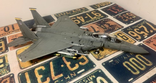
Near the end of last year, I bought a sheet of bootleg decals to make my Mobius-1 F-22 Raptor (as seen here!). The sheet had a lot more decals than just the Mobius ones. Some were for planes I had no interest in doing, some ended up in my old decal-less Berkut model, and some inspired the model I'd end up building right after the Area 88 Tiger. After all, I knew sooner or later I'd end up making an F-15. Even if I'm not its biggest fan.
Yeah, yeah, I dunno, I just don't like the F-15 Eagle. I know it's the backbone of the USAF and a fantastic plane and it does everything and the story of how it was conceived is super funny, but there's something about it that just doesn't spark anything in me. It's just... a fighter plane. Much like the Flanker platform, it always felt like the most standard example of Fighter Jet to me, without the cool swing wings of the Tomcat or the sleek small shape of the F-16. There's no such thing as a boring fighter jet, but the F-15 is close.
That's not to say we don't have some history. One of the last models my brother built back when we were kids was an absolutely massive (for us) 1/48 scale Eagle. As with all our models, it was glued together and not much else, and I distinctively remember it losing one of its tail fins somewhere underneath a bed. Still, the thing was huge to us, and I always remember it as the biggest model we ever had. But that's about as much fondness as I have for the Eagle.
Or at least, as much as I had until Ace Combat happened.
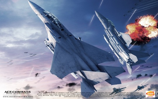
Although the Eagle is very prominent in several AC games, the important one for this model is Ace Combat 6: Fires of Rubi--I mean Fires of Liberation, for the Xbox 360. This was one of the very last Ace Combat games I tried during my "I want to play all of them phase", since although PS1, PS2, PSP and 3DS emulation are all pretty good right now, Xbox 360 emulation is not quite there, and has apparently been not quite there for years now. I should know, I tried. But earlier this year, a very generous and dear friend of mine offered me an old Xbox 360 which he'd come into possession and was using to try some cool hacker stuff. And soon, I was finally getting to play AC6.
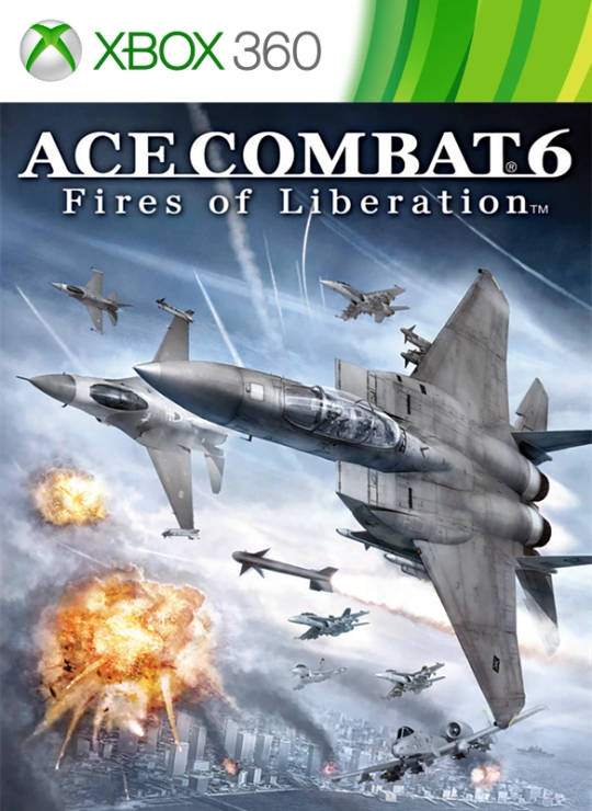
The game itself is great, as are all Ace Combats. It has a really interesting "large-scale battle" system, where different units are doing their own thing and you can choose which ones to support. It has the first appearance of high-g turns, which I love. It has a killer soundtrack, but that's no surprise. It has a really frustrating boss fight followed by a really amazing final level. And it has one of the most gloriously OP fictional jets in the series. Its story isn't quite as engaging as the PS2 games but I'm very glad I played it. And as seen above, the game's cover star is the F-15E, a plane for which I already had the decals to make.
So as I was finishing up the Tiger, I knew what the next project would be.
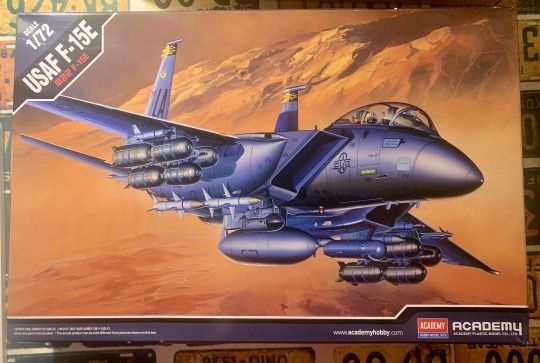
This was also going to be my first Academy model kit. Academy is a Korean model kit company that as far as I can tell sits quite comfortably in the middle ground of model kit quality. They make decent stuff for a good price with solid plastic quality, although some reviewers note a few glaring accuracy issues. I don't really care about accuracy when it comes to models, especially not at the price I found this, so I got to work pretty quickly.
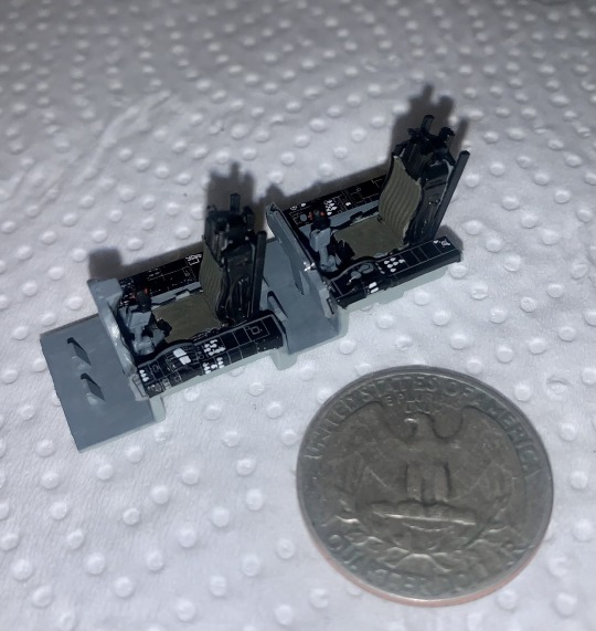
The cockpit was the first step. Emboldened by my work on the Tiger, I tried to really make it shine this time, adding those little extra dabs of red to the flightsticks and other touches. Unfortunately, the decal sheets were a bit too wide for the panels, so they ended up getting warped and stretched. It looks pretty bad, but once inside the plane, I figured it wouldn't be visible. And I was right! Althouh what is visible are some of the corners where I skimped or forgot to paint, something which I'm definitely trying to work on in my latest kits.
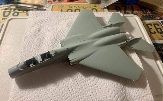
The main fuselage was a much easier fit than the Raptor, although not quite as easy as the Tiger. The Eagle is a big motherfucker, after all, so putting it together requires a lot of pressure in different spots. Unfortunately, it also resulted in some plastic melting around a few corners, but only in the underside, and only on one wing. It was still a good lesson that made me want to invest in better cement, but it'd take a while for me to actually do it.
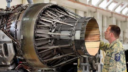
I decided the next step would be the nozzles, which is where this particular kit goes a bit fucking nuts. The F-15's thrusters feature external fairing arms for their variable geometry nozzles, which is way easier to explain with a picture:
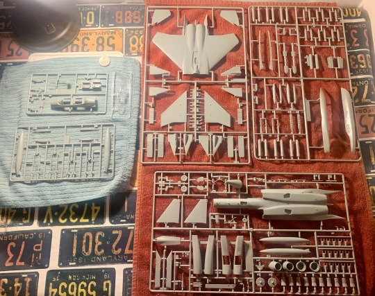
And if you're observant, you can go back to that first picture of all the model's sprues and see how this kit handles that. But just in case:
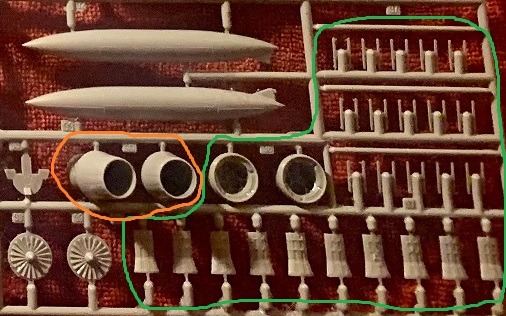
The parts in green are the 30 (!) parts necessary to build just the two exhaust nozzles. The parts in orange are Academy offering people who aren't insane a way out, with two fully built nozzles with "turkey feather" panels instead of the arms. Which is very thoughtful of them, but after 12 models, I guess I was feeling a bit insane.
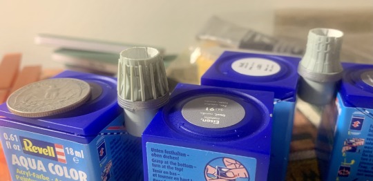
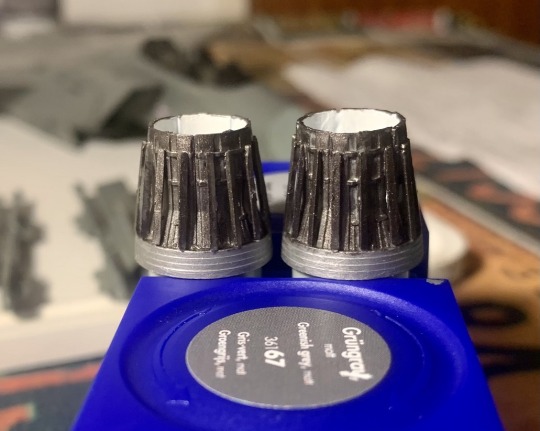
Admittedly, it wasn't rough sailing. The panels themselves didn't fit as well as I would've liked, and the faring arms required a very delicate touch. Still, I figured it'd all look at least decent once I went in with my beloved burnt iron paint, and sure enough, the end result was mostly fine.
Around this time, I started running into what's become my weak point this far into model building: indecisiveness. It's easy to think that models are "put them together first, then paint, then decals, then varnish, then panel lining, then clear coat", and some cheap kits are perfectly capable of following that order. But the more experienced I get and the bigger kits I try, the more I find myself playing with that order, doing things like painting certain parts of the plane first before gluing, or even fully detailing things like tail wings before I'm even done painting the fuselage.
Which sounds smart and is the way to do until you're staring at four different tasks and you just don't know what you should start on now. In this model's case, one of the biggest problems was armaments.
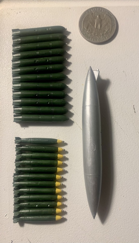
This isn't even all of it, btw. This is still missing the eight other missiles I also had to paint. Though I will say, as messy as the yellow tips on the Mk 82 bombs are, I'm still a little proud of the way I figured out to paint them roughly similar:
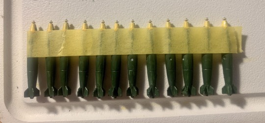
It's not perfect, but nothing is. However, the armaments thing was something that bothered me all the way to the end of the build.
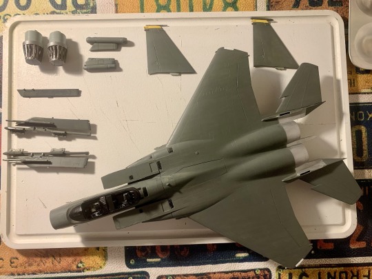
Painting the fuselage was a way different story. One of the reasons why I chose AC6's F-15 was precisely because it's just one big color. No camo jobs, no masking tape save for the yellow bits on the tail wings, just me and my brushes and a newly bought box of Revell Greenish Grey paint. That paint is... an odd one. Looks absolutely disgusting when wet, like the insides of a toilet after eating some very unhealthy food, but once it dries out and especially once varnished it looks... kinda cool? Kinda awesome? It just has way more personality than the usual air superiority grays of most USAF fighters.
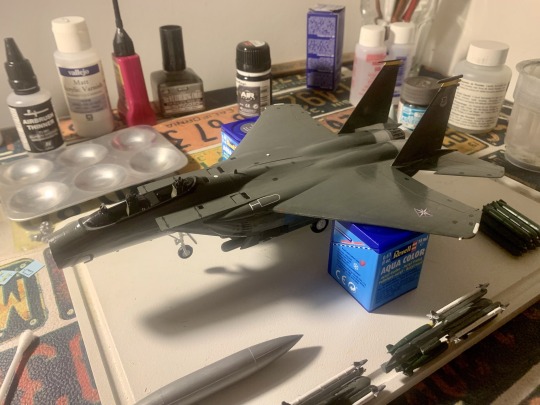
The other part of the build that was surprisingly comfortable was the landing gear, since this model only has one door for each gear. Made the whole thing go by in a breeze, and before I knew it, I was already putting in the decals. At least the big ones. Admittedly, they're not 100% game accurate, since AC6 uses low visibility versions of the emblems and such, but they were there and I wasn't not gonna use them.

Panel lining was also shockingly easy for this kit. Although I'm still pretty lousy at it, the kit's panel lines were very well defined and easy to get the paint in. Compared to other kits I've had, this one was very well behaved when it came to this step. Sooner than I'd expected, the whole thing seemed almost ready to be done. I just had to finish the armaments and we'd be all done.
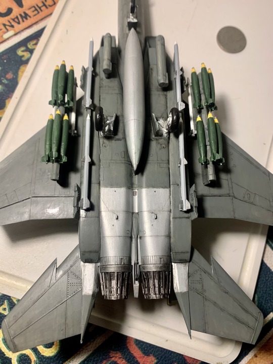
So... yeah. You might notice something missing here. As it turns out, this kit doesn't actually have enough parts to put the 12 green bombs I'd painted besides the Mk 82. They're supposed to go three alongside the edges of the conformal fuel tanks (where the missiles now are) and three on the little chunks poking out of the sides. But for whatever reason, this kit only has four of those little chunks instead of six. And due to some issues with the instructions, I think I also glued the ones it did have wrong.
On top of that, I had some issues gluing the hardpoints with the Sidewinders and Mk-82 bombs to the wings, mostly because hey, protip: gluing stuff that's already painted and varnished is waaaay harder than gluing stuff when it's fresh off the box. But I just had to be a smart boy and get all the panel lining done first... Very frustrating, especially after realizing this, too, isn't game accurate. But it'd never really been my goal to make something perfectly accurate to the game. Like with the Raptor, like with every kit I make, I'll always choose what looks good to me over what looks closer to the real (or virtual) thing.
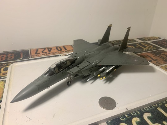
Eventually, the whole thing was done. Painting the cockpit was tricky but I've lost a lot of my old fears about it these days. And once the whole thing was varnished, I found myself really liking what I was seeing. The long nose, the beefy wings, the shiny engines... Maybe I'd been wrong about the F-15 all this time. Maybe it isn't really a boring jet. Maybe I just needed to let it back into my heart. And although it gave me a real tough time in a bunch of places, at the end it's low-key one of my favorite models so far, and a nice homage to an unsung game.
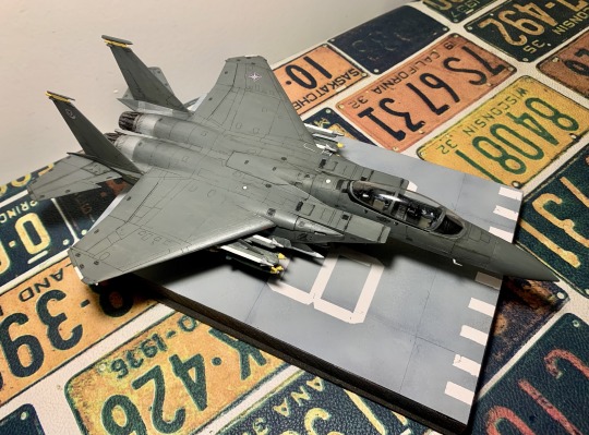
And it looks pretty cool on the Area 88 base too.
14 notes
·
View notes
Text
fuck it. tierlist for the stuff im watching rn;
the best things this season;


-jjk is here twice because the first arc(s) feels like a separate thing from the rest of the season. its hard to even compare the two, but my heart will always lie w hidden inventory/premature death. the vibe is just. so good -the shibuya incident though? my god. it kinda dipped a bit right after the hi/pd ended, but the last chunk of eps has been banger after banger. -if you ever rec migi and dali to anyone they'll think you're insane. but its really good. its so good but so deeply fucking weird and uncomfortable to watch during the entire middle part. -solid show. what else is there to say.
shows that execute their own premise very well;


-yonkyoudai is rlly sweet and surprisingly creative in terms of visuals. i wouldve put it at the best but. i could do without the brother complex guy (mikoto) -the mysteries are fun, they leave it all ambiguous enough to let you sleuth along with the characters. the pieces are usually all there for you to figure it out, but most of the crimes end up being so convoluted you wont piece it together before they explain it anyways, lmao. very manzai like humour though, which kind of has to be your thing. -my only gripe w bullbuster is that the 3d models for the monsters are bad. the mechs look fine and the 2d animation is actually really good. the story is pretty interesting so far, and goddd is this show funny.
fun for what it is;


-hypmic fan here. this season is a noticeable step up in quality from s1 (not to say that s1 was bad. in fact i loved it). its fun if you like hypmic. idk what this show would be like from an outsider's perspective -one of those wacky gag comedies. filled w a wonderful array of weird women. again, could do without the incest jokes.
couldve been better;


-wow what an amazing scene about casual homophobia and the portrayal of gay people in media! I sure hope they keep up this- oh so they want to make incest accepted now? oh so. oh now they're drawing parallels with homosexuality, calling both "forbidden love"? and the incest couple gets a happy ending? yeah ok. -the animation isnt nearly as bad as ppl say. they just hate 3d. the story however... well it all feels a little disjointed. the characters are an interesting bunch though, i rlly like all their designs too
not good but I'm enjoying it anyways;


-look. THIS is a show where the animation is below standard level. the character designs are rlly good though (no wonder, its ebimo) the music CAN be good. but sometimes it sounds bad on purpose (cause yknow. theyre still learning) but sometimes it sounds bad even when its supposed to sound good (the humming. THE HUMMINGGG) aside from that, the characters are rlly fun and i enjoy the stupid wacky shit that happens every episode
#migi to dali#atarashii joushi wa do tennen#yuzuki san chi no yonkyoudai#kamonohashi ron no kindan suiri#bullbuster#dekoboko majo no oyako jijou#watashi no oshi wa akuyaku reijou#kamierabi#kawagoe boys sing#tedpost#tedtalks#not tagging 2 of them since theyre already popular enough#tedlists#< fuck it new tag. since i did another one
43 notes
·
View notes
Text
So, as some of you might know, one of my GIFs was recently featured on the Tumblr Radar - which is pretty cool! I was fairly happy with how that one turned out, especially considering that I made it rather last-minute on a whim to acknowledge Valentine’s Day. It understandably received a lot of attention as a result of this, and I’ve loved reading through all the comments and tags (especially all the ones about how people want to eat the heart containers from TP); however, I wanted to clear up a bit of a misunderstanding surrounding the creation of that GIF, as there were additionally a lot of tags along the lines of #3d art or #artists on tumblr in that influx of reblogs. I don’t want to take credit for something I didn’t do, even accidentally, and so allow me to be perfectly clear: the heart container GIF is not something I modeled and rendered myself! It is the original in-game model, recorded in-game using the Dolphin GCN/Wii emulator, with very little done in the way of post-processing in Photoshop. If that sounds impossible or confusing (which is perfectly understandable, for those of you unaware of what Dolphin is capable of), I’d like to take this opportunity to give you guys a bit of a “peek behind the curtain,” as it were, to show you guys exactly how I made that particular GIF, as well as similar ones I’ve made (such as those in my #items tag).
I didn’t take screenshots of my initial process (nor did I save the edited textures I used), so I’ll be recreating it from the ground up for the sake of demonstration, but that shouldn’t be a problem.
First thing’s first: finding a heart container! For this particular GIF, I wound up using the one that spawns after the Morpheel fight at the end of Lakebed Temple. I’m sure many others would work just as well (I think, at the time, this one just happened to be the most accessible to me), but let’s use the same one for the sake of it.
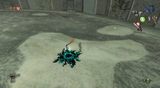
Morpheel: defeated. And I didn’t even need Zora Armor! (Seriously, we do that in the speedrun. But I’m getting off-topic.) Of course, we’re going to need clean, close-up footage of the heart container rotating in order to do what we want to do, so let’s shift into first-person mode and and get a bit closer to the thing.
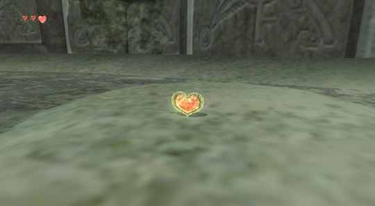
Now, because the only UI-element in this shot is Link’s health (and it’s in the corner and relatively non-obtrusive), removing it isn’t strictly necessary - but I’ve already made a texture pack that removes UI elements as part of my Text Free TP project from a while back, so let’s load it anyway, for the sake of being thorough. This shot is also still a bit too far away, so next we’ll be utilizing Dolphin’s free cam feature (which can be accessed by going to Graphics > Advanced > Free Look and checking “Enable” in Dolphin) in order to get the heart container in a more central position. Now we’re left with this:
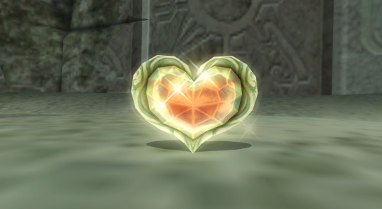
And we’re already looking well on our way to making a nice, solid color background GIF. But how do we get the solid color? Well, that’s where more texture editing comes into play - and here I have to give credit where credit is due, as this is a trick I picked up from 186px, after wondering how they were able to make this GIFset of Link fighting Ganondorf in The Wind Waker in a great, black void. (Seriously, shoutouts to them, their stuff was and still is amazing.)
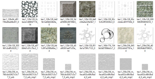
But, very basically, we’ll be using Dolphin’s texture dump feature in order to find the textures that need to be edited so we can replace them with pure black ones. Texture dumping can be enabled by going to Graphics > Advanced > Utility and checking “Dump Textures,” and the file path for these dumped textures by default is Documents > Dolphin Emulator > Dump > Textures > [Game ID]. (In the case of Twilight Princess, the Game ID is GZ2E01). After dumping the textures in the Morpheel arena, my GZ2E01 folder looks like this:
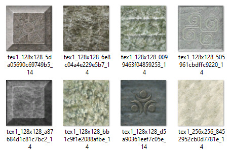
When editing textures, sometimes you’ll have to endure a bit of trial and error until you find the correct ones. Luckily, in this scene, the textures making up the sand floor and the stone walls are rather large, so let’s isolate the ones we’re pretty sure are responsible (plus a few others that are obviously environmental, just to be safe).
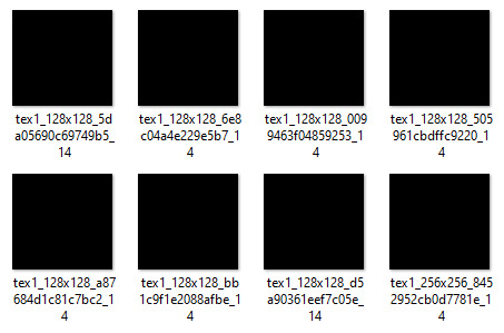
Now, when loading custom textures, it’s important that the file name you’re trying to load matches up exactly with the original texture that you’re trying to replace. I have a plain, black, square PNG that I keep on my desktop specifically for this purpose; I copy the file names of the textures I’ve isolated, then rename and drag and drop the black PNG into the folder where custom textures are loaded (Documents > Dolphin Emulator > Load > Textures > [Game ID]). Like so:
And now, to refresh our custom textures by disabling and reenabling them in Dolphin’s graphics settings:
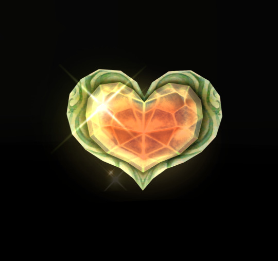
And voilà! We have something that very nearly resembles the GIF I made (well, a still of it, at least). I skipped over a few details, such as the fact that TP has a pretty significant amount of bloom surrounding just about everything, which I’m fairly certain I disabled using cheat codes when I made the original GIF in order to give it an overall cleaner look. It’s hard to tell from this still, but TP’s heart containers also sparkle considerably in a way that’s random and not loopable; I found the texture responsible for this sparkle and replaced it with a transparent 1x1 PNG, in order to remove it entirely (as well as the texture behind the “glow” of the thing). After that, it was as simple as recording the game with OBS, dumping the MP4 into Photoshop, cropping and cutting it to make it loop, and adding some adjustment layers for contrast and color. So...yeah!
I hope this has served to clear up any confusion about some of the things that I’ve made in the past. I’m not a 3D artist - just a person with an emulator and way too much free time on their hands. This stuff is really, super simple, and also lots of fun, so I would highly encourage anyone with the means to mess around with emulation on their own some time to see what they can do! (Even if you don’t have Photoshop and can’t make GIFs, there are always edits, such as this one I made of Midna.) For Twilight Princess in particular, I also highly recommend checking out TPGZ; it’s a patch you can apply to a clean ISO of the original game, designed with the purposes of helping folks learn and practice the speedruns (yes, I had to bring up speedrunning one last time, kill me), but it’s got nifty features like built-in savestates, cheat codes, and HUD removal, as well as the ability to freeze actors while maintaining the ability to move the camera freely, among other things (all things that are very useful as far as making unique graphics go). Sorry this post got as long as it did, but I at the very least hope that some of you found it educational and/or interesting. Cheers!
#uhhhhh i don't even know how to tag this#not like it will show up in the tags anyway because i've linked five billion things#twilight princess#long post#tutorials#i guess????#resources#myposts*#i didn't intend for this to be a tutorial i just wanted to explain that i'm not a 3d artist lmfao#OTL
72 notes
·
View notes
Text
3D printing- demystified.
My remodel is ongoing, but that doesn't mean everything has to be put on hold. I have big plans for future collections and with 3D printing one can really create a unique and thematic army (demons anyone?). But, another project first to get back into the groove. I will be using the free Jailor model from Endless Menaces' collection. He has several free & detailed pieces for download. Lots of them Wow themed. 3D printing utilizes a special type of CAD file know as an STL file or 'Standard Triangle Files.' Basically, these represent three dimensional drawings of something (the jailor) that you can print. These files are then put into either CHITBOX (shit box) or another software to fiddle with. Here you can arrange them on the build plate- many things on the build plate creates a more efficient print. Additionally, here one can add supports to the piece.

Because the file was unsupported I had to add these scaffoldings to every piece. The software does it for you, although there are options for true freaks to go in and place every stand off on their own. This stage, arraigning the build plates, is the most irritating part of the process in my opinion. From here you slice the file. 3D printers operate by hardening every slice of resin with UV light until it becomes something recognizable. Slicing also tells you what the print time is going to be for the project. In the legs case about 3.5 hours. Finally it also tells you what the cost of printing will be in resin. Printing is generally cheep. Even the solid basilisk models I used last year were only $7.00 each in resin.

Here is what the print looks like after about 30 minutes. I like to check at this stage to see if the machine is working. Occasionally if the build plate is not aligned properly it will cause an error or there can be errors with the raft not sticking to the build plate. when this happens its best to empty the resin reservoir, realign the plate and start again.
The Jailor cooperated with minimal printing errors, thankfully. Here is the result of a successful print still on the build plate:

Once the piece is printed it needs to be washed in Isoprophil Alcohol then cured with UV light. Resin is very toxic, do not touch it and then put your hands into your mouth like me. Always use gloves (unlike me).
And here are all the pieces printed for just the main sculpt.

A little all over the place.
I would say the piece has a 90% success rate. The loin cloth pieces came out very thin in some parts, I think I will either reinforce them with green stuff or reprint them. There are also errors on the left arm that will need to be sculpted back before assembly.
Next: Head shots
5 notes
·
View notes
Text
Performative Badassery & Women in Kdramas
When I said I wrote an essay, I meant essay. This is a long one! Grab a snack and venture below the read more. I’ll see you at the end!
----------
You know the feeling. The drama begins. Our female main lead walks onto screen. She’s a successful businesswoman, a hotshot detective, clever lawyer, smartass retail worker, etc, etc. She stares down a random man to prove she’s the powerful one here. Or kicks some ass. Or rattles off a bunch of demands to her workers. Or talks fast to show off her intelligence.
Then she meets the male lead. There’re fireworks. Slowly we find our female lead has a softer side. Good to know. 3-dimensional and complex characters are important. It’s nice to see women on-screen who are both capable and emotional. Kick ass and feminine.
But slowly... something starts to go wrong. She seems to be crying more than showing literally any other kind of emotion. And is it just me or is she getting saved and manhandled and flustered quite a lot for a woman who we were told was so well put together? Sure, the circumstances are extreme. But they’re extreme for the male lead too and he seems to be managing just fine for some reason. Also, if both of them are ordinary people with no on-screen fighting experience, how come he’s so great at throwing fists out of nowhere and she’s busy keeping hidden or needing rescuing? Exactly how many times can one person just faint like that without anyone checking to see if she has a medical condition?
By the drama’s end our lead has gone through trials and tribulations. She’s fallen in love too, I’m happy for her. But... now that the story’s ending and she’s getting in one last chance to show us she’s a “badass”, why am I left feeling hollow? She’s showing us how tough she is but... we ALL spent this whole drama watching her have absolutely no agency or such a little amount that she might as well have been trying to put out a fire with a water-pistol. It’s almost like her previous badassery (in whatever form it may have been - I don’t mean badass only in terms of being able to throw a good punch) was just a façade. A way to hook in female viewers like me who want to see something more than a wilting wallflower or one-trick Cinderella. But the tiniest knock and the cardboard house collapses.
And no matter how many times we get throwaway lines about her being “the smartest/toughest/scariest/most capable one here” it doesn’t ring true compared to the actual character we’re watching.
Rom-coms, melos and sagueks especially (but many more genres besides), have a real problem when it comes to performative badassery in their female characters. The writers give us a female lead they claim is hyper competent, but the reality is totally different. Any plot that features romance, almost always features this. Honestly the way the start of the relationship in dramas actively MURDERS the female character’s agency could be its own essay so I won’t go deep, just know the two are 100% linked.
The “Faux Action Girl” Problem
A Faux Action Girl happens when a writer wants the popularity that comes with having a cool action girl character, or they want the praise that comes with writing a lead that breaks gender norms, or they want to be lauded for writing a FL whose more capable & progressive than the female kdrama lead we’d imagine, but they don’t end up actually giving us her. Instead we get the fake or faux version. The reasons are usually a combination of:
Relying on outdated tropes. Wrist grabs, damsels in distress, a girl fainting so she misses some vital plot related moment to increase runtime etc...
Sexist worldviews. As a by-product of being Korean which is still a heavily sexist country because of the holdover of Confucianism mixed in with the Christianity westerners brought over that leads many writers to (often without even realising) inserting moments that inadvertently reduce their female leads because they think that’s what correct or natural for the female character based on their opinion of women in general. Even if it doesn’t actually fit the type of character they’ve set out to create.
Executive meddling. Producers who think their demographic wouldn’t be able to handle a real badass but also know their female viewers want more complexity and agency in their FLs these days and so give us the paper-version instead of the 3D model.
This character’s more “badass” traits are nearly always just an Informed Ability (the writers tell us via other characters what she can do but never actually show us on-screen these same things) or we only ever see her utilise them once/twice at the beginning and maybe if we’re lucky once at the end, but never again.
It really hurts.
The “Badass Decay/Chickification” Problem
Sometimes she really is a legitimate action girl though. She’ll be a cop whose good at her job or an ordinary citizen whose well-versed in taekwondo. She has actual moments on-screen to prove herself.
Well. She has moments in episodes 1 and 2. Then she almost always goes through Badass Decay/Chickification. Which means that writers (& producers) believe that if we don’t see her having a softer side, she’ll become unrealistic or unlikeable.
They fix her. So she becomes more vulnerable. As the only girl on the team (usually), she becomes the one who ends up injured more often or needs rescuing most. Her life begins to revolve entirely around her romance and nothing else. (Meanwhile the male leads gets to have the romance and keep his side-quest - have you noticed that? If the FL is really lucky she gets to keep one side-quest too, maybe a dream job or solving some family mystery. Never more though.. only men get to be complicated here). Once she was competent... now it feels like she legitimately had a personality transplant.
Is this even the same person we began with?
The “Worf Effect” Problem
Worf Effect is when the danger/power level of a villain is shown to the audience by making him successfully attack/hurt/ruin the plans of someone that the audience knows is skilled. This isn’t a bad thing alone and writers use it all the time. We need to acknowledge the villain as a proper threat and this is a useful way to do it!
But in kdramas it’s something used almost always against the lead female character. The one we’ve seen is intelligent, or strong-willed or quick-witted.
And because it’s always her, this character begins to look weak. If this writing trope is abused, her reputation as the "biggest, toughest" etc. begins to look like it never existed and we’re back to her having an informed ability.
That this is something that happens to the female characters not only more often but almost exclusively is a sign of sexism. Plain and simple.
Competent, Real Badass Female Characters Aren’t Scary
If you’re going to sell me a capable woman, give me her.
Not someone who has one very unique, specialised skill but otherwise can do nothing else except for that one time when her one skill is useful.
Or has built up her own empire, implying a certain level of smarts, business ability or networking skills, but then once she’s removed from it she becomes so utterly useless it begs the question how she built that empire in the first place.
Or has a rep as the detective whose taken down the toughest guys off-screen, but whatever skills she used to do that seem to disappear the moment anything really challenging happens on-screen.
I’m not saying she needs to win all the time. Of course she doesn’t, how boring is that? All I’m asking is that when she loses, it’s in keeping with the character I’m supposedly watching. A woman that can kick ass can still be outwitted. A clever woman can be physically beaten. A street-smart girl can be foiled by rules and regulations. A leader-type can be beat by someone whose more unconventional.
It’s not difficult to write someone like this. I know the writers can do it because every male lead is written this way. I’ve never once, whilst watching a badass male lead lose, get beaten and cry, thought “oh no, his badassery was fake all along!”
Because when he loses it makes sense. It’s in character. There’s a solid plot reason behind why it happens.
Meanwhile my ladies who are meant to be able to kick ass and take names somehow just got kidnapped out of nowhere?
Make it make sense!
Consistent Characterisation is Good Writing
I get wanting moments where one is injured and the other fusses over them. I love those moments! All I ask is more imagination taken to get us to that point. Make it in-character. If my taekwondo black belt is kidnapped, I want to see her really fight. I want the kidnapping to be shown as genuinely tough on the people trying to nab her. Imagine how much more satisfying it would be to see her fight off all these bad guys, yet still end up losing? How much more heart-breaking?
We’d be so much more invested in the mind games or politics the villain is playing if the female lead we’ve been told is good at that stuff is playing the game just as hard. When she loses it’ll hurt more.
Writers need to stop being afraid that her remaining capable in some way diminishes the masculinity, attractiveness, prowess or “hero” status of the male lead. Trust me. It doesn’t. Ever.
It’s not a case of either/or. We don’t think less of the male lead because his partner is as capable as him in whatever way that may be. Instead, we think more of them both. Once a romance begins, the heightened worry both characters have for each other should only make both of them stronger in whatever area they’re skill lies in. Not just make the man a sudden defence wall and the woman a worrying mess.
I’m sure everyone who reads this can immediately think of at least one drama with a FL who is a Performative Badass. I know I had about ten in mind as I wrote this.
There are exceptions. Cases where the badass gets to stay a badass. Usually these cases happen in genres without romance because like I said above, those problems are linked. But I can think of a few romcoms/sageuks/melos where it happens too.
But those are the minority.
Women in kdramas. Give them agency. Make their characterisation genuine, not just a bit-part for the sake of a cool trailer. Not just one moment someone can edit into a “badass multifemale” video edit - only for us to watch the drama from the clip and discover we’ve been sold a lie.
How satisfied would we be?
Writers! Give us a story we enjoyed because of the excellent characterisation. A new female character we can add to our lists of faves. Women who proved themselves as consistently badass as their first scenes claimed. Women in kdramas who, no matter what problem they faced, don’t become echoes or paper-thin versions of who we were promised.
Actual, complex, layered, enjoyable, KICK-ASS AND BADASS female leads.
Wouldn’t that be a miracle.
----------
PS. This is an open notice that it’s OKAY to reblog with added commentary/thoughts/rambles of your own. I would *love* to see it if you have anything to add.
----------
(Disclaimer: This essay was written with a specific female character type in mind. I am not saying every FL needs to be a badass or hyper competent. Soft, shy, physically weak female characters exist and can be just as realistic and complex. There’s a few I can think of who I adore. Instead my essay is very specifically about characters who are *meant* to be badass from the start but then... don’t end up being. So, yeah, before anyone claims I’m some angry feminist who needs every FL to be some tough martial artist or something. Absolutely not! Diversity is amazing and interesting. All I ask is that when I am told I’ll be getting a badass in a drama I get her. Not have my heart broken by the fake wilting flower I find in her place. Ok. End disclaimer. ^^)
----------
Also I’m tagging a bunch of you because you reblogged my post saying you wanted this so here! TY for making it to the end ^^
@kdramaxoxo @islandsofchaos @storytellergirl @vernalagnia-blog @lostindramas @salaamdreamer @planb-is-in-effect
#kdrama#kdrama discourse#kdrama feminist#women in kdrama#badass women#strong female lead#though to be clear I am an angry feminist lmfao#how does a woman living in this world not be tbh
297 notes
·
View notes
Text
Finished Season 4 of Castlevania: the Netflix, and thus the whole series! And I’ve got a lot to say!
Here’s the biggest observation for this season: I get the impression that they didn’t originally plan for this to be the final season. It feels like, at the start of Season 3 they believed they were going to have two more seasons, and then maybe by the time they started wrapping that up they were told they’ve been cut down to just one more, so they had to speed of the pace of Season 4 dramatically to make sure they could still hit the ending. I have no actual evidence to support this- I haven’t read any interviews or official comments to that effect- just a gut feeling based on aspects of the plot:
Biggest support of this is how quickly Saint Germaine is just like “ok I’m evil now”. He immediately submits to the random woman who tells him he’s gotta be evil to find his lady love, there’s one scene of him murdering a guy, and then he’s all-in on being a villain, complete with “I AM A GOD WHO FUCKS” monologuing.
In addition to Saint Germaine’s heel turn feeling half-baked, the Dracula’s resurrection plot in general really doesn’t feel all that important until the finale. Varney is a comic relief character, which in hindsight was completely intentional, but Ratko and Draken are just huge fighter dudes who weren’t involved with Dracula’s court during Season 2, but are very into bringing him back for reasons that are never clearly explained besides the assumed “it’s Dracula so we gotta”. Additionally, the way major characters like Hector and especially Isaac treat the resurrection plot don’t help, although it makes perfect sense that they both do what they do.
The things that happen in Targoviste, and the way they happen, also contribute, especially because there’s no satisfactory resolution to it. Trevor and Sypha start to help the people organize and rebuild, and then get whisked away to the Underground Court. They barely have time to react to the fucked up shit going on down there before they teleport to the castle to kick off the finale. More time to let hostilities between them and Zamfir bubble up before the reveal of the Underground Court, along with a more satisfying build-up to Trevor collecting the components of the Super Holy Dagger would have been good.
Season 3 ends with Alucard in Hector in very bad places: Alucard has just been betrayed by the twins vampire hunters, which has brought out a misanthropic streak, including him leaving them on pikes, and Hector has once again been duped into an even deeper submission than he was in as Carmilla’s prisoner at the end of Season 2. Trevor and Sypha’s vignettes establish that roughly a month and a half have passed, which was apparently enough time for Alucard to basically get over his trust issues, enough to help the villagers, and Hector to not only cope with the reality of his situation but also finally develop into a character on par with every other major character in terms of competence.
Carmilla and Isaac’s stories didn’t feel rushed like everything else I’ve mentioned, but following the train of thought that there was originally going to be more episodes, both of them could’ve stood to have more time and events to get to their final forms.
So, Death: I don’t know how I feel about Death as portrayed in this series. On the one hand, this interpretation technically not being Dracula’s right hand as he is in the games, and instead being an independent actor that stands to benefit from Dracula’s rampage and thus serves the same capacity as a right hand, is incredible. On the other, the fact that Death’s true personality is actually just Varney fucking blows. The design for Death is also not my favorite, because it reminds me just a bit too much of Castlevania Judgment, but Malcolm McDowell being the voice actor is really cool. In conclusion, Death is a land of contrasts.
On that note, “no it’s not Death Death, it’s an entity that calls itself Death that feeds on death and is an elemental spirit- or force of nature in other words- but is distinctly different from the personification of the concept of-” just fucking say “yeah for all intents and purposes it’s the Grim Reaper”. Coming up with a semantics explanation for why vampires get fucked up by crosses to explain the cross subweapon is fun, don’t undercut your final antagonist by trying to rationalize it into something less fantastical.
I already said that I liked the motivation behind Death, but also the execution of “I’m going to bring back Dracula wrong on purpose” and the way he accomplishes that is the best it’s ever been.
I thought Varney hopping over the stream of holy water was a fun cap on the argument about whether or not vampires can cross over running water from Season 2, but was in fact clever foreshadowing, since Death isn’t a vampire. Good stuff!
I think it’s just because I’ve been focusing a lot on animation quality over the last few months, but I noticed they started using 3D models a lot more this season. I imagine it was a matter of practicality considering that there are more action setpieces in this season than the other three combined. I think this is ultimately a good thing, because they do a very good job of masking the fact that they’re using 3D most of the time because it still looks very good, unlike some of Netflix’s other 3D action projects, and if it makes life easier for the animators without sacrificing quality then that’s a win for everyone.
Didn’t think much of it at first, but I’ve really come to appreciate the term “night creatures” as a catch-all for monsters in this series. It’s generic enough to encompass everything regardless of design difference, but more unique than just ‘monsters’ or ‘demons’.
I had heard someone make a joke about a character wearing Artorias Dark Souls’s armor for a scene because fuck you, but holy shit, Striga really does just wear Artorias Dark Souls’s armor for a scene because fuck you.
When Saint Germaine first shows up, his lines sound really low quality compared to Alucard and Greta, and then that issue goes away after that episode. I imagine that it was pandemic related, but clearly Bill Nighy was either able to get into a studio or eventually got a better home setup- couldn’t you just have him re-record those lines?

I’ve talked so much about how Carmilla’s design in this series is The Best™ because they masterfully adapted a single sprite with no animation from a 1987 video game into a fully realized design, and this frame in particular struck me as perfect. This is the best this character has ever looked and likely will ever look.
I love how optimistic and positive the tone of everyone’s ending is. Ranging from the unexpectedly beautiful and uplifting resolution to Isaac’s story, to the foundation of a town that fundamentally accomplishes what Lisa hoped for at the very beginning of the series, it’s all nice way to go out. Even Lenore choosing to commit suicide, while not necessarily optimistic or positive, is at least on her own terms.
Dracula and Lisa also having a happy ending is nice. It doesn’t really make any sense, and it makes me wonder what Richter’s call to action is going to be in the next series, but I think they were right to have the series end with the same two characters it opened with.
AYY SOMEONE THREW A WINE GLASS!!!
Unfortunately, I’d say Season 4 is the weakest of the series, but they did everything they could to make sure they provided an explosive finale and a solid ending. This was a damn good show and without a doubt the best thing to be associated with Castlevania in over a decade. Not that it had much competition there, but still!
As a final note on the nature of Castlevania as an adaptation: I can certainly understand why certain people don’t like this series. If you’re looking for Castlevania: The Video Game: The Animated Series, you’d walk away disappointed because of how many things were changed in adaptation, how much they were changed, and that so much is just made up from whole cloth. But an animated series isn’t a video game, and while an eight episode series where each episode is a different stage of non-stop fight scenes, complete with a big boss fight at the end sounds like it could be cool, if that’s what I really want I’d probably be better served just playing a game.
9 notes
·
View notes
Text
I’m doing this for fun simply because I'm rewatching them all so,
Here's my personal ranking for Every Gorillaz Music video, based both on song and the video itself:
(This is going to be a long post)
PHASE ONE:
Tomorrow Comes Today: 7/10. I love this song and the video fits its vibe, but its still pretty simplistic and not a whole lot of actual animation and no story, so it gets points off for that.
Clint Eastwood: 10/10. I love this one honestly. Its still so charming after all this time and showcases the band well for their early days. Love the more moody tone of it, and I always love seeing the band actually play instruments in their videos too. Bonus points for Murdoc's laugh opening this one because I love that.
Rock The House: 9/10. Pure fun. I don't have a lot of commentary for it, I just think its fun and I love the song itself too. One point off for Murdoc thrusting his hips too many times for my eyes tho.
19-2000: 10/10. This one was the first Gorillaz video that I saw and it really is just a nice non plot connected video. The 3D animation still manages to hold up because of its mix with 2D animation in my opinion and I enjoy it.
Rockit: 5/10. I like the song but the video is kinda meh.
PHASE ONE MV'S OVERALL: Overall I like phase one and I miss Del. Bring him back.
PHASE TWO:
Dirty Harry: 8/10. 2D is just vibing so hard in this video and I'm living for it. That’s all that matters. (Side note but I love the version of this video they did for the BRIT's as well.)
DARE: 10/10. Noodles time to shine, a perfect song, what more could you ask for?? (Also love the bit with Murdoc at the end of course.)
Feel Good Inc: 10/10. This one is obvious if you know me at all. Murdoc playing his bass is what sells this one for me cause I enjoy the animation. The songs amazing and one I find comforting to listen to, and the mood of the video fits it perfectly. Theres some really fun shots with lighting while 2D is standing at the window too in the tower in here that I've always liked.
El Mañana: 6/10. I love this song but it makes me sad and so does the video.
PHASE TWO MV'S OVERALL: Phase One is iconic for its art style and for being The Beginning, but Phase Two is my favorite of the two for its art. I love how these videos are animated, and even if Demon Dayz is my least favorite album, the songs in these videos are all very good. Pretty solid as a whole all things considered.
PHASE THREE:
Stylo: 10/10 LISTEN, I KNOW SOME PEOPLE HATE THE CGI, BUT I LOVE IT. It’s so expressive, this song is one of my absolute faves, I’m sorry to be such a Murdoc liker but hes so much fun in this video and so expressive and it starts the story off for Plastic Beach. I love it so much.
On Melancholy Hill: 7/10. It’s not a bad video, and I love the song a lot, but...not a lot actually happens in the video aside from the bits with Noodle. Bonus points however go to just how seamlessly it puts 2D and 3D animation together, and for how cute 2D looks this whole video.
Rhinestone Eyes: 9/10. WOULD BE A 10/10 IF WE’D GOTTEN OFFICIAL ANIMATION FOR IT ;-; (The fan animated video for it tho is Very very good and i applaud that whole team.) Amazing song, this video has the most story packed into it so far from all the other videos and it’s memorable from its storyboards for that alone.
Doncamatic: 10/10 Listen...Listen I know its a one off and it doesn't really have anything in it but I’m obsessed because its one of my favorite Gorillaz songs tbh and I love Daley’s outfit in it so it gets a full pass from it.
PHASE THREE MV’S OVERALL: I love every video this phase tbh, none of them are bad. All of them are fun,and even if Melancholy Hill is a little slow, it’s still enjoyable. I love this phase because they all connect and I know I’m not the only one who feels that way either.
PHASE FOUR:
Hallelujah Money: 7/10. It’s not at all bad, but I’m as not fond of this song, and the video itself is much too trippy for me. Still has its own merits tho that I won’t knock it for even if it’s not my personal taste.
Saturn Barz: 10/10. Everything about this video is amazing. Character designs and as a comeback for the bands animated counterparts, it was perfect. I loved hearing them actually speak again too it made the whole thing so fun. The song is fuckin awesome and it fits the vibe of the whole video. Bonus points for the more lineless animation style they gave everyone in this video, it was a really neat change from past phases. My one complaint is again stop making me see so much naked Murdoc, I may like him but not like that.
Sleeping Powder: 6/10. I am so split when it comes to the mo cap models. This songs good but the video is again too trippy for me.
Strobalite: 9/10. Would have been 10/10 if Russel got to dance with 2D and Noodle, but other than that its pretty damn good. The mo cap looks way less awkward in here, particularly Murdoc and Russel. Also hilarious that Murdoc made a deal with the devil, and the guy who played him is actually his voice actor irl. This songs too much fun to vibe to as well.
PHASE FOUR MV’S OVERALL: Not much for story, but makes up for it in updated art and great music again. Solid overall yet again. I like it.
PHASE FIVE:
Humility: 20/10. Literally every single person I know who’s seen this video loved it. The animation is Beautiful, the song is so fuckin catchy, Jack Black is in it! What more do you want!! (The only thing I could have asked for was to see more of Ace but that’s its only flaw.)
Tranz: 9/10. I love this song so much but this video is Again just a little too trippy for me. However, we get to see Ace just jamming out in this video and I’ll take the trippiness just for that.
PHASE FIVE MV’S OVERALL: I was surprised there wasn't at least one more video for this phase honestly? I feel like Kansas or Souk Eye would have made for great videos for this phase. That aside tho, both the videos it does have are a lot of fun. My literal only complaint is that I wanted to see more of Ace. Bring him back in the future.
PHASE SIX:
Momentary Bliss: 8/10. This songs fine, but what sells it for me is the video is more slice of life/a day in the life of the studio. I’m always a fan of those moments. Bonus points goes to Murdoc trying to fuckin poison Jamie and it backfiring on him.
Désolé: 10/10: ooooh this song is so beautiful...I love it so much. 2D Noodle and Russel got to have such a fun time in this video and they deserve it. And poor Murdoc, having his little sad times by his asshole self. I love him but I think he deserved it. The others needed a good break from the bullshit and I’m glad they got it.
Aries: 6/10. Video itself is kinda boring, but the song is nice. Murdoc deserved to be left behind in Désolé after what he tried to pull here.
Friday the 13th: 3/10. I don’t care for this video and I really don’t care for the song. Not much else to say.
PAC-MAN: 6/10. Video’s fine, I like some of the little details in it, but it’s nothing special. The song itself is nice tho, super calming, I like it.
Strange Timez: 20/20 MY GOD I LOVE THIS ONE SO MUCH...VISUALS ARE SO FUN, I LOVE ROBERT SMITH SO I LOVE HIM IN HERE, ITS JUST A GOOD TIME ALL AROUND!
The Pink Phantom: 5/10 I just don’t really care for this song?? I like Elton John but I couldn’t get myself to like this one no matter how many times I’ve listened. 2D got to be happy in this video tho so I’ll give it a pass.
The Valley of the Pagans: 6/10. This song fuckin slaps but the video feels like a boring redo of 19-2000 except for it’s ending. It gets points for giving everyone Plastic Beach feelings at the end and hyping up the video after it.
The Lost Chord: 20/20. Y’all knew this was coming. This was something I’d BEEN hoping for story wise and I finally got it. Was it maybe a little rushed? Yes. But GOD it was such a nice thing to see them say “hey we’ve wrapped up this part of the story for good and want everyone to move on from it, so we’ve given it a properly acknowledged final send off.” And tangibly seeing everyone's emotions laid out about the island and their times there was very nice. And I know Jamie and Damon have stated Murdoc is irredeemable, blah blah yes I know hes an asshole still, but I WILL think about Murdoc in this video and how he seemed actually regretful and what that means to me and the fact that it was no one else but 2D himself being the one to reach out to Murdoc in the end to save him until my dying breath, thank you very much. And this song?? Fuckin beautiful, it had those Plastic Beach vibes again and felt good for it’s send off song, I love it.
PHASE SIX MV’S OVERALL: I may be a little split on some of them and on Song Machine as a whole, but tbh I love the phase six art style so much and most times the videos were pretty good. Bringing back PB in the end was something I always wanted too so it really does get bonus points from me for that. I’m 50/50 on them overall. The great ones are great, and the meh ones are just kinda boring, so it evens out in the end.
STAND ALONE VIDEOS MENTION:
Do Ya Thing: 10/10. I’ve said before I love the 3D animation and the slice of life stuff, so this one’s obviously a favorite, and you really cant go wrong with an Andre 3000 feature either.
Superfast Jellyfish: 3/10. This song is kinda fun but I don’t give a single shit about the music video.
Garage Palace: 8/10. Very fun pixel visuals for a change along with a killer song, super enjoyable.
So what’s my final verdict on Gorillaz and their long music video history?
Honestly for a group thats been going as long as they have, I dont think they have too many misses in their catalog. The ones that aren’t as fun are just kinda there, but the videos that really stand out stand out far above the ones that don’t hit the mark as well and in the end it all feels like a good balance. No band has a perfect video every time, but the ones that Gorillaz did well they did amazing on and I enjoy it immensely when that happens.
Sidenotes after watching all of those:
For the love of god please put Russel in the videos more, please, he deserves it and I would love to see him more.
On that note, BRING DEL BACK WITH HIM TOO!!
And speaking of characters to bring back, I want Ace to come back and join Murdoc sometimes, even if its only once or twice more, I need to see them interact PLEASE.
Last note but Jamie, please, I’m begging, show less of mostly naked or fully naked of Murdoc in future videos, we’ve had our fill by now.
#can you tell im hyperfixating again??? anyways#kief rambles about gorillaz#gorillaz#this was fun but good lord
19 notes
·
View notes
Note
misdreavus?

YESSSSSSSS MISDREAVUS!!!!!
Misdreavus is an absolute favourite of mine, and the pre-evolution of my current #1 favourite pokemon overall. It’s a pokemon I’ve got a long history of adoring at this point, and is also the first Ghost-type I’m reviewing, which happens to be my favourite type as well. I wasn’t actually all that fond of it as a child, though, because child me had trash taste, but it’s not atypical for kids to have trash taste so whatever. I love it now and that’s what matters!!! This cute lil spookster is gonna be gettin��� pure praise from me! It’s got a great colour scheme, great hair, and an expression that exudes the sort of chill-yet-mischievous vibes I love most in a pokemon.

Basis-wise, Misdreavus is probably the most “traditional” ghost, albeit with a bit of banshee mixed in with its title of Screech Pokemon and its propensity for startling people. It has a clear resemblance to a floating disembodied head as well, perhaps indicating an additional basis in the youkai nukekubi, a human-like being whose head can detach and fly around at night. It uses its necklace-like red orbs to absorb fearful emotions from people, which it converts into nourishment, effectively eating fear. Eating fear is a concept I’m sure I’ve seen before, but it’s a great concept for a ghost especially, since it provides an incentive for scaring people and justifies so much otherwise-baseless ghostly behaviour! Like, of course a ghost would be scary, if that’s how it eats!

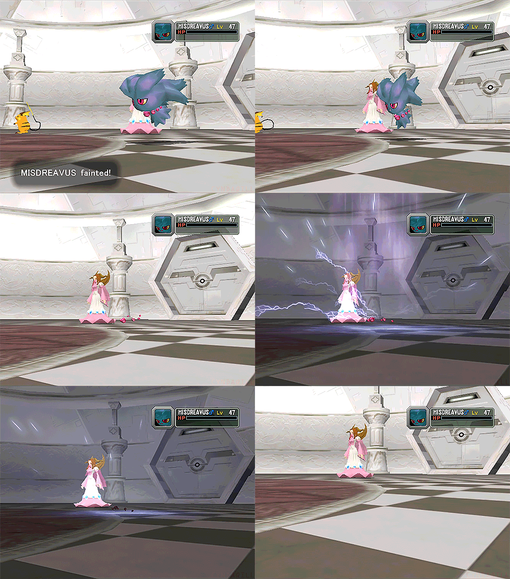
The scariest thing Misdreavus can do, though, is my absolute favourite attack! Perish Song is a move that makes it so both the user and all pokemon present to hear it will spontaneously faint in three turns. The only way to avoid it is by switching out, which led to it being paired with a move that prevents switching, Mean Look. This strategy, known as Perish Trapping, was somewhat notorious in Gen II’s competitive scene and has occasionally seen fringe use since, with Misdreavus being the strategy’s best user when the technique first emerged.

As marvelous as Misdreavus is, though, its design actually took a fair bit of time to actually finalize. We know from the GS beta releases that Misdreavus was a very late addition to the games, absent from the 1997 beta and then added to the 1999 version in Norowara’s slot (a creepy doll made of straw). Its sprite was also somewhat unfinished-feeling even in the final game, with very inaccurate indigo and magenta colors. What’s really interesting, though, is that its original artwork seems intended to communicate something entirely different from what we ended up with: iridescence. Notice here how the pink bits aren’t uniformly distributed at the hair tips; they’re placed seemingly randomly. The anime was quick to simplify this to just the tips, but Stadium 2 actually left its hair a solid teal color and then gave the entirety of its body a unique pink shine effect. It’s sad that such a unique design feature ended up getting dropped when the designs got more standardized in Gen IV; I suppose consistency with the anime was just higher priority. Beyond the color, its hair also used to be much less defined, just sort of being a wavy amorphous mass. This would get toned down in XY, though, with its hair becoming a consistent seven tendrils once 3D models became a focus.

Regardless, Misdreavus is pretty much perfect, but there is a major criticism to be had: its distribution in its original appearance. I talked about this with Zorua, but one key to a pokemon’s popularity is actually being able to USE it, and nobody could have conceivably used Misdreavus in the Gen II games because it never appears until Mt. Silver, the VERY final area in the games. Sneasel was in a similar predicament in GS, but that got fixed in Crystal by moving it to Ice Path, whereas poor Misdreavus never got a proper playable role in Gen II at all. This did get fixed with Cliff Cave in HGSS two generations later (which messed up Sneasel again!!!), but by then Misdreavus had already gotten eclipsed in popularity by its evolution.

Unfortunately, Misdreavus is also one of those pokemon cursed by a pukey green shiny, but it’s not like it was gonna improve upon such a fantastic base colour scheme anyway. Teal with pink is just too good to beat, y’know? It was more of a chartreuse in past generations, having some bright citrus vibes, which I think was superior even if less ghostly. Wish XY didn’t arbitrarily decide to make some shinies worse.
But yeah, I absolutely love Misdreavus. I vibe with its nefarious trickster demeanour more than nearly any other pokemon, and whilst it’s kinda been usurped by its evolution as my #1 favourite for awhile, it’ll always hold a special place in my heart. There’s really no improving upon this precious perish baby uwu
You fainted/10.
60 notes
·
View notes
Text
Games I played in 2020
Just felt like getting my thoughts out on all the games I played this year. I’ve been wanting to do something like this for years but I always let it pass me by. Well not this year! Fuck you laziness!
I played the first half in 2019 but finished it in 2020 so I guess I'll count it. DQ11 was my intro to Dragon Quest and what a good starting point. I'm not exaggerating when I say this is one of the best traditional JRPGs on the market. Characters, story, combat, it all clicks in just the right way to make a flawless game... until the end credits roll that is.
I have no idea what happened with the post game but by god does it dive off a cliff. It undermines everything you worked to do in the main plot. The characters act brain dead and it shamelessly reuses events from the main game. Please pick up and play DQ11 but for the love of god just stop when the credits roll.
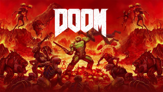
Doom is a game I knew I'd like. The heavy metal ascetic and soundtrack were right up my alley, but I just never found the time. With Eternal on the way though and having found it on the cheap at a pawn shop I figured there was no time like the present. Needless to say but I was right. I loved everything about this game. The thrill of combat, the screech of the guitars, and the silent take no shit attitude of Doomguy. Make no mistake though, I SUCK at this game. I played on easy but still got my ass handed to me on the regular. But I don't care, I was having way to much fun.
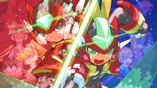
I flipped my shit when this game got leaked at the tail end of 2019. Zero 3 is my all time favourite game. To celebrate this getting announced I went and 100% Zero 3 as I hadn't done it on my current cart, and Zero 3 was still the first thing I played when I got this collection! I love that game to death and I’m glad to have it on modern consoles again. As I was under a bit of time crunch with other games releasing soon I only played 2 other games in the collection Zero 4 and ZX Advent. Until the DS collection those and 3 were the only Zero/ZX games I had so I have a lot of nostalgia for them.
Zero 4 hold ups better then I remember. Not as good as 3 but a damn solid game with tweaks I honestly wish hit the series before its end. I remember having issues with the stage design and ya it’s not perfect, but it’s far from as bad as I thought. For ZXA this was the first time I beat the game on normal difficulty. For some reason the ZX games have always given me more trouble than the Zero games, so finally beating one on normal was very exciting. Maybe I can now finally go and beat ZX for the first time...

The Mystery Dungeon series rising from the depth to punch all those unexpecting in the face was a very welcome surprise. I had a lot of hype going into this one as I have very fond memories of my time with Red Rescue Team and even more with Explorers of Darkness. And the game lived up to it! The remastered music is great and crazy nostalgic, the 3D models are well used and don't feel as stiff as they do in the core series, and the QOL changes are near perfect... So why did I drop this game like a rock once I finished the main quest?
Anyone familiar with Mystery Dungeon will know that the post game is the real meat of it. The story is short and all the really cool shit comes in after it's done. But I just couldn't bring myself to put more time in after I finished said story mode. I'm definitely chocking that up to me just not being in the mood then an issue with the game. Here's hoping we get an Explorers DX sometime soon. That will fucking hook me for all it's got.
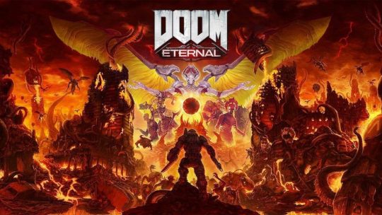
Second verse same as the first. I loved this game and sucked at it horribly. Out of all the games I've played this year Doom Eternal is the one I want to go back to the most. I was not the hugest fan of some of the changes made and retained a stance that I liked 2016 better. First person platforming has never been a fun experience in my opinion and Eternal did little to change that. And I know this a lukewarm take at best but fuck Marauders!. They are so unfun to fight and ruin the pace. The Marauder in the last mook wave took me so long I was worried I wouldn’t be able to finish the game. But the more I've seen of Eternal after my playthrough makes me think I was being far to harsh. I haven't played the DLC yet either. Mostly cuss I haven't heard great things about it. Gonna wait for the rest of it to come out to see if it's worth getting. Might just replay to whole game at that point to see if it clicks with me better.
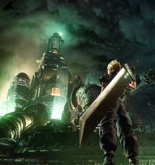
This was my second favourite game of the year, and was going to take the top slot until a certain other game came out. Addressing the elephant in room right away, I hated the ending. But I was expecting something like that, I think we all were. I won't let the ending ruin the rest of the game though. Not gonna let 1 segment colour everything that came before it. We have to see how the later parts play out to truly see if this ending was trash or not anyway.
It took Square over a decade but they finally got an action RPG battle system that works and feels good to play. This may be my favourite battle system in an RPG period honestly. All four characters are a blast and it only gets better the more time you spend with it. Figuring out the nuances of each character’s skills and how to combine them not only with the skills of the others but how to enhance them with the right Materia set. This makes fights thrilling and satisfying when you finally best whatever was giving you trouble. Tis was the best way to bring 7′s mechanics into the modern landscape while also fixing the BIGGEST issue the OG had. The fact every character feels the same aside from Limit Breaks.
All this on top of graphics that just look fucking stunning, a few glitched out doors aside. Fuck I still feel blown away looking at the characters models (mostly Tifa) and see how god damn pretty everyone is. Also Tifa’s Chinese dress is gift from the Gods and I still haven’t picked my jaw up from the floor after I first saw it.
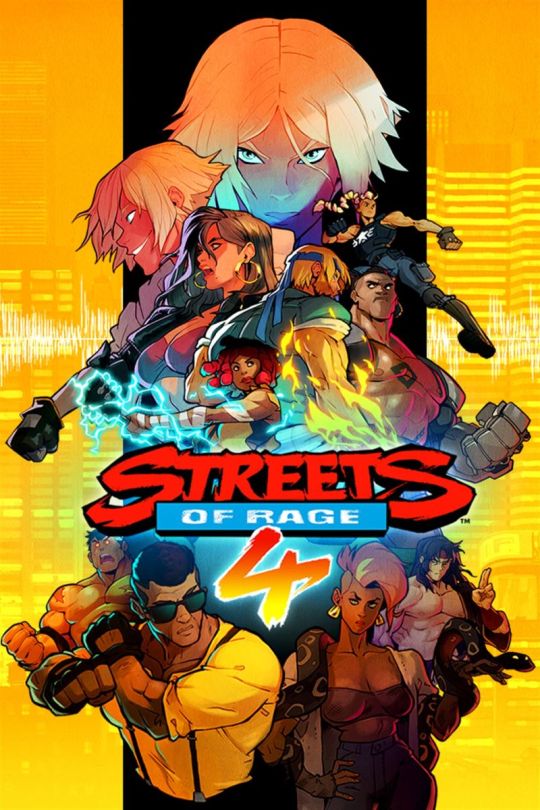
In my circle of the internet there was a lot of hype for this game. So much so that I ended up buying it to see what all the hubbub was about. I had never played a Streets of Rage game before and my only experience with beat'em ups was playing a LOT of Scott Pilgrim and last year's River City Girls. Turns out Streets of Rage plays quite a bit different and it kicked my ass! So sadly I had to switch to easy to make it through but I still had a fun time with it.
I started playing mostly as Blaze but once Adam hit the scene oooooh fucking boy. I didn’t play anyone else. There's a deceptive amount of content in this game. You can unlock almost every character from the previous games and all of them rocking their original sprites and moves. If I had more of a connection with this series I'm sure I would have gone nuts on unlocking everything. I stopped after my one playthrough and I was happy with that. Always glad to support a long overdue franchise revival.
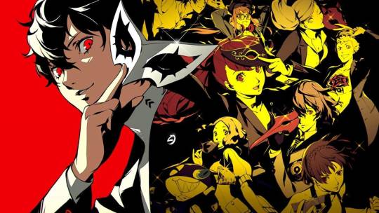
To properly talk about P5R I think I need to air a lot of my feelings on the original game and the importance it has to me. You see, prior to 2017 I barely played games, only sticking to specific franchises. AKA Pokemon and Mega Man/Mega Man like games. Until 2016 though I still bought a lot of games. Eating up Steam sales and deals I found at pawn shops. This lead to a Steam library and shelf filled with games I've never touched outside of maybe an hour or 2. So in 2016 when I took interest in the newly released Kirby Planet Robobot I made a deal with myself. I could get the game but I HAD to beat it. And I did just that, gaining not just a new fav Kirby game but a new rule for game purchases. If I knew I wouldn't beat a game I was not aloud to buy it. Now what does ANY of this have to do with P5 you may ask? Well... almost everything.
I was immediately interested in P5 when it hit the west in 2017. I loved the 20 or so hours I but into P3 years ago and really liked the P4 anime I had watched around the same time. So of course with all the hype around it I wanted to dive into the series full force with P5. But I knew myself. Putting over 100 hours into a game was beyond me and I had a weird relationship with home console games as I was predominately a handheld gamer. Add in the fact I didn't even have a PS4 and I was convinced P5 would be something I always wanted to play, but never would. So when I went to the mall with a few friends and they showed me that P5 had a PS3 version, I had a dilemma on my hands. I knew I wanted to play it and I now had a way to do so. But doing that would require me to change 2 HUGE hang ups I had with games. Would I being willing to waste 60 bucks with so much working against me? Apparently I was. I immediately started going to town on this game. Making sure I spent no less then 2 hours a day playing NO MATTER WHAT. Which may not seem like a lot but it was to me... at the time.. I also had just moved to my current house, so coming home from my still relatively new job and going straight into P5 was the first real routine I formed during this heavily transitional part of my life.
I of course ended up loving P5 and put 200 hours into it. As such my outlook on gaming was forever changed. Console games were no longer out of reach and I knew I could handle playing monster length game. I started playing way more games then I ever did before and trying out generas I never thought I would play. P5 is the main reason for this and why I'm able to make a post like this. To actually touch on Royal though? It's unarguably the better version of the game and Atlus learned all the right lessons from P4G. The new characters are great and the added section at the end is possibly the best shit Atlus has ever written. I only wish Yoshizawa joined the party sooner so I could play as her more.
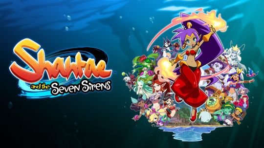
The release of this really came out of nowhere huh? Wayforward announced it was being made mid way through 2019, then there was its weird half release on the Apple store... and then suddenly it was out! Very little fanfare for this one. Is that indicative of the games quality? Luckily no. Seven Sirens is a solid addition to the series and follows up Half Genies Hero nicely. The game goes back to Shantae's Metroidvania roots and makes a TON of improvements.
Transformations are now instant instead of having to dance for them (don't worry dancing is still in the game) making the game feel more like Pirates Curse in its fast flow. They also added the Monster Cards which take heavy inspiration from Aria of Sorrow's Soul system. A feature I'm happy to see in any Metroidvania since Aria is one of my all time favourite games. Sadly though the game does not take the best advantage of these improvements.
Over all the game feels kinda empty. The dungeons aren't super exciting to explore nor are they challenging in any way. And the plot is very repetitive, with each dungeon repeating the same beats. Really this game feels more like set up for a better game down the line. The mechanics are all here and Wayforward has a solid art style with the sprites from Half Genie Hero. Hopefully they capitalizes on this for Shantae 6 and we get the best game in the series.
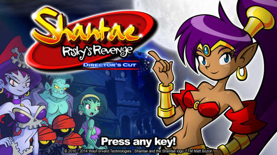
While it may not have been the most thrilling game, Seven Sirens really put me into a Shantae mood. So much so that I went back to play the 2 games in the series I had never touched. This being the first game and Risky's Revenge. Shantae 1 really is a hidden gem in my opinion. Don't get me wrong, it's the definition of jank, but there's a lot of heart to this game. The sprites are great, the soundtrack is good, and the characters are funny... but it's still on the OG Gameboy and that's a massive hindrance for any game. I'm hard pressed to recommend this with how poorly its aged but I think it's better then it looks.
Risky's Revenge on the other hand was a game that shocked me by how little it had to offer. I know this game went through a hellish development and what we got was far from what Wayforward planned to make, but it's hard to imagine a world where this was the technical BEST Shantae game. It's not a bad game by any stretch... just a boring one.
For the record my ranking of the games goes Pirates Curse>Half Genie Hero>Seven Sirens>Original>Risky’s Revenge
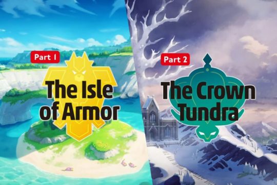
Sword and Shield are mediocre games at best. I know, real steaming hot take there. I managed to make my Sword playthrough a lot more fun by not spoiling myself on the new Pokemon designs for the first time since Gen 3. Either way, I enjoyed myself enough that I didn't mind playing more of it with these DLC campaigns. Plus I love the idea of Game Freak switching over to this method as apposed to making a third version, so I wanted to support it.
Klara is a fucking top tier Poke Girl both in design and personality and is probably the highlight of Isle of Armour. GF actually went out of their way to give her multiple expressions to sell her toxic bitch personality and I love every minute of it. She sadly drifts into the background for the second half of the DLC’s story which hurts an already rough section even more. Not more then having to grind Kubfuu all the way to fucking level 70 though! That put a serious hamper on my motivation to finish the story but I pushed through anyway. Having to solo the tower with Kubfuu was at least a fun challenge though, as was the final fight with Mustard. Fuck the Diglett hunt though. Ain’t no one got time for that.
Crown Tundra may be my fav of the 2 though even if there isn't a character as good as Klara in it. The hunt for the legendaries was just pure adventure and I had a fucking blast doing it. The joy I felt when I figured out Registeel’s puzzle put a smile on my face unlike any Pokemon game since I was a kid. The whole Regi stuff was honestly a nice Nostalgia trip to my times with Emerald. The story around Calyrex was enjoyable, even if I still hate its design. Not revealing the horses before release was a good call to as it gave an honest surprise. Having to chase down the Galar forme Birds in the overworld is a great way to evolve the roaming legendaries idea and I hope GF sticks to this. Plus the Galar forme birds are some of the best legendary designs since Gen 5 and I love Chocodos way to fucking much.
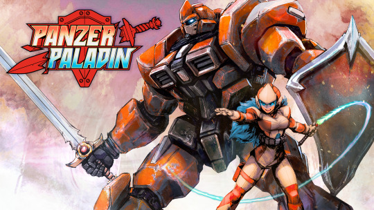
Here we are folks, my GotY. I love Panzer Paladin so fucking much. A combination of mechanics from Mega Man, Castlevania, and Blaster Master? Sign me the fuck up! This game is tailored made for me and I knew I had to play it once it started making the rounds on social media. I'll admit though, I was a bit worried when the the first full trailer dropped and showed the weapon mechanics. Breakable weapons that you have to sacrifice for checkpoints and power ups? I'm not sure about that.... Luckily I was being a complete moron and those mechanics are near perfect.
I love the set up of each boss being a mythological creature from different cultures. They didn’t just pull the easy ones either. A lot of these things I learned of for the first time here. I love how Grit controls. Using the upward stab as a double jump and being able to pogo off enemies Shovel Knight style just felt great and satisfying. Flame was limited but it made her sections feel tense. She does more damage then you think she could at first glance. Also the only way to heal Grit being to use pods that only Flame could access was a cool idea.
I am begging you Tribute Games, you have to make more Panzer Paladin games. Slap some new upgrades on Grit and expand what Flame can do and you have an even better sequel on your hands. Also maybe not have so many 'gotcha' moments with enemy placement. That's really my only complaint about the game. Great music, great sprites, giant robots, unique premise, and a reference to Canadian legends. The ultimate self indulgent game for me.
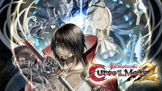
It felt super out of left field for Curse of the Moon to be getting a sequel. The games fucking amazing but it was really just a tie in for the main Bloodstained product. Not something I expect to get a continuation. Either way I was pumped. If this was even half as good as the original then I was in for a great time. Which held true... cuss this legitimately is only half as good as Curse of the Moon. I still like the game, quite a lot actually. I mean how could I not with a fucking Corgi piloting a Death Train Mech.
Something was just missing here that never made this click like the first game. Maybe it was the stage design, maybe the bosses, maybe the fact that it's a bit to long. I'm not sure. All I know is I couldn't bring myself to play all the modes like I did in the original. . Stopping part way in to the one where you can get the first games characters. I want to go back some day... I just don’t know when someday is.
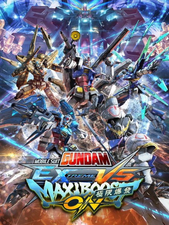
This was an announcement I never saw coming. A Gundam Verses game coming to the west? That hasn't happened in the entire time I've been a Gundam fan. I had played a bit of Full Boost on my old roommates PS3 thanks to him having a Japanese account and I played Force on the Vita a few years ago. But to have the latest version fully translated with open servers? Holy hell that's a dream come true.
Having the open betas every weekend leading up to launch was some much needed fun during this shit hole year. I had a lot of fun just fucking around with different suits and seeing what I could do with 'em. Absolutely trashing two Bael players as the Kapool is a memory I'll keep with me for a long time. Fucking danced on their graves. This gave me some new appreciation for suits like the Baund Doc and Hambrabi, the later becoming a lowkey fav as it was my main.
I've fallen off with the game in the last few months but I definitely want to go back. I hope to start learning the game and take parts in tourneys when cons aren’t death sentences anymore.
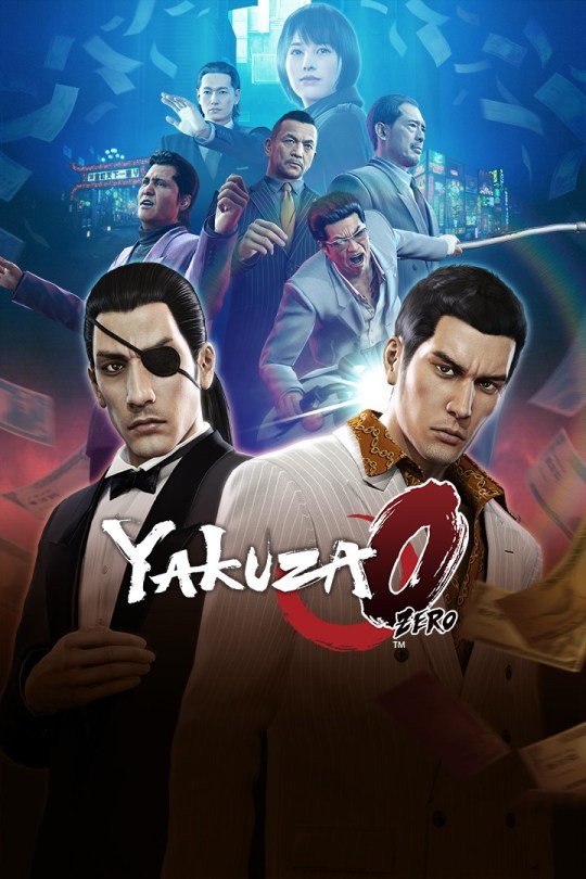
It felt like everything in my life was SCREAMING at me to start the Yakuza series. From 2 of my friends playing 0 recently, a youtuber I following live tweeting as he played through the WHOLE series back-to-back, and Yakuza 2 having a run at AGDQ 2020. Plus the constant pleas to play this series you get from following Little Kuriboh on Twitter. I finally broke and picked up 0 in the middle of August. Boooooooooy howdy did I not know what I was getting in to. And no I don't mean the content. I knew Yakuza was a series of wildly conflicting tones between the main story and side quests. What I mean is the length. I legit thought this was gonna be a 20-30 hour game. When i reached hour 30 of my playthrough and realized I wasn't even close to a conclusion, I think I knew I had bitten off more then I was planning. That misstep aside I ended up loving this game and want to play the rest of the series.... I just need to rest up first before I dive into Kiwami 1.
Let's actually talk about the game for a moment here. Kiryu and Majima quickly clicked as likeable characters to me and I cared about their stories. Combat is fun and the multiple styles are all great.... though both the default styles take a while to get there. The mad rush I felt at the end was fantastic and the last bosses are a joy to fight. Only real complaint is the pacing of the side stories. I loved being able to just stumble into various different events while on route to the next plot objective. But this became less common as the game went on and side stories started getting more tucked away. Also hot take here, the host club mingame is more tedious then fun and I like Kiryu’s business stuff as I could do that in the background. I’m excited to dive into Kiwami and probably Kiwami 2 this year... Though I’m not sure when just yet.
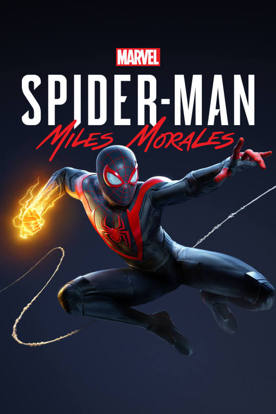
Just gonna say it flat out, I think this is better the the 2018 game. The smaller scale helps in this style of game and Miles just naturally has a better move set then Peter. I'm not sure if they actually tightened up the combat system or if they just threw less bullshit enemies at you but fighting feels so much better in this one. Traversal is better too, simply because they changed the button for tricks. In the original you have to hold down 2 face buttons to enter trick mode??? In hindsight that was such a bad call.
Having both the heal and venom powers run off the same meter was a good idea. Making the choice between keeping yourself alive guaranteed or potentially ending a fight quicker/disposing of a problem enemy is super fun. The player having to make small choices like this during combat is what helps it not be brainless. I love all the different venom skills you get. While they all achieve the same thing in stunning opponents, how you achieve that goal is up to you. Do you want to just slug the bastard, throw 'em up in the air, tackle the shit out of them? The choice is yours.
Only real big complaint is certain upgrades being NG+ locked. I know you want to encourage replays, but this is a shitty way to do it I feel. Also can we retire Rhino for the next game. Man has had 2 shitty boss fights now and I need a break. Between this and Spider-Verse, I'm honestly starting to like Miles as Spider-Man more then Peter.
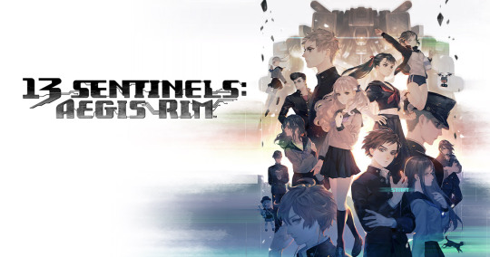
I got this game more on a whim then anything. I was definitely interested when it was first announced for the west. Vanillaware's beautiful art style in a story about giant robots beating the shit out of Kaijus? Sign me the fuck uuuuuu-oh wait it's an RTS? I had never played an RTS's before, mainly due to the sheer concept stressing me out. So I let it fall to the wayside. The game started coming up again though towards the end of the year with GotY on everyone's minds. This revived my interest, especially as what I HAD planned to be playing around that time was... well. Cyberpunk. Don't think I need to say much more. Also I had worried for nothing as the Real Time Strategy was not that Real Time.
This game really lays on the analysis paralysis once you're out of the tutorial. Do you want to fight, do you want to do story, who's story do you want to do, what branch should you follow, how much should you play with this one character? It's very overwhelming at first. I decided to not go ham on just one character and swap around all the time. The twists in this game are equal parts exciting and infuriating. Learning something new always came with the caveat of more questions, or something you knew 'for sure' being disproven. Like when I learned 1 characters was actually 4 separate ones! Anyone that's played knows exactly what I'm talking about.
Natsuno ended up being my fav and not just because of.... obvious reasons. BJ was cute if unfortunately named and her relationship with Mirua was my favourite in the game. Not that there was much competition except for maybe Ogata and Tomi. I ended up really liking the combat but I can see why RTS fans say it's the weakest part. It's far from complex and I had a winning strat by the third or so real fight. Aka spam turrets and have the Gen 1′s gank all the bosses.
One quick thing I want to share was how I beat the boss at the end of Area 2. The one where Inaba is singing. I had Hijiyama use the limit break skill to bum rush the boss right off the hop. I took out half its health in one hit but Hijiyama’s Sentinel was on death’s door. Only thing that saved him was sending in Amaguchi to blow up a bunch of missiles. Hijiyama took it out on his next attack but lost his Sentinel at the same time. It was a real clutch victory and crazy fucking anime.
The best way to really describe Carrion is that it's a fantastic proof of concept. Can you make a game where you play as The Thing? Why yes, yes you can. Carrion just needed a bit more tweaking to really bring this concept home and be the A+ game I know it can be. As it is now the game is a bit empty. The level design is super samey and the lack of a map is fucking brutal at points. I know it would make no sense for a blob monster to have a map but somethings you just have to gameify for convenience. The level design must have done something right as even though I was completely lost I still moved from area to area properly. Hell by the time I actually looked up a map I had 1 more item to get and I learned I was one door away from beating the game.
I love the idea of losing mass as you take damage and gaining more by eating people, but having abilities tied to size was a terrible idea. It just leads to tedium as I have to go and shed myself to the right size, do the puzzle, then of course I'm going to go back and rebuild myself to see if I can do the next segment at full power. Just make it so you can swap between abilities using the d-pad or something. I hope this game gets a sequel just so this sick ass concept can be fully realized.
#games#goty#Final Fantasy#pokemon#spiderman#yakuza#gundam#bloodstained#panzer paladin#shantae#persona#streets of rage#doom#mega man#dragon quest#13 sentinels: aegis rim#carrion
22 notes
·
View notes
Text
Exclusive Interview with Xander Smith: ‘AHS’ Concept Artist!
Xander Smith, the über skilled and talented concept artist who worked on four seasons of American Horror Story (Hotel, Roanoke, Cult, Apocalypse), was generous enough to answer some of our burning questions about the designs that he created for the show!
Throughout this interview, we will attach images of Xander’s work that pertain to the questions asked. You can check out his full, expansive portfolio by clicking here.
Thank you so much for agreeing to this interview! How did your involvement with American Horror Story begin? Were you a fan of the show beforehand?
Thanks, it's one of my favorite projects to have been a part of, so happy to talk about AHS!
I've loved the genre of horror my whole life, to me it's the one genre that you can push all emotions to their limits, and explore the human experience on a much deeper level than other genres. I think this accounts for some of the greatest stories being so horrific in nature: because it's innately human. This also accounts for the genre having the most lame movies too, haha, because it prompts storytellers to try to push boundaries, and oftentimes there's no reason to push a boundary if there's nothing substantive behind it. I think with American Horror Story though, that's not the case. It's deep, it's intricate, and it's very culturally significant.
I had seen the first season on television, and I remember thinking beforehand, 'this is going to be lame, you can't go as deep with TV as you can with an R rated film...' man was I wrong. It pushed boundaries and asked dark, human questions, all while staying relevant and mysterious. I never once thought that they were holding back due to it being on television.
As for the beginnings of my involvement with the franchise, that actually starts with my parent's love of genre films. When I was a kid they would take me to conventions, like Comic-Con, to learn more about film making and meet the cast and crews of various films. That's where my love of design came from. When I was in college, my Dad met Heather Langenkamp at a horror convention, and told her about my pursuit of concept art when I was going to school in Los Angeles. Heather was really kind, and said that when I graduate, I should send her my portfolio; her and her husband, David Anderson, own the legendary special FX studio, AFX. When I graduated in 2014 I did exactly that, they loved my work, and they hired me to work on American Horror Story: Hotel which would come out later that year. Since then, they've hired me to work on the next 3 seasons, I've also been hired by 20th Century Fox on 2 seasons, and by legendary Costume Designer Lou Eyrich for 2 seasons. I'm very fortunate and always have a blast working with the diverse teams that bring AHS to life.
Starting with American Horror Story: Hotel, you were part of the design process for the Addiction Demon [see above]. Can you talk about that? It was such an obscene being, but at the same time so true to form for the show.
Ah yes, the lovely Addiction Demon. That's one hell of a design to have worked on, ha.
I read that part of the script with David Anderson at AFX Studio, as they would be building the prosthetics, and the infamous 'drilldo'. He looked at me and just, 'alright, do your thing, make it horrific.' And that's what I did. I've seen people in the throes of addiction, and actually lost a good friend in my teen years to drug addiction, so when designing the Demon, I wanted it to be really visceral, painful to even look at. In the script, the Demon rapes a character, and as horrific of a concept as that is, I knew that it's one of those concepts that fits with AHS; pushing the limits, but for a good reason. That's exactly what addiction is: you think it's going to be like great consensual sex when it starts, but quickly the Addiction Demon materializes and it has its way with you whether you like it or not. Truly disgusting, but that's what I thought the design should encompass. So I sketched about 20 different versions, and 1 of those versions stuck, and we decided to take that one further. I sculpted the final design in Zbrush, and that's the concept that Ryan Murphy picked. The brilliant team at AFX brought it to life, and that's the demon you see in the show.
You also produced fantastic concept artwork for Lady Gaga’s character’s chain mail glove [see above], alongside costume designer Lou Eyrich and designer Michael Schmidt. How did that design develop? Was it fun designing for Gaga?
Thanks! Yes that might actually be my favorite piece I worked on. Lou Eyrich and Michael Schmidt were awesome, I think we came up with an iconic piece that's uniquely elegant and fit for a horror queen. It was very motivating knowing that it would be worn by Gaga, so as I was translating Michael's sketch, I wanted to maintain a balance of stylishness and darkness, something that both Lady Gaga and American Horror Story is known for. It was incredible to see it in the posters. Definitely a highlight for me.
Moving on to American Horror Story: Roanoke, you produced terrifyingly good concept art for another one of the show’s iconic villains, the Piggyman entity [see above]. Since that same figure was also featured in the first season, did you look back for inspiration?
Great question, because for Piggyman I was back at AFX Studio, working on the design with David Anderson, and we certainly had a lot of the same inspiration and ideas on how to do the design justice for such a horrific piece. There was a lot of shocking content surrounding him, like pig fetuses and butchery, and we just went all out on letting the character bathe in so much debauchery. It was also really fascinating to be designing while their FX team was sculpting the prosthetics (the production schedule was very intense), and I got to see sculptor Glen Eisner working on the pig head and stomach pieces in clay, only a few days after I had worked on the concept art. Incredible process.
On the same season you collaborated quite closely with the makeup department to design concept art for some of the season’s makeup looks, including illustrations for Kathy Bates’ and Finn Wittrock’s characters [see above]. Wittrock played incestuous hillbilly Jether Polk and the final product was quite frightening. How did that process go?
Also a really fun process, I got to meet some of the actors as they came in for face castings, while I was deforming their faces in the concept art- I almost felt guilty! We pulled a lot of inspiration from medical journals relating to birth defects, and we stayed pretty close to reality, as we saw fit for the Roanoke season. I was also busy terrorizing Kathy Bates image while designing what the character's demise would look like. Since there are a lot of complicated practical effects involved in the gory scenes, we spent time illustrating what the wounds would look like ahead of time. By the end of it, I had like 2 full pages of various gory ways Kathy Bates could meet her end that we presented to production, and they chose one of the most horrific ways that fit with the script (of course). Hopefully Kathy is used to it after so many years as a horror icon!
Arguably your most prolific designs for the show were for season seven, Cult. You produced some stunning concept art for the clown masks and general appearance [see above], some of which weren’t seen in the show but absolutely should’ve been. They look slightly ‘mechanical’. What was Ryan Murphy’s pitch there?
Completely agree, I really love the final designs. Unfortunately, for as much art as I did for this season, none of my designs fit the script well enough, I just couldn't hit the mark, and so my work did not make it to production. It happens, and that's why there are many artists on a project! I appreciate you saying they should have been in the show though! I think I focussed too much on the clown/mask angle, and less on the political/cultish angle, which is where the magic of that script was. In true American Horror Story form, it is a cultural commentary on the times, and I feel I was not paying as much attention as I could have. That being said though, I had a blast working with the crew at AFX Studio again, and we worked on a lot of pieces that at least helped move production forward. Sometimes it's useful to see a design that's not quite right, just to move the production in the right direction.
The last season you worked on was of course the crossover season, Apocalypse, for which you designed the Outpost Three hazmat suits [see above]. The plague doctor influences in those designs was a stroke of genius. How was it blending dystopia with 17th century Europe? Also, were you aware that Apocalypse was the crossover season when you started work on it?
I think I got my mojo back on this season, since not only were my illustrations on those hazmat suits finalized for the script, but I was also able to do some of the 3D modeling for the Plague Doctor masks that were 3D printed and worn by the cast as props in the show. That was a really rewarding experience, and I was working under Lou Eyrich again who is the genius behind the blend of dystopia and 17th Century Europe that characterizes Apocalypse. We did probably about 50 different sketches of those suits, and explored such a wide variety of directions and blends of dated technologies, medieval influences, hazmat suits, and gas masks. When we had a solid direction, I did a tighter illustration of a generic suit that could be worn by any one of those characters (one of the keys to the design was that they could be worn by several different body types, as per the script), and then did a final piece that showed Kathy Bates wearing the mask. I'm really pleased to have come up with the idea of the 'plastic plague doctor' design, and thrilled to see it on screen.
I wasn't aware that it was the crossover season either, I wasn't given that part of the script, but that let me watch the revelation in real time with the rest of the world!
Lastly, would you like to design for American Horror Story again in the future? What is your “dream theme” that you’d like the show to explore?
Absolutely I would love to return some day and help flesh out some new designs. Some of the later seasons have been less concept-heavy, but I've also had to pass on the work as I've been involved in other projects, and of course have been busy helping found my current company, Aliza Technologies.
But you never know what the future holds!
As for a 'dream theme', that's such a good question because I feel there are so many interesting directions the show could take. They've built such a rich world where stories can take place across a range of time periods and genres, and that's a real gift to horror fans. One of the elements I really love about AHS is that when it delves into the supernatural, it does it in a really measured way. I've always found ghost stories to be a little bland and heavy-handed, but since AHS is so nuanced in its supernatural material, especially in season 1, I think it would be really interesting to see them go the heavy handed way, lead the audience down a super super-natural route for half a season, and then absolutely pull the rig from underneath them halfway through, and have a natural explanation for all the 'supernatural' elements. It would be a complete mind-f**k, like 'wait, there were no ghosts at all??' and have that realization be even more horrifying. I'm no writer, but I think a concept like that could be really interesting... Also set the mystery across several different generations so that the supernatural explanation is more appropriate for an older generation, and is busted open by the modern take. Image what the flashback reveals could look like, and imagine the types of 'ghosts' I could illustrate...
Thanks for the questions, now I'm off to do some script-writing myself...
(Also, special mention to Eryn Krueger Mekash and Mike Mekash who designed the makeup looks!)
Xander’s links:
Official Website: https://www.xandersmithdesign.com/
ArtStation: https://www.artstation.com/xandersmith
Behance: https://www.behance.net/XanderSmithDesign
Instagram: https://www.instagram.com/xandersmith_design/
8 notes
·
View notes
Text
FORTIS F-43 BI-COMPAX CHRONOGRAPH
The Fortis F-43 Bi-Compax Chronograph looks like it is hewn from granite. Indeed, its overt robustness and peerless legibility make this pilots’ watch ideal for daily wear. Mark McArthur-Christie provides a fascinating insight into this extraordinary watch.
Fortis has never been scared of doing things its own way. When, in the early 1990s, most watch businesses were still pushing quartz for all they were worth, Fortis stuck to their love of milled-from-billet, read-at-half-a-mile, functional, mechanical flying watches. Sure, there have been some interesting excursions along the way – the gloriously 1970s chest-wig and flares Skylark, for example – but it’s always felt as though Fortis is happiest when form follows function.
With a background like this, it was worrying when the company hit financial problems back in 2017. There are too many watchmakers who’ve been taken over by organisations who simply hollow out the firm, leaving only a well-known name to stick on the dial of the next fashion watch. Instead, thanks to a series of fortunate accidents and careful planning, businessman (and Fortis aficionado) Jupp Philipp took over the firm in late 2018 and its future now looks secure.
With Jupp at the helm, it’s not surprising that the Fortis F-43 Bi-Compax Chronograph and its fellow models the Triple GMT, the F-39 and F-41 Automatics all do that thing that’s so, so hard; they’re clearly new and different but the Fortis DNA is clear to see.
Starting from the outside, the bi-compax (it tells you on the dial, just to make sure you don’t forget) F-43 has a 43mm stainless steel case, hence the name. In the finest Fortis tradition, it’s the sort of 43mm stainless steel case that hangs around on assault courses with its armour-piercing ammunition mates at weekends. If you happen to run a Panther II tank and need something to use as an engine mount, it’ll happily volunteer.
It’s 55mm lug-to-lug and 15mm thick, so the watch is no shrinking violet, but it’s still comfortable and the weight is reassuring. You’ll definitely know it’s there.
Fortis describes the inscription on the solid caseback (you weren’t expecting anything as soppy as a display back, were you?) as “Ultra-Engraving”. Although I’m not sure about the process involved, the lettering and design are certainly crisp and clean. It gives you the depth rating (20ATM – 200m or 660 ft), aided by the screw-down crown and the words “Without a flyer, the sky would only be air” in German. This isn’t a watch you’ll worry about getting wet. In fact, this isn’t a watch you’ll worry about at all.
The bezel, separated both physically and visually by a black case-ring, has a grippy coin-edge and turns with a thoroughly positive action, clicking 24 times every 12 hours. This means you can use it as a simple timer (I’m a big fan of watches that do this) or a basic, single timezone GMT. The inside edge of the bezel slopes down towards the dial, taking some of the visual weight away from what might otherwise be an overly chunky case.
The crown – as I’ve mentioned – screws down but the textured pump-pushers remain free.
With a case like a tank hatch, you’d expect the F-43’s bracelet to be equally no-nonsense. It won’t disappoint you. For a start, it’s held to the case with four single-slot screws, so no flimsy little spring bars to ping out. It’s a classical three-link, Oyster-style set-up – but these oysters were probably hanging around near Sizewell B. They’re properly solid links too, but you still get a micro-adjust clasp with 8mm of movement. If the bracelet doesn’t appeal, there’s a thick black leather strap with a Fortis pin buckle.
Inside the Fortis F-43 Bi-Compax Chronograph you’ll find the equally no-nonsense Fortis UW-51, 27 jewel, unidirectional automatic chronograph movement in the style of the Sellita 510 and ETA Valjoux 7753. Unlike your average naggy wrist computer, it’ll run for 48 hours without any fuss off your wrist and forever on it. No charging points or wireless synching needed here. It beats at a decent 4Hz (28,800vph). Clearly, you get hours and minutes as well as a running seconds at 9 and a 30 minute counter at 3. The chrono seconds runs from the centre of the dial and there’s a quickset date. The dial sits under a sapphire crystal coated on both sides with anti-reflective treatment.
The dial – as you’ll spot – is classic Fortis, but with a measure of evolution. There are still the large, lume-filled, black-edged spade hands, but there’s quite a bit more colour. That’s a tough balance to get right; it would have been easy to make the whole thing look like a Christmas tree. Fortis avoided colour-bling by keeping their focus, as ever, on function. Where there’s colour or texture, it has a use. So the 3D lumed dial batons on the five-minute markers (with the flieger triangle and dots at 12) make the time much easier to read. The second hand stands out by being Fluor Orange, developed by Swiss firm Berlac. The same colour edges the 30 minute subdial as well as bracketing that 12 o’clock triangle – Fortis call this the ‘Synchroline’. It’s intended to make it simpler for the pilots in a squadron to synchronise their watches in-flight. It’s probably debatable how often it would get used for that, but it certainly makes the dial easy to read, even without specs.
The orange also makes an entrance when the date snicks over to the 13th. The rest of the date numerals are plain old white. But the 13th is apparently when Herr Philipp signed the papers to buy Fortis, so it’s coloured orange.
OK, pilots don’t really need mechanical chronographs nowadays and haven’t done for years. But that really doesn’t matter. The things that made a watch useful in the air make it just as useful everywhere else. Having a chronograph is always handy; being able to see it and the time and understand it at a glance in light or dark is equally useful. And having a watch that can withstand a good amount of bashing about is ideal; who wants something they’ll have to baby constantly?
All-in-all, there’s a definiteness about the construction, pushers, crown and case finishing of the Fortis F-43 Bi-Compax Chronograph that makes you feel you could rely on it anywhere. It’s good to see Fortis back, making the sort of watches they’ve always made.
1 note
·
View note
Text
Godzilla Singular Point
I'm not much of a “binger” for the most part but I got the whole series Godzilla: Singular Point watched in about 4 days I think. Let's start positive: I think the 3D models for the monsters work a lot better than most anime 3D models, they're still fairly apparent but it seems like they blend with the rest of the art alright. The designs are mostly fairly good too, there's some ugly ones in there but I kind of don't mind them? Monsters can be ugly sometimes and not just cool looking, a few here and there in the cast doesn't hurt anything. It's nice to see some nods to the more obscure kaiju too, there's a lot of interesting and fun monsters from Toho's old movies and it gets a little tiring to be hit with nonstop Godzilla-Mothra-Ghidorah-MechaGodzilla incarnations every single time there's a new take on Godzilla. I like a lot about the premise, the apocalyptic rise of kaiju around the world as they bring their habitat/environment with them into our world, terraforming it into a world of monsters. It's not new by any means, but it's usually not the approach taken witht the Toho monsters and it's a good excuse to fit a lot of them into a setting quickly. The end credit sequence is pretty great, I hit 'watch credits' every time on my watch. Heck, the whole series might be better if it was more like its own end credits.
I think Godzilla: Singular Point could have been better, but we've also seen worse recently. I've only dabbled in storytelling but I suspect a lot of its problems come from overcompensating, specifically: “Godzilla movies/media are dumb” being met with “Oh yeah, well how about one based on theoretical quantum physics” just didn't work out. I actually think what they use in the series is a fine technobabble excuse for the monsters having powers and durability beyond science, but I also don't feel like kaiju media really needs that excuse. It's fine though, I think the sheer quantity of the technobabble is the biggest problem with it. I've been listening to discussions of theoretical multi-dimensional physics for a while now, so I think I might have been better prepared than average but it's still a chore to get my head around so I know it's going to lose a majority of the general population. One big question I have is why did they give the main characters the wrong interests? Yun, who is into future predictions deals with the monsters, and Mei who is studying theoretical impossible animals deals with the future predicting technology end of the plot... I could get that if the idea was to raise tension by making the wrong people have to work outside their field of expertise, but that's not what happens, they're both pretty good “omnidisciplinary scientist” sorts who don't have much problem learning a whole new field. Honestly they really should have been assigned the other interests though, Yun studying fantastical creature ideas and Mei the future stuff.
While I like the premise and some of the stuff they do with the monsters, there's also a lot that's disappointing – The Kumonga-Megalon-Hedorah hybrids really need some explaining. Why are there three monsters in one species? Just to reference as much old material as possible at once? As far as I'm concerned Anguirus is the stand out star of the series and they kill him far too quickly. The series could also be called a fairly cozy catastrophe too, for the most part the worst thing happening for most people is losing their internet connection, kind of seems like a monster apocalypse should have a bit more than that going on. That said it's not nearly the disappointment that the Polygon Pictures trilogy is, which managed to take the most interesting and unique premise the Godzilla franchise has ever had and do basically nothing with it.
I might give Singular Point something like 6 out of 10, and I think a second season might have enough room for improvement that I'm not against it.
For the heck of it:
Shin Godzilla: The most common criticisms are right (dull, Godzilla has no personality, the humans are more random bureaucrats than characters), but so are most the common praise (topical in its way, punchy with its political critique, holy hell that weapons upgrade on Godzilla). Which one outweighs the other is a simple matter of personal preference. I don't have super strong feelings about it and it will be one of my least re-watched Godzilla movies ever, up with Godzilla's Revenge.
Polygon Trilogy: AAAAAAAAAAAARRRRRRG. The only things worth watching are Godzilla Earth avenging Godzilla filius and Ghidorah's destruction of the spaceship (wasn't it Atrium or something? I'm feeling too lazy to look it up) but unfortunately there's an awful lot of crap around those bits. Ok, I exaggerate a little but not much. I kind of appreciate how they tried to subvert the classic “your life goals or your love interest” kind of scenario, but she wasn't much of a character so it didn't have much impact to kill her off and the main character is an unlikable jerk too.
Legendary's Monsterverse: Godzilla 2014: Too much of its run time is boring for me to recommend it but the monster stuff is too well done for me to ever dismiss it outright.
Godzilla King of the Monsters: I get why people have a problem with it, but I appreciate the story between Godzilla, Ghidorah, Rodan and Mothra enough to forgive it and it's my favorite of the Monsterverse. I don't have as much problem seeing the monsters through the weather effects as some people seem to, the only one I really can't follow is when Godzilla drags Ghidorah into the Gulf of Mexico. It does cut to the humans too much during the monster fights, but it's also trying to connect the stories. The goal of the human characters lines up with Godzilla's well enough that they can be considered to be on the same side, and that's why we see things like Godzilla charge Ghidorah, then cut away to humans where Ghidorah's heads slam into the earth somewhere in the background. It's fairly flawed, but...
Godzilla vs Kong: Holy shit over-correction much? I think it might actually work better as a stand alone movie than a continuation of King of the Monsters, yet it actually can't because of some elements like the Ghidorah heads. Notice how they say one skull holds the pilot, there's another skull in Mecha Godzilla? - clearly supposed to be the side heads incinerated by Burning Godzilla not the one Godzilla tore off in the Gulf of Mexico – not sure why everyone misses that. ANYWAY, it's a fun movie that gets to the main event as fast as it feels like it can and the monster action is solid. With the one exception that I really hate Godzilla being portrayed as defenseless against Mecha Godzilla – outmatched and needing help is fine, but utterly unable to do anything but get stomped is just not enjoyable to me. As soon as Kong comes to help double team Mecha G it gets a lot better though. - Quick note, why did “Team Kong” see any reason to sic Kong on Mecha G? We the audience know that since the robot is possessed by Ghidorah that once it kills Godzilla it'll go on to wipe out all humanity and anything else it comes across, but does “Team Kong” know it? If Kong knows it, would he care beyond Jia? I mean, it doesn't matter but it does nag me a little bit.
I honestly thing the basic story teased at the end of King of the Monsters in the news reel stuff sounds like a better movie than Godzilla vs Kong turned out to be but I'm fine with what we got for the most part. Except why did they dump all the other monsters? They've come up with all these interesting new monsters and they have Rodan and what-not and they just say they all haven't been seen? It's the most disappointing part of the Monsterverse so far if you ask me.
#Godzilla#Kaiju#Godzilla Singular Point#Singular Point#Godzilla vs Kong#Godzilla King of the Monsters
1 note
·
View note
Text
My brief thoughts on this season of anime!
Just a quick review of the ones I’d recommend and/or keep watching. I managed to find all of the below on Funimation or Crunchyroll or Youtube!
Horymia: (Yes) This is looking to be a very funny romcom slice of life style anime, and seems to be a fairly good one! Had me laughing a lot. The Main couple are a nerdy quiet boy who’s actually dumb as a sack of bricks using his disheveled appearance to hide his tattoos and piercings, and a popular pretty girl who’s actually a total homebody. Their friends seem to have a lot of potential to be fleshed out as the series progresses and I look forward to seeing how it goes!
So I’m a Spider, So What?: (Yes) Whooo another isekai (excited)! This time a girl and her entire class!? Get isekai’d in a massive explosion. The main character reincarnates as a trash monster in a dungeon and must fight her way up the food chain just to survive. Meanwhile her friends who have mostly reincarnated as Cool Humans or the occasional elf or baby dragon, have mostly found each other, and want to figure out what happened/why and if they’re all okay. It’s genuinely pretty funny, though leans a little too hard sometimes on the gamey aspects of this new world. I think it may get darker as it goes along too.
Mushoku Tensei: (No) Whooo another isekai (derogatory). 34 yo old man gets reincarnated and uses his worldly experience to Learn Magic Fast and creep on his mom and prepubescent tutor. If you can stomach that stuff, it actually has a fair amount of potential? It did set itself up to touch on some interesting stuff down the road, but I’m kind of Over the horny toddler/young boy trope and it kinda just seems like the protagonist is Just Awesome At Everything but not in a remotely charming way.
Cells at Work Code Black: (Yes) If you liked Cells at Work, this is that but dingier, and is able to tackle some darker themes - like what stress, smoking, drinking, and probably eventually STDs can do to your body.
Kemono Jihen: (Yes) I don’t wanna explain TOO much about the plot of this one because it looks to be a mystery series, and the first episode sets it up the characters very very well. A man from the city is called to a rural town where animals are being mysteriously killed and found rotting. He’s tasked with finding and killing the perpetrator, assumed to be a monster of some kind. It does the horror very well, and even in the first episode manages some twistyness.
The Hidden Dungeon Only I Can Enter: (No) Even for a blatant fan service anime this one is just......... stupid. It might have a scrap of joy to it if the protagonist were anything other than a boring sycophant. His harem just all seems to be random girls who’s singular personality traits are to be in love with him in various stereotypical ways, that he just uses to min max his Cool Stats. But like, it’s not even self aware enough to make that into an interesting premise.
Sk8: (Yes) It’s a racing anime that seems super stylish and fun and very well animated. The protagonists have some cool chemistry already, and it really leans into the Underground Illegal Racing part of the fun - all the various characters who battle in death defying races through this abandoned mine, all have seemingly ordinary day jobs. Definitely worth a shot if that sounds up your alley.
Suppose a Kid from the Last Dungeon Boonies moved to a starter town?: (Probably) Okay so the premise is just there in the title and is actually pretty fun. Think: a random NPC who is considered pretty weak where the monsters are lv 50 moving somewhere where the monsters are scary at lv 5, shenanigans ensue. The MC boy is hilariously oblivious to the fact that anyone with a shred of sense can see he’s insanely over leveled to the area, and just trying to be nice and polite to everyone ^u^. The tentative nature of my recommendation is that it is kind of leaning harder on the Girls are Obsessed With Him train than is ideal. How much it depends on that as opposed to utilizing the premise to its fullest extent will have an enormous bearing on how fun the show is to watch going forward.
Ex-Arm: (Absolutely not but yes) It’s a fucking train wreck.
Heavens Design Team: (Yes) God decided to outsource creating animals to a team of angels, and works as a client giving weird ass requests for the angels to fill. Hilarity ensues, and it is peak edutainment to boot. It’s so much fun learning weird shit about animals, or trying to guess the animal these seemingly random train of failed attempts leads to.
Dr. Ramune -Mysterious Disease Specialist-: (No) It has a promising premise and some good moments. The main characters are solving these weird “diseases” that people get by finding the actual emotional cause and using magic of some kind to monkey paw it into a resolution. This could be really fun and interesting, but something about the execution just... falls flat? Like maybe it picks up as the season goes on but for now it’s not rly worth it.
Vlad Love: (Yes) I was going through the list of anime this season and was like wtf is this and literally just now watched episode 1. It’s about a girl with a blood donation kink and her vampire girlfriend. Literally. It’s rly funny and over the top ridiculous but like, gay vampires.
Back Arrow: (No) It’s like... fine. It’s about these two warring kingdoms surrounded by a wall with a mountain range between. They worship the wall as god, and occasionally get gifts from beyond it, in the form of mech suits they use to fight each other in. One day a boy shows up from beyond the wall in one of those suits and no memories of anything and he wants to get back. Which... could be promising I guess? But something about the show just didn’t grab my attention.
Skate-Leading Stars: (No) It’s like Yuri on ice if it was less gay and less well written I guess...? The first episode set up the Drama competently enough, but I just... couldn’t give a shit.
Project Scard: (No) For some reason part of Tokyo has been turned into a post apocalyptic hellscape where people just murder each other. They also have super powered tattoos and use them to fight each other. Animation is very similar to Handshakers - which is an Aesthetic that may not appeal to some. The first episode didn’t rly do much for me but I could see it going somewhere if it tries.
Wave!!: (No) Might have been a tentative yes if I hadn’t gone on and watched the second episode. First ep went hard with the queerbaiting cause they want to be the new Free! but with surfing, but Ep 2 just forgot all about that entirely. Dialogue is mostly boring and there’s like 3 sets, which becomes painfully obvious very quickly by ep 2.
Idoly Pride: (No) Literally looks like they ripped off the waifus of a bunch of other more popular anime and made an idol anime with the most basic ass idol plot. Nothing exceptional here.
Gekidol: (undecided) It’s an idol anime... set after a mysterious apocalyptic event? It’s mostly so far seemed intriguing as hell but not my jam. Mysterious craters destroyed parts of Japan, and its rebuilding and the MCs wanna bring light to the world. Maybe aliens exist? Idk! I’m intrigued.
I*Chu: (No) Another idol anime but this time it’s cute boys! Idk maybe this is a decent idol anime but it rly didn’t grab me and idol stuff isn’t usually my jam. I couldn’t tell anything exceptionally unique about this one from just the first episode.
WIXOSS Diva: (No, but) I don’t normally watch spin-offs of series but I didn’t realize until halfway into this that it was one cause Crunchyroll didn’t attach it to the core line. It’s like... magical girl battle idols in VR! Which honestly if you’re a fan of that it might actually be worth checking out.(edited)
Idolls!: (No) Another idol anime! But this one uses mocap 3d models. Phoned in plot line delivered by a weird tiki statue that tells the girls what to do. Seems extraordinarily low budget, and more just a way to sell music. The whole episode happened in a single set and was basically just... girls want to make it big as idols... oh no... gotta book a stage! Yay they got one! Now must get an audience! Like... ok
Hortensia Saga: (No but) Sword and sorcery fantasy setting that’s mostly sword, main character is a princess masquerading as a male knight alongside the son of her dead parents’s also dead bodyguard. The first episode is very lore heavy and felt kinda like the prologue to a video game. So it ended up feeling a little expository and trope laden, but it has potential. Seems a bit Game of Thronesy? Wasn’t like... bad or anything, so if it’s your thing you might enjoy it.
Otherside Picnic: (Yes) I think it’s gay first of all, two girls going exploring / treasure hunting / monster hunting in a bizarre mirror world to their own. Girls are cute, it’s very interesting premise and writing seems solid.
Wonder Egg Priority: (Yes) It deals with some HEAVY themes? But it’s... a bit of a psychological horror but in a way that feels very like it’s dealing with some of the real life issues. The main character girl comes across as neurodivergent, and it’s just... idk man the first episode was good and left me wanting more.
1 note
·
View note
Text
10 Games To Play If You Like Terraria
Terraria is a representative of the sandbox game genre, which gives the player the freedom to set goals for themselves, freedom to decide how to interact with the world around them, and what to create. Many fans are also captivated by the pixelated retro graphics of this game. If you are thrilled with the adventures you have experienced in Terraria, then most likely you will enjoy similar games from this list. There are 2D and 3D games, which are united by a high degree of freedom, the ability to craft and build, as well as battles with mobs.
Starbound
In Starbound, you will explore endless procedurally generated planets, where even enemies and weapons you pick up are randomly generated. This way, your every Starbound adventure will be unique and unrepeatable. Unlike Terraria, here you will not need to equip your home, as your spaceship will be your home. Gather resources, fight enemies and find equipment that will make you stronger.

Craft the World
In Craft The World, you will control a tribe of dwarfs. Your little subjects are threatened by a bunch of enemies (zombies, skeletons, goblins, etc.), so the first thing to do is to build a solid fortress. You need to make sure that the gnomes always have food and resources so that the tribe grows and flourishes. In battles, you can help wards using magic (for example, throwing fireballs at enemies).

Spelunky
Spelunky is a cave exploration platformer. Each game includes 16 randomly generated levels (not counting secret levels), on each of which your character must reach the exit, overcoming enemies and traps. Only 4 hearts are given for the walkthrough, and if you die, you will have to start from the first level. Also, along the way, you can save the girls calling for help, getting a +1 bonus to health.

Don't Starve
A dark survival game inspired by Tim Burton. Here, dangerous creatures, poisoned plants, hunger, darkness and other dangers await your character at every step. You need to monitor your character's satiety, health, and sanity in order to stay alive and get a chance to get out of here. You will have several characters with different abilities.

Hollow Knight
An indie metroidvania-style game in which a nameless knight explores a long-abandoned kingdom inhabited by evil insects to find the cause of the kingdom's demise. You have to overcome many obstacles and fight many enemies, and to unlock the next location, you need to defeat a strong boss. The atmosphere of the game is similar to Don’t Starve, the same stylish and dark.

Minecraft
Hardly anyone from Terraria fans could not have heard of Minecraft, the legendary sandbox, which many believe strongly influenced the game Terraria (some gamers even considered it plagiarism on Minecraft). And yet, we had to include this game on the list. If in Terraria the main emphasis is on battles with mobs, then in Minecraft the most interesting thing is to build houses. Minecraft and Terraria are equally adored by many gamers.

Realmcraft
Free 3D sandbox, similar in function to Minecraft and Terraria (more, however, to Minecraft). It also has a survival mode and a creative mode (free building). You can also build with friends in Worlds mode. The creators of the game decided to move a little away from cubism and make more realistic player models, which was appreciated by users who do not really like the original graphics of Minecraft.

Growtopia
An experimental multiplayer sandbox in which you can build houses and anything with your friends in unlimited worlds. There is no need to worry that your creation can be destroyed, because you can lock your territory and give the key to it only to your friends. You can also buy seeds and grow various items (yes, crafting happens this way here).

Dragon Quest Builders 2
Popular JRPG game about brave builders who challenge the Children of Argon organization. Members of this dangerous organization seized power, forbade people to build and destroy everything in their path, since they consider construction a sin. Your character, together with your partners, must defeat the villains and rebuild the destroyed world, village by village. You can move away from the storyline at any time and build whatever you want.

Adventaria
A free alternative to Terraria, where you can explore the endless expanses of the 2D world, build any buildings, upgrade weapons and armor to be safer and defeat mobs. There are quests-instructions to help you get comfortable in the game, more than 80 bloodthirsty monsters with which you can fight, more than 80 useful items and more than 50 types of powerful weapons.

3 notes
·
View notes
Text
Off-the-Cuff First-impressions Review: Trials of Mana
I got Seiken Densetsu 3/Trials of Mana in the mail today and am surprised by just how excited I am about it. After the admittedly predictable letdowns of the Secret of Mana “remake” and the FFVIII “remaster,” not to mention the iOS revision of the former, you’d think I’d be jaded at this point.
But! FFVII remake is Actually Good, and so far it looks like Trials of Mana is, while certainly lower budget, also Actually Good. The voice acting is kinda meh, but not bad enough to detract from the game in my opinion, and considering they are working with SNES-era scripts (the dialogue is 99% word-for-word the same as the more recent translation of the original SD3 game, so it’s going to be a bit stilted anyway) it’s really not bad at all.
Besides, the actual meat of the game--the world, character and monster design, and the gameplay--is extremely solid and I have had very little trouble acclimating to it. It’s fun to play, it feels good to run around and explore the world and the battles are both very simplistic in a way that is familiar to an old fart like me and very satisfying in the way they function. One of the biggest weaknesses the original game had was absolutely horrendous input lag in some areas due to 1. the sheer size of the loaded map section, such as Rolante/Laurant, 2. The number of on-screen instructions the SNES had to process during battles, particularly during fights where you had massive sprites taking up the entire screen (the awful awful wall-guardian “Genova” [harhar] is probably the single hardest boss in the game purely due to input lag/drops; when you attack an enemy, even assuming your weapon swings when you tell it to, and that’s a big ‘if,’ the monster you are attacking is actually in a state which is several frames ahead of whatever state it visually appears to be in on-screen, making it extremely difficult to time your attacks properly to both defend and do optimal damage to what should have been a relatively minor “miniboss” fight). Trials of Mana, on the other hand, has none of those problems, simply thanks to more modern technology. So far every fight I’ve engaged in has been smooth and responsive as well as very visually appealing.
And wow is this game pretty. It’s not the most amazing example of the best graphical advances in gaming history, to be sure, but I genuinely don’t think that matters, as it’s still beautifully detailed and really does look like they took the original graphics and magicked them into more modern models. The re-imaginings of each area and monster are very faithful to both the aesthetic and the layout of the original design while at the same creatively expanding on them; I've had no trouble finding my way around familiar maps or identifying the bestiary, but I have found a lot of added depth to them, such as the ability to jump down on rooftops and find hidden nooks that were just static backdrops or otherwise out of sight in the original. The areas are more layered and interactive, but very importantly, nothing is missing. Not even the dogs and cats, who still bark and meow at you if you talk to them. I feel like I’m being allowed to see and explore the original maps from angles I didn’t have access to in the past. It really makes the 16-year-old in me unbelievably happy, to be able to finally, actually see and do these things I could only wish for back then. For people who have never played it, it’s probably a very pretty, if otherwise unremarkable experience, but for me it’s the granting of a wish I’ve had for a long time, but never expected to happen.
Similarly, I think a lot of people will look at the plot for this game and go, “...what?” Because it really doesn’t seem to have been changed at all from the SNES version, aside from a few little tweaks to the dialogue here and there to ease the transition between some sections or correct for differences in game mechanics (of which there are only a few; again, this is definitely a remake--it remains the same game with the same mechanics at its core). This can lead to some pretty awkward interactions between characters, and at times it seems pretty clear that the voice actors weren’t given a lot of direction about the context of their lines. It’s not a bad story, but it’s a very simply told one, and feels more like it’s targeting 12~16 year-olds (which it probably is, to be fair) who might not care so much about nitpicking the semantics of the plot and character motivations. Which is to say, most of the characters who are not main protagonists or villains are painfully cardboard-flat. They do what they do and say what they say because it advances the plot for them to do and say those things. Elliot falls for a “trick” that I’m pretty sure most 4-year-olds would see through. The Bad Guys are 1-dimensionally evil, wanting to either destroy or take over the world, with the possible exception of Lugar and Koren who have slightly more complicated “I’m your rival” reasons. That leaves the complexity up to the protagonists to shoulder, and while I haven’t played that far into the game yet, thus far is is beat-for-beat and shot-for-shot the same as the original, so I expect that character-building will be left largely up to the player to mentally write in, especially since the game features light/dark class-changes as a feature of its progression. (I do kiiiind of hope that your choice in class changes has a more material effect on the ending’s outcome, but I think that might be asking a bit too much from a remake of this sort.) But the somewhat archaic plot and character arcs are not surprising and for me don’t take away any of the game’s charm. Nikita is still the best, the shop owners still dance inexplicably, the fact you can play a werewolf is badass, rabites are still cute, Don Perignon is still kind of a jerk. I’m very nervous/excited to get Busukaboo and Flammie and hope they’ll be as much fun now as they were then. And the whole world is so damn pretty, I’m just glad to be there.
I’d be remiss if I didn’t mention the music. I’m not sure how much of a hand Hiroki Kikuta actually had in this remake, but the synth-orchestral arrangements of his originals are excellent so far. They’re both accessible/adaptable to the game’s sudden scene transitions (”Nuclear Fusion” starts and ends just as cleanly) while being a richer version of the themes, keeping close to the original sound while making better use of all the instruments that the SNES just wasn’t capable of emulating well. It blends very well with the rest of the game and I hope that continues to be true.
I do have nitpicks; while I know it’s a popular mechanic, I don’t like the “shift-lock” sort of dash using the left analog stick as both directional and a button. I think the camera controls are solid, but I do wish there wan a toggle-option to have the camera just follow over your shoulder wherever you run until you either run into a battle or turn it off. The character models don’t seem especially affected by anything except the most intense/pervasive lighting and sometimes feel oddly out of place, like I’m watching one of those old movies where an animated character comes into the Real World. Some of the monster designs seem cute-ified more than I’d like. And I can’t help but think that if the game can be this nice as a third-tier title for SE, what could it have been if they’d but the resources behind it that they obviously did with FF7? I understand why they didn’t, but it’s hard not to wonder what it could have been if they had. Seiken Densetsu is one of the most fraught series in the history of home video games and the fact that it’s even still around is something of a miracle, in my opinion. After the last...four?...titles following Legend of Mana, and the disappointment that was SD2′s (second!) remake, I really didn’t go into Trials of Mana with high hopes. I have been really, honestly pleasantly surprised. Even if you’re a diehard old-schooler who really doesn’t like modern JRPGs, if you have any nostalgia left for this series, you should give this one a go. I think it translated really well to 3D models, and what little it loses in the switch, it makes up for in playability. It’s not hard to pick up, it’s easy on the eyes and ears, it’s less grind-y than the original, and it doesn’t try to be more than what it is. I’ll probably always prefer the original, of course; there are too many memories attached to it for me, too many things that were groundbreaking at the time that are now old news or completely obsolete nowadays, and the new game certainly doesn’t push any modern boundaries. But it’s worth checking out, and especially if you’ve spent 20 years feeling let down by the Mana series, this might actually be the game you were hoping for, albeit maybe a decade late.
#other games#seiken densetsu#seiken densetsu 3#sd3#trials of mana#sd3 remake#long post#i have not proof read this at all#wysiwyg#opinion
6 notes
·
View notes