#most of my art is drawn with different brushes and different softwares I just keep switching between firealpaca clipstudio and medibang hah
Explore tagged Tumblr posts
Visit Tumblr Blog
Explore Tumblr blogs with no restrictions, modern design and the best experience.
Last Seen Tumblr Blogs


Fun Fact
Women make up for the other 50% of Tumblr’s audience.
Note
I see you've mentioned what brushes you use before, but which did you use for the HTTYD doodles? Did you change any of the settings/what was the size? Do you draw with a light or heavy hand? Sorry I know this is very specific, but your drawings came out looking SO good in general-- but the lineart especially has just a really good stroke and texture to it, and I know having the brushes without knowing how to use them won't necessarily help lmao
THANK YOU!!! I love sharing my brushes but I always download new ones so it can be a little hard to keep track of them ^^'

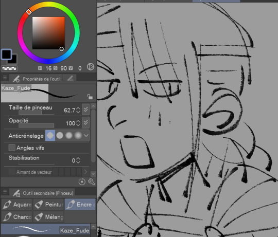
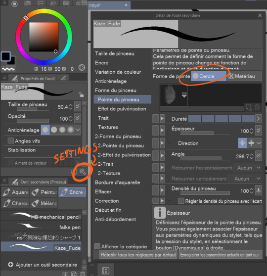
(Sorry my software is in french) These are the brushes I used for those doodles! I drew them on Clip studio paint. For the first one I didn't modify the settings (I usually never modify them) but for the second one I changed the shape of the brush for a round one^
I never use a specific size for my brushes and canvas I just go with whatever looks right. When I draw with that brush I try to not press too much at the end because the brush stroke might come out too round at the end

Also I don't turn on the anti-aliasing feature because I prefer when it looks more pixelated

#Im not the best at explaining so i hope this could help you!!!!!#if there's anymore question about the drawing process i would love to answer them<33#most of my art is drawn with different brushes and different softwares I just keep switching between firealpaca clipstudio and medibang hah#right now i use alot of clipstudio tho!! theres alot of fun brushes to discover!!#asks & answers#art tips#my art#kappart
44 notes
·
View notes
Text
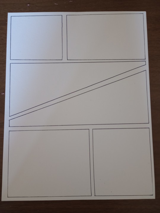
HOW I MAKE TRADITIONAL COMICS AND COLOR THEM DIGITALLY - PART 1 - HOW TO MAKE AN EMPTY COMIC PAGE
Things you'll need for this part
Ruler
Thin pen
Thick pen
Pencil
Eraser
Heavy book
Something small you can draw on, preferably small paper or a handheld whiteboard

Step one - write your comic page

I usually write comics like this, I work by myself so the comic script can be messy. I stay on six panels most of the time so I can reuse pages, but you should also change it up sometimes, especially on scenes where it needs it.
Step two - plan out panels
Use a small piece of paper or a whiteboard to plan out panels after you've written them. Do the most important panels biggest, and more chaotic panels for more chaotic scenes. You could also use a tablet or ipad and use ibis paint to plan out the panels.


Step three - sketch the different panels
Use a ruler to decide how wide you want the space in-between your panels to be. I usually go to 0 inches because there's some space between the start of the ruler and 0, but you can also do whatever fits the style of the comic.
Draw the lines with the ruler and a pencil, use a heavy book to weigh the paper down straight so it doesn't move. Make a box on your page, then start adding the gutter (space in-between panels) to separate the panels. Make sure you go outside the lines while you're sketching so you don't cover up the entire line with your ruler when you ink.
Step four - inking panels
Use a thin pen to ink the panels with the ruler. Be sure to not go to far off the line, or go too low down below the other lines. Erase all the pencil marks by holding the paper down and carefully erasing (so the paper doesn't bend)
It should look something like this

Step five - copying
Swipe away all eraser marks before you copy the page on your printer. You may still have some marks on your new copy, but you can edit those away in your art software. I always make a copy of the page to keep incase i need to use it for later. Use plain paper and 8'5 by 11 (if that's the type of paper you're using).
Extra step six - thick copy
This is an extra quick step incase you need a more hand drawn and thicker look to your page for now or later. Copy the page like before, but afterwards go over the lines with your thick pen (i use a brush pen) and make it as shaky as you'd think fits the style. It's a quick way to make another type of page and i try to do it with every page i make just incase i need it one day.

Step seven - put away original copies
I keep the original copies of my comic pages in a folder for later use. After a while you'll have a bunch of blank comic templates to use.
I'll post the next part once i finish and scan the finished traditional page.
Also I'm not a professional, this is just how i make traditional comics
6 notes
·
View notes
Text
" And now here I am, to my waist in water and getting drowned on the regular. "
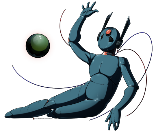
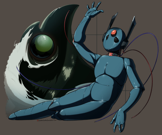
Looks to the Moon being reminiscent of memories she no longer has... ...Featuring, my design take on Moon! Yaaay! This is my first time actually sitting down and fully coloring and fleshing out the look, wow!
This was originally for the Rain World art month, but as it approached the end of the month I just decided to finish it on my own time, and as is often the case, my own time is usually about a month- TT+TT [Though drawing the very last-minute background that I had NO planning beforehand other than the realization "Oh, right, Twitter doesn't do transparent images" most likely did not help...]
Despite having said all that, I actually am kind of proud of how long this took me! I tried a lot of new techniques for this! For instance: I knew I wanted to show motion with Moon's wires and incorporate them into the piece but I wasn't really satisfied with how I draw wires, and drawing two parallel lines by hand would have taken substantially more time. SO- to counteract this I did some research into properly making my own custom brushes for my software, I use Paint Tool SAI so I don't necessarily have the luxury of softwares like Clip Studio Paint to have catalogs of brushes sadly, and was able to make my own 2-point brush! It definitely needs some tweaks and revisions, despite being the 5th one of its kind that I made for this piece, but it served itself well for this piece and was a great help! The texturing was also a custom brush, made by someone else but heavily tweaked to match my preferences so that I could replicate skin refracting the rain. That in itself took a LOT of time studying references and watching tutorials and tips. [Thank you Sinix Design for all you do for the art community...]
However, there's more that I wish I could've done for this piece and it is FAR from perfect. I really wanted to make the red parts of Moon's body much shinier to show that they are a different property than her skin. Part of me really wanted to add in some rain falling from the ceiling too, to better sell the look of her being in the middle of an active rain cycle. Alas, my art program was really struggling to keep up with the number of layers I already had on the canvas and... also I didn't want to spend another few hours learning how to draw raining in free fall... there was also that... [Also I promise I am much better at drawing water and waves than this, I DID NOT plan how that shape would look in a third dimension at ALL and it suffered as a result- Oops--]
But! She's done and I'm comfortable enough with how this turned out! I'm glad to have finally properly drawn an iterator finally! It only took 6 years...
And thank YOU, yes you... for reading all my ramblings on my work and the process I went through!
18 notes
·
View notes
Note
Do you have any tips for sketching / lineart? (also for drawing characters any way that isnt 3/4 view neutral expression? It's the bane of my existence habit wise and you're amazing at it!)
Ahh ty! Sorry this took a few days, I ended up taking some screenshots because I’m not great at explaining things!
Lining Stuff and sketching
So generally I use Paint Tool Sai, and have one brush I do almost EVERYTHING with! (Well technically 2 - the sketching one is just the same but thicker) I think its a brush I tweaked a LONG time ago so I can’t remember where it came from. It’s fairly smudgy so I keep my lines separate from the colours if I want them to be sharp and clean.

For my proper drawings I tend to keep the brush small and zoom in to about, 125-150%, and depending on my mood I turn my stabilizer up!
I think the most important thing for me however, is to have confidence in my lines when drawing! I’d rather the line is slightly incorrect after one long stroke and move on, then spend ages drawing one little bit repeatedly, or using lots of little lines and just getting angry at myself. You can always erase bits when your finished and go back! I use this tip when drawing on any software, and find I do much better lines when I just go for it! And of course practice, the more you do lines the more confident you’ll be trusting in your hand.
For sketching I use a nice chunky brish and focus more on the mood/expression, I often forget to add things (Like Pépin’s flowers in the example) but that’s all stuff I can add in lining. To me sketching is just to get the vibe down, and I like nice chunky lines and just going for it!

Non-3/4 Angles
Ahhh I’m glad you like my attempts at angling and expressions too! I still fall into the trap of a 3/4 a lot, but it’s good practice to vary it up. I 100% recommend playing with 3d pose software if you can!


(These aren’t very extreme examples I’m afraid (And one of them again is a 3/4 sliiightly top down looks XD, I wanted something easy to do.)
When using 3d software I can pose it and change the angle to what I want, then I just sketch roughly over that, changing it to what the character is, and then remove the 3d model entirely and refine it, sometimes redoing the sketch again. I more often then not reference photos and stock poses (Such as Senshi Stock!). Using photos is super important, and I also take my own goofy photos to use as reference too!
Referencing is VERY important, I’ve been drawing since I could hold a pencil and oh my gosh my doodles and drawings when I don’t take the time to at least glance at a photo do they look a bit wiggly!
More often then not I don’t use 3d models and just stick to referencing photos, but it’s a super easy and useful way of getting used to figuring out angles and poses, and I still set up scenes if I’m really struggling! There is nothing wrong with tracing over a 3d scene you’ve, you’ll be completely changing it anyway as you work on it more.
It’s ALSO super handy to make sure your characters are distinct. Both Pépin and Alec were drawn over that default head just as an example, but I tried to still make them different from each other.
Expression wise I’d say just play with them! I actually think my expressions could use more work, as I don’t tend to push them very far and tend to go for more subtle looks, but it is something I enjoy doing! Honestly a mirror is SUPER useful, and pulling faces and feeling how your own face moves is a great tool!
I think overall confidence is very important! I draw for myself rather then anyone else, and whenever I stop enjoying working on a picture I move on! Alongside practising and referencing, trusting myself and having a nice time is how I mostly draw!
I hope any of that was useful, I’m a very rambly person 😅 I still have a long way to go in my own art too, and still trying to find what I enjoy doing art wise after three years of animation and realising that that wasn’t for me!
8 notes
·
View notes
Text
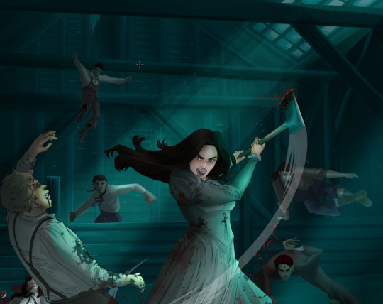
How I Digitally Paint like a Scenic Artist/Designer
Aka: how I did this and put my degree to good use.
LONG POST WARNING
Step 1: Research.
First off, get to your image search. If you are going to be using Google, you may want to type “-pinterest” in the search to eliminate the countless boards.
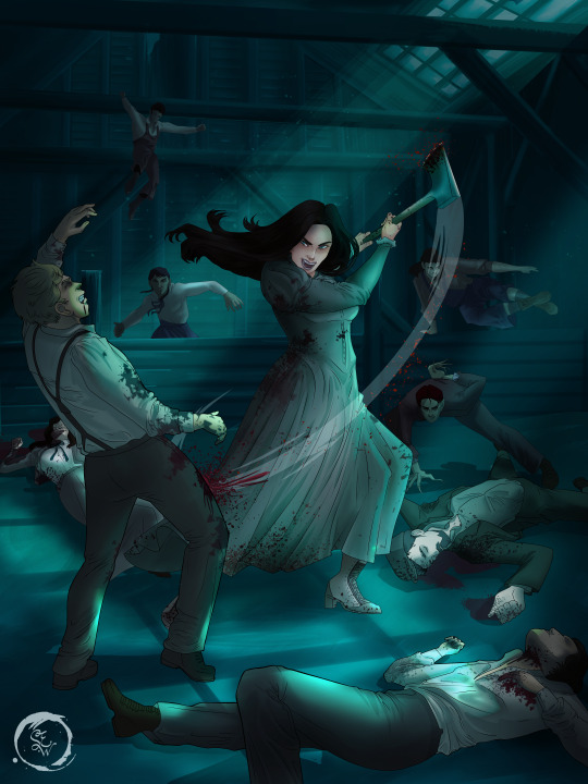
I had to figure out clothing that is vaguely late 1800s. I found a multitude of reference images that were fancier clothes- but I wanted to find images of clothing for kindred across all social classes. Photographs from the era and paintings are your friend. They will more accurately showcase what was worn.
After Fashion research comes location research. The 1890s in America is known for the rapid industrialization. Factories were getting bigger and work days were getting longer. But, I wanted the moonlight to be cascading into the place, illuminating the scene. This means I needed to find a structure that had skylights or let sunlight in. And the best images I found? Slaughterhouses. Fitting, huh?
The same rule for fashion still stands- if you can find photographs or paintings from the era- they’re better. There are tons of places still standing today from the 1800s. But today, they look WAY different. Ya know, Abandoned! So just be sure to take this into consideration if you search “abandoned slaughterhouses” or go trespassing like I did.

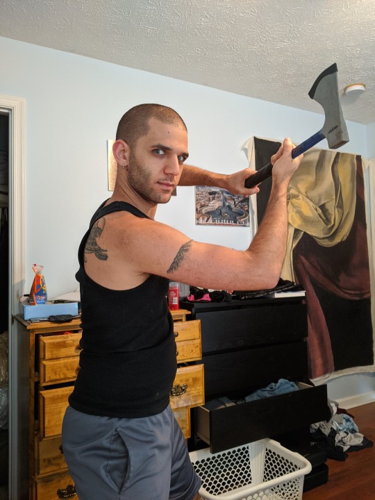
Lastly, pose research. Finding the poses for a fight scene can be tedious. So, I enlisted some help from a few fight choreographers and stunt men. You can record their fights and play them back at quarter or half speed. You can also get a mirror and flop on the floor a bunch. I did both. This lets you see the action/motion lines you are going to replicate in the drawing. Heres how we initially did fina’s pose:
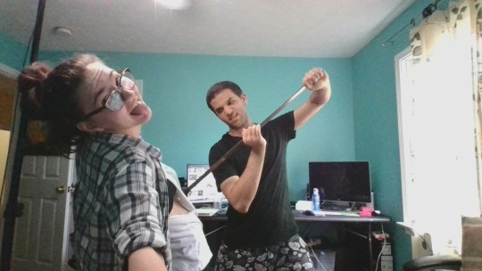

And sometimes you have to go back and get a clean shot. I ended up using this pose for the axe.
Step 2: Set up and Background!
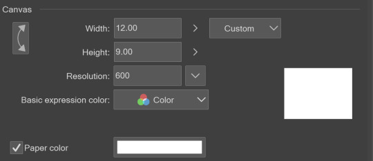
When you open a new file, set it to the dimensions and resolution you want. I was working at 600. Usually, I’m working at 300-350. You can always reduce resolution. Its hard to prevent fuzzy lines if you increase it later.
I cannot stress the following enough:
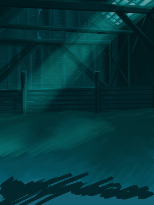
You work background to foreground. Big Shapes and areas to little shapes. Work your way forward. What this means is you need to fill in as much space as possible first. Then build your details. I prefer working as follows: Big Solid tones, Soft shadows, Dark Shadows, Highlights, then final blend. Once you finish this, put an overlay on top. This knocks everything back and helps create the illusion of depth. See this at work with the video below or here
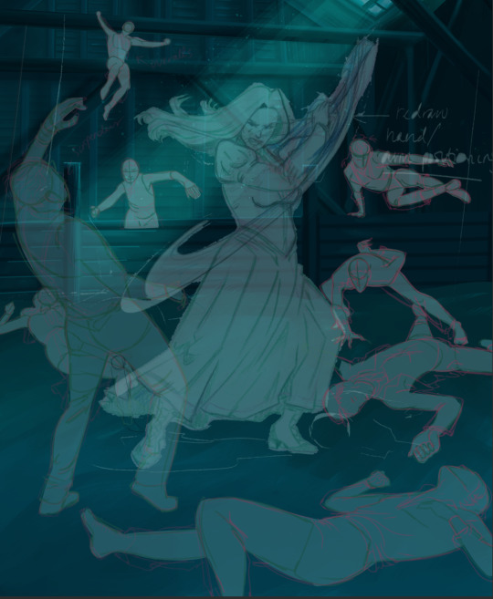
Step 3: Figure Drawings + Composition
Utilize that research and images you collected to pose your characters. I create subfolders for each set of figures. Organization is important here. This will help keep you on the right layer and prevent the eternal digital artist struggle of “Fuck that was on the wrong layer!”
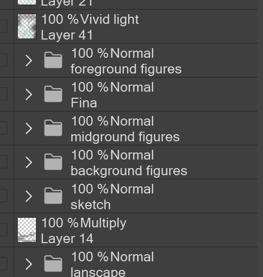
Even after you move on to lineart and shading, Keep the sketch layer as a reference. You may need to see what youre original notes/ figures looked like as you do the lineart and shade. Don’t be afraid to move them around and alter the composition rn. You want to be able to make changes. Make notes! Detail light sources!
I’m about to through out some art jargon:
You want to think about asymmetric balance. The easiest way to achieve this in an eye-pleasing manner is to use the Fibonacci spiral. Yeah. This boi:

Place your figures and actions in a similar sequence to the spiral and the viewer’s eye tends to naturally follow it. This is sometimes called the Golden Ratio in the art world.
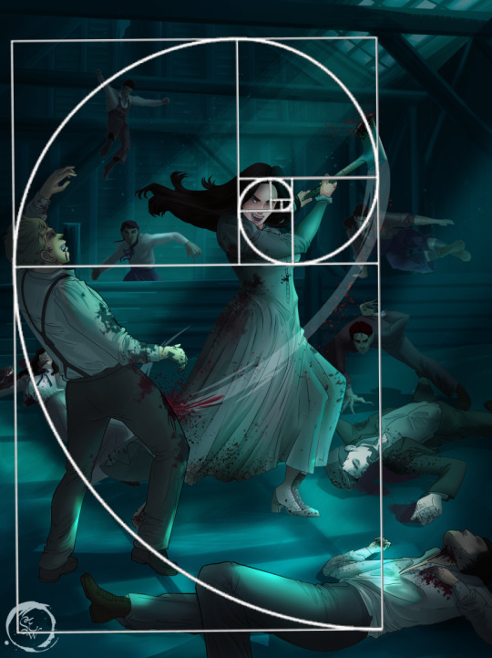
Doesn’t need to be perfectly on the spiral. You can break it- but its an excellent tool to plan how things move in the piece.
Step 4: Lineart
Once you got things sketched- its time to do the lineart. I’m using clip studio paint’s standard brushes. Nothing fancy. I often switch between the G-pen and the For Effect Liner. Mapping and Turnip are for thicker lines.

Usually I set these pens to a specific thickness depending on where I’m drawing.
My background figures are lined at 0.05 thickness, the midground is .1 to .2, Fina is .3 and the foreground is .4. I set my stabilization high to help keep my lines smooth. Stabilization 100 means there’s a significant delay between where the pen is and the cursor. I like the stabilization to be at 20 for freehanding and at 50 ish for outlining. Dont become completely reliant on the stabilization though. Good and smooth lineart is drawn from the arm not the wrist. Your range of motion is severely limited if you only move your wrist. Practice moving from your elbow and you’ll be surprised how much smoother your lines get.

Once I finish lining the figures, I usually go around it with an outline. This does three things:
1. Solidifies the figure and cleans lineart for paint bucket tool. More on that in the next step.
2. Its a stylistic choice. Helps give it that comic book feel with a heavy outline.
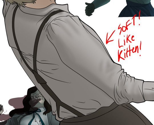
3. Pushes figures forward or back in the composition. Thicker outline helps denote that a figure is farther forward than another. My background figures have no outline to push them away
Step 5: Digitally coloring
For each figure you are going to select outside the lineart.
Create a new layer under the lineart
Invert the selection. Paint bucket. You should now have a solid shape of the figure under the lineart. Do not deselect.
Create a new layer above the one color. Title it solid colors. Paint in thick, solid tones. I like to use the mapping pen and turnip pen to color in my solid tones: skin, clothing, hair, etc.
After that, deselect. Create a multiply layer if you can. If your program does not have a multiplier function, Pick a tone you want to use for shadows and lower the opacity (usually 30-40% I like to use lavenders or blue tones). It will not be as vibrant, but you can edit it in post. Select off of the solid colors layer. I like to start with skin tones. Use the airbrush tool to create soft shadows. You don’t want to create harsh lines on this layer.
Then repeat this process with harsh lines.
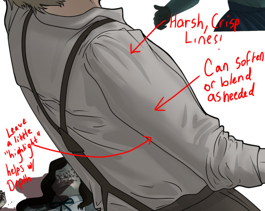
Then knock it all back with an overlay. If you dont have the ability to create an overlay, you can again drop a solid color and lower the opacity, but you’ll have to mess with the color balance/ brightness/contrast to let all the hard work come through.
You’re going to repeat this for every single figure. Here’s a few color theory tips though.
Your overlay colors should be darker (not more vibrant) in the foreground and lighter (avoid using pure white) in the background. This helps with the depth of the piece. Things closer tend to be darker (not always true, depends on lighting)
You can choose to use color theory to aid your shadows. Instead of choosing black or grey for shadows, choose a complimentary color. I used a lot of green for this piece, I used red for really dark shadows. Its not that black drains color- its just loses some depth if not used carefully.
Keep your colors consistent. Helps unify the piece. You can strategically break the consistency to draw focus. For example, Fina is the only figure with a true blue overlay. This helps her stand out from the other figures who have reds and greens.
Step 6: Touch Ups and Final Renderings
Now comes the most tedious part. If you’re like me, your computer fans have been whirring for the last few hours trying to render this monster of a file. If you havent already, SAVE FOR THE LOVE OF ALL THINGS GOOD

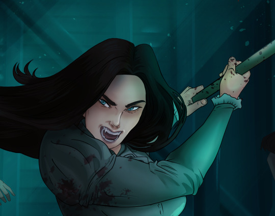
These are the last four layers I have for the entire piece. Here, I am trying to create effective and believable lighting. This kind of work I have only been able to achieve in clip studio or photoshop. You can do it with normal layers, but choose your colors CAREFULLY. Stay away from pure white. Carefully utilize your knowledge of light and shadow to create soft highlights. Harsh lines tend to be a stylistic choice for me. The final layer, subtract, dulls out harsh red tones. I used this as a final overlay to help put everyone and everything in the scene. Without it, things are a little too green and skin tones are a little too blushed for vampires.
The challenge here is I want to tone down the red, but not lose the vibrancy of the blood. So, shift it to a blue. This also helped reinforce the “nighttime” effect. Its only a slight change.
Final thoughts:
Whenever you finish something, its important to reflect.
1. I am so FUCKING PROUD OF MYSELF. This is easily one of the most complicated pieces I’ve done in a while- and I’ve made 16′ tall faux stained glass. Brag. Let yourself feel awesome cuz you just made something awesome.
2. I timed myself on the piece. I could have easily spent another 7 hours on it. But its important to know when to stop messing with it. Partially for budget reasons but also when you get down to the details you can make yourself go insane. Theres also a ton of detail work I lost cuz of overlays or its just too small to notice. Fina’s face? hard to see cuz its not close enough.
3. I needed to take frequent breaks for this piece. That was good. Resting and stretching was very important. That is one of the reasons why I was able to work so fast.
4. I started doing more digital art in April 2020. I have to say, practice makes perfect. I practice drawing and digital painting for at least 3 hours a day.
That discipline has allowed me to improve so rapidly. So- I don’t wanna hear shit about I can’t possibly get this good! Or I couldn’t even draw a stick figure! BULLSHIT. You can. Get yourself some free software like Krita or Autodesk sketchbook and start playing!
And thats what I got! Thanks for coming with me on this long post!
27 notes
·
View notes
Note
hi! i've always loved your hnk panel redraws and recently i've been so inspired by them that i've tried my hand at coloring some panels too! if you don't mind me asking, do you have any tips?
oh i certainly do! some of these are a bit generic/art related but they’re definitely useful in this case too. I’m adding a read more because unfortunately it got a bit long but here you go:
1) Get to know your tools!
Since you weren’t very specific, I’ll assume you aren’t too familiar with art softwares (and if you are, you can just skip that part it’s not That deep). I’ll start with the basics; I know this is obvious, but please bear with me, because understanding how your program works WILL make you a lot more efficient.Here are quick descriptions of some features I think are very useful - I use Clip Studio Paint, but I believe most programs have equivalents. If you don’t know them, please experiment with them, they’ll come in handy!
- Locking transparency :
Locking the transparency of a layer means only the parts where something is already drawn can be modified. Basically, you can recolour something that already exists in a rather precise way.
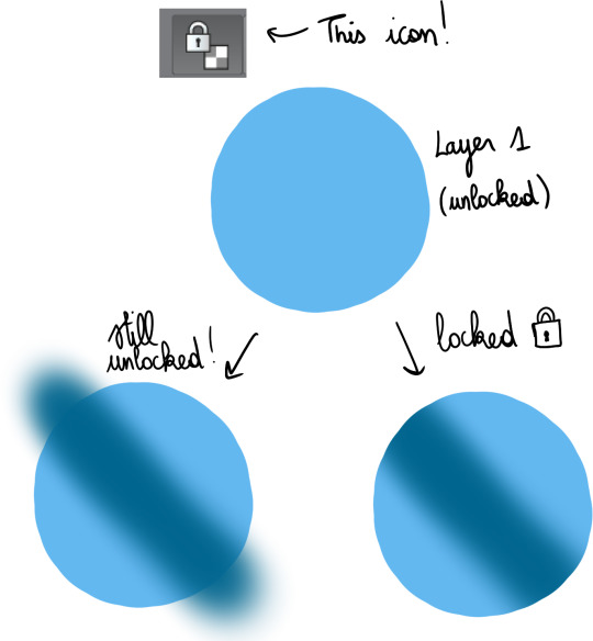
This is very useful for gradients, which I’ll talk about a bit later.
- Clipping layers :
This gives the same result as locking a layer then drawing over it, but the difference is that you use more than 1 layer ; one as the bottom layer, defining the part of the canvas you can draw on, and the others, clipped on top, where you’ll draw. This can be more practical than locking transparency, because if you have a lot of details to add, doing everything on a single layer may make things more difficult.

I use this a lot when I shade, but just like gradients, I’ll bring that up later.
- Layer settings :
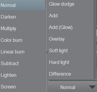
These options change the way the colours on a layer blend with the colours below. As an example, addglow is pretty good for colouring very bright light sources or for adding highlights on gems :

Basically, using those isn’t a necessity, but they’re still pretty useful so I’d recommend experimenting with them whenever you feel like it!
- Magic Wand :
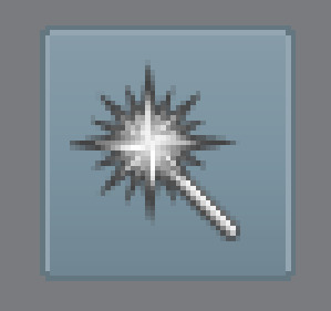
Not the most complicated to use, but damn it’s really useful. It allows you to make selections based on the colours you’re targeting, so basically, if you need to colour an entire area a certain colour, you can just select it from the original panel, go on the layer where you’re colouring, and colour nothing but the part you selected. That’s about it!
There are lots of others, but these are the main ones you need to know about when you’re getting started.
2) Colouring stuff
This is where it gets interesting! I guess! I’m not too good at just coming up with these kind of tips, so I’ll illustrate with some colouring, hopefully it’ll help you out?
I usually colour in 5 parts : 1) Preparing the panel(s), 2) Applying flat colours, 3) Adding gradients, 4) Adding shading, 5) Finalising with details.
I always prepare pages in the same way: first, I use the magic wand to select everything i do NOT want to colour ; the frames around the panels, the speech bubbles, the sfx, etc. Once they’re selected, I copy them, and paste them on a new layer. Then, I select the original layer, and turn it transparent so I can colour below while still keeping the lines. To do that, I go in Menu > Edit > Change brightness to opacity (in CSP at least, it depends on your program tho but most of them support this, I think!).
I end up with something like this :
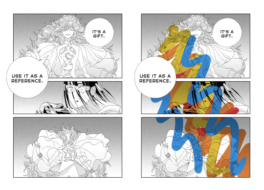
Two layers, one on the bottom with the semi-transparent page, and another on top, with everything that I don’t plan on touching. On the page on the right, you can get an idea of what it looks like when you add a layer below these 2 and draw on it.
Now that I’m done with the panel, I can start adding some (flat) colours.
I think it’s a good idea to start with the background, because it’ll help you figure out the feeling you want to give the panel.
The airbrush is a pretty good tool for gradients btw, just make sure you use a brush that is big enough so the transition in colours looks natural.
Next, I add a new layer, and colour the shape of the characters (and here the vessel as well), so it stands out from the background. It’ll make colouring less complicated, since the lines will be clearer.

As you can see, I was kind of confident, so I directly added a gradient. The bottom of the panel is a bit “darker”, because I wanted the main light source to be the reflect on Phos’….. head thing?
Here’s something kind of important about your choice of colours : if you’re colouring an area that is already shaded in the original panel, I would recommend taking a colour that is more saturated than it should, or else the colour may end up looking dull because the original shading will make it darker.
Next, I do more flat colours. Nothing too fancy, and pretty much everything is on different layers. The clothes are left uncoloured because the background colour already fits, so it’s okay honestly
Then, I added some gradients using clip layers :
As a reference, I used some overlay layers for Dia’s hair, and some addglow layers for Phos’ alloy.
I mean it when I say gradients are important! They make your colouring feel more complete even when they’re barely visible. quickly coloured bortz for reference, assuming tumblr won’t compress the colours too much:
the bastard on the left has nothing but flat colours. They’re nice, but when you’ll have shaded everything, chances are it’ll look kind of …. i dunno, like something is missing? So yeah, gradients : good, though i would recommend you keep them in the same tone as the base colour. I’ll talk about this a bit more later if i don’t forget.
Ok! next:
I felt like golden colours weren’t quite fitting the mood, so i added a layer with blue on top of it to make it colder. It’s at 40% transparency, so you can still see the colours behind well enough. Some parts were slightly erased because i liked the idea of these parts being lighter (you can see it a little bit around phos’ neck, or above dia’s knees : these parts are yellower than the rest of the pic)
I added some shading! Nothing too fancy. also not to sound like some gradient-freak but you can add some of those in shading as well, it’s usually a nice touch.

After than, I added some lightings, which are on a layer clipped on the original manga panel (so basically only the black parts of the original image changed colours, and the colouring work I did on the layers below wasn’t really affected, if that makes sense?)
The red lighting is the obvious one (it’s an airbrush, and i used an eraser to clear the part near Phos’ head so it looks like it’s coming from above/behind them and not from themself).
There is another lighting at the bottom, which is grey/blueish, to contrast with the warm colours on the top of the pic. it also kind of looks like smoke but yeah
Now the panel is mostly done, and I’m starting the “details” part.
Something I find really bothersome in the manga is the *original* shading : while it’s always really good, colouring under it will leave some grid of pixels on top of your colours, so to counter that i just colour on top of the grid by colour picking and painting on a layer above the manga layer.
It’s a bit tedious but it has a texture that makes it look like a painting. The downside is that the colours can be altered since you’re colourpicking from something with an irregular pattern, but it can end up making your panel look less boring, honestly, it just depends on what you’re aiming for!
I end up with something like that :
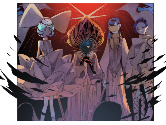
And then it’s just. Whatever man. I added a black border and some highlights, sparkles, etc, it’s the kind of things you do when you’re basically done.
For the technical aspect, I’m not sure I have a lot more to add. If you want some advices for picking colours, tho…
3) General colour stuff :
These are just recommendations! Licherally these are mental notes i came up with ever since i’ve started colouring, so they’re kind of personal and if you don’t follow them you’ll be fine, i suppose. But so far they’ve been useful to me so consider them whenever you’ll be colouring something:
- Do not use pure white! Unless it’s for something CLEARLY meant to stand out, such as the frame of your pages, a speech bubble, sparkles, or a light source/something very shiny. If you’re just colouring something that is not meant to draw attention, use some other shade of white, but not the #ffffff one if you see what i mean?
- Same about pure black, to be honest.
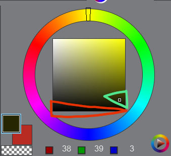
The shades circled in red tend to look “emptier” than the ones circled in green (here the hue of the colour is yellow but it works with most colours). It doesn’t mean you can’t use it, just, use it sparingly or it may make things look dull I think? I would recommend trying a few shades before taking a decision.
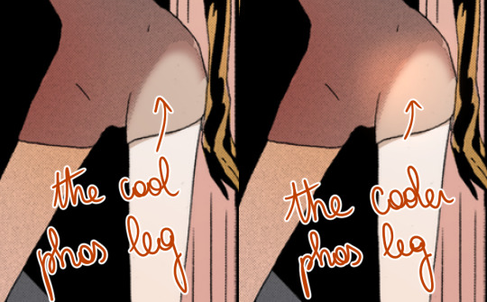
- Sometimes adding highlights where the shading starts can make the transition look smoother:
- Even if a panel is already shaded in the original page, I would recommend shading it again, because the manga shading is a black shading and shading a coloured drawing with black usually doesn’t look that good. (hence why i said something about using saturated colours in shading earlier).
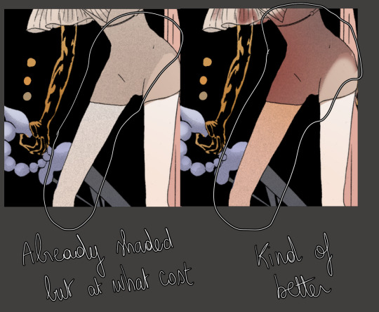
- Even if a panel isn’t shaded in the original page, consider shading it anyways, even if it’s just a very light shading. It’s worth it :o)
I’m running out of things to say oh well
#i didnt mean to write so much. it just happened i hope it's not a pain to read#also i hope it was clear but if it wasnt. (points @ my inbox)#whenever people tell me theyre getting into panel colouring i go... [powercry emoji]... its really fun and honestly i dont see that many#ppl into it so i get really enthusiastic ? thats it#personal#asks
119 notes
·
View notes
Text
A Loud Canvas
Rating: G Pairing: Markus and Connor (vague pining) Summary: Markus invites Connor over to come try out painting. Things are going well, until Connor begins to lose himself in the art, and not in a good way.
AO3 Link: https://archiveofourown.org/works/18742600
Notes: hi i had this idea a few weeks ago and wouldn't stop thinking about it and if i wanna indulge in content like this i have to do it mySELF. RA9 is a bitch
Adjusting to a new way of life after the revolution isn’t easy for everyone, be they human or android. Everyone came from different walks of life, their choices shaping everything around them and the people who would love or loathe them. Some humans still had their prejudices, some androids had their own traumas to mull over. Either way, Markus had become a hero, a shining new beacon, a bastion of hope for the androids, and the future was bright and promising.
Connor was grateful for his freedom, the entire world looking so different with these new eyes. To be alive, to feel alive -- it was something he accredited fully to Markus for setting him free. The thought of it is still one Connor hasn’t been able to fully process and dissect; Markus, held at gunpoint, still made an effort to reach out to him. Markus, after witnessing the destruction of Jericho, a massacre brought on by Connor, still saw a hope in him, still trusted him, still welcomed him. Even after Amanda had nearly seized control of Connor’s program and killed Markus before hundreds of freed androids, Markus held no resentment, no fear, no worry.
Had the roles been reversed, Connor would not have hesitated to kill.
He shoves these thoughts down, focusing back on the present as he took a few breaths to cool his systems. It had been several months since all of it had happened, and he stood now beside Markus as he always has since then, returning a favor. Guarding him. Watching for him. Like a loyal guard dog. Markus seems to catch the look on his face, and he puts a comforting hand on Connor’s shoulder, smiling gently.
“You don’t have to be tense all the time, you know,” Markus says, his eyes glancing briefly at the LED at Connor’s temple. “It’s safe here.”
Connor looked around the home. Expensive, frivolous, full of so much art and books -- seeing Manfred’s home in person at last made him understand Markus so much more. But still, he remembered hearing that this was where Markus died, and he wondered how he could be so calm leading Connor to the studio when he himself could barely even look down a skyscraper after his own death. It keeps him on edge.
The doors slide open, and there are canvases filled everywhere, most unfinished, others full of so much color. Markus watches Connor carefully, smiling a little to himself as Connor’s LED shifts to a curious yellow, scanning each piece. Connor broke down each stroke, identifying which were Manfred’s art style, and the others with the flourish only Markus knew how to create. His HUD lights up, picking out every detail by the millisecond; the magazines left behind, the age of some of the canvases, dust left on some of the countertops, dried oils and acrylics. His stress rises, however, when he manages to catch just the faintest trace of thirium left in the pavement. He could tell someone made an effort to scrub it clean. A human eye wouldn’t be able to detect it, and he wagers, neither would Markus anyways; his model is far more advanced than Markus’, able to pick up the scene and deconstruct it with ease. A blessing, when on missions, but right now, only a curse.
Markus had turned his back just before seeing Connor pick up on the scene, oblivious to the detective work. He hums a song quietly as he reaches for a blank canvas, propping it on the easel and setting up a palette of paints. Connor eventually rejoins him, head tilting slightly as he watches Markus mix the colors.
“Ever since Carl taught me to paint, it’s been something I haven’t been able to stop,” Markus says as he approaches, already beginning to fill in the white spaces of the canvas. “Didn’t get to make much when I led Jericho, but now I paint whenever I get the chance. It’s… calming.”
He can’t help but be a little amused at how Connor paid so much attention to each stroke, his LED at a stable yellow as he processes it. Markus is able to create art much faster than a human -- the perks of being an android -- but the speed never took away from the artwork itself. It wasn’t long until the near surreal piece was done. A full moon overhead a sea, except it appeared to be bleeding thirium blood, and the sea appeared as though it were being held by a pair of android hands.
Markus steps back to look over the piece, turning to Connor expectantly. Connor seemed fully invested in the artwork, his gaze lingering on it for a while until the LED finally spun blue.
Markus smirks. “What do you think?”
Connor gave it another glance before meeting Markus’ eyes. “There’s a part of me tempted to comment on how the moon can’t bleed,” He says, humor in his voice. “But it’s intriguing. Very much so.”
Connor had silently stored the memory of this painting into his long-term storage. He would think on this later.
An amused huff is all Markus responds with, and he moves to replace the canvas, setting his painting to dry to the side. Then, with a bit of a flourish, he hands the palette of paint to Connor. The action was unexpected, and it stumps him for a moment, simply staring at the brush and paint as its offered to him.
“Hey, come on now,” Markus teases, holding it closer to Connor until he took it. “Aren’t you a bit curious what you can make? I know I am.”
Holding the palette and brush felt so… foreign to Connor. Seeing Markus work with it was far different than this, and he finds himself shaking his head, trying to give it back.
“This is more your thing, Markus,” Connor says, internally questioning why his thirium pump seemed to have kicked a notch. “I was designed with forensics and investigative work in mind, my software specifically intended for police and --”
“Right, and I’m a domestic android who led a revolution,” Markus teases, poking at Connor’s shoulder. “You’re not bound by your creators anymore, Connor.”
Connor nods slowly, holding up the brush the same way he had seen Markus do so. Markus steps aside so he could stand before the canvas, processing. He samples the data of the times he had watched Markus create art, trying to figure out where he would begin. None of Markus’ paintings made entire sense to him, let alone the thirium moon he had just witnessed, and Connor found it rather silly that he would stand here before this inanimate, blank canvas, and feel intimidated by it.
Markus’ gentle voice fills the silence. “I was daunted by the idea of painting too when I first started,” He reminisces, garnering Connor’s full attention. “Don’t think too hard about it. It’s about… your emotion, paint what you feel.” He stood close to Connor, and damn him, Connor’s thirium pump continues to betray him. Markus sweeps his hand out towards the canvas, as if painting with just his gesture. “Interpret the world, improve on it, show what you see.”
Connor nods at this, looking between his blue and green eyes. Markus only offers a reassuring smile, and he has to turn away else another biocomponent of his starts complaining at the sight of it. “Alright,” Connor says, dipping the brush in black paint with three taps, just as Markus usually did. “... Walk me through this?”
Markus recalls Carl’s words to him, taking an unneeded breath as he watches Connor mimic him. It was funny in a way; Connor taking up this role while Markus tries to repeat the words Carl had given. It was like singing a song off key.
“Close your eyes for me,” Markus says, watching Connor’s flutter shut. There’s a bit of excitement he finds, anticipating what he might witness, but he keeps it tampered down. “Imagine… something that doesn’t exist, or something you’ve never seen. Concentrate on how it makes you feel and just… let your hand drift across the canvas.”
Connor remains silent, standing stiff in that odd, prim way he always held himself. There’s a long moment of hesitation before Connor lets the brush make contact, sweeping strokes filling the canvas with black streaks. Several times he opens his eyes to see where he’s going, nose twitching ever so slightly when the paint gave out on him and he needed to refresh it. It takes him a while to get accustomed to this, but luckily, androids don’t get tired, and Markus is more than happy to stand there the entire duration as Connor figures it out.
The first paintings start off relatively abstract. Blacks, greys, blues and reds are streaked across with no general guidance or direction aside than to just be on the canvas. A few strokes that were intended to be straight come out horrendously wobbly, much to Connor’s dismay. He starts over several times, repainting the canvas back to black, each attempt beginning to take more form and shape as he paints. He was learning and improving right before Markus’ eyes, and it was fascinating to watch. Markus wonders if this was what it was like for Carl when he watched him paint for the first time.
One hour, and twelve minutes pass since Connor began, and Markus can finally see a solid picture beginning to form. He still stuck with the same four colors, but now, they were working for him, values becoming present as Connor tapped into something within him. Grey streaks -- buildings, skyscrapers, he realizes, frames the canvas, the eye drawn to the bright rooftop at the bottom center, as if watching the scene from a bird’s eye view. Markus’ brows furrow as he watches the art begin to take form and shape, what he assumes to be a pixelated helicopter coming to life at the top, shining a light down on a figure at the rooftop while flares and strokes of red and blue pitter and patter in muffled tones around the scene. Connor’s controlled brushstrokes slowly become harsher, more energized than before, detailing a figure on the rooftop. Markus moves closer to peer at it, painted pixels forming the RK800 standing at the edge of the roof, and suddenly, Markus is filled with a wave of unease.
Paint is flicked here and there as the brush strokes become more fervent, the art coming together quicker than he was managing before. Armed soldiers all stood facing the painted Connor as he too faced them, despair in his features, red LED glowing to a broken halo that leaked and bled to the ground. Lights shone down on him, guns pointed towards him -- he holds himself hostage, his own pistol aimed at his head. Horrifically beautiful, an art piece that he knows that, if it were to be displayed at a gallery, would have the rich humans cooing and speaking over it with their wines.
But it didn’t feel right. From where Markus stood, he could see the angular features of Connor’s face were pulled taut in stress, eyes were fully shut, and as Markus circles Connor so he stood to his right, and he catches sight of the LED at his temple glowing an alarming shade of red, pulsing with every stroke he made. Every stroke, angry, shaky, losing the control and restraint he had seen earlier.
“Connor?” He calls to him. Connor doesn’t seem to acknowledge him in the slightest, and he doesn’t react when Markus puts a hand to his shoulder. Markus didn’t need to interface with him to notice that his stress levels were rising by the second, and he gives a gentle shake. “Connor, hey, you don’t need to keep going.”
He still doesn’t stop. Whatever it was he was trying to say with this needed to be out. He was caught in a trance, still moving and swaying a beat that wasn’t his own. His teeth grit, the red paint he was adding to the color near the rendition of himself suddenly spikes out, a streak of the red cutting through the skyscrapers and smearing against the greys and blacks. His cheeks were slick with tears, and as if he were possessed, his strokes change entirely. He wasn’t painting anymore, no -- this was a font. He was writing, ruining the canvas, red text over the skyscrapers and the lights. ‘RA9’, on repeat, again, again, again--
“Connor!”
Markus took hold of Connor’s face in his hands, and his eyes fly open, taking gasping for air to cool down systems he hadn’t realized were overheating. The palette drops from his hand, and he grasps Markus instinctively, grounding himself without thinking. Strings of errors clog up his system, and he takes several slow breaths before everything returned back to normal, focusing again on what was in front of him.
And oh god, Markus was right in his face.
“There you are,” Markus says, relief clear in that gentle voice of his, hands still cupping Connor’s cheeks. “Are you alright? I… I didn’t mean for this to stress you.”
Connor is keenly aware of how Markus brushes away the tears that had run down his cheeks, and he can’t stop questioning why it happened. There was no outward trigger, no real danger, and yet his entire system was poised for combat, defensive maneuvers online and ready to act, and yet he felt so unstable in the midst of it. There was something grounding about Markus being there, however, though the closeness was not something he was accustomed to. At the very least, his stress levels were beginning to reel back enough for stability.
“I.. I don’t know why I did that…” Connor says, looking back to his canvas. RA9. He recalls his previous investigations on the deviants, and how they had all frantically wrote this script on the walls, or anywhere they could get a pen to. He can feel the scripts that ran in the background and the anomalies that became present upon deviancy repeat, a sensation that would come close to that of a headache. The code continues to echo in his head, and he’s very careful to set down the paintbrush he still held so that he didn’t end up writing it again. “I… wasted your paints. I’m sorry.”
“No no, it’s fine,” Markus reassures, backing away to give Connor some space. He stoops down to fetch the palette that fell, looking back to the painting with worry. He was relieved Connor responded at all -- he’d seen other androids in Jericho reach a state similar to what he just witnessed, and it never failed to frighten him. Connor still stared at his canvas, his LED still red and cheeks still wet.
It was so strange, he thought, to see Connor this way. Connor, who always kept himself so eerily calm, prim and proper, who never let anyone see or think they had the upper hand. Connor, who carried himself with power, who could track down and hunt enemies with ease, who knew how to preconstruct skirmishes and fights and predict an outcome that he would come victorious. Connor, who had proven he would take a bullet or twelve for anyone he cared for. Connor, who now stood in his home, looking uncharacteristically lost and confused, with an art piece that said so much yet so little about who he was. Markus didn’t know how to process it.
Connor seems to pick up on this, and he holds his head up, carrying himself as if nothing had happened at all. Only his LED betrays him. “One of my earliest memories,” He says, gesturing to the canvas. “Philips apartment, 70th story, August 15, 2038. A PL600 took a little girl hostage -- CyberLife deployed me to tackle the situation. As one of my first missions, I have a tendency to revisit the memory… deconstruct it and rerun the numbers and success probabilities.”
Connor blinks several times, a defect of his as a result of being a prototype. He gestures to the art vaguely, and though Markus still hadn’t quite figured out how to read Connor entirely, he could tell that there was something heavy weighing in on him. He listens intently as he continues.
“Ever since my deviancy, I’ve thought again about that android. Daniel. I wondered if I would have done the same. What would have become of me had I been in his stead.” Connor says aloud. He runs a thumb over the still wet paint, staring down at the red that smeared on his synthetic skin. The algorithm rings in his head again, and he backs away, resisting the urge to frantically write again. “Art… is…. interesting.”
Connor looks up at Markus, doe-eyes searching him curiously. His LED was now settling back to a yellow with glimpses of blue, and he had the need to fidget and rid himself of the excess energy he had produced. Markus reaches out, hesitating only for a moment as he ponders his actions, and simply rests a hand on his shoulder. The touch is welcomed, and for a moment they just look to the painting silently.
“I understand if you don’t want to do this again,” Markus says at last, breaking the silence. “If I had known it would upset you like this, I wouldn’t have --”
“Actually,” Connor interrupts, looking to Markus and realizing that there was paint left on him. He tries to wipe it off his shirt with a finger. “As… strange as this was, I don’t think I despised it. If anything, I feel like it… helped me.”
Markus blinks a few times, but cracks a small smile. “Humans do find art to be therapeutic in a sense.”
Connor shrugs a shoulder. “Maybe it could do without the red paint everywhere. Perhaps I should have made a bleeding sun to compliment yours.”
They both chuckle lightly at that, and Connor is quick to take hold of the canvas he ruined and sets it aside, hoping not to look at it any further. There was something to this art, he supposes, and he had a newfound respect for it. He gave the studio another scan, now looking to the artwork with a different appreciation. The abstract faces, the bleeding moon, the flowers and rivers, the portraits of neon colors -- he wouldn’t be opposed to learning more about it.
“Well, you know,” Markus says, facing him fully. “You’ll always have another chance.”
That damn smile.
#okay i wrote something#DBH Markus#DBH Connor#detroit: become human#detroit become human#rk1k#rk1000#ish#connor dbh#markus dbh#dbh fanfic#d:bh#ra9#Detroit: BH
81 notes
·
View notes
Photo

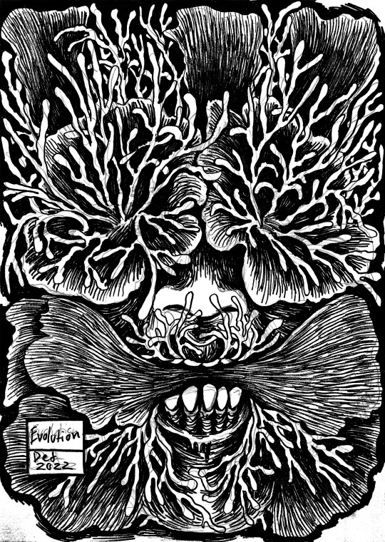


My technique after the Spits (how the 57 and the 63 were made):
Before showing anymore posts which include images of my work in situ or publications etc, I want to give a quick synopsis of my processes and materials behind the final resolutions, and after having covered my paintings its only fitting that I elaborate on why I didn’t just keep making paintings on mass and instead leaned on revising and getting back into ink and the achromatic through illustration. As this post evidences in the top images and throughout my notes here, I’ve broken everything down into the most layman mode I could possibly do, for the sake of keeping this post about the practice and not the philosophies behind the imagery. This post is about how the job is done, not why the job looks a whole lot like this.
Firstly I’ll evidence my materials and tools (bare in mind I won’t be showing pencils and rubbers I use, as I only use a simple cheap rubber and a simple and cheap box of 2 pencils, or HB depending on my mood, there’s no real character there either way, if it was super important I would include it, but those tools are just so common it’s not worth evidencing them when comparing them to the more complicate collection of ink tools I will be discussing):
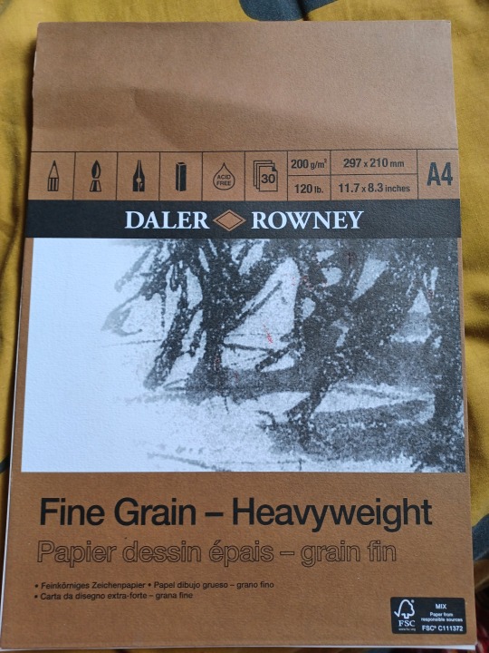
Fig 1. The paper.
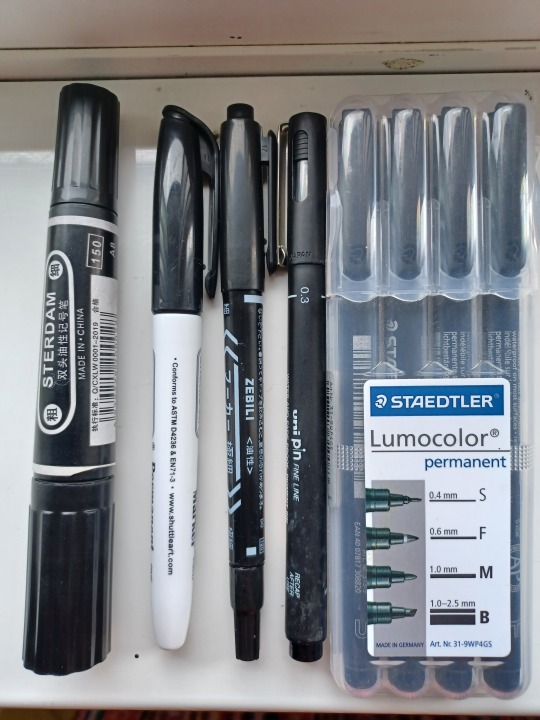
Fig 2. The selection of markers.

Fig 3. Whaline brush tip and edged tip markers.

Fig 4. Shuttle Art markers.

Fig 5. Whaline fine tipped liners.

Fig 6. The Staedtler brand of designer pens.
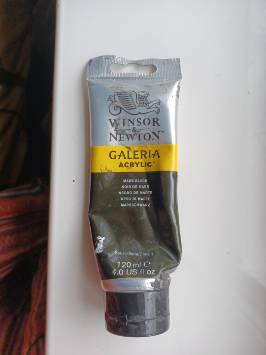
Fig 7. The Paint.
Fig 8. The brushes, scrapers, straws, artificial hair brushes and natural hair brushes etc.
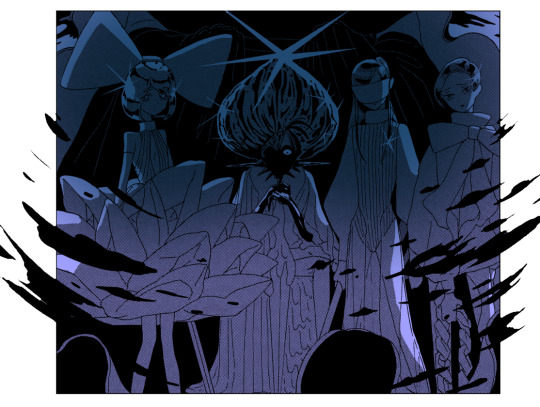
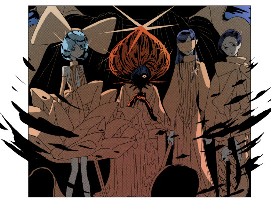
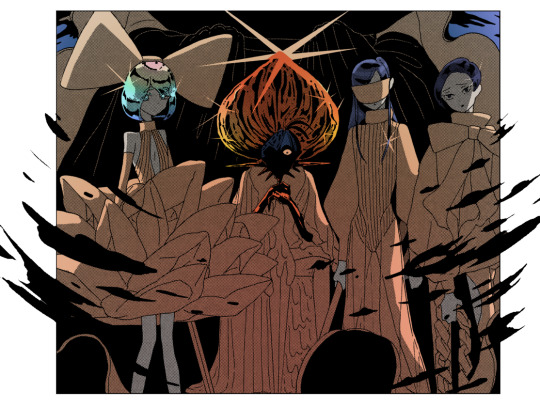
Firstly, I of course go through many of these Daler Rowney sketchpads, they aren’t too expensive and the rigidity of these sheets has often been a great medium for me to work with. No reason to be snobby about paper, when it works it works and I’ve made many hundreds of images on this paper and so I how it well and find it very easy to work with and to exhibit, it’s just as pliable as the lightest canvas material, yet strong enough that it can withstand water and paint incredibly well, and ink doesn’t bleed as easily into it. The selection of pens later applied on this paper run the gamut from making the finest of details in the wisp of a hair, blacking out the borders of a portrait for later painting, or simply to make hundreds of marks quickly without having to painstakingly scratch them in with the smaller tipped liners. This process of using liners and markers in contemporary art is of course a popular medium among comic illustrators and graphic novelists, in particular and found best in the works of Japanese illustrators such as Junji Ito, Suehiro Maruo and Kentaro Miura (as evidenced here, 1 is Junji Ito, from his graphic story: Planet Remina, 2005. 2 is Suehiro Maruo’s version of St Sebastian, 2021, many of his other pieces are maybe a little too graphic for tumblr so you get the picture. 3 is Kentaro, emblemised best by his series Berserk, 1988 to 2021, 41 volumes, may resume production this year after the death of Miura suspended the series in typical japanese manga tradition, in short, mangas often die with their creator, but Berserk is a gigantic franchise and won’t fade from public consciousness just yet, and with this one panel you can see why)
1.

2.
3.
These panels of course take hours upon days at a time and are often drawn with much of the same tools, the greyscale and tonal differences between the gray and the rest of the marks is made in post through various forms of editing software, this of course being a graceful advancement for illustrators such as this, given just how many panels they make in a year and how often the panels have to be approved or reworked for specific stories and to best showcase all the narrative elements without overdoing it. I of course have no love for grey scaling within my pieces, as that would conflict the value found in the extreme contrast within each piece, in turn symbolising my work as the bridge between dark subjects and the literal and figurative ability to shine a light onto them, in turn making such bright details and yet with absolutely soaked in black backgrounds, further emphasising the faces on show. In the examples shown you can see the build up of marks in both my work and that of my featured idols, alot of what I do is about taking a simple sketch and ever adding and mutating it into the image I want it to be, and that’s why ink is such an exciting media, with it’s strong and dense pigmentation in it’s black choices, you can really see just how the page becomes a work of art and how the white isn’t merely dredged over, but becomes just as important as the patterns over it.
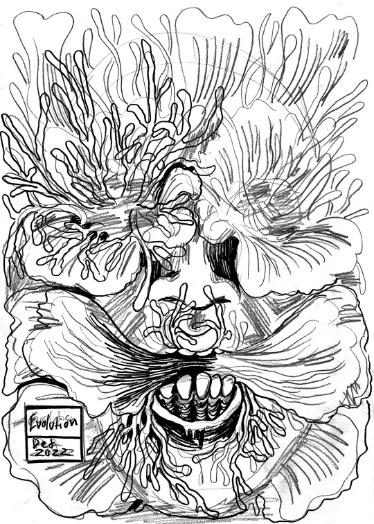
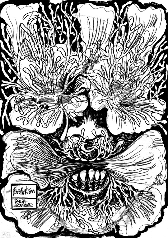
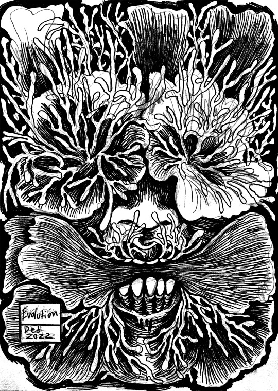
It’s important to mention that my pencil sketches as discussed in a previous post are automatically drawn and a featured best here, are by no means the same image by the end, it’s an evolution and this is of course most fitting given the subject of this piece. I also chose this piece to document as it’s one of the earliest works in the 63 and so I wanted to document atleast one piece for Instagram and for this project, knowing full well it would look good to explain and properly show how I work beyond a starting sketch, especially before I finished the 63. This trend of showing progress is quite popular on social media and so it’s a trend I can easily get behind given just how many sketches I make per month (at one point it was 40 within 3 weeks), I have been posting my sketches every time a new batch are started to clue my audience into the realism of what I do, and the response seems to be quite positive. Speaking now of my actual processes, firstly I take the finest of liners as evidenced above, and build up the essential shapes, this means outlining all the minute and much more minor aspects is essential, everything has to have an outline first before the larger, faster and darker marks are made. Once this beginning stage is out the way I work to strike in the majority of the black into the most dense of areas, while using various modes of hatching and scratching with the fine tips and more brush like tipped pens to create the texture of the piece. Once I am satisfied that the entire piece is marked up (This being shown best in the 5th descending order picture of my piece, all central and and greater details blacked in and well textured but no overworked due to how quickly I fill and finesse an area, with a combination of the smaller brush like dual tipped liners and the bigger fine point markers that are the average ink marker, sharpie sized I guess if I had to compare it to anything) I put a thick black mark round all the outer edges, so as to blend the final layer of paint with the rest of the piece, and so no outlines are lost when I go to paint, unless areas need softening to blend better with the background. The final steps are to paint in some darker shade and to fill in the background, this is done with a wide array of brushes, the background may be painted with straight square tipped brushes so that I don’t go madly over those outlines again, yet mainly to connect the ink border and the paint smoothly. The central detail may be worked over with a much smaller, rounder brush to keep the detail blended into each other, if I wanted more rigid blackness in the piece then I would just stick to the square tips and dry them so that the brush can use the paint the same a felt marker stiffly marks ink into things etc. I only apply as much paint as I need to cover areas of importance, the black I use for my paint and ink markers, typically dry quite matte and very pigmented so I don’t need to overwork or add multiple layers of paint and ink to any of this piece just to get a good concentrated blackness all over. Once the piece is painted it is dried in sunlight on my windowsill, then pressed under some books and old sketchpad boards, this flattens the piece for scanning, you can’t scan bowing pieces because it messes with the fitting of the piece in the scanner and it ruins the symmetry of the paper when scanned, so I use any weight to take the bow and it works perfectly. The ultimate and total resolution of the work is handled first by scanning the works into my laptop through my home printer and scanner, then filing the work into a plastic wallet into it’s grouping of ten pieces (just a way to chronologically group pieces so I can find them far easier, especially when working with tens of pieces that are all the same scale), then I work over the pieces on the laptops own editing software to up the contrast and replicate the real world look of the piece, given scanning can often make a piece brighter and so I have make the piece darker and more contrast centric and the ink and paint can reflect differently at first, looking often as if they are different tones of black, so I correct that and use the digital version for my Instagram and coursework of course so it has to represent the real piece exactly. Once a piece is edited it’s uploaded to my google drive for storing the works somewhere where they won’t be lost or mishandled, the last pictures of the piece on this post show how I edit on borders through a free mobile app called Snapseed (it allows you to make adjustments to a picture that don’t exist in the original image and is akin to something like adobe illustrator and/or photoshop), as I redownload the works onto my phone and then edit them thusly, the very last picture is me editing the image to a 3:2 aspect ratio so they can be well fitted to a typical Instagram post without losing any of the image. The choice of black border is quite the motif of social media horror art, so it’s typical that you do that, especially if you have a really dark collection of work like I do, though I may make white versions too just to have some variation, I prefer the black as it pops the whites more but that’s just personal preference.
Those are my processes and typically it can take around 2 hours to fully complete one portrait, I of course had to do this dozens of times during January, February, March, April and May, the majority of time so far on this project has been about finishing and cataloguing this overwhelming collection. Each piece is also numbered in pencil and catalogued in a small notebook to properly keep track of all my current and completed collections. I run quite the tight turn around with my work and so now you can see why I’m focusing solely on the documentation aspect of this project, the practical side is just so time consuming, but I still greatly enjoy the busyness and prolific nature of my practice due to how busy it keeps and me and how often I get to work on new collections of amazing one of a kind ideas through my portraiture, it’s often been one of the reoccurring peer compliments I get, I just have quite the work ethic and always have so I’m lucky.
1 note
·
View note
Text
Hair Chalk: How to Use It & Remove It
Perhaps it’s all the gorgeous festival beauty looks on our Pinterest feeds, but lately we’ve had the urge to go full-on cotton candy with our locks. There’s something about pastel-hued, hair-chalked strands that speaks to our inner wild child—and we’ll be honest, the lack of commitment makes them even more appealing. But with new formulas springing up left and right, how are you supposed to know how to use (and more importantly, remove the remnants of) each one? We did the research for you, and found out exactly how to apply and wash out each type of hair chalk, leaving you more time to fishtail and dip-dye to your heart’s content.
Liquid Hair Chalk
Liquid hair chalk lasts anywhere from 2-10 shampoos. It will usually come with a sponge-tipped or foam applicator. To apply, place a towel over your shoulders and put on gloves to prevent staining your clothes and hands. Next, use the applicator to apply the formula to your locks. wait 30 seconds for product to absorb fully, then blow-dry with a styling brush. To remove it, you're supposed to just wash your hair as you would normally. However, you can also massage a hair oil like Sachajuan's Intensive Hair Oil ($33) into your strands before shampooing and conditioning, in order to speed up the removal process.
Hair Chalk Compact
A hair chalk compact can be used on wet or dry hair, but applying to wet hair will give you a more intense color. Take a one-inch section of hair and slide the hair chalk compact over the length you’d like to color. Seal the pigment in with a spritz of hairspray. Depending on how light your hair is, it'll last one to three shampoos to get it out of your hair. Hair chalk that comes in a compact will usually wash out quickly and easily with shampoo, though blondes may have to shampoo a few times more to rinse out all of the pigment.
Hair Chalk Pen
The traditional hair chalk pen can be used on wet or dry hair, and lasts from 2-4 shampoos, depending on how light your hair is. Place a towel on your shoulders and use gloves to prevent staining. If you're brunette, wet the section of hair you’d like to color before applying the chalk. Blondes can do that too, but it'll make the pigment stay on much longer. Apply the chalk to the strand of hair you'd like to color, twisting the hair into itself as you go. Allow for the color to dry, or just give it a cool blast of air with your hairdryer. Style as usual, but if you want to lock in the color, finish it with hairspray. It can be removed with normal shampoo, but a clarifying shampoo (like Verb's Reset, $16) will rinse it out quick.
Hair Chalk Spray
Hair chalk spray is likely the easiest to use, because you just spray it on dry hair right before going out. It typically only lasts a few shampoos, but that also means it's super easy to get out of your hair. Just mist the color directly on your hair, wherever you would like a pop of color, and style it like normal.
Marker
Markers, or felt-tip pens, serve a variety of functions. Children use them to make bright, colorful drawings. The stereotypical teacher uses a glaring, unmistakable red felt-tip to grade papers. Retail employees, roadside vendors, performers, and protestors rely on the indelible, eye-catching shades and thick inking surface of these writing and drawing utensils to announce sales, prices, and productions, or to create strongly worded posterboard signs to convey dissatisfaction. Markers are also useful for permanently marking surfaces, which is often necessary for identification purposes—putting names on clothing tags, boxes, and tape which can be adhered to almost any item.
Raw Materials
The marker body, cap, and plugs are formed from plastic resin. The marker reservoir, which holds the ink, is formed from polyester. Powder and water are used to form the felt writing tip. In addition, markers require ink, and the pigments and synthetic substances used to make it. Toluol and xylol used to be common synthetics used as solvents in dye, but due to their toxic nature these substances have largely been replaced with safer chemicals such as cyclic alkylene carbonates, although these chemicals are still used to make the indelible ink contained in permanent markers. The solvent is the substance into which the dye is diluted. Water also acts as a solvent in ink. Additives may also be used in an ink mixture to act as wetting agents.
Making the marker
3 To make the body of the marker, plastic resin is injection-molded into a marker body. Injection molding involves heating a substance, in this case plastic resin, into a molten state and forcing (injecting) it into a mold of the desired shape, then allowing it to cool and harden. Marker caps and plugs are formed in the same manner as the barrel.
4 The nib, or tip, of the marker is made from powder which is mixed with water, molded, and baked into its pointed or flat form.
5 Using one machine for all the following functions, an assembler then places a polyester cylinder inside the marker barrel to form a reservoir for the ink, fills the reservoir with ink, and inserts the nib at the bottom and the cap at the top.
6 The markers are then placed into color assortment and packaged for retail marketing.
The highlighter’s appeal has flourished in the digital age. Most word-processing and e-reader software products have a highlighter function. And the hand-held highlighter continues to evolve, too. In the early ’80s, the fiber tip gave way to polyethylene beads molded into porous heads. (The plastic squeaks less, and the ink flows more smoothly.) When the highlighter business saw that it wasn’t being embraced by holdouts who preferred pens, it made the dual highlighter/pen. There are now retractable highlighters. And flat ones. And ones that smell like pizza.
LIGHTING UP THE BIBLE
Due to the thin paper used in most Bibles, typical highlighters often bleed through. For that reason, G.T. Luscombe, a distributor of Bible-study accessories based in Frankfort, Ill., got into the business of Bible-paper-friendly highlighters. John Luscombe, the president and chief executive, explains:
Is there a particular color code? There are different types of coding depending on how many colors there are. But for the most common four colors, we recommend that yellow represents blessings, blue represents the Holy Spirit, pink represents salvation and green represents growth and new life.
How to Choose a Paint Starter Set for Beginners
With so many paint colours available and new ranges being released every week, which paint set should you buy when you first start painting?
The overwhelming feeling that descends when trying to buy paint colours either online or in your local art store can often lead to the safe bet…
The pre-boxed starter set.
The paint companies have designed them to help you, right? The best paints for your needs when you are just beginning…or so you would think.
But are they a good choice?
Are you getting the best value for money or are they sending you down the wrong path? I’ve devised a simple technique to help you decide which starter palette is right for you.
Ready for a little paint history lesson to understand what you should be thinking about on your next trip to the art store?…
Boxed starter sets are designed to give you a varied approach, a range of colours that can give you the widest colour gambit with the minimum amount of outlay.
But here’s the rub.
It depends on what you’re aiming for with your end result. If you think about the paintings that you want to achieve, the subject matter you are most drawn to before you actually buy your paints then you can make an educated guess which colour palette is going to be right for you.
The Old Masters
In Renaissance times, the Old Masters learnt their trade of painting as a craft.
The tradition of the craft had a system of apprenticeship.
Colour mixes were kept secret and passed on from generation to generation, some painters even created their own codes to keep the secret mixes safe.
Working under apprenticeships in individual Ateliers (the French word for “workshop”) was the norm. Artists learnt how to grind their own paints from the natural earth pigments surrounding them. Working from dry pigments, they had to be mixed with oil and then ground into a paste by hand to make paint.
The colour choice was limited and paintings relied on the use of dramatic lighting and tonal value to produce great works. (see: The Importance of contrast in painting)
Working with this limited available palette can teach you a great deal about colour mixing and warm and cool colours. I’ve made a free still life video course that shows you a classical approach to painting using just burnt sienna, ultramarine blue & titanium white.
Masters Palette – Perfect for portraits & understanding the importance of tone.
When the Old Masters were mixing colours, the pigments came from the earth, literally ground up rocks and minerals – hence the muted palette being called the earth colours.
When painting portraits, they couldn’t just go out to buy ‘flesh tint’ they looked, observed and mixed it.
Burnt umber, raw umber, yellow ochre, burnt sienna, red ochre, these are the sorts of colours they would have been using.
If you want to try and recreate an Old Master-style painting, using the pigments they used, gives you an immediate head start. In my article on ‘How to choose a basic portrait palette’ I use a muted collection of colours.
Skin tones are muted, so start with a muted colour. It seems obvious right? But when you’re painting the urge to try and ‘fix it’ by adding an extra colour is huge.
Don’t feel like it’s only you, I still do it now after 20 years, even though I should know better!
The Holiday Season brings with it plenty of gifts… and then there are the actual gifts themselves! Yes, we know it. Christmas is not just about presents and shopping alone. It is definitely not a time to just run around from one store to another looking for that elusive gift. But we all do it anyway. Then comes the time to wrap it all up and put it under the giant tree so that it all feels picture-perfect. And for some us, this is undoubtedly the part that we most enjoy. Wrapping your Christmas gift feels so very serene, relaxing, and enjoyable. Maybe it is because you know that finally the shopping is all done. Maybe because you can marvel at the DIY Gift Box you just crafted. And once you’ve completed your DIY gift set you can choose from this pack of 20 different Holiday Grosgrain Ribbon patterns as the final touch.
This is right; this Holiday Season, it is time to give your presents a homemade box. A festive DIY gift box makes it all more personal and you will see that every member of your family and our friends will love the custom box as much as they cherish the gift inside. Handmade gift boxes also give you greater creative freedom when it comes to ‘saying it just right’.
0 notes
Text
Task 4 - Final Piece
Out of the 3 pitches that I came up with, I decided to move forward with creating illustrations within the theme of fashion and creating posters promoting some of Nike’s most popular shoes. I thought this idea would be ideal as it will allow me to get used to using a Wacom Pad in my illustrations. This would be useful for me in the future as it makes me more skilled in designing, using different equipment and software allows me to adapt easier when it comes to designing things that depend on certain equipment or software. Drawing is something I enjoy, but I haven’t done a lot of it digitally, so I thought this would be the best pitch to go with so I can make a start and get used to drawing digitally and creating illustrations.
With these posters, I’ve used the same process as I did while I was practicing other artist’s work, and continued on from my poster of Air Max 95s. The first few screenshots are from the practicing post, so I will be using the same annotations with them.

I started by opening a blank A4 page into Photoshop and added an adjustment layer and made it a solid fill layer and coloured it into a colour I think would look good for the colours I’ll be using for the shoe itself.
Next, I inserted an image of the shoe I will be tracing over, which is an Air Max 90. I added a new layer and used a Wacom pad and pen to trace over the image using the brush tool in Photoshop. I made sure to get as many details as I could so the finished piece of art looks accurate to the shoe itself. I also made it look not too neat, but also not too messy, so that it looks hand drawn as I originally said in my pitch, to give it a theme and make it look more unique and stylised.

After this, I hid the layer of the image as I only needed it for the outline. While still using a Wacom pad and pen, I coloured in the illustration using colours I thought would look good together, and also go with the background colour I had originally chosen. I also added some shading to the illustration to give it some depth and avoid it from looking simple. For the shading, I just used a darker shade of the original colour I will be drawing over.

From here, I duplicated the illustration and rotated it 180 degrees so that it is displayed as most shoes would be when they are in the box. I chose this layout as I thought it would be the most suitable way, based on the fact that my illustration is in the theme of shoes anyway.
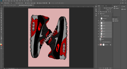
Next, I rotated the two trainers 90 degrees so that they face upwards/downwards. The reason I did this is because I noticed that by doing this, the shape of the trainers looks like an N. I thought this could be a good way to represent Nike as the first letter is N and can be a new way to promote the brand or even create a new logo out of it.

Finally, I created a pattern in the background. For this pattern, I decided to use text to create the pattern ans repeated the name “Air Max” till it fills up the page. I chose the font Franklin Gothic Heavy and set it to Italic as I thought that looks similar to the font Nike use for their text and also looks sporty, which is appropriate for the brand. The text was black but I reduced the opacity down so that it is subtle and doesn’t take any focus away from the trainers.
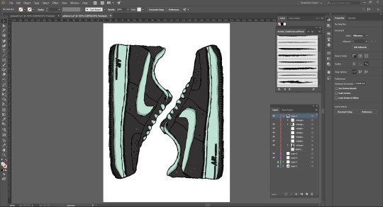
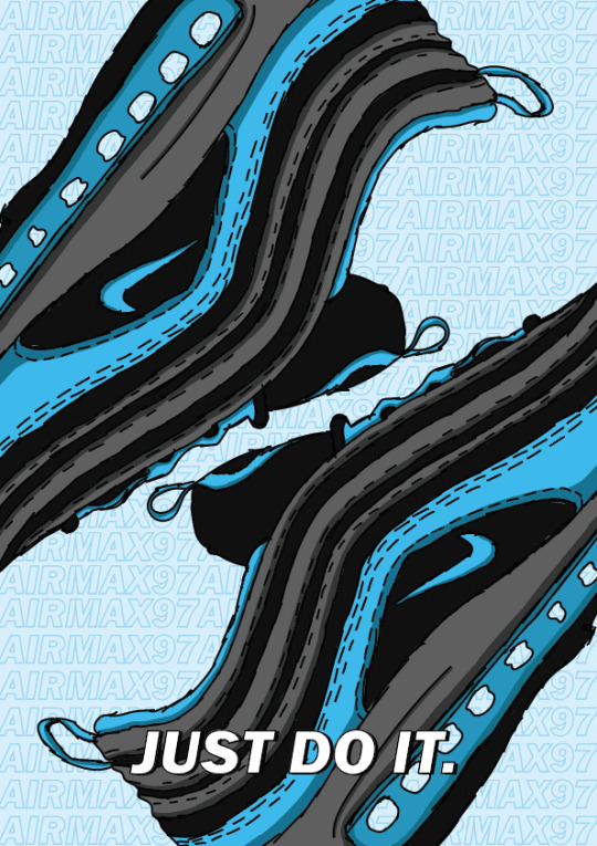
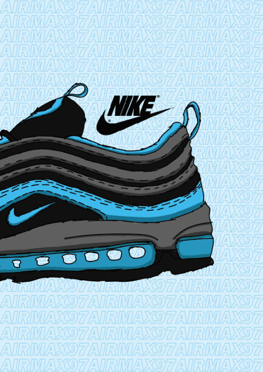
This is the process for my second poster. For this one, I did an illustration of the Air Max 97. I used the same style and layout so it matches with my first poster and looks like they are supposed to be together. For this poster, I decided to use Illustrator as I thought it would look better and stay high quality, as Illustrator is made for vectors and doesn’t rely on pixels. I also found to have a better experience with the Wacom Tablet and pen on here, as my first poster originally started as practice. Below are the screenshots to show my process, which is repeated from the first poster.


This is the process for my third and final poster. I decided to illustrate another one of Nike’s most popular shoes, the Air Force 1s. For this poster, I also followed the same process and layout the keep all 3 of my posters consistent and matching. I continued to use Illustrator for this poster as I’d found I had a better experience with the Wacom Tablet on it, and again, it is best for vectors and high quality illustrations. In addition to that, I also decided to change this poster up by experimenting with different brushes. I used a charcoal brush to paint the shoe, this gives it a nice texture and adds to the whole hand drawn style I am going for. Below are the screenshots of my process, the first showing how the brush looks as I’m painting the shoe.


Here are my final posters in their full sizes and quality. I’ve also presented these posters on Behance (link below).
https://www.behance.net/gallery/81275503/Nike-Air-Posters


These are some alternate versions of the one of the posters that I was experimenting with in position, size, and just the overall look in general.


Evaluation

These are my final posters presented all together so you can see the full triptych.
The things I think came out well are the consistency of my posters; using the same process and layout worked out in the end as it allows the posters to become a series. I also think the illustrations themselves came out well; they have ended up being very detailed, despite having a rough look to them because of the hand drawn style I was going for. I have included as many details I thought was necessary, not too many as it would look messy with the stroke size I use too, and because of smaller areas in the shoes. The shading also came out well and helped give some depth to the shoes and make them stand out even more than they already did and give them a sense of realism. I think using different colours for each poster was another good idea as it makes the posters visually appealing when they’re all together. The use of the lighter shades as the backgrounds helped for the illustrations to stand out against them. The use of text in the background also looks good; it makes my posters look less simple and gives it more of a professional look in my opinion. I think it helps look more like promotion posters as well as graphic art, instead of just art alone.
The things I think didn’t come out so well and could’ve been handled better happens to also be one of the things that did go well, the consistency again. I think the first poster looks out of place; one reason being the thicker stroke, another is that I did it in Photoshop rather than Illustrator. And finally, the text used in the background doesn’t match as it is filled in and not just the stroke, like the other two posters, so it doesn’t look as subtle. I think considering this poster was started as practice, I should’ve redone it in Illustrator and made the changes I need to make so it could match better. As well as as this, I think the painting with the charcoal brush on the third poster could’ve been better, as it looks messy and patchy. I left it like this on purpose to show how I’ve used a different brush but I think I should’ve done it neater. With that being said, these bad qualities also allow each poster to have something different in them, exclusive to each individual poster.
Overall, I am pleased with how my posters have turned out. All 3 of them together, I think they look great. They all look like they’re meant to be together as well as they can be presented individually at stores or social media or even something like bus stops. I’ve stuck to using the same kind of colour schemes, being using one colour on the shoe and the rest being shades of black or white, and that one colour I used is also the background colour, just a lighter shade of it. I’ve made sure the text is always positioned in the same spot, so it always stays consistent. I’ve also used the same layout for the shoes themselves, to create an N shape that represents Nike. I could’ve done a better job with a couple of posters individually, but I think they still look good and professional, especially next to the other posters.
0 notes
Text
This month in Design Integration we continued our thesis in our rebranding for our communities. We took a look at creating brand characteristics as well as a voice and tone for the new brand identity, which including creating a tagline and mission statement.W e finished up by creating a media matrix which will outline the types of assets we are going to for the rebrand and their pros and cons.
Connecting/Synthesizing/Transforming
This month I spent the first half of the month creating a solution statement to my problem statement. I had to research an innovative way to create solutions to design problems. The second half of the month I researched voice and tone and how it is used throughout a brand. I looked into brands like Spodify , Misguided and Skype looking at their brand books, and social media accounts to see the voice of the tone of the brand. I used this research with these companies to create my brand's youthful voice and tone
Problem Solving
The design problem I am trying to solve is :
Manayunk struggles to shed the image of being a college drinking town, which is causing its young professional residents to seek enjoyment outside of the community.
I came up with three possible solutions to this problem, which was a problem in itself. Trying to come up with three legitimate solutions that could help solve the problem at hand in a way that the community wouldn’t reject.
Solution 1
Through a new identity brand and campaign focused on bringing other aspects of the community aside from drinking forward. Manayunk will become a neighborhood known for its community aspect it has to offer its young professional and shed the reputation of being a college drinking town.
Solution Rational: Solution 1 suggest leaning away from the reputation of drinking altogether, with Manayunk being such an active community by leaning away from drinking in its entirety the residents can focus on what the community has to offer. Activity like the arts festival or stroll the street in the summer should be focused on more than drinking; by showing the residents that Manayunk isn’t a neighborhood centered around drinking resident can start to develop more pride in beginning a part of the community. This identity brand revamps and campaign won't totally shift the brand as a total rebrand would but instead shift attention from the aspect of the community to another this. Disilvestro suggests “A radical shift in your overall message takes time, so do just that – take your time. Don’t dramatically shift your image from Thrift Shop to Macy’s. Sometimes an instant or speedy transition isn’t in the cards”(Disilvestro, 2017). This solution isn’t intended to be a radical shift of the brand just think of it as a spring cleaning.
Solution 2
With a campaign centered around “drinking out” in Manayunk and how it can be more than just an extended college party, but a useful professional tool, the community will see that Manayunk is just if not more enjoyable than the surrounding neighborhoods like Center City or Conshohocken.
Solution Rational: With solution 2 unlike solution 1 the campaign with lean into the neighborhood history of drinking. With Manayunk being a native American word for “where we go to drink” the campaign won’t shy away from drinking but change the culture of it. In his article Cole says, “A lot of business deals still happen over a drink!” and “Happy hours can be a great networking tool, when done wisely” (Cole, 2014). This solution will lean into those ideas that drinking in Manayunk does have to be about blacking out on a Friday night, but it can be a networking a professional tool to further the young professionals’ career. This coupled with research into what attracts the young professionals to neighbors like Conshohocken or Center City when they are going out could make this the solution need to keep the resident from venturing outside of the community when looking to go out.
Solution 3
A visual identity change (new logo, color patterns, signage, and digital aspects) will show the young professional that Manayunk is a neighborhood changing and evolving with them and be able to compete with Center City and its new rebrand.
Solution Rational: This solution is a rebrand the visual aspect and deliverable. Manayunk has the small town feel in an urban environment, this is successful but the issue with Manayunk is its image. With it being in such close proximity to Center City and the entire city of Philadelphia having a rebrand, which focused primarily on Center City the area has created a renewed buzz practically in young professionals. If Manayunk did the same and rebranded to show its residents that is evolving and growing like them this could allow for it to competitively compete against an area like center city
I decided the solution 1 would be the most successful solution, this solution highlights all aspect of the community not just drinking, it will allow the resident to see how much Manayunk has to offer.
Innovative
The work I’m doing isn’t innovative in the sense that its new (hand-drawn elements, contrasting colors, brush script type) but how it is being used to reach the audience is. This brand is going to reach the young professionals of the community. So, the brand new to carry an air of freshness and likeability, the hand draw element are little doodles that you would find in a planner where you’d write down your activities. The color is contrasting colors of orange (youthful, bright, fun) and blue (calming & professional) which is perfect for the residents many are young professionals so those two colors are a sort of representation of the two parts of their life.
Acquiring Competencies
This month I took a stab at a new video software instead of using After Effects I used Premiere Pro and After Effect, which was a little of a learning curve, but I felt I was able to do more video editing wise in Premiere Pro. I also enjoyed learning more about voice and tone and how creating that early in the process can dictate a lot of the design decision. I’ve begun to notice the voice and tone in the real word like documentaries and how they used the different method and angels of shooting to convey their voice and tone.

youtube
Throughout this program, I have been wanting more creative opportunities like I had in my undergrad degree, but as the program continues, I’ve begun to see how the lesson and skill I’m learning actually influence and challenge me more as a creative. I have started noticing myself using the lesson I learn in the classes in my job as a design and it is making me happy to realize that this lesson is going to be what takes me to the next leave as a designer and help to move forward in my career.
0 notes
Text
10 Free Adobe Illustrator Brushes to Download Today
Adobe Illustrator is one of the most powerful tools in the Creative Cloud suite of design software. That is partly because of the slew of free Illustrator brushes you can download for it. We found a lot of great additions to your toolbox. With these at your disposal, the work you get out of Illustrator will go from splendid to downright amazing.
1. Japan ProBrush
The free version of LeoSupply Co.’s Japan ProBrush is powerful enough that you might not need to upgrade to pro (but you get even more awesome if you do.) Designed for calligraphy and watercolor styling, this set of 9 free Illustrator brushes will give a handcrafted look to any design that needs it, as well as a soft look that stands out in a landscape of clean lines and minimal designs.
More Information
2. Smoke
If your design calls for a more ephemeral look, and you don’t want to go through the number of steps that it takes to create a smoke effect by hand, just install this brush set. You will be wisping away in no time. Great for color and black-and-white, the effects you will generate using these brushes are innumerable.
More Information
3. Fur Brushes
You know what’s hard to get right? Hair. Fur. Even in static, 2D art, getting hair and fur to look appropriately hairy and furry can be a challenge. With these brushes, that challenge goes right out the window. Admittedly, they are stylized and not photo-realistic. But with a little tweaking and expertise (you are using Illustrator, after all, which isn’t the most user-friendly of the Adobe Creative Cloud), you’ll have these Illustrator brushes shedding all over your art in no time.
More Information
4. Mel’s Free Illustrator Brushes
While Mel’s brushes are all great, and he’s offering up some great downloads for trees and hair strands here, too, we couldn’t resist mentioning you can get a dedicated Emperor Penguin brush. Yes, it’s free Illustrator brushes that let you paint emperor penguins more easily. We don’t know if you will find a lot of use out of it, but we wanted you to know it exists. Because if there’s one you should download today just for fun, it’s this one.
More Information
5. Rodeo
With as on-trend as rustic designs are right now, you can’t go wrong with the rodeo robe brush from The Vector Lab. It’s hand-drawn and easy to use, and the download page mentions that you can adjust the color and brush width and apply it to any path. Not too bad for a freebie.
More information
6. Road Map Vector Brushes
In one of the more unique takes on free Illustrator brushes, Joyologo Design gives you some pre-made vectors to make your own maps mockups (and real maps for your apps, even). The set includes six different brushes, including waterways, interstate highways, surface streets and more. We feel as though this is a great addition to anyone’s design toolbox because while it might not be an everyday use, there’s a high chance you’ll have a client who wants something very specific marking their location. This is going to make dealing with that a lot easier.
More Information
7. Child’s Play
“I don’t know what’s so special about that. My 6-year-old granddaughter could draw it just as well.”
We’re sure you’ve heard that kind of comment before. And while that’s decidedly not true in nearly every case, if that 6-year-old happened to have the Child’s Play brush installed on her computer, she sure could. (Though realistically, it would be on her grandparents’ or parents’ computer.) But in all seriousness, the Child’s Play brush set lets you put together authentic crayon and colored-pencil art in Illustrator. And why do we say authentic? Well, the download page says that each brush in the set was scanned from real strokes using the physical media. It’s not just an approximation, you’re using the real thing.
More Information
8. Wax Crayon
Wax Crayon is a nice set that includes a whopping 40 different brushes, all for free. While it may look like a similar set to Child’s Play above, don’t be fooled. This set is actually a collection of textures and lines that let you give the illusion of chunky, crayon-like textures, but they aren’t specifically for use as crayons. The textures lean toward a more retro/vintage look than the whimsical and child-like nature you might expect. Sure, you can use them that way, but we were fans of the clean edges with the waxy texture in the middle. The collection includes a lot, so we think you’ll be able to get some good work done with these.
More Information
9. Essential Vector Brushes
Anna Ivanir has outdone herself with this set of free Illustrator brushes. While the full, premium set comes in at 150 brushes, the free sample is still packed full of 29 different hand-made brushes. With 5-7 examples each of watercolor, brush pen, pencil, charcoal, and marker Illustrator brushes, we wanted to include this because with just a single download, you can get to making your designs appear as mixed media. Many sets come with one kind of brush for one kind of utensil, but this one runs the gamut and works as an all-in-one pack for people to keep their toolbox stocked. And while there is a premium license you may want to opt into, the free sample really feels like a complete set in and of itself.
More Information
10. Ornate Pattern Brushes
Rather than give you a brush that mimics a brush stroke and the freedom to create ornate patterns with them, the Ornate Pattern brush takes away the guesswork by simply being ornate patterns to begin with. You get 12 pattern brushes included in the set, each designed specifically to work as either a shape of your design or a border/pattern by itself. Make sure to combine them, and your work will take on a look that would be impossible to achieve with a simple pen-tip or marker brush.
More Information
Wrapping Up
This is just a scratch on the surface of all the free Illustrator brushes out there. But we have a feeling that with all of these installed in your Creative Cloud account, you’ll definitely be set up to handle pretty much anything a client throws your way.
What brushes do you tend to use the most in Illustrator?
Article featured image by hvostik / shutterstock.com
The post 10 Free Adobe Illustrator Brushes to Download Today appeared first on Elegant Themes Blog.
😉SiliconWebX | 🌐ElegantThemes
0 notes
Text
Personal Evaluation
We were asked to create awareness for a social issue of our own choice. However the aim of the module was to emphasise the importance of experimentation by trying various different ways of expressing our ideas and concerns. We were encouraged to take on new challenges and thinking of what other softwares, media, material and production we can produce and skill in. My target audience was quite broad when i was designing and creating my work i wanted to keep the language simple in order to be able to communicate my message effectively throughout different genders and demographic of people. However i wanted my work to specially make a difference in the west where the seems to be a negative representation of Islam which has led to unfortunate consequences in the way Muslims are being treated. In order to be relevant and not biased towards my chosen topic, I researched a lot into islamophobia and where/how it all started. The term Islamophobia refers to the dislike of or prejudice against Islam or Muslims, especially as a political force, which isn’t something new it has been occurring since the very early days when Prophet Muhammed was still alive, however the term first started being used around 100 years ago in 1918. Islamophobia specially grew after the horrific incident of 9/11 in 2001 done by unrepresentative extremist group called Al-Qaeda that was when innocent American Muslims civilians were publicly being harassed on the street physically and verbally due to their faith. However, well established newspapers such as Independent Newspaper have reported that Islamophobia is even worse under Trump than after 9/11 attacks. There’s a viral tweet that has been going around saying “We didn’t blame German’s for Hitler, we don’t blame Christians for KKK so do not blame Muslims for ISIS”. This gave me all the background detail i needed in order to begin exploring different ways of pursuing to communicate this message to the world, that at the end of the day we’re all the same, that we’re all human and shouldn’t judge each other based on based on their skin tone, religion or ethnic background. I really wanted the message i send across to make an impact which is why i tried to incorporate elements to my compositions that were identifiable by my audience. As people are more able to feel a connection or sympathy with things that’s identifiable to them. For example the “We can do it!” poster is known worldwide and women feel a special connection with that poster as it empowers us, therefore my poster of Halima would catch women’s attention and hopefully start viewing Muslim women the same way rather than passive beings controlled by Muslim men. Like wise in my video i decided to include Trump in my video has he’s been very controversial in the media since his presidency began, whether you like him or not people like to talk about him.
I started by looking at how other designers used posters to tackle social issues whether it was global warming, mental health or racism. I analysed the way they used text and image to communicate with the reader. I then specifically looked into art work done on islamophobia, where i found a lot of different illustrations and drawing done on the topic. In my research i had also found out that most crime hate against muslims were targeted at muslim women which is why i started sketching a few ideas in my sketchbook that mostly focused on Muslim women. I also sketched something that related to the well known NOH8 campaign however once my sketch was drawn i realised that the poster would be too simplistic and not innovative enough. I drew my Halima ‘Muslim women can do it too!’ poster and saw that it had a lot of potential which is why i decided to develop my idea further on photoshop. Where was with my other poster i got inspired when i was going through all the photographs i had taken in Dubai, and was particularly drawn by the photos i had taken of the two young Arab ladies and how elegant they looked.
I looked into 5 practitioners who had worked closely with social issues as i wanted to get an insight into how professional are hoping to solve these problems. Lucienne Roberts has done a lot raise awareness to mental wellbeing and general health concerns i looked into her exhibition at Wellcome Collection’s called “Can graphic design save your life?”. The key features i found in the posters at her exhibition was that they all had a pale look to them, there were no popping bright colours the colours were all somewhat low saturation. I also looked at Banksy’s work as he’s a graffiti artist and political activist. A lot of the work Banksy has done on social issues such as war, he uses a of imagery of children in them. I also looked into Yi-Fei Chen’s work, her work is definitely different to anyone else work I’ve seen, she doesn’t use a conventional method of conveying her message through deign instead she designs bizarre yet fantastic objects such as the tear gun. I noticed that Fred Martins work is very true to him as he sticks to his own specific style which is like his trade marks of using dripping stretched lines in his illustrations, his posters are clean and straightforward. Lastly i looked at Mauro Gatti, his designs were very childish and happy, he used a lot of bright colours and his work looks very cartoon like. I believe Mauro Gatti’s work had the most impact on my own personal reasoning for my posters. My editing processes switched between Photoshop and Adobe After Effect. I used photoshop to edit my images and used After Effects to edit my video. On photoshop the key editing features i used consisted of magic wand tool for subtracting figures from their background, filter gallery, brushes and different blending mode of layers. I also used Photoshop to draw my illustrations for my video. On After Effects the main editing i used was key framing different features such as scale, position, rotation and opacity. The most time consuming and challenging part about editing my video was making everything flow and making sure all the sound effect i added would be in sync with what was happening on the screen.
I found out in my research that the media is one of the main reason why islamophobia is spreading and becoming more common as they only show negative imagery of Muslims which is why people have developed a bad perception of the religion. So in my first poster i wanted to communicate to the audience that not everything you see in the media is real. Again as i mentioned earlier, i wanted to stand up for Muslim women who seem to be easy target for hate crimes which is why i created the Halima poster and the reason i chose Halima as the face of my poster its due to the fact that she’s a successful modest hijab model working along side famous designers, photographers and she’s working in an industry where nudity sells therefore in order to be doing so greatly with out showing much skin is quite revolutionary which i believe complements the text “Muslim women can do it too!”. Posters was one of my production methods just because they simple yet they allow you to connote a message which makes them affective (if constructed properly) as well as the fact posters are suitable for a wide age group and demographic as they’re clear to understand and straightforward for the reader. i also chose to create a video as videos can be virtually shared on various different social media platforms which allows the awareness o spread, videos often can have more of an impact as you can add non diegetic sounds as mood music to fully convey an emotion. You can also fit a lot more content into a video.
I think i was successful at meeting the aim of the module by creating a video which is something i hadn’t done so i did leave my comfort zone and try something new. My music choice for my video was also very effective and really managed to make the child scene more emotional and dramatic than if i hadn’t added the music like was with the sound effect of the pops and spray in the beginning of the video, with out those sound effects my video would’ve been quite dull and boring. On the down side my video was slightly short, it was just under 40 seconds, I struggled slightly trying to work with After Effects as it doesn’t give u the flexibility to edit images as freely as photoshop does. I think that i may have focused a bit too much on the whole muslim women aspect of the concept as both of my posters were based on that. However i can argue that the main reason i got sidetracked by that idea is because women in general are underrepresented anyway. I would definitely manage my time more effectively in the future, one way i wasted so much time was that i had an idea about what i wanted to do with my project however i spent way too long trying to make that idea work rather than just moving and and coming up with another idea that would actually work. Next time i would also step away from creating a poster as i don’t believe posters really challenge me as a designer anymore its become a bit repetitive and i would rather grow my skills else where.
1,600 words
0 notes
Text
Selective Colouring Piece
The first piece of work I created was turning a black and white photo and only adding colour in certain parts by using the software “Adobe Photoshop.” Photoshop has adapted incredibly over the last 30 years, being once used to change the saturation of a picture to completely transforming a picture as a whole.“Digital artists and manipulators know how to take an ordinary photograph and turn it into something completely different and extraordinary.” ( https://edex.adobe.com/discussion/f425c84-/ - Christian Gutierrez) - Published Sep 23, 2015.) Photoshop can be used by normal people to professionals which can help promote companies or just be used as an art form.

Here I have chosen an existing photo shopped photo that I found the most interesting and appealing to me. I believe this photo shows a clear example on how creative you can get with Photoshop just by simply using colour. What makes this photo so gripping to me is how the artist has only took colour on a specific part of the photo making it so you are instantly drawn to that part.

Here above is my photo shopped image. My personal interpretation of the piece is how we portray ourselves vs to how we put ourselves across for social media to judge us and tell us what is considered perfect to make us go to extreme lengths to achieve this level of acceptance. I felt the need to keep the colours I used in the picture to look almost unnatural to give off the impression that we as a society make up this pretend fantasy of everything being “perfect” when in reality all we are doing is putting a mask on. Luckily for me this meant I didn’t need to use a lot of different variation of techniques as it was specifically just using the brush tool and using a mix of colours to add some boldness to the photo. A challenge I overcame would be trying to understand Photoshop as a whole because this is the first time I have ever used it for an actual purpose so trying to make sure that the photo I used was clear enough and that I used the correct format was a slight difficulty I had to face.
I do generally like my overall outcome of my final piece because I feel like it has a story behind the photo that can be interpreted in many different ways. If I were to undertake this task again, I may use more of the given tools to add a bit more creativity to the piece, I would also select a wider proportion of the piece to have colour to it so that I can play around with the picture a lot more.
Here is some feedback I received from other people:

0 notes
Text
Design Tutorial: Transform Hand-Drawn Artwork into Digital Illustrations
Digitizing hand-drawn illustrations is a must-have skill for graphic designers. The ability to digitize artwork is a common bullet point In graphic design job postings and employers expect graphic designers to perform this skill. If your digitizing skills are rusty or if you are a novice to this art, the below game design course lesson will provide you with the necessary knowledge to start digitizing your artwork.
This excerpt from the course Photoshop for Game Design walks game design neophytes through the process of transforming their line art drawings into digital drawings. While this course is focused on game design, the lesson can be applied to a variety of graphic design tasks. Learn how to digitize art today and add this requisite skill to your resume.
A Guide to Digital Illustrations
by Instructor Todd Gantzler
Once the drawing is complete you should use a scanner to make a digital copy. You will want to paint in an image with very high pixel dimensions, so set your scanner accordingly. Once you have your drawing scanned and safely stored on your hard drive, you may want to add some shading to the original drawing. You can use gray markers for this purpose. You can also get white gel pens that can be very useful for adding highlights.
In my own work, I have been experimenting with tracing paper, working on several sheets at once in an attempt to emulate layers in Photoshop. This way I can keep the figure separate from background elements, for example, and adjust them separately.
We’re going to explore the basics of working with line art with this manga-style drawing:
The simplest kind of drawing consists of creating outlines for shapes and filling them with a solid color. This type of simple representation won’t be suitable for most 3D game purposes, although cell-shaded games are quite popular. What we’re about to do is create a comic-style illustration, using a small range of colors, with one color for the shadows, and one for highlights.
I think broad areas of solid color work well with the line art style of this image, so the shading will be quite minimal. As a result, I can pretty much choose each color that will be in the image. I want fairly warm skin tones, brown hair, and a cool blue/cyan top:
The color used for shading will be darker versions of these three colors. The darker blue will be used for the background:
There will be some white in the image as well. I may find that I want to use just a bit more color variation for shading. Otherwise, this is my color palette and nearly every color that I’ll use in this image. With the approach I’m using I can quite easily adjust these colors later.
Simple as this style of art may seem, this section will give you a good routine for working with any type of line art.
Brush up more on your Photoshop skills when you enroll in the online workshop, Photoshop Fundamentals. Starts today!
Using Paths
Paths in Photoshop can be a good way to create strong, smooth lines and solid shapes. Drawing good paths is not nearly as quick as drawing with pencil or pen, but it has distinct advantages. If you don’t have a tablet, paths can be used to get the shapes and lines that you need, using a mouse.
The Pen tool—mightier than the sword, they say.
The Pen tool, shown selected above, lets you work with a vector image approach. Any shape made with the Pen tool will print well at any resolution. Using the Pen tool is like working in Illustrator, or using splines, or curves, in 3D software.
The function and use of the Add Anchor Point tool and Pen tool may be self-explanatory for some, but should become clear to others as we explore uses for changes we make with the Pen tool. We’ll use the Convert Point tool to make various changes to our paths.
Selecting Areas
Rather than work on white, I added a layer filled with a solid color—a dark blue. I set it to Multiply mode from the menu in the Layers panel to allow the scanned drawing to be seen through.
Set the Pen tool to Shape in the options bar. Now click and release to place a point, then repeat around the arm as shown below. Click on the first point again to close the shape.
Choose a good flesh tone to fill the shape from the options bar at the top of the screen. Currently, the shape is made up of straight line segments. At the ends of each straight segment are points. To see them, click on one with the Convert Point tool. The points of your shape should become visible. Click on a point and drag away from the point. Handles should appear and stretch away from the point as you drag the mouse away, and the lines on either side of the point will curve. Keep dragging around with the mouse to see how this affects the shape.
After you release the mouse button, you can click and drag on the small diamonds at the end of the handles to move the handles. Hold Ctrl (Command on a Mac) to move both at once, maintaining a smooth curve through the point, or without Ctrl/Command to move one handle, making a sharp angle at the point. Hold Ctrl/Command and click and drag on the point itself to move the point.
It will take a little while to get the hang of adjusting the shape using the Convert Point tool. Use this first shape to experiment and get the hang of it. Try out the Add Anchor Point tool and experiment with that as well.
Finish with the arm shape as shown below.
You can set the layer containing your shape to around 75% transparency, which can make it easier to see the lines in the drawing beneath. As you create other shapes, you can allow some overlap—as long as the right layer is on top. Observe the right arm in the example shown below.
As you continue to lay down shapes, use transparency to see the lines, but remember to check your colors with the layer set to Normal. Of course, you can easily change the colors of a shape at any time.
Details have been added to the face, and some shading as well. These are all done in a dark brown, and set to varying degrees of transparency, to allow the color of the skin to come through (the skin color is washed out below because it is still set to around 75% opacity).
The mouth can look quite large when it is rendered solid white. Some shading can reduce that exaggeration a bit.
Our image is perfectly acceptable in a minimalist state right now, although a little cleanup of the lines should be required.
Shading and Highlights
A little more shading adds depth to the image. To add shading, you can save some time by duplicating the arm, for example, and by changing the color, then deleting points and reshaping it. This saves you some time in making the left edges match.
Adding strokes to shapes is as easy as selecting the shape in the Layers panel, choosing the Pen tool, and setting a stroke color and width in the options bar. But if you want a little more power and control, we can use the Paths panel to add lines by converting them into selections. Select the arm, and go to the Paths panel. Choose Make Selection from the flyout menu.
With the Lasso tool selected, right-click (Control-click on a Mac) and choose Stroke. Set the Width to 2 px; and Location to Center. Click OK.
If you allowed shapes to overlap, you won’t want to stroke the shape without adjusting it. This is actually quite easy to do. The blue shirt, for example, is overlapped by the arms and purse strap.
With the selection shown above, select the layer containing the purse strap. Go to the Paths panel flyout menu and choose Make Selection. Set the Operation to Subtract from Selection.
The purse strap is removed from the selection, as shown below. Do the same with both arms before you stroke the top.
OK, if you’ve followed along so far, you’ve gained some experience in the challenge of importing line art, making precise selections for different areas in a drawing, choosing a color scheme, and representing shadows, highlights, and details.
Become a skilled game designer when you enroll in the online course, Photoshop for Game Design.
The post Design Tutorial: Transform Hand-Drawn Artwork into Digital Illustrations appeared first on HOW Design.
Design Tutorial: Transform Hand-Drawn Artwork into Digital Illustrations syndicated post
0 notes