#mimi does a photoshop tutorial
Explore tagged Tumblr posts
Note
Hello! How are you? I hope you are well, I saw some of your posts and I think it's really cool how you edit GIFs. I would like to know how you edit them?
Hello there! I'm doing good, just really busy with work and life! Nothing new for me lol! I hope you are doing well also. Thank you so much for your kind words! I love that people like how I edit and want to know how I did them. I'm so sorry I'm getting to your ask so late! I've never done much tutorials so I hope mine makes some sense!
Before I get going into this, I use Adobe Photoshop! My tutorial is just gonna be a simple gif manip tutorial I use for my intros. Like this for example.
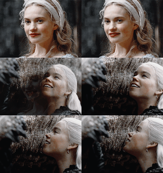
I wasn't sure what exactly kind of gif edit you want to know how I did.
And for a more complicated gif manip that I use for intros, like this:

I use mask layers and text, which would be a different and longer tutorial I can do if anyone is interested.
ANYWAY Let's get started!
First up you want to create a new document. The size and everything that I did before editing my gif are right in the screenshot below.

Next up this is what you should have when you push the create button and follow the preset details above.
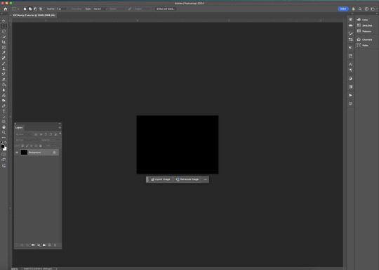
To make a gif you have to have a timeline, there are a few different ways people do this inside Photoshop. But if you don't see the timeline on your Photoshop layout here you can find this by clicking the window bar at the very top of your screen.
Once you click the window bar there should be a whole column of options. Make sure Layers and Timeline is checked off like this.
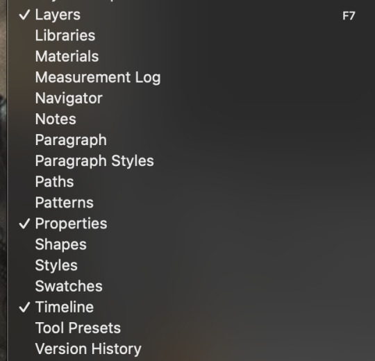
After doing that This is what you should have.
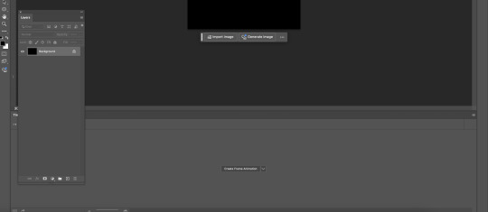
Now like I said there are a few different ways people edit or create their gifs in Photoshop. I do this by the Create Frame animation option. Click that button and a timeline should be created. Next up you need to find and open the gifs for your scene in mind. I recommend trying to find gifs that match in some way. Make sure you number the gifs into the open file BEFORE copying and pasting them into your canvas.
After that,use the transform tool to make sure they fit onto your canvas like this.
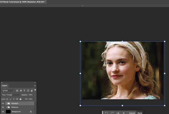
I would try to get into the habit of naming your layers and grouping them up like how you see mine. Since it will be confusing at times if you have a lot of layers to keep track of. Once your layers are named and gifs are placed the way you want. I would try finding colorings and or using the adjustment tool for your gifs. Right now I don't have any on. So after that this is how your layout should look.
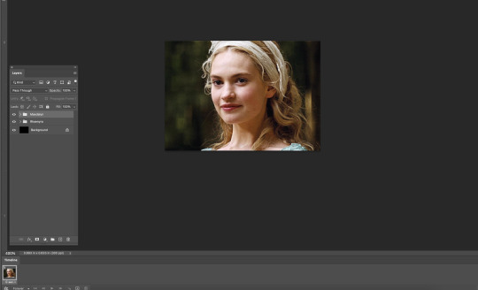

Your timeline is at the very bottom, right now the speed of your gif is 0 sec, which is SUPER fast and could make your gif look REALLY fast pace and mess up with the natural flow of your scene.
Make sure you click the v beside the sec on your timeline. Like this.

Click 1 second to start. Once you finish the gif and get to exporting you can try out what speed is best. Now we can finally start to edit. If you grouped your files click the > where the group file is in the layers tab. This is what it should look like before and after.
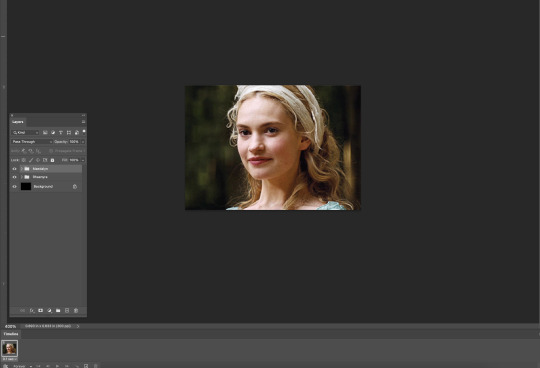

Now, this is how your timeline should look.

You are gonna need to click this symbol right here at the bottom. The + with the box around it.
That creates another frame for your gif. When it does your timeline should now look like this. (I forgot to take a screenshot of this part so this is what mine looks like with the adjustments I added later)
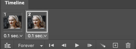
When you are on the second frame you need to go to your gif, find that second layer to match, and click the box beside it. It should reveal the eye.


Repeat that step all the way to the end of your first gif.
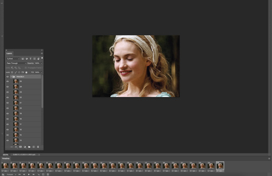
Now you don't have to do this but I like to fade out some scenes to make it flow better. Click the timeline number where the gif is about to end. For mine, it's layer number 22.
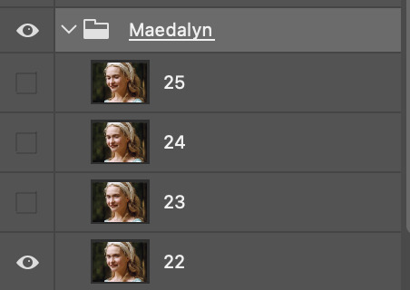
When you click the timeline number it follows right to the number in your layer. You see how my group is highlighted because I clicked it? I would stay right there. Because we are going to click the Opacity for that ENTIRE layer.
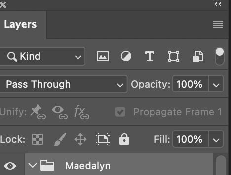
Just click the 100%, or click the V beside the 100, it doesn't matter, and put in 80%. It should start to fade and you can see the layer underneath it. The next part of our scene, this is what we wanted.

Repeat that by clicking the next number up on your timeline and change the opacity to 60%. Like for me the next one is 23. The pattern that I do for my opacity changes is 80%, then 60%, then 40%, and finally 20%. Example below.
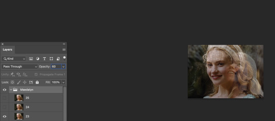
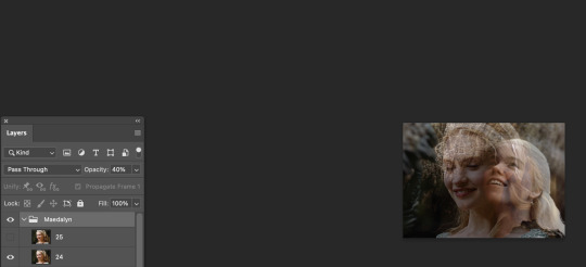
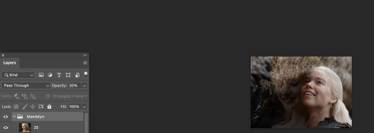
But now you need to make your second gif move right alongside your first so it flows. So now click back to the number on the timeline you change the opacity to 60% and click the visibility box of the second gif.

It should look like this now. I exported the gif so you can see the fade from playing with the opacity.
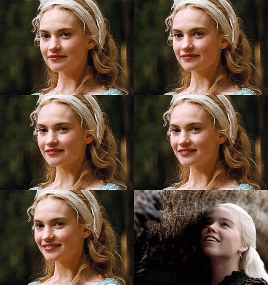
Next, repeat the same steps you did above for your second group gif. BUT, when your opacity on your gets to the 20%, the next frame make SURE you click OFF the visibility or put the opacity to 0.
The example below is just following where you should start the 2nd frame with the new group.

After repeating the first steps, your gif is now complete and should flow nicely!

NOW we just gotta export it so you can eventually post it! In my example below I ended up using this coloring and just tweaked some adjustments. So go to file, export, and click the save for web button just like you see below.
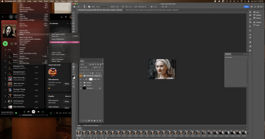
Now after clicking that this is what should pop box should pop up. In that same box I have below, is the settings I use to export.

NOW!! After you click on save and save that beautiful work into the file area you want...you are now finished!!

I hope I made sense! I'm not used to doing tutorials and I had a lot of more step by step screenshots, but Tumblr's 30 image limit made that impossible to put together!
#mimi replies#ask answered#answered asks#asks answered#mimi does a photoshop tutorial#photoshop tutorial#gif manip tutorial#gif tutorial#Kill your queue. you'll feel better
8 notes
·
View notes
Text
Mastery Journal Process and Reflection
InThese last four weeks of this class have been an eye opening experience for me, it taught me there is so much more to graphic design than just drawing and creating things by hand, there is also use of video and film as well as learning how to put motion into a work and making frames work together to crate a moving graphic. It has also been difficult for me with the new software we were working with because it was my first time, but I worked with them and learned well how to do my projects. I am also still working with and learning the software. I will also keep working with it each week as much as possible. My dream is to be a good graphic designer, and work with motion and animation in some way and this class helped me to realize that. I love seeing things move with color and type.
Process
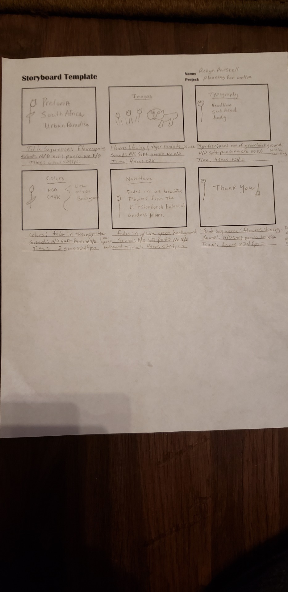
Connecting/Synthesizing/Transforming - In week one to create my story board I started my reading Animated Storyboarding witch broke down the process of storyboarding and how to work with frames per second. I also found in article The Art of Storytelling with Mimi Chao, It breaks down the whole process, startring with making a plan, deciding the formats of the storyboard and then hand -sketching and thumb- nailing and moving into digital tools to use to make the storyboard come to life. I also used Motion Graphics and the Art of the Abstract by Abi Pollokoff. Witch breaks down the use of animation and narrative abstraction and how to make all work together to create a storyboard, I also learned about different types of sound and how to use it. My storyboard on pretoria broke down how I would add motion and sound to my brand to present my city as an adventurous, welcoming, and fresh place.
In Week 2 Communicating with Motion I used an the article the Basics of After Effects and watched several tutorials on after effects, the article broke everything down on how to create a new document and save and how to understand the interface import media, and how to organize projects, I worked with after effects at first as well as making my motion in Keynote and then I moved my project into iMovie because it allowed me to edit each clip all in one and at the same time make it into a working video and movie, I watched one toutoral on iMovie, then I just worked with it by hand to learn and create my project. through this process I was able to learn how to make motion frame by frame and how to make each motion and frame work together in the movie as a whole. I also was working with how to make the motion fit the frame and make the time of each frame not be too fast or too slow, this was the hardest part for me and my movie was too fast in some frames. I worked though this and made my motion project.

In week 3 I researched and read all the articles and videos I was given to make my choice of which Motion Media Project to do, I chose to do a Cinemagraph because it was the most interesting and fun for me to learn, I used an article called the Art of Cinemagraphs and How to Make Your Own, this really helped me to understand what a cinema graph works and what it does, I also learned what software to use to create them. I started out with Photoshop, I struggled working with it and making the live video fit with still frame that I chose and masking it all together in photoshop, so I researched some more and began working with cinemagraph pro, I could choose the still frame within the live video and it was easier to pinpoint which frame I wanted to make as my sill picture and to mask the part I wanted to move, the making was easier to do and the effects I added were not hard to do, I wanted to bring out my narrative in my cinemagraph, I worked to do this with the movements and I hope I did.


Problem Solving- In week 1 the problem I was solving was to create a storyboard for my city brand, the storyboard needed to be broken down into different frames, with each frame moving at a different rate.
the problem that my medium solved according to the industry is the first steps into making my brand into a motion piece, I solved the problem by researching how to layout my storyboard, I did though laying out my game plan by getting to the drills ( The Art of Storyboarding, Chao,2018). then I moved on to the sketches and the timing of each frame for my brand.
In Week 2 The problem I solved was to create a working motion piece for my brand, the problem my medium solved according to the industry was giving life and movement to my brand, and making it work for the client. I solved this problem by researching how to bring a motion graphic to life, one of the most important things is it is much better to see a simple project executed well, then a big one gone wrong.( 27 Tips to make a Motion Graphic, French, 2017)
I used after effects and Movie to make my motion graphic, I wanted my narrative and voice and tone to stick out and work well together.
In week three the problem I solved was to bring a type of motion graphic to life with work related to my city, I chose a cinemagraph to bring my brand to life, My cinemagraph solved the problem of isolating a certain part of a video to draw attention to it, and by making a part of that video stand out to my audience. I solved the problem by working with Photoshop and Cinemagraph Pro, I was able to represent parts of my narrative and emphasize one part of it to bring it to life and make my brand have presence.
Innovative Thinking- Compared to others in the industry all three of my projects were beginner level, my brand does stand out as being different because I took a look at the city like never before, I worked hard to make my storyboard, motion piece, and context ,motion for my audience all fit together as one standout brand, by bringing my narrative to life.
I approached the subject of innovation with fresh eyes and a mind full of research to create something new, different, and interesting. even though some of it was mind opening and different for me, it brought me excitement and Joy to create my own moving pieces.
My work is innovative because my unique look at the city and what it stands for is different than anyone else, I made a unique narrative and brought it to life. and my colors in my graphics were bold and bright and fit my voice and tone , and in my motion piece I used pics of the botanic gardens to prove my narrative and I tried to make my motion seem like the wind blowing or animals playing, in my cinemagraph i highlighted the great parts of my narrative to bring life to it.
Acquiring Competencies - throughout this entire process I learned a great deal of new things, I learned what a motion graphic does, and I learned how to bring my brand and story to life in beautiful and interesting ways that could make the client and the target audience stop and take a second look, the brand could be one of a kind.
The new software I learned was After Effects, PhotoShop, I Movie, Cinemagraph Pro, and Keynote, it was a-lot to take in at first but it was all worth it and lots of fun bringing life to my own story and designs to life and create another story through motion. It made me expand my mind to new areas I never thought I could reach I was excited to create for a client and a target audience,
the skills I learned were how to make the software work for me, and how to create motion that will standout and last, and how to create a unique piece.
this class and the work was definitely a challenge at first, but I continued to research and work hard to learn the software and concepts that will do me good and the future, this class also helped me realize what I want to do with my degree, and how i want my work to mean something and standout to the world. I am ready to keep going and create great things.
youtube
youtube
I will continue to work hard and open my mind to new and exiting work
1 note
·
View note