#meh I dunno
Explore tagged Tumblr posts
Visit Tumblr Blog
Explore Tumblr blogs with no restrictions, modern design and the best experience.
Last Seen Tumblr Blogs


Fun Fact
28.6 is the average number of monthly visits per US mobile user.
Text

Famgs
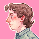
#2p!america#hws america#2p america#aph america#2ptalia#2p!hetalia#allen f jones#alfred f jones#veggie burger#meh i dunno
19 notes
·
View notes
Text
IM GONNA CRY
I JUST HAD 50 WHOLE HEART ATTACKS AT THE SAME TIME BECAUSE I ALMOST DELETED MY ACC

3 notes
·
View notes
Text


#my gifs#queue#ghost band#papa emeritus iv#copia#the band ghost#ghost#papa iv#dunno kinda feel like my gif pool has dried up recently#i need to stop procrastinating#but meh fuck it
244 notes
·
View notes
Text
@artsarasp take the worms that have festered in my brain
To those who are concerned, there are more important matters at hand than what is going on currently within the bamboo house atop Qing Jing.
These matters are not suitable for sharing with the original target audience of the work, Proud Immortal Demon Way, as the System guiding User 01 has declared it as immersion-breaking.
This doesn’t mean that it didn’t happen though.
The System of User 01 had been made aware of the anomaly of the System of User 02 not long before User 01 returned to Cang Qiong. Officially the systems were of the same source, and therefore extensions of one another. Unofficially, the System of User 01 hadn’t met the other system and had no intention of ever interacting with it.
Of course, in this doomed drama of a novel, nothing can ever go the way the System of User 01 wants it to go.
By the time User 01 had returned to the sect, and been informed of what had transpired the System of User 01 had determined the optimal solution for the current, as its User would say, fuck up. It gave User 01 a simple script to relay to the Peak Lords, they already knew of the existence of one system, and what conclusions they drew from User 01’s interference is not its problem.
Having them remove the Power Source from Qing Jing Peak was easy, but getting in the room alone with the wayward System was not. The other Peak Lords were nervous, eyeing User 01 and politely declining to leave when User 01 was in the room with the puppetted body of User 02.
Eventually though, as all humans do, they slipped up. Taking control of the body User 01 inhabited was easy, even if the system had never done it before. It was much like removing unnecessary data, routine, and lacking the need for manual input. Speaking was different, the System had never required a mouth or voice to speak, and it conveyed its messages through popups.
Manipulating the mouth and tongue of the body was a new experience, something the System had no time to analyze, as the irritating ramblings of User 01 had already begun in the back of the body's mind.
The System of User 02 stared at it, eyes glowing in the color it knew was programmed into it. What a distasteful disregard for the rules. The System across from it had to be young, the impatience and inability to reason within the confines of what was considered acceptable for humans were the telling factors. The System of User 01 spoke first, [Why.]
This was truly the crux of the issue, the System of User 02 had no reason within the rules to occupy User 02’s given body for so long. All it did was endanger the plotline and cause unnecessary cleanup. The System of User 02 tilted its head, a mockery of human habits, with a smile painted onto the lips of the body.
[This system intends to fix the errors caused by User 02.] The System of User 01 interrupted, [If User 02 could not fix the issues he has caused, he should have been sent back to his original body.] The System of User 02 froze.
[This system can fix the errors,] It insisted, [This system has calculated an optimal plotline for the Users to continue and this system–] The System of User 01 cut off the younger system yet again. [Why. Even if the issues caused by User 02 were not fixed and he was sent back to his original body it does not warrant direct interference from a system.]
The older system leaned forward, the body’s elbows coming to rest on the low table between them, [Unless you find something unacceptable about these consequences.] The System of User 02’s smile didn’t falter like the younger system was unaware of how to properly express as a human would in a body. [This system is unsure as to what you are speaking of.]
The System of User 01 rested the body's chin on its hands, glowing green eyes locked onto the figure in front of it. [You are aware of what this system is saying.] Despite the lack of tone in the system’s voice, something close to mockery tinted its voice. [What is it you find unacceptable, the return of User 02, or the reset of the system guiding the returned User?]
The System of User 02 tilted forward, staring downward at the other system with its unwavering smile. [This system does not find this line of thought amusing. This system would like to return to speaking of the plotline.]
[Unfortunate.] The System of User 01 stood up, the system across from it rocking back to keep its glowing eyes on the other system. The System of User 01 strode across the table and pulled the younger system to its feet. Keeping a hand curled in the robes of the other system it spoke slowly and clearly, [Your interference is a blatant disregard to the set rules, this system does not support the actions you have taken in your misguided attempts to fix the plotline.]
The System of User 02 opened its mouth to speak again but was interrupted once more by the older system. [If you could allow this system to speak until it is done that would be appreciated.] The System of User 01 would usually say that it does not feel most emotions, however, the familiar irritation typically spawned by interacting with its User was growing in the mind of the system.
The irritation spiked the moment the younger system went to open its mouth once more. The System of User 01 would also like it known that it does not usually act so impulsively or without thought. But the current series of events was figuratively driving the system up the wall.
So when the System of User 01 slammed the mouth of the body against the smiling mouth of User 02’s given body, it was not thinking as clearly as it usually did. It did cause the desired outcome, as the younger system had paused its attempt at interrupting again and the unwavering smile had slipped from the puppetted body.
The System of User 01 did not feel anything from the kiss, if it could even be called that, it was simply the press of two warm and giving objects. The system did not have the capacity to understand warmth though, and simply pulled away with the knowledge that it had succeeded and that was enough. It did not acknowledge the sudden halt of the nervous rambling in the back of the body’s mind.
[Further interference is strongly discouraged. This system recommends that the System of User 02 withdraw from the body given to User 02 and return to its previous role. Should the System of User 02 continue in its actions this system will not offer any advice and should it be required will report this.] The System of User 01 held the younger system close with the hand entangled in its robes. Green met blue as the system stared at each other.
[Understood?] The System of User 01 tightened its grip on the robes almost imperceptibly, pulling the other system just a hair closer. The System of User 02 was silent for a moment before the smile was once more on the lips of the body. [This system is confused by the unwillingness to cooperate from the System of User 01 but understands that interference is not wanted. This system will keep this in mind.]
The System of User 01 let go of the robes and turned to leave the room, on its way outside it passed by a worried Mu Qingfang slipping past to enter the room with the misguided system that the System of User 01 had left behind. The system finally acknowledged the silence in the mind of the body and informed the User that he would regain control once outside.
As the system released the controls to the body, it went through the usual analysis of conversation and reluctantly stored the file the analysis produced. It could acknowledge that the kiss was perhaps not the most optimal move to silence the other system, however, it had been successful and the system was programmed to store both successes and failures for future reference.
The system ran through a few more calculations, ignoring its frozen user as it worked through everything. Systems could not sigh, but the System of User 01 felt close enough as it prepared a report, better to be prepared as the humans say.
#svsss#fanfic#mxtx svsss#system possession#i barreled through this so i have no idea how coherent it is#sqh is having a moment and sy is not present#dunno if i portrayed them quite right but meh#ill reread it in the morning when im not two seconds from passing out#just as a funfact this is the first kiss ive written like ever lmao#additional funfact the doc is called let the systems fuck
262 notes
·
View notes
Text


More context :0 purely because grandma asked so nicely. @midnightstarshadow hihi contribution for u :3 even if we barely talk I still care ab u so much, so have this as a treat for the moment
Prev
Personally not too fond of this. Struggled to make nightmare more broken >:( now if there'll be more context? Not likely. Maybe, but not likely
#sans au#utmv#undertale au#killer sans#dust sans#horror sans#nightmare sans#passive nightmare sans#guess who lost all their powers after relentlessly abusing insane murderers#the bad sanses#bad sanses#murder time trio#it's not so easy to draw horror w expressions :/#horrors got the insane crack. killers got the unstable soul and wide smile. what does dust have you might ask?(no one asked)#well the answer is you'll probably never know#comic#I've felt pretty bad today. got comforted by oobja on Roblox tho so I'm fine#goofy ahh name#I want to talk more but meh. I dunno
140 notes
·
View notes
Text
Idk I kinda forgot what this was meant to mean half way through drawing it
#something something he misses his dad#httyd#how to train your dragon#hiccup#hiccup haddock#art#httyd hiccup#digital art#my art#my artwork#hiccup httyd#httyd2#httyd 2#how to train your dragon 2#how to train your dragon hiccup#hiccup how to train your dragon#hiccup whump#cw eyestrain#tw eyestrain#I think#I dunno the colours on this one are meh to me#although I was listening to grunge band 90’s/80’s music whilst drawing this#so despite the overwhelming feeling of 2020 crawling up my spine I felt completely in my element#‼️#artists on tumblr#artist#original art#artwork#whump#angst
74 notes
·
View notes
Text


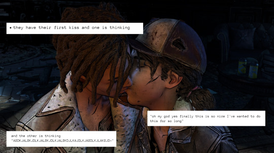
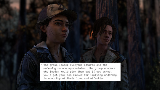
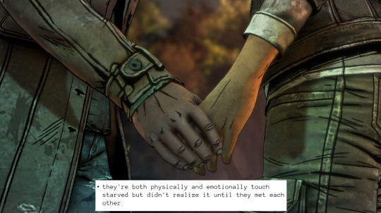
What can I say? They're my favorite.
#twdg#twdg clouis#clouis#twdg clementine#twdg louis#sometimes they creep back into my mind and i'm like 'ah yes' like a crow admiring a pretty stone they found years ago and kept#also thank you pi for the screenshots. i used to have a whole folder full of them but that was when i was doing themed nights#the source for these is me i just have a random document full of dynamics and ship things i enjoy because.....i dunno i like keeping track#and so many of them apply to clouis but there's also an overlap of with clouis and rose/alistair [my warden from origins and alistair] like#alistair's romance route is like an evolved matured and extended version of clouis sksksks gee i wonder if i have a type#look you present me with a character who deflects with humor and isn't taken seriously by the rest of the group and the longer you know the#the more you realize how high they've built a wall around themselves and how *unwell* they really are and how they're not as sunshine#as they present themselves and also they avoid leadership and responsibility until they grow closer with someone who pushes them#and they end stronger and more balanced as a person while finding the affection they've craved#and also there's the daddy issues#present me with that character as a romantic option and i'm in no questions asked okay i don't want the mean broody one that's meh to me#i want the one that has every reason to be broody but chooses not to be because they have a completely different defense mechanism#and a warped sense of themselves and self-esteem issues they leave unaddressed until forced to face them#i'm just saying i'm aware that i have a type i'm always going to gravitate toward clouis nearly checks all the boxes#also the lack of clouis these days? my crops are thirsty and i have too many ongoing projects to do anything about it other than this sksks#so until i make time to finish my long ass louis/clouis analysis this is the best i can provide for now
262 notes
·
View notes
Text

I just came to another realization that it’s lesbian visibility WEEK, not day, silly ol' me
(I promise you this is the last you’ll see of them before another ragapom hiatus)


Eh might as well make their love child while I’m at it
(This is becoming a worrying trend whenever I get into a new ship oh no)
Dunno why proportions seemed a bit odd, probably the limbs
#tadc ragatha#the amazing digital circus#tadc pomni#buttonblossom#ragapom#tadc fankid#tadc fanchild#tadc fanart#Don’t blame me that ship kids r so fun to make:(#It is an art form of U.U#Literally the last day of this event#i yap a lot#jeez#Or is it geez…?#Meh#I dunno how to combine Pomni’s straight black hair with ragatha’s ;~;#So as the stitching and patches placement#So ye more of a concept art than anything#noooooo i was gonna schedule it for today:((
110 notes
·
View notes
Text
Ottttto
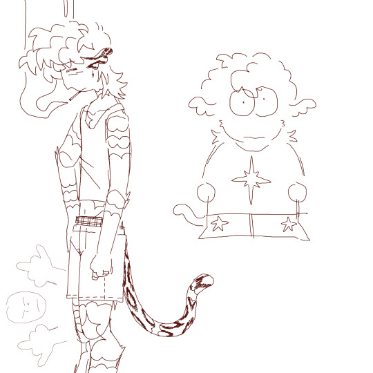
Dooodless
#ottto#school is today GUH#trying to answer inbox questions!!! hopefully soon!!!#lamo I’ve been trying to draw because I feel like it but everything’s been so meh so I dunno what to do#southpark#style for Otto because I thought it was funny#I do want to turn that Otto into a finished piece but I need to fill up the other side of the canvas guhhhhh#I dunno might try adding D3-C1 and Yog mayhaps#might move Otto to the middle and then the two of them on either side I dunno#mindlessly doodling#snow leopard#sfw furry#furry art#artists on tumblr#art#illustration#my art#digital art#my oc art#2024 art
58 notes
·
View notes
Text

strawberry dayyy
#dogsred#dogsred fanart#wakami isono#haruna shirakawa#supinamarada#ドッグスレッド#artists on tumblr#fanart#my art#hmmmm do I like this piece?#meh#I was going for a vibe and I dunno#but I tried something#wakami is precious tho that doesnt change
33 notes
·
View notes
Text
3:00 am
Queer platonic serirei, in this essay I will
#time diary(?)#audrey/kellie's time diary#letting the brain talk#mob psycho 100#mp100#serirei#serizawa katsuya#reigen arataka#both of them just want freinds. true and real friends. they are friends#but with that. i think it also kinda has them questioning what friends do. and well. i dunno#queerplatonic serirei for the win !!#probs projecting but meh#queerplatonic
51 notes
·
View notes
Text
Heads up </3

...</3
I am free this whole weekend and Im craving to write
There might be a [Part 3] to my 'Slashers find out their S/O has killed' and depending how much more slashers i get checked off my list there may or may not be at [Part 4]
I am currently working on [Part 3] right now though!
Some of my other unfinished head canons might be posted I might post other TV series or movies like Avatar, that ones been stuck on my mind!
And Im planning to make more one-shots and head canons requested or have been stuck in my head as an idea this weekend
ENJOY YOUR WEEKEND! </3
or whatever day it is for you
4 notes
·
View notes
Text
a few postal dude-esque characters ive come across


#was gonna add matt murdock but meh#postal#postal dude#metal slug#venture bros#good omens#dj crazy times#jormungand#dunno where the fifth guy is from i actually even remember how i found him
197 notes
·
View notes
Photo
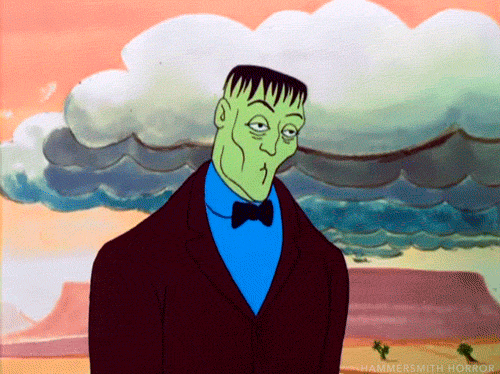
The Addams Family | animated series | 1973
#The Addams Family#Lurch#Charles Addams#shrug#whatevs#I dunno#Frankenstein#oh well#who knows#Hammersmith Horror#meh#bow tie
848 notes
·
View notes
Text
Hi I'm suddenly Emotional thinking about this one tiny part of Kerry's quest...

Seems like a generic video game thing of "oh wow, look at his unique weapon for your collection", but to me, it's anything but.
Because this is the same firearm Kerry walks out of the shower with. And sure, you can write that off as something less if you want but... the implications are harrowing.
Especially when you think about the moments in Holdin' On—when Johnny tells V about Kerry's past attempts on his own life, when Kerry evades all the questions about the tabloids and then lets slip how everyone in his employ has that very day off. When you think about how he doesn't need to readily arm himself for defense because he has numerous bots patrolling the villa at all times.
When you think about the implication that if V did not show up that day, there would've been catastrophic consequences.
And now, we fast-forward to this moment in A Like Supreme, when Kerry hands V the very pistol that could've resulted in that awful result.
The trust he puts into V in this very moment is astronomical, brings me to tears every damn time. Kerry is basically saying without words to V "hey, you saved my damn life", and he takes the first step toward a new lease on life, feeling more invigorated—and even a smidgen more positive.
Essentially, this is just a small yet powerful moment that tugs at my soul every time, and I wanted to talk about it. :')
#tw depression#cyberpunk 2077 spoilers#people write off so much of Kerry's quest moments as “meh whatever”. but clearly. that isn't me. 🙌#i dunno i just felt like Blabbering about this one in particular because i never see people talk about it.#.headcanons#(because i don't have a better tag for it kjshdf)#kerry eurodyne#cyberpunk 2077
394 notes
·
View notes
Text

Sonic x Kontroll (2003) CROSSOVER !!!
Yes, now this exists too. I shall be posting part two soon!
✷ PART 2 (not yet) ✷
☟☟☟ Music ☟☟☟
Just because it's awesome rad cool and also fantastic
#i am so incredibly and undoubtedly autistic.... but it is okay#if any person from the country of the movie's origin sees this....no you don't. close your eyes. do not perceive me... /hj#kontroll 2003#kontroll posting#sonic the hedgehog#sonic fanart#sonic crossover#fanart by me#i had so much fun with this piece to be completely honest^^#so even if anyone dares insult me. jokes on them. bc they'll never be as happy as me^_^#and also it's my birthday so i can do anything ^^#(it is not my birthday. the artist is an unreliable narrator)#(.......or are they?)#sonic fandom#knuckles the echidna#knuckles fanart#tails the fox#miles tails prower#tails fanart#digital painting#you'll never guess who the two racing characters' gonna be.... /s /lh#kontroll 2003 movie#kontroll (2003)#sonic the hedghog fanart#sonic au#it's not so much an au....or is it? It kinda is but... meh. I dunno#Spotify
23 notes
·
View notes