#me after lineart: ok the hard parts done! i just need to do simple coloring i dont need anything too fancy
Explore tagged Tumblr posts
Text
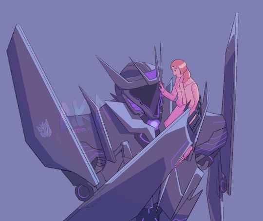
What if he loves me and is very gentle with me
#i drew him through sweat and tears#me after lineart: ok the hard parts done! i just need to do simple coloring i dont need anything too fancy#(proceeds to take hours coloring him)#i love soundwave#tfp soundwave#self ship#soundwave#transformers#maccadam#transformers x human#what if he was megatron’s best and most trusted soldier#AND my husband#what then huh#i want to kiss his face#he has so much geometry i cried#aka drawing#tfp soundwave x reader#tfp soundwave x human
372 notes
·
View notes
Note
Y E S id LOVE to see how you draw The Boi!!
I think you’re referring to when I posted about asking if anyone wanted me to put out a tutorial about anything so....ok! :D
Your wish is my command~
///
Uhh so for y’all other artists or people who might also see this, disclaimer again that I’m not a professional so pls pls pls dont come at me if you see mistakes...which there are mistakes...like I’m 99.9% sure some of this isn’t really “symmetrical” or its warped weirdly because I Suck at perspective and I’m still learning! :’)
The point of this tutorial thing is just to show my general process of how I draw Optimus (a headshot of him, just his head and neck, to be specific; his body is another, longer story o//o’’) and others’ execution of it can definitely vary. I mostly just showed the steps in which I completed the different parts of his helm.
Which I’d also like to add that I’m an Idiot and forgot to record my screen so instead I took photos of the different compeleted steps after drawing the whole thing O//////o’’ but anyway......I do still hope this maybe sorta helps....^^’’
///
1.) Sketching; I like to draw a human head actually (same goes for body; I’ll start with a human form as the sketch and then do a second sketch of the armor over it before I start lining; and those dont include other sketches I do over those to clean them up....^^’’)
2.) Cleaner, More Specific sketch; This is the last sketch before lineart where I place things and color the lines so I get an idea of what the final product might look like...if I end up doing it right! I try to place everything that should be in the final, so before this are other sketches....but this is the last one. Ok. Moving on--
3.) Crest; this can move around a lot while lining the rest of the helm as you may find you’ve centered it incorrectly...or at least...that’s what happens to me...but nonetheless, I begin with the crest~
And a note about how I make it: I use the line tool to make the shape, duplicate the shape, make that one smaller, fill it in completely, then take the eraser and turn the canvas so I can erase in the lines. When you finish, it’ll look like a grill of sorts (is that the term??? O///O’’) and it saves the trouble of extra lineart,,,idk call me lazy but it looks good in the end,,,, ^^’’
4.) Top of his helm; When I draw this the first time, I close up the bottoms so I can clean them up later when I draw the other parts of his head, but as I said above, by this point I’d already finished the drawing so that’s why it looks like that, but basically, that blue part of his helmet goes next! :D I also try to do extra lines as I go along so I don’t forget later...^^’’
5.) Add in the audio receptors + Side face-plate things!! Preferably, start with the receptors, then do the side thingies. And for the grill on those, take your line tool and draw in a rectangle that follows the shape at the top but is straight on the bottom and fill it in. Then, erase the same amount of times on each side to create the same look~ Obviously, be neater than me...since this example here is kinda lopsided....but I suppose you probably get the idea.. :’3
6.) Draw in the blue plating on his face, then the chin on a separate layer below, and on yet another layer, add the tiny blue things at the bottom. Clean up the chin lines that cross into the blue plating spaces, and that should give you this step! If that,,,makes any sense? If my rambles make it confusing, just look at the final result here and compelete the three components on three separate layers so it’s easier for you. Also, when you’re done with that, combine the side blue plating and the chin bits so you have less layers to go through in the end...if you wanna...
7.) As for the antennae things, use the line tool for sure, and erase or change the brush size up so you can play with line-weight...and again call me lazy but you can combine them when you’re done cleaning them up (again, I reccommend putting each one of these on a separate layer first so you can clean them up individually and then combine to one) and duplicate the layer for the other side. For front view, literally just flip it so it’s symmetrical, for 3-quarter, you might need to use your “transform” (hahah lol) tool to fix it a bit. Or just draw the new side in, either way, that completes step 7.
8.) Neck!! Now this wasn’t a more “serious drawing” or anything, so I kinda made a neck shape and drew in random cables and lines so it looks complicated but it’s actually not....tbh when you do draw him, you can kind of do that because ultimately, the shades of black used to color his neck area are dark enough to conceal what exactly was drawn in there so it’s not the most important thing in the world...since you’ll see there’s lining in there but it’s too hard to make out what exactly....basically, from afar, having all this “complication” will give the look that he has a complex neck area, with all these cables and wires and it looks alien! And that’s exactly what you should go for without needing to make it too hard for yourself. I remember someone told me once that in a lot of art, especially art displayed on social media or that kind of thing, you wanna focus on details but not too much; always do a double-take to see what it looks like as a thumbnail so you won’t end up stressing over every tiny miniscule detail. Idk but it seems like good advice~
9.) Eyes/mouth; For the eyes the only thing I wanna say is that I make a shape and fill it in. I know he has other little details surrounding his optics, but for the sake of showing you how I do this in my lil style, I like to simplify it by just making the shape and filling it in, then duplicating the layer and “gaussian blurr-ing” it so it has a softer look. The mouth is...the mouth. Do with it what you shall~
10.) Optics! The blue part! The most fun part in my opinion! I actually have a more “complicated” (not really lol) version of his eyes which I use if I’m going to color the piece or do something more “serious,” so this here’s the simplified version. Like I said with his eyes, I like to keep it simple when it comes to his eyes, since idk it just...looks good to me ^^’’ I take the pen tool and draw in two circles, ovals, whatever the shape is supposed to be. I do not use the circle tool because it feels a little.....stiff..? Idk ^^’’ But anyway, then I duplicate the layer, gaussian blur, and combine both. Another thing I like to do is change the first layer (the one that didn’t get the blur) from “normal” to “Add (Glow)” ((as it’s written in Clip Studio settings, that is)) and mess with that a little, THEN combine these layers. The last part is adding your shine bits; just take your white pen and go wild, and if you wanna, do the whole “duplicate, blur, combine” thing with the shine bits as well; it adds to the look~
And ofc, take away the sketch layer (but don’t delete it, just in case you need it! ^w^)
I have another process for coloring....but I didn’t include it since it’s fairly simple ^^’’
Unless you wanna see that too....but for now.....I hope you could get something out of this tutorial here! Sorry it was so long!!
I also just realized I forgot his eyebrows, but you can add those in along with the eyes/mouth step if you don’t forget like I did...idk, for this particular look it seems not to take so much away from the drawing but....I should have remembered ahh--
Anyway! Thanks so much for asking!! And thanks to all of y’all for reading/looking through all this!! <3
See ya around~
-Kuni :D
#asks#kuni answers#requests#art#things#nice things#:)#tutorials#optimus prime#how I draw#:3#apologies for typos or other things like that#its late#my head really really hurts#but dw I'm smiling :)#thanks~
10 notes
·
View notes
Note
This is for both of you! I am SO NEW to digital artwork and I have no idea what I’m doing. I’m using FireAlpca and I was wondering if you could give me some tips and how to make my art better! Thank yo7~
Forgive me for taking so long to get to this, just asks like this take a lot of time to put answers together for.
Seeing as you’re using FireAlpaca, this’ll be somewhat easier. So, I’m going to assume you’ve got a drawing tablet and have it set up in a way you like. If you’re using a mouse, then godspeed.
I also went into a lot more than I thought I would with many pictures, so I’m going to put this below a read more.
First, let’s go over a few basics.
Canvas size. I’ve seen it and done it myself, so let me tell you, you want a large canvas. That’s the resolution I use, I like to have something that’s 16:9, but the aspect ratio is up to you. Extra large canvases can also cause FireAlpaca to lag, so keep that in mind before you do a 10,000x10,000 canvas. Find something that’s at least over 1,500x1,000 that your computer can handle. It’s a lot easier to shrink something down than to blow it up and you can always crop out extra space at the end. If you noticed you drew the sketch small, I recommend blowing it up some before lining so you have more room for details and so if you upgrade your monitor in the next few years, your old artwork won’t look pixelated.
Correction/stabilization. You’ve probably heard many people talk about this already and are using it, so I’ll keep it brief. It uses some digital tech to make your pen movements seem more fluid and flow better. Find the number that feels right to you and adjust it as need be. As you can see I keep mine pretty high, so here’s a quick example of the same drawing with different stabilization settings.
…I somehow got progressively worse each time. Well, the important thing is you can see the smoothness of the lines and how they flow better, so that’s what matters. Now onto the next topic.
The brush tab. FireAlpaca is widely used and that means it has a huge community that makes custom brushes. Some people find this confusing, so I’ll try my best to walk you through installing custom brushes.
First, you want the actual brush. I recommend looking through DragonLoreStudios’ brush packs as most of the ones I use are from them. Some cost points, but there are a few free packs. (Pack 6 has a water texture which I freaking love.) You’ll need to keep those files, so I recommend making a folder on your computer where you keep all the custom brush textures.
It’ll be in a zipped folder, so you’ll need to extract it. Just right click and select “extract all” to a folder that is NOT the zipped folder (done this a few times). Now the hard part.
Click that icon, “Add Brush (Bitmap)” and select the image from your computer.
It’ll pull this up. This is the tricky part. Some brushes come with what the presets should be to make it look like it does in the preview, however not all do. You can do some tweaking if you change your mind about something or it didn’t work like you wanted it to by double-clicking on the brush in the brush tab. However, since this one is from DragonLoreStudios, there’s a preset panel I can match this to.
And that’s the end result. They update that panel once in awhile and it is time consuming to put in a bunch of brushes, but they carry over from version to version, so no need to worry about losing your custom brushes when you update.
Lastly, if you’re like me and want to organize your brushes, I introduce to you folders. I had some people ask me about this on my last stream, so it’s as simple as layers and folders. Just click the folder icon, name it, drag ‘n’ drop. Nice and easy way to keep your brushes organized.
So far, haven’t said a whole lot you didn’t know, huh? Alright, let me get into some stuff that I jumped for joy when I found out.
FireAlpaca doesn’t have a multi-select….or does it?
Yup! I didn’t find this out for a long time. If you hold shift with the wand, you can select as many areas as you want. It seems like a silly thing to get excited over and you may have already known about it, but I figured I’d point it out since my friends and I took forever to learn about it.
The blur sucks. We all know. No matter what computer you have, when you turn it up over 120 it gets so laggy you can’t hardly use it. But, those big canvases, you can’t use a dinky little 100 size blur on it. Welcome to filters.
I’ll admit, I don’t quite know what everything on that list does. HOWEVER, I do know what gaussian blur does and with the select tool, it’s amazing.
Let’s say you drew this awesome background, but you want those dots blurred however you don’t wanna sit here for 10 minutes with the manual blur tool.
It’s amazing, really. Only want one side blurred? Just use the select tool and blur that side. I wish I knew about this a year ago whenever my airbrush shading wasn’t smooth enough.
Now, the hue is also something that has saved my shading life more than once. It works just like you’d expect. Don’t like that background color? Think it needs more pop?
Simple. The other two options that I know on the filter tab are also great! Sand and cloud. Depending on how big your canvas is, it might take the computer a second to put it out, but it’s a texture that’s randomized every time you do it and here’s what they look like with black and white.
Not very interesting, huh? Well, put a color below them and turn that layer to overlay…
Wow! It adds some texture! I personally like to turn those down to about 15% opacity so it doesn’t overpower the image, but it’s nice for adding texture to your plain, otherwise straightforward, backgrounds.
So, time we take that knowledge and move to the miracle that is clipping.
Clipping is your go-to tool for shading and colored lines. I can’t believe how often I have to tell my friends “no, don’t grab the paint bucket use clipping” because clipping looks better. Always. Alright, for an example I’m gonna grab a newer piece that I already finished since I still have the project file.
Notice the clipping? I actually used more, but had to merge some layers because a clipping layer can’t clip onto another clipping layer. I’m gonna go backwards a little here and show you how helpful clipping can be.
This is without clipping. Not very nice looking, is it? I shaded with black as a base color, the lineart sticks out like a sore thumb and it lost its soft look. I actually use black a lot to shade, but only as a base color (unless I’m shading a really deep color, then black is basically my only option). After I got all the shading, I made a new layer and turned on clipping.
Now with this layer, I’m free to put color into the shading. If I did this with say a paint bucket, I would end up with spots that didn’t quite reach because of the antialising or it would expand if I turned on that on and I’d have to go over it again to clean it up. With clipping, I get clean lines and am free to change the color with ease.
The ears are a gradient, which means it’s time for some clipping ex machina mixed with the hue tab.
I made a copy of the top half of the color layer that covers the part I’m shading.
Now we got it pasted in with clipping on the ears. It matches up perfectly, of course, but there’s no shading. Time for the hue tab!
Look at that. Was able to keep the shading even with the gradient while adding a bit of hue shift to the purplish side. THAT is the power of clipping. Of course, use clipping for the lineart mixed with a bit of airbrush for the ear gradient (since the color layer ain’t on the lineart, have to color that by hand) and remembering to darken the lineart around the shaded areas, and we get this.
Sounds complicated, but it’s really simple and the result doesn’t look half bad. I’ve used clipping + hue on so many drawings and it’s saved my life.
Now, another little nifty trick is that white boarder. You don’t have to trace all the way around your piece, that would take forever. Let’s go back to our little grumpy Tara piece.
I added some color to help the boarder stick out. Now, first we wanna make a layer above the background layers, just below the color layer, and turn off the background.
Should be looking like this.
Next, we’re gonna use the wand to select outside and under the select tab, click “inverse”.
Now, it’s time to expand! It’s the button right under inverse, you can see it in the last image. How big or small you want it all depends on you and the canvas size, so play around until you’re happy with it. For this example, I’m using 7 because this is a pretty tiny canvas.
Next, we want the fill tool. Honestly this thing is so much more useful than people give it credit for.
Get the whole area and boom! That’s it. Deselect, turn your background back on and take a look!
Beautiful. The reason you don’t want to use the paint bucket is it wouldn’t get every spot. If you drew a tuft of fur or a little corner, it wouldn’t reach. This way makes it so every inch is covered. However, with fur and all, there’s a bit of a draw back and something you’ll have to fix manually.
Look how it squared those spots out, yikes. You’ll have to take your pen and round them as I did in that earlier piece with Miles.
I think this’ll be the last thing I cover and I myself am not very good at this, but I want to show you comics in FireAlpaca.
Step one: do NOT USE THE SNAP FOR THE LOVE OF GOD, PLEASE. THERE’S A BETTER WAY.
For real though, don’t do that. Make a new canvas (I wouldn’t use the comic tab, I just find it screws with all the knowledge I have and all it does is make a new canvas anyways).
Great. Next step.
We’re going to go to the layer tab and click “add panel material”.
That’ll bring this little box up. Whatever you pick is up to you and remember the undo button does exist, so choose whatever you want and click “OK”.
We got it started! That’s the easiest part done. It’ll automatically set you to the “panel divide” tool so you can get working. Drag that tool across and it’ll cut lines and if you hold shift, you can do diagonal lines.
Here’s a quick example. If you adjust the kerning and leading, you know, this stuff:
You can change how close it’ll cut the panels.
However, for some odd reason, you can’t do completely diagonal. Like if you take a square and cut from one corner to the other, it won’t work. I don’t know why, maybe they’ll change it in an update, but that’s how it is right now.It also takes a little getting used to, so mess around with it.
The great thing about doing this instead of using the snap (besides it looking better) is nothing will go above it. Even if it’s the bottom layer, you can’t go over it or erase it. However, sometimes you want a little panel overlay and this doesn’t give you many options, does it? Maybe you’d like to transform it, but you can’t because it’s a comic layer. You wanna convert it.
Under the layer tab, just click “rasterize material” and it’ll turn it into a normal layer you can use your select tool and transform stuff on. Now if only they had a way to create text boxes my life would be complete…
Oh, one last thing I wanna mention: ALWAYS save your project file. When you finish a piece, don’t just save it as a PNG and be done, save it as a MDP (FireAlpaca file) too. I can’t tell you how many times I’ve drawn something, uploaded it then realized I forgot one minor detail I wanna fix. Without the project file that contains all my layers, I’d be so screwed. Just keep the file around for maybe a week or two, at least until you know you won’t go back and edit it any time soon. Also be careful you don’t save a file as a PNG to show it to a friend, make progress, then just aimlessly click “save” because it’ll be in the format you last saved it as. I’ve had a friend do that several times and it’s terrible when that happens.
Okay this went from some help to a sales pitch. Still, when I found out about this stuff I thought it was a godsend. I might’ve just rambled on about stuff you already knew about, but I tried to cover some more obscure things you won’t find in basic YouTube tutorials. Anyways, hope this was of use to you!
-Sassy
6 notes
·
View notes