#maybe it'll help someone else who's struggling to draw this space dork's hair?
Explore tagged Tumblr posts
Text
How (not) to draw Kaito in left profile view: A Kaito Fanartist's Lament
If you're familiar with my blog, you'll know that I've drawn Kaito a lot. And contrary to apparently a large proportion of this fandom, I actually enjoy drawing his ridiculous hair! Usually. From a lot of the more commonly-used angles, it has a very distinctive shape to it which I find fun to get down.
But from certain angles? Not so much. In particular, it is not a coincidence that none of the drawings I've done of Kaito have ever been composed such that he's in a left profile view. Because I am not at all comfortable with drawing his spiky fringe from that angle. The rest of his hair is still fine - it is always very UP, just draw a lot of spikes going UP and you can't go too far wrong - but his fringe, from this angle, is a Problem. Here is a chronicle of my adventures in trying to figure this problem out.
First, let's look at some sprites of Kaito from the angles that give his hair its most distinctive shapes, in order to get a sense of the shape his fringe is "supposed" to be.
Front:
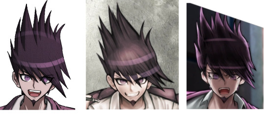
Pretty straightforward, and pretty consistent between the sprites and various illustrations drawn from that angle, give or take a spike or two. Kinda downwards, about as far as his nose or mouth for the longest spikes, and also pointing about 45 degrees to his left.
Right 3/4 view:
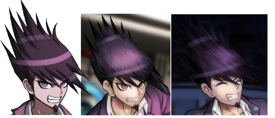
Also pretty straightforward and consistent between different depictions. I personally consider this the most distinctive and iconic shape of Kaito's hair, so if any angle should be considered "correct" and the thing to use for reference in case of inconsistencies, I think it should be this one. Note how from this angle we can see more than we could from the front that his fringe spikes not only point to his left but also outwards from his face at least a bit. They do not fold back around to the left side of his face towards his left ear.
Right profile view:
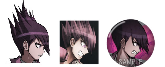
This still seems fairly consistent with the other sprites we've looked at so far, at least as far as one can tell considering that his fringe spikes are partially hidden behind his face and pointing away from the camera. All of them are fine to look at, because any awkwardness in foreshortening of the spikes is mitigated by the fact that they're pointing away anyway, and they're not getting in the way of his face from this angle. There are however slight inconsistencies here between the different depictions of this angle, in exactly how far outwards from his face his fringe spikes are angled, and how long they are.
I personally like drawing Kaito from this angle a lot and have done it a bunch of times. It's pretty surprising to me to realise that the official artists almost never have (this was basically all I could find; that third one is some merch something or other from the wiki using what should be his opposing Debate Scrum sprite but for some reason the actual one they use in the game is a mirrored version of his left profile view, grumble grumble).
Left 3/4 view:
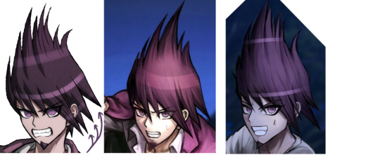
Now we're getting into possibly being a liiiittle more inconsistent with the other angles. At this point his fringe spikes should probably be pointing a little less downwards and to the left and generally more towards the camera than they actually are. Not that I blame the artists for not drawing it that way, though, because foreshortening is hard, probably especially when it's spikes. Nonetheless, these are still all quite consistent between different depictions of him from this angle, so getting his hair to look right from this angle is still fairly simple as you just need to copy this basic shape.
(The arrows are pointing out something else of note, namely the only downwards-pointing spikes in Kaito's hair that aren't on his fringe, which are only found on the left side of his head. Illustrations of Kaito from an angle that should have these spikes visible are incredibly inconsistent on whether they even exist or not, so while I personally choose to include them in my depictions of Kaito's hair whenever relevant, I think it can be considered equally correct not to do so).
But now for the left profile view, which for some reason has been used in official drawings way more than the right profile view despite the fact that even the official artists clearly don't have a clue how to keep it consistent, as we are about to see. There are a few different approaches they can take.
The Too Backwards:

On its own, aesthetically, this looks fine. But that's not the angle that his fringe spikes go at at all! This is incredibly inconsistent with his hair as seen from most other angles, particularly the right 3/4 view, in which clearly those spikes are not going to end up anywhere near behind his left ear. The spikes are very straight and should not be bending around his forehead to point backwards like this.
The Too Short:

This time, the spikes are probably angled about right; mostly downwards, maybe a bit forwards, any “leftwards” would be pointing into the camera from here and so not visible, and not doing any kind of wrapping backwards around behind his ear. But if you look at any of his regular sprites, the spikes are meant to be long enough to be down about as far as his nose or mouth. These barely go down past his eyes... which has the incidental benefit of keeping his eye unobscured. As it happens, the Too Backwards approach also incidentally results in mostly not getting in the way of his eye. Hmm. Starting to sense a pattern here.
The Too Forwards:

Now this is a novel idea! Only one regular illustration in the whole game uses this approach, such that I had to dig into the closing arguments (which I otherwise left out of this because their art style is a bit different anyway) to find another similar example. This overlaps with the Too Short approach a lot in terms of angle, but these spikes are longer while still not blocking his eye from view. But maybe in doing so they've ended up pointing just a little more forwards than they really should be? The one on the left here, while seeming closer to correct than the rest we've seen, still looks a little off to me. (Maybe it’s just that there isn’t even attempt to foreshorten and imply they’re pointing into the camera.)
So if none of these are quite correct and consistent with the shape of Kaito's hair as seen from other angles, what should it look like? The best way to be sure is to take an image of Kaito from the right profile view, flip it, and then redraw the hair spikes to be on the near side of his face while keeping the silhouette the same, since that should be the same from either side. So I went and did this both by tracing one of the official right-profile sprites, and then with one of my own drawings of Kaito from a right profile view, and...
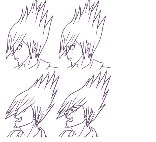
look at this ridiculous doofus how does he even manage to see anything that's approximately 45 degrees to his left (he probably doesn't)
...here we have the problem. The shape that Kaito's fringe is probably supposed to make from this angle blocks his eyes to varying degrees depending on exactly how you're angling it within the realistic bounds that it could be at. The Too Forwards approach kind of has the right idea but is probably exaggerating the forwardsness just slightly to avoid having that happen. I suppose it depends on which right profile image you use for reference, since they're all slightly inconsistent between the tiny handful of official ones that even exist.
I can try and do the anime artstyle cheat of having the eyes be visible through the hair anyway, but that's usually only forgivable because the fringe of hair blocking the view is probably thin enough that you'd be able to kind of see their eyes through it regardless. Here, though, there's such a large volume of foreshortened spikes in the way that I don't think one can reasonably get away with this. If the point of an art piece were to obscure Kaito's eyes and therefore his expression, then this particular angle would be great and incredibly useful. But otherwise, if he's supposed to be expressive? Eeehhhhhhh.
Leaving us with a conundrum of either drawing Kaito's hair correctly and how it should look from that angle but awkwardly obscuring his face in the process, or drawing something that leaves his face perfectly visible and readable but very clearly isn't consistent with what his hair is doing when he's seen from any other angle. This is also not even getting into the part where foreshortening is hard and I'm not sure how well I managed to do that when trying to draw the spikes "correctly"; they still don't look like they're pointing into the camera as much as they probably should, but how do you even???
So, to sum up, and to give the advice that I myself have been following all this time: how best to draw Kaito in left profile view?
Don't.
#danganronpa v3#danganronpa v3 spoilers#kaito momota#the kaito hair mystery#i'm not even sure why this post happened it just kind of did#was messing around with drawing what it 'should' look like and figured i might as well share my Important Research Findings#maybe it'll help someone else who's struggling to draw this space dork's hair?
35 notes
·
View notes