#marketing materials design
Explore tagged Tumblr posts
Text
Introduction to ClickDesigns™: A Game-Changer in Digital Design
In today's fast-paced digital world, standing out is essential for businesses and content creators. The challenge? Finding a design tool that is both versatile and easy to use, but also affordable. That’s where ClickDesigns™ comes into play. This innovative software is a game-changer in the world of digital design, offering users the chance to create stunning graphics, websites, and marketing materials quickly and effortlessly. ⚡ $515/Sale ⚡ 50% Coms ⚡ $257.5/Yours!
Easy-to-Use Interface
One of the standout features of ClickDesigns™ is its user-friendly interface. Whether you're a design novice or a seasoned professional, this platform is intuitive and straightforward to navigate. Gone are the days of hiring expensive graphic designers or wasting time learning complex software. With ClickDesigns™, anyone can create professional-looking designs with just a few clicks. The interface is clean, simple, and incredibly powerful, making it easy for users to get the most out of their creativity.
CLICK HRAR
#ClickDesigns#Digital design tool#Customisable templates#Marketing materials design#Logo creation software#Social media graphics design#All-in-one design tool#Design software for businesses#High-conversion design tool#No technical skills required design software#software
1 note
·
View note
Text
Website Design Services in Warwick RI
Website Designs By Lisa, founded with the mission to assist new and small businesses in their growth, specializes exclusively in WordPress. Lisa creates well-crafted websites that increase your visibility in the business world, showcase your brand and connect you with potential clients. There is no better source for an attractive, affordable pre-designed Wordpress website!

Website Designs By Lisa Warwick RI 02889 401-663-6329 [email protected] www.websitedesignsbylisa.com Facebook | Instagram | LinkedIn Find us on Google
#pre-designed wordpress websites#web designer#web developer#website designer#logo designer#website company#marketing materials design#brand consultant
1 note
·
View note
Text
Actually it really fucking frustrates me as a disabled person how ‘controversial’ video game accessibility is, how contrived it is to find actually useful accessibility mods for even popular games, how abled gamers try to distance themselves from us because we’re the ones without social lives, who don’t leave the house, who can’t work.
#ra speaks#personal#video games#accessibility#not to mention this is part of why elderly people would LOVE video games but the modern market is hostile to ANYONE who might need help#whether that’s better designed controllers/easier remapping of controls#options for low vision/color blind players#or simply implementing easier difficulties#do you know how much it fucking sucks to love horror and gore and ‘adult’ material#while being relegated to fucking Nintendo kids games bc they’re the only people#who makes games that are approachable and forgiving and MADE to be understood?#this isn’t a stab at convoluted plots or even difficult bosses this is to say that a lot of adult games#don’t have good game design when it comes to having accessible controls or ‘tutorial’ levels#like that’s the bare fucking minimum and jfc is it rare to find a#‘skill issue/git gud’ fun fact I do in fact kick ass in doom 64.#because it’s an older game with simple controls and plenty of accessibility mods#I suck at modern shooters bc they have shit tutorial levels too many buttons and terrible modding scenes#it’s not a matter of skill it’s a matter of accessibility for the purpose of improving that skill
122 notes
·
View notes
Text
.
#if you go to the BioWare Gear Store > Dragon Age collection and sort by new#you can see that 4 of the 10 most recent merch items to come out for DA were Grey Warden-related things#of the remaining 6 items#2 are 'general DA:D' merch and the other 4 are 'general DA' things or things based on previous DA games#the Wardens are popular and marketable ofc due to DA:O and the HoF#but idk i just think it's interesting..#the wardens are one of several factions/groups that have been marketed/spotlighted recently in DA:D-era material and promo material#like the Anderfels art#the Warden short stories#appearance in The Missing#concept art and segment in the most recent trailer#but several other factions have received that also like the Crows etc#but its Warden gear specifically which is currently coming out a lot lately yk? and quite a lot at that 👁#and with a new or different logo design as well...#prominence in the DA:D storyline..?#dragon age: dreadwolf#dragon age 4#the dread wolf rises#da4#dragon age#bioware#video games#dragon age: the missing#dragon age: the missing spoilers
47 notes
·
View notes
Text
new goal in business major studies: find a cruelty free way of scamming rich people
#ok so far we got that luxury is mostly about pricing the brand itself independently of the production of the good#so 20000 dollars for a bag sounds like a scam bc in its core it literally is luxury product is just a fancier way of saying it#and logically raw materials + appropriate payment for design and craftsmanship cannot cost 20000 or some shit#so theoretically (and very ironically) luxury market is a very legitimate way of scamming the rich#and the quality of the product is replicable for much much lower prices so as long as you brand it differently#even the not so rich should be able to access almost the same product as long as it is branded differently#so the question of alienation of the worker from the product is at least alleviated#also none of this makes sense so just skip it#im just loving the idea of scamming rich fucks#bc i started a training on luxury market and none of this shit is sensible to me and it is so funny that it is important to a small group
9 notes
·
View notes
Text
Video by kerriclarkcreative
A few years ago, I picked up this oversized sketchbook—perfect for when I need plenty of space to let my creativity unfold. I use it to sketch designs for all sorts of projects: brochures, flyers, a printed 200-page book, PowerPoint presentations, T-shirts, and even concepts for YouTube. It’s also where I jot down lists of photography ideas or elements to include in design projects.
It’s truly my most valuable, yet somewhat underutilized, design leadership tool. I say underutilized because I don’t use it as often as I should. But whenever I do, it helps my ideas flow freely and brings a sense of clarity to my creative process. I think it’s time I make better use of it!
#design leadership#design leadership tool#sketchbook#massive sketchbook#sketches#sketches of digital and print marketing materials#digital marketing#print marketing#mindset and visual diary#abstract and tangible tool
3 notes
·
View notes
Text
Elevate Your Brand with Expert Graphic Design: Amina Rehmat’s Creative Touch
Welcome to my blog! I’m Amina Rehmat, a seasoned Graphic Designer with over three years of experience specializing in various aspects of graphic design. My work encompasses branding, logo design, print design, and packaging design, all tailored to elevate your brand's visual identity.
My Expertise in Graphic Design:
Branding: I craft comprehensive brand identities that resonate with your target audience and stand out in a crowded market.
Logo Design: My logo designs are unique and memorable, providing your brand with a professional and recognizable mark.
Print Design: From brochures to flyers, I design high-quality print materials that capture attention and communicate effectively.
Packaging Design: I create innovative packaging solutions that not only protect your product but also enhance its visual appeal and marketability.
Explore My Portfolio:
Take a look at my work to see how I can help transform your brand’s visual presence. Visit my portfolio on Behance to view a curated selection of my design projects.
Get in Touch:
If you’re looking for a graphic designer who brings creativity and expertise to every project, let’s connect! You can reach me via:
Email: [email protected]
Phone: 03419862750
Feel free to reach out to discuss your design needs or to get a quote. I look forward to helping you bring your vision to life!
#graphic design#branding#logo design#print design#packaging design#visual identity#Design Consultancy#Design Portfolio#Graphic Arts#Product Design#Packaging Art#Visual Branding#Creative Direction#Brand Identity#Print Advertising#Social Media Graphics#Web Design#Marketing Materials#Advertising Design#Illustration#Design Strategy#UI/UX Design#Digital Graphics#Typography#Creative Design#Visual Communication
2 notes
·
View notes
Text
9 Types of Brochure Designs
Introduction:
Brouchers are promotional documents used by companies to introduce their products and services to their customers by providing simple information about them. The more attractive and vibrant a flyer and brochure is the more effective it would attract potential customers.
Brochures are ideal for promotions of restaurants, spas or any kind of business. For successful marketing, the quality of material used for the brochure must be up to the mark. Along with the material, high-quality printing is also necessary.
In this article, we are going to learn about 9 types of brochures that are used by businesses more often.
Types of Brochures:
Gatefold: The gatefold brochure is folded in such a way that the two outer panels fold inward to meet at the centre, creating a gate-like appearance. Gatefold is ideal for brochures with impactful visuals or those that tell a story in a sequence. Often used for product launches, event promotions, or high-end services.
Bi-Fold: A bi-fold brochure is folded in half, creating two equal panels. It’s a simple and common fold that provides a front and back cover, along with ample space for content on the inside. It’s commonly employed for informational brochures, menus, or event programs. The straightforward layout is effective for presenting key information with a clear front and back.
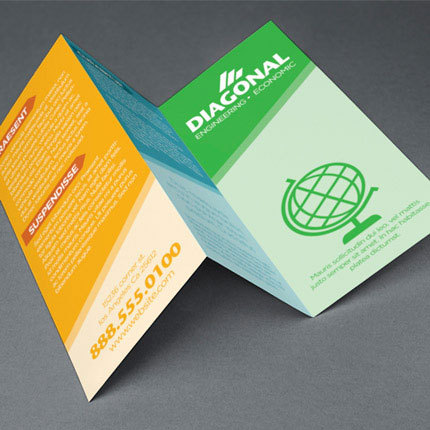
Trifold: A trifold brochure is folded into three equal sections, with the outer sections folding inward to cover the central panel. This type of Brochure is excellent for organizing information into distinct sections. Frequently used for travel brochures, educational materials, or promotional pamphlets where content can be compartmentalized.
Roll fold: In a roll fold, the panels are folded one after the other, creating a rolling effect. This type of brochure is suited for content-heavy brochures, such as annual reports or detailed product catalogues. The sequential unfolding maintains a logical flow, making it easy for readers to follow along.
Z Fold: The Z fold involves folding the paper into a zigzag pattern. The paper opens up like an accordion, with alternating panels visible. It’s very effective for presenting step-by-step information or creating a visual timeline. Frequently used for instructional guides, event timelines, or any content that benefits from a sequential unfolding.
French Fold: The French fold involves folding the paper in half horizontally and then vertically. This creates four panels, with the outer panels being half the size of the inner panels. This fold is often used for artistic or high-end promotional materials. The larger outer panels provide a canvas for impactful visuals, while the inner panels can house detailed information or a narrative.
Accordion fold: Similar to the Z fold, the accordion fold involves multiple parallel folds. However, all the panels in an accordion fold are the same size, creating a continuous, accordion-like effect when the brochure is opened. It is suitable for conveying a mix of visuals and text, it is popular for brochures with diverse content, such as product features or service offerings.
Half Fold: A half-fold is a simple fold where the paper is folded in half, resulting in two equal-sized panels. This basic fold is often used for event invitations, basic product information, or introductory company profiles where brevity is key. This basic fold brochure is quick and easy for conveying essential information.
Double Parallel Fold: In a double parallel fold, the paper is folded in half and then folded in half again parallel to the first fold. This creates four equal-sized panels, offering a compact format with organized sections for content. This type of fold is efficient for organizing content into four distinct sections. Well-suited for brochures where each panel represents a different aspect of a product or service.
Conclusion:
In conclusion, the art of brochure folding is a nuanced aspect of design that significantly influences how information is presented and perceived. Each design serves a distinct purpose, offering a unique canvas for content creators to convey their messages effectively. From the dramatic presentation of a Gatefold to the organized sections of a Trifold, and the artistic flair of a French Fold, the choice of fold plays a crucial role in capturing the attention and engagement of the audience.
Contact Shayona Printing for any type of brochure design that you require. We are happy to help you. For the best business printing services near Corona CA contact Shayona Printing.
#brochure#brochure design#brochure printing#marketing materials#printing company#printing services#shayona printing#printing industry
3 notes
·
View notes
Text
Elevate Your Brand with Perfect Stationery Design Templates
Elevate your brand with perfect stationery design templates. Captivating graphics leave a lasting impression. Stand out and create a cohesive brand identity with ease. Invest in professional results today!
Get it Now: stationery design templates
Section 1: Captivating Designs for Every Business
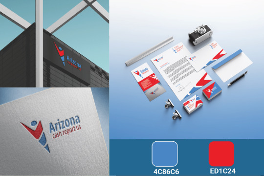
Our perfect stationery design templates are thoughtfully created with captivating graphics and attention to detail. Whether you run a small startup or a well-established corporation, these templates offer versatility and professionalism, making them suitable for businesses of all sizes and industries.
Section 2: Create a Cohesive Brand Identity
Consistency in branding is crucial for building brand recognition and trust. Our templates enable you to create a cohesive brand identity across all marketing materials, from business cards to letterheads and envelopes. By presenting a unified and professional image, you establish credibility and make a lasting impact on your audience.
Section 3: Stand Out from the Competition
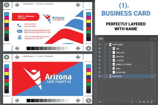
In a crowded marketplace, standing out is key to success. Our perfect stationery design templates help you do just that. With unique and eye-catching designs, you differentiate your brand from competitors and attract the attention of potential clients. The striking visuals and thoughtful layouts ensure that your brand will be remembered long after the initial interaction.
Section 4: Versatility for All Occasions
Whether you need designs for a corporate event or a client presentation, our templates have got you covered. Their versatility allows you to adapt them to various occasions and purposes, saving you time and effort in creating professional materials.
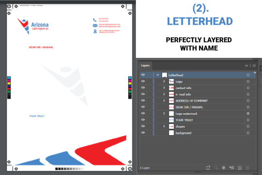
Section 5: Easy Customization and Professional Results
Our perfect stationery design templates are user-friendly, enabling easy customization to match your brand's colors, fonts, and logo. You don't need to be a design expert to achieve professional-looking results with these templates.
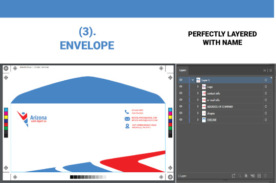
Conclusion:
Elevate your brand with our perfect stationery design templates and make a strong and lasting impression on your audience. Their captivating designs, versatility, and ease of customization will help you stand out in a competitive market and create a cohesive brand identity. Invest in these templates today and unlock the potential to elevate your business to new heights of success. Create a brand image that leaves a positive and unforgettable impact, and watch your business flourish.
Get it Now: stationery design templates
#stationery design#brand templates#professional stationery#versatile designs#captivating graphics#business marketing#stand out#branding materials#creative templates
4 notes
·
View notes
Text
Canva
Create stunning designs with Canva, the ultimate graphic design platform. Access a wide range of tools, templates, and resources to bring your creative vision to life. Whether you're designing social media graphics, presentations, logos, or marketing materials, Canva has you covered. Unlock your design potential and make an impact with professional-looking visuals. Sign up for Canva today and let your creativity soar. Visit now
#canva#canvapro#stunning designs#graphic design#tools#templates#social media graphics#professional-looking#design#designs#design platform#marketing materials
2 notes
·
View notes
Text
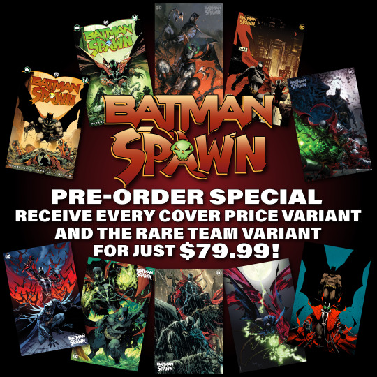
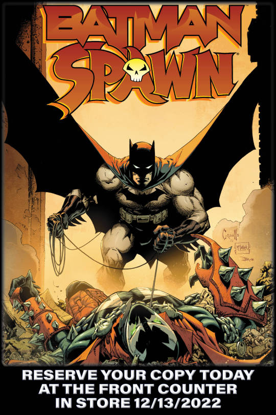
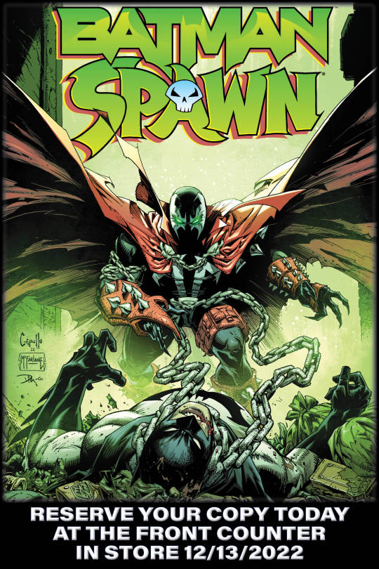
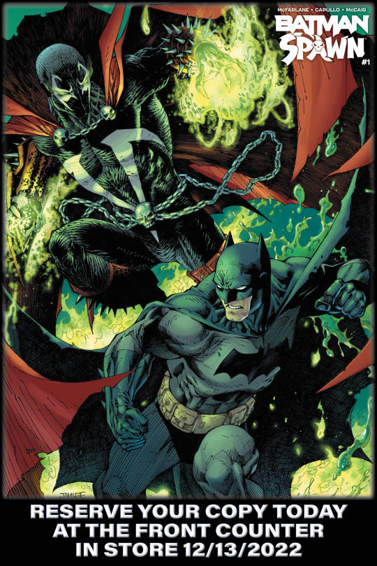
Another promotional campaign for last year's Batman/Spawn crossover. Up top is the social media graphic, and below are the posters I made using a few different covers of the book. The poster designs were never used, which I'm honestly happy about. Not my best work, but that's okay. As a designer, every assignment is an opportunity to learn and grow.
#portfolio#batman#batman spawn#spawn#lcbs#comic book shop#promotional material#social media marketing#graphic design#design blog#poster design
3 notes
·
View notes
Text
Bulk Flyers
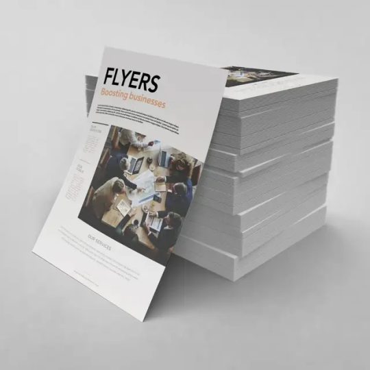
Quapri’s bulk flyer printing delivers vibrant, high-quality prints to enhance your brand’s visibility. Using advanced offset technology, we ensure sharp colors and eye-catching designs. Our eco-friendly printing options support sustainability without compromising quality. With fast turnaround times, we guarantee timely delivery for your marketing needs. Choose from various paper types, including 60 GSM uncoated and 90 GSM art paper, for the perfect finish. Available in A4, A5, and A6 sizes, our flyers suit any promotional need. Customization options allow you to tailor designs to match your brand identity. Trust Quapri for affordable, reliable, and impactful flyer printing.
#Bulk flyer printing#custom flyers#business marketing#promotional flyers#high-quality printing#eco-friendly printing#fast flyer printing#affordable flyers#full-color printing#Quapri printing#flyer design#event flyers#brand promotion#marketing materials#custom printing.
1 note
·
View note
Text
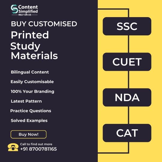
Looking for Customized study materials for your coaching institute? We've got you covered! With our high quality and personalised study materials take your coaching institutes to next level. We provide study materials like books, question banks, class sheets, etc. for different competitive exams such as SSC, CUET, CAT, NDA, Bank PO, RRB and many more. These can be fully personalised and contains 100% your branding with NO co-branding. From printed to soft copies, or digital marketing to web development, or logos, leaflets and prospectus designs, we've got everything you need. Just ask! Contact Now and Grow your institute with us. +91 87007 81165 www.contentsimplified.com
#study materials#customised#personalized#coaching institute#grow#digital marketing#web development#ERP#LMS#logo designing#logo re-designing#leaflet design#prospectus design#coaching merchandise#competitive exams#SSC#CAT#NDA#RRB
1 note
·
View note
Text
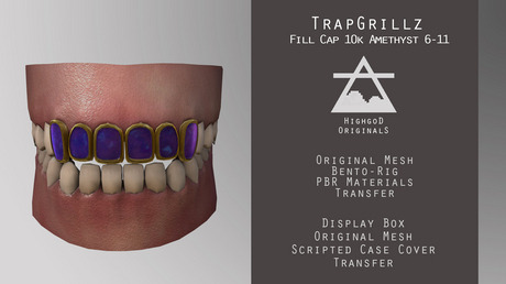
Discover the TrapGrillz FillCap 10k Amethyst for Second Life
Highgod Originals unveils TrapGrillz FillCap 10k Amethyst on Second Life. These luxurious grillz in 10k gold with amethyst cover teeth 6-11. Discover them and explore the amethyst-inspired Dragon Collection at Highgod Originals' in-world location.
Highgod Originals has launched a new and exciting style in their TrapGrillz collection on the Second Life marketplace and at their in-world location. Introducing the TrapGrillz FillCap 10k Amethyst, an exquisite accessory for Second Life residents looking to elevate their virtual style. Key Features of TrapGrillz FillCap 10k Amethyst: Premium Materials: These bento grillz are beautifully plated…
View On WordPress
#10k gold#accessories#blog#CAD#custom grillz#custom jewelry#digital marketing#digital merchandise#digital product#fill cap grillz#game art#game design#gaming#highgod originals#instagram#jewelry design#jewels#PBR materials#primfeed#product design#sansar#second life#SL#teeth#virtual merchandise#virtual world#VR#wearables
0 notes
Text
Project: D&E Granite And renovations
🚀 Excited to share the mobile-friendly website we built for D&E Granite and Renovations! From sleek CTAs to stunning project showcases, it’s designed to turn visitors into leads. 💻 #WebDesign #SmallBusinessSupport #ZenTek365
#Call-to-Action Design#Customer Testimonials#Digital Marketing for Small Business#Granite and Renovations#Granite and Renovations Kitchen Renovation Bath Renovation Home Improvement Mobile Website Design One-Page Website Call-to-Action Design Cus#Granite Materials Showcase#Home Improvement#Kitchen Renovation#Mobile Website Design#One-Page Website#Project Showcase#Responsive Web Design#San Antonio Services#Web Design Portfolio#ZenTek
0 notes
Text
The role of graphic design in building a strong brand identity
Discover how graphic design shapes a brand identity that stands out. Learn its impact on logos, colour palettes, and marketing materials to build trust and recognition. Elevate your brand's identity with professional design solutions. Contact Koobr today to create a lasting impression.
#graphic design for branding#role of graphic design#graphic design UK#brand identity design#professional logo design UK#colour palette branding UK#marketing materials design UK#website graphic design UK#graphic design for small businesses UK#graphic design start-ups UK#Koobr
0 notes