#lousie galan
Explore tagged Tumblr posts
Photo

Louise Galan ph. by Hugo Comte for All About Magazine
255 notes
·
View notes
Text
Robotnik Art Historia- Part Two: The Road to Endgame
Hello there, and welcome to the Robotnik Art Historia, where we journey through the various artistic interpretations of the dearly depraved doc over the course of Archie Sonic’s existence!
In this installment, we observe some the later artists who contributed over the course of what was considered The Classic Era, leading up to issue 50. While many of the regular artists were firmly in place by this point (Manak, Spaziante and Mawhinney), there were still others who would step up from time to time. Many of these artists worked sporadically on the book during this time and after it, with one rather major exception- none the less, each one put a fairly unique stylistic spin on the doc, for better or worse. And that’s what this is all about.
6. Brian Thomas
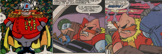
Brian Thomas, prior to coming to Sonic, was an artist for Archie’s Teenage Mutant Ninja Turtle Adventures book, and also did work on the ‘Mighty Mutanimals’ spinoff. By this point the Archie TMNT comic had been cancelled for a while now, and it was likely he was bumped onto the TMNT book under the basis that his experience in drawing humanoid animals would be a boon. Jury’s out on that front, but he wasn’t a bad fit all the same. His Robotnik tended to be drawn with somewhat thin limbs, and he made Robotnik’s nose more bulbous...in that respect, his design was actually closer to that of the Sonic games than the SatAM show.
7. Richard Koslowski
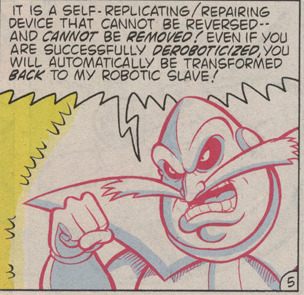
Rich Koslowski was an inker who got to do pencils for a single story, issue 37′s “Bunnie’s Worst Nightmare”. There is not a lot to say about his take on Robotnik other than the fact that he seems to be a middle ground between Mawhinney’s and Thomas’, possessing the visible black pupils of the latter and the overgrown nose of the other. Uniquely though, his depiction of Robotnik would see to treat what is normally Robotnik’s iris as being his actual eye, with the black ‘sclera’ seemingly being the shadows around his eye, a creative conceit that was actually contemplated in SatAM’s concept art before moving on to the final design. An interesting coincidence, to be sure.
8. Manny Galan

A fresh young face at Archie, Galan much like Spaz took some time to really get things down right, but to his credit Galan really managed to do Robotnik justice, drawing him as a massive, menacing sort that was all too appropriate for the character. Galan started out on the Sonic book proper, but his ‘big break’ came when he did the art on the Sonic Quest miniseries. Galan would then become particularly famous for being the main artist on the Knuckles the Echidna series. Over time his style would evolve to become more anime-esque, but whatever the particular period, he always drew the Big Round Guy Well.
9. Kyle Hunter
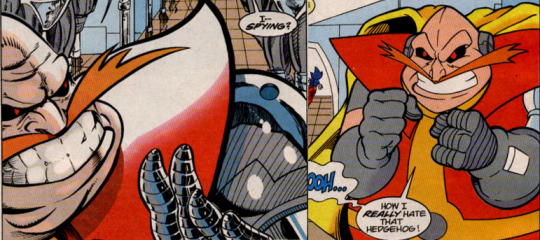
Working primarily as a colorist, Kyle Hunter did pencils for exactly one issue of Sonic, so there’s not a lot to say really. His take on Robotnik is fairly standard, though weirdly enough he was depicted as ultra-detailed on the first page and then far toonier on the second. Why this is, I have no idea- but either way, his Robotnik was competently handled if not particular noteworthy, seeming to take cues from Spaz’s depiction.
10. Nelson Ortega
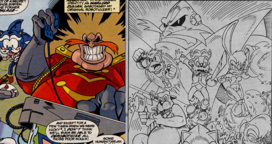
Nelson Ortega is a bit of an odd one. He did several issues for the book, and a lot of that artwork looks... kinda lousy, in all honesty. However, his one bit of Pro-Art, pictured on the left there, demonstrates that he is in fact a stellar artist. This leads me to believe that the lack of skill demonstrated in the book proper may fall on the inker... who, ironically enough, was the previously examined Brian Thomas. Anyway, despite the problems with the final art in the book, his depiction of Robotnik is pretty impressive all the same, ESPECIALLY in the pro-art piece. It’s just a shame would couldn’t have seen more like the latter rather than the former.
11. Sam Maxwell
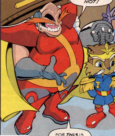
One of the last additions to the ‘classical’ era of the book, Sam Maxwell’s style tended to throw a lot of people for a loop. VERY rubbery and cartoony, many have claimed that his characters look like they’re stuffed with balloons, and a lot of the times the proportions on his characters would shift from page to page or even panel to panel. How good or bad a fit he was depends on your personal tastes, and honestly I always kinda liked his style. His Robotnik was also pretty distinct looking, with a lot of emphasis placed on his teeth and the absolutely MASSIVE size of his ear implants. Maxwell would linger on a while after Endgame and even contribute a bit of pro-Art before disappearing into the ether.
And with that, the second installment of the Robotnik Art Historia comes to a close! Sufficed to say, the art didn’t want for variety in these days, and that trend would continue in the time period we’ll be covering tomorrow- the Post Endgame Era!
53 notes
·
View notes