#look there are probably far better ways of magic wand selecting out the background colors i needed to get rid of
Explore tagged Tumblr posts
Visit Tumblr Blog
Explore Tumblr blogs with no restrictions, modern design and the best experience.
Last Seen Tumblr Blogs


Fun Fact
Tumblr’s website traffic is steadily declining.
Note
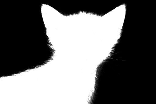
The talk of Jon’s possible Royce emblem got me thinking. And using a program I roughly made this. Shadow on a black background sutoundeld by runes

You inspired me to make my own super rough version! 😅 I grabbed the Royce coat of arms off the wiki as a base and then did unspeakably sloppy things in a photo editing program to combine it with a color-tweaked version of Brynden Rivers' dragon sigil (also from the wiki). It was too much work to change Shadow's dragonflame, and we don't know what color it actually is yet in Resonant!

That said, I did like the suggestion from the comments of the boys preferring a two-headed dragon to represent them being twins. (Alternately, I could see two flipped dragons back to back.)
#resonant asks#look there are probably far better ways of magic wand selecting out the background colors i needed to get rid of#but did i use them? of course not#in fairness to me i haven't used the gimp editor in like five years
40 notes
·
View notes
Text
A Complete Beginner’s Guide to Masking in Photoshop
Several years ago a friend of mine asked me to teach him how masks work in Photoshop. This is my incredibly late response.
We’ll go over the basics of what masks are, what they’re used for and how wielding them properly will take your Photoshop skills to an entirely new level.
What Is a Mask?
Layers are probably the single most important addition to Photoshop since the original version, but layer masks are a close second. I would posit that until you thoroughly understand how and why to use masks, you simply don’t understand the power of Photoshop.
The term “mask” isn’t immediately understandable to someone outside the realm of graphic design. At its simplest definition a mask is a way to apply something to a very specific portion of an image.
There are two primary types of masks: clipping masks and layer masks. These two tools are closely related in concept, but very different in application. Let’s start by discussing layers masks, which are generally what people are referring to when you hear them discuss Photoshop masking.
Layer Masks
A layer mask is something that you apply to a given layer to control the transparency of that layer. Where layer opacity controls the transparency of the entire layer at once, a mask gives you more precise controls over very specific areas. If you want the entire layer to be at 30%, you would lower the opacity, if you want just the left side of a layer to be at 30%, you would use a mask.
When you add a mask to a layer, it covers the entire thing with an invisible grayscale canvas. There are ways to see it that we’ll check out later but just know that as a general rule, applying a mask to a layer won’t cause any immediate visual differences unless you have an active selection at the time.
On this invisible canvas, you can paint white, black or any level of gray in-between. The color that you paint tells Photoshop how opaque to make the pixels at that point. White means 100% opacity and black means 0% opacity.
With this in mind, try to imagine what the mask below would do to a layer:
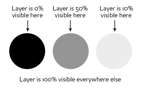
As you can see, if our mask was all white with the three circles shown above, we would have a completely visible layer where in all the white areas, and spots of transparency in the circles. If we apply this mask to a layer, this is the result:
Clipping Masks
Clipping masks are very similar to layer masks only they use one layer to determine the transparency of another. In this scenario, you stack two layers on top of each other with the bottom being the determining factor of the transparency of the top.
Instead of using black and white values though, clipping masks simply borrow transparency from the layers used to make them, namely the bottom layer. If the bottom layer has some areas that are opaque and some areas that are transparent, a clipping mask will apply these values to the top layer.
This one is hard to explain without an example, but becomes crystal clear when you see it in action. Let’s use the two layers shown below and say that our goal here is to cut or “clip” the wood layer to be in the shape of the letters. Notice that, at this point, the wood is the bottom layer and the text is the top layer.

To achieve the effect that we want, simply swap the position of the layers so that the wood is on the top, then go to the Layers menu at the top of your screen and select “Create Clipping Mask” (Command-Option-G). Voila, we now have the effect we were going for. Where the text layer was opaque, the wood layer is now opaque and where the text layer was transparent, the wood layer is now transparent.
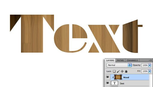
There’s some really interesting functionality here. You can still position and make changes to each of the two layers independently. By dragging around the wood layer, you move the position of the texture inside the bounds of the letters while the letters themselves stay stationary.
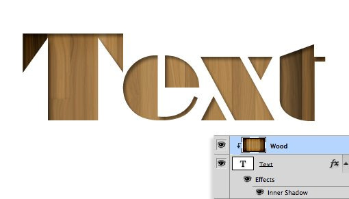
Also, you can apply layer effects to the compilation via the bottom layer. For instance, here’s what happens if we select the text layer and add an Inner Shadow.
Clipping masks fun, functional and underrated, but the truth is that layer masks are far more common in every day use. The information above should be enough to get you off and running with clipping masks so from here on out we’ll focus purely on layer mask functionality.
How Do I Make a Layer Mask?
Now that we have a strong grasp of exactly what masks are and how the two different types of masks differ, let’s see how to create and work with a layer mask.
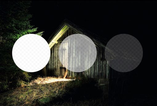
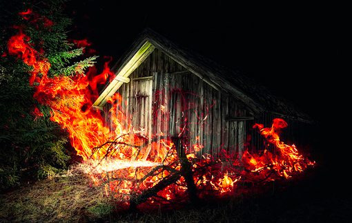
The first thing we need is two layers. I grabbed the two images below from photographers Adrian Durlea and Erik Soderstrom. The shack image is on the bottom and the fire is on the top.

The general idea here is to take some, not all, of the fire and apply it to the shack. The first step is to stack the two images as we see above and set the fire layer’s blending mode to Screen. This will make all of the black pixels transparent, which blends the two images together nicely.
With that one change, this is already a pretty decent image! Let’s say though that we want to only have fire near the door of the shack. To accomplish this, we’ll need to add a mask to the fire layer. Select the fire layer and click the mask icon shown in the image below.
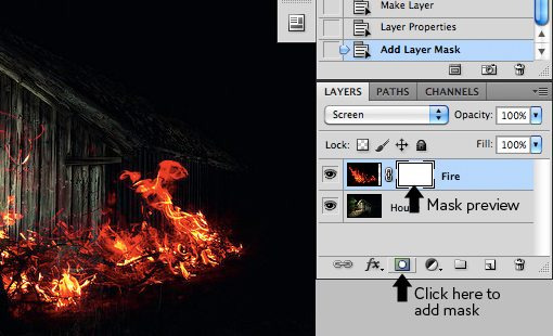
Now, with the mask selected in the layers palette, we grab a soft, black brush and paint out the portions of the fire that we don’t want to see. As we do this, the fire begins to disappear. To bring it back, we simply paint white.
As you can see in the image below, with just a little painting, our fire is now much more centralized to the portion of the image that’s already lit up and therefore looks decently natural.
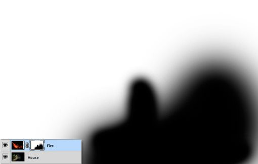
To see the actual mask, Option-Click (Alt-Click on a PC) on the little mask preview in the layers palette (Shift-click to hide the mask completely). After painting out some of our fire, this brings up the following:
Notice that we’re not just constrained to hard edges. The beauty of masks is that you can do anything you want with them as long as you can pull it off in values of gray. This means you can paint, clone, create and fill selections, copy and paste, and all kinds of other actions you perform on the main canvas.
Why Not Just Erase?
Upon first learning how to use masks, most rookies think the same thing: “I can already do all of this with the eraser tool.” Wrong! In fact, as far as I’m concerned, once you learn to mask, you should literally never pick up the eraser tool again because it tends to be so destructive.
What do I mean by destructive? Think about what happens when you use the eraser tool: it erases pixels. Mind you, it doesn’t hide them for a while until you want them back, it “destroys” the pixels. The changes that you make by deleting portions of a layer are permanent and can’t exactly be tweaked later.

This is simply a horrible way to work. With every new iteration of Photoshop, Adobe gives us more and more ways to make non-destructive edits, meaning those that don’t truly alter the original pixel data. For instance, Filters used to be a permanent and destructive change, if you blurred a layer, it was stuck that way! Now, with Smart Filters, you can always go back and adjust or even delete the blur.
This same concept gave birth to masks many years ago. With a mask, you not only have the ability to make remarkably detailed decisions about the transparency of a layer or group of layers, even better, you have the freedom to go back and refine or scrap those changes at any time. If I had erased my fire in the example above, it would be gone forever and bringing it back would involve importing the layer all over again. However, because I used a mask, all I have to do is fill that mask with white and immediately all of my fire detail returns.
To use the metaphor of an actual mask, imagine that you want to change your appearance for Halloween. You have two options: the first is to undergo plastic surgery to permanently change your face to look like that of a scary creature and the second is to wear a mask. In this scenario, the eraser tool is plastic surgery. It’s simply a bad choice when you’re not sure that you want the changes to be permanent. Go with the mask instead.
Advanced Masking Techniques
The information above is an absolute beginner’s guide to masks. Odds are, if you’ve been using Photoshop for a while, not a single piece of this was news to you. In fact, you may be thinking that masks are so incredibly simple that they barely merit conversation.
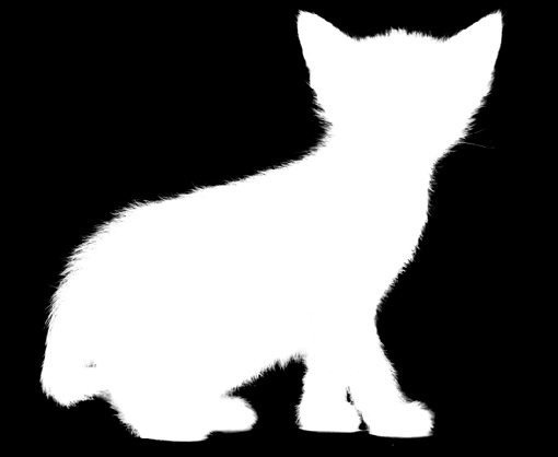
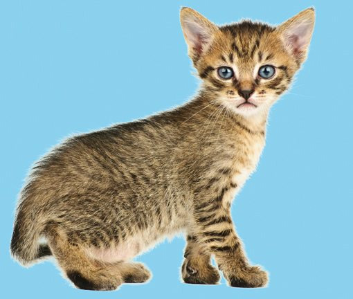
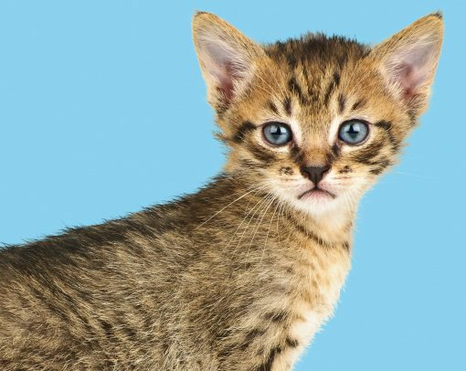
However, masking techniques go from simple to wickedly complex really fast. It’s easy enough to paint some broad strokes to erase large portions of an image, but what if you want to do something more complex? For instance, let’s say we want to take the cat below off of its white background.
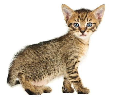
Furry animals make particularly difficult masking subjects. All of that fine hair detail means making an accurate selection will be time consuming. The Magic Wand or even the Pen Tool are of no use to us here. So how do the pros start with the image above and create a mask like the one below?
If you’re ready to find out, keep reading as we undertake this feat!
Change the Channel
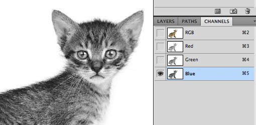
The good news about the cat image is that there is plenty of contrast to work with. The key to making a good mask is finding contrast and knowing how to pull it out. Here we have a fairly dark cat on a bright white background, which means all we have to do is figure out how to leverage our good fortune and convert the contrast already present into a suitable mask.
The first step in a project like this is to jump over to the Channels Palette and look for the channel with the most contrast. So in our case, we want the channel with the darkest cat and the brightest background, which turns out to be the blue channel.
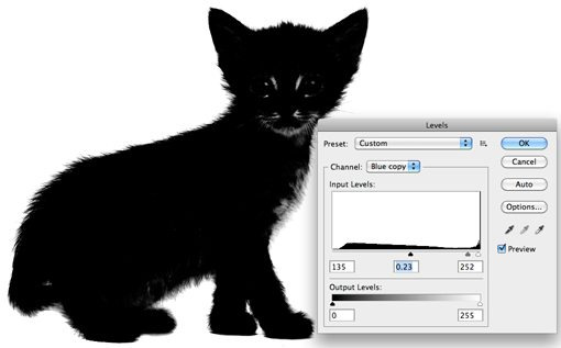
Make a copy of the blue channel, select it and hit Command-L to bring up a Levels Adjustment. Darken the shadows and the midtones so that there is a crazy amount of contrast like in the image below. Be careful to no go too far with this adjustment. You’ll want to zoom in and watch the hair detail on the fringes of the fur to make sure you’re not clipping too much. It doesn’t have to be perfectly black and white at this point, some dark grays are acceptable.
At this point you encounter one of the trickiest steps of the entire process. The goal is to get as much of the cat as closest to black as you can. This is easy for the face potions and other random spots near the center, just grab a black brush and fill them in. But what about the edge of the hair?
It turns out one of the best ways to handle this task is to use a couple of unlikely candidates: the Dodge and Burn Tools. The reason these work so well is that they can accurately target certain ranges of gray extremely accurately. I set the Dodge Tool to target the highlights and the Burn Tool to target the shadows, grab a medium size soft brush and make my way around the edges of the image, burning shadows and dodging highlights until I like the level of detail that I’m seeing.

This may sound like a time-intensive task, and it can be for some images, but in truth the Dodge and Burn Tools feel like magic when you’re using them and take much of the work out. I was able to come up with a great looking silhouette in only a minute or two.
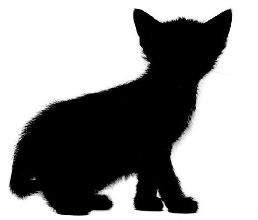
Once you’re done here, hit Command-Shift-I to inverse the channel so that the cat is white and the background is black like in the image below. Remember that, in masking, white is opaque and black is transparent.
Converting the Channel to a Mask
Now that we have a channel that accurately represents what we want from a mask, how do we convert it? There are a few ways to do this but the easiest is just to Command-click on the channel to load a selection. With a selection loaded, return to your cat layer and click the New Mask button. That’s all there is to it!
Defringing the Mask
As you can see, despite a super detailed mask, we still have some white fringing occurring around the edges. Getting rid of this can literally take hours of tedious work if you don’t know what you’re doing. For starters, we can use the fantastic new Masks Palette in conjunction with Refine Edge to make some live adjustments to our mask.
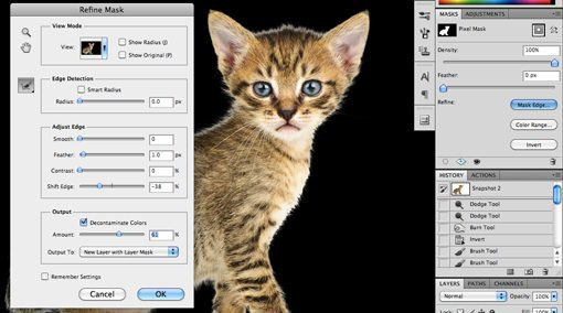
Utilizing these tools properly takes practice. I won’t cover them closely now because it would take so much time but I encourage you to dig in and play with all of the controls to get a feel for what they do. Often, you can patch up a rough edge in seconds with these sliders, but with our cat project I wasn’t really getting any results that I liked so I cancelled out this operation altogether.
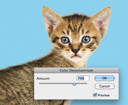
Instead, I went to the Layer menu at the top of the screen and selected Matting>Color Decontaminate. This is an almost hidden command that has the ability to yield some amazing results. As you can see in the image below, it went a long way toward reducing our halo. Note that this command is actually destructive so you should always duplicate your layer before using it.
From here, the last trick I use is to look for problematic areas and actually run the clone brush over the fringes. The mask keeps everything looking nice and cloning replaces unnatural colors with those from the actual fur of the cat in other places. Compare the back and head of the cat in the image below to that above to see the improvement.
Finishing Up
From here it becomes a factor of how much time you want to spend refining your result. With complicated masks like these there is always room for improvement but you’ll find that the point of diminishing returns on your time spent becomes easier and easier to spot as your skill level improves.

The technique we just discussed is just to give you a taste of how advanced masking can become. There are a ton of different types of images to mask and therefore a million different tricks and techniques to figure out along the way which can be mixed and matched on a per-project basis. Practice makes perfect, just be bold and never become intimidated by a masking job that seems too complex. Think through the process one step at a time and find ways to pull out the detail you need.
Conclusion
To sum up, there are two primary types of masks in Photoshop: layer masks and clipping masks. Layer masks use values of gray to assign levels of transparency to specific portions of a layer or group of layers while clipping masks use the transparency of one layer to define that of a different layer or group of layers.
Also, while masking in simple in concept, the actual art takes considerable time, education and practice to master. Leave a comment below and let us know if you learned anything from the information above. Also be sure to share any unique masking techniques or tricks you might have!
Photo Credits: Adrian Durlea, Erik Soderstrom, and Sergiu Bacioiu.
4 notes
·
View notes
Note
Do you have any art tips?
Uhhhhhh Funk im not The Greatest Artist ™ but I’ll try to bestow some Wisdom on you. Keep in mind Art is Subjective and I’m no expert and all that so take everything with a grain of salt but that being said I’ll try to give u Tips and Tricks
-listen so if you have a boring class at school just draw in it. School is great because you have 1. Access to paper at all times 2. Incredibly boring lectures. If you have a study hall that’s the Drawing JACKPOT. Basically what I’m saying is practice all the time when you have energy but like that’s such boring art advice. It’s important but “practice! uwu” is like what people with Natural Art Talent say when they didn’t have to figure everything out from the ground up so it’s kind of aggravating
-There’s gonna be people better than you. Chances are you have a friend who’s better than you because this is Tumblr we all draw. Try Not To Compare Yourself ™ which idk how to do but it’s bad don’t do it
-unless you find a terrible person with worse art than you in which case FUCK DUDE COMPARE YOURSELF TO THEM! THEYRE HORRIBLE AND THEY CANT DRAW FOR SHIT LOOK WHOS LAUGHING NOW!
-“work until your idols become your rivals” is absolute bullshit because your idols are working at it at the same time you are. You fool. You imbecile. I feel like this works better for writing when your idols can become irrelevant or straight up die between you being an aspiring author 8 year old and a tired 30 year old who just wrote The Great American Novel ™ or just kind of. Leave the fandom if you’re writing fanfic. Anyway
-ok that’s all the preachy shit, time for Real Art Advice ™. Keep in mind I do digital cartoony shit with Strong Lineart and cel shading for the most part and I pretty much only draw people so my knowledge is limited to that. if you wanna be a professional artist maybe do other things and Expand your Abilities ™
-Ok first off if you’re using Gimp or Photoshop please love yourself and download Firealpaca or illegally torrent Paint Tool Sai or something. I swear by Firealpaca it cured my depression but like. Photoshop is Trash for drawing. Get Firealpaca it has Line Correction ™
-Keep Line Correction ™ at like. A 5 when you’re sketching and at a 19 (the maximum) when you’re lining, coloring, shading, highlighting, doing literally anything that isn’t sketching
-Sketching digitally can be hard if you’re used to sketching on paper and I find it easier to do a sketch on paper, take a picture of it on my phone or scan it, and line/color it digitally. You do you and figure out what works best
-speaking of which I refused to use sketchbooks until I was Worthy ™ of not drawing on notebook paper and uhhhhhh that’s dumb just get a sketchbook they cost a little more than a notebook at Target it’s not super expensive. Although if you’re not financially in the position to buy a sketchbook anyway, just hoard notebooks from school that you didn’t use much. Bam, that’s your new sketchbook
-the Head Circle Cross Thing and the Spheres For Shoulder, Elbow, and Wrist Thing are good and important and will save you
-hands are hard so use references but bullshit your way through it. eventually they’ll look good (I haven’t gotten there yet)
-HAVE FUN WITH NOSES OH MY GOD. Noses are super fun and cool because there’s, like, infinite variety with them, they can be as long or short, thin or thick, rounded or pointy as you want, you can make them be, like, triangles or circles or more squareish or diamond-shaped, the base of the nose can be about as high or as low on the face as you want, you can make the nostrils prominent or not really there at all, they can add another Layer to a character’s design, oh my goodness noses are so fun. They’re like, severely underrated and oh my god I could gush about how fucking fun noses are
-same with facial expressions. Where you put the pupils and how big they are, how much of the eye is covered by eyelids, the way the eyebrows are, the mouth, tons of other shit. There’s loads of variety and so much you can do and honestly having fun with the facial expression is The Best Part. There’s tons of Face Art Chart Memes floating around, you know the ones, save it to your phone/computer and practice those on your own time it’s fun
-if you don’t know how to do something, avoiding it won’t help you. Just kind of draw around with it in your sketchbook or in a “I’m not posting this” file until you feel confident enough to do it in your Real Projects ™.
-Ok for lining did you know..… it isn’t illegal to erase parts of the lineart to clean it up.… just be careful and draw it back in to the best of your abilities if you erase too far and use a smaller eraser brush/lining brush for this… I know it’s tedious nobody likes lining it’s okay you can do this put on some good music
-use mcfucking references
-eyedrop character’s official colors but adjust said colors based on the color of your background to make them look less funky is my general rule for clothing, I usually pick the hair/skin by myself or from something I’ve already drawn though
-for flats, make sure your lineart is all closed off and there aren’t any “holes” cuz that’ll mess up your coloring
-so how I do flats is I use the magic wand tool to select whatever I want to color, expand selection 3 pixels (in firealpaca you can set it to do this automatically), pick the color I need, turn up the brush to as big as possible, and color it in. It saves the time you’d spend with cleaning up where the color gets outside the lines
-you can do the flats on one layer, but I personally like to do every Object on a different layer so when I do shading, I know what goes on top of what
-if a color is darker than the lineart it looks ugly so pick your line color with caution (or just use black! Unlike shading black lineart tends to go with pretty much everything)
-SHADE YOUR GODDAMN ART. Like, what makes people go “wow holy shit that’s good!” is the shading + highlights, don’t be lazy ya fuck.
-I’d take a break before shading to Refresh Your Eyes ™ but also I constantly forget this is a good idea
-don’t shade with black oh my god. Unless you’re doing Strong Punchy Dramatic Stuff or monochrome black and white stuff, don’t shade with black, and if you’re doing that it’ll probably be drawn into the lineart. Don’t shade with black please we can tell you’re doing it and it looks bad
-highlighting with white isn’t too bad though, especially with the eyes, but it might look too strong in some places
-As a general rule, shading is darker and more saturated, highlighting is lighter and less saturated. Whether it gets warmer or cooler depends a lot on what color or thing you’re shading or what you want the feel of the picture to be and I’m not 100% sure how to do it myself so uh. Trust your gut and change the color if it looks wrong I guess.
-where exactly the shadows or highlights fall depends on lots of things, just kind of. Look at how things work irl maybe? This is the kind of thing that you just have to practice, and it’ll look like shit until suddenly it doesn’t sorry I’m not sure what to say
-One Medium Sized White Dot on a layer above the lineart where the pupil borders the Iris (or the whites of the eyes if you’re like me and you make the pupil and Iris one thing) works for a glint in the eye that makes a person look less dead and more cute. How big you’re gonna make it depends on how adorable you want the person to be
-SMOOTH BORDERS FOR THE SHADING ARE REALLY IMPORTANT IF YOURE DOING CEL SHADING which is why firealpaca is my best friend thanks line smoothing. If you’re doing like. Soft shading or painterly shit or other kinds of shading it’s less Super Important but like. Still be sort of neat. Unless being really messy and sketchy is what you’re going for but even then you still need to be sort of careful
-for simple backgrounds, it’s like. Easy to make it interesting. Add polka dots to the background or a big old square or a gradient or a cloud filter or something the possibilities are endless. Another option is to straight up make it transparent and write a secret message in white on the side. But uhh never do a blank white background at the very least fill it with a solid color
-ok style is kind of hard because I never had to struggle to find my style? I just “drew in my handwriting” so to speak and then if along the way I realized something looked shitty I just changed how I drew it slightly? I guess a thing you could do if you’re in tune enough is look at the styles of things you do like and things you don’t and figure out why you do and don’t like it. “I like how *2010s cartoon* does Eyes!” great take that general concept. “I hate how this shitty yaoi has enormous hands!” great then don’t do that. It’s all Personal Preference my dude style is Your Own Thing
-notes aren’t everything but fuck do they feel nice. Self reblogs are fine but don’t overdo it, I’d say reblog it Twice to account for time zones and tag it as self reblog so as to not be a dick
This got long whoops. That’s all I can think of but I hope this helps it’s All I Know
4 notes
·
View notes
Text
Tutorial: Custom Skylines for Sims 2
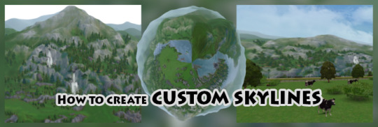
This tutorial is for advanced Photoshop users that bring up quite a lot free time and have The Sims 3 installed on their computers. The skylines are being created by sticking screenshots from Sims 3 worlds together and warping that into a globe. Because of this, you could also use other games with cool landscapes or real life photos, but it probably won’t fit to the Sims 2 artstyle.
1. Start Sims 3 - preperation
Choose a world with an interesing landscape and be sure to be in live mode
If you haven’t already: Turn up the resolution. Optional: If your graphic card supports virtual 2k or 4k resolutions, enable this in the NVIDIA or AMD settings and choose the highest resolution in TS3. Your game will look weird and your laptop screen/monitor might not even support this resolution, but the pictures will look better afterwards.
Turn off all weather effects and seasons, only leave summer activated
Make sure it’s daytime
If your PC can handle it for a short time: Maximixe all settings except the reflection quality, turn that off (doesn’t fit to the TS2 graphics)
2. Making photos
Pause the game and hit tab, move the camera up or down (E, Q), tilt it so it looks like the following video. The goal is to shoot three photos of your object. The first one is the left, the second the main (center) and the third one the right part of your object. Let’s say it’s a mountain with a waterfall in the center and the mountain extends to the left and right. It is important that the left and right part end with the same landscaping because the ends will meet afterwards. You can also make it ‘seamless’ in Photoshop later, but that’s just more work.
Be sure that your object (ex. main part of a mountain) is in the center and the top is not cut off (ex. a hill or trees). You can ignore the bottom since you won’t see much of that later. Also be sure that you are not too far away from the object because oftherwise it gets really foggy. Here's a picture of the three divisions you have to pay attention to.

Hide any icons and the red border by pressing F10.
Rotate the camera to the left (,) and take a photo (C). Memorize the object that is on the right corner and move the camera again to the right (.) until that objects disappers to the left. With that, it’s easier to stick the images together later (fewer gaps). You are in the center again. Make a photo (C). Note the object on the right again and move the camera one more time to the right (.) Be sure that the objects disappears. Make a photo again (C).
You are done here. But I recommend to do this a few more times from slightly different angles here and there. You are set up perfectly at this point, so it would be annoying if you would have to start at step 1.1 again if the original pictures did not meet your requirements.
3. Photoshop: Sticking the images together
In the following gifs I’m using the German Photoshop version. Be sure to follow the text and look at the position of each option.
Open a picture of a set in photoshop, click on the lock in the layers and enlarge the Canvas Size’s width (3x your current width).
Drag and drop your two other pictures in Photoshop and align everything correctly (does not have to be perfect yet).
For now, don’t edit the images. We don’t know how it will look on the globe in Sims 2. Once you see the globe with your texture in the game, you will be surprised how much information of your original picture is lost under the terrain of your neighborhood. I’m sorry.
4. Photoshop: Forming the globe; edit the skyline package file
Merge all your layers into one. Copy the picture (without empty borders) and paste it into a new one (with the same dimensions). You can undo the first step in the original picture if you like. Now in the new picture, resize it to 2048x2048px. Don’t be scared. Flip it vertically (CTRL + T, then right-click and check the tick at the end). You may ask what’s going on at this point.
Go to filters > warp filters > polar coordinates. Leave the first option checked. Click OK and here you go. That’s your globe. You will notice that the center looks totally weird and stuff in there is deformed. We will look at this later. If you don’t want your head too much, you can rotate the camera by pressing ‘R’ and then click with the mouse.
Position the globe in the center of the picture if it isn’t already. Save it as png and clone (or edit) either lowedeus or criquettes horizon object. Change the texture by buildung a DXT and upload the globe image. Save and start your game.
5. Sims 2: Take a detailed look at your beta horizon
In your neighborhood, place the globe wherever you like. Now take a look at things that are too big (often houses are too big) and things that disappear under your terrain. Take a look at the colors. Just look at your horizon. Take screenshots of everything you don’t like. If you don’t like your skyline at all (of course, at this point is isn’t perfekt at all!), consider creating a new one with the other images taken. Also snap a screenshot that shows the horizon from under the terrain. You want to clean this up since it’s confusing and ugly. You now have several screenshots of the Sims 2 that show screenshots of the Sims 3 in the background.
6. Photoshop: Work on your skyline
Now go back to your flat skyline and remove everything that’s ugly. Remove houses or trees that appear too big (yeah...), remove the sky (the magic wand tool should be enough) and tweak the colors. For this, I put in a Sims 2 screenshot and pick the grass color & copy the color code. Now I replace the color in the skyline with the new one. If the edges of the landscapes are too frayed, mark the image and add a mask. Round the corners and play a bit with the options. I recommend to place a black background behind the image because otherwise you won’t see the edges that well. Oh and don’t forget the smooth transition between the images!
Make sure everything in the buttom is cleaned up with grass or water. You won’t see that in lot view for example, but it’s nicer in neighborhood view. Or if you want to do it the fast way: After transforming the skyline into a globe, just cut a hole into the center of the globe.
Enlarge the Canvas Size a bit and move everything to the right. Select a part of the very right corner, copy it and paste it before the left beginning. At the end of the copied part, insert a help line and now, merge the corner piece with the actual picture. Now you have to make the two ends (that are now both at the left corner) seamless. If you are finished, cut off the copied corner and paste it where it originally came from (far right edge). You should delete the original corner (that's now behind the new one) so it doesn't stand out.
If you are happy with the results or interested how it will look like, repeat main step 4 and 5 again. Be sure to exclude the empty part of the picture that came from enlarging the canvas size when you want to form the globe.
7. Done
... after thousands attemps and hours of work in photoshop. At least I hope so! Now don’t forget to include this little thing in the center of your globe so you can actually see where you placed it in the neighborhood:

224 notes
·
View notes