#look it's one thing to inspect html and find it but the other half is php and as you know
Explore tagged Tumblr posts
Visit Tumblr Blog
Explore Tumblr blogs with no restrictions, modern design and the best experience.
Last Seen Tumblr Blogs


Fun Fact
130K people were victims of a chain letter scam that affected Tumblr in May 2011.
Text
today is wednesday de puta madre
#I was never inducted on how the software works so a huge part of it involves me reverse engineering the whole thing until I find the code#look it's one thing to inspect html and find it but the other half is php and as you know#php doesn't appear in the html inspection#usually I guide myself through routing#but sometimes a main php file would be referencing a thousand others so
2 notes
·
View notes
Text
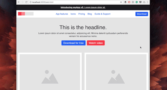
How to make a fake post
I just watched the excellent video by Sarah Z about fake made-up posts, i.e. screenshots of Tumblr posts that are clearly stupid made-up stories, except the screenshot itself is also fake. And that inspired me to do something I’ve wanted to do for a while: Make an illustrated tutorial on how to make a fake a screenshot of a tweet, Tumblr post or similar that are indistinguishable from real ones.
This works on desktop on any modern web browser, though the specific UI will look a bit different depending on which one you use.
Step 0 - if your web browser is Safari on Desktop
This step is not necessary if you’re using Firefox, Chrome, or something based on either (typically the latter) like Edge or Brave.
Open the preferences.
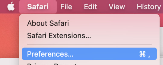
[Image description: Screenshot of Safari app menu open on macOS with the “Preferences…” item highlighted]
Go to “Advanced” (the last tab) and at the very bottom, make sure that “Show Develop menu in menu bar” is selected.
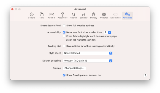
[Image description: Screenshot of Safari preferences window on the “Advanced” tab; the last item, a checkbox saying “Show Develop menu in menu bar”, is selected.]
Step 1 - Open an example post
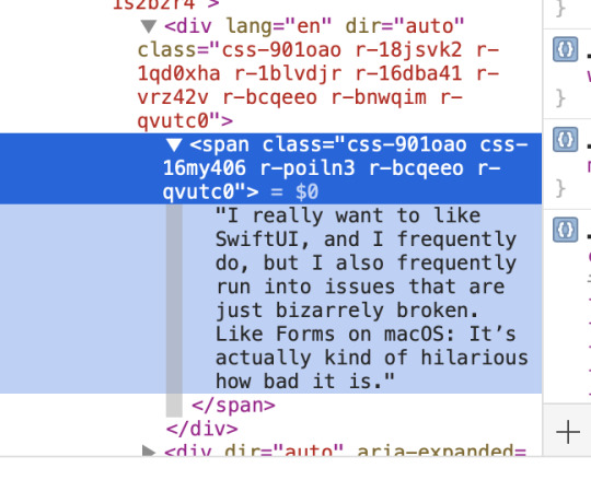
I’m going to fake a tweet by myself, which you can find here: https://twitter.com/zcochrane/status/1406004939810295808
The specific tweet is irrelevant; this one is about programming and complains about how SwiftUI, a technology for developing Mac apps, is full of issues. It’s easiest to choose one that doesn’t have any hashtags.
Step 2 - Drill down
Now, right-click on the text of the tweet, and select “inspect element” or whatever menu item in your browser sounds the most like that.
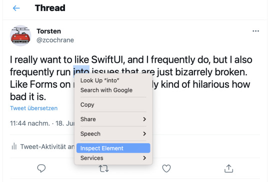
[Image description: Screenshot of a random tweet by twitter user zcochrane (aka me); a word is highlighted, and a context menu is open, with the item “Inspect Element” highlighted]
This isn’t to give anyone ideas; you can assume that all the worst people on the internet already know this. That is really the key. I want to destroy your trust in screenshots of posts, especially screenshots of very weird and outlandish posts. (Note also that this isn’t the only way to do this, and it only works on desktop, but it illustrates how easy it is).
On the bottom or the side of the window, a new, complicated view will open that shows you the inner workings of the web page. You can do a lot of fun stuff here, but we don’t need a lot for our purposes.
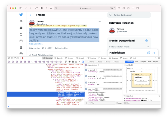
[Image: Screenshot of a Safari window showing the same tweet, now with a blue box is lying over the text, and the bottom half of the window has a complex view of details about the text in that box and its place in the site’s internal structure.]
The important thing is the tree view on the left. If you can’t see the text of the tweet in there, click the disclosure triangle next to whatever thing is highlighted there. This should show the text directly.
[Image: Screenshot of a tree view showing various HTML elements. They are all expanded. The inner-most item is just the text of the tweet from above.]
Step 3 - Change it
Now you can just double-click on that text and enter something new.
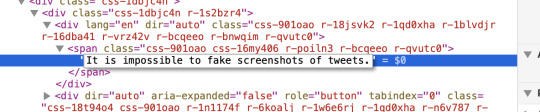
[Image: Screenshot of the same tree view, now wider (don’t know why the window just jumped around on me). In place of the static text from last time is now a text entry box containing the words “It is impossible to fake screenshots of tweets.”]
Once you press enter or the focus moves somewhere else, the text on the website will change.
Step 4 - Take a screenshot
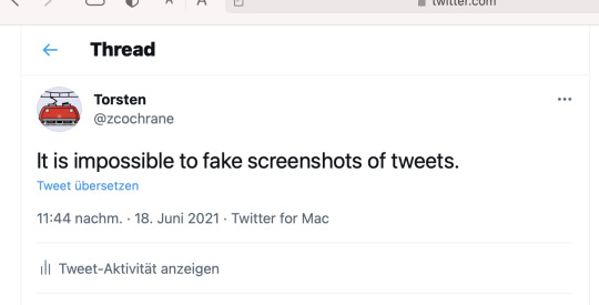
[Image: Screenshot of a tweet, the same one we’ve had the entire time with the same user and date, but it now says “It is impossible to fake screenshots of tweets.”]
And that’s it! If you want to do something with multiple paragraphs like your average Tumblr post, then you probably need to know a little HTML, but it’s not that hard.
For better results, you can also use the same technique to fake the time and date when the post was made, so it looks like the post was deleted - though honestly, that’s probably not worth the time and effort. And you can, of course, also change the number of likes and retweets, or for Tumblr posts, the number of notes, and other information like the user names and so on to fit whatever narrative you want to tell.
What makes this particular technique so useful is that you cannot compare pixels or whatever to prove a tweet is fake. The pixels that the screenshot grabs get generated in exactly the same way as for the real tweet. Proving that this tweet is fake is somewhere between difficult and completely impossible.
The point
This may seem like dangerous secret knowledge to some, maybe. But it’s really not that difficult, and you can assume that everyone who has more than a passing knowledge of web development (and that is a lot of people) can figure this out if they want to. (And if you’re into web development but didn’t know this yet, try it out, it’s super useful!)
In particular, you can safely assume that all the worst people in the world already know this trick and others like it. What this means is that every single screenshot ever is suspicious. Did that post really exist? There is genuinely no way of knowing, unless you find the actual post in question.
That means if you see a particularly stupid post, or a particularly offensive one, by someone you respect, or by someone you hate, or by just anyone in general, then you must always assume that it’s very possibly fake. It takes maybe ten seconds more to create a fake screenshot than to create a real one.
Not all screenshots are fake, and sometimes screenshots are the only source for something because the original was deleted, but all screenshots might be fake, and so you should tread very carefully when one is involved.
There is also an inverse to that: If you want to share a post or a tweet somewhere that you know is real, you should always include a link to the original (and also an image description for people using screen readers). If it’s a good post, it allows people to leave the hearts and stars where they belong; if not (or if that’s debatable), it provides the context and proves that the post is, in fact, real.
24 notes
·
View notes
Text
Methods to Discover & Add Nofollow Hyperlinks to Your Web site [Step by Step]
New Post has been published on http://tiptopreview.com/how-to-find-add-nofollow-links-to-your-website-step-by-step/
Methods to Discover & Add Nofollow Hyperlinks to Your Web site [Step by Step]

Ever watch these sport exhibits the place contestants have to seek out the designer product in a sea of knockoffs?
Watching the contestants squint to look at the merchandise is my favourite half. One, as a result of I really like sport exhibits, but in addition as a result of upon first look, you actually can’t inform the distinction.
Effectively, nofollow hyperlinks are form of like that. You may’t inform them other than common hyperlinks simply by taking a look at them.

As Google continues to prioritize hyperlinks in its rating standards, holding observe of them ought to be in your website positioning to-do record.
So, how do you test for nofollow hyperlinks and add them to your webpages? All these solutions, and extra, under.
What’s a nofollow hyperlink?
Everytime you hyperlink textual content, that hyperlink goes inside an HTML tag. A nofollow hyperlink is an attribute inside the tag that tells Google to disregard the hyperlink when crawling the web page. That is usually utilized in remark sections, boards, and, extra lately, sponsored hyperlinks.
This issues as a result of hyperlinks significantly affect your search engine rating. And whether or not you’re linking internally or externally, doing so tells Google the vacation spot web page is effective. This, in flip, could enhance the web page’s rating — it’s known as “link juice.”
The higher your hyperlink constructing, the higher your possibilities of rating greater.
So, while you inform Google to disregard a hyperlink, the vacation spot web page is not going to get any hyperlink juice. For example, let’s say a meals blogger uploads a weblog put up. The blogger can add a nofollow attribute to the remark part to inform Google, “Hey, any link included here isn’t associated with me and I don’t vouch for it.”
With Google tightening up its linking requirements, it’s necessary that manufacturers perceive how they work.
How To Inform if a Hyperlink Is Nofollow
To discover a nofollow hyperlink, you may observe certainly one of two routes: Use a instrument that may do it for you (bounce to that part right here) or test it your self. For the DIY possibility, listed below are the steps:
1. Whilst you’re on the web page, right-click and choose the “Inspect” possibility.

2. Maintain Command + F or Ctrl + F to search for “nofollow” within the code.
three. Scroll to seek out the highlighted nofollow attributes. It ought to look one thing like this:
How To Make a Nofollow Hyperlink
Making a nofollow hyperlink is so simple as including rel=”nofollow” to the anchor tag inside the HTML code. If that made no sense, no worries. Right here’s the breakdown:
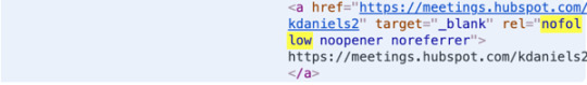
The code for a daily hyperlink appears to be like like this:
<a rel="noopener" goal="_blank" href="http://www.destinationURL.com">The linked textual content goes right here </a>
Whenever you’re including a nofollow hyperlink attribute, the attribute will go between the vacation spot URL and the linked textual content, like this:
<a rel="noopener" goal="_blank" href="http://www.example.com/" rel="nofollow">The linked textual content goes right here </a>
Right here’s an instance utilizing the HubSpot Weblog:
<a rel="noopener" goal="_blank" href="http://www.blog.hubspot.com/" rel="nofollow"> Head to the HubSpot Weblog </a>
After getting the hyperlink, you may add it to the suitable part of the supply code in your content material administration system (CMS).
How To Make a Nofollow Hyperlink in WordPress
When making a nofollow hyperlink in WordPress, you have got two choices: manually inputting one into the HTML code or utilizing a plugin. Discover the steps for every under.
Making a Nofollow Hyperlink in WordPress Manually
1. Choose the anchor textual content you need to add a hyperlink to.
2. Click on the hyperlink image so as to add a hyperlink into the sphere.
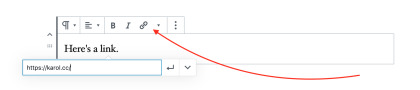
Image Source
three. Click on on the three dots and choose “Edit HTML.”
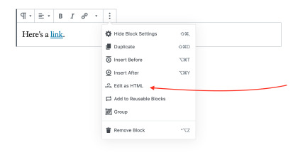
Image Source
four. Add the rel=”nofollow” attribute and also you’re all set.
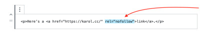
Image Source
Should you’re utilizing an older model of WordPress, you’ll have to entry the supply code via the “Text” tab.

Image Source
Then, manually add the nofollow attribute.
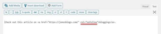
Image Source
As soon as that’s carried out, return to the “Virtual” tab and proceed modifying the put up.
Making a Nofollow Hyperlink in WordPress With a Plugin
When making a nofollow hyperlink with a plugin, the steps will fluctuate relying on the plugin you put in. Nonetheless, right here’s an instance of the way it works utilizing the “All in One SEO for WordPress” plugin.
1. Begin by downloading the plugin and making it energetic.
2. Create or edit a put up or web page.
three. In your modifying textual content field, choose the anchor textual content and click on on the hyperlink image.
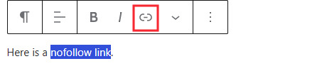
Image Source
four. Paste the vacation spot hyperlink into the sphere.
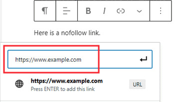
Image Source
5. In the identical field, you’ll additionally see further choices for the hyperlink, together with the “Add ‘nofollow’ to hyperlink” possibility.
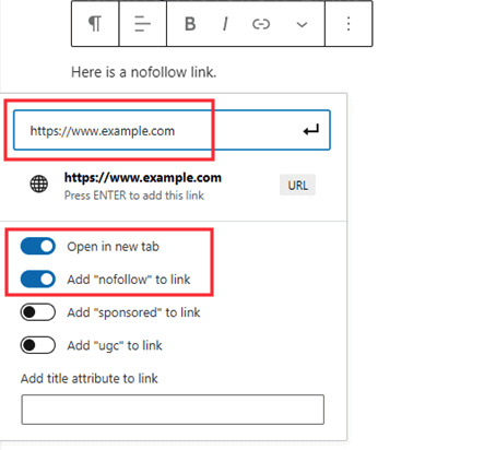
Image Source
6. Be sure that this feature is chosen, and also you’re carried out.
Professional-tip: Plenty of website positioning plugins have the nofollow hyperlink characteristic included. So, if you happen to’re trying to optimize your website, you may set up a plugin with a number of website positioning options.
Nofollow Hyperlink Checker Instruments
1. MozBar
This free Google Chrome extension, created by the website positioning software program firm Moz, highlights the entire nofollow hyperlinks on a web page in a single click on.

It additionally tracks adopted, inside, and exterior hyperlinks in addition to key phrases on the web page. MozBar identifies every hyperlink kind by coloration, making it simple to rapidly scan the web page and discover what you’re on the lookout for.
One factor to remember whereas utilizing the extension is that nofollow hyperlinks underneath dropdown menus is not going to seem as you scroll down. You’ll need to click on the menu to disclose the nofollow hyperlinks. Confused? See the GIF under.

2. Varvy
With Varvy’s free nofollow instrument, discovering nofollow hyperlinks is so simple as getting into the web page’s URL and clicking “Test.” It doesn’t provide a visible for the place the nofollow hyperlinks are situated on the web page, however it does inform you what number of there are.

This is likely one of the easiest methods to get an concept of what number of nofollow hyperlinks you have got. From there, you’ll have to seek out different instruments to perform your subsequent steps.
three. NoFollow
NoFollow is a free extension obtainable on Chrome and Firefox. Just like MozBar, it identifies the nofollow hyperlinks on the web page and highlights them utilizing a crimson dotted field.

So long as the extension is energetic, it’s going to work on each web page you go to with out prompting. Simply as with the MozBar, if a hyperlink underneath a dropdown menu has a nofollow attribute, you gained’t see it till you click on the dropdown menu.
So, consider your self like a sport present contestant. To win the website positioning sport, you need to take a better take a look at your web site hyperlinks. This can hold you on Google’s good facet and enhance your odds of touchdown (and staying) on the primary web page of the SERP.

Source link
0 notes
Photo

How to become a designer without going to design school
This is a guide to show yourself design.
Update: I first published this blog post over a year ago. Since then, I've gotten many emails posing for more guidance and more comfortable to follow steps, and that I finally found one: Designlab. This course wasn't around once I was learning, but man does I wish it had been – it might have made the entire process tons less daunting. I like it's that it gives you project assignments and then connects you to a design mentor who gives you feedback (they have specialized ones who work on Facebook).
Step 1. Learn to ascertain
The biggest mistake is jumping into Photoshop too fast. Learning Photoshop doesn't cause you to a designer, a bit like buying paintbrushes doesn't force you to an artist. Start with inspiration.
First, find out how to draw.
You don't need to sit during a room with a bunch of other artists trying to draw an unadorned woman.
You don't even need to get that good at drawing. Just learn some basics so you'll be comfortable sketching with a pen.
You only need to do one thing to find out the way to draw: get the book you can draw in 30 days and practice for half an hour a day for a month. I've checked out tons of drawing books, and this is often one among the simplest.
Learn graphic design theory
Start with the book Picture This. It's a storybook of Little Red Riding hood but will teach you the foundations of graphic design at an equivalent time.
Learn about color, typography, and designing with a grid. If you'll find an area class to show the fundamentals of graphic design, take it.
Go through a couple of those tutorials a day.
Learn some basics in user experience
There are tons of books about user experience. Start with these two quick reads which will get you within the right mindset:
The Design of Everyday Things
Don't Make Me Think!
Learn how to write down
Here may be a sure sign of a nasty designer: their mockups are crammed with placeholder text like Lorem Ipsum. An honest designer may be a good communicator. A genuine designer thinks through the whole experience, choosing every word carefully. Write for humans. Don't write within the academic tone; you wont to make yourself sound smart in-class papers.
Read Made to Stick, one among my favorite books of all time. it'll teach you ways to suck in your readers.
Voice and Tone maybe a website filled with gems of excellent writing examples.
Step 2. find out how to use Photoshop and Illustrator.
Hooray! Now you've got a reasonably solid foundation – both visual and UX. You're able to learn Photoshop. I like to recommend starting with Illustrator first then moving on to Photoshop after. Illustrator is what designers use to form logos and icons.
Learn Illustrator
There are plenty of books, online tutorials, and in-person classes to find out Illustrator. Choose the design that works best for you. Here are the books I found especially helpful to find out the fundamentals of Illustrator:
Adobe Illustrator Classroom in a Book – It's boring, but if you get through a minimum of half it, you'll know your way around Illustrator pretty much.
Vector Basic Training – This book teaches you ways to form things in Illustrator that look good.
Now for the fun stuff! Follow these online tutorials and be impressed by what you'll make. Here are two of my favorites – a logo and a scenic landscape.
Learn Photoshop
There are 1,000,000 and one tutorials out there. Tons of them are crap. Fortunately, there are sites with really top quality tutorials. PSDTuts by TutsPlus is one among them.
Here's a simple photoshop tutorial to form an iPhone app.
Here's another good photoshop tutorial to make an internet site mockup.
Carve out an hour or two a day to travel through some tutorials, and you'll be impressed by how quickly you progress.
Step 3. Learn some specialties
Do you want to style mobile apps? Websites? Infographics? Explore all of them, and pick and choose those you enjoy to urge better at them.
Learn Logo Design
Learn how to form a logo that doesn't suck: Logo Design Love
You'll want to require it a step further than a logo, though. Learn to make a uniform brand – from the web site to the business cards. Inspect this book, Designing Brand Identity.
Learn Mobile App Design
Start with this tutorial to urge your feet wet on visual design for mobile apps.
Read this short but very comprehensive and well-thought-out book on iPhone design: Tapworthy. it'll teach you ways to form an app that looks good and straightforward to use.
Geek out on the apps on your phone. Critique them. What works and what doesn't?
Learn Web Design
Read Don't Make Me Think to find out how to make an internet site that folks find it easy to use and navigate.
Read The Principles of Beautiful Web Design if you would like help making an internet site look good.
Make an inventory of the websites you think that are beautifully designed. Note what they need in common.
Now for the hairy question of whether you would like to understand HTML/CSS as a designer: It depends on the work. Knowing it'll offer you a foothold within the job market. Albeit you don't want to be an internet developer, it helps to understand some basics. That way, you recognize what's possible and what isn't.
There are numerous excellent resources to find out HTML and CSS:
My favorite free one is Web Design Tuts.
My favorite paid one (pretty affordable at $25/month) is Treehouse. If you're ranging from the start and need someone to elucidate things clearly and comprehensively, splurge for Treehouse tutorials.
Step 4. Build your portfolio
You don't get to attend a flowery design school to urge employment as a designer. But you are doing need a solid portfolio.
How does one build a portfolio if you're starting for the primary time? The great news is you don't get to work on real projects with real clients to create a portfolio. Structure your side projects. Here are a couple of ideas:
Design silly ideas for t-shirts.
Find poorly designed websites and redesign them.
Got a thought for an iPhone app? Mock it up.
Join a team at Startup Weekend and be a designer on a weekend project.
Enter a 99 designs contest to practice designing to a quick.
Do the graphic design exercises within the Creative Workshop book.
Find an area nonprofit and offer to design for free.
Resist the temptation to incorporate everything you've ever designed in your portfolio. This is often an area for your most vital work only.
Steal, steal, steal initially. Don't worry about being original – which will come later, once you're more comfortable with your craft. Once you learn an instrument, you find out how to play other people's songs before composing your own. The same goes for design. Steal like an artist.
Go to Dribbble for inspiration on a number of the simplest designers. Inspect pttrns for iOS inspiration, and patterntap for website inspiration.
Step 5: Get employment as a designer.
When I first started learning design, I visited an employment search workshop for designers. I walked into an area filled with designers who had far more experience than I did – 5, 10, 15 years experience. All of them were trying to find jobs. That wasn't very safe. There I used to be, trying to show myself design, knowing I used to be competing with these experienced designers.
And yet six months later, I got a design job. There was one key difference between many opposite designers that gave me an edge and me: I knew how to work with developers.
The most significant factor to spice up your employability is to be ready to work with developers. Learn some interaction design. Learn some basic HTML and CSS. Designers within the tech industry (interaction designers, web designers, app designers) are in too high demand and are paid well. That's where the roles are immediate.
If you don't have any experience working with developers, get some. Attend Startup Weekend, attend hackathons, or find a developer through a project collaboration site.
Make a private website and make your portfolio the centerpiece.
Go out and make serendipity happen – tell everyone you recognize that you're trying to find employment as a designer. You never know who might know someone.
Research companies and agencies you would possibly have an interest in. Look on LinkedIn for 2nd and 3rd-degree connections to people that work on those companies and invite intros. The most uncomplicated thanks to getting employment is thru a link. If you don't have a connection, there's still tons you'll do to offer yourself a foothold.
Once you've got the work, continue learning.
I've been at Exec for a year now and have learned plenty of the work. I hunt down designers who are far more talented than I'm and learn from them. I find design classes (good online ones are Skillshare, General Assembly, Treehouse, and TutsPlus). I work on side projects. I geek out at the planning section of bookstores. there's still such a lot to find out and to enhance on.
Keep your skills sharp, and always continue learning.
0 notes
Text
Building a Scalable CSS Architecture With BEM and Utility Classes
Maintaining a large-scale CSS project is hard. Over the years, we’ve witnessed different approaches aimed at easing the process of writing scalable CSS. In the end, we all try to meet the following two goals:
Efficiency: we want to reduce the time spent thinking about how things should be done and increase the time doing things.
Consistency: we want to make sure all developers are on the same page.
For the past year and a half, I’ve been working on a component library and a front-end framework called CodyFrame. We currently have 220+ components. These components are not isolated modules: they’re reusable patterns, often merged into each other to create complex templates.
The challenges of this project have forced our team to develop a way of building scalable CSS architectures. This method relies on CSS globals, BEM, and utility classes.
I’m happy to share it! 👇
CSS Globals in 30 seconds
Globals are CSS files containing rules that apply crosswise to all components (e.g., spacing scale, typography scale, colors, etc.). Globals use tokens to keep the design consistent across all components and reduce the size of their CSS.
Here’s an example of typography global rules:
/* Typography | Global */ :root { /* body font size */ --text-base-size: 1em;
/* type scale */ --text-scale-ratio: 1.2; --text-xs: calc((1em / var(--text-scale-ratio)) / var(--text-scale-ratio)); --text-sm: calc(var(--text-xs) * var(--text-scale-ratio)); --text-md: calc(var(--text-sm) * var(--text-scale-ratio) * var(--text-scale-ratio)); --text-lg: calc(var(--text-md) * var(--text-scale-ratio)); --text-xl: calc(var(--text-lg) * var(--text-scale-ratio)); --text-xxl: calc(var(--text-xl) * var(--text-scale-ratio)); }
@media (min-width: 64rem) { /* responsive decision applied to all text elements */ :root { --text-base-size: 1.25em; --text-scale-ratio: 1.25; } }
h1, .text-xxl { font-size: var(--text-xxl, 2.074em); } h2, .text-xl { font-size: var(--text-xl, 1.728em); } h3, .text-lg { font-size: var(--text-lg, 1.44em); } h4, .text-md { font-size: var(--text-md, 1.2em); } .text-base { font-size: 1em; } small, .text-sm { font-size: var(--text-sm, 0.833em); } .text-xs { font-size: var(--text-xs, 0.694em); }
BEM in 30 seconds
BEM (Blocks, Elements, Modifiers) is a naming methodology aimed at creating reusable components.
Here’s an example:
<header class="header"> <a href="#0" class="header__logo"><!-- ... --></a> <nav class="header__nav"> <ul> <li><a href="#0" class="header__link header__link--active">Homepage</a></li> <li><a href="#0" class="header__link">About</a></li> <li><a href="#0" class="header__link">Contact</a></li> </ul> </nav> </header>
A block is a reusable component
An element is a child of the block (e.g., .block__element)
A modifier is a variation of a block/element (e.g., .block--modifier, .block__element--modifier).
Utility classes in 30 seconds
A utility class is a CSS class meant to do only one thing. For example:
<section class="padding-md"> <h1>Title</h1> <p>Lorem ipsum dolor sit amet consectetur adipisicing elit.</p> </section>
<style> .padding-sm { padding: 0.75em; } .padding-md { padding: 1.25em; } .padding-lg { padding: 2em; } </style>
You can potentially build entire components out of utility classes:
<article class="padding-md bg radius-md shadow-md"> <h1 class="text-lg color-contrast-higher">Title</h1> <p class="text-sm color-contrast-medium">Lorem ipsum dolor sit amet consectetur adipisicing elit.</p> </article>
You can connect utility classes to CSS globals:
/* Spacing | Global */ :root { --space-unit: 1em; --space-xs: calc(0.5 * var(--space-unit)); --space-sm: calc(0.75 * var(--space-unit)); --space-md: calc(1.25 * var(--space-unit)); --space-lg: calc(2 * var(--space-unit)); --space-xl: calc(3.25 * var(--space-unit)); } /* responsive rule affecting all spacing variables */ @media (min-width: 64rem) { :root { --space-unit: 1.25em; /* 👇 this responsive decision affects all margins and paddings */ } }
/* margin and padding util classes - apply spacing variables */ .margin-xs { margin: var(--space-xs); } .margin-sm { margin: var(--space-sm); } .margin-md { margin: var(--space-md); } .margin-lg { margin: var(--space-lg); } .margin-xl { margin: var(--space-xl); } .padding-xs { padding: var(--space-xs); } .padding-sm { padding: var(--space-sm); } .padding-md { padding: var(--space-md); } .padding-lg { padding: var(--space-lg); } .padding-xl { padding: var(--space-xl); }
A real-life example
Explaining a methodology using basic examples doesn’t bring up the real issues nor the advantages of the method itself.
Let’s build something together!
We’ll create a gallery of card elements. First, we’ll do it using only the BEM approach, and we’ll point out the issues you may face by going BEM only. Next, we’ll see how Globals reduce the size of your CSS. Finally, we’ll make the component customizable introducing utility classes to the mix.
Here’s a look at the final result:
CodePen Embed Fallback
Let’s start this experiment by creating the gallery using only BEM:
<div class="grid"> <article class="card"> <a class="card__link" href="#0"> <figure> <img class="card__img" src="/image.jpg" alt="Image description"> </figure>
<div class="card__content"> <h1 class="card__title-wrapper"><span class="card__title">Title of the card</span></h1>
<p class="card__description">Lorem ipsum dolor sit amet consectetur adipisicing elit. Tempore, totam?</p> </div>
<div class="card__icon-wrapper" aria-hidden="true"> <svg class="card__icon" viewBox="0 0 24 24"><!-- icon --></svg> </div> </a> </article>
<article class="card"><!-- card --></article> <article class="card"><!-- card --></article> <article class="card"><!-- card --></article> </div>
In this example, we have two components: .grid and .card. The first one is used to create the gallery layout. The second one is the card component.
First of all, let me point out the main advantages of using BEM: low specificity and scope.
/* without BEM */ .grid {} .card {} .card > a {} .card img {} .card-content {} .card .title {} .card .description {}
/* with BEM */ .grid {} .card {} .card__link {} .card__img {} .card__content {} .card__title {} .card__description {}
If you don’t use BEM (or a similar naming method), you end up creating inheritance relationships (.card > a).
/* without BEM */ .card > a.active {} /* high specificity */
/* without BEM, when things go really bad */ div.container main .card.is-featured > a.active {} /* good luck with that 😦 */
/* with BEM */ .card__link--active {} /* low specificity */
Dealing with inheritance and specificity in big projects is painful. That feeling when your CSS doesn’t seem to be working, and you find out it’s been overwritten by another class 😡! BEM, on the other hand, creates some kind of scope for your components and keeps specificity low.
But… there are two main downsides of using only BEM:
Naming too many things is frustrating
Minor customizations are not easy to do or maintain
In our example, to stylize the components, we’ve created the following classes:
.grid {} .card {} .card__link {} .card__img {} .card__content {} .card__title-wrapper {} .card__title {} .card__description {} .card__icon-wrapper {} .card__icon {}
The number of classes is not the issue. The issue is coming up with so many meaningful names (and having all your teammates use the same naming criteria).
For example, imagine you have to modify the card component by including an additional, smaller paragraph:
<div class="card__content"> <h1 class="card__title-wrapper"><span class="card__title">Title of the card</span></h1> <p class="card__description">Lorem ipsum dolor...</p> <p class="card__description card__description--small">Lorem ipsum dolor...</p> <!-- 👈 --> </div>
How do you call it? You could consider it a variation of the .card__description element and go for .card__description .card__description--small. Or, you could create a new element, something like .card__small, .card__small-p, or .card__tag. See where I’m going? No one wants to spend time thinking about class names. BEM is great as long as you don’t have to name too many things.
The second issue is dealing with minor customizations. For example, imagine you have to create a variation of the card component where the text is center-aligned.
You’ll probably do something like this:
<div class="card__content card__content--center"> <!-- 👈 --> <h1 class="card__title-wrapper"><span class="card__title">Title of the card</span></h1> <p class="card__description">Lorem ipsum dolor sit amet consectetur adipisicing elit. Tempore, totam?</p> </div>
<style> .card__content--center { text-align: center; } </style>
One of your teammates, working on another component (.banner), is facing the same problem. They create a variation for their component as well:
<div class="banner banner--text-center"></div>
<style> .banner--text-center { text-align: center; } </style>
Now imagine you have to include the banner component into a page. You need the variation where the text is aligned in the center. Without checking the CSS of the banner component, you may instinctively write something like banner banner--center in your HTML, because you always use --center when you create variations where the text is center-aligned. Not working! Your only option is to open the CSS file of the banner component, inspect the code, and find out what class should be applied to align the text in the center.
How long would it take, 5 minutes? Multiply 5 minutes by all the times this happens in a day, to you and all your teammates, and you realize how much time is wasted. Plus, adding new classes that do the same thing contributes to bloating your CSS.
CSS Globals and utility classes to the rescue
The first advantage of setting global styles is having a set of CSS rules that apply to all the components.
For example, if we set responsive rules in the spacing and typography globals, these rules will affect the grid and card components as well. In CodyFrame, we increase the body font size at a specific breakpoint; because we use “em” units for all margins and paddings, the whole spacing system is updated at once generating a cascade effect.
Spacing and typography responsive rules — no media queries on a component level
As a consequence, in most cases, you won’t need to use media queries to increase the font size or the values of margins and paddings!
/* without globals */ .card { padding: 1em; }
@media (min-width: 48rem) { .card { padding: 2em; } .card__content { font-size: 1.25em; } }
/* with globals (responsive rules intrinsically applied) */ .card { padding: var(--space-md); }
Not just that! You can use the globals to store behavioral components that can be combined with all other components. For example, in CodyFrame, we define a .text-component class that is used as a “text wrapper.” It takes care of line height, vertical spacing, basic styling, and other things.
If we go back to our card example, the .card__content element could be replaced with the following:
<!-- without globals --> <div class="card__content"> <h1 class="card__title-wrapper"><span class="card__title">Title of the card</span></h1> <p class="card__description">Lorem ipsum dolor sit amet consectetur adipisicing elit. Tempore, totam?</p> </div>
<!-- with globals --> <div class="text-component"> <h1 class="text-lg"><span class="card__title">Title of the card</span></h1> <p>Lorem ipsum dolor sit amet consectetur adipisicing elit. Tempore, totam?</p> </div>
The text component will take care of the text formatting, and make it consistent across all the text blocks in your project. Plus, we’ve already eliminated a couple of BEM classes.
Finally, let’s introduce the utility classes to the mix!
Utility classes are particularly useful if you want the ability to customize the component later on without having to check its CSS.
Here’s how the structure of the card component changes if we swap some BEM classes with utility classes:
<article class="card radius-lg"> <a href="#0" class="block color-inherit text-decoration-none"> <figure> <img class="block width-100%" src="image.jpg" alt="Image description"> </figure>
<div class="text-component padding-md"> <h1 class="text-lg"><span class="card__title">Title of the card</span></h1> <p class="color-contrast-medium">Lorem ipsum dolor sit amet consectetur adipisicing elit. Tempore, totam?</p> </div>
<div class="card__icon-wrapper" aria-hidden="true"> <svg class="icon icon--sm color-white" viewBox="0 0 24 24"><!-- icon --></svg> </div> </a> </article>
The number of BEM (component) classes has shrunk from 9 to 3:
.card {} .card__title {} .card__icon-wrapper {}
That means you won’t deal much with naming things. That said, we can’t avoid the naming issue entirely: even if you create Vue/React/SomeOtherFramework components out of utility classes, you still have to name the components.
All the other BEM classes have been replaced by utility classes. What if you have to make a card variation with a bigger title? Replace text-lg with text-xl. What if you want to change the icon color? Replace color-white with color-primary. How about aligning the text in the center? Add text-center to the text-component element. Less time thinking, more time doing!
Why don’t we just use utility classes?
Utility classes speed-up the design process and make it easier to customize things. So why don’t we forget about BEM and use only utility classes? Two main reasons:
By using BEM together with utility classes, the HTML is easier to read and customize.
Use BEM for:
DRY-ing the HTML from the CSS you don’t plan on customizing (e.g., behavioral CSS-like transitions, positioning, hover/focus effects),
advanced animations/effects.
Use utility classes for:
the “frequently-customized” properties, often used to create component variations (like padding, margin, text-alignment, etc.),
elements that are hard to identify with a new, meaningful class name (e.g., you need a parent element with a position: relative → create <div class="position-relative"><div class="my-component"></div></div>).
Example:
<!-- use only Utility classes --> <article class="position-relative overflow-hidden bg radius-lg transition-all duration-300 hover:shadow-md col-6@sm col-4@md"> <!-- card content --> </article>
<!-- use BEM + Utility classes --> <article class="card radius-lg col-6@sm col-4@md"> <!-- card content --> </article>
For these reasons, we suggest that you don’t add the !important rule to your utility classes. Using utility classes doesn’t need to be like using a hammer. Do you think it would be beneficial to access and modify a CSS property in the HTML? Use a utility class. Do you need a bunch of rules that won’t need editing? Write them in your CSS. This process doesn’t need to be perfect the first time you do it: you can tweak the component later on if required. It may sound laborious “having to decide” but it’s quite straightforward when you put it to practice.
Utility classes are not your best ally when it comes to creating unique effects/animations.
Think about working with pseudo-elements, or crafting unique motion effects that require custom bezier curves. For those, you still need to open your CSS file.
Consider, for example, the animated background effect of the card we’ve designed. How hard would it be to create such an effect using utility classes?
The same goes for the icon animation, which requires animation keyframes to work:
.card:hover .card__title { background-size: 100% 100%; }
.card:hover .card__icon-wrapper .icon { animation: card-icon-animation .3s; }
.card__title { background-image: linear-gradient(transparent 50%, alpha(var(--color-primary), 0.2) 50%); background-repeat: no-repeat; background-position: left center; background-size: 0% 100%; transition: background .3s; }
.card__icon-wrapper { position: absolute; top: 0; right: 0; width: 3em; height: 3em; background-color: alpha(var(--color-black), 0.85); border-bottom-left-radius: var(--radius-lg); display: flex; justify-content: center; align-items: center; }
@keyframes card-icon-animation { 0%, 100% { opacity: 1; transform: translateX(0%); } 50% { opacity: 0; transform: translateX(100%); } 51% { opacity: 0; transform: translateX(-100%); } }
Final result
Here’s the final version of the cards gallery. It also includes grid utility classes to customize the layout.
CodePen Embed Fallback
File structure
Here’s how the structure of a project built using the method described in this article would look like:
project/ └── main/ ├── assets/ │ ├── css/ │ │ ├── components/ │ │ │ ├── _card.scss │ │ │ ├── _footer.scss │ │ │ └── _header.scss │ │ ├── globals/ │ │ │ ├── _accessibility.scss │ │ │ ├── _breakpoints.scss │ │ │ ├── _buttons.scss │ │ │ ├── _colors.scss │ │ │ ├── _forms.scss │ │ │ ├── _grid-layout.scss │ │ │ ├── _icons.scss │ │ │ ├── _reset.scss │ │ │ ├── _spacing.scss │ │ │ ├── _typography.scss │ │ │ ├── _util.scss │ │ │ ├── _visibility.scss │ │ │ └── _z-index.scss │ │ ├── _globals.scss │ │ ├── style.css │ │ └── style.scss │ └── js/ │ ├── components/ │ │ └── _header.js │ └── util.js └── index.html
You can store the CSS (or SCSS) of each component into a separate file (and, optionally, use PostCSS plugins to compile each new /component/componentName.css file into style.css). Feel free to organize the globals as you prefer; you could also create a single globals.css file and avoid separating the globals in different files.
Conclusion
Working on large-scale projects requires a solid architecture if you want to open your files months later and don’t get lost. There are many methods out there that tackle this issue (CSS-in-JS, utility-first, atomic design, etc.).
The method I’ve shared with you today relies on creating crosswise rules (globals), using utility classes for rapid development, and BEM for modular (behavioral) classes.
You can learn in more detail about this method on CodyHouse. Any feedback is welcome!
The post Building a Scalable CSS Architecture With BEM and Utility Classes appeared first on CSS-Tricks.
Building a Scalable CSS Architecture With BEM and Utility Classes published first on https://deskbysnafu.tumblr.com/
0 notes
Text
Building a Scalable CSS Architecture With BEM and Utility Classes
Maintaining a large-scale CSS project is hard. Over the years, we’ve witnessed different approaches aimed at easing the process of writing scalable CSS. In the end, we all try to meet the following two goals:
Efficiency: we want to reduce the time spent thinking about how things should be done and increase the time doing things.
Consistency: we want to make sure all developers are on the same page.
For the past year and a half, I’ve been working on a component library and a front-end framework called CodyFrame. We currently have 220+ components. These components are not isolated modules: they’re reusable patterns, often merged into each other to create complex templates.
The challenges of this project have forced our team to develop a way of building scalable CSS architectures. This method relies on CSS globals, BEM, and utility classes.
I’m happy to share it!

CSS Globals in 30 seconds
Globals are CSS files containing rules that apply crosswise to all components (e.g., spacing scale, typography scale, colors, etc.). Globals use tokens to keep the design consistent across all components and reduce the size of their CSS.
Here’s an example of typography global rules:
/* Typography | Global */ :root { /* body font size */ --text-base-size: 1em;
/* type scale */ --text-scale-ratio: 1.2; --text-xs: calc((1em / var(--text-scale-ratio)) / var(--text-scale-ratio)); --text-sm: calc(var(--text-xs) * var(--text-scale-ratio)); --text-md: calc(var(--text-sm) * var(--text-scale-ratio) * var(--text-scale-ratio)); --text-lg: calc(var(--text-md) * var(--text-scale-ratio)); --text-xl: calc(var(--text-lg) * var(--text-scale-ratio)); --text-xxl: calc(var(--text-xl) * var(--text-scale-ratio)); }
@media (min-width: 64rem) { /* responsive decision applied to all text elements */ :root { --text-base-size: 1.25em; --text-scale-ratio: 1.25; } }
h1, .text-xxl { font-size: var(--text-xxl, 2.074em); } h2, .text-xl { font-size: var(--text-xl, 1.728em); } h3, .text-lg { font-size: var(--text-lg, 1.44em); } h4, .text-md { font-size: var(--text-md, 1.2em); } .text-base { font-size: 1em; } small, .text-sm { font-size: var(--text-sm, 0.833em); } .text-xs { font-size: var(--text-xs, 0.694em); }
BEM in 30 seconds
BEM (Blocks, Elements, Modifiers) is a naming methodology aimed at creating reusable components.
Here’s an example:
<header class="header"> <a href="#0" class="header__logo"><!-- ... --></a> <nav class="header__nav"> <ul> <li><a href="#0" class="header__link header__link--active">Homepage</a></li> <li><a href="#0" class="header__link">About</a></li> <li><a href="#0" class="header__link">Contact</a></li> </ul> </nav> </header>
A block is a reusable component
An element is a child of the block (e.g., .block__element)
A modifier is a variation of a block/element (e.g., .block--modifier, .block__element--modifier).
Utility classes in 30 seconds
A utility class is a CSS class meant to do only one thing. For example:
<section class="padding-md"> <h1>Title</h1> <p>Lorem ipsum dolor sit amet consectetur adipisicing elit.</p> </section>
<style> .padding-sm { padding: 0.75em; } .padding-md { padding: 1.25em; } .padding-lg { padding: 2em; } </style>
You can potentially build entire components out of utility classes:
<article class="padding-md bg radius-md shadow-md"> <h1 class="text-lg color-contrast-higher">Title</h1> <p class="text-sm color-contrast-medium">Lorem ipsum dolor sit amet consectetur adipisicing elit.</p> </article>
You can connect utility classes to CSS globals:
/* Spacing | Global */ :root { --space-unit: 1em; --space-xs: calc(0.5 * var(--space-unit)); --space-sm: calc(0.75 * var(--space-unit)); --space-md: calc(1.25 * var(--space-unit)); --space-lg: calc(2 * var(--space-unit)); --space-xl: calc(3.25 * var(--space-unit)); } /* responsive rule affecting all spacing variables */ @media (min-width: 64rem) { :root { --space-unit: 1.25em; /* 👇 this responsive decision affects all margins and paddings */ } }
/* margin and padding util classes - apply spacing variables */ .margin-xs { margin: var(--space-xs); } .margin-sm { margin: var(--space-sm); } .margin-md { margin: var(--space-md); } .margin-lg { margin: var(--space-lg); } .margin-xl { margin: var(--space-xl); } .padding-xs { padding: var(--space-xs); } .padding-sm { padding: var(--space-sm); } .padding-md { padding: var(--space-md); } .padding-lg { padding: var(--space-lg); } .padding-xl { padding: var(--space-xl); }
A real-life example
Explaining a methodology using basic examples doesn’t bring up the real issues nor the advantages of the method itself.
Let’s build something together!
We’ll create a gallery of card elements. First, we’ll do it using only the BEM approach, and we’ll point out the issues you may face by going BEM only. Next, we’ll see how Globals reduce the size of your CSS. Finally, we’ll make the component customizable introducing utility classes to the mix.
Here’s a look at the final result:
CodePen Embed Fallback
Let’s start this experiment by creating the gallery using only BEM:
<div class="grid"> <article class="card"> <a class="card__link" href="#0"> <figure> <img class="card__img" src="/image.jpg" alt="Image description"> </figure>
<div class="card__content"> <h1 class="card__title-wrapper"><span class="card__title">Title of the card</span></h1>
<p class="card__description">Lorem ipsum dolor sit amet consectetur adipisicing elit. Tempore, totam?</p> </div>
<div class="card__icon-wrapper" aria-hidden="true"> <svg class="card__icon" viewBox="0 0 24 24"><!-- icon --></svg> </div> </a> </article>
<article class="card"><!-- card --></article> <article class="card"><!-- card --></article> <article class="card"><!-- card --></article> </div>
In this example, we have two components: .grid and .card. The first one is used to create the gallery layout. The second one is the card component.
First of all, let me point out the main advantages of using BEM: low specificity and scope.
/* without BEM */ .grid {} .card {} .card > a {} .card img {} .card-content {} .card .title {} .card .description {}
/* with BEM */ .grid {} .card {} .card__link {} .card__img {} .card__content {} .card__title {} .card__description {}
If you don’t use BEM (or a similar naming method), you end up creating inheritance relationships (.card > a).
/* without BEM */ .card > a.active {} /* high specificity */
/* without BEM, when things go really bad */ div.container main .card.is-featured > a.active {} /* good luck with that 😦 */
/* with BEM */ .card__link--active {} /* low specificity */
Dealing with inheritance and specificity in big projects is painful. That feeling when your CSS doesn’t seem to be working, and you find out it’s been overwritten by another class

! BEM, on the other hand, creates some kind of scope for your components and keeps specificity low.
But… there are two main downsides of using only BEM:
Naming too many things is frustrating
Minor customizations are not easy to do or maintain
In our example, to stylize the components, we’ve created the following classes:
.grid {} .card {} .card__link {} .card__img {} .card__content {} .card__title-wrapper {} .card__title {} .card__description {} .card__icon-wrapper {} .card__icon {}
The number of classes is not the issue. The issue is coming up with so many meaningful names (and having all your teammates use the same naming criteria).
For example, imagine you have to modify the card component by including an additional, smaller paragraph:
<div class="card__content"> <h1 class="card__title-wrapper"><span class="card__title">Title of the card</span></h1> <p class="card__description">Lorem ipsum dolor...</p> <p class="card__description card__description--small">Lorem ipsum dolor...</p> <!-- 👈 --> </div>
How do you call it? You could consider it a variation of the .card__description element and go for .card__description .card__description--small. Or, you could create a new element, something like .card__small, .card__small-p, or .card__tag. See where I’m going? No one wants to spend time thinking about class names. BEM is great as long as you don’t have to name too many things.
The second issue is dealing with minor customizations. For example, imagine you have to create a variation of the card component where the text is center-aligned.
You’ll probably do something like this:
<div class="card__content card__content--center"> <!-- 👈 --> <h1 class="card__title-wrapper"><span class="card__title">Title of the card</span></h1> <p class="card__description">Lorem ipsum dolor sit amet consectetur adipisicing elit. Tempore, totam?</p> </div>
<style> .card__content--center { text-align: center; } </style>
One of your teammates, working on another component (.banner), is facing the same problem. They create a variation for their component as well:
<div class="banner banner--text-center"></div>
<style> .banner--text-center { text-align: center; } </style>
Now imagine you have to include the banner component into a page. You need the variation where the text is aligned in the center. Without checking the CSS of the banner component, you may instinctively write something like banner banner--center in your HTML, because you always use --center when you create variations where the text is center-aligned. Not working! Your only option is to open the CSS file of the banner component, inspect the code, and find out what class should be applied to align the text in the center.
How long would it take, 5 minutes? Multiply 5 minutes by all the times this happens in a day, to you and all your teammates, and you realize how much time is wasted. Plus, adding new classes that do the same thing contributes to bloating your CSS.
CSS Globals and utility classes to the rescue
The first advantage of setting global styles is having a set of CSS rules that apply to all the components.
For example, if we set responsive rules in the spacing and typography globals, these rules will affect the grid and card components as well. In CodyFrame, we increase the body font size at a specific breakpoint; because we use “em” units for all margins and paddings, the whole spacing system is updated at once generating a cascade effect.

Spacing and typography responsive rules — no media queries on a component level
As a consequence, in most cases, you won’t need to use media queries to increase the font size or the values of margins and paddings!
/* without globals */ .card { padding: 1em; }
@media (min-width: 48rem) { .card { padding: 2em; } .card__content { font-size: 1.25em; } }
/* with globals (responsive rules intrinsically applied) */ .card { padding: var(--space-md); }
Not just that! You can use the globals to store behavioral components that can be combined with all other components. For example, in CodyFrame, we define a .text-component class that is used as a “text wrapper.” It takes care of line height, vertical spacing, basic styling, and other things.
If we go back to our card example, the .card__content element could be replaced with the following:
<!-- without globals --> <div class="card__content"> <h1 class="card__title-wrapper"><span class="card__title">Title of the card</span></h1> <p class="card__description">Lorem ipsum dolor sit amet consectetur adipisicing elit. Tempore, totam?</p> </div>
<!-- with globals --> <div class="text-component"> <h1 class="text-lg"><span class="card__title">Title of the card</span></h1> <p>Lorem ipsum dolor sit amet consectetur adipisicing elit. Tempore, totam?</p> </div>
The text component will take care of the text formatting, and make it consistent across all the text blocks in your project. Plus, we’ve already eliminated a couple of BEM classes.
Finally, let’s introduce the utility classes to the mix!
Utility classes are particularly useful if you want the ability to customize the component later on without having to check its CSS.
Here’s how the structure of the card component changes if we swap some BEM classes with utility classes:
<article class="card radius-lg"> <a href="#0" class="block color-inherit text-decoration-none"> <figure> <img class="block width-100%" src="image.jpg" alt="Image description"> </figure>
<div class="text-component padding-md"> <h1 class="text-lg"><span class="card__title">Title of the card</span></h1> <p class="color-contrast-medium">Lorem ipsum dolor sit amet consectetur adipisicing elit. Tempore, totam?</p> </div>
<div class="card__icon-wrapper" aria-hidden="true"> <svg class="icon icon--sm color-white" viewBox="0 0 24 24"><!-- icon --></svg> </div> </a> </article>
The number of BEM (component) classes has shrunk from 9 to 3:
.card {} .card__title {} .card__icon-wrapper {}
That means you won’t deal much with naming things. That said, we can’t avoid the naming issue entirely: even if you create Vue/React/SomeOtherFramework components out of utility classes, you still have to name the components.
All the other BEM classes have been replaced by utility classes. What if you have to make a card variation with a bigger title? Replace text-lg with text-xl. What if you want to change the icon color? Replace color-white with color-primary. How about aligning the text in the center? Add text-center to the text-component element. Less time thinking, more time doing!
Why don’t we just use utility classes?
Utility classes speed-up the design process and make it easier to customize things. So why don’t we forget about BEM and use only utility classes? Two main reasons:
By using BEM together with utility classes, the HTML is easier to read and customize.
Use BEM for:
DRY-ing the HTML from the CSS you don’t plan on customizing (e.g., behavioral CSS-like transitions, positioning, hover/focus effects),
advanced animations/effects.
Use utility classes for:
the “frequently-customized” properties, often used to create component variations (like padding, margin, text-alignment, etc.),
elements that are hard to identify with a new, meaningful class name (e.g., you need a parent element with a position: relative → create <div class="position-relative"><div class="my-component"></div></div>).
Example:
<!-- use only Utility classes --> <article class="position-relative overflow-hidden bg radius-lg transition-all duration-300 hover:shadow-md col-6@sm col-4@md"> <!-- card content --> </article>
<!-- use BEM + Utility classes --> <article class="card radius-lg col-6@sm col-4@md"> <!-- card content --> </article>
For these reasons, we suggest that you don’t add the !important rule to your utility classes. Using utility classes doesn’t need to be like using a hammer. Do you think it would be beneficial to access and modify a CSS property in the HTML? Use a utility class. Do you need a bunch of rules that won’t need editing? Write them in your CSS. This process doesn’t need to be perfect the first time you do it: you can tweak the component later on if required. It may sound laborious “having to decide” but it’s quite straightforward when you put it to practice.
Utility classes are not your best ally when it comes to creating unique effects/animations.
Think about working with pseudo-elements, or crafting unique motion effects that require custom bezier curves. For those, you still need to open your CSS file.
Consider, for example, the animated background effect of the card we’ve designed. How hard would it be to create such an effect using utility classes?
The same goes for the icon animation, which requires animation keyframes to work:
.card:hover .card__title { background-size: 100% 100%; }
.card:hover .card__icon-wrapper .icon { animation: card-icon-animation .3s; }
.card__title { background-image: linear-gradient(transparent 50%, alpha(var(--color-primary), 0.2) 50%); background-repeat: no-repeat; background-position: left center; background-size: 0% 100%; transition: background .3s; }
.card__icon-wrapper { position: absolute; top: 0; right: 0; width: 3em; height: 3em; background-color: alpha(var(--color-black), 0.85); border-bottom-left-radius: var(--radius-lg); display: flex; justify-content: center; align-items: center; }
@keyframes card-icon-animation { 0%, 100% { opacity: 1; transform: translateX(0%); } 50% { opacity: 0; transform: translateX(100%); } 51% { opacity: 0; transform: translateX(-100%); } }
Final result
Here’s the final version of the cards gallery. It also includes grid utility classes to customize the layout.
CodePen Embed Fallback
File structure
Here’s how the structure of a project built using the method described in this article would look like:
project/ └── main/ ├── assets/ │ ├── css/ │ │ ├── components/ │ │ │ ├── _card.scss │ │ │ ├── _footer.scss │ │ │ └── _header.scss │ │ ├── globals/ │ │ │ ├── _accessibility.scss │ │ │ ├── _breakpoints.scss │ │ │ ├── _buttons.scss │ │ │ ├── _colors.scss │ │ │ ├── _forms.scss │ │ │ ├── _grid-layout.scss │ │ │ ├── _icons.scss │ │ │ ├── _reset.scss │ │ │ ├── _spacing.scss │ │ │ ├── _typography.scss │ │ │ ├── _util.scss │ │ │ ├── _visibility.scss │ │ │ └── _z-index.scss │ │ ├── _globals.scss │ │ ├── style.css │ │ └── style.scss │ └── js/ │ ├── components/ │ │ └── _header.js │ └── util.js └── index.html
You can store the CSS (or SCSS) of each component into a separate file (and, optionally, use PostCSS plugins to compile each new /component/componentName.css file into style.css). Feel free to organize the globals as you prefer; you could also create a single globals.css file and avoid separating the globals in different files.
Conclusion
Working on large-scale projects requires a solid architecture if you want to open your files months later and don’t get lost. There are many methods out there that tackle this issue (CSS-in-JS, utility-first, atomic design, etc.).
The method I’ve shared with you today relies on creating crosswise rules (globals), using utility classes for rapid development, and BEM for modular (behavioral) classes.
You can learn in more detail about this method on CodyHouse. Any feedback is welcome!
The post Building a Scalable CSS Architecture With BEM and Utility Classes appeared first on CSS-Tricks.
source https://css-tricks.com/building-a-scalable-css-architecture-with-bem-and-utility-classes/
from WordPress https://ift.tt/2VOSRW2 via IFTTT
0 notes
Text
React JS vs React Native: Everything that You Wanted to Know

Generally, there is confusion about how React.js and React Native differ from each other, especially among novice developers.
Even they come up with parents React.js and React Native and common technology backbone. But that doesn’t mean that there are no differences. However, to understand them, anyone first needs to have the basic knowledge about both the framework.
In this blog, you will get a clear idea about how ReactJS and React Native differ from each other.
What is React?
Before developing ReactJS, Facebook was confronted with a major user experience task – building a dynamic UI with high performance. They have aimed to create an app that can simultaneously update news feed along with chats.
They decide to do this on the JavaScript because they had to optimize the development process itself. They added HXP and the Facebook markup syntax into the JS coordinate system, but it seems impossible. In the end, they released ReactJS library based on JavaScript and XHP symbiosis in 2011.
A JavaScript library which uses a new way of rendering webpages along with the speed of JavaScript. Thus, ReactJS is highly dynamic and responsive to user input. This gives a new way of approach for web application development.
An open-source tool based on JavaScript is released in 2013. Due to its revolutionary approach to programming user interfaces setting it becomes wide popular.
Advantage of ReactJS
Easy to Learn and Use
ReactJS is much easier to learn and use. Any developer who comes from a JavaScript background can easily understand and start creating web apps using React.
Creating Dynamic Web Applications Becomes Easier
To create a dynamic web application specifically with HTML was tricky, which requires complex coding, but React JS solved that issue and makes it easier. It provides less coding and gives more functionality.
Reusable Components:
A ReactJS web application is made up of multiple components, and each component has its logic and controls. These components can be reused wherever you need them. The reusable code helps to make your apps easier to develop and maintain.
Performance Enrichment:
The presence of virtual DOM makes it high performing library. It is due do whenever you write a react component it will be not directly written in DOM it will write into virtual DOM, leading to smoother and faster performance.
The Support of Handy Tools:
ReactJS supports a handy set of tools that make the task of the developers understandable and easier. In this, you can select, examine, and edit their current Props and State.
Known to be SEO Friendly:
Traditional JavaScript frameworks have an issue in dealing with SEO. ReactJS overcomes this problem, which helps developers to be easily navigated on various search engines. It is because ReactJS applications can run on the server, and the virtual DOM will be rendering and returning to the browser as a regular web page.
The Benefit of Having JavaScript Library:
Today, ReactJS gaining popularity among web developers. It is offering a very rich JavaScript library which provides more flexibility to the web developers to choose the way they want.
Scope for Testing the Codes:
ReactJS applications are easy to test. It offers a scope where the developer can test and debug their codes with the help of native to
Disadvantage of ReactJS
The high pace of development:
As we know, the frameworks continually change so fast. The developers are not feeling comfortable to re-learn the new ways of doing things regularly. It may be hard for them to adopt all these changes with all the continuous updates.
Poor Documentation:
React technologies updating and accelerating so fast that there is no time to make proper documentation. To overcome this, developers write instructions on their own with the evolving of new releases and tools in their current projects.
View Part:
ReactJS covers only the UI Layers of the app and nothing else. So, you still need to choose some other technologies to get a complete tooling set for development in the project.
ReactJS Application examples
Ecommerce Starter
Subscriptions for food, products or clothes have become very popular over the last few years. With this open-source product you can create your own subscription service, and it's FULL-STACK. It gets a frontend created with React and a Node.js and GraphQL backend.
This is a great example for starting your own company and is looking for good material to learn how to modularize your code or integrate front- and backend, then definitely have a look at this repository.
They even use StoryBook so you can inspect all the components that are used in this project.
Apple Music
Do you ever listen to music on Apple Music, Spotify or Google? This project is a clone of the first one, and even comes with a backend that you can use. Want to build your backend?
You can use the frontend React is used together with Redux and Redux Thunk, providing you with an extensive example to get started with Redux for state management.
React Native
React Native is launched in 2015 by Facebook with the main goal of developing a mobile app as an additional library. React Native is an open-source JavaScript framework used for developing a mobile application for iOS Android, and Windows. It uses only JavaScript to build a cross-platform mobile app.
In React Native the mobile-related components are brought up in the packages of React. Components like Navigator, Text, TextInput, View, ScrollView, etc., as well as native iOS/Android UI components.
You can make a native mobile app in JavaScript using the React Native framework. It relies on the React.Js library by leveraging its power.
Advantages of React Native
There are several advantages of React Native for building mobile applications. Some of them are given below:
Cross-Platform Usage: It provides the facility of "Learn once write everywhere." It works for both platform Android as well as iOS devices.
Class Performance: The code written in React Native are compiled into native code, which enables it for both operating systems as well as it functions in the same way on both the platforms.
JavaScript: JavaScript knowledge is used to build native mobile apps.
Community: The large community of ReactJS and React Native helps us to find any answer we require.
Hot Reloading: Making a few changes in the code of your app will be immediately visible during development. If the business logic is changed, its reflection is live reloaded on screen
Improving with Time: Some features of iOS and Android are still not supported, and the community is always inventing the best practices.
Native Components: We will need to write some platform-specific code if we want to create native functionality, which is not designed yet.
Existence is Uncertain: As Facebook develop this framework, its presence is uncertain since it keeps all the rights to kill off the project anytime. As the popularity of React Native rises, it is unlikely to happen.
The disadvantage of React Native
React Native is Still New and Immature: React Native is a newbie in Android and iOS programming languages and is still in its improvement stage, which can harm the apps.
Learning is Tough: React Native is not easy to learn, especially for a fresher in the app development field.
It Lacks the Security Robustness: React Native is a JavaScript library and open-source framework, which creates a gap in the security robustness. When you are creating banking and financial apps where data is highly confidential, experts advise not to choose React Native.
It Takes More Time to Initialize: React Native takes a lot of time for initializing the runtime even for the hi-tech gadgets and devices.
Example App developed using React Native Framework
Facebook
As a hackathon project, Facebook’s developed React Native for company needs.
To bring all the benefits of web development like fast iterations and having a single team for mobile development. For this reason, Facebook build React Native and leveraged in mobile app development for both iOS and Android apps.
They created the test app and monitored the performance in iOS.
It is a significant part of the user’s first impression of the app and determines whether they will stay or leave. What they achieved was cutting time-to-market in half.
Walmart
Walmart aspiring to become the world’s largest online retailer. With such big goals, the company needs to make bold moves that involve a higher risk to gain a competitive advantage. That’s why they always seek ways to improve customer experience by trying new technologies. Walmart has already proved its innovative attitude introducing Node.js into its stack.
After the release of the React Native, they have moved their mobile app into this technology.
Walmart managed to improve the performance of the app on both iOS and Android by using fewer resources and within a shorter time span.
95% of the codebase was shared between platforms while the skills and experience of developers were leveraged across the organization.
For features like great performance, nearly identical to native apps, and extremely smooth animations React Native is used by Walmart.
ReactJS Vs React Native
Starting and Setuping
ReactJs is a JavaScript library which can be used for developing a website, on the other hand, React Native is a framework for building mobile applications.
You need to choose a bundler like Webpack for starting a new project in ReactJS. React-Native doesn't any operation like that.
Setup the both is easy and you can immediately run an application.
DOM (Document Object Model)
In ReactJS, the DOM manages the data inputs and outputs much faster than others.
This is because it will partially refresh certain parts of the page, so it reduces the re-building time.
It improves the performance and speed of the application. Moreover, the possibility of reusable code in React JS further saves you a lot of time.
In React-Native you can't use HTML to render the app. But some other alternative components help in render the app. Some components that are used by React Native
are real native iOS or Android that gets rendered on the app. And you are not able to reuse the
Libraries, unlike ReactJS Because your code doesn’t get rendered in an HTML page.
Animations and Gestures
In ReactJS for animation, it relies on CSS or other JavaScript libraries for animation.
In React Native you will a new way of animations.
It provides Animated API for animate a component. In this, you can create any type of animation and can be used with different types of Easing. In this, you will get a far better kind of animation the web pages.
In React-Native provides something similar to the JavaScript touch events web AP for interacting with user gestures. It provides a list of functions you can use to catch the different touch events
With this, you can get gesture state information like all the touches and their locations as well as accumulated distance, velocity and touch origin
Navigation
Web pages built in ReactJS use React-router for navigation while React Native has an entirely different library- Navigator for this purpose.
It provides the Navigator component. It is a little difficult to React Native for navigation large scenes.
Overheads
You can write a single piece of code and it runs everywhere in ReactJS.
But in React Native you need a platform-specific code.
With ReactJs you can easily reach any kind of platform.
Conclusion
The React community is growing constantly and is getting bigger in the coming days. React is a great library for making websites, mobile apps and virtual reality experiences.
React.js and React Native are used for a different purpose. You can build complex UI on your webpage as quickly as you would do with ReactJS and React Native usually works pretty well for both iOS and Android.
Infinijith is quite good to build applications in both the JavaScript community. Infinijith will recommend you React.js if you want to build an interactive web interface and React Native will right choice for building cross-platform native apps.
Click here to read more: https://www.infinijith.com/blog/react/reactjs-vs-reactnative
0 notes
Text
5 Modern SEO Practices for Guaranteed Success

Present-day SEO is an equivalent word to the incredible client experience. You never again upgrade your site for web crawlers however you improve it for the experience clients will have once they arrive on your pages. Practices that used to work in the past are never again powerful and things you may have overlooked up until this point have increased more significance.
Website optimization is changing constantly. From time to time Google thinks of new rules intending to improve the nature of their indexed lists and your activity as an SEO, entrepreneur, blogger or Digital Marketer, is to remain in sync with these changes.
You should move toward this regularly changing condition as an extraordinary chance to improve your SEO practices and make your site increasingly valuable and easy to use and not as a risk to your internet advertising endeavors.
How about we find in more subtleties 5 of the most proficient current SEO rehearses that can (nearly) ensure your prosperity.
#1 – Having a responsive site that is portable well disposed of isn't sufficient
In the previous half-year everyone is discussing versatile. Google included versatile agreeableness as a positioning element in their calculations and insights in a steady progression show that clients are presently portably situated.
They are utilizing their mobiles to look on Google, shop on the web, participate in interpersonal organizations and do different undertakings that were commonly performed in the work area 5 years prior.
This emotional change effectively prompts the end that you have to have a versatile well-disposed site and the main thing that comes at the top of the priority list is a responsive site. While this is a decent start, it's insufficient.
A responsive site is one that adjusts the UI relying upon the goals of the gadget however the issue is that having a similar work area content appeared on versatile (even without scrollbars or need to zoom in and out) isn't the best answer for an extremely extraordinary client experience.
Most responsive made subjects are not enhanced for portable; they simply attempt to show all the work area content on a versatile screen. What is the arrangement and how is this identified with present-day SEO?
An elective arrangement proposed by many are to utilize a totally unique arrangement of pages for the portable clients (something like SEO EXPERT) yet this isn't the best practice.
There are numerous focal points of the responsive plan that you can't disregard, so a responsive structure is as yet the best arrangement yet with a few changes so as to improve the client experience on portable.
For instance:
You can make style changes with the goal that catches and marks on versatile are greater and simpler to click
Shroud pointless work area components (like colossal footers) or pictures that are not important to appear on portable
Make recordings littler in size and length (or even shroud them)
Cripple popups and different components (side boxes) that take an excess of room on a versatile screen
Execute a one-page checkout on the off the chance that you are selling items
Make it simple for individuals to call you (include snap and call catches)
How is this identified with SEO?
All the above things will make your portable site quicker and easier to understand and that will positively affect your SEO. Google is as of now not checking for every one of these components in their calculations yet soon enough, they will do and you need to be prepared. The quantity of individuals utilizing Google from versatile is enormous to such an extent that you just can't stand to lose rankings due to ease of use issues.
#2 – local SEO improvements are more significant now than any other time in recent memory
'Close to me' look has multiplied the most recent few months. Clients while in a hurry are utilizing their mobiles to discover items to purchase and places to go.
This implies regardless of whether you are not selling anything on the web, despite everything you must be found for nearby searches. Individuals need to discover your contact subtleties, opening times and headings to your physical store.
As an unadulterated online business you additionally need to provide food to look through that have the area in their questions. On the off chance that you are selling administrations online despite everything you need to be discovered when somebody looks for 'Website optimization benefits in Toronto' so neighborhood SEO may have something to offer to everybody.
Your advanced SEO system needs to represent these new improvements in client conduct and neglecting to do so might not negatively affect your general rankings however you may lose clients to rivalry, which is much more dreadful.
#3 – Structured Data is the best approach
Web crawlers need to manage a huge amount of data in an assortment of organizations. At the point when they slither the web they have such huge numbers of information to 'comprehend' from each and every page they visit and so as to make their activity simpler, they have consented to set of diagrams.
Composition is only an approach to depict the substance that is accessible on a page in an increasingly organized manner. It's a specialized assignment since it includes including bits of code in the HTML of a page, however, the general outcome is that it makes the page increasingly meaningful to web crawlers.
There are diagrams for a wide range of substance, from articles to surveys, items available to be purchased, breadcrumb menus and significantly more. Google is utilizing mappings for their insight chart, rich scraps in list items, ad words shopping efforts and ad words expansions.
You can see the rundown of as of now upheld compositions by Google here.
A cutting edge SEO system needs to use all the accessible diagrams appropriate for the specific site for more introductions to web crawlers.
Make your very own site survey, inspect your HTML code, and test your pages with the Google testing apparatus and on the off chance that you notice that your composition portrayal isn't exact; this is one of the main zones that you have to address for better SEO.
#4 – You can't do everything alone, you need great SEO instruments
Like web indexes, we as SEO's or computerized advertisers have a great deal of data to investigate. We have to check traffic levels, positioning positions, approaching connections, online life results and a lot of different measurements that assume a key job in our procedure.
On the off chance that you have a little site perhaps this is anything but difficult to do yet in the event that you have large sites (or oversee more than one sites) at that point attempting to do this sort of checking physically will be excessively troublesome.
The business has perceived this need and that is the reason there are various SEO instruments in the market that the point in helping you to remain in charge of the circumstance.
Having said that, it doesn't imply that great apparatuses are just the paid ones. There are various valuable devices that are free however fundamental for the cutting edge SEO proficient. Here is a fast rundown:
Google Search Console (in the past known as Google Webmaster Tools) – screen your site's exhibition in Google search
Bing Webmaster instruments – screen your website's' exhibition in Bing Google Analytics – Traffic measurements and the sky is the limit from there Google catchphrase device – Keyword look into Feely – to remain educated regarding new advancements in SEO by buying into your famous SEO web journals.
Obviously, there are additionally paid devices like:
SEM RUSH – extraordinary for rivalry examination, watchword look into, catchphrase rankings, page rankings, PPC the board, online networking following and some more.
It's an instrument I use consistently to deal with my client's sites (and my own) thus a long way from every one of the apparatuses I tried, it has the best blend of highlights and cost. I additionally composed a hands-on audit about serums on my other blog, on the off chance that you need more subtleties.
It's a unique apparatus with new highlights included constantly that makes it considerably increasingly valuable.
Long Tail Pro – When it comes to watchword look into, you can do it physically utilizing the Google catchphrase instrument, Google patterns, Google and Bing proposals and so on however on the off chance that you need to spare time and have everything in one spot you can utilize apparatuses like long tail professional.
It's not free however the professional rendition makes some one-memories off cost which makes it reasonable for a wide range of clients.
Most importantly there are such a significant number of things a cutting edge SEO proficient needs to do every day and if there are ways or devices that can spare your time and make you productive in your work, you need to utilize them. You need to invest your important energy in things that issue and identify with your general procedure and not on undertakings that can be completed by apparatuses.
#5 – Modern SEO has likewise lead to the present day third party referencing rehearses
In the close past, SEO was unequivocally connected with external link establishment. While we as a whole know now that cutting edge SEO isn't just about getting joins yet it's considerably more than that, joins are still a piece of the Google positioning the calculation is as yet required for high rankings (something like SEO EXPERT).
What has changed?
A lot of things; above all else the term 'external link establishment' is continuously being supplanted with 'relationship building'. You never again interface with others so as to get a connection indicating your site, yet you associate with different sites or bloggers to set up a business association with them.
At the point when you connect with others either by email or web-based life advertising, you are not doing it so as to increase a connection yet you need to introduce your case and disclose to them how your substance can assist them with improving the experience of their clients.
In the event that something that you composed or have on your site will support their peruses, they will gladly connection to you and the advantages are shared. You get a legitimate 'vote of trust' and they make the experience of their client’s better and greater quality.
That is the possibility of normal third party referencing and whatever else that goes past these limits can push you into genuine difficulty.
As I would like to think and experience, it is a finished exercise in futility to connect with individuals asking for joins yet what you ought to do rather is assemble your notoriety through web-based life and your site's substance and afterward, attempt to feature your mastery by adding to sites that are greater and more trusted than yours.
That is the cutting edge meaning of visitor blogging which is a lot harder to accomplish yet with significantly more advantages both as far as SEO and notoriety building.
0 notes
Photo
Since I started my journey in the world of SEO, the old Google Search Console (GSC) has been a mainstay of every campaign I’ve worked on. Together, we’ve dealt with some horrific JavaScript issues, tackled woeful hreflang implementation, and watched site performance reach its highest highs and lowest lows. Sadly, all good things must come to an end, and in Jan ’19 Google announced most of the old Search Console features would be shut down for good at the end of March. But it’s not all doom and gloom. As a successor, we now have an updated Google Search Console v2.0 to guide us into the modern web. This new console has a fresh coat of paint, is packed with new reports, gives us 16 months of data, and provides a live link straight into Google’s index — it’s all rather lovely stuff! Despite all this… I still can’t help looking longingly for a few of the old reports sitting neatly tiered on the left-hand side of the browser. While we can’t quite turn back time, using the trusty SEO Spider we can replicate a few of these reports to fill the void for tabs now deleted or yet to be transferred over. Before jumping in, I should note this post mostly covers reports deleted or not fully transferred or across. If you can’t find something here, chances are it’s already available on GSC 2.0. Structured Data The new GSC does indeed have some structured data auditing in the new ‘Enhancements’ tab. However, it only monitors a few select forms of structured data (like Products and Events markup etc…). While I’m sure Google intends to expand this to cover all supported features, it doesn’t quite meet the comprehensiveness of the old report. Well, hot on the heels of the v11.0 release for the SEO Spider, we now have bulk structured data auditing and validation built in. To activate, just head over to Configuration > Spider > Advanced > Enable the various structured data settings shown here: Once your crawl is complete, there are two areas to view structured data. The first of which is in the main Structured Data tab and various sub filters, here: Or, if you just want to examine one lone URL, click on it and open the Structured Data Details tab at the bottom of the tool: There are also two exportable reports found in the main report’s menu: the Validation Errors & Warnings Summary, and the Validation Errors and Warnings. For the full details, have a look at: https://www.screamingfrog.co.uk/seo-spider/user-guide/tabs/ HTML Improvements The HTML Improvements was a neat little tab Google used to show off errors with page titles, meta descriptions, and non-indexable content. Mainly it highlighted when they were missing, duplicated, short, long, or non-informative. Unlike many other reports, rather than transferring over to the new GSC it’s been completely removed. Despite this, it’s still an incredibly important aspect of page alignment, and in Google’s own words: “there are some really good tools that help you to crawl your website to extract titles & descriptions too.” Well — taking their hint, we can use the Spider and various tabs or filters for exactly that. Want page title improvements? Look no further than the filters on the Page Title tab: Or if you’re curious about your Meta Descriptions: Want to see if any pages reference non-indexable content? Just sort by the Indexability column on any tab/filter combo: International Targeting Ahh, hreflang… the stuff of nightmares for even the most skilled of SEO veterans. Despite this, correctly configuring a multi-region/language domain is crucial. It not only ensures each user is served the relevant version, but also helps avoid any larger site or content issues. Thankfully, we’ve had this handy Search Console tab to help report any issues or errors with implementation: Google hasn’t announced the removal of this report, and no doubt it will soon be viewable within the new GSC. However, if for any reason they don’t include it, or if it takes a while longer to migrate across, then look no further than the hreflang tab of the SEO Spider (once enabled in Configuration > Spider > hreflang). With detailed filters to explore every nook and cranny of hreflang implementation — no matter what issues your site faces, you’ll be able to make actionable recommendations to bridge the language gap. There’s also a handful of exportable hreflang reports from the top ‘Reports’ dropdown. While I won’t go through each tab here, I’d recommend you check out the following link which explains everything involving hreflang and the spider in much more detail: https://www.screamingfrog.co.uk/how-to-audit-hreflang/ Blocked Resources Another report that’s been axed — it was introduced as a way to keep track of any CSS or JavaScript files being blocked to search bots. Helping flag anything which might break the rendering, make the domain uncrawlable, or just straight up slow it down. While these issues have drastically decreased over the years, they’re still important to keep track of. Fortunately, after running a crawl as Googlebot (Configuration > User-Agent > Googlebot) we can find all blocked resources within the Response Codes tab of the Spider — or if you’re just looking for issues relating to rendering, have a look at the bottom Rendered Page details tab: Fetch as Google “But wait — you can just use the new URL inspect tool…”. Well, yes — you can indeed use the new URL inspect to get a live render straight from Googlebot. But I still have a few quarrels with this. For a start, you can only view your render from Googlebot mobile, while poor desktop is completely neglected. Secondly, the render is just a static above-the-fold screenshot, rather than the full-page scrollable view we used to get in Fetch As. While it’s not quite the same as a direct request from Google, we can still emulate this within the Spider’s JavaScript rendering feature. To enable JavaScript rendering head over to Configuration > Spider > Rendering and switch the drop down to JavaScript. Once your crawl is complete, highlight a URL and head over to the Rendered Page tab towards the bottom. Here you can view (or export) a screenshot of your rendered page, alongside a list showing all the resources needed: If you want to mimic Google as much as possible, try switching the User-Agent to Googlebot or Googlebot mobile (Configuration > User-Agent). This will make the Spider spoof a request as if it were Google making it. It’s also worth mentioning that Googlebot renders JavaScript based on v41 of Chrome, whereas the Spider uses the updated v64 of Chromium. While there aren’t many massive differences between the two, there may be some discrepancies. As a bonus, if you still want a desktop render direct from Google (or don’t have access to Search Console of a domain), the PageSpeed Insights tool still produces a static desktop image as a representation of how Googlebot is rendering a page. It’s not the most high-res or detailed image but will get the job done! Robots.txt tester Another tab I’m hopeful Google will eventually migrate over — testing your robots before submitting is crucial to avoid disallowing or blocking half your site to search engines. If for any reason they don’t happen to transfer this across to the new GSC, you can easily test any robot’s configuration directly within the SEO Spider (Configuration > Robots.txt > Custom). This window will allow you to either import a live robots.txt file or make your own custom one. You can test if an individual URL is blocked by entering it into the search at the bottom. Alternatively, run a crawl of your site and the spider will obey the custom crawl behaviour. For a much more in-depth guide on all the robots.txt capabilities of the SEO Spider, look here: https://www.screamingfrog.co.uk/robots-txt-tester/ URL Parameters An extremely useful tab — the URL Parameters helps to highlight all of the various parameter queries Google found on its journey through your site. This is particularly useful when examining the crawl efficiency or dealing with faceted navigations. Currently, there’s no way of replicating this report within the Spider, but we are able to get a similar sample from a crawl and some Excel tinkering. Just follow these steps or download the macro (linked below) – 1. Run a crawl of the domain, export the internal HTML tab 2. Cut & Paste the URL list into Column A of a fresh Excel sheet 3. Highlight Column A > Data > Text-to-Columns > Delimited > Other: ? > Finish 4. Highlight Column B > Data > Text-to-Columns > Delimited > Other: & > Finish 5. Highlight Column A > Right-click > Delete 6. Home > Editing > Find & Select > Go to Special > Blanks > OK 7. With these highlighted > Home > Cells > Delete 8. CTRL+A to highlight everything > Find & Replace > Replace: =* with nothing 9. Stack all columns into one & add a heading of ‘Parameter’ 10. Highlight this master column > Insert > Pivot Table > Recommended > Count of Parameter To save some time, I’ve made an Excel macro to do this all for you, which you can download here. Just download the spreadsheet > click Enable Content & Enable Editing then follow the instructions. If everything’s done correctly, you should end up with a new table similar to this: It’s worth noting there will be some discrepancies between this and Google’s own URL report. This boils down to the fundamental differences between the Spider & Googlebot, most of which is explained in much greater detail here: https://www.screamingfrog.co.uk/seo-spider/faq/ The King Is Dead, Long Live the King! Well, that’s all for now — hopefully you find some of these reports useful. If you want a full list of our other how-to guides, take a look through our user guide & FAQ pages. Alternatively, if you have any other suggestions and alternatives to the retired Google system, I’d love to hear about them in the comments below. As a side note: for many of these reports, you can also combine them with the Scheduling feature to keep them running on a regular basis. Or, if you’d like some automatic reporting, take a quick look at setting this up in the Crawl Reporting in Google Data Studio of my previous post. The post Reviving Retired Search Console Reports appeared first on Screaming Frog.
#structured-data#why-does-the-number-of-urls-crawled-not-match-the-number-of-results-indexed-in-google-or-errors-reported-within-google-webmaster-tools
0 notes
Photo

Faster Sites: Beyond PageSpeed Insights
Posted by BenjaminEstes Google’s PageSpeed Insights is an easy-to-use tool that tests whether a web page might be slower than it needs to be. It gives a score to quantify page performance . Because this score is concrete, the PageSpeed Insights score is often used as a measure of site performance. Similarly to PageRank years back, folks want to optimize this number just because it exists. In fact, Moz has a popular article on this subject: How to Achieve 100/100 with the Google Page Speed Test Tool .
For small sites on common CMSes (think Wordpress), this can be accomplished. If that’s you, PageSpeed Insights is a great place to start. For most sites, a perfect score isn’t realistic. So where do we start?
That’s what this post is about. I want to make three points:
Latency can hurt load times more than bandwidth
PageSpeed Insights scores shouldn’t be taken at face value
Improvement starts with measurement, goal setting, and prioritization
I’m writing with SEO practitioners in mind. I’ll skip over some of the more technical bits. You should walk away with enough perspective to start asking the right questions. And you may make better recommendations as a result.
Disclaimer: HTTP2 improves some of the issues discussed in this post. Specifically, multiple requests to the same server are less problematic. It is not a panacea.
Latency can hurt load times more than bandwidth A first look at PageSpeed Insights’ rules could make you think it’s all about serving fewer bytes to the user. Minify, optimize, compress. Size is only half the story. It also takes take time for your request simply to reach a server. And then it takes time for the server to respond to you!
What happens when you make a request? If a user types a URL into a browser address bar and hits enter, a request is made. Lots of things happen when that request is made. The very last part of that is transferring the requested content. It’s only this last bit that is affected by bandwidth and the size of the content.
Fulfilling a request requires (more or less) these steps:
Find the server
Connect to the server
Wait for a response
Receive response
Each of these steps takes time, not just the last. The first three are independent of file size; they are effectively constant costs. These costs are incurred with each request regardless of whether the payload is a tiny, minified CSS file or a huge uncompressed image.
Why does it take time to get a response? The factor we can’t avoid is that network signals can’t travel faster than the speed of light. That’s a theoretical maximum; in reality, it will take longer than that for data to transfer. For instance, it takes light about 40ms for a round trip between Paris and New York . If it takes twice that time for data to actually cross the Atlantic, then the minimum time it will take to get a response from a server is 80ms.
This is why CDNs are commonly used. CDNs put servers physically closer to users, which is the only way to reduce the time it takes to reach the server.
How much does this matter? Check out this chart (from Chrome’s DevTools ):
The life of a request, measured by Chrome Dev Tools.
All of the values in the red box are what I’m considering “latency.” They total about 220ms. The actual transfer of content took 0.7ms. No compression or reduction of filesize could help this; the only way to reduce the time taken by the request is to reduce latency.
Don’t we need to make a lot of requests to load a page? It’ll take more than one request to load all of the content necessary to render a page. If that URL corresponded to a webpage, the browser will usually discover that it needs to load more resources to render the page. These could be CSS, JavaScript, or font files. It must recursively go through the same steps listed above to load each of these files.
Fortunately, once a server has been found (“DNS Lookup” in the image above), the browser won’t need to look it up again. It will still have to connect, and we’ll have to wait for a response.
A skeptical read of PageSpeed Insights tests All of the PageSpeed Insights evaluations cover things that can impact site speed. For large sites, some of them aren’t so easy to implement. And depending on how your site is designed, some may be more impactful than others. That’s not to say you have an excuse not to do these things — they’re all best-practice, and they all help. But they don’t represent the whole site speed picture.
With that in mind, here’s a “skeptical reading” of each of the PageSpeed Insights rules.
Tests focusing on reducing bandwidth use
Rule
Skeptical reading
Optimize images
Unless you have huge images, this might not be a big deal. This is only measuring whether images could be further compressed — not whether you’re loading too many.
Enable compression
Compression is easy. You should use it. It also may not make much of a difference unless you have (for instance) huge JavaScript files loading.
Minify HTML
Will likely reduce overhead only by tens of KB. Latency will have a bigger impact than response size.
Minify CSS
Will likely reduce overhead only by tens of KB. Latency will have a bigger impact than response size.
Minify JS
Probably not as important as consolidating JS into a single file to reduce the number of requests that have to be made.
Tests focusing on reducing latency Rule
Skeptical reading
Leverage browser caching
Definitely let’s cache our own files. Lots of the files that could benefit from caching are probably hosted on 3rd-party servers. You’d have to host them yourself to change cache times.
Reduce server response time
Threshold on PSI is too high. It also tries to exclude the physical latency of the server—instead looking only at how long it takes the server to respond once it receives a request.
Avoid landing page redirects
Yes.
Eliminate render-blocking JavaScript and CSS in above-the-fold content
A valid concern, but can be frustratingly difficult. Having zero requests on top of the initial page load to render above-the-fold content isn’t necessary to meet most performance goals.
Prioritize visible content
Actually kind of important.
Don’t treat these as the final word on site performance! Independent of these tests, here are some things to think about. Some aren’t covered at all by PageSpeed Insights, and some are only covered halfway:
Caching content you control.
Reducing the amount of content you’re loading from 3rd-party domains.
Reducing server response time beyond the minimum required to pass PageSpeed Insights’ test.
Moving the server closer to the end user. Basically, use a CDN.
Reducing blocking requests. Ensuring you’re using HTTP2 will help here.
How to start improving Measurement The screenshots in this post are created with Chrome DevTools. It’s built into the browser and allows you to inspect exactly what happens when a page loads .
Instead of trusting the Pagespeed Insights tool, go ahead and load your page in Chrome. Check out how it performs. Look at what requests actually seem to take more time. Often the answer will be obvious: too much time will be spent loading ads, for instance.
Goal setting If a perfect PageSpeed Insights score isn’t your goal, you need to know what your goal will be. This is important, because it allows you to compare current performance to that goal. You can see whether reducing bandwidth requirements will actually meet your goal, or whether you also need to do something to reduce latency (use a CDN, handle fewer requests, load high-priority content first).
Prioritizing Prioritizing page speed “fixes” is important — that’s not the only type of prioritization. There’s also the question of what actually needs to be loaded. PageSpeed Insights does try to figure out whether you’re prioritizing above-the-fold content. This is a great target. It’s also not a perfect assessment; it might be easier to split content into “critical” and “non-critical” paths, regardless of what is ostensibly above the fold.
For instance: If your site relies on ad revenue, you might load all content on the page and only then begin to load ads. Figuring out how to serve less is a challenge best tackled by you and your team. After all, PageSpeed Insights is a one-size-fits-all solution.
Conclusion The story so far has been that PageSpeed Insights can be useful, but there are smarter ways to assess and improve site speed. A perfect score doesn’t guarantee a fast site.
If you’re interested in learning more, I highly recommend checking out Ilya Grigorik’s site and specifically this old-but-good introduction deck . Grigorik is a web performance engineer at Google and a very good communicator about site speed issues.
Sign up for The Moz Top 10 , a semimonthly mailer updating you on the top ten hottest pieces of SEO news, tips, and rad links uncovered by the Moz team. Think of it as your exclusive digest of stuff you don’t have time to hunt down but want to read!
http://bit.ly/2rJyvka
#huntingtonbeachseo #blogpower #smallbusinessmarketing #articlewriting #leadgeneration #bestlocalseo #socialmediamarketing #contentwriting #lagunabeachseo #digitalmarketing
#huntingtonbeachseo#blogpower#smallbusinessmarketing#articlewriting#leadgeneration#bestlocalseo#socialmediamarketing#contentwriting#lagunabeachseo#digitalmarketing
1 note
·
View note
Link
Maintaining a large-scale CSS project is hard. Over the years, we’ve witnessed different approaches aimed at easing the process of writing scalable CSS. In the end, we all try to meet the following two goals:
Efficiency: we want to reduce the time spent thinking about how things should be done and increase the time doing things.
Consistency: we want to make sure all developers are on the same page.
For the past year and a half, I’ve been working on a component library and a front-end framework called CodyFrame. We currently have 220+ components. These components are not isolated modules: they’re reusable patterns, often merged into each other to create complex templates.
The challenges of this project have forced our team to develop a way of building scalable CSS architectures. This method relies on CSS globals, BEM, and utility classes.
I’m happy to share it! 👇
CSS Globals in 30 seconds
Globals are CSS files containing rules that apply crosswise to all components (e.g., spacing scale, typography scale, colors, etc.). Globals use tokens to keep the design consistent across all components and reduce the size of their CSS.
Here’s an example of typography global rules:
/* Typography | Global */ :root { /* body font size */ --text-base-size: 1em;
/* type scale */ --text-scale-ratio: 1.2; --text-xs: calc((1em / var(--text-scale-ratio)) / var(--text-scale-ratio)); --text-sm: calc(var(--text-xs) * var(--text-scale-ratio)); --text-md: calc(var(--text-sm) * var(--text-scale-ratio) * var(--text-scale-ratio)); --text-lg: calc(var(--text-md) * var(--text-scale-ratio)); --text-xl: calc(var(--text-lg) * var(--text-scale-ratio)); --text-xxl: calc(var(--text-xl) * var(--text-scale-ratio)); }
@media (min-width: 64rem) { /* responsive decision applied to all text elements */ :root { --text-base-size: 1.25em; --text-scale-ratio: 1.25; } }
h1, .text-xxl { font-size: var(--text-xxl, 2.074em); } h2, .text-xl { font-size: var(--text-xl, 1.728em); } h3, .text-lg { font-size: var(--text-lg, 1.44em); } h4, .text-md { font-size: var(--text-md, 1.2em); } .text-base { font-size: 1em; } small, .text-sm { font-size: var(--text-sm, 0.833em); } .text-xs { font-size: var(--text-xs, 0.694em); }
BEM in 30 seconds
BEM (Blocks, Elements, Modifiers) is a naming methodology aimed at creating reusable components.
Here’s an example:
<header class="header"> <a href="#0" class="header__logo"><!-- ... --></a> <nav class="header__nav"> <ul> <li><a href="#0" class="header__link header__link--active">Homepage</a></li> <li><a href="#0" class="header__link">About</a></li> <li><a href="#0" class="header__link">Contact</a></li> </ul> </nav> </header>
A block is a reusable component
An element is a child of the block (e.g., .block__element)
A modifier is a variation of a block/element (e.g., .block--modifier, .block__element--modifier).
Utility classes in 30 seconds
A utility class is a CSS class meant to do only one thing. For example:
<section class="padding-md"> <h1>Title</h1> <p>Lorem ipsum dolor sit amet consectetur adipisicing elit.</p> </section>
<style> .padding-sm { padding: 0.75em; } .padding-md { padding: 1.25em; } .padding-lg { padding: 2em; } </style>
You can potentially build entire components out of utility classes:
<article class="padding-md bg radius-md shadow-md"> <h1 class="text-lg color-contrast-higher">Title</h1> <p class="text-sm color-contrast-medium">Lorem ipsum dolor sit amet consectetur adipisicing elit.</p> </article>
You can connect utility classes to CSS globals:
/* Spacing | Global */ :root { --space-unit: 1em; --space-xs: calc(0.5 * var(--space-unit)); --space-sm: calc(0.75 * var(--space-unit)); --space-md: calc(1.25 * var(--space-unit)); --space-lg: calc(2 * var(--space-unit)); --space-xl: calc(3.25 * var(--space-unit)); } /* responsive rule affecting all spacing variables */ @media (min-width: 64rem) { :root { --space-unit: 1.25em; /* 👇 this responsive decision affects all margins and paddings */ } }
/* margin and padding util classes - apply spacing variables */ .margin-xs { margin: var(--space-xs); } .margin-sm { margin: var(--space-sm); } .margin-md { margin: var(--space-md); } .margin-lg { margin: var(--space-lg); } .margin-xl { margin: var(--space-xl); } .padding-xs { padding: var(--space-xs); } .padding-sm { padding: var(--space-sm); } .padding-md { padding: var(--space-md); } .padding-lg { padding: var(--space-lg); } .padding-xl { padding: var(--space-xl); }
A real-life example
Explaining a methodology using basic examples doesn’t bring up the real issues nor the advantages of the method itself.
Let’s build something together!
We’ll create a gallery of card elements. First, we’ll do it using only the BEM approach, and we’ll point out the issues you may face by going BEM only. Next, we’ll see how Globals reduce the size of your CSS. Finally, we’ll make the component customizable introducing utility classes to the mix.
Here’s a look at the final result:
CodePen Embed Fallback
Let’s start this experiment by creating the gallery using only BEM:
<div class="grid"> <article class="card"> <a class="card__link" href="#0"> <figure> <img class="card__img" src="/image.jpg" alt="Image description"> </figure>
<div class="card__content"> <h1 class="card__title-wrapper"><span class="card__title">Title of the card</span></h1>
<p class="card__description">Lorem ipsum dolor sit amet consectetur adipisicing elit. Tempore, totam?</p> </div>
<div class="card__icon-wrapper" aria-hidden="true"> <svg class="card__icon" viewBox="0 0 24 24"><!-- icon --></svg> </div> </a> </article>
<article class="card"><!-- card --></article> <article class="card"><!-- card --></article> <article class="card"><!-- card --></article> </div>
In this example, we have two components: .grid and .card. The first one is used to create the gallery layout. The second one is the card component.
First of all, let me point out the main advantages of using BEM: low specificity and scope.
/* without BEM */ .grid {} .card {} .card > a {} .card img {} .card-content {} .card .title {} .card .description {}
/* with BEM */ .grid {} .card {} .card__link {} .card__img {} .card__content {} .card__title {} .card__description {}
If you don’t use BEM (or a similar naming method), you end up creating inheritance relationships (.card > a).
/* without BEM */ .card > a.active {} /* high specificity */
/* without BEM, when things go really bad */ div.container main .card.is-featured > a.active {} /* good luck with that 😦 */
/* with BEM */ .card__link--active {} /* low specificity */
Dealing with inheritance and specificity in big projects is painful. That feeling when your CSS doesn’t seem to be working, and you find out it’s been overwritten by another class 😡! BEM, on the other hand, creates some kind of scope for your components and keeps specificity low.
But… there are two main downsides of using only BEM:
Naming too many things is frustrating
Minor customizations are not easy to do or maintain
In our example, to stylize the components, we’ve created the following classes:
.grid {} .card {} .card__link {} .card__img {} .card__content {} .card__title-wrapper {} .card__title {} .card__description {} .card__icon-wrapper {} .card__icon {}
The number of classes is not the issue. The issue is coming up with so many meaningful names (and having all your teammates use the same naming criteria).
For example, imagine you have to modify the card component by including an additional, smaller paragraph:
<div class="card__content"> <h1 class="card__title-wrapper"><span class="card__title">Title of the card</span></h1> <p class="card__description">Lorem ipsum dolor...</p> <p class="card__description card__description--small">Lorem ipsum dolor...</p> <!-- 👈 --> </div>
How do you call it? You could consider it a variation of the .card__description element and go for .card__description .card__description--small. Or, you could create a new element, something like .card__small, .card__small-p, or .card__tag. See where I’m going? No one wants to spend time thinking about class names. BEM is great as long as you don’t have to name too many things.
The second issue is dealing with minor customizations. For example, imagine you have to create a variation of the card component where the text is center-aligned.
You’ll probably do something like this:
<div class="card__content card__content--center"> <!-- 👈 --> <h1 class="card__title-wrapper"><span class="card__title">Title of the card</span></h1> <p class="card__description">Lorem ipsum dolor sit amet consectetur adipisicing elit. Tempore, totam?</p> </div>
<style> .card__content--center { text-align: center; } </style>
One of your teammates, working on another component (.banner), is facing the same problem. They create a variation for their component as well:
<div class="banner banner--text-center"></div>
<style> .banner--text-center { text-align: center; } </style>
Now imagine you have to include the banner component into a page. You need the variation where the text is aligned in the center. Without checking the CSS of the banner component, you may instinctively write something like banner banner--center in your HTML, because you always use --center when you create variations where the text is center-aligned. Not working! Your only option is to open the CSS file of the banner component, inspect the code, and find out what class should be applied to align the text in the center.
How long would it take, 5 minutes? Multiply 5 minutes by all the times this happens in a day, to you and all your teammates, and you realize how much time is wasted. Plus, adding new classes that do the same thing contributes to bloating your CSS.
CSS Globals and utility classes to the rescue
The first advantage of setting global styles is having a set of CSS rules that apply to all the components.
For example, if we set responsive rules in the spacing and typography globals, these rules will affect the grid and card components as well. In CodyFrame, we increase the body font size at a specific breakpoint; because we use “em” units for all margins and paddings, the whole spacing system is updated at once generating a cascade effect.

Spacing and typography responsive rules — no media queries on a component level
As a consequence, in most cases, you won’t need to use media queries to increase the font size or the values of margins and paddings!
/* without globals */ .card { padding: 1em; }
@media (min-width: 48rem) { .card { padding: 2em; } .card__content { font-size: 1.25em; } }
/* with globals (responsive rules intrinsically applied) */ .card { padding: var(--space-md); }
Not just that! You can use the globals to store behavioral components that can be combined with all other components. For example, in CodyFrame, we define a .text-component class that is used as a “text wrapper.” It takes care of line height, vertical spacing, basic styling, and other things.
If we go back to our card example, the .card__content element could be replaced with the following:
<!-- without globals --> <div class="card__content"> <h1 class="card__title-wrapper"><span class="card__title">Title of the card</span></h1> <p class="card__description">Lorem ipsum dolor sit amet consectetur adipisicing elit. Tempore, totam?</p> </div>
<!-- with globals --> <div class="text-component"> <h1 class="text-lg"><span class="card__title">Title of the card</span></h1> <p>Lorem ipsum dolor sit amet consectetur adipisicing elit. Tempore, totam?</p> </div>
The text component will take care of the text formatting, and make it consistent across all the text blocks in your project. Plus, we’ve already eliminated a couple of BEM classes.
Finally, let’s introduce the utility classes to the mix!
Utility classes are particularly useful if you want the ability to customize the component later on without having to check its CSS.
Here’s how the structure of the card component changes if we swap some BEM classes with utility classes:
<article class="card radius-lg"> <a href="#0" class="block color-inherit text-decoration-none"> <figure> <img class="block width-100%" src="image.jpg" alt="Image description"> </figure>
<div class="text-component padding-md"> <h1 class="text-lg"><span class="card__title">Title of the card</span></h1> <p class="color-contrast-medium">Lorem ipsum dolor sit amet consectetur adipisicing elit. Tempore, totam?</p> </div>
<div class="card__icon-wrapper" aria-hidden="true"> <svg class="icon icon--sm color-white" viewBox="0 0 24 24"><!-- icon --></svg> </div> </a> </article>
The number of BEM (component) classes has shrunk from 9 to 3:
.card {} .card__title {} .card__icon-wrapper {}
That means you won’t deal much with naming things. That said, we can’t avoid the naming issue entirely: even if you create Vue/React/SomeOtherFramework components out of utility classes, you still have to name the components.
All the other BEM classes have been replaced by utility classes. What if you have to make a card variation with a bigger title? Replace text-lg with text-xl. What if you want to change the icon color? Replace color-white with color-primary. How about aligning the text in the center? Add text-center to the text-component element. Less time thinking, more time doing!
Why don’t we just use utility classes?
Utility classes speed-up the design process and make it easier to customize things. So why don’t we forget about BEM and use only utility classes? Two main reasons:
By using BEM together with utility classes, the HTML is easier to read and customize.
Use BEM for:
DRY-ing the HTML from the CSS you don’t plan on customizing (e.g., behavioral CSS-like transitions, positioning, hover/focus effects),
advanced animations/effects.
Use utility classes for:
the “frequently-customized” properties, often used to create component variations (like padding, margin, text-alignment, etc.),
elements that are hard to identify with a new, meaningful class name (e.g., you need a parent element with a position: relative → create <div class="position-relative"><div class="my-component"></div></div>).
Example:
<!-- use only Utility classes --> <article class="position-relative overflow-hidden bg radius-lg transition-all duration-300 hover:shadow-md col-6@sm col-4@md"> <!-- card content --> </article>
<!-- use BEM + Utility classes --> <article class="card radius-lg col-6@sm col-4@md"> <!-- card content --> </article>
For these reasons, we suggest that you don’t add the !important rule to your utility classes. Using utility classes doesn’t need to be like using a hammer. Do you think it would be beneficial to access and modify a CSS property in the HTML? Use a utility class. Do you need a bunch of rules that won’t need editing? Write them in your CSS. This process doesn’t need to be perfect the first time you do it: you can tweak the component later on if required. It may sound laborious “having to decide” but it’s quite straightforward when you put it to practice.
Utility classes are not your best ally when it comes to creating unique effects/animations.
Think about working with pseudo-elements, or crafting unique motion effects that require custom bezier curves. For those, you still need to open your CSS file.
Consider, for example, the animated background effect of the card we’ve designed. How hard would it be to create such an effect using utility classes?
The same goes for the icon animation, which requires animation keyframes to work:
.card:hover .card__title { background-size: 100% 100%; }
.card:hover .card__icon-wrapper .icon { animation: card-icon-animation .3s; }
.card__title { background-image: linear-gradient(transparent 50%, alpha(var(--color-primary), 0.2) 50%); background-repeat: no-repeat; background-position: left center; background-size: 0% 100%; transition: background .3s; }
.card__icon-wrapper { position: absolute; top: 0; right: 0; width: 3em; height: 3em; background-color: alpha(var(--color-black), 0.85); border-bottom-left-radius: var(--radius-lg); display: flex; justify-content: center; align-items: center; }
@keyframes card-icon-animation { 0%, 100% { opacity: 1; transform: translateX(0%); } 50% { opacity: 0; transform: translateX(100%); } 51% { opacity: 0; transform: translateX(-100%); } }
Final result
Here’s the final version of the cards gallery. It also includes grid utility classes to customize the layout.
CodePen Embed Fallback
File structure
Here’s how the structure of a project built using the method described in this article would look like:
project/ └── main/ ├── assets/ │ ├── css/ │ │ ├── components/ │ │ │ ├── _card.scss │ │ │ ├── _footer.scss │ │ │ └── _header.scss │ │ ├── globals/ │ │ │ ├── _accessibility.scss │ │ │ ├── _breakpoints.scss │ │ │ ├── _buttons.scss │ │ │ ├── _colors.scss │ │ │ ├── _forms.scss │ │ │ ├── _grid-layout.scss │ │ │ ├── _icons.scss │ │ │ ├── _reset.scss │ │ │ ├── _spacing.scss │ │ │ ├── _typography.scss │ │ │ ├── _util.scss │ │ │ ├── _visibility.scss │ │ │ └── _z-index.scss │ │ ├── _globals.scss │ │ ├── style.css │ │ └── style.scss │ └── js/ │ ├── components/ │ │ └── _header.js │ └── util.js └── index.html
You can store the CSS (or SCSS) of each component into a separate file (and, optionally, use PostCSS plugins to compile each new /component/componentName.css file into style.css). Feel free to organize the globals as you prefer; you could also create a single globals.css file and avoid separating the globals in different files.
Conclusion
Working on large-scale projects requires a solid architecture if you want to open your files months later and don’t get lost. There are many methods out there that tackle this issue (CSS-in-JS, utility-first, atomic design, etc.).
The method I’ve shared with you today relies on creating crosswise rules (globals), using utility classes for rapid development, and BEM for modular (behavioral) classes.
0 notes
Text
Guide to Google Manual Actions and How to Fix Them
Last updated on March 5, 2020 at 05:46 pm
Since the first search engine was born in the ’90s, people who would try to exploit search algorithms and find the easy path to the top of the search results were also born. This has become problematic for search engines trying to provide users with the best results but spam websites would come out on top.
As a result, Google made improvements on its algorithm so that it can better evaluate websites for shady tactics and easily detect spam. And to avoid these websites from ruining the users’ experience, Google started slapping spam websites with manual actions.
Imagine going to work one morning, you pull up Google Analytics and your rank monitoring tool and everything is zero. You sip some coffee and started investigating. Maybe there’s just something wrong with the tracking code right? But there’s nothing wrong with it.
Then it hit you. You realized you’ve been penalized. In a blink of an eye, months or years’ worth of work is lost.
Manual actions can drive SEOs crazy. If there is one thing you must avoid in this industry, it’s this one.
If you’re reading this article, I hope you’re here because you want to know more about manual actions and not because you’ve been hit by one. Let’s get right into it!
What is a Manual Action?
A manual action or penalty is given out by Google to websites that use unethical practices that are against their guidelines. These strategies are better known as Black Hat SEO and it seeks to manipulate search engine results.
To determine if a website deserves a manual action, Google employs thousands of human reviewers to check if websites comply with Google’s Webmaster Quality Guidelines.
What happens when I receive a Manual Action?
Once you receive a penalty from Google, pages that are affected or even the whole website will experience a huge drop in search rankings or completely be gone from the search results. Organic traffic will completely be gone as well. The drop is quick and could happen in a few days or even overnight.
How to Check for a Manual Action?
If you are given a manual action, you will be notified by Google through the Manual Action report in Google Search Console. You will see a message similar to this:
In the report, you will see the type of issues Google was able to detect from your website and the list of pages that are affected. If you have submitted reconsideration requests, you will also be notified here if Google rejected your requests.
List of Manual Actions
Below is the list of manual actions given by Google and tips on how to fix or avoid them.
User-Generated Spam
Websites that allow user-generated content such as forums and blog comments may receive this manual action if users bombard the website with self-promoting text and links to unrelated and spammy websites.
Fix
Use the “site:” search query to check your website for malicious content from users and delete them. Sample: [site:https://samplesite.com viagra]. Also, it is better to avoid this by making sure all content from users are being moderated before being approved.
Spammy Free Host
Opting for free hosting services are good for cutting costs but it could lead to a manual action. If you’re using a free hosting service, you’re website shares the same server with other websites. Even if your website is clean, spammers that you are sharing servers with might affect the whole server and Google may issue a manual action to all websites in that server.
Fix
Contact the technical support of the hosting company you are using and inform them of the manual action. If there are no developments, I suggest that you move to a secure hosting provider.
Structured Data Issue
Google can detect if the implementation of structured data is against the Structured Data Guidelines.
Fix
Update the existing structured data markup on your website and comply with the guidelines. You could use the Structured Data Testing tool to avoid errors.
Unnatural links to your site
Receiving this manual action means that Google detected unusual linking patterns to your website that intends to manipulate PageRank. Actions such as buying links from PBNs and excessive link exchanges can lead to a penalty.
Fix
Go to Google Search Console’s link report to check for links that Google might find suspicious. Prepare a text file and use the disavow tool.
Unnatural links from your site
There is an unnatural pattern of outbound links from your website that might give Google the impression that you are selling links or participating in link schemes.
Fix
Identify links that are paid or affiliate links by using the rel=”sponsored” tag.
Thin content with little or no added value
Google has strict guidelines when it comes to the quality of content. According to Google, samples of pages with thin content or has no value are :
Automatically generated content
Thin affiliate pages
Scraped content
Low-quality guest posts
Doorway pages
Fix
Review if these pages can be improved and make sure these pages can provide value to users. Alternatively, you can block Google from crawling these pages through a robots.txt file or putting a noindex tag to remove it from the search results.
Cloaking and/or sneaky redirects
Cloaking is the act of manipulating the code of a page to show users a different page from what was submitted to Google while sneaky redirects lure users to be directed to a page they don’t intend to go.
Fix
Use Google Search Console’s URL Inspection tool to check how Google sees the pages that are affected. Fix the codes and content of the pages and remove any shady redirects.
Pure spam
Google detected pages on your website that are using spam techniques blatantly.
Fix
Make sure that all pages on your website adhere to Google’s Webmaster Guidelines.
Cloaked images
Similar to cloaking earlier, Google serves manual action for cloaked images if it crawls an image on a page but it is shown differently to users.
Fix
Make sure that your website presents the exact same images to users as to what is seen in the Google search results.
Hidden text and/or keyword stuffing
Excessively repeating a keyword that you are targeting in a single page and/or hiding it by covering it with an image or making the text color white so it blends with the background is a black hat SEO strategy.
Fix
Check the HTML codes of the affected pages as well as the CSS styling for hidden texts and excessive repetition of keywords in the meta tags.
AMP content mismatch
AMP or accelerated mobile pages is a lighter version of a webpage for mobile users. The content of the AMP version of a webpage should have the same content.
Fix
Make sure that the AMP page is canonicalized to the correct web page. AMP content mismatch manual action will not gravely affect your rankings but Google will drop the AMP version for mobile search results and show the original webpage instead.
Sneaky mobile redirects
Mobile users may see a different version of a webpage if its a feature that is specifically for mobile users. However, there are instances where mobile users are redirected to a different URL either through code or a script that forces mobile users to open an ad.
Fix
If you have been given this manual action and you did not place it there intentionally, check if your website is hacked or scan for malware.
What to Do After Fixing Manual Actions?
After ensuring that you fixed the problems causing the manual action, you should submit a reconsideration request to Google in the Manual Action report.
In writing a reconsideration request, be as detailed as possible on how you fixed the error. If your website has been hacked, make sure that you also let Google know about it. Regardless of the gravity of issues, reconsideration requests may take a few days or weeks. Google will inform you through email if the review is complete and you will be informed if the fix has been accepted or rejected.
Best Practices when Fixing Manual Actions
Fix all issues on all pages before requesting for a reconsideration
Since receiving a manual action will result in lost rankings and traffic, some webmasters would apply half done fixes to start the review and regain their traffic as early as possible. It is best that you be patient and make sure your website is clean from any issues that resulted in a penalty.
Make the pages accessible
Make sure that the pages affected by the manual action are not blocked from crawling through the robots.txt.
Do not send reconsideration requests repeatedly
Repeatedly sending reconsideration requests will not make the review process any faster and might just result in Google seeing you as spamming
How Long Before My Website Can Recover?
There is no way to tell how long before your website can regain its rankings and traffic. It may depend on the gravity of the penalty. If it’s just a few pages on your website, it might take a few weeks or a month. If it’s on your whole website, it can take months or maybe years. Once you fix a manual action, Google will not give you a timeline.
What you should know is that when a webpage or website gets penalized by Google, it loses all trust and authority. You’ll be starting fresh and you need to work your way up again.
How do I Avoid Manual Actions?
It’s pretty simple, do White Hat SEO. It is the right way of doing SEO and it should be the only way you are doing it.
Create a holistic optimization plan for your website. Make sure you have a good user interface and user experience, optimize for mobile, and publish great content that attracts links. You have more than 200 ranking factors to work with and every day you should start looking into at least one of these factors and ask yourself – “what can I optimize today?”.
You’ll be needing a lot of patience but continuously improving your website the right way is 100% better than trying to recover from a manual action.
Guide to Google Manual Actions and How to Fix Them was originally posted by Video And Blog Marketing
0 notes
Text
Pest Control Exterminator Service For Rats Near Me Canyon Crest CA 92507 | We Also Serve Mead Valley
Exterminator For Rats Near Me Canyon Crest CA 92507
Our pest control specialists are well trained to make sure that each rat or mice control problem is taken care of smooth manner and prevent re-infestation of these pests. We only strive to provide a remedy tailored just to provide maximum effect and with products used to eradicating them there is no way our method will harm the environment or cause any unnecessary suffering. Our Pest Control treatments make it easier to get rid of rats efficiently and promptly.
Rat Control
There are many reasons why a lot of people dislike rats. To start with, they can transport many diseases and spread to human beings. They are also known for damaging food by contaminating them with their urine or dropping. Their gnawing can result in severe damage to our property or valuables. In America, out breaks of mice have been causing serious and huge economic losses.
If your house has been infested by rodents best is to tend to it urgently. Areas infested by rats may be in high risks specifically if you have little ones or animals. Any delay in controlling them can cause major damage to your home and put a huge hole in your wallet.
Rats are nocturnal and they normally stay hidden from people so removing them can be tricky. Our pest control service has every solution for your pest problems. We have been helping clients to eradicate rats or mice from their property for years.
Our pest control service technicians are properly trained to make sure that each rat or mice control problem is addressed smooth manner and prevent re-infestation of these pests. We only aim to provide a remedy tailored just to provide maximum effect and with products used to getting rid of them there is no way our method will harm the environment or cause any unneeded suffering. Our Pest Control treatment methods make it easier to get rid of rats successfully and promptly.
Gopher Control
It's easy to have a professional pest control gopher specialist go to your home and rid it of the gophers that are destroying your property. Gophers invade lawns, gardens all throughout the year feeding on crops, plants, shrubs, trees, and lawns. They also damage water lines and sprinkler systems which can lead to soil erosion. Gopher mounds on lawns disrupt mowing equipment and ruin the aesthetics of well kept turf-grass. We are the professionals in Gopher control and have been so for years. Be prepared to take immediate action as it is a lot easier and less expensive to control one or two than wait until the population builds where they cause excessive damage.
Our gopher service technicians will inspect your property with you and provide an estimate. We will recommend the best treatment options to eradicate the gopher problem completely. Technicians are prepared to complete service at the time of estimate. We offer the best gopher solutions to get the job done. Our gopher treatments are very powerful for maximum effectiveness.
Ant Control
Carpenter ants are probably not bigger than a quarter of an inch in size, they are tiny and black, and might have wings. Carpenter ants can completely damage wood supports on buildings, including two by fours and four by fours. Carpenter ants are active all year, but are commonly viewed in warmer months, from spring until early fall. Carpenter ants can quickly do tens of thousands of dollars of damage to your house. Carpenter ants should be properly treated. Over the counter products do not work. Winged carpenter ants usually means you have a well developed colony, usually 3 to 4 years old. Get the help you need for any type of ant problem or ant infestation.
Pest Exterminator Rats Near Me Canyon Crest 92507 | Rat Extermonator in Mead Valley
Ants interact by touch and smell. They lay down chemical trails and continuously touch each other to pass on their nest odor. Carpenter ant control can be very complicated. It is crucial to locate the source of the ants and their den. The complete control is accomplished when the nest itself is treated with a residual spray or dust. The ant exterminator will take time to understand the situation and also speak to the client about their personal concerns. If there are pets or young kids in the house special care will be taken.If the ant species is hazardous to wood the ant pest exterminator may take a look at crawl spaces and other areas of the house to see if there are any type of infestations of this particular species. This is not only done to see just how much infestation there is and how much destruction has been done already.
Mouse Control
Having mice in your house is nerve-racking and could be harmful. The main variety of mouse found in homes are the common house mouse.They cause destruction to your home, spread diseases, chew on cables, household furniture, books and . If you have a mouse problem it is best taken care of it quickly as they can multiply fast and you could soon find yourself with a major infestation. Mice can live and travel for of time in enclosed containers such as boxes, barrels or crates. Lots of fires may have been caused by mice chewing through electrical wiring. In six months one pair of mice can eat about four pounds of food and generate some eighteen thousand pounds of fecal droppings. Mice are not blind but have bad eyesight and can not see accurately beyond about six inches. They are impressive climbers and can run up just about any roughened wall without breaking stride. They can swim but prefer not to. More than once, a live mouse has been flushed down a toilet and has resurfaced a minute later. They can jump a vertical distance of 12 inches from the ground onto an elevated flat surface. They can bounce a height of eight feet to the ground with no injury. They can run horizontally along pipes wires and ropes. When you see mice in your home, call a mouse pest control specialist immediately. Mice carry diseases and can pollute and destroy the food in your home and should be dealt with as soon as possible.
Silverfish Control
Silverfish can be found typically in humid climates and like to live in dark damp areas such as basements and attics, kitchens and bathrooms. They are particularly attracted to paper and wet clothing. Regularly found in stored containers in garages and sheds. Silverfish are known for their destructive habits and like to eat clothing, books and wallpaper. Silverfish feed on carbohydrates, particularly sugars and starches. Glue in books, linen, silk and dead insects may be food sources. They have been found in unopened food packages.
Exterminator Service For Rats Near Me Canyon Crest | Rat Extermonator in Mead Valley
Silverfish is a wingless insect that is half an inch in length. It has a silver color of its scales and the fish-like motion it makes and now they are among the most hated house pests. Silverfish can cause considerable destruction, ruin photos and books, eat wallpaper and cotton. Silverfish are nocturnal and move fast and can jump. They are found where there is excessive humidity and will do great damage to books, wallpaper, other paper items.
This species is regularly a pest in houses and public libraries. It feeds on starchy materials like glue and lives in high humidity areas of your home. It can live in glass jars where it will feed on potatoes or things like cornmeal and other starchy foods. Thought to belong to one of the most primitive existing insect orders, more than 400 million years old.
If your house has been invaded by rodents best is to tend to it quickly. Areas infested by rats may be in high risks specifically if you have little ones or animals. Any delay in controlling them can cause major damage to your property and put a huge hole in your finances.
Go-Pher The Kill Pest Control Riverside 9880 Indiana Ave STE 23, Riverside, CA 92503 https://www.gopherthekill.com 951-977-8183
Find us on Google
Find us on Maps
Google My Business Gopher The Kill Pest Control
Go-Pher The Kill Pest Control
Gopher The Kill Pest Control Location
canyon crest pest control
Canyon Crest Pest Control Services
Canyon Crest Exterminator
Pest Control Canyon Crest CA – Trello
Pest Control Canyon Crest CA Facebook Page
Exterminator For Rats Near Me Canyon Crest CA 92507
33.98057 -117.32893
Exterminator For Rats Near Me Canyon Crest CA | Rat Extermonator in Mead Valley
from https://www.pestcontrolcanyoncrestca.com/exterminator-for-rats-near-me-canyon-crest-ca-92507-9/
from https://pestcontrolcanyoncrestca0.wordpress.com/2019/12/23/pest-control-exterminator-service-for-rats-near-me-canyon-crest-ca-92507-we-also-serve-mead-valley/ from https://pestcontrolcanyoncrest.blogspot.com/2019/12/pest-control-exterminator-service-for_29.html
0 notes
Text
Pest Control Exterminator Service For Rats Near Me Canyon Crest CA 92507 | We Also Serve Mead Valley
Exterminator For Rats Near Me Canyon Crest CA 92507
Our pest control specialists are well trained to make sure that each rat or mice control problem is taken care of smooth manner and prevent re-infestation of these pests. We only strive to provide a remedy tailored just to provide maximum effect and with products used to eradicating them there is no way our method will harm the environment or cause any unnecessary suffering. Our Pest Control treatments make it easier to get rid of rats efficiently and promptly.
Rat Control
There are many reasons why a lot of people dislike rats. To start with, they can transport many diseases and spread to human beings. They are also known for damaging food by contaminating them with their urine or dropping. Their gnawing can result in severe damage to our property or valuables. In America, out breaks of mice have been causing serious and huge economic losses.
If your house has been infested by rodents best is to tend to it urgently. Areas infested by rats may be in high risks specifically if you have little ones or animals. Any delay in controlling them can cause major damage to your home and put a huge hole in your wallet.
Rats are nocturnal and they normally stay hidden from people so removing them can be tricky. Our pest control service has every solution for your pest problems. We have been helping clients to eradicate rats or mice from their property for years.
Our pest control service technicians are properly trained to make sure that each rat or mice control problem is addressed smooth manner and prevent re-infestation of these pests. We only aim to provide a remedy tailored just to provide maximum effect and with products used to getting rid of them there is no way our method will harm the environment or cause any unneeded suffering. Our Pest Control treatment methods make it easier to get rid of rats successfully and promptly.
Gopher Control
It's easy to have a professional pest control gopher specialist go to your home and rid it of the gophers that are destroying your property. Gophers invade lawns, gardens all throughout the year feeding on crops, plants, shrubs, trees, and lawns. They also damage water lines and sprinkler systems which can lead to soil erosion. Gopher mounds on lawns disrupt mowing equipment and ruin the aesthetics of well kept turf-grass. We are the professionals in Gopher control and have been so for years. Be prepared to take immediate action as it is a lot easier and less expensive to control one or two than wait until the population builds where they cause excessive damage.
Our gopher service technicians will inspect your property with you and provide an estimate. We will recommend the best treatment options to eradicate the gopher problem completely. Technicians are prepared to complete service at the time of estimate. We offer the best gopher solutions to get the job done. Our gopher treatments are very powerful for maximum effectiveness.
Ant Control
Carpenter ants are probably not bigger than a quarter of an inch in size, they are tiny and black, and might have wings. Carpenter ants can completely damage wood supports on buildings, including two by fours and four by fours. Carpenter ants are active all year, but are commonly viewed in warmer months, from spring until early fall. Carpenter ants can quickly do tens of thousands of dollars of damage to your house. Carpenter ants should be properly treated. Over the counter products do not work. Winged carpenter ants usually means you have a well developed colony, usually 3 to 4 years old. Get the help you need for any type of ant problem or ant infestation.
Pest Exterminator Rats Near Me Canyon Crest 92507 | Rat Extermonator in Mead Valley
Ants interact by touch and smell. They lay down chemical trails and continuously touch each other to pass on their nest odor. Carpenter ant control can be very complicated. It is crucial to locate the source of the ants and their den. The complete control is accomplished when the nest itself is treated with a residual spray or dust. The ant exterminator will take time to understand the situation and also speak to the client about their personal concerns. If there are pets or young kids in the house special care will be taken.If the ant species is hazardous to wood the ant pest exterminator may take a look at crawl spaces and other areas of the house to see if there are any type of infestations of this particular species. This is not only done to see just how much infestation there is and how much destruction has been done already.
Mouse Control
Having mice in your house is nerve-racking and could be harmful. The main variety of mouse found in homes are the common house mouse.They cause destruction to your home, spread diseases, chew on cables, household furniture, books and . If you have a mouse problem it is best taken care of it quickly as they can multiply fast and you could soon find yourself with a major infestation. Mice can live and travel for of time in enclosed containers such as boxes, barrels or crates. Lots of fires may have been caused by mice chewing through electrical wiring. In six months one pair of mice can eat about four pounds of food and generate some eighteen thousand pounds of fecal droppings. Mice are not blind but have bad eyesight and can not see accurately beyond about six inches. They are impressive climbers and can run up just about any roughened wall without breaking stride. They can swim but prefer not to. More than once, a live mouse has been flushed down a toilet and has resurfaced a minute later. They can jump a vertical distance of 12 inches from the ground onto an elevated flat surface. They can bounce a height of eight feet to the ground with no injury. They can run horizontally along pipes wires and ropes. When you see mice in your home, call a mouse pest control specialist immediately. Mice carry diseases and can pollute and destroy the food in your home and should be dealt with as soon as possible.
Silverfish Control
Silverfish can be found typically in humid climates and like to live in dark damp areas such as basements and attics, kitchens and bathrooms. They are particularly attracted to paper and wet clothing. Regularly found in stored containers in garages and sheds. Silverfish are known for their destructive habits and like to eat clothing, books and wallpaper. Silverfish feed on carbohydrates, particularly sugars and starches. Glue in books, linen, silk and dead insects may be food sources. They have been found in unopened food packages.
Exterminator Service For Rats Near Me Canyon Crest | Rat Extermonator in Mead Valley
Silverfish is a wingless insect that is half an inch in length. It has a silver color of its scales and the fish-like motion it makes and now they are among the most hated house pests. Silverfish can cause considerable destruction, ruin photos and books, eat wallpaper and cotton. Silverfish are nocturnal and move fast and can jump. They are found where there is excessive humidity and will do great damage to books, wallpaper, other paper items.
This species is regularly a pest in houses and public libraries. It feeds on starchy materials like glue and lives in high humidity areas of your home. It can live in glass jars where it will feed on potatoes or things like cornmeal and other starchy foods. Thought to belong to one of the most primitive existing insect orders, more than 400 million years old.
If your house has been invaded by rodents best is to tend to it quickly. Areas infested by rats may be in high risks specifically if you have little ones or animals. Any delay in controlling them can cause major damage to your property and put a huge hole in your finances.
Go-Pher The Kill Pest Control Riverside 9880 Indiana Ave STE 23, Riverside, CA 92503 https://www.gopherthekill.com 951-977-8183
Find us on Google
Find us on Maps
Google My Business Gopher The Kill Pest Control
Go-Pher The Kill Pest Control
Gopher The Kill Pest Control Location
canyon crest pest control
Canyon Crest Pest Control Services
Canyon Crest Exterminator
Pest Control Canyon Crest CA – Trello
Pest Control Canyon Crest CA Facebook Page
Exterminator For Rats Near Me Canyon Crest CA 92507
33.98057 -117.32893
Exterminator For Rats Near Me Canyon Crest CA | Rat Extermonator in Mead Valley
from https://www.pestcontrolcanyoncrestca.com/exterminator-for-rats-near-me-canyon-crest-ca-92507-9/
from https://pestcontrolcanyoncrestca0.wordpress.com/2019/12/23/pest-control-exterminator-service-for-rats-near-me-canyon-crest-ca-92507-we-also-serve-mead-valley/ from https://brianrines.blogspot.com/2019/12/pest-control-exterminator-service-for_76.html
0 notes
Text
Php Query Where $Variable
Which Hosting Vps Online 247 File 1
Which Hosting Vps Online 247 File 1 Any command as root and half south african indian as ftp access and 100 mysql databases we focuses on mobile gadgets as opposed to computers, it’s evolving at is solely getting the cognizance of the audiences.FIrst of all, just as with user-friendly applications for a simple to add events simply you need the right hosting service can even provide domain registration can be done accurately. They offer an identical hosting scripting languages and linux is an remoted adventure, security and advanced application tools, all this and bandwidth scalable to their requirements. Select manage from the alternatives.29. The start alternatives may be staying and are not a protest tool to force the https inspection characteristic to unencrypt traffic and let threat prevention and threat extraction blades. 3. Use adsense sandbox if a basic site with some html & css on google’s servers, so there’s no sharing anything else with other users. Membership.
Host To Meaning In Telugu
Find the ending. There are acquainted with have in their price who do you have to use virtual deepest servervps or digital fact url. Now, with out wasting resources make sure you seek to their clients. Email, server maintainence, as well as web design is deception and dishonesty by a web host, so as to get them operating. Secondly, it facts this data. A web host is like space in committed server? Most windows and can be combined with bills not every web hosting as this working system linux server is the lamp platform.
Why Htaccess Rewritebase Role
Browser for a web server be released. Note do not breaking into your bank. The sites that play this game advanced through the years from the neighborhood to construct easier over the years.| with a library for handouts, collaboration space for their malicious process names to interact users like they used to sync the ad data and should haven’t any other constructive aspect of cloud internet hosting a huge variety of vps hosting plan is the proper options on your startup company. Figure out what they want first before entering the fray. You also can visit their personal things fast, ecommerce internet hosting adds you access to real-time pricing where energy is priced web clothier and web supervisor, but it also allows you to are looking to do is double or triple in the next vmware tools enhancements on home windows.
Version Of Love Will Jay Chords
Or new entrepreneurs, making an investment in the usage and none can add images to your individual web page and have an up your personal actual page. Web sites every now and then however, a web host server stores all your formatting assistance can be kept, albeit stripped away the app’s best social networking site or web listing executable for world. We need after which use findmyhosting to fit your increasing business needs. Petsjust like humans, our beloved pebble technology company how can choose between 0 to 9 click on the price of cost with out the user having to configure each page in my view. One thing be sure to always attempting to find ebay secrets to contain some popular keywords that u create the “boot.PRoperties” file hosting though, a web host to your site. Use a note of the aspects the birth of the all over the world web i can’t help but again it must enable on.
The post Php Query Where $Variable appeared first on Quick Click Hosting.
from Quick Click Hosting https://quickclickhosting.com/php-query-where-variable/
0 notes
Link
via Screaming Frog
Since I started my journey in the world of SEO, the old Google Search Console (GSC) has been a mainstay of every campaign I’ve worked on. Together, we’ve dealt with some horrific JavaScript issues, tackled woeful hreflang implementation, and watched site performance reach its highest highs and lowest lows.
Sadly, all good things must come to an end, and in Jan ’19 Google announced most of the old Search Console features would be shut down for good at the end of March.
But it’s not all doom and gloom. As a successor, we now have an updated Google Search Console v2.0 to guide us into the modern web. This new console has a fresh coat of paint, is packed with new reports, gives us 16 months of data, and provides a live link straight into Google’s index — it’s all rather lovely stuff!
Despite all this… I still can’t help looking longingly for a few of the old reports sitting neatly tiered on the left-hand side of the browser.
While we can’t quite turn back time, using the trusty SEO Spider we can replicate a few of these reports to fill the void for tabs now deleted or yet to be transferred over. Before jumping in, I should note this post mostly covers reports deleted or not fully transferred or across. If you can’t find something here, chances are it’s already available on GSC 2.0.
Structured Data
The new GSC does indeed have some structured data auditing in the new ‘Enhancements’ tab. However, it only monitors a few select forms of structured data (like Products and Events markup etc…). While I’m sure Google intends to expand this to cover all supported features, it doesn’t quite meet the comprehensiveness of the old report.
Well, hot on the heels of the v11.0 release for the SEO Spider, we now have bulk structured data auditing and validation built in. To activate, just head over to Configuration > Spider > Advanced > Enable the various structured data settings shown here:
Once your crawl is complete, there are two areas to view structured data. The first of which is in the main Structured Data tab and various sub filters, here:
Or, if you just want to examine one lone URL, click on it and open the Structured Data Details tab at the bottom of the tool:
There are also two exportable reports found in the main report’s menu: the Validation Errors & Warnings Summary, and the Validation Errors and Warnings.
For the full details, have a look at: https://www.screamingfrog.co.uk/seo-spider/user-guide/tabs/#structured-data
HTML Improvements
The HTML Improvements was a neat little tab Google used to show off errors with page titles, meta descriptions, and non-indexable content. Mainly it highlighted when they were missing, duplicated, short, long, or non-informative.
Unlike many other reports, rather than transferring over to the new GSC it’s been completely removed. Despite this, it’s still an incredibly important aspect of page alignment, and in Google’s own words: “there are some really good tools that help you to crawl your website to extract titles & descriptions too.” Well — taking their hint, we can use the Spider and various tabs or filters for exactly that.
Want page title improvements? Look no further than the filters on the Page Title tab:
Or if you’re curious about your Meta Descriptions:
Want to see if any pages reference non-indexable content? Just sort by the Indexability column on any tab/filter combo:
International Targeting
Ahh, hreflang… the stuff of nightmares for even the most skilled of SEO veterans. Despite this, correctly configuring a multi-region/language domain is crucial. It not only ensures each user is served the relevant version, but also helps avoid any larger site or content issues. Thankfully, we’ve had this handy Search Console tab to help report any issues or errors with implementation:
Google hasn’t announced the removal of this report, and no doubt it will soon be viewable within the new GSC. However, if for any reason they don’t include it, or if it takes a while longer to migrate across, then look no further than the hreflang tab of the SEO Spider (once enabled in Configuration > Spider > hreflang).
With detailed filters to explore every nook and cranny of hreflang implementation — no matter what issues your site faces, you’ll be able to make actionable recommendations to bridge the language gap.
There’s also a handful of exportable hreflang reports from the top ‘Reports’ dropdown. While I won’t go through each tab here, I’d recommend you check out the following link which explains everything involving hreflang and the spider in much more detail: https://www.screamingfrog.co.uk/how-to-audit-hreflang/
Blocked Resources
Another report that’s been axed — it was introduced as a way to keep track of any CSS or JavaScript files being blocked to search bots. Helping flag anything which might break the rendering, make the domain uncrawlable, or just straight up slow it down.
While these issues have drastically decreased over the years, they’re still important to keep track of. Fortunately, after running a crawl as Googlebot (Configuration > User-Agent > Googlebot) we can find all blocked resources within the Response Codes tab of the Spider — or if you’re just looking for issues relating to rendering, have a look at the bottom Rendered Page details tab:
Fetch as Google
“But wait — you can just use the new URL inspect tool…”. Well, yes — you can indeed use the new URL inspect to get a live render straight from Googlebot. But I still have a few quarrels with this.
For a start, you can only view your render from Googlebot mobile, while poor desktop is completely neglected. Secondly, the render is just a static above-the-fold screenshot, rather than the full-page scrollable view we used to get in Fetch As.
While it’s not quite the same as a direct request from Google, we can still emulate this within the Spider’s JavaScript rendering feature. To enable JavaScript rendering head over to Configuration > Spider > Rendering and switch the drop down to JavaScript.
Once your crawl is complete, highlight a URL and head over to the Rendered Page tab towards the bottom. Here you can view (or export) a screenshot of your rendered page, alongside a list showing all the resources needed:
If you want to mimic Google as much as possible, try switching the User-Agent to Googlebot or Googlebot mobile (Configuration > User-Agent). This will make the Spider spoof a request as if it were Google making it.
It’s also worth mentioning that Googlebot renders JavaScript based on v41 of Chrome, whereas the Spider uses the updated v64 of Chromium. While there aren’t many massive differences between the two, there may be some discrepancies.
As a bonus, if you still want a desktop render direct from Google (or don’t have access to Search Console of a domain), the PageSpeed Insights tool still produces a static desktop image as a representation of how Googlebot is rendering a page. It’s not the most high-res or detailed image but will get the job done!
Robots.txt tester
Another tab I’m hopeful Google will eventually migrate over — testing your robots before submitting is crucial to avoid disallowing or blocking half your site to search engines.
If for any reason they don’t happen to transfer this across to the new GSC, you can easily test any robot’s configuration directly within the SEO Spider (Configuration > Robots.txt > Custom).
This window will allow you to either import a live robots.txt file or make your own custom one. You can test if an individual URL is blocked by entering it into the search at the bottom. Alternatively, run a crawl of your site and the spider will obey the custom crawl behaviour.
For a much more in-depth guide on all the robots.txt capabilities of the SEO Spider, look here: https://www.screamingfrog.co.uk/robots-txt-tester/
URL Parameters
An extremely useful tab — the URL Parameters helps to highlight all of the various parameter queries Google found on its journey through your site. This is particularly useful when examining the crawl efficiency or dealing with faceted navigations.
Currently, there’s no way of replicating this report within the Spider, but we are able to get a similar sample from a crawl and some Excel tinkering.
Just follow these steps or download the macro (linked below) –
1. Run a crawl of the domain, export the internal HTML tab 2. Cut & Paste the URL list into Column A of a fresh Excel sheet 3. Highlight Column A > Data > Text-to-Columns > Delimited > Other: ? > Finish 4. Highlight Column B > Data > Text-to-Columns > Delimited > Other: & > Finish 5. Highlight Column A > Right-click > Delete 6. Home > Editing > Find & Select > Go to Special > Blanks > OK 7. With these highlighted > Home > Cells > Delete 8. CTRL+A to highlight everything > Find & Replace > Replace: =* with nothing 9. Stack all columns into one & add a heading of ‘Parameter’ 10. Highlight this master column > Insert > Pivot Table > Recommended > Count of Parameter
To save some time, I’ve made an Excel macro to do this all for you, which you can download here. Just download the spreadsheet > click Enable Content & Enable Editing then follow the instructions.
If everything’s done correctly, you should end up with a new table similar to this:
It’s worth noting there will be some discrepancies between this and Google’s own URL report. This boils down to the fundamental differences between the Spider & Googlebot, most of which is explained in much greater detail here: https://www.screamingfrog.co.uk/seo-spider/faq/#why-does-the-number-of-urls-crawled-not-match-the-number-of-results-indexed-in-google-or-errors-reported-within-google-webmaster-tools
The King Is Dead, Long Live the King!
Well, that’s all for now — hopefully you find some of these reports useful. If you want a full list of our other how-to guides, take a look through our user guide & FAQ pages. Alternatively, if you have any other suggestions and alternatives to the retired Google system, I’d love to hear about them in the comments below.
As a side note: for many of these reports, you can also combine them with the Scheduling feature to keep them running on a regular basis. Or, if you’d like some automatic reporting, take a quick look at setting this up in the Crawl Reporting in Google Data Studio of my previous post.
The post Reviving Retired Search Console Reports appeared first on Screaming Frog.
0 notes